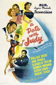
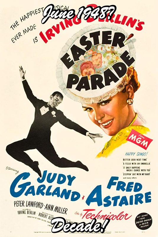
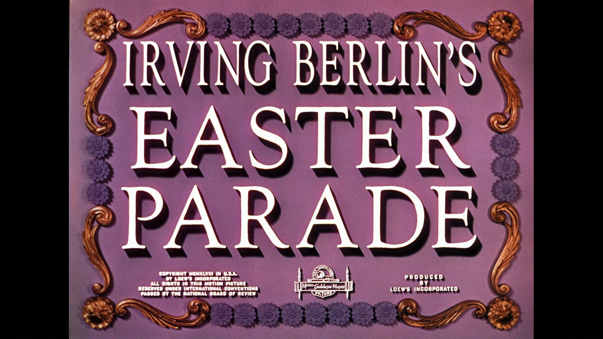
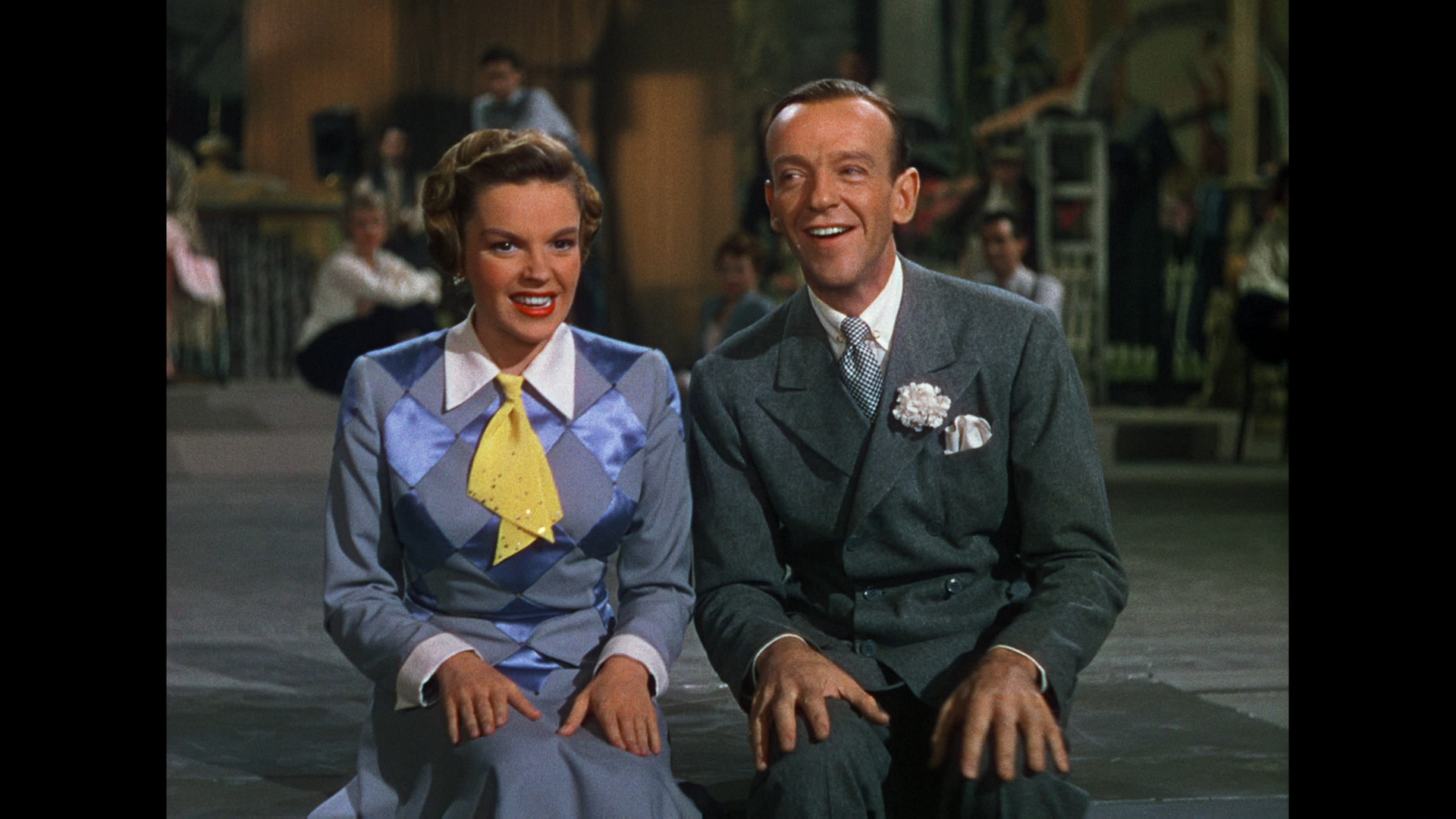
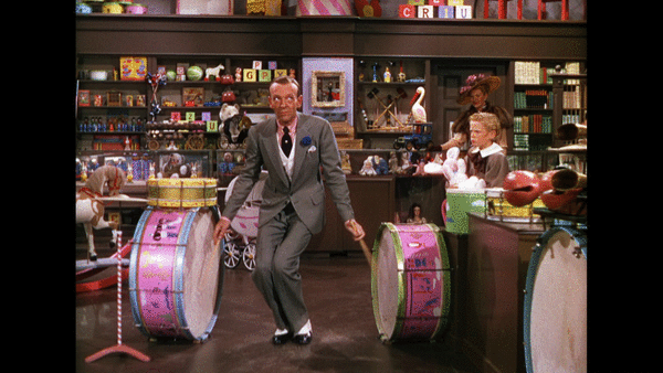
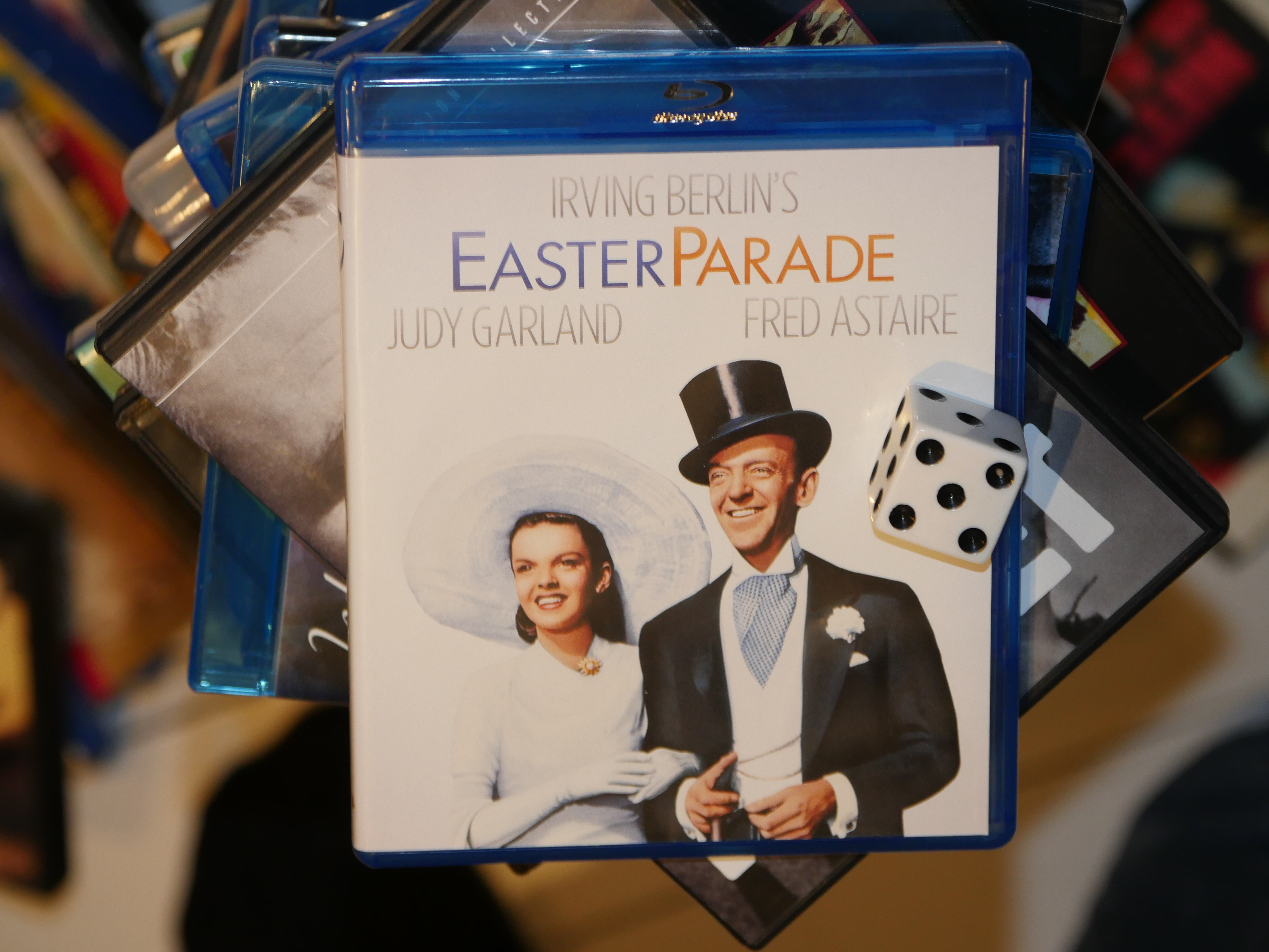
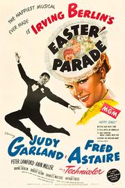
Based on the name I thought this was going to be a cheap B movie, but instead it’s an Irving Berlin extravaganza! With Fred Astaire and Judy Garland!
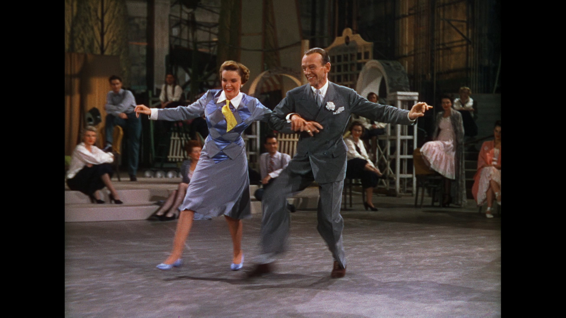
But like I guessed by the “parade” name, this is basically a bunch of songs and dances and skits with some nonsensical plot to tie it all loosely together.
Which is fine by me!
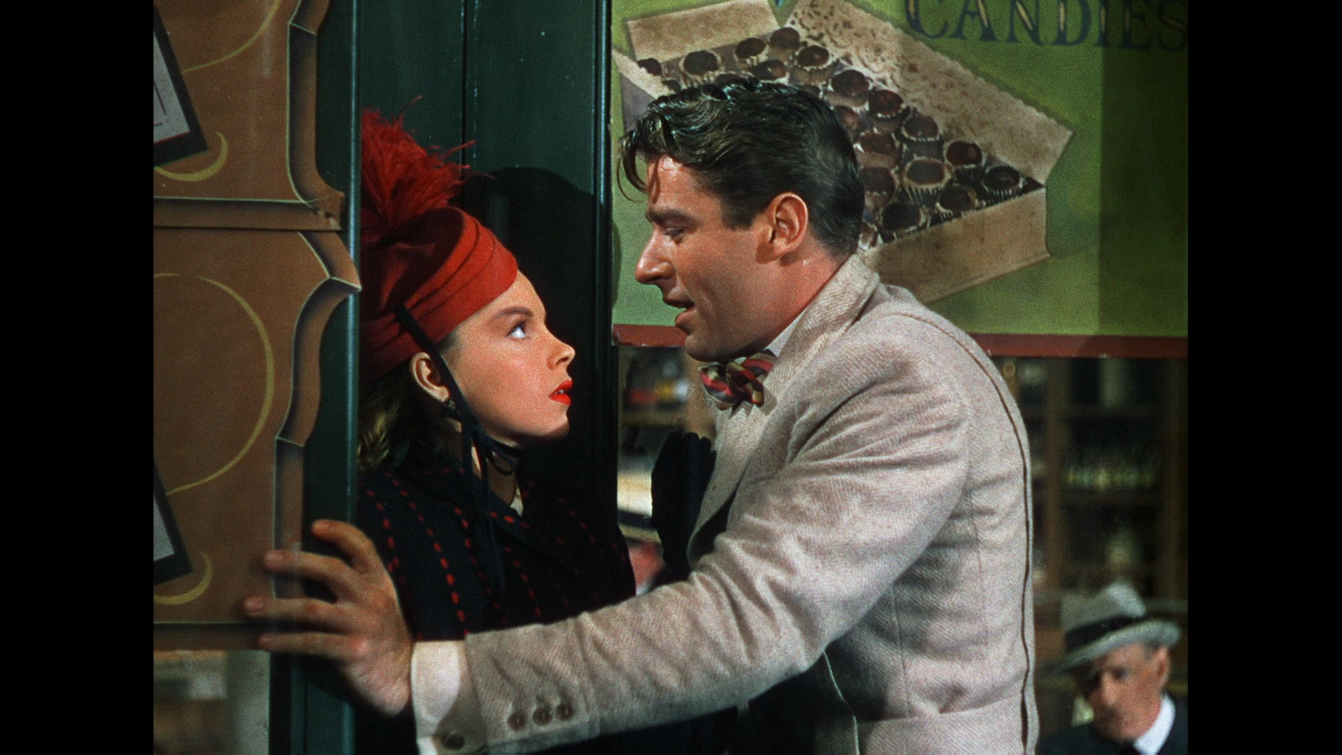
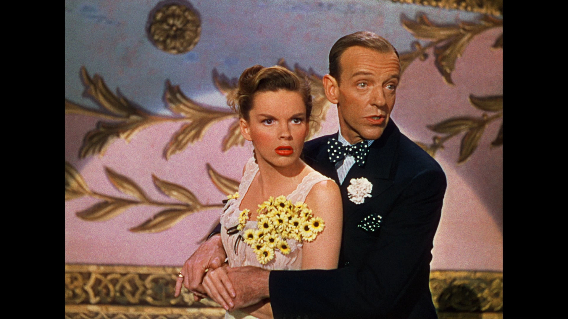
It’s odd watching Astaire in colour and in 2K. He looks so… highly resoluted. (That’s a word.) For the first five minutes I was going “is that really Fred? Is it really? Is it?”
It was the most financially successful picture for both Garland and Astaire as well as the highest-grossing musical of the year.
But I can see why. This is effortlessly funny. It’s a kind of Eliza Doolittle thing, really, and Judy Garland is hilarious here. And she hoofs it impressively.
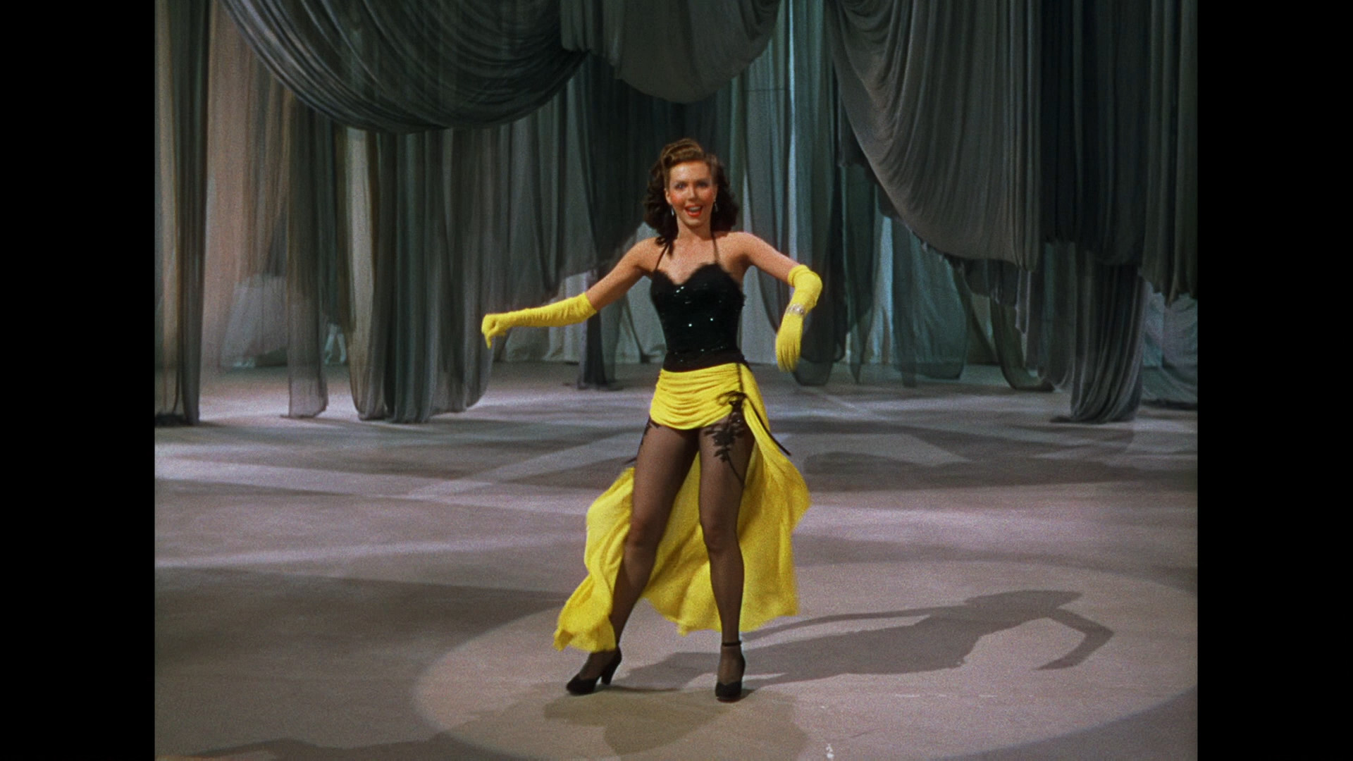
The Ann Miller tap scene tops everything, though. Amazeballs.
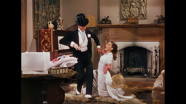
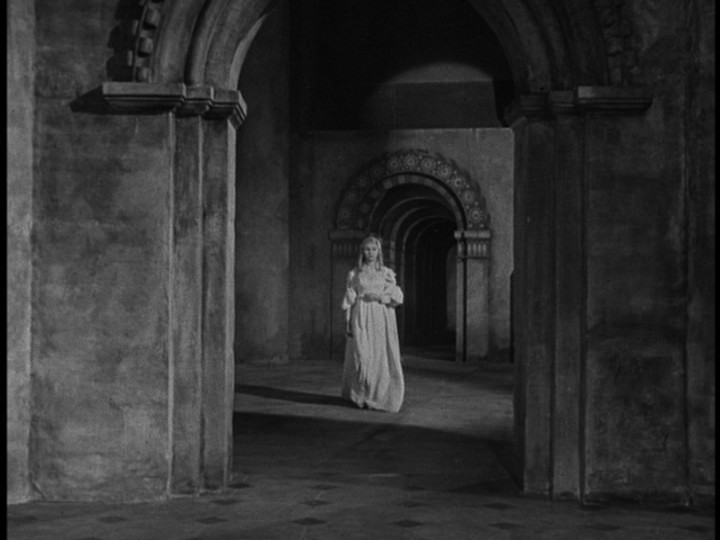
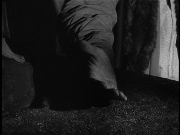
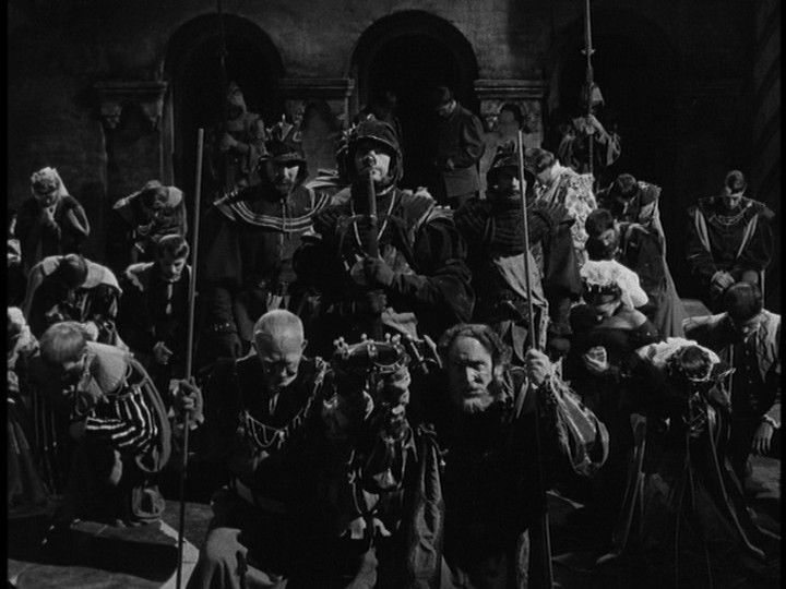
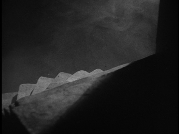
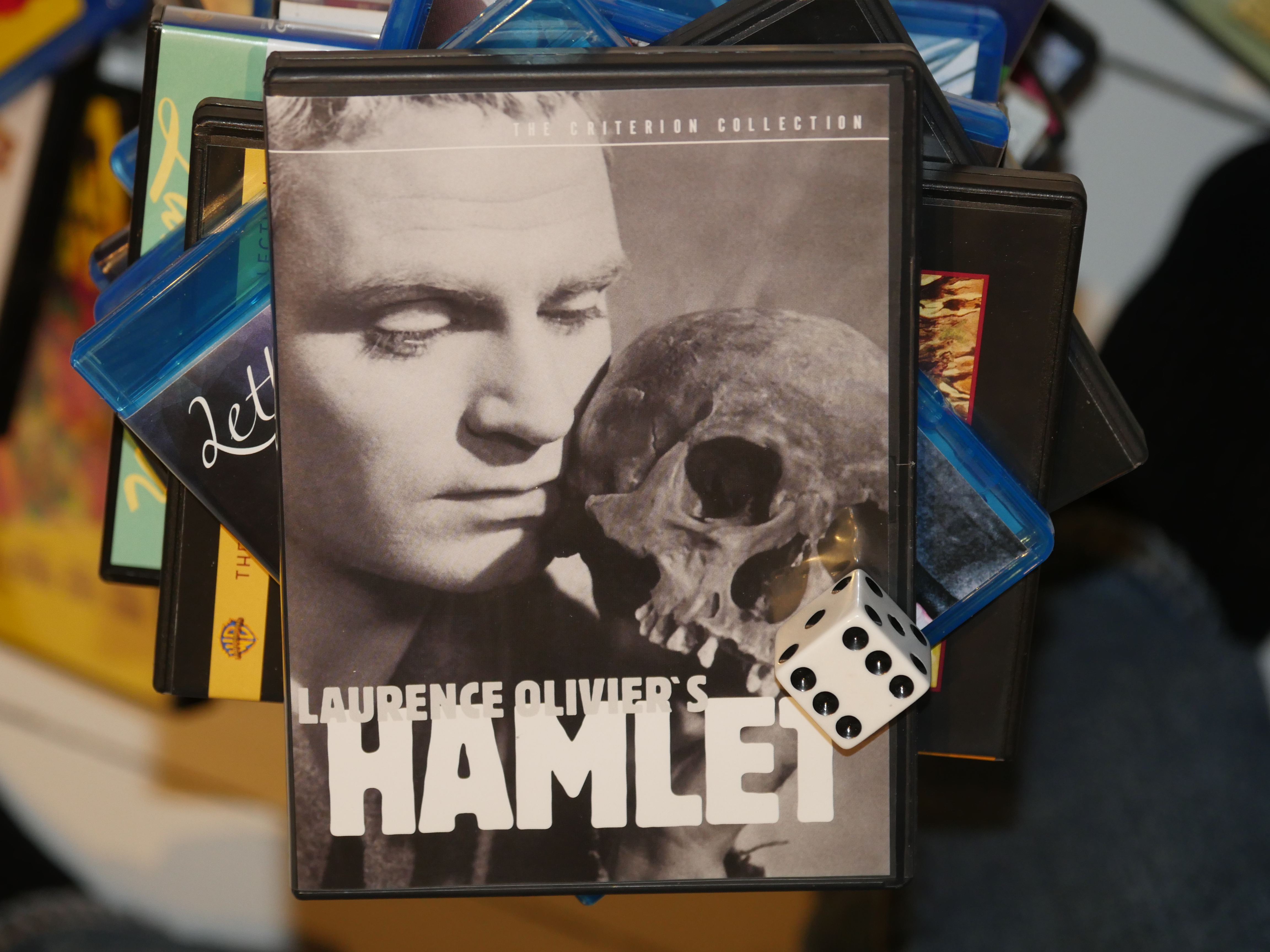
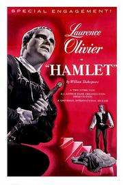
Directed by Laurence Olivier, this is pretty spiffy. Lots of weird little touches.
It’s not filmed theatre at all — it’s all movie.
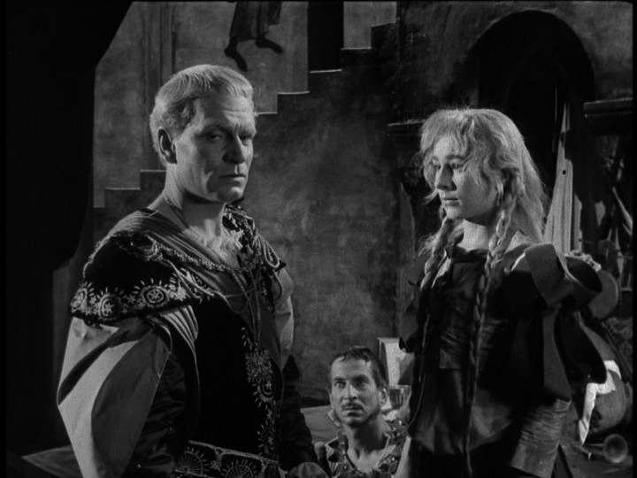
I didn’t recognise Olivier at all. Perhaps I’ve just seen him in much later movies? Or is it just the blond(e)ness? He’s fabulous here, anyway.
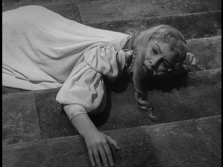
We’ve all seen Hamlet way too many times, right? But this version seems so fresh. Despite my expectations, I found myself riveted. I think this may well be the best version I’ve seen?
Yes.
Even if it doesn’t include Rosencrantz and Guildenstern. It feels very compact, even if it’s two and a half hours. And that means that it’s all psychodrama and doesn’t have all the funny and or political bits.
Oh, huh. It won all the Oscars that year, which I didn’t expect, either.
But even so, it’s great. The only major misstep is the casting of Horatio. He’s just an oafish non-entity here. And it’s a bit weird that Hamlet’s mother is obviously much younger than Hamlet is, but they make it work.
Did Olivier want to play Hamlet as he was really a lunatic instead of playing at being one? This version seems to be open to that interpretation… Especially when you mix the incestuous bits with his mother in.
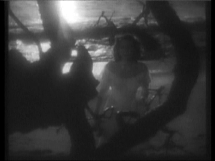
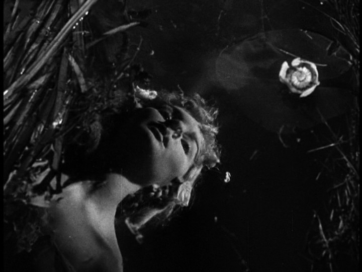
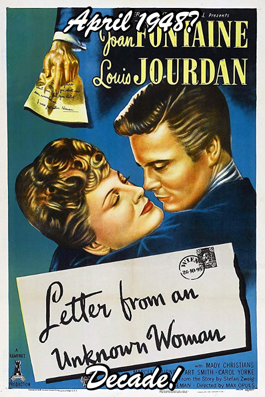
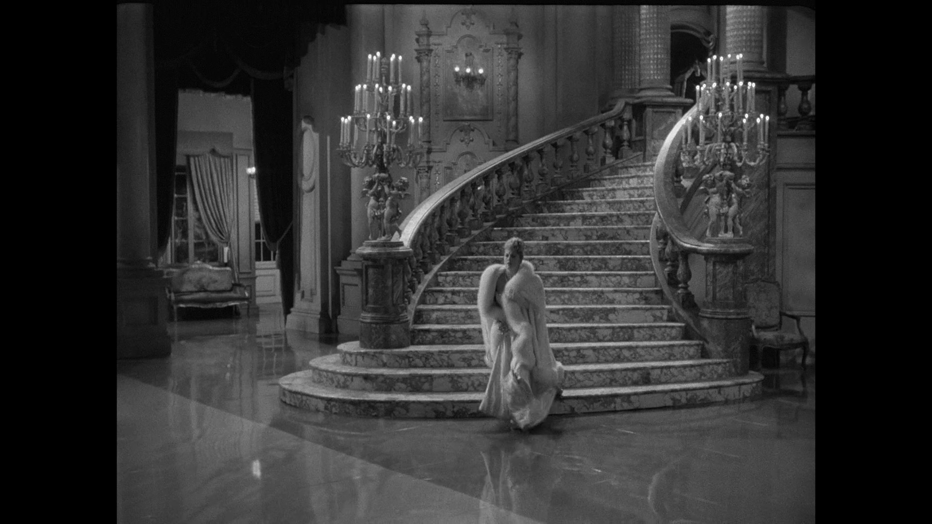
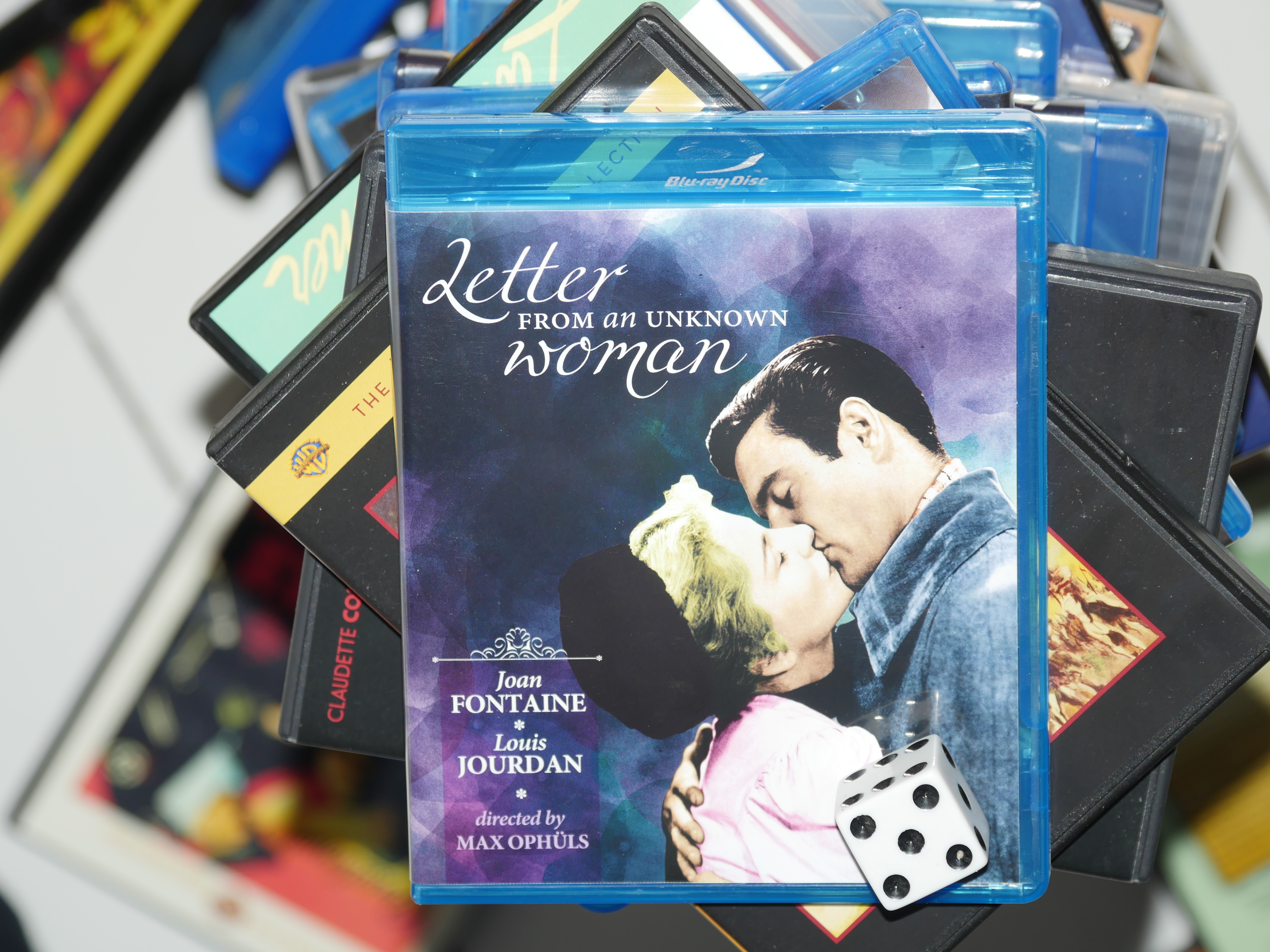
Oh, directed by Max Ophüls. I haven’t seen a lot of movies by him… I remember seeing The Earrings of Madame De… the other year. I think? Yes.
I was apparently befuddled then.
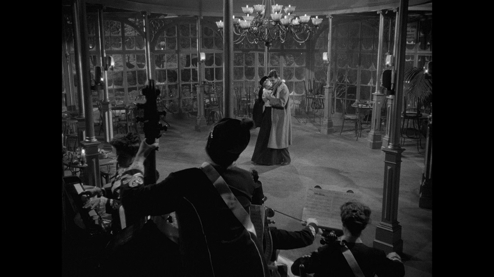
This looks great. The cinematography is relentlessly intriguing.
Joan Fontaine is marvellous. Her acting style is so different from what you usually get in Hollywood movies of this era. Not that there’s anything wrong with the norm, but it’s refreshing to see a different take.
This is a very strange film: I had no idea where it was going (on a macro plane) while most of the individual scenes were quite predictable.
The most disturbing thing about the movie is watching Louis Jourdan pretending he knows his way around a piano.
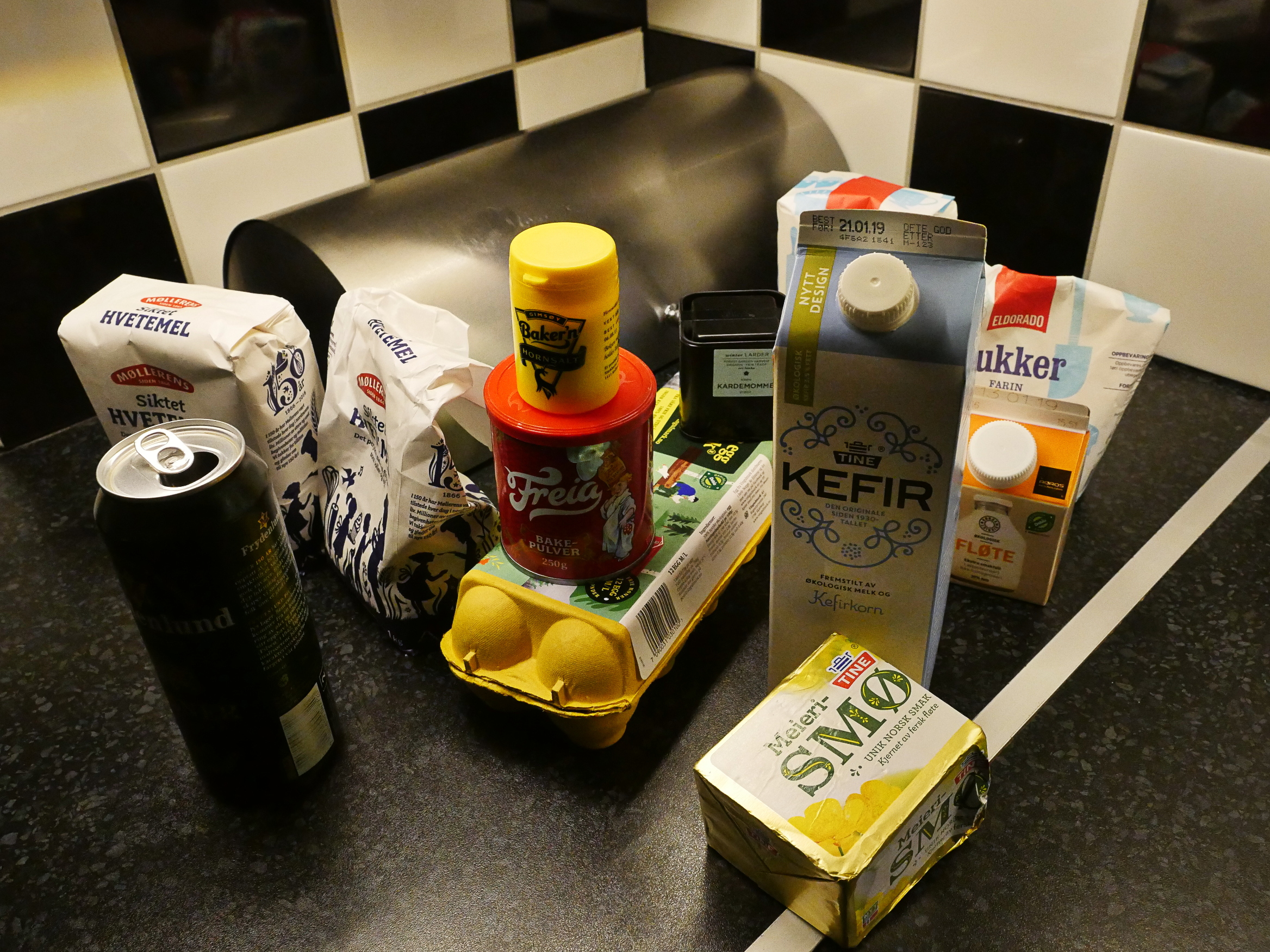
When I went to the kitchen equipment store and asked for the stuff I needed to bake these things, the shop assistant asked me “you’re making smultringer (literally “lard rings”) after Christmas?” incredulously.
Which was slightly weird. These are things one makes in Scandinavia at Xmas, but they’re eaten all year long, because these are the Scandinavian version of donuts.
It’s basically just a pretty normal (but moist) dough (look at me, I’m an expert after making like a handful of things), but it has the aforementioned horn salt (which smells very er invigorating) and lots of eggs and cream and butter.
WHERE DID THAT BEER COME FROM.
Oops.
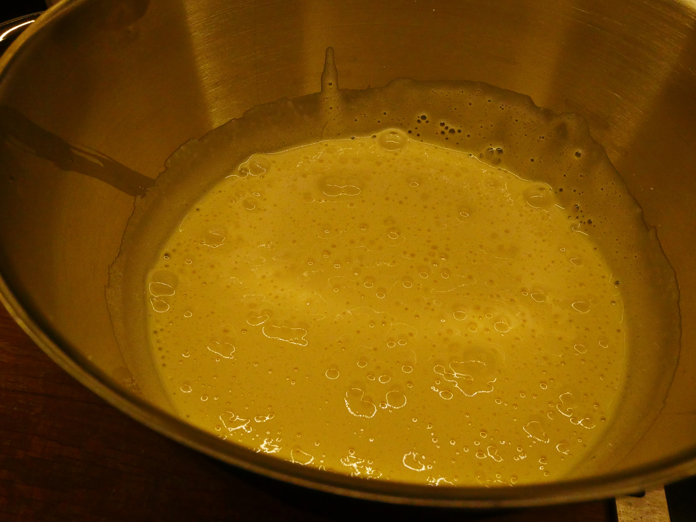
Whisk whisk whisk.
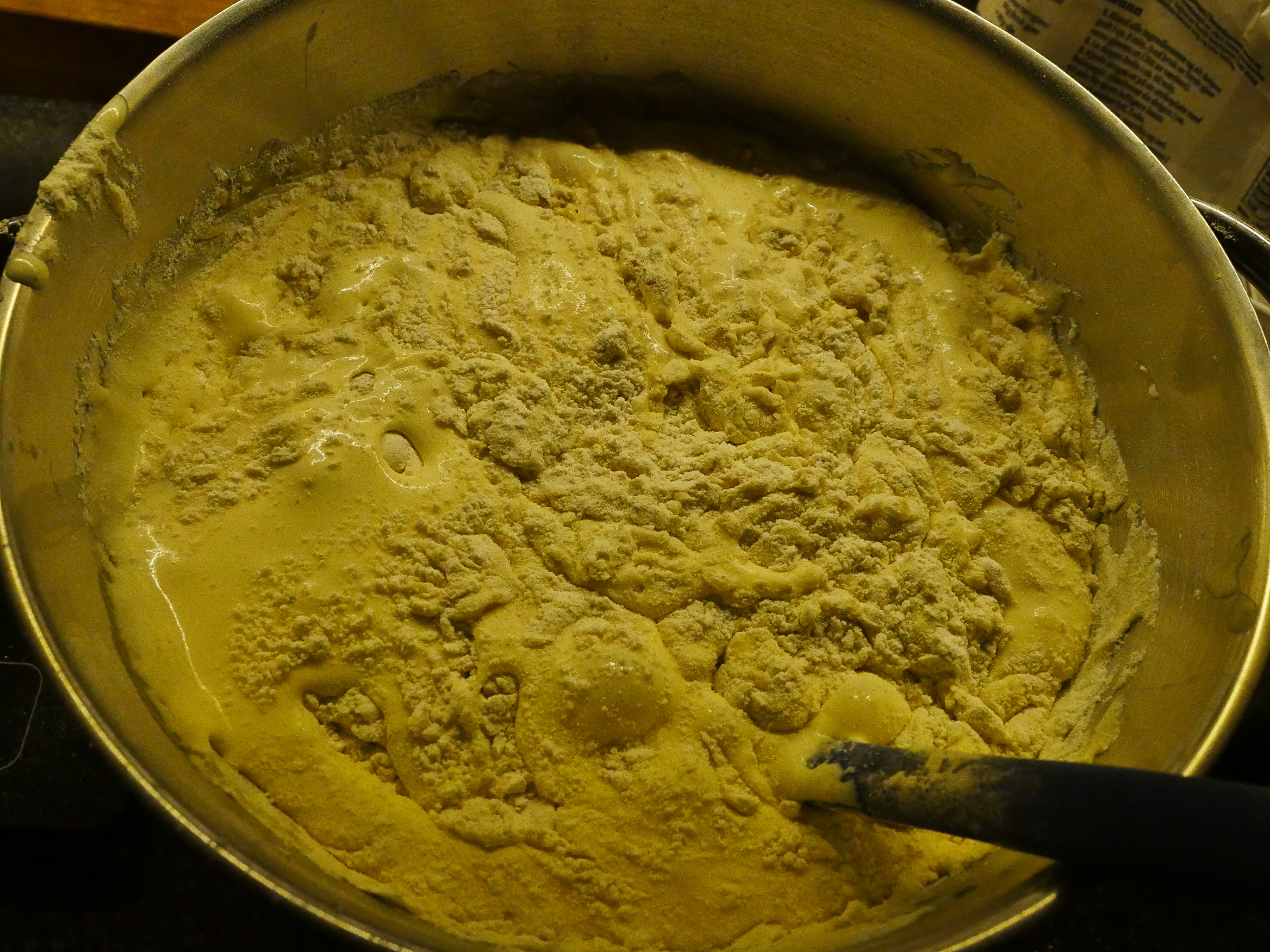
Add the dry bits.
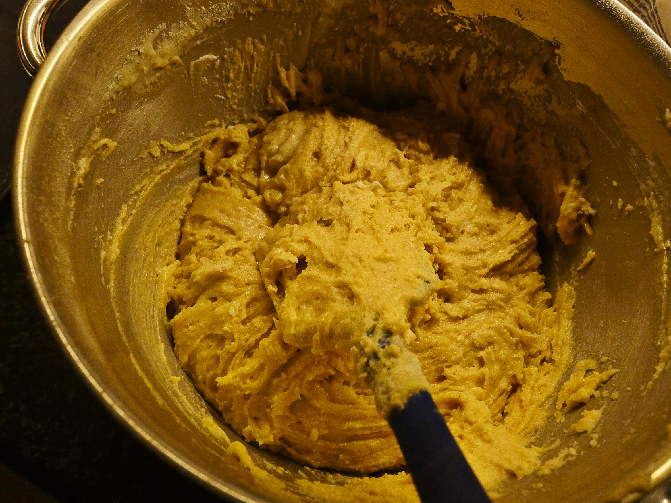
Mix. Done. And then you let it rest in the fridge until the next day.
That’s it! The dough is the easiest I’ve made, I think?
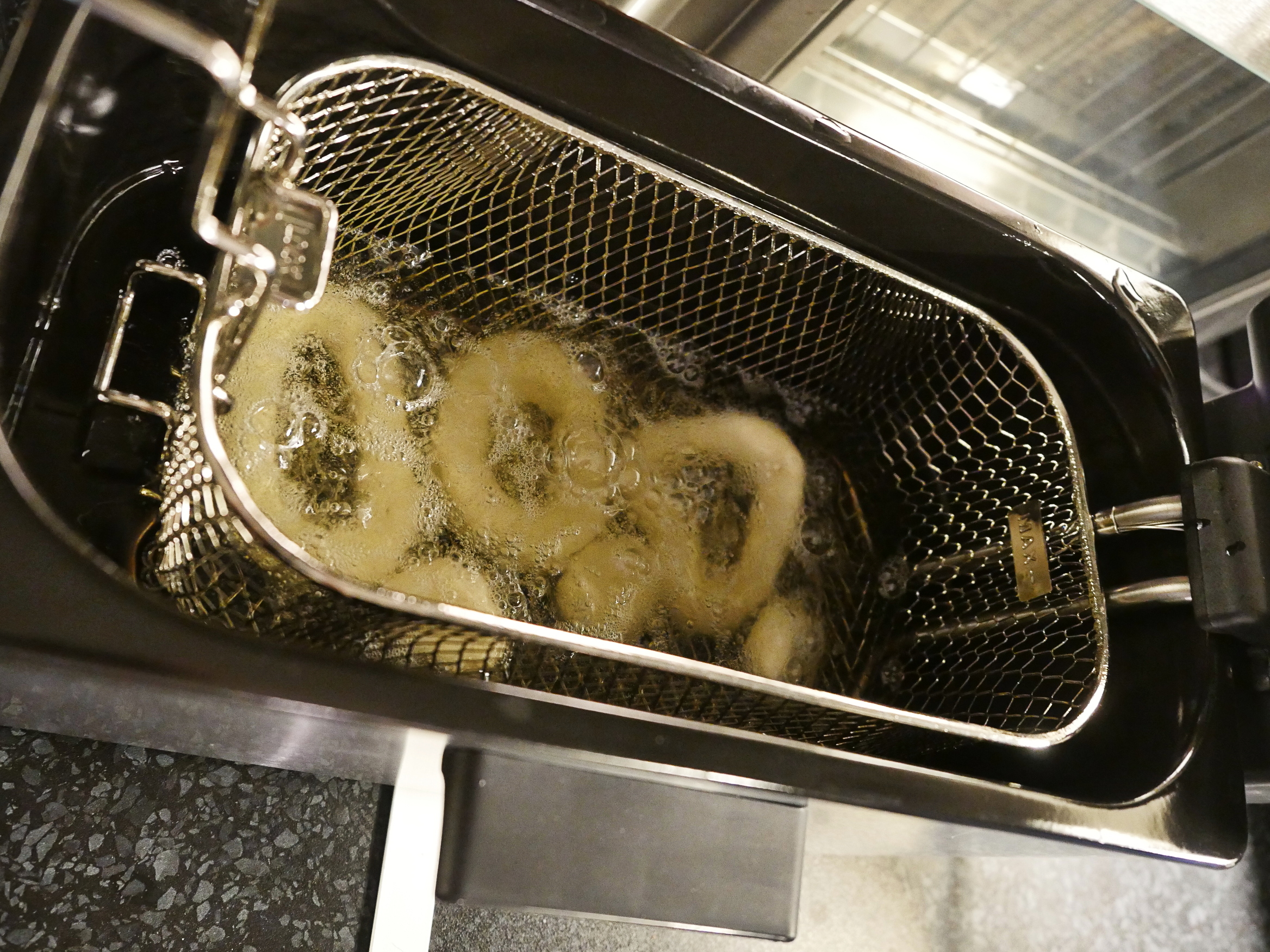
But then comes drama! Deep frying! I’ve never deep fried anything in my life, so this is the exciting part (for me).
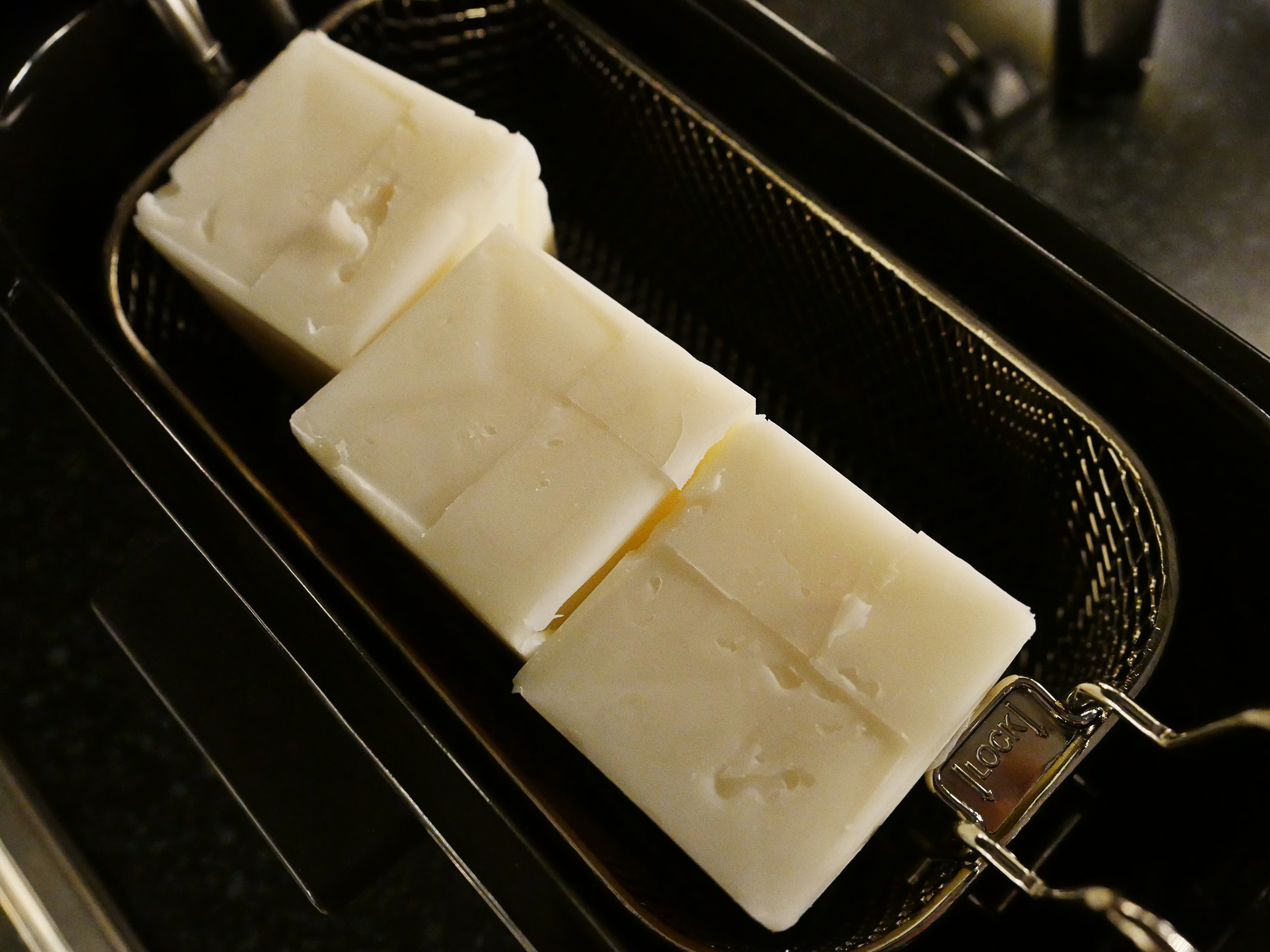
The fat comes in half kilo blocks. You traditionally use lard, as the name implies, but these days everybody uses some kind of plant-based fat (this is coconut, shea and palm, I believe).
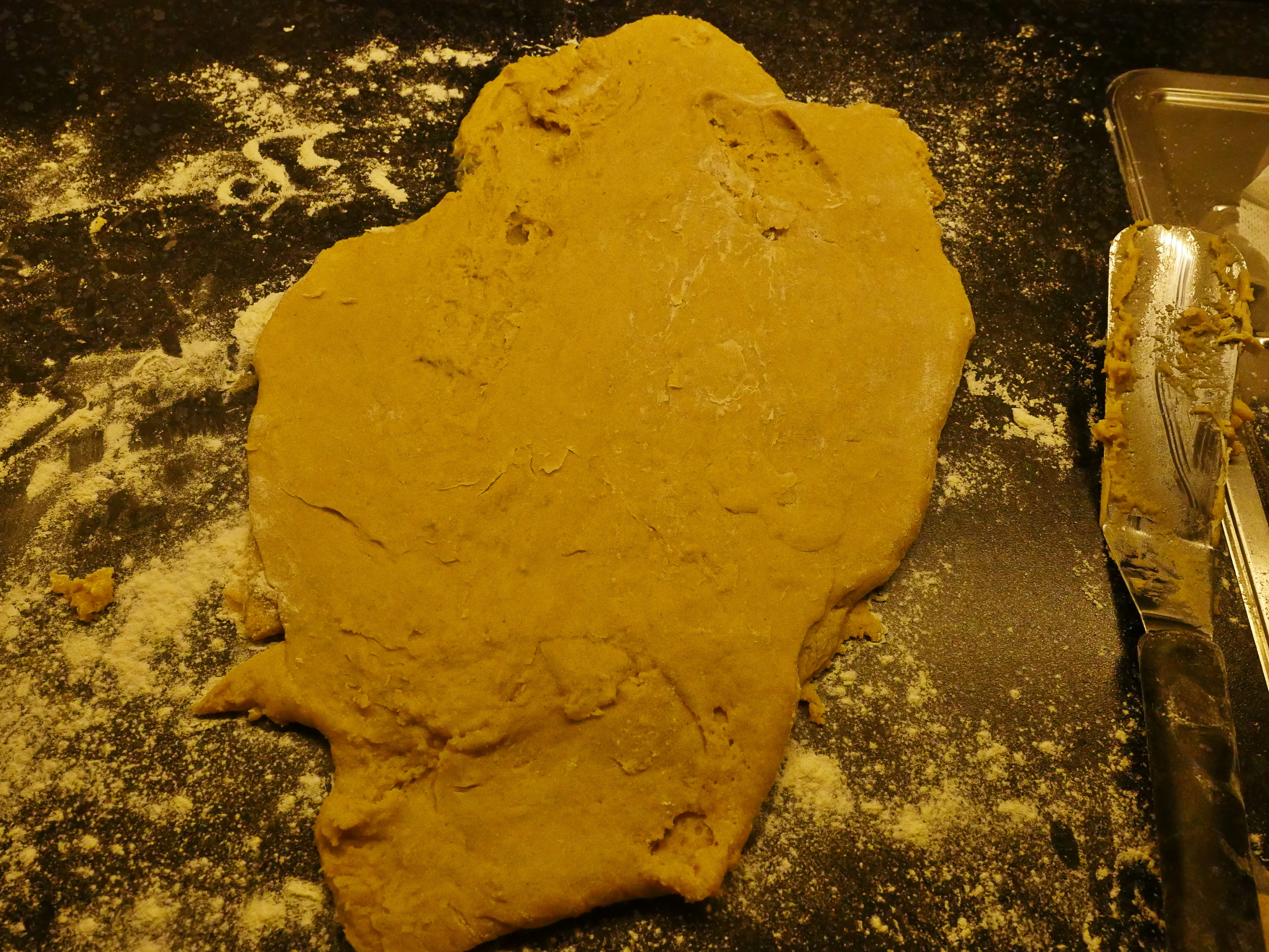
Then catastrophe! The dough is very sticky. I mean… stickier than an HSTS policy! I nervously tried to get some more flour into the dough while everything was sticking to everything else, and I finally wrestled it into some kind of submission.
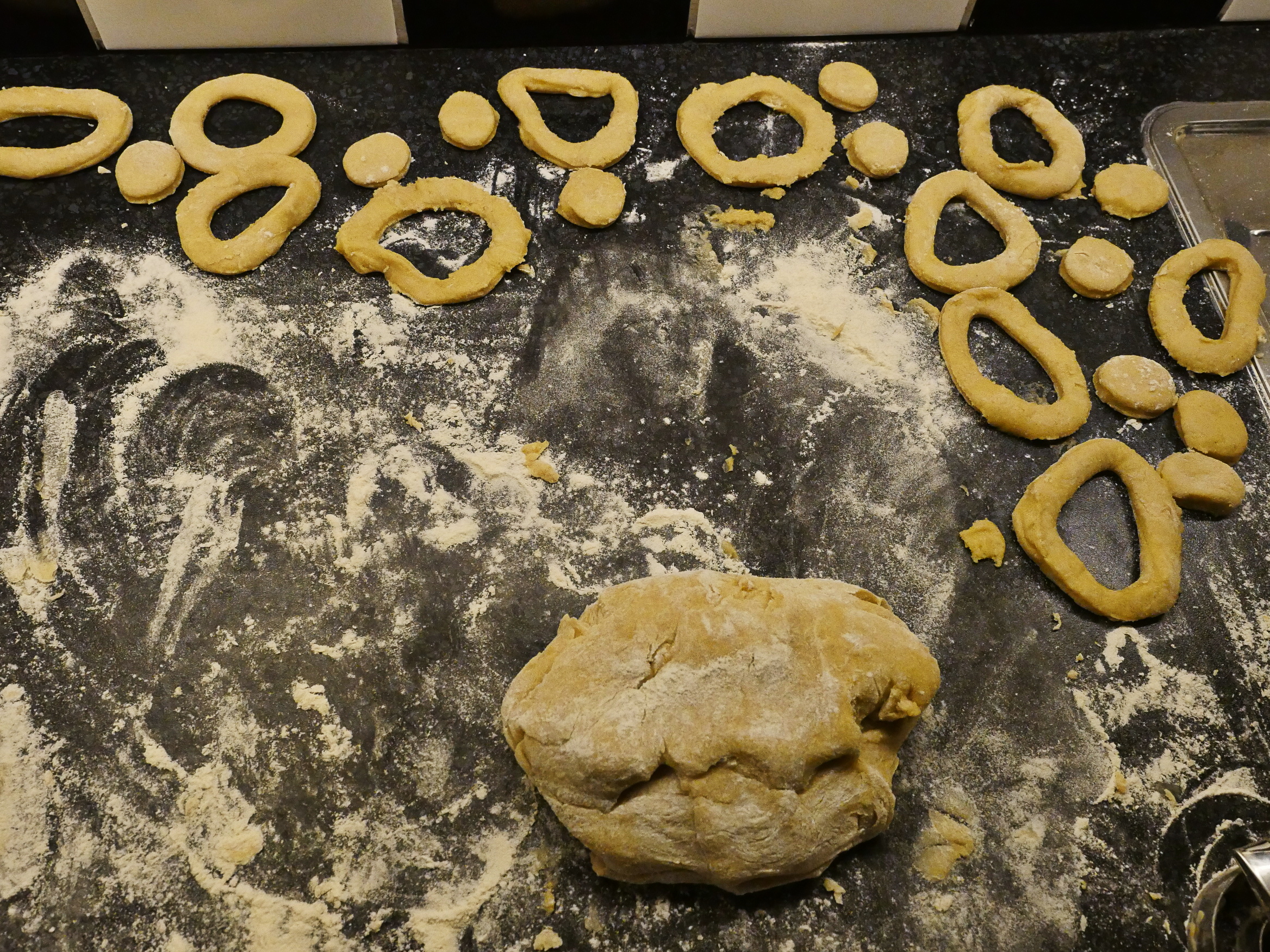
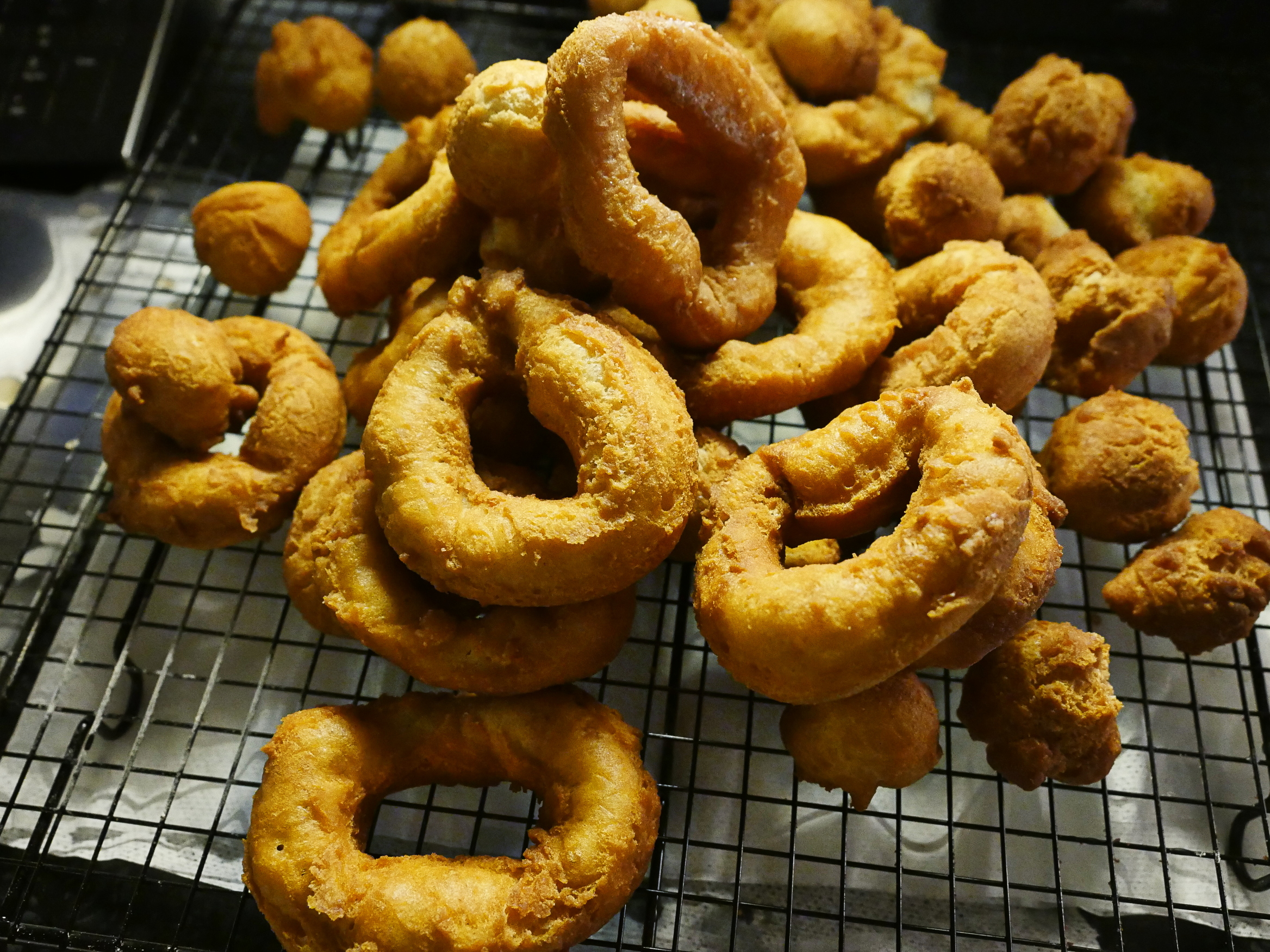
But since it’s so sticky, getting any kind of ringy rings out of the dough was a challenge. Which I failed as. As you can see.
Oops! I had started the deep fryer with the cubes of fat in the basket, which meant that they didn’t touch the heating element, which meant that the heating element gave off a not-very-pleasing smell of overheated electronics. Gaaah!
Did I mention that I’ve never used one of these before?
I quickly pulled the plug and then dumped the blocks of fat right onto the heating elements.
And got the powder fire extinguisher out of the closet.
But look! I didn’t burn the house down! (If ever my neighbours happen onto my blog they must be so reassured.)
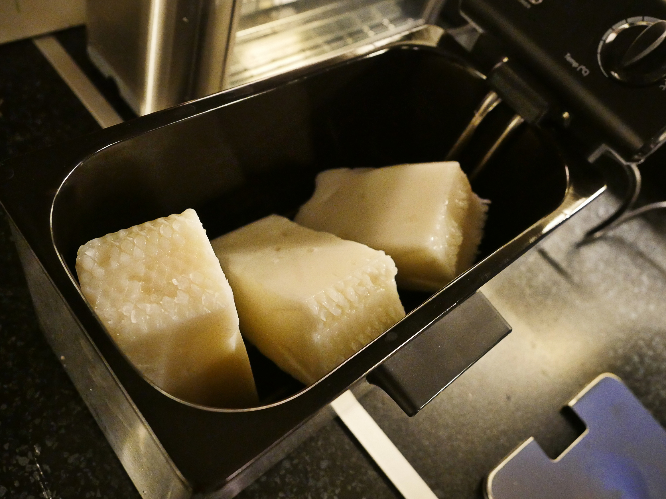
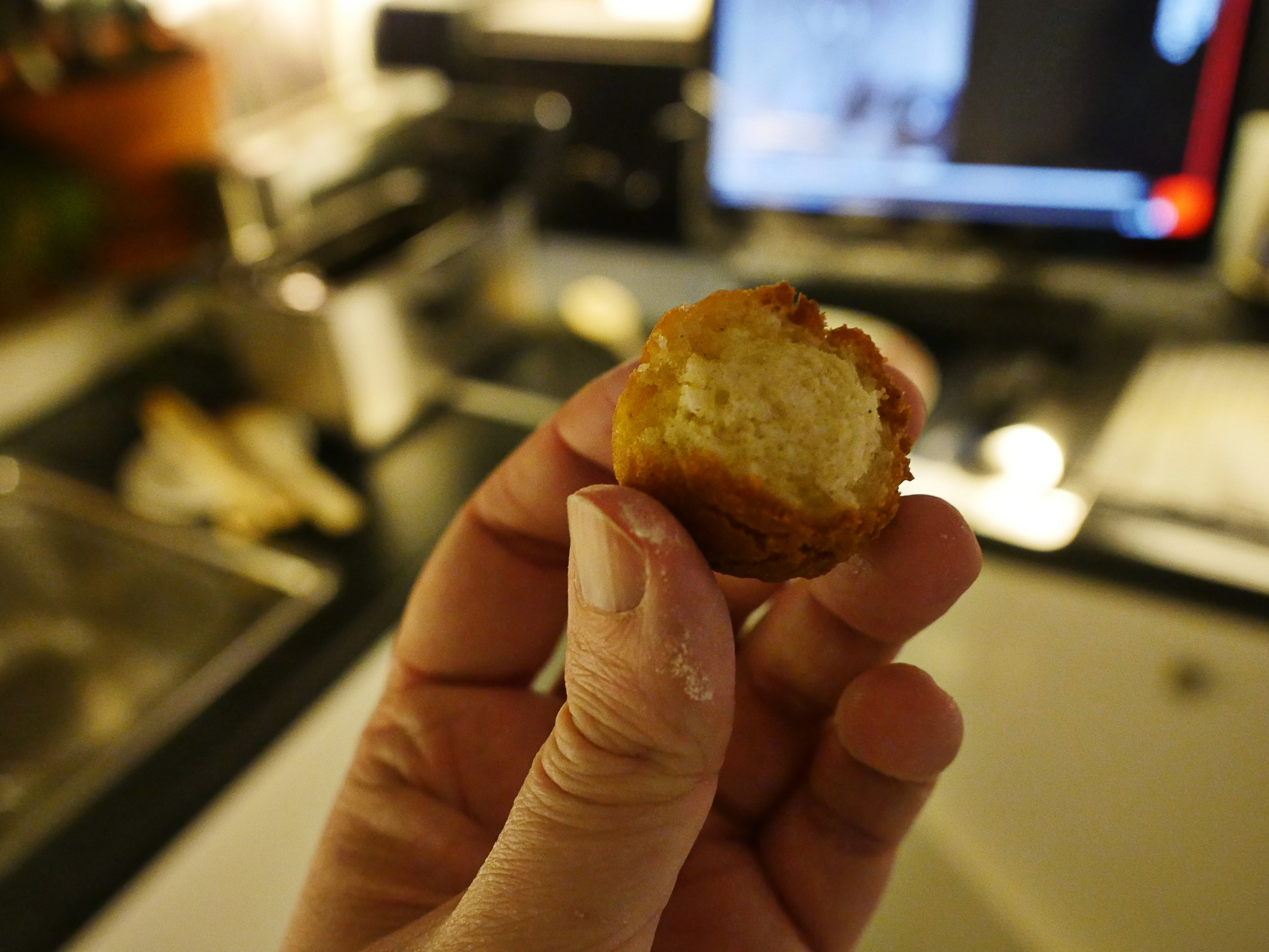
Mmmm… Crispy on the outside and sweet and fluffy on the inside…
Masses of lardy … shapes!
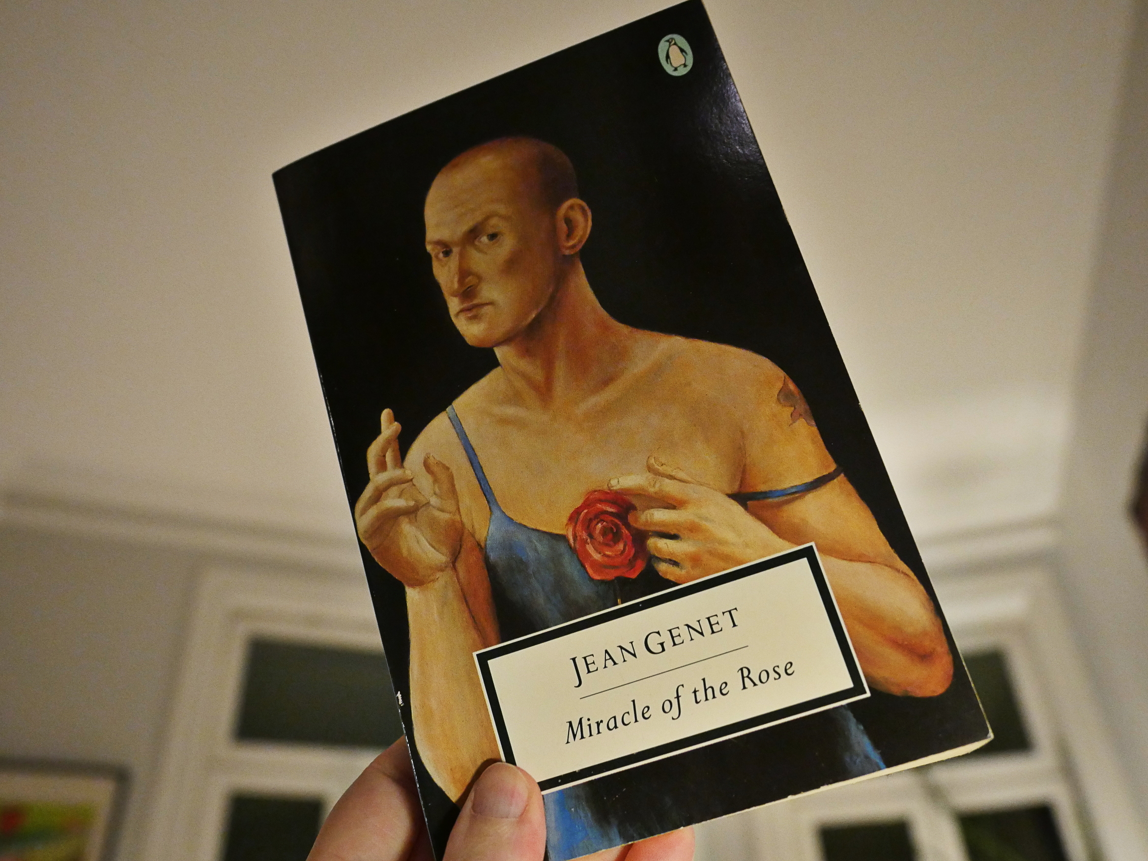
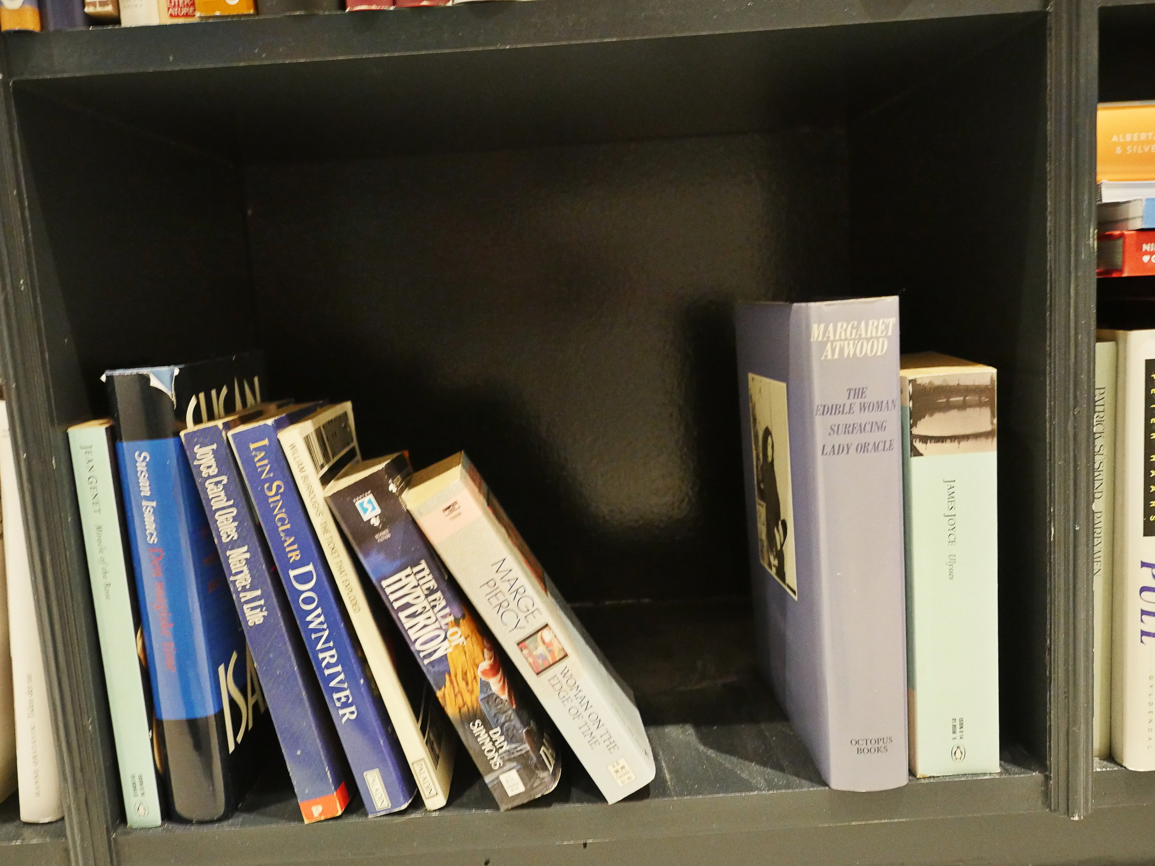
Ok, time to choose a book that I’ve avoided reading for like 25 years…
Eenie… meenie…
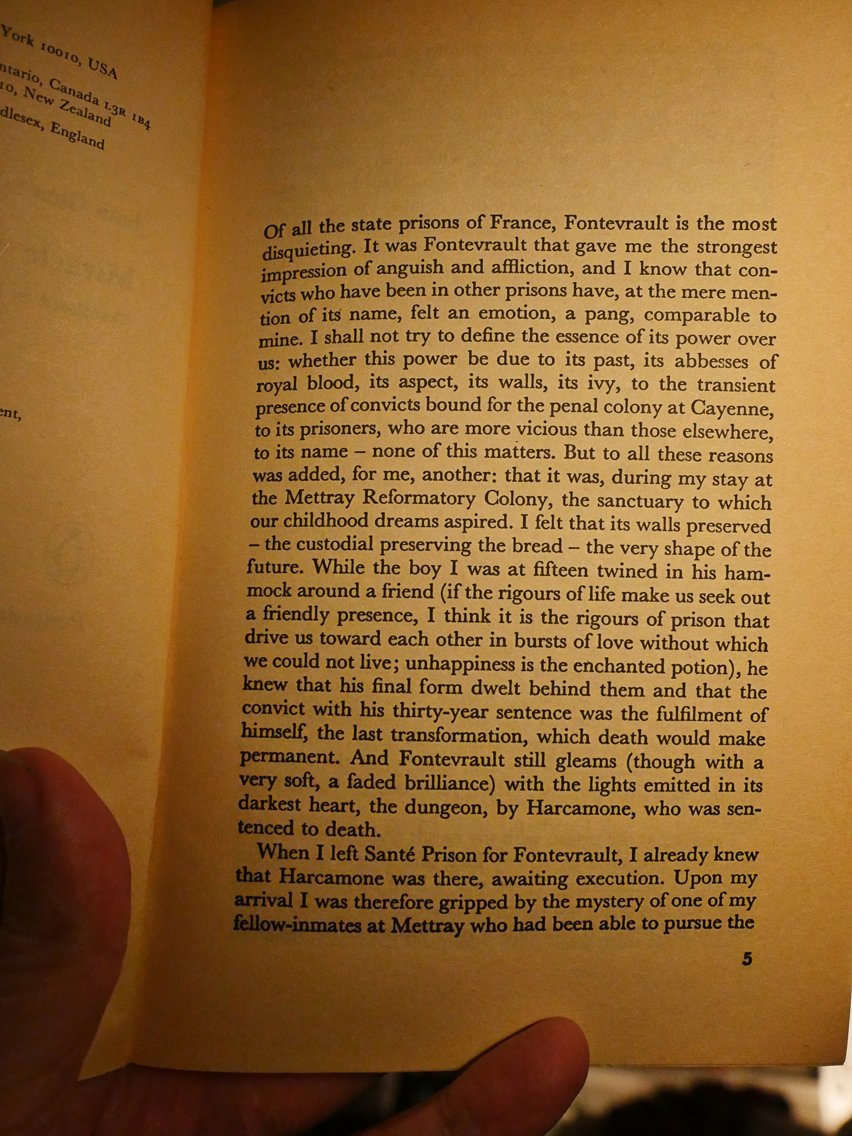
I choose Miracle of the Rose by Jean Genet, and I know exactly when and where and why I bought this, and why I’ve avoided reading it: I bought it in London in 1993 at the big Foyle’s (I was in London for the 4AD festival called Thirteen Year Itch (it was 4AD’s 13th anniversary)), and I bought it because it was an author whose name was familiar to me, and I had to buy something, and I didn’t read it because I’d read some Genet while in high school (not as an assignment) and I didn’t like his books.
See? It all… makes… sense…?
The other reason I’ve avoided reading this is that this is a translated work: If I want to read something badly translated, it might as well be badly translated into Norwegian and not badly translated into English. In my experience, English language translations are often of high quality, but sometimes tend to go more for authenticity (i.e., preserving the other language’s cadence and grammar) than legibility.
But let’s read the first two pages in the book.
Hm!
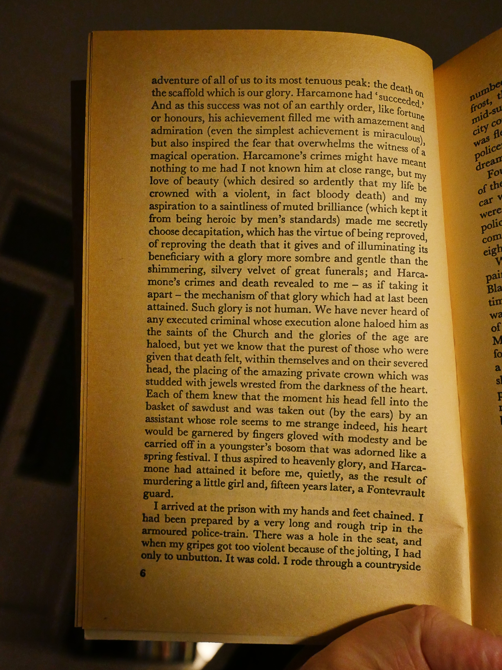
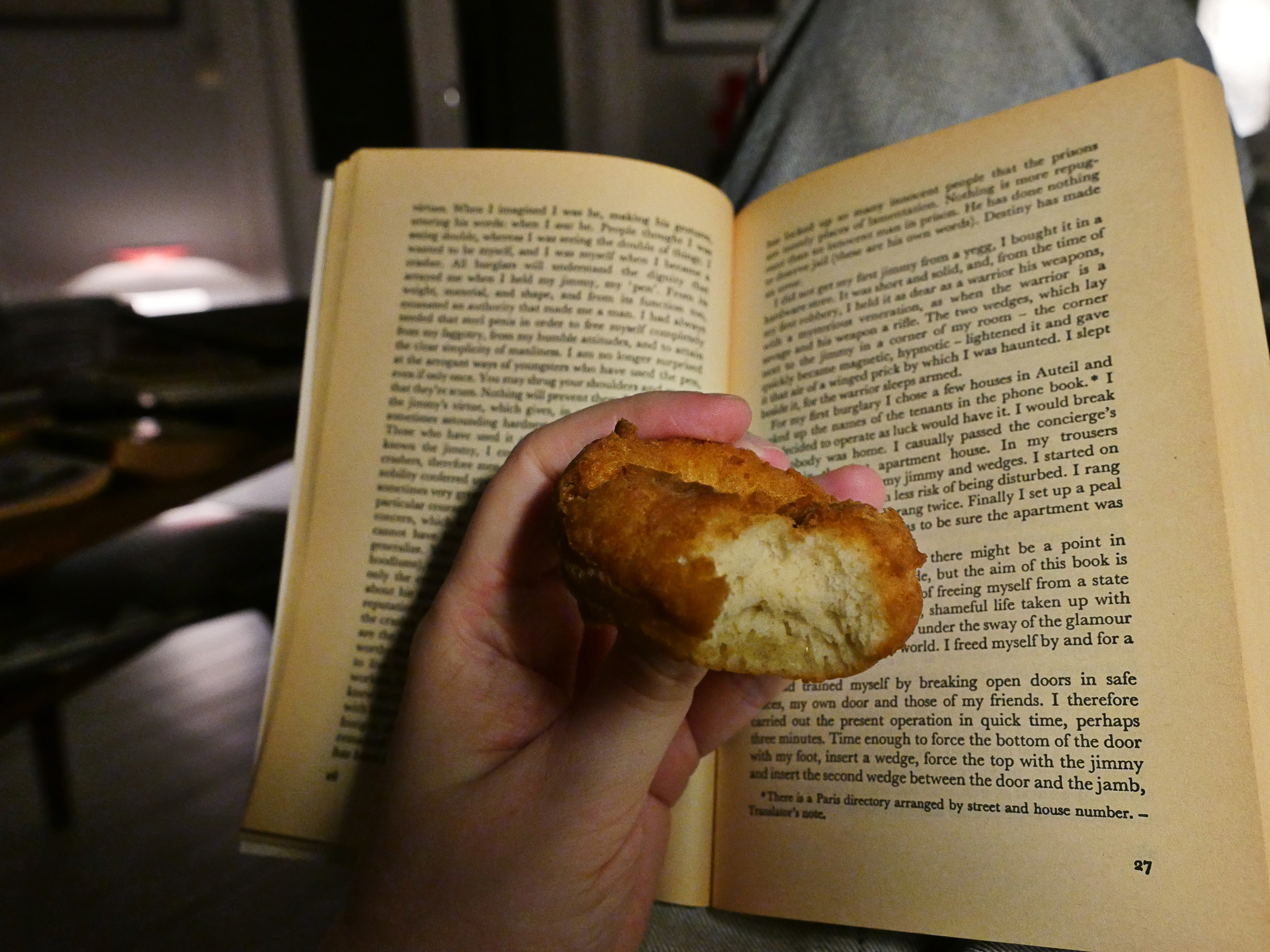
There was a hole in the seat, and when my gripes got too violent because of the jolting, I had only to unbutton.
Hm? Gripes? Complaining? Unbutton? The opposite of buttoning up? No… er…
gripe (grīp) v. griped, griping, gripes v.intr. To have sharp pains in the bowels.
(If you didn’t get hit, he shat down the hole in the seat.)
Is that related to “having the grippe”?
This book was written in 1951 and translated into English in 1965 by one Bernard Frechtman. Looks like he’s done a bunch of Genet books.
And my reservations seem to be warranted: The text has a very Frenchie flow to it, and I’m guessing that he’s using quaint English words to emulate other quaint French words.
The book purports to be about Genet himself in prison, and that may very well be true, for all I know. He did spend a lot of time behind bars, didn’t he? I’ve done no research.
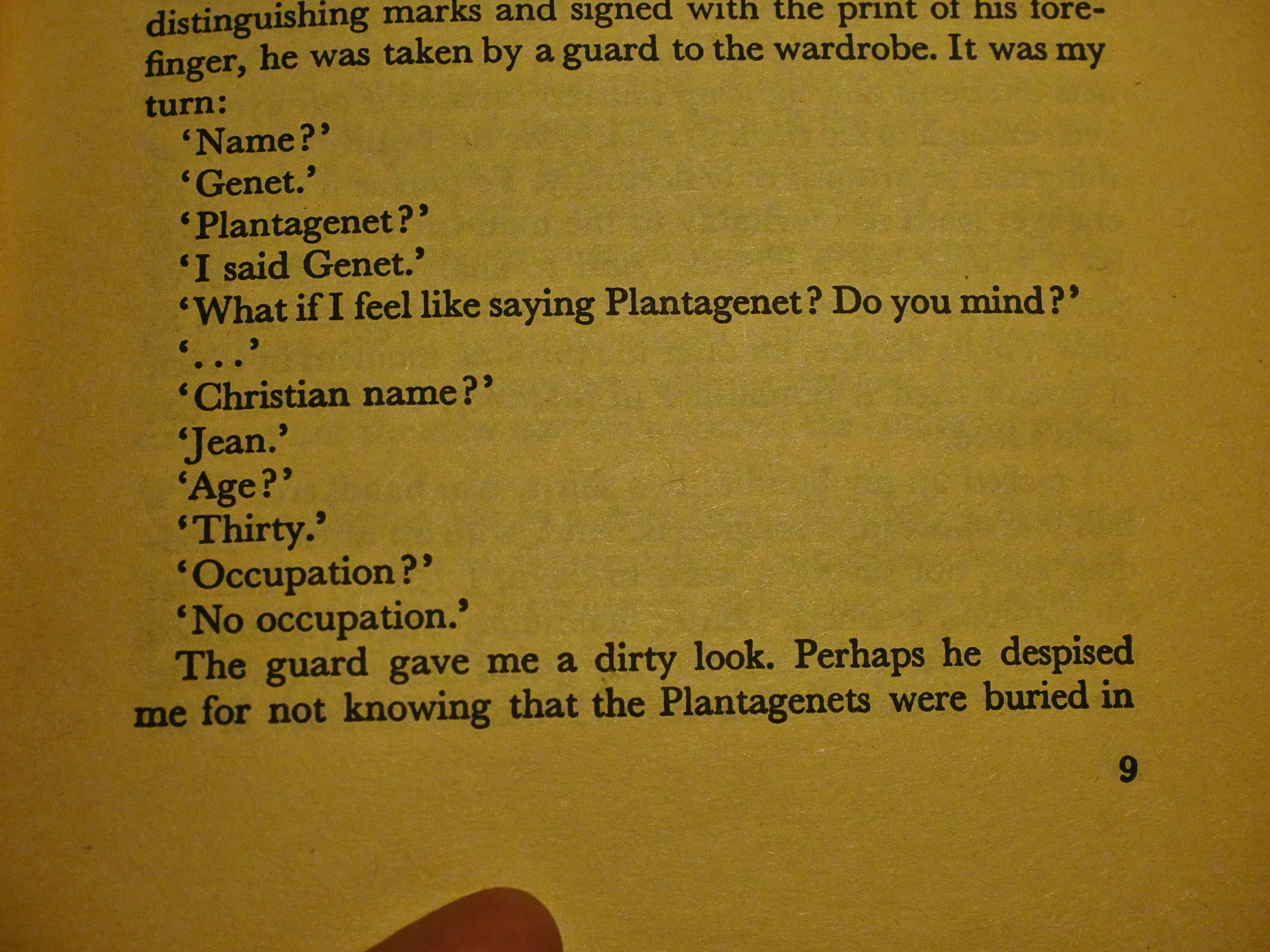
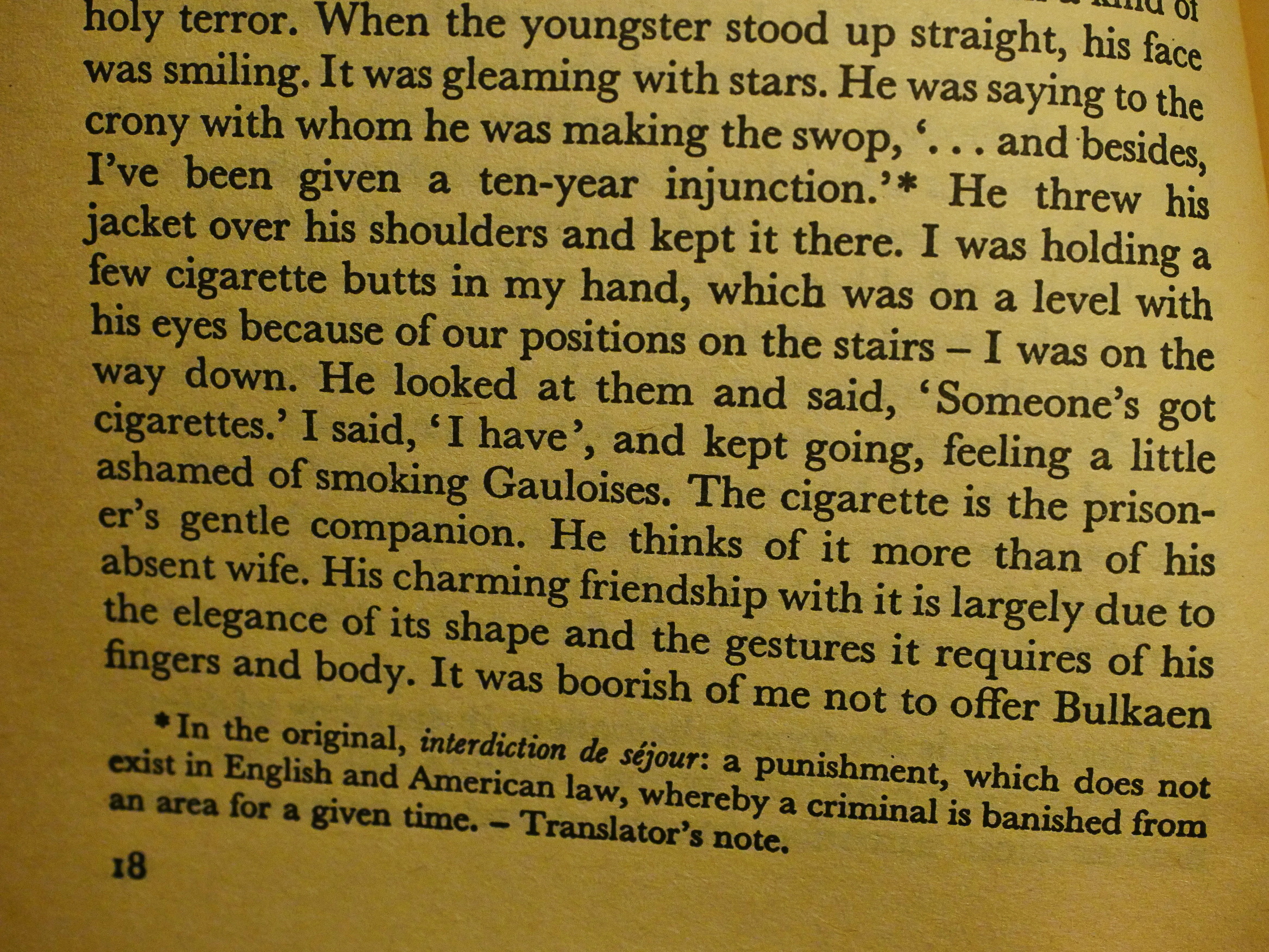
The translator is footnote happy. (It’s like gun crazy, but with footnotes instead of guns.) Genet writes a lot about language in this book, and expounds, say, on the differences between “Les Bijou” and “bijoux” which of course makes the translator chime in. As much as I hate footnotes, the translator doesn’t really go overboard with the explanations, even if he sprinkles them generously throughout the book.
There’s a lot of little bits in this book that I absolutely adore.
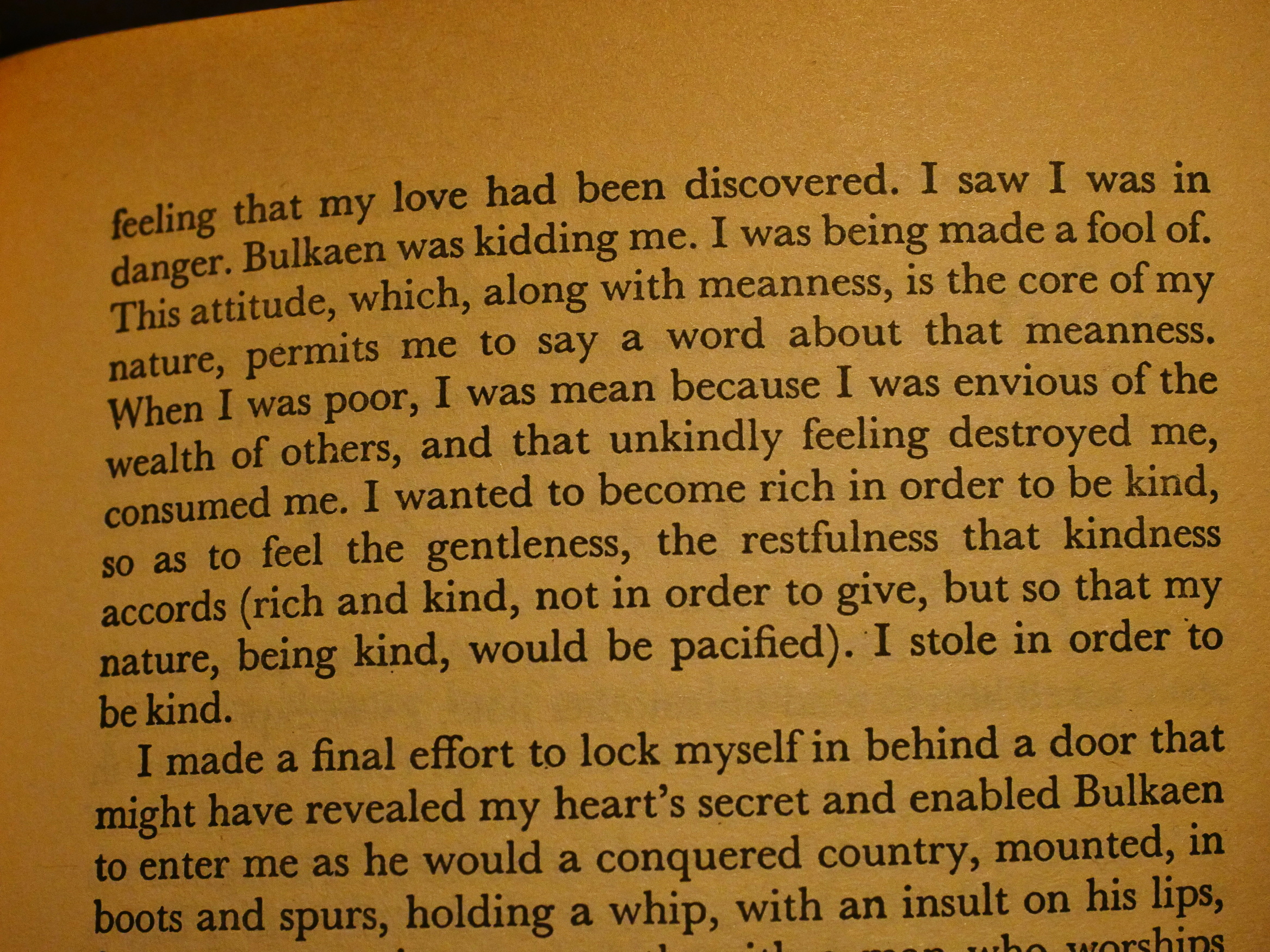
I wanted to become rich in order to be kind, so as to feel the gentleness, the restfulness that kindness accords (rich and kind, not in order to give, but so that my nature, being kind, would be pacified). I stole in order to be kind.
Or what about this one:
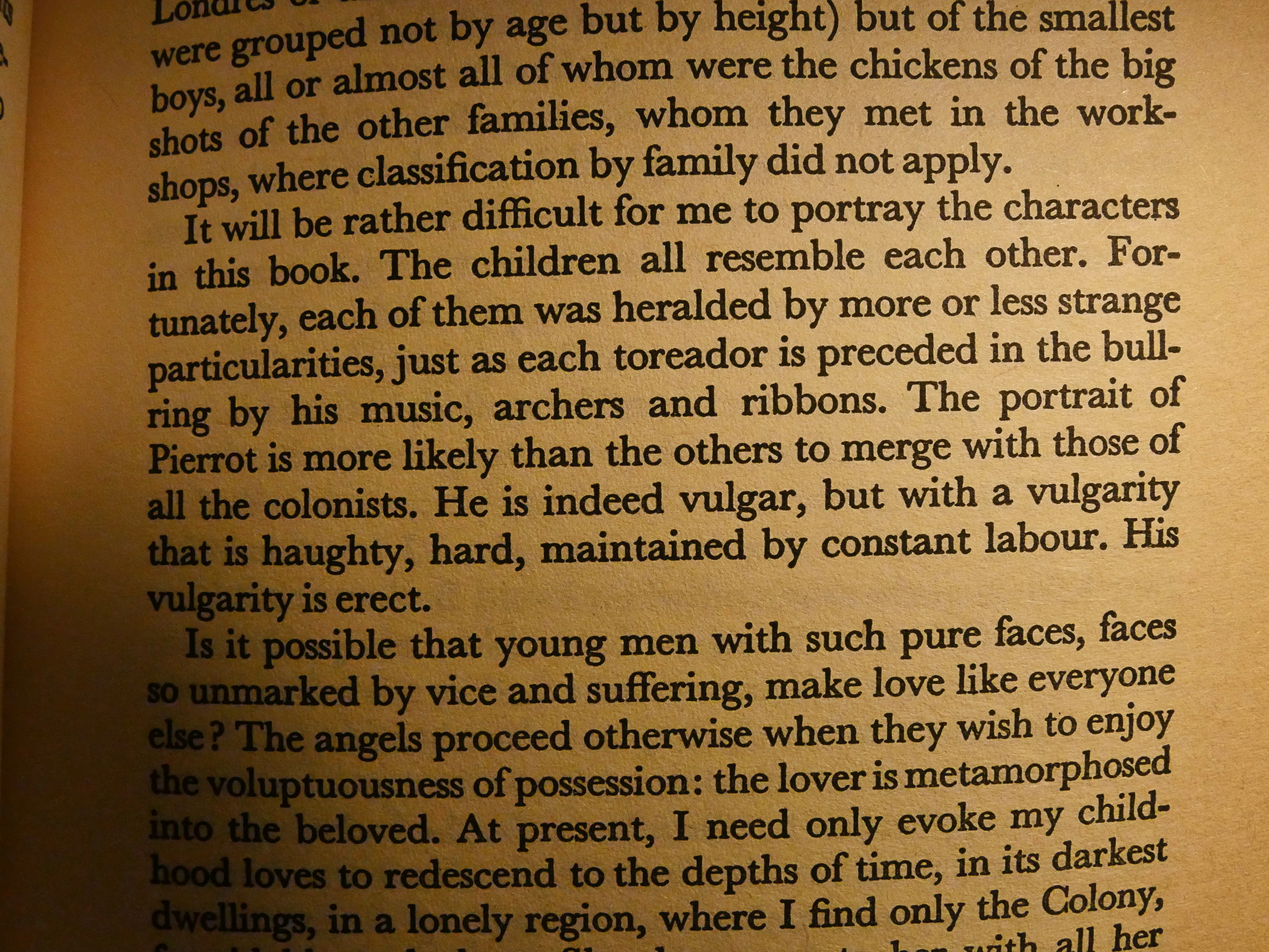
He is indeed vulgar, but with a vulgarity that is haughty, hard, maintained by constant labour. His vulgarity is erect.
I mean, you can’t quibble with that.
But these glimmers of brilliance are mostly submerged in a swamp of semi-opaque, meandering recollections. Genet doesn’t have much of a structure going on here… or perhaps vaguely shifting back and forth between various people and times and situations is a structure as good as anything. You can’t really say that there’s much sense of progress in the book, because we return to the same things so many times; sometimes we learn a bit more than last time and sometimes not. Genet glides around as if writing by nothing more than free association. Still there’s a sometimes satisfying connectedness to these pages.
But… I agree with my teenage self. I don’t really like Genet’s books. Getting through this one was mostly a chore, but with some real points of interest. I can see why he fascinates.
So how does the lard not-quite-ring pair with the book?
Well, they’re delicious, and, of course, makes the book a lot sweeter.