Mark Beyer screen printed poster.
This blog post is part of the Punk Comix series.
From time to time, people send me email about not being able to link to this blog from Facebook. They get:


And… I know! But I have no idea why — I’ve never posted a link to the site myself on Facebook. (I think I’ve made two Facebook posts in my life; I don’t use the site.)
So… there you go.
Sorry for having so many spammy pop-ups (they must be here somewhere), pretending to be a well-known brand (you mean I’m not?), being misleading (that’s fair), and being beloved by suspicious accounts.
I guess it’s all on you, people with suspicious accounts.
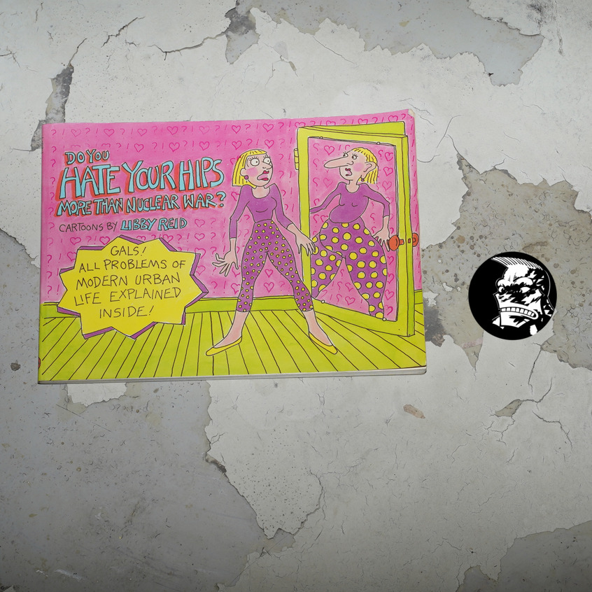
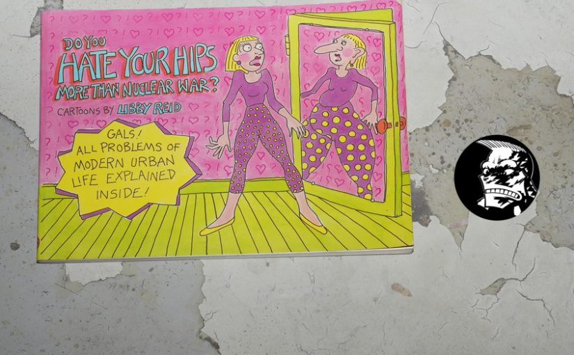
Do You Hate Your Hips More Than Nuclear War? by Libby Reid (216x152mm)
I’ve covered a few books that have been “adjacent” to the purported subject matter of this blog series… but I don’t quite know why I meant to do this book. I mean, it doesn’t look very… adjacent?
Hm… *ponder*… Oh yeah, I think it’s coming back to me now, but it might be a fake memory: Was there an ad for this in an issue of Raw? It’s published by Penguin, who had recently published the first Maus collection, so perhaps that’s what prompted the connection.
Or…
OK, I just don’t know. At some point, a month or so ago, I bought this book because I thought it would be pertinent or something, so let’s read it.
So — it uses a pretty standard format — topical (or not) jokes arranged by subject.
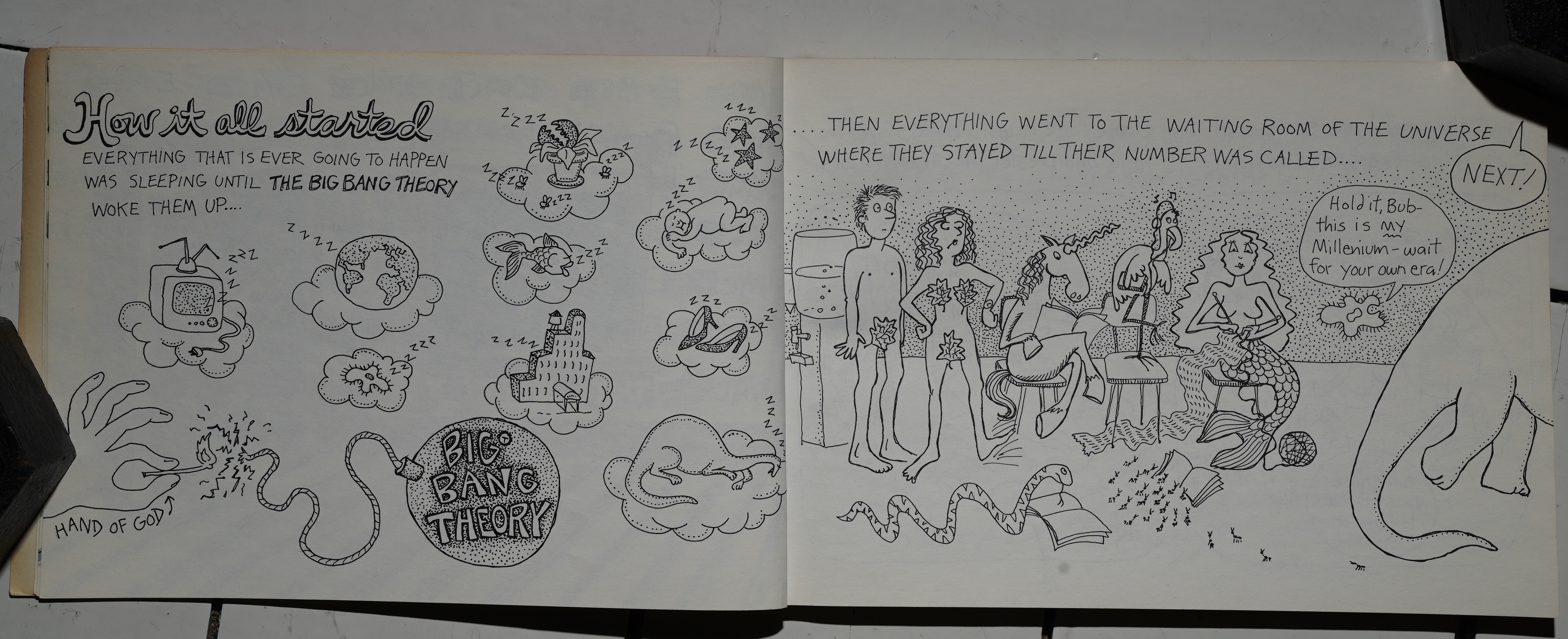
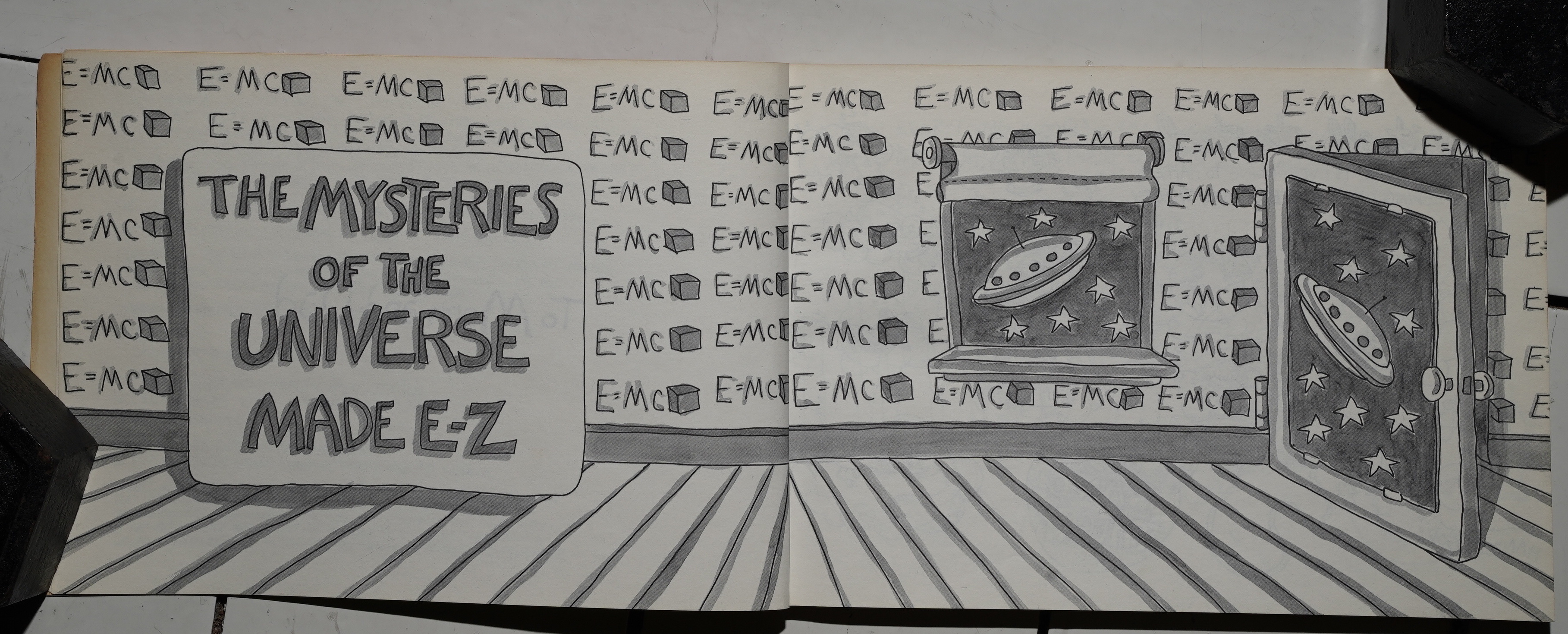
Er… is this a Christian book? Or is this an anti-Creationist joke? Americans are so confusing.
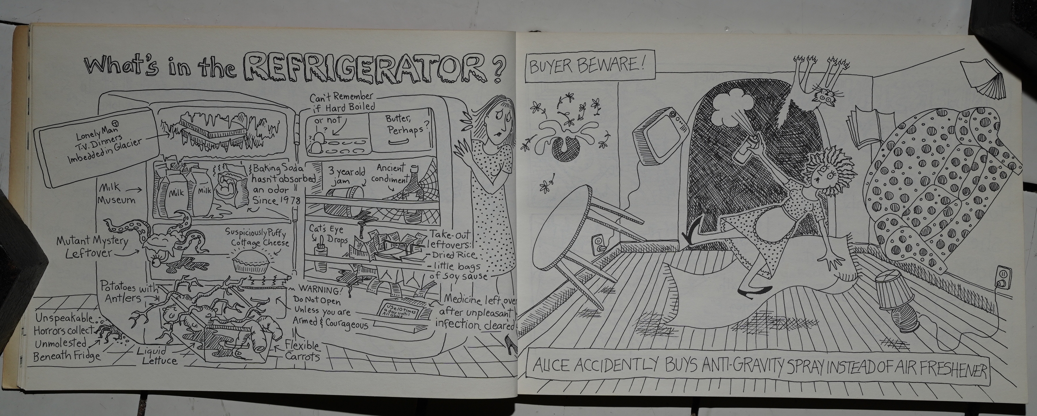
But there’s not a lot of religion in the rest of the book. It varies between observational humour (to the left: “aren’t fridges full of stuff, eh?”) and absurd stuff (to the right: “anti-gravity spray”).
I think both approaches are pretty successful here? I mean, those are two solid gags. I mean, I’m not laughing out loud, but I’m amused…
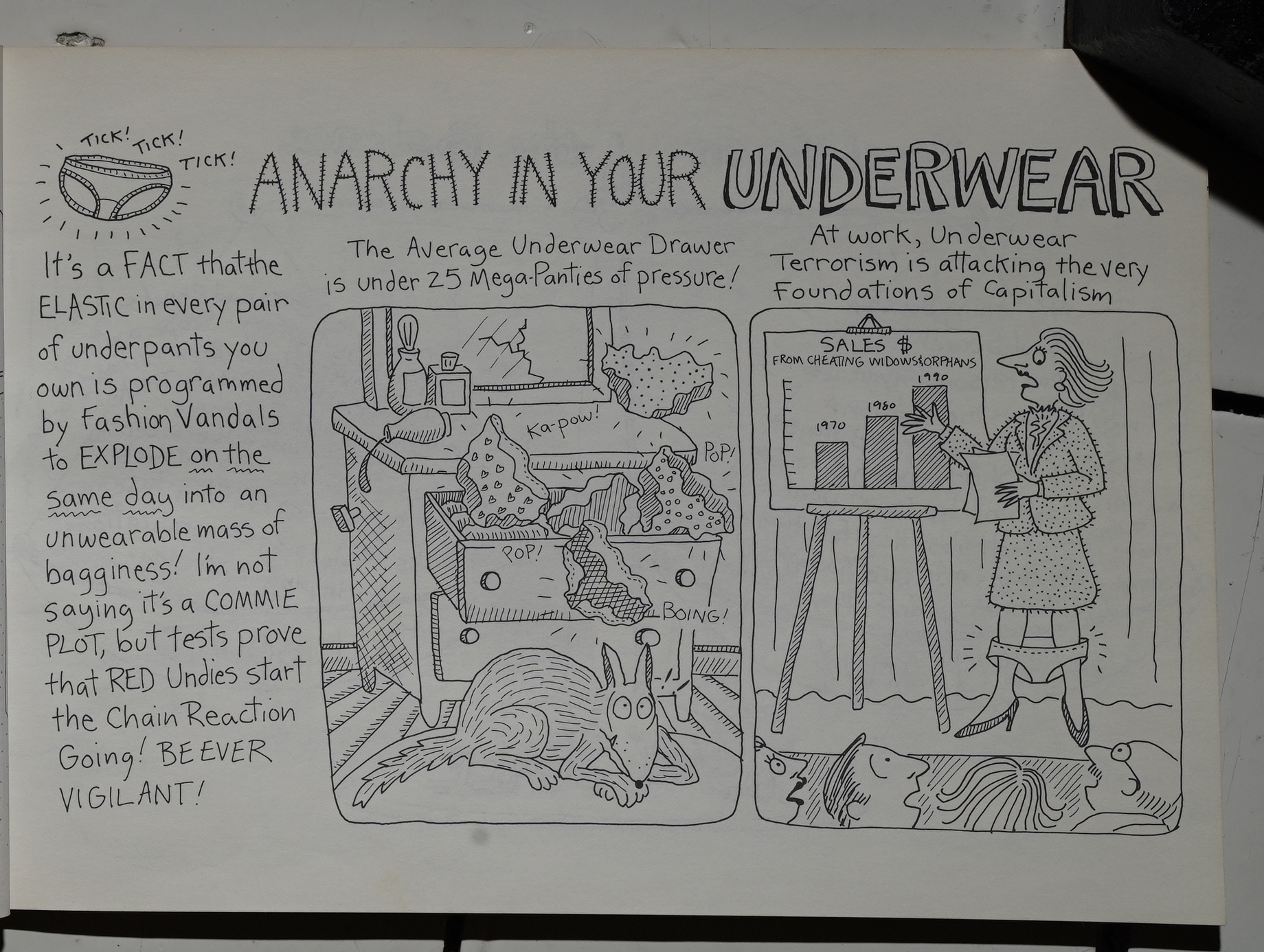
And here’s a mixture of observational humour and absurd humour.
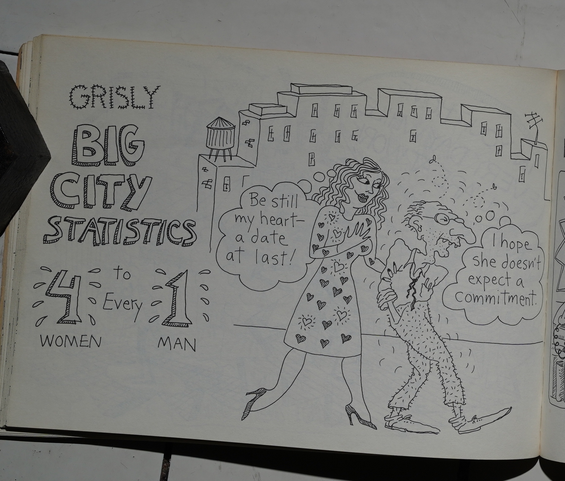
Oh yeah — I’d totally forgotten that this topic was so major in the 80s. I think the discussion has totally flipped these days, eh? These days it’s all about them there poor incels instead.
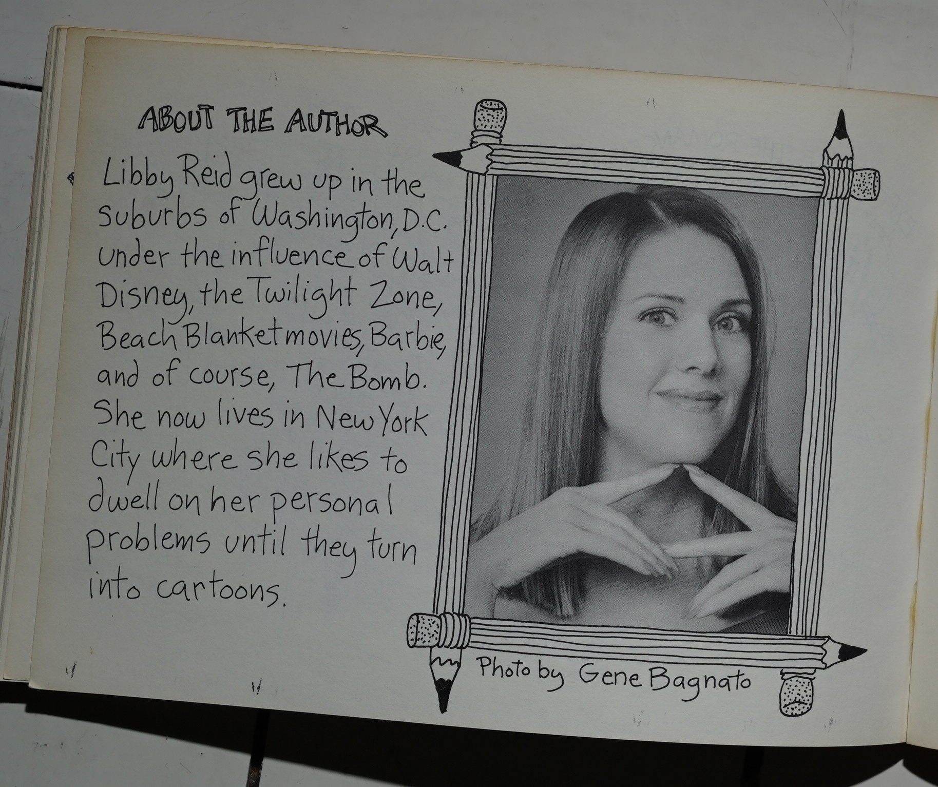
Author portrait.
So, this was totally off the topic of this blog series (neither artwork not writing have anything to do with anything here), but at least it’s a look at what else Penguin was publishing in the comics dept. at the time.
Doesn’t seem to be much in the ways of reviews of this book out there… Hm! That’s odd…. OK, here’s her web page.
This blog post is part of the Punk Comix series.
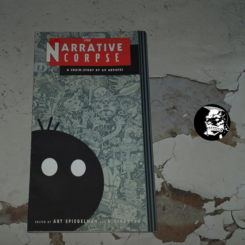
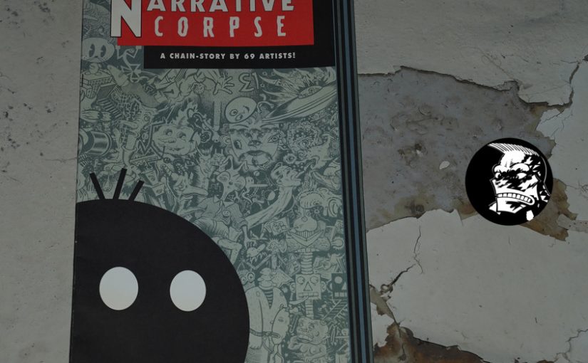
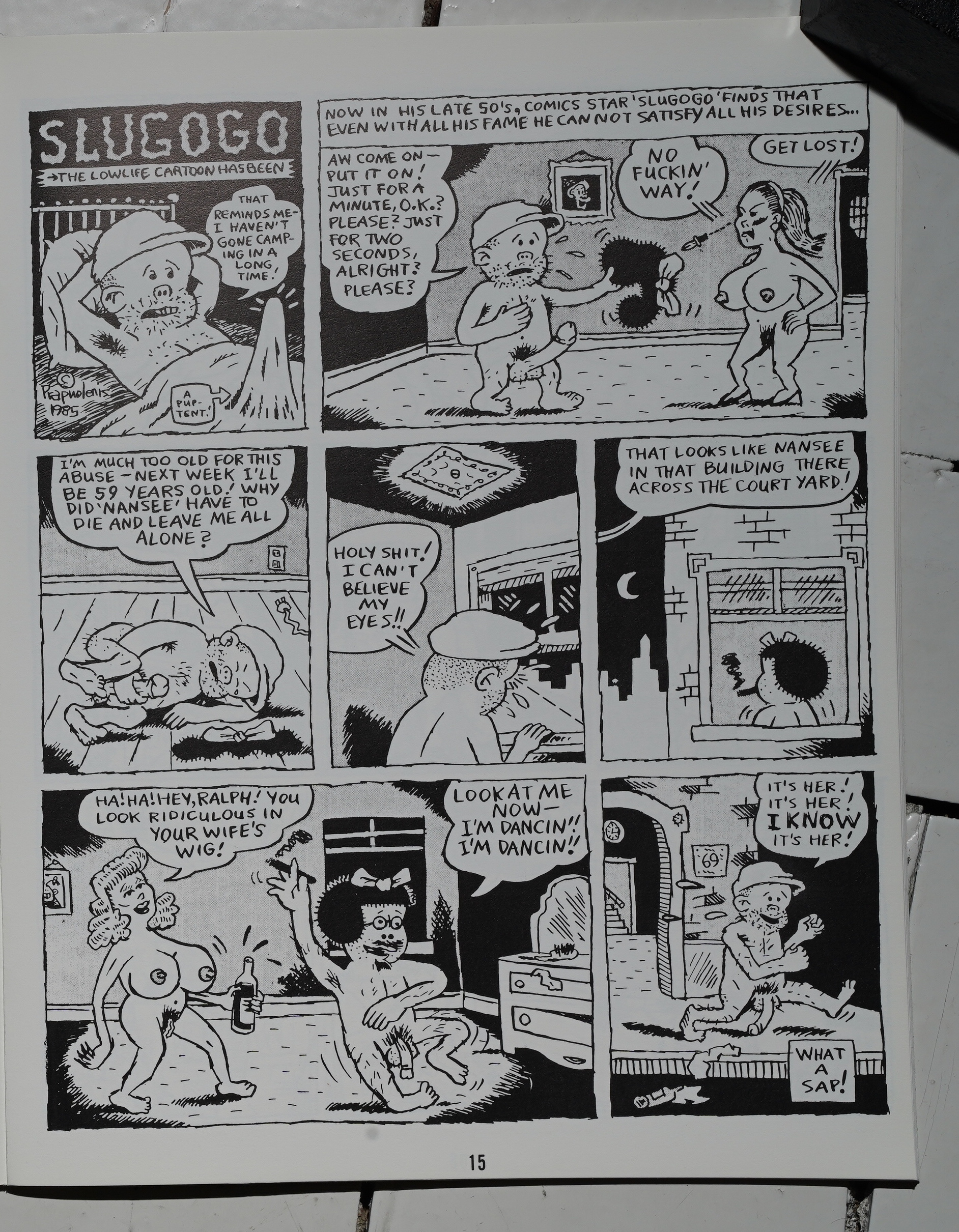
The Narrative Corpse edited by Art Spiegelman and R. Sikoryak (223x413mm)
I remember buying this in the 90s: It’s a narrow and tall book and it looked very enticing in the book store, so I finally broke down and bought it even though it was trey expensive (and I was a poor(ish) student).
But after buying it and starting to read it, it really pissed me off. I remember that it seemed like such a self-indulgent, boring exercise. I’m not sure whether it was because I loathed the book that it disappeared — it might just be the oddball format that meant that I put it in a storage box somewhere that got lost in one of my moves. In any case, I couldn’t find my copy now, so I had to buy a new copy.
The sacrifices you have to make!
(Except I don’t.)
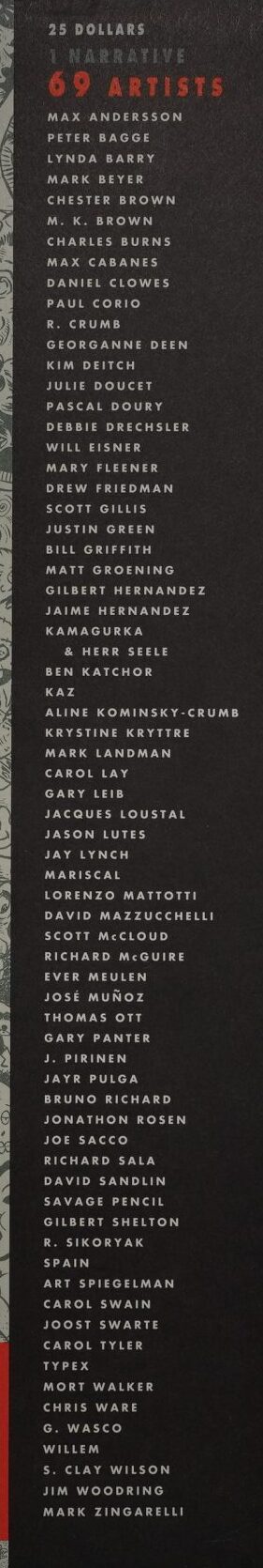
Look at that list of contributors! Is it any wonder I couldn’t stop myself buying a copy, even if I couldn’t afford to? And I remember the copies being sealed, so I couldn’t look at the innards…
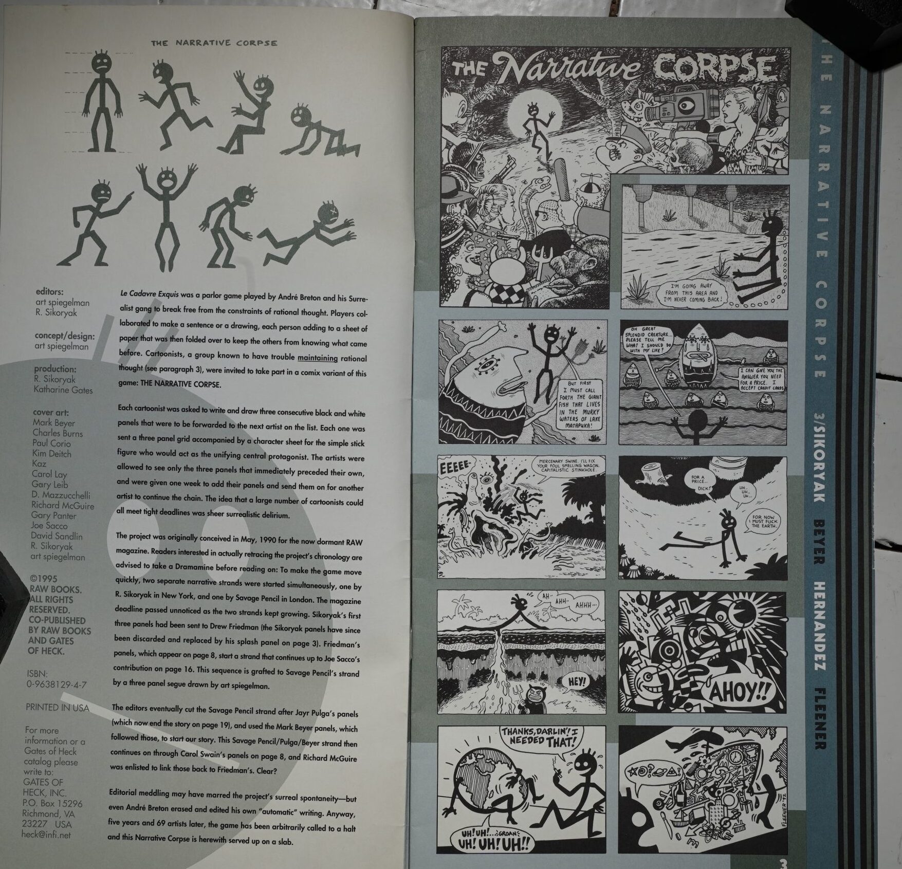
Spiegelman explains the concept: Each artist gets to see the previous artist’s three panels, and then they have to create three new panels, and so it goes in a long merry chain. But Spiegelman explains that he then edited the sequence — so it’s not exactly a Narrative Corpse, anyway.
The contributors are basically… all of the people working in the Rawosphere, a bunch of Underground artists, and some Europeans. And Mort Walker, who is the only one who uses his three panels to do an outright gag.
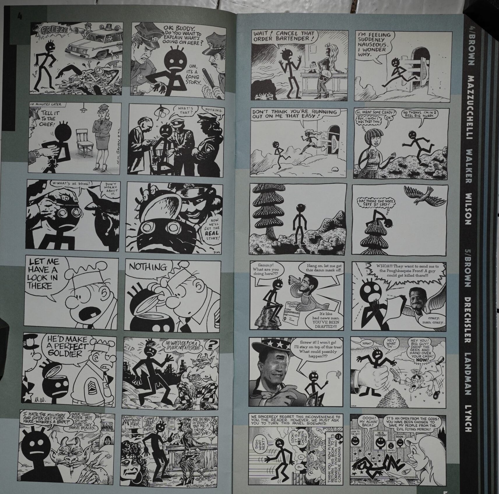
Reading this now… I’m not mad at it? There’s a lot of swell art here, and while most of the people haven’t really tried to keep a storyline going (so it just stops a lot of the time), it’s… Yes, I’m gonna say it: It’s pretty entertaining?
So I guess I have more patience with this sort of nonsense than I had in my mid-20s.
And the format is excellent: The traditional thing to do would be to make the pages wider and do the three panels from each artist horizontally, but breaking it up in this two+one/one+two pattern makes it feel quite vibrant.
Larry Reid writes in The Comics Journal #183, page 36:
THE EXQUISITE CORPSE is an
exercise in random-drawi ng techniques practiced
initially by the Surrealists at the turn of the
century. One artist would begin a drawing, then
fold the paper to largely conceal the image,
which was subsequently completed by another
artist. The resulting imagery was rarely masterful,
but the stellar reputations of the participating
Mists, as well as the process itself, makes this
peculiar parlor game of passing interest to art
historians. It looks like they were having alot of
fun, which was precisely the point.
The concept of the Exquisite Corpse was
revi ved by Art Spiegelman and Bob Sikyoryak
in The Narrative Corpse, jointly published by
RAW Books and Gates of Heck. A virtual hall
of fame of late 20th Century cartoonists Was
recruited to create a comic narrative based on
the random principles set fort by Andre Breton
and his brethren. Each cartoonists was allowed
to view only the three panels preceding their
own, and given one week to continue the story
for three panels before passing it along to the
next artist. This process was repeated 69 times
over five years, employing the talents of the
most creative cartoonists on the planet. The
resulting book, while adequately showcasing
the contributors’ considerable talents, is pre-
dictably banal. And it doesn’t even look like
much fun.
The problems begin with the protagonist,
“Sticky,” as he is called in the publisher’s press
release. Presumably concocted by Spiegelman
and Sikoryak, the childish stick configuration
severly restricts the character’ s empathic possi-
bilities. He’ s “Generic Boy,” as Matt Groening
refers to him, or ahe Shtich Figure” in the
words of Bill Griffith. Many of the cartoonists
take liberties with the basic character — or
indecent liberties — as when Gilbert Hernandez
has him sprout an appendage and spew forth an
extraordinary amount of “sticky” fluid. The
European artists seem the least content with the
limitations of “Sticky,” at one
point forcing Peter Bagge to call
a halt to the mutations and have
the character re-draw itself.
Daniel Clowes dresses the char-
acter in drag. in a refreshing,
though short-li ved, gender bend.
The Narrative Corpse suf-
fers from the sort of continuity
problems one would expect given
the format. It is best read as a
series of three-panel gagcafioons
with some interesting stylistic
transitions between artists. The
narrative itself is convoluted and
ultimately pointless. Left to their
owmdevices, most of the con-
tributors rely on the tired Howard
the Duck ‘Trapped-in-a-world-
he-never-made” angst. Perhaps
given more time, a more com-
plex character, and twice the
numberofpanels allotted, a semi-
coherent story could have
emerged from this experimental
premtse.
Little thought seems to have
been give to the order of
the artists and how the work
might aesthetically flow. Given
another context, it would be a
treat to see Holocaust chronicler
Spiegelman’s work followed by
Palestinian sympathizer Joe
Sacco’s, as happens here to no
effect. More often, it appears that
logistical expediency was the determining fac-
tor, as when R. Crumb is followed by wife
Aline. An explanation of the editorial process is
offered in the introduction, but it is as incom-
prehensible as the story itself.
Perhaps the biggest problem with The Nar-
rative Corpse is its enormous price tag. It was
conceived in 1990 asan insert into the currently
defunct RA W magazine. It might well be worth
owning as a curiosity were it offered as a
modestly priced comic book, but in its present
oversized format it seems more than a little
overblown. It is essentially 1 7 pages of hurried
black and white comics, albeit handsomely
packaged, that retails for $25. It contains incon-
sequential work by very important arti sts, whose
best work can easily be found elsewhere at an
affordable cost.
I guess he didn’t like it. Also, he seems like a cheapskate.
The Comics Journal #188, page 150:
Tne biggest comic book scam of 1996 — and re-
member. this is in an industry where unscrupulous
dealings are rampant — has to be the release of
Narrative Corpse. Based On an interesting idea.
with which all Journal readers are by now familiar,
it features 69 comics luminaries doing some really
bad work.
But prc%ably the biggest problem with Corpse
is the S25 price tag: the excessive production val-
ues effectively preclude anyone from buying it out
of curiosity, which is really the only reason that
anyone should want to take a look at this. I can’t
say that the staggered-page design (while admit-
redly attractive) adds much except to push the book
out of the range of casual buyers. Sure The Narra•
rive Corpse is worth flipping Lhrough. but you’ll
probably get tired of it in about 30seconds.
And on top of that. the design work is overly
complicated and ineffective, drawing attention to
the weaknesses. The staggered design for
an all-paper project (this is a coffee table book?)
must have cost a for-
tune, but I’m afraid
it looks more like
a Denny’s menu
than a design
award winner. In
the end, Narra-
five Corpse is
completely unsatisfactory in every way. Copy the
names off the back cover and start buying their
books — leave the art school projects on the shelf.
I guess they didn’t like it.
Gary Groth interviews Spiegelman in The Comics Journal #181, page 132:
GROTH: Tell me about The Narrative Corpse.
SPIEGELMAN: It’s the first Raw book we’ ve put together in
a few years. We’ re working in conjunction with Gates who
published Gary Panter’s and Charles Burns’ Facetasm.
The book is an elaborate jam that grew out of a smaller
project we initiated as part of the last Raw, the one that
focused on collaborations. We set up a character sheet,
drawn by Bob Sikoryak, for a stick figure character that
was passed along to the artists we invited to participate in
a variant on the old Surrealist Exquisite Corpse game. An
artist was asked to draw three panels with that character.
We passed those panels on to a second artist and passed the
second Mist’ s panels — but not the first artist’ s panels —
to a third artist, and so on, to create a chain story. It took
forever to keep the thing moving from hand to hand, but
we’ve gotten a rather loopy story by 69 different artists
which is a fairly good Who’ s Who of alternative cartooning,
including most of the international Raw gang as well as
many of Fantagraphics mainstays like the Hernandez
brothers, Dan Clowes and Joe Sacco and on around to
Crumb, Shelton and even, believe it or not, Mort Walker.
That was one of my favorite segues: we sent Mort Walker’s
panels on to S. Clay Wilson to continue. We somehow
missed a few people I’d like to have seen in it, like Robert
Williams and Doug Allen, but after five years it seemed
like time to finally call it in. We’re publishing it in a rather
peculiar and lush format, about 8″x16″ in 3 colors and
much to our astonishment someone from the Quality
Paperback Book Club saw it by accident and has decided
to buy into the print run. It’ll be out before Christmas.
Or:
But if you’re looking for examples of the genius and skills that make many of these artists great (e.g. story, characters), I think you’d be better off buying spending the money on several of their “solo” or more genuinely collaborative creations.
This blog post is part of the Punk Comix series.
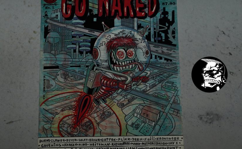
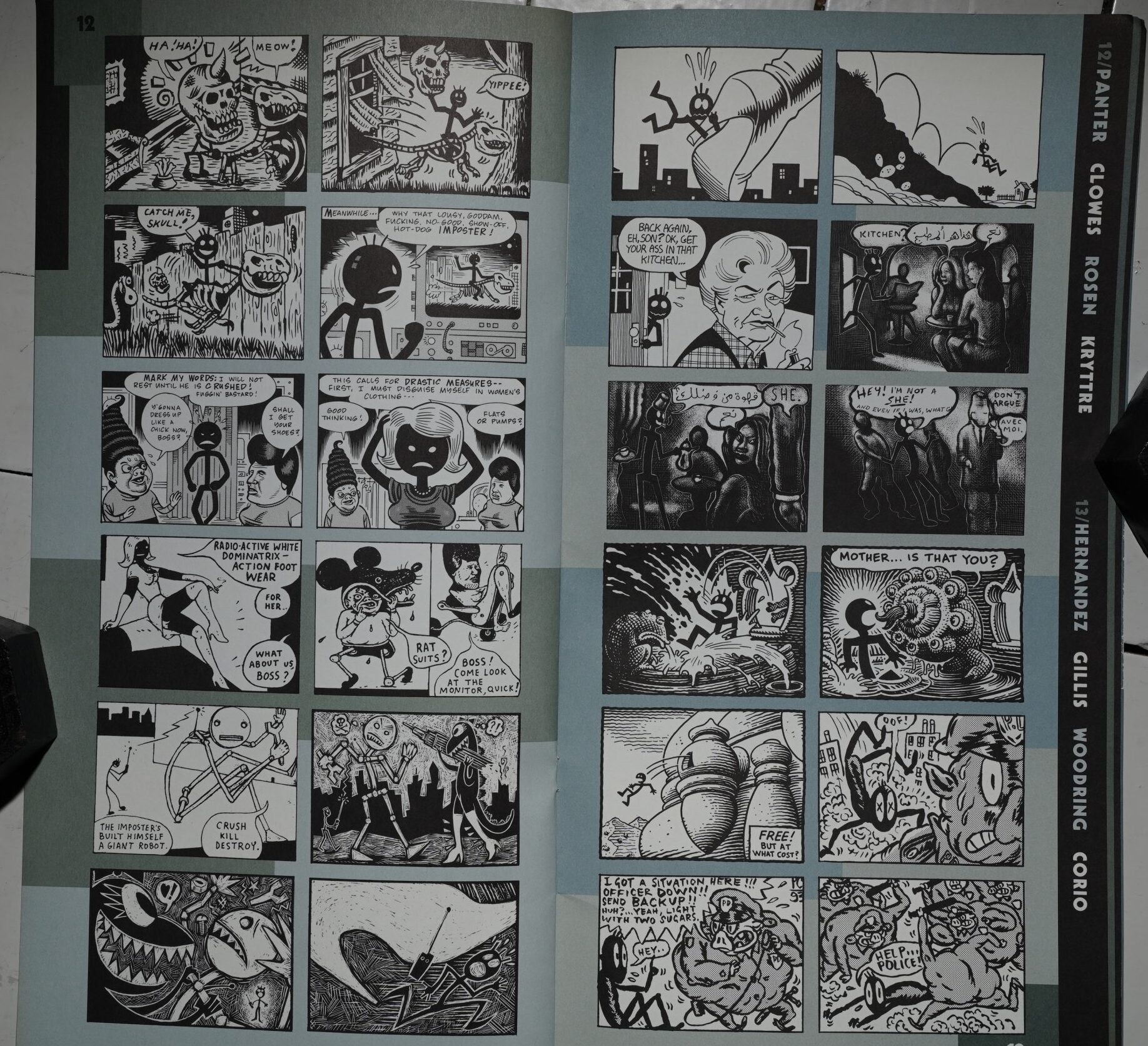
Go Naked #1 edited by Gary Panter (215x173mm)
I’ve never read this book before — it popped up one day while I was “doing research”. I think it has to be the only anthology edited by Panter? And it’s published by Underground comix stalwarts Last Gasp Eco-Funnies, so colour me intrigued.

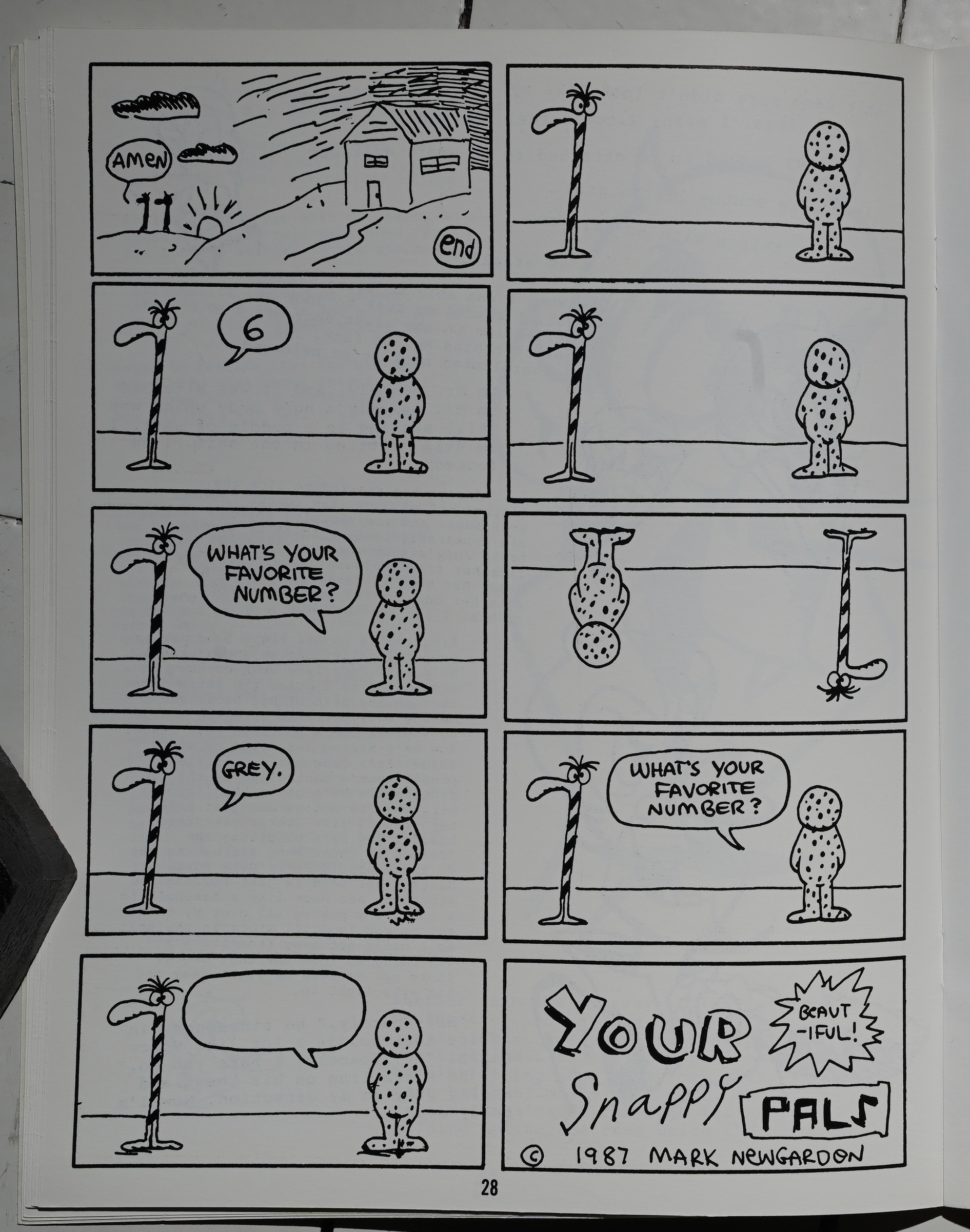
So this is a collection of mostly one and two page strips by a whole bunch of people — many of the people featured in this blog series, but mostly people who are doing more underground stuff, I guess?
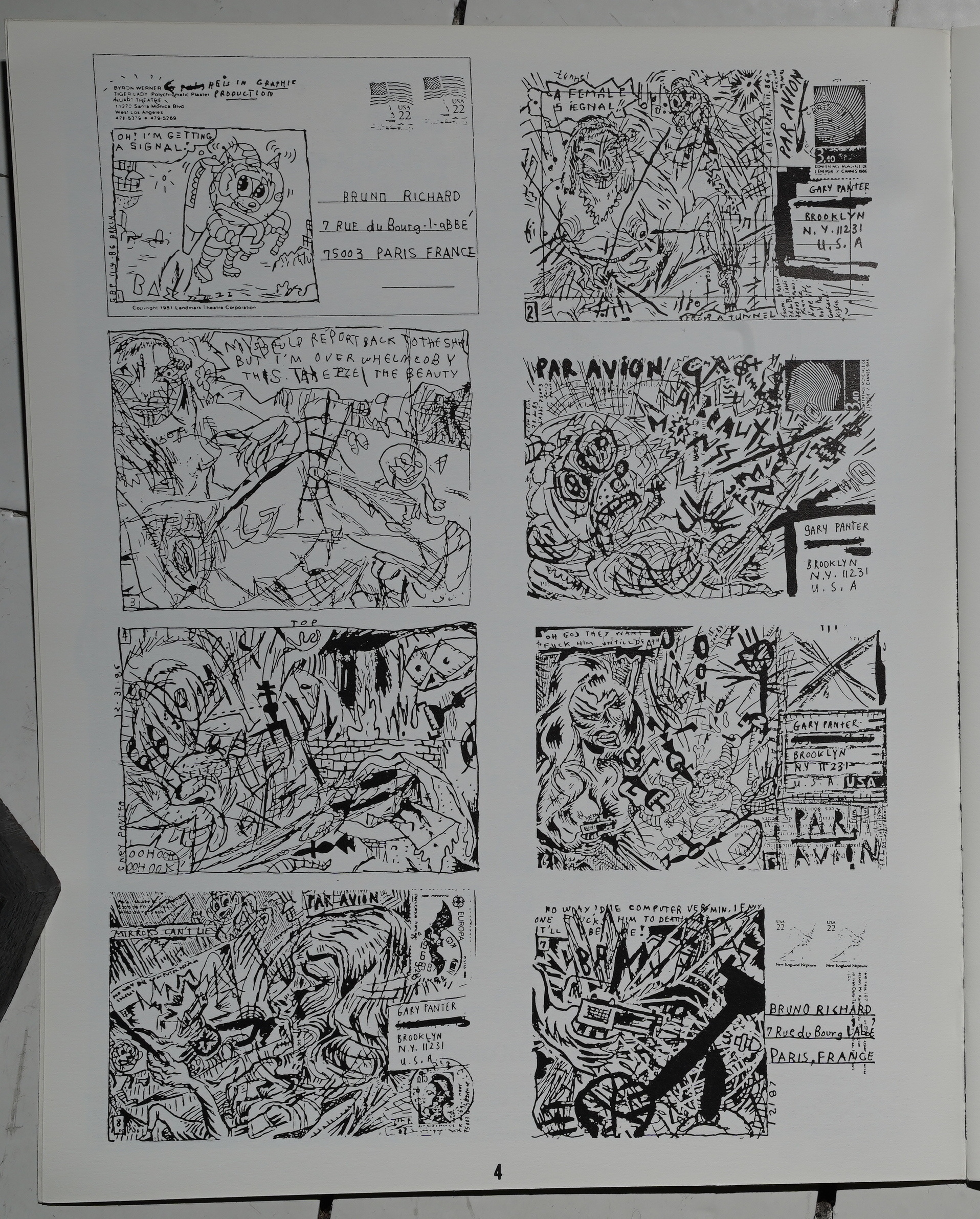
But we have, for instance, a series of postcards from Gary Panter and Bruno Richard (to each other, I think).

I think this is Goro Fujii? Panter has done a lot of work in Japan, so I was expecting more Japanese artists, but there’s not a lot of them.
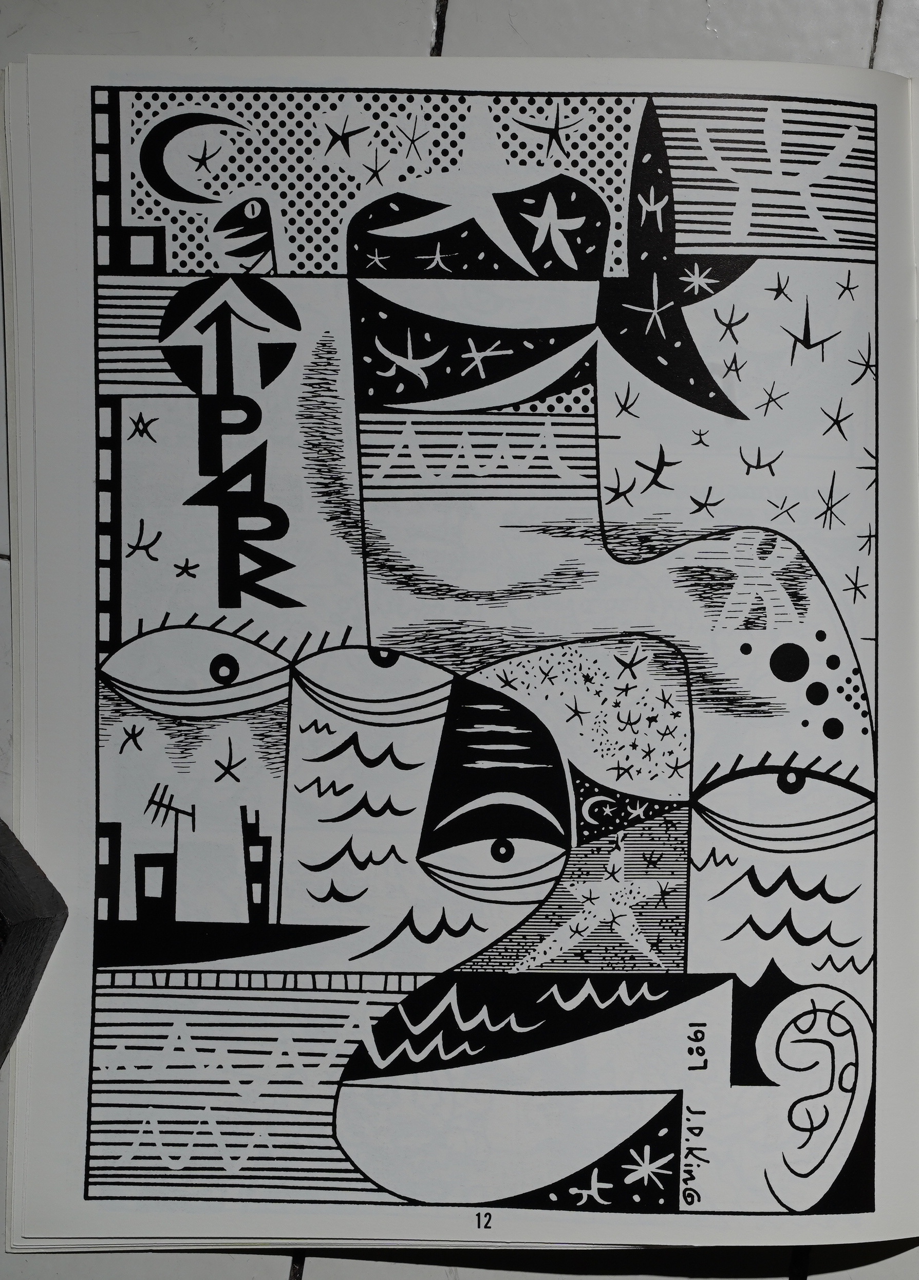
Instead it’s pretty… er… dashed off work by people like J D King (i.e., from the small press world).
Most of the strips are jokes, like this Nancy-referencing thing by Kaz.
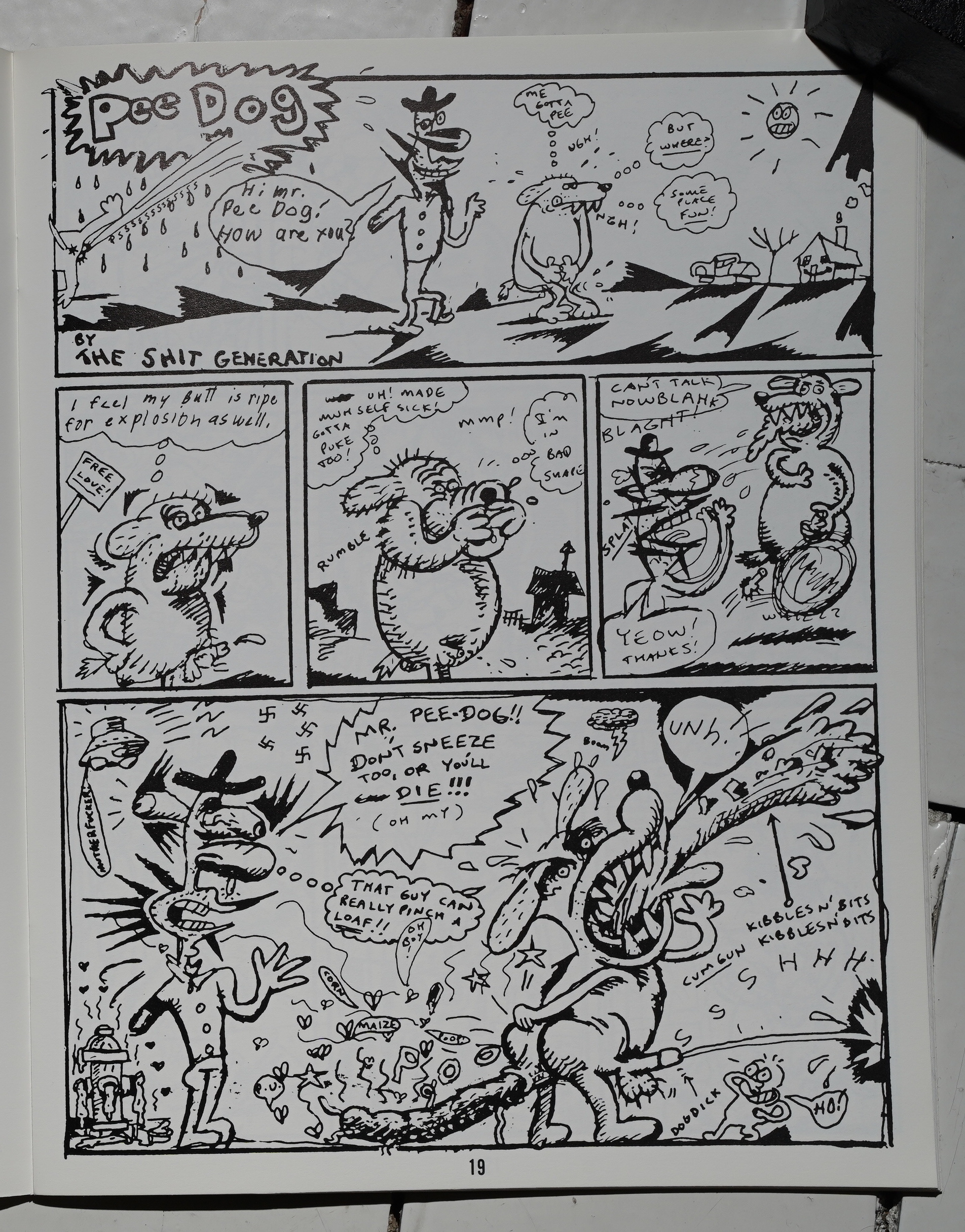
And Pee Dog by Ed Nukes and Jocko Levant Brainiac. (Is that Panter under a different name?)
I wonder how it all came together. Did Panter say “send my stuff you did while drunk?”
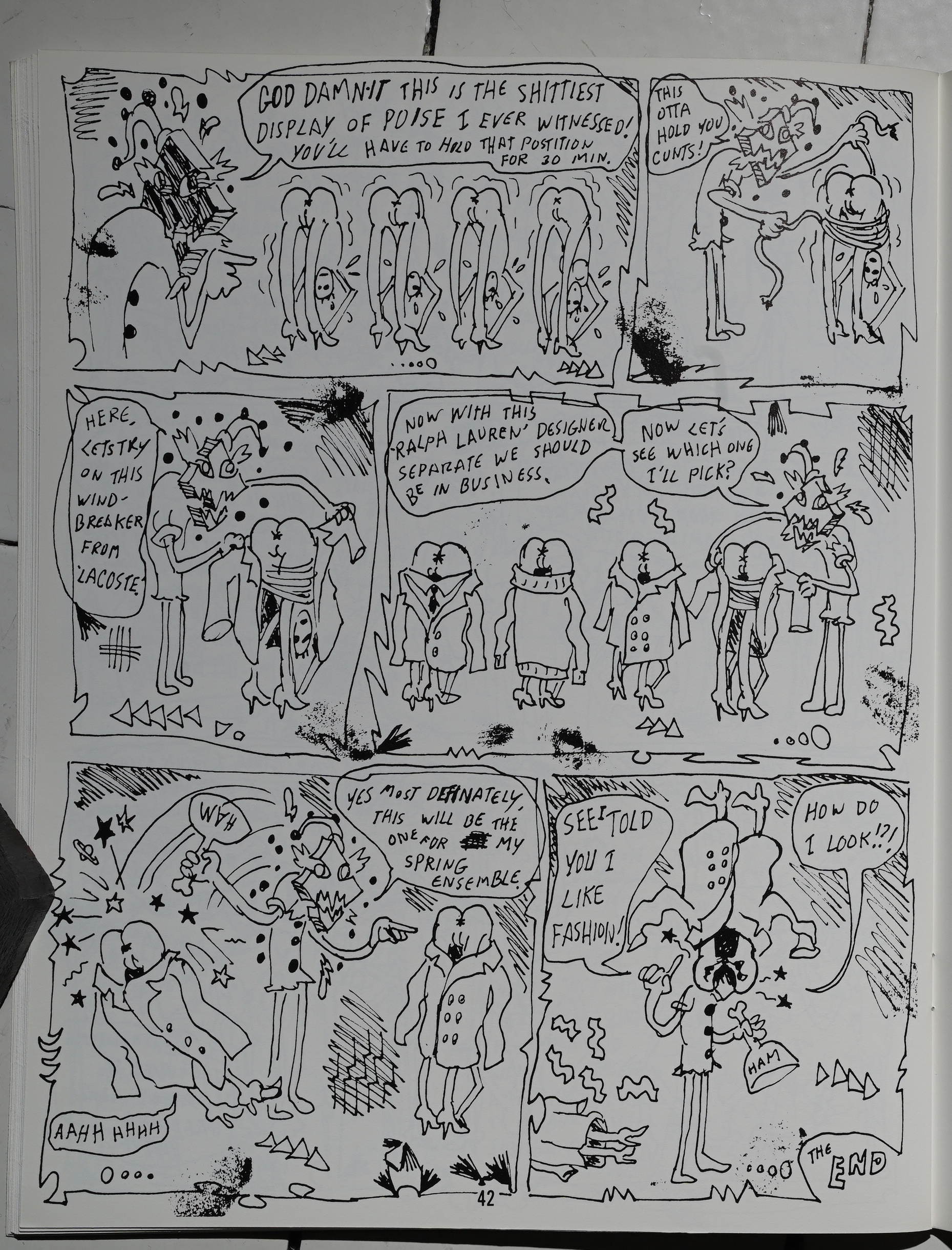
It’s mostly pretty scatological. (Robert Williams.)
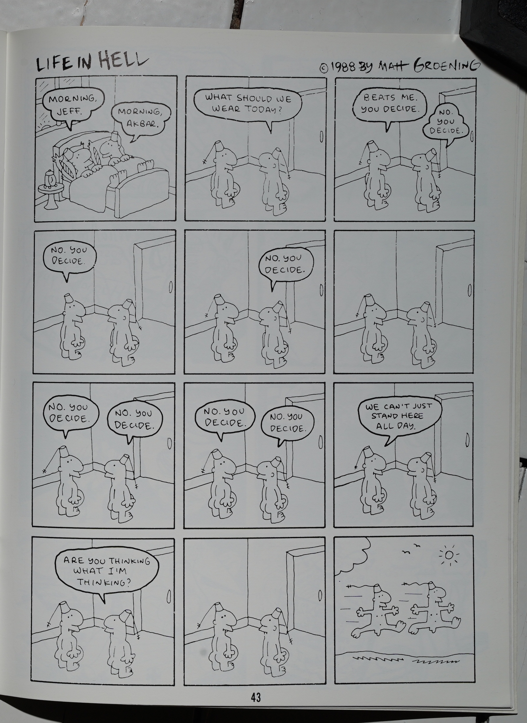
Heh. Matt Groening does a variant of this strip… the one in the Life in Hell collections didn’t have that final panel.
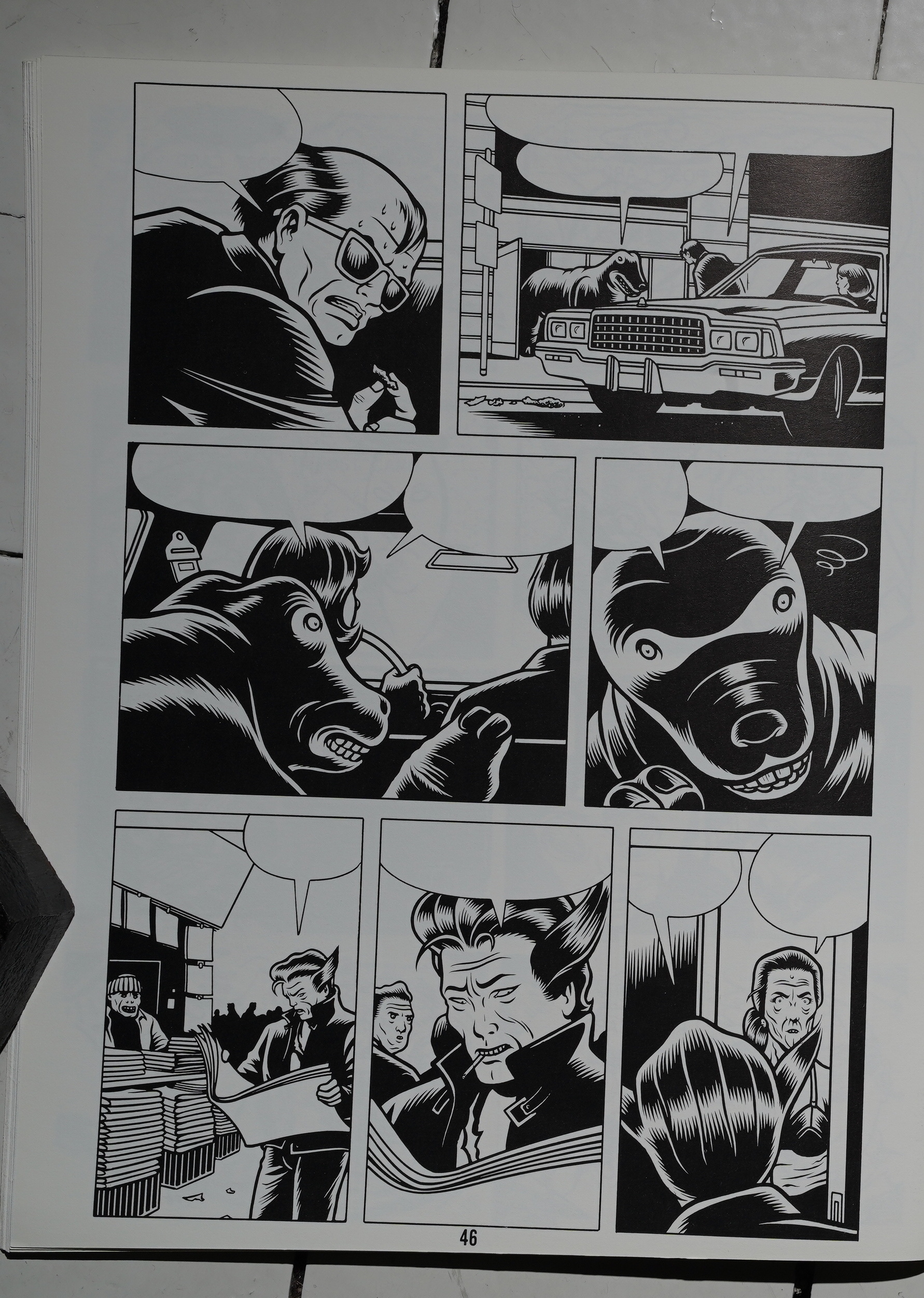
Is this from that Marvel Try-Out Book that Charles Burns had fun with? That does look like Aunt May in the final panel…
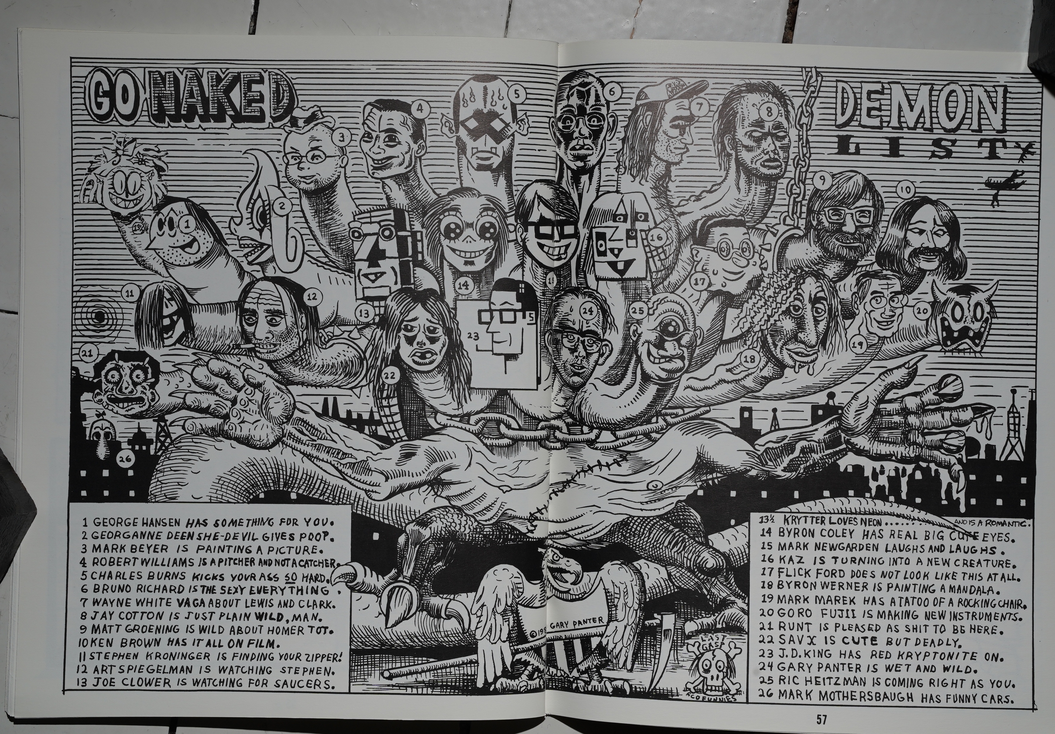
Panter draws all the contributors.
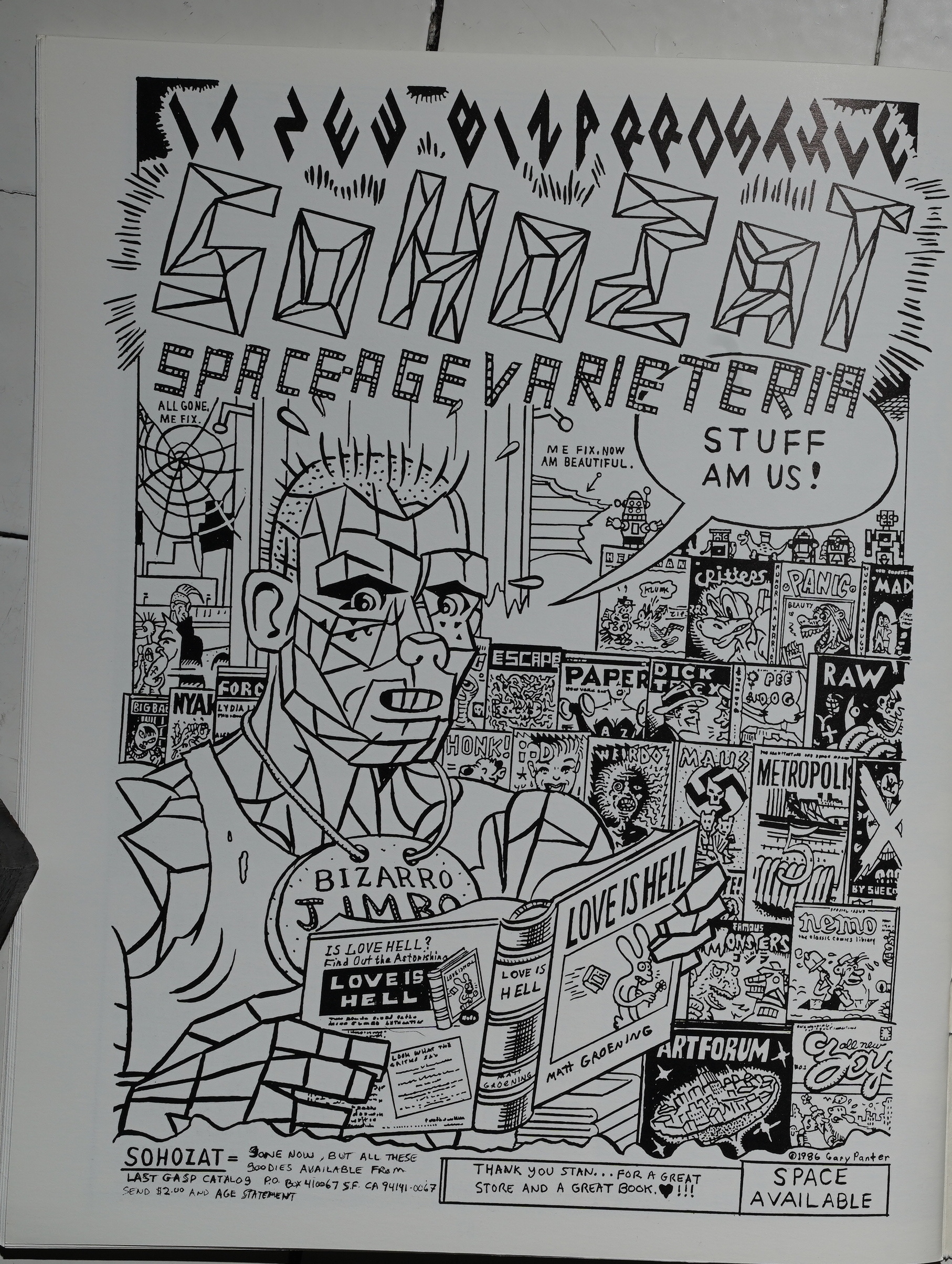
And waxes nostalgic, sort of, about the SohoZat store.
So… I didn’t quite know what to expect from this anthology, but I certainly didn’t expect something so slight as this. It’s got a ton of good artists contributing, and it looks like everybody involved had fun, but…
There’s no urgency to this book.
I couldn’t find any reviews of this book, so I guess it didn’t make much of an impression.
This blog post is part of the Punk Comix series.