


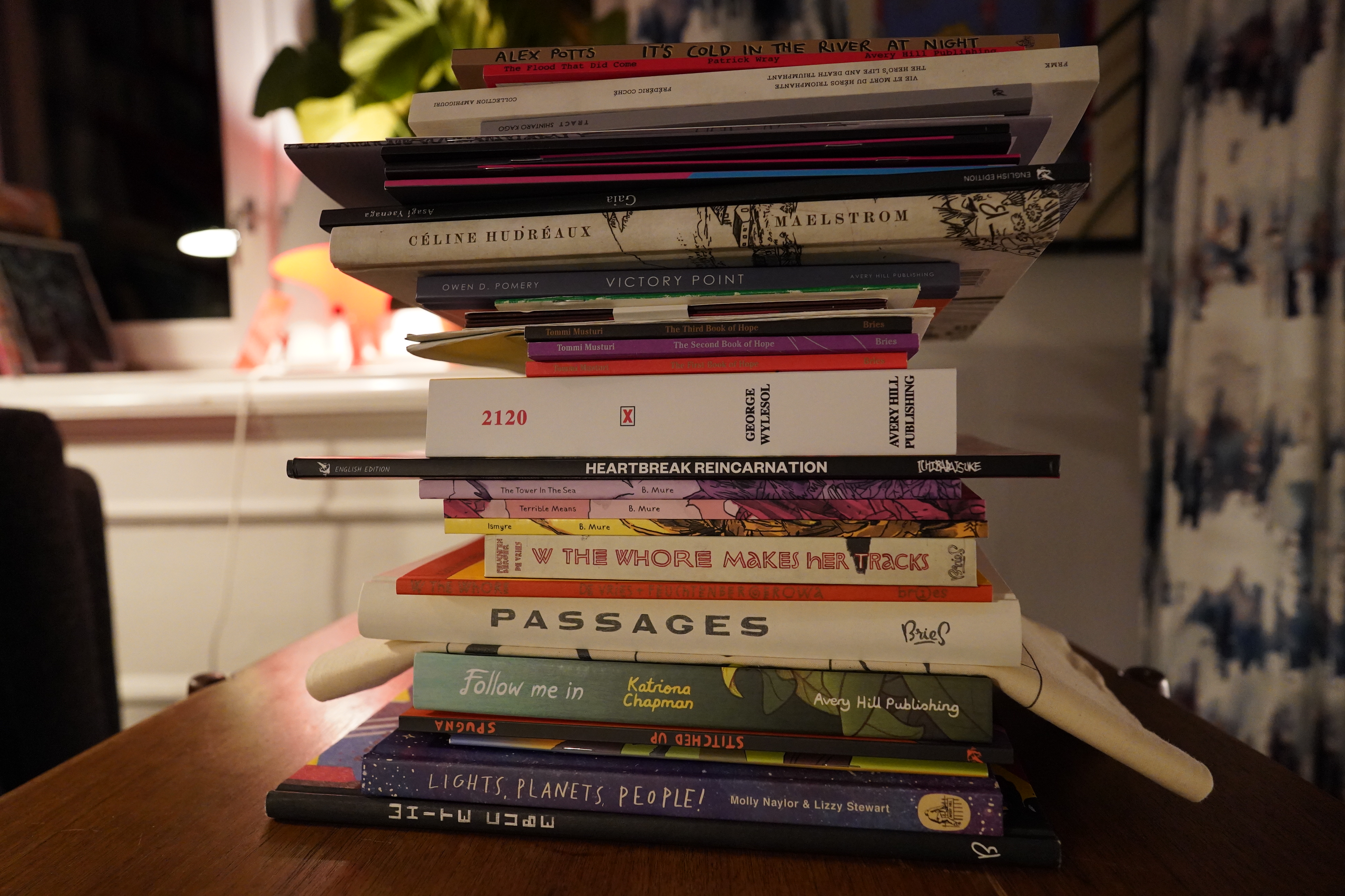

This week, I’ve been shopping from some European publishers: Bries (Belgium), Avery Hill (UK) and Hollow Press (Italy). I’ve mentioned this before, but one of the most thrilling developments in European art comics has been that a lot of publishers are publishing in English, which increases the potential audience from dozens to several dozens of readers. I guess some of this is due to technical progress: Doing smaller editions is apparently cheaper now, so publishers like Hollow Press are doing both Italian and English language editions of their books.
In any case: It means that so much more cool stuff is possible to read for somebody who doesn’t speak French, Italian and Latvian than just a decade ago.
| Bill Callahan & Bonnie Prince Billy: Blind Date Party (1) |  |
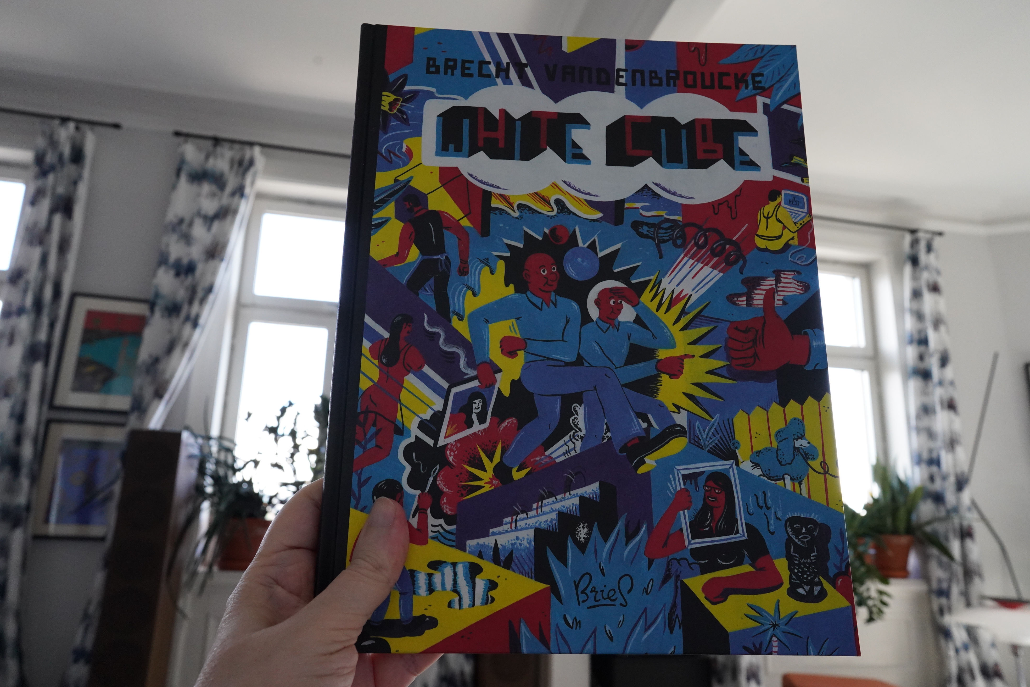
14:57: White Cube by Brecht Vanderbroucke (Bries)
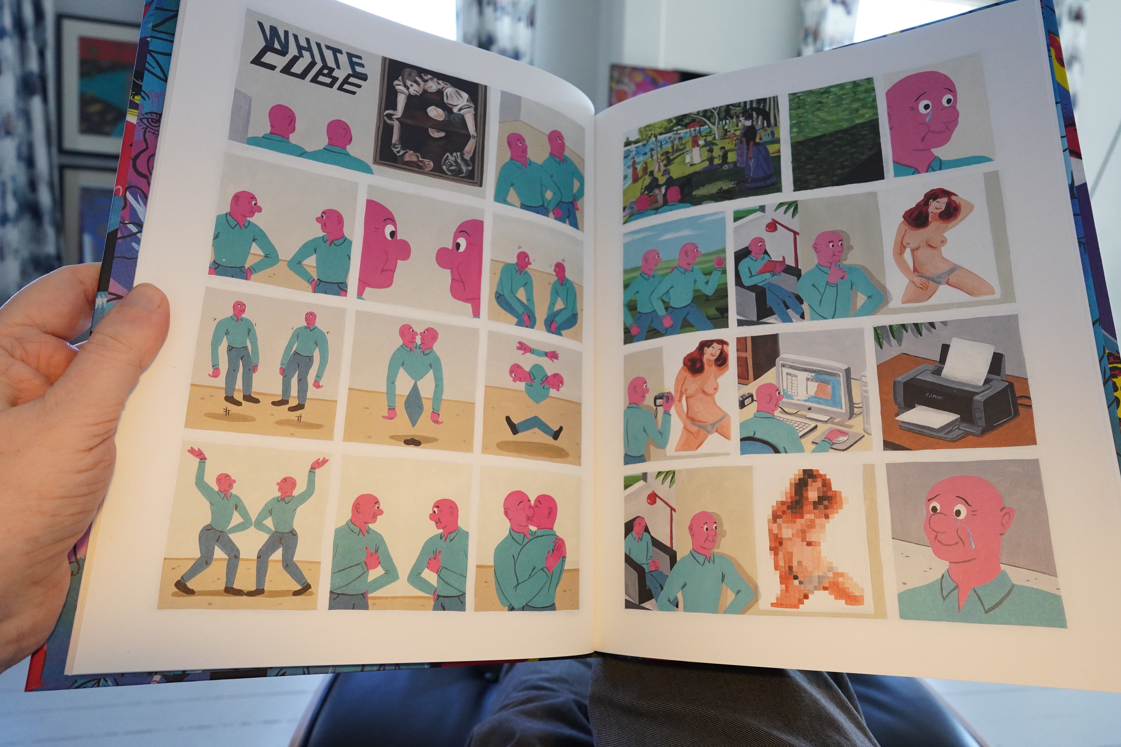
This reminds me quite a lot of Joan Cornellà, but it’s from 2012, so I guess that couldn’t be a direct inspiration?
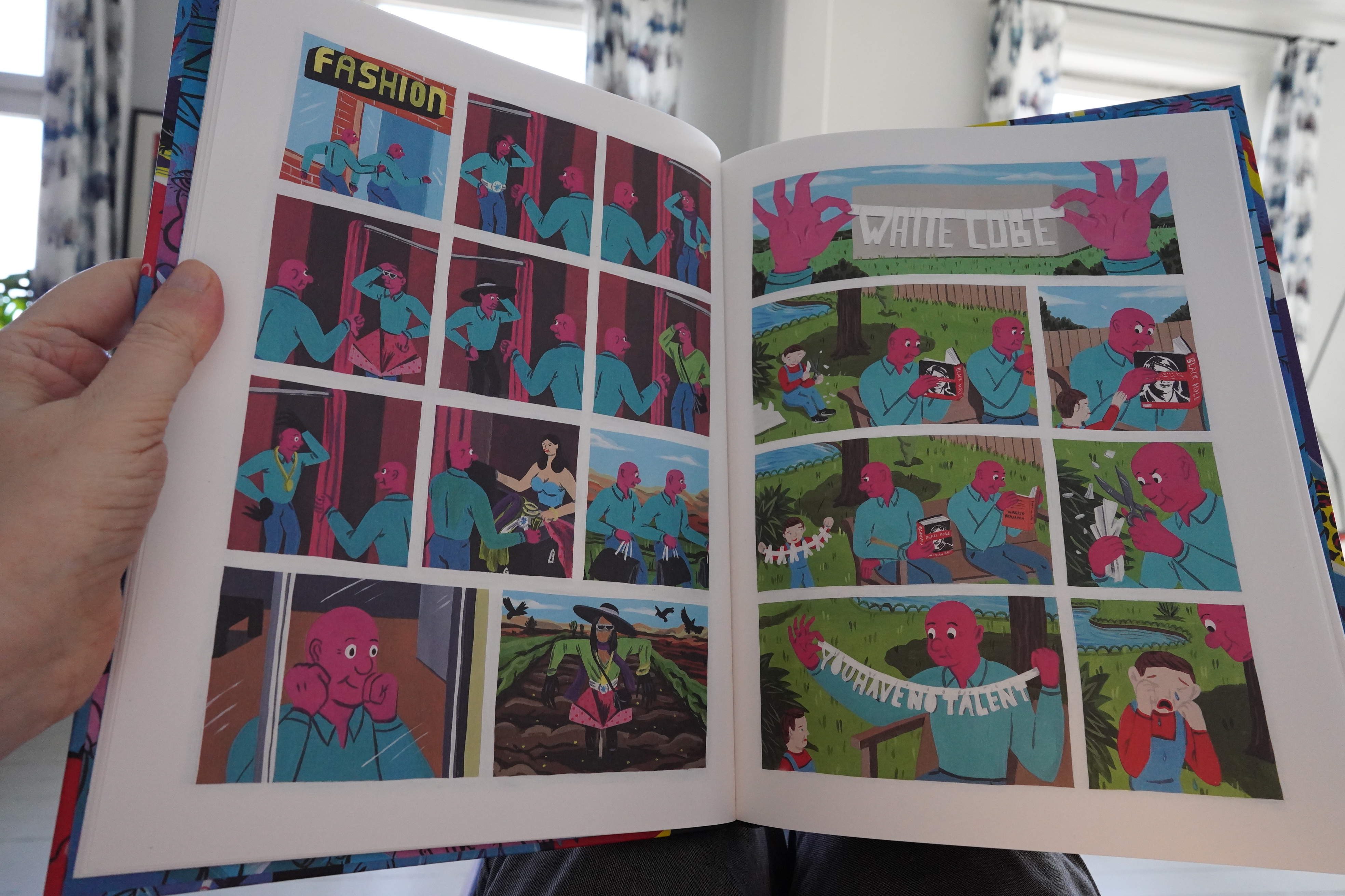
I love the artwork (especially the colours), but many of these jokes don’t quite land. But the ones that do work are something to behold.
| Bill Callahan & Bonnie Prince Billy: Blind Date Party (1) |  |
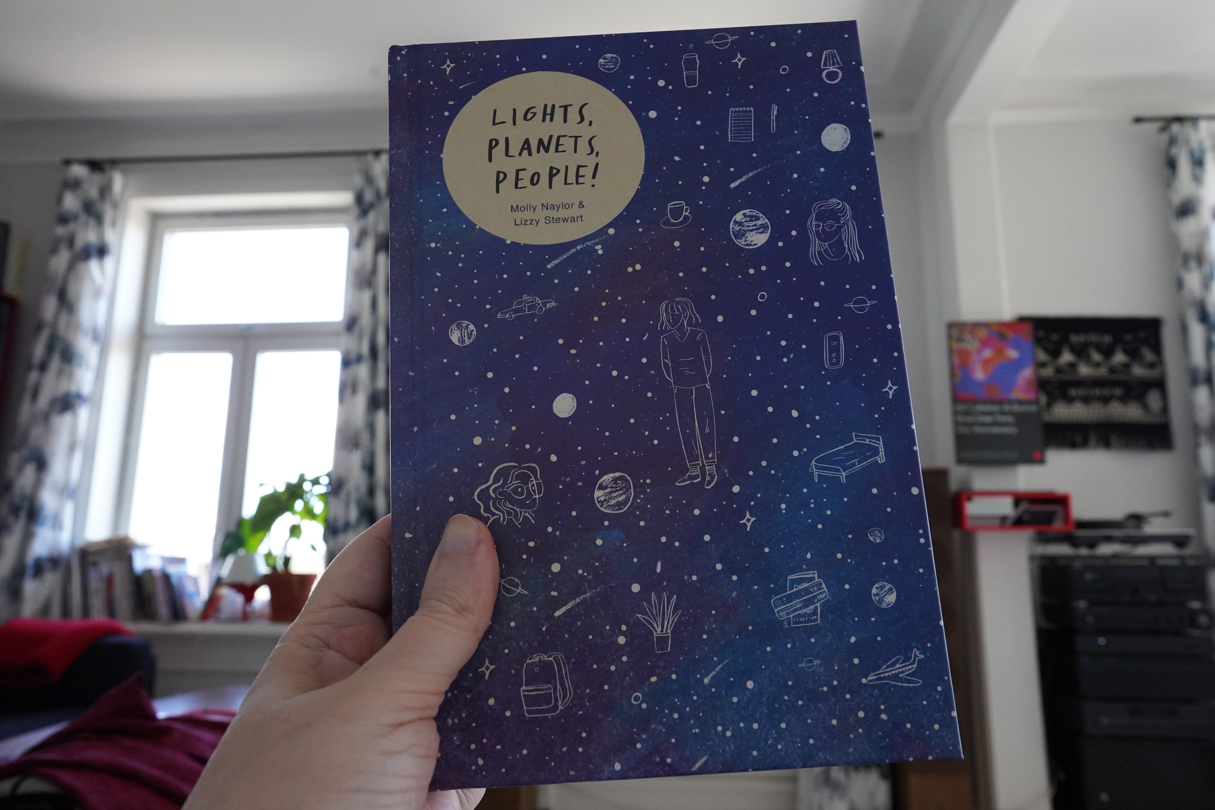
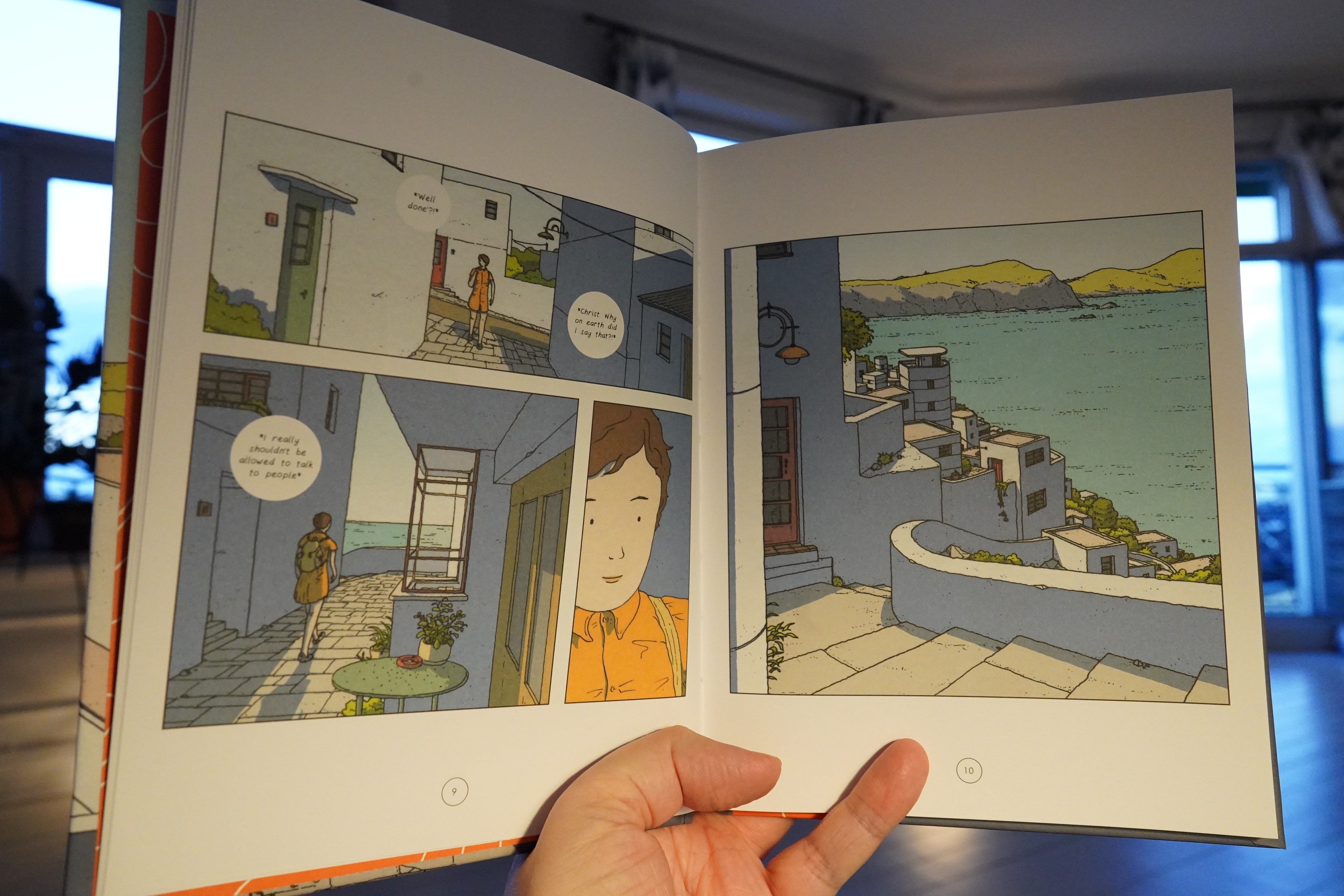
15:20: Lights, Planets, People! by Molly Naylor & Lizzy Stewart (Avery Hill)
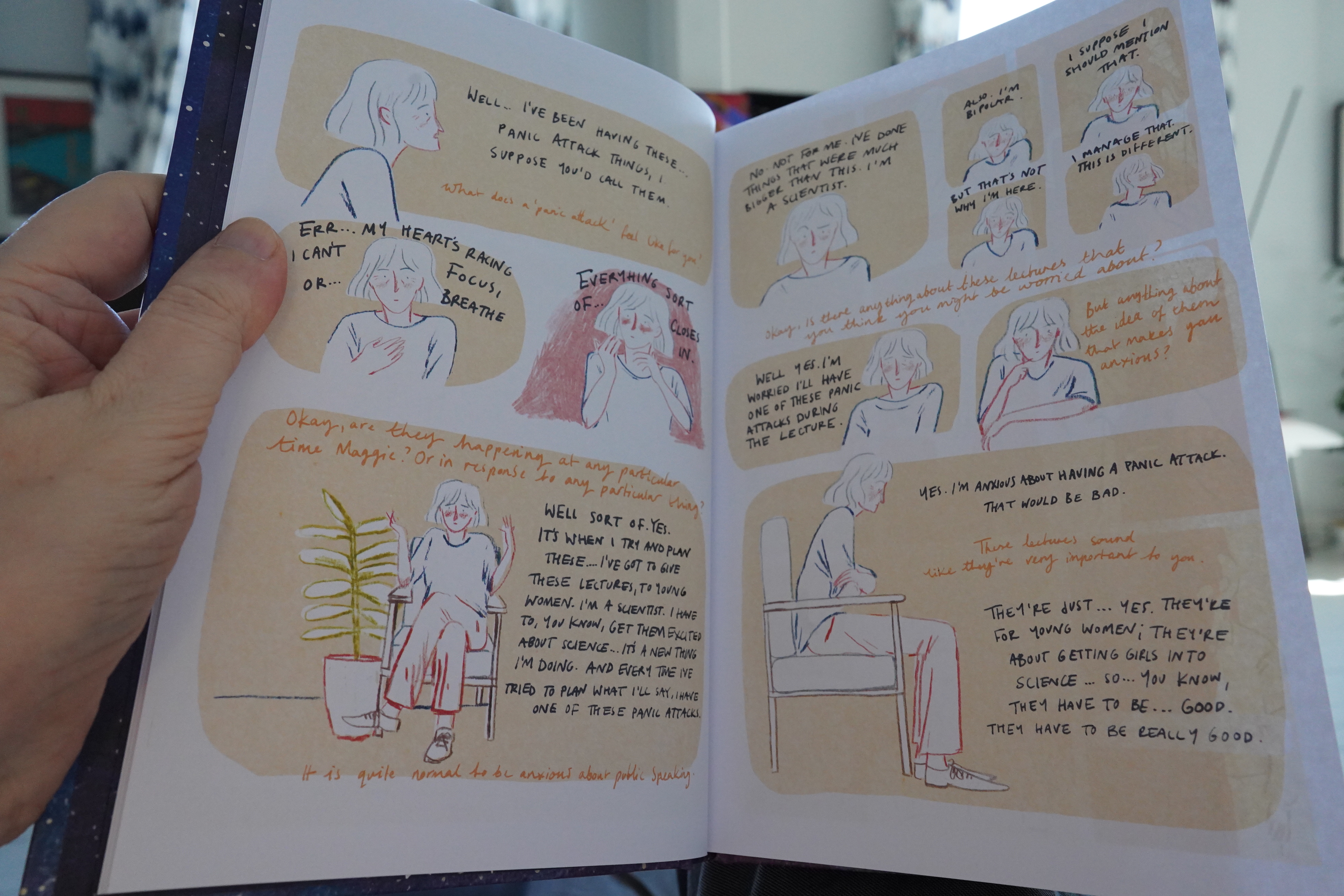
This started off in a kinda dry, somewhat offputting way…
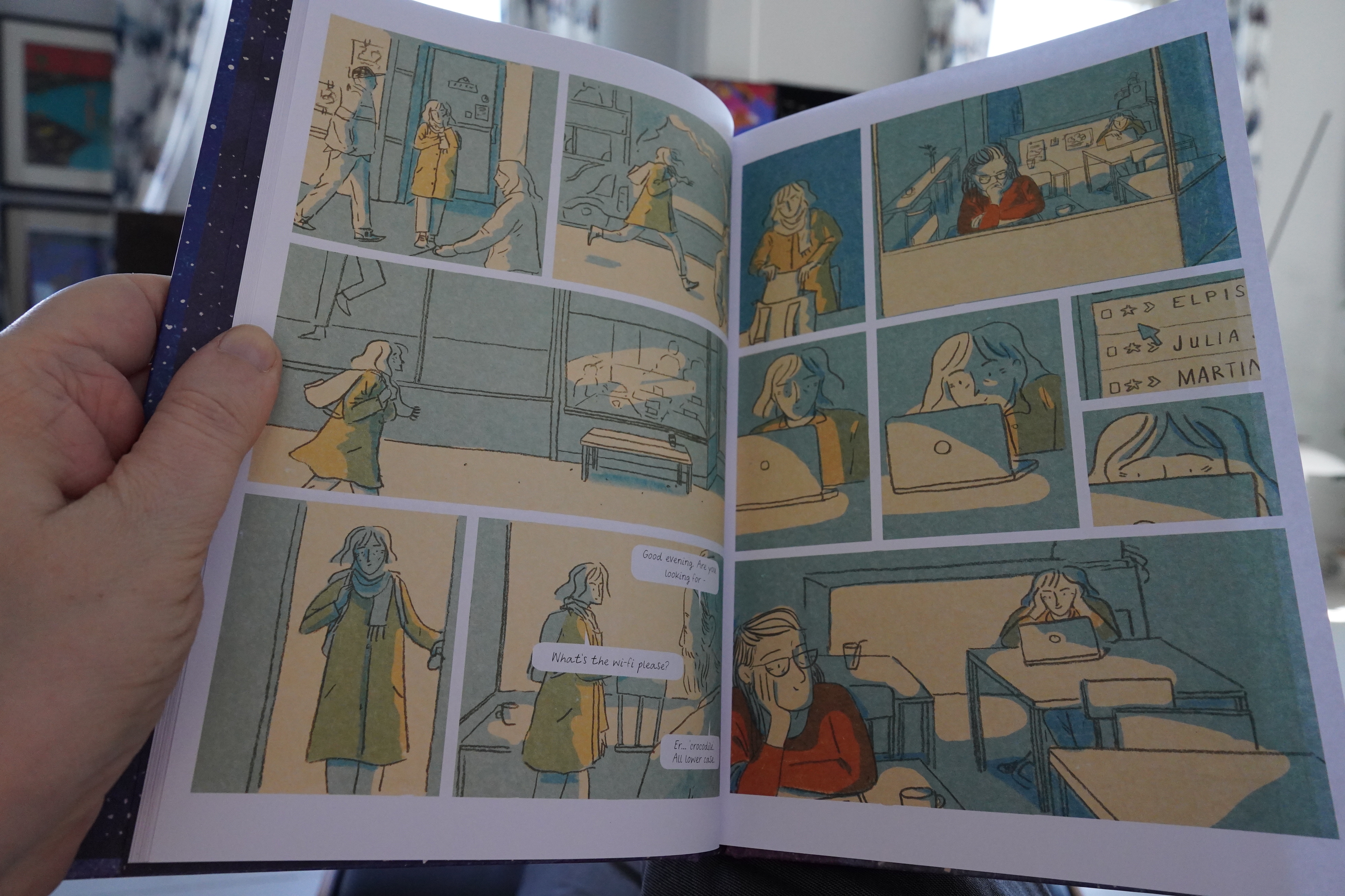
… but then it became amazine. The storytelling is really original — the way this snakes around and then hits an emotional centre is amazing. It’s smart, moving book. And kinda perfect artwork for the story.
| Bill Callahan & Bonnie Prince Billy: Blind Date Party (2) |  |
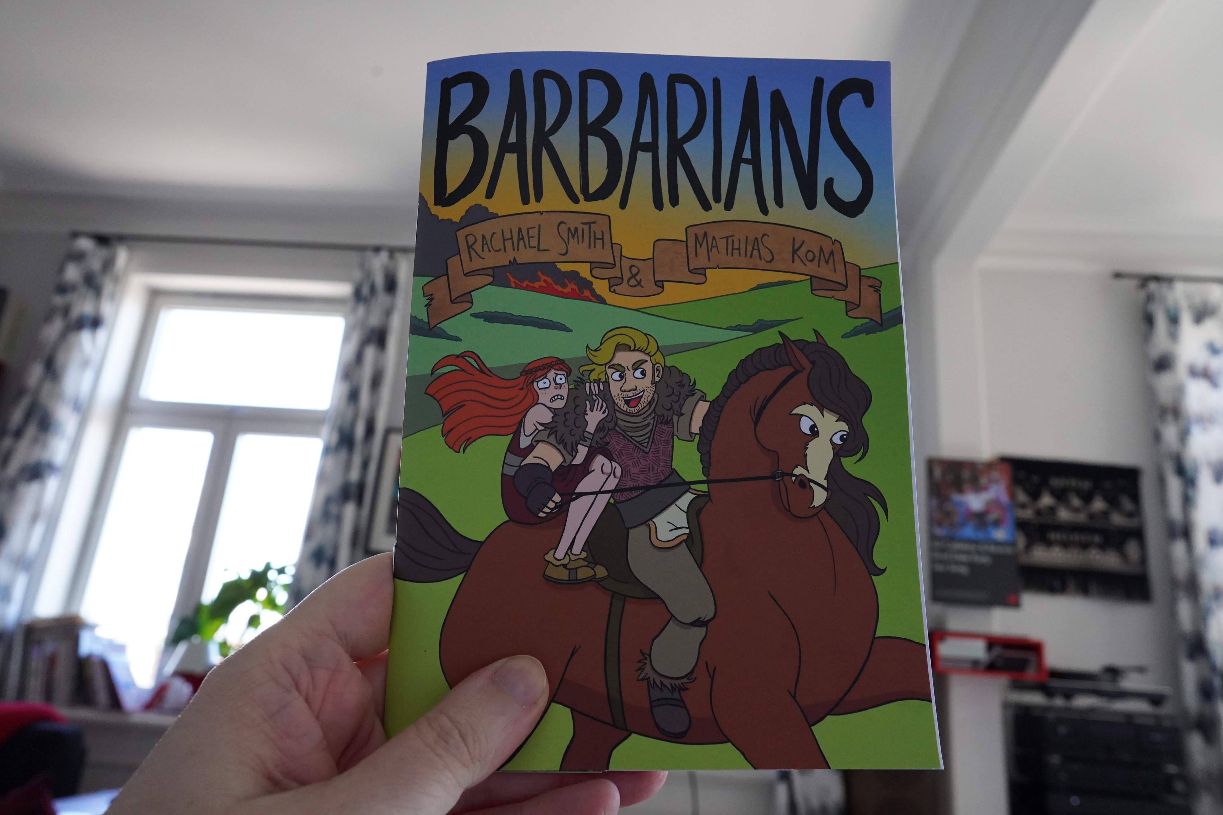
15:48: Barbarians by Rachel Smith & Mathias Kom (Avery Hill)
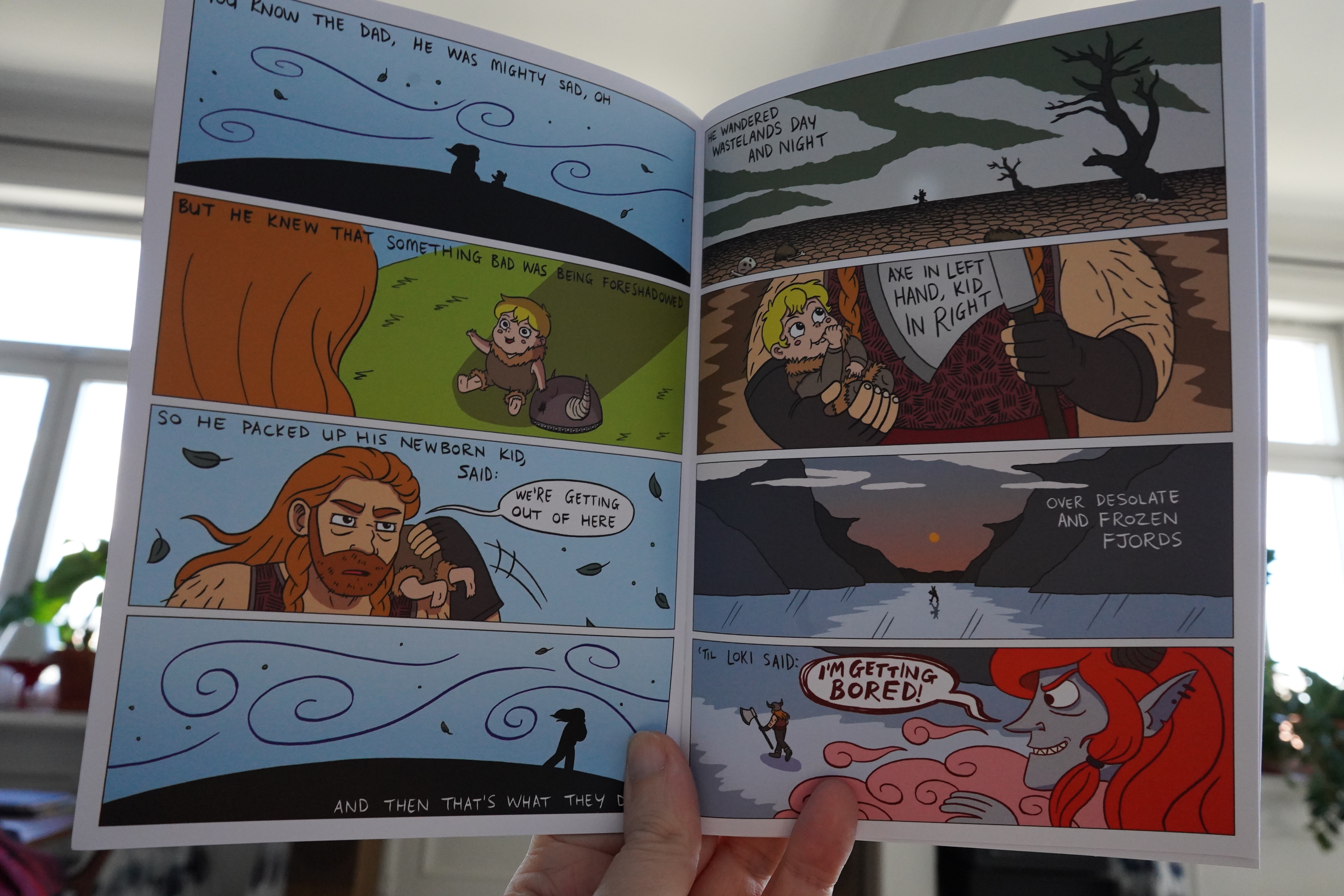
This is cute.
It’s a pretty simple story, and it goes down easy.
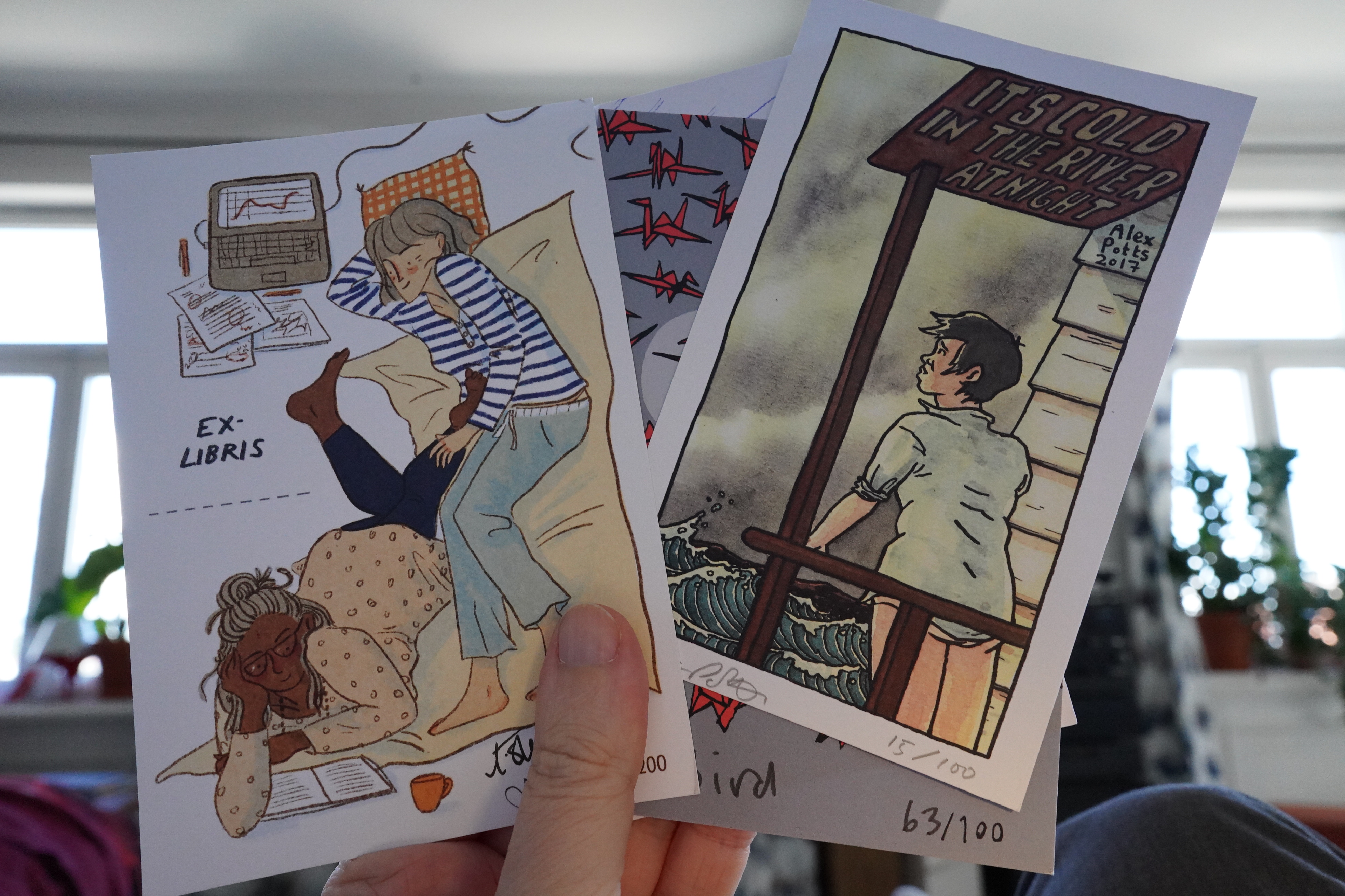
Huh, Avery Hill included a bunch of signed postcards in the package.
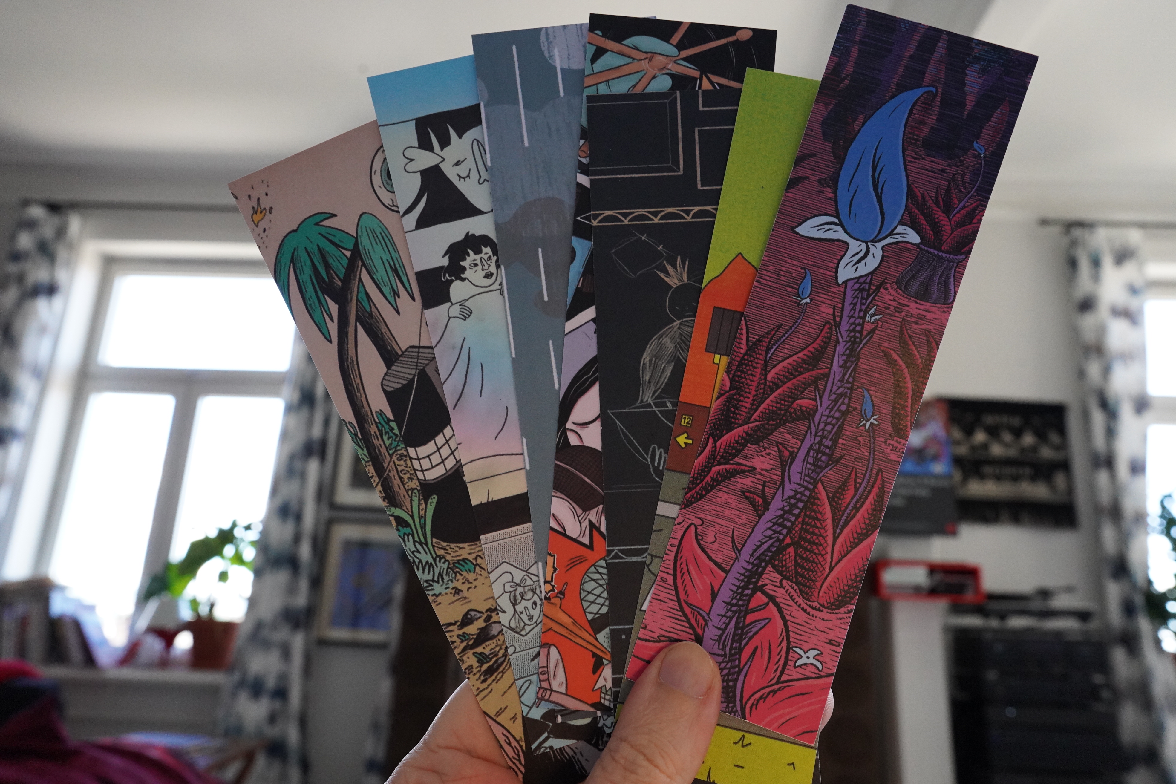
And some bookmarks, too.
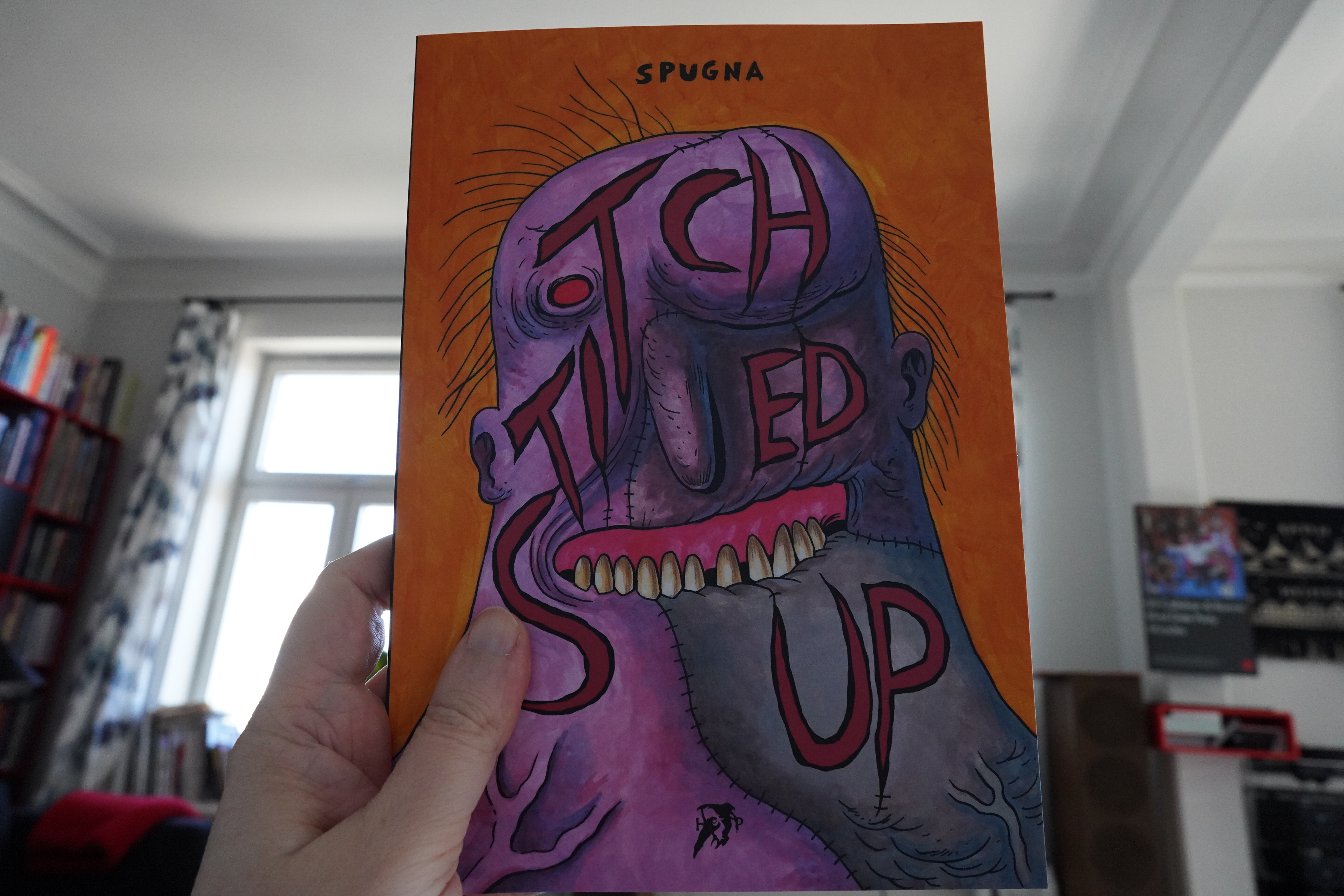
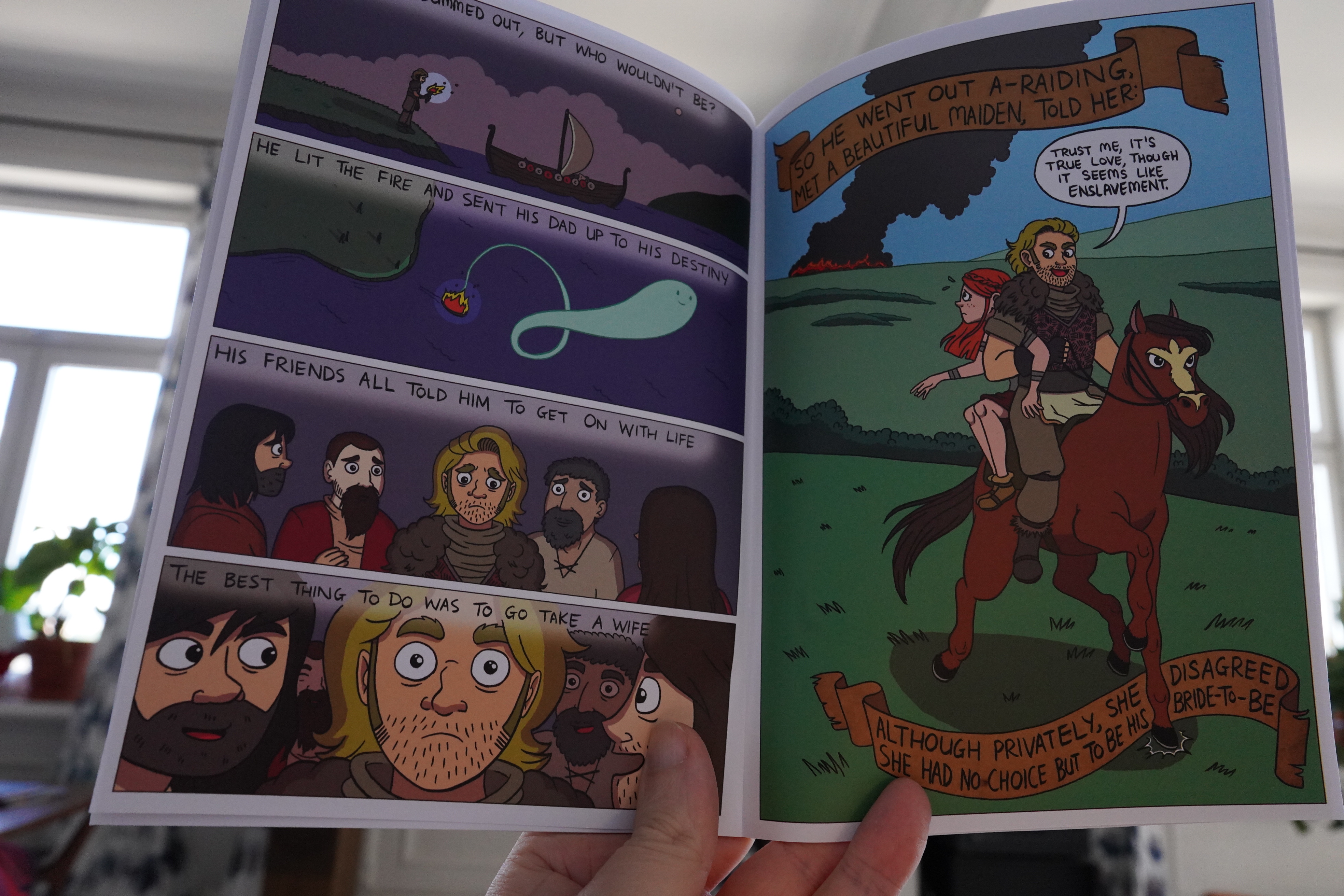
15:54: Stiched Up by Spugna (Hollow Press)
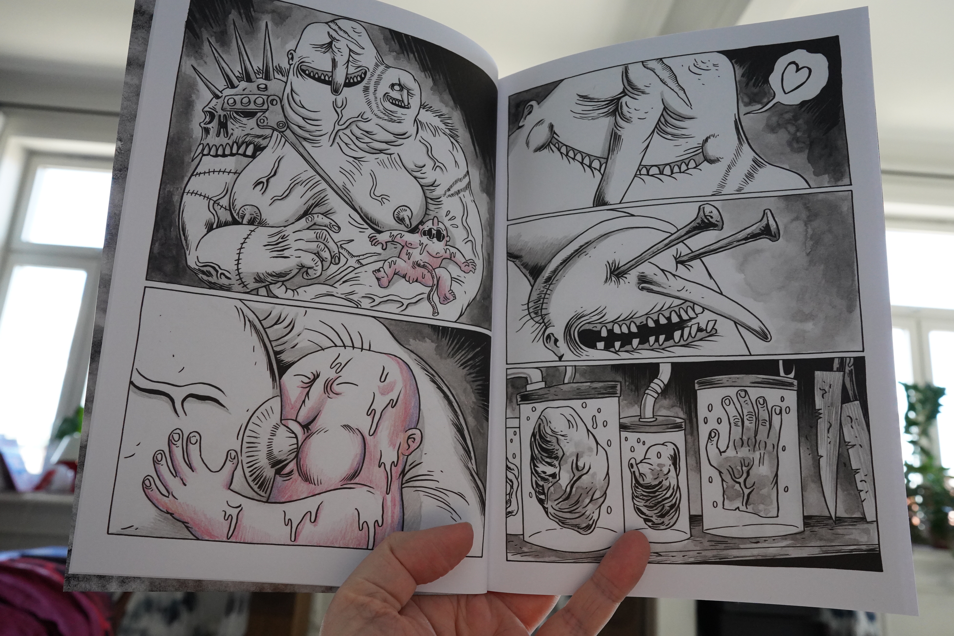
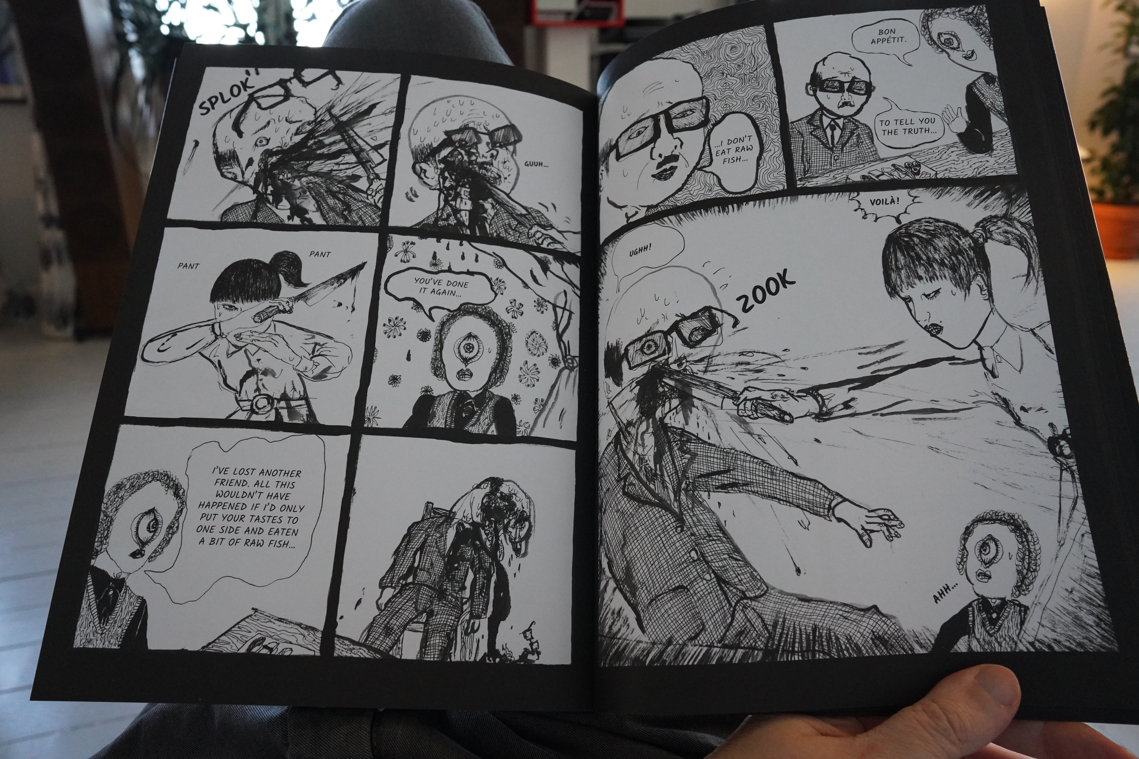
This is very strange.
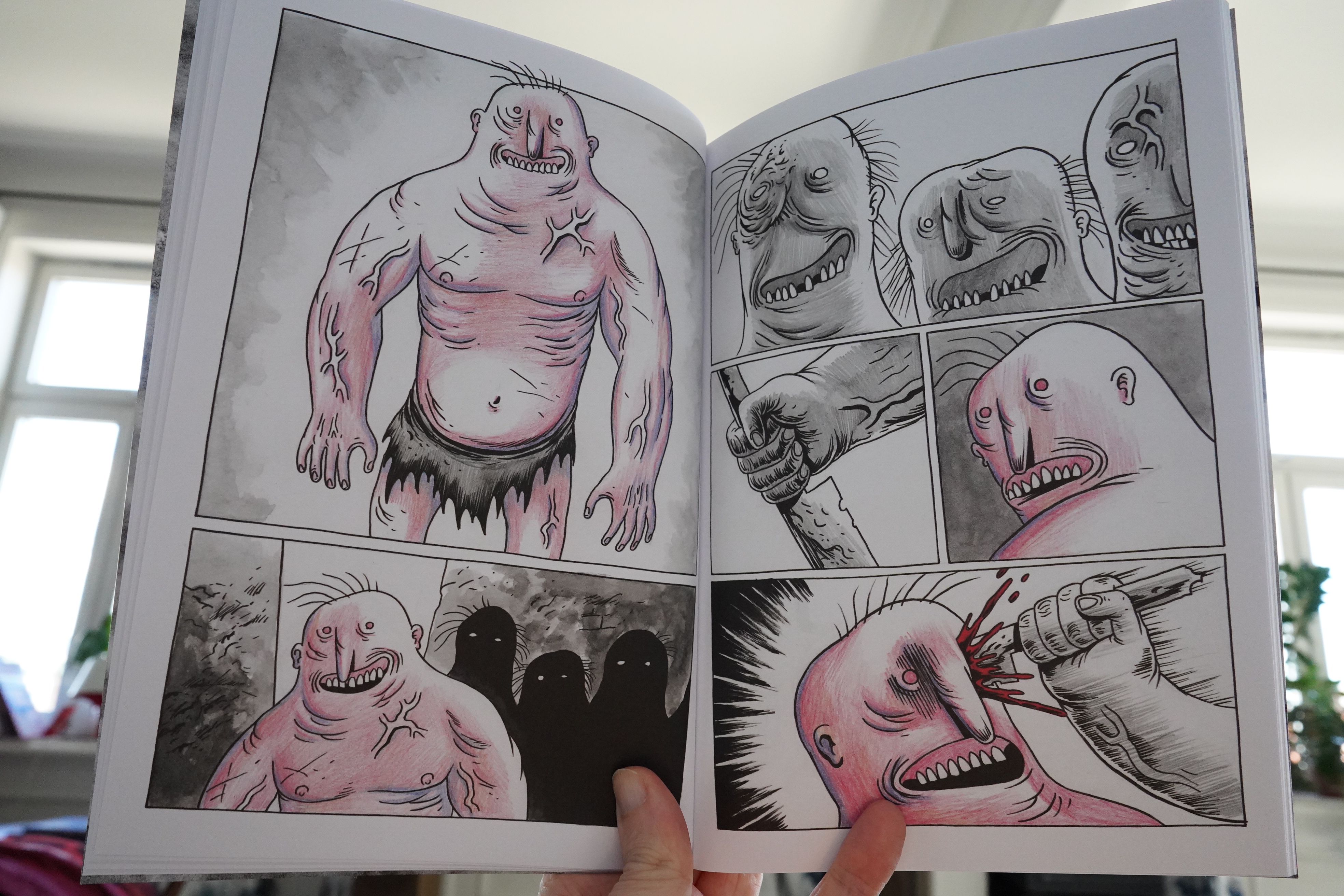
And very violent. It’s also kinda pointless? I mean, I have no idea what Spugna is after here — there’s not really much of a story here beyond “everybody dies” (and some people die a lot). Perhaps Spugna just wanted to draw this and not much beyond that?
| Tess Parks: Tess Parks an Those Who Were Seen Dancing |  |

15:59: Follow Me In by Katriona Chapman (Avery Hill)
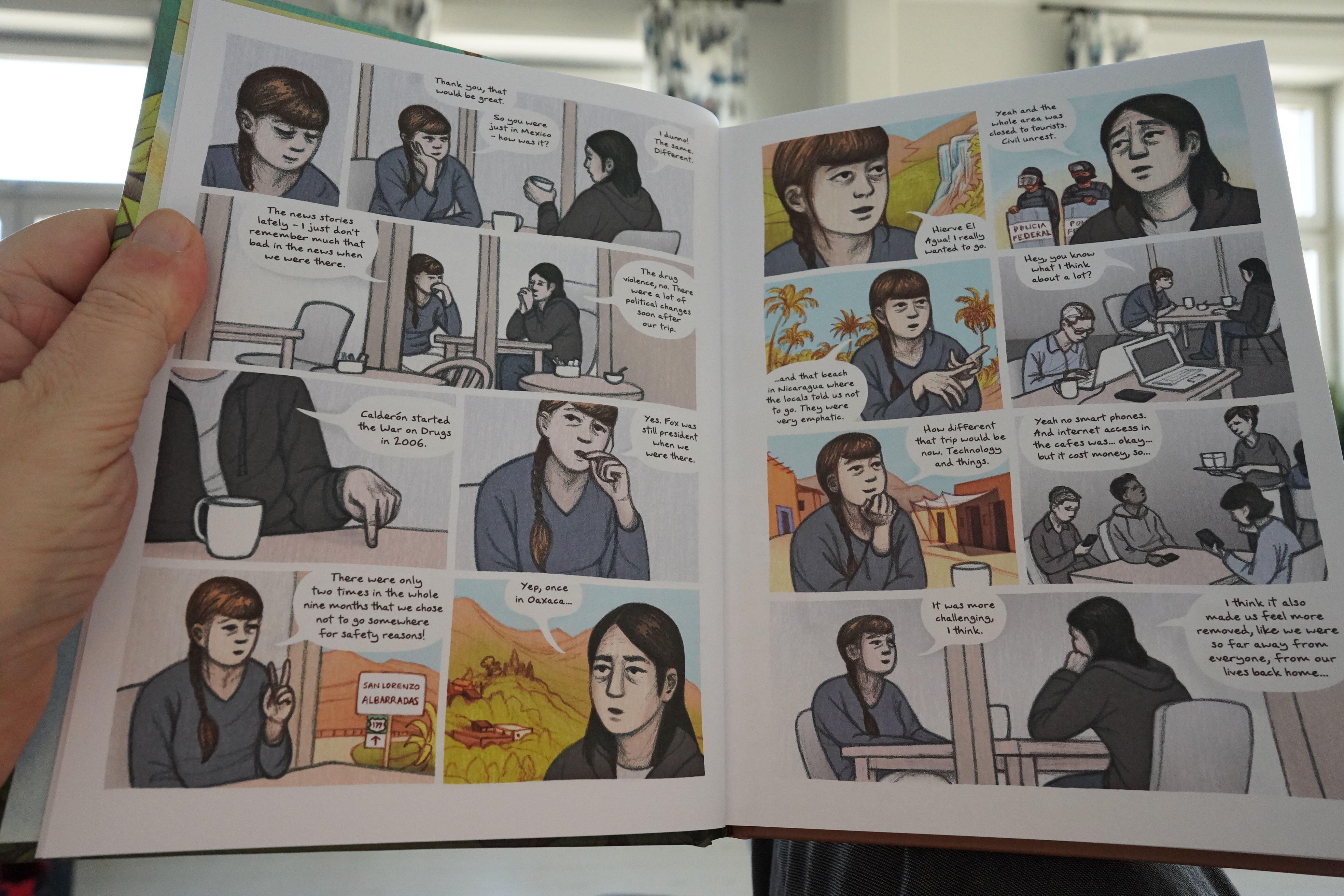
Oh! I’ve read this before. But before I started blogging about reading comics, so I had no idea. I’m kinda outsourcing my memory to WordPress.
But, OK, I’ll re-read it, but I’m skipping the bits about Mexican history.
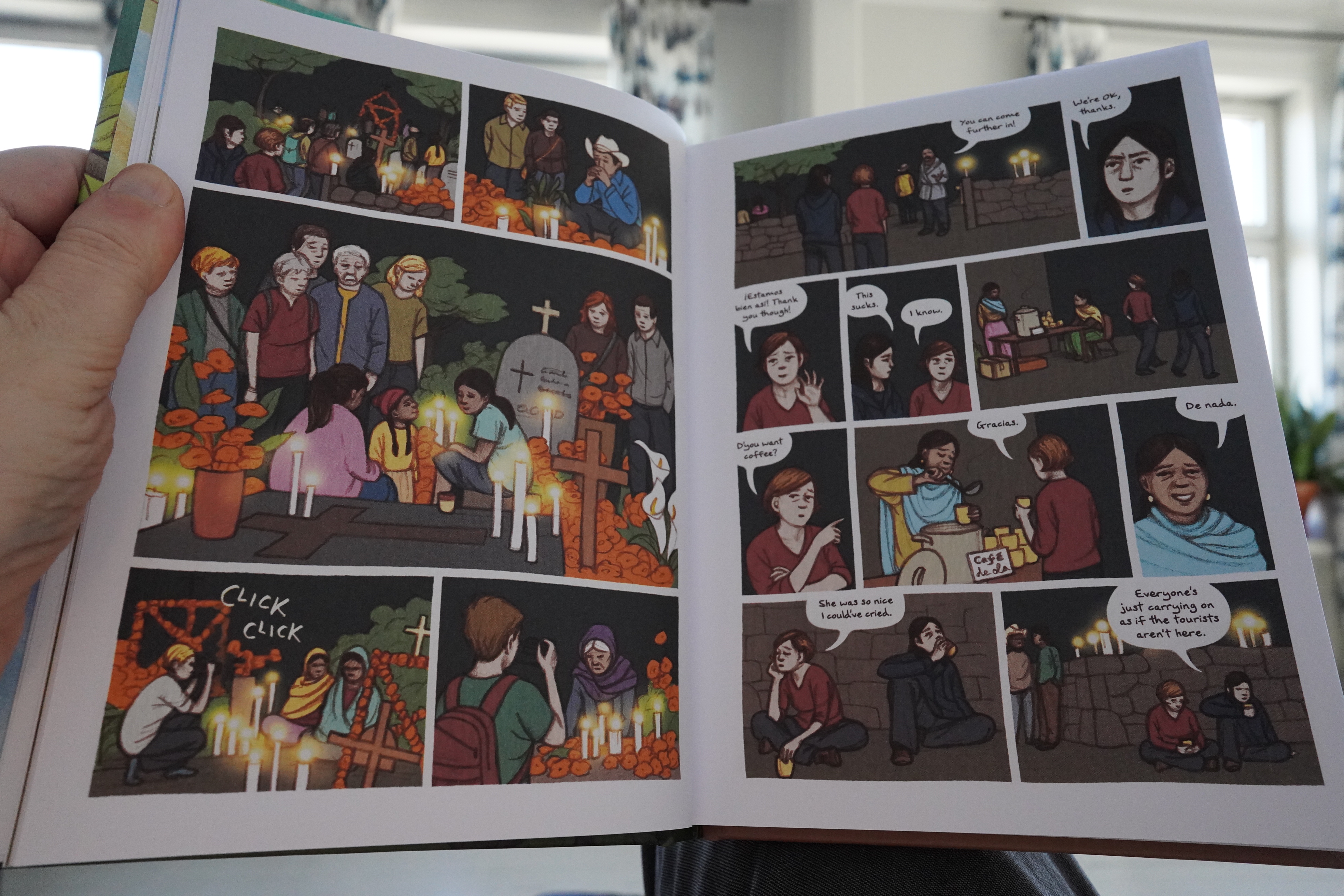
It’s a classic book in many ways: It’s an autobio travelogue.
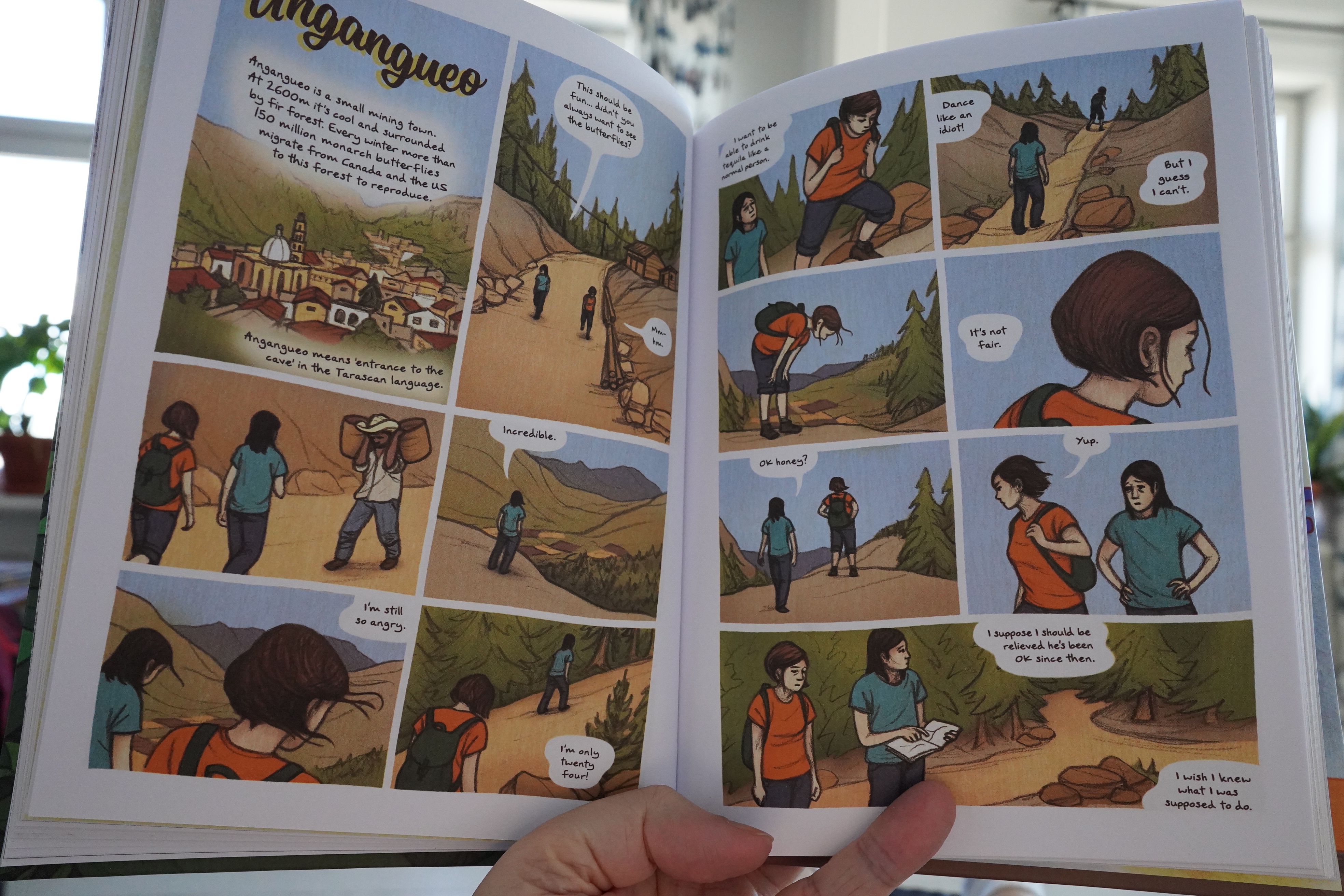
But it’s strangely affectless in many ways. There’s moments of wonder, but it’s mostly a slog of getting from one place to another. And the book is mostly concerned with how her boyfriend is an alcoholic (who mostly abstains from drinking, but then goes for three-day black out drunkenness binges), and how that colours everything with dread.
And to be gauche — that makes for a read that’s not enjoyable.
But it’s an interesting book.
| Congotronics International: Where’s The One? |  |
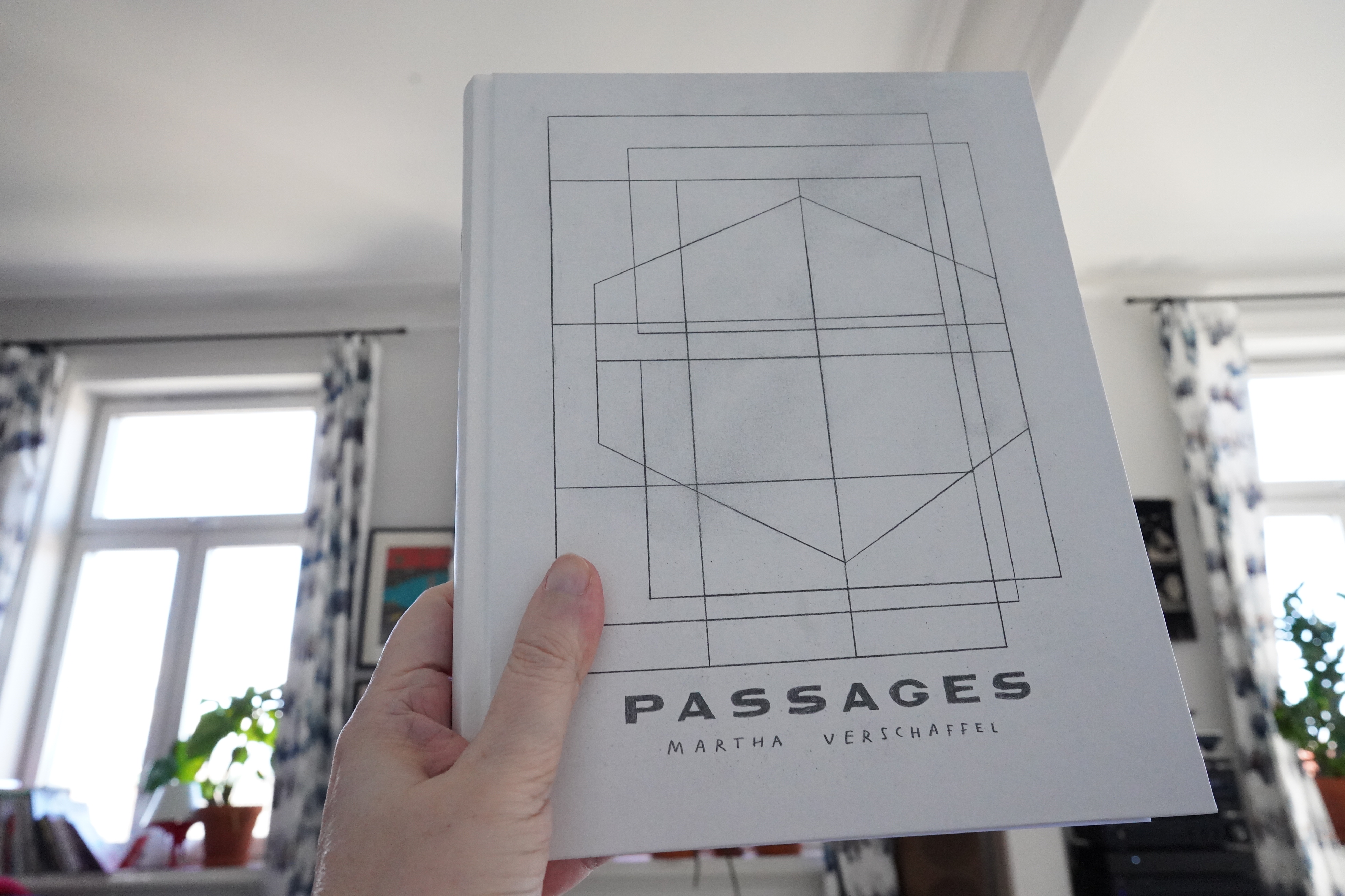
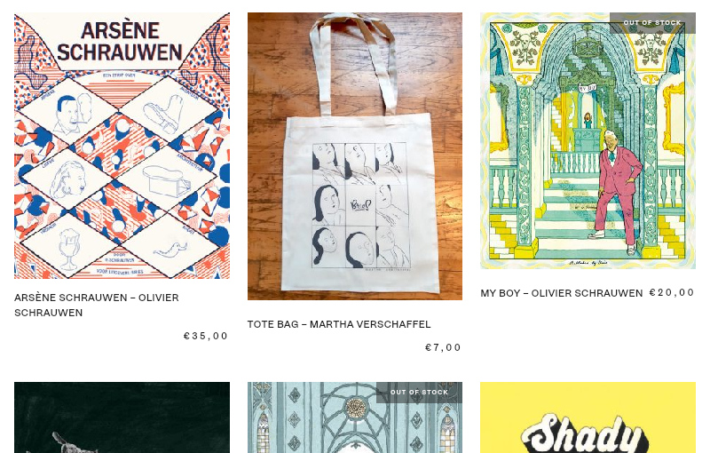
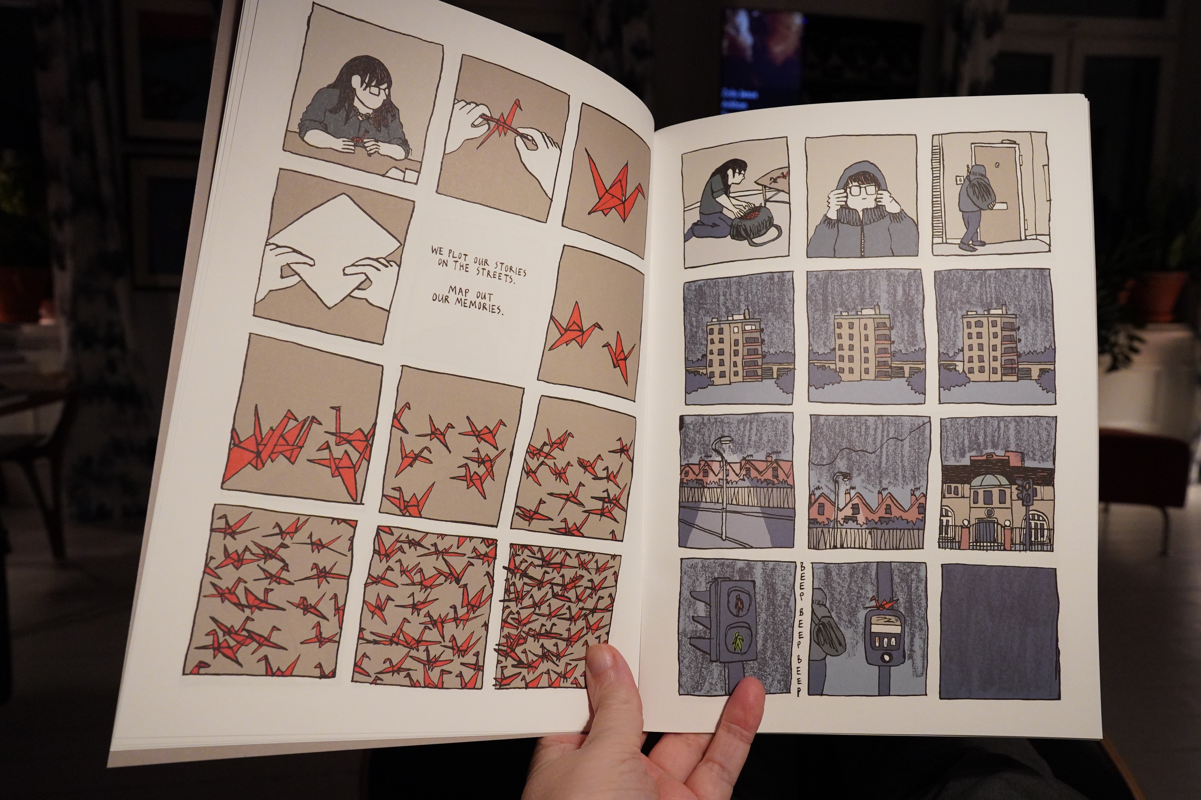
17:02: Passages by Martha Verschaffel (Bries)

And a cool tote bag.
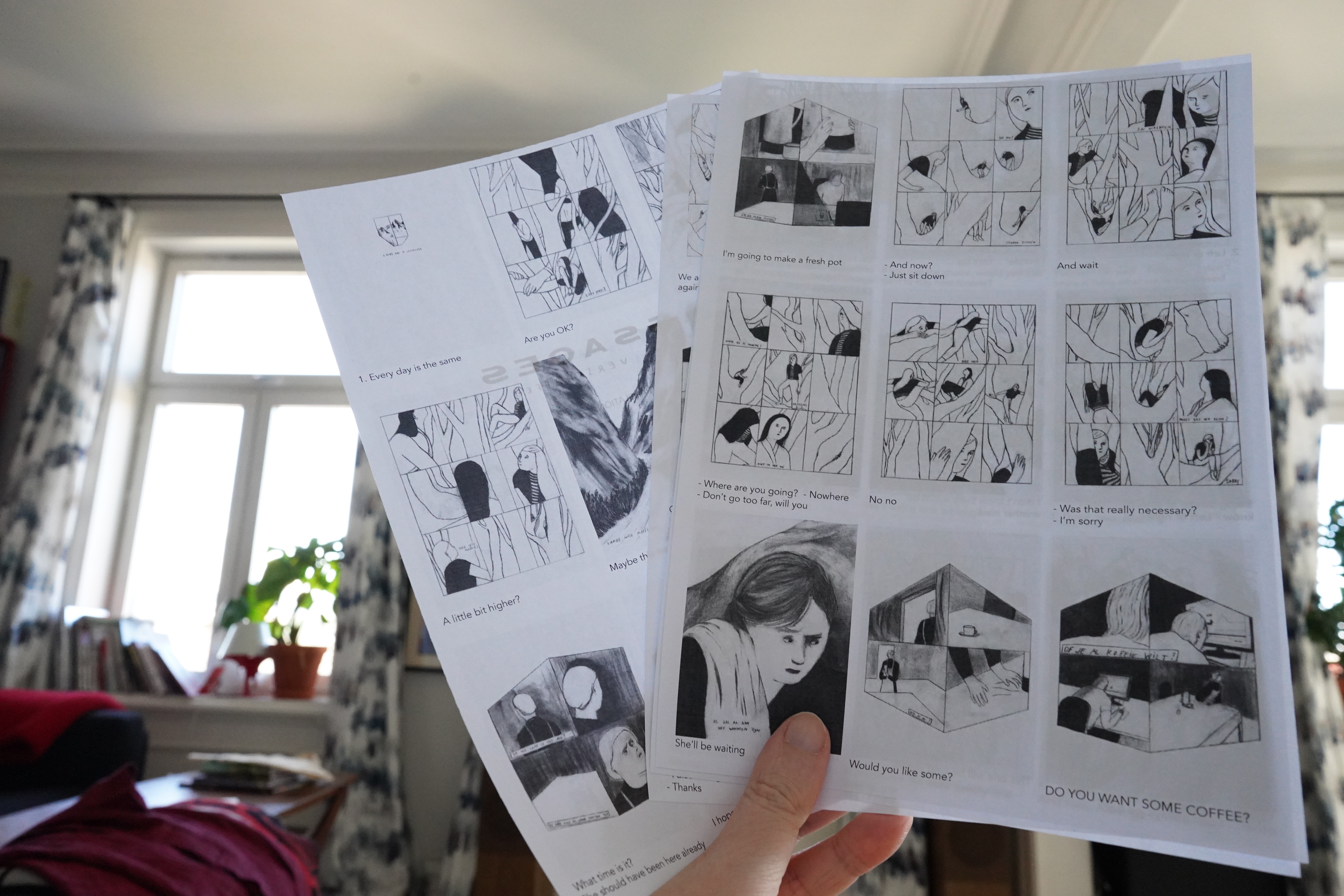
Ah, there’s not much dialogue here, but it’s in… er… Flemish? I don’t know. So there’s some sheets tipped into the book with translations to English.
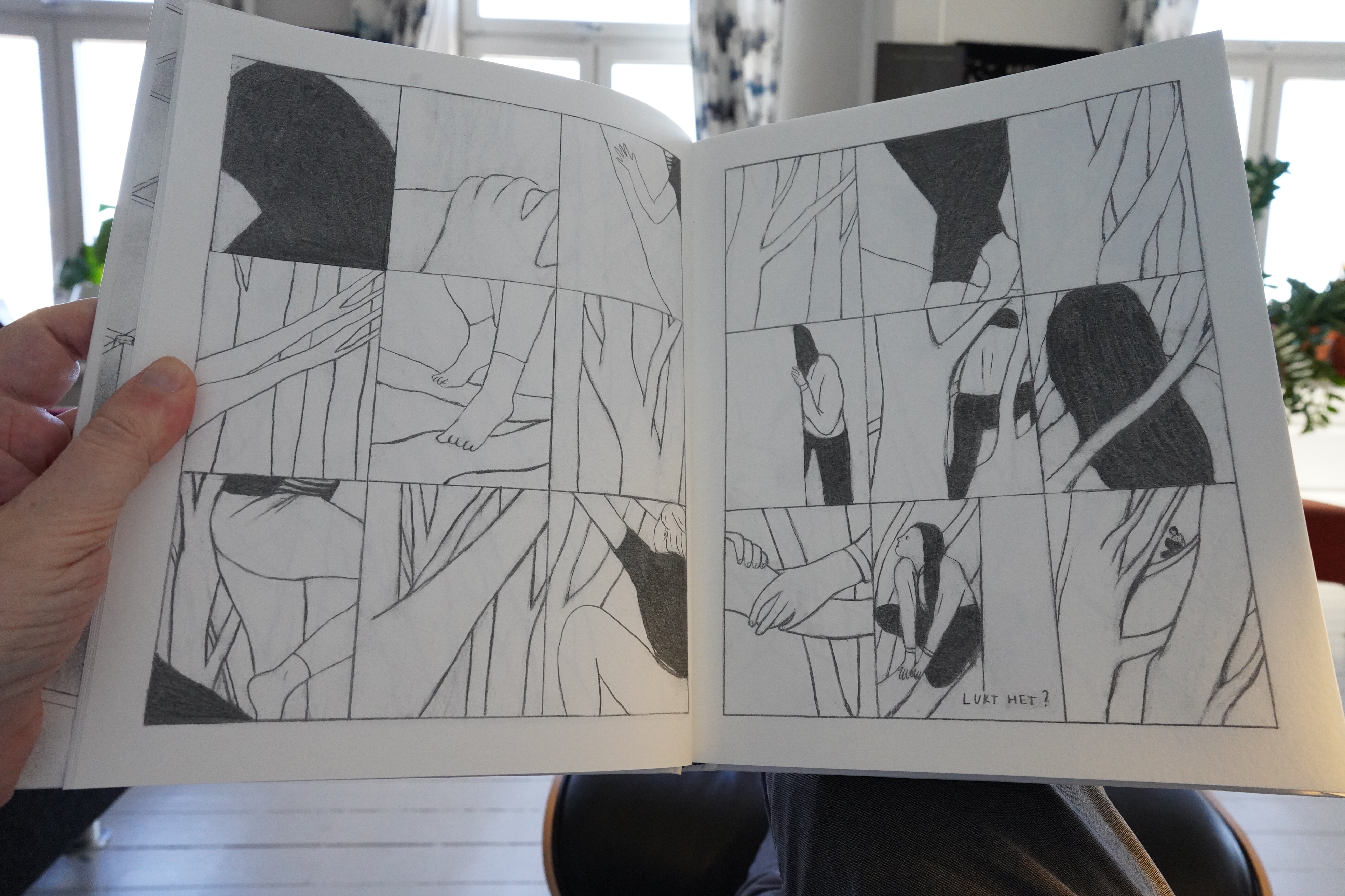
This is a lovely book. I love the flow of the storytelling — it’s just so er fluid.

And gorgeous artwork.
And it’s just so puzzling. It seems to make sense on several intuitive levels at once, even if I couldn’t really explain what it’s “about”.
It’s a magnificent book.
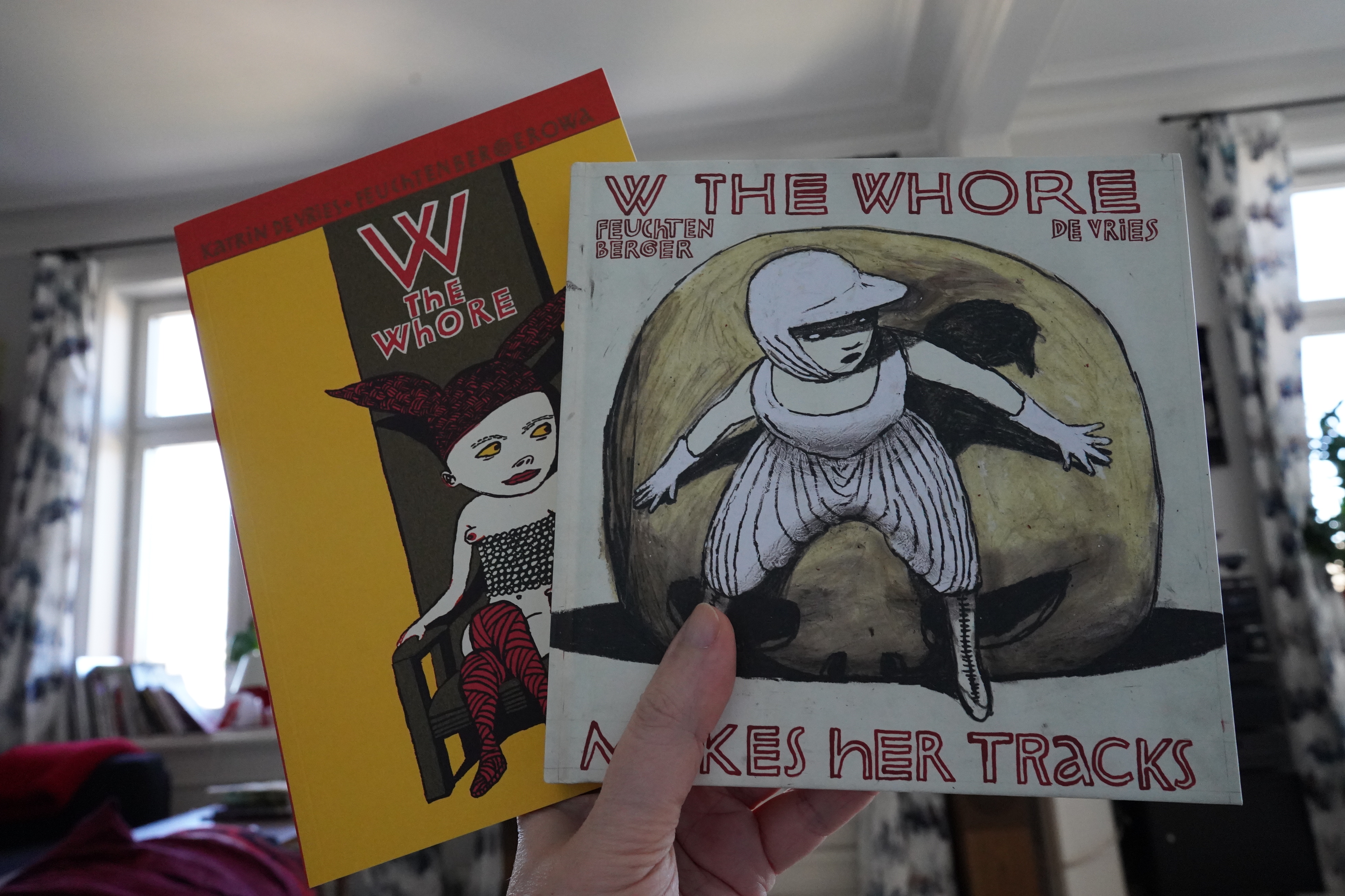
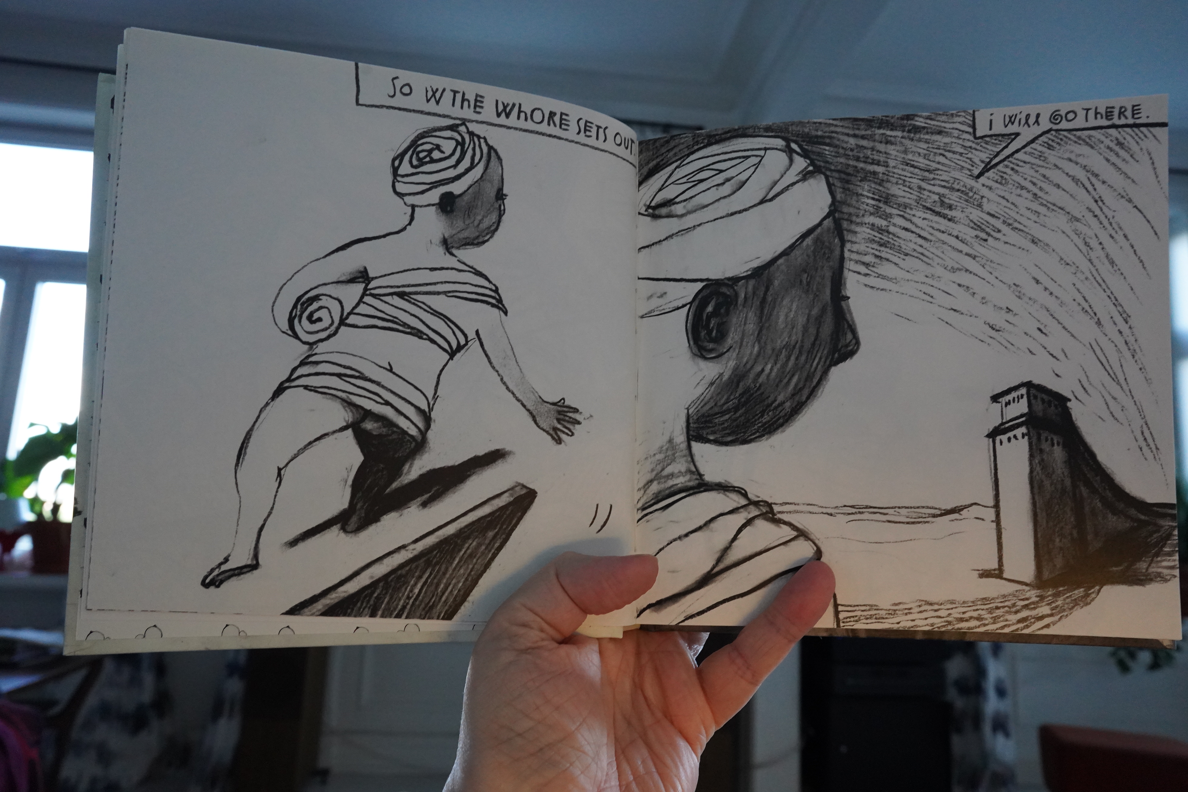
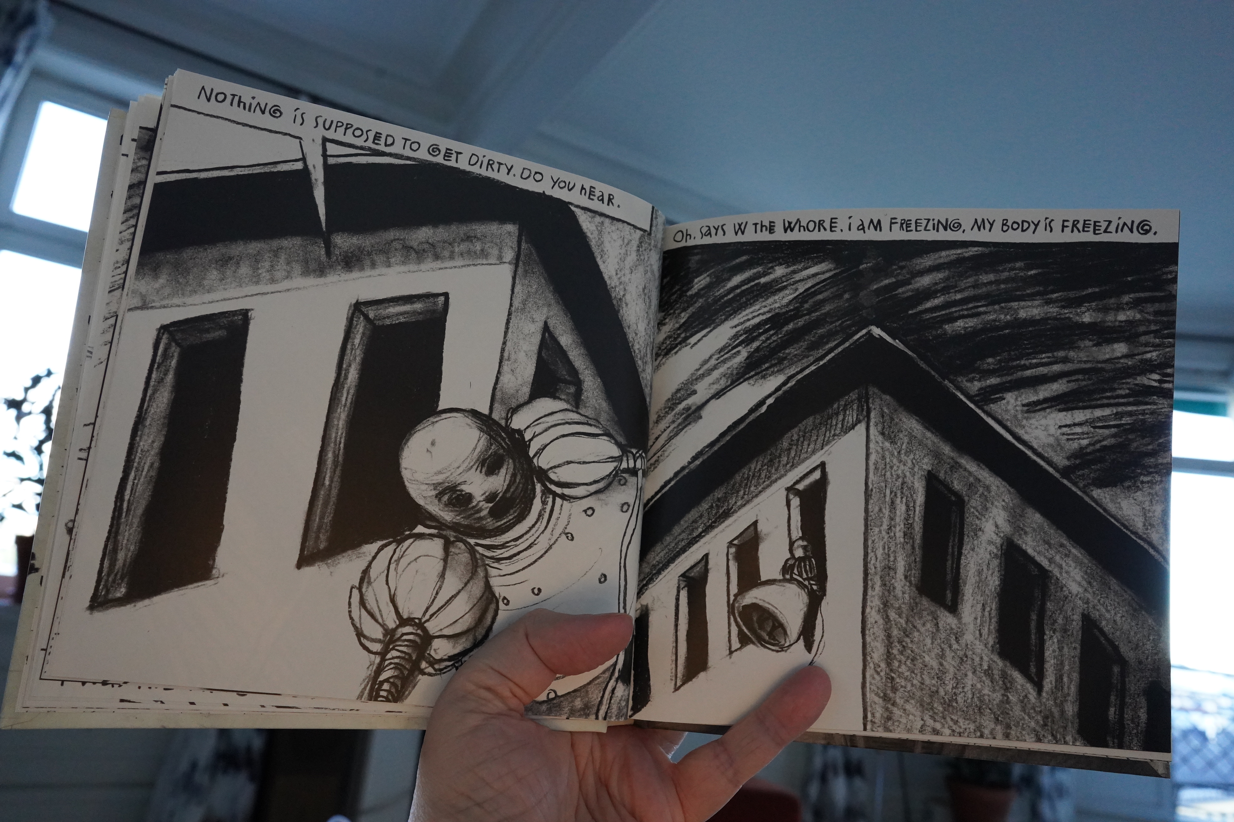
17:51: W The Whore/Makes Her Tracks by Katrin de Vries + Anke Feucthenberger (Bries)
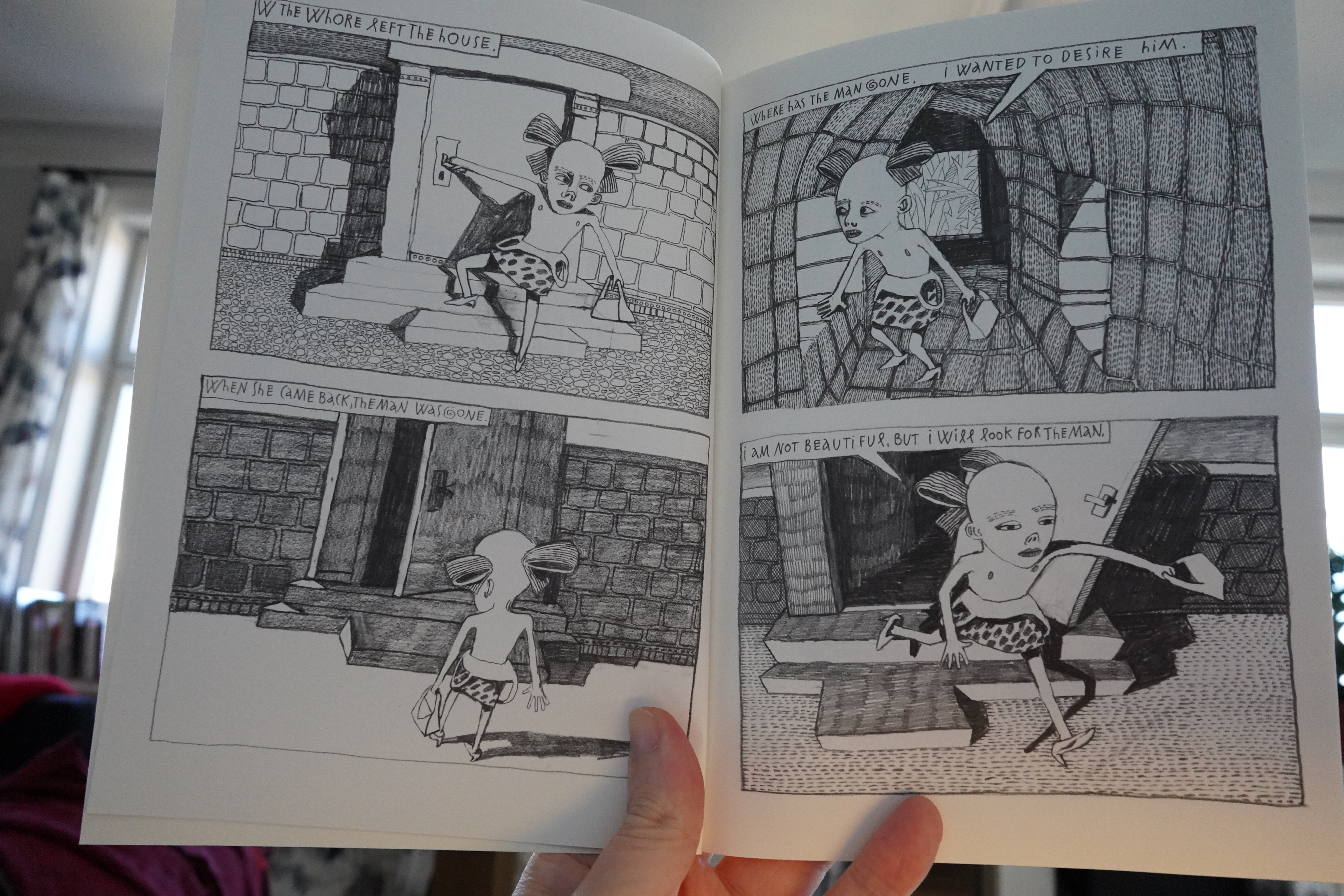
These two books are from 2001 and 2006 respectively, and Bries is still selling the first editions, apparently, so I guess they… er… didn’t sell that much? But it’s a Belgian publisher publishing a German book in English, which is complicated, I guess.
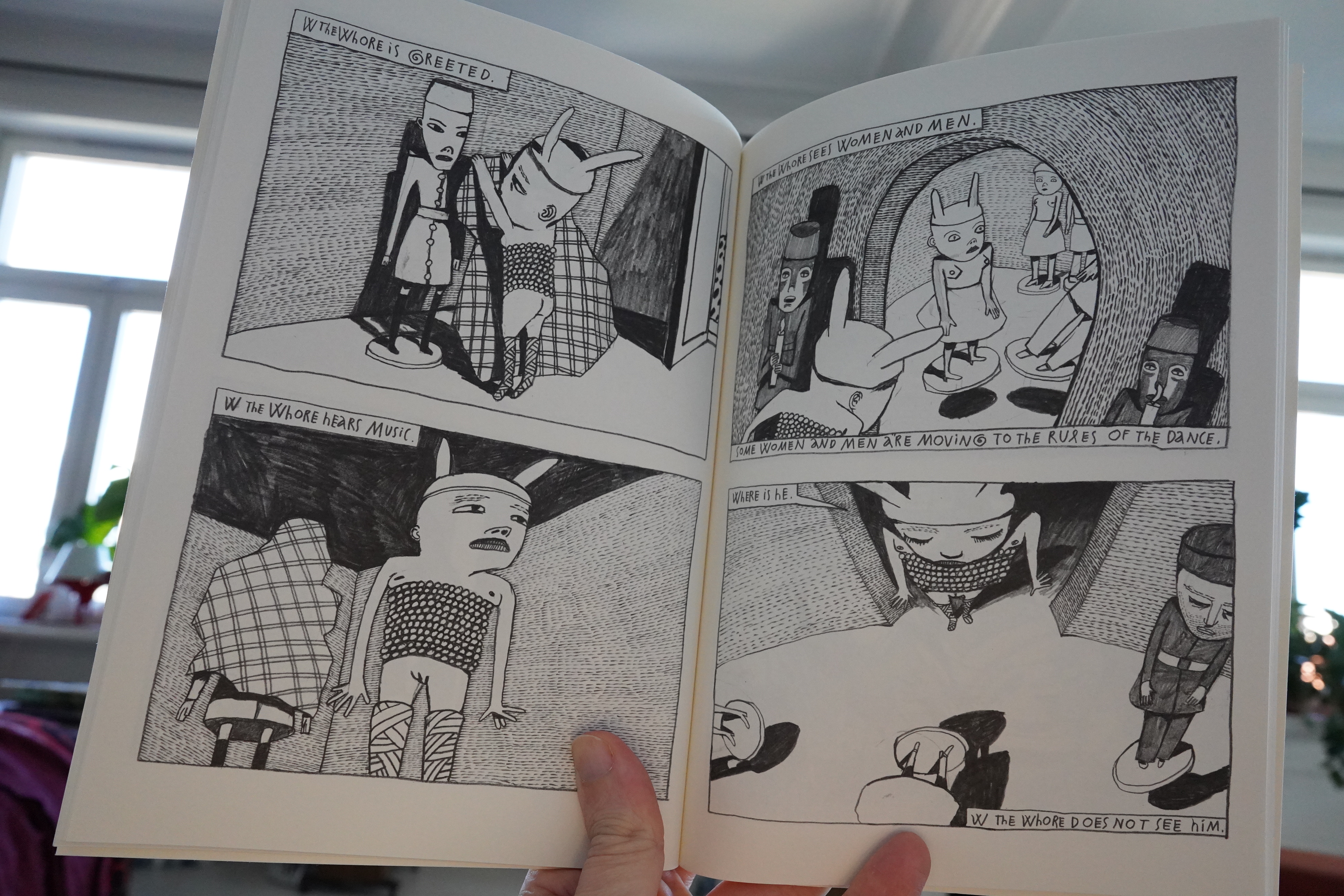
Anyway, these are pretty unique. Very odd, even on an art comics scale.

*ding dong* Pizza time. Got no time to cook when reading comics, so I got some anchovy pizza this time… and… geez, that’s really heavy on the fishies? I like anchovy pizza, but I’m more used to just having a couple strips of them giving pops of salty fishiness, and not, like… that?
And it’s a soggy mess to boot. Boo!!! I think the rot has set in in my neighbourhood pizza parlour — they were great like a couple months ago.
Makes for an odd pairing with these books. Or perhaps not. Both are very salty.
But really good books.
| Test Card: Patterns | 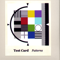 |
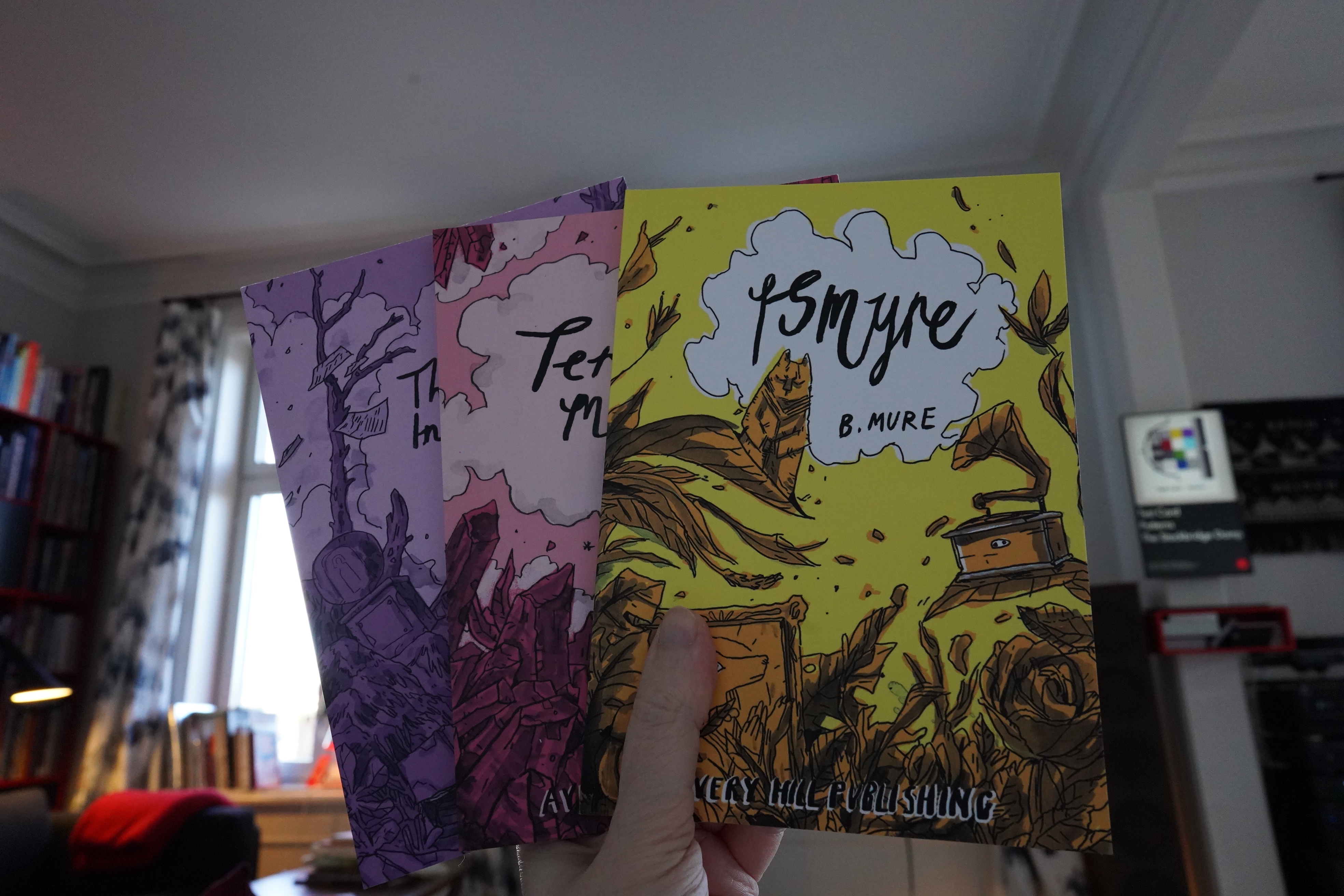
18:33: Ismyre/Terrible Means/The Tower in the Sea by B. Mure (Avery Hill)
I read the fourth book in this series the other month, so now I’m circling back to the start.
It’s a unique approach to colouring, and it’s gorgeous.

The first book is a small and sweet story, but set in a world that feels huge and fully realised (even if we only get small snatches of what that world is like). It’s a lot of fun to read.
The second story gets more into this world, and the story feels a bit less fully realised. That is, in the first book, there was a nice little mystery, while in this book there wasn’t much of that.
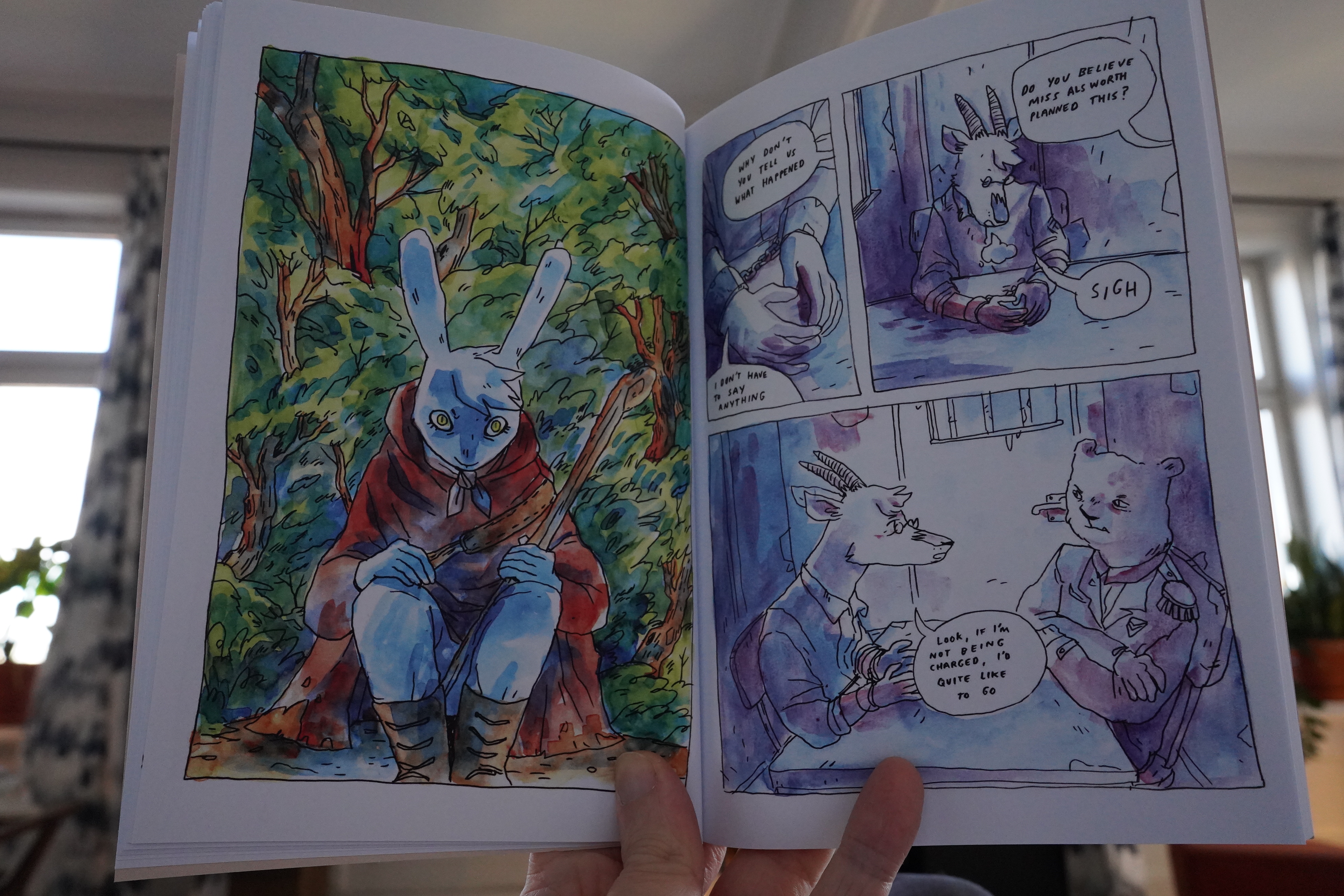
But it’s still a good read, and it’s the kind of world I’d have been obsessed with as a child.

The third book feels like a totally different thing. The colouring is a lot less exuberant, and basically nothing happens.
It reads like the middle book of a trilogy? I.e., it’s setting things up for the fourth book, but nothing actually interesting happens in the book?
And if I recall correctly, huge stuff happens in the fourth book.
| Wrangler: LA Spark |  |
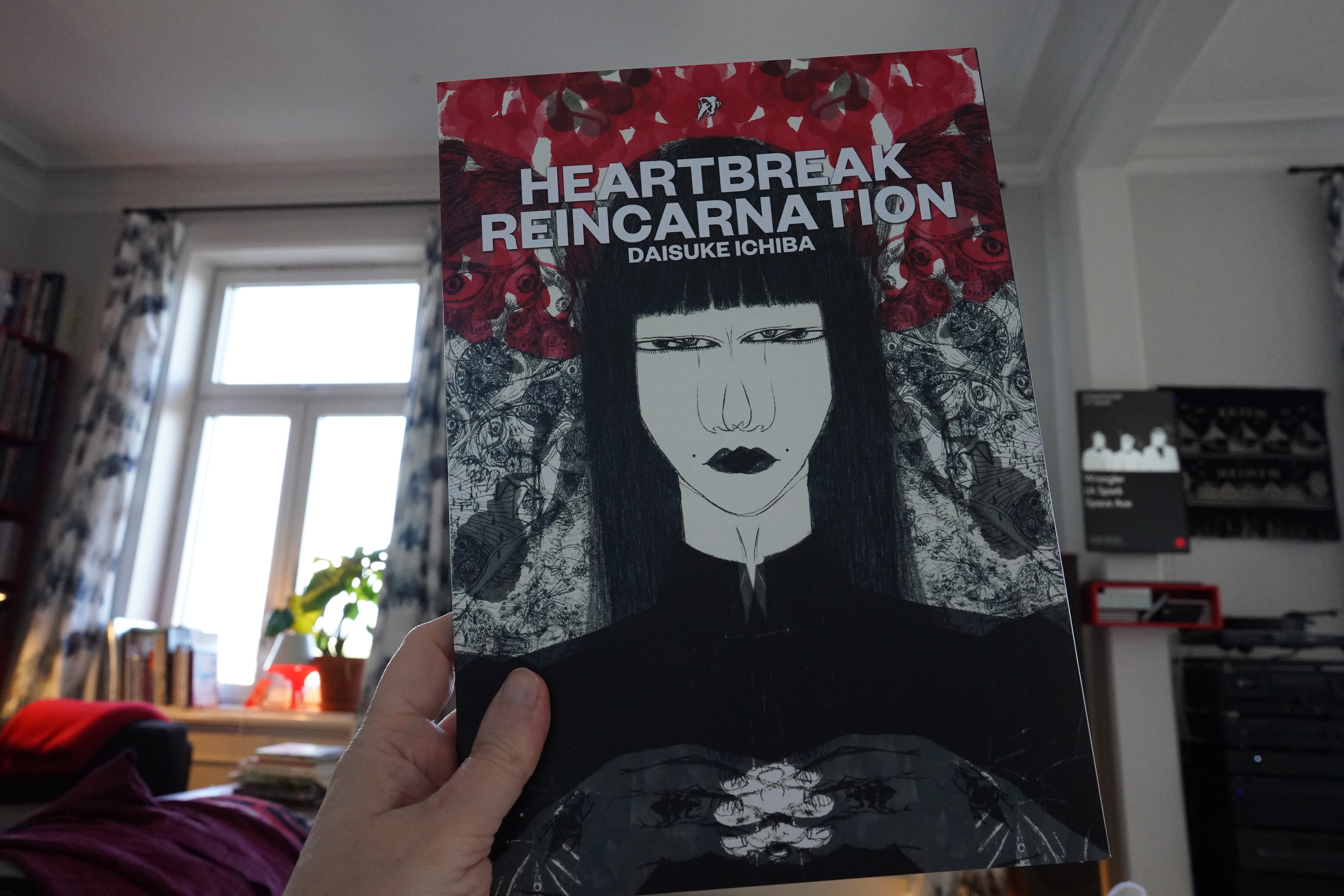
19:21: Heartbreak Reincarnation by Daisuke Ichiba (Hollow Press)

Odd and unsettling.
It’s very punk.
| Playgroup: Reproduction (1) |  |
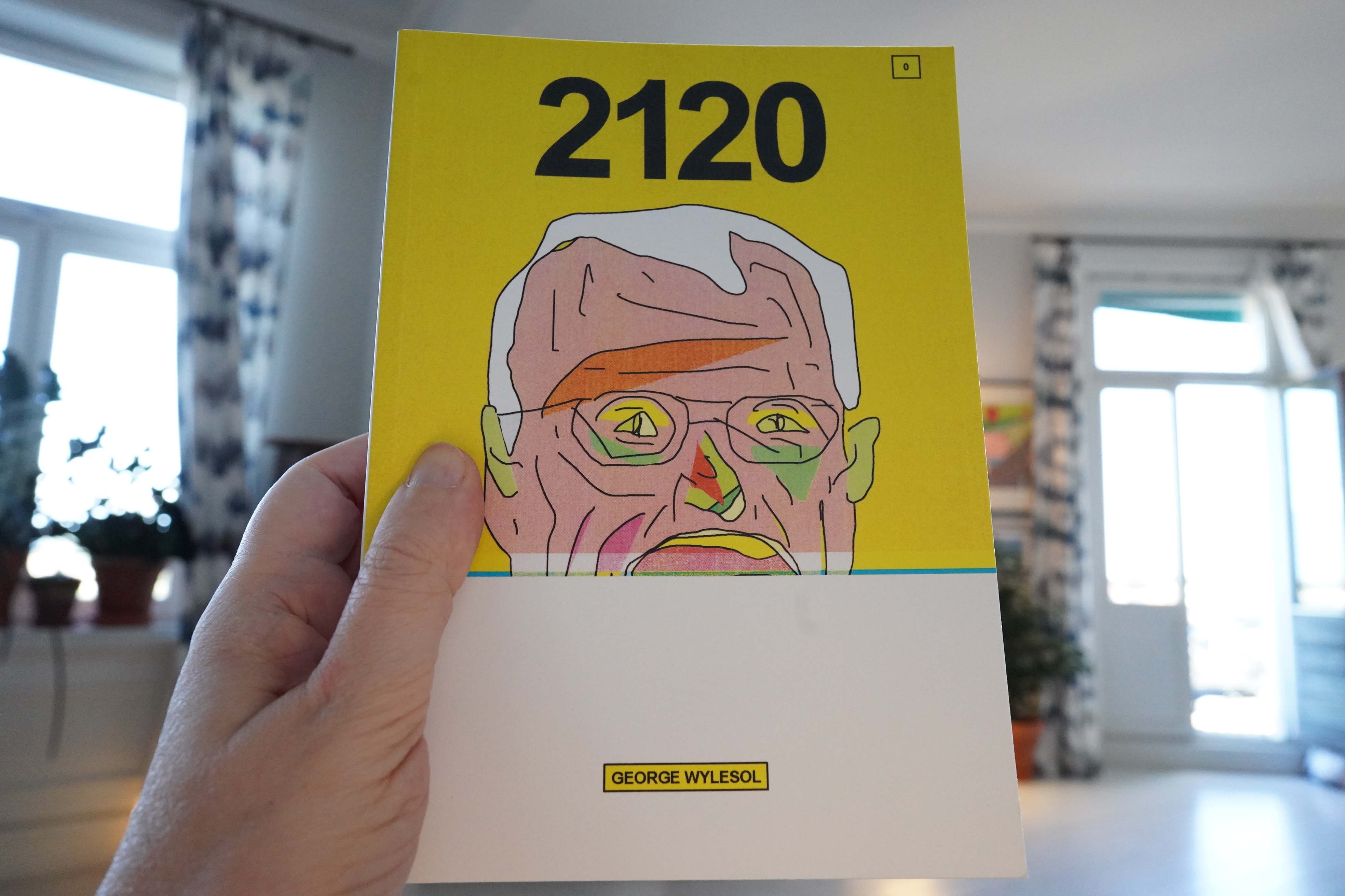
19:40: 2120 by George Wylesol (Avery Hill)
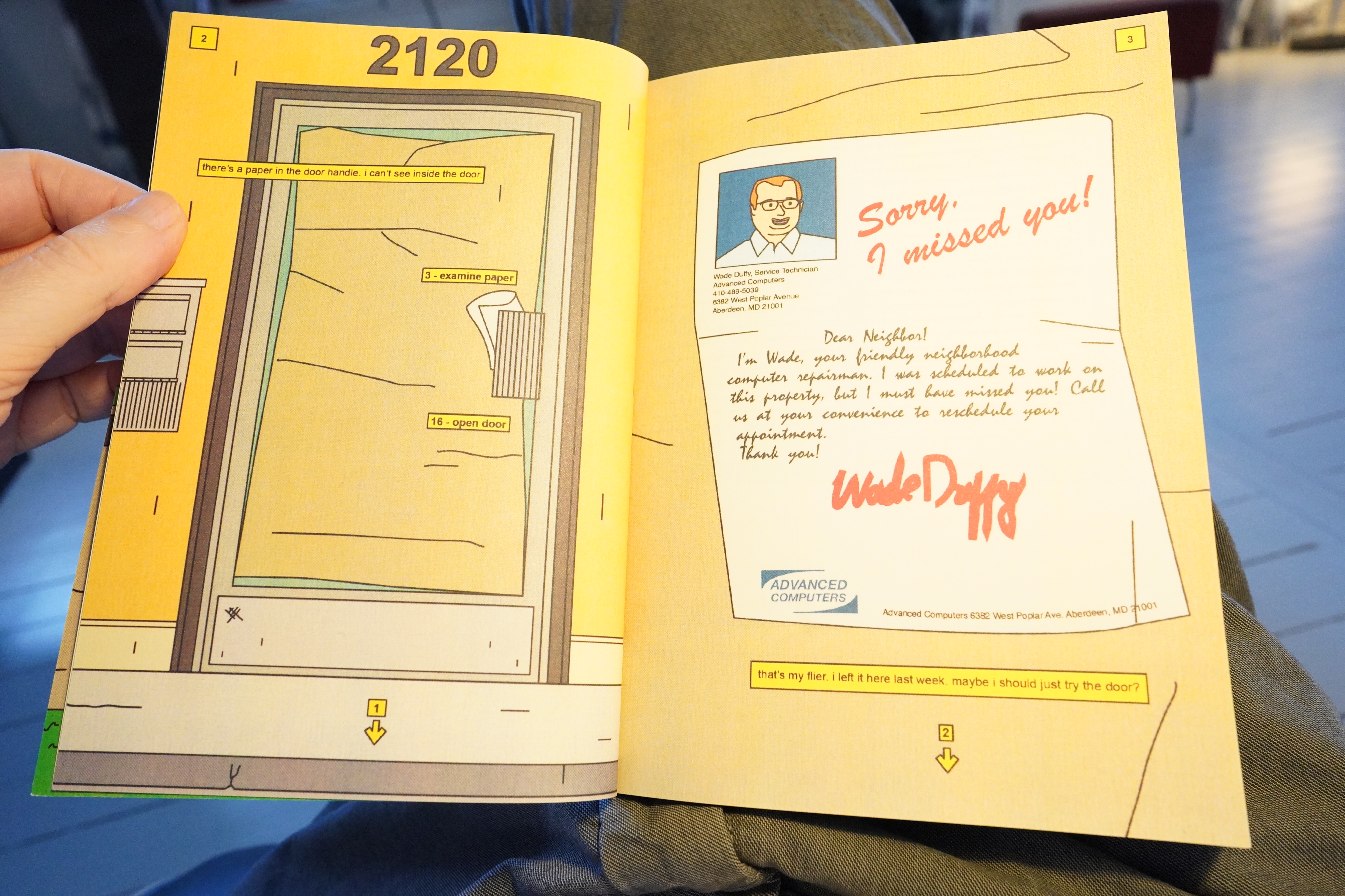
This is a choose your own adventure thing.
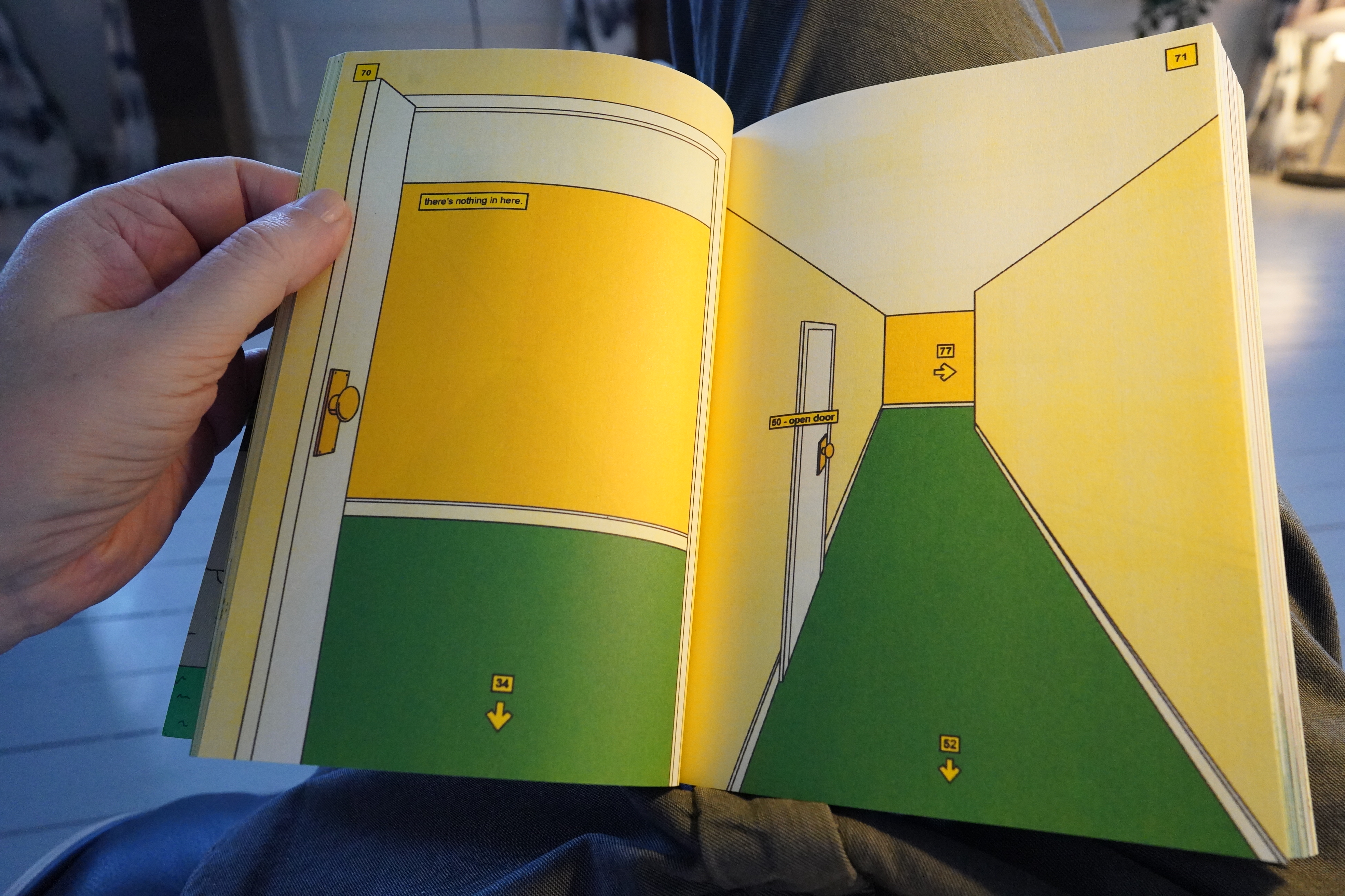
But it’s way more detailed than these things usually are.

It reads more like a 90s adventure game? But it’s an interesting reading experience: You follow long passages and skip ahead and skip ahead and while skipping, you see adjacent pages where lots of very weird things are going on — but on the periphery of your vision, so to speak. And then you’re put back where you’ve started, often, and then have to try different doors, and then you advance some more…
So this is really interesting, but it’s not for me — I don’t do video games. Even so, it held my attention for more than half an hour before I ditched it.
And made some food, because I was starving after ditching that pizza after eating one third of it.
| Playgroup: Reproduction (2) |  |
20:34: Books of Hope #1-3 by Tommi Musturi (Bries)
I’ve read Musturi’s Future books, and they’re great. These are earlier books — from the mid noughties (did we ever decide what to call that decade?).
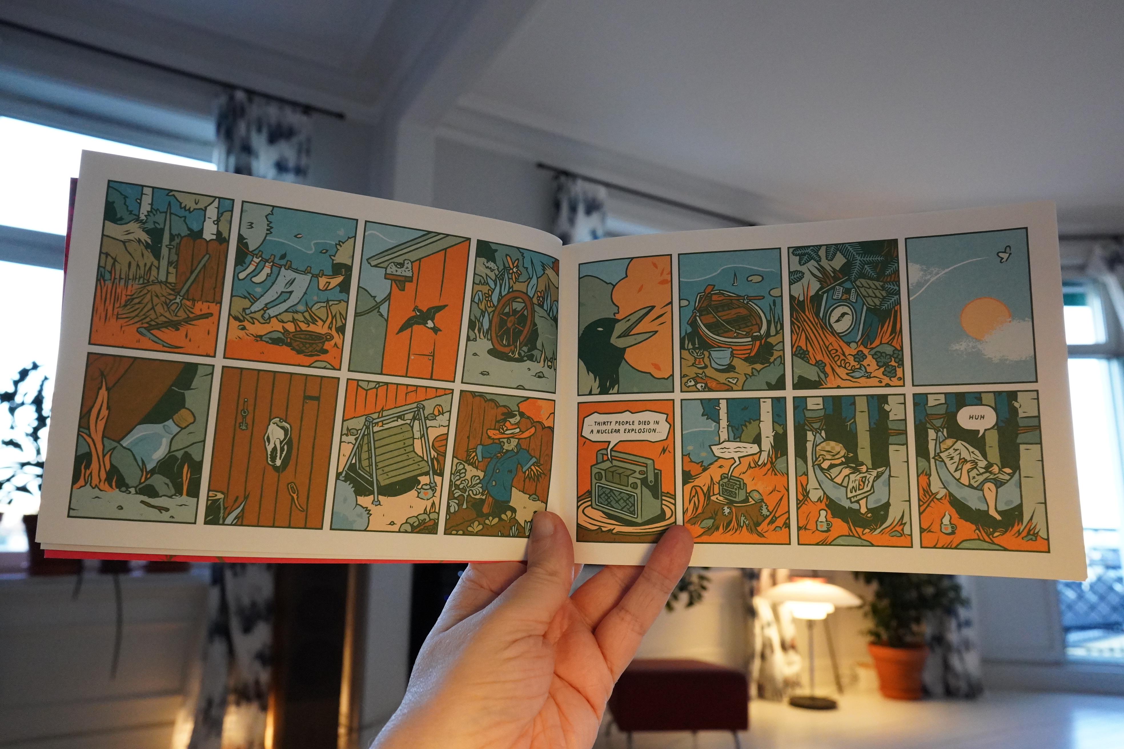
This is a collection of these two-page strips? It’s all the same character, but not development as far as I can tell.
We’re solidly in post-Ware territory, and this reminds me a lot of certain American late-90s comics (like Ethan Persoff etc). But more Finnish.
The third book, titled Dreams of Hope, is very different from the first two. The first two books were (basically) gag strips, but all existential and stuff. In this one all the panels have wavy borders, signifying that it’s all a dream, but it reads less like a dream than drunken meandering thoughts.
The first two books are solid, though.
What’s this then?
Oh, it’s an envelope with this in it:
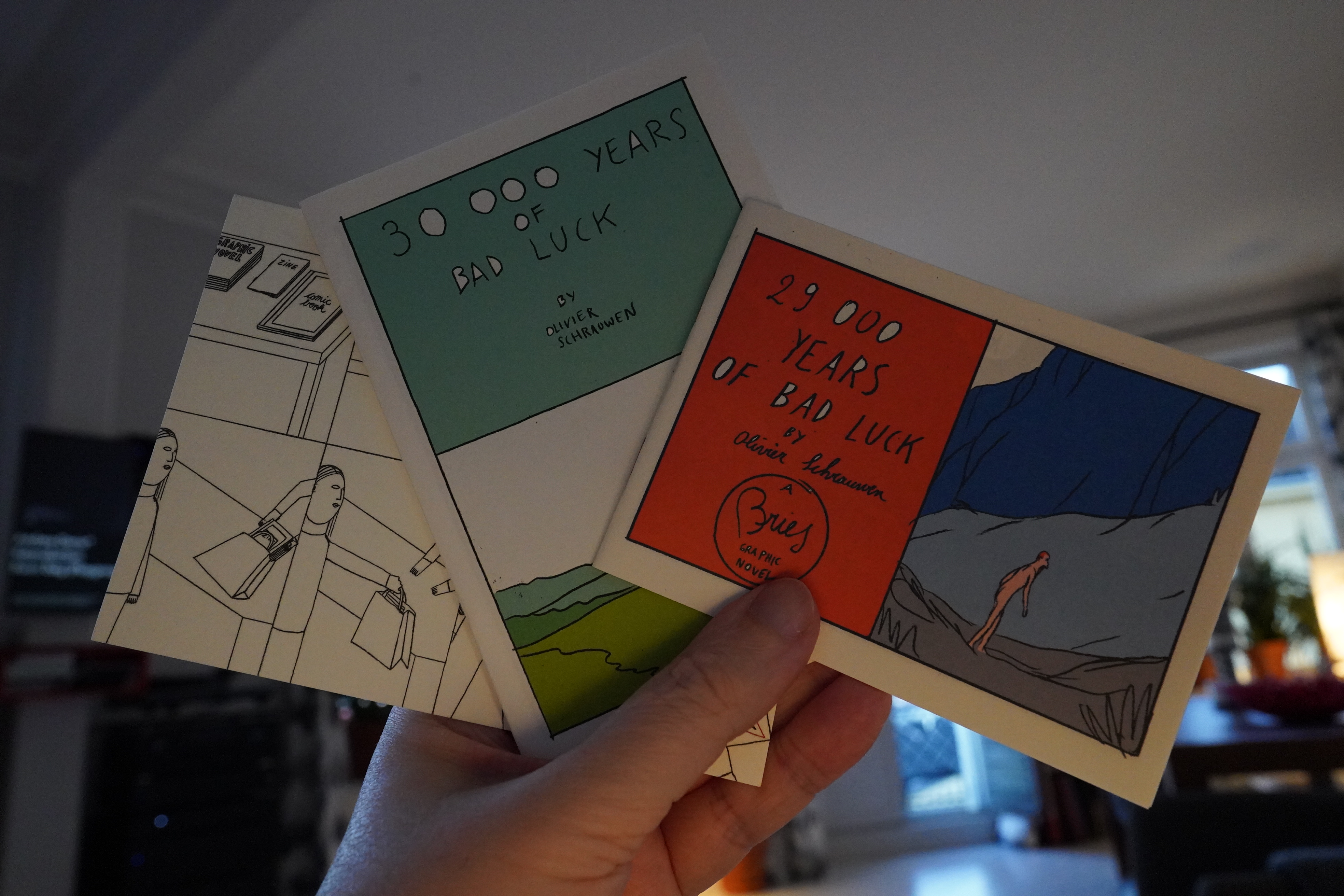
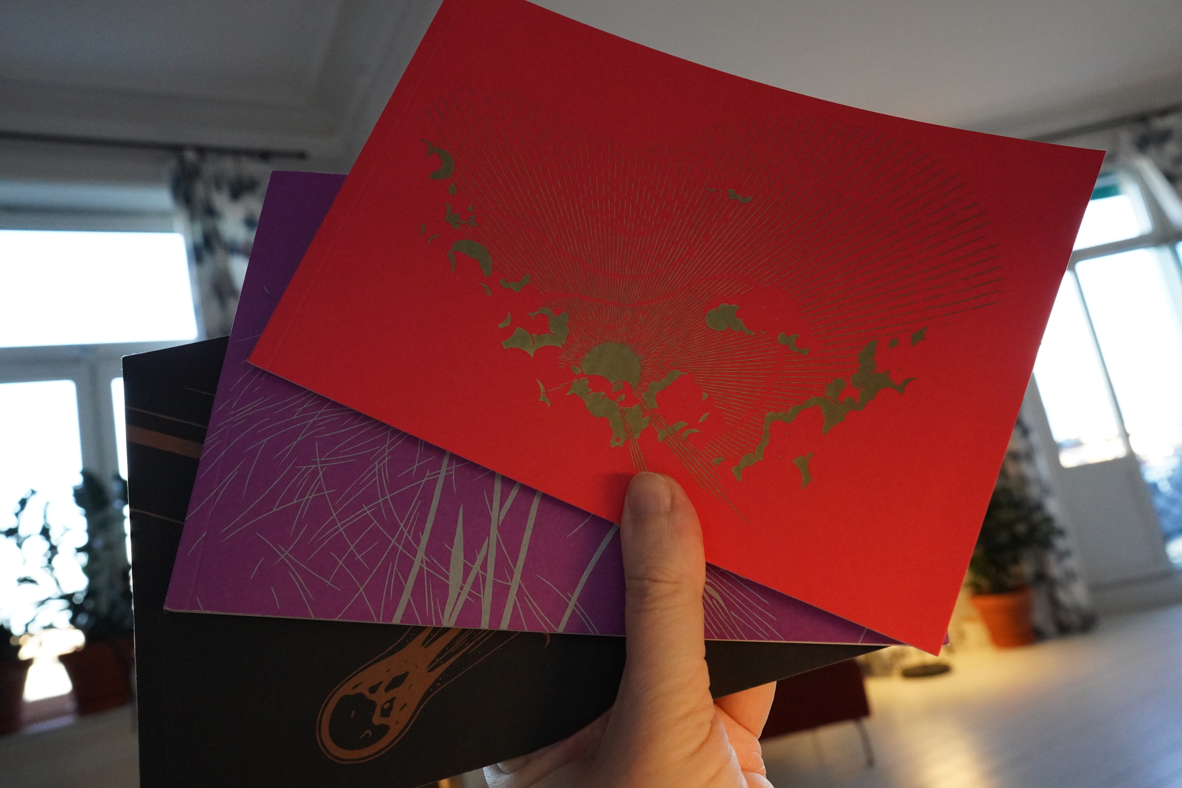
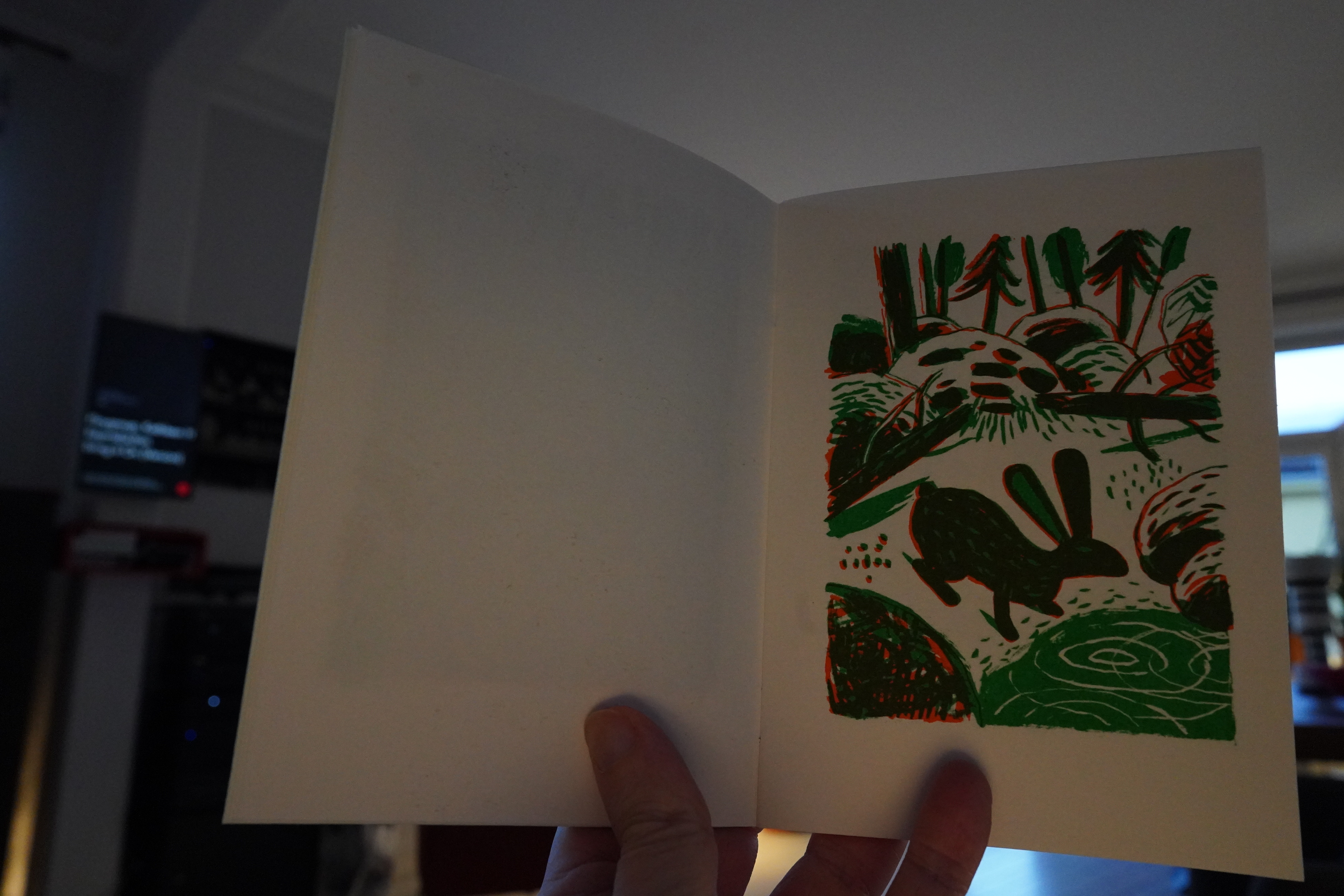
21:04: 29,000/30,000 Years of Bad Luck by Oliver Schrauwen (Bries)
I love how the first of these tiny pamphlets say “A Bries Graphic Novel”.
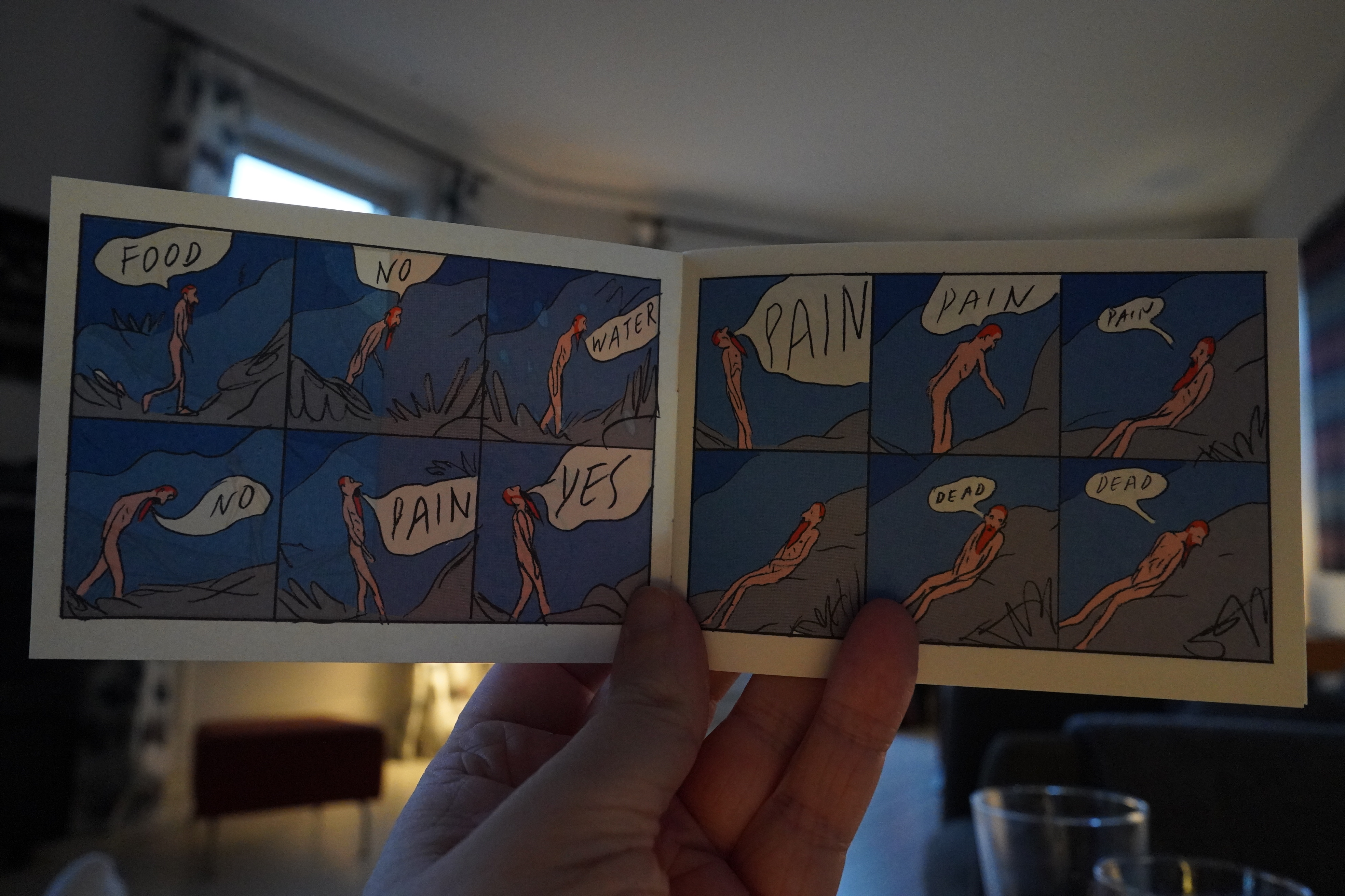
Schrauwen is difficult to pin down — you never know what his books are going to be like. Except pretty great?
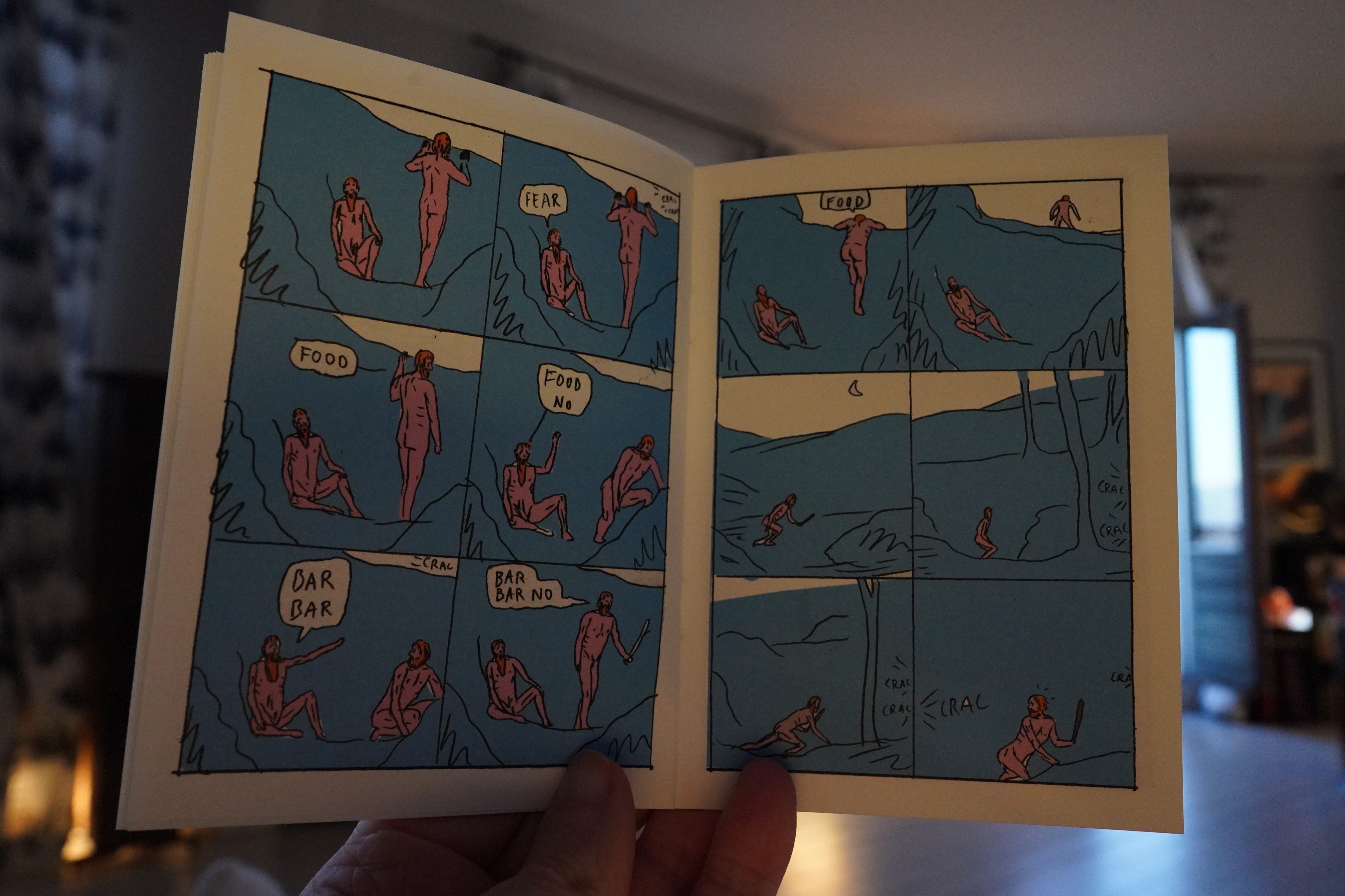
These are pretty great.
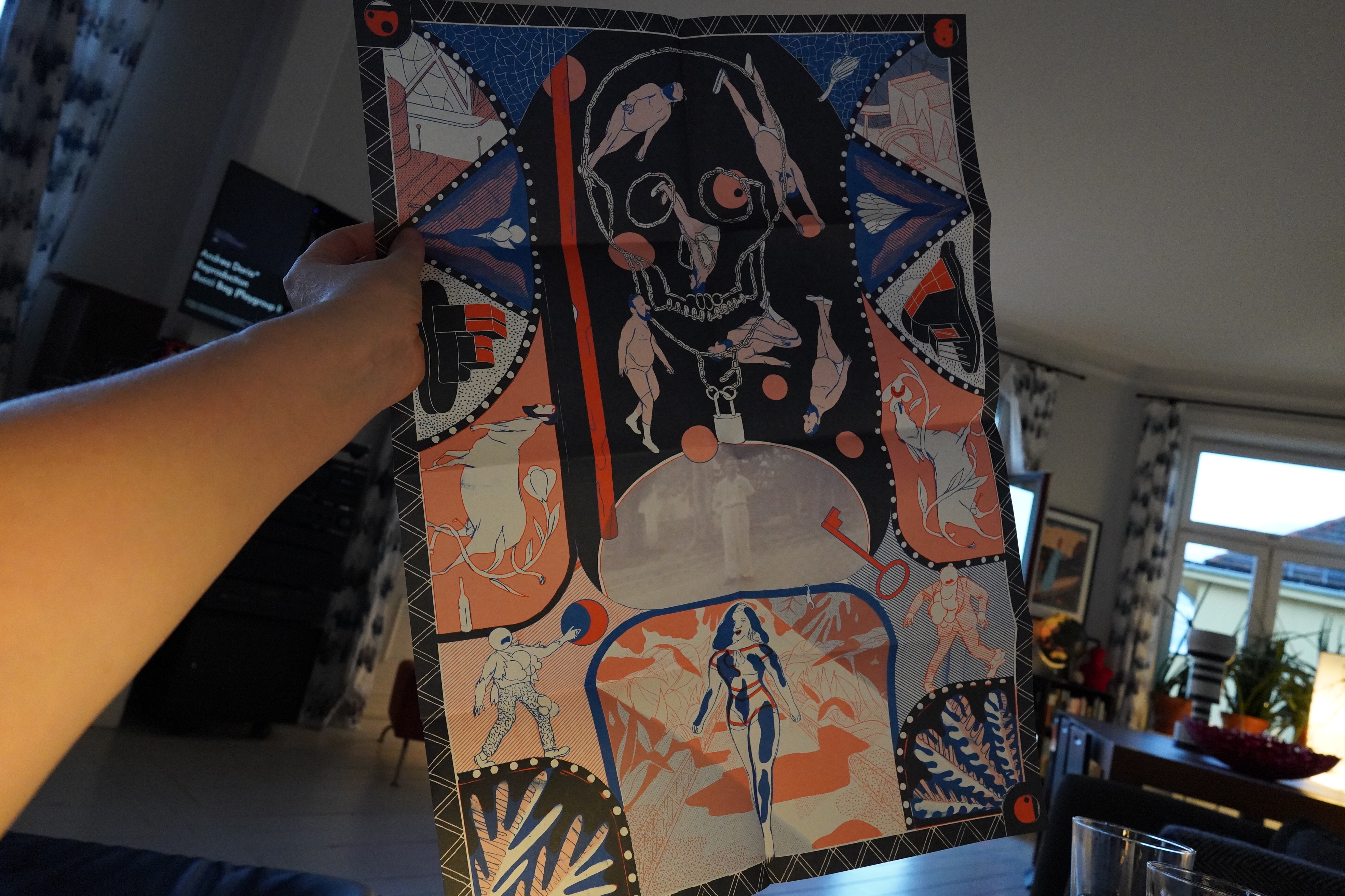
Oh, and Bries have included this poster in the package…
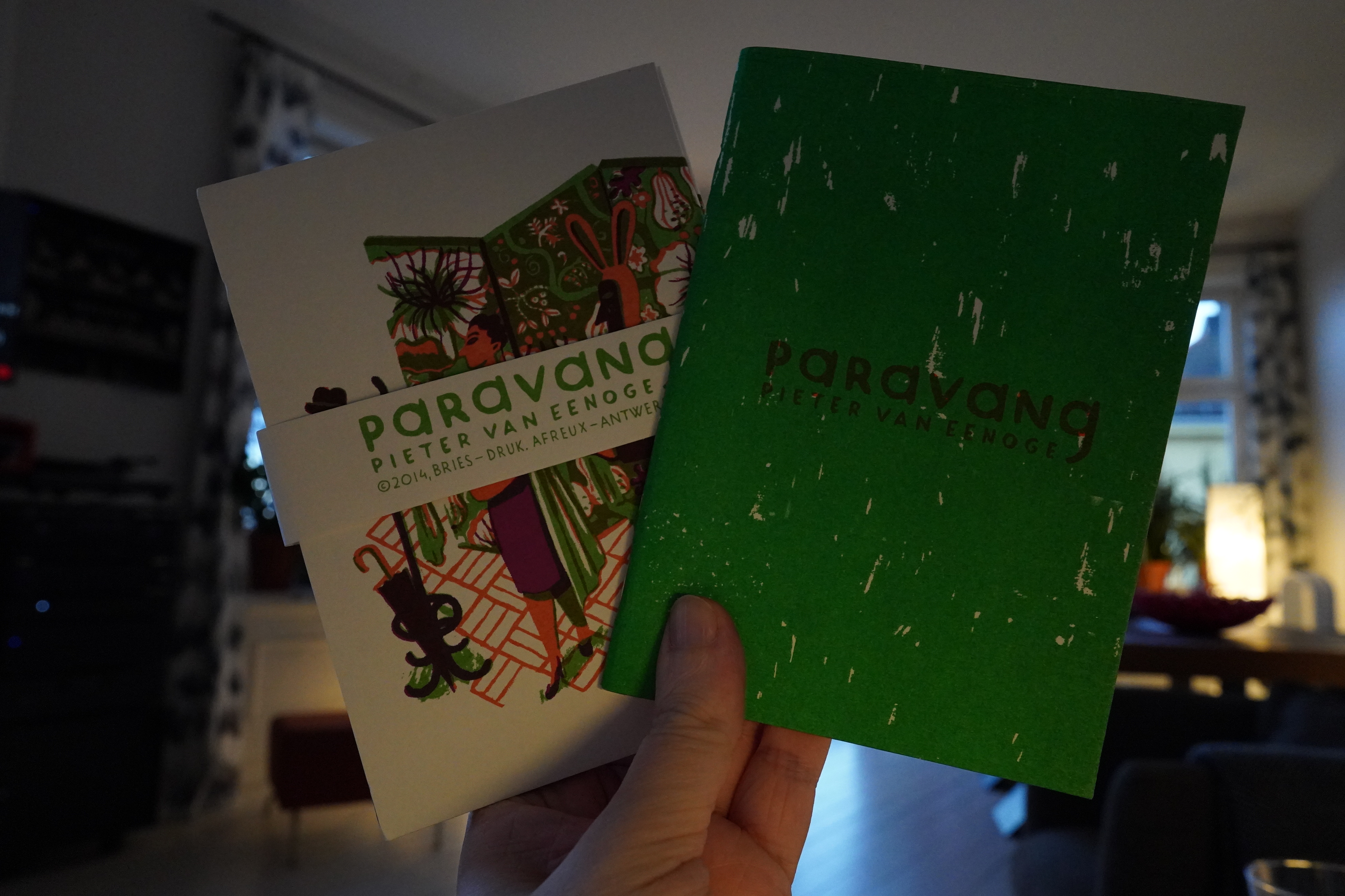
21:10: Paravang by Pieter van Eenoge (Bries)
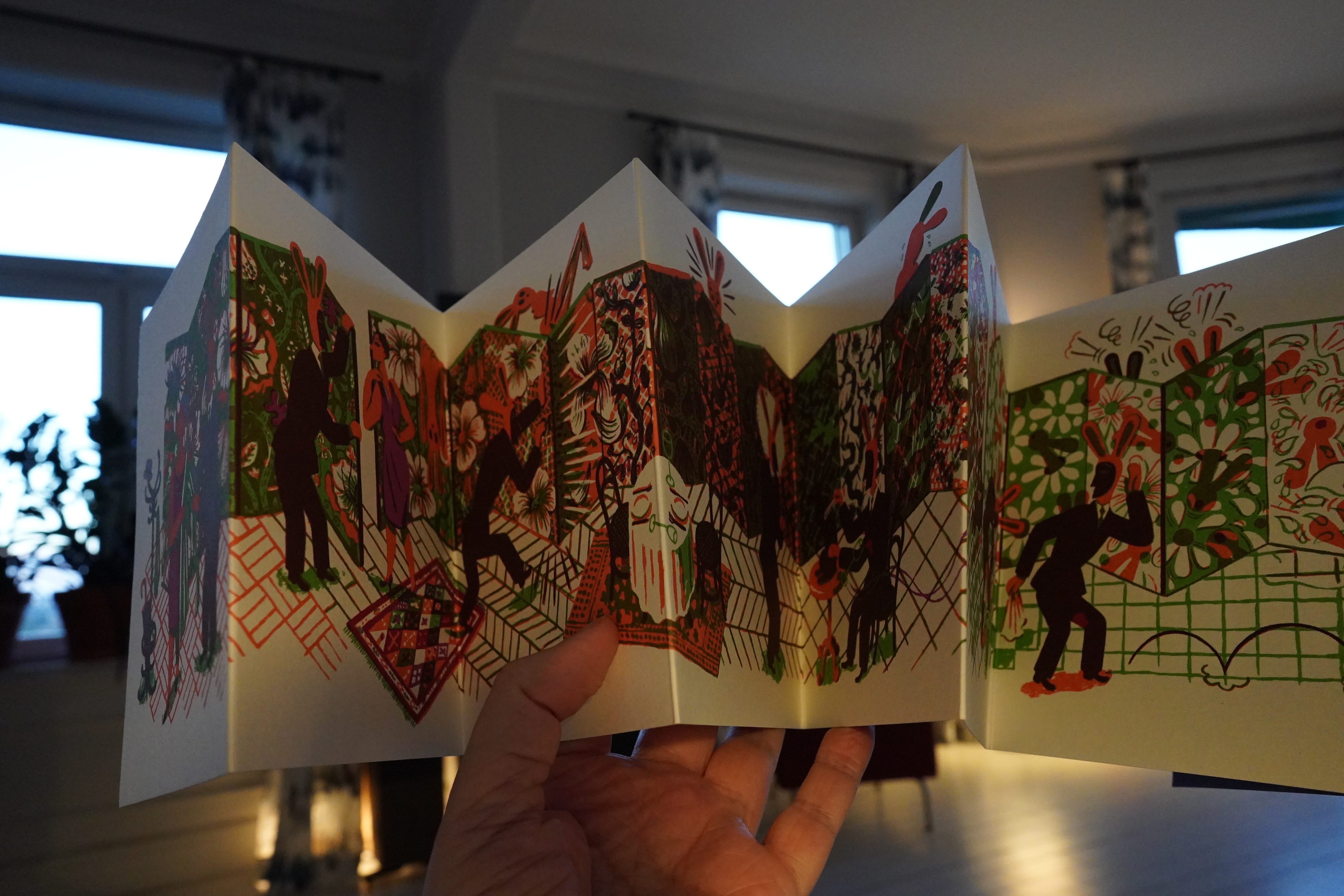
This is two objects — the first is an accordion book, and it uses the format admirably.
And the second is a booklet (possibly screen-printed)?
Excellent stuff.
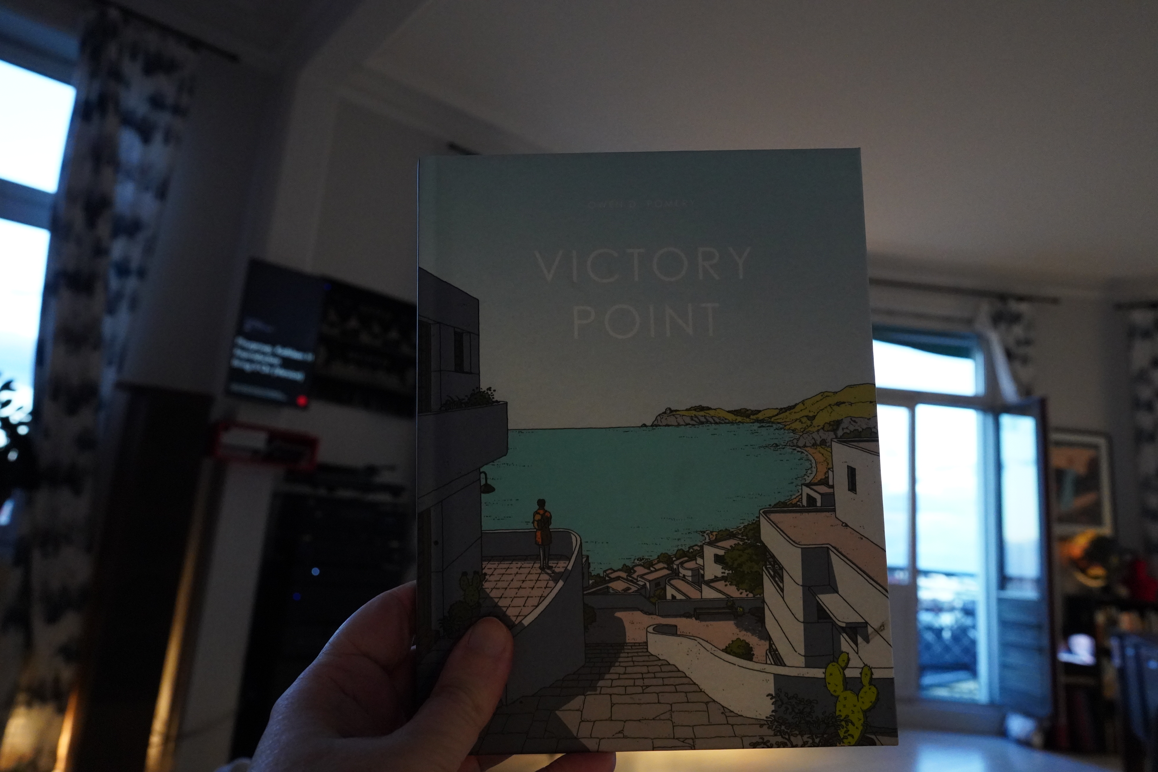
21:14: Victory Stuff by Owen D. Pomery (Avery Hill)
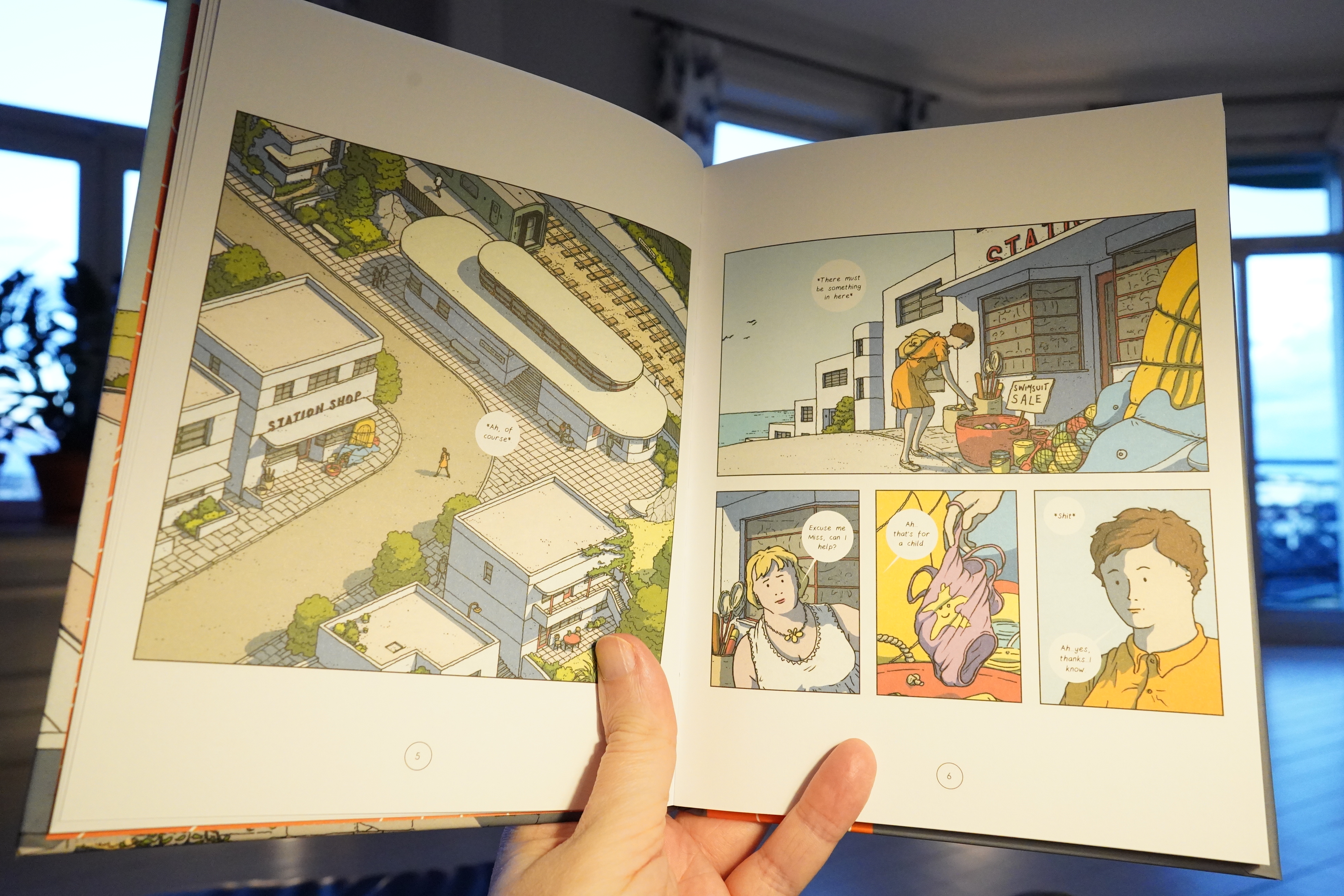
Huh. This artwork reminds me of something, but I’m not quite sure what. It’s got a strong 70s French comics vibe?
Oh, is it Moebius, perhaps? It’s got something Moebiusian going one, but I’m not quite sure that’s exactly it…
Anyway, the storytelling here is pretty odd — it sort of… rickety? It shouldn’t work, but it does. It’s got a very appealing stillness. It’s really good.
| David Sylvian: Sleepwalkers |  |
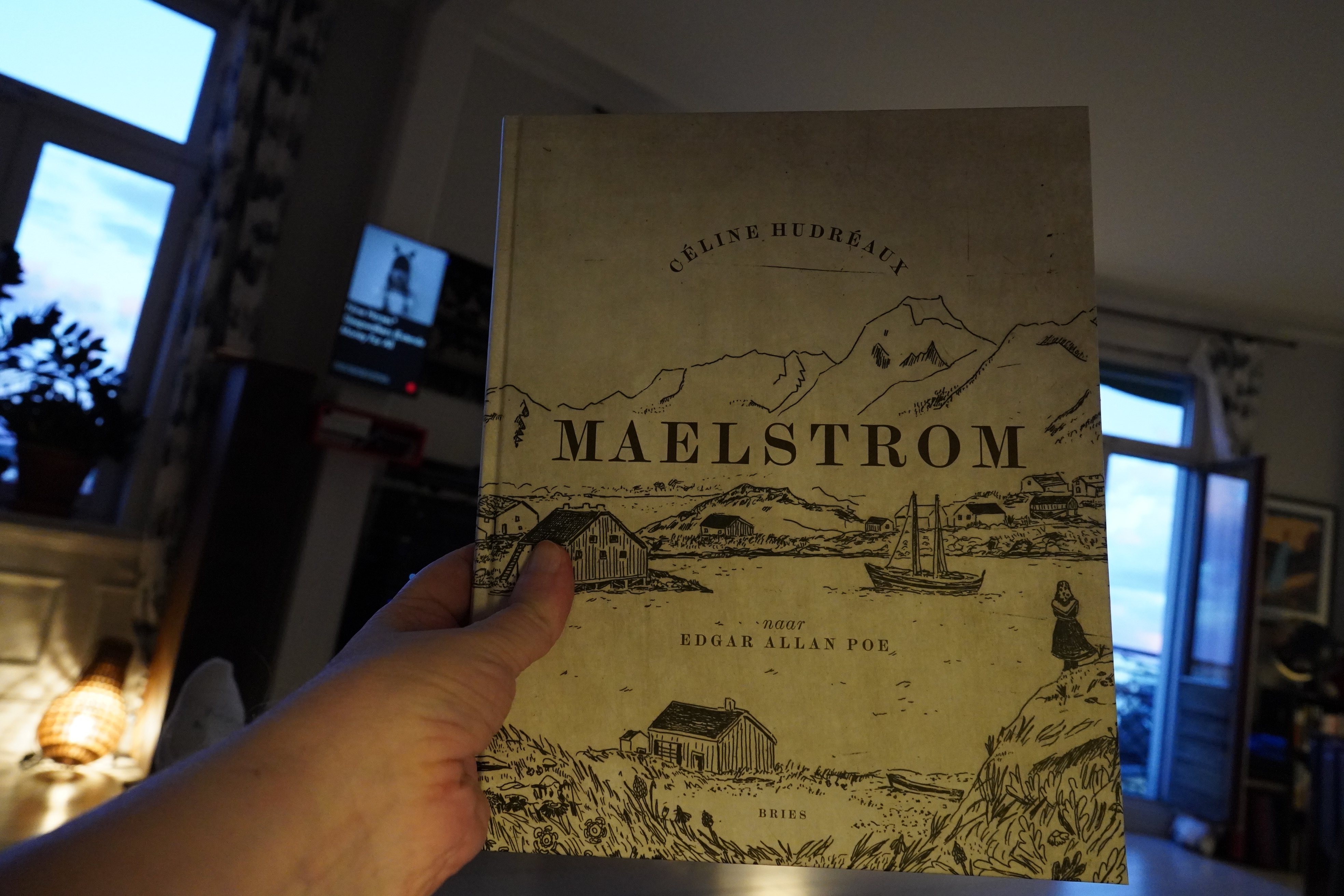
21:31: Maelstrom by Céline Hudréaux (Bries)
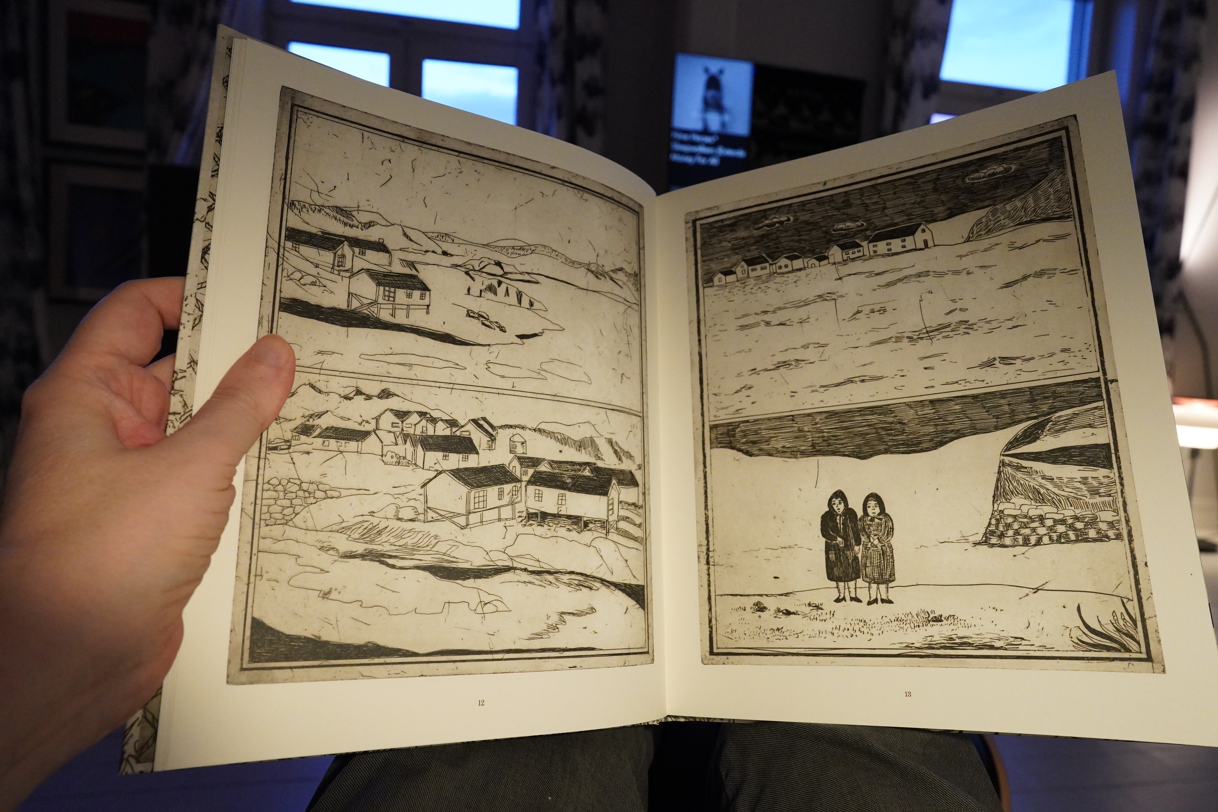
Hm… this is wordless… and I think it’s narrative?
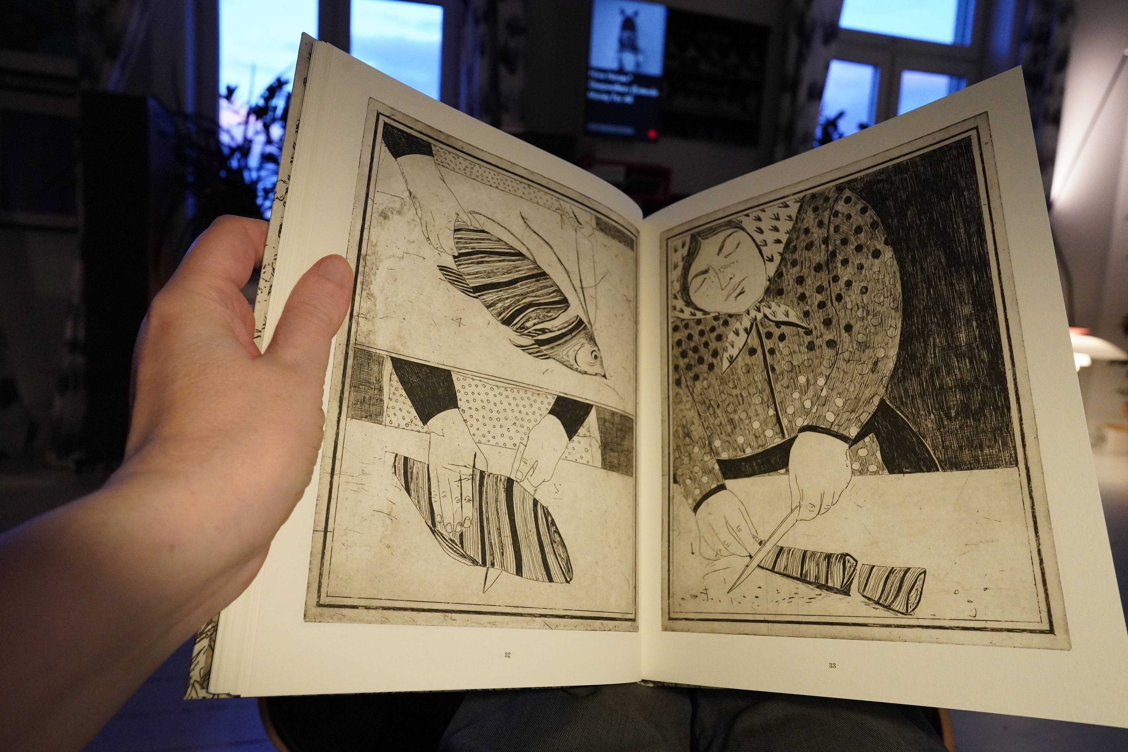
But I have absolutely no idea what’s going on.
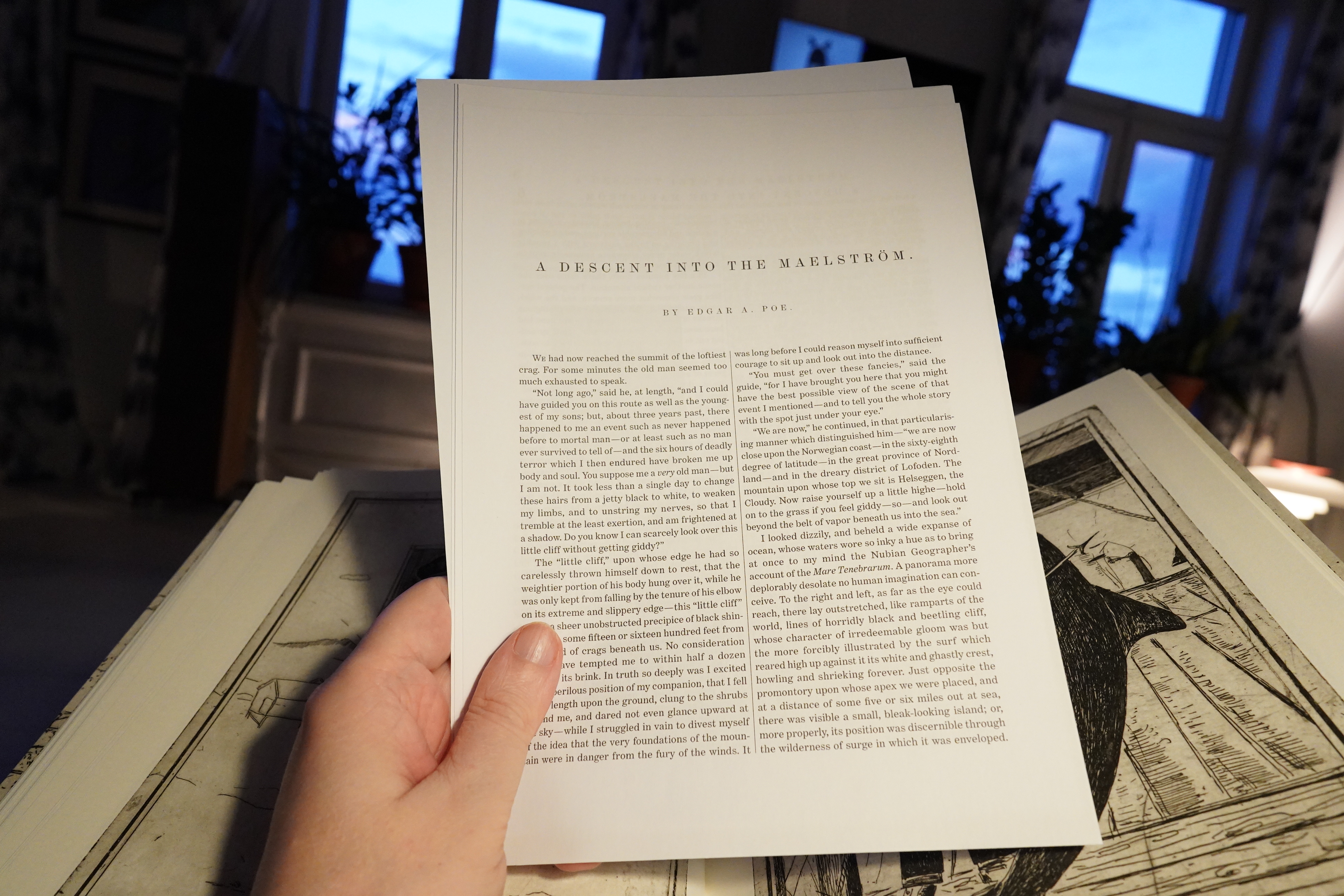
Oh! They include a short story by Poe in here, so I guess the book is an adaptation (or something) of that story? I’m not familiar with it, though, and I didn’t read it now, but I think I’ll read the story and then re-read the book. (But not now.)
| David Sylvian: Sleepwalkers (Extended) |  |
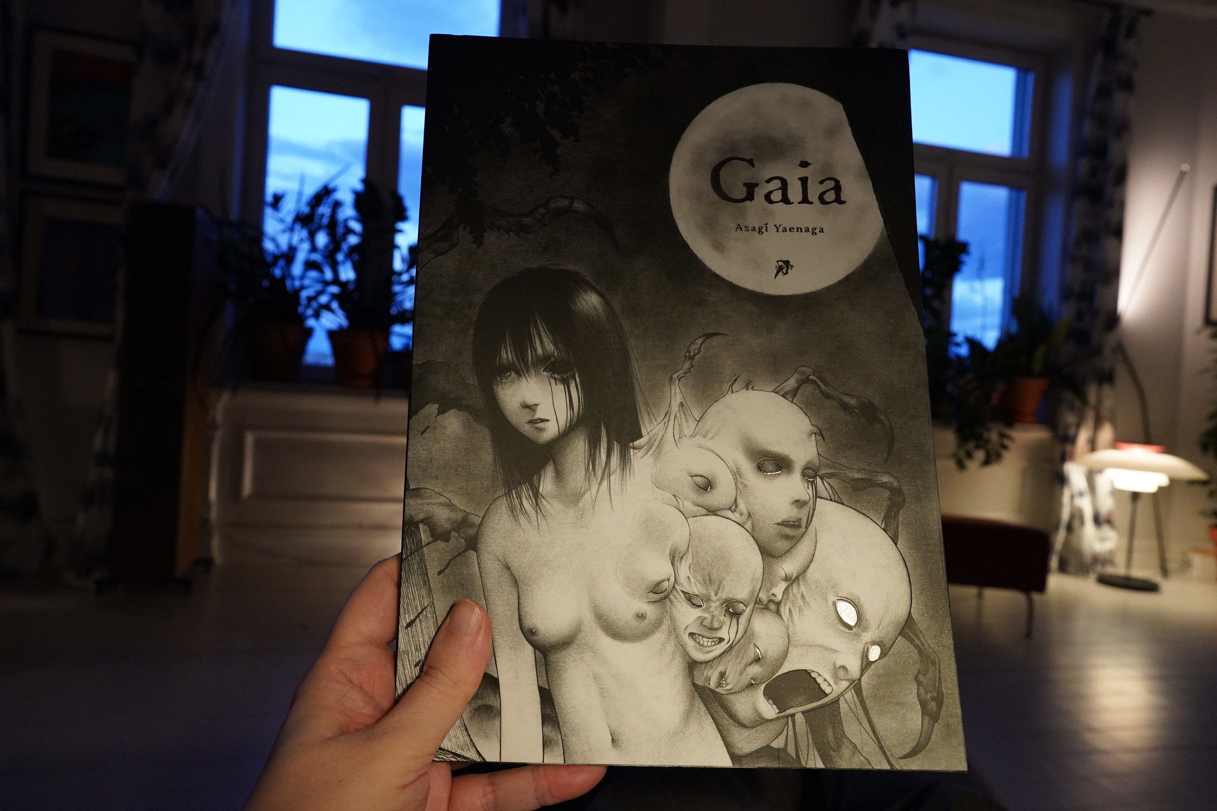
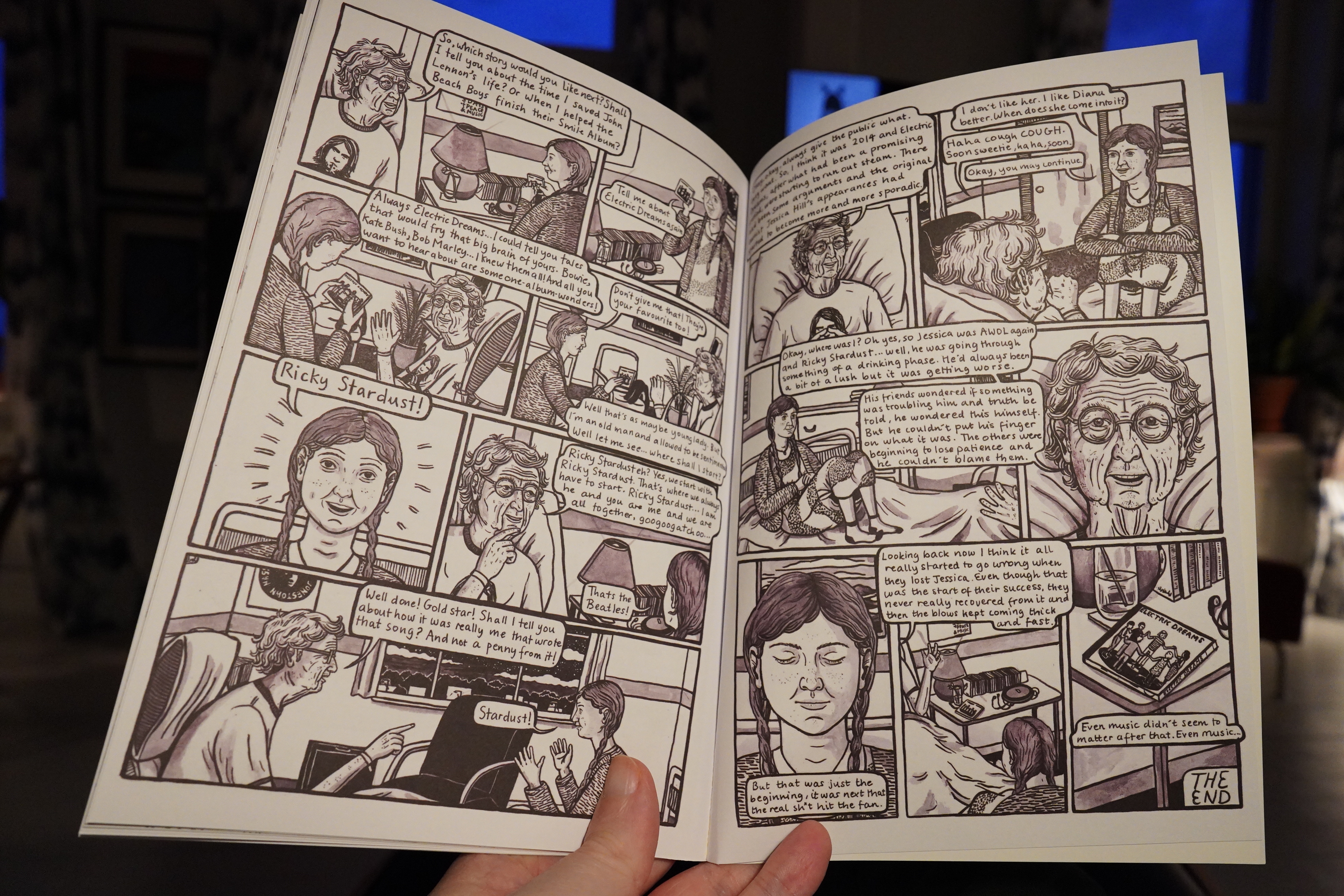
21:39: Gaia by Asegi Yaenaga (Hollow Press)
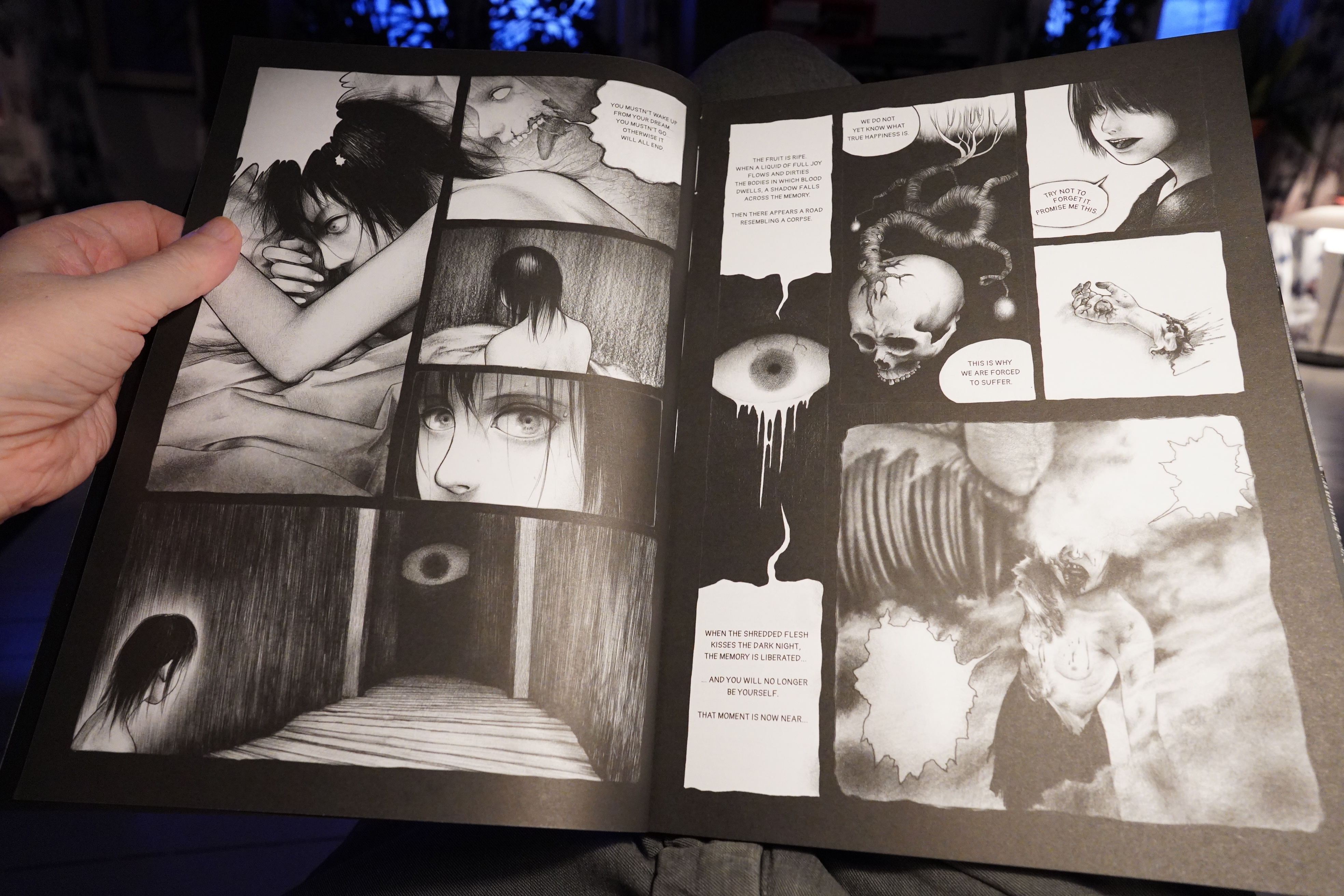
Well… the artwork’s nice, if in a generic Japanese horror way.
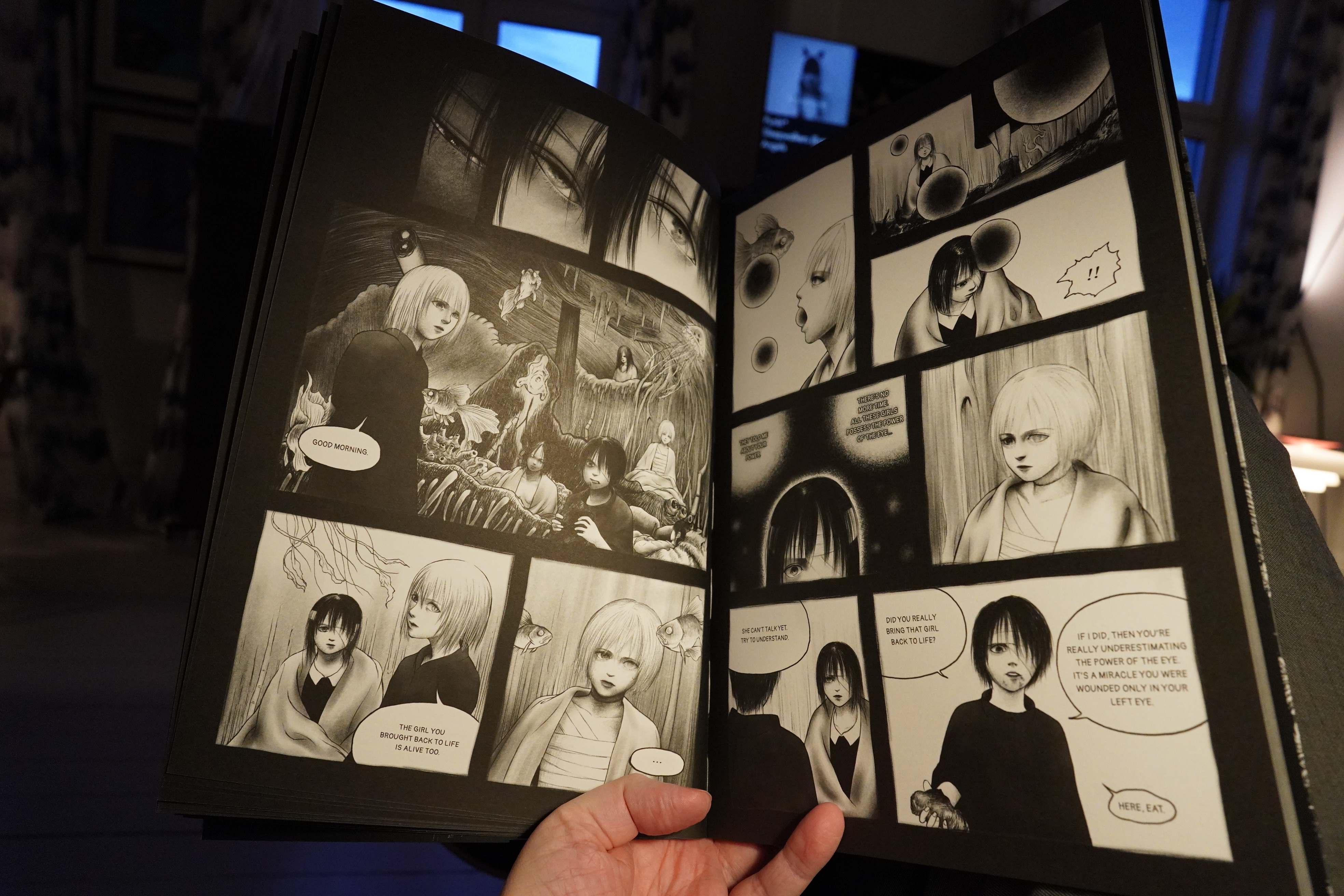
The dialogue is beyond turgid, and I lost interest quickly.

21:52: Metroland #1-4 by Ricky Miller & Julia Scheele (Avery Hill)

Moody!
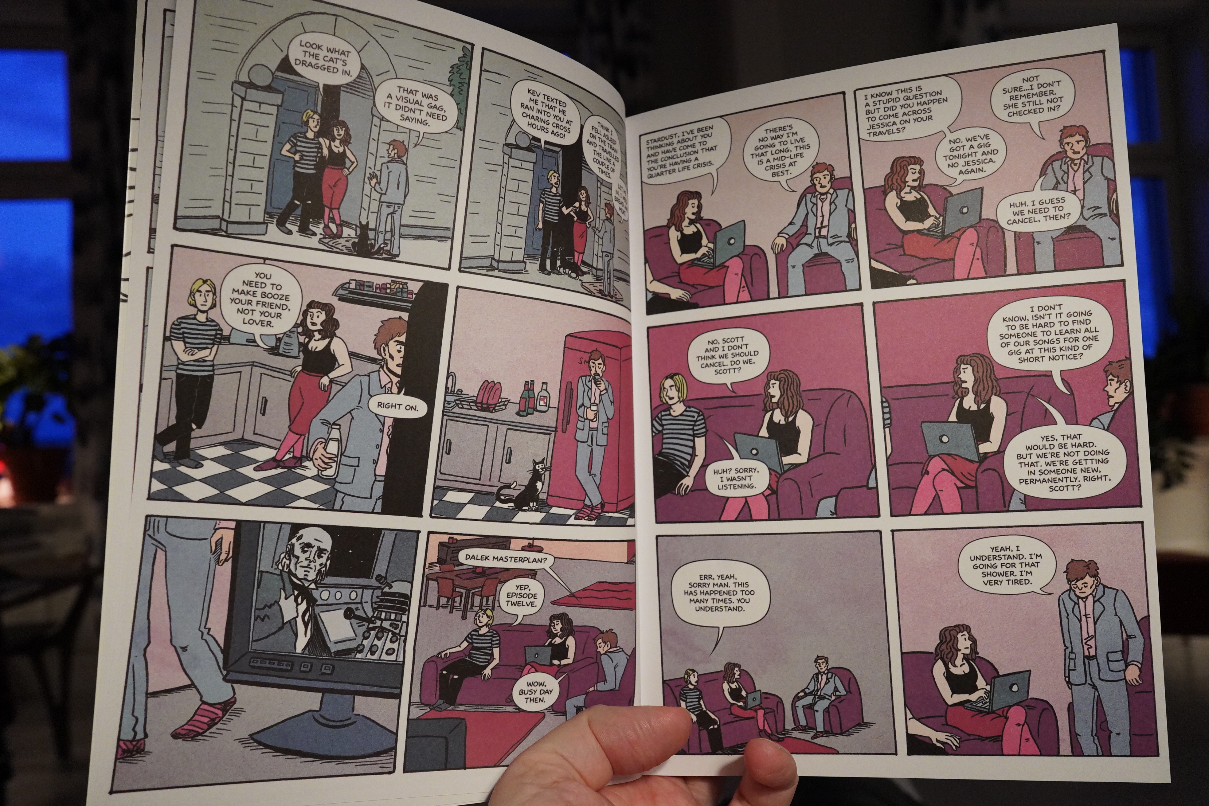
This is quite unexpected — it starts off basically as yet another comic book about a hapless band…
… but there’s this meta quality to it.
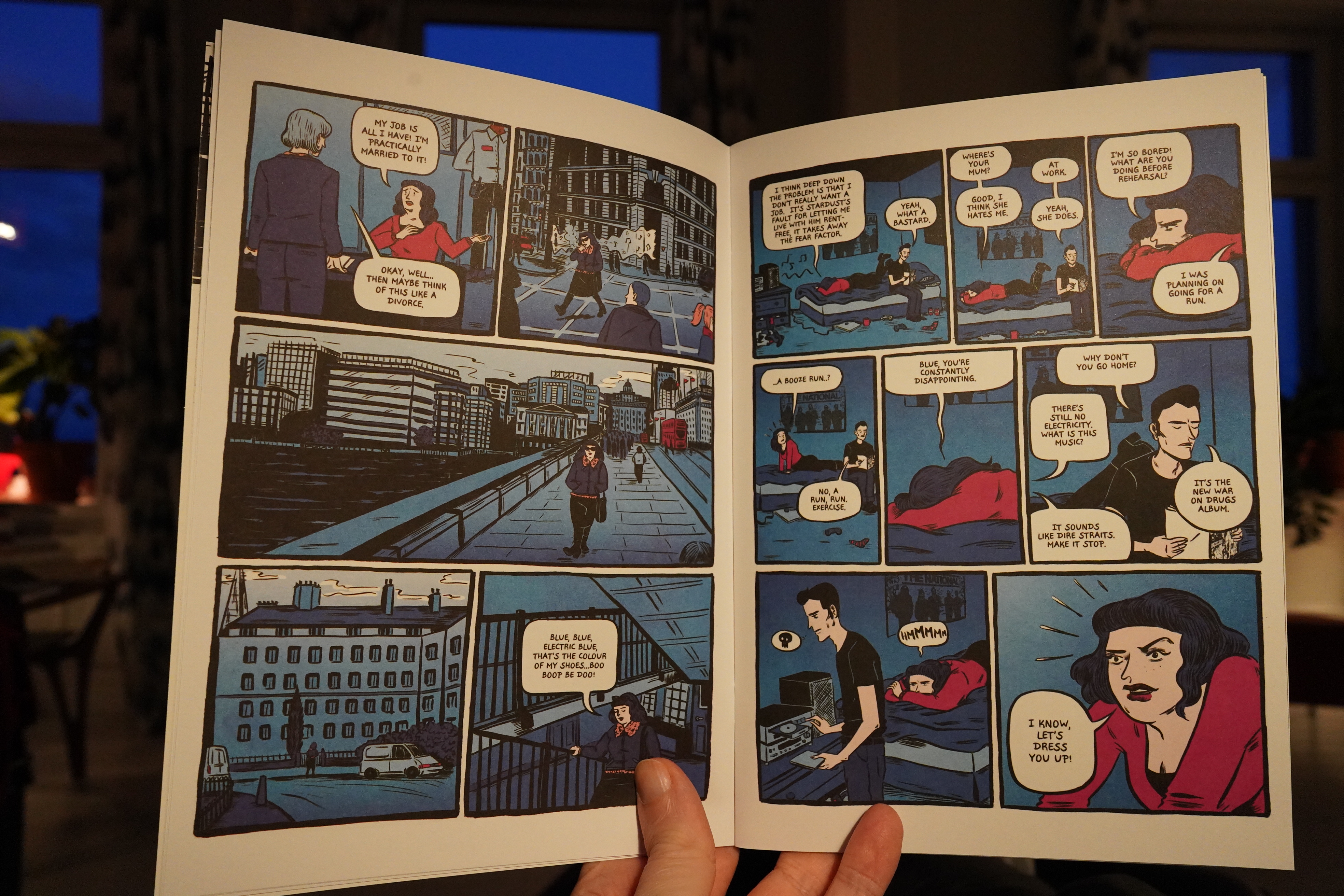
And there’s been some signs that things are… going on… but its get more and more explicit, and then suddenly we’re in a time travel/alternative history thing. It’s fun!
The artwork develops a lot over the issues — it’s very clear and attractive, but becomes more its own thing. (And lovely Avery Hill logo reenactment.)
Cosmic!
Anyway, really fun book.
| Zola Jesus: Arkhon |  |
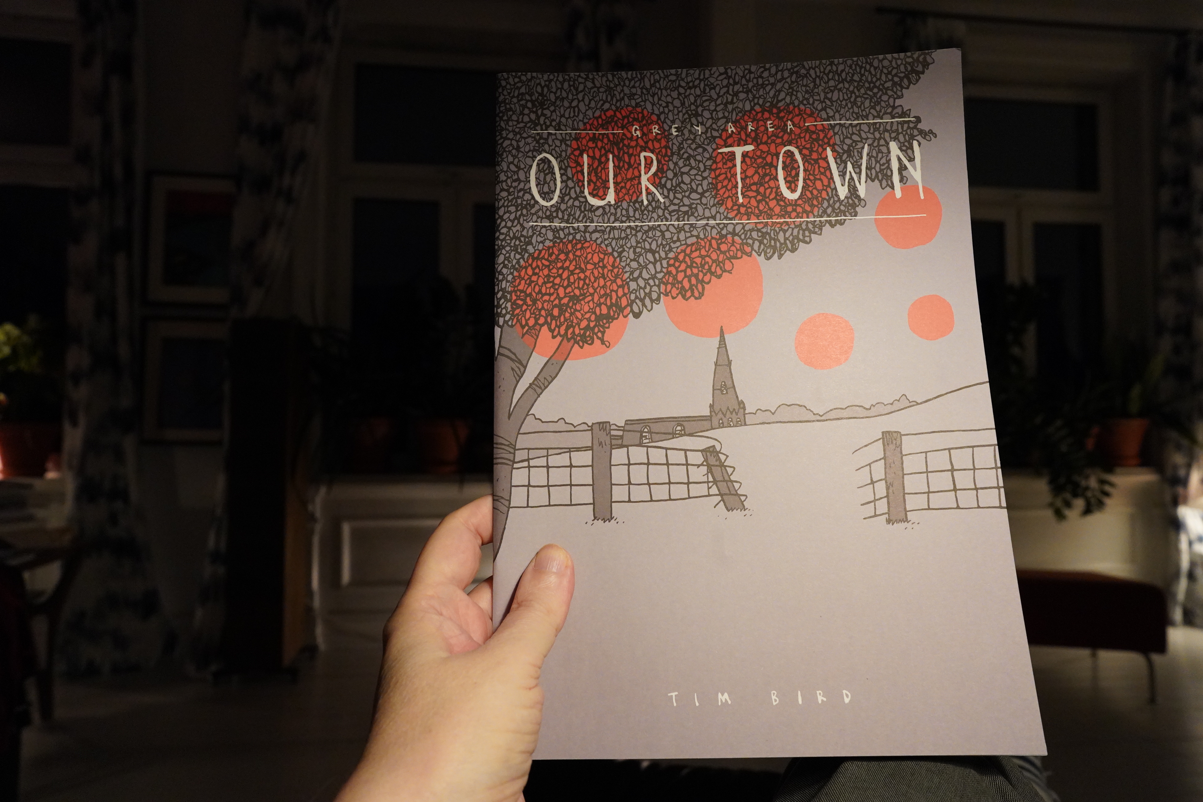
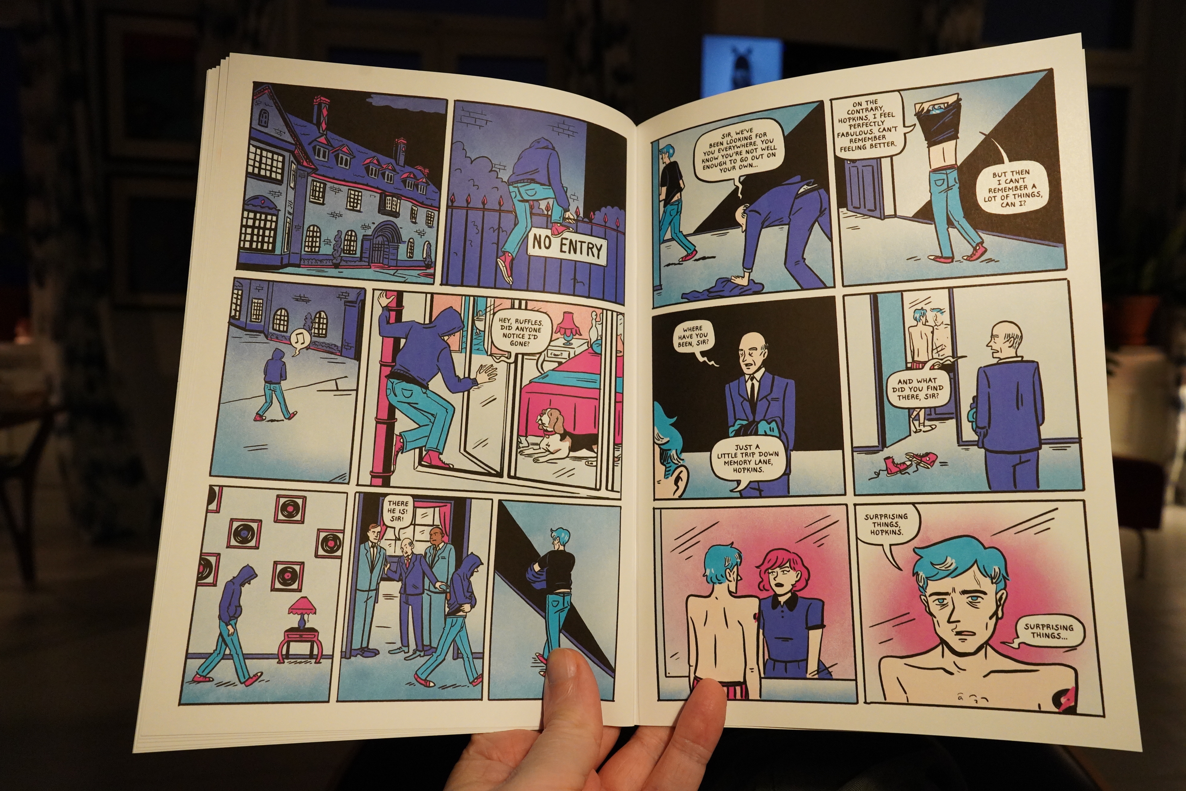
22:59: Our Town by Tim Bird (Avery Hill)
This is cool. It’s about remembrance and stuff. Got a nice flow.
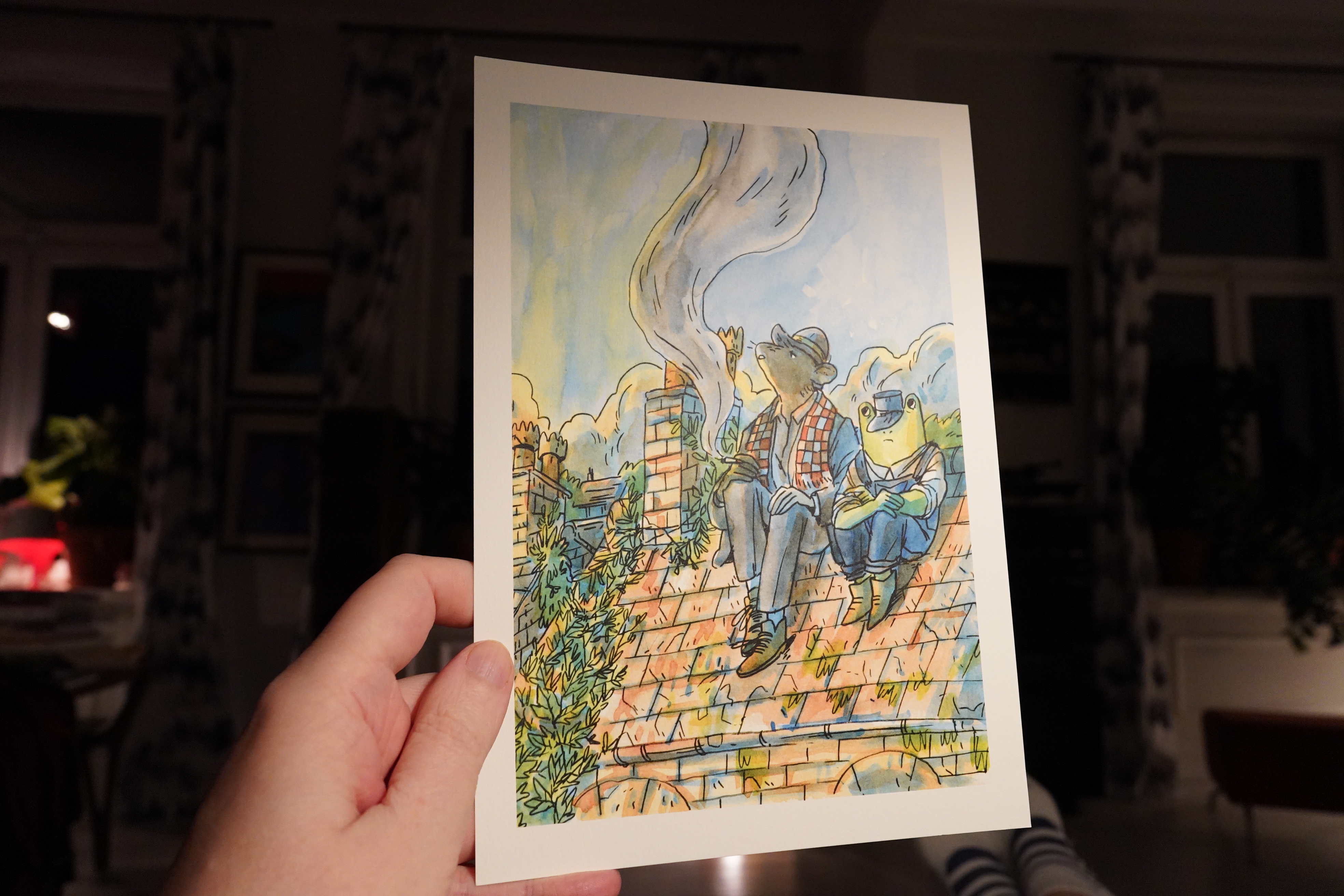
Oh, and I just found this Ismyre print in between the books. Thanks, Avery Hill.
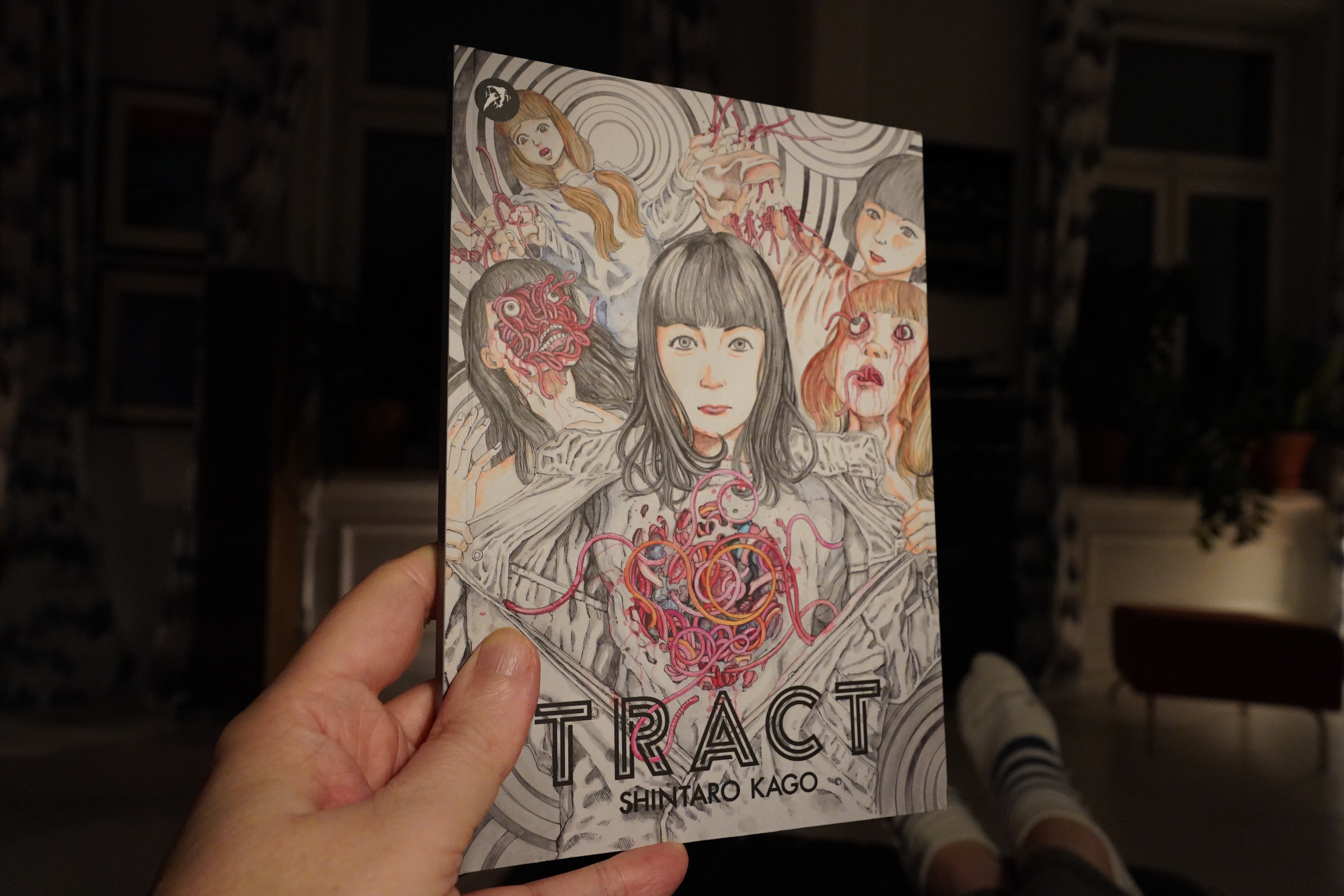
23:03: Tract by Shintaro Kago (Hollow Press)

I’m getting a bit fed up with these Japanese Hollow Press books — they’re so one note. Drawn in a slick, pretty style, but with grotesque violence.
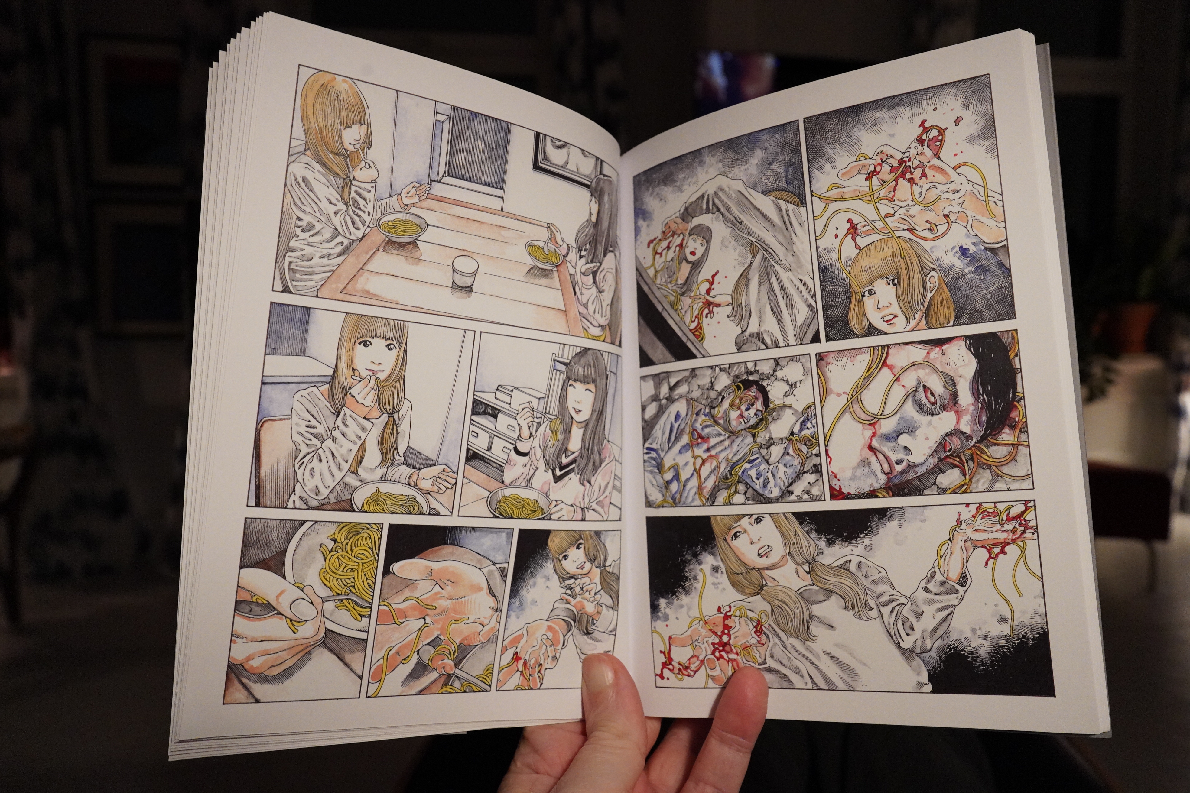
This book seems even more pointless than most of them — it’s just one story after another of bloody spaghetti-like threads erupting from all orifices. (And elsewhere.)
Hollow Press has published some really good stuff in the past, but this batch is pretty boring.
| Steve Reich: Reich-Richter |  |
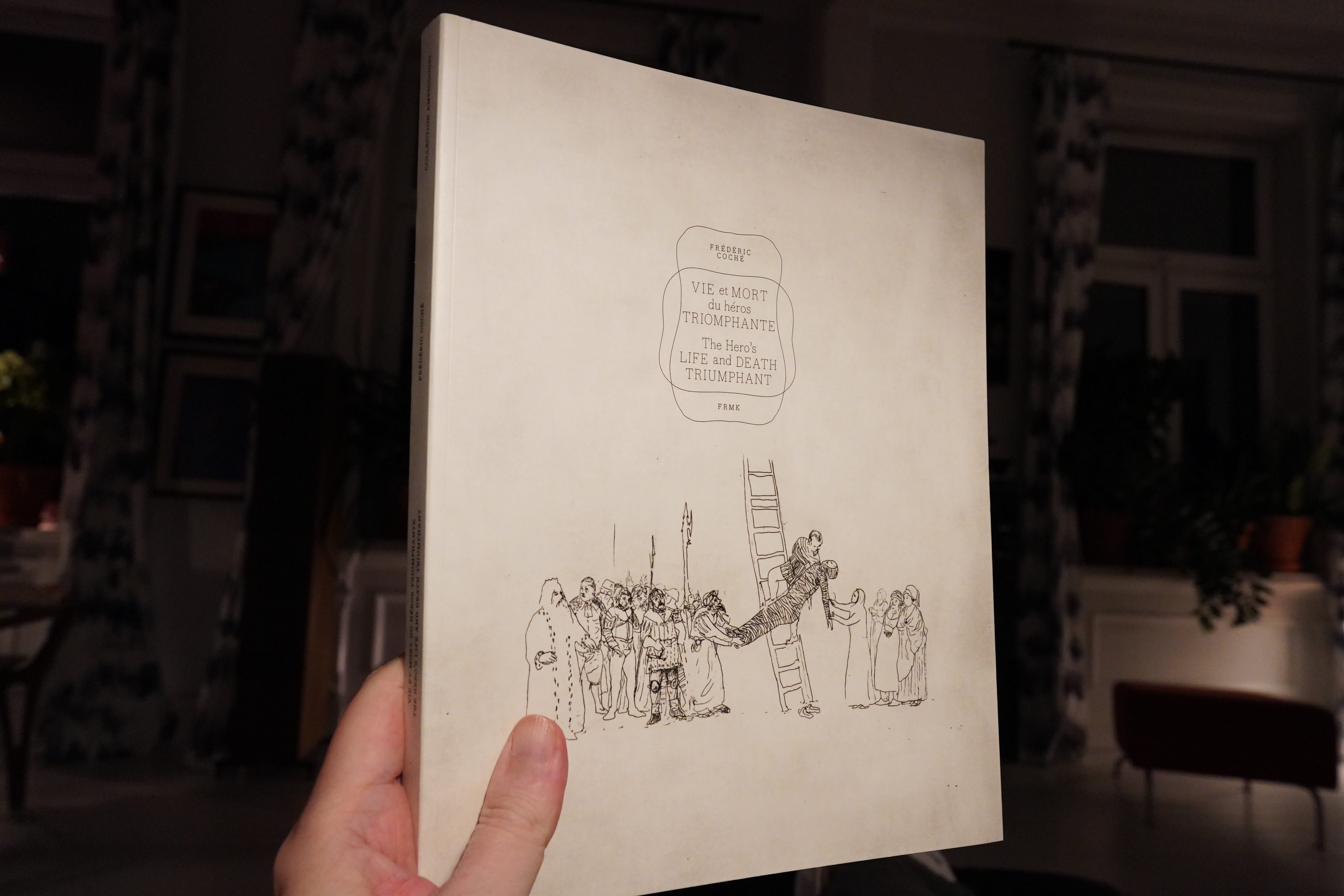
23:10: The Hero’s Life and Death Triumphant by Frédéric Coché (Fremok)
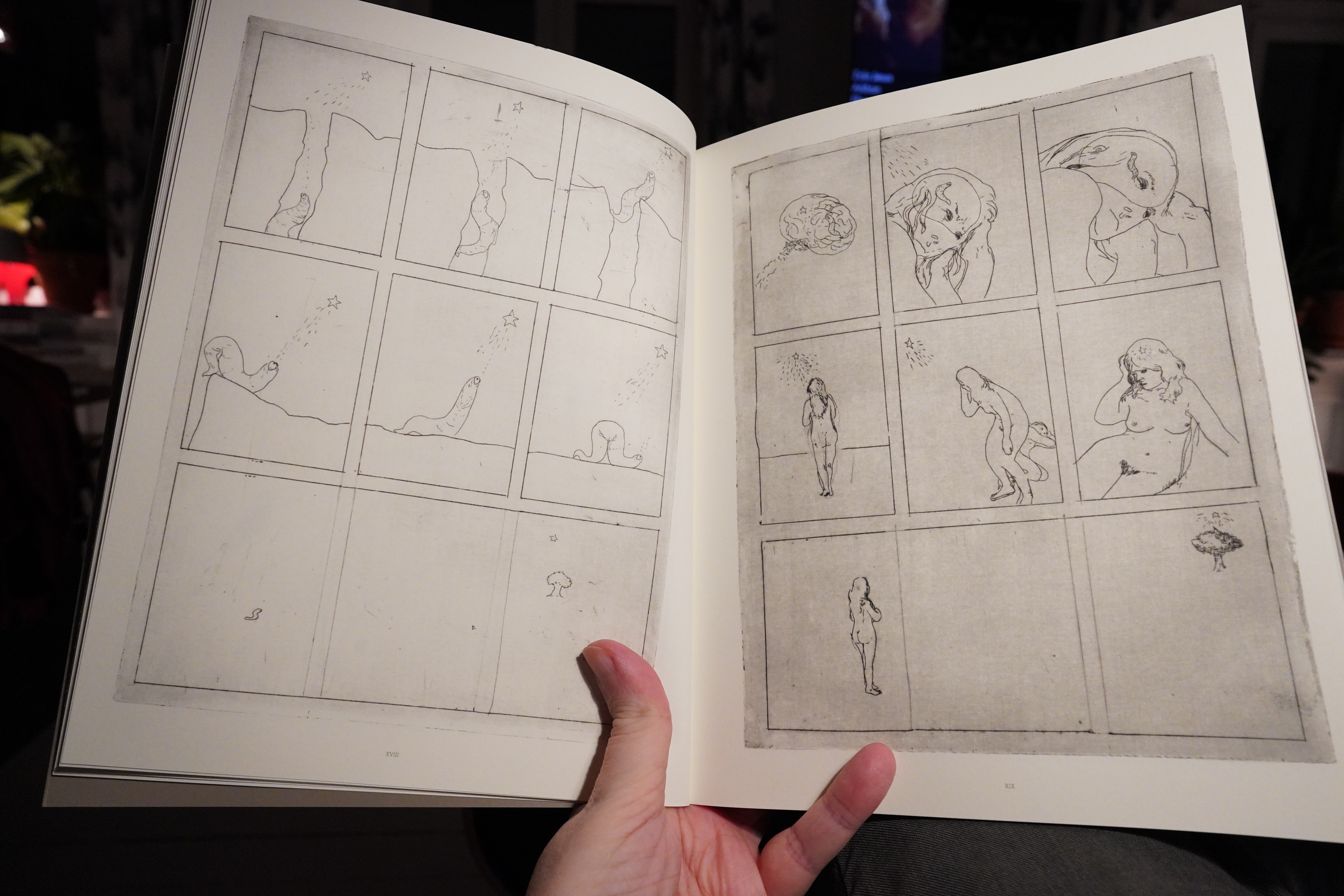
This feels like some long-lost artefact.
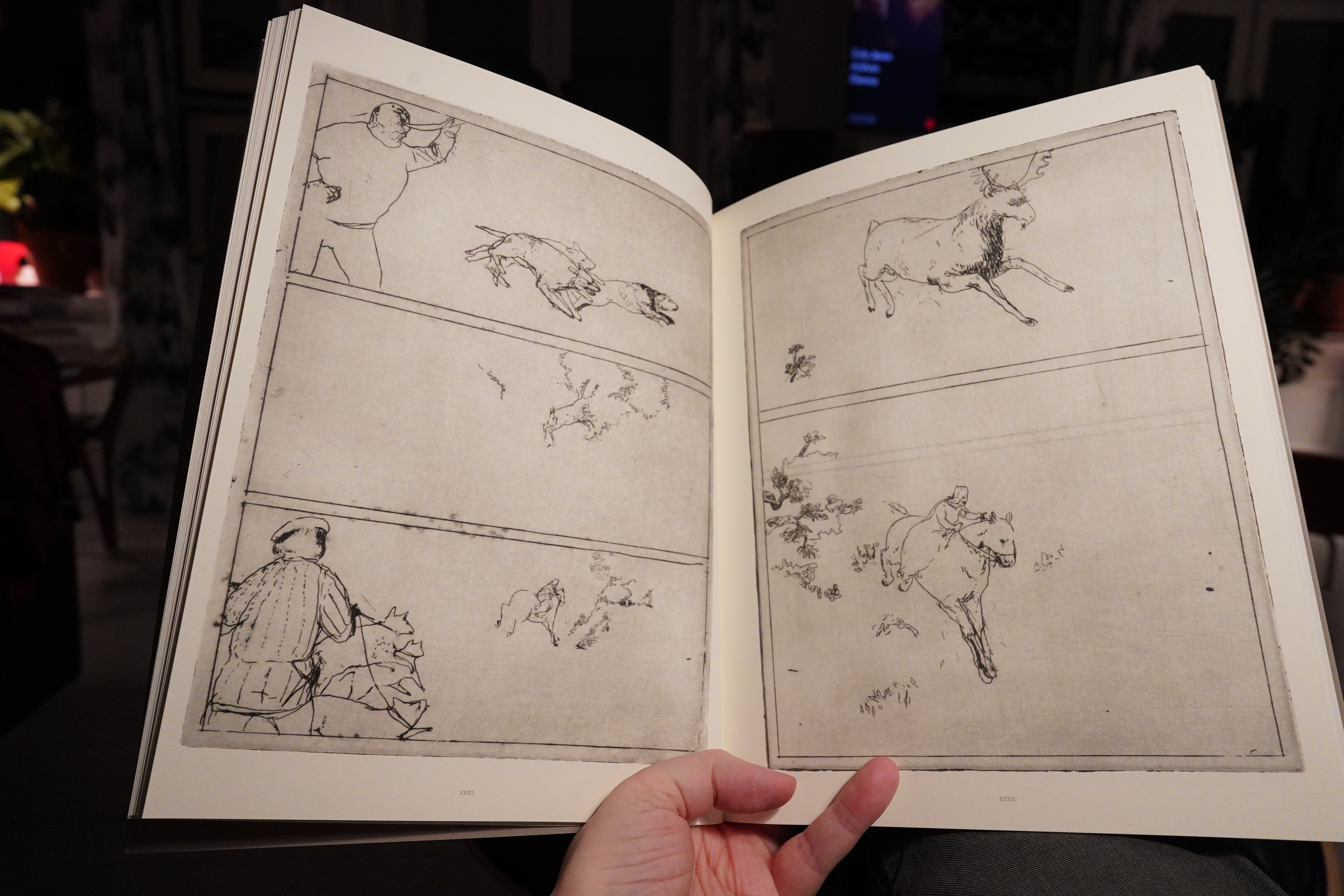
But probably isn’t. It’s a narrative work, but I’m not quite sure what it’s all about in the end. That doesn’t really matter; it’s really interesting.
| COH: WYGG |  |
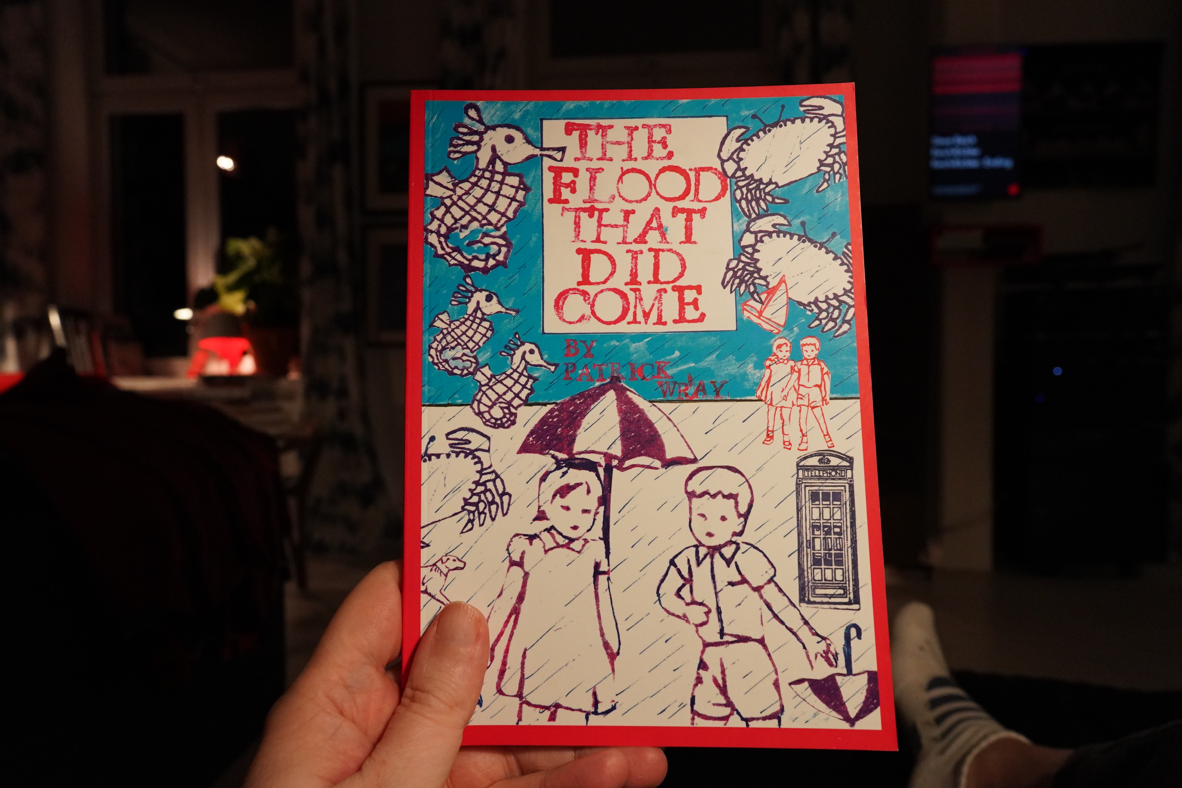
23:56: The Flood That Did Come by Patrick Wray (Avery Hill)
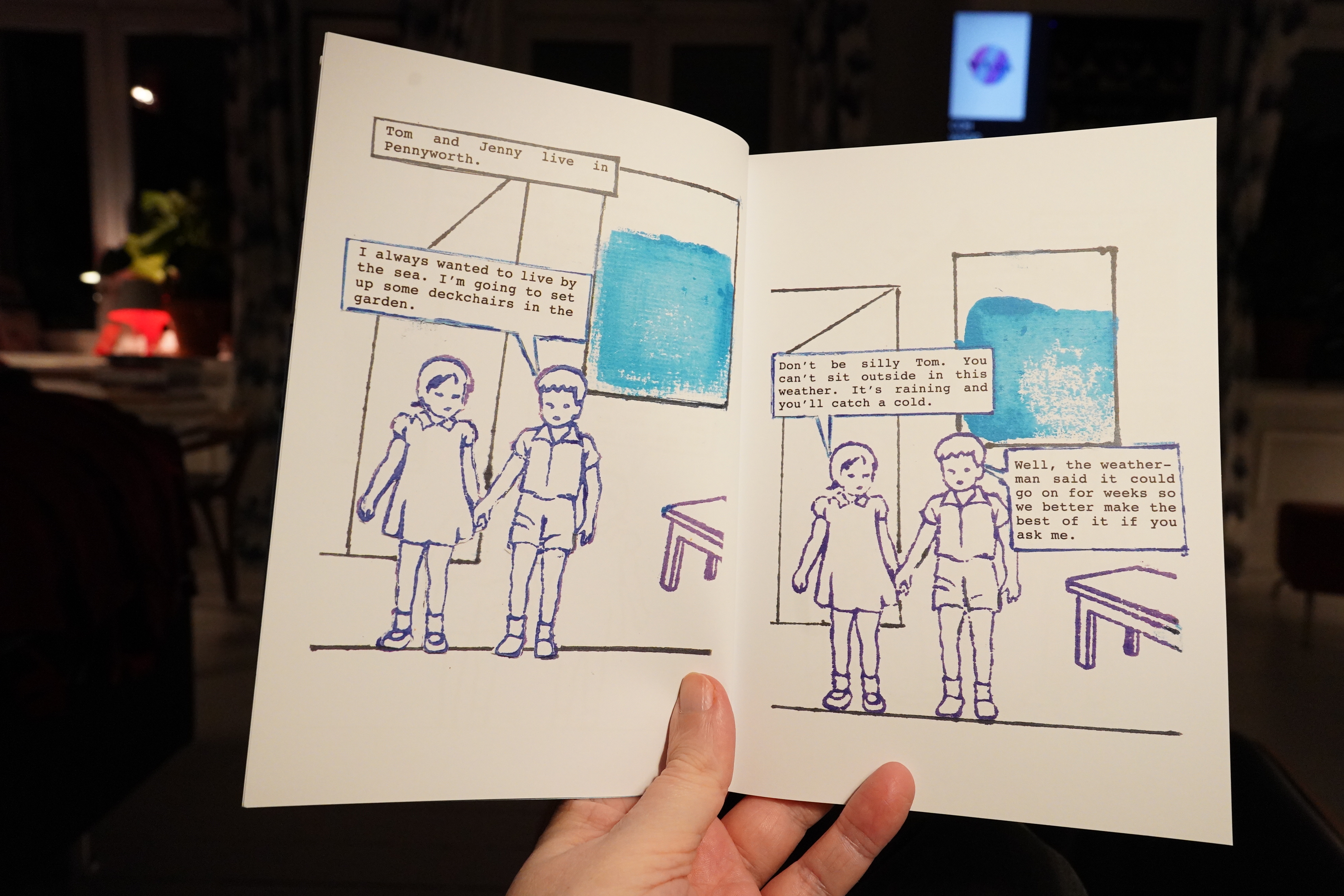
Very strange. I mean, not the clip/stencil art, but the storyline.
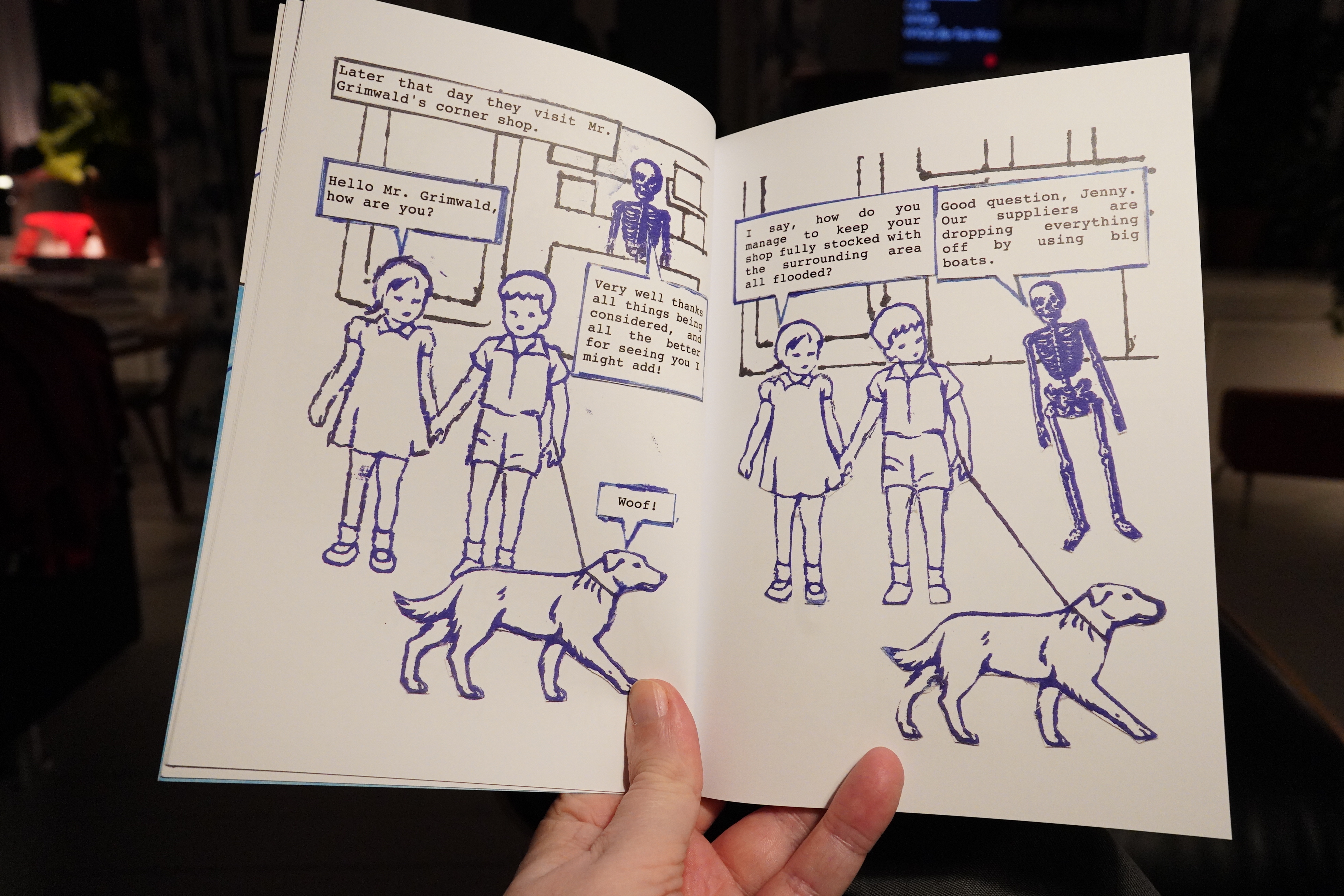
It reads much like a askew children’s story. It’s amusing, but it’s not hilarious? Perhaps there’s references I’m missing; I don’t know.
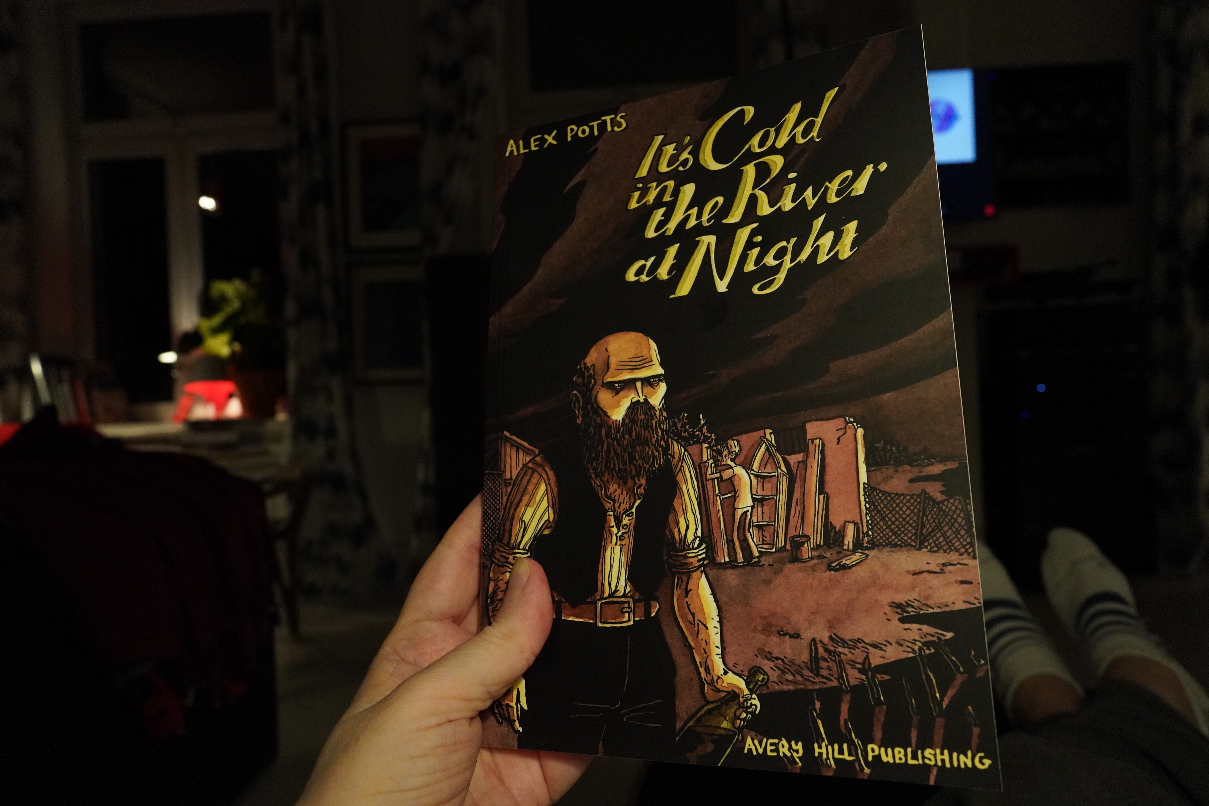
00:17: It’s Cold in the River at Night by Alex Potts (Avery Hill)
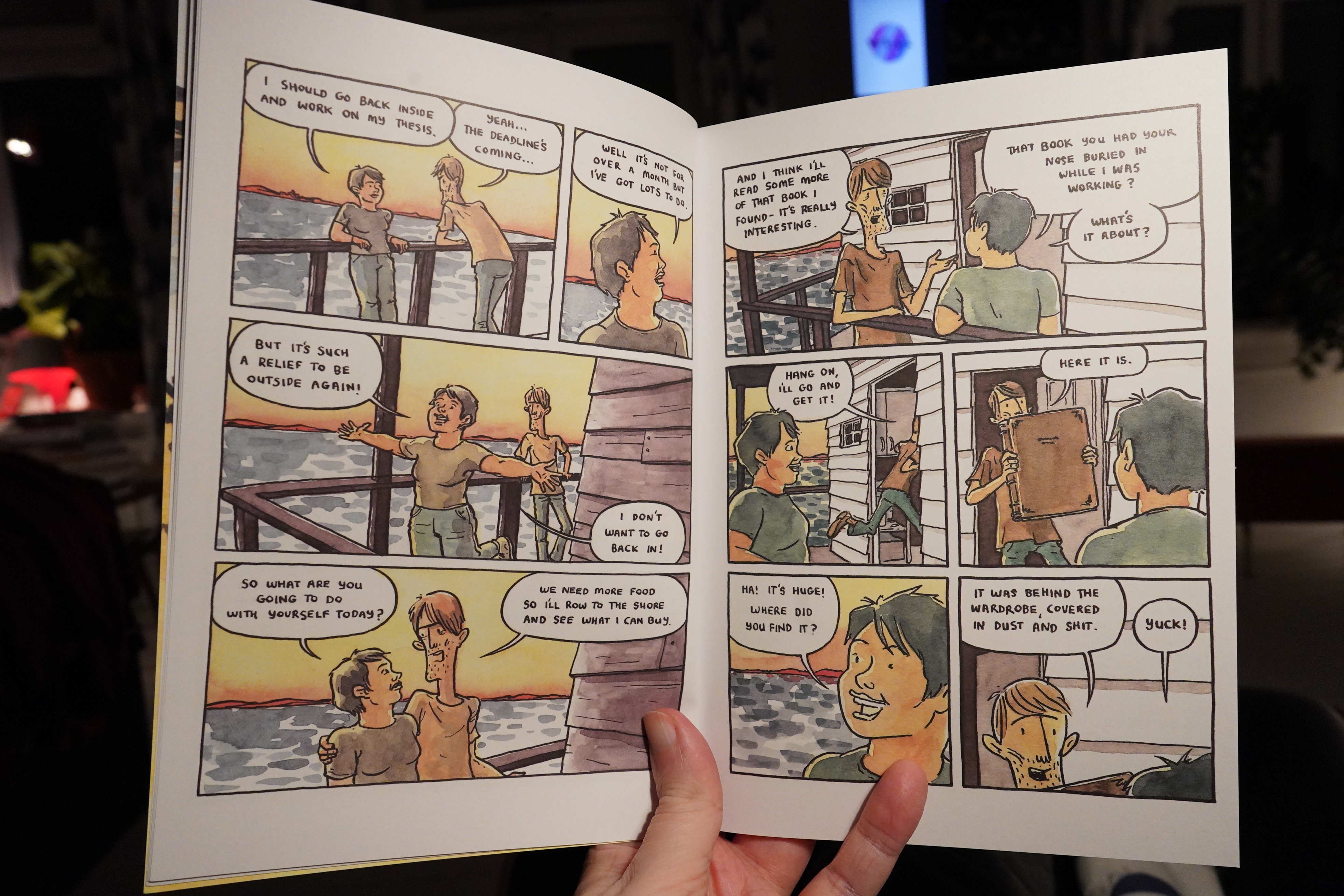
In a way, this is a variation on the old City People Move To The Mysterious Country Side And The Hillbillies Come Out To Play trope, but more mysterious.
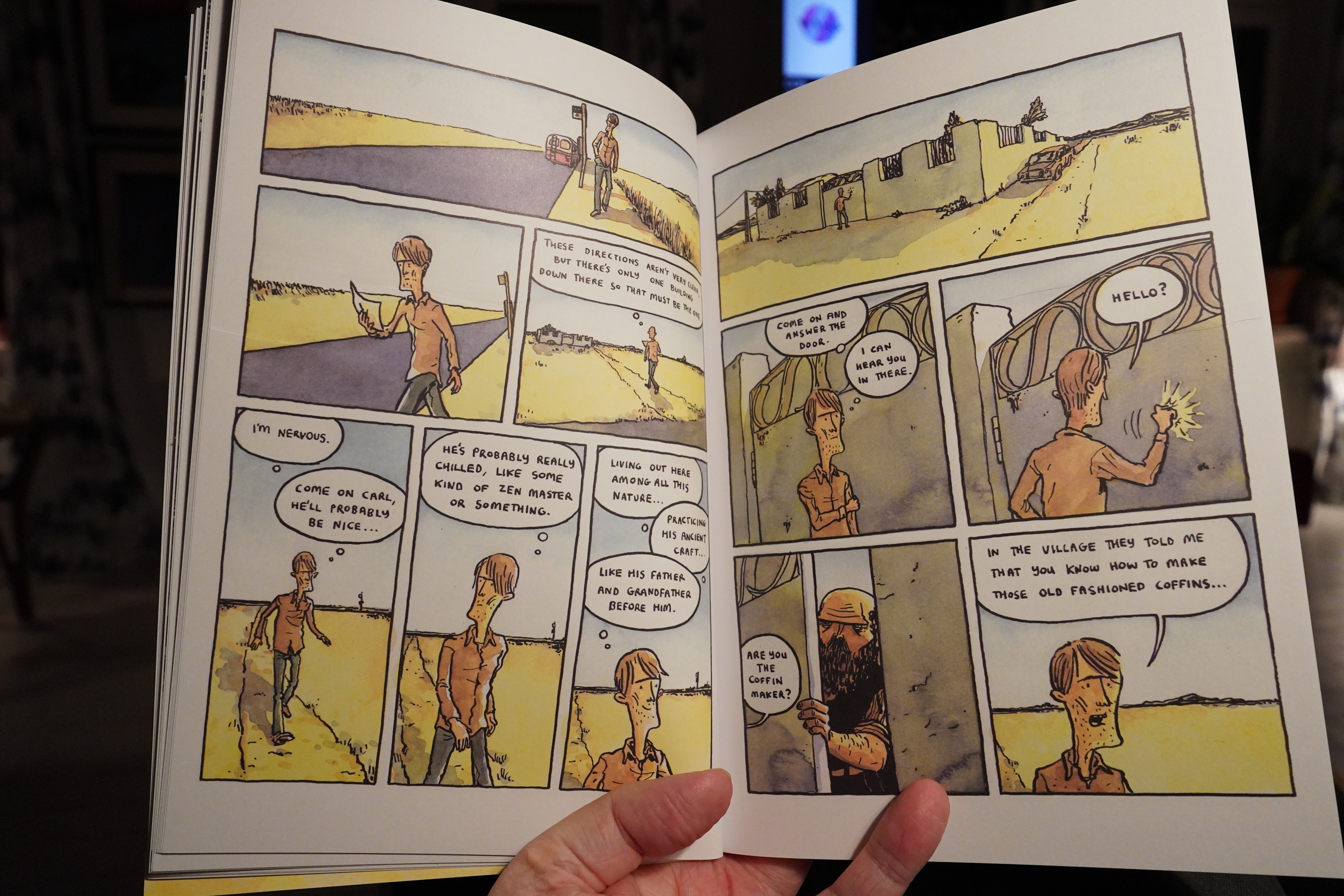
It’s pretty good? But somewhat aimless.
| Various: Music from Saharan Whatsapp |  |
00:38: The End
And now it’s sleepytime.

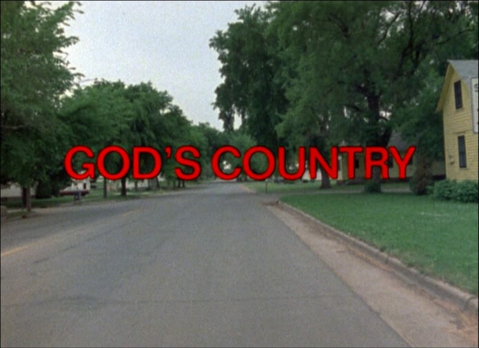
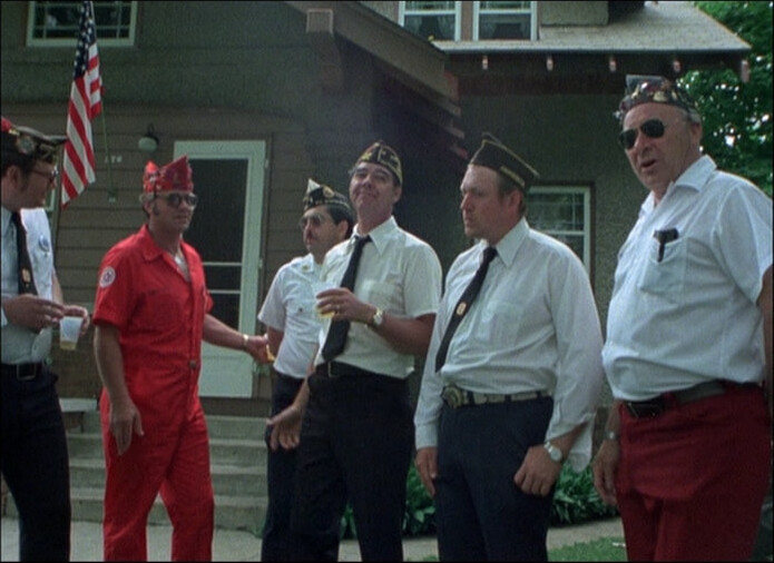
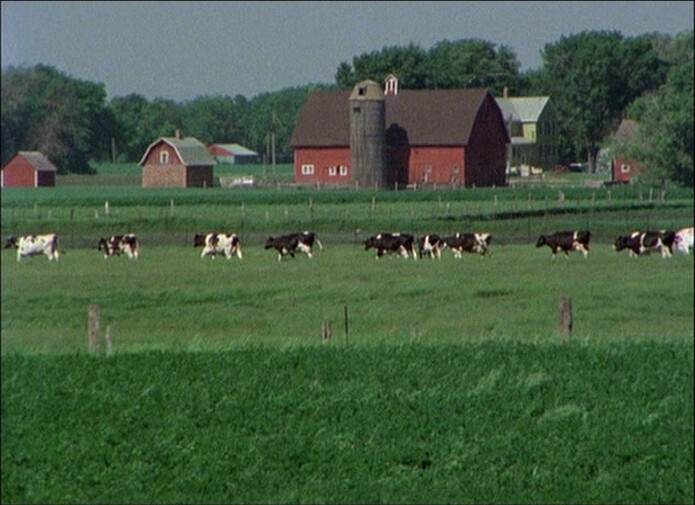
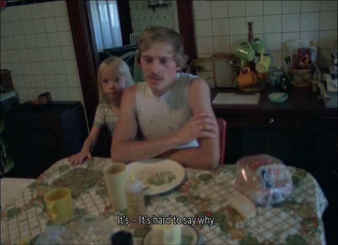
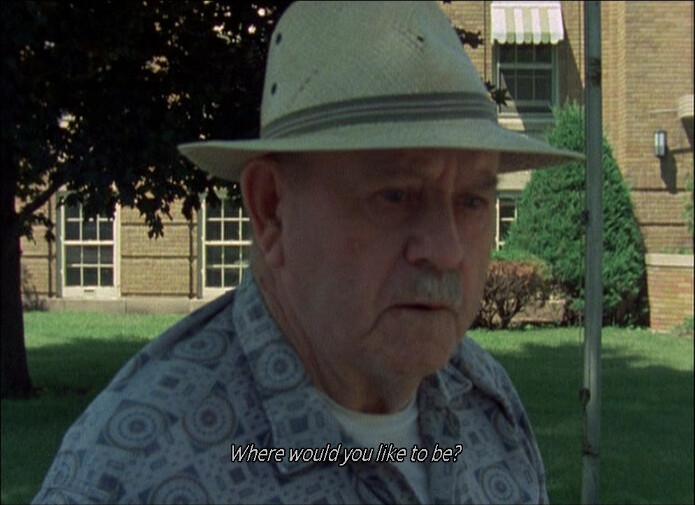
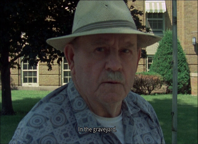
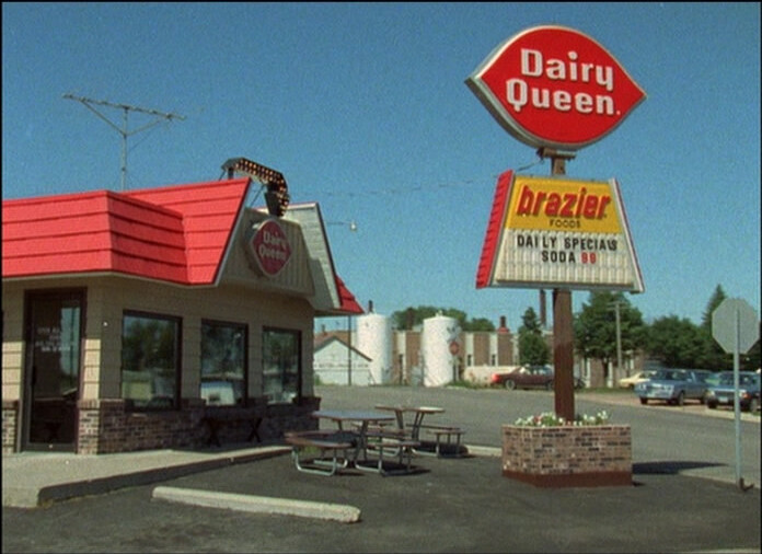
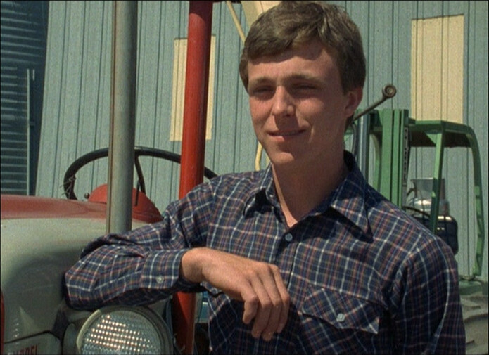
So in the 70s, PBS wanted Malle to do a documentary, and he semi-randomly landed at Glencoe, Minnesota. But there was no budget to edit it, so it languished until 1985.
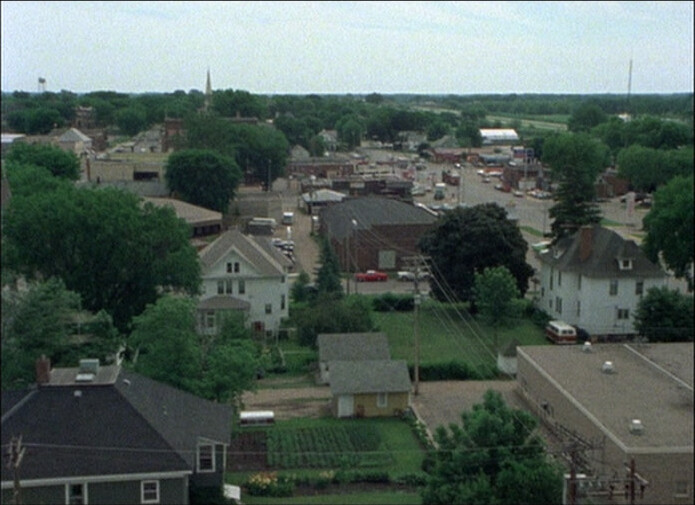
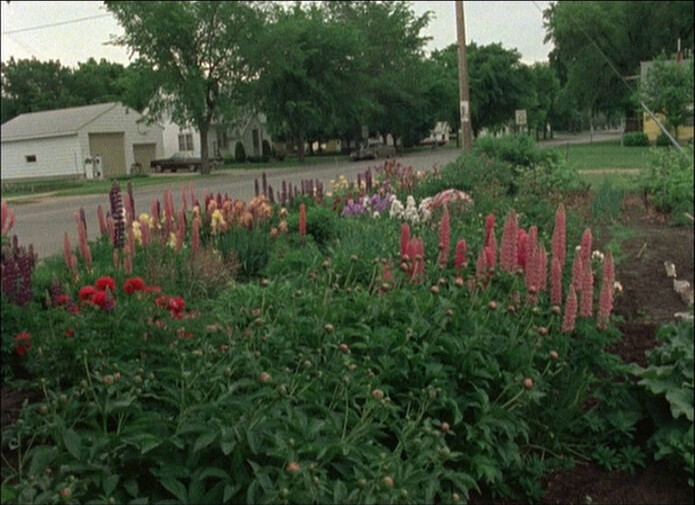
Nine churches, 5K people.
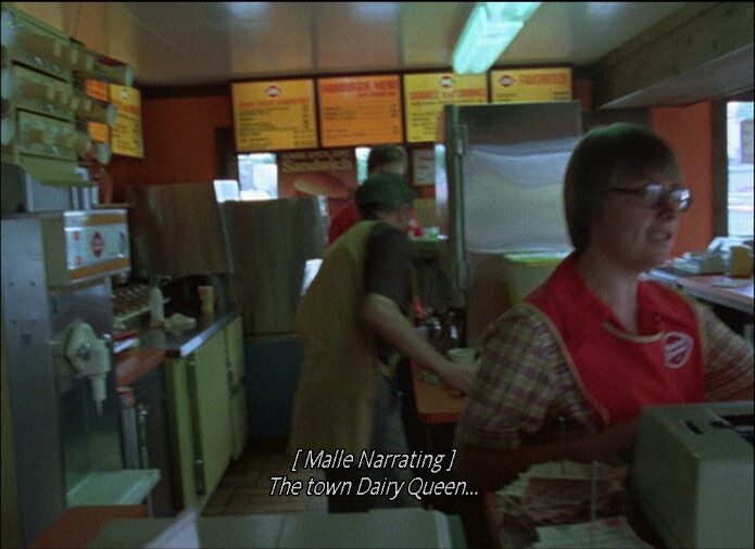
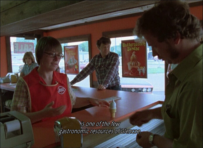
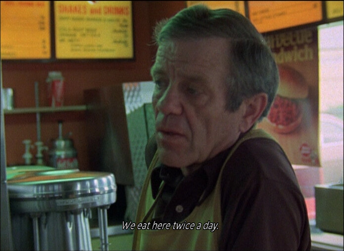
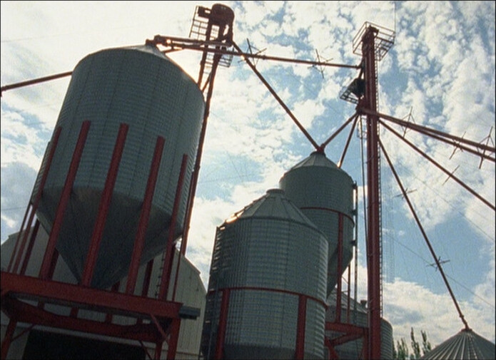
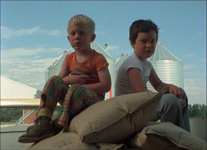
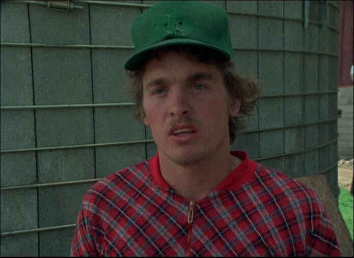
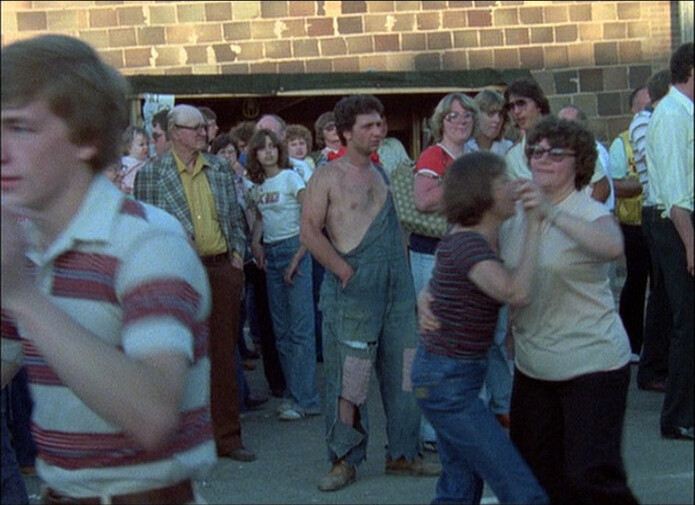
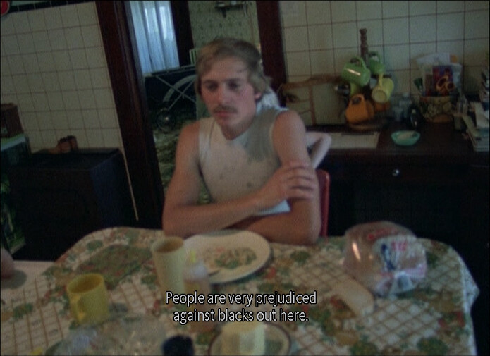
Perhaps not the ideal stache for a town with 80% German-ancestry population.
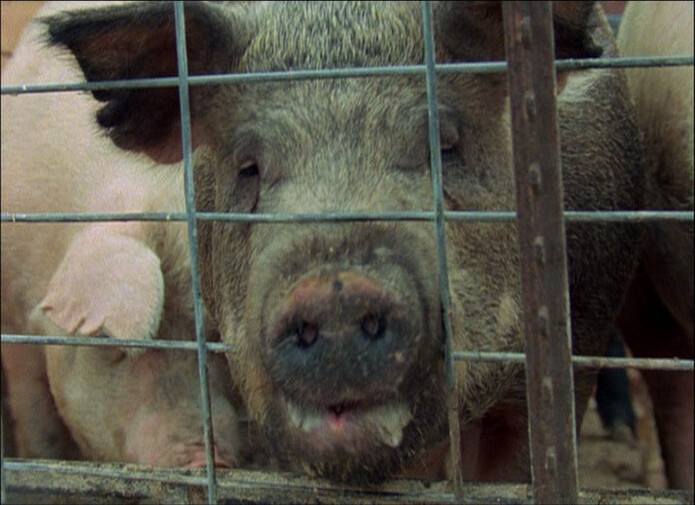
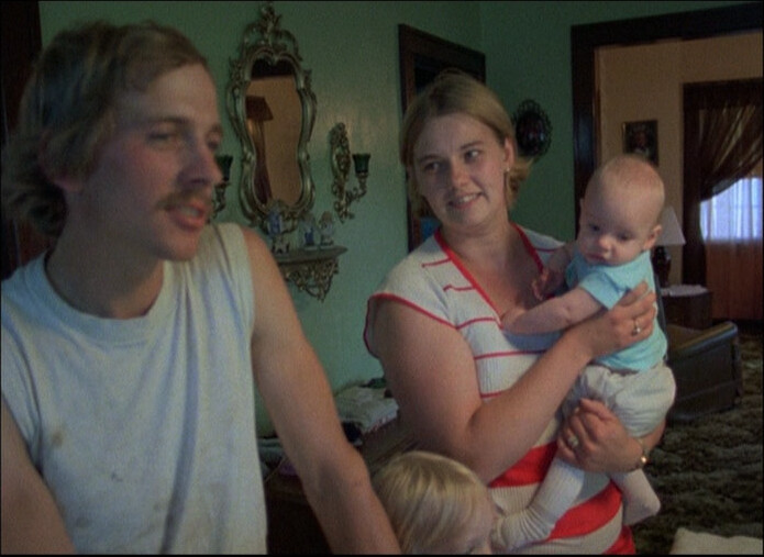
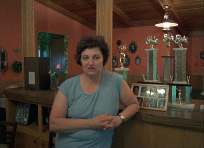
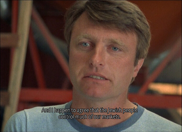
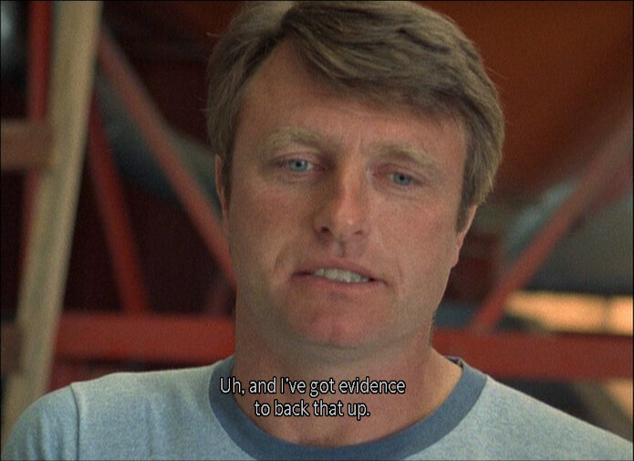
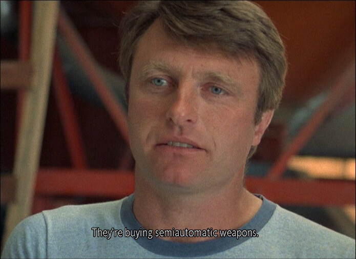
It’s a slightly odd documentary — I mean, Malle is really sympathetic to the people he portrays, but they still don’t come off, probably, in the way they want to be portrayed? I’m guessing? He’s sympathetic to them like if as they’re wild animals?
But it’s pretty interesting.
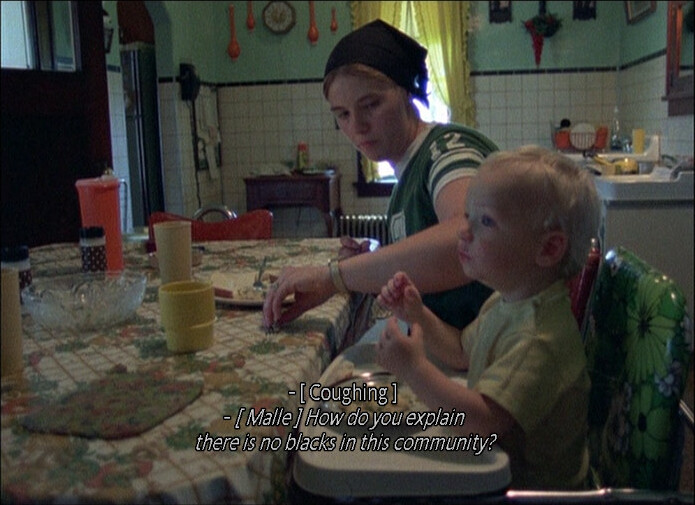
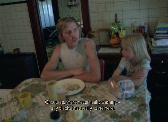

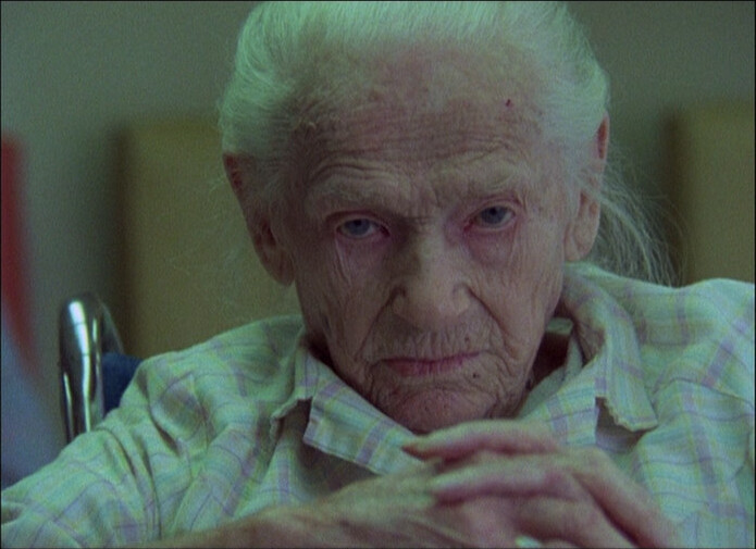
As a documentary, it’s a bit scattershot, but it’s fascinating. It doesn’t quite seem… ethical? But fascinating. Some of the reviews on imdb are hilarious:
I found this film to be the usual French slap in America’s face. The camera, all too often, focuses on fat people, on sloppy homes and on tacky rural areas.
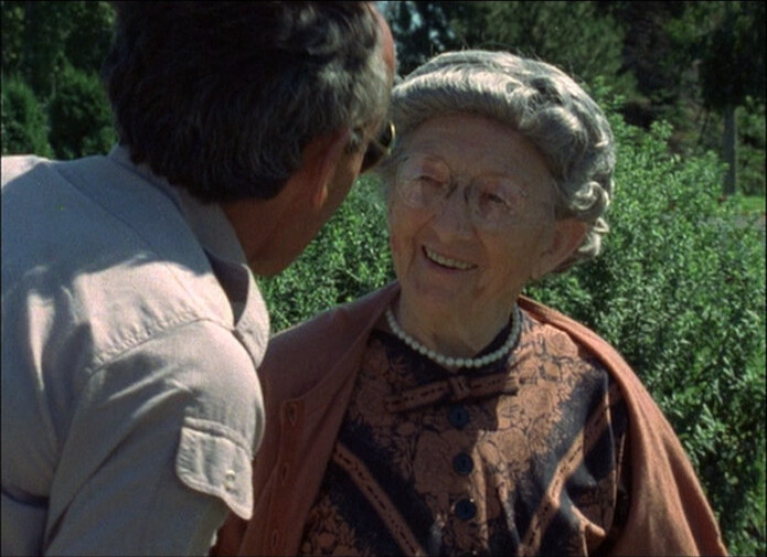
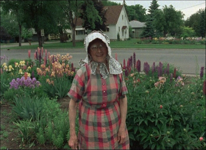
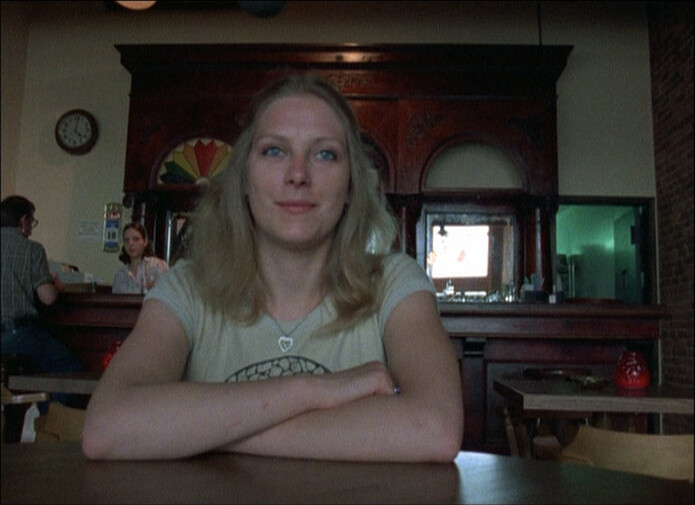
And then Malle is back, six years later, and Miss Litzau is still gardening in her wonderful garden!
He wasn’t quite right about the time schedule (he predicts a Nazi uprising in 1985), but I guess correct in the long run.
Anyway, this is great, so:
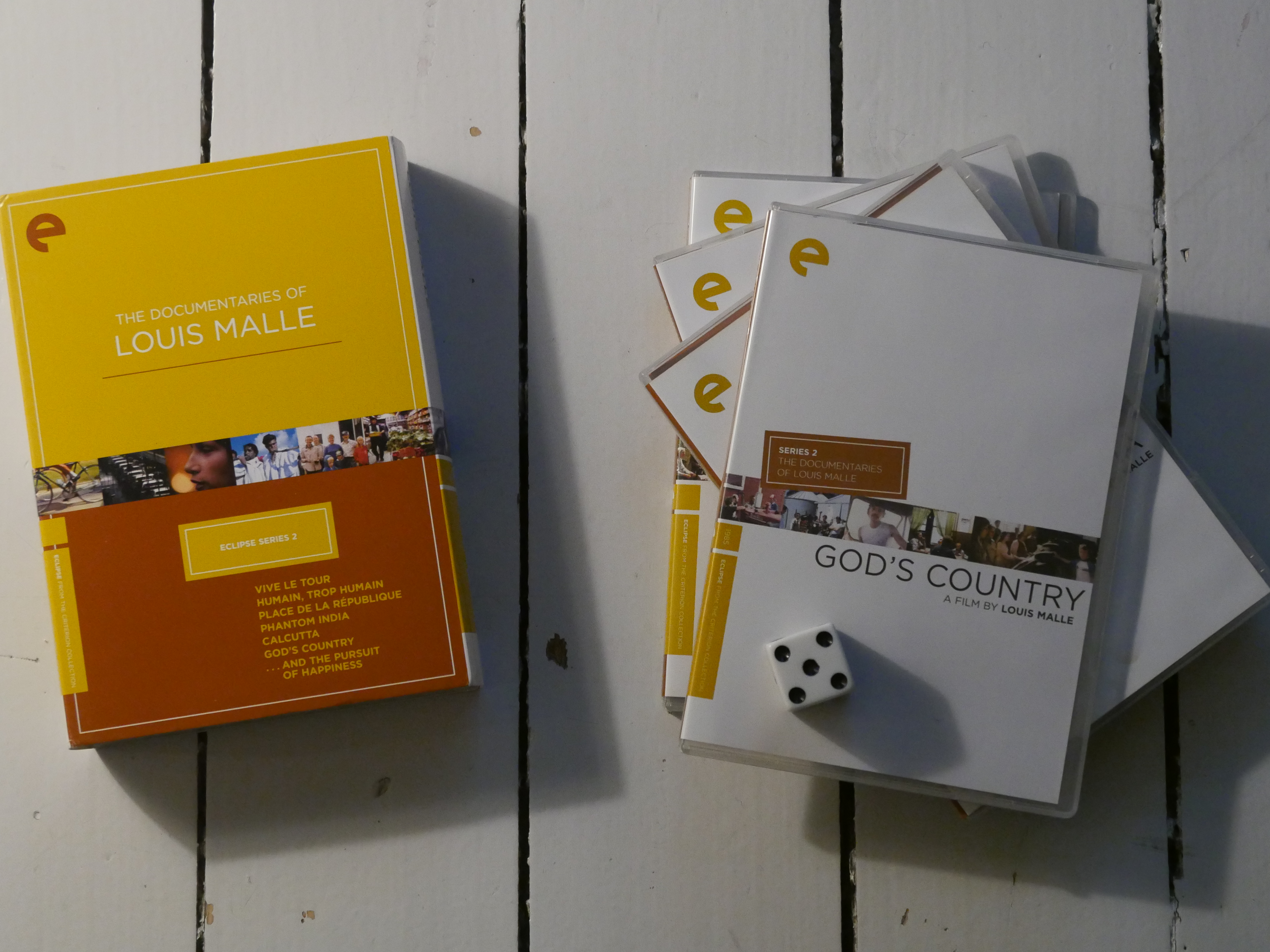
God’s Country. Louis Malle. 1985.
This blog post is part of the Eclipse series.

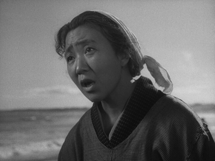

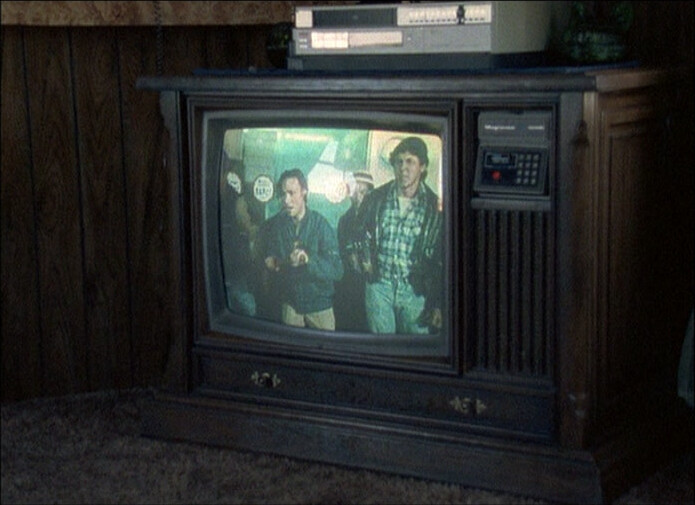
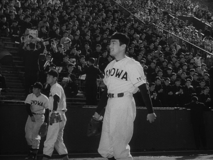
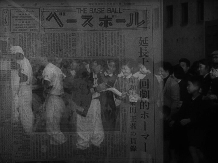
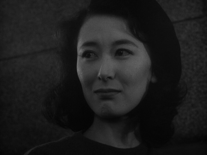
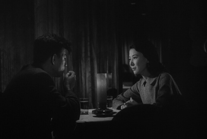
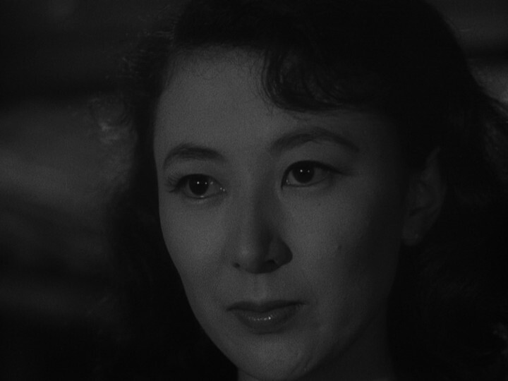
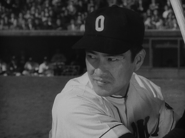
I really disliked the first Kobayashi movie on this Criterion Eclipse box set, but at least it was earnest. This… is a movie about baseball and baseball scouts?
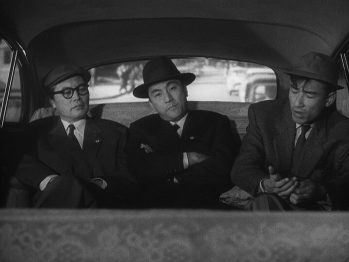
OK, it’s a critical movie about baseball scouts…

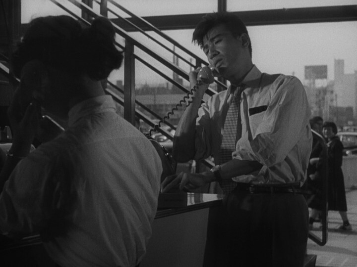
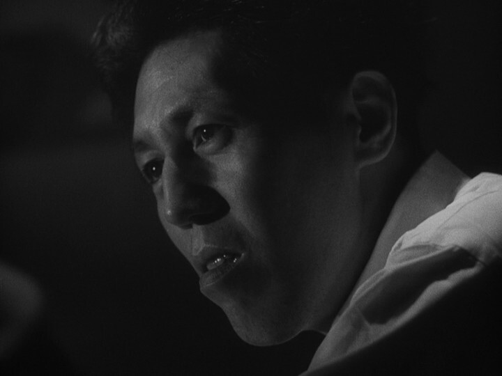
This is brutally tedious. The cinematography is OK — the shots generally look nice — but it’s just so uninspiring.


Finally!
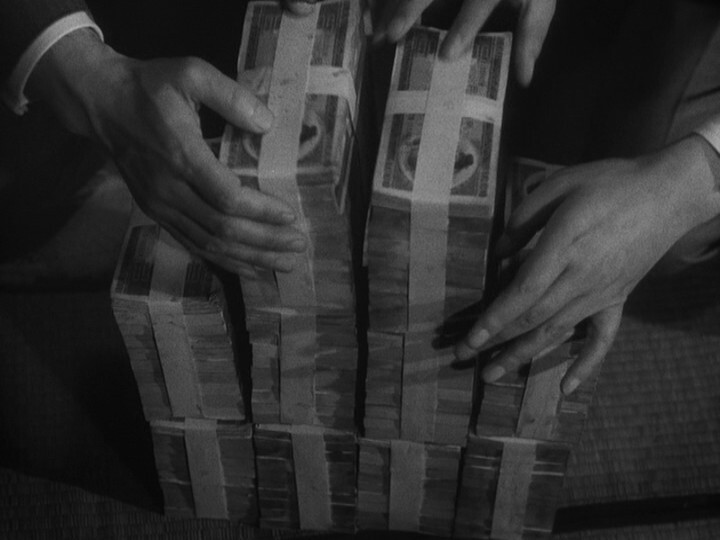
I guess the point of all this is to point out that sports is a business and that there’s money involved? I”M SO SHOCKED I CANNOT EVEN TYPE ANY MOR
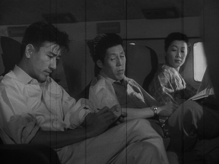
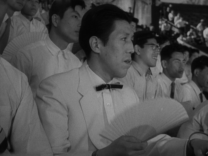
I wish that were me in the middle there.
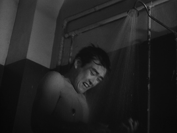
Intense showering!!!
Kobayashi wants nothing to do with that – his intentions are to strip away the masks and expose sports as just one manifestation of the human meat market that the economic status quo thrusts nearly all of us into, one way or the other.

Oh! That 30 year old guy is supposed to be a teenager? I guess that makes more sense.


So ironic.
I was almost right up there: This movie is distilled tedium.
But it’s got some nice shots so:

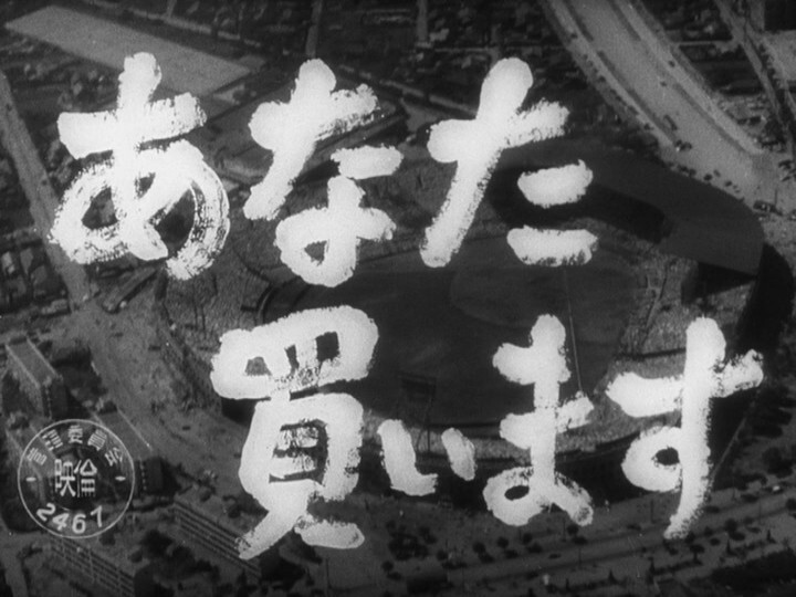
I Will Buy You. Masaki Kobayashi. 1956.
This blog post is part of the Eclipse series.