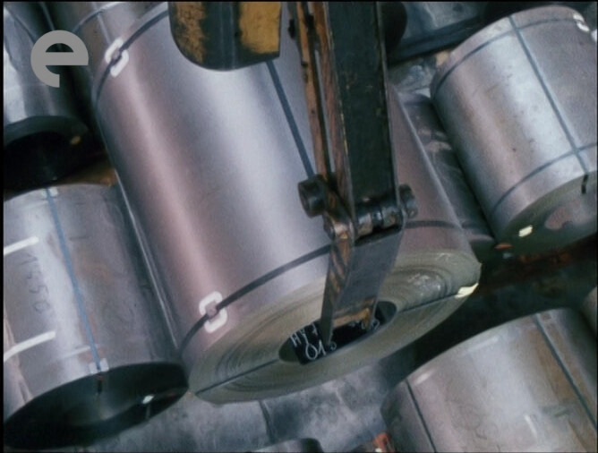

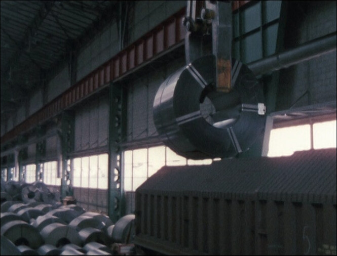
This is utterly fascinating. It’s a documentary from a car factory? There’s no commentary track or sound be, so we have to just sit here and look at people assembling cars.
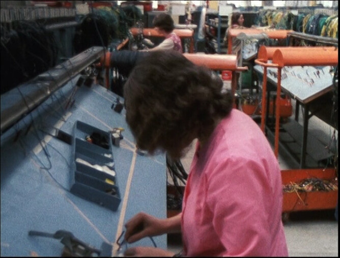
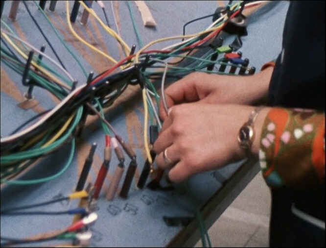
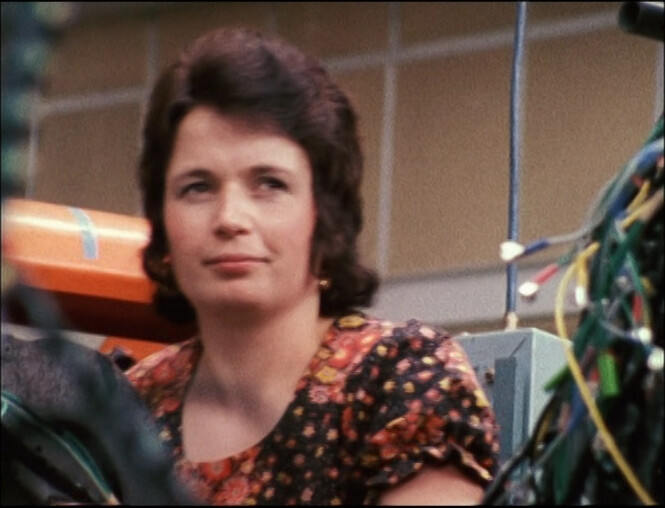
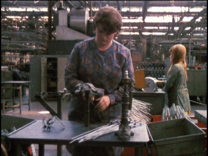
Oh, they’re assembling the wiring harness for the car? Ooo.
Of course, this wouldn’t be that fascinating if it hadn’t been for the amazing colours and cinematography.
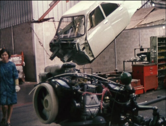
I could watch this forever, but they’ve basically assembled the car now? And we’re just 15 minutes in? What’s Malle going to do for the rest of the movie? We have an hour to go.
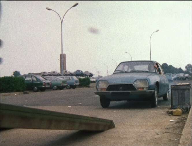
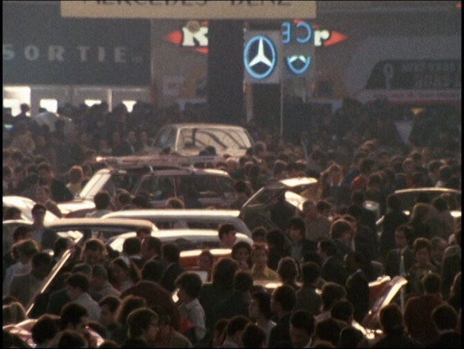
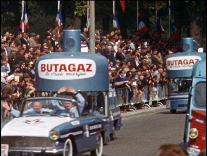
Now they’re at a car show. Are they gonna, like, follow the life of a car? Being made, sold, used, trashed?
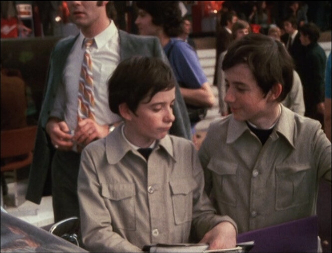
We’re still at the car show, fifteen minutes later.
Me too!
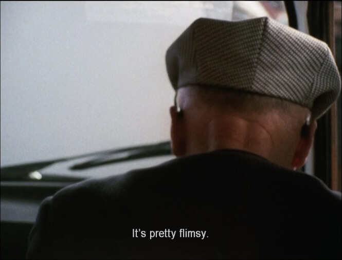
This is nowhere near as fascinating as the car factory…
But then we return to the factory! WHAAAA
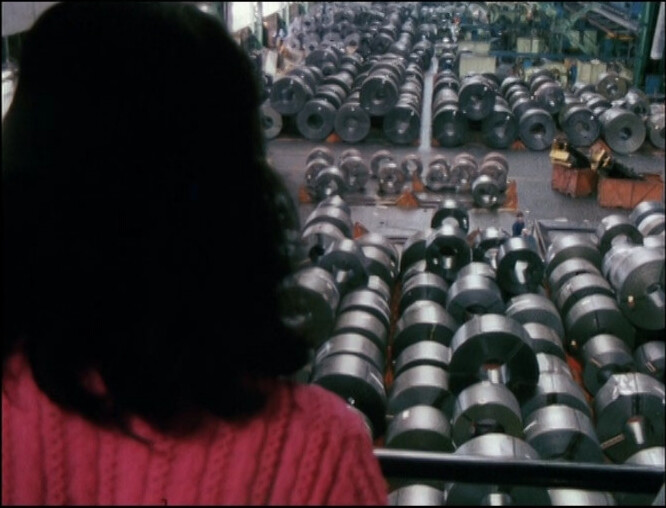
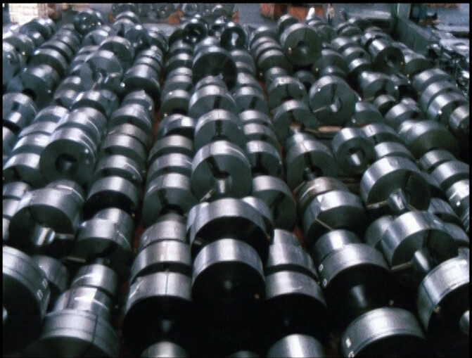
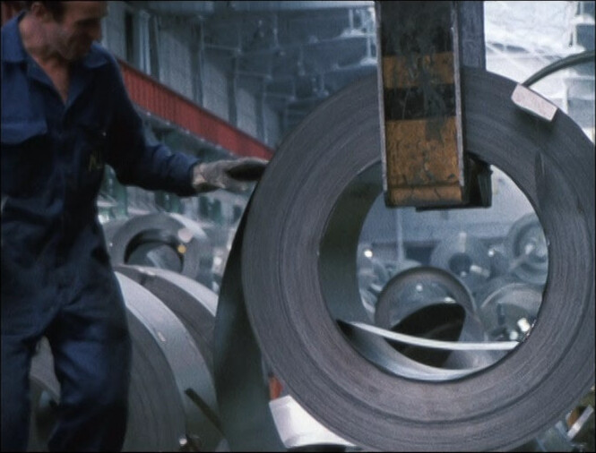
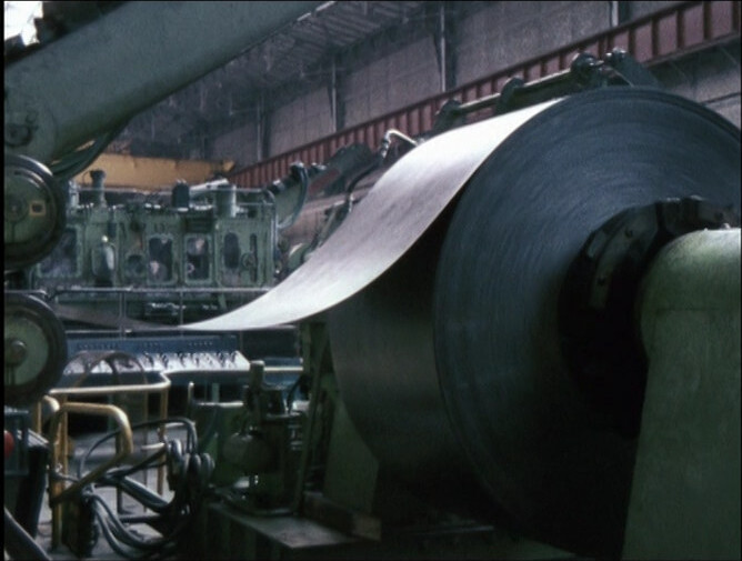
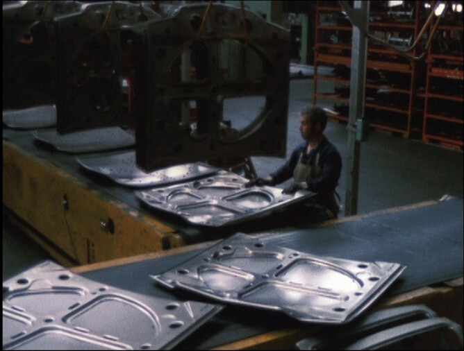
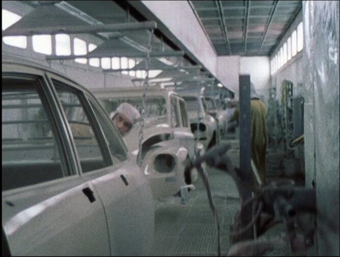
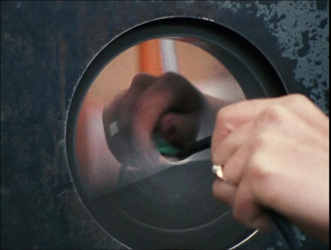
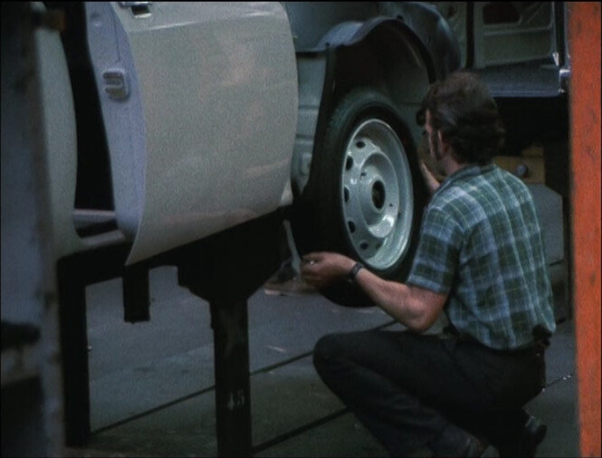
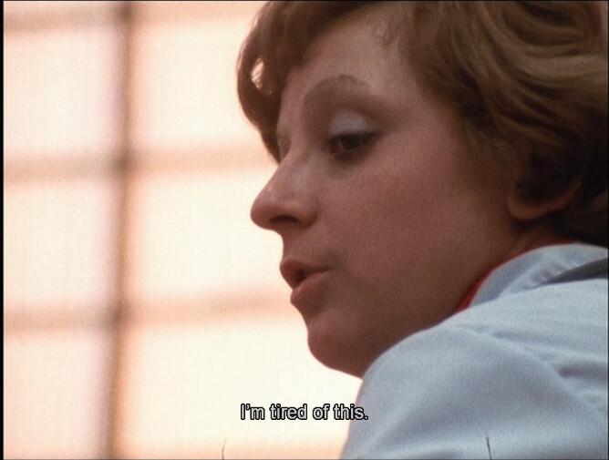
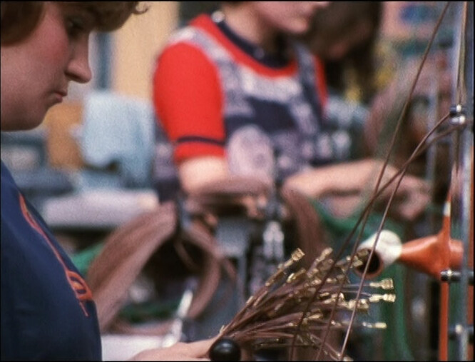
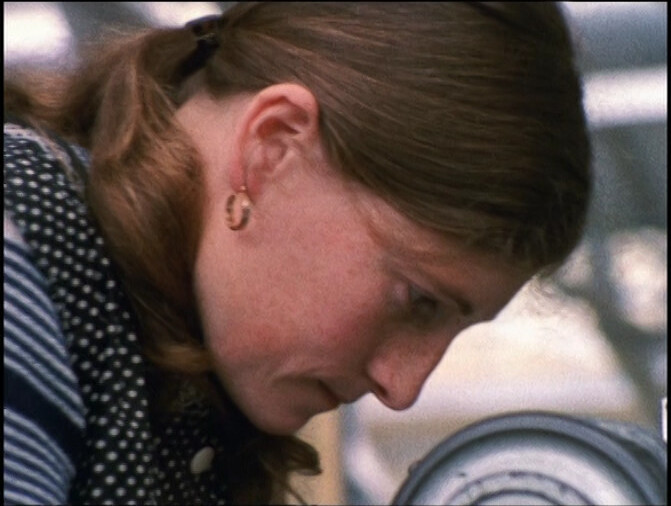
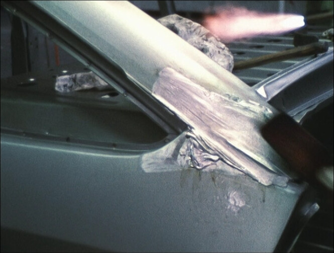
Oh, but while the first fifteen minutes was all cool stuff: Huge metal sheets being cut! Robot arms spraying cars! Electrical harnesses! Now it’s smaller things that are hard to work out just what the purpose of is. I.e., kinda alienating and repetetive… I think Malle has a plan with this movie!
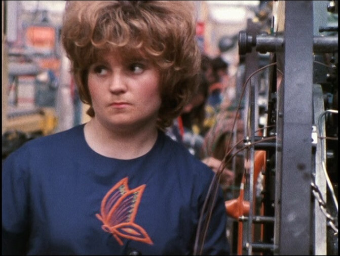
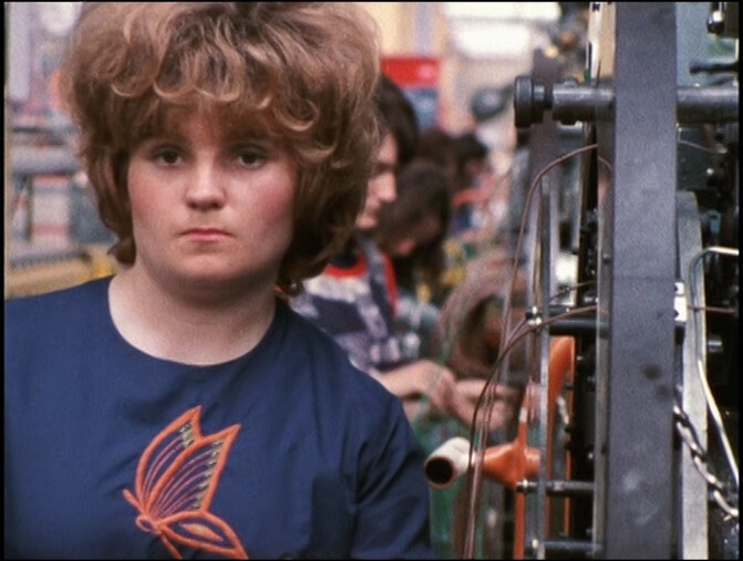
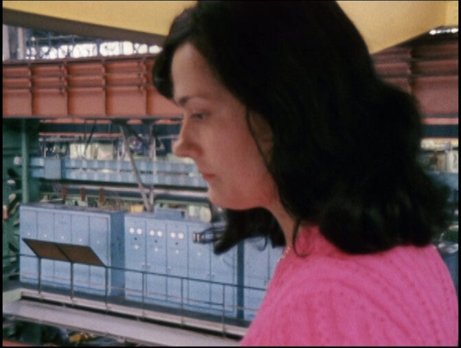
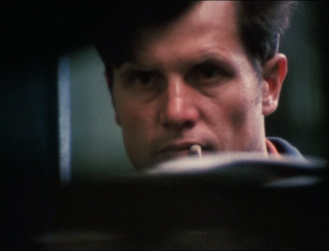
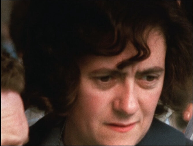
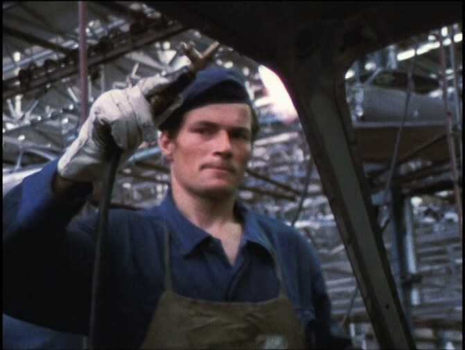
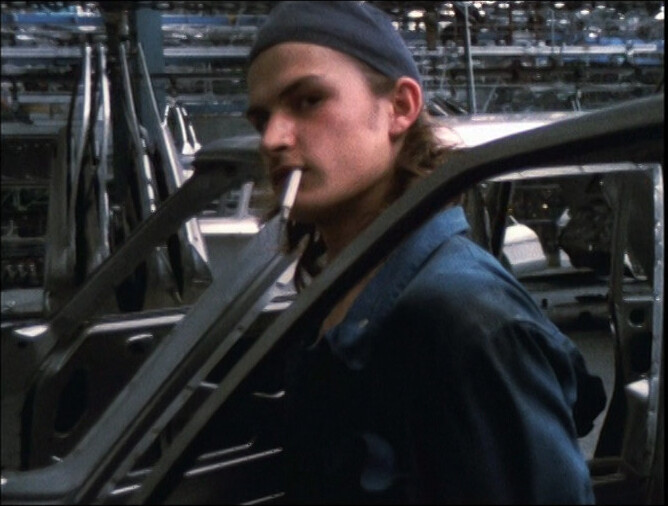
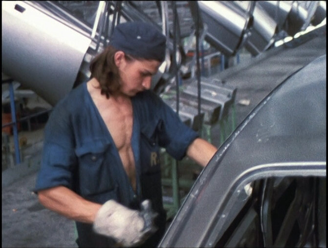
I also think the people in the factory might have been notified that there was going to be a camera team present, because they look awesome. And I love that — that they’re being allowed to present themselves the way they prefer.
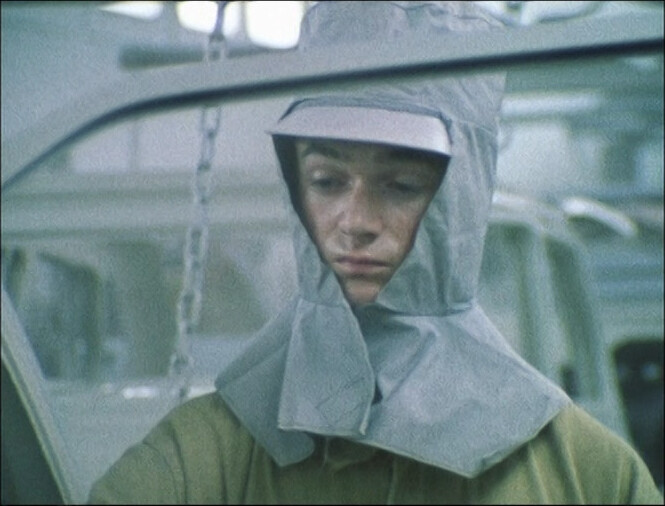
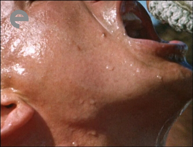
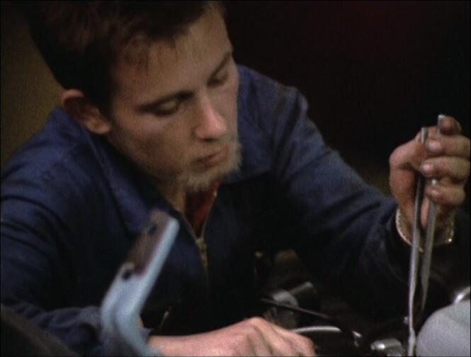
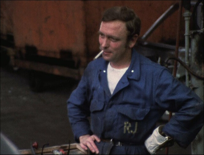
Except for this guy who I think has as much paint on his face as on the car. Oh, the joys of solvents…

This movie is absolutely fantastic. Wouldn’t change a second of it.
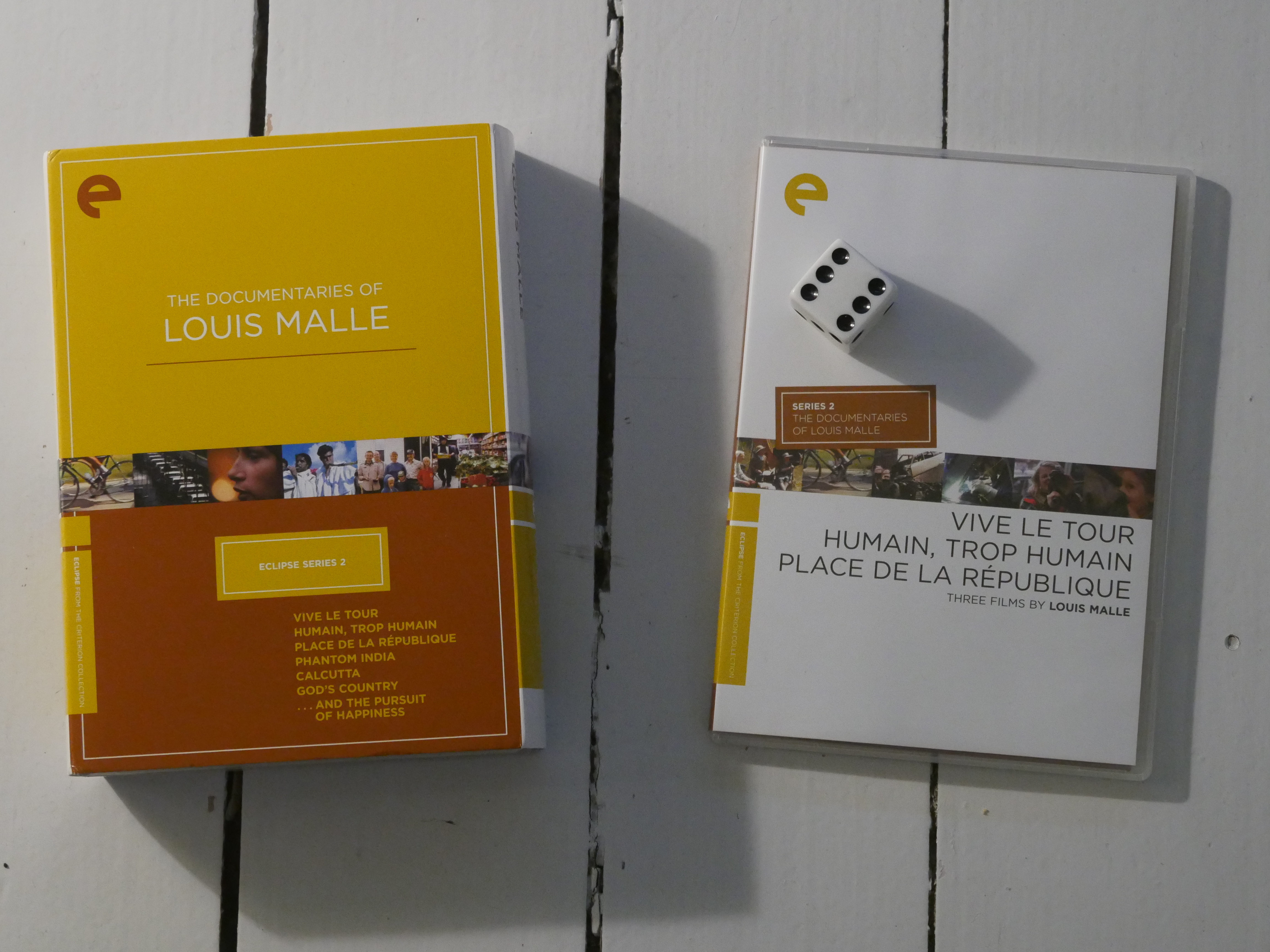
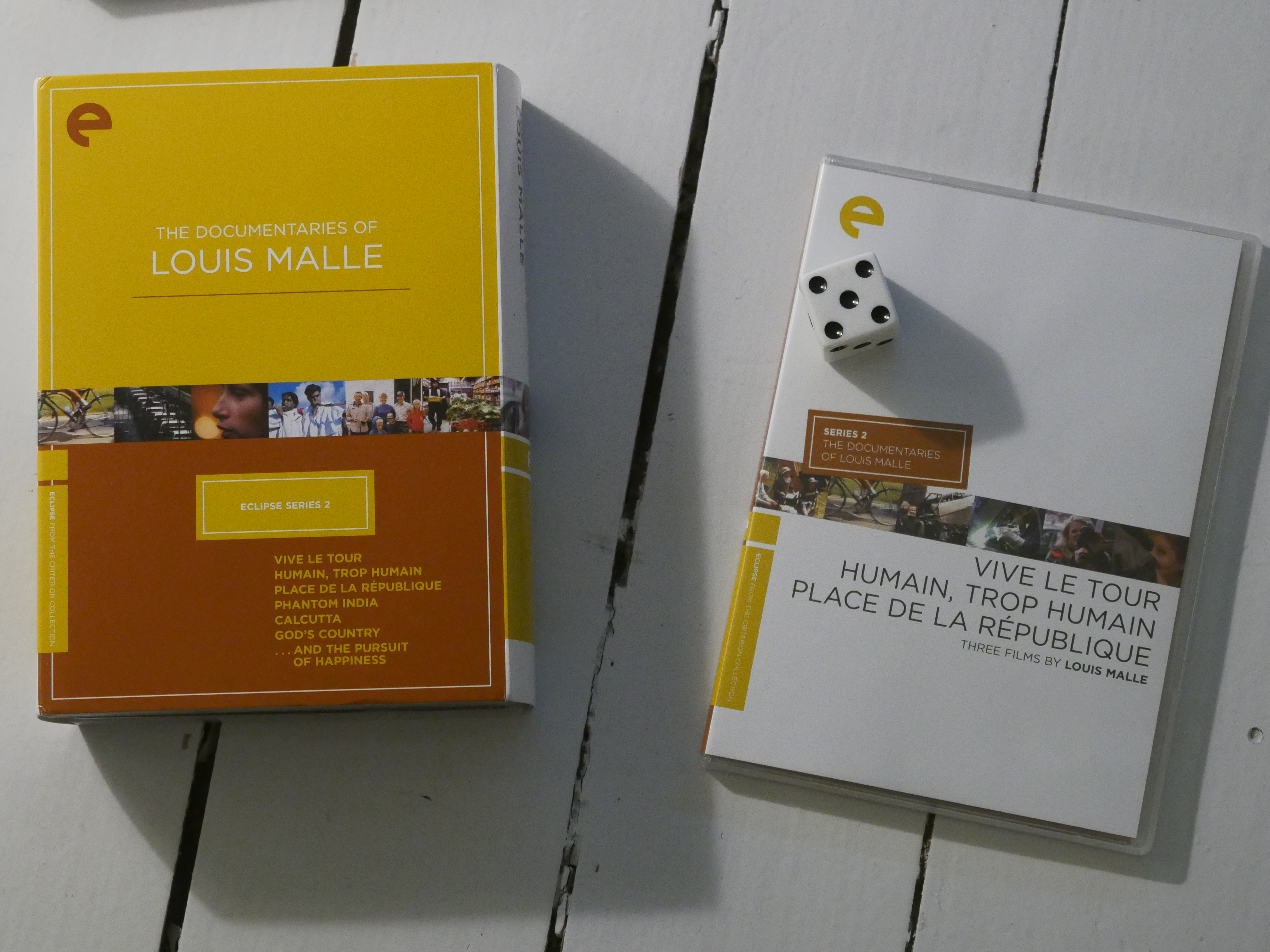
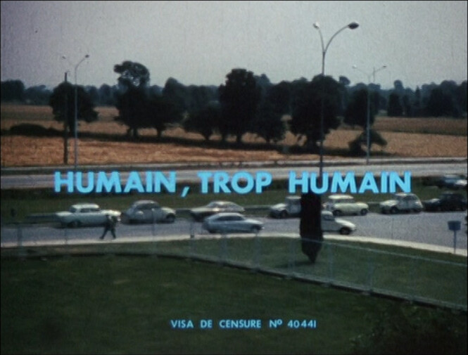
Human, all too human. Louis Malle. 1973.
This blog post is part of the Eclipse series.