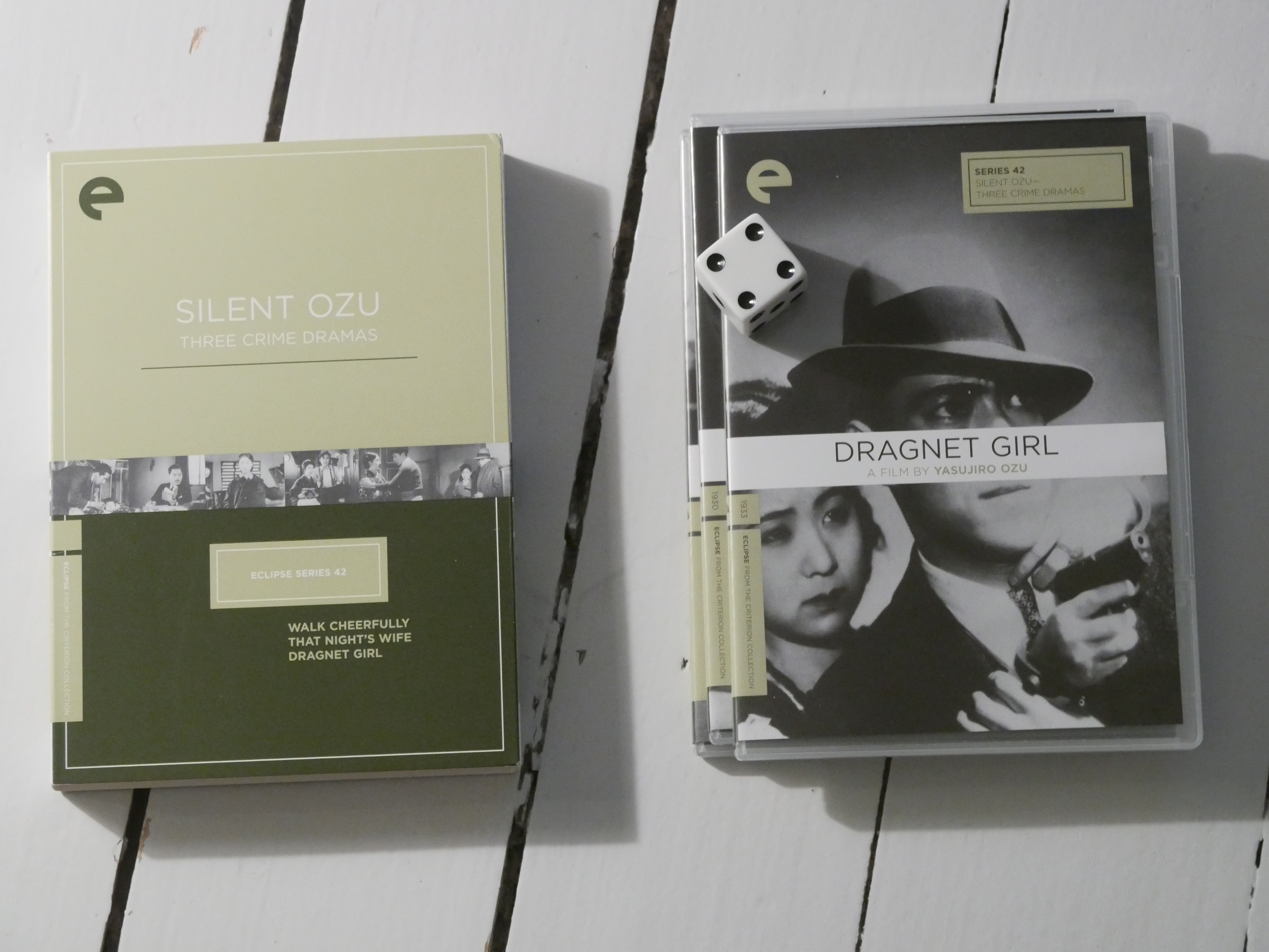

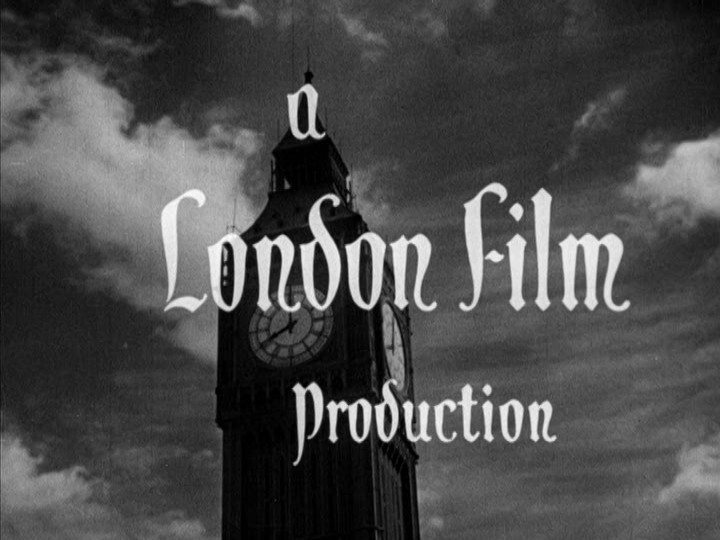
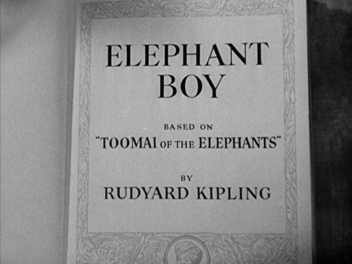
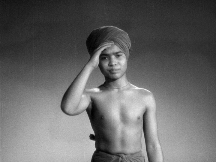
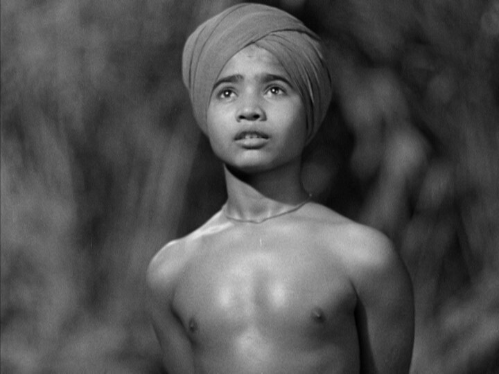
Oh, this box set — “Sabu!” — is a collection of movies featuring this guy (later seen in Black Narcissus etc). And this is his first movie.
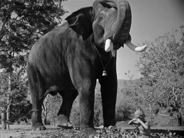
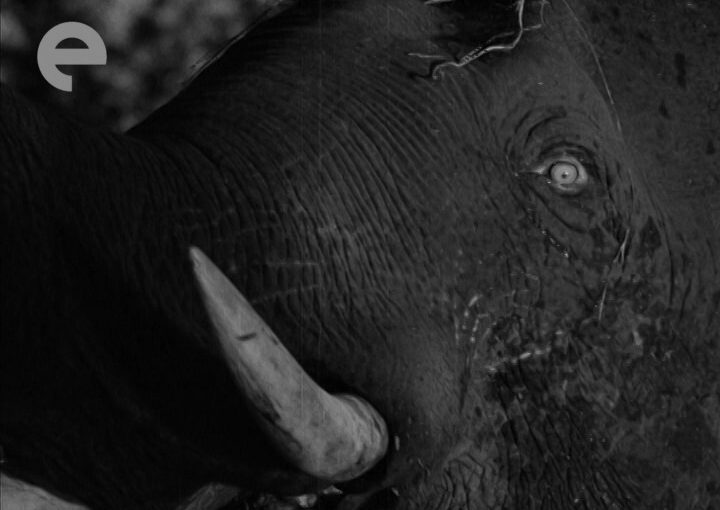
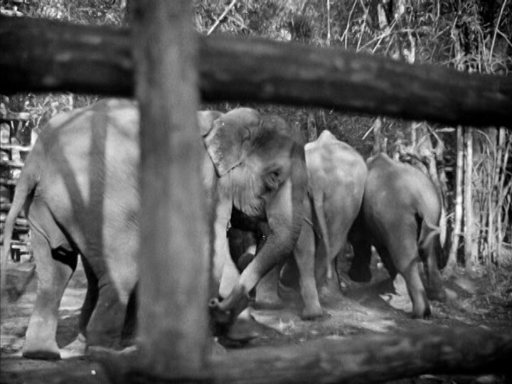
Man, that’s a big elephant.
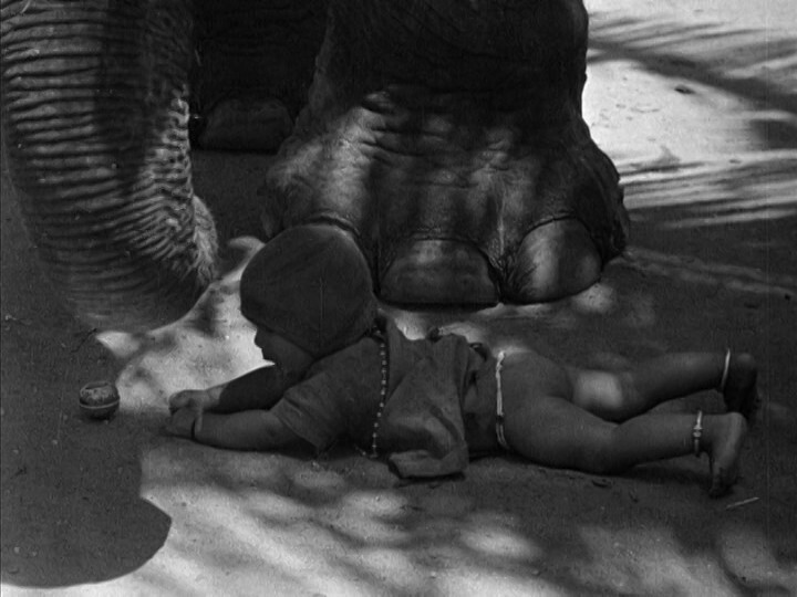
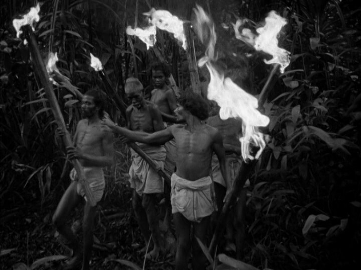
Oh my god! These filmmakers are insane!!!!
(No babies were squished during the making of this movie, I hope, but…)
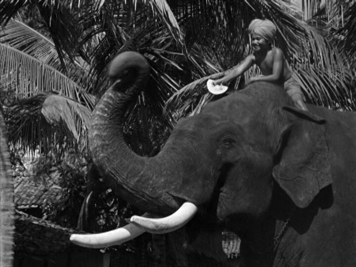
See? Very large elephant.
*pause while I read the liner notes*
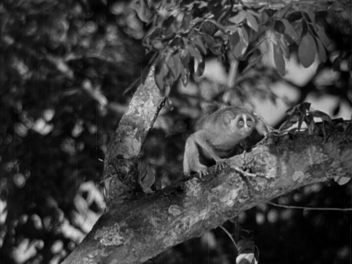
Aha! Flaherty shot the nature scens in India, while the more narrative scenes were shot by Korda… on a studio lot in England!?
I really wouldn’t have guessed — it’s pretty seamless.
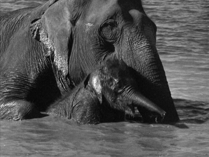
Aww.
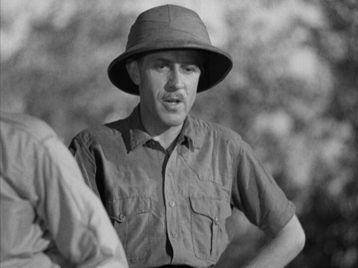
Oh, yeah, I can see how they cleverly are using bokeh to disguise that they’re shooting in a Denham back lot…
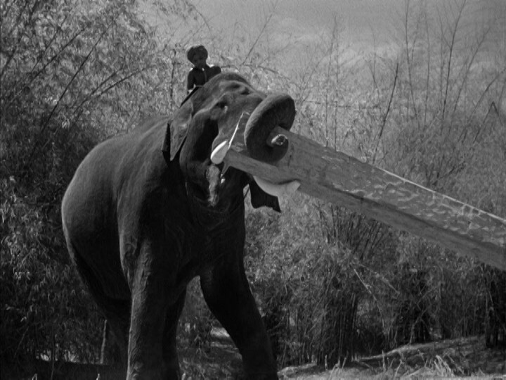
This was a major box office smash and won plenty of awards and stuff, and that’s totally understandable. It’s a very amiable movie, and there’s just a lot of fun and interesting shots — like randomly of an elephant picking up a huge log: Will he make it? Will he? He does!
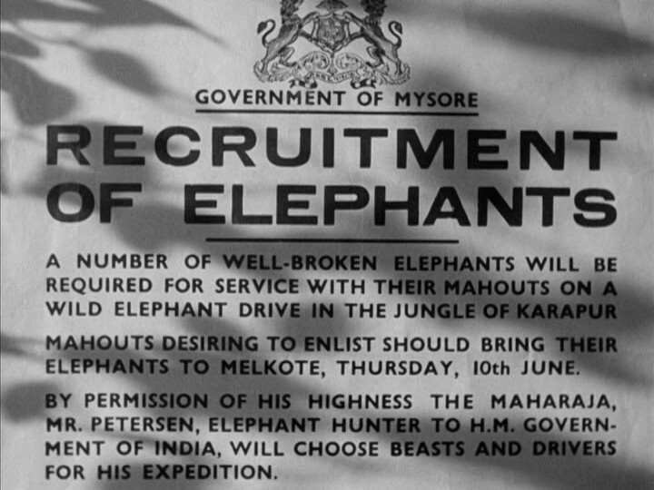
So it’s like a mix of nature documentary, and pre-internet snippets of animals doing odd and cute stuff, and then there’s even an adventure plot about going into the jungle to find the Macguffin (which here is apparently a whole bunch of… wild elephants…?)
But… as the plot becomes thicker and the Denham shots starts to outweigh the Flaherty shots, it’s starting to fall a bit flat, and it becomes quite clear why this isn’t one of those classics they show at Xmas every year. There just isn’t much here? It feels like they had some nice nature shots, and a really good child actor in Sabu, and then made a movie around that (based on the Kipling story), but that gives you a 40 minute short. This movie just needs… more… Like a fun B plot or something.
It’s also never explained why we should cheer when they capture all the wild elephants? Which just seems cruel and heartless? It’s just odd. This is one of those rare instances where a movie could have used a Hollywood script doctor to drop in some motivation and stuff.
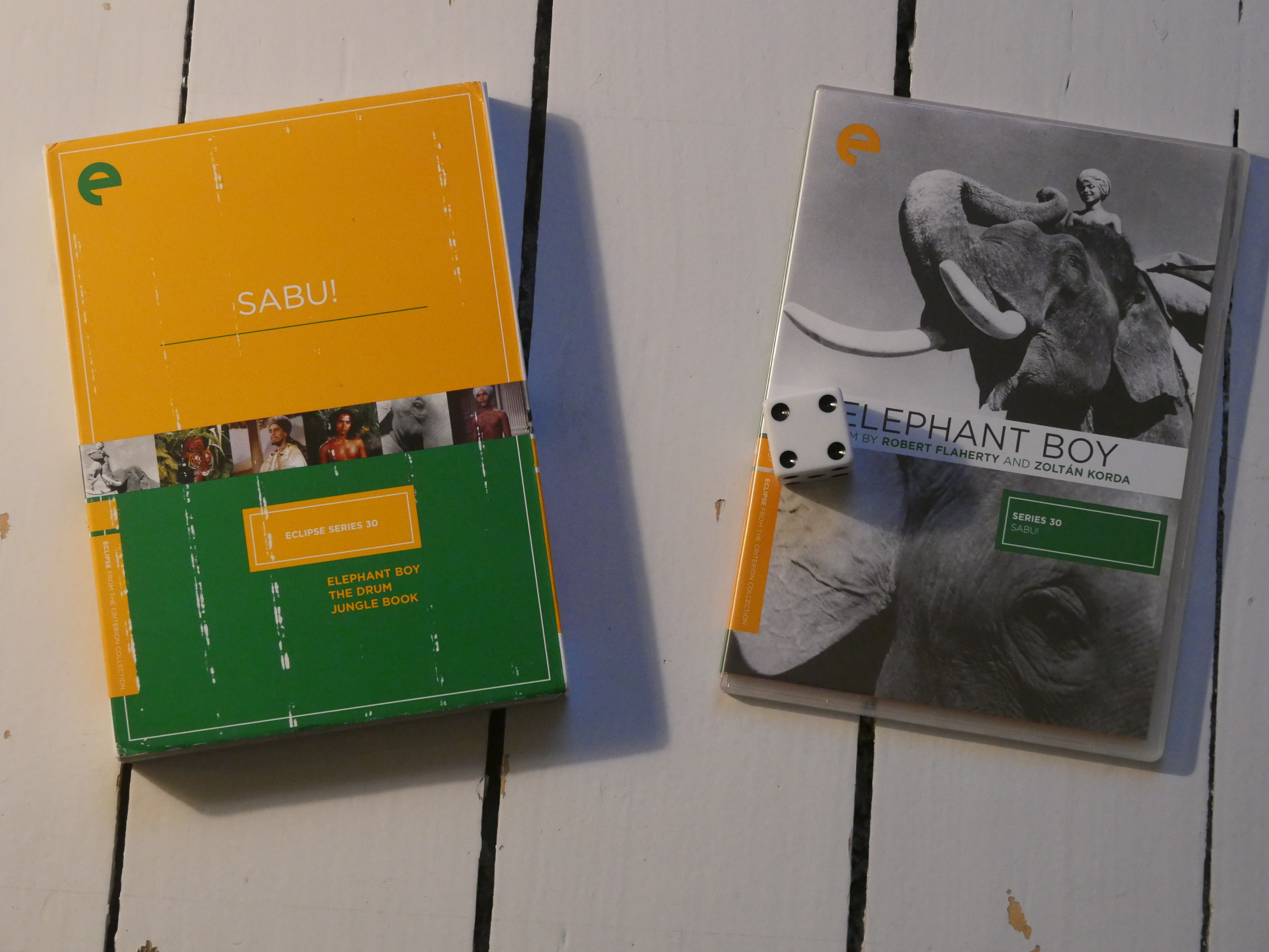
Elephant Boy. Robert J. Flaherty and Zoltán Korda. 1937.
This blog post is part of the Eclipse series.