When I grow bored of an author, I have a tendency to buy one more book by them. This usually happens when I’m at a sale in a book shop, and I go “oh, well, it’s cheap; perhaps…”
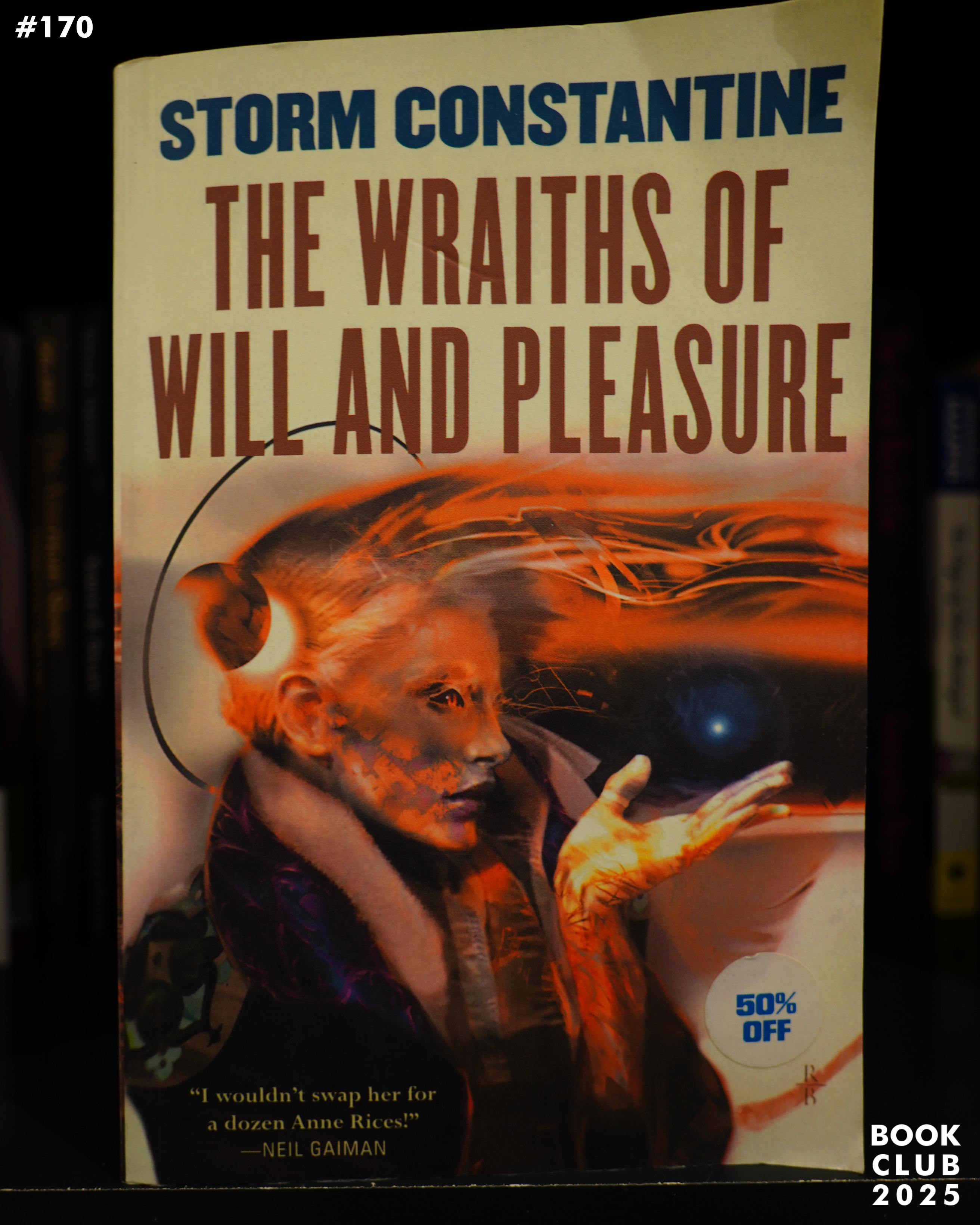
So this is classic — I’d been kinda into Storm Constantine in the late 90s (as was a friend of mine), but I found them books less and less enthralling. But this book was apparently 50% off, so I bought it (in 2010, I think). And then, of course, I never read it.
Now’s the time!
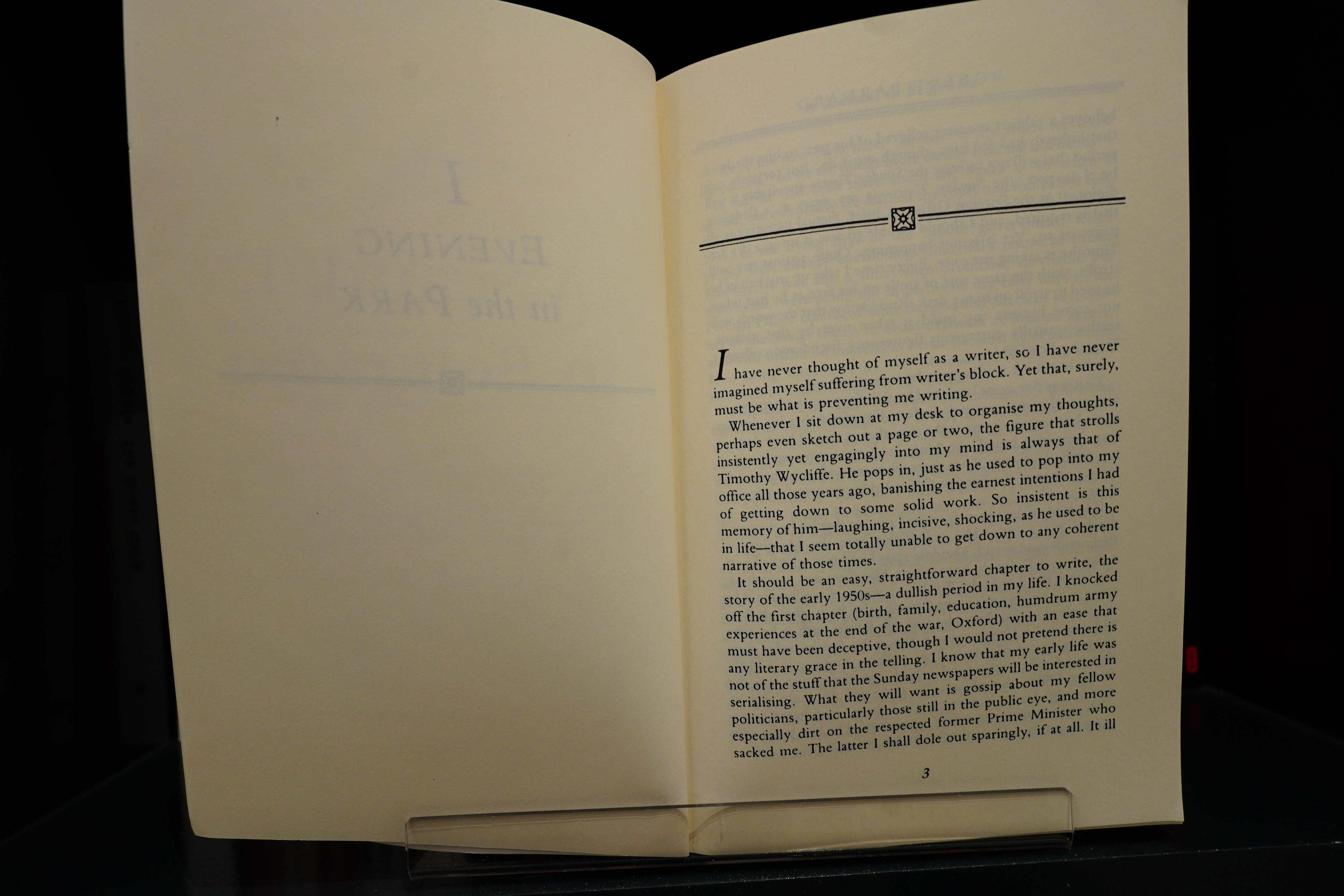
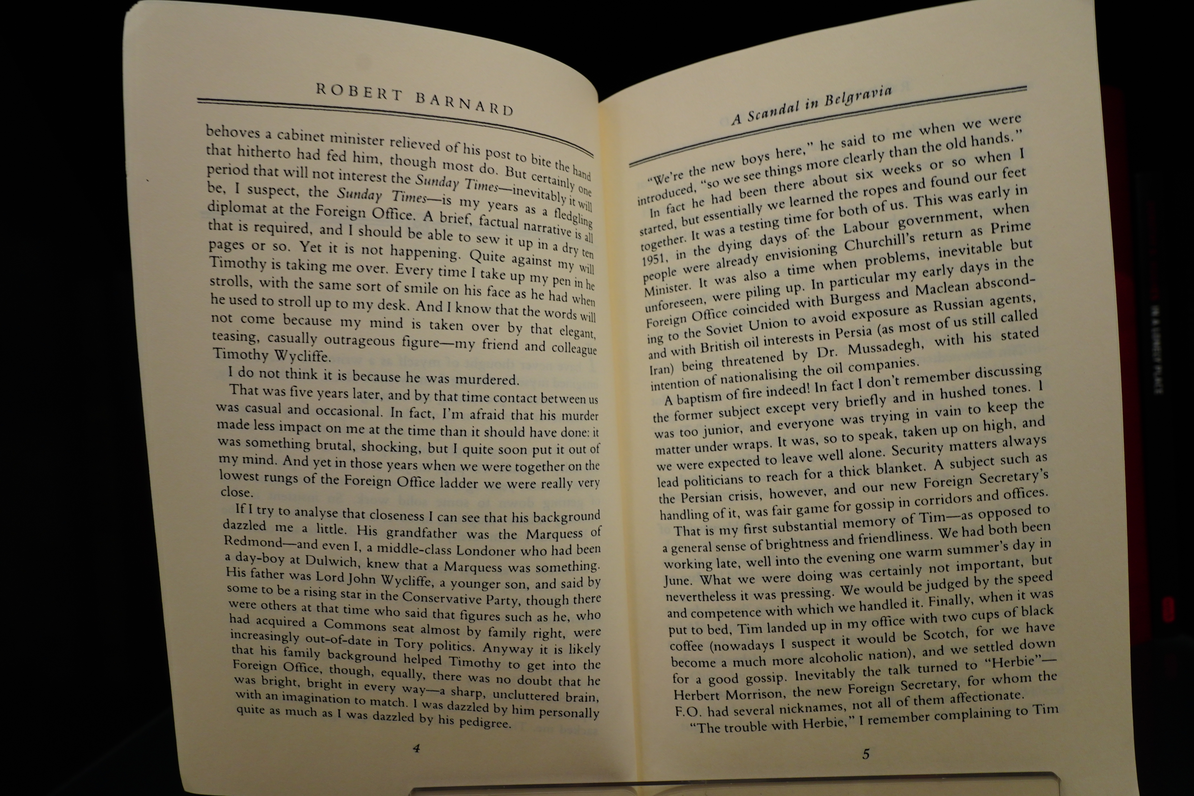
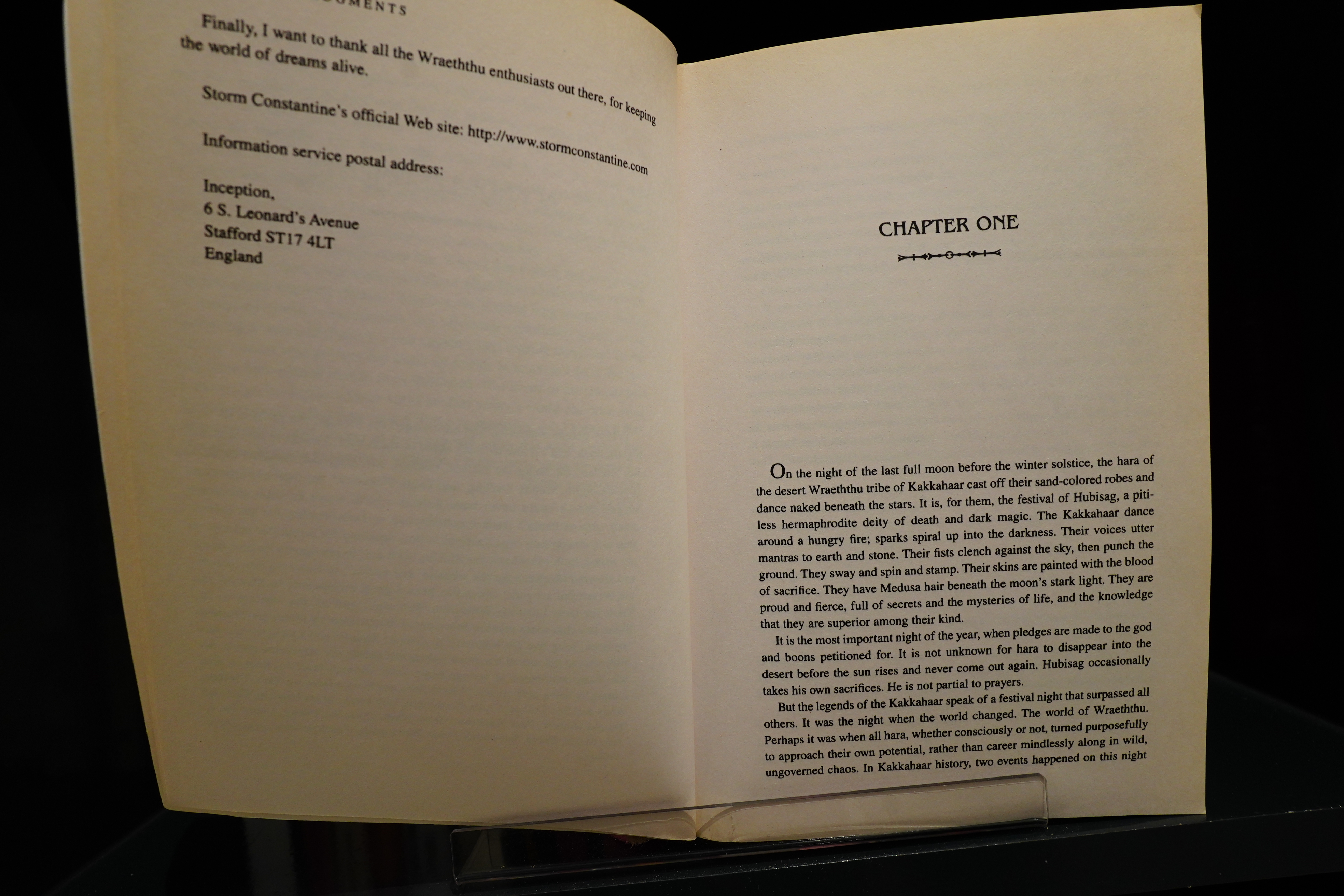
Hm, yes, exactly… This book is set between two previous books that I’ve read, but I read them back in the 90s and I don’t remember much about them. It’s about… Hermaphrodite Vampires From Spaaace? Or something? But this all feels familiar — the extreme amount of fantasy jargon: Not just unfamiliar names like “Wraeththu”, but also words like “nohar” instead of “nobody” (because this species is also called “har”), and so on.
Which is all fun and stuff, but this is combined with a certain slipperiness — we get pages and pages about savage tribes and strange rituals, and then on the next page they’re making tea in the kitchen and having some cookies. That is, it’s hard to get a handle on what this world looks like; it’s like a half-imagined feverish dream.
It’s a bit of a brick of a book — after I’d read a hundred pages, I went “no, I’m not reading four hundred more pages of this”, and then I carried on, and “no, I’m not reading three hundred more pages of this”, until I reached the end. It’s not entirely successful, but I liked it enough to carry on, almost despite myself. But it took me a week to read the book, so I wasn’t very enthusiastic about it…
It’s very much a “well, I have all this backstory I figured out while writing the other books, so I might as well just put all that down on paper”. So structure goes out the window — it starts off following three different plot threads, but then two of them peter out and the last half of the book is just one of those plot threads”.
But it was also nice to read one of these big fantasy books again? Quantity has a quality all of its own.
I’m going to go ahead and guess that this is a well-liked book on Goodreads, but that there will be people who hated it. Let’s have a look!

Yes, that’s a very high score.
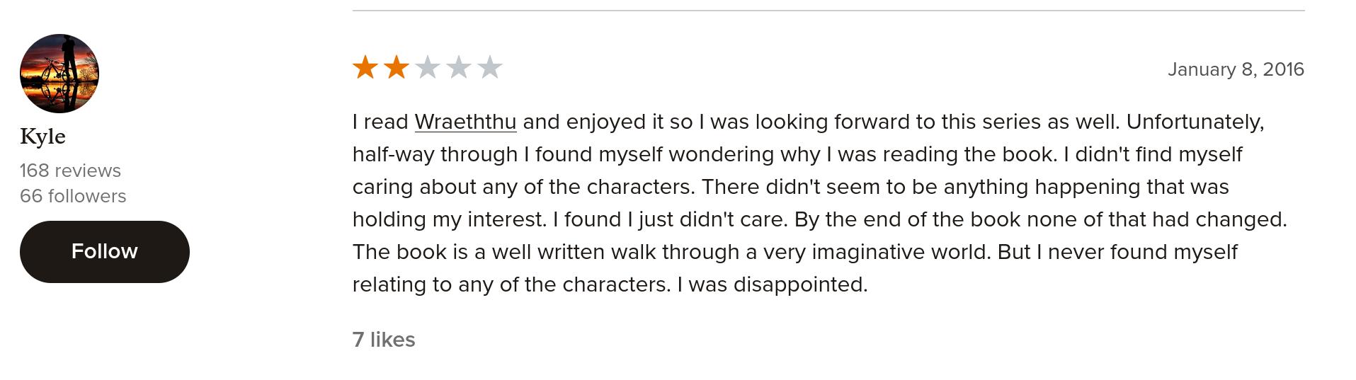
But the second-most liked review is a negative one.
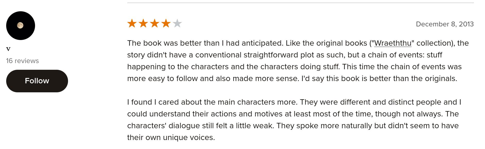
Yes, it’s written in a more straightforward way than the original books.
So there you go. While I didn’t hate this book, I definitely won’t be picking up any further books in the series.
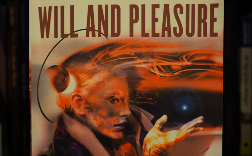
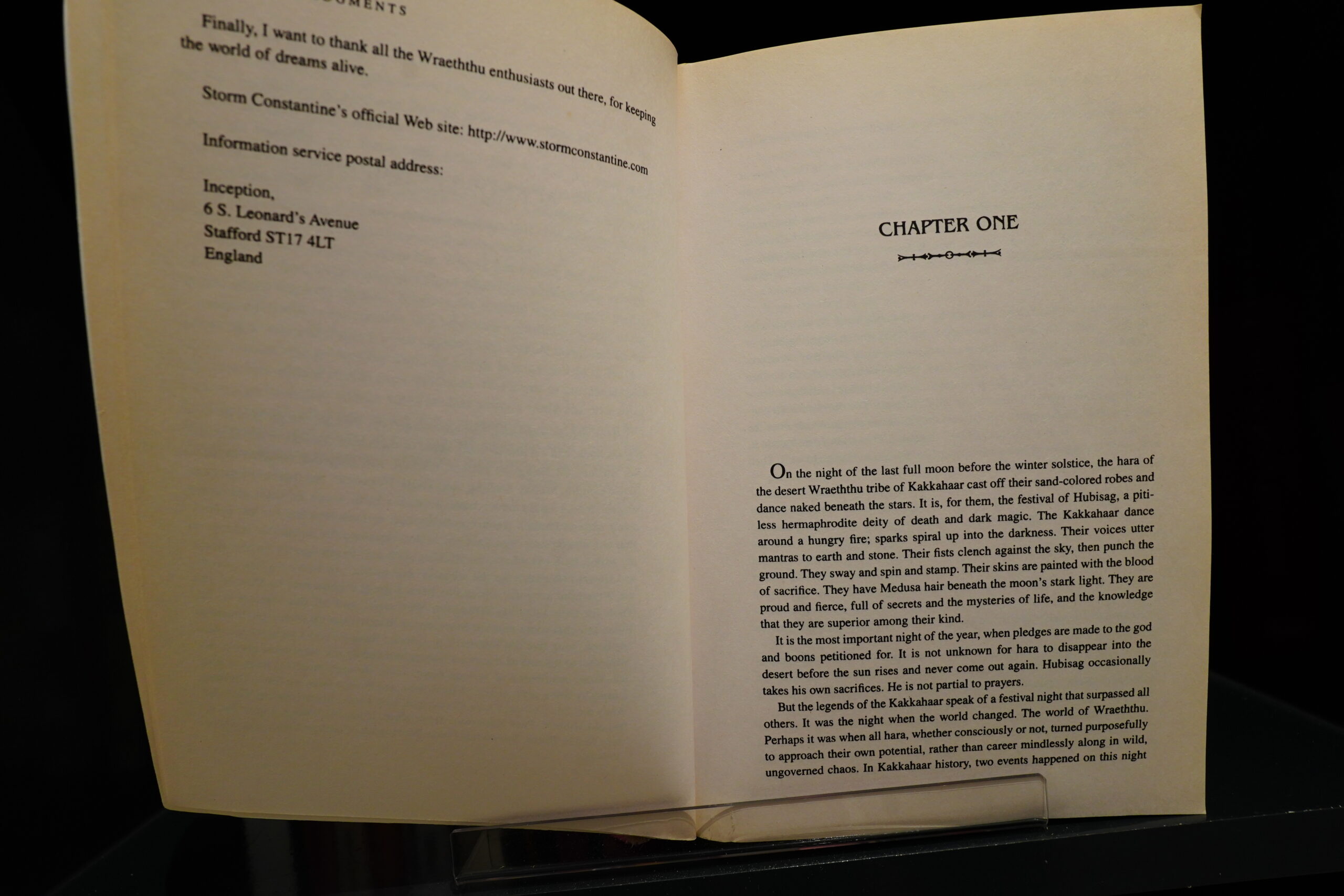
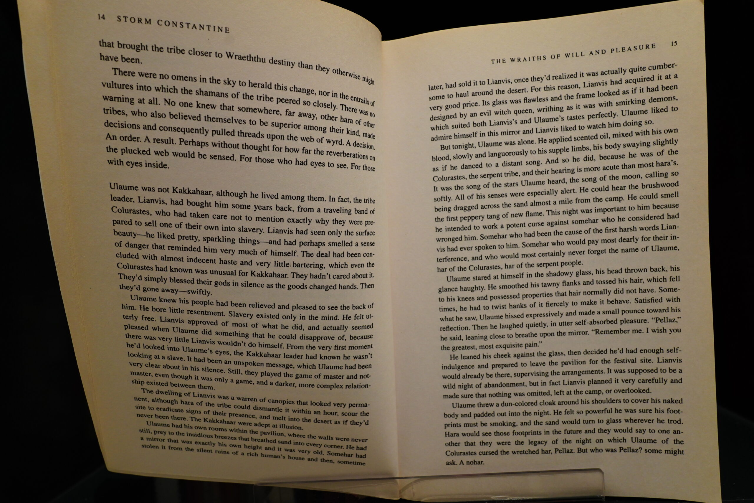
The Wraiths of Will and Pleasure (2003) by Storm Constantine (buy new, buy used, 4.23 on Goodreads)