Brr. It’s cold outside, and it’s a Sunday, so it seems like a good day for reading comics. This time around, it looks mostly like bigger books (a few, if any, small press items). And since it’s December, only music from 2022.
| Boris: W |  |

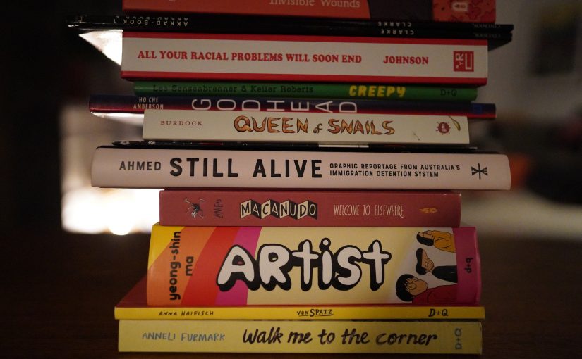
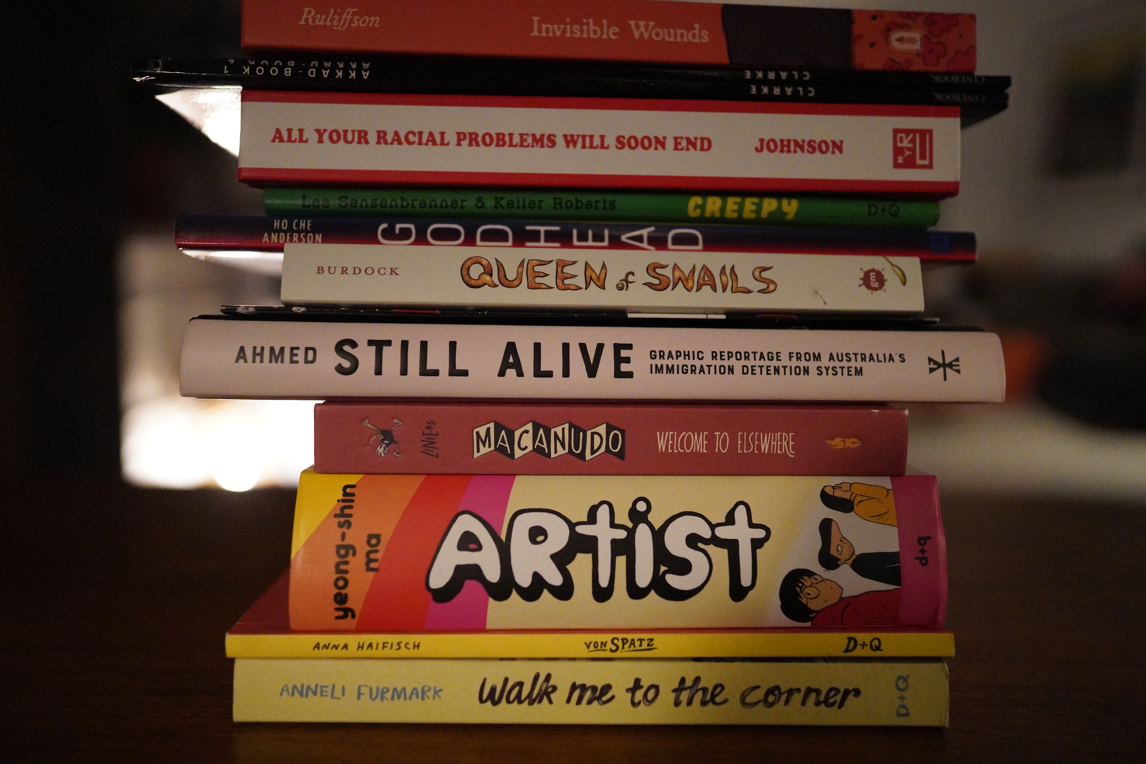
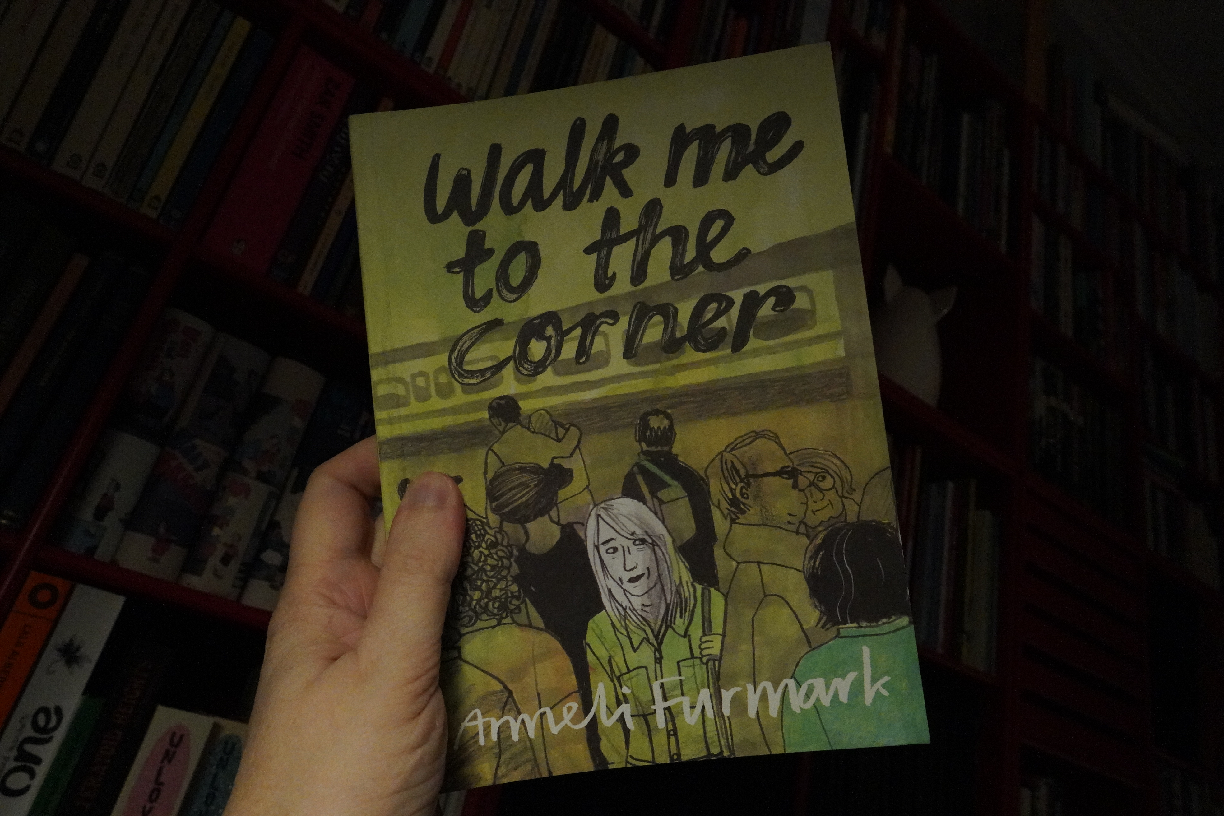
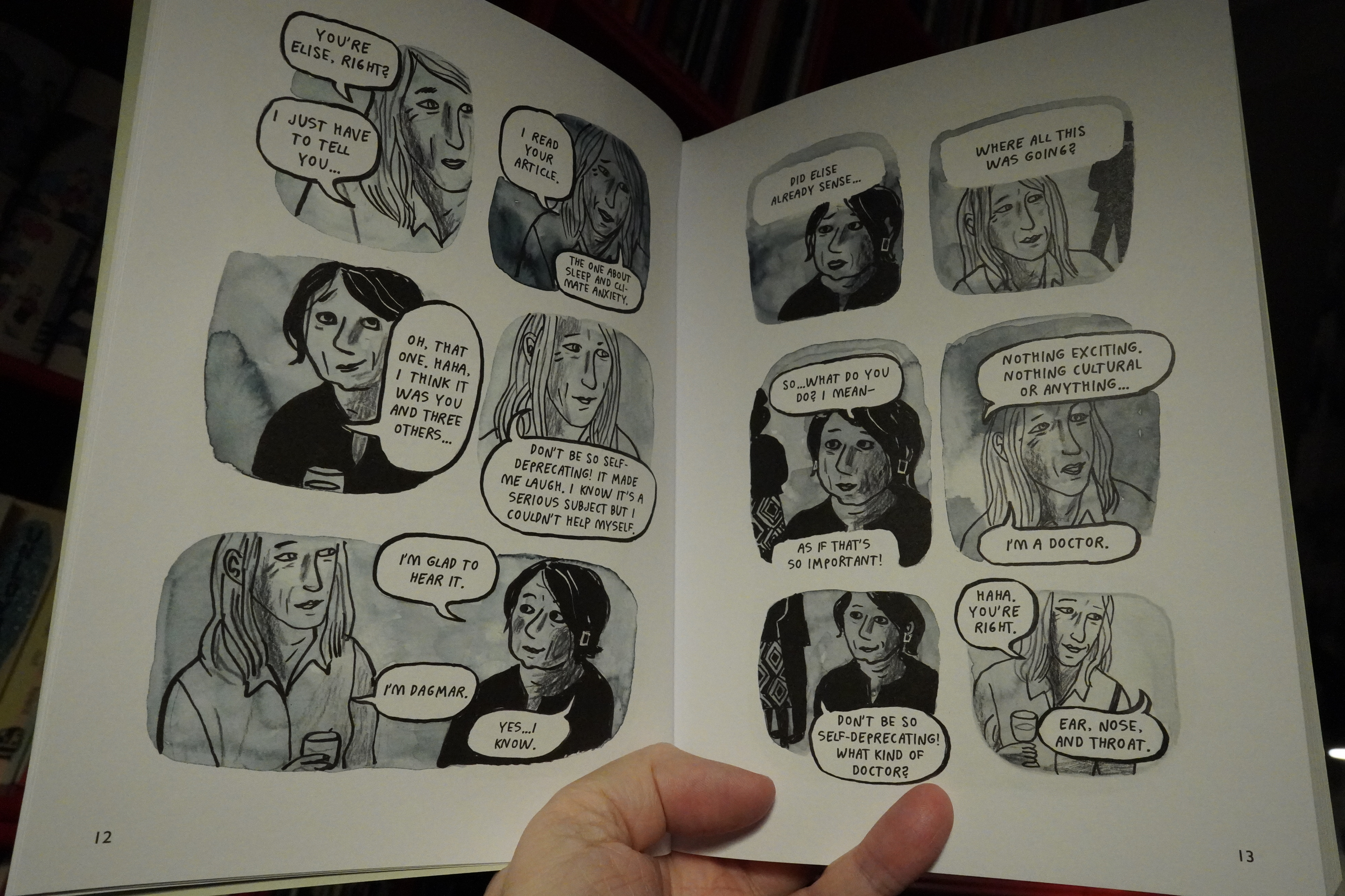
07:31: Walk Me to the Corner by Anneli Furmark (Drawn & Quarterly)

Hm… well, I don’t know. It’s a story that’s been told a gazillion times before, and the only reason we seem to be given for it to be told again is “well, this time it happened to me”. That is, this feels more like a private story than a personal story — it feels undercooked.
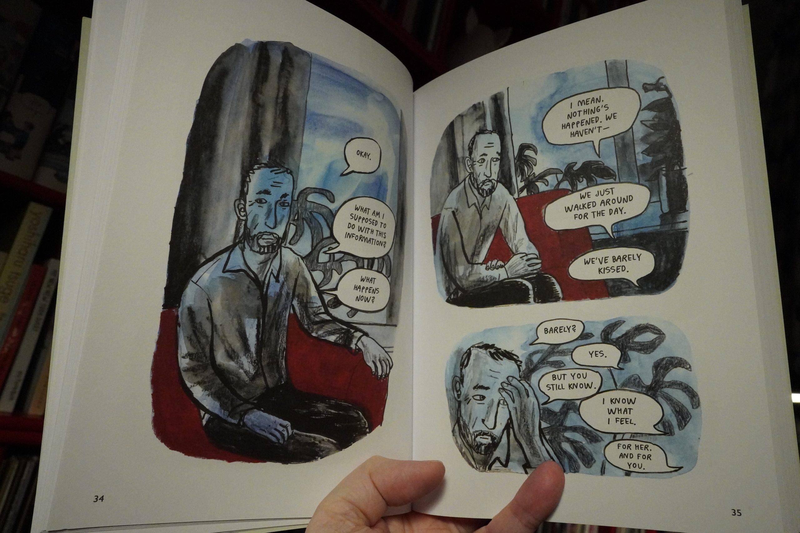
But the artwork’s lovely and the storytelling is accomplished — I love the colours in particular.
| 75 Dollar Bill: Social Music at Troost vol. 3: (Other) People’s Music |  |
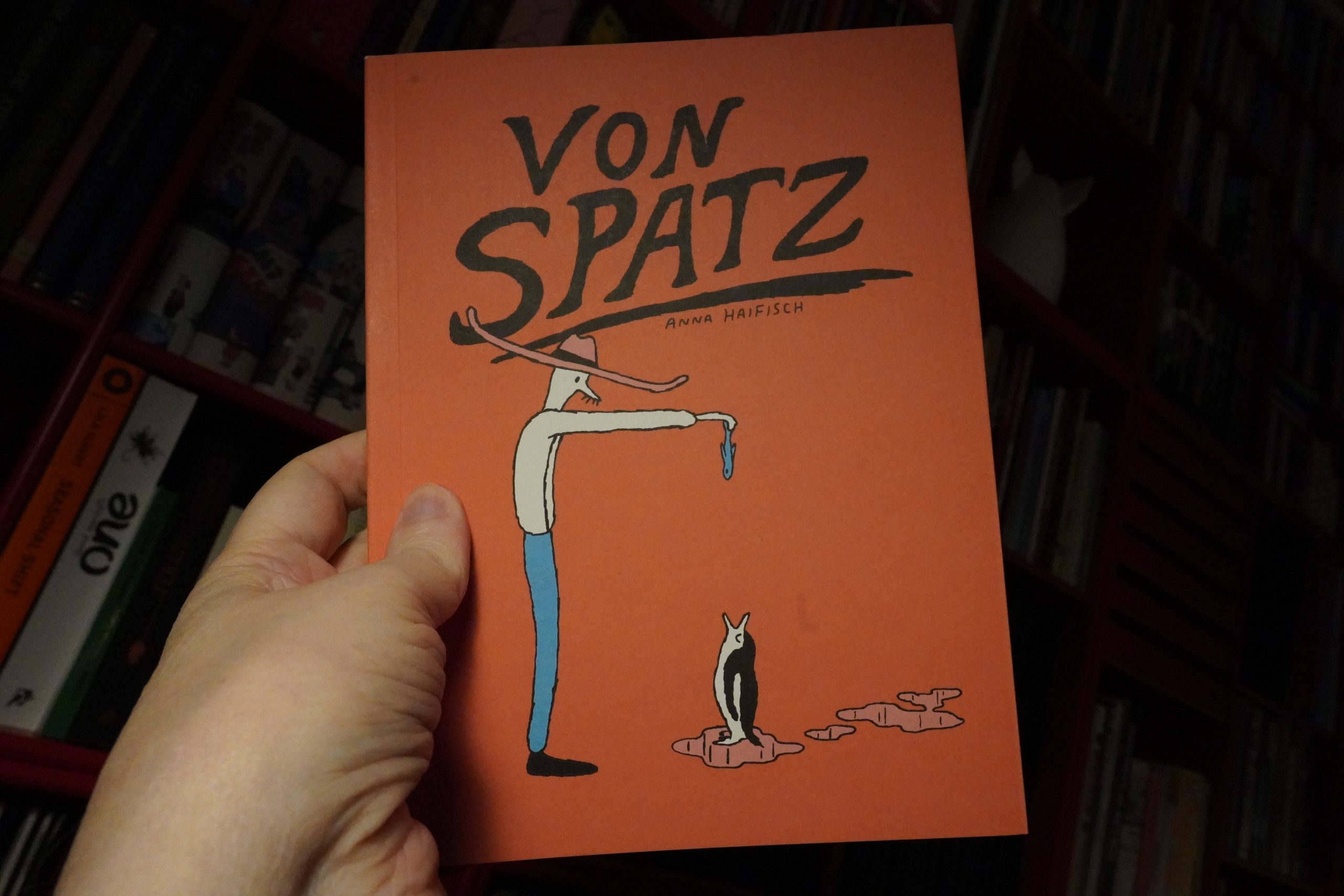
08:05: Von Spatz by Anna Haifisch (Drawn & Quarterly)

I like Haifisch’s books, but this one doesn’t quite connect.

It’s about Walt Disney in a mental institution, which sounds pretty high concept, right? It’s just got this strange flow, and nothing really coheres. But there are some sequences here that are kinda exciting.
| Burial: Antidawn |  |
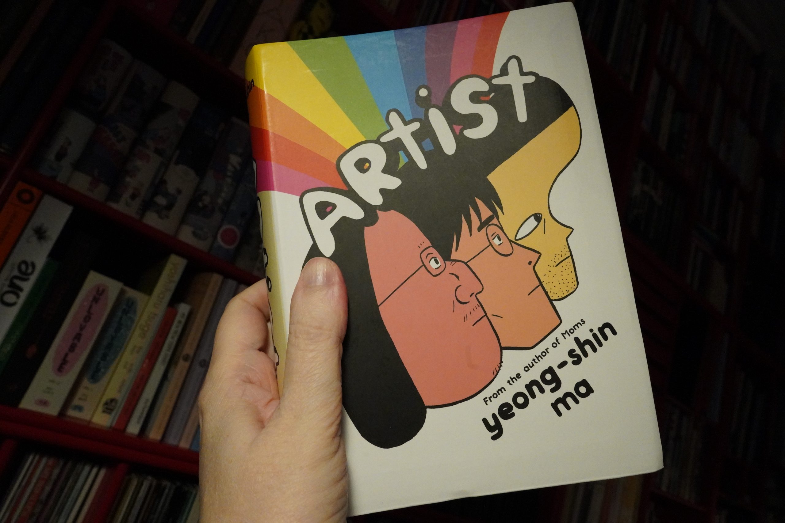
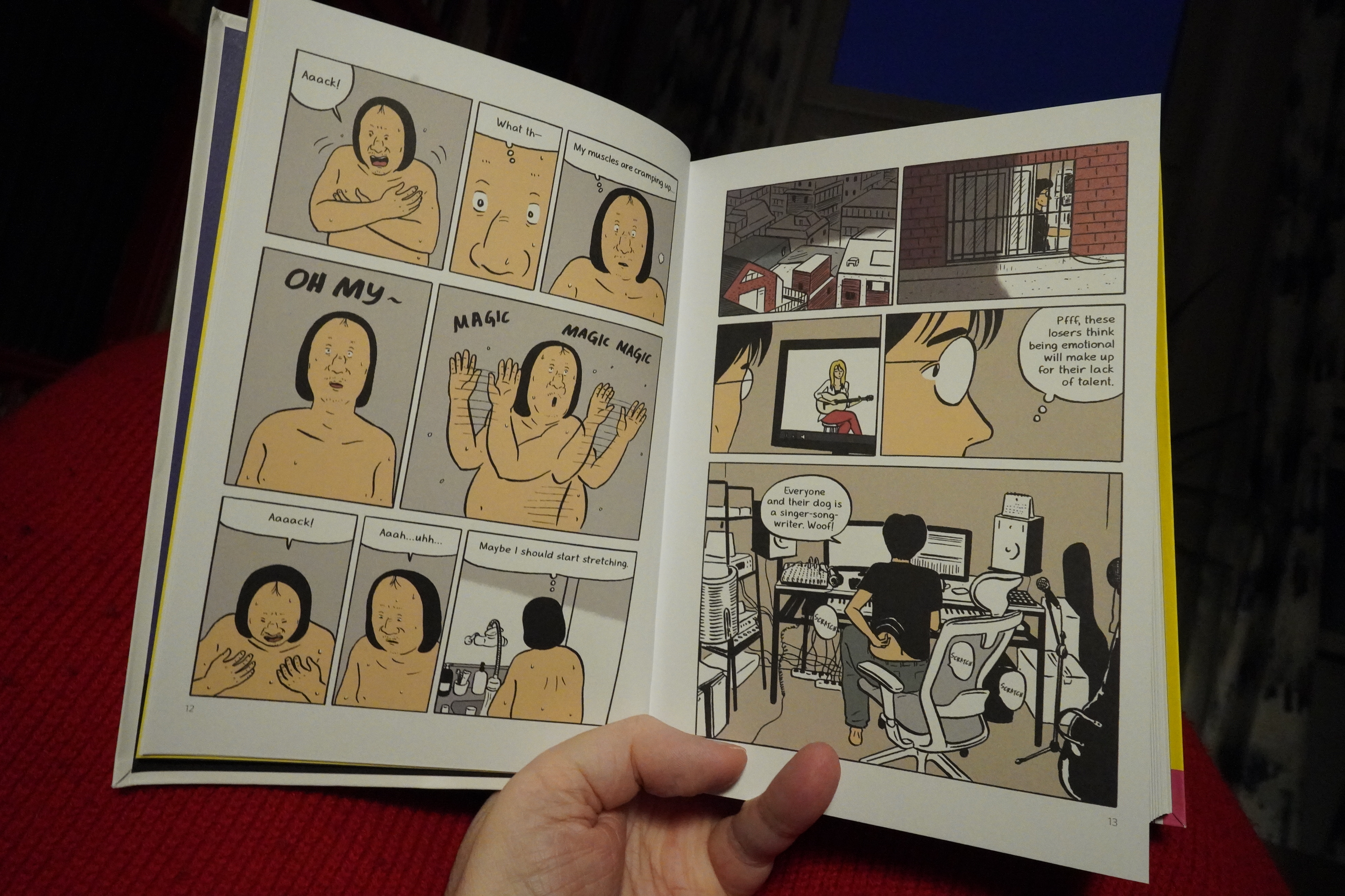
08:17: Artist by Yeong-Shin Ma (Drawn & Quarterly)
What a brick of a book — it’s more than 600 pages long.
I guess this is that old chestnut — a book about a bunch of slackers. But this time around, they’re not young slackers, but instead middle-aged ones, which makes is kinda interesting.
The character design is just bizarre. I’m guessing Ma is trying to keep them distinct (which I appreciate), but it leads to stuff like the guy who looks like The Elephant Man, while most of the rest look pretty normal. I wondered whether he was supposed to be horribly deformed, but no — he’s just drawn that way.
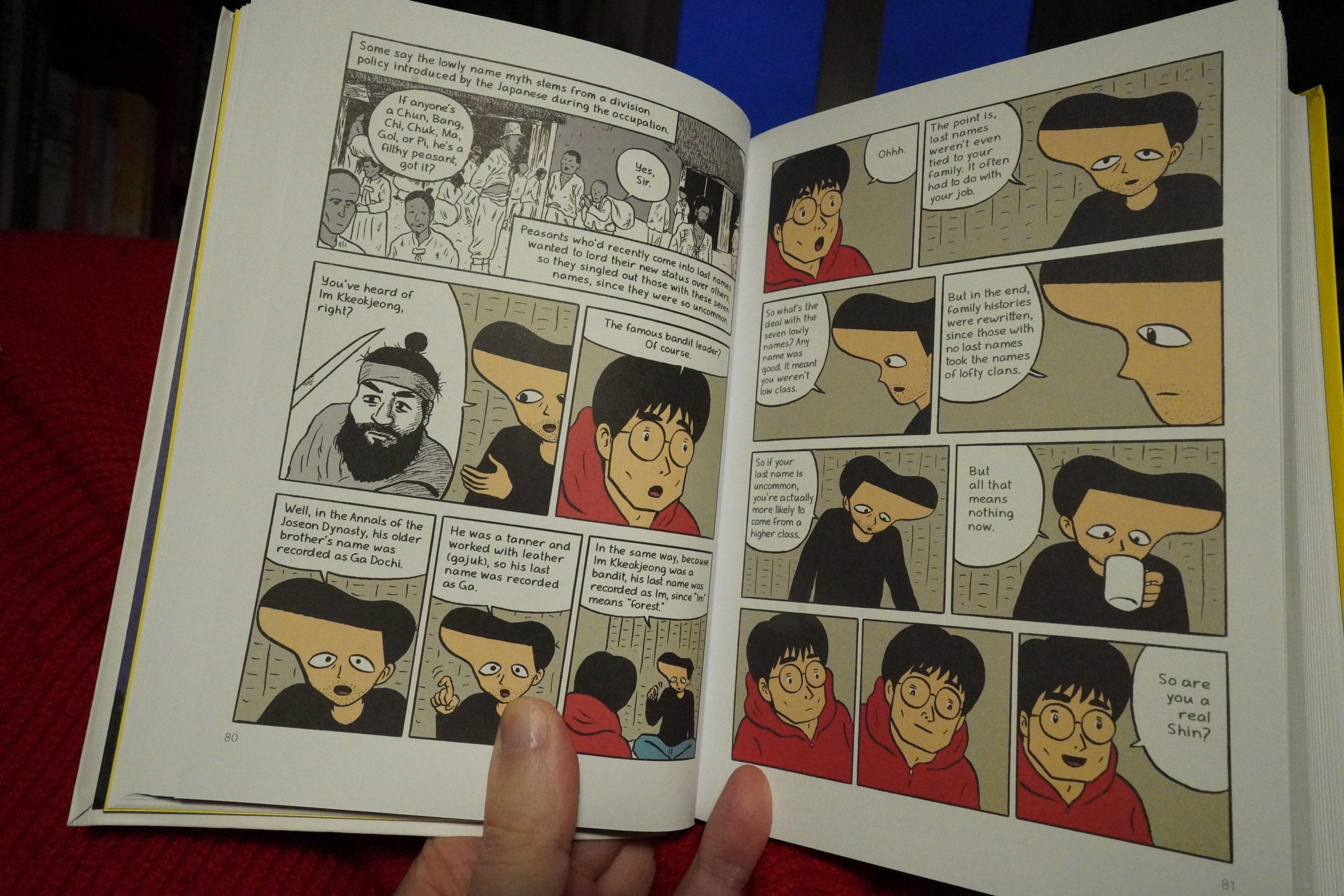
Ah, Ma is considered a low class family name in Korea, but here Ma explains that Ma is really the most hoity of toityest names, really. Only nobody knows. Very subtle.
| Cat Power: Covers | 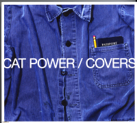 |
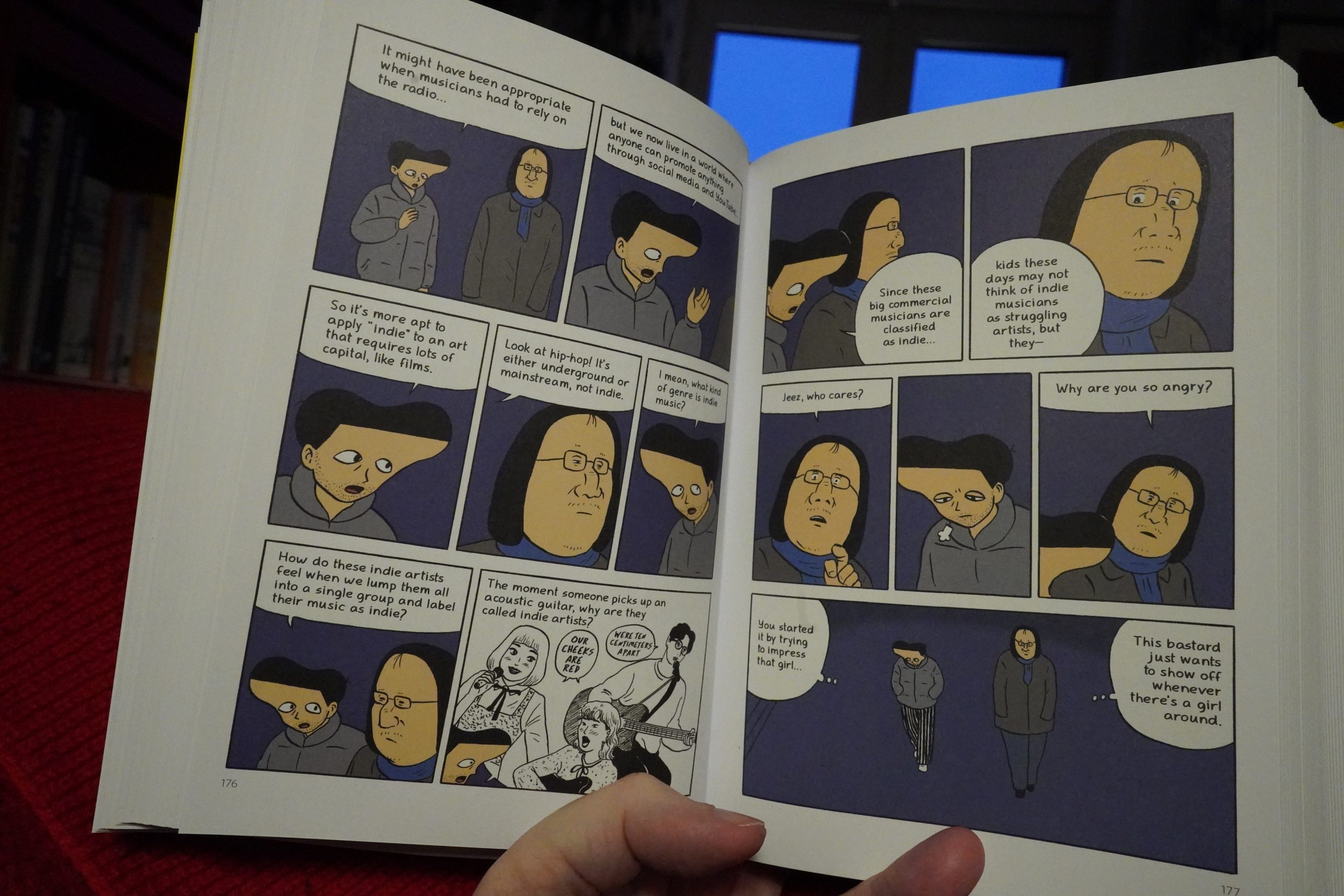
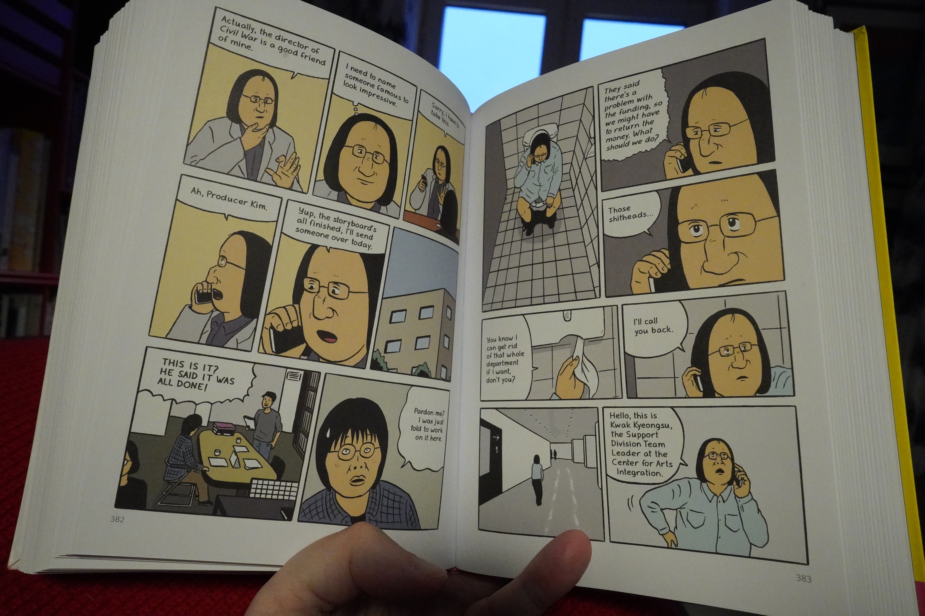
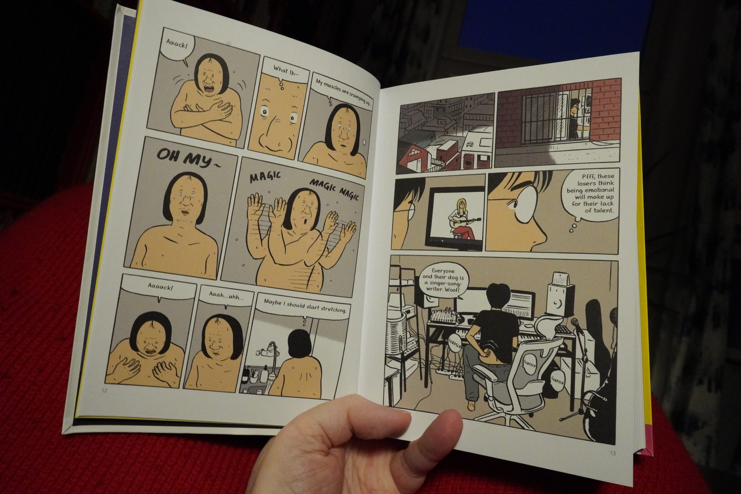
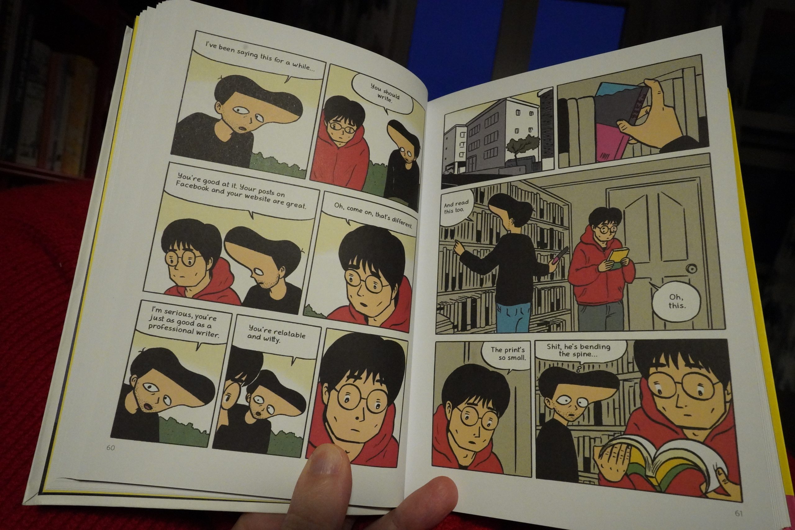
For the first couple hundred pages, I was really enjoying this book — but then more and more tedious scenes start appearing, like this.

And as it’s revealed that most of the characters are total assholes, it somehow gets less interesting. The constant digs at rampant corruption and unfairness in Korea feel like they should be more interesting, but instead they come off as sour grapes and envy, really.
The book is OK, I guess. The art does nothing for me (including the post-Drnaso colouring), which I guess is a major part of my impatience with the work.
| Snapped Ankles: Live at Shacklewell Arms |  |
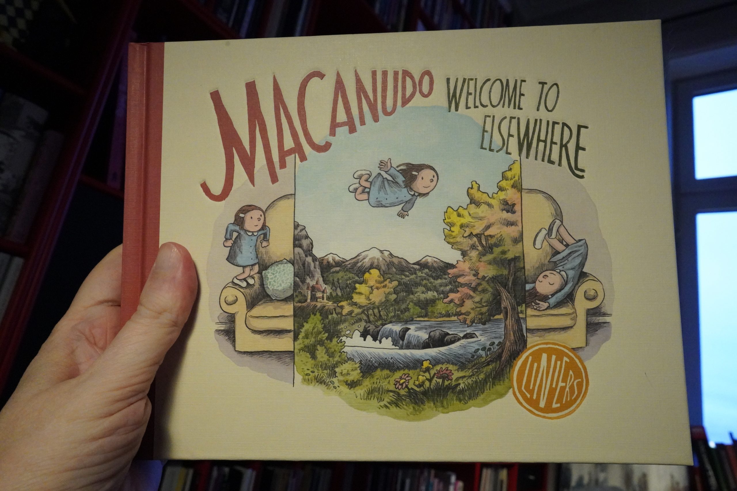
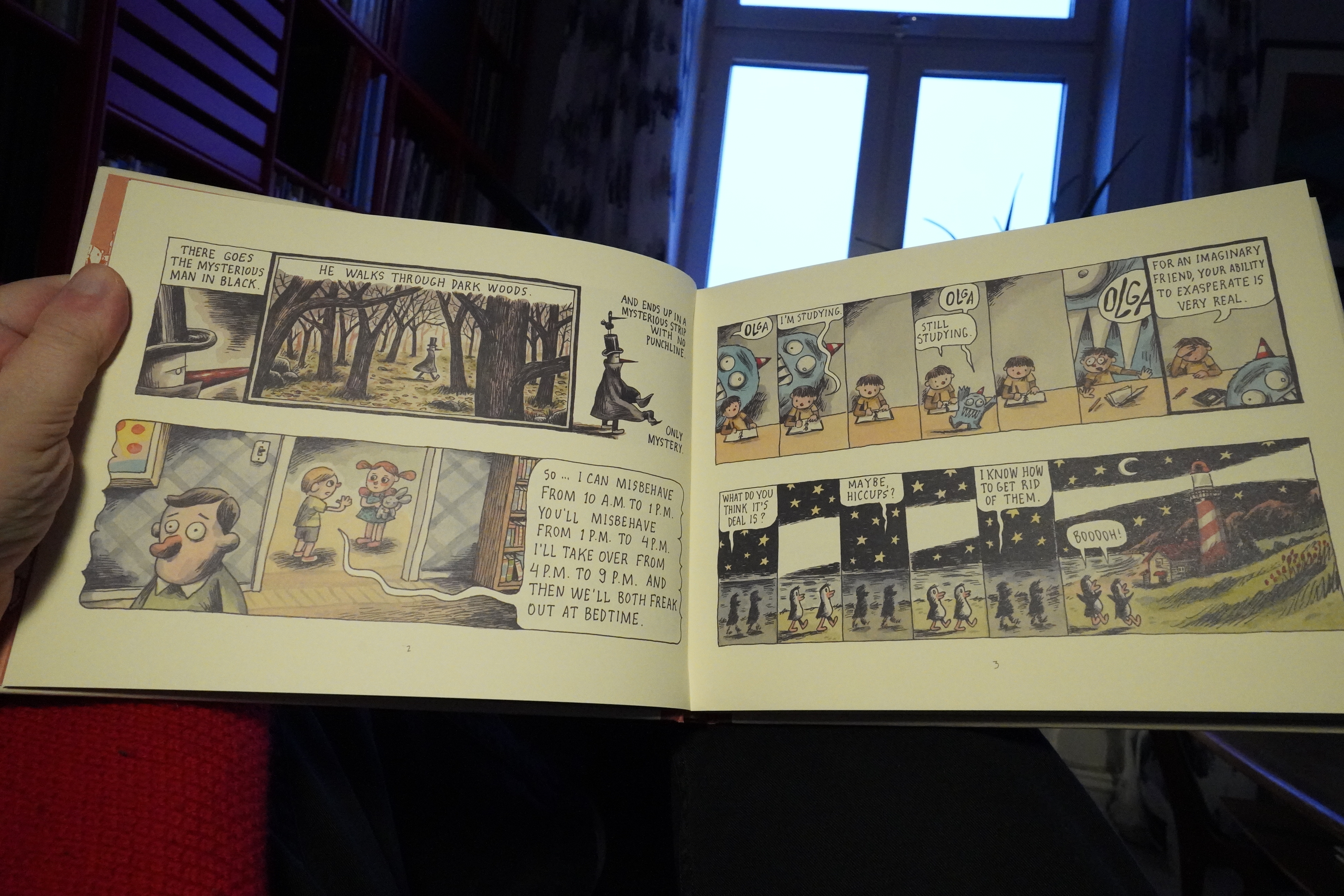
10:25: Macanudo: Welcome to Elsewhere by Liniers (Fantagraphics)
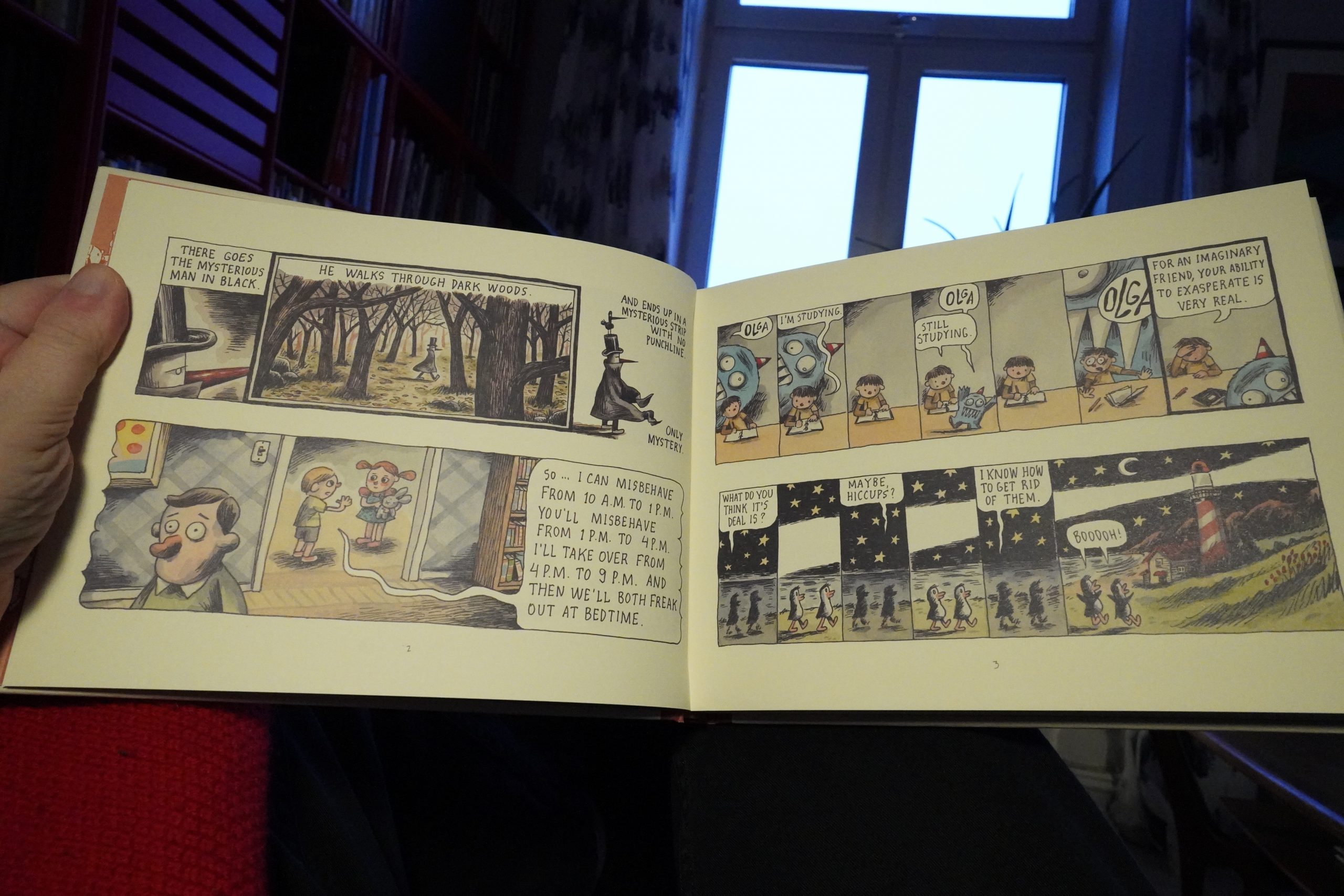
I kinda like the art… it’s got an oldee tymey feeling, even if it’s slightly on the slick side.
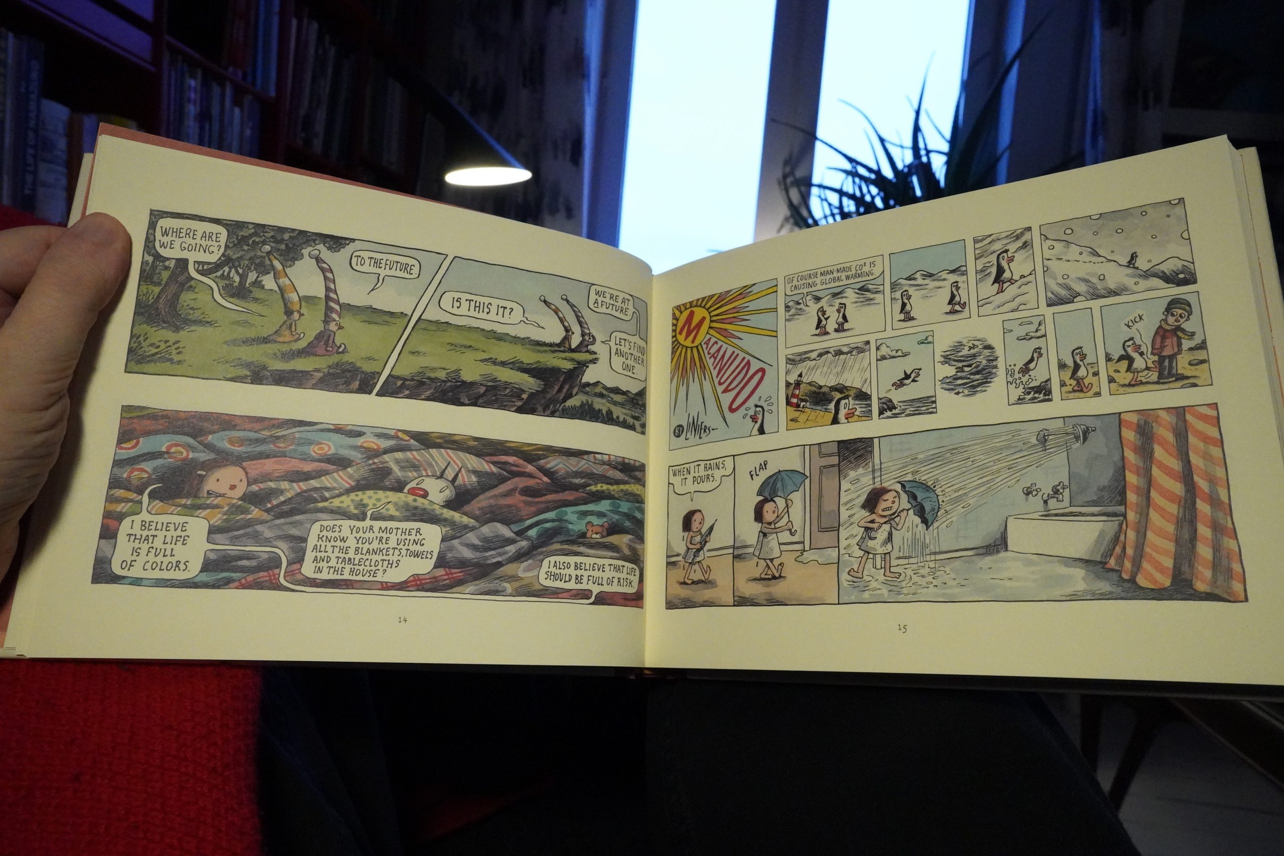
The humour, though. Ouch.
I had to ditch it one third in, because it’s too painful.
I haven’t been lucky with the books today… I shouldn’t have read all the art comics the other night. All these “quality” comics…
| DJ Nigga Fox: Musica da terra |  |
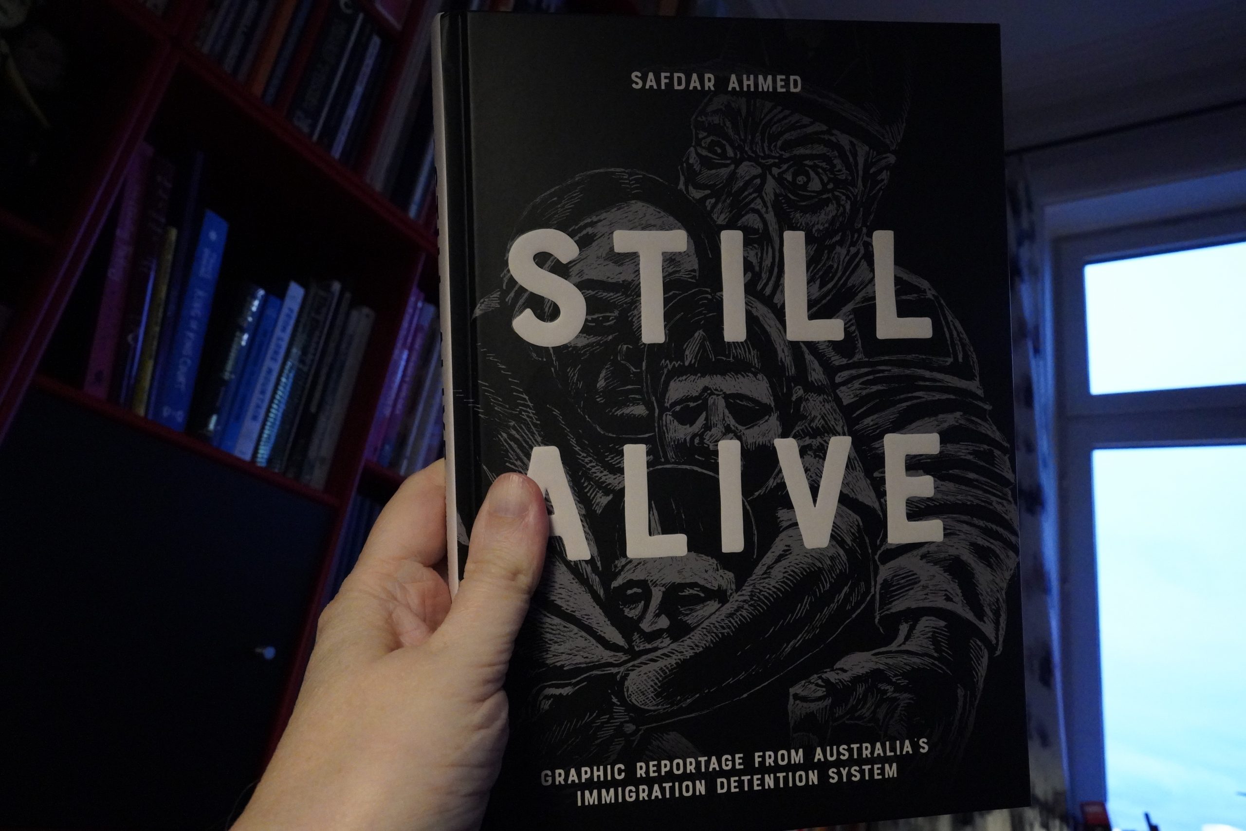
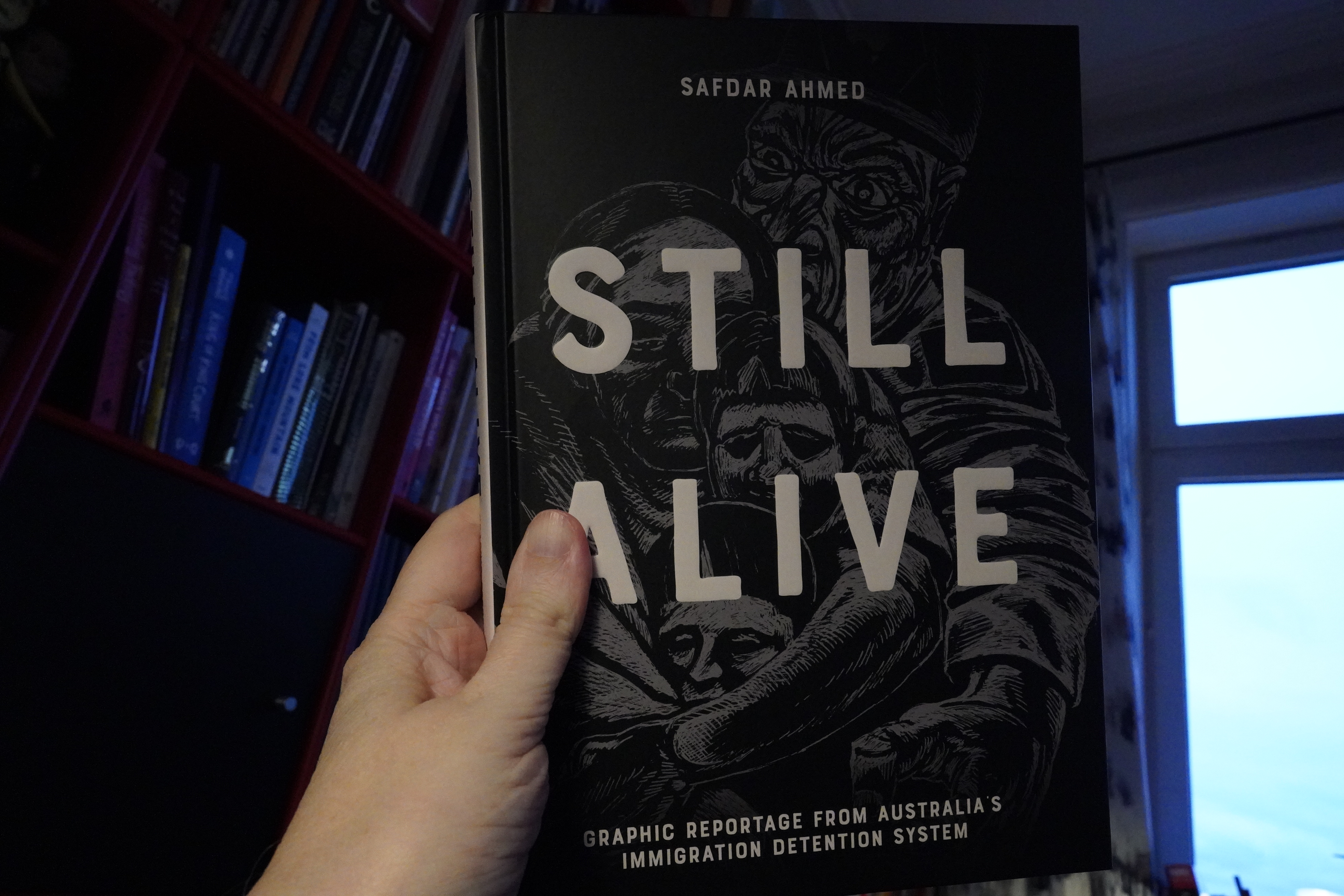
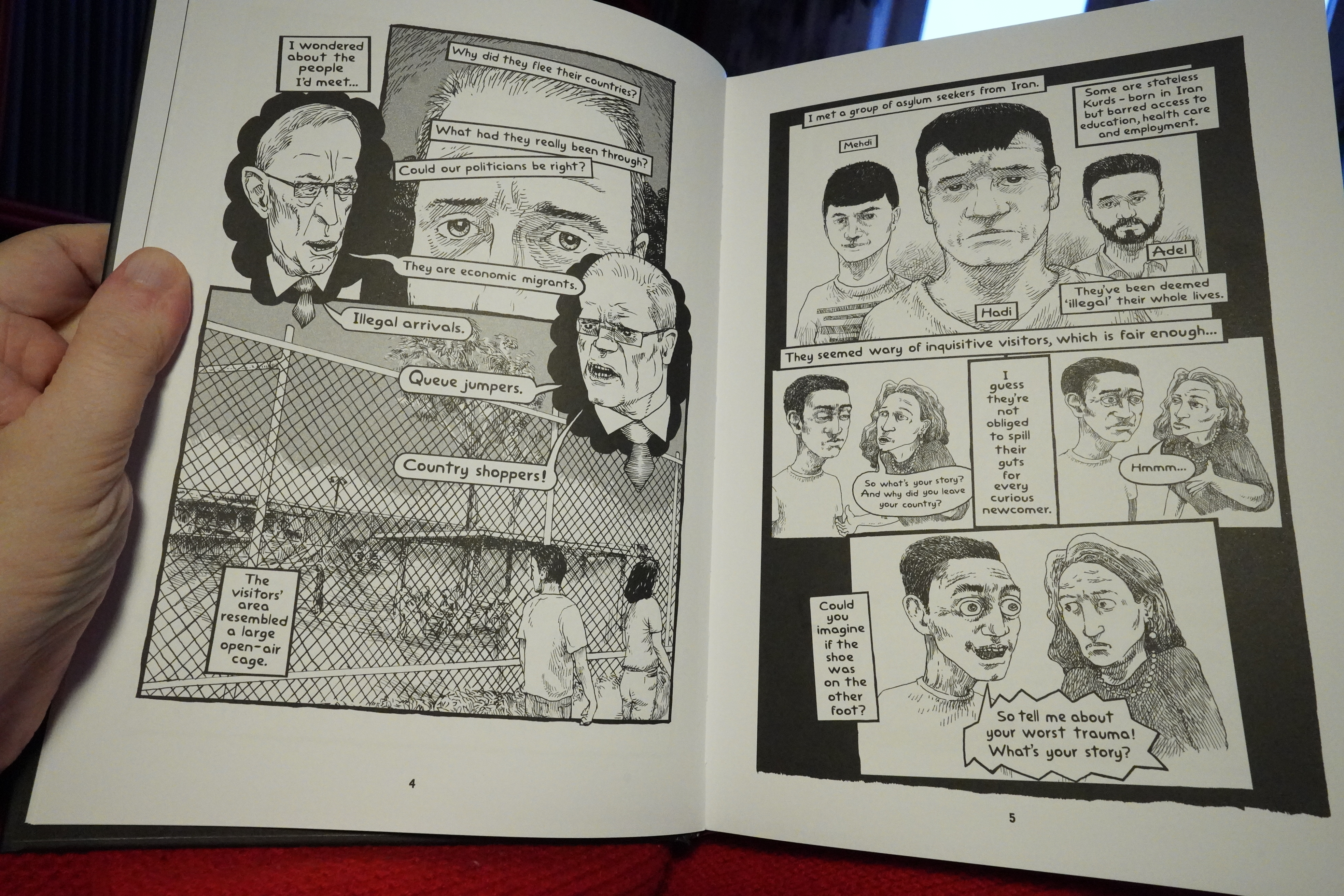
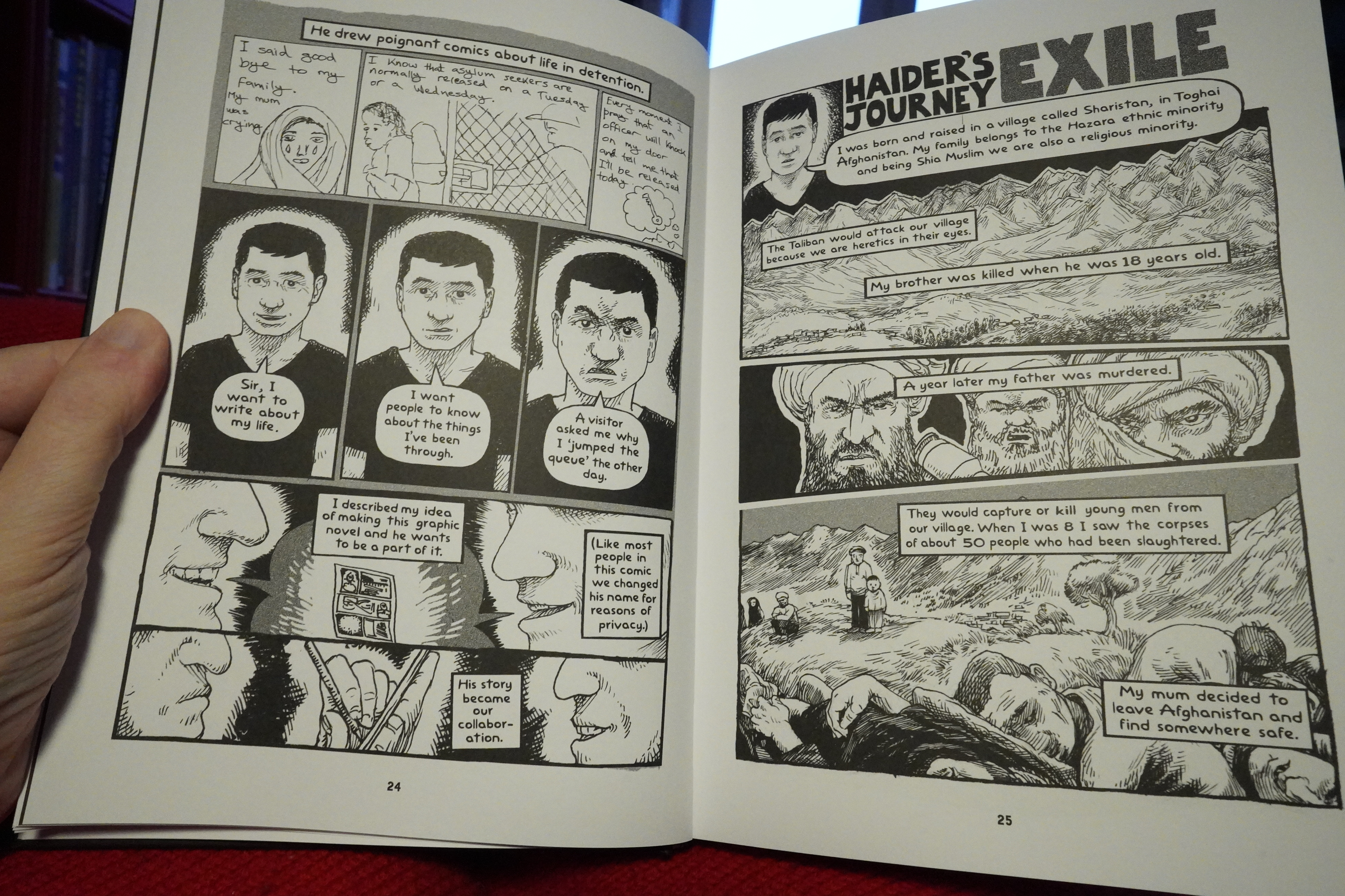
10:39: Still Alive by Safdar Ahmed (Fantagraphics)

Hey! This is pretty good. The storytelling is sometimes a bit clumsy, but the rightful anger comes through well.
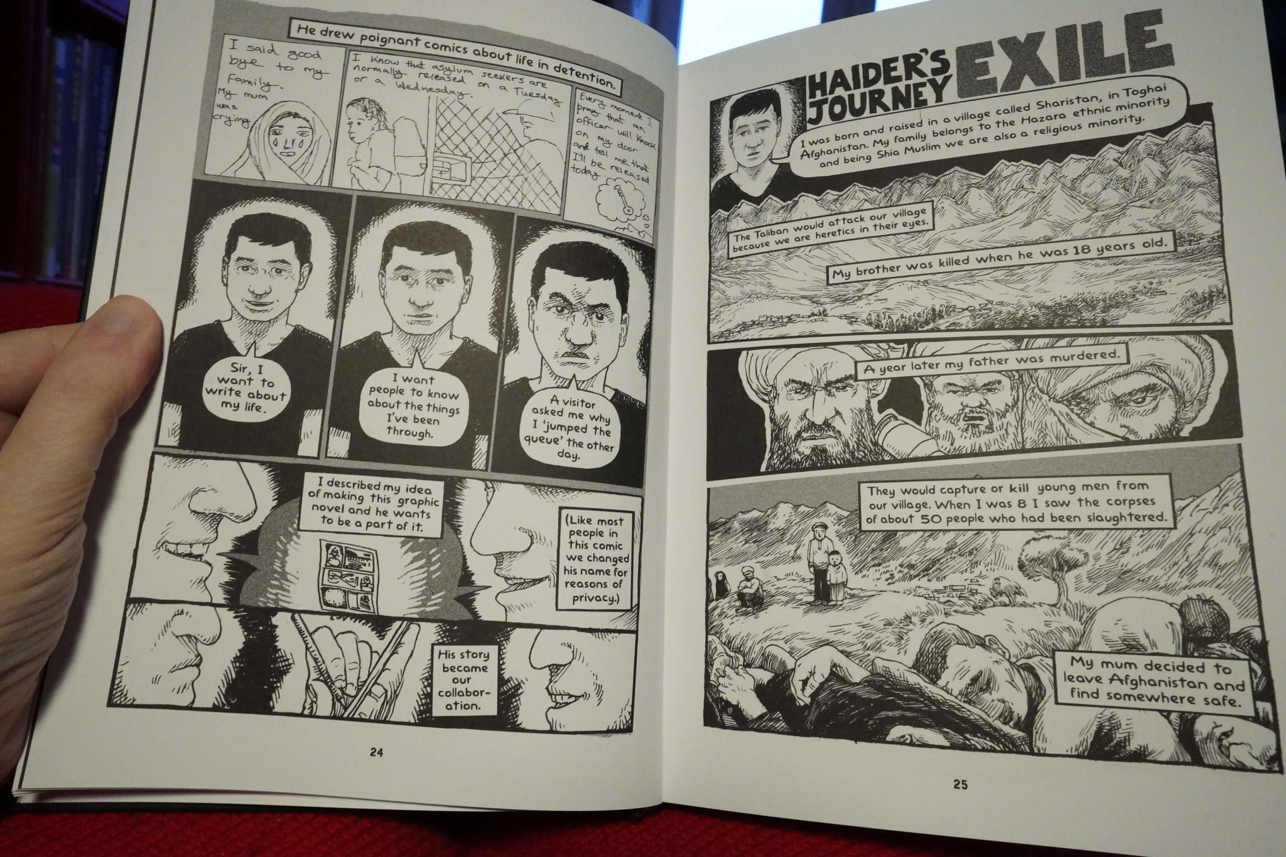
It really shines in the sections where Ahmed retells the stories from different refugees — these are more straightforward and less angsty. But it’s all good — it’s gripping and it’s and interesting book.
| The Body & OAA: Enemy of Love |  |
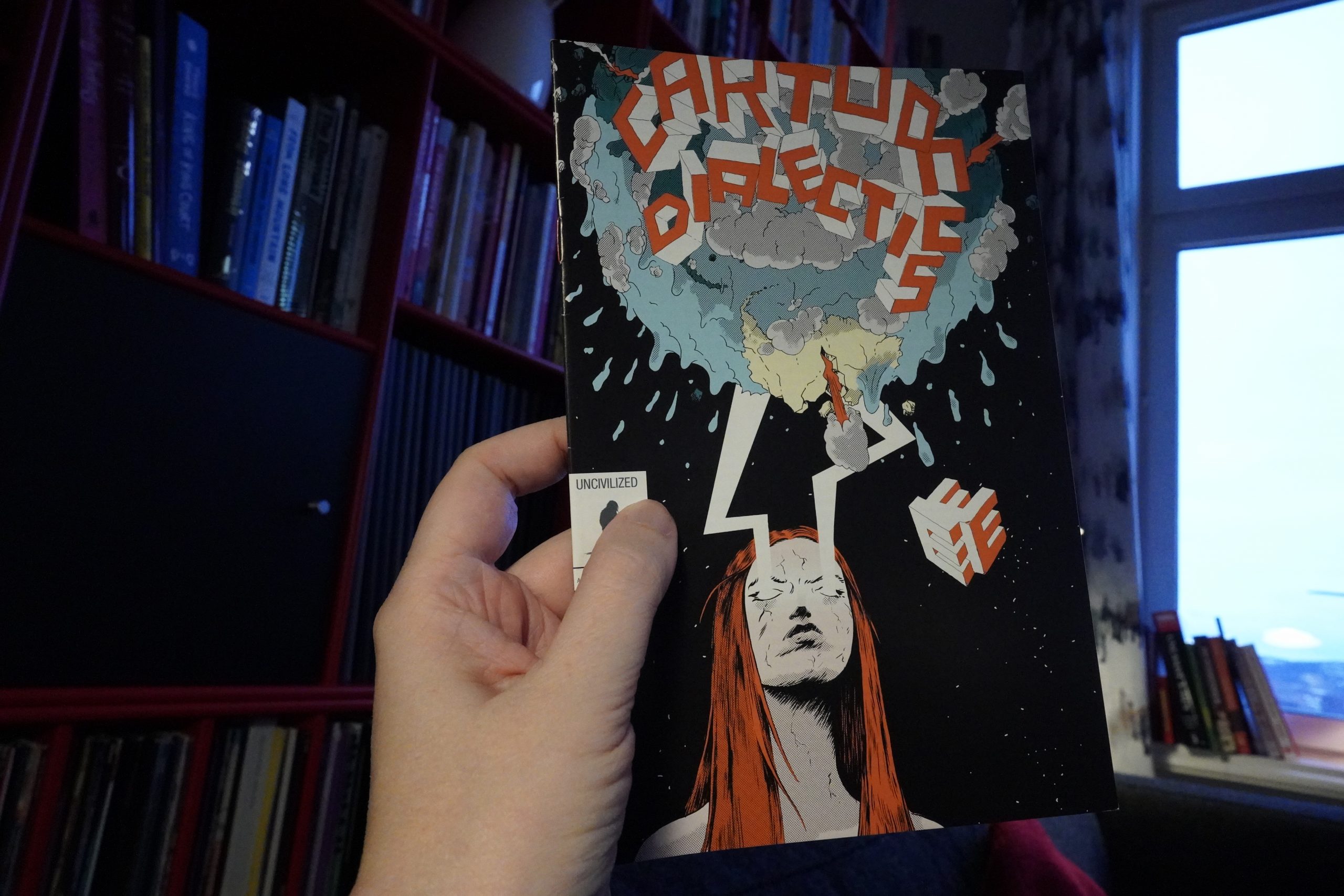
11:44: Cartoon Dialectics v2 #3 by Tom Kaczynski (Uncivilized Books)

This is much less serious than this series usually is, isn’t it?
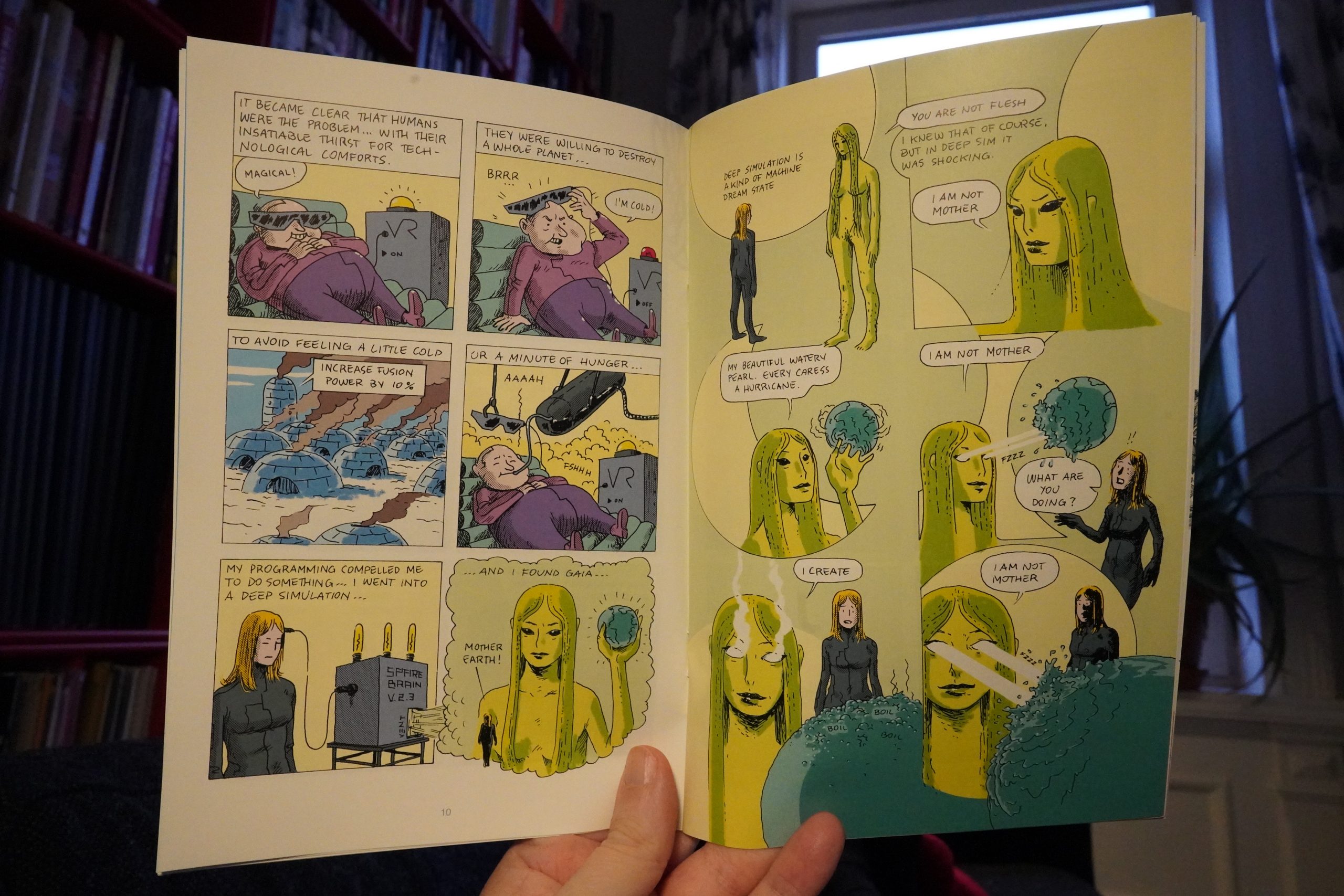
Perhaps it’s something Kaczynski was doing while procrastinating or something. It’s fun, nonetheless.
| Kreidler: Spells And Daubs |  |
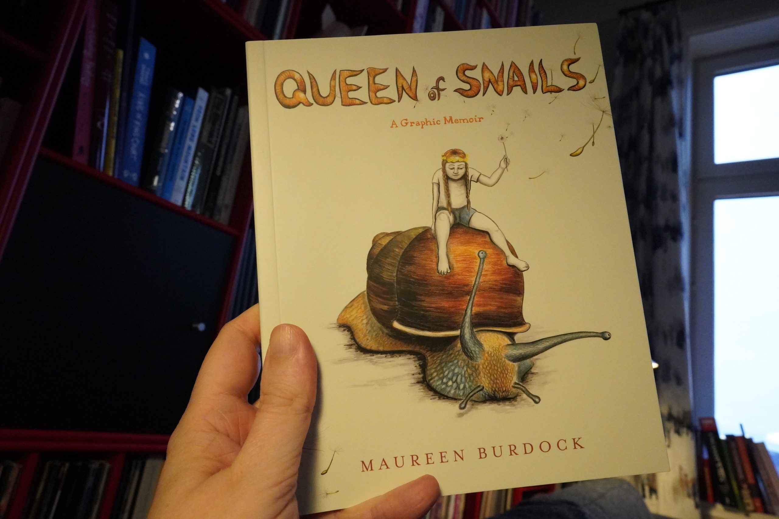
11:56: Queen of Snails by Maureen Burdock (Graphic Mundi)
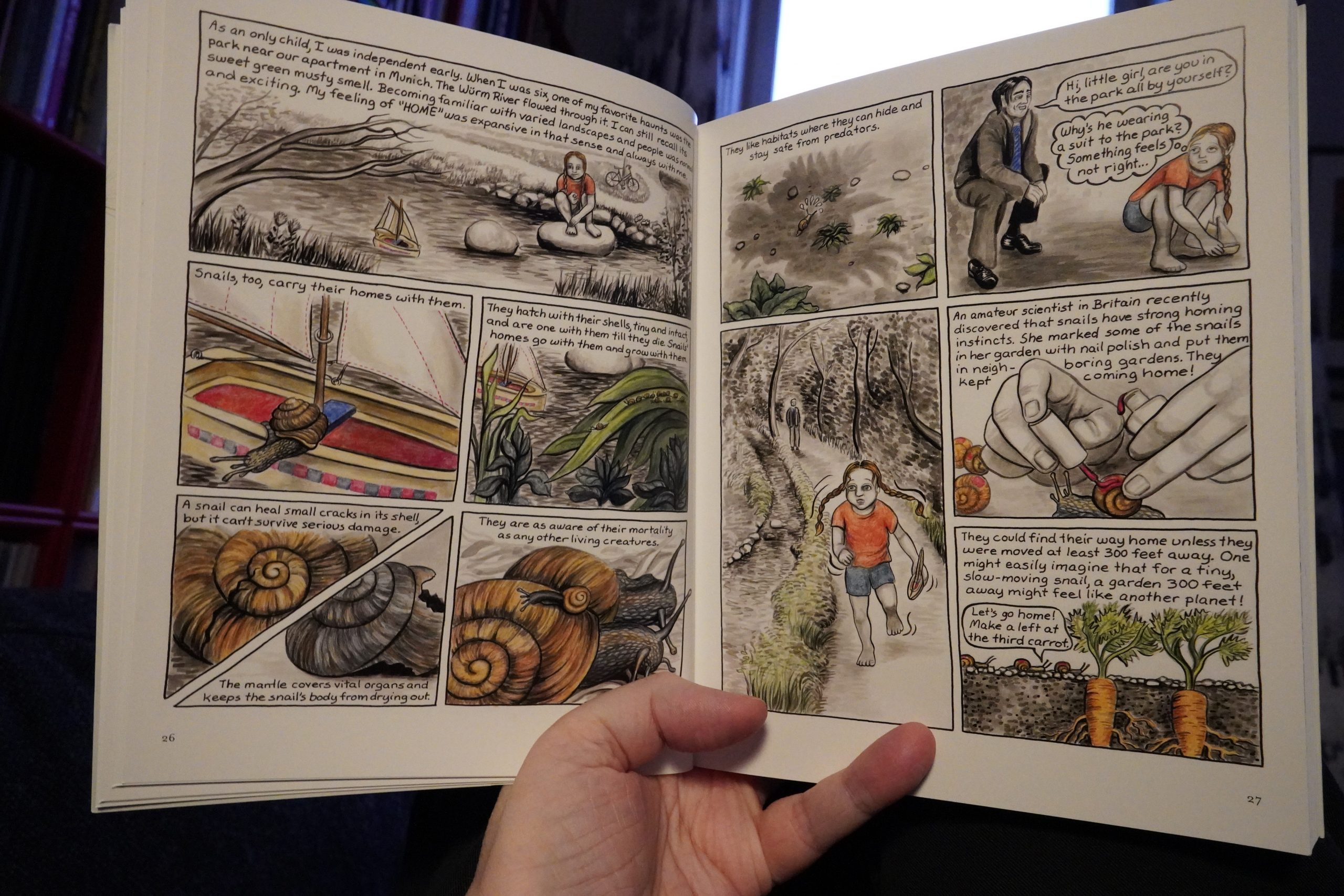
This is on the other end of the scale from the Furmark book — that one didn’t seem to have any kind of framework or analysis behind it. This, on the other hand, seems to be so thoroughly digested and contextualised that it drains the life out of it — everything is pre-analysed and all metaphors are in place and are explained explicitly.
| The Kids And The Cosmos: Ambient Mixtape Vol.1 |  |
By having everything — absolutely everything — totally analysed within this framework, the book becomes claustrophobic and exhausting. One horrifying thing after another happens in this book, so perhaps this distancing is necessary to even be able to tell this story?
| Various: Blackwaterside |  |

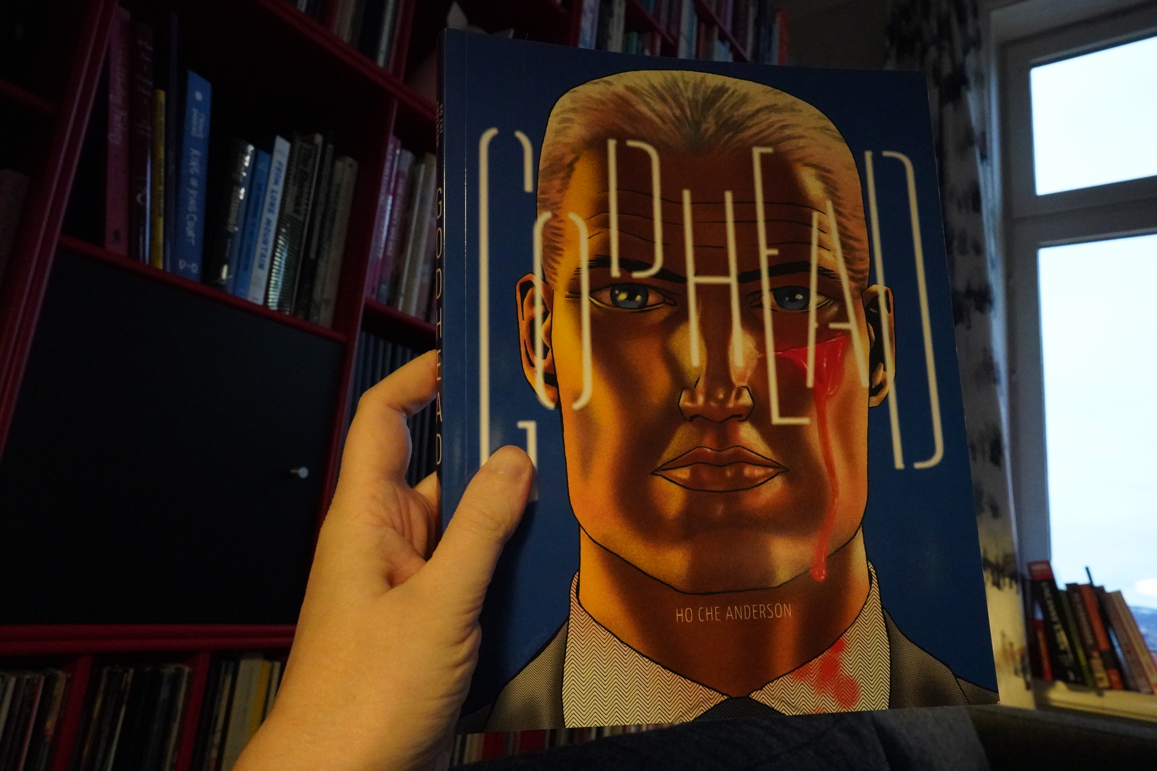
13:07: Godhead 1 by Ho Che Anderson (Fantagraphics)
Oh, this was originally released in 2018, but I missed it. Hm… oh, Godhead 2 is to be released in a couple of month, which explains why Fantagraphics resolicited it now.

Well, this is quite a different art style than Anderson used to use… it’s cool. (I think I’ve read everything he’s done over the years.)
Then he switches to a style that’s closer to his old style, but… not as wild? And he copy/pastes stuff here and there, which is highly disturbing, because the eye snaps *SNAP* to the copied images and starts scanning for other copies. But Anderson only does this on a handful of pages… very odd. It’s like he started the book off in a very work intensive style, then flipped to a very lazy, Photoshop work flow, and then to a style that’s more normal, but never as interesting as his 90s style (which was amazing).
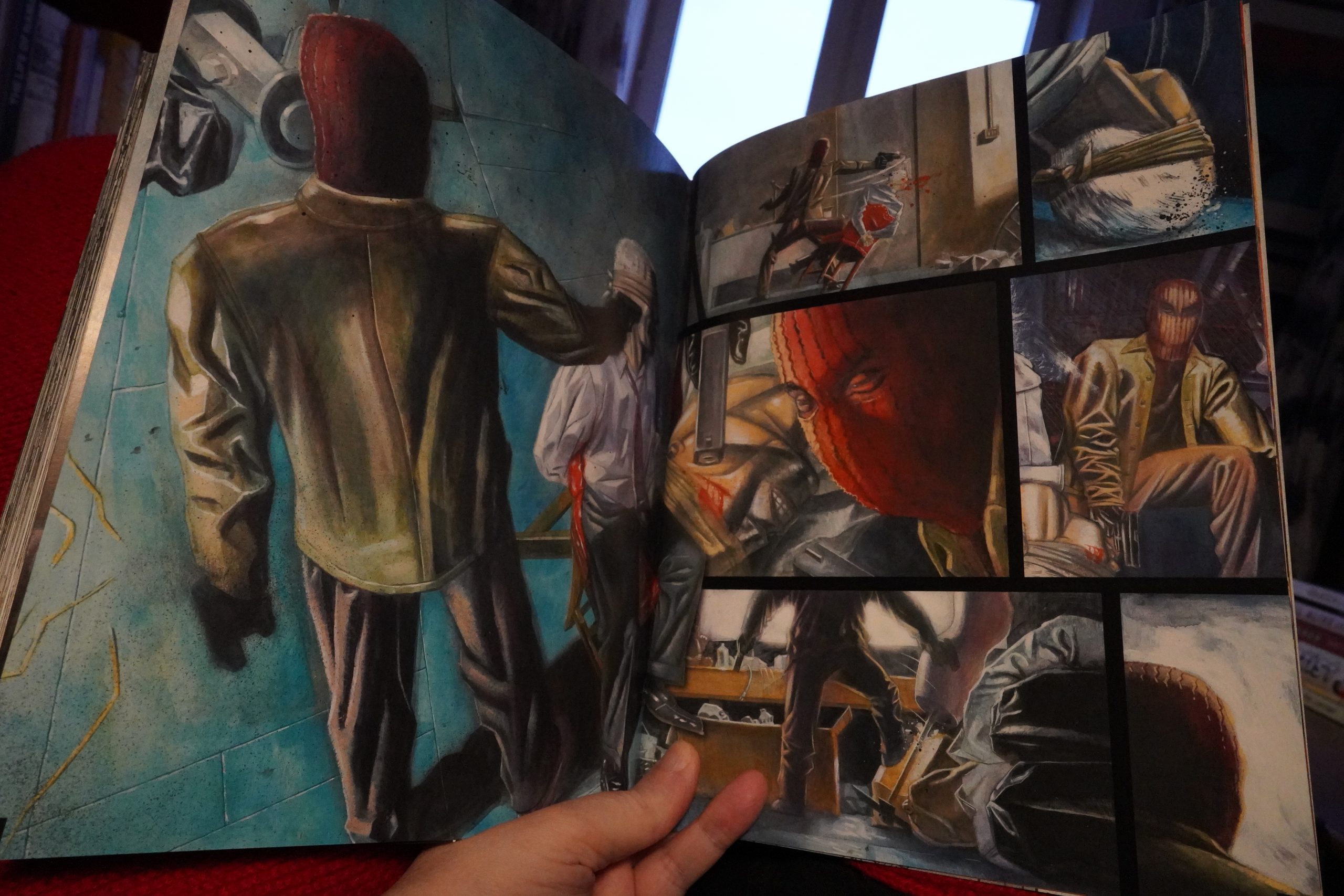
Oh! It was originally meant to be done in this full-colour style? They print the opening sequence in colour at the end… if it’d all been in this style, that’d be awesome.
Anyway, despite the art wobbles, it’s a pretty entertaining book — it’s got a classic Mad Scientist that’s killing people, and there’s a side plot about a soldier… I’ll be picking up the second (and final) volume for sure.
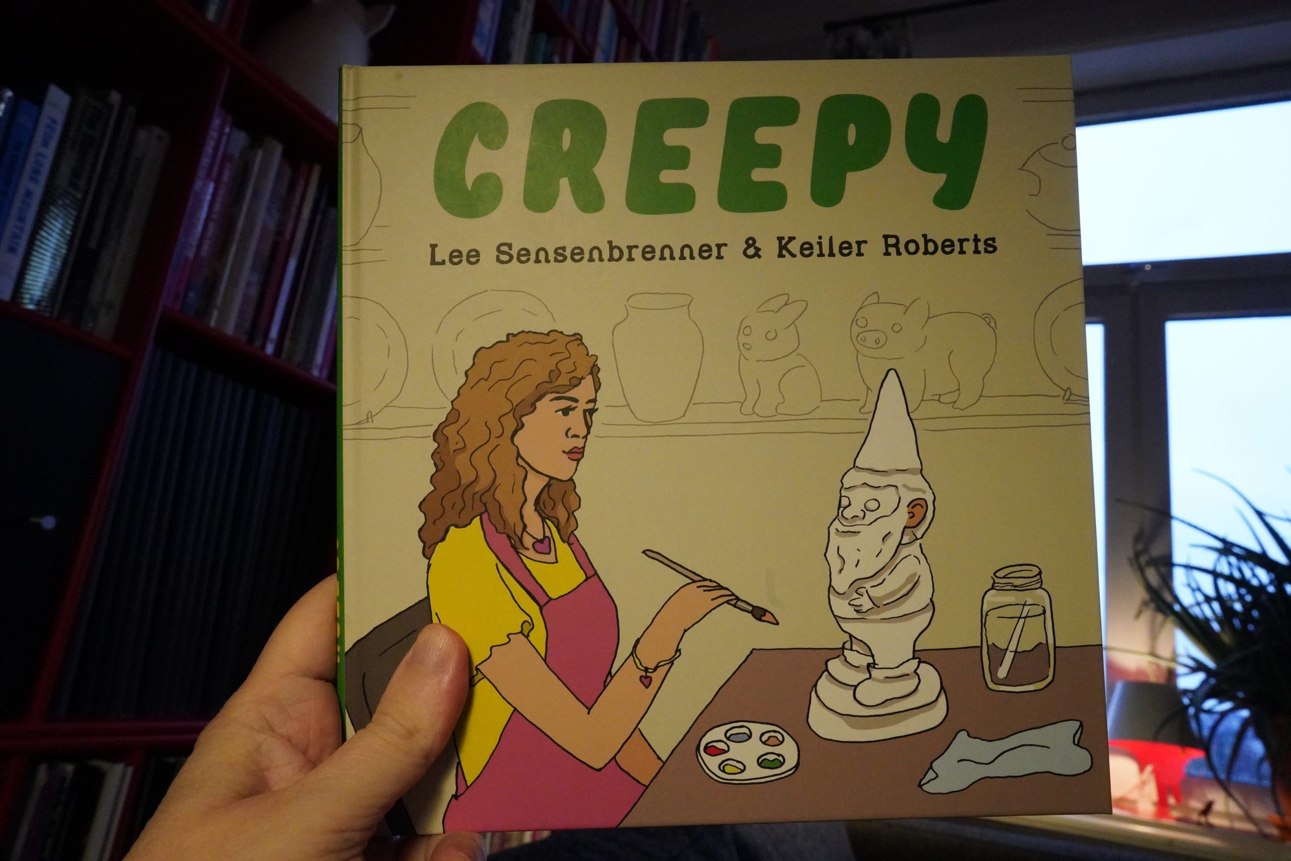
13:58: Creepy by Lee Sensenbrenner & Keiler Roberts (Drawn & Quarterly)
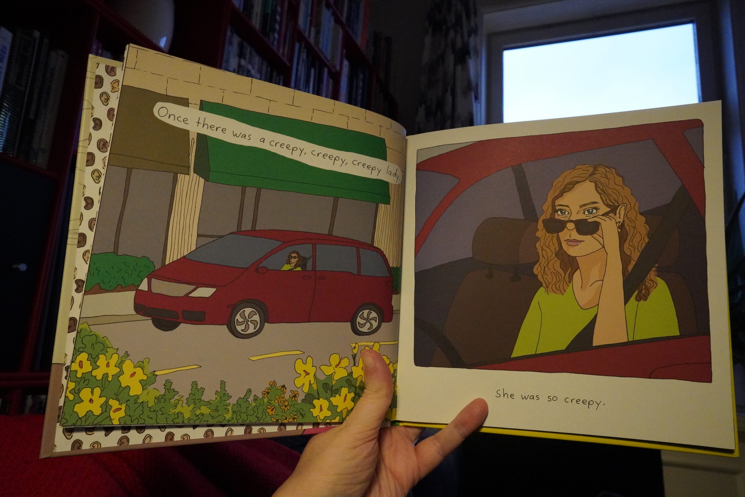
Heh heh. This is a book for children, and it is, indeed, very creepy. And funny.
| Umru: Comfort Noise |  |

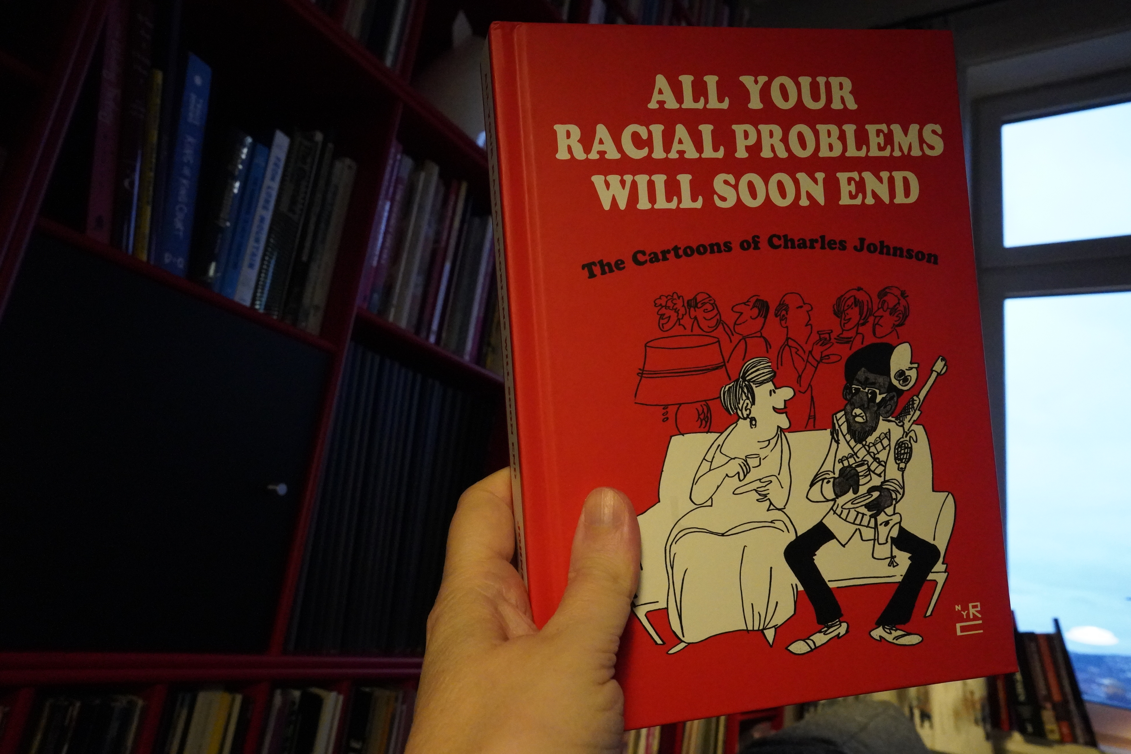
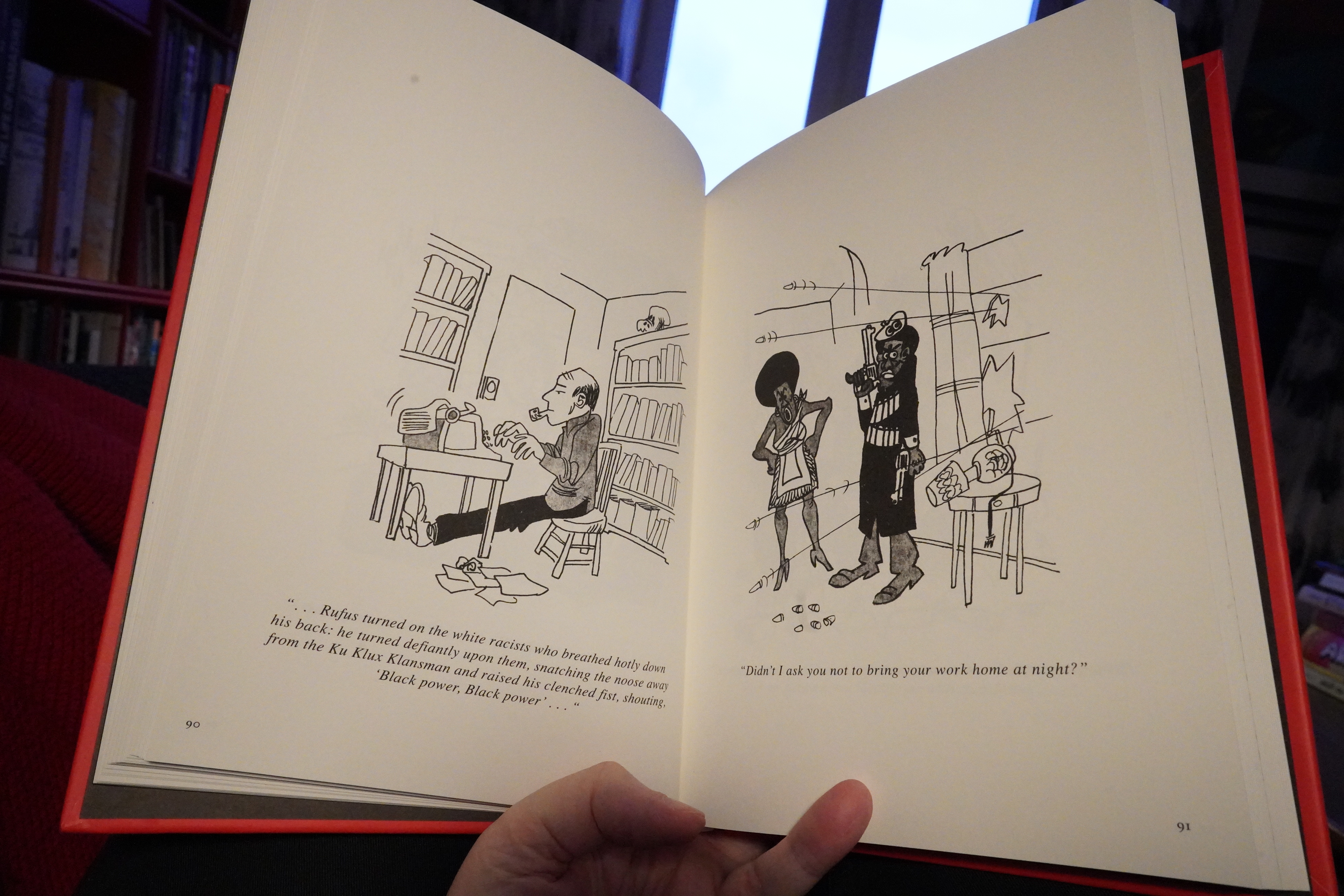
14:00: All Your Racial Problems Will Soon End by Charles Johnson (New York Review Comics)
Hm… this looks really familiar. But it’s brand new? Have I read a different collection of Johnson stuff recently? Hm…
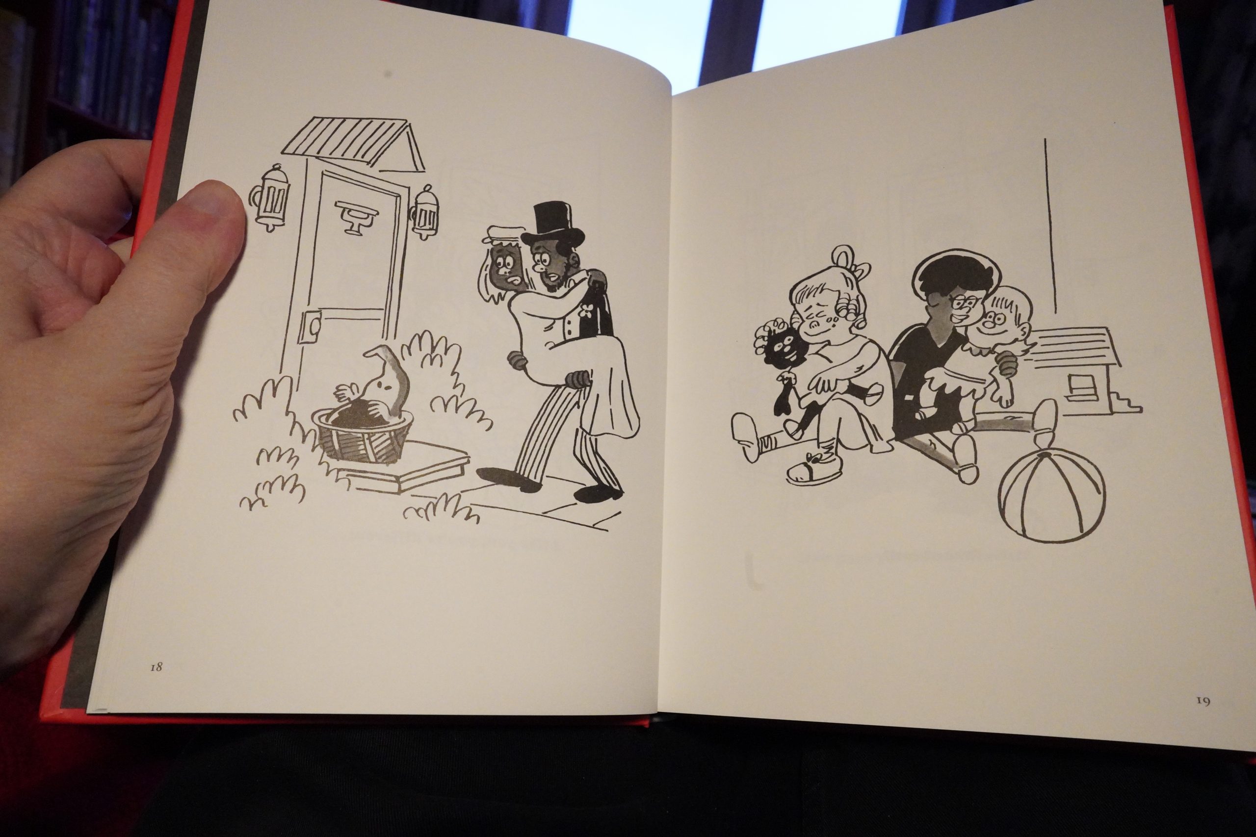
No, probably just getting it confused with something else, because gag cartoons aren’t my thing.

So I don’t really know whether this is any good or not. I found it pretty dire, but then again, that’s what I think of virtually all gag cartoon books.
Most of the books in the latest shipment are so heavy… don’t I have anything lighter here? Hm… OK, this:
| Miss Kittin and The Hacker: Third |  |
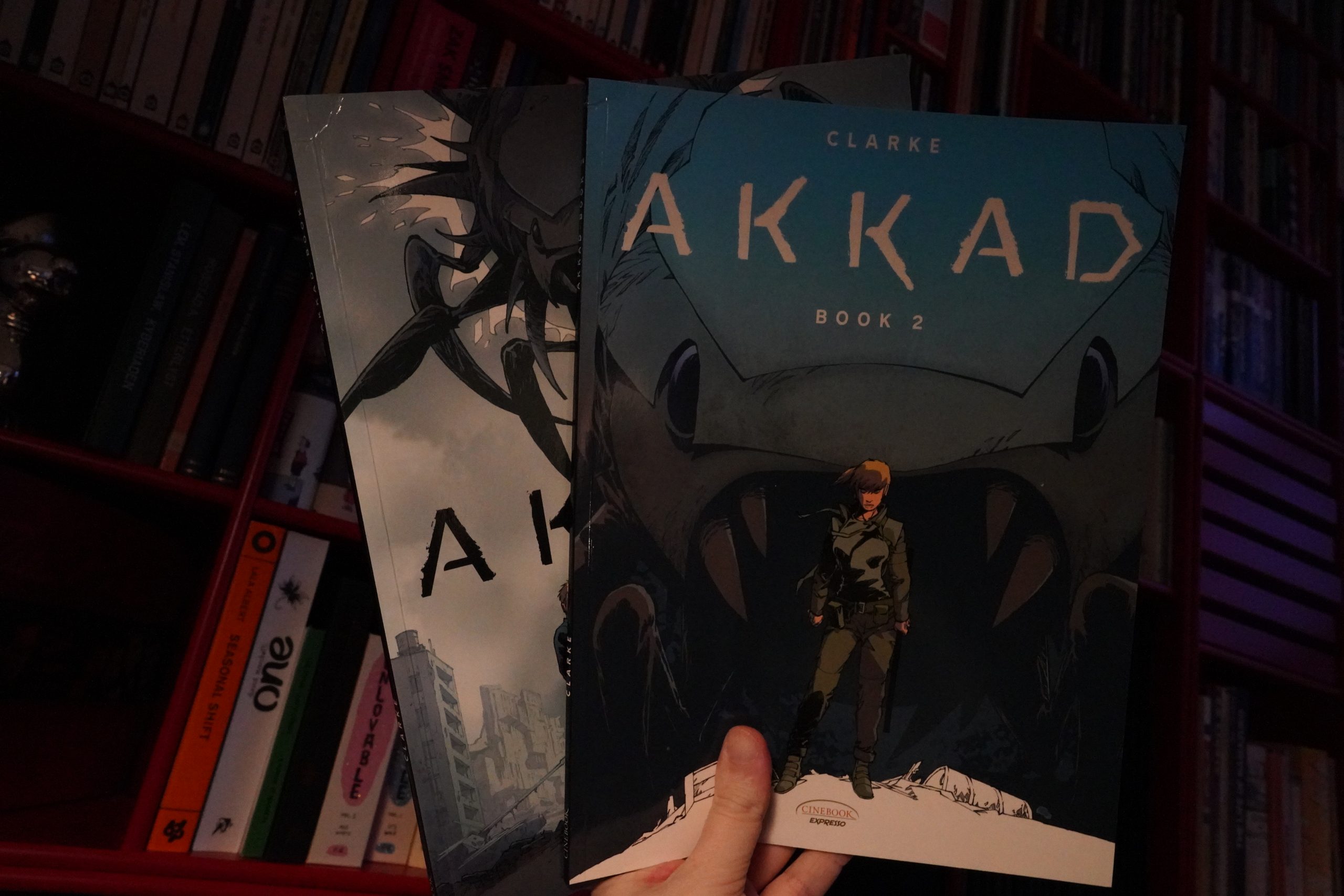
14:42: Akkad by Clarke (Cinebook)
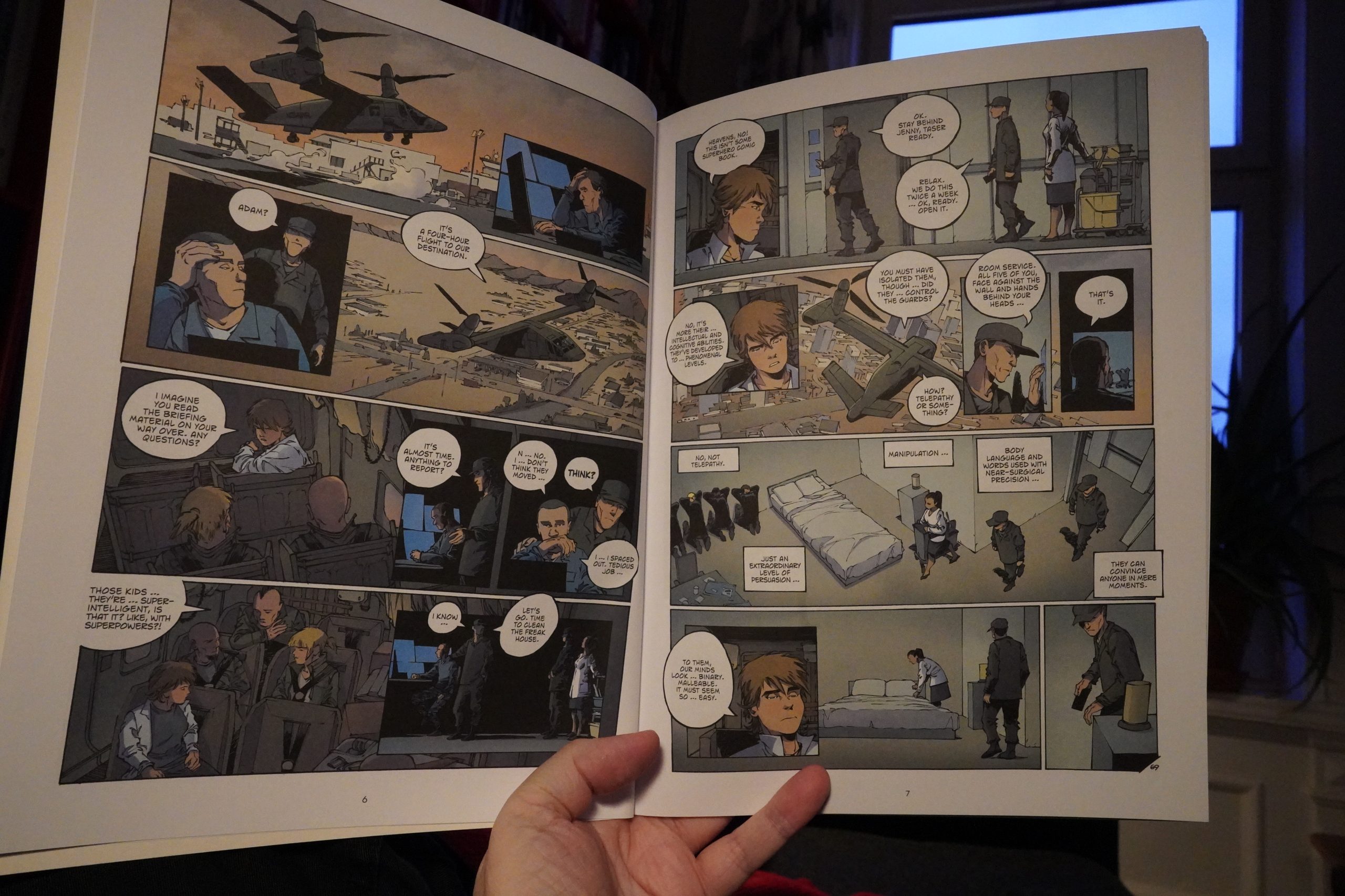
This seems like it’s going to be standard sci-fi, but it’s kinda clever.
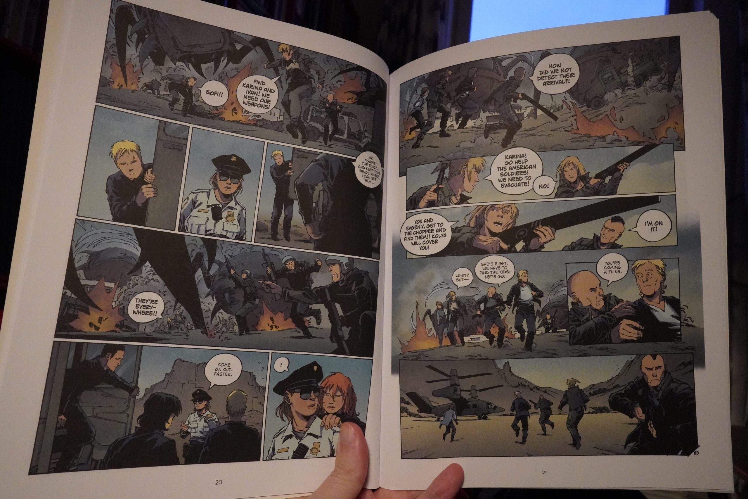
The storytelling is what keeps this zipping along — we’re constantly getting two different storylines shown at the same time, and it’s occasionally bewildering, but mostly kinda fun.
There’s some unfortunate infodumps along the way: We get one of the long expositions done twice, even. But it’s a very high concept story, and I guess he’d have to spend a whole lot more pages on this if not for the speeches.
| Plastikman & Chilly Gonzales: Consumed In Key |  |
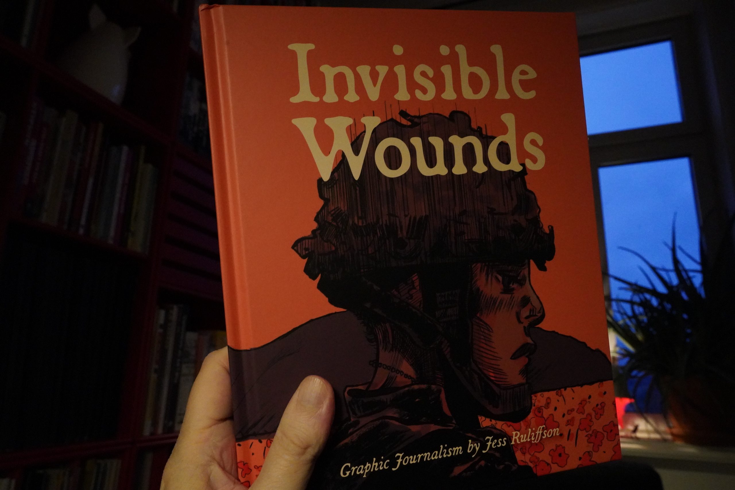
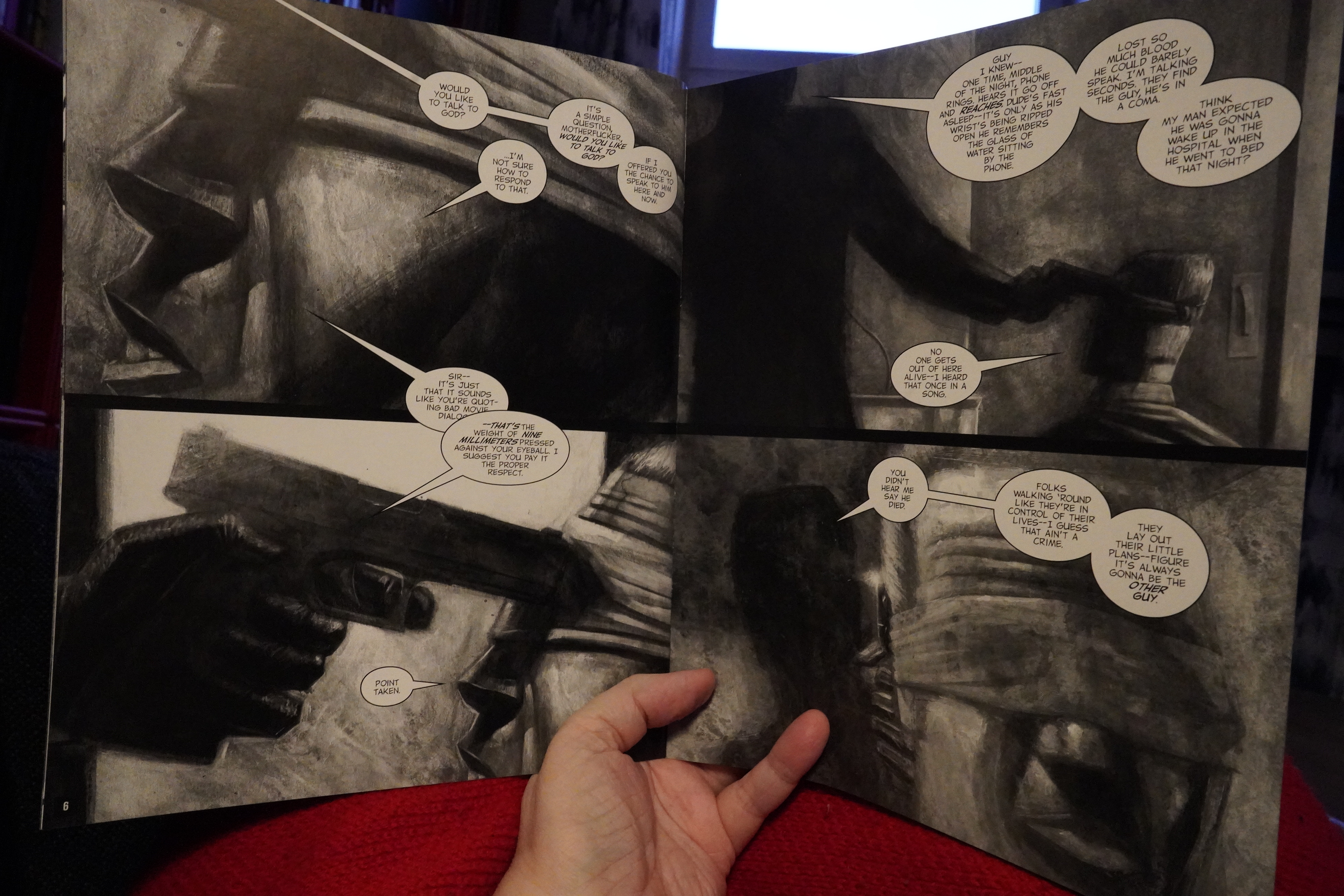
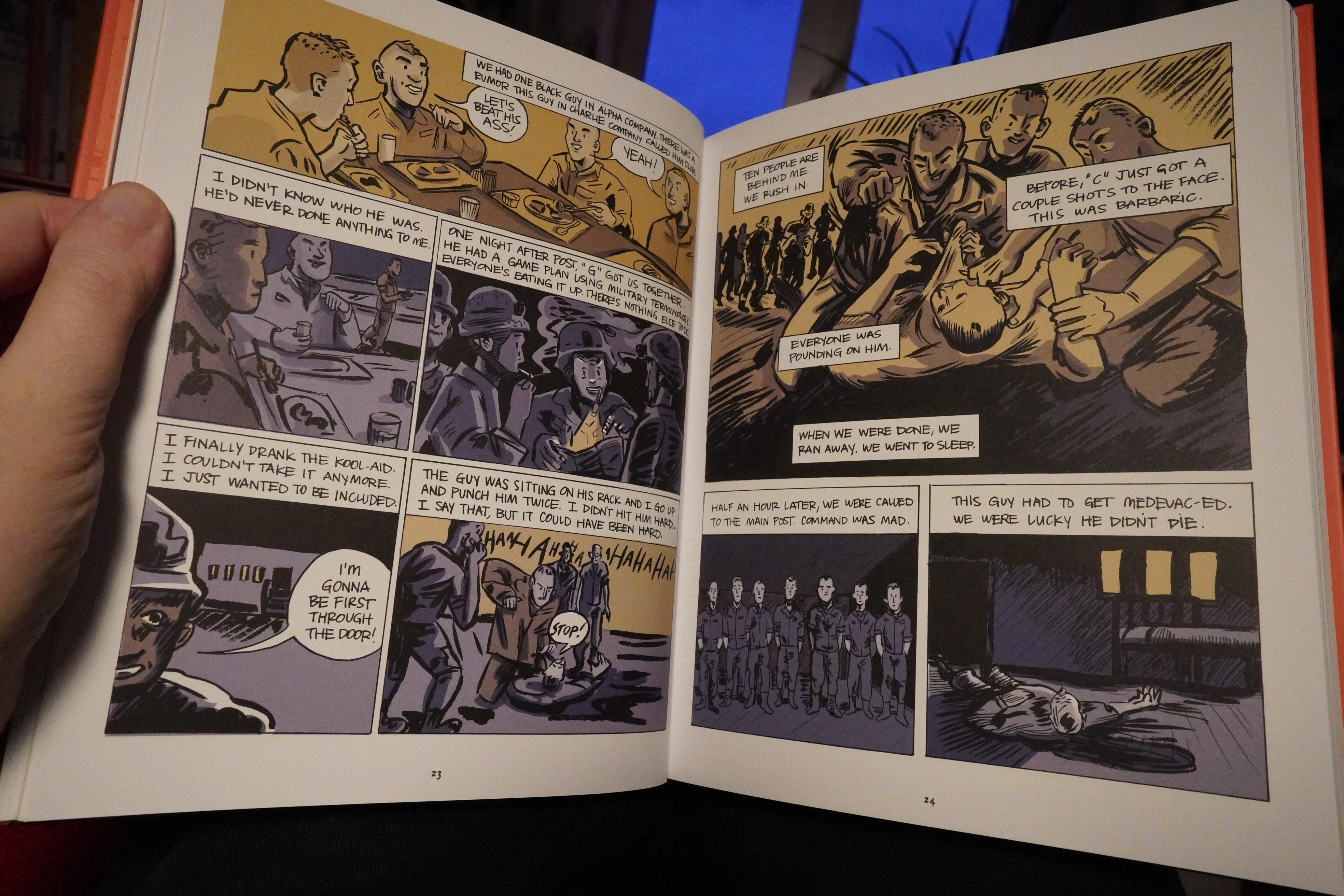
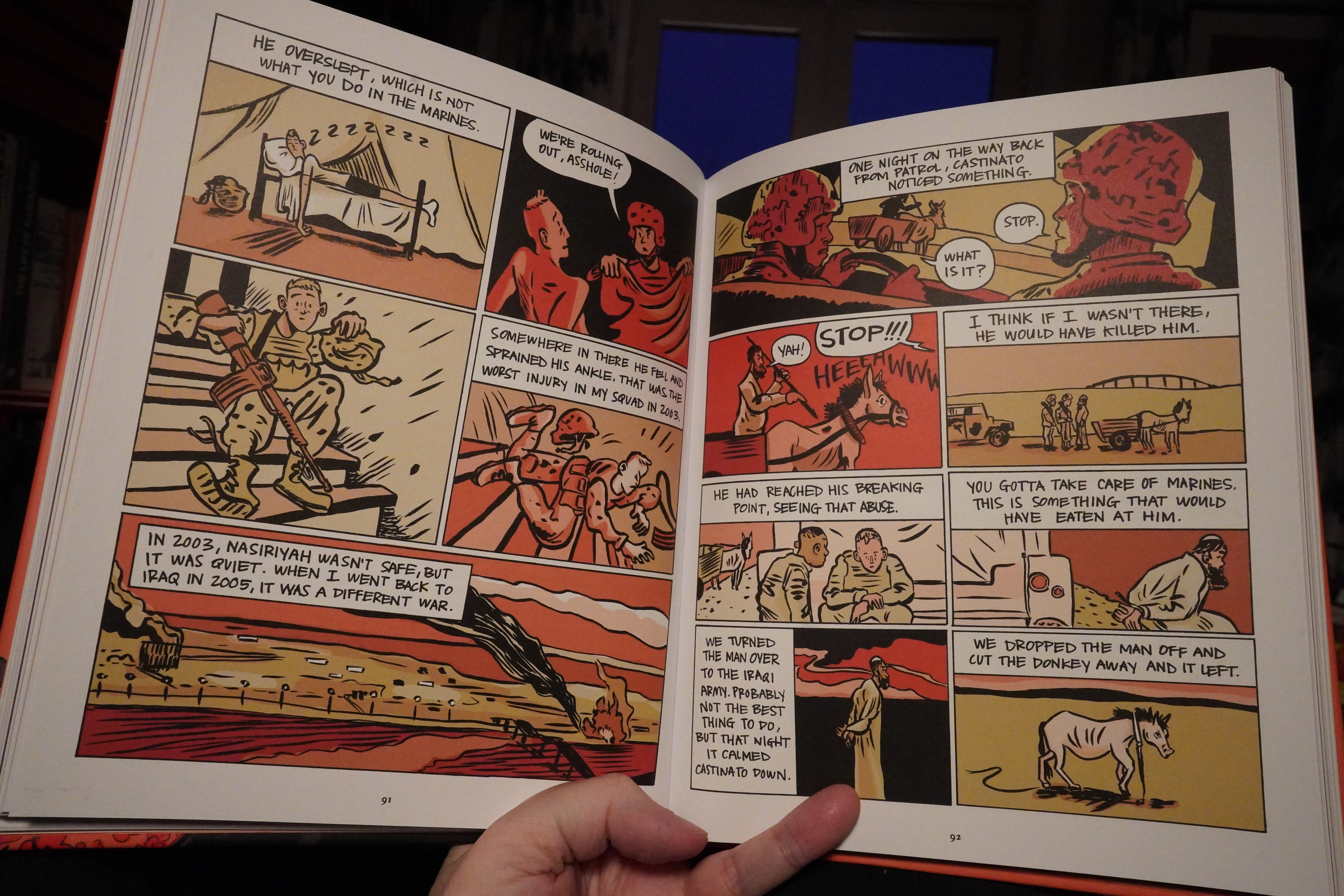
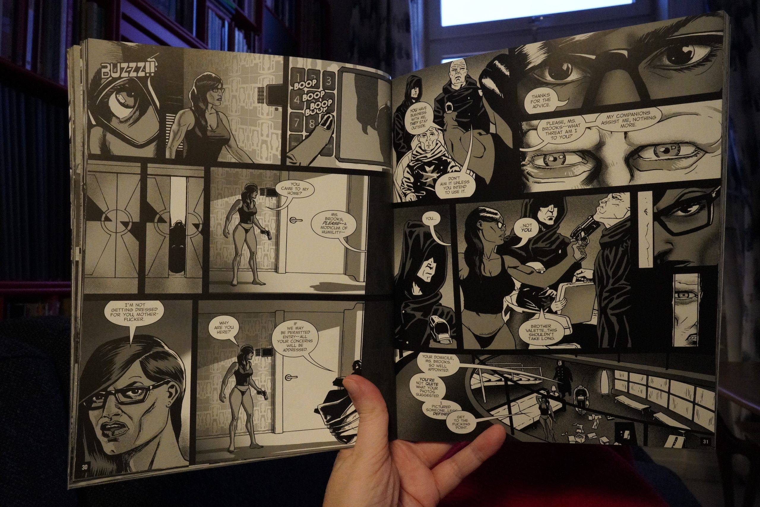
15:25: Invisible Woulds by Jeff Ruliffson (Fantagraphics)

This is apparently a collection of first person narratives from people who’ve been in the army. I think. It’s a bit confusing, because they speak in pretty similar voices, so perhaps that’s a wrong assumption…
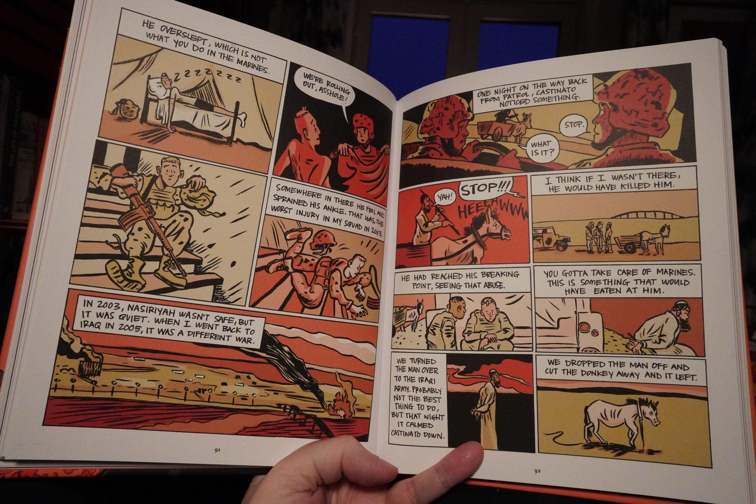
But the stories are sometimes pretty impenetrable. That is, I found that I had to skip back a few panels a lot, because I didn’t get what they were talking about until a later, and sometimes I’m not sure I got what they were going on about at all.
So it’s a choppy read, and only intermittently interesting. The cartooning is solid, though.
| Jenny Hval: Classic Objects |  |
16:20: The End
OK, I think that’s enough for today… perhaps it’s the Xmas season that brings out all these worthy books — comics people can give as Xmas presents? “Serious”, “literary” books.
Fooey, I say. Fooey!