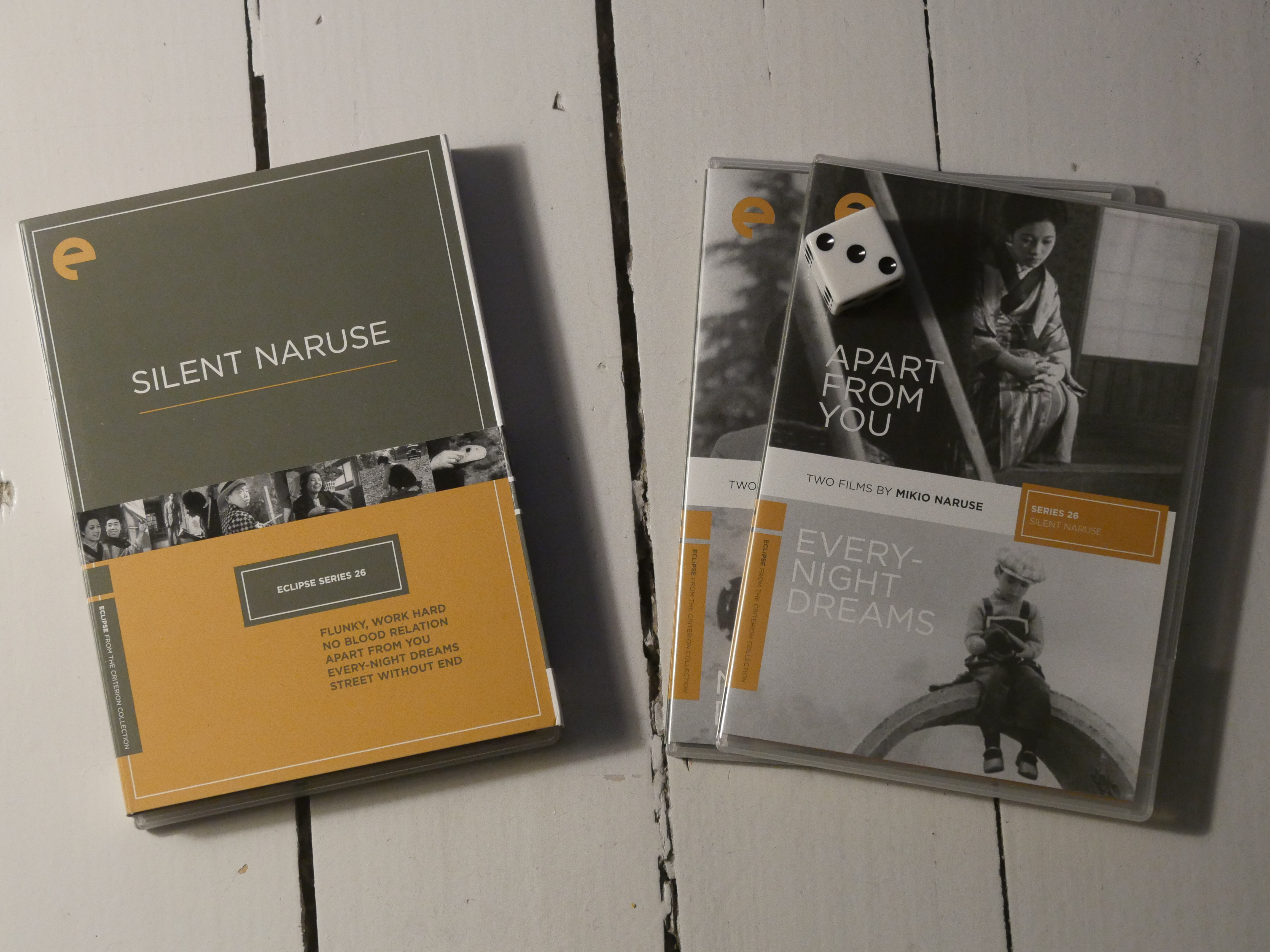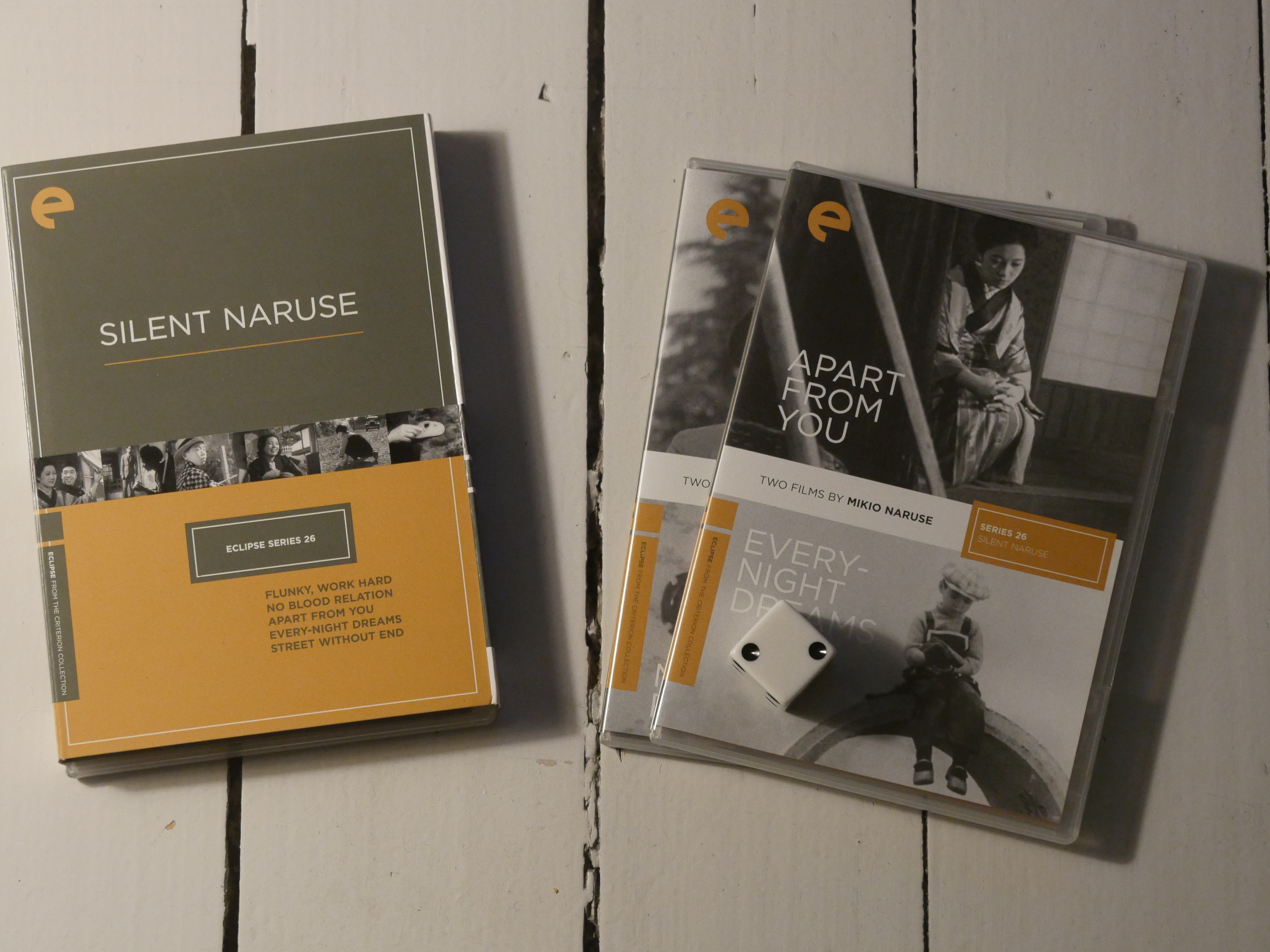
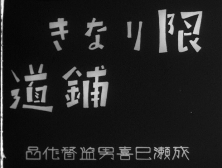
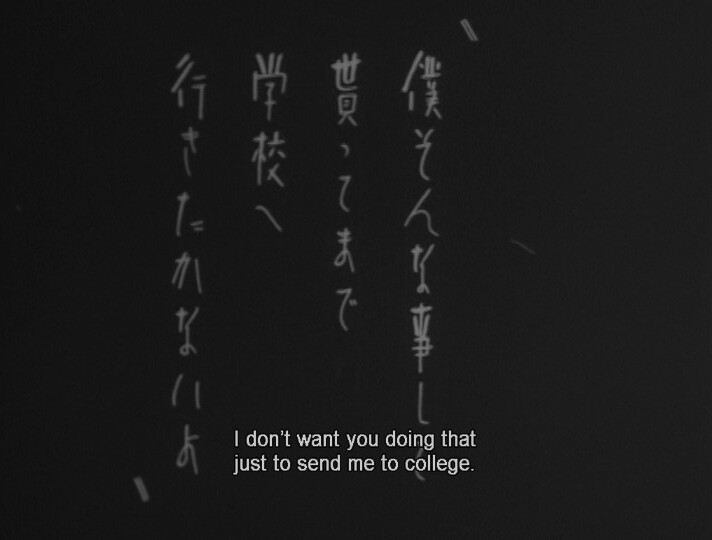
The Japanese kept on making silent movies for way longer than was reasonable… but this is the final one on the Criterion Eclipse box sets.
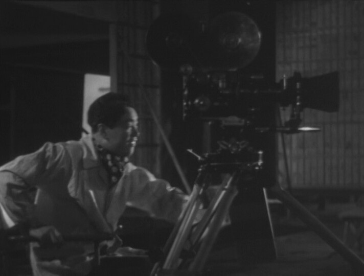
I mean, in a way it’s nice — some male Japanese actors have a tendency to grunt a lot and talk way below their natural ranges, which is annoying to listen to — but it seems wilfully perverse to continue doing silent films while the cinematography is getting really technically accomplished.
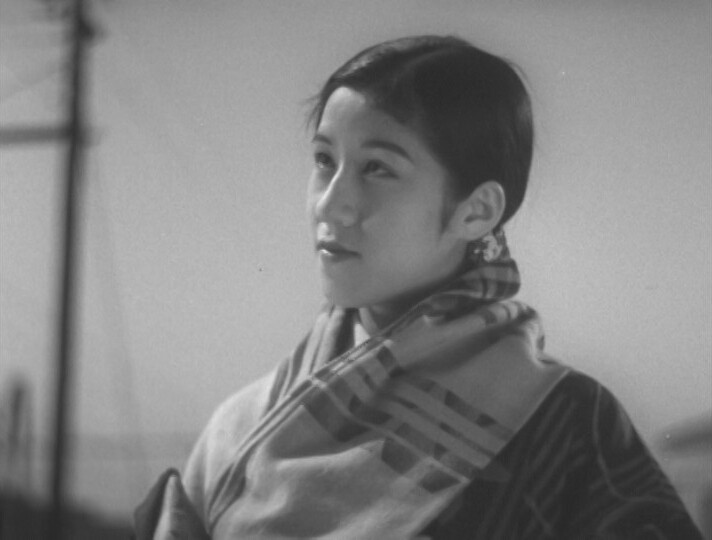
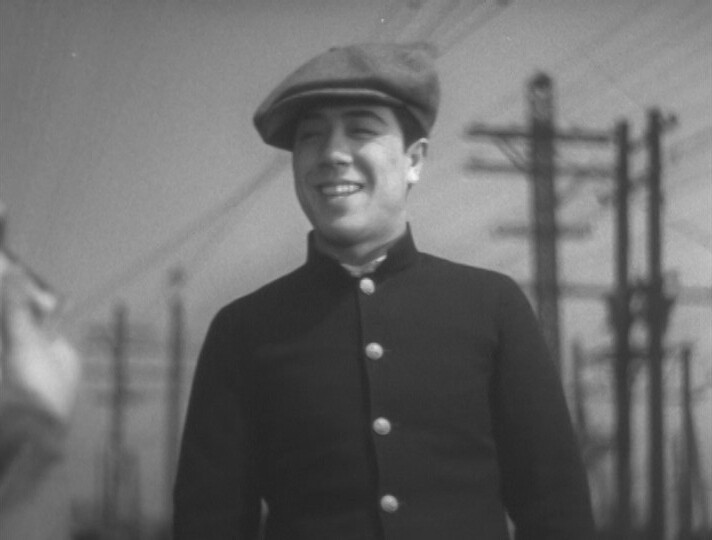
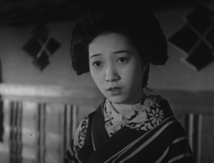
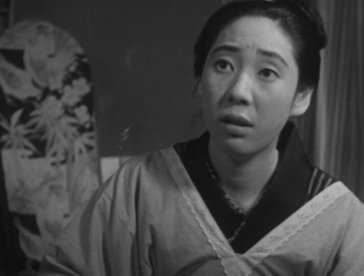
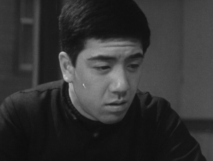
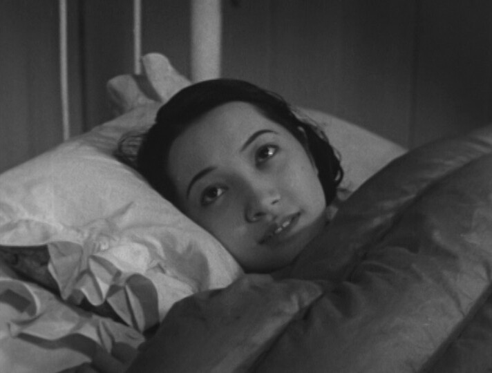
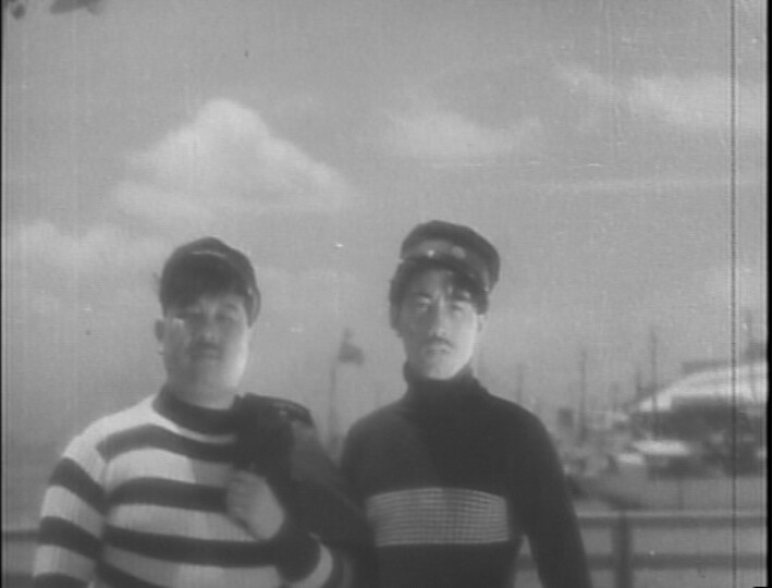
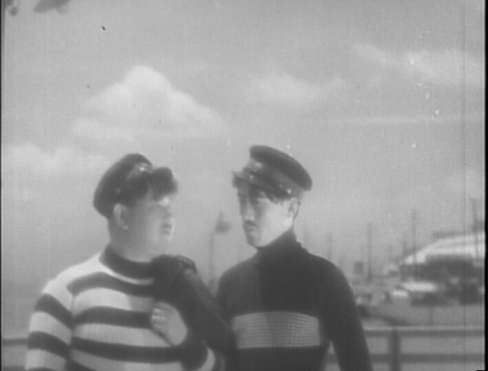
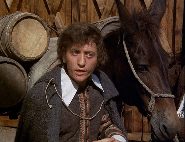
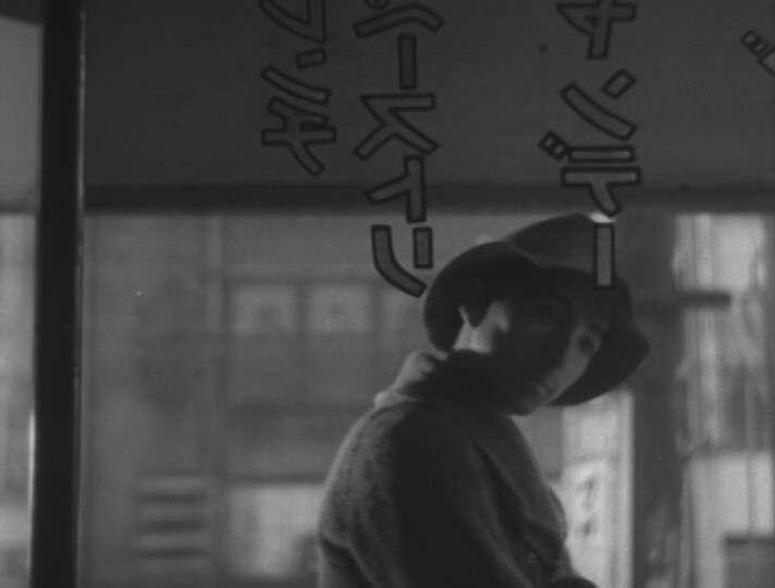
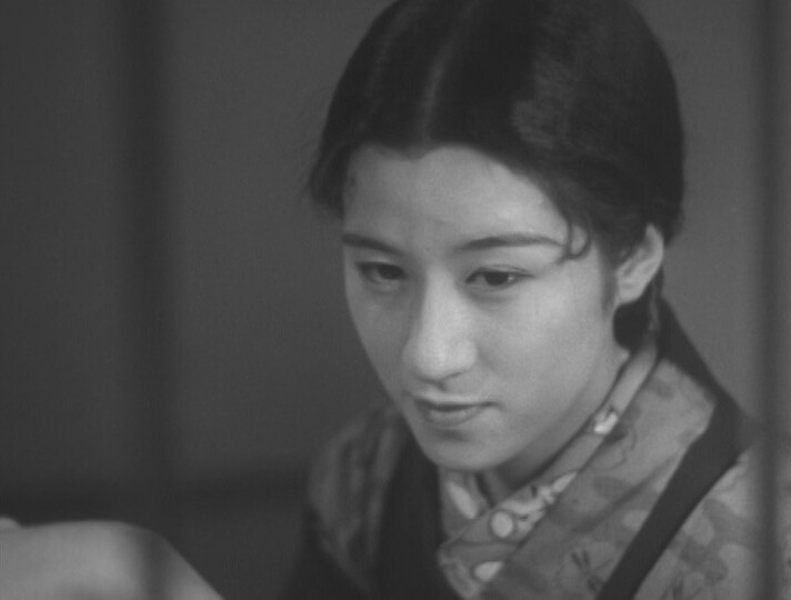
Oh, once again I’ve been wrong-footed by the casting… he’s supposed to be like 18? It’s weird — they have no problem casting children as children, but all teenagers look like this in these Naruse films.
Anyway, of all these Naruse films, this is the least compelling one — it’s like nothing’s happening, and it takes a long time not happening. It’s the longest one of these five films, too.
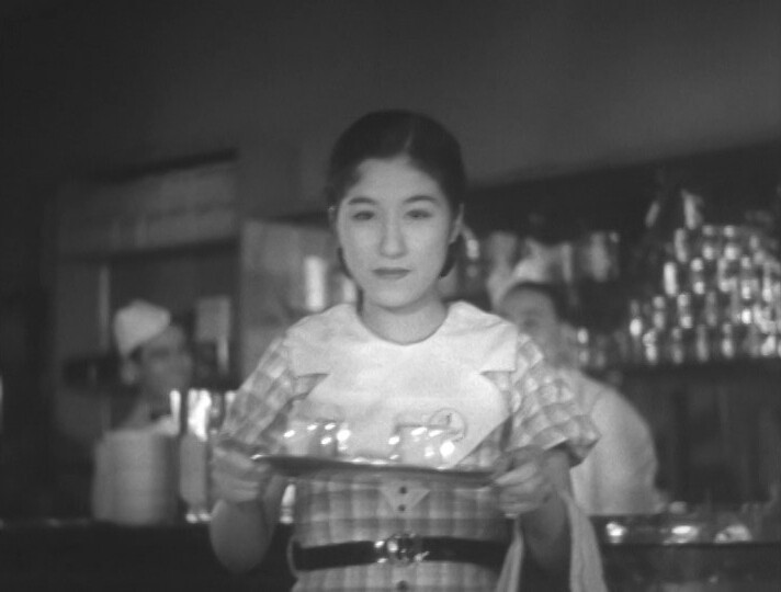
Hm… OK, I read the liner notes on the DVD now: This movie is based on a newspaper serial about a tea hostess, and none of the directors at Shochiku (the studion) wanted to do this movie. Naruse was promised that he could any movie he wanted if he just took this one, and he did.
Shochiku apparently reneged on the promise, so that didn’t happen, and Naruse left. But watching this, I’m wondering whether the studio just wanted him to leave, because this film just doesn’t work.
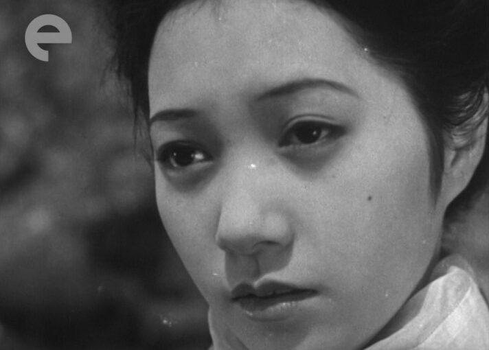
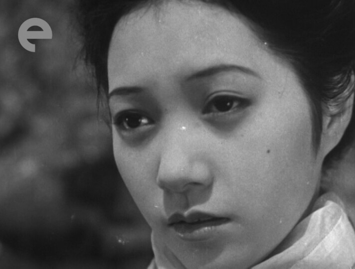
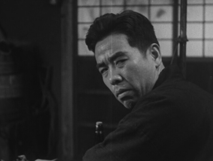
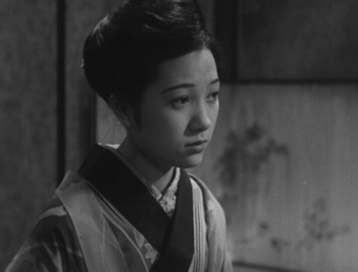
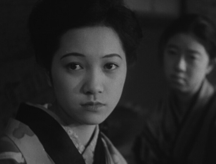
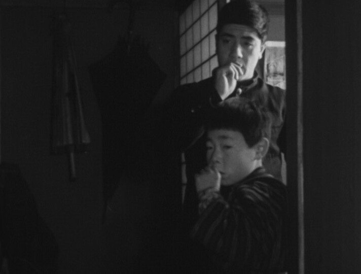
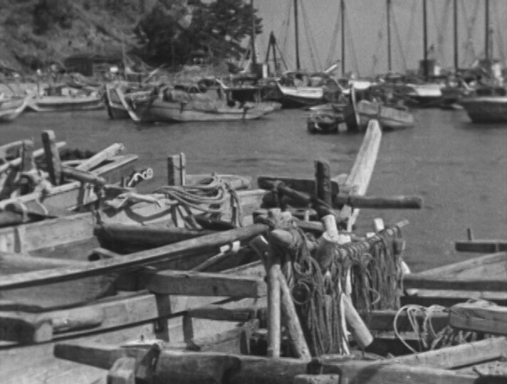
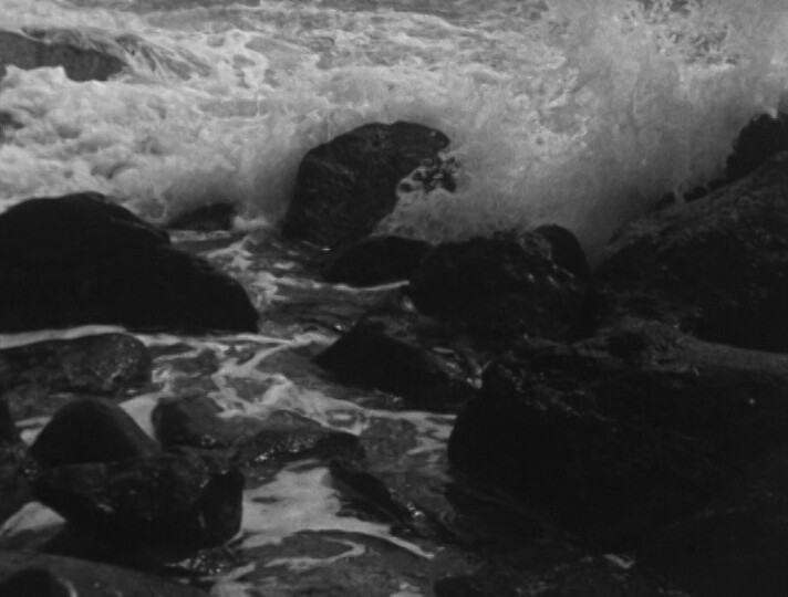
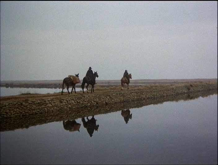
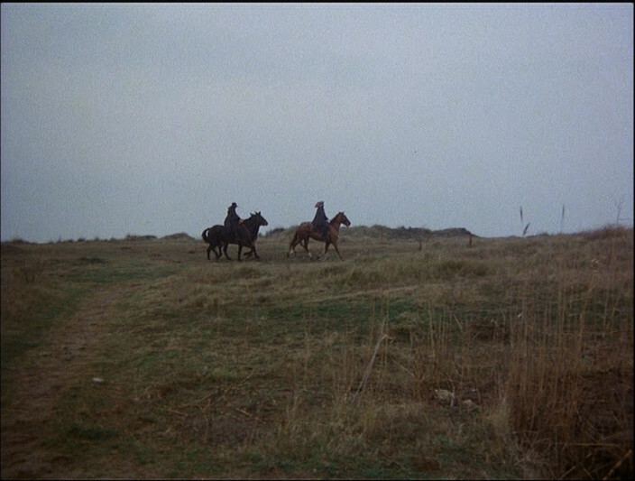
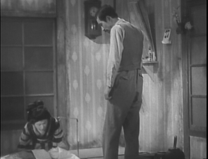
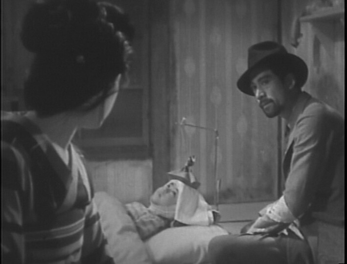
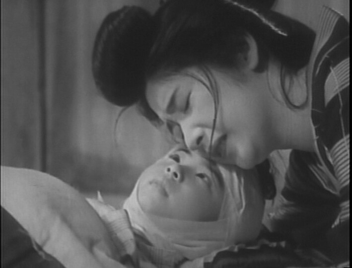
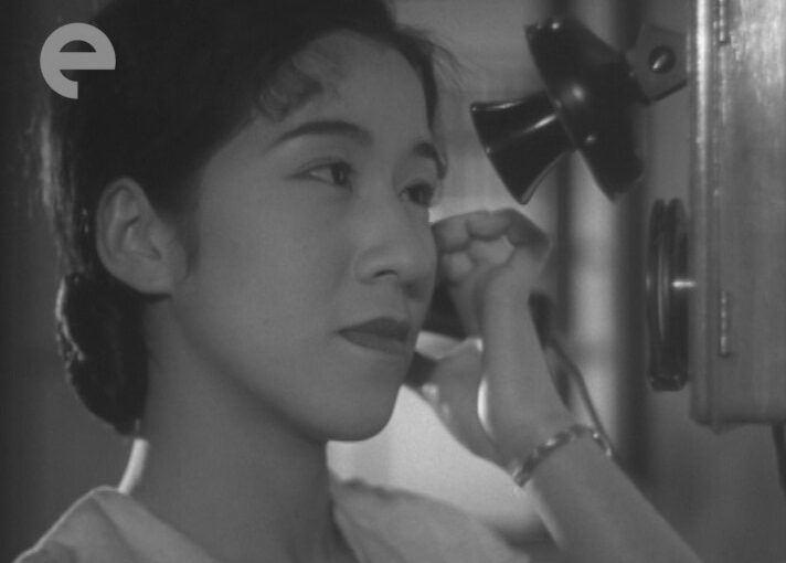
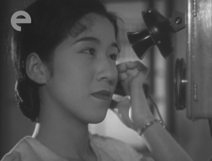
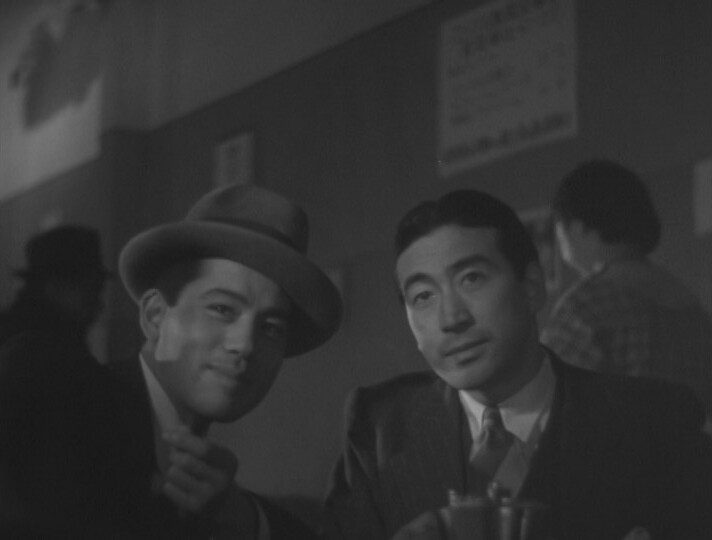
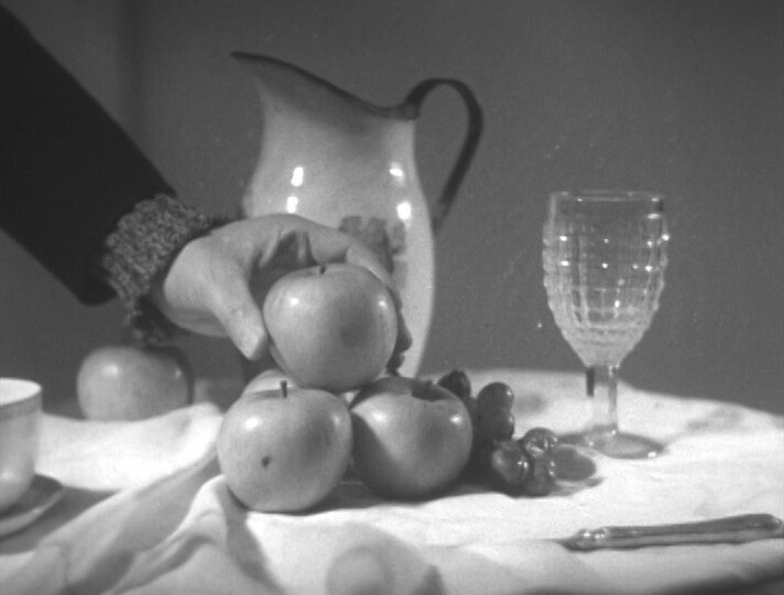
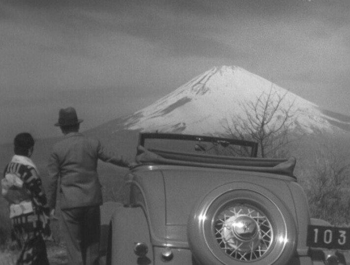
But as always, there’s interesting shots here — I guess they kept themselves amused.
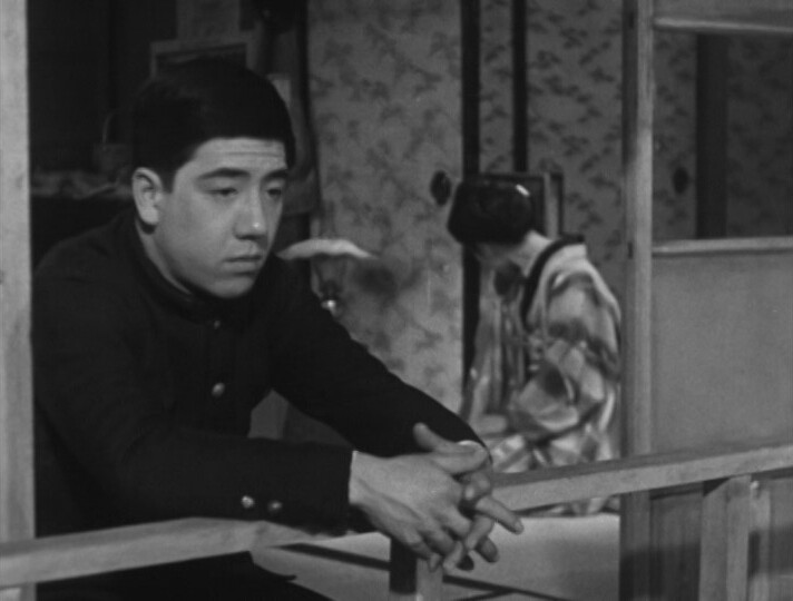
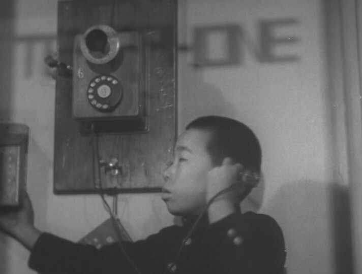
And then there’s shots that you’d think would be no-brainers, and they look all kinds of meh.
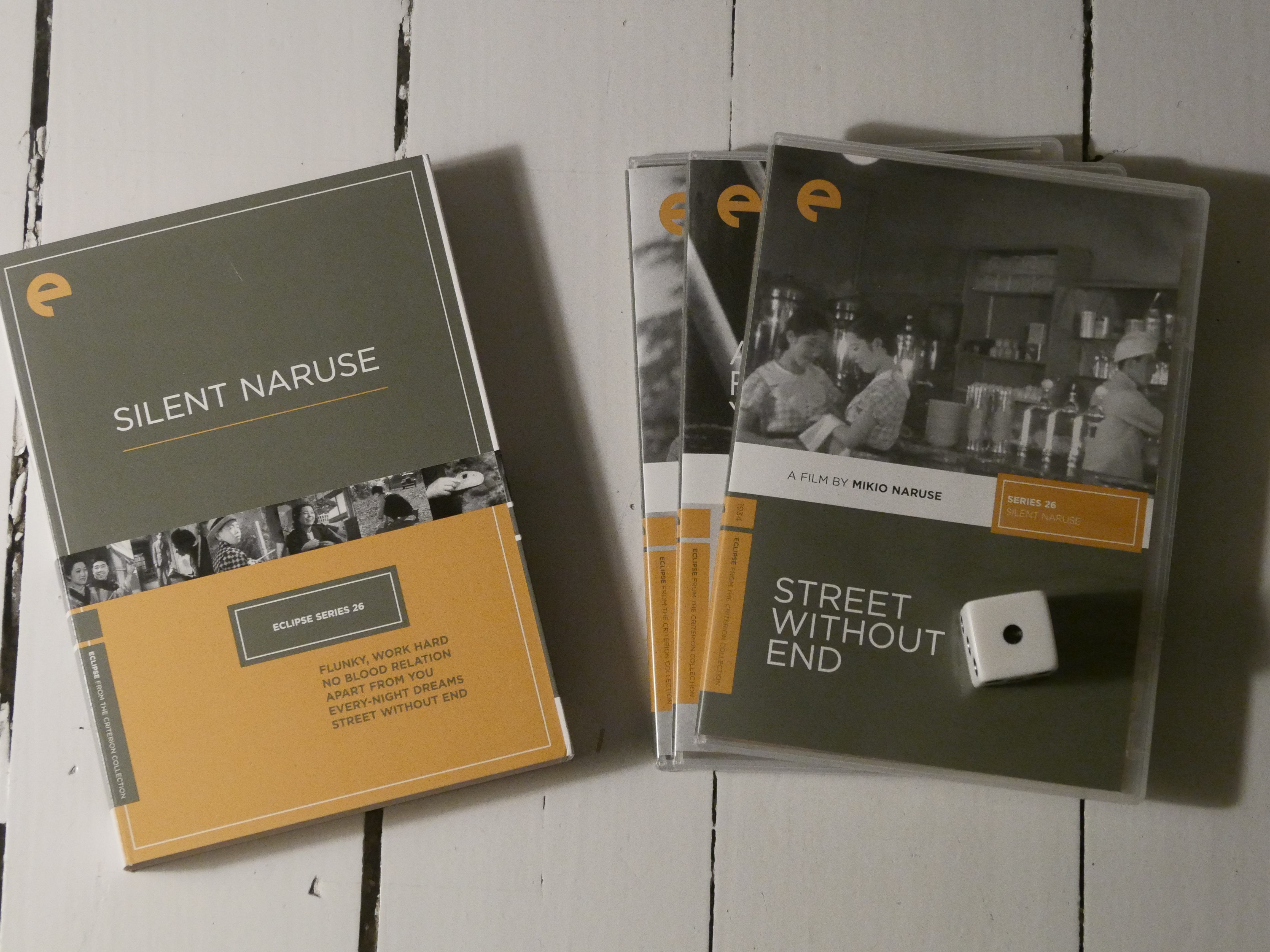
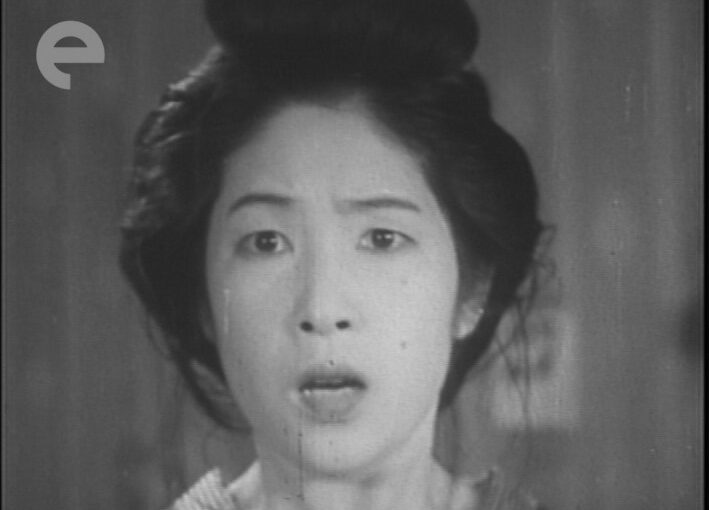
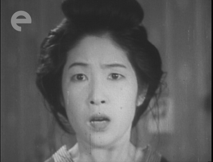
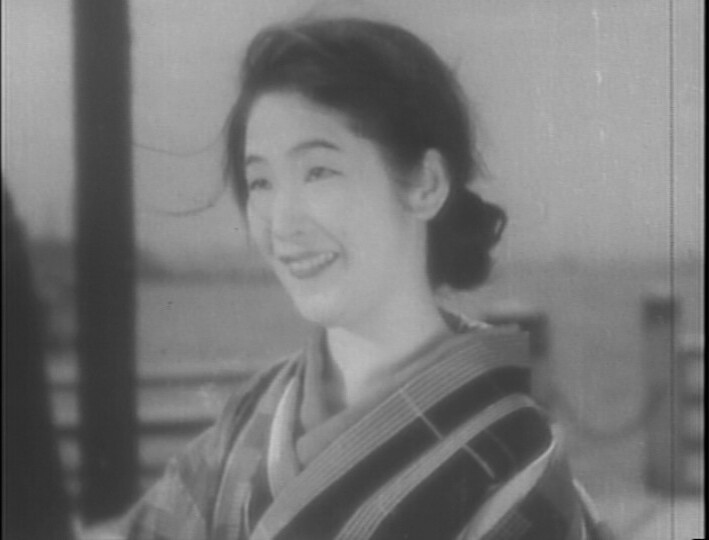
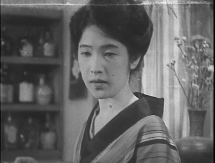
Street Without End. Mikio Naruse. 1934.
This blog post is part of the Eclipse series.