I bought this around 2008, and the only reason is, of course, that Chip Kidd is a well-known designer who’s done a lot of (sometimes controversial) designs for comics. But I never read it because I’ve always assumed that it was probably pretty naff.
But let’s look at it.
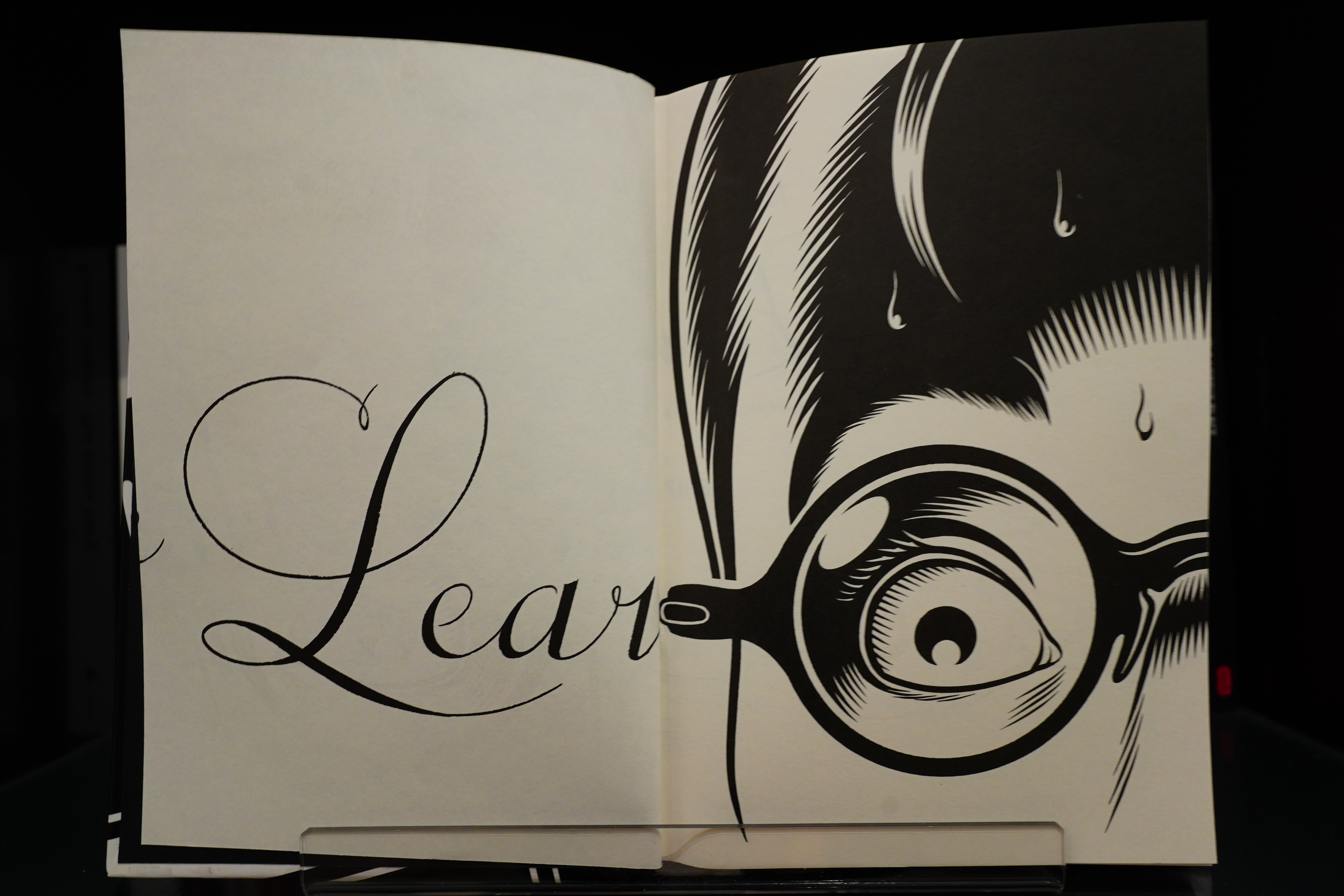
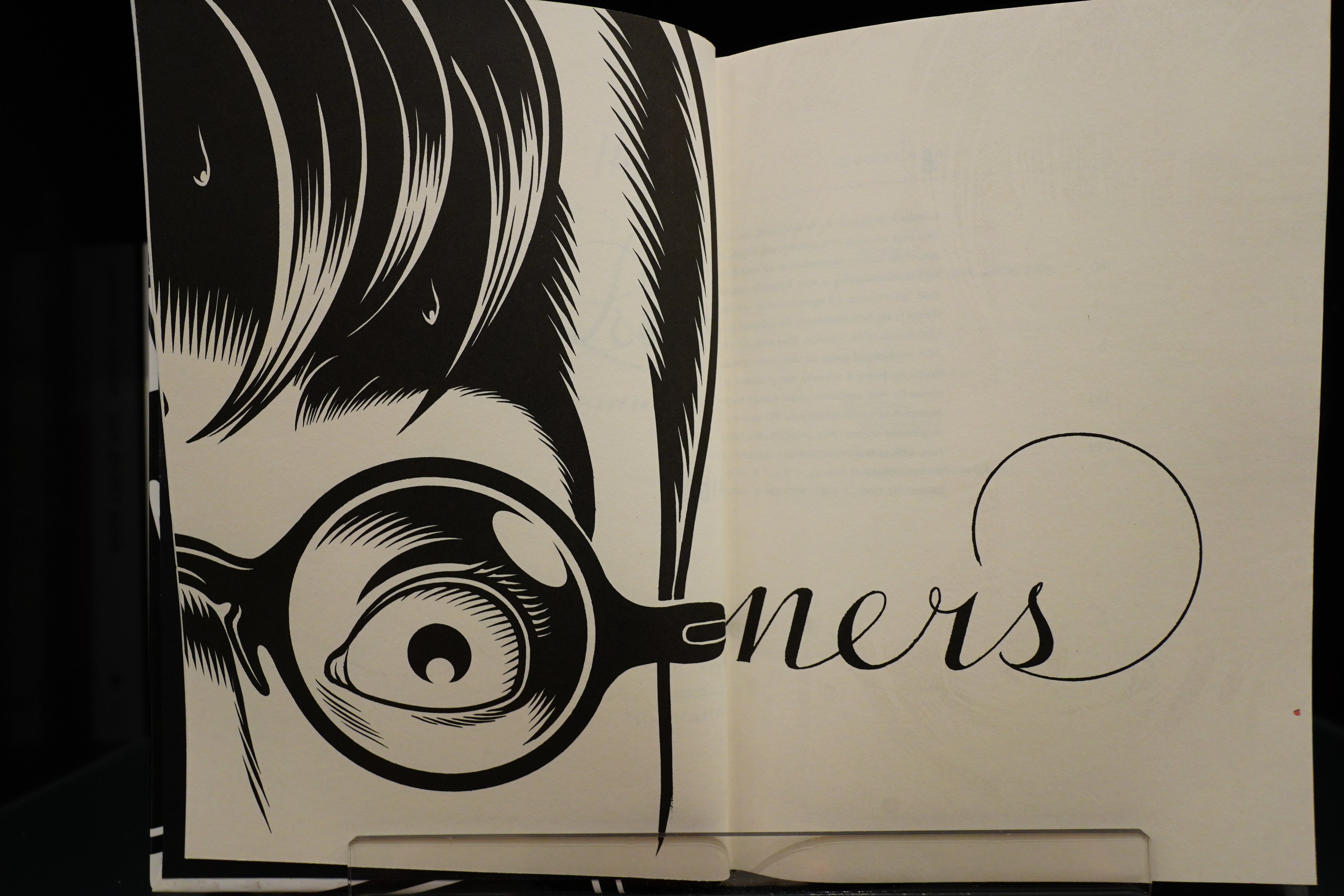
Oooh! Bleed through as design!
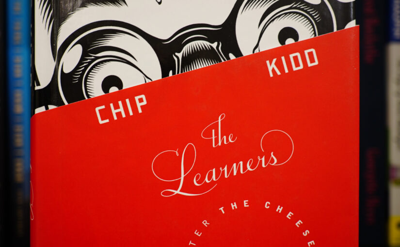
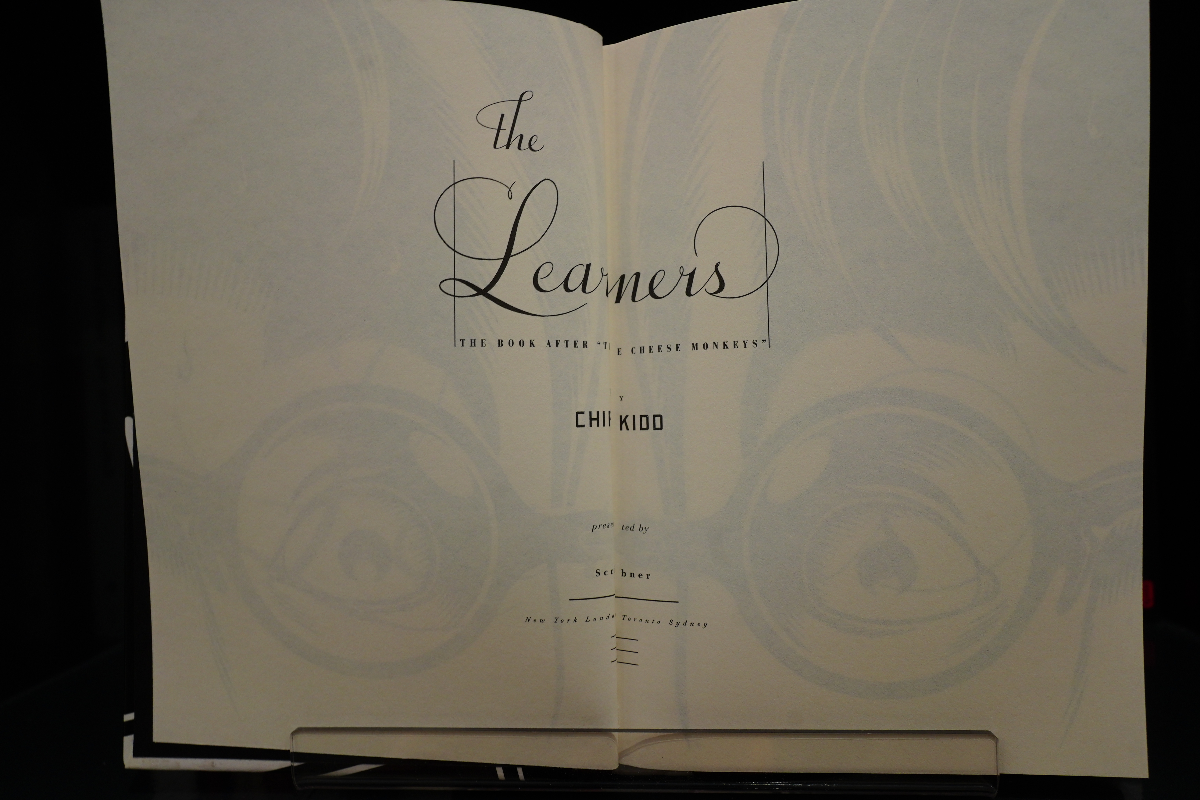
Well, that’s a bit of OK, ain’t it?
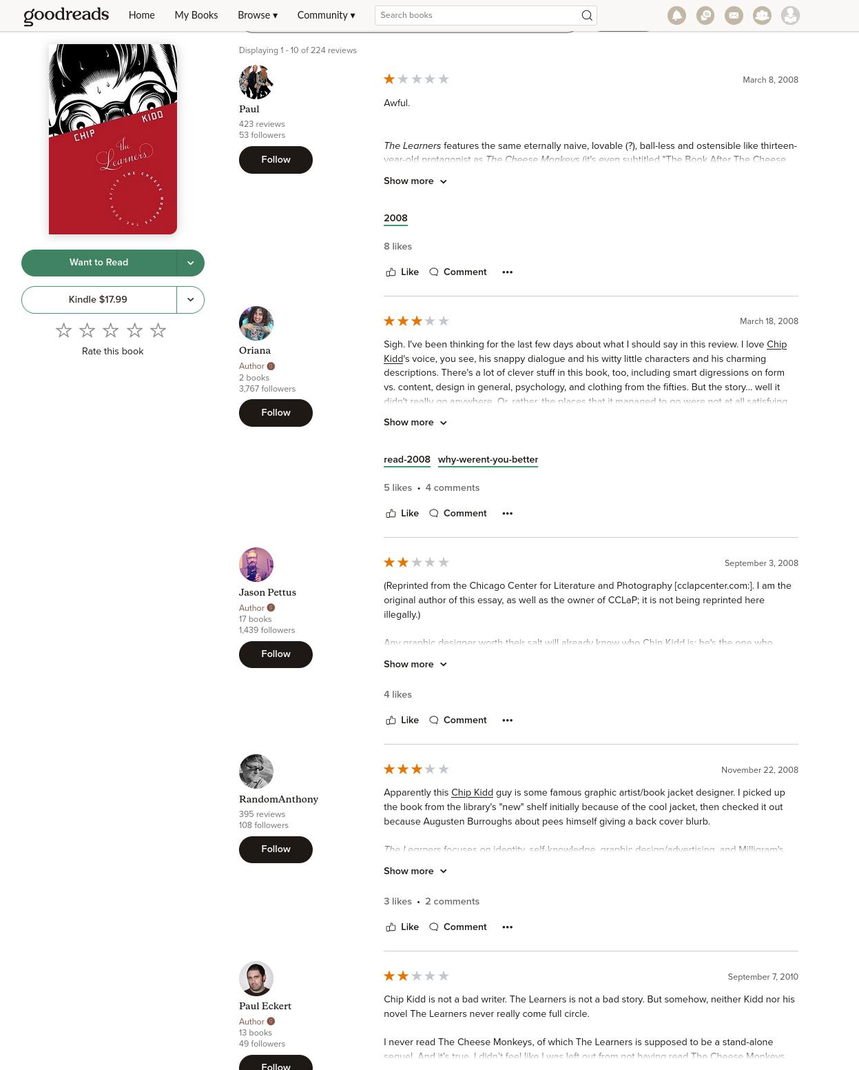
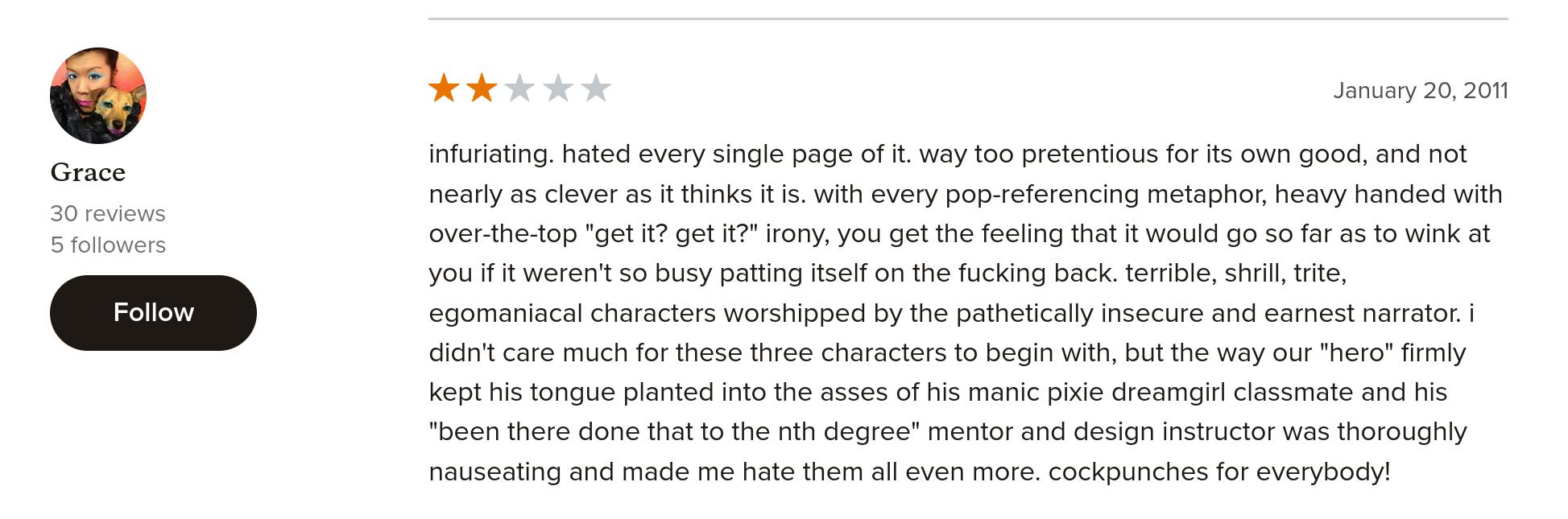
The book has a totally normal 3.58 score, but most of the featured reviews are dismal. I don’t think I’ve seen something like this before, but it means that the ones who dislike the book have made the effort to go and upvote all the other negative reviews. So that’s some dedicated hatin’ (although there aren’t that many likes overall, so it’s not a hard job).
I wonder whether some of this hate comes from comics nerds — some of Kidd’s comics projects have been presented with Kidd’s name in huge letters and with the creator of the comics in a smaller font, as if an afterthought. Kidd’s name sells (or used to), so it seems natural to me, but some comics people felt slighted, if I understand things correctly… The ratings probably have nothing to do with that — I don’t know; I never read reviews before reading a book.
So now it’s book readin’ time.
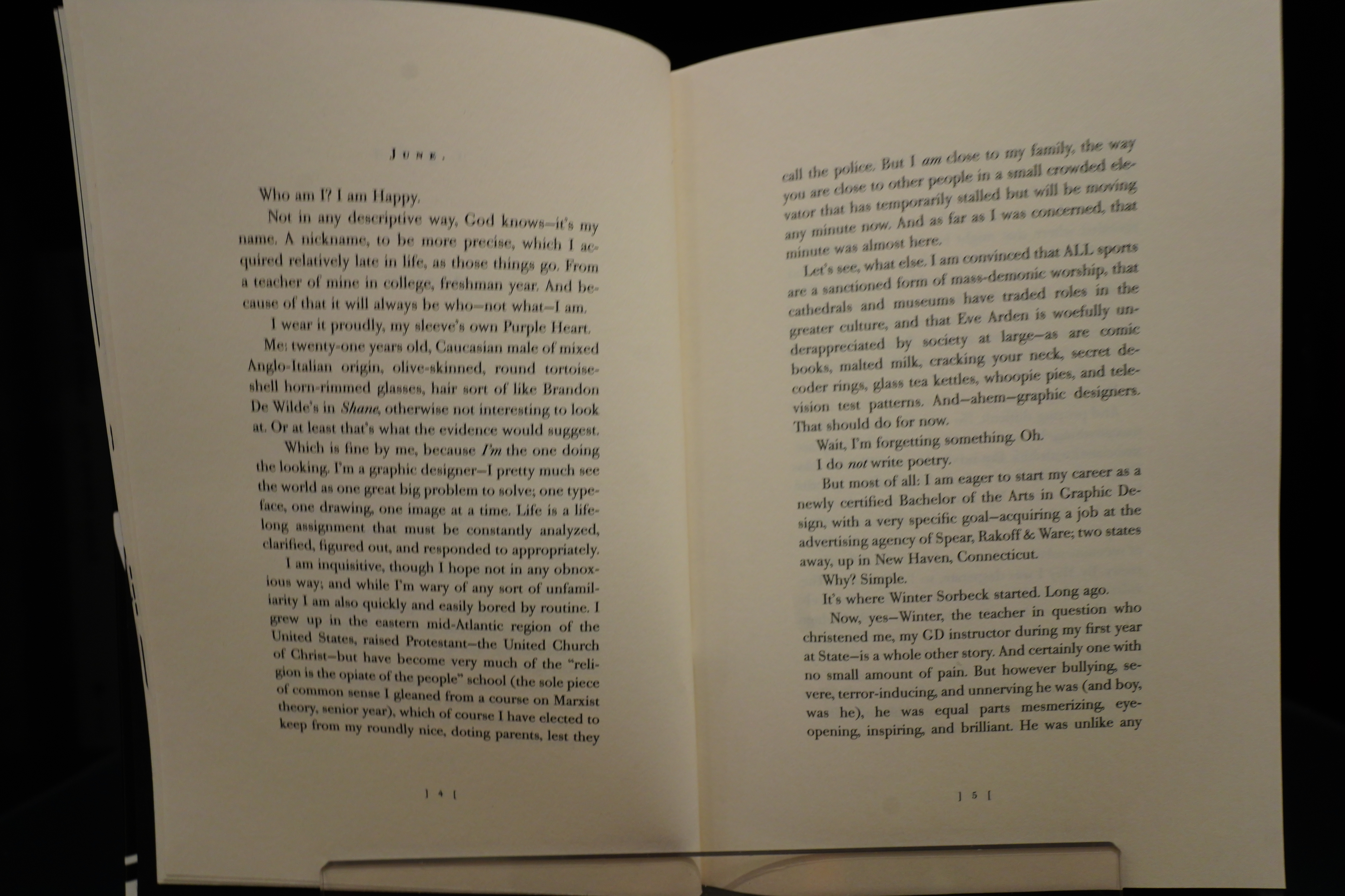
I kinda like it. It feels like a book written by a 22-year-old. In a good way, since the protagonist is around that age. That is, Kidd can help himself in dropping in not very relevant jokes and quips all the time — he burbles and chortles his way through the book — even the serious parts. It’s obviously based on his own experiences, but it’s set in a dreamy 1961, when he imagines that the advertising industry was fun. (See Mad Men, which I now see started the year before this book was published — I thought it was later. Did Kidd churn out this book as a response? Nah, publishing timelines are longer than that…)
It reads as it’s simultaneously a wish fulfilment fantasy and a collection of anecdotes from his 20s at the same time? Yeah, something like that.
There’s some real oddities: We’re introduced to a magic pixie dream girl (she’s even described as being a “pixie”), and then she’s killed off ten pages later (which provides us with the book’s “serious” bits). That’s goes against how that cliché is usually structured, which is nice, I guess.
The book also touches on the Milgram experiment, and Kidd uses that to say something about the nature of evil and all of that. If you managed to get through that part without wincing in embarrassment on behalf of Kidd, you’re a stronger man than I am.
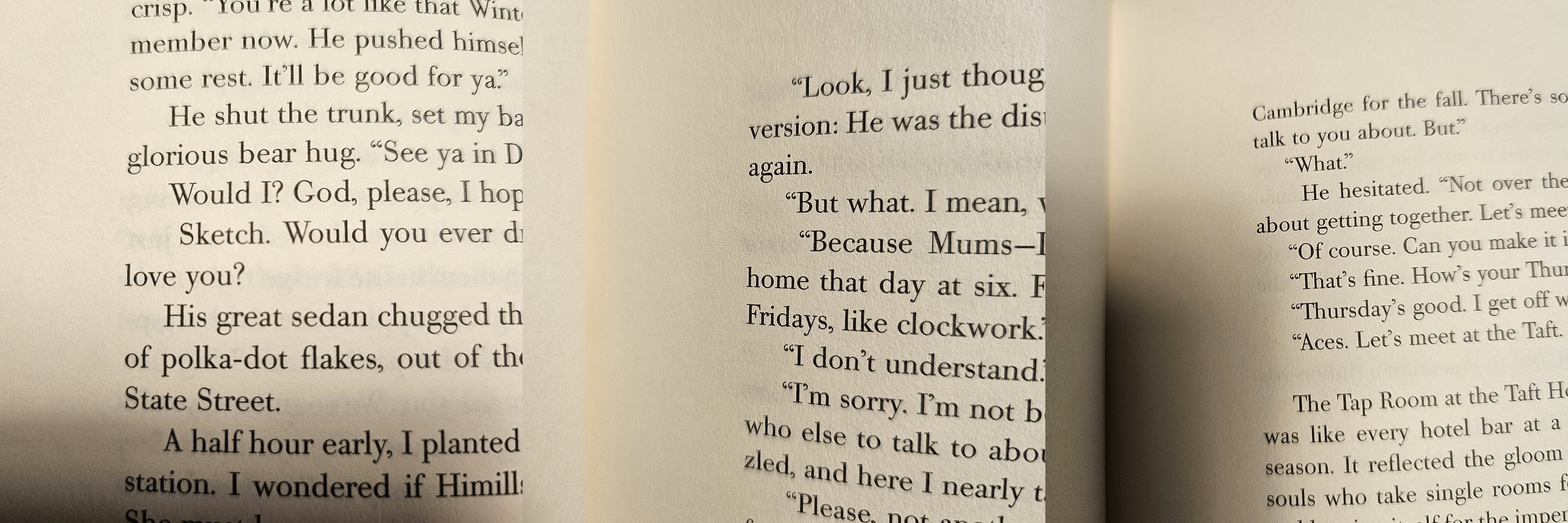
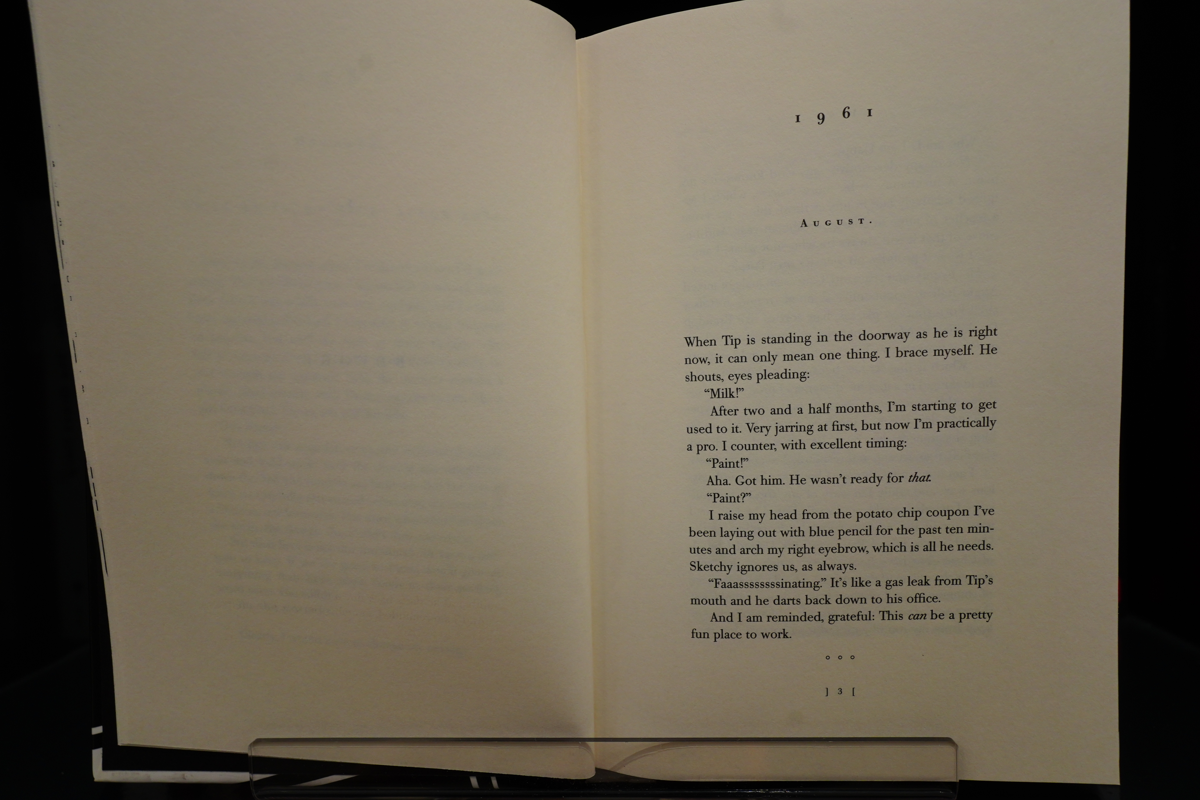
For a book that’s about design, it’s very sloppily typeset. One recurring problem is that the first-line indent of a paragraph is of random width, as seen above. It’s so persistent that it starts getting pretty annoying… Perhaps it was written in Indesign and you have to indent manually?
I guess some people would be put off with some of the humour…
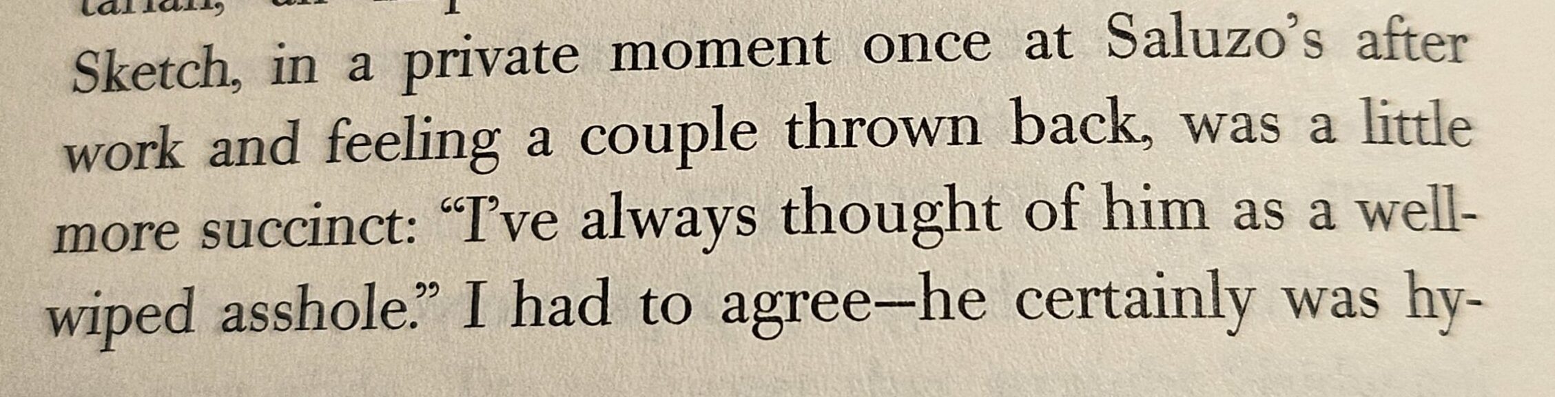
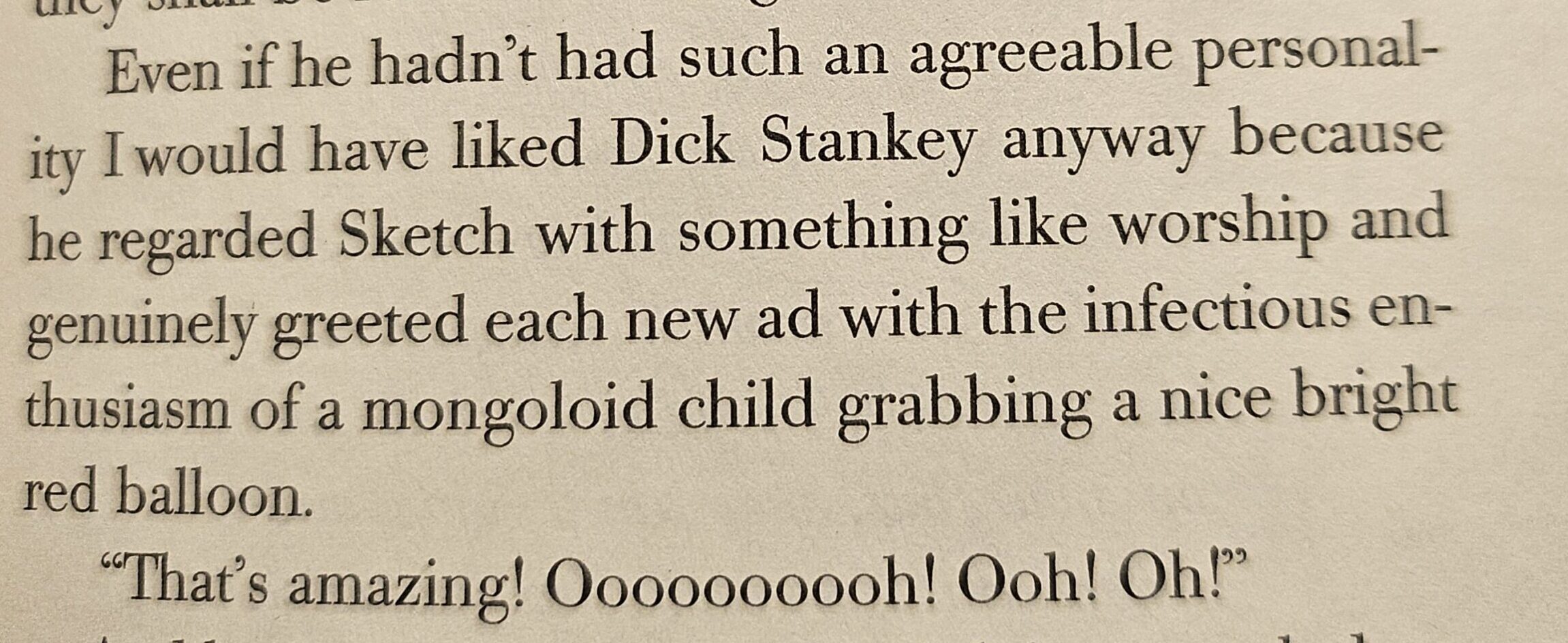
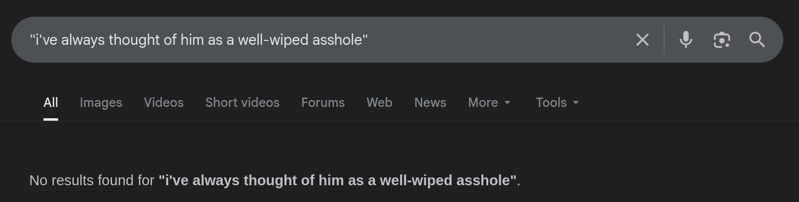
But it has some sentences that have apparently never been seen by mankind before:
So… it’s not a good book. Some parts are eye-rollingly horrendously bad. But I kinda liked it anyway.
Oh! This is the second novel Kidd wrote, and it’s a direct continuation of one that’s more well-regarded. But not by everybody:
So the magic pixie dream girl that I thought was introduced here ten pages before killing her off (so that Chip I mean Happy could learn a lesson)… wasn’t. So that wasn’t as original as I thought — it was the bog standard magic pixie dream girl arc.
Heh heh, yeah I noticed that, too:
The book is really nicely laid out, but you know Kidd wrote the thing in InDesign, meaning if there was a widow or some bad line-break or something, you can’t help but assume he cut a word or two to make it all fit nicely (the aforementioned italic interjections are all exactly one page long, e.g.).
All the text fits perfectly on the pages with no gaps between sections.
Kidd has not written (or at least not published) any further books after this. But he’s written a Batman comic book.
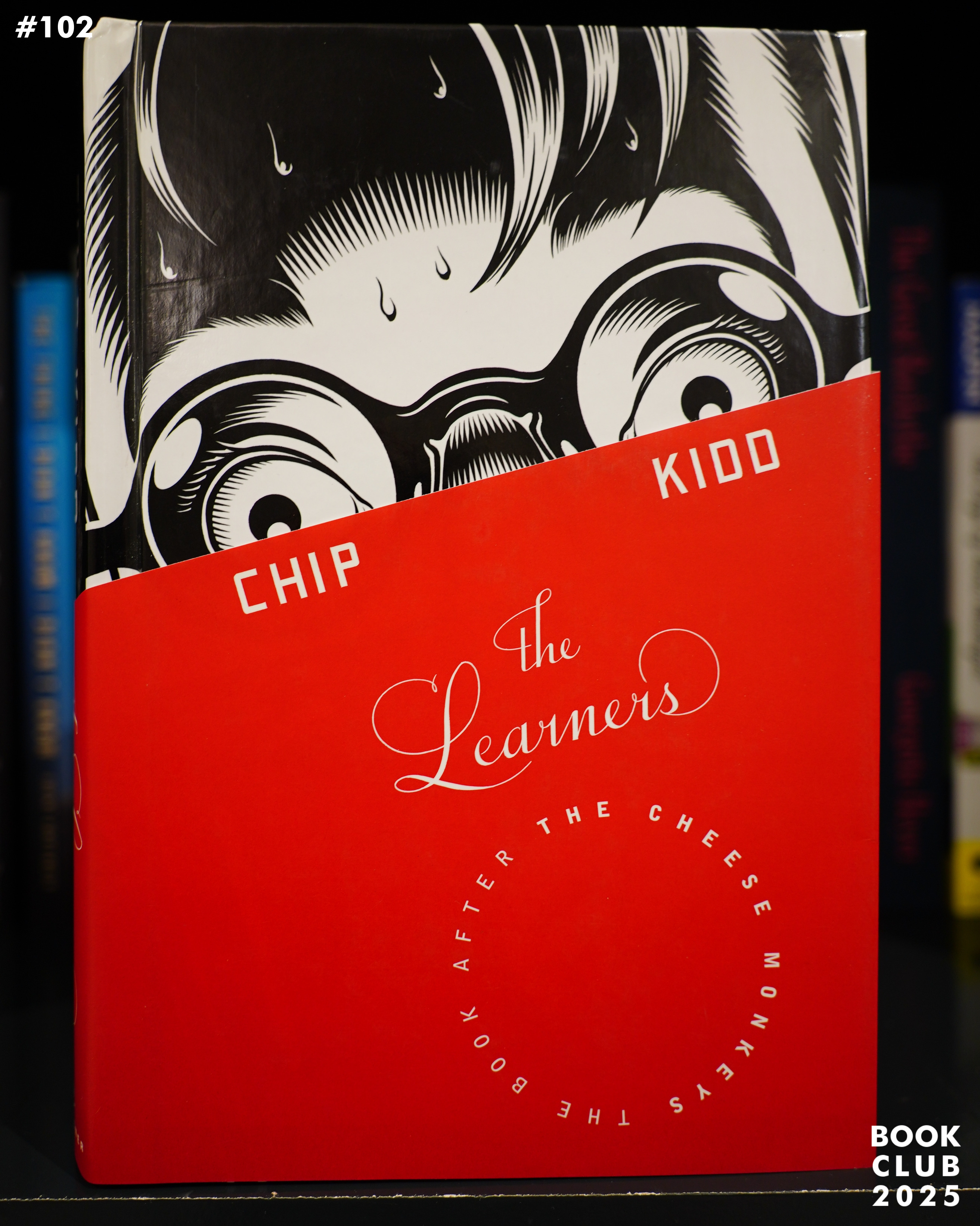
The Learners (2008) by Chip Kidd (buy used, 3.58 on Goodreads)