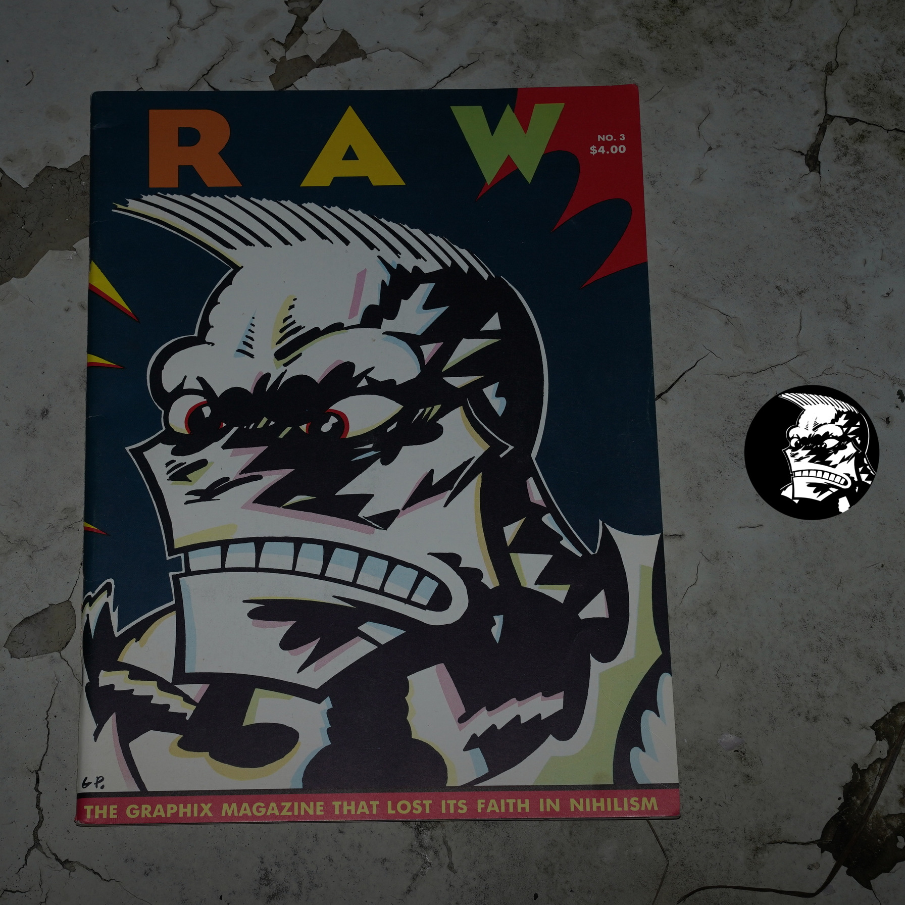
Raw #3: The Graphix Magazine That Lost Its Faith In Nihilism edited by Françoise Mouly and Art Spiegelman (268x360mm)
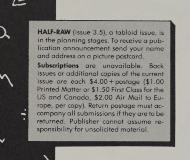
Huh. “Half-Raw (issue 3.5), a tabloid issue”? I don’t think that ever happened…
Anyway, the first issue of Raw was stunning, and the second was a let-down (relatively speaking). One problem it had was just pacing — it was almost nothing but one and two page stories, and that feels unbalanced. The other problem was that it had some pieces that felt studentey (because they were pieces from the students at the School of Visual Arts).
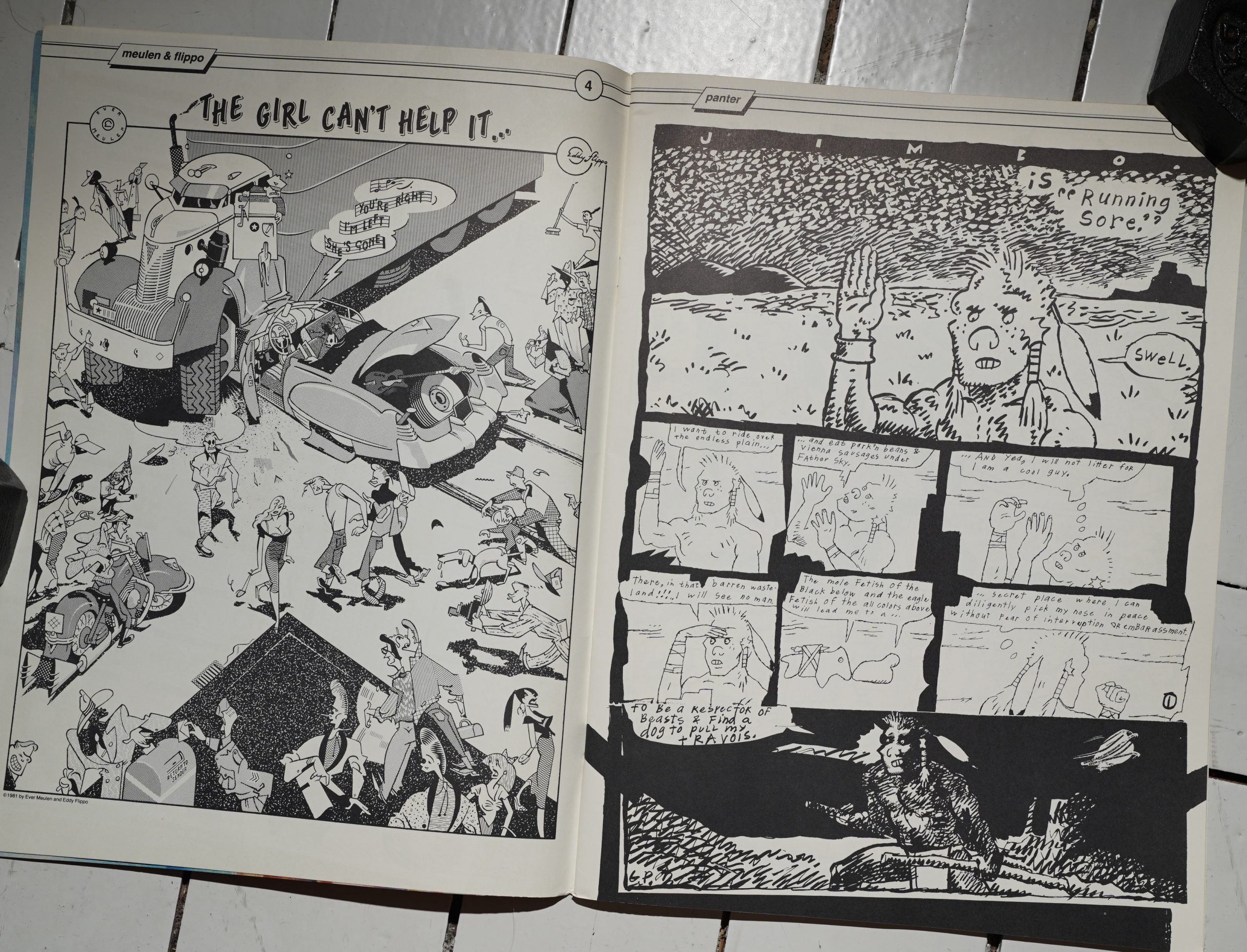
So we start off this issue with a visually striking one-pager by Ever Meulen and Eddy Flippo, and I was going “uh-oh”, but then we get a brilliant (and wistful) five page Jimbo thing from Gary Panter.
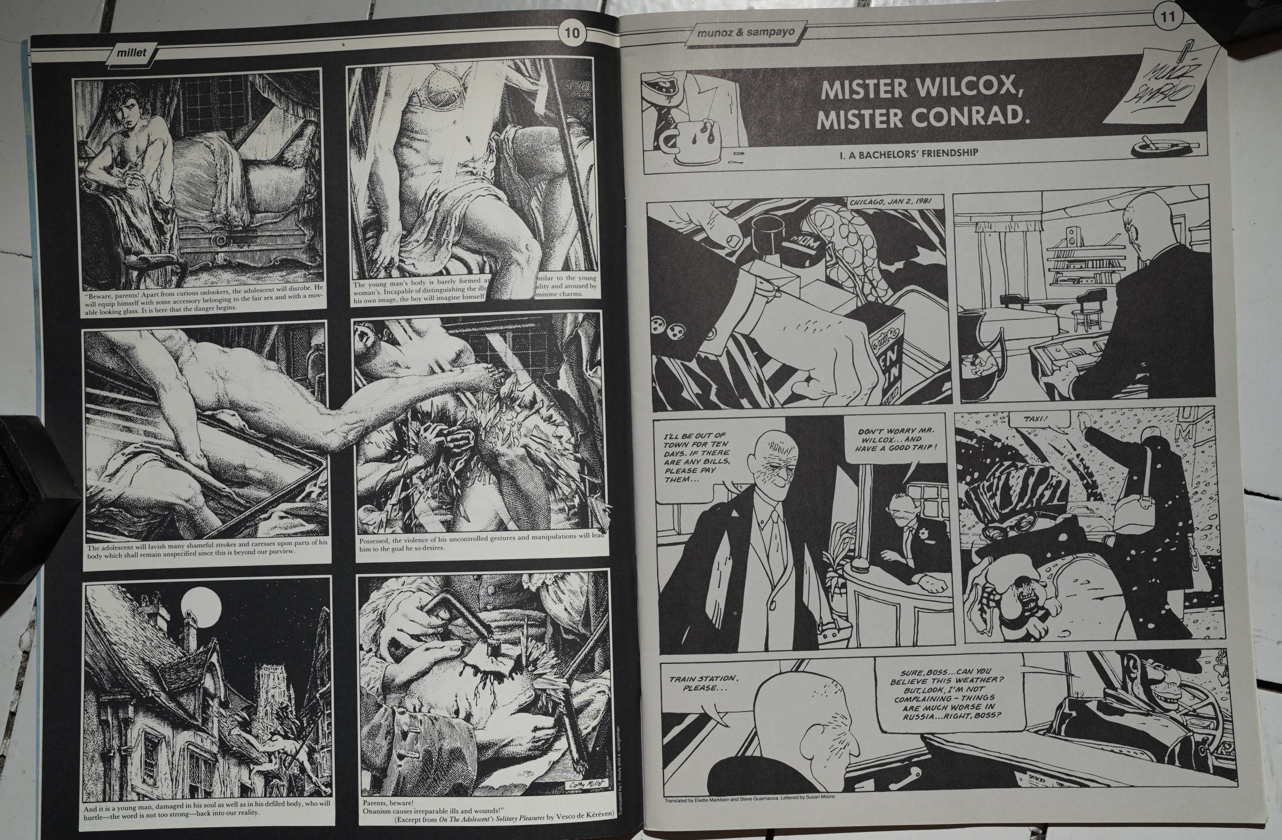
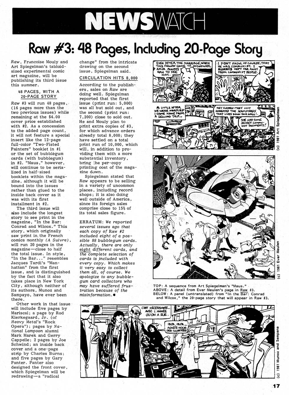
And this issue is indeed very satisfying. We’ve got this somewhat unnerving (but funny) page by Cathy Millet, and then a twenty (!) page story by Jose Muñoz and Carlos Sampayo. (And it’s printed on a different, more grey paper.)
Since it’s on a different paper stock (and isn’t in the middle of the magazine), we get a “continued on” message after ten pages.
Using 20 pages of a 50 page magazine on a single feature is a risk, but the artwork is so sharp and fabulous. And the story seems really intriguing… until the final couple pages where it turns out to be an O. Henry kind of story. So that’s a let-down, but it’s still a satisfying trunk to hang the rest of the issue’s contents off of.
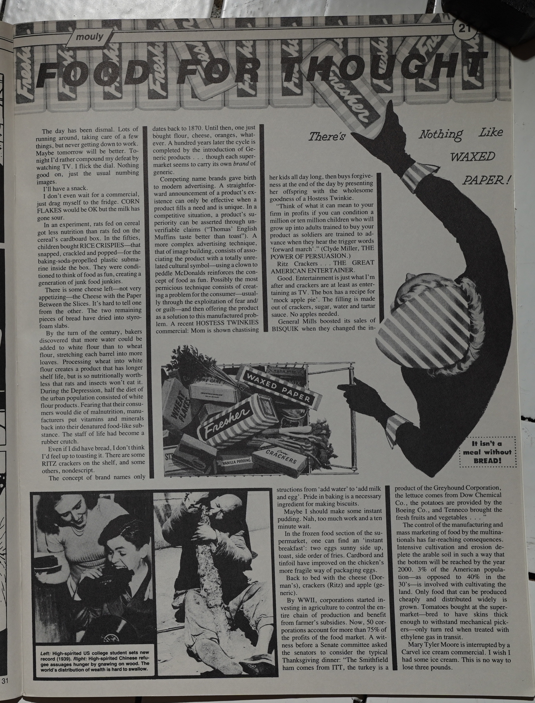
It’s not just comics, either — Mouly herself writes one of the text pieces.
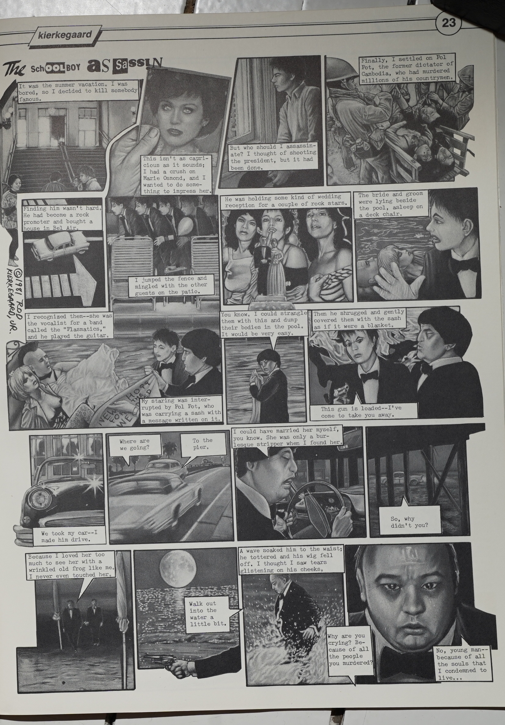
I’m surprised to see a page of Rod Kierkegaard here — he would pop up in Heavy Metal a lot later, I think? But it’s a fun page.
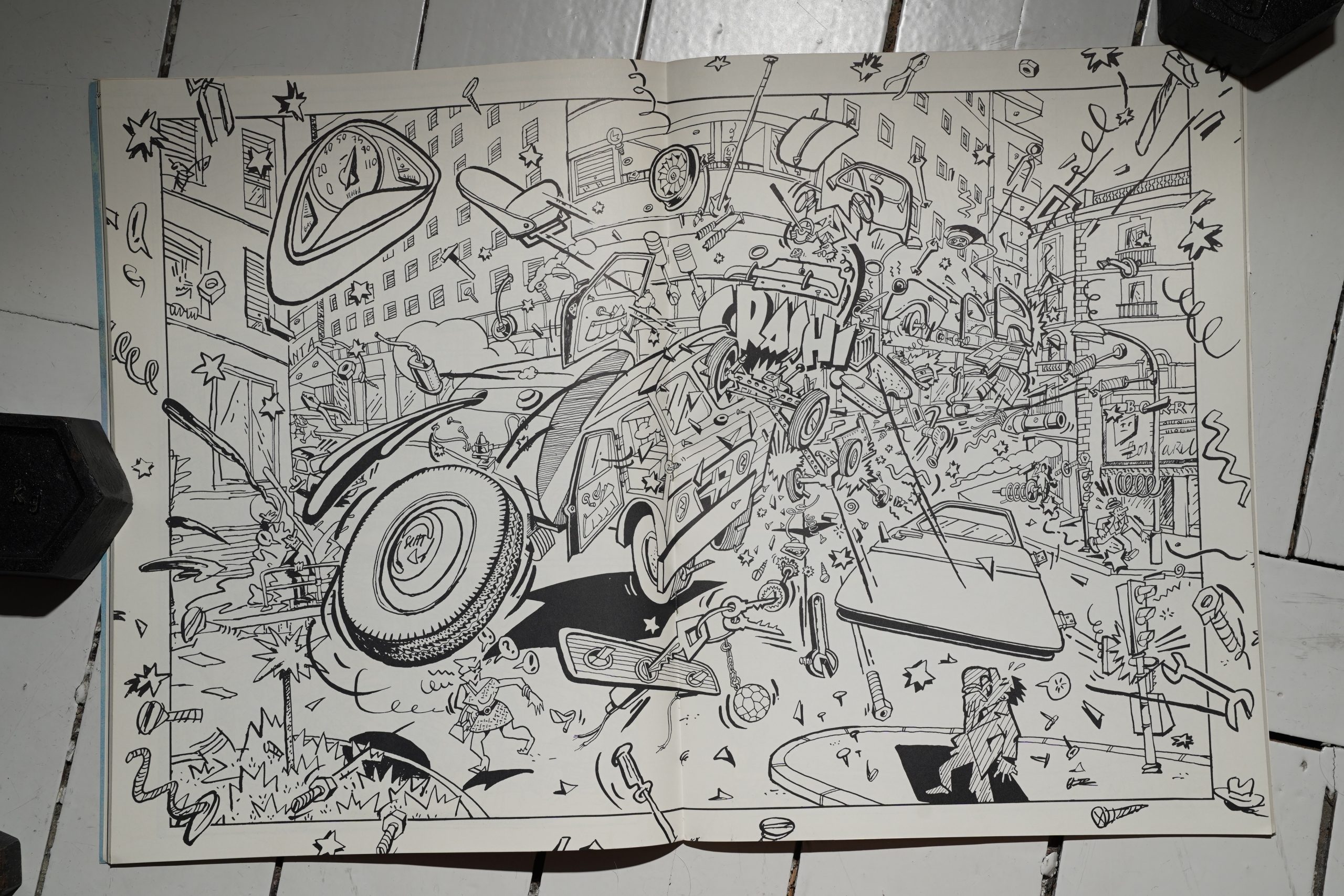
And the reason that the grey paper stock wasn’t put in the middle becomes clear: Mariscal needed the centre to pages for this insane double spread.
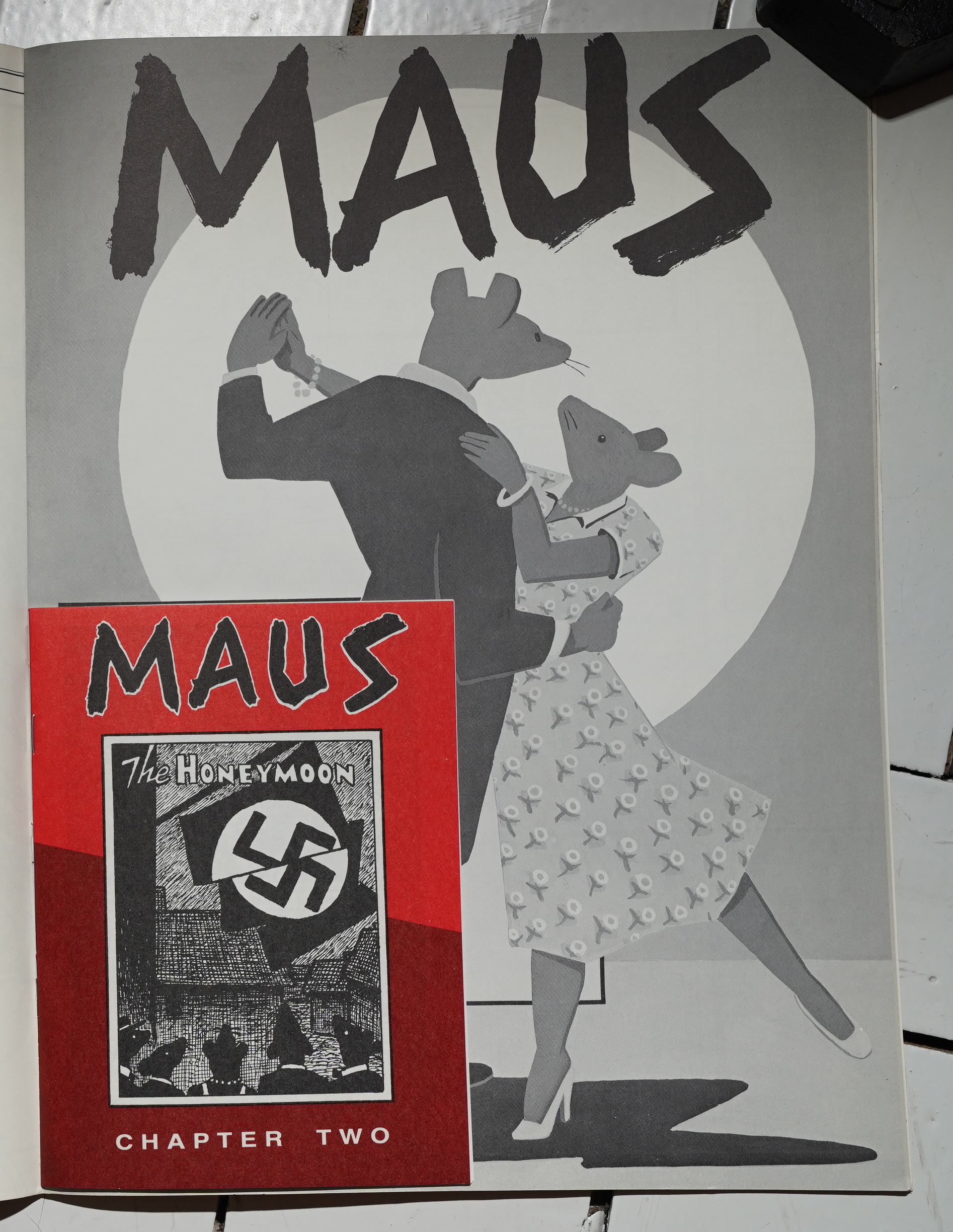
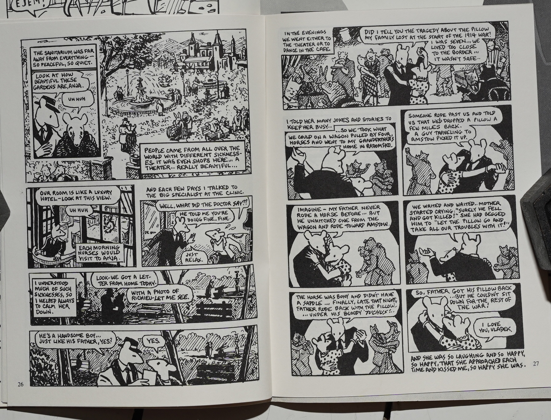
The only insert this time around is Maus. So they’re cutting slightly back on the printing extravaganza stuff, I guess, except for the different paper stocks.
And we’re getting into Spiegelman’s parent’s pre-war history.
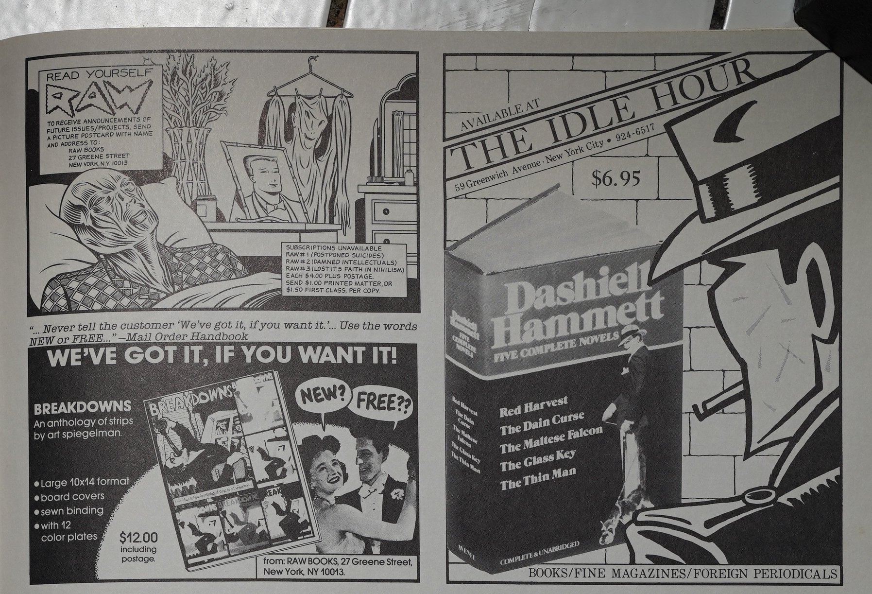
The first few external ads show up, like this ad by The Idle Hour.
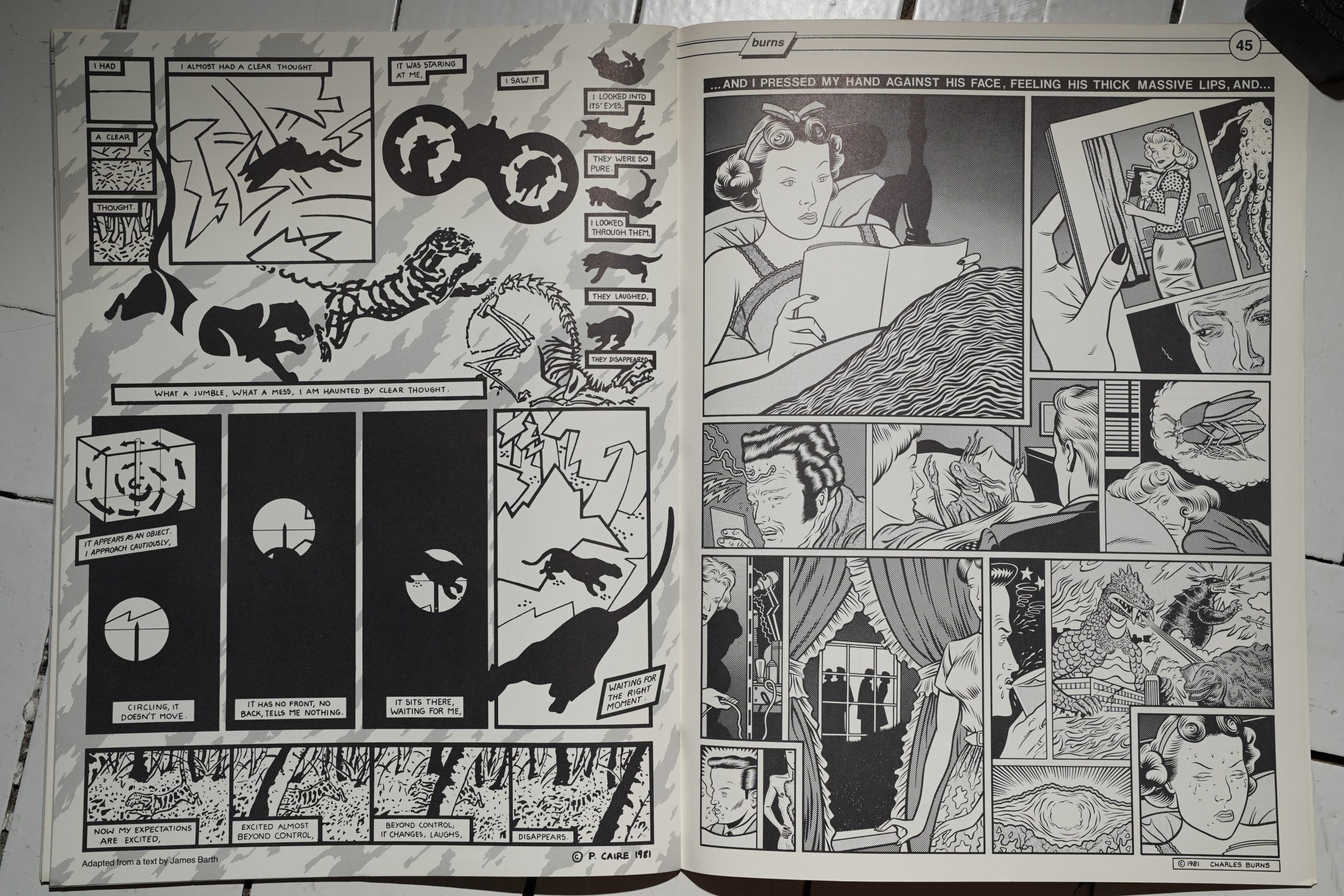
This issue is so rich — every page a new delight. Patricia Caire and Charles Burns on these two pages.
So — after a wobbly second issue, the third issue is absolutely fabulous. There’s not a single dud here, and it’s such a delight to read this. There’s no “theme” here, but everything seems to fit together into a cohesive reading experience.
By the third issue, they were printing 10K copies. It’s a smash hit.
This blog post is part of the Punk Comix series.
