A while back, I watched a film and drank a cocktail from each country on Earth, but it occurred to me just now that I had never done any visualisation of where on Earth the good movies and drinks are.
Since I had the data semi-readible available, I whipped up some charts.
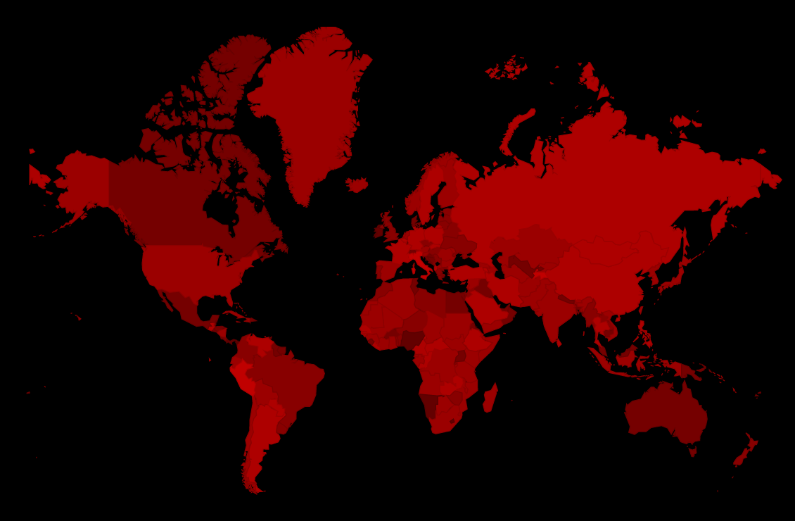
Here’s the film map (brighter red is better):
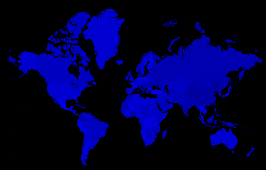
Here’s the cocktail map (brighter blue is better):
Hm… I should run some regression on the data set to determine whether there’s a correlation or not between what I thought of the cocktail, what I thought of the film, and how drunk I was.
Oops! No data on the last bit.
It looks like Africa leads on the cocktail scale… And the dry bits between Europe and Asia (as well as South America) on the film scale.
Here’s the interactive version of the film map and the cocktail map if you’re really curious, for some reason or other.
Anyway, this is all statistically valid, since I have a sample size of 1 per country, so you can totally trust me here. The p value is definitely < 0.05 according to my math.

