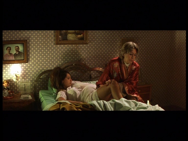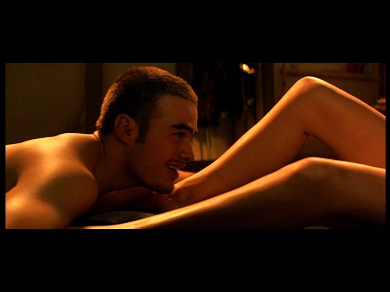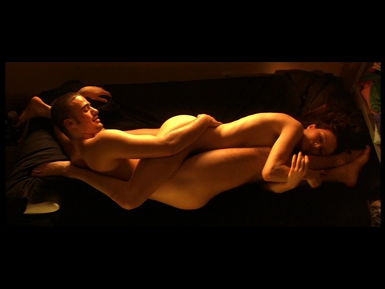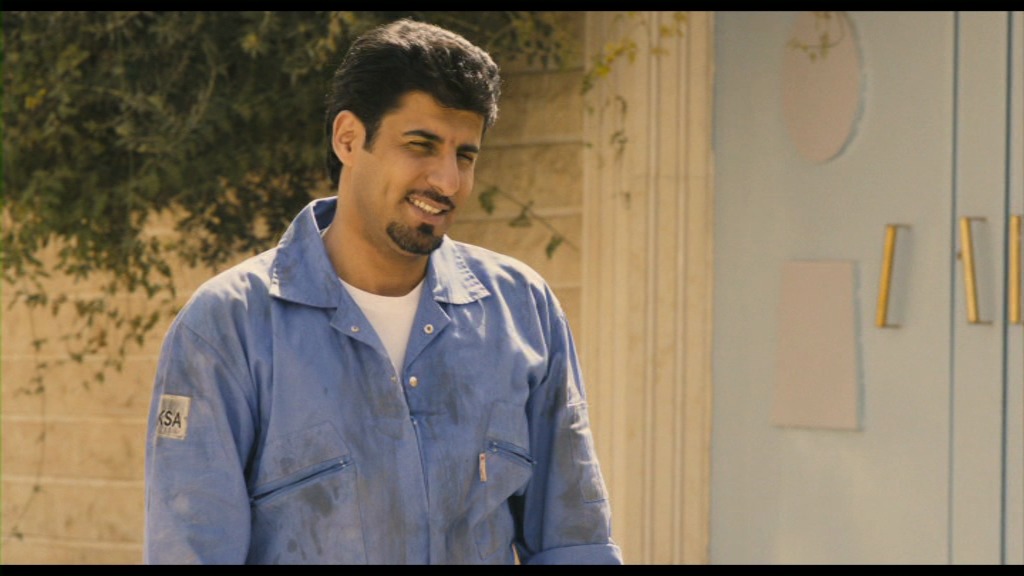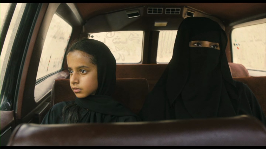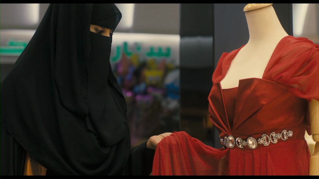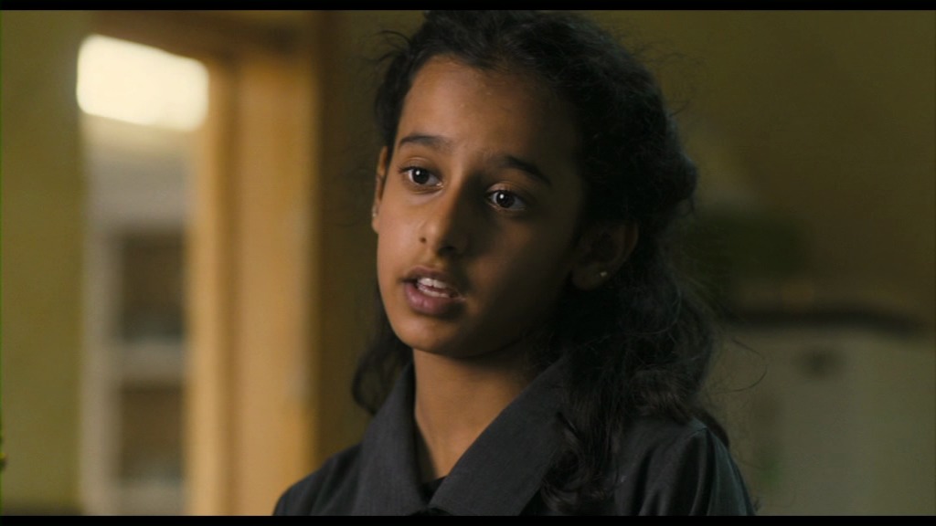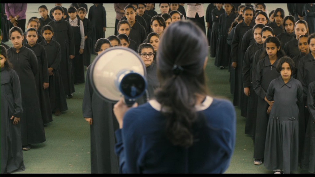

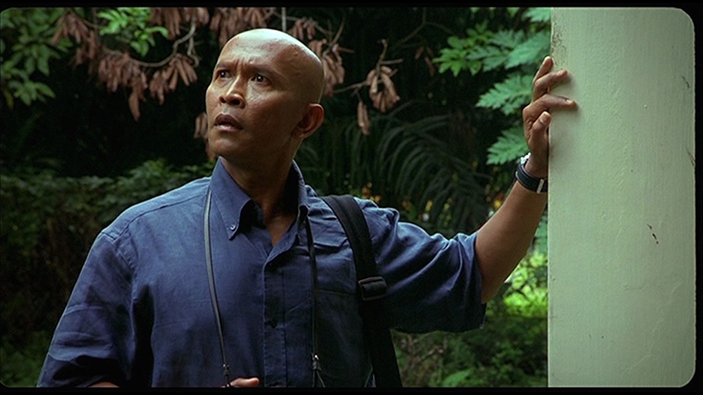
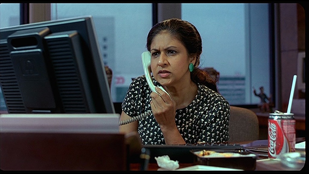
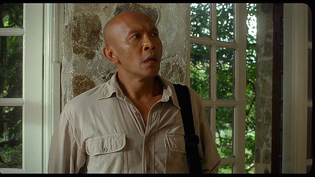
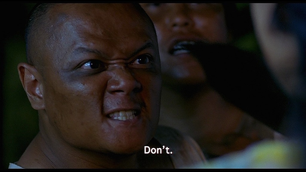
Oh, man. This is so amateurish.
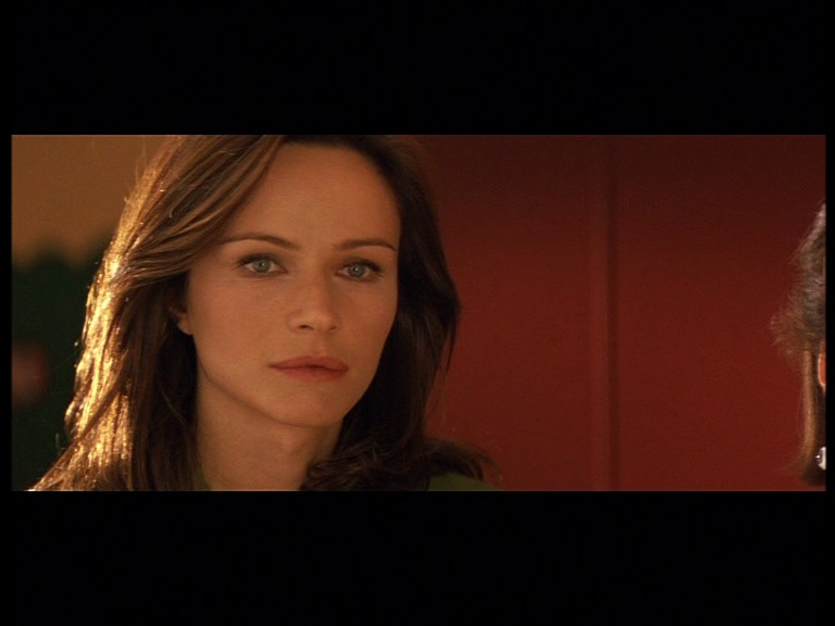
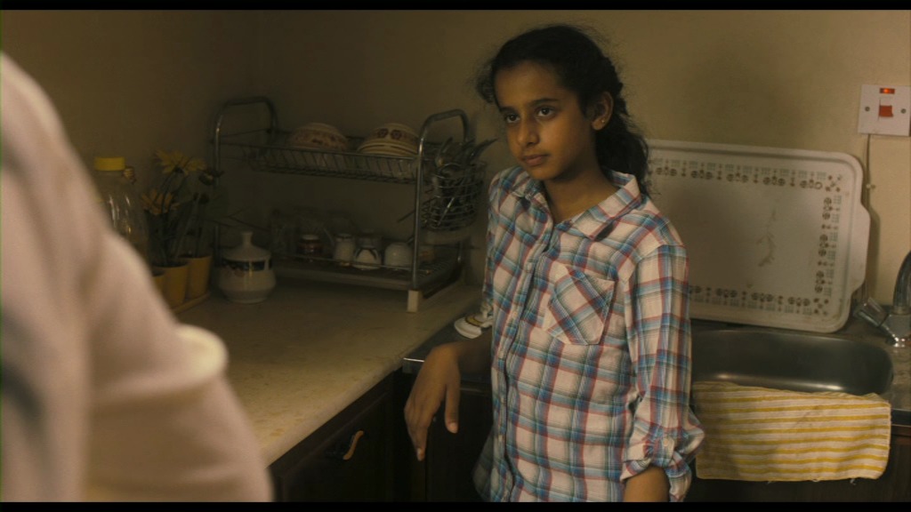
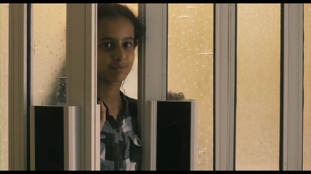
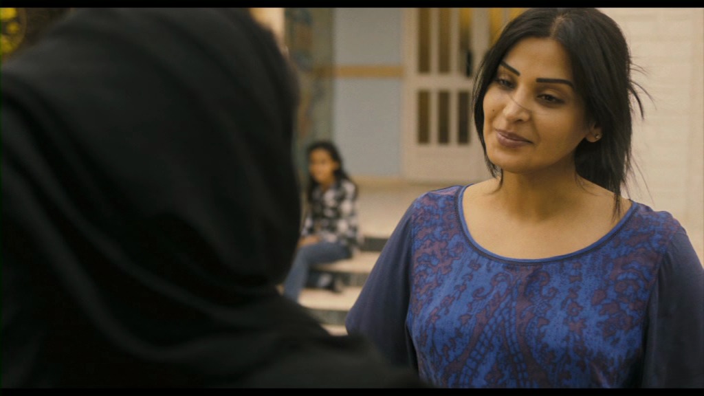
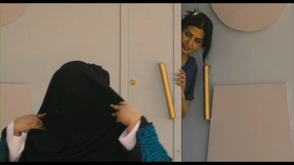
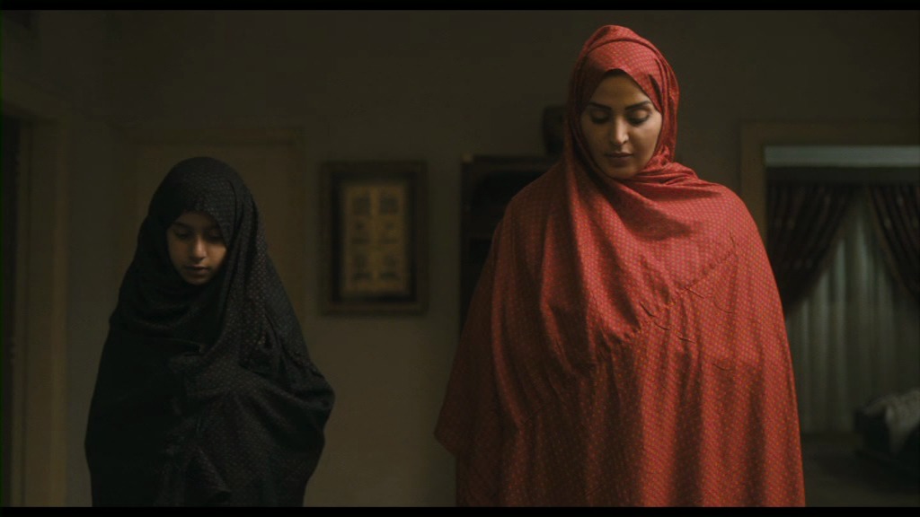
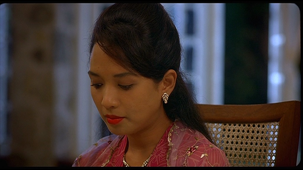
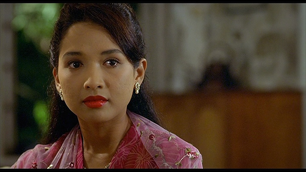
But it’s kinda atmospheric, and the central conceit of the film is kinda cute. And the actor playing Azizah is pretty good. And it won the prize for Best Poster (WON).
So I’m being oh so generous and rolling:
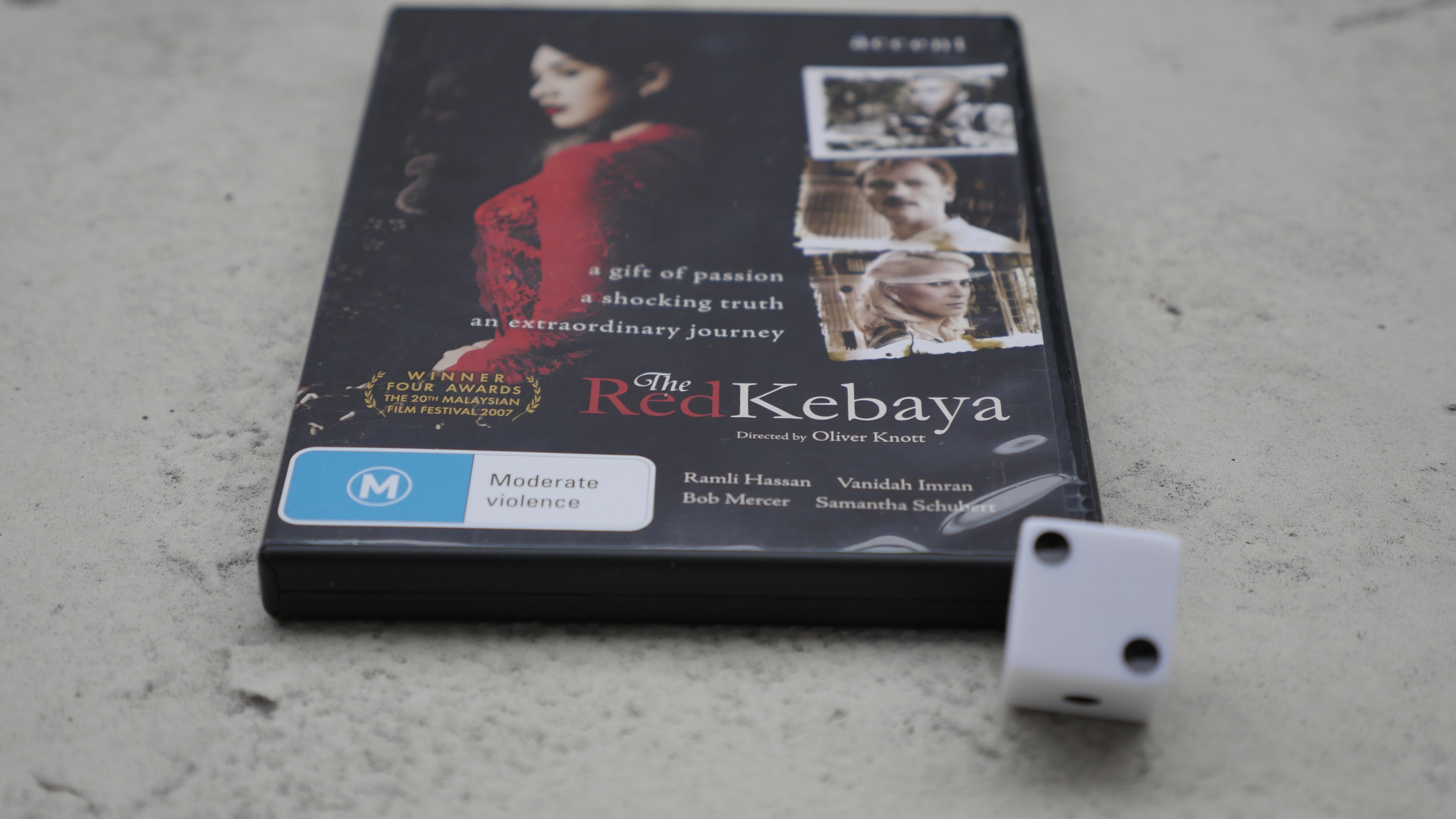
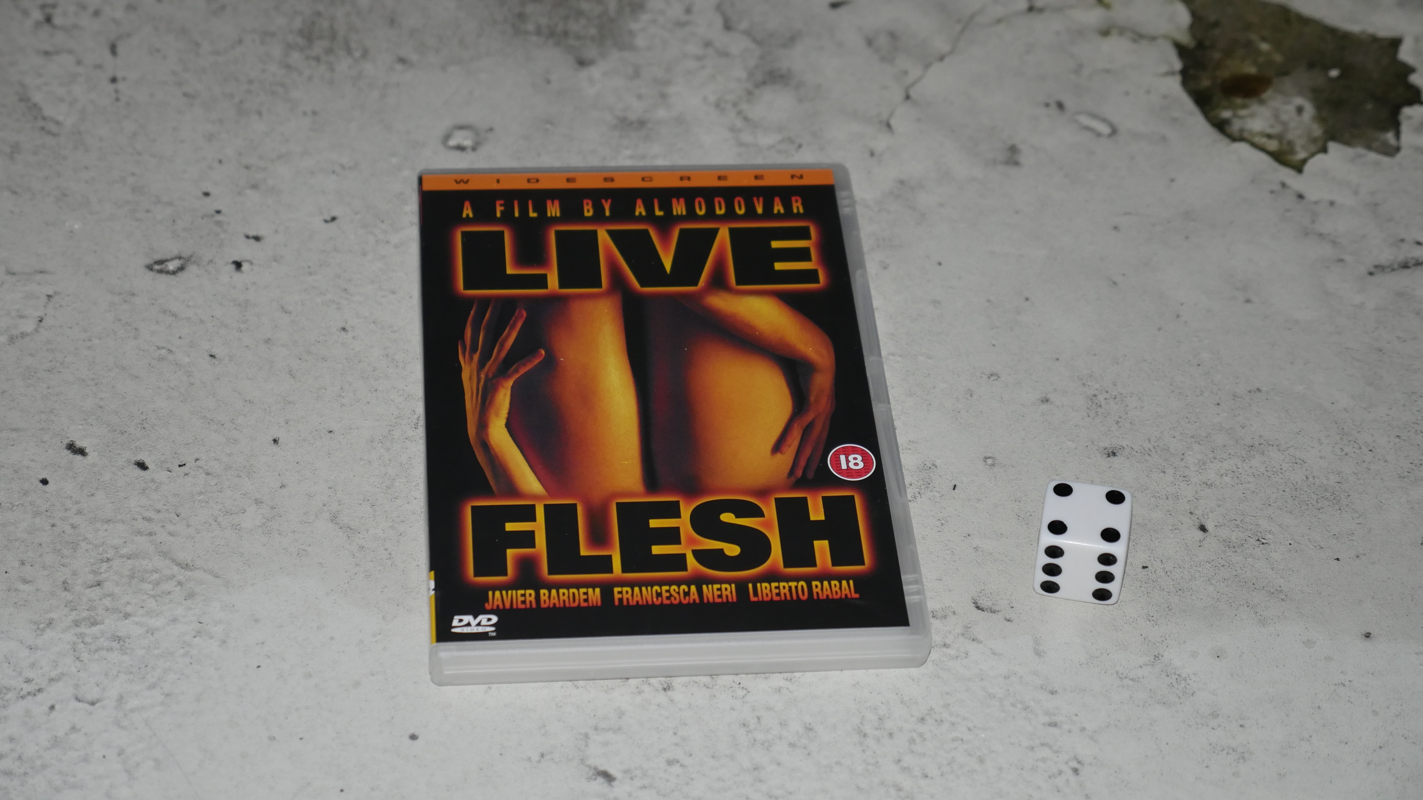
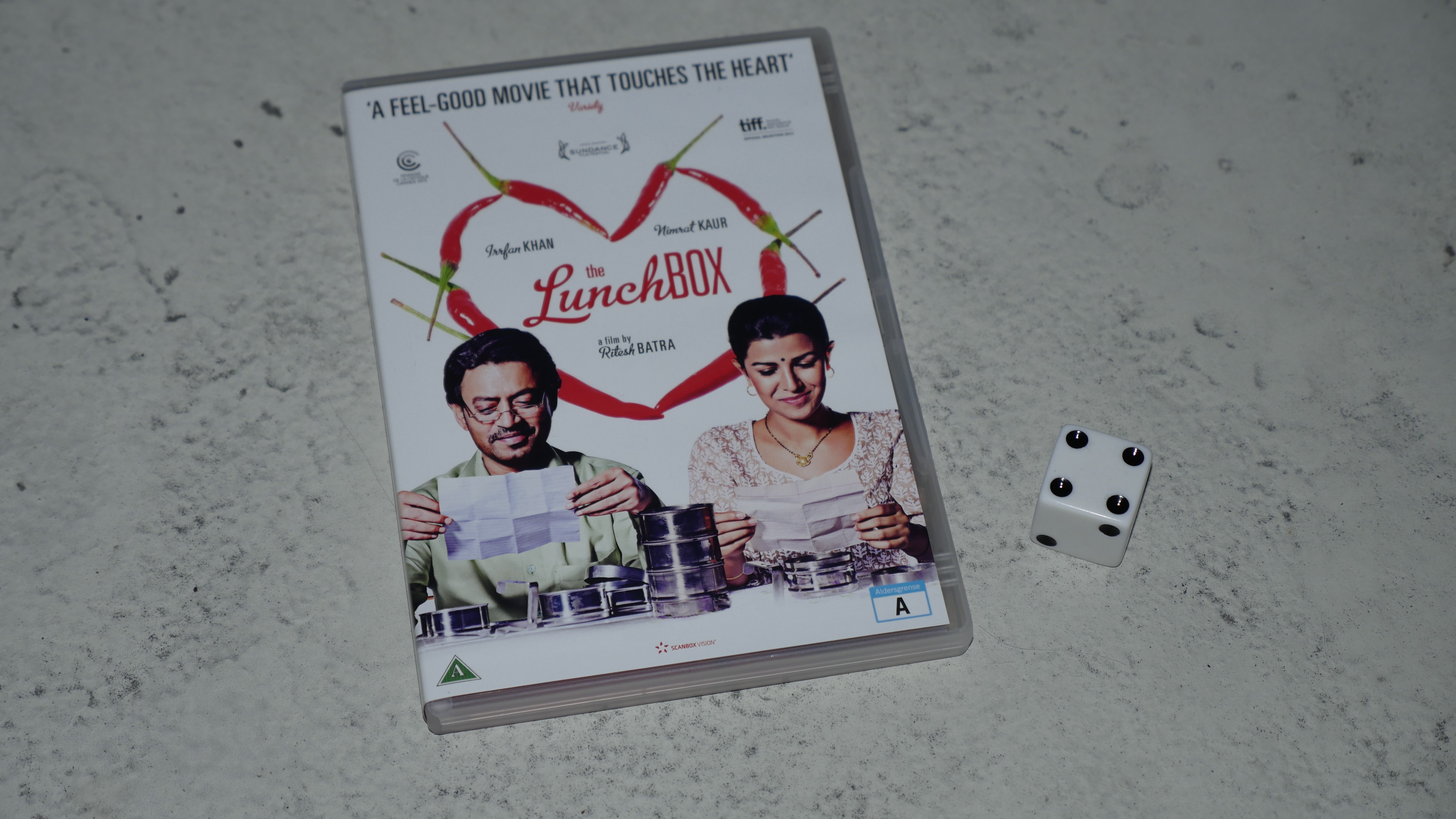
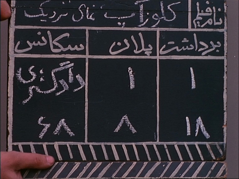
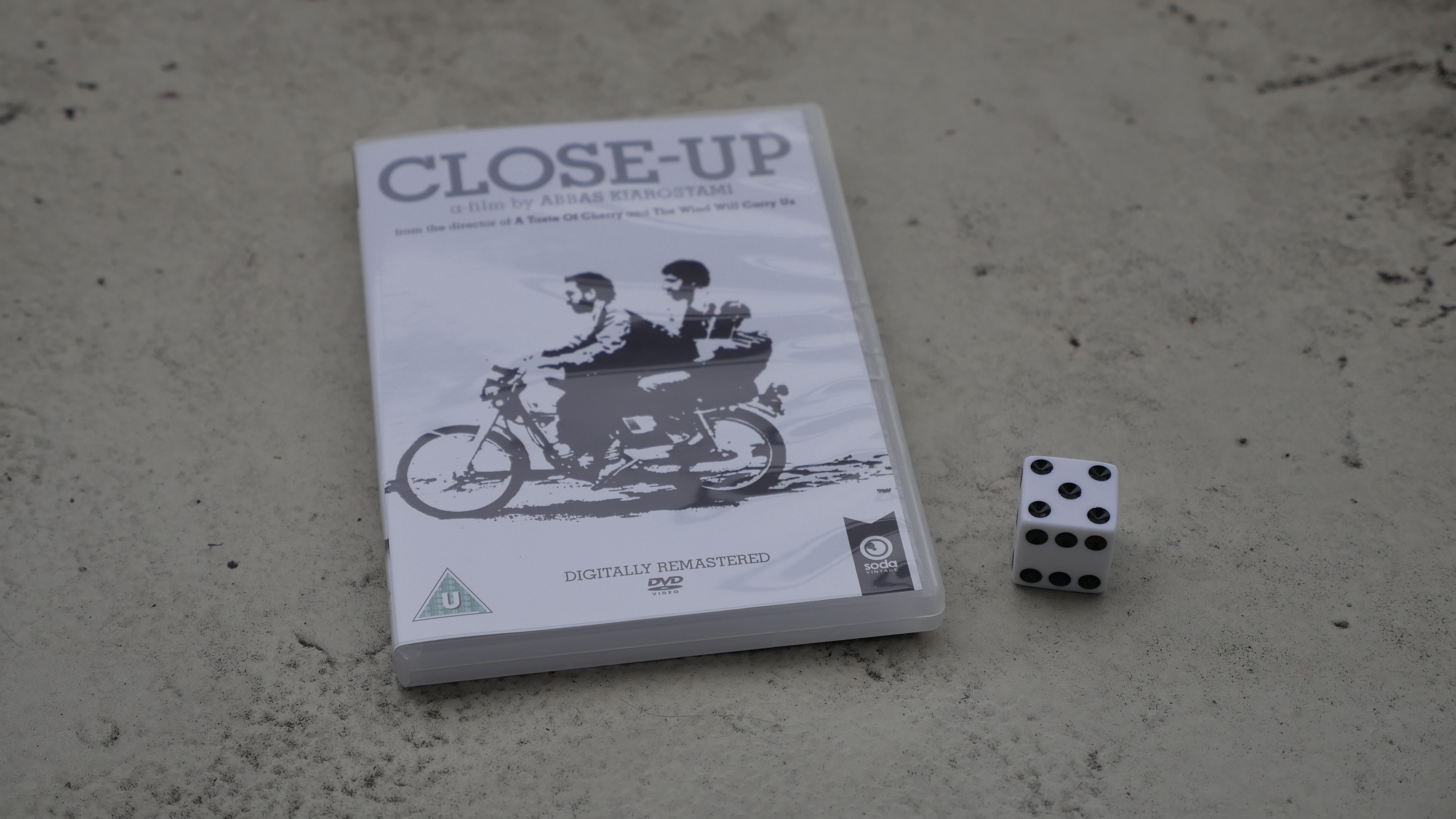
The Red Kebaya. Oliver Knott. 2006. Malaysia.
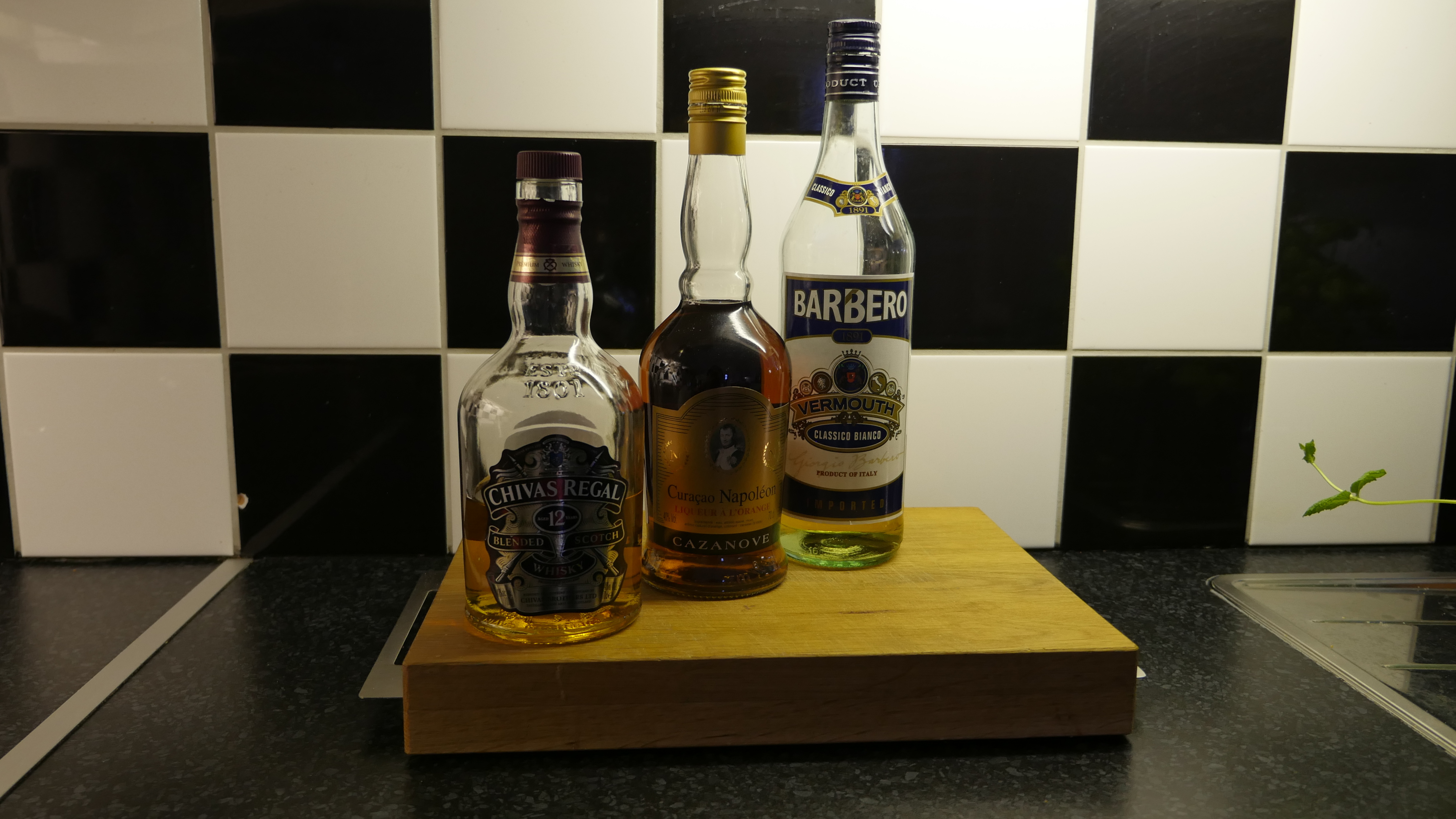
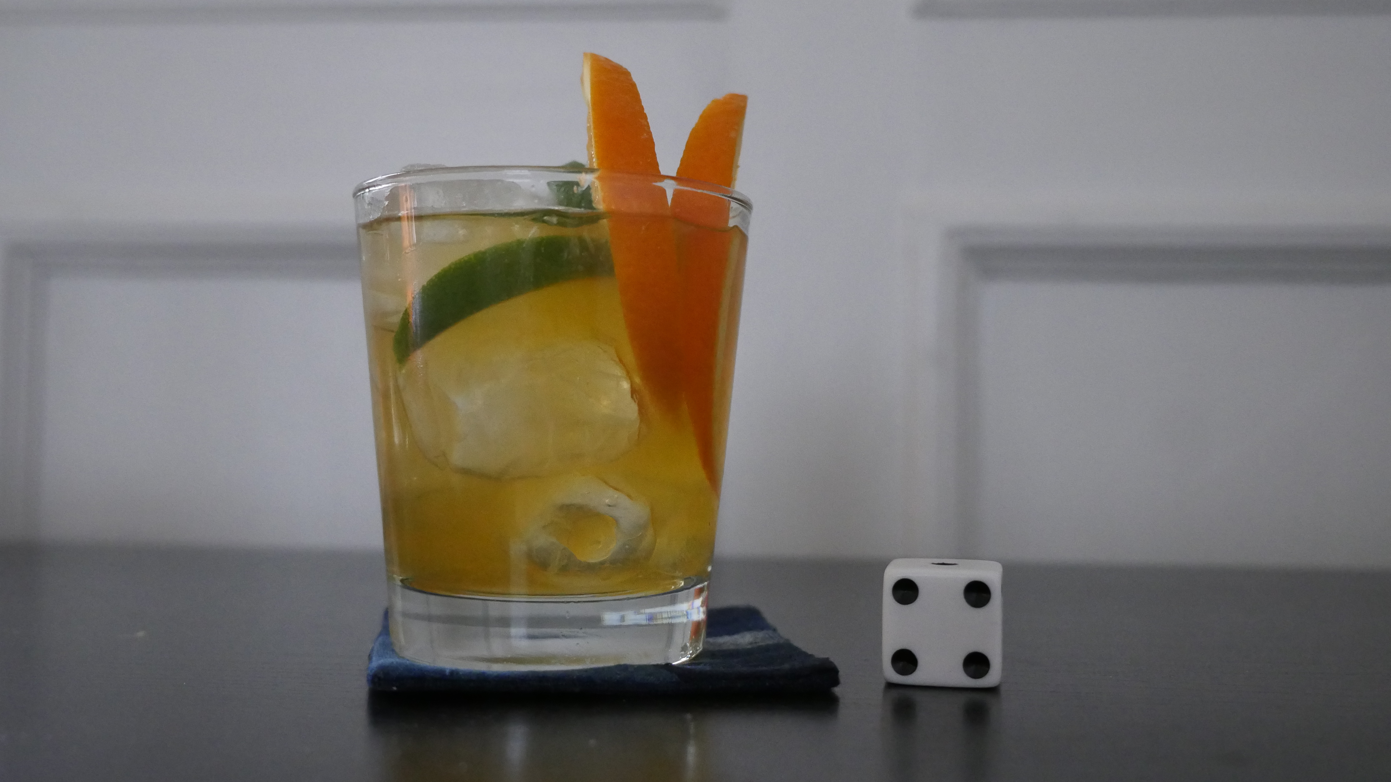
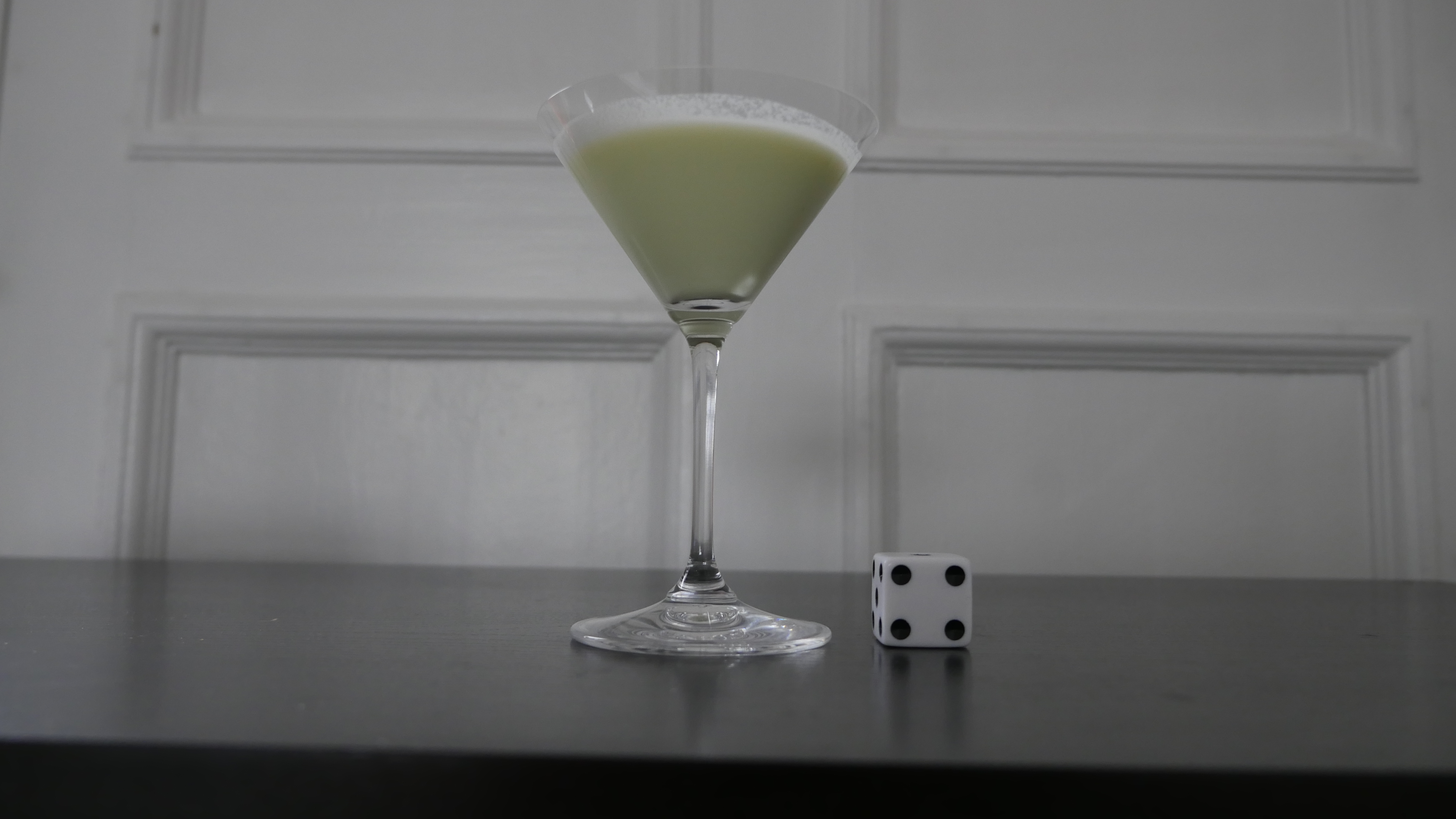
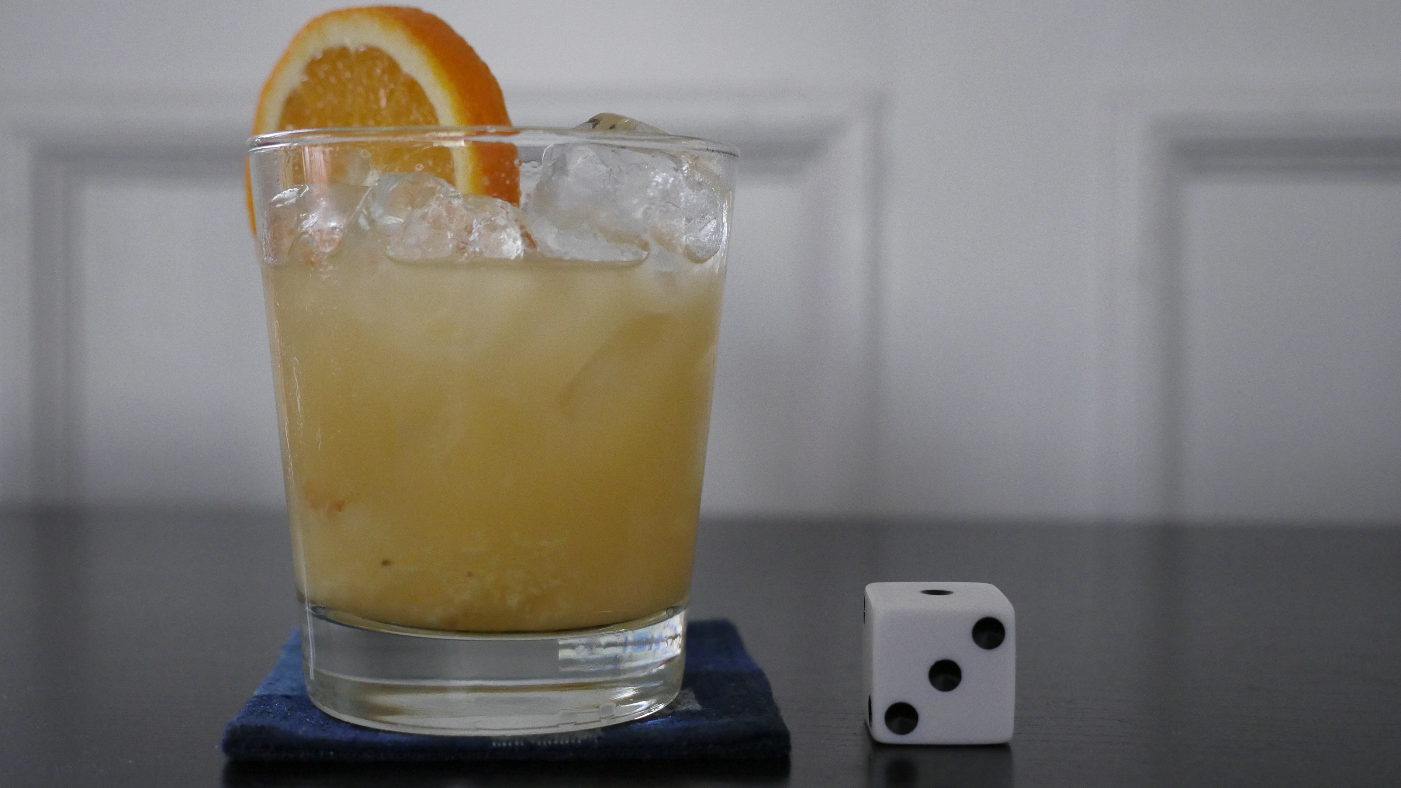
Sing Sing
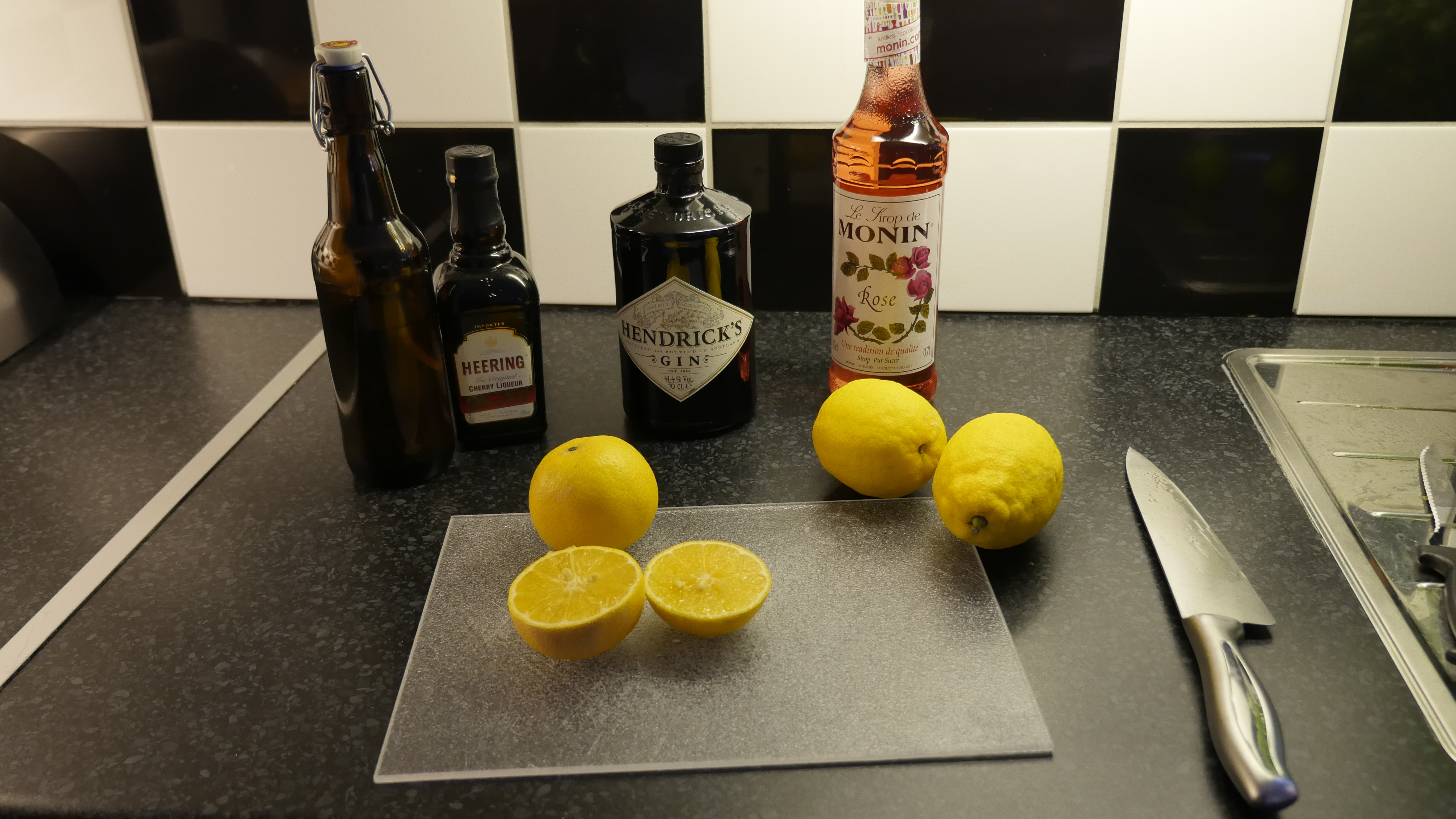
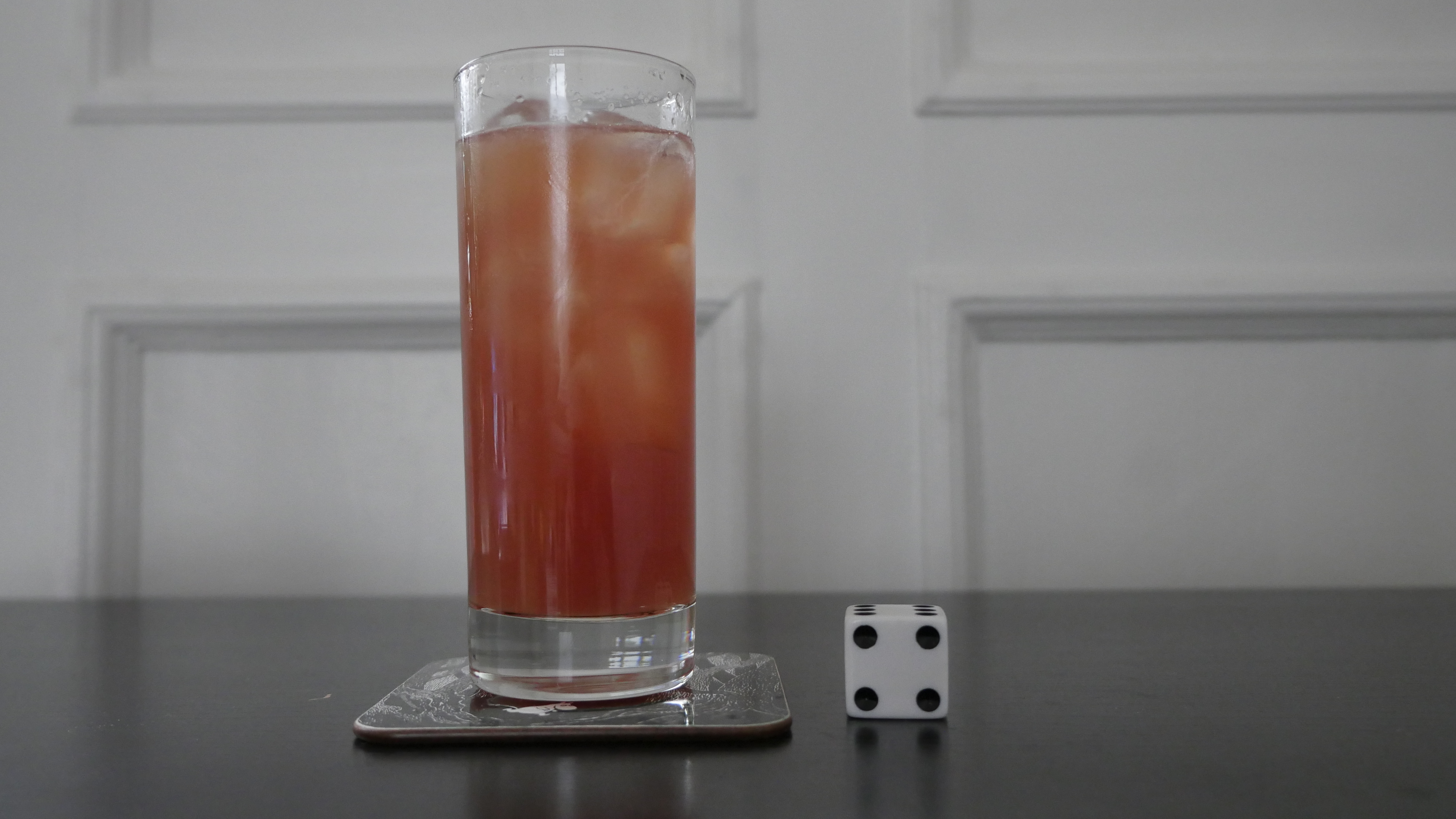
- 2 parts whiskey
- 1 part sweet vermouth
- 1 part orange curaçao
Shake with ice and strain into a cocktail glass. Garnish with an orange zest twist

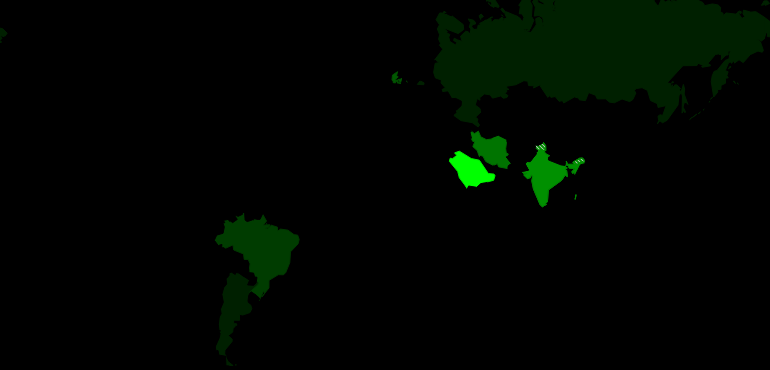
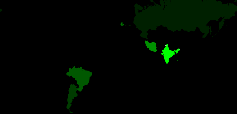
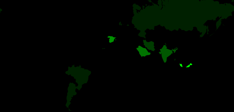
This post is part of the World of Films and Cocktails series. Explore the map.