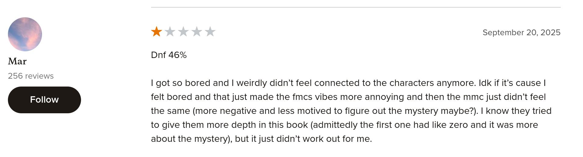
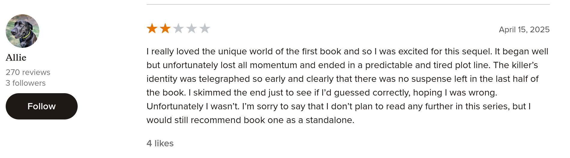
TBE1994: The Land of Nod

The Land of Nod Treasury (1994),
The Land of Nod (1996) #1-3 by Jay Stephens

Up until now, Black Eye had published all their comics in standard US comics size (except for the two magazine-sized issues of Sputnik). So the Land of Nod Treasury represented something of a rupture in Black Eye’s publishing, because from now on, I don’t think they published a single thing in standard formats? (I’m just fondling the little stack of comics to be read, so I may be somewhat off here, but not by much.)

Instead Black Eye would publish their pamphlets in a slightly smaller size than normal — in the size that was pioneered by Chester Brown’s Underwater, perhaps? Or did the final issues of Yummy Fur also use this format? I forget. Perhaps they used the same printer? They’re both publishers in Canada…

The thicker books that Black Eye would publish came with French flaps, I think they’re called. So this gives the lineup a quite distinctive and higher class look — they’ve always had a good design sense, and this new format is a good thing.

Anyway, first out in this new design direction is this collection of comics from Jay Stephens — the Land of Nod strips that were originally published in Reactor Girl, Sin and Sin Comics (plus some other odds and ends).

Evan Dorkin does the introduction.

Sin was a very chaotic series that read wonderfully — it was one loopy thing after another.

(While the book is a very nice format, the paper chosen here isn’t ideal — there’s a lot of bleed through. Paper selection was such a big deal back in the 80s and 90s — people never seem to have these problems these days… but perhaps that’s because all comics are printed in China and the paper weight isn’t something that affects the price noticeably, so everybody goes for better paper?)

Sometimes when you collect stuff like that in a thicker book, it doesn’t really survive the transition, because what can seem fun and whimsical in a pamphlet can become twee and annoying in a collection.

That’s not the case at all here — it’s like these comics were made to be collected. There’s definitely a cumulative effect where all these nonsensical bits become funnier and funnier.

There wasn’t a clear line between the Land of Nod strips and the rest in Sin, so you have to decide whether to include things like this Badman strip that leads into a Land of Nod thing — but I think it works well. Even if you don’t know that Badman is a continuing character, this just feels like one more random gag in this book.

Is this autobio!?

This book also collects the Land of Nod bits that were slated for Sin #6, and which had never been published before (because Tragedy Strikes Press kinda dissolved). It’s a bit of a downer of an ending — most everybody dies, so it seems like Stephens was aiming for Sin #6 to be the end of the series anyway.

And then we get some sketchbook stuff.

So — it’s a very good book indeed. Collected like this, the storyline (for some values of) becomes clearer, and the gags land even better.

Then, a couple years later, while Stephens was also doing Atomic City Tales, we get a Land of Nod series.

These are in the new, smaller format, and are only 24 pages long, and are printed on newsprint-ey paper. This makes these books very, very light indeed, and I’m guessing comics nerds (notoriously cheap as they are) were standing in the comics shop going “I could buy this book… but this issue of Spawn masses 200% more and has 33% more pages! And only a quarter of them are ads! I’m buying Spawn instead of Land of Nod!”

The inside front cover explains that each issue would focus on one character (from Sin/Sin Comics, I guess). And they do, kind of, but:

Stephens can’t help himself, and drops in a few pages of a comic book one of the characters are reading.

Super sharp cartooning.

The second issue is all like this — it’s 288 panels of horrible things happening to this guy.

The third and final issue uses a ligne grasse style — I don’t think I’ve seen this style from Stephens before?

So he’s developing a lot as an artist, but I can’t say that I was really gripped by any of these issues.

The Comics Journal #176, page #120:

When Jay Stephens first
burst On the scene with Sin,
confusion reigned. This is not to suggest that Sin
was incomprehensible. but a reader had to pay very
close attention to realize what was going on. (This
reader will cheerfully confess to being totally mys-
tified.)
If you Were confused and mystified by Sin (and
perhaps therefore stopped reading it), please pick
up The Land of Nod Treasury. Everything that was
in Sin, including the bizarre interruptions in the
plot, seemingly unrelated stories (often drawn in
strikingly different drawing styles), and its
fundamentally bizarre
premise, all make sense
read it in one go. Tired
neologisms like
modern” and “meta-
fiction” were invented
to books like
The Land of Nod, but don’t let that frighten you
away. The Land of Nod Treasury is a delightful
book.
The Land of Nod is a place where stories read
in comic books eventually become part Of the read.
ers’ reality. This blending of the books within a
book may remind readers of “Tlön, Uqbar, Orbis
Tertius” and If 0m a Winter’s Night a Traveler, but
you won’t recall those fine literary works being
quite as goofy as The land of Nod Treasury. With
the well-meaning but ineffectual Dave. the reckless
Merv, and various other funny animal characters
(including numerous insects who would like every.
one to take their concerns just a little more seri-
ously), the Land of Nod is a place where every
character is a potential plot, all of which go off in
various directions. occasionally resolving them-
selves long after you’ve forgotten them.
The land of Nod Treasury is the freshest take
on funny animals in a long time. Forget Disney Ad.
ventures — this is the shit!
ROBERT BOYD

Darcy Sullivan writes in The Comics Journal #179, page #45:

AT THE RIPE OLD AGE of 24, Jay
Stephens is already getting hassled by people
who say his older comics were better.
Considering thatStephens only stopped doing
his “older” comics last year, this seems a bit
perverse. Until you read The I-and of Nod
Treasury.
This book, which Black Eye Productions
published at the end of last year, compiles
Stephens’ comics from two series Of his book
Sin (1992-94). It’s quite simply one of the
most wonderful comics of the last year. Mix-
ing abundant charm with cartooning chops,
Stephens makes The Land of Nod Treasury
into a real anomaly: a kiddie comic for adults.
In a sense, Stephens’ Nod stories are to
Walt Disney comics what Bone is to Pogo.
But Stephens reworks the funny-ani mal genre
more radically than Smith does, managing to
be both Cute and Obscene at once. In another
sense, these stories of slapabout characters whose
moods and plots change panel-to-panel are like
the best cartoons your kid brother ever drew to
amuse you on a family road trip. There’s even a
monster who gobbles up the other characters
when the ostensible story starts thinning out.
Pages later, an equally sudden lottery win has the
book’s survivors casting off the tragedy and
sunning themselves by a pool. Stephens seem to
have been making it up as he went along, without
running out of steam.

Wizard Magazine #56, page #75:

Stephens’ two new series separate the
parts of his earlier work into different
comics. “I’m interested in a lot of different
styles of storytelling and cartooning,”
Stephens explains. “l used to think mixing
it up in one comic like Sin was cool, but I
wasn’t getting enough room to play with
each of those techniques. Now I have two
different comic books, each with quite dif-
ferent styles. If you know my work, you can
tell it’s all by the same guy, but both comics
really cover a lot of ground for me. Maybe
I’m too ambitious, but I think I can do it.”
Aside from the different subject matter
of Land of Nod and Atomic City Tales,
Stephens’ two new series provide him with
new challenges, and the reader with very
entertaining stories. Every issue of Land of
Nod will feature a complete story focusing
on one character from a memorable cast,
including Space Ape Number Eight, Cap-
tain Rightful, Tutenstein the Mummy Boy,
and Irwin.

The Comics Journal #212, page #97:

SW-IVAN: — you didn’t have a very happy experience
withyour three-issue Land ofNodfor Black Eye. Didyou
think ofdoing this Dark Horse book with a different title
than The Land of Nod?
STERENS: Yeah, I wanted to call itJet Cat.
SILLIVAN: But… ?
STERENS: Well.. Dark Horse thought that — this
r m sure is going to send chuckles through the alterna-
tive comics crowd — the name recognition would
bring in my fan base. [laughs] Like I had any readers.
Of course it didn’t work. I’ve heard from people who
Were fond of the Black Eye stuff and had no idea that
Dark Horse had done Land of Nod issues.

The Comics Journal #212, page #103:

SULLIVAN: I was thinking ofthe Black Eye Land of Nod
issues. The Captain Rightful co•ver is very nice.
STEPHENS: I actually hate that cover. Thads another
one of those Michel screw-up things.
SULLIVAN: Hou 50?
STERENS: Thads completely his design. He threw out
every suggestion I had, and just went with his own
thing. And it went to press his way. So rm not too
happy with it. I had a whole negative background thing
ing on that was really cool. At least I thought so.
aybe you wouldn’t think so. [both laugh]
My favorite stuff is the recent Land ofNodJet Cat
stuff for Dark Horse. The last thing I did is always
going to be my favorite one. Ifitwasn’t, I’d have to kill
myself. You know, if I really thought that the work I
did fouryears ago was mybestwork… mygod! [laughs]
Who can live like that?
SULLIVAN: But do you everfeel like Woody Allen? Do you
ewer get those people who go, •The original Sins were the
great —
STEPHENS:You know, Darcy, I think thaeswhatmakes
me feel old. That’s what makes me feel like six years
ago was a long time ago. I get that all the time. I did
those five issues in like halfa year. So a year after I
debuted in comics, I had people saying they liked my
older material better.

The Comics Journal #186, page #35:

IF HANNA-BARBARA DEALT with
existential angst and deconstructionalism, the
end result would probably resemble The Innd
of Nod, the new comic from Jay Stephens. I
sincerely doubt, however, that they would do
anywhere near as good a job as he has.
Make no mistake, this book is quite an
achievement. Without ever pausing for breath,
Stephens manages to recreate all the fun of such
goofy saturday morning interstellar operas as
Space Ghost (and their comic book counter-
parts), while adding his own disturbing set of
spices to the recipe. All this without once seem-
ing “hip” or pretentious. The most amazing
thing, considering how the story ends, is how
much fun I had reading it.
The secret, I think, is that Stephens doesn’t
look down on his subject matter the way other
“alternative” artists like Daniel ClowesorTerry
LaBan often do. You can tell just by glancing at
the story that he has a genuine love for funny
animals and silly adventure comics that tran-
scends any possible grown-up disdain. There’ s
no “God, I hate superheroes, and funny ani-
mals, and people in general, so I ‘ m gonna rip all
that shit up right before your very eyes,” atti-
tude going on here at all. No false notes or faux
intellectual comments here, folks. As a result,
it’s impossible not to get swept up in the tide of
his enthusiasm.

writes in The Comics Journal #212, page #94:

SIRLIVAN: The third issue looks like it was printedfom
your pencils —yean
STEHENS: No, ifs actually inked and crayoned.
reproduced from black final art, but i ds much rougher.
a departure in art styles for me, definitely. Those
three books have completely differentvisual approaches,
and I was trying to do that. I think every project I kte
done has had Rs own particular look, including the
Oddville strip.
SULLIVAN: No•w, you mentioned the misprinting of the
third one. They’ve left off words from uord balloons,
they Q done one caption twice Of having the
SALOMEy:•
diffrent caption that’s supposed to be there. What hap-
pened?
STEPHENS: What happened is.. .Michel for some rea-
son decided that even though the artwork’s all messy
and rough, the lettering might have a bit too many
black flecks on it for reproduction. I was in Prague for
all of this. The issue should have been out and on the
stands before I left, and wasn’t, which was another
continuing problem with Black Eye. I mean, poor
Michel — I don’t know why he thinks it has to be a
one-man operation, but you can’t do everything. Any-
way , so first ofall he decided to Scan the lettering, clean
it up and drop it back in. Whatever. Thadshis preroga-
tive, I suppose, as a publisher. So he personally made
the mistake of dropping the same thing in twice, or
forgetting to drop something in. Thads fine. The
tragedy comes when the bluelines, which he’s paying
good money for, come in, and he doesn’t look at them.
He didn ‘t checkover the printer’s blueline copy, and he
had the book printed — the fill run — with errors,
which is a pretty big mistake. And from what I hear, in
the same couple of months that he did that was the
whole Black Eye disaster, which I don’t need to cover
— I mean, it was covered in an earlier Journal article.
There were missing pages in Bnlbakeds book He
printed poor Brian Biggs’ cover upside down — it was
a disaster. He forgot to ship books to a small press
convention — just a disaster. It was a mess. I’m
embarrassed talking about it.
SULLIVAN: It’s unfortunate, because he uas publishing a
lot Of teOrk. He Obviously cared about it. I’m sure he
either not making money or not making Very much
money.
STEPHENS: He was not making money. But that brings
up an interesting point. You say that as ifthaes a good
thing.
SIILIVAN: NO, no, r m not saying that’s a good thing.
saying poor

Indy Magazine #10, page #36:

I’d fcrgcttet’i how much enjoyed these pieces. Since growing a litt e dissatis
fed with Jay Stephens’ work in Atomic City Tales, hadn’t picked up this (Olec-
tion of the “Nod” stories from Sin and other scurces. But as Stephens was
doing a signing here at Chicago (omics, and seeing as hcw he (harmed the
sc«s oii of me (he lccks just ‘ike he draws himself, exa(tly!!) I picked it up.
And it is wonderful. Evan Dorkin describes “Nod” as tja funnybook for adults
who haven’t ‘et adulthood ruin them.” It is simple stories, which are humov
015 with a dark steak. Like Pickle there is a iot of love for comics in the sto-
ries, but here the (haracters love Superhero books. An interesting (hoke is
that none of the “Atomic City; bits from which Stephens’ current bocK leaps,
are reprinted here. Whenever a character cpens a comic the story he reads is
skipped. The emphasis here is on Nod. And love it. The cartoon characters
who live in tGe I-and of Nod are wonderful. Alternately cruel and innocent
they can be capab!e of great evi’ while rct completely understanding ffe
damage they do. The cartccning is simple, stories are simple, yet they have
much treat to them. I was much enheartened when Stephens told me Ncd
be appearing in ACT in the future, that it would nct be ali superheroes.
These stcries have the irnccence that his suoerhero stories lack and work on
a few more levels. Great book Highly recommended.

Man, the Black Eye books got a lot of press at the time… I think that’s enough, because I have to go run some errands.

The Land of Nod series has continued after this series ended.

This blog post is part of the Total Black Eye series.

Mirror Words: Rug & Rye

We were talking, nerdily, about a fun (FSVO) thing about Norwegian and English the other day on irc (it’s a chat system that’s relayed on the Internet; it’s all the rage):

Rye (in Norwegian) means rug (in English). Rye (in English) means rug (in Norwegian). Are there other pairs of words like that?

We couldn’t think of anything, so I asked ChatGPT o1-preview:

After thinking for 50 seconds, and using more electricity than several small Latin American countries combined (probably), it said it understood the problem perfectly, and then answered with complete nonsense. So, that’s as expected.

What about Claude?

Well, it seems to “realise” that it doesn’t know anything, so I guess that’s better than just gaslighting the user.

If there’s one thing an LLM should be good at, it would be linguistic data, but nope.

How about Google, then? Well, there’s always reddit:

Let me translate:

“Turkey in English is “turkey”. Turkey in Turkish is “hindi”. Turkey in Hindi is “peru”. Peru is the country where the Aces: Iron Eagle III movie takes place, which is a film that most people consider to be a turkey.”

This is indeed quite brilliant, but not quite the same thing, either.

So does anybody know of a different pair/quad of words like rye (N)/rug (E)/rye (E)/rug (N)?

Or perhaps a longer chain involving several languages?

There must be something, surely.

TBE1994: Dance Me Outside: The Illustrated Screenplay

Dance Me Outside: The Illustrated Screenplay (1994) adapted by Nick Craine

I remember seeing this book in the stores at the time, but I didn’t pick it up because I though “eh, if there’s one thing I hate, it’s comics that read as if they’re movie scripts”, and this is presented as an adaptation of a movie script, so I assumed it would be awful. Because if there’s another thing I hate, it’s adaptations.

(OK, the latter bit isn’t quite true — there’s a whole lot of fantastic adaptations, but it’s always caveat emptor.)

So I didn’t buy this until, like, a decade ago? Let’s re-read it now.

Right, this is indeed adapted from the screenplay… which again is an adaptation of a book (a short story collection, apparently).

Right, the voice-over… did the movie have a voice-over, I wonder? On the comics page, it seems rather old fashioned: Having a narrator like this mostly went out of style in the 80s (before making a slight return a decade ago).

Heh, even titles behind the characters.

Craine’s rendering had developed a lot since his last book, Cheese Heads. It’s now more stark and less scratchy, and it’s a quite appealing look. His figures still look kinda the same — like how odd that guy’s head is in the final panel.

Craine tries to make his characters easier to tell apart by giving them different hairdos and having some of them wear hats and stuff, but it can still be pretty difficult to tell what’s actually going on — just basic stuff like who’s talking to who, because there’s so many characters and they all pretty much look the same.

Even with the narration, it can be difficult to understand whatever they’re talking about. I’m assuming this was clearer in the movie, because it seems to be pretty successful:

A television series, The Rez, was spun off from the film in 1996.

However:

Good intentions pave the way to Message Movie Limbo.

Anyway, back to the comic book — many of the scenes are extremely condensed, and I’m not sure the resulting confusion is always intended.

This is an interesting spread. I like how on the right hand page here, after the head butt, the guy falls toward the left, leading the eye that way, and then pandemonium erupts — as if the break in reading direction leads to chaos. It’s cool.

I’m of two (at least) minds about the book. I don’t feel like the voice-overs are necessary all the time — it sometimes feel like we’re been explained at, which is never a comfortable feeling for a reader. The book feels to brief; perhaps with a larger page count the voice-over could have been ditched altogether? But is it a good read? Yeah… there’s lots of good bits, some interesting characters, a plot twist I didn’t see coming.

So it’s… it’s pretty good?

Craine explains himself — he felt that the voice-over is necessary to move the plot forward.

Ah, the movie was directed by the guy that planned on adapting Yummy Fur.

Nick Wyche writes in Overstreet’s FAN #6, page #116:

DANCE ME OUTSIDE: This book
adapts a screenplay which in turn
adapts a novel by W.P. Kinsella
(author of Field of Dreams)about a
group of Amerind teenagers grow-
ing up on a reservation in Canada.
The story
sharply and
succinctly
delineates the
feeling of liv-
ing on the
land of one’s
ancestors while
having no real
connection to
those ances-
tors’ history. It
also, ironically,
shows the
racism of
Amerinds to other Amerinds who try to
take themselves out of the reservation
lifestyle and blend in with European cul-
ture.

Uh — that’s an interpretation for sure!

It’s on the Hit List in The Comics Journal #173, page #129:

This is a peculiar book. Not because it’s an adapta-
tion of a screenplay (by Bruce McDonald), or be-
cause the screenplay is an adaptation of a collection
of short stories (by W.P. Kinsella), making this
graphic novel twice removed
from the original source mate-
rial. Nor is it peculiar because
the graphic novel, which takes
place entirely on an Ojibway
First Nation reserve in Alberta,
is by a white cartoonist adapting
a white filmmaker’s screenplay,
who in turn adapted a white
man’s collection of short stories based on his own
interpretations of life on the Ojibway reserve. It’s
not peculiar because this is one of the first serious
pieces of comics fiction to deal with Native Ameri-
can issues (which, on the flipside, have had a tre-
mendously rich literary tradition), or because the
Native Americans in this case are in Canada, which
has had a similar yet different history of disrespect
and misunderstanding of North American natives
than the United States.
Well, okay, maybe all of these factors contribute
to the peculiarity of Black Eye’s latest graphic
novel, but the true peculiarity lies in the quality of
the book. One would expect, given the poor history
of comics adaptations, that the original vision of
W.P. Kinsella’s stories would have long been filtered
beyond recognition by the time, via McDonald,
Craine took his hand at it.
But it is good. Craine wisely injects his own
voice, through his brush, into the story much in the
same way David Mazzucchelli did in his wildly suc-
cessful adaptation of Paul Auster’s City of Glass.
The story loosely follows the life and friendships of
three young Ojibway adults whose lives are upended
when Illiana. a member of the tribe, brings home her
new white husband for the holidays. Conflicts arise,
though not in an obvious manner, even less so when
a murder takes place on the reservation. The story
also injects some fascinating Canadian history with
regard to Native Americans. Craine strays away
from a literal translation Of events and action, choos-
ing wisely to focus on a reinvention of Kinsella’s
textual stylisms (and/or McDonald’s camera
stylisms) into his own visual voice.
There are inherent disadvantages in adaptations
of any kind, and Craineproperly subverts them by
utilizing the inherent strengths of his medium to cre-
ate a stand-alone body of work, rather than fix-using
on producing a “faithful” adaptation — which is
where. say, Kenneth Branagh went wrong with his
recent Frankenstein film. Craine is a cartoonist to
keep your eye on (his first series, The Cheeseheads.
was published by Tragedy Strikes), as is the film-
maker McDonald: his next film is expected to be
(here we go again) an adaptation of Chester Brown’s
“Ed the Happy Clown” stories.

People seem to like it:

Any fan of independent, super-hero-less comics is likely to enjoy this book; it’s nicely written, so compelling I read it in one sitting and clearly told & drawn.

I’m not able to find any substantial modern reviews of this book, but I guess it’s never been reprinted?

This blog post is part of the Total Black Eye series.

Programmers are lazy

*clicks “Show more”*

*throws laptop out window*

But seriously, adding an “if” statement there to not do the “Show more” if there’s nothing more to show should be something you’d do reflexively, but few programmers do — perhaps because this situation wasn’t in the data set they were programming against (which is why using the stuff you’re implementing is always important), or perhaps they were on a schedule.

Or perhaps they just didn’t care.

It’s even more annoying when you’re paging through things, and the web page is displaying (say) 100 items per page. You hit “next”, and then there’s a single thing on the last page? C’mon. You could have done a check for “less than 10% extra on next page?; just include them on this page”.

Counting is something computers do very well.

This has been my campaign manifesto for 2024.

TBE1994: Human Remains

Human Remains (1994) by Darren Raye and Sean Scoffield

This comic seems to place a lot of weight on appearing serious.

“Sophisticated”.

So we open with…

… a bunch of title pages, and now that the reader is in a properly serious state of mind…

… it’s a story (in three parts) about a guy in a strange bowler hat?

The artwork (by Scoffield) is really strong, but there’s a disconnect between what the words are saying and what we’re seeing. That sort of thing can be used to great effect, but here I’m not sure whether it’s just because the illustrator didn’t actually read what the writer had written. Like that woman — “she wears the face of obvious pain”, but she seems gleeful instead.

And here we’re seeing a thirteen year old girl? Who looks fine?

It’s odd, but there’s too few of these panels to say whether it’s purposeful (as a verfremdung thingie) or not.

Anyway, despite the portentous look of the book — it’s like it’s designed to make you roll your eyes at it — it’s pretty good? It’s got a mood going, and while what the author seems to be getting at isn’t all that interesting, it flows well.

And then you read the last page:

Where the author poo-poohs all the philistines that aren’t getting his pure geniusly genius. Most bizarre of all, he says stuff like “Human Remains is one man’s vision” — but Raye didn’t do the artwork on this. Raye doesn’t mention Scoffield at all, so I started wondering whether Scoffield just did the colours on the cover or something minor, but nope: He’s credited as the sole illustrator.

So, yeah. A bit high on his own supply, this Raye guye.

But like I said, it’s a pretty good book, so why wouldn’t he be?

This seems to be the only book Raye has writing credits for, while Scoffield seems to have a few more.

Nick Wyche writes in Overstreet’s Comic Book Marketplace/Monthly #19, page #14:

Human Remains (Black Eye)
Newcomers Darren Raye and Sean Scoffield
bring the reader three interwoven tales that
stand alone and yet make a whole tapestry at
the same time. Writer Darren Raye is able to
sculpt an engaging atmosphere in each of
these three stories that pulls the reader into
the foggy wet city the story takes place in. On
art chores Sean Scoffield renders the stories in
a style somewhat reminiscent of Dave McKean
but still stamped with Scofield’s unique style.
Yet another excellent Black Eye!

That’s the only review I’m able to find, so I guess it didn’t really make much of a splash.

This blog post is part of the Total Black Eye series.