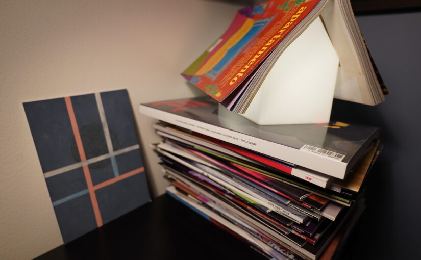
I may have fallen slightly behind on my magazine reading
Whenever I look up a book on Goodreads, it feels like I see the same number every time. No matter whether the book was awful or awesome, the Goodreads rating apparently remains stubbornly the same.
Or is that just my memory playing tricks on me?
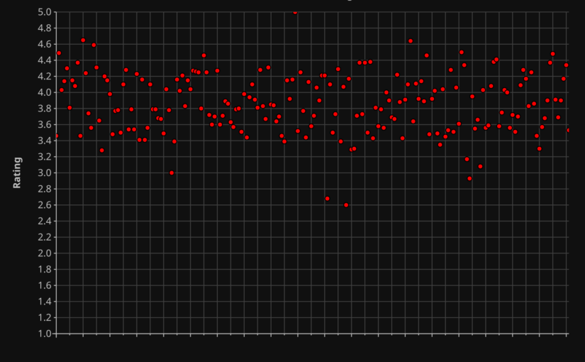
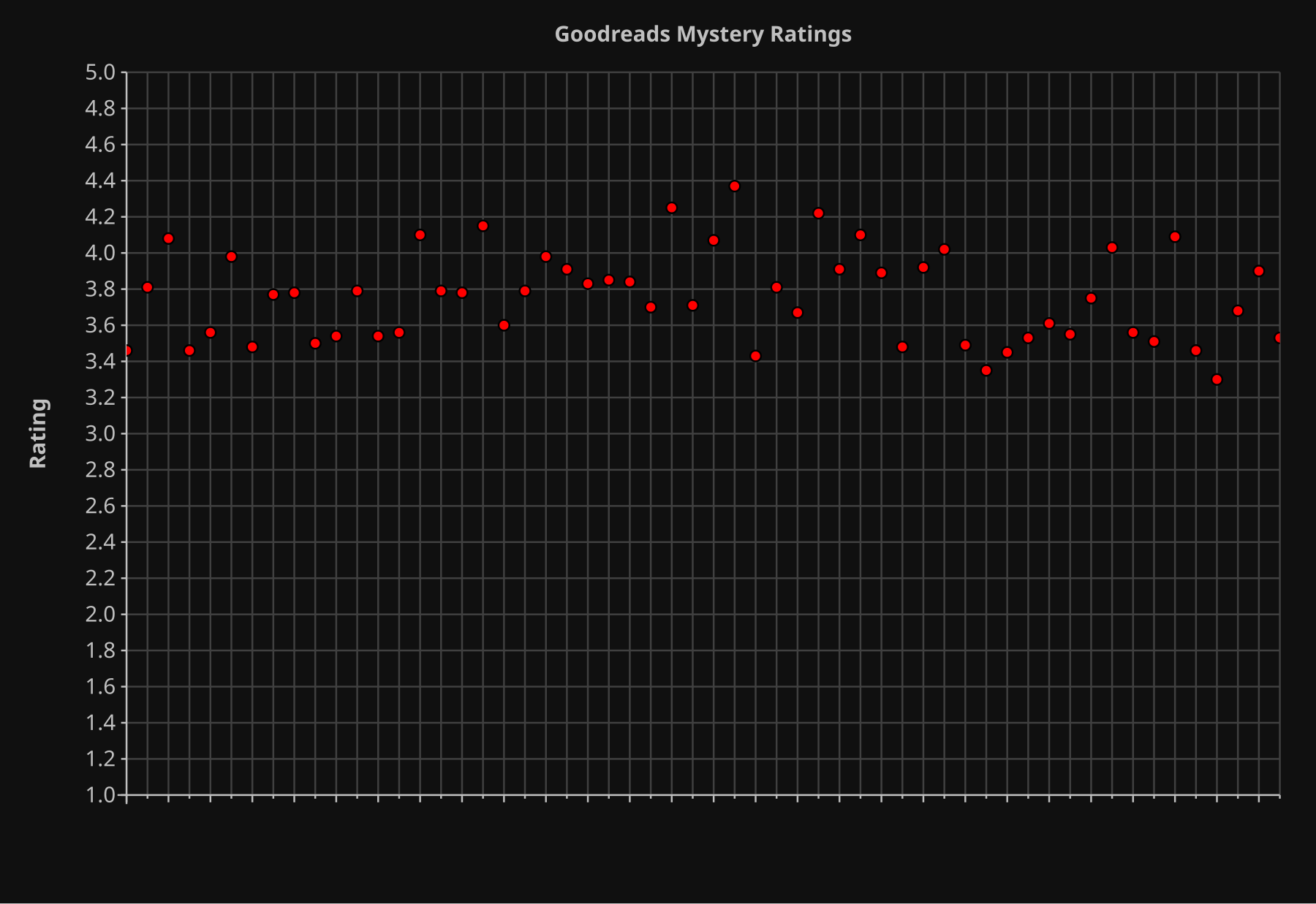
I read a lot of books this year, and I had Emacs record the Goodreads rating for every book. So now I have data! Behold:
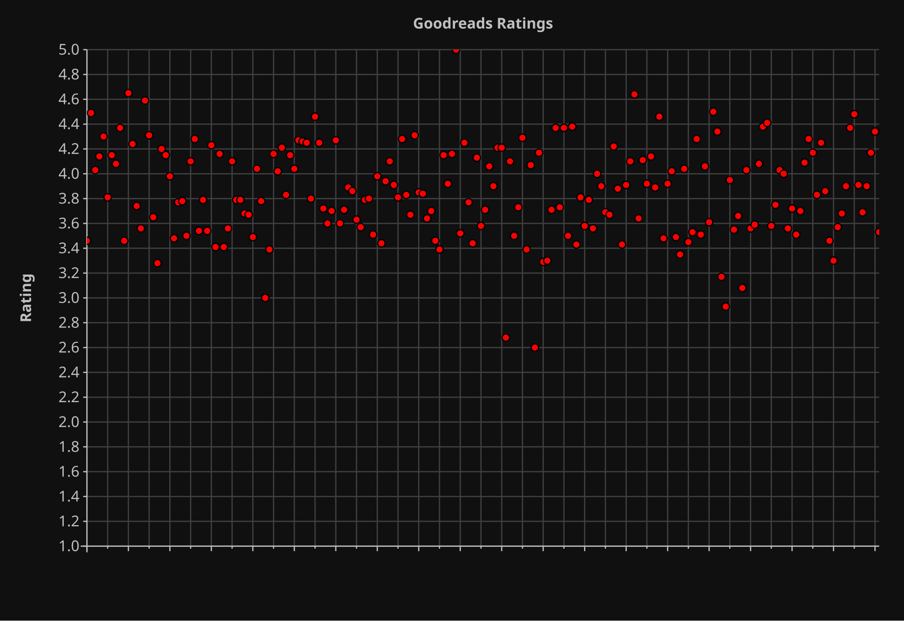
OK, my memory shouldn’t be relied on, but it wasn’t that far off — the mean rating of the books I read was 3.86, but the spread is pretty small — 90% of the books are between 3.4 and 4.5.
It seems like this is a smaller range than on imdb, but perhaps that’s more to do with the range on imdb being 9 and it being 4 on Goodreads.
Let’s math it… If you have a 90% spread of 1.1 on Goodreads, you’d expect a 90% spread on imdb to be 2.5, while it’s… 3, according to Google. Well, that’s not really a huge difference.
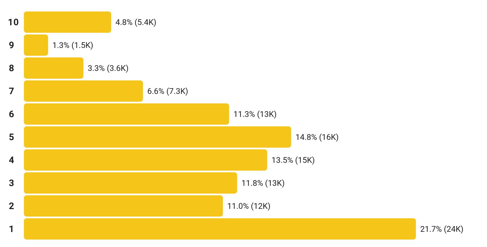
But you almost never see ratings charts like this on Goodreads. Because you rarely have brigading going on there, while on imdb it’s pretty common — whenever a movie goes viral for being soooo bad (in one forum or another), you have all these morons going on imdb and rating pretty mid movies “1”. (Or “10” in the opposite case.)
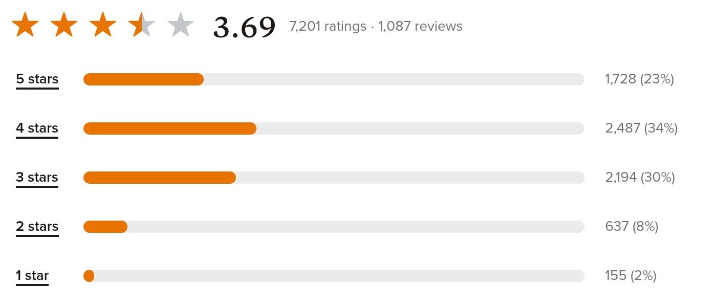
You almost never see a book on Goodreads that has a different shape than this: More than 60% of the votes are going to be 3 or 4 stars.
But do ratings matter? Well, I’ve found that an imdb rating of 6 or less is a pretty solid indication of the movie probably being naff. But so is a rating of 7.5 and up — then it’s either been brigaded, or it’s some mid movie that nerds are totally into. So an imdb rating of around 6.3 is usually a good indicator of the movie being spiffy.
Before I started the book blogging project last year, I assumed that the same would be the case for Goodreads ratings, but… not really? Yes, you have the same nerdiness effect:
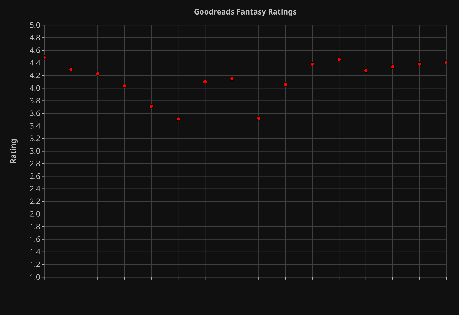
Fantasy books, for instance, have a way too high rating. Most of these books were totally mid, but almost all of them have a rating above 4. I.e., fantasy readers have pretty bad taste.
I mean, they’re really enthusiastic about their hobby.
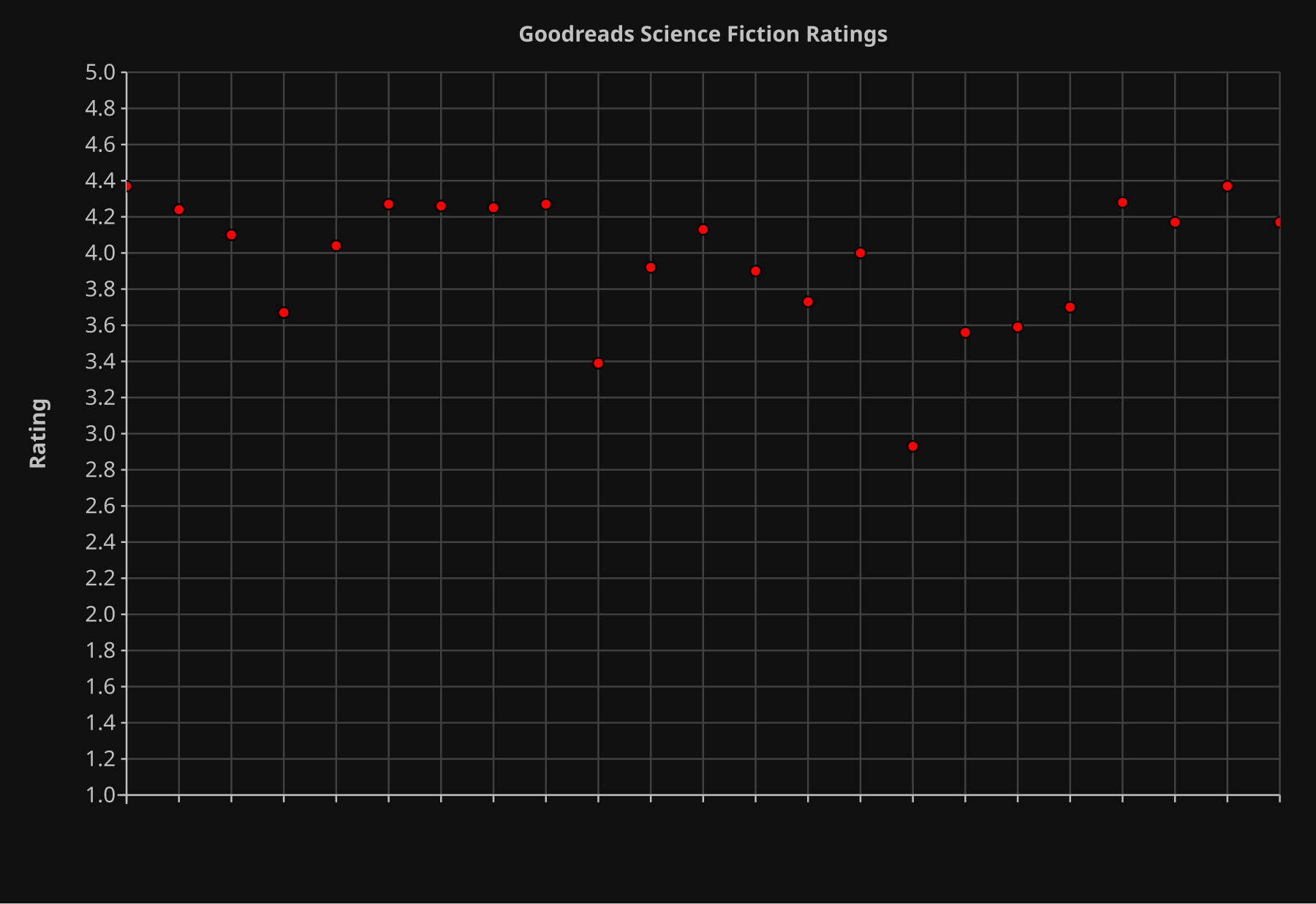
Science fiction readers are similarly enthusiastic, but not to the same degree.
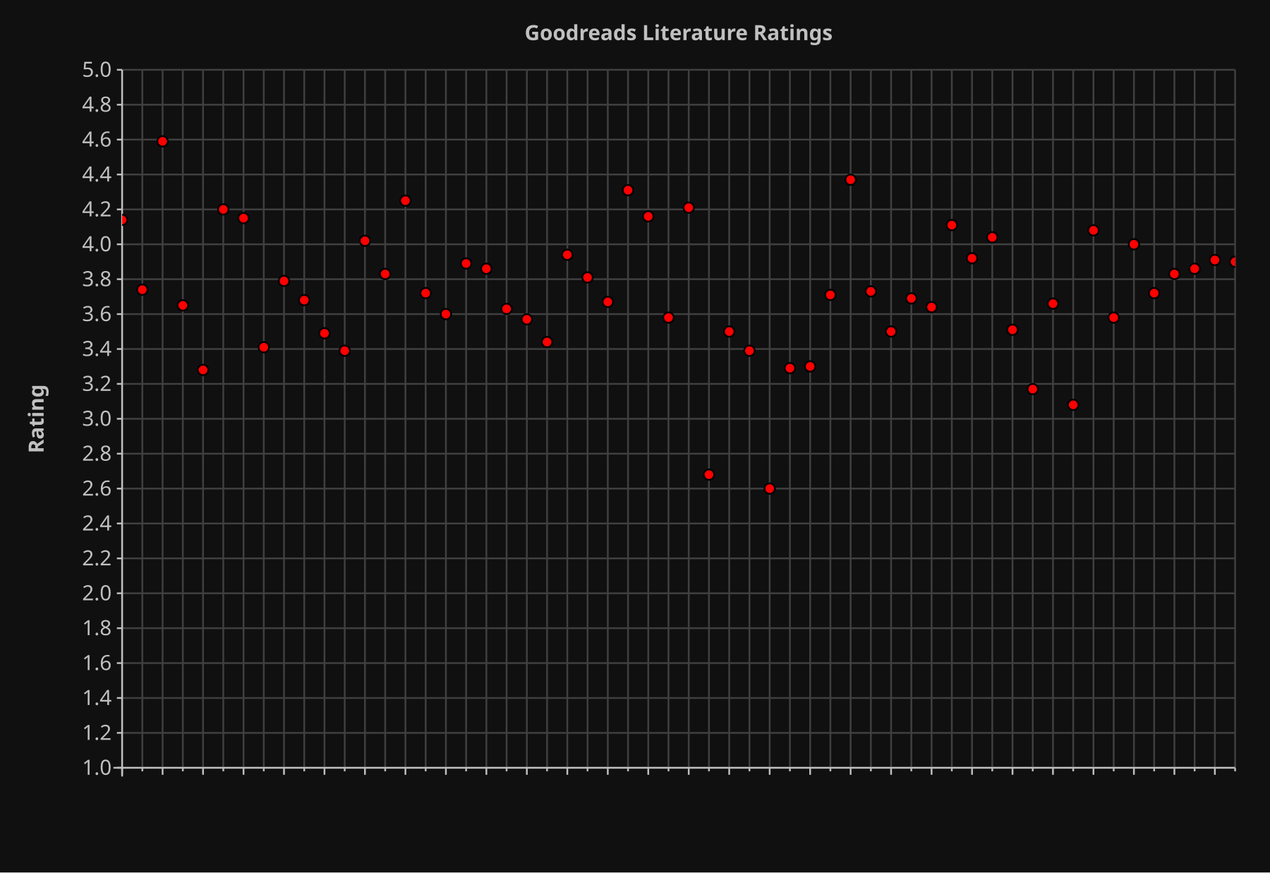
Literature readers, on the other hand, are more realistic — most books are kinda mid.
And perhaps a bit surprisingly — mystery readers are also pretty realistic in their assessments.
OK, these data sets are pretty small, of course, so perhaps I’ve just chosen Totally Fantastic fantasy books to read, and Pretty Mid mystery books? It’s possible, of course. But my conclusion from this is that you should subtract one point from fantasy book ratings, and half a point from science fiction books. If you want a more realistic score.
But overall, I found myself agreeing with the Goodreads score more often than I thought I would. I guess I’m not as contrarian when it comes to books as I thought I am.
Let’s see… can I torture this insignificant data set some more?
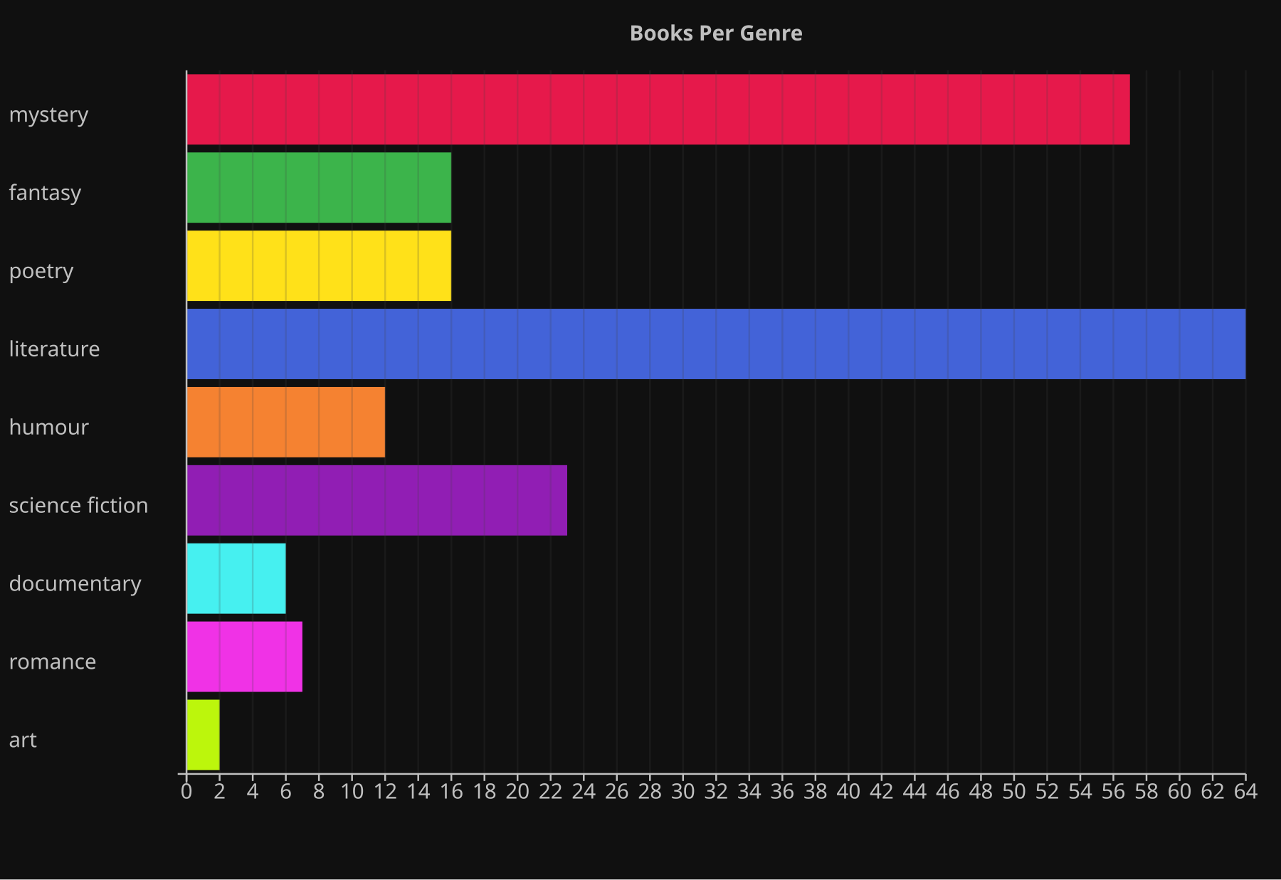
That’s how many books per genre I read (or skipped; I dropped 15 of these books mid-reading). I thought the literature/junk ration would be lower…
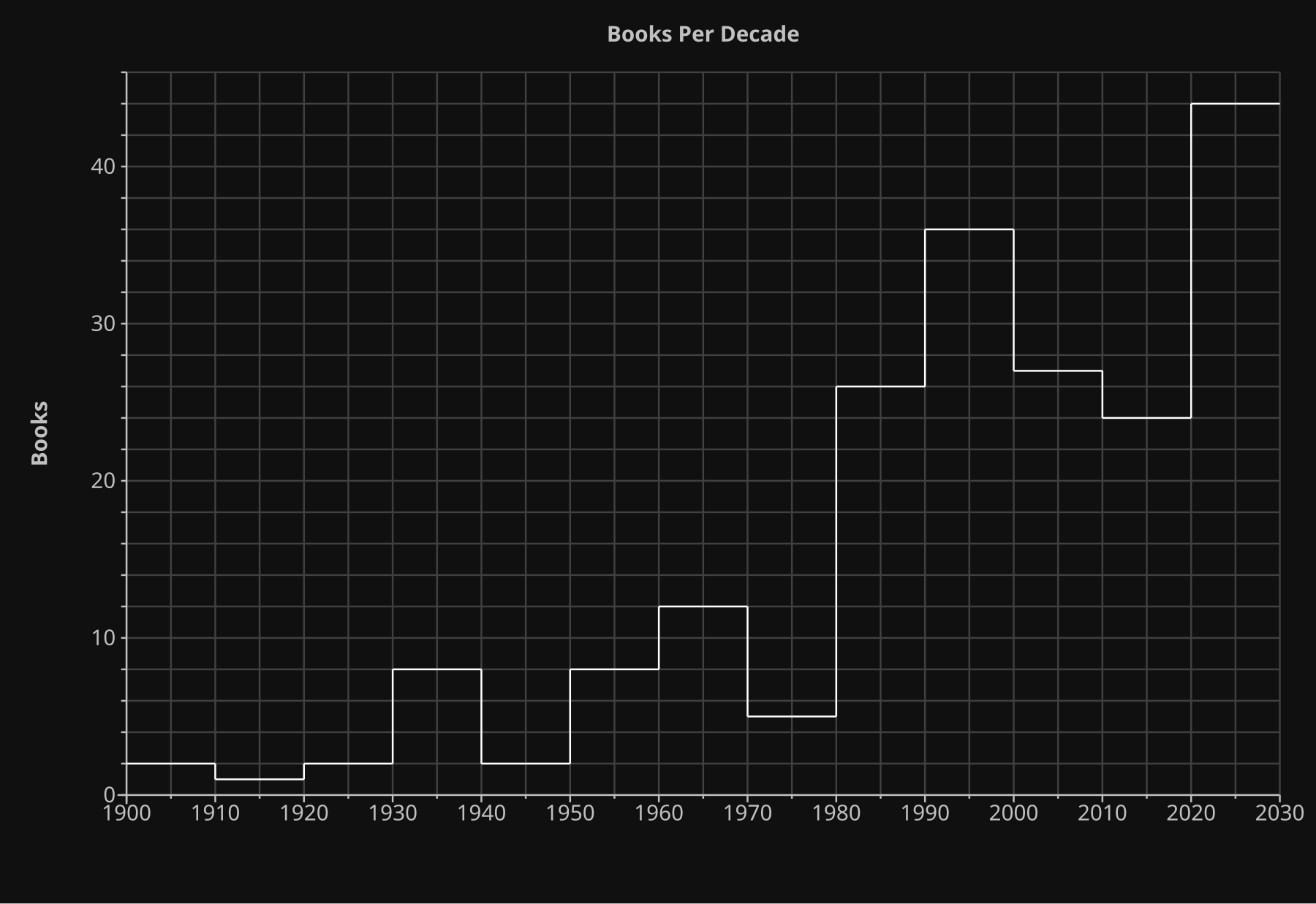
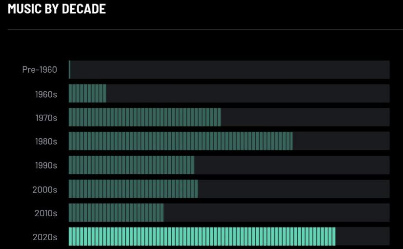
And I didn’t think my recency bias (heh heh) was that bad, but there you go.
When I started the Book Club 2025 blog series last January, I didn’t really mean to read so many books this year. But it turns out that having a venue to bloviate about what I’d just read somehow made reading books more compelling? It’s the (somewhat) performative aspect of it all, too — not that anybody much actually read these posts. It’s just that doing anything “in public” makes one more obsessive, right?
But the major reason for “why all these books” is because I’ve been feeling under the weather a lot, especially the last half of this year. I think I’m better now? Possibly? It’s also led me to up the trash quotient of what I’ve read a lot, because reading a mystery novel is about the lowest energy setting I have — it’s a lot more relaxing to read a stupid book than to watch a stupid TV show. Watching TV takes more energy.
I’d say my normal literature to trash quotient is 1:2, but this year it’s been more 1:8.
Before I get to the all-important List Of Books, I feel a whole bunch of blathering coming on, because it’s been three days without blogging! My god!
About My Methodolody:
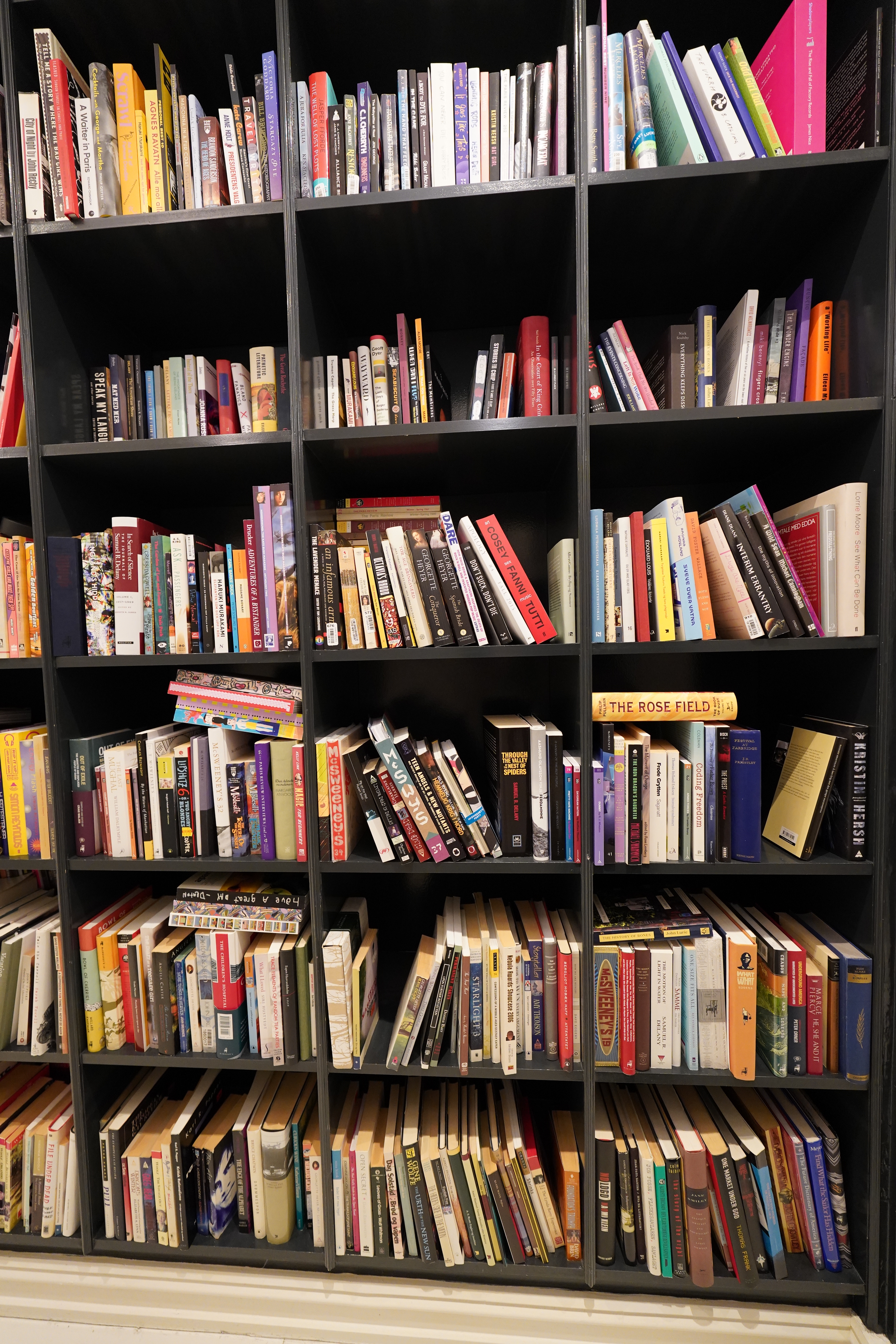
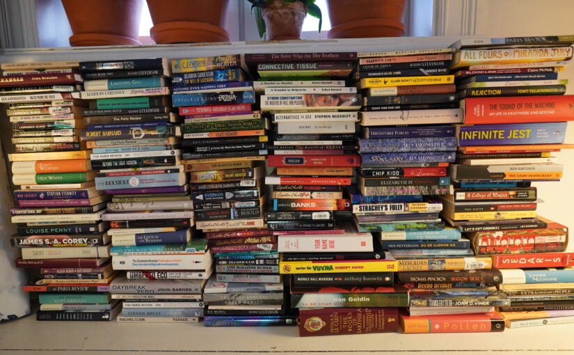
I’ve set aside this portion of the main bookshelf for unread books. There’s, let’s see, 6×3=18 of these cubbies, plus one overflow cubby (not shown here). So that’s, like, 20×18=360 unread books, roughly. When I want to read a book, I go and stand before this shelf, and I feel like I’m at a bookstore that caters to my tastes, which is a very nice feeling.
This is after this year’s reading…
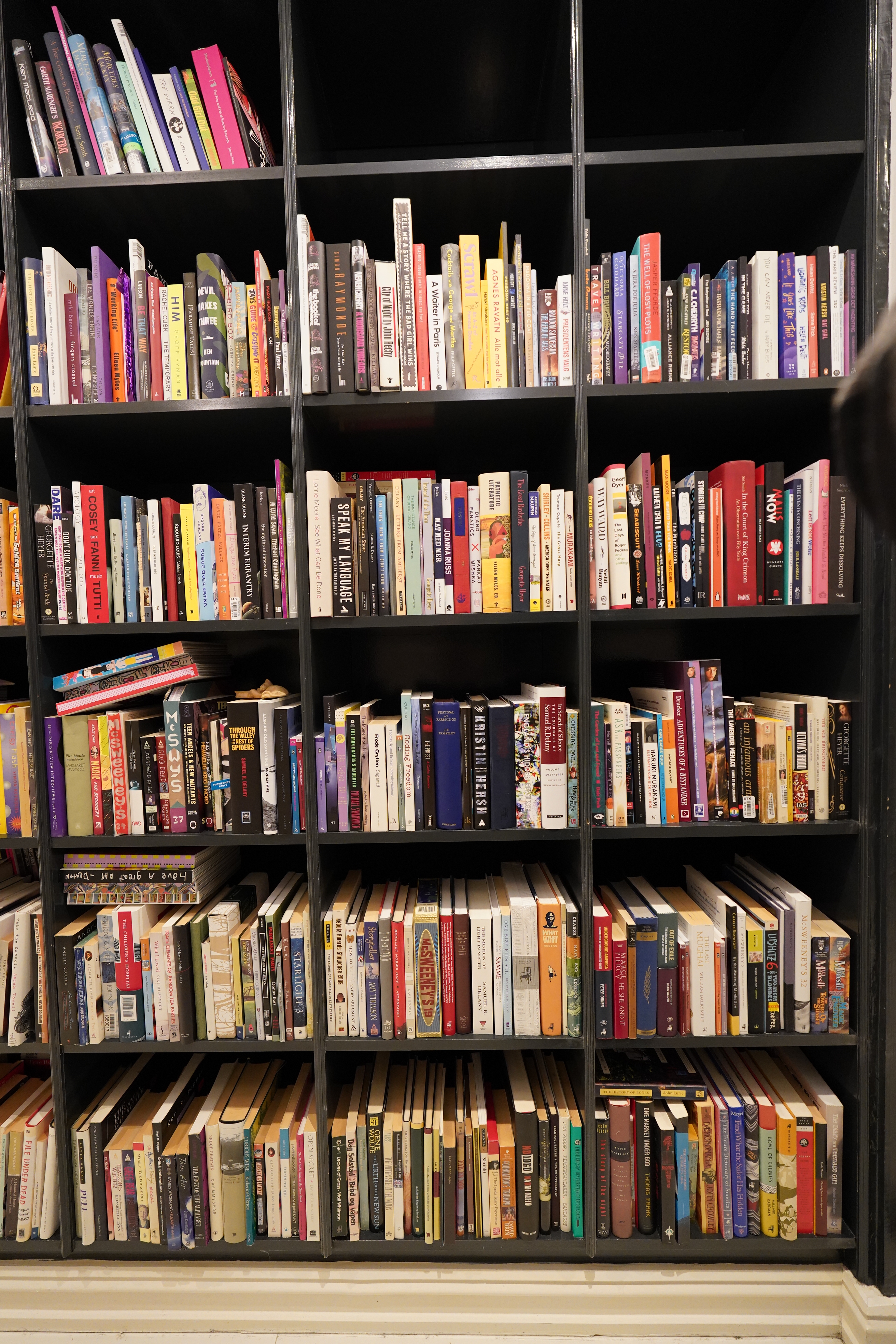
… and at the start of each new year, I compact the books down and to the left. So the bottom left cubby here has the oldest unread books, and the topmost right has the newest. Tu vois ?
So I read about two hundred books (*gulp*) this year — so why isn’t the shelf half empty now!? Because I bought 130 new books.
*sigh*
Well, that’s just what happens when you read a book — it reminds you of other books you might want to read, like All Other Books By This Author, which is a refrain of mine…
Seems to be correct — three and a half cubbies (including the overflow one) have been emptied, and that’s about 70 books… The math is mathing!
Thrilling, I’m sure. Which brings me to more blathering about:
Or rather, lots of people on Twitter talking about what “counts” as “reading a book”.
I just find the entire thing so weird, because I like reading books. It’s like having a discussion about what counts as eating a cake.
“No! Cupcakes don’t count!”
“No! All real cakes are marzipan cakes, and marzipan makes me throw up, so if you eat more than four cakes a year, you’re not savouring the cake!”
“No! All true cakes are made from granola, and give you healthy digestion! If a cake doesn’t improve your digestion, it’s nothing to brag about.”
And here I’m just posting pictures of cakes because I like cakes and I think it’s fun talking about the cakes? Why would anybody consider posting pictures of cakes as being a brag?
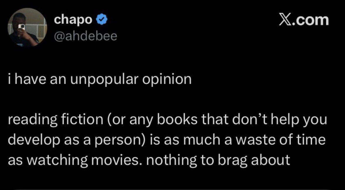
But of course, people have these hangups about reading books. Here’s my working hypothesis: Many people don’t really enjoy longform reading, so they invent strange rules (“only Greek philosophy books count”). This has two effects: 1) Whenever somebody else says “I read this book”, they can protect their own egos by saying “that doesn’t count”, and 2) by limiting what “counts” to books to “hard” books, they can feel better about not reading many books, since reading books is hard work.
It’s pretty transparent and somewhat circular logic.
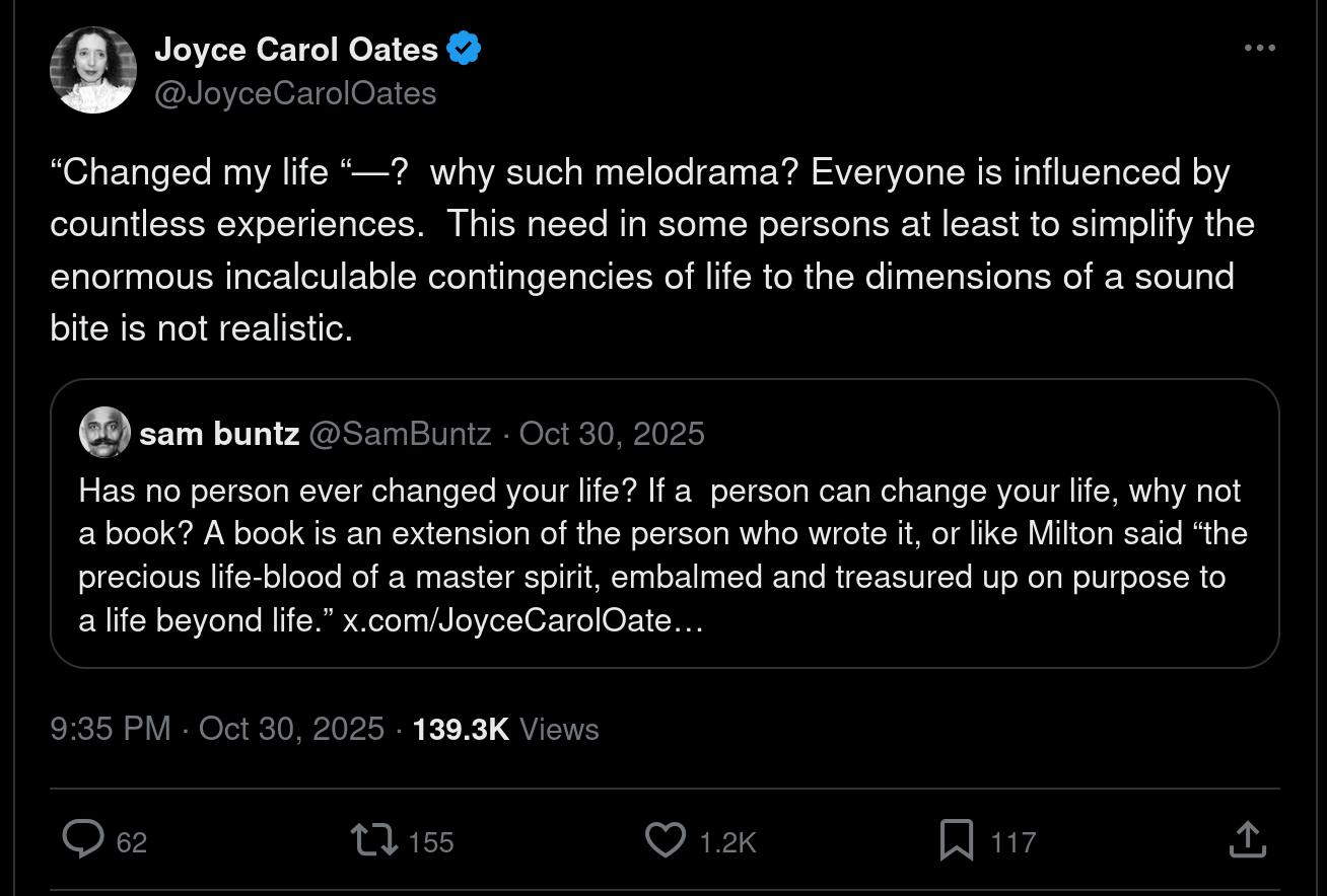
This thread (well, sort of thread) by Joyce Carol Oates about “life changing books” is also apposite — some people have such melodramatic views of literature: They read a book, and if they can’t post “literally life changing” afterwards, it’s not worth it, or something.
Most books are pretty mid, of course. That’s fine — of the following books, 15 were so bad that I abandoned them after starting to read. And I have no compunction about dropping books — there’s an approx. infinity number of good books out there, and a second spent reading something you don’t enjoy is a second you could have been spending on something you do enjoy.
Many people feel differently, and that’s fine. “Perhaps if I persevere, I’ll start liking it? WHAT IF IT TURNS OUT THAT THE LAST PART OF THE BOOK IS THE BEST THING EVER!!!” Well, you’re only going on odds. The likelihood of the last part of the bad book you’re currently reading is going to be great is smaller than the likelihood that some other random book is going to be great.
And it’s not about “hard” books vs “easy” books at all. My approach makes you a more fearless reader — you can start reading any book, no matter whether you think you’re going to like it or not, and no matter how “hard” it looks. If it turns out to have been a bad choice, just go on to the next one.
The one bad thing about this is that sometimes I find myself thinking “eh… am I enjoying this book sufficiently? How about now? Now then?” which is not ideal.
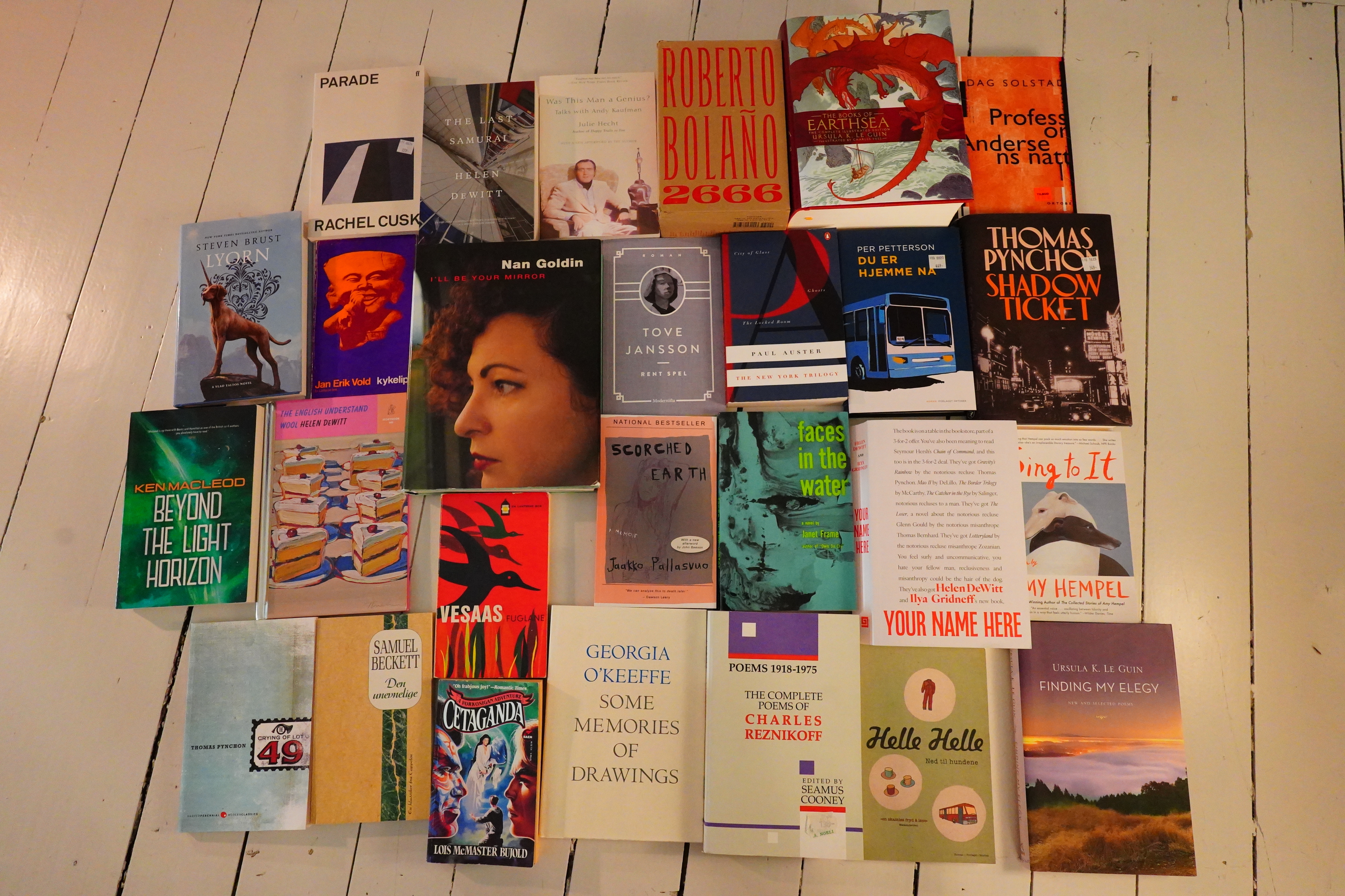
But these books are good. I’ve stashed away last year’s books, and these were the ones that I thought I could remember enjoying particularly much. I may be misremembering, of course. I mean, I wouldn’t want to double-check by clicking on the links down there.
| Cover | Year | Author | Title | Goodreads |
|---|---|---|---|---|
 | 1977 | Robert Barnard | Death of an Old Goat | 3.53 |
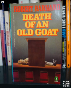
 | 1974 | Georgia O’Keeffe | Some Memories of Drawings | 4.34 |
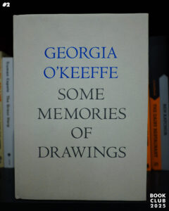
 | 2021 | Elizabeth H. Bonesteel | Arkhangelsk | 4.17 |
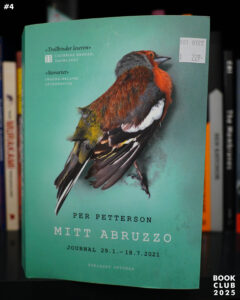 | 2021 | Pet Petterson | Mitt Abruzzo | 3.9 |
 | 1931 | P. G. Wodehouse | Doctor Sally | 3.69 |
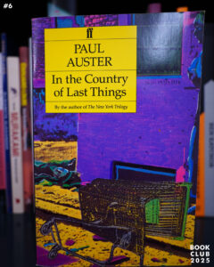 | 1987 | Paul Auster | In the Country of Last Things | 3.91 |
 | 1988 | Charles Reznikoff | Poems 1918-1975 | 4.48 |
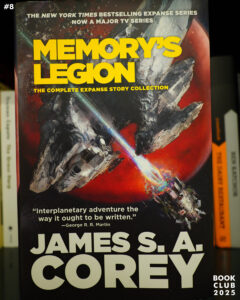 | 2022 | James S. A. Corey | Memory’s Legion | 4.37 |
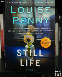 | 2012 | Louise Penny | Still Life | 3.9 |
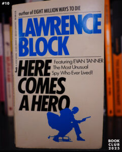 | 1968 | Lawrence Block | Here Comes A Hero | 3.68 |
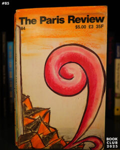
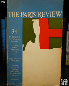
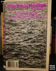
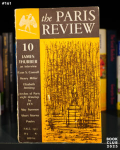
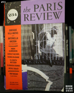 | 2020 | The Paris Review 234 | 3.29 | |
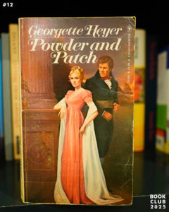 | 1968 | Georgette Heyer | Powder and Patch | 3.57 |
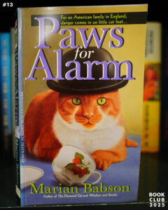 | 1984 | Marian Babson | Paws For Alarm | 3.3 |
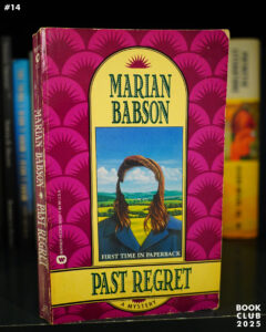 | 1990 | Marian Babson | Past Regret | 3.46 |
 | 1830 | Stendhal | The Red and the Black II | 3.86 |
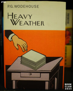 | 1933 | P. G. Wodehouse | Heavy Weather | 4.25 |
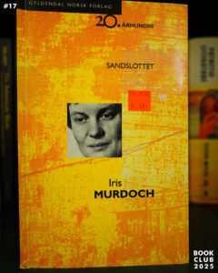 | 1970 | Iris Murdoch | The Sandcastle | 3.83 |
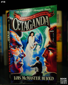 | 1996 | Lois McMaster Bujold | Cetaganda | 4.17 |
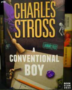 | 2025 | Charles Stross | A Conventional Boy | 4.28 |
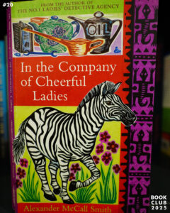 | 2004 | Alexander McCall Smith | In the Company of Cheerful Ladies | 4.09 |
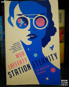 | 2021 | Mur Lafferty | Station Eternity | 3.7 |
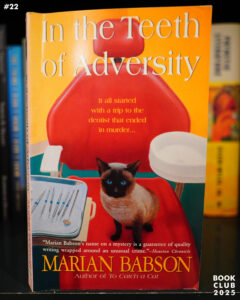 | 1990 | Marian Babson | In the Teeth of Adversity | 3.51 |
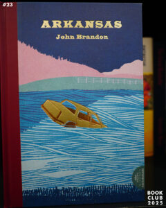 | 2007 | John Brandon | Arkansas | 3.72 |
 | 1983 | Robert Barnard | School for Murder | 3.56 |
 | 1953 | Samuel Beckett | The Unnamable | 4.0 |
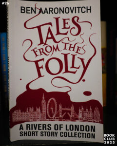 | 2020 | Ben Aaronovitch | Tales from the Folly | 4.03 |
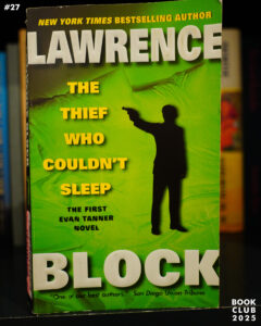 | 1966 | Lawrence Block | The Thief Who Couldn’t Sleep | 3.75 |
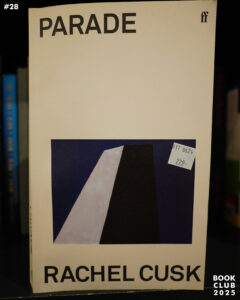 | 2024 | Rachel Cusk | Parade | 3.58 |
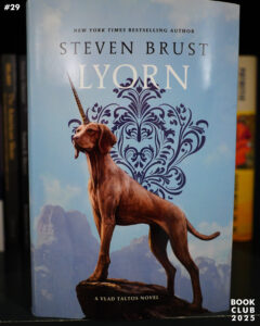 | 2024 | Steven Brust | Lyorn | 4.41 |
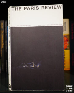 | 2024 | The Paris Review #250 | 3.30 | |
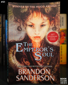 | 2012 | Brandon Sanderson | The Emperor’s Soul | 4.38 |
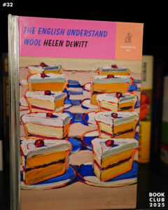 | 2022 | Helen DeWitt | The English Understand Wool | 4.08 |
 | 2011 | John Barnes | Daybreak Zero | 3.59 |
 | 1998 | China Miéville | King Rat | 3.56 |
 | 2012 | Ursula K. Le Guin | Finding My Elegy | 4.03 |
 | 2005 | McSweeney’s #17 | 3.71 | |
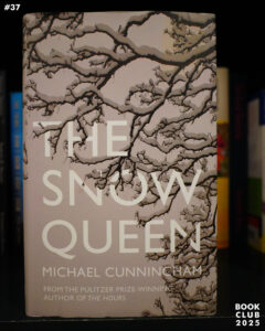 | 2014 | Michael Cunningham | The Snow Queen | 3.08 |
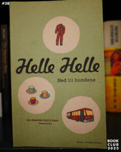 | 2008 | Helle Helle | Ned til hundene | 3.66 |
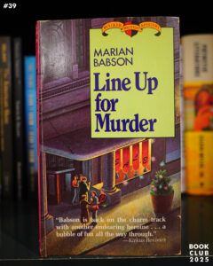 | 1980 | Marian Babson | Line Up For Murder | 3.55 |
 | 1993 | Roberto Bolaño | De romantiske hundene | 3.95 |
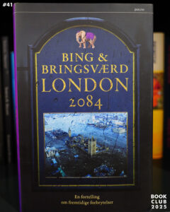 | 2014 | Bing & Bringsværd | London 2084 | 2.93 |
 | 2015 | Umberto Eco | Numero Zero | 3.17 |
 | 2014 | Elizabeth Moon | Deeds of Honor | 4.34 |
 | 2021 | Tor Eystein Øverås | Fakkelen er tent! | 4.5 |
 | 1995 | Robert Barnard | The Bad Samaritan | 3.61 |
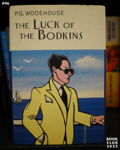 | 1935 | P. G. Wodehouse | The Luck of the Bodkins | 4.06 |
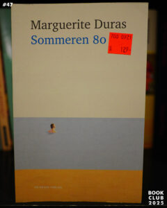 | 1980 | Marguerite Duras | L’été 80 | 3.51 |
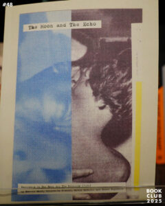 | 2022 | Richard Porter | The Moon and The Echo | |
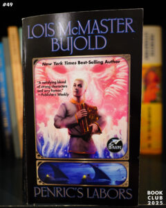 | 2022 | Lois McMaster Bujold | Penric’s Labors | 4.28 |
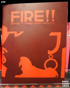 | 1926 | Wallace Thurman | FIRE!! | 4.37 |
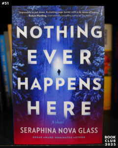 | 2025 | Seraphina Nova Glass | Nothing Ever Happens Here | 3.53 |
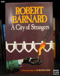 | 1990 | Robert Barnard | A City of Strangers | 3.45 |
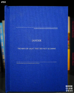 | 2020 | Jandek | The Rays Of Light That Did Not Illumine | 4.04 |
 | 2007 | Anne Holt | 1222 | 3.35 |
 | 2012 | Unni Lindell | Djevelkysset | 3.49 |
 | 2002 | Jill Paton Walsh | A Presumption of Death | 4.02 |
 | 1992 | The Paris Review #122 | ||
 | 1984 | Richard Stevenson | On the Other Hand, Death | 3.92 |
 | 1997 | Anne Holt and Berit Reiss-Andersen | Løvens gap | 3.48 |
 | 1956 | The Paris Review #13 | ||
 | 2018 | Ursula K. Le Guin | The Books of Earthsea | 4.46 |
 | 1986 | Richard Stevenson | Ice Blues | 3.89 |
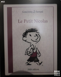 | 1959 | René Goscinny & Jean-Jacques Sempé | Le Petit Nicolas | 4.14 |
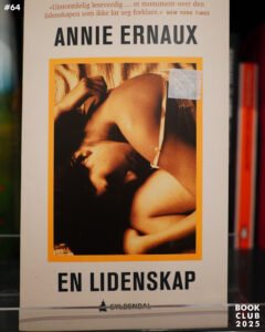 | 1991 | Annie Ernaux | Passion simple | 3.92 |
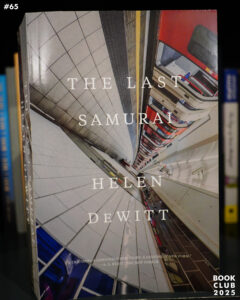 | 2000 | Helen DeWitt | The Last Samurai | 4.11 |
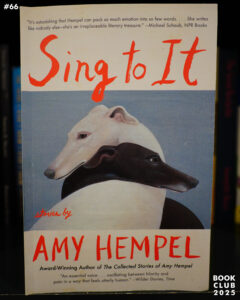 | 2019 | Amy Hempel | Sing to It | 3.64 |
 | 1996 | Nan Goldin | I’ll Be Your Mirror | 4.64 |
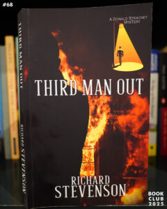 | 1992 | Richard Stevenson | Third Man Out | 4.1 |
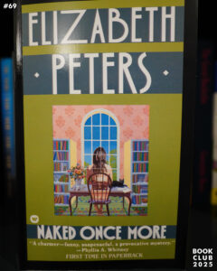 | 1989 | Elizabeth Peters | Naked Once More | 3.91 |
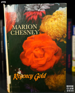 | 1980 | Marion Chesney | Regency Gold | 3.43 |
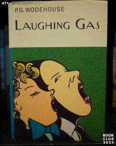 | 1936 | P. G. Wodehouse | Laughing Gas | 3.88 |
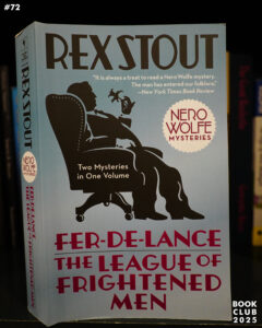 | Rex Stout | Fer-de-Lance/The League of Frightened Men | 4.22 | |
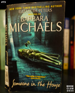 | 1981 | Barbara Michaels | Someone in the House | 3.67 |
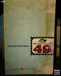 | 1966 | Thomas Pynchon | The Crying of Lot 49 | 3.69 |
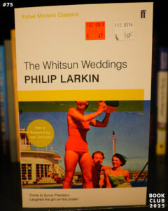 | 1964 | Philip Larkin | The Whitsun Weddings | 3.9 |
 | 2024 | Ken MacLeod | Beyond the Light Horizon | 4 |
 | 1984 | M. C. Beaton | The French Affair | 3.56 |
 | 1986 | M. C. Beaton | To Dream Of Love | 3.79 |
 | 1986 | M. C. Beaton | Those Endearing Young Charms | 3.58 |
 | 2024 | M. C. Beaton and R. W. Green | Death of a Spy | 3.81 |
 | 2024 | Cherie Priest | The Drowning House | 3.43 |
 | 1970 | The Paris Review #251 | 3.73 | |
 | 2007 | Brandon Sanderson | The Well of Ascension | 4.38 |
 | 2020 | Emi Yagi | Diary of a Void | 3.5 |
 | 1982 | The Paris Review #84 | ||
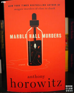 | 2025 | Anthony Horowitz | Marble Hall Murders | 4.37 |
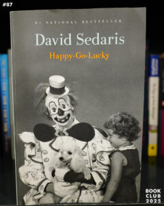 | 2022 | David Sedaris | Happy-Go-Lucky | 4.17 |
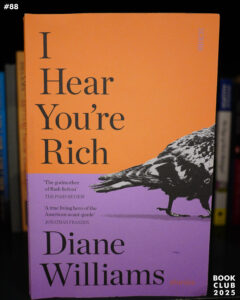 | 2023 | Diane Williams | I Hear You’re Rich | 2.6 |
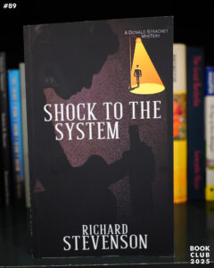 | 1995 | Richard Stevenson | Shock to the System | 4.07 |
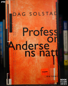 | 1996 | Dag Solstad | Professor Andersens natt | 3.39 |
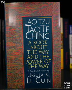 | 1997 | Lao Tzu | Tao Te Ching | 4.29 |
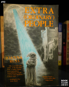 | 1984 | Joanna Russ | Extra(Ordinary) People | 3.73 |
 | 1965 | The Paris Review #34 | 3.5 | |
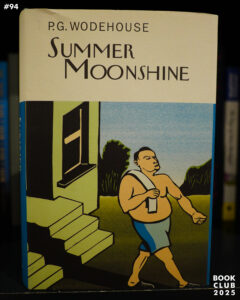 | 1937 | P. G. Wodehouse | Summer Moonshine | 4.1 |
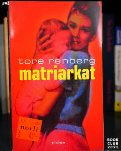 | 1996 | Tore Renberg | Matriarkat | 2.68 |
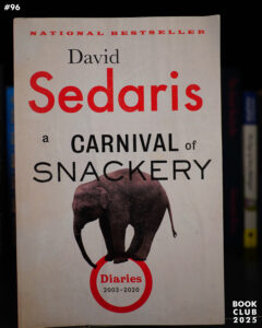 | 2021 | David Sedaris | A Carnival of Snackery: Diaries (2003-2020) | 4.21 |
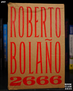 | 2004 | Roberto Bolaño | 2666 | 4.21 |
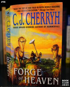 | 2004 | C. J. Cherryh | Forge of Heaven | 3.9 |
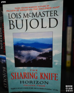 | 2009 | Lois McMaster Bujold | Horizon | 4.06 |
 | 1992 | The Paris Review #124 | ||
 | 2014 | Emma Healey | Elizabeth Is Missing | 3.71 |
 | 2008 | Chip Kidd | The Learners | 3.58 |
 | 2017 | Martha Wells | All Systems Red | 4.13 |
 | 2009 | Bob Fingerman | Connective Tissue | 3.44 |
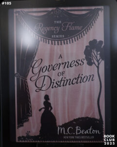 | M. C. Beaton | A Governess of Distinction | 3.77 | |
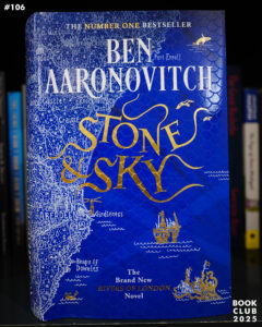 | 2025 | Ben Aaronovitch | Stone & Sky | 4.25 |
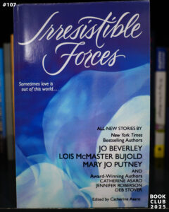 | 2004 | Catherine Asaro | Irresistible Forces | 3.52 |
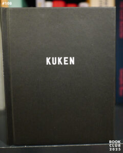 | 2023 | Lars Sjunnesson | Åke Jävel: Kuken | 5 |
 | 1913 | Marcel Proust | À la recherche du temps perdu — Du côte de chez Swann | 4.16 |
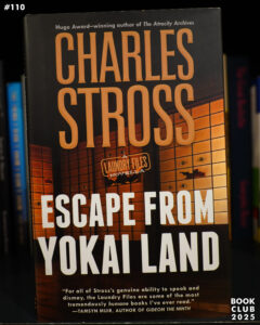 | 2021 | Charles Stross | Escape from Yokai Land | 3.92 |
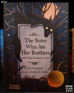 | 2021 | Jen Campbell and Adam de Souza | The Sister Who Ate Her Brothers | 4.15 |
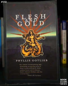 | 1998 | Phyllis Gotlieb | Flesh And Gold | 3.39 |
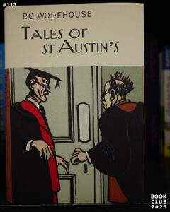 | 1903 | P. G. Wodehouse | Tales of St Austin’s | 3.46 |
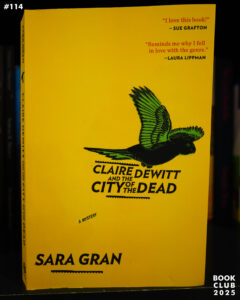 | 2011 | Sara Gran | Claire DeWitt and the City of the Dead | 3.7 |
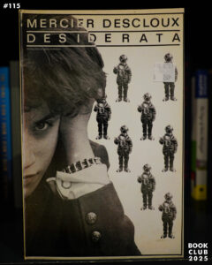 | Lizzy Mercier Descloux | Desiderata | 3.64 | |
 | 2020 | Lawrence Block | The Burglar in Short Order | 3.84 |
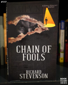 | 2023 | Richard Stevenson | Chain of Fools | 3.85 |
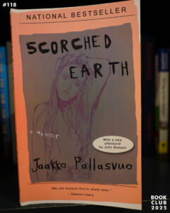 | 2015 | Jaakko Pallasvuo | Scorched Earth | 4.31 |
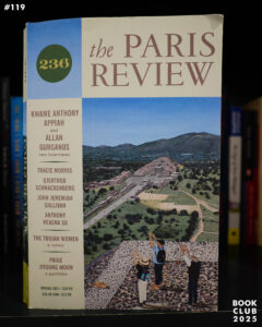 | 2021 | The Paris Review #236 | 3.67 | |
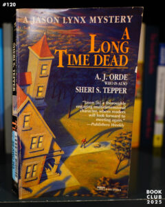 | 1994 | A. J. Orde | Long Time Dead | 3.83 |
 | 2017 | Karl Bartos | The Sound of the Machine | 4.28 |
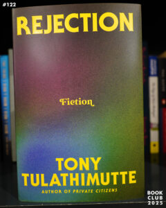 | 2024 | Tony Tulathimutte | Rejection | 3.81 |
 | 2015 | Guro Skumsnes Moe | Ville hester lim på hjertet | |
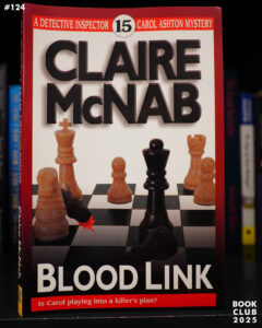 | 2003 | Claire McNab | Blood Link | 3.91 |
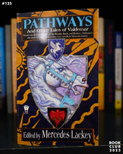 | 2017 | Mercedes Lackey | Pathways | 4.1 |
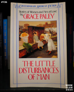 | 1959 | Grace Paley | The Little Disturbances of Man | 3.94 |
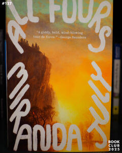 | 2024 | Miranda July | All Fours | 3.44 |
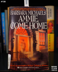 | 1968 | Barbara Michaels | Ammie, Come Home | 3.98 |
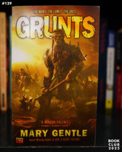 | 1992 | Mary Gentle | Grunts | 3.51 |
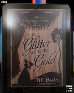 | 1993 | M. C. Beaton | The Glitter and the Gold | 3.8 |
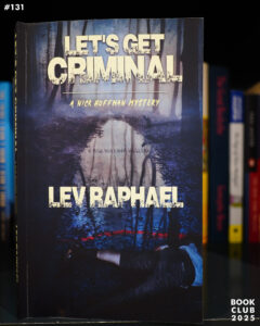 | 1996 | Lev Raphael | Let’s Get Criminal | 3.79 |
 | Bertolt Brecht | Fatzer | 3.57 | |
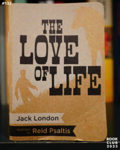 | 1905 | Jack London | The Love of Life | |
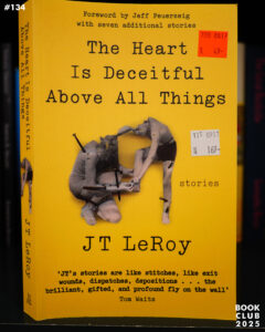 | 2001 | J. T. LeRoy | The Heart is Deceitful Above All Things | 3.63 |
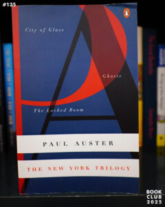 | 1987 | Paul Auster | The New York Trilogy | 3.86 |
 | 1989 | Tove Jansson | Rent spel | 3.89 |
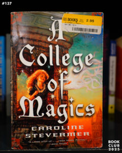 | 1994 | Caroline Stevermer | A College of Magics | 3.71 |
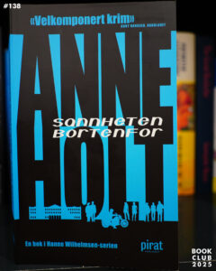 | 2003 | Anne Holt | Sannheten bortenfor | 3.60 |
 | 1990 | Lois McMaster Bujold | The Vor Game | 4.27 |
 | 1996 | Elizabeth Alexander | Body of Life | 3.70 |
 | 2007 | Ben Katchor | The Dairy Restaurant | 3.60 |
 | 2001 | Julie Hecht | Was this man a genius? | 3.72 |
 | 2018 | Martha Wells | Artificial Condition | 4.25 |
 | 2016 | Camae Ayewa | Fetish Bones | 4.46 |
 | 2024 | Chris Heath | Pet Shop Boys. Annually. 2024 | 3.80 |
 | 1996 | David Foster Wallace | Infinite Jest | 4.25 |
 | 1987 | Lois McMaster Bujold | Borders of Infinity | 4.26 |
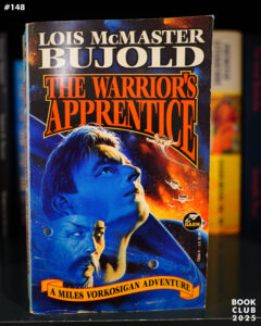 | 1986 | Lois McMaster Bujold | The Warrior’s Apprentice | 4.27 |
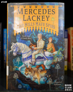 | 2018 | Mercedes Lackey | The Hills Have Spies | 4.04 |
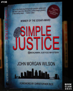 | John Morgan Wilson | Simple Justice | 4.15 | |
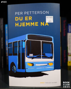 | 2025 | Per Petterson | Du er hjemme nå | 3.83 |
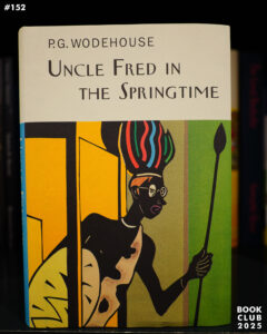 | 1939 | P. G. Wodehouse | Uncle Fred in the Springtime | 4.21 |
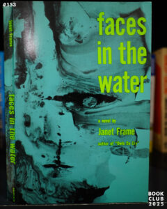 | 1961 | Janet Frame | Faces in the Water | 4.02 |
 | 1958 | Lawrence Ferlinghetti | A Coney Island of the Mind | 4.16 |
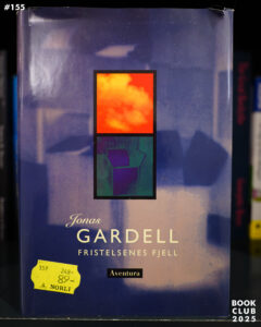 | 1995 | Jonas Gardell | Frestelsernas berg | 3.39 |
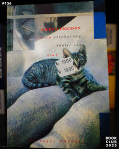 | 1993 | Kjersti Ericsson | Katten stryker seg inntil oss | 3.00 |
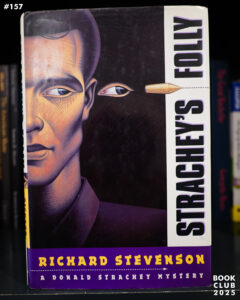 | 1998 | Richard Stevenson | Strachey’s Folly | 3.78 |
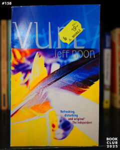 | 1993 | Jeff Noon | Vurt | 4.04 |
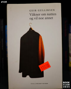 | 2001 | Geir Gulliksen | Våkner om natten og vil noe annet | 3.49 |
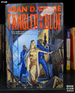 | 2000 | Joan D. Vinge | Tangled Up in Blue | 3.67 |
 | 1955 | The Paris Review #10 | ||
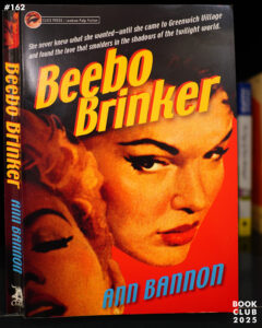 | 1962 | Ann Bannon | Beebo Brinker | 3.68 |
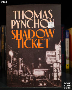 | 2025 | Thomas Pynchon | Shadow Ticket | 3.79 |
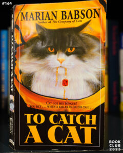 | 2000 | Marian Babson | To Catch a Cat | 3.79 |
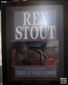 | 1960 | Rex Stout | Three at Wolfe’s Door | 4.1 |
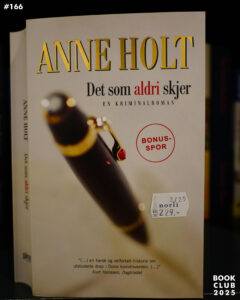 | 2004 | Anne Holt | Det som aldri skjer | 3.56 |
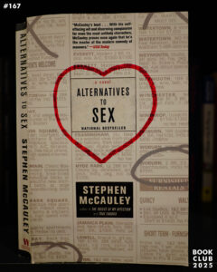 | 2006 | Stephen McCauley | Alternatives to Sex | 3.41 |
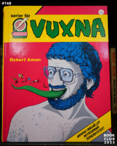 | 2024 | Robert Aman | Serier för vuxna | 4.16 |
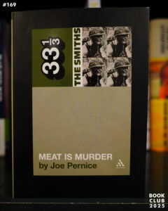 | 2003 | Joe Pernice | Meat Is Murder | 3.41 |
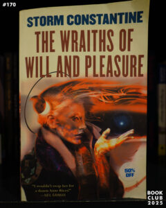 | 2003 | Storm Constantine | The Wraiths of Will and Pleasure | 4.23 |
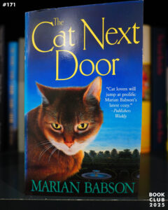 | 2002 | Marian Babson | The Cat Next Door | 3.54 |
 | 1991 | Robert Barnard | A Scandal in Belgravia | 3.79 |
 | 1999 | Robert Barnard | A Murder in Mayfair | 3.54 |
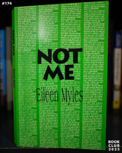 | 1991 | Eileen Myles | Not Me | 4.28 |
 | 1993 | Iain M. Banks | Against a Dark Background | 4.1 |
 | 1987 | Marian Babson | Reel Murder | 3.5 |
 | 1952 | Agatha Christie | They Do It With Mirrors | 3.78 |
 | 1939 | Agatha Christie | Murder Is Easy | 3.77 |
 | 1988 | Robert Barnard | At Death’s Door | 3.48 |
 | 2025 | Anne Holt | Diamanter og rust | 3.98 |
 | 2025 | Agnes Ravatn | Doggerland | 4.15 |
 | 2017 | Samuel Hasler | The Gob | |
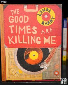 | 1988 | Lynda Barry | The Good Times Are Killing Me | 4.2 |
 | 1928 | Georgette Heyer | Helen | 3.28 |
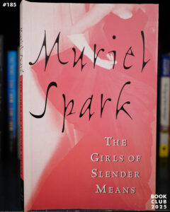 | 1963 | Muriel Spark | The Girls of Slender Means | 3.65 |
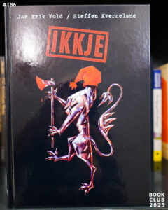 | 1997 | Jan Erik Vold and Steffen Kverneland | Ikkje | |
 | 1996 | Alice Notley | The Descent of Alette | 4.31 |
 | 2025 | Chris Fink | Forage Like A Bear | 4.59 |
 | 1981 | Edward O. Phillips | Sunday’s Child | 3.56 |
 | 2025 | Helen DeWitt and Ilya Gridneff | Your Name Here | 3.74 |
 | 2018 | Martha Wells | Rogue Protocol | 4.24 |
 | 2025 | Raymond Biesinger | 9 Times My Work Has Been Ripped Off | 4.65 |
 | 1974 | Lawrence Block | Make Out With Murder | 3.46 |
 | 2018 | Martha Wells | Exit Strategy | 4.37 |
 | 1949 | Agatha Christie | Crooked House | 4.08 |
 | 1988 | Joe Keenan | Blue Heaven | 4.15 |
 | 1942 | Agatha Christie | The Body in the Library | 3.81 |
 | 2024 | Robert Jackson Bennett | The Tainted Cup | 4.3 |
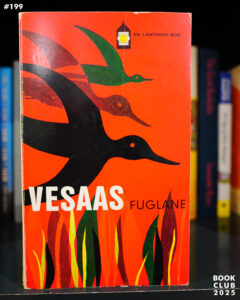 | 1957 | Tarjei Vesaas | Fuglane | 4.14 |
 | 1969 | Jan Erik Vold | Kykelipi | 4.03 |
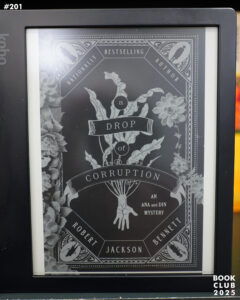 | 2025 | Robert Jackson Bennett | A Drop of Corruption | 4.49 |
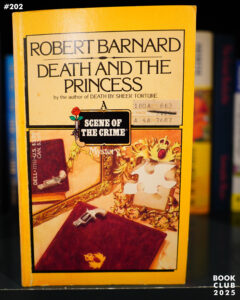 | 1982 | Robert Barnard | Death and the Princess | 3.46 |
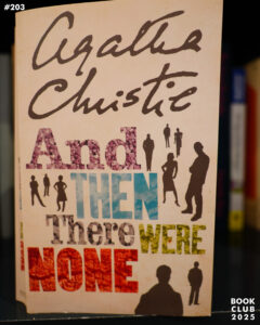 | 1939 | Agatha Christie | And Then There Were None | 4.27 |
*phew*
This year, I’m gonna read more comics and watch more movies.
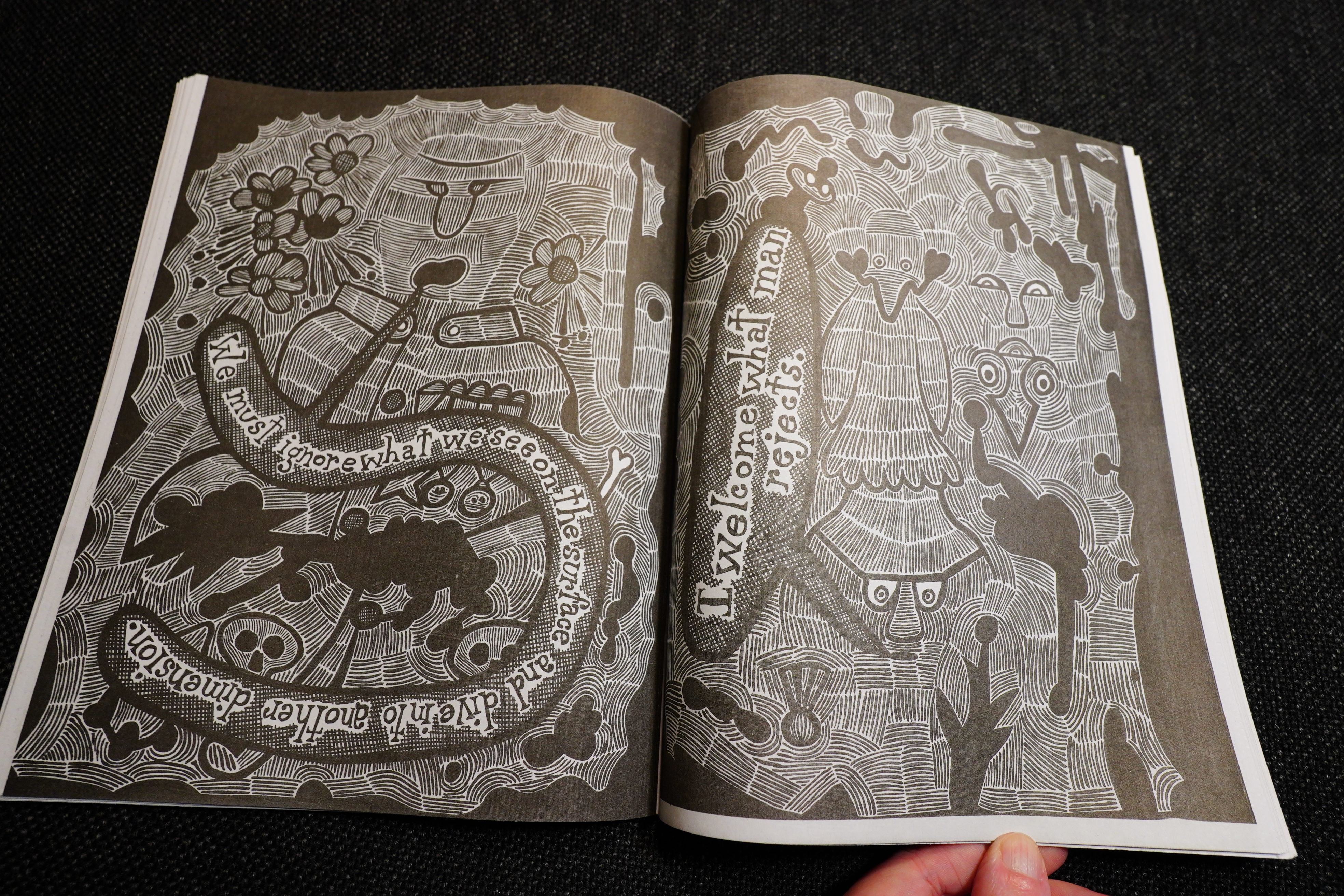
It’s been an OK year for comics? It hasn’t been the best, though — in December, I usually go through best-of lists like The Comics Journal’s to see everything I’ve missed, and there were like … five? … books there that I hadn’t read and sounded interesting (so I’ve ordered them now). That’s almost nothing — usually I find tons and tons of great stuff via those lists.
I.e., I’ve already read almost everything of interest that’s been published.
After Diamond went under, there’s apparently been a great contraction in the US comics “market”. Not only have many micro publishers been left without a distributor (so they’ve disappeared), but the majors (Fantagraphics and Drawn & Quarterly) have cut back heavily on their schedules. Fantagraphics mostly repackages Disney and Marvel (!) comics these days, and NBM went bust recently (after having retreated into publishing Extruded Biography Comics for a while). And other previously reliable outfits (the ones still going, like Fieldmouse and Uncivilized) seem to have retreated into safer (i.e., more boring) territory. It’s a bit depressing.
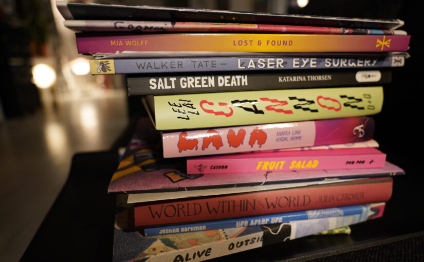
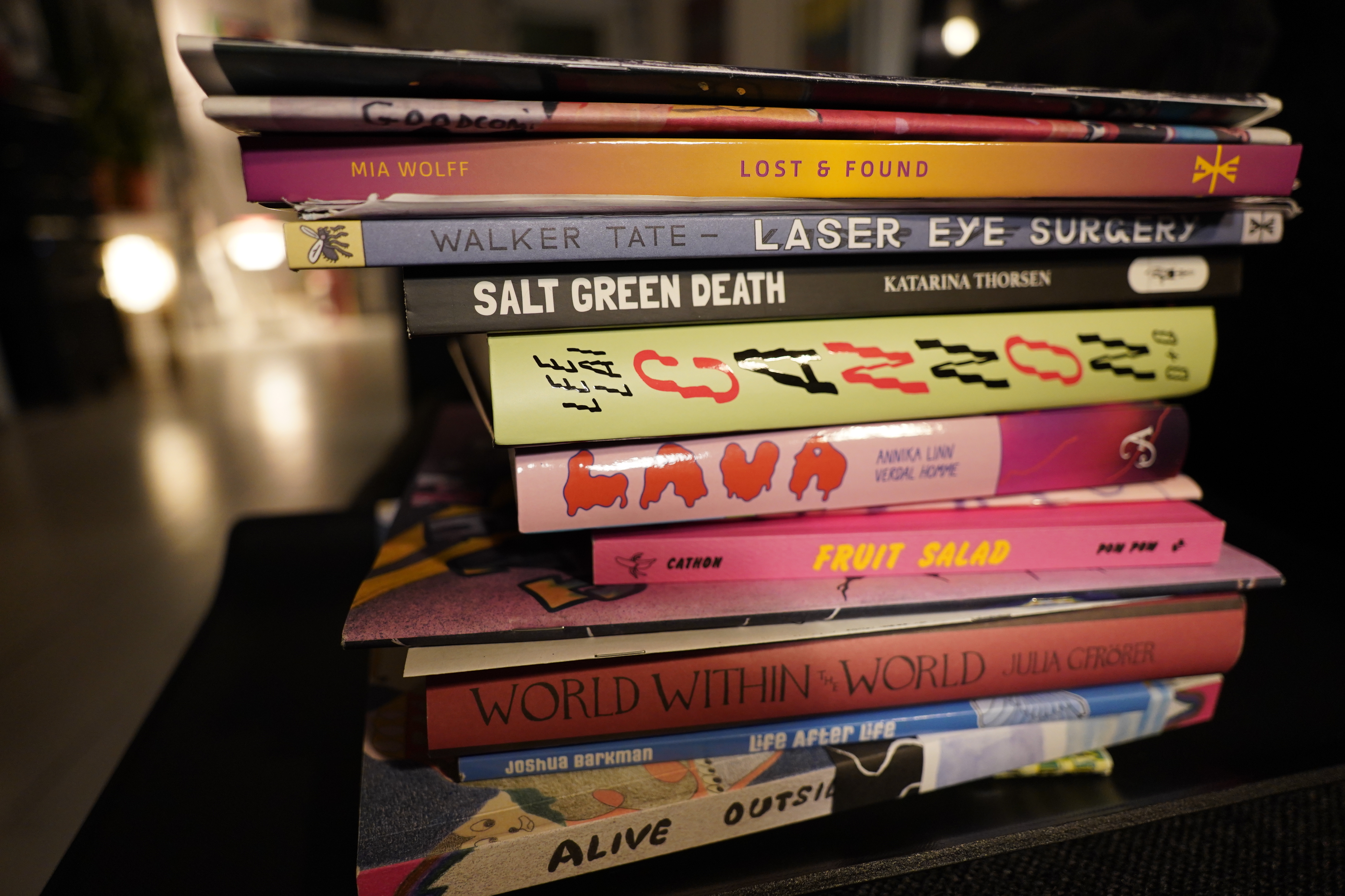
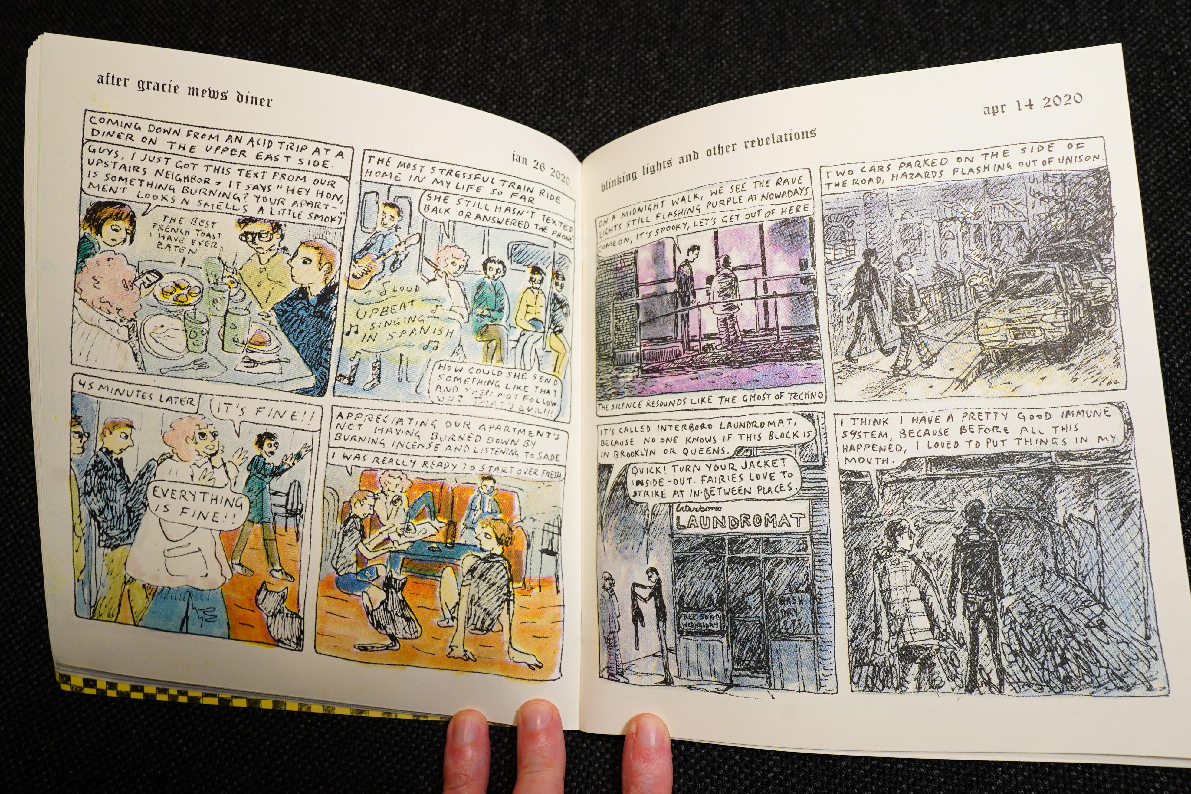
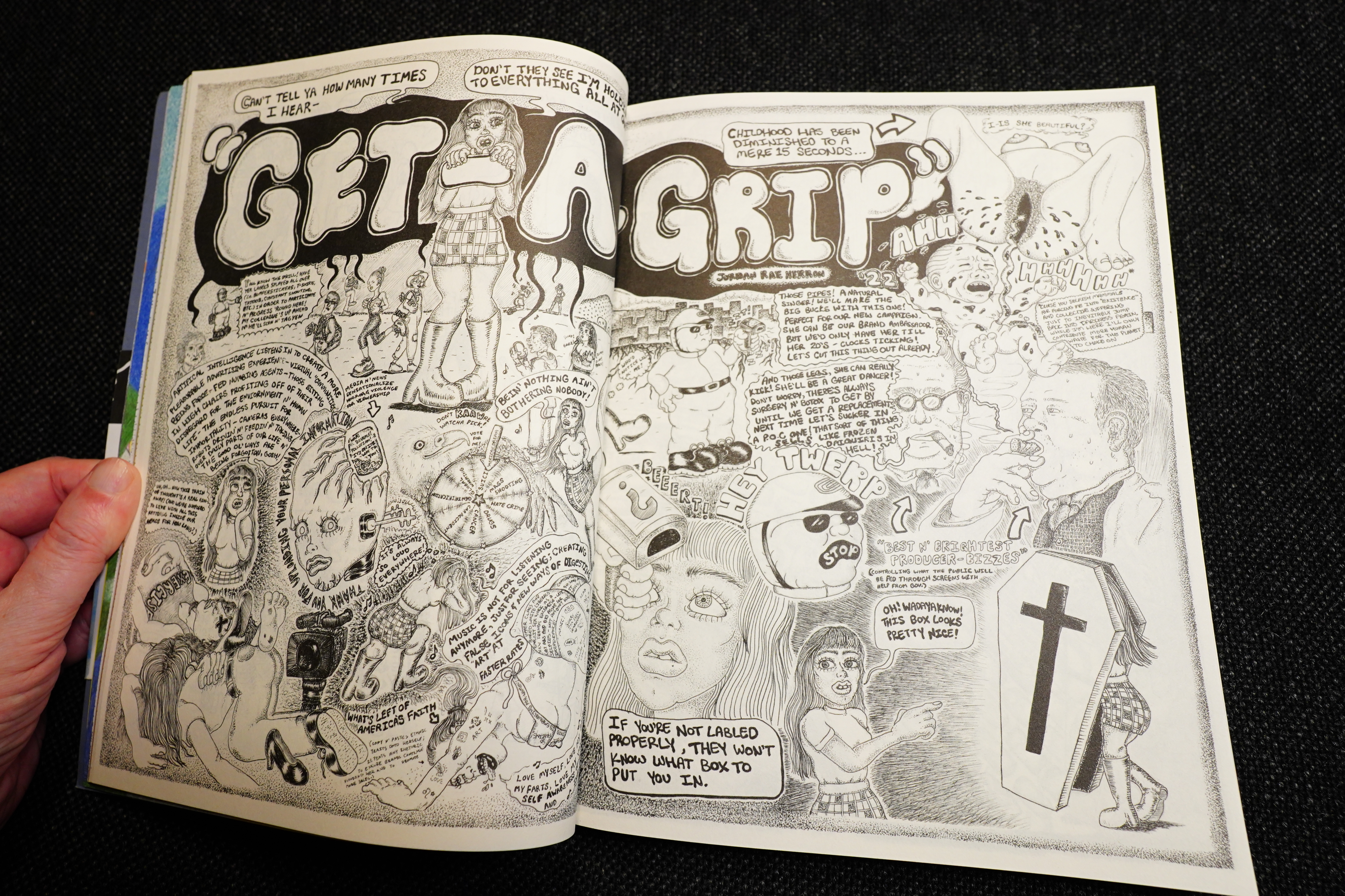
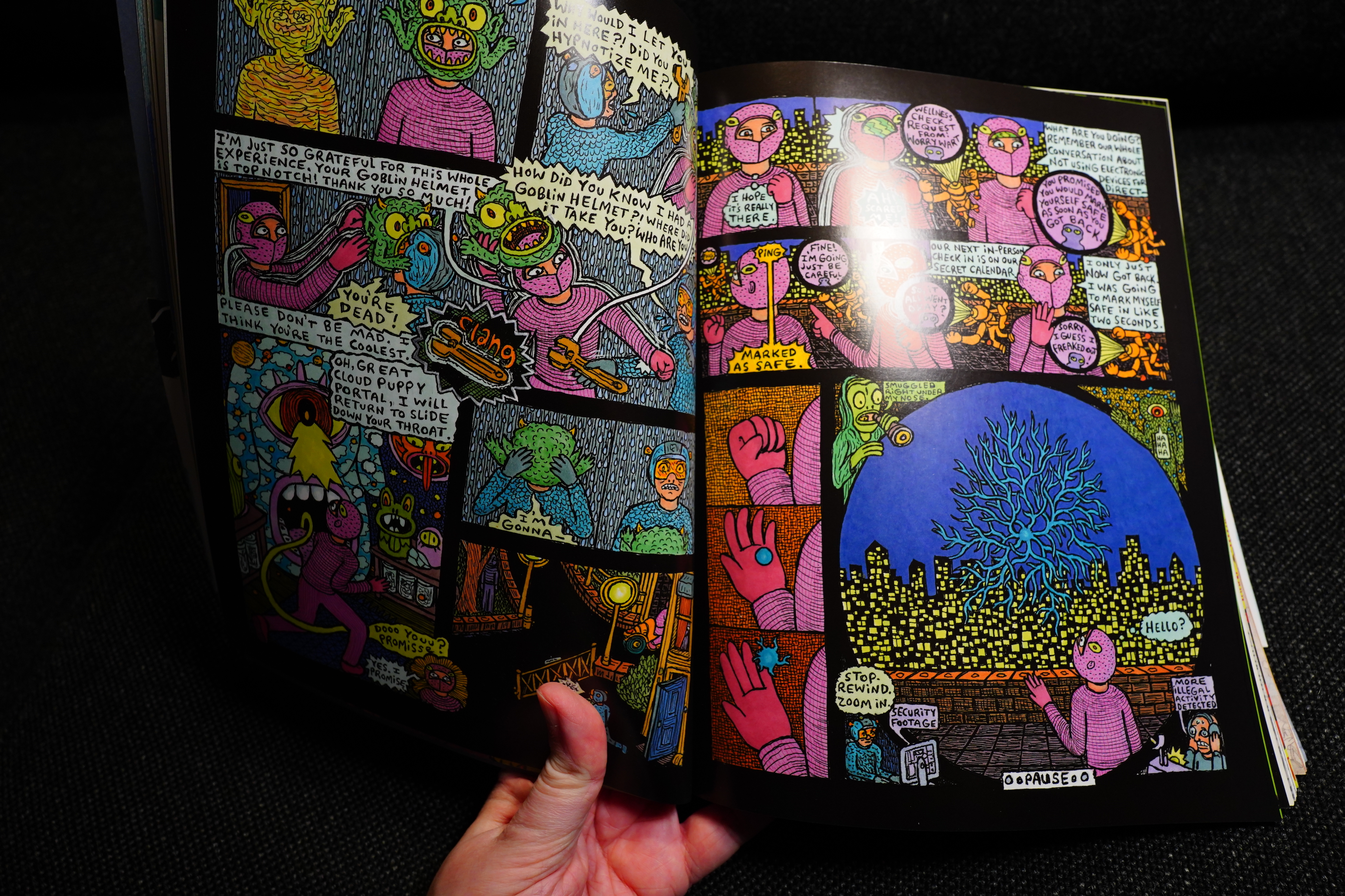
Well, let’s see what I have here… when I read a comic and I’m totally impressed with it, the comic moves to a special shelf I have here in the living room, and these are the ones that landed there:
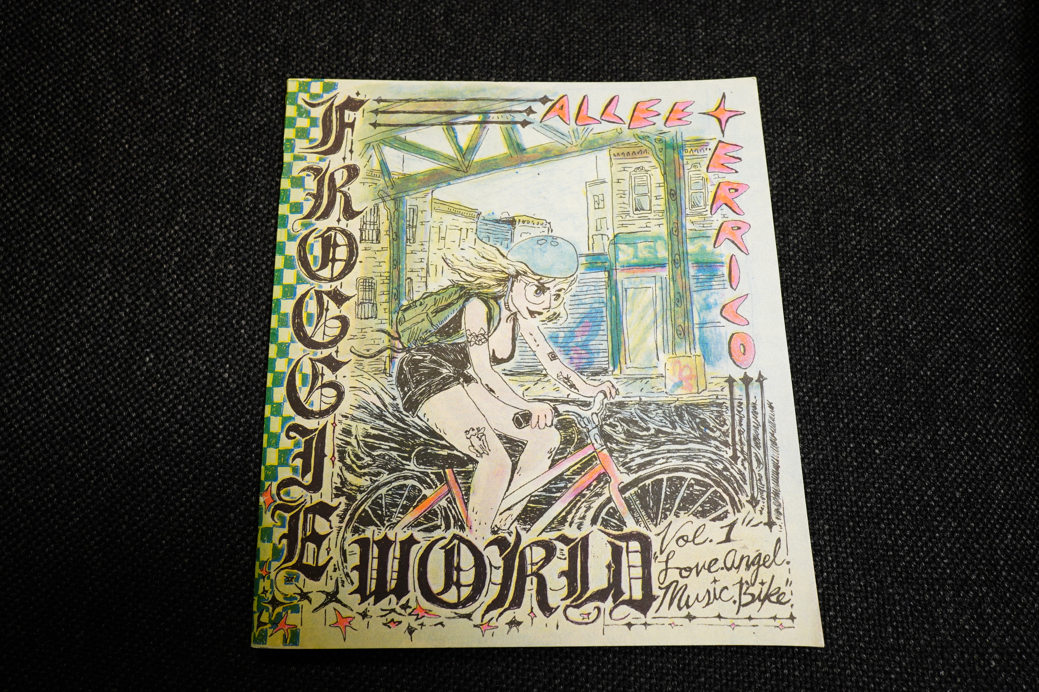
Froggie World by Alee Errico (Cram Books)
You can get this from here. It’s great.
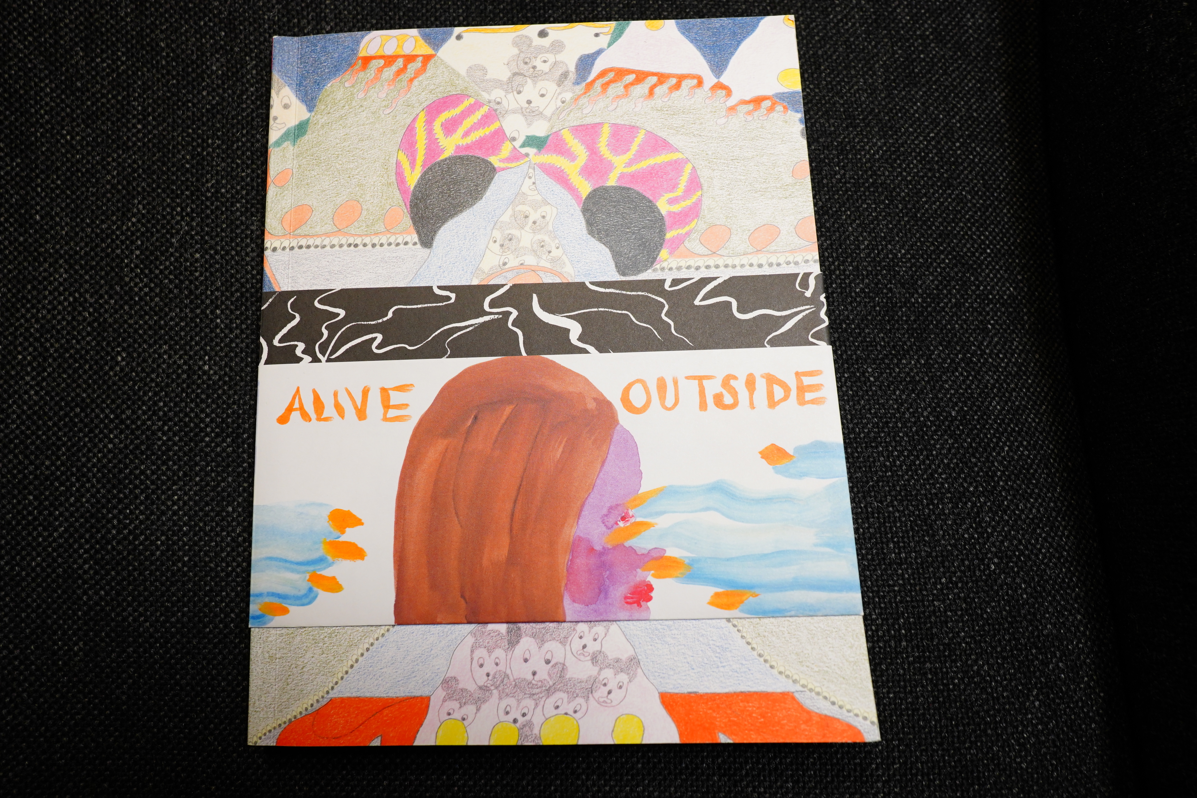
Alive Outside edited by Cullen Beckhorn and Marc Bell
This anthology is amazing. It’s a classic. You can get it from here. And it’s on sale! When it’s gone it’s gone.
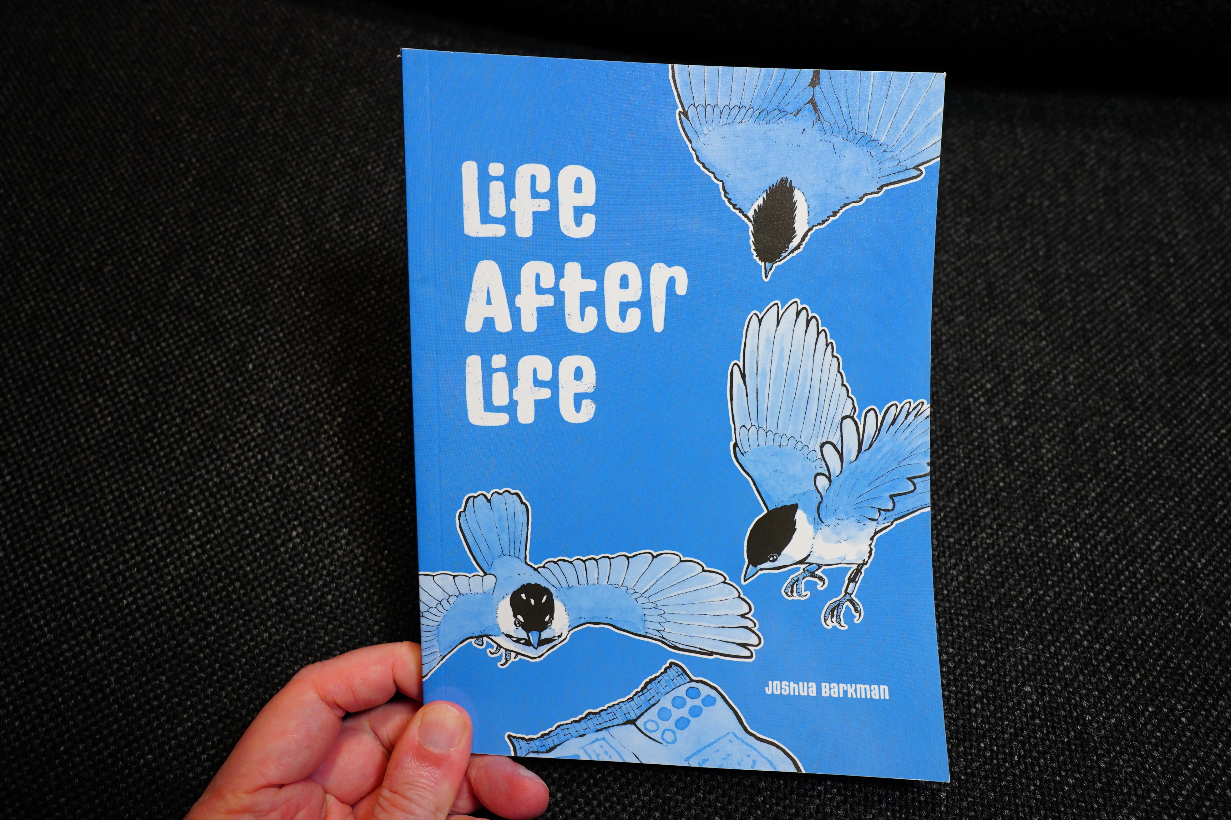
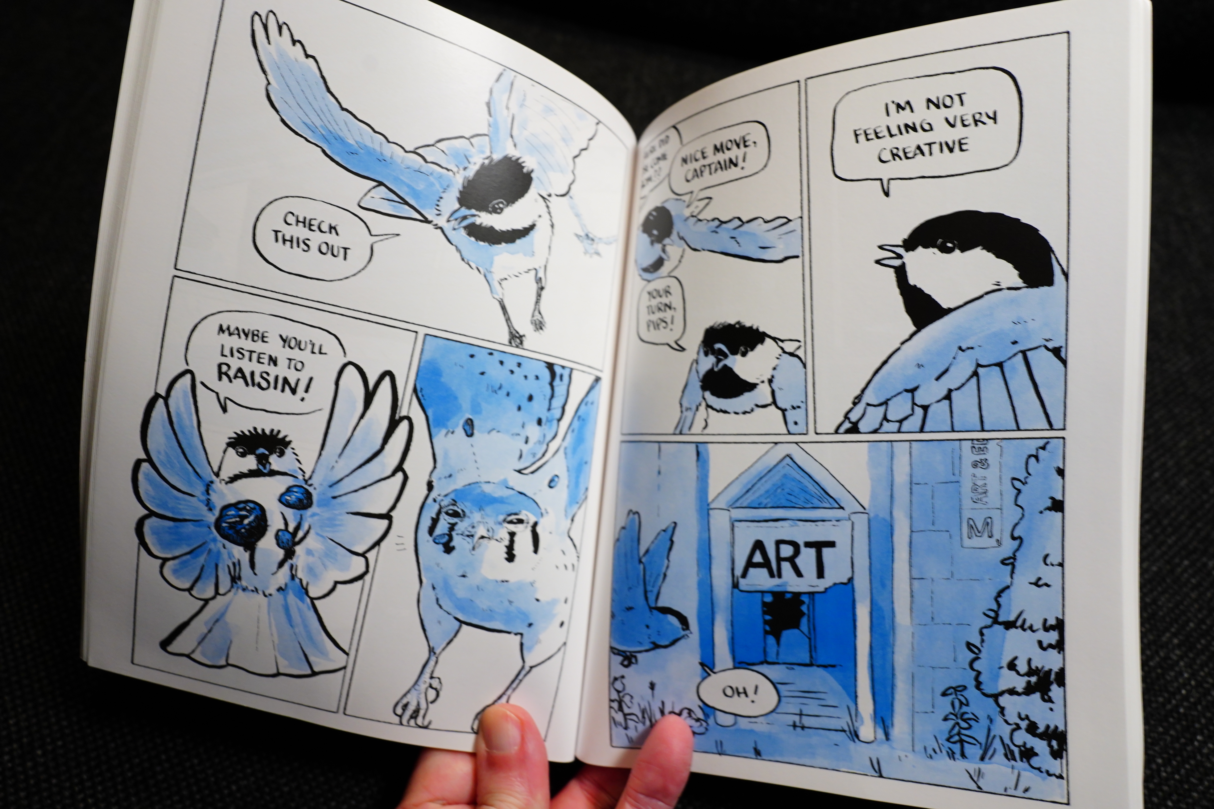
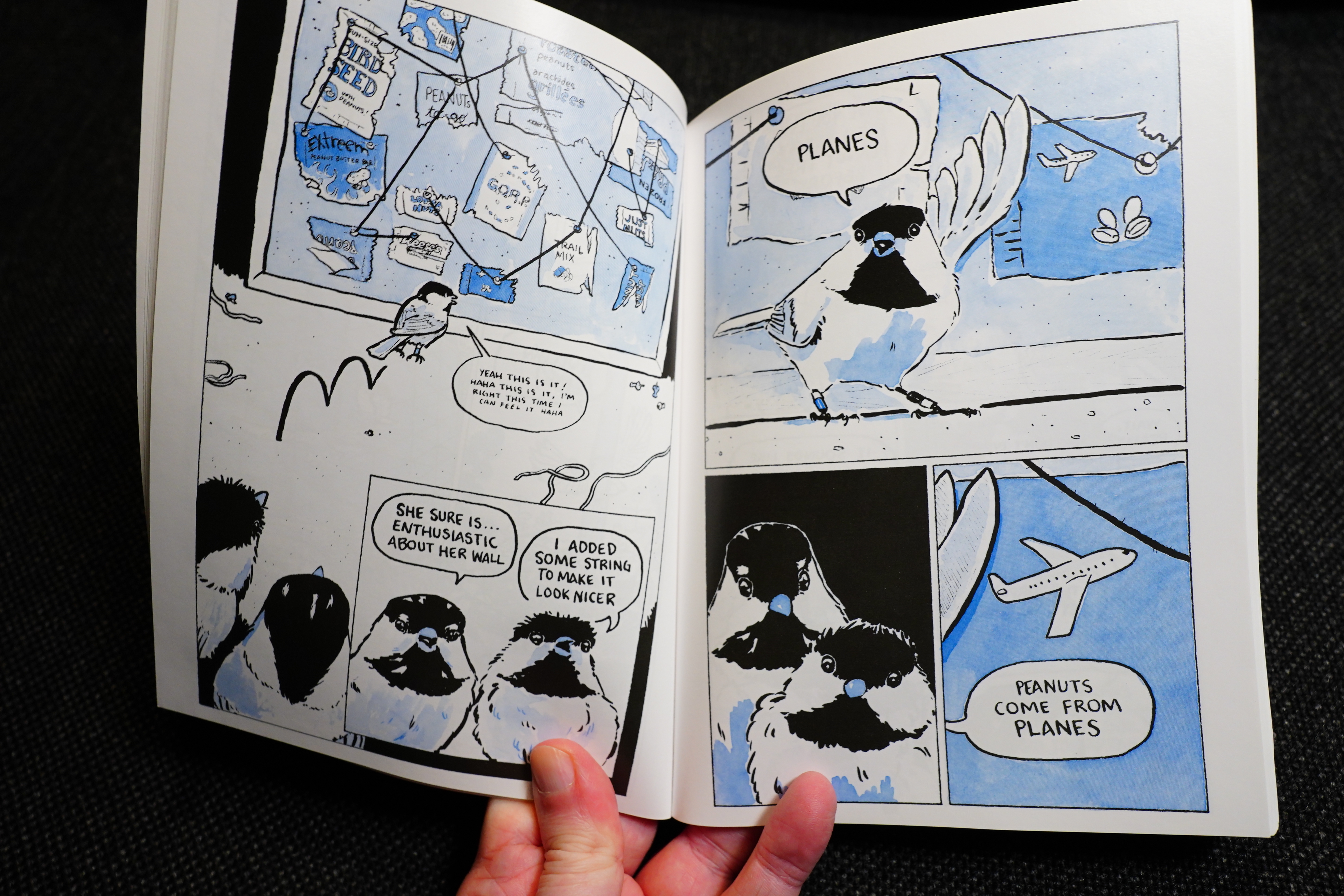
Life After Life by Joshua Barkman
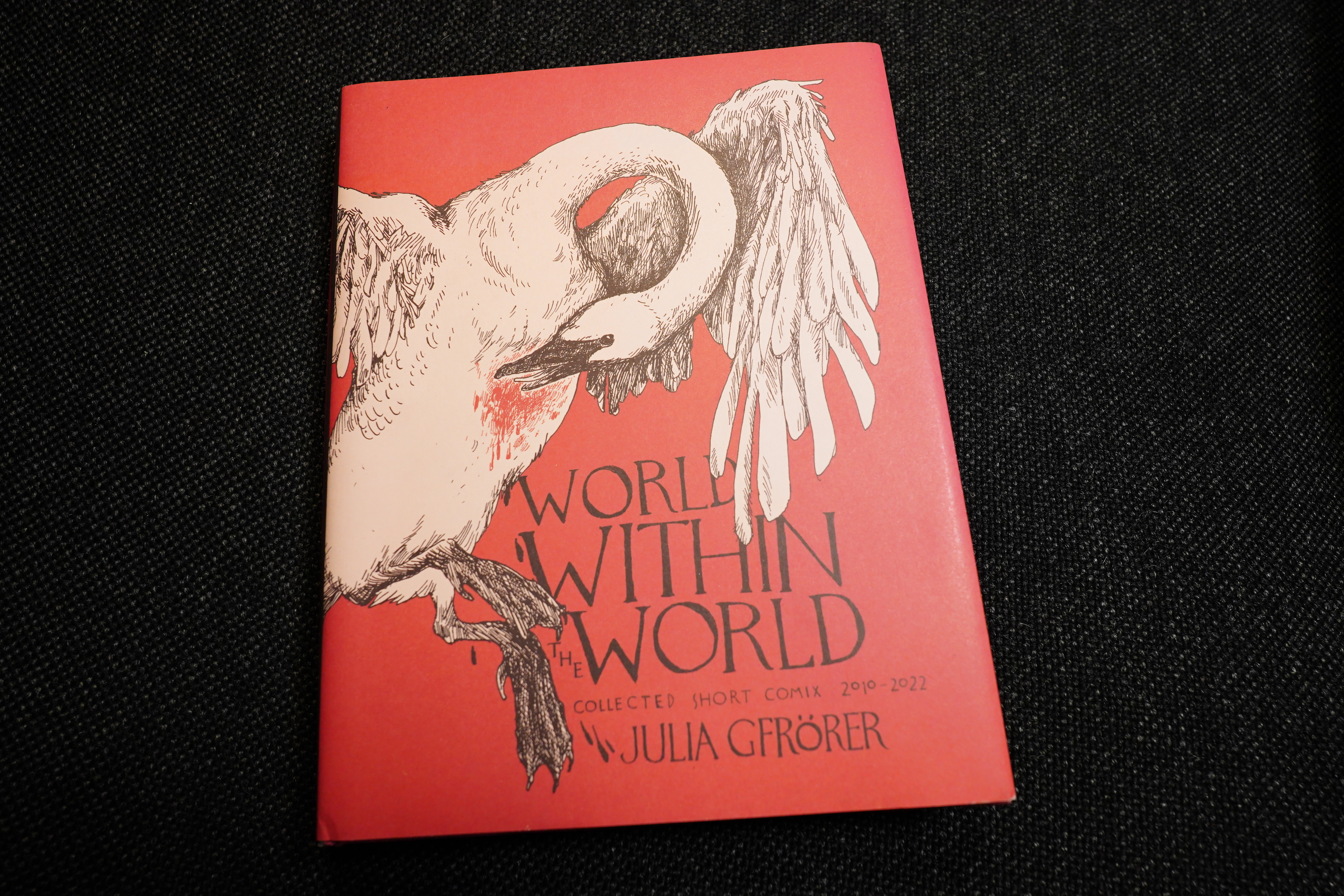
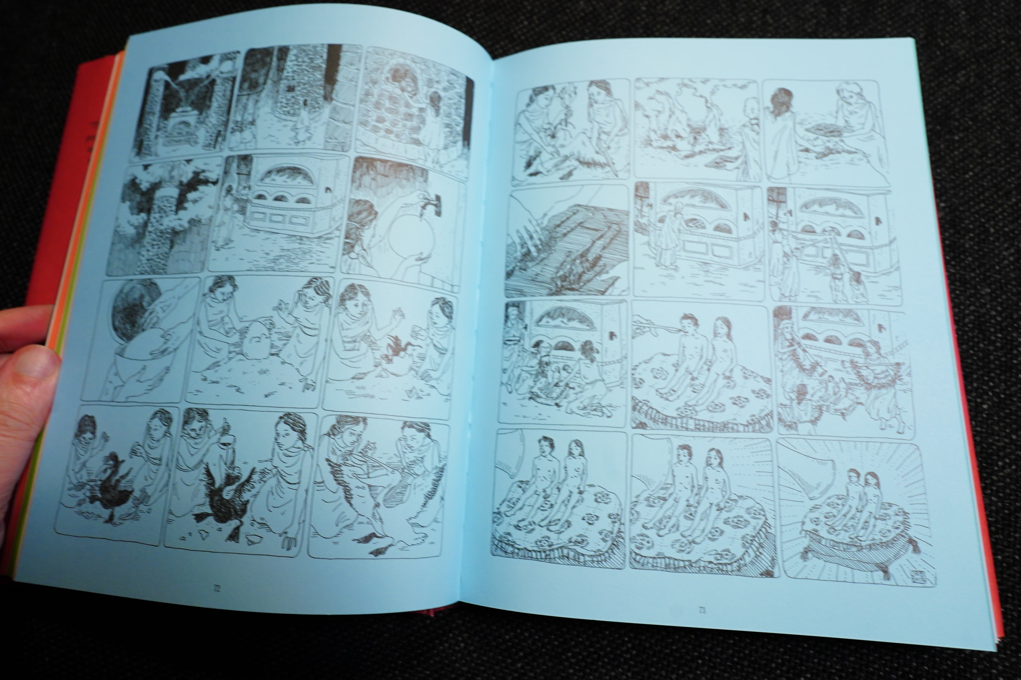
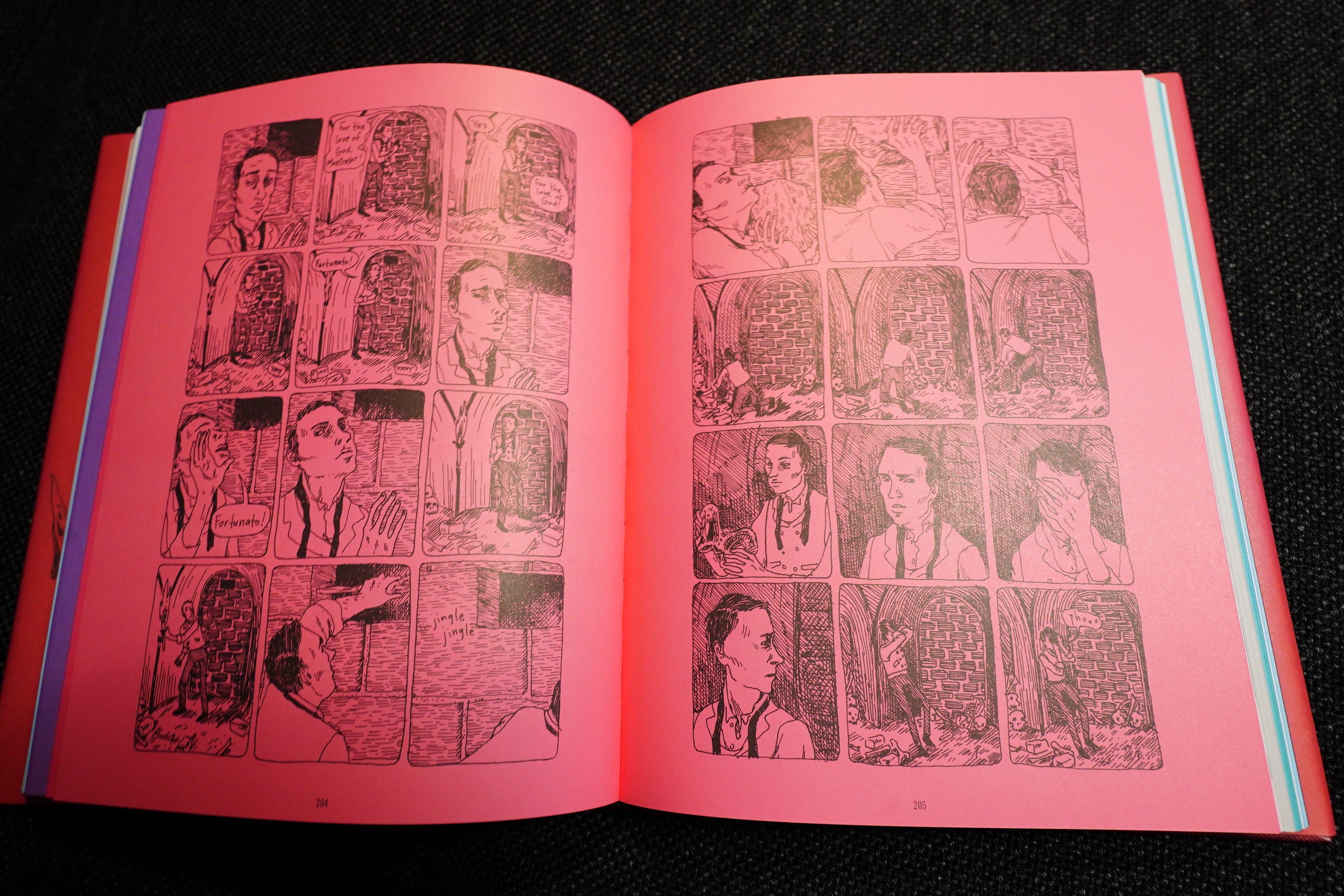
World Within The World by Julie Gförer (Fantagraphics)
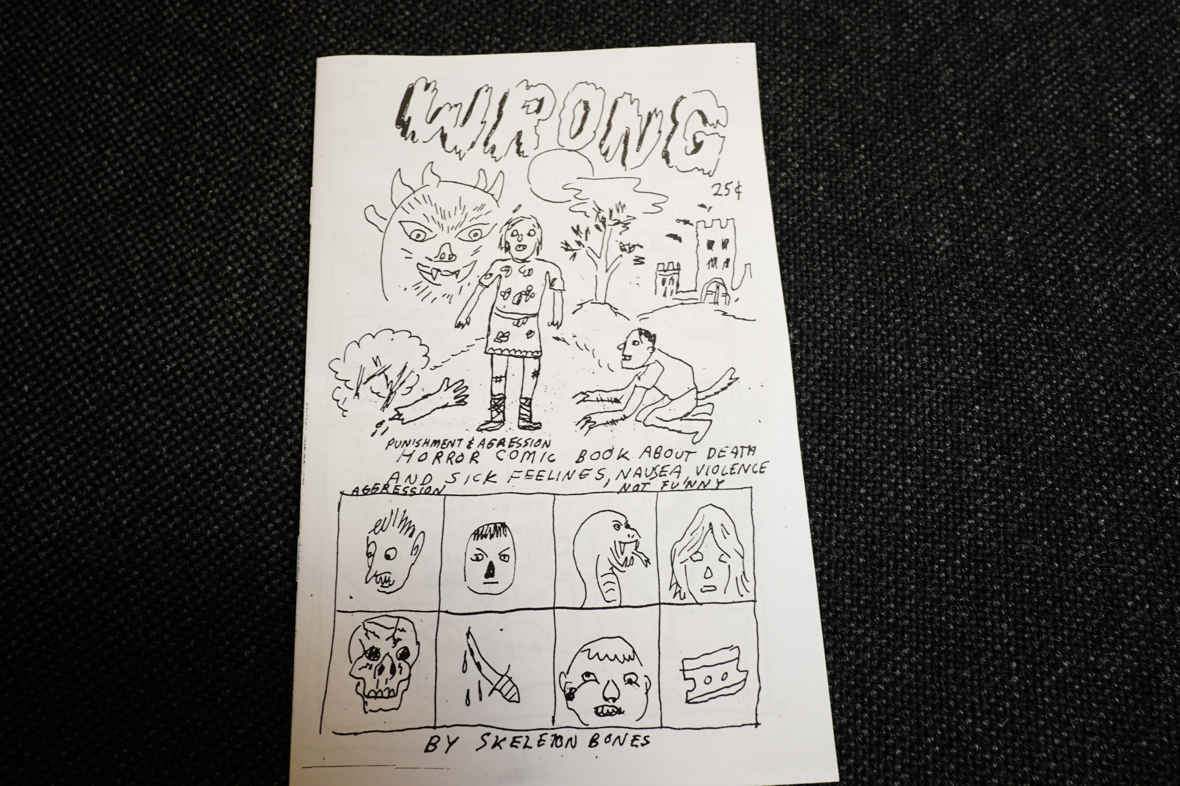
Wrong by Skeleton Bones (TBC)
I guess this is really CF? And it’s old, but it was republished in 2025, so.
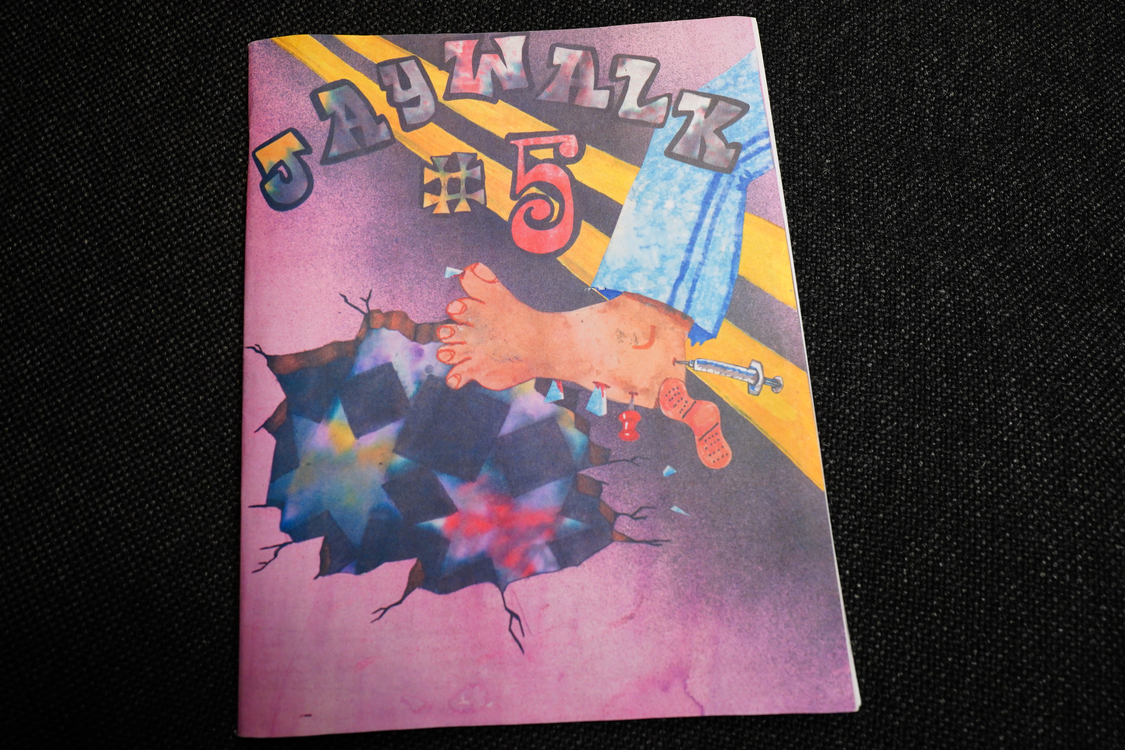
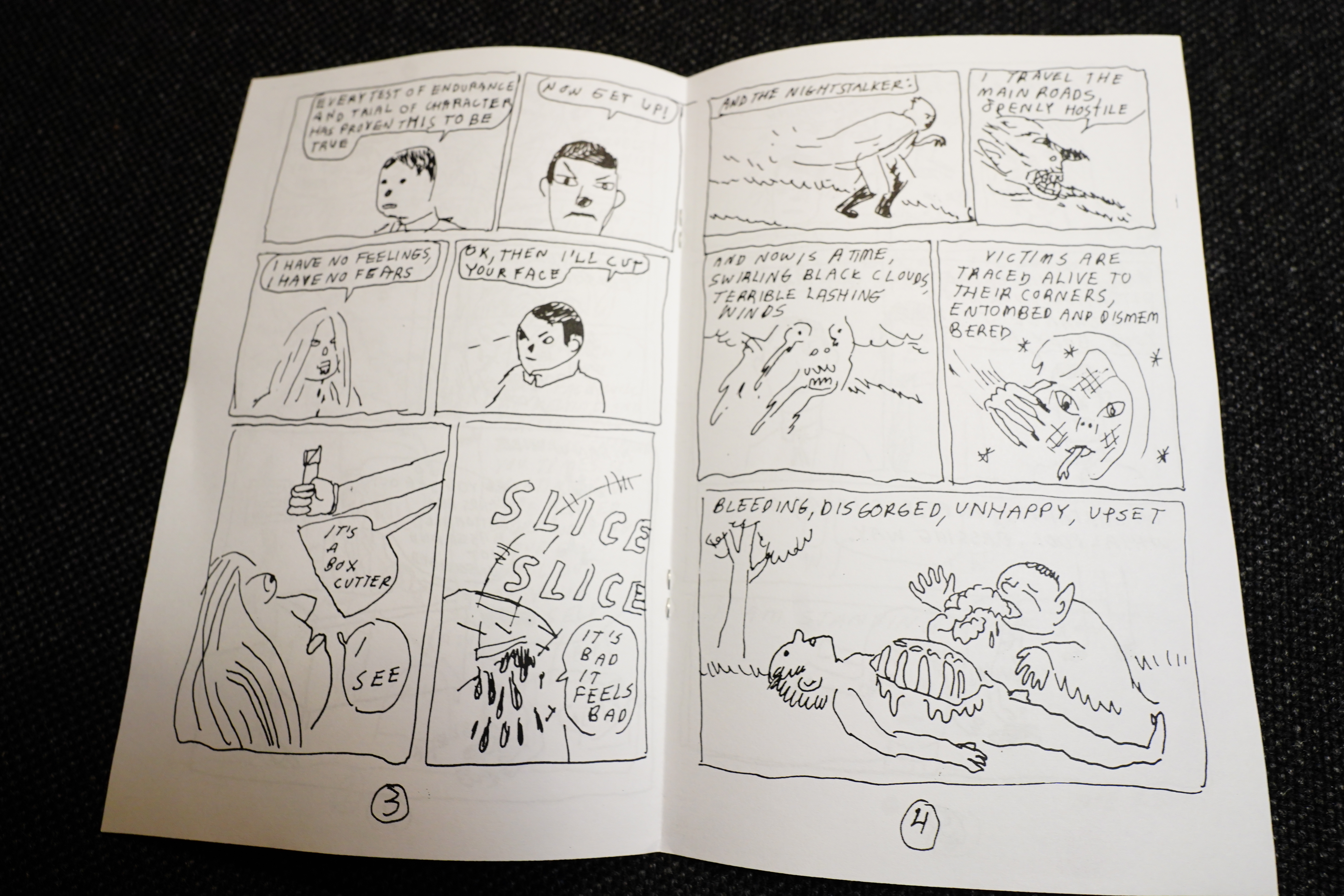
Jaywalk #5 (Domino Books)
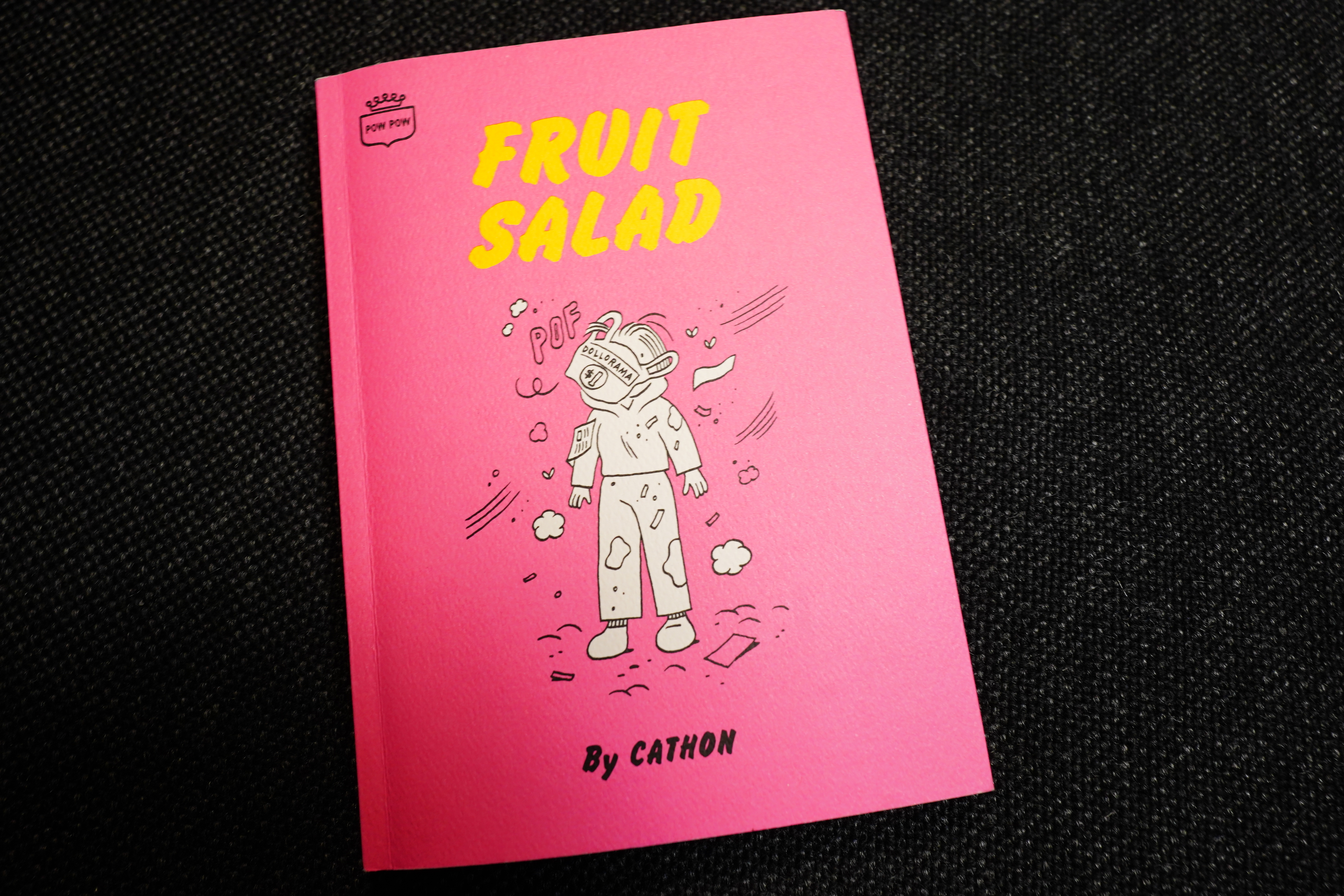
Fruit Salad by Cathon (Pow Pow Press)
Extremely funny book.
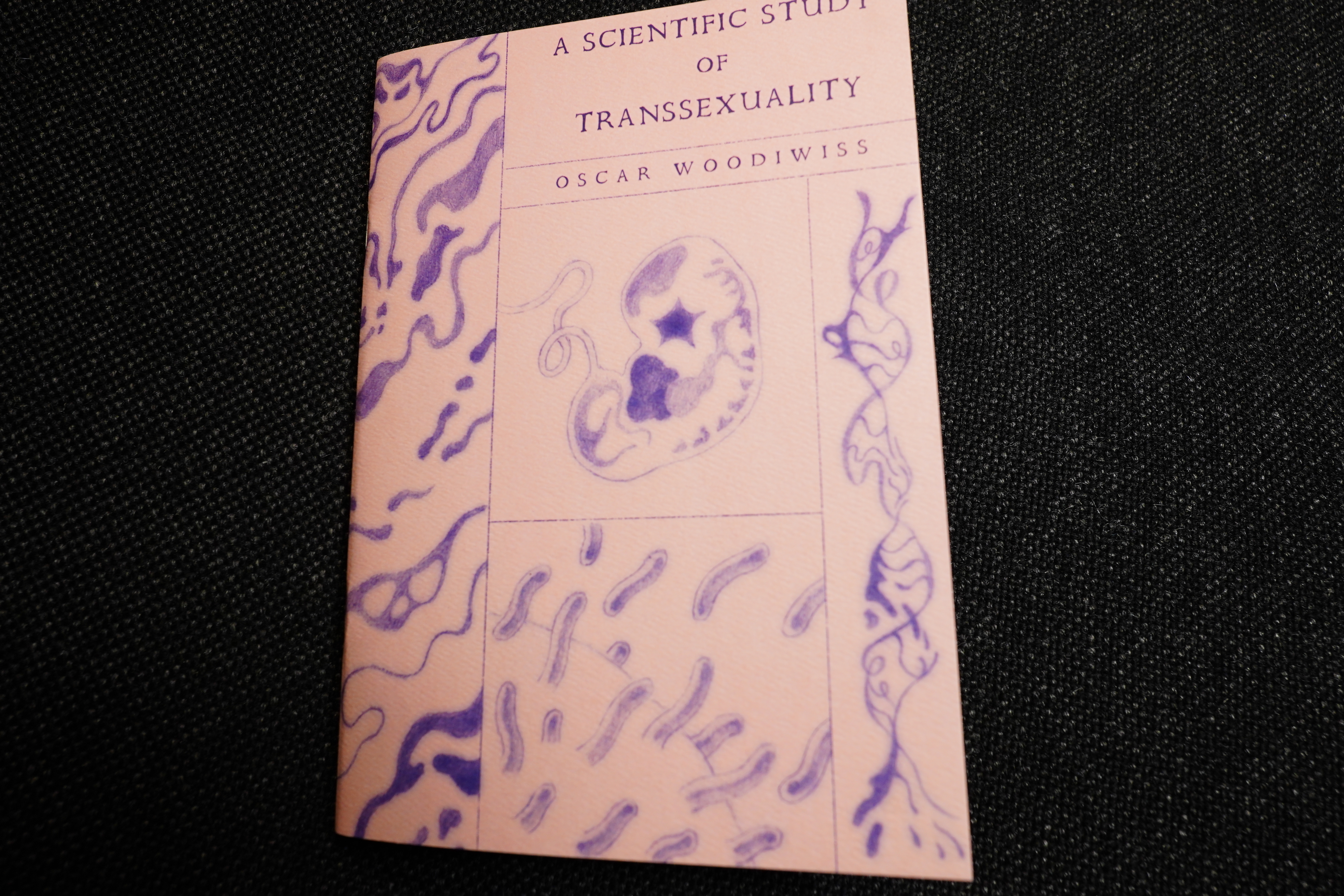
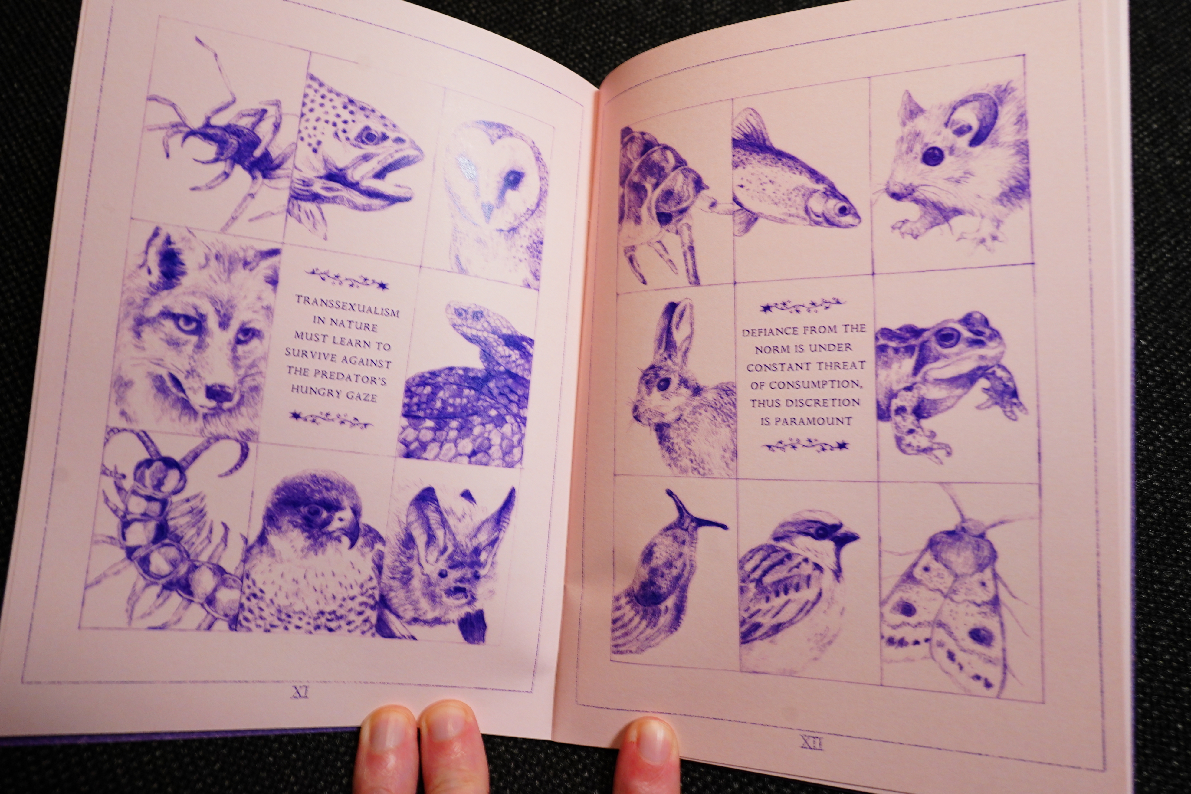
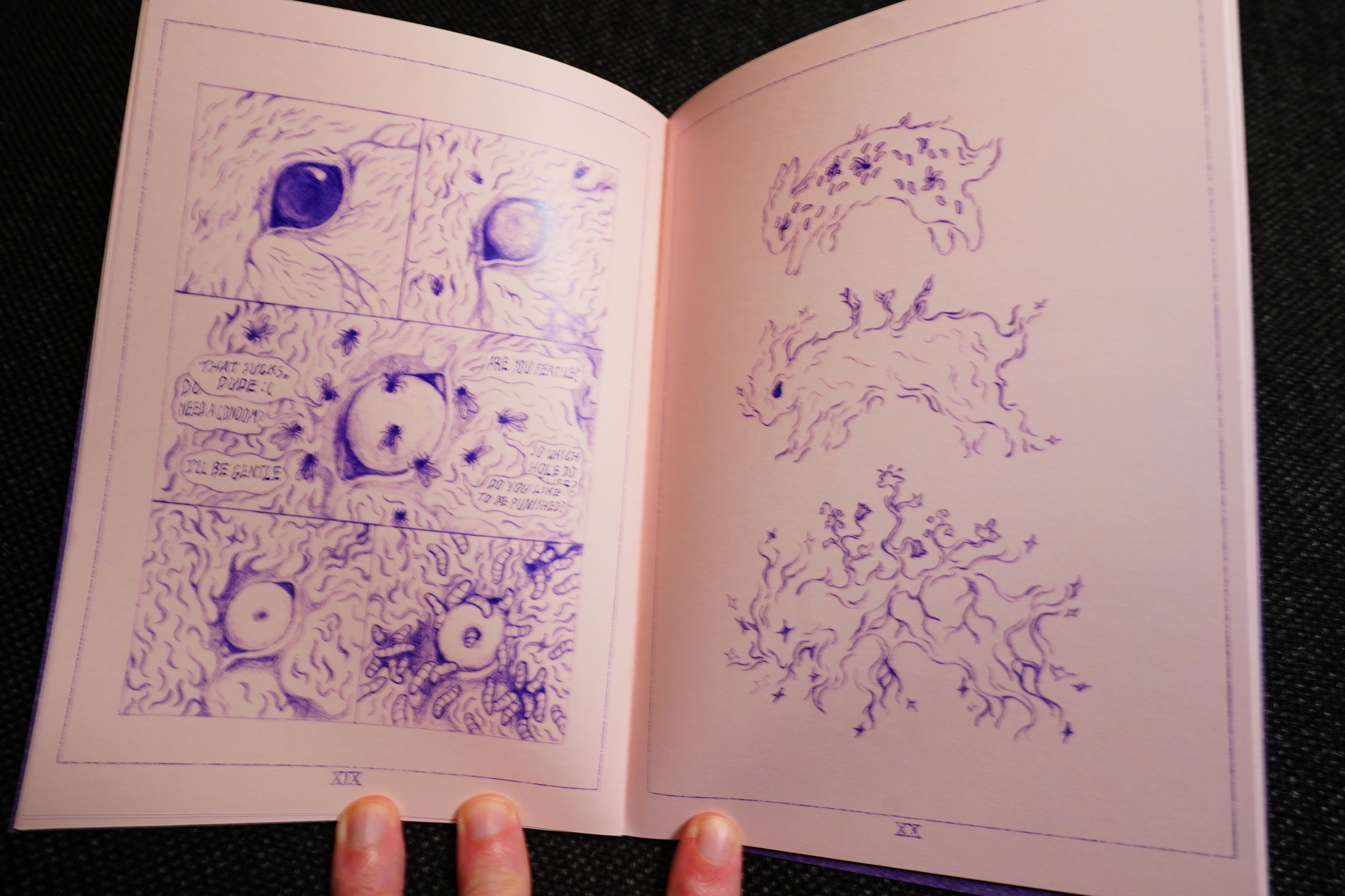
A Scientific Study of Transsexuality by Oscard Woodiwiss (Fieldmouse Press)
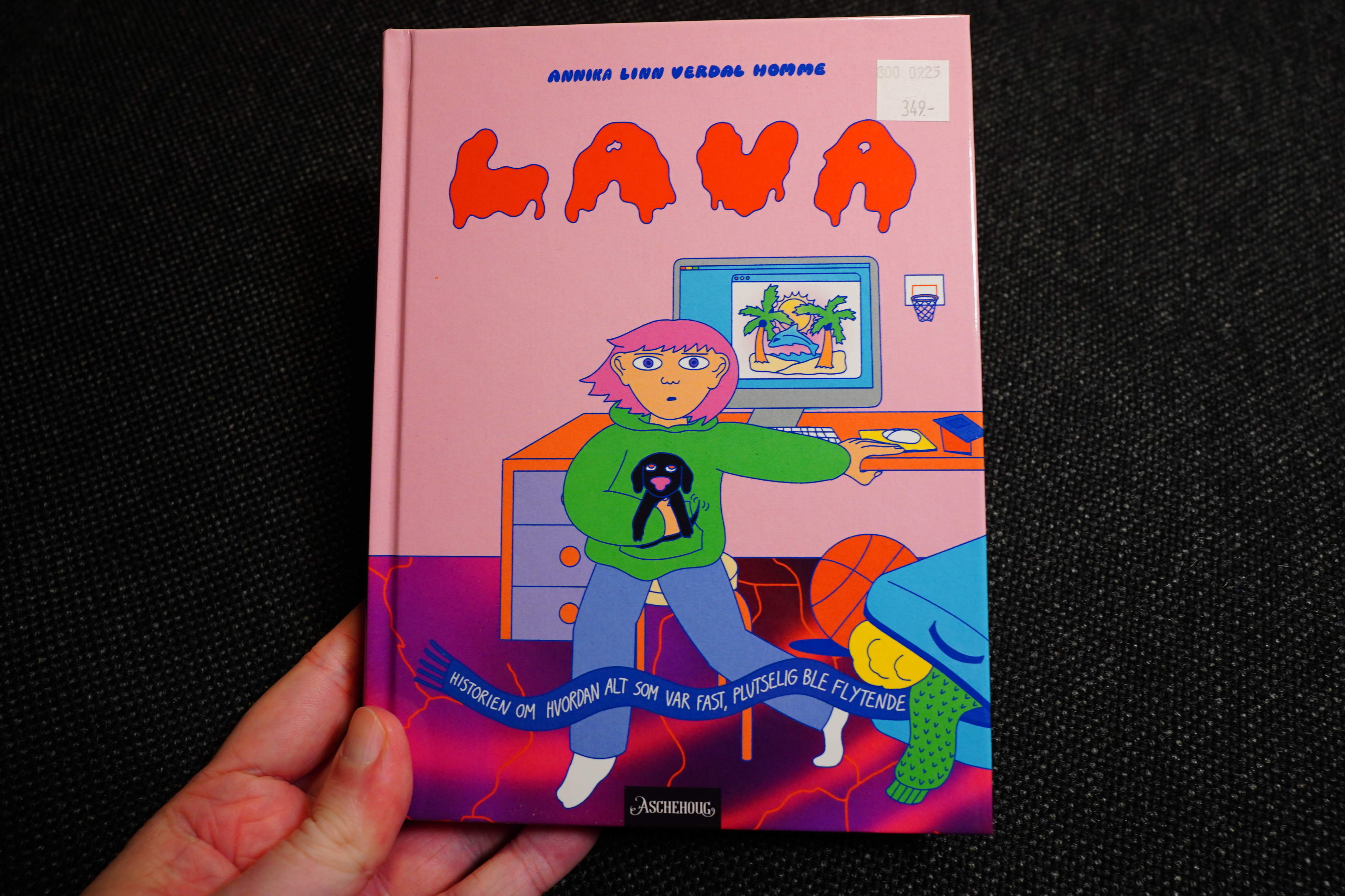
Lava by Annika Lind Verdal Homme (Aschehoug)
Norwegian comics!
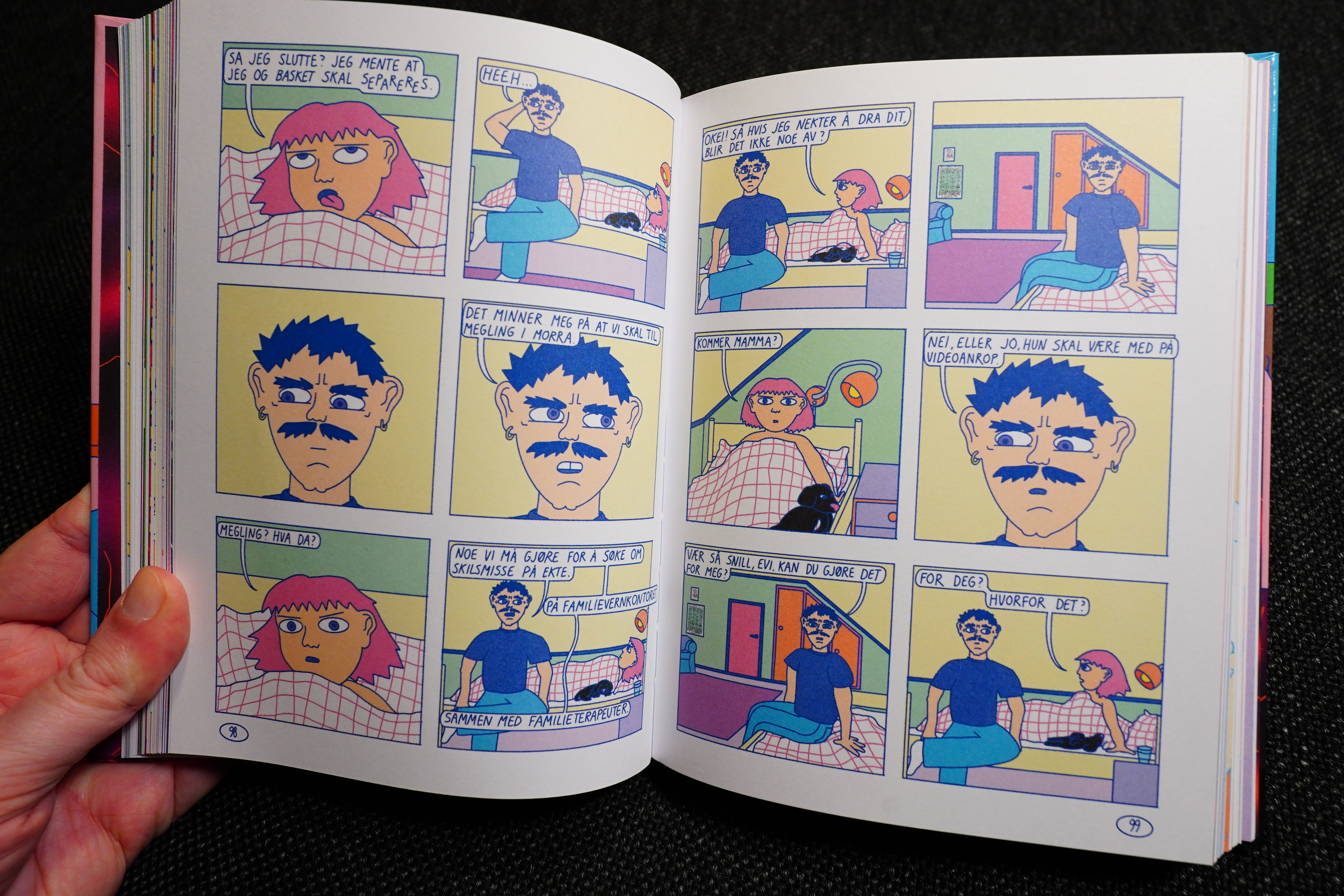
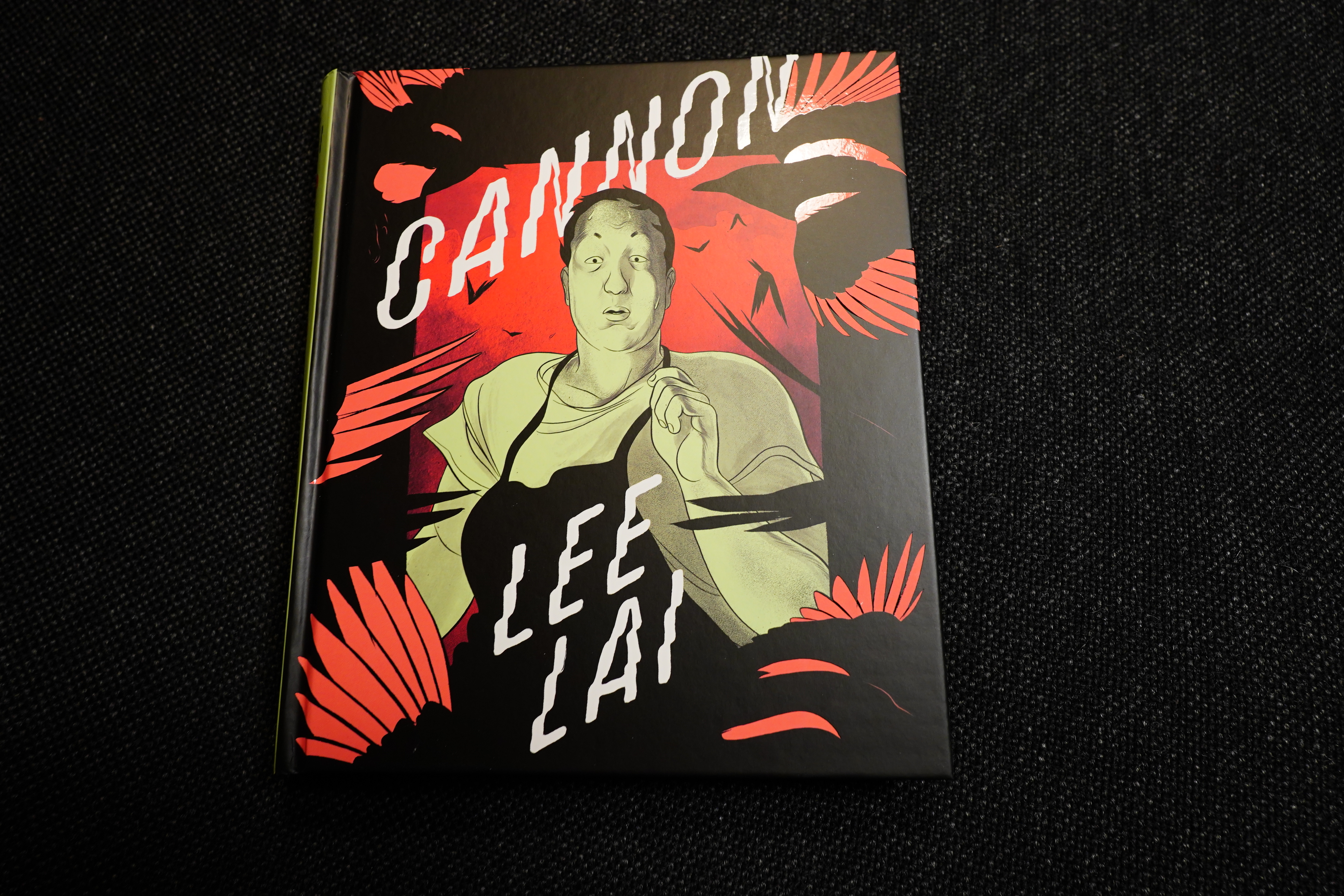
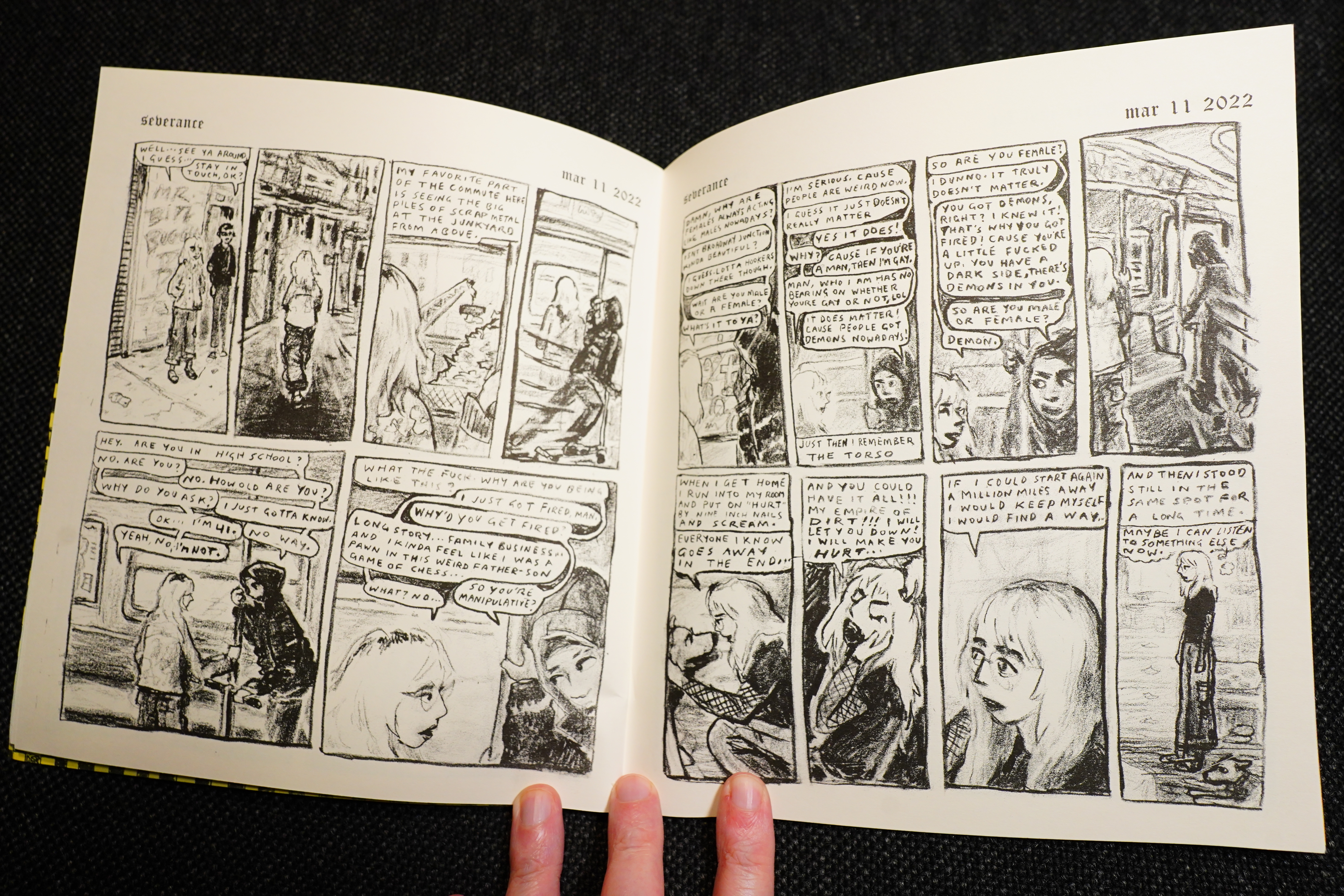
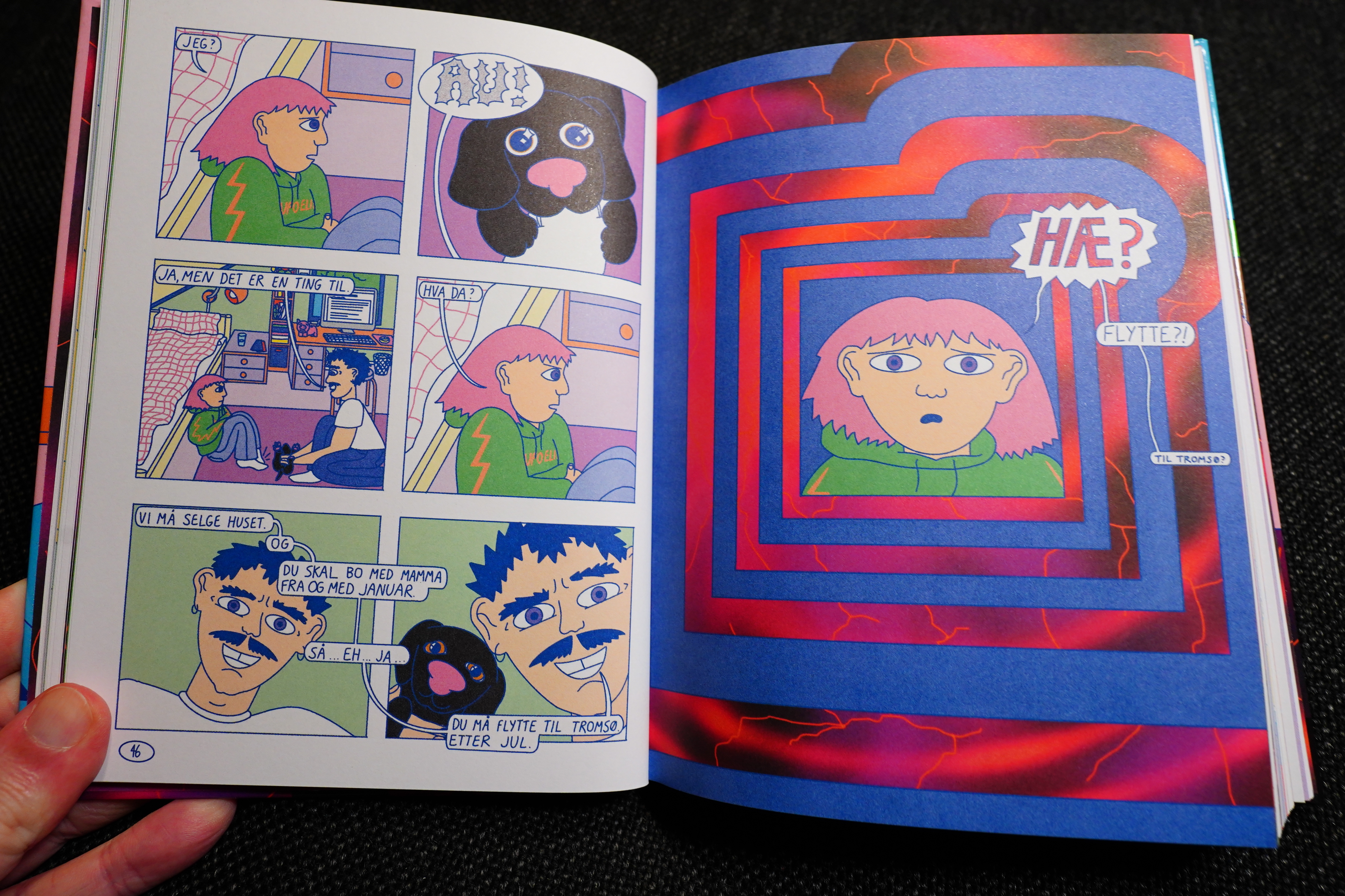
Cannon by Lee Lai (Drawn & Quarterly)
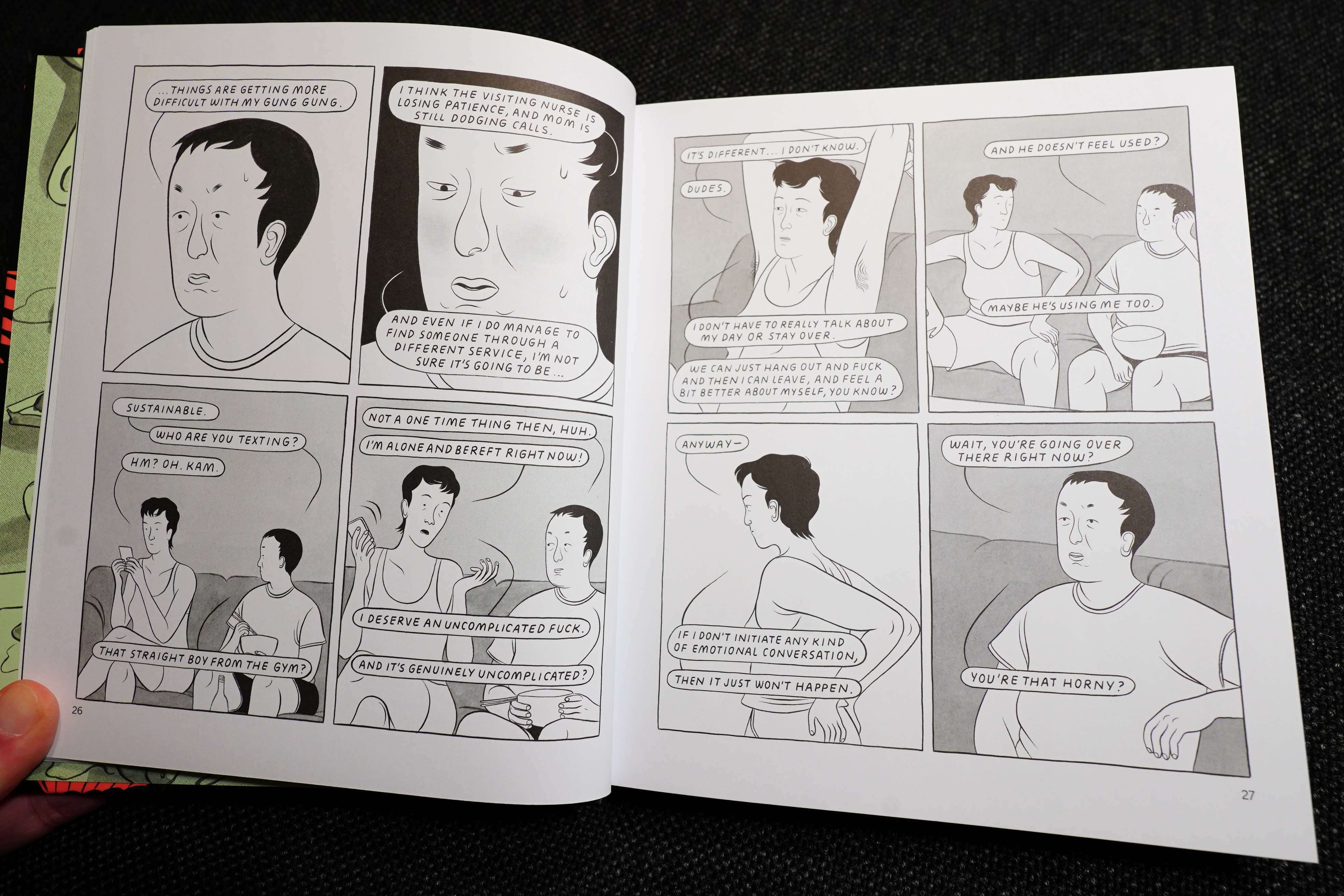
This is the only D&Q book here — they really scaled back, but they also went even more middlebrow this year, publishing “worthy” book after “worthy” book. This one is really good, though.

Salt Green Death by Katarina Thorsen (Conundrum Press)
This book is fantastic.
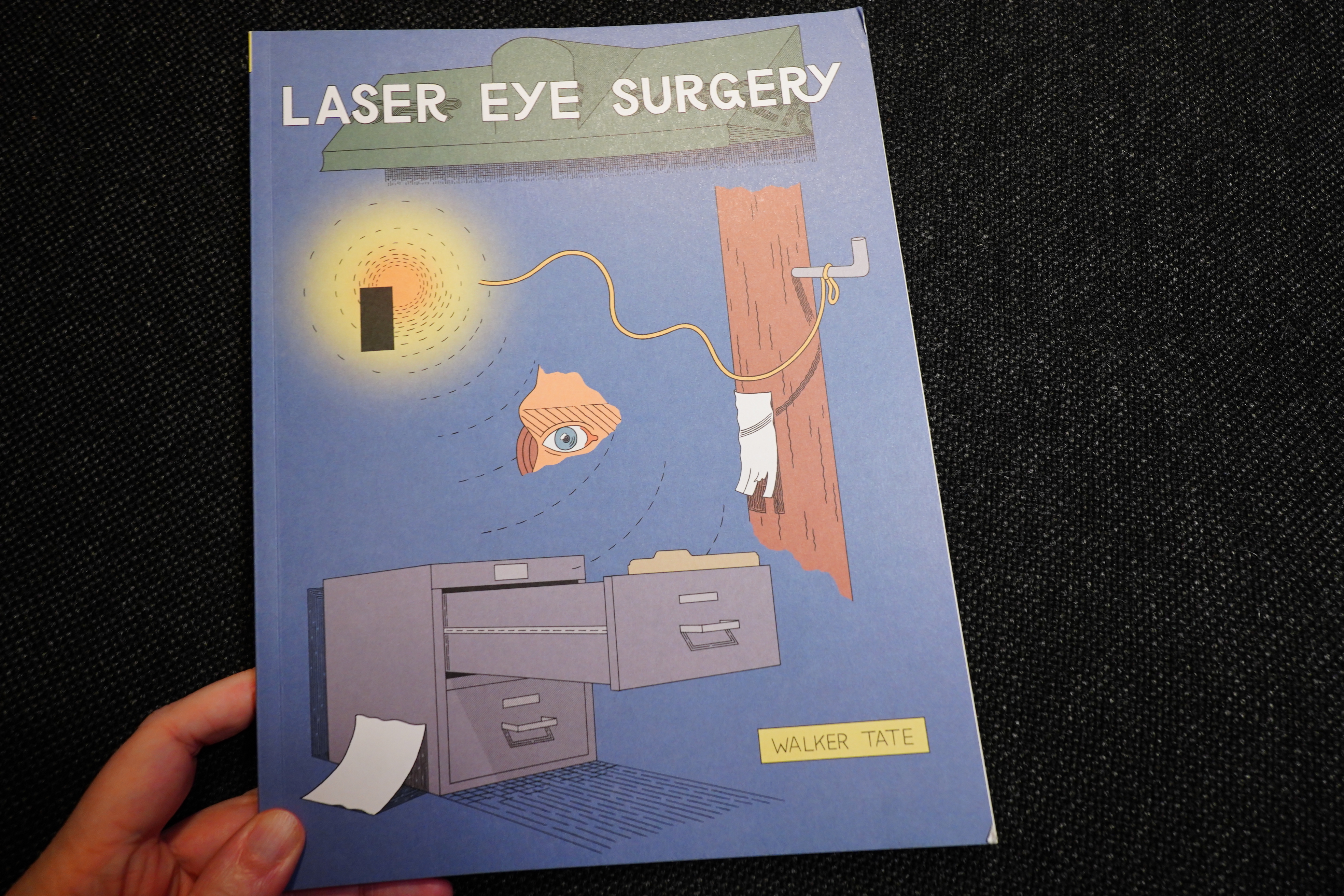
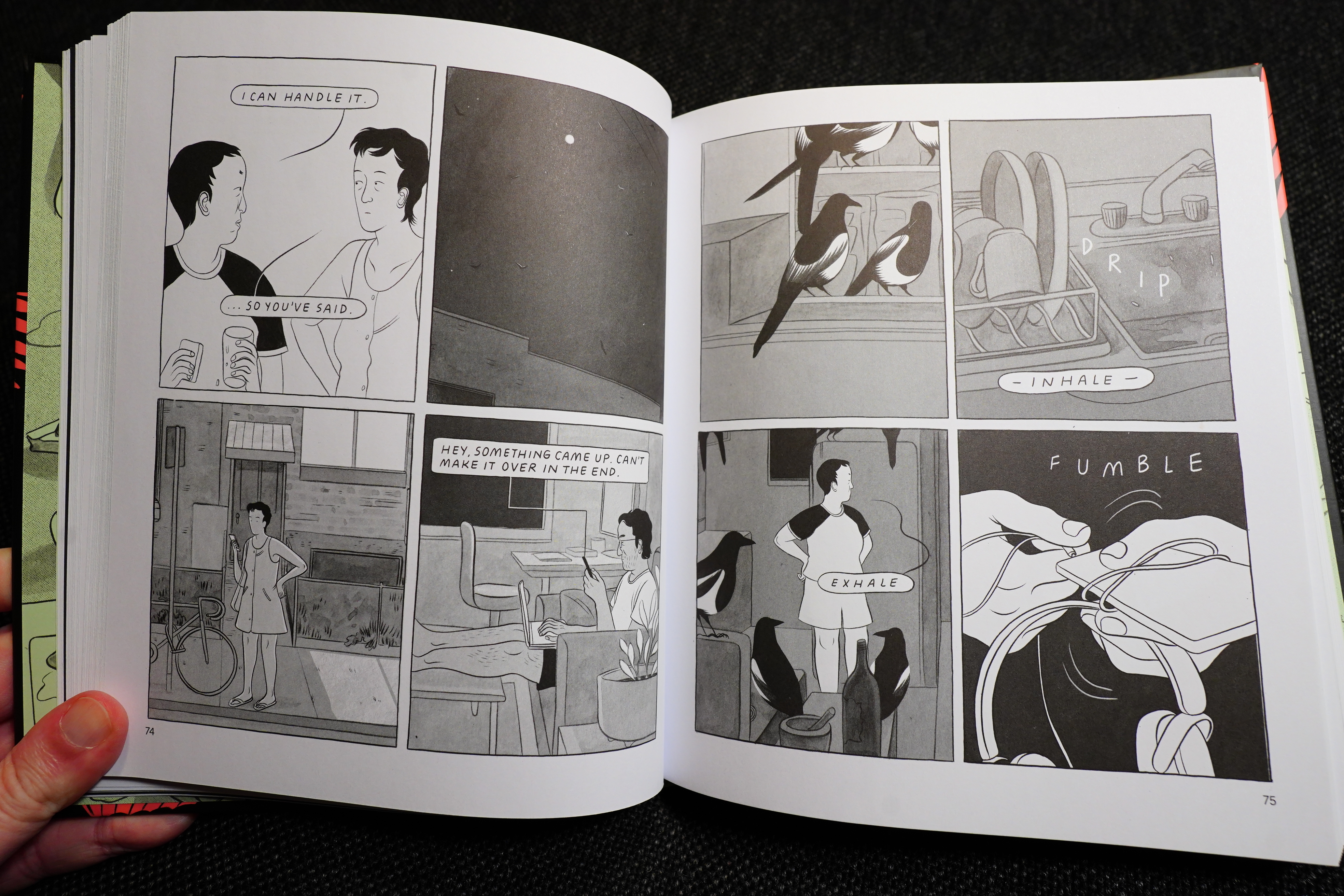
Laser Eye Surgery by Walker Tate (Fantagraphics)

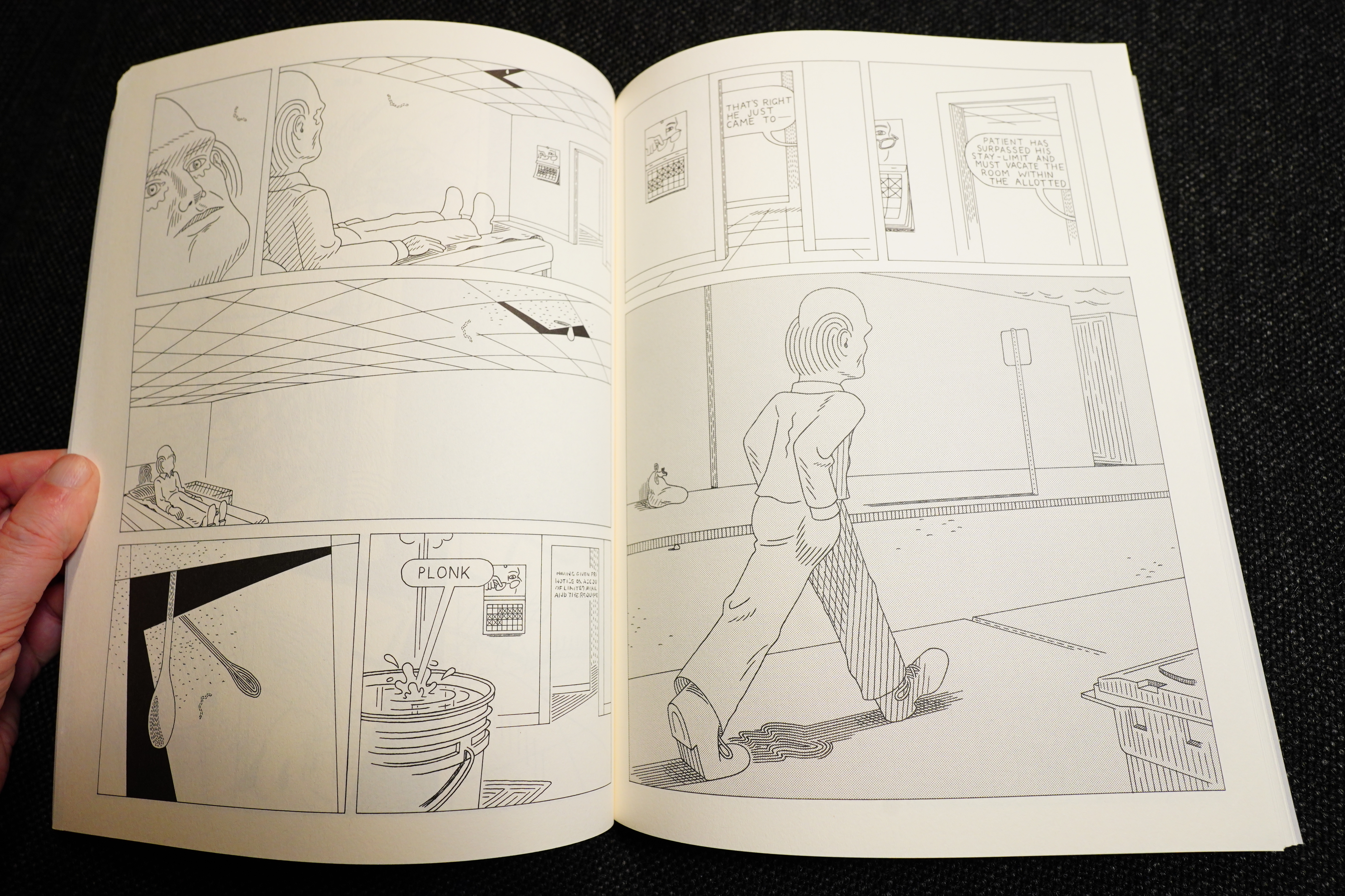

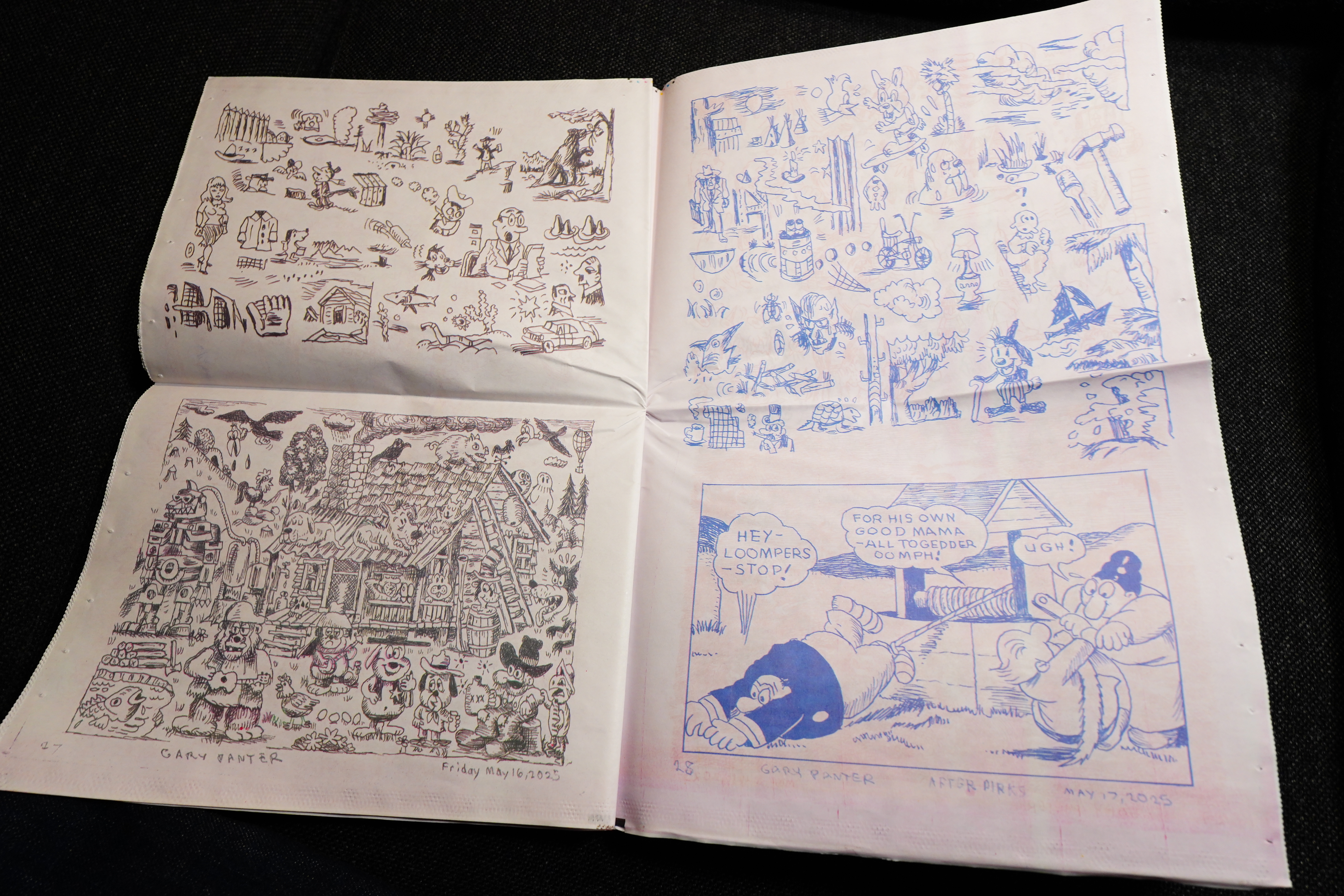
Smoke Signal #44 by Gary Panter (Desert Island)
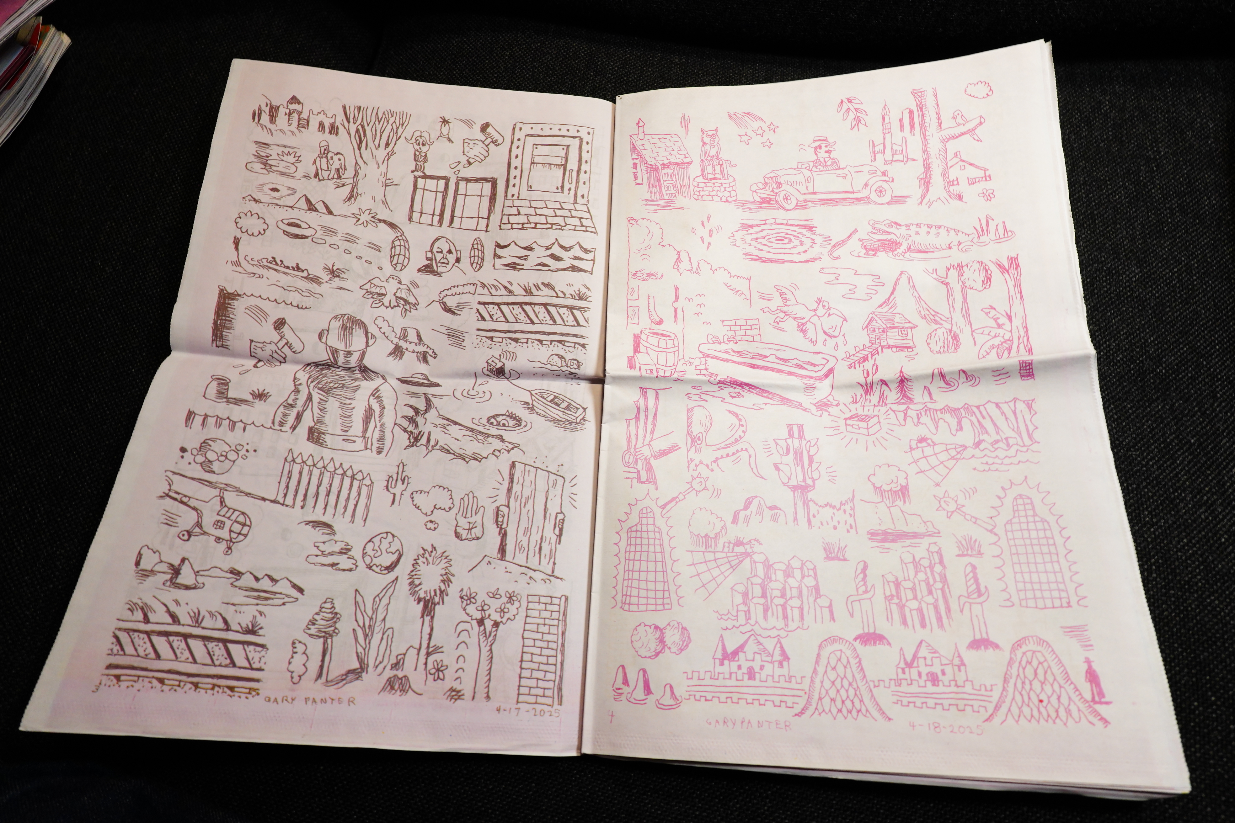
This is sold out, unfortunately.
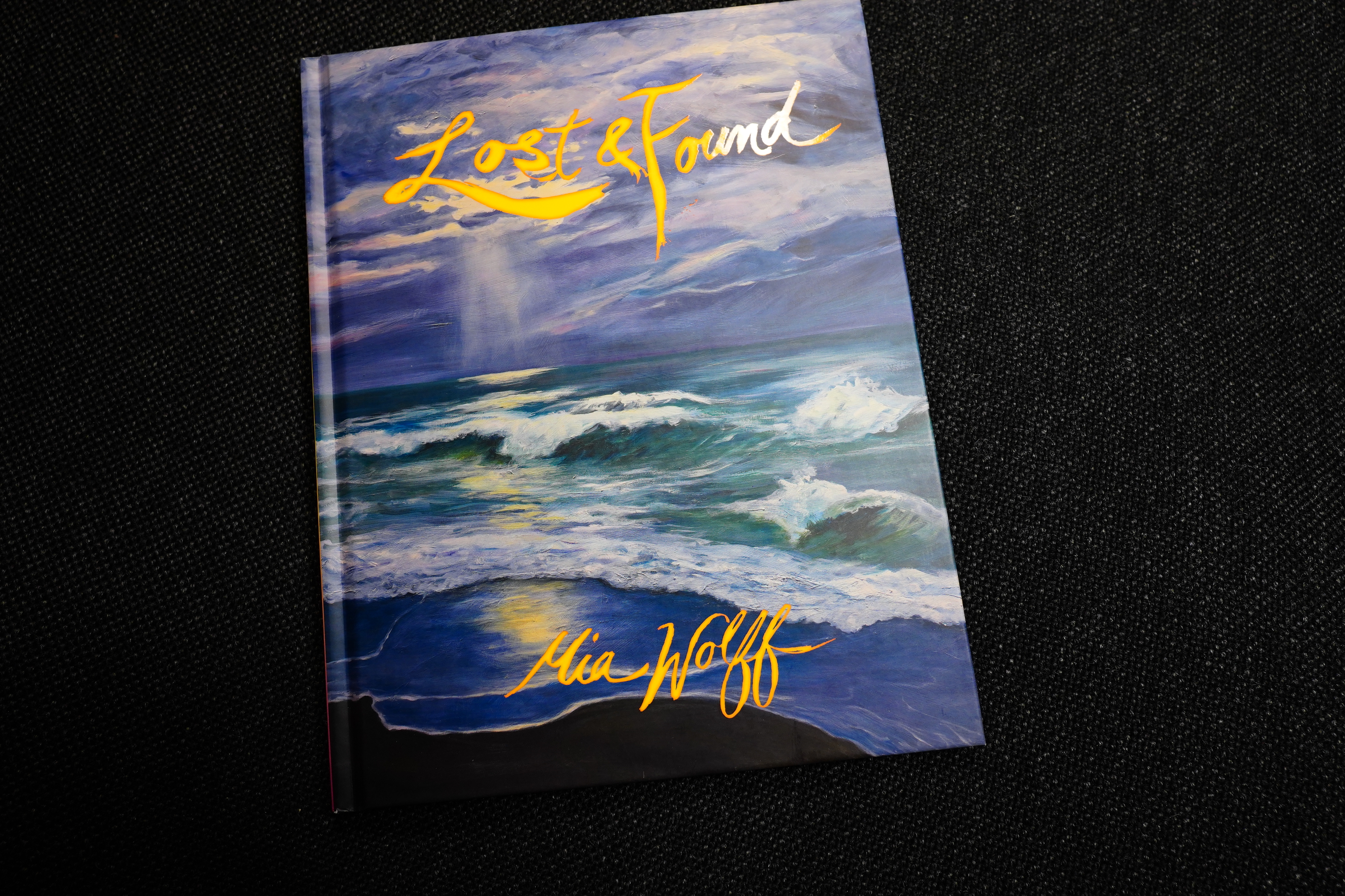
Lost & Found by Mia Wolff (Fantagraphics)
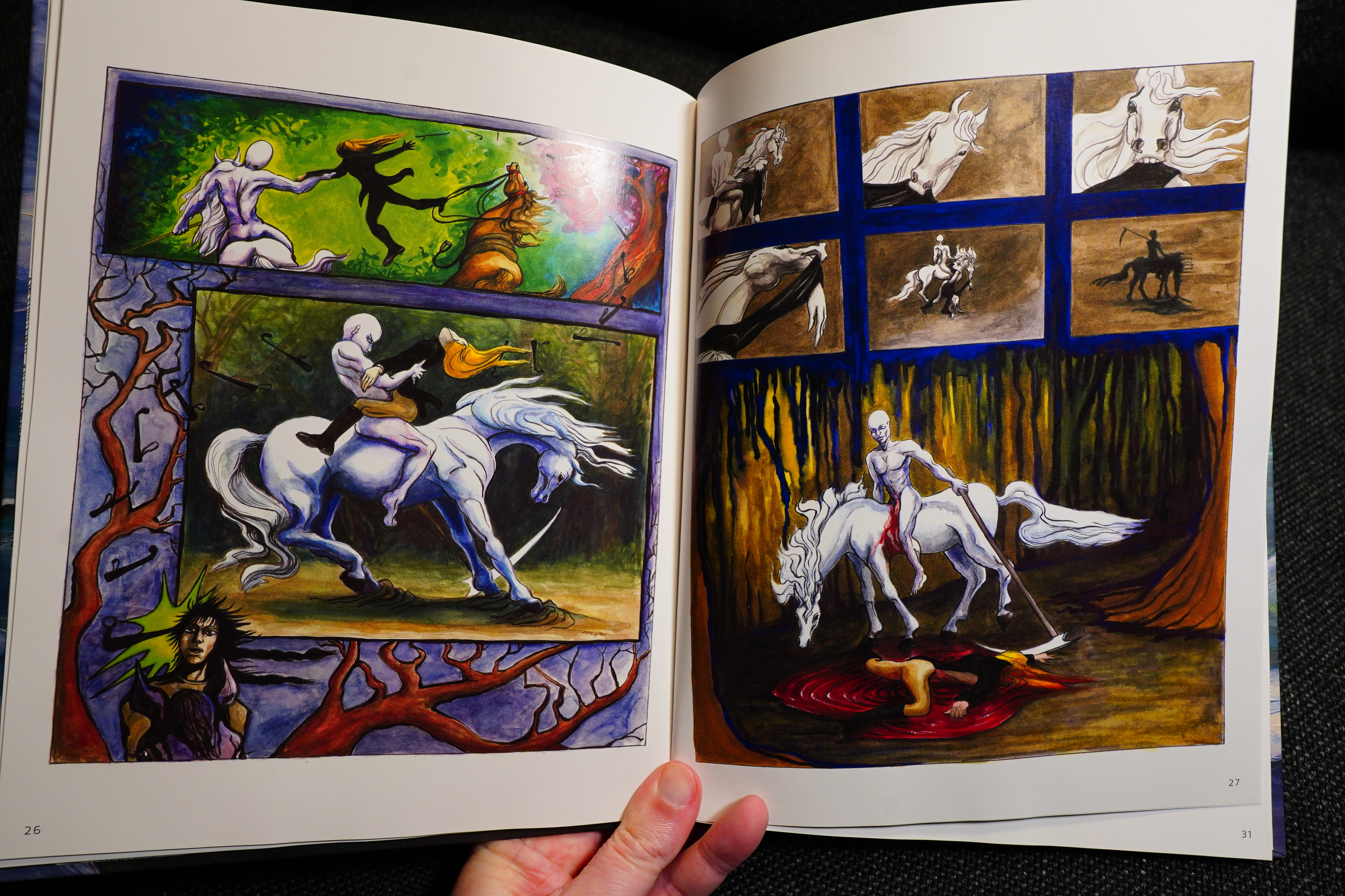
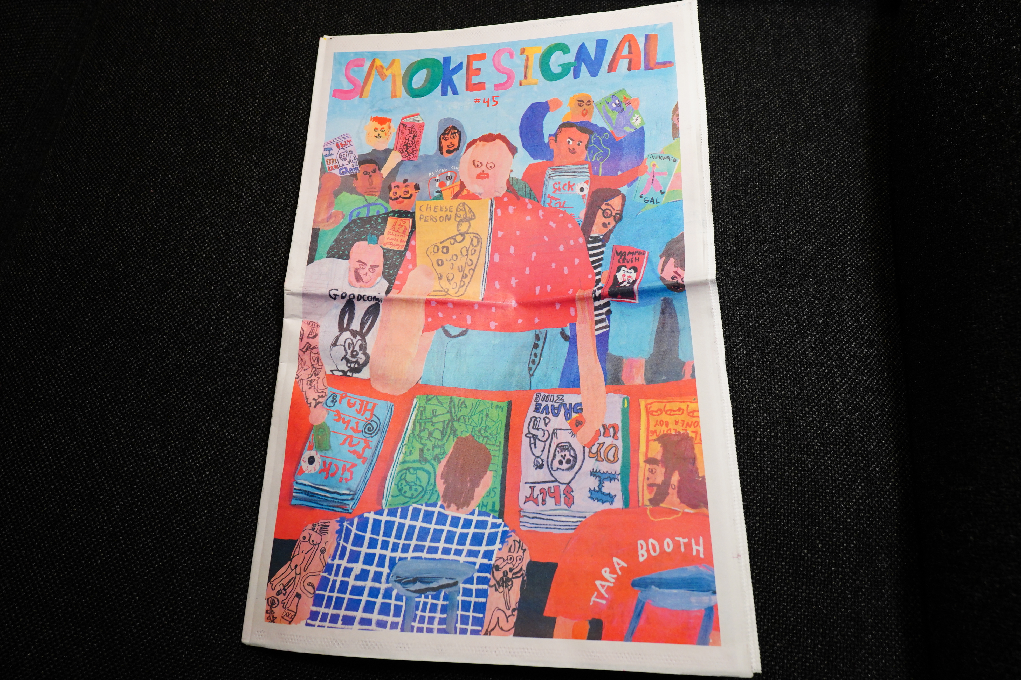
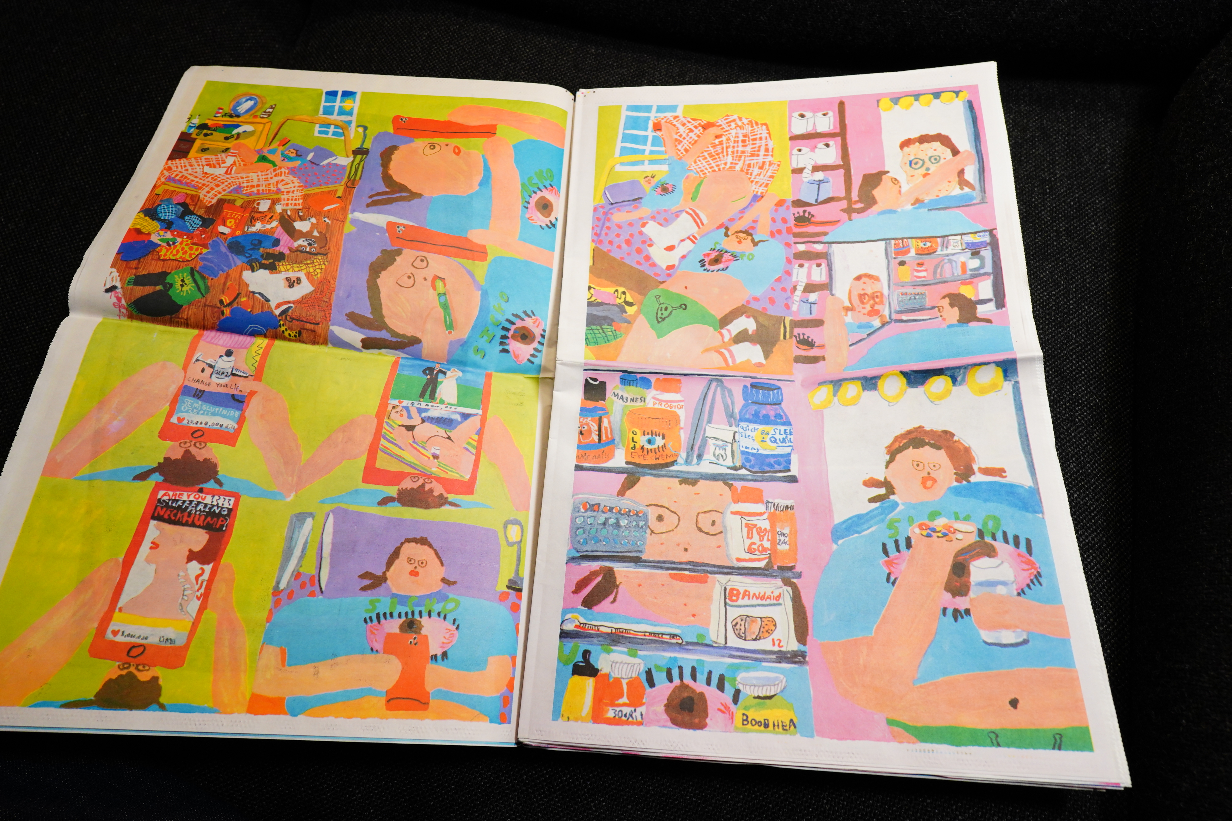
Smoke Signal #45 by Tara Booth (Desert Island)
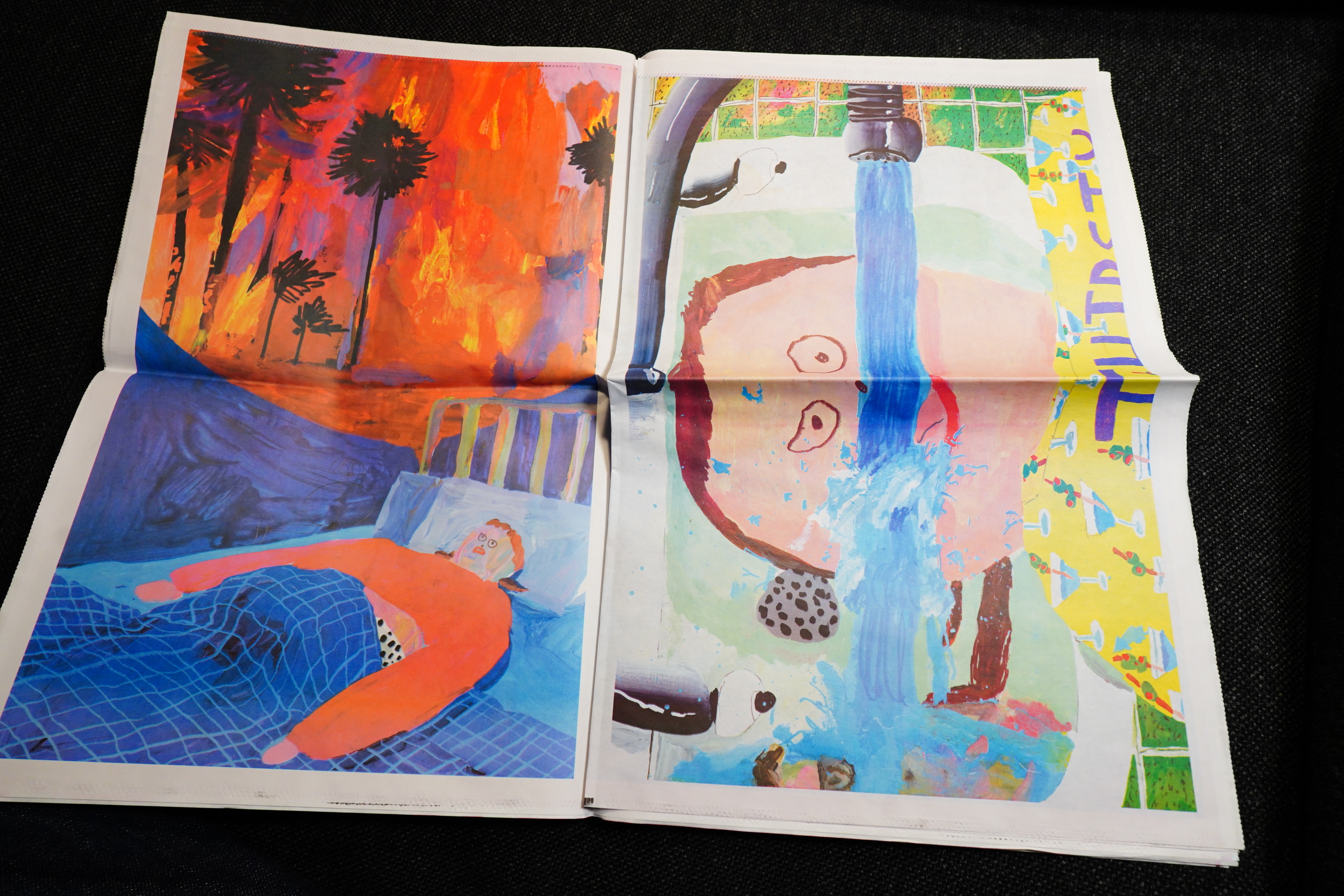
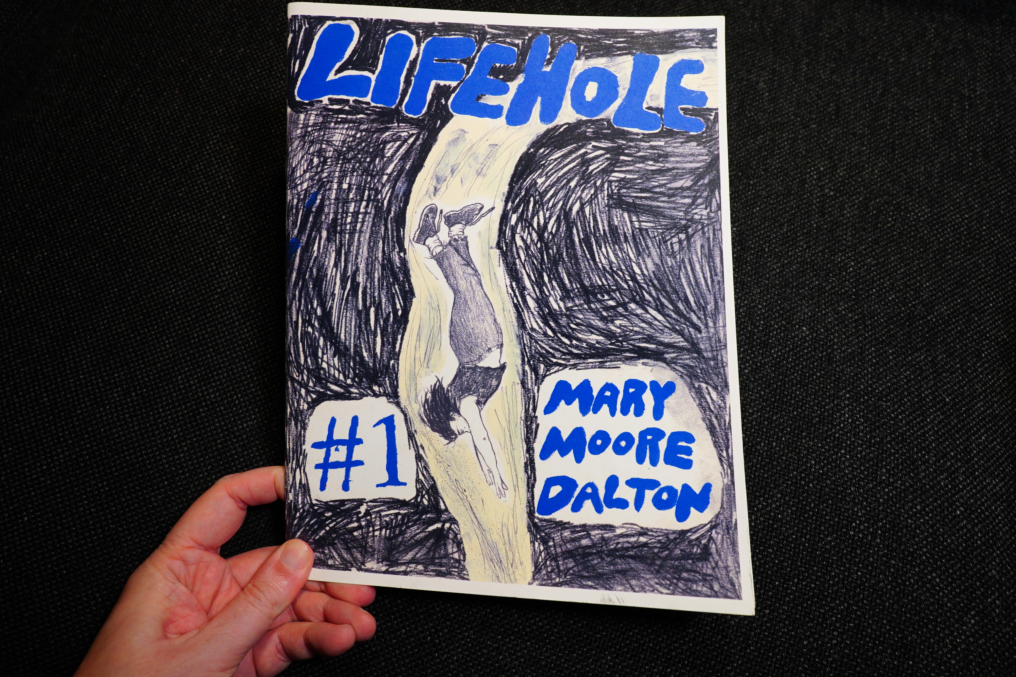
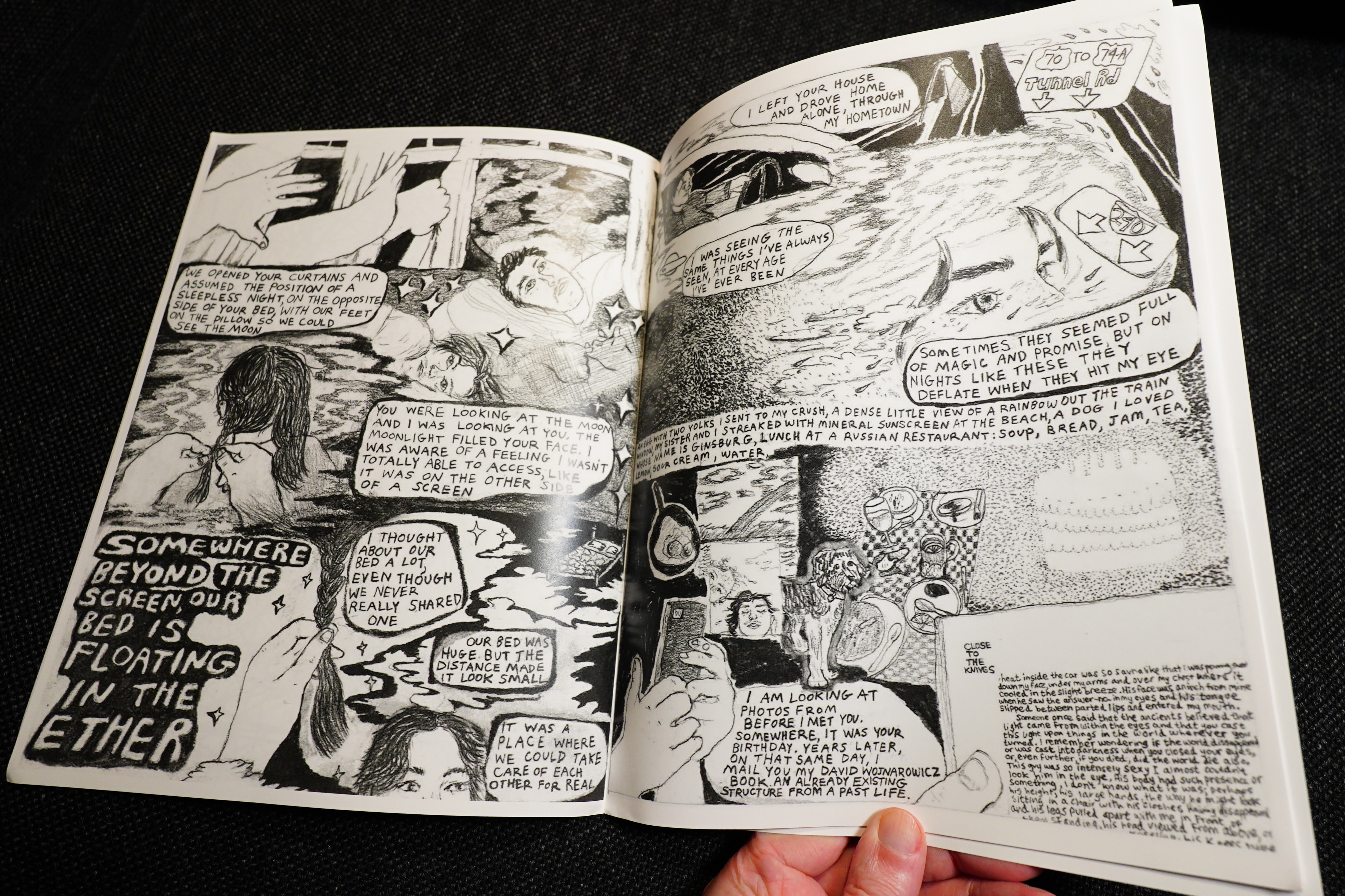
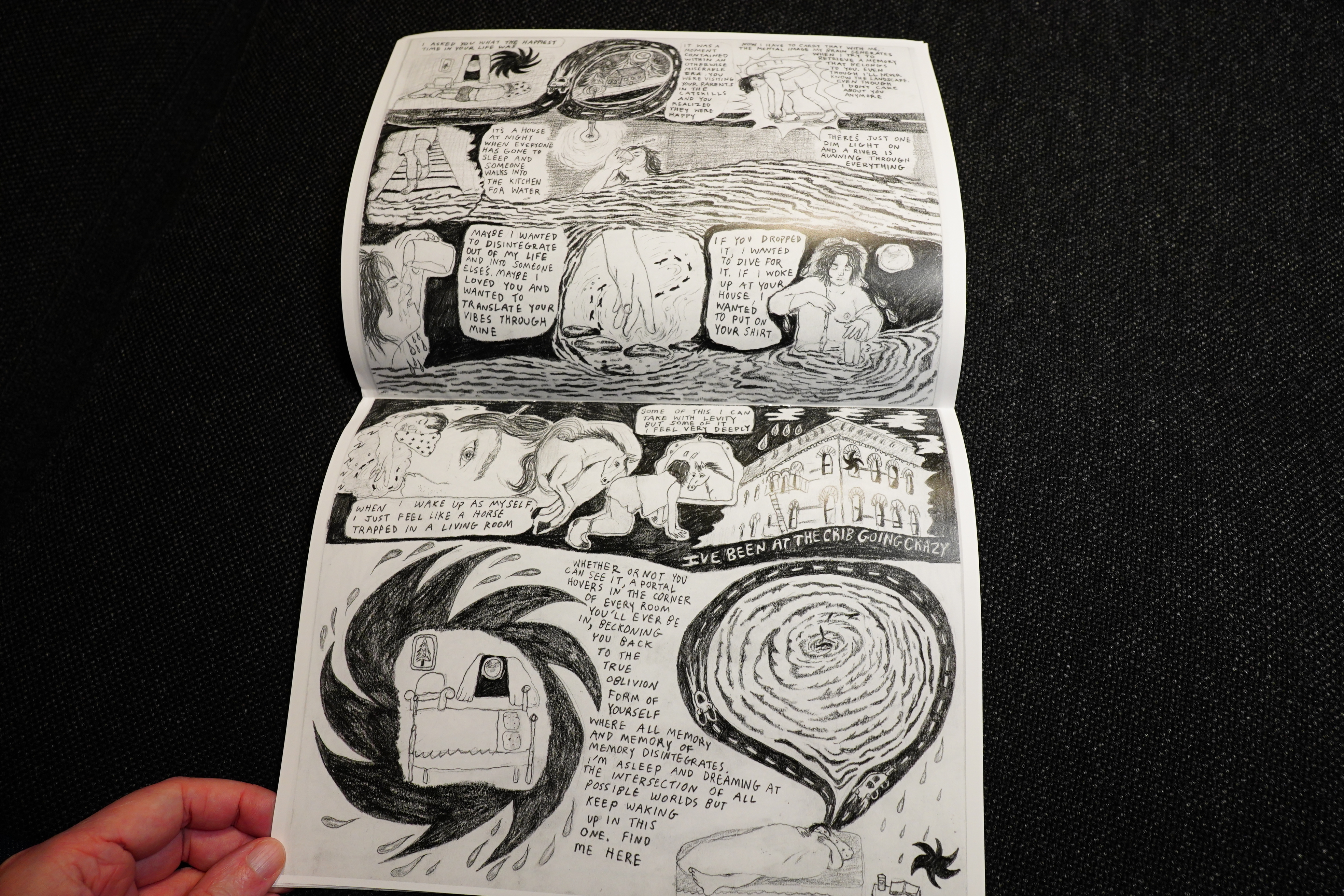
Lifehole by Mary Moore Dalton
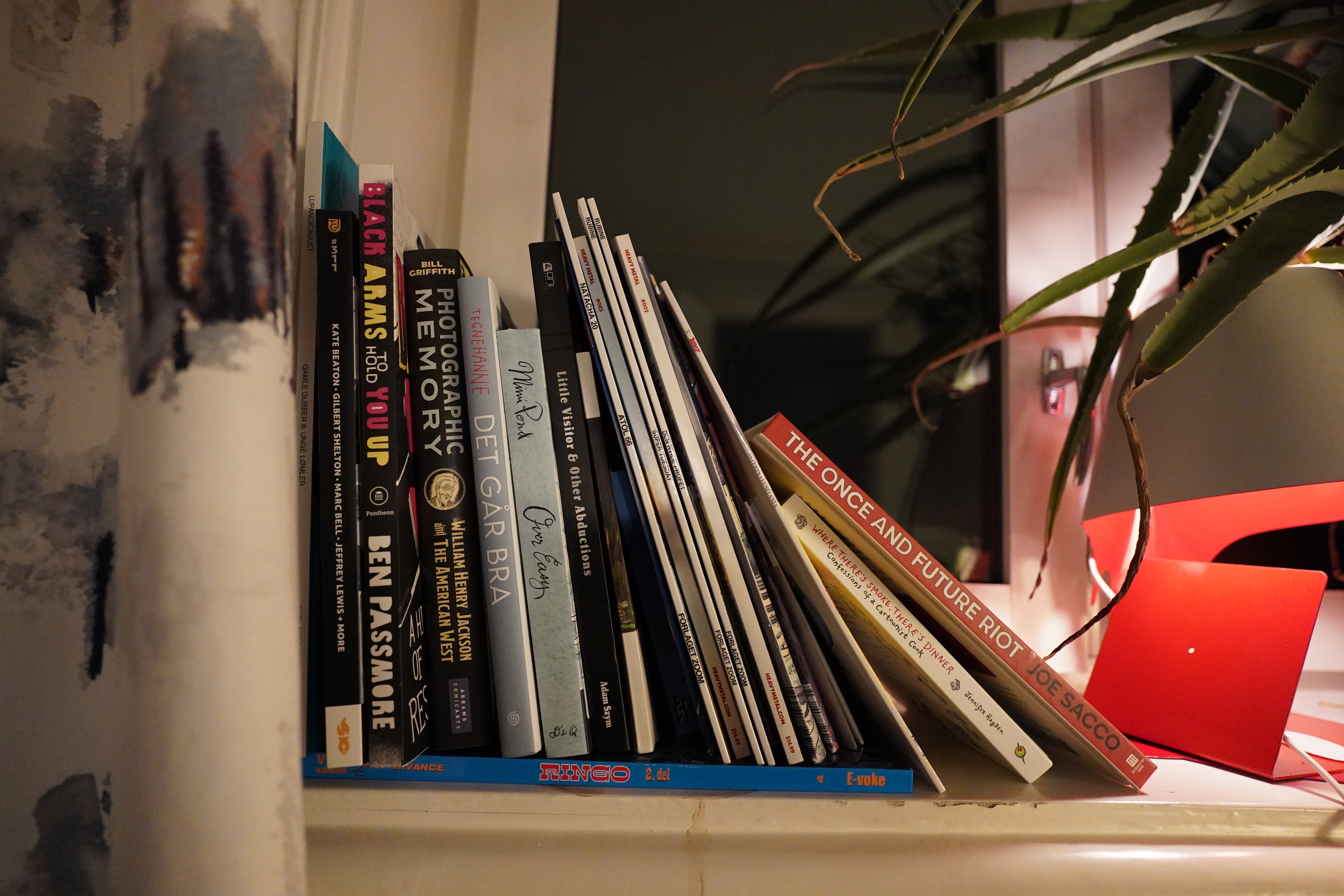
And that’s it for 2025, although I’ve got a stack of unread comics, so perhaps there’s more brilliance here:
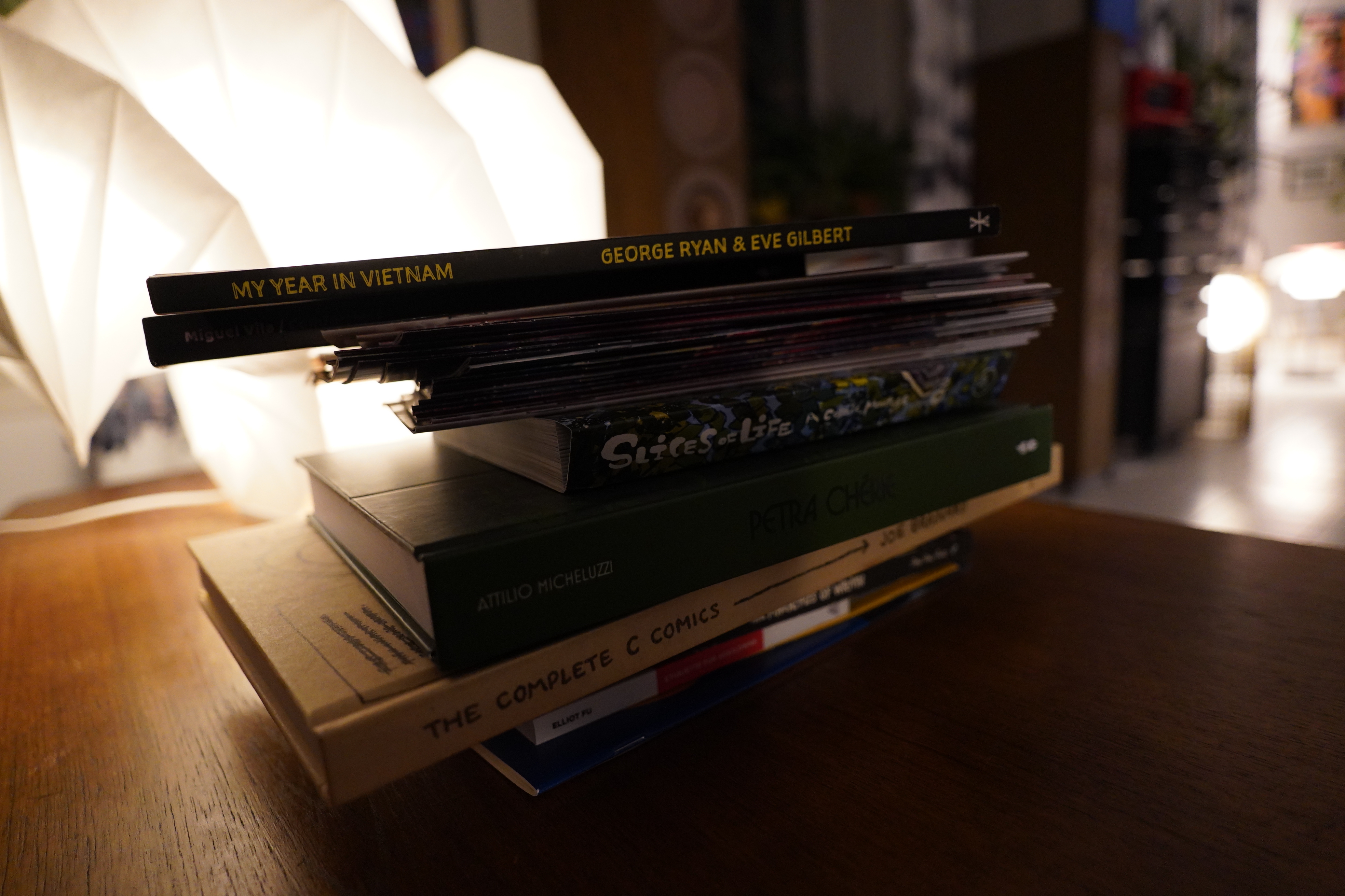
Or here:
But I also read some older, noteworthy comics. These are mostly from 2024, I guess, but a couple older ones:
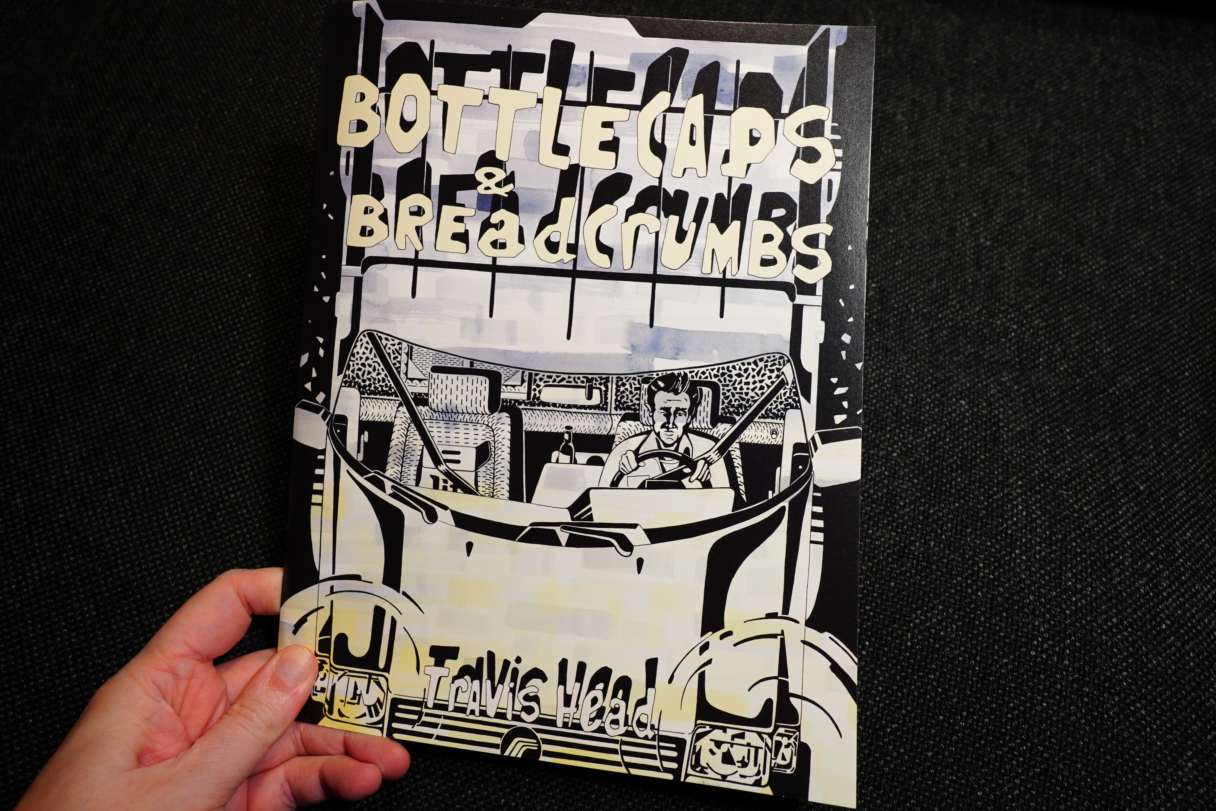
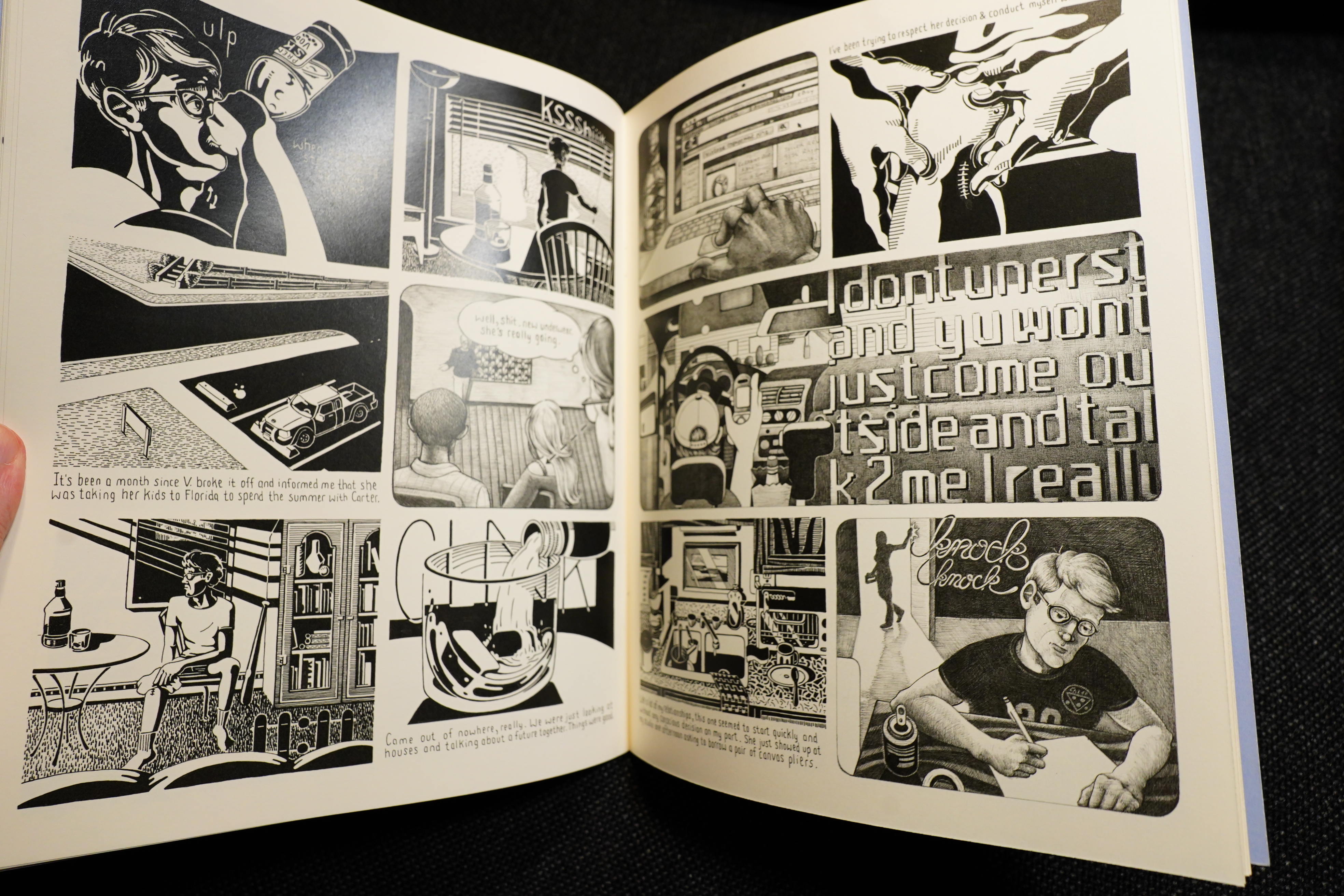
Bottlecaps & Breadcrumbs by Travis Head
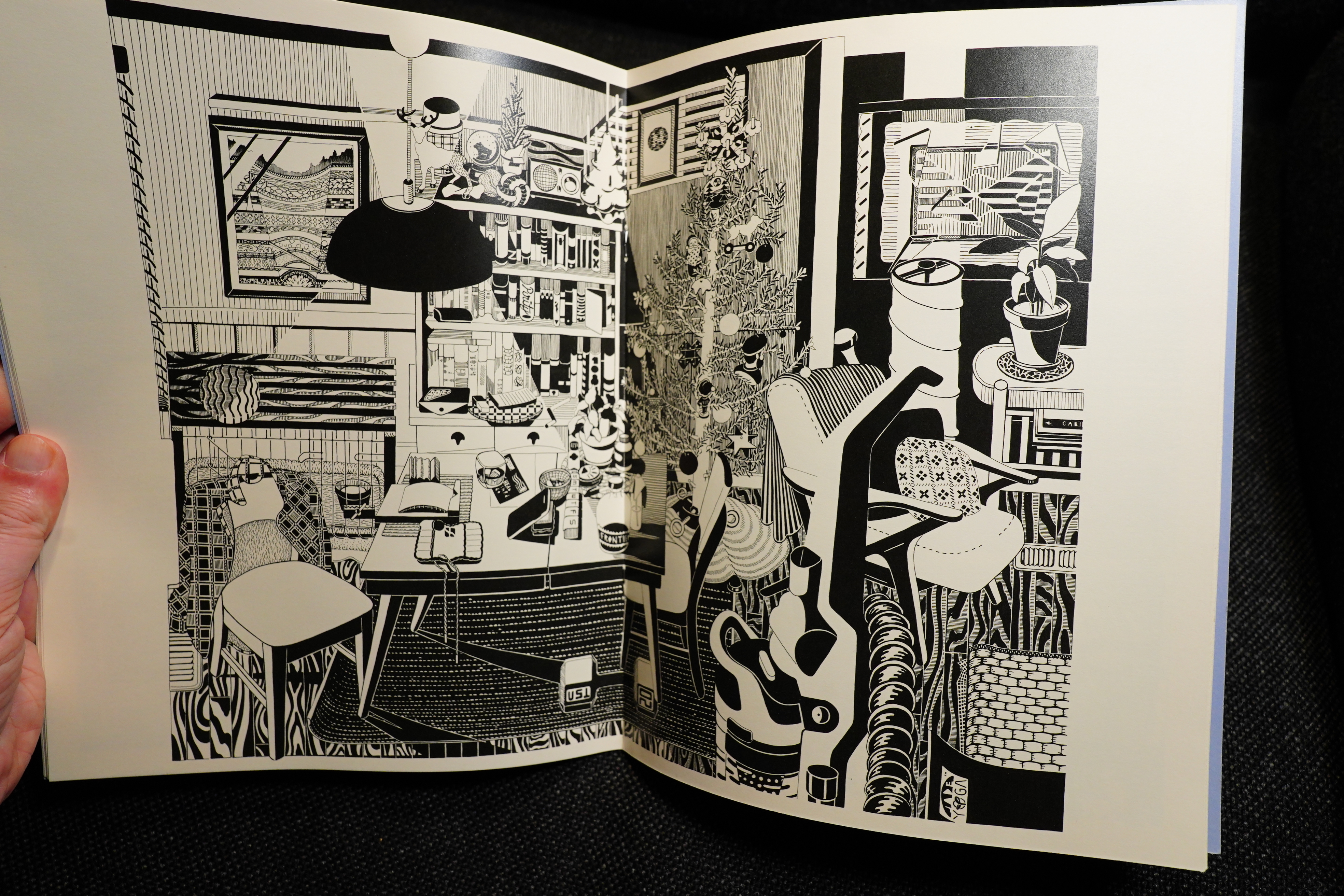
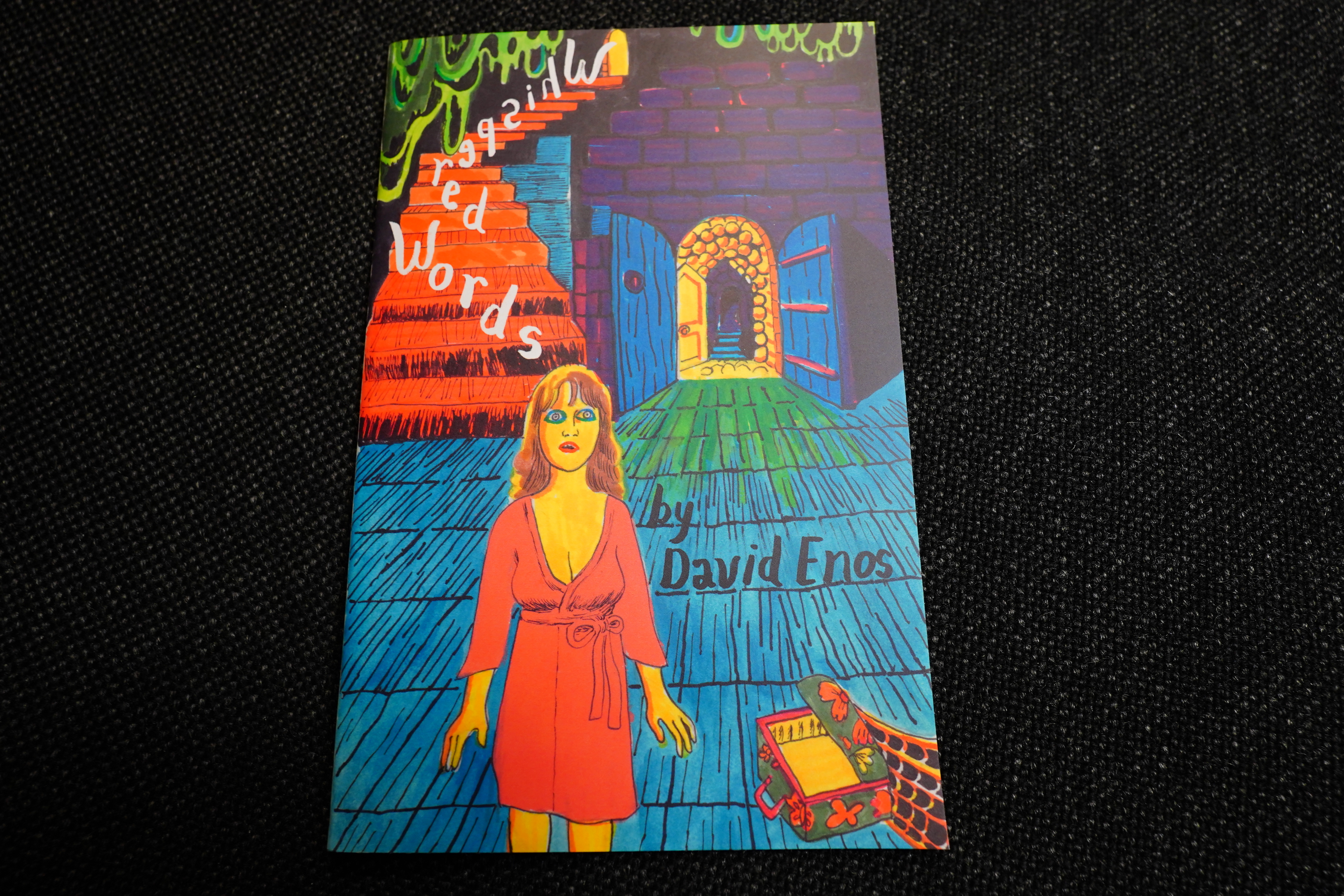
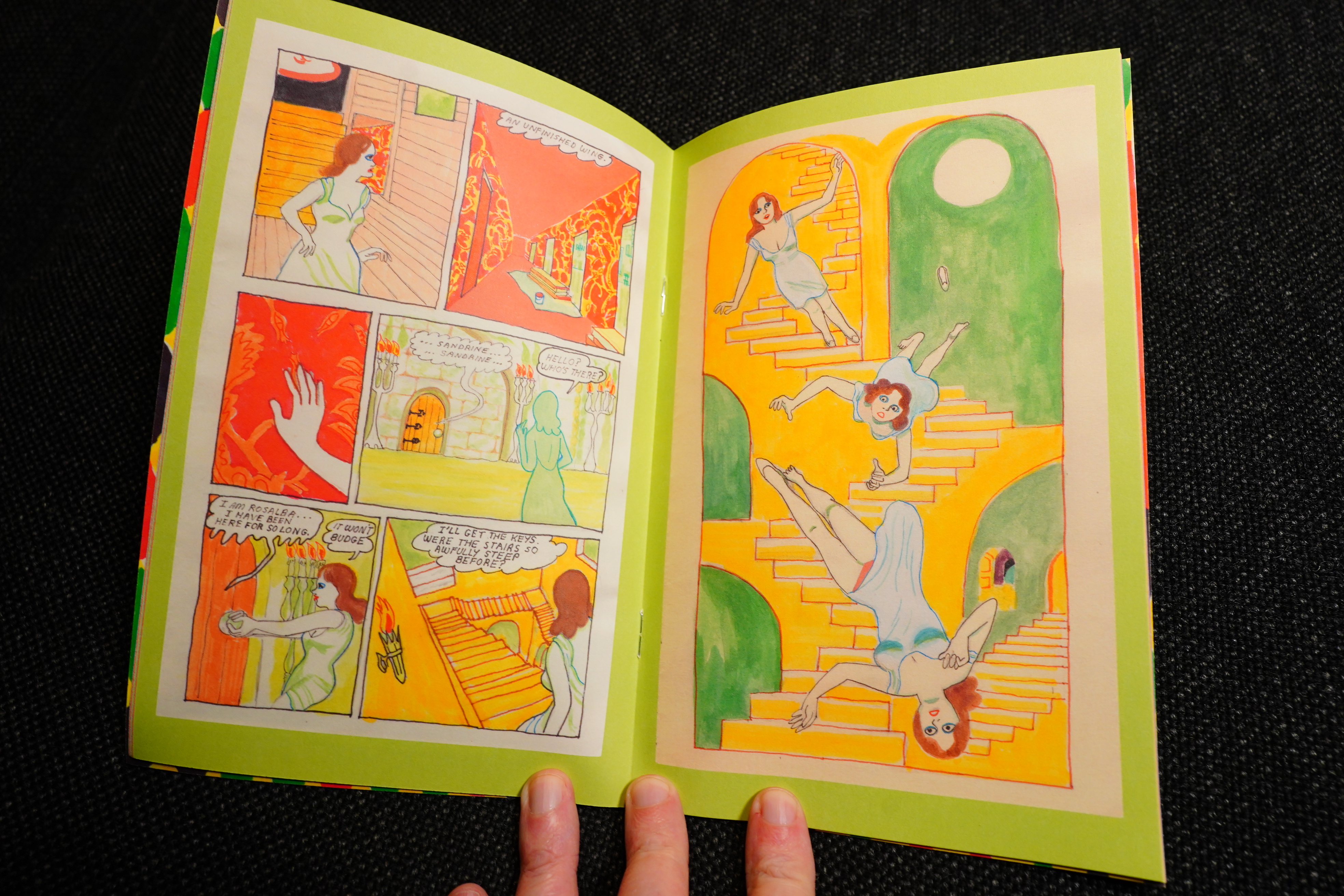
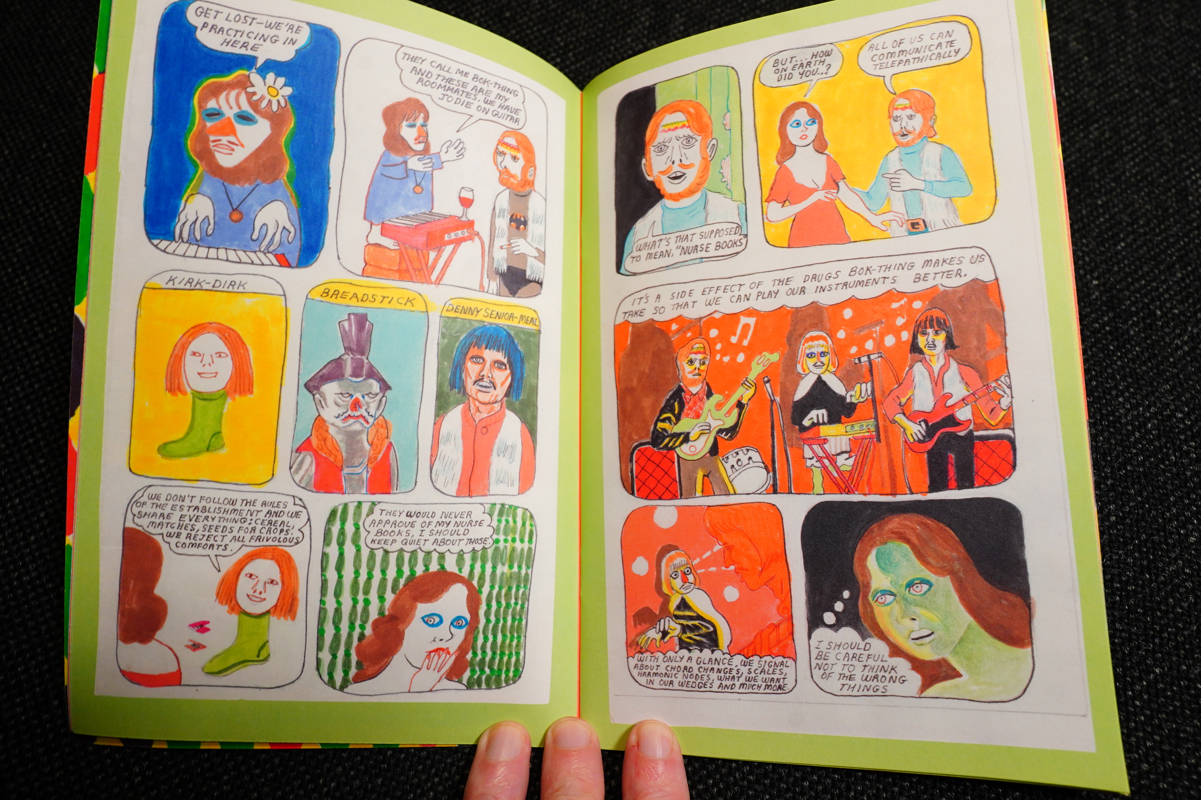
Whispered Words by David Enos
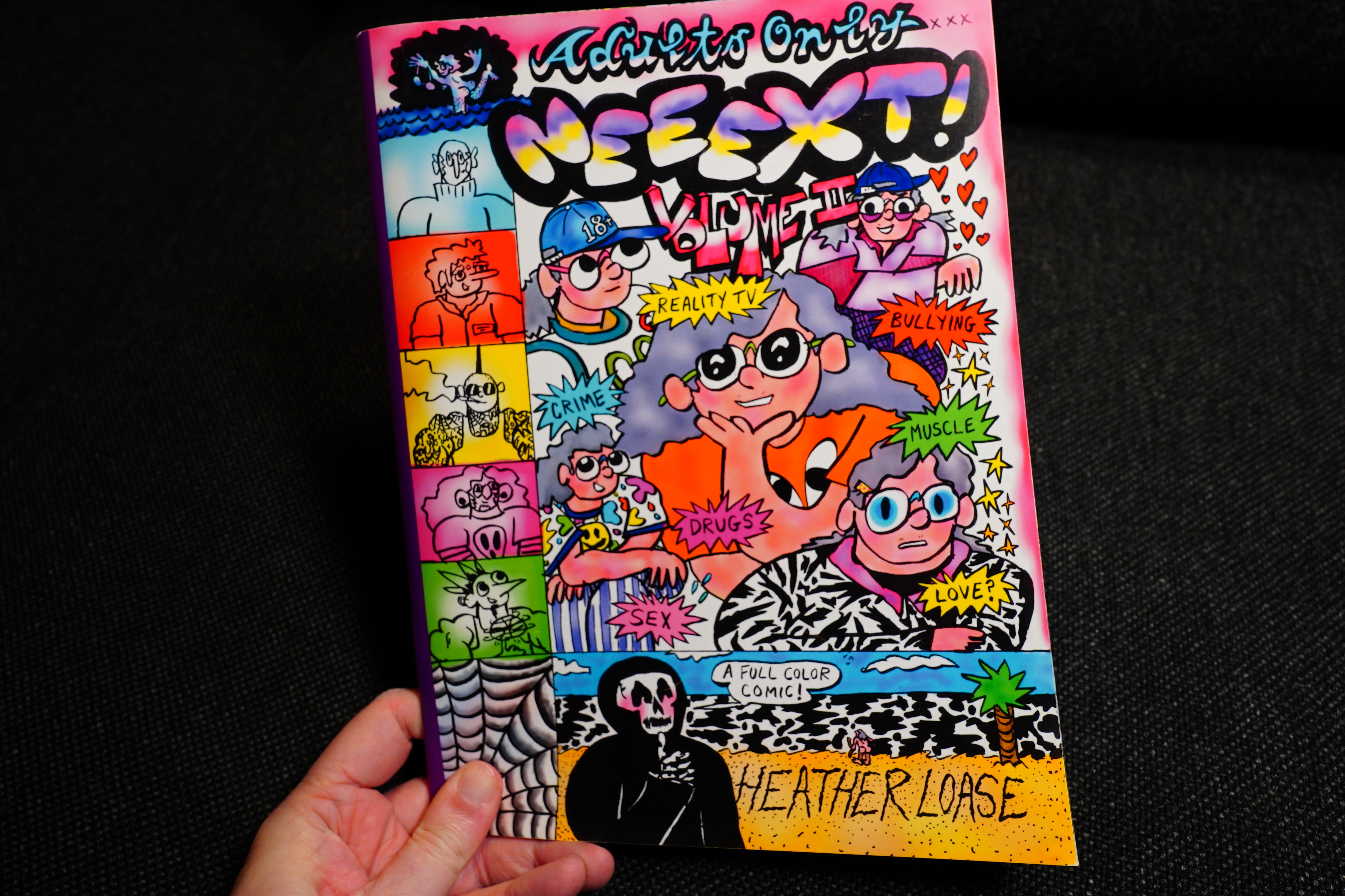
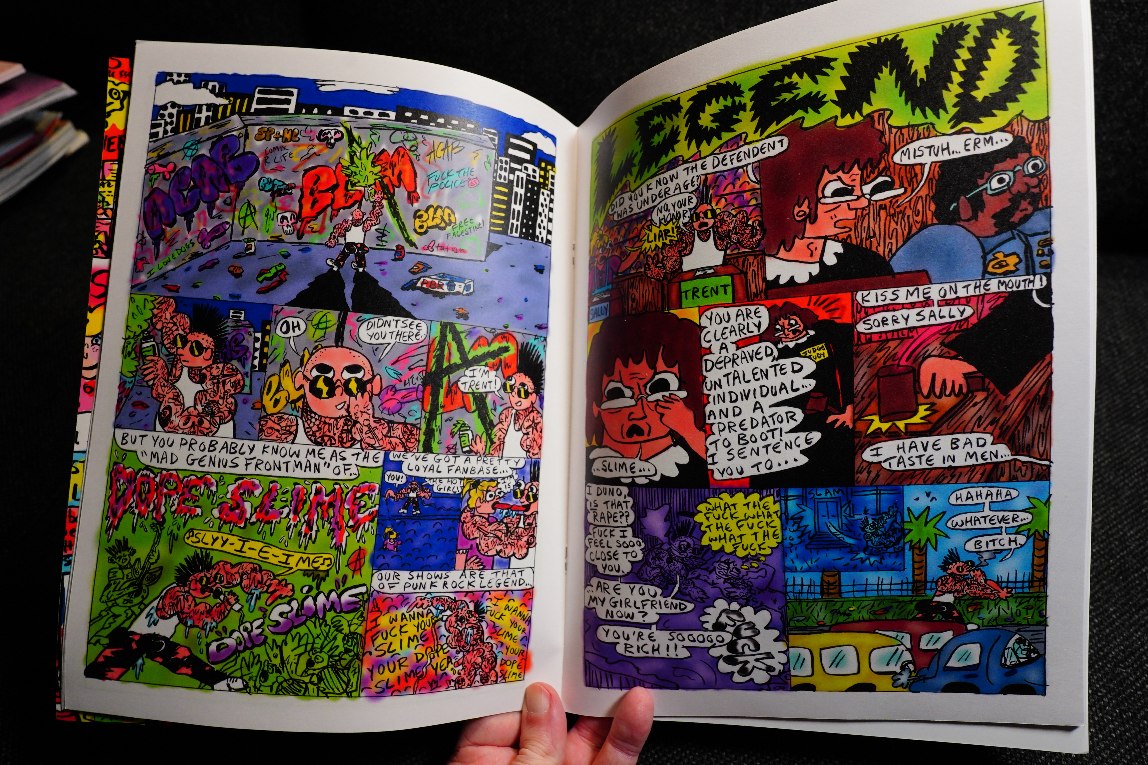
Neeext! Volume II by Heather Loase
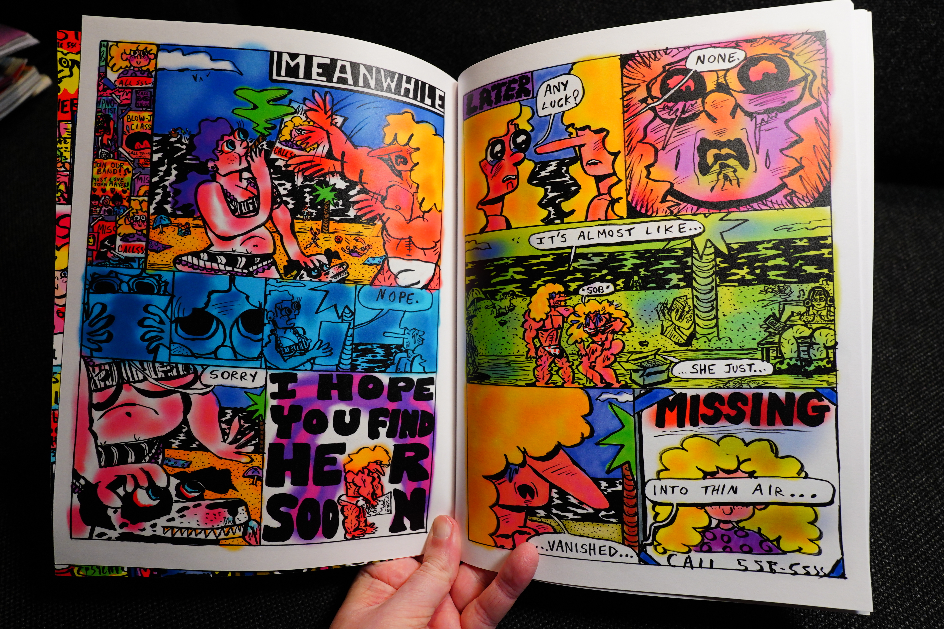
Brilliant.

Kaskelot by Sebastian Larsmo
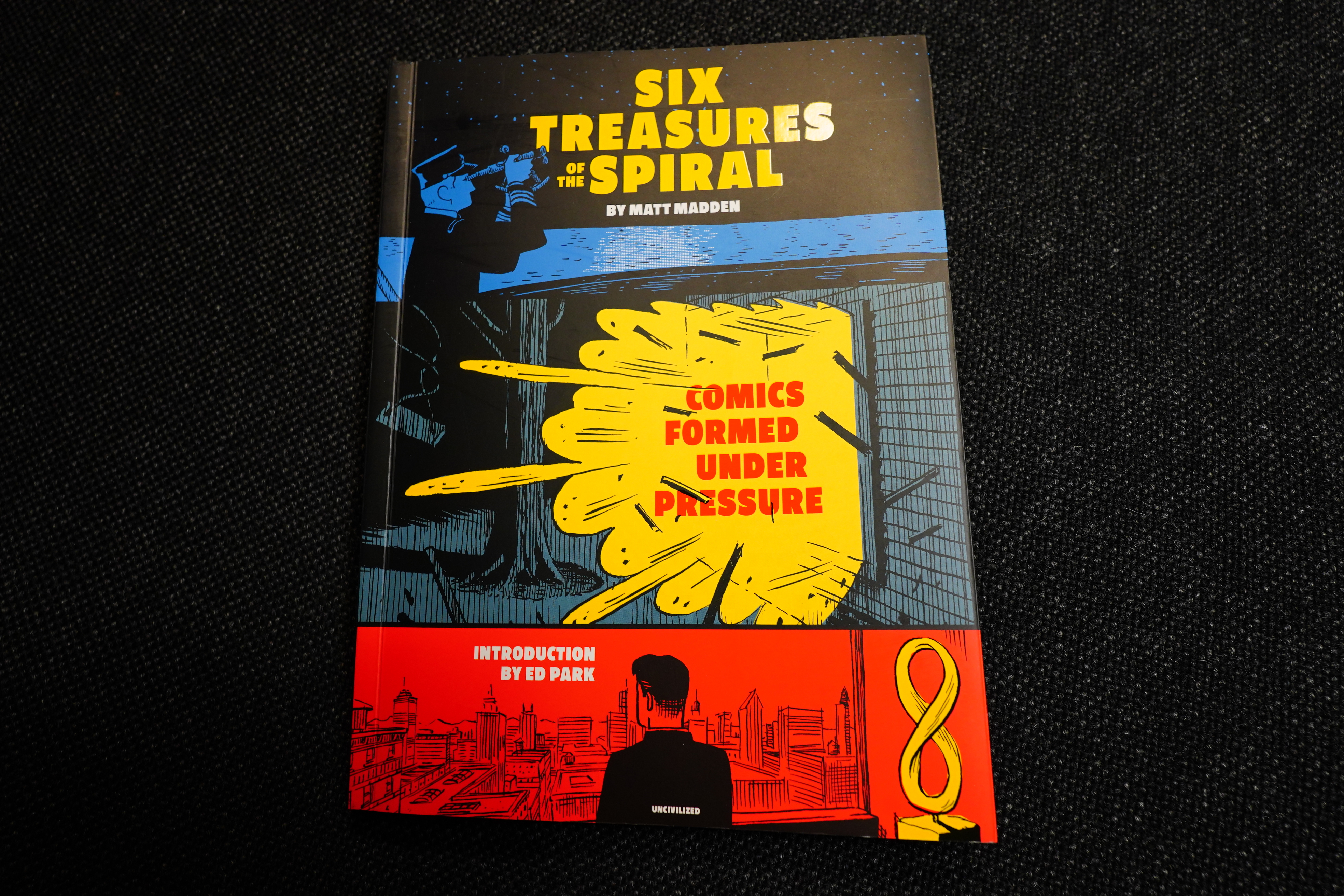
Six Treasures of the Spiral by Matt Madden (Uncivilized Books)
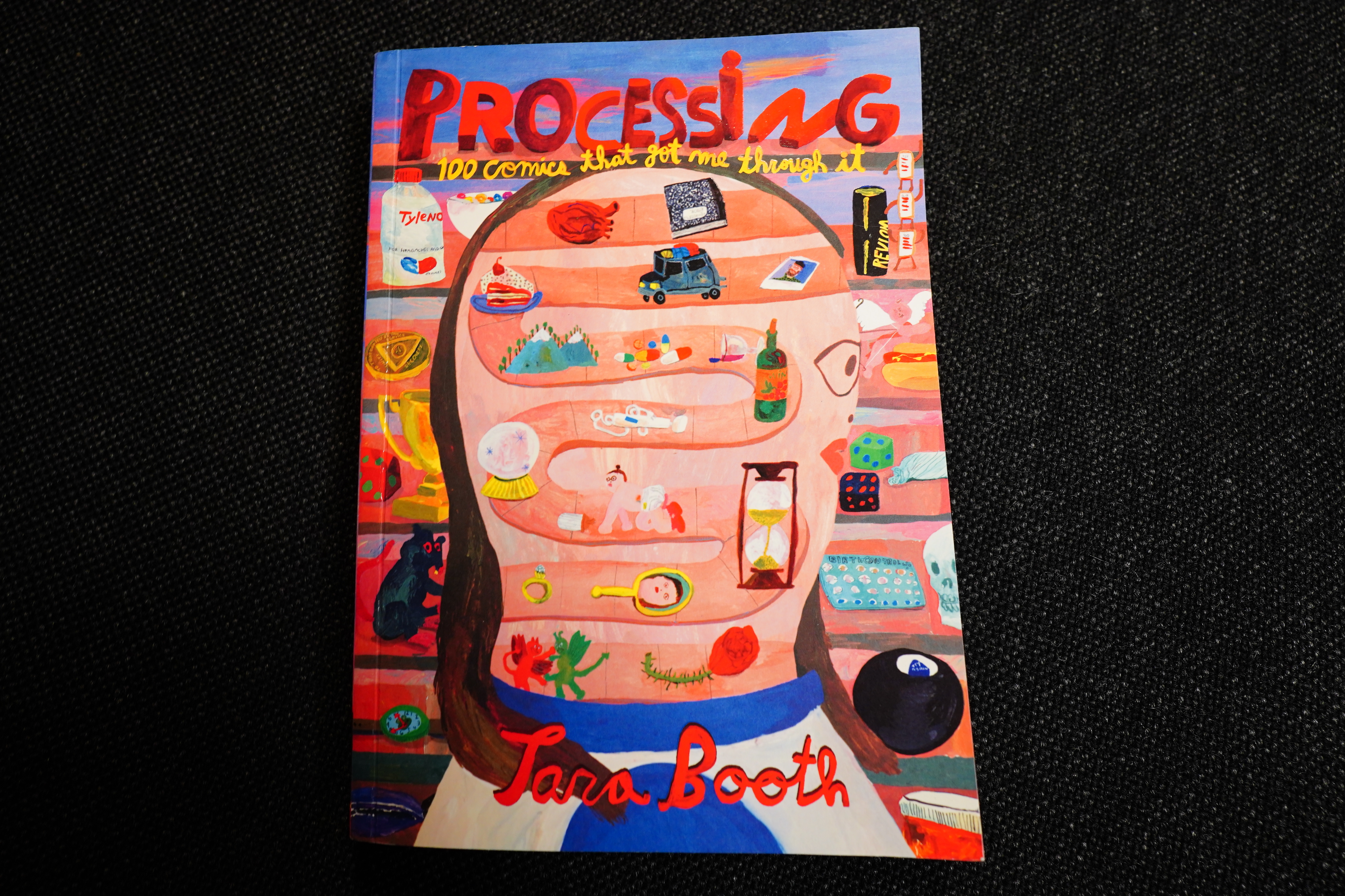
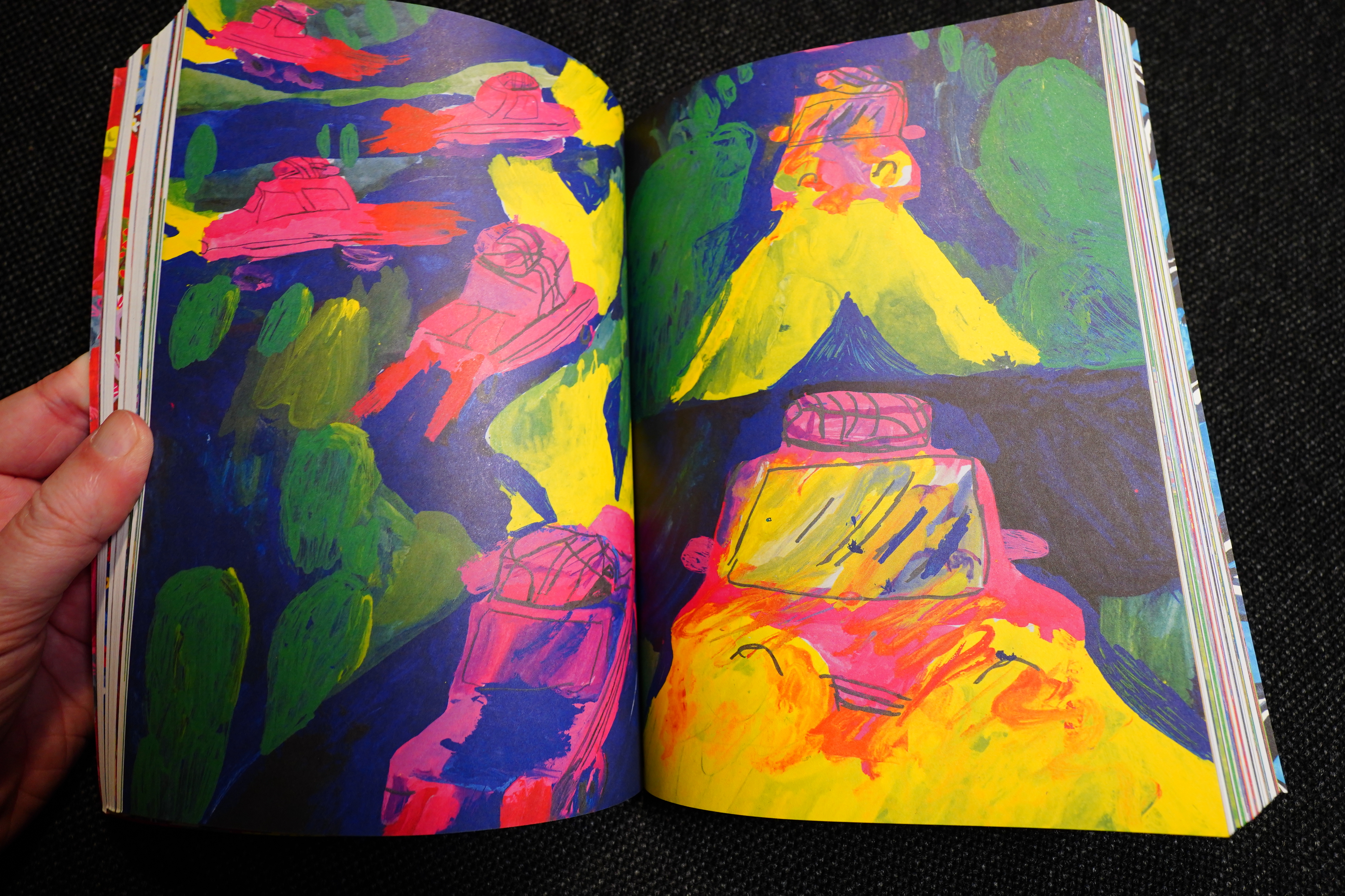
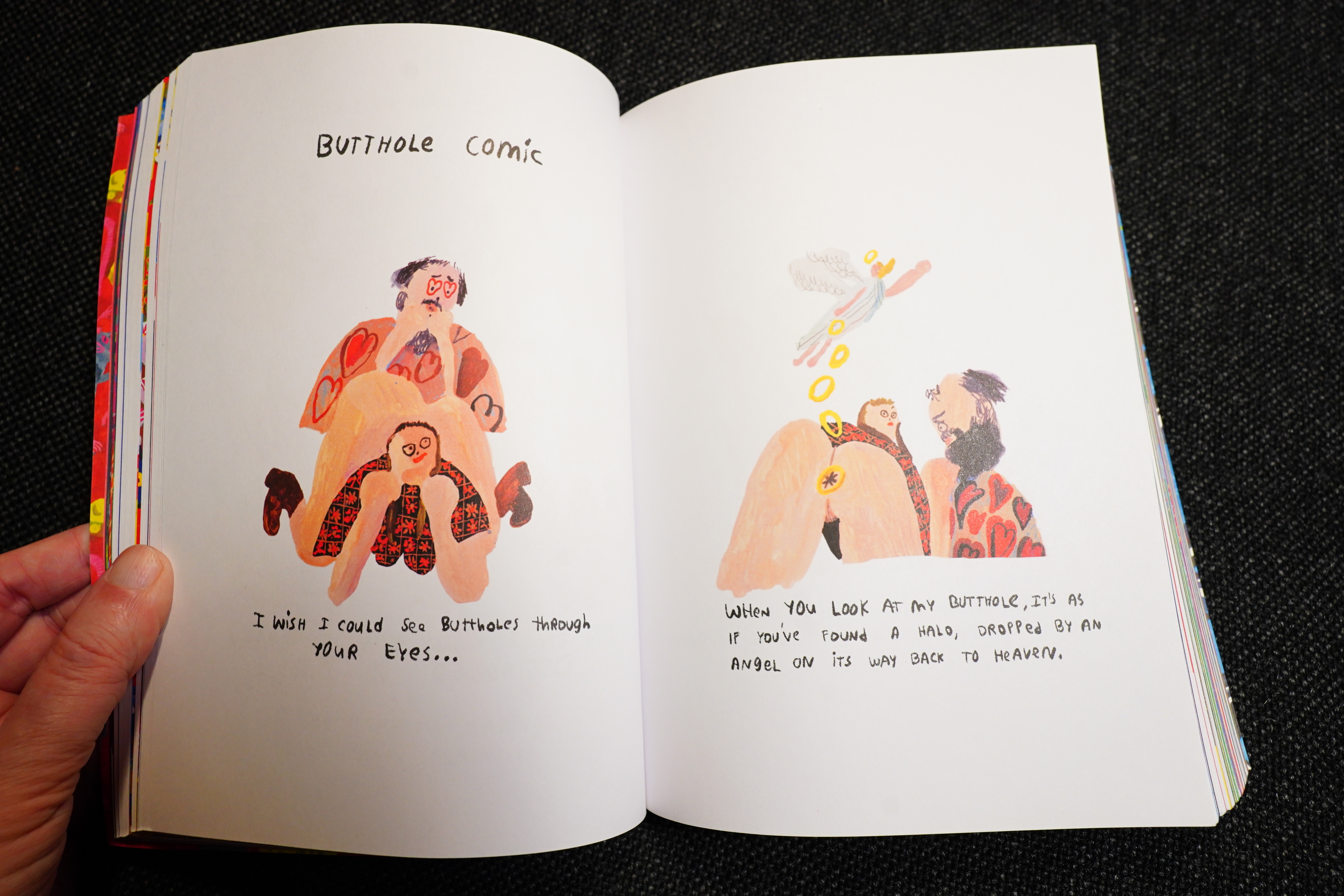
Processing by Tara Booth (Drawn & Quarterly)

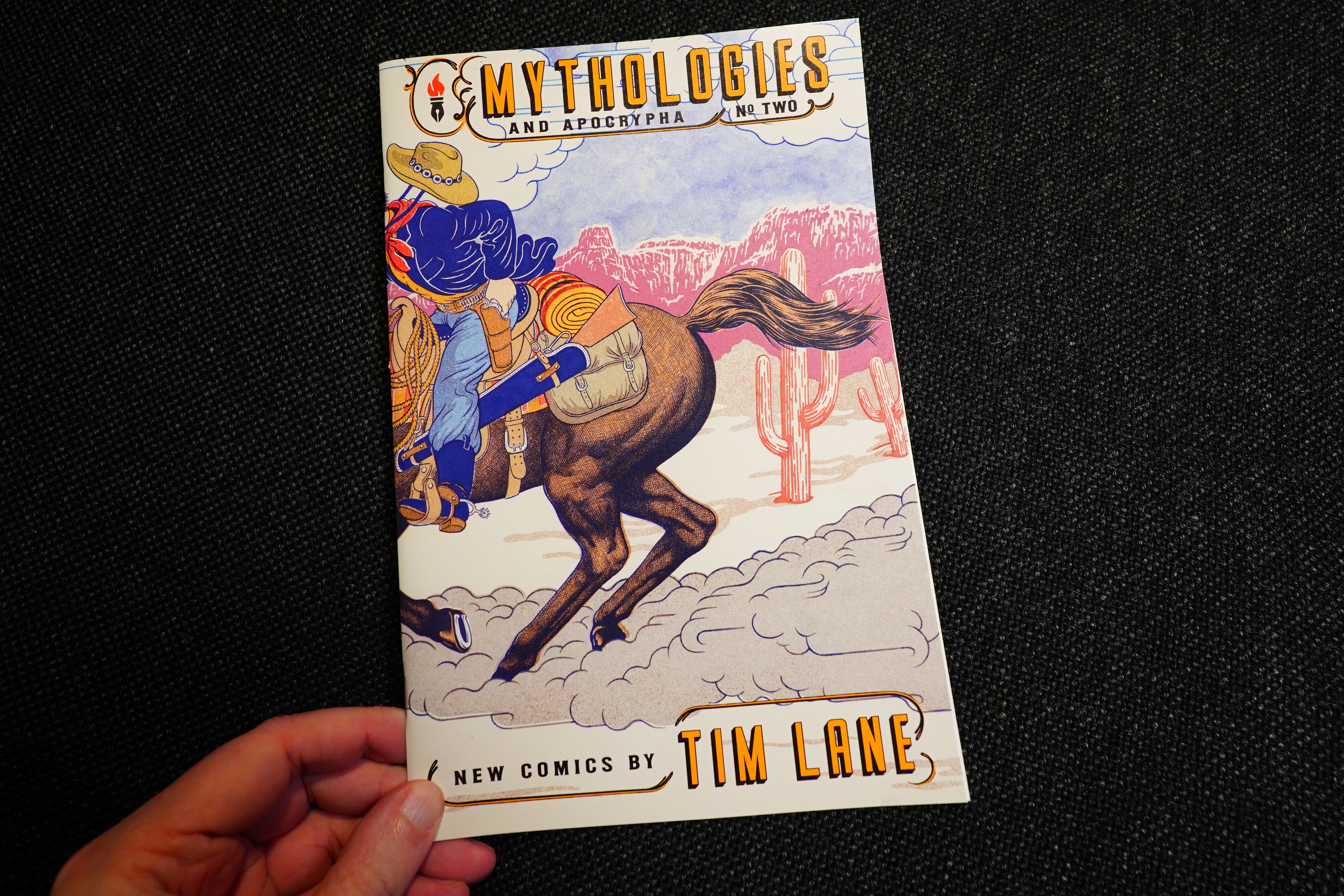
Mythologies and Apocrypha #2 by Tim Lane (Fantagraphics)
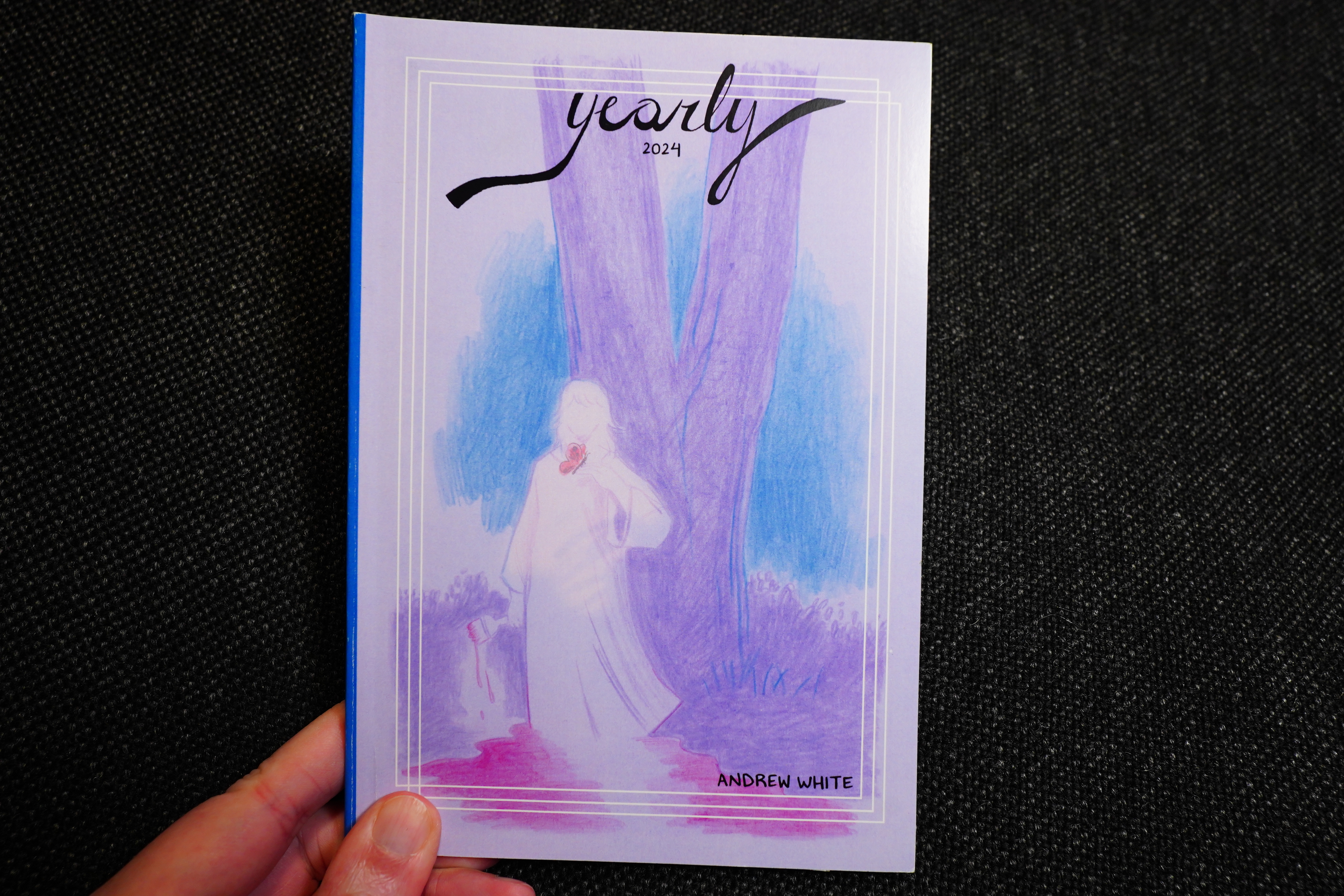
Yearly 2024 by Andrew White
I really enjoy these yearly anthologies from Andrew White… and I see now there’s a 2025 and a 2026 out?! *sounds of me ordering them*
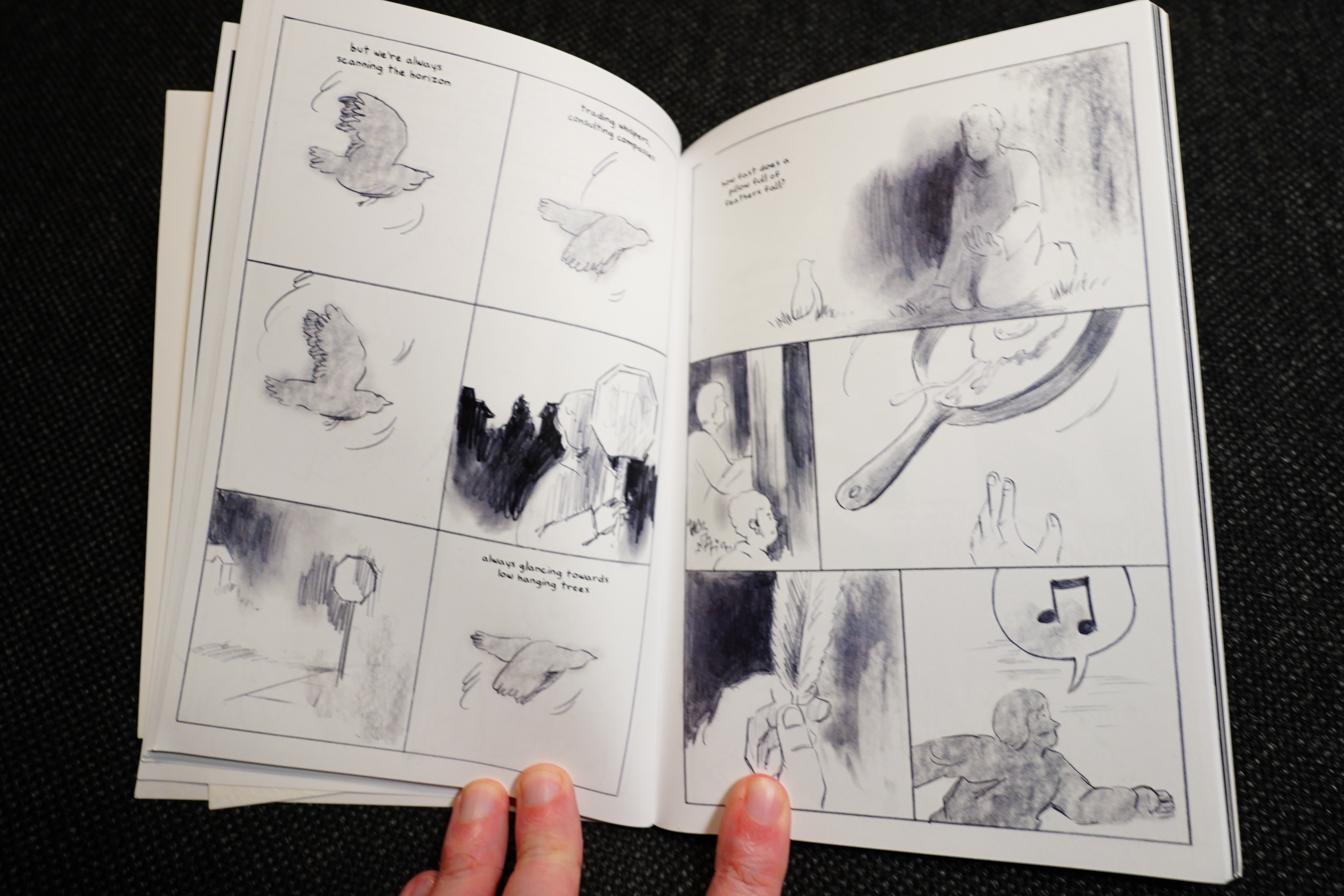
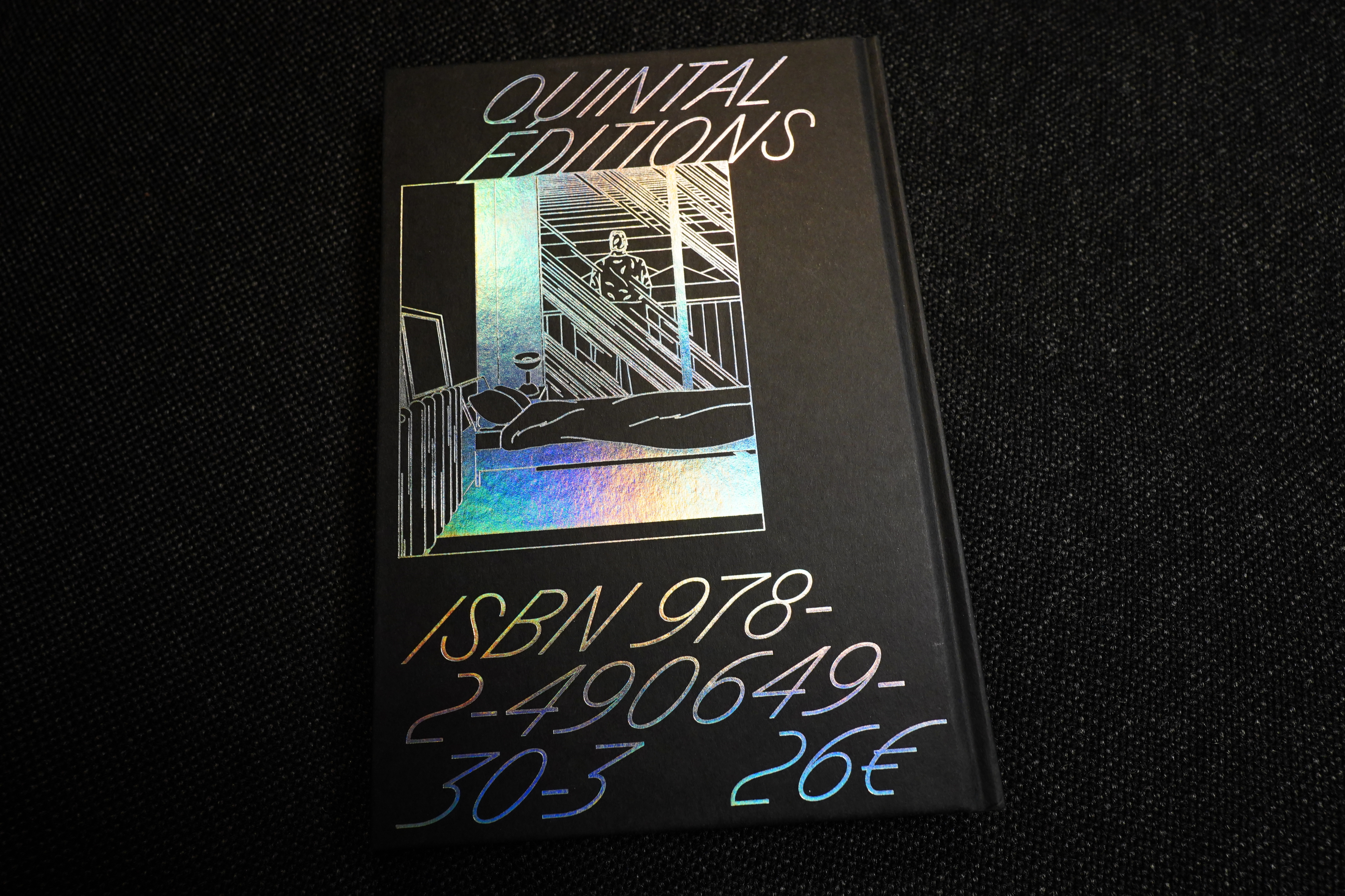
Les Trembles by Thomas Merceron (Quintal éditions)
This is a French book, but it’s wordless, so you can read it.
And you totally, absolutely should.
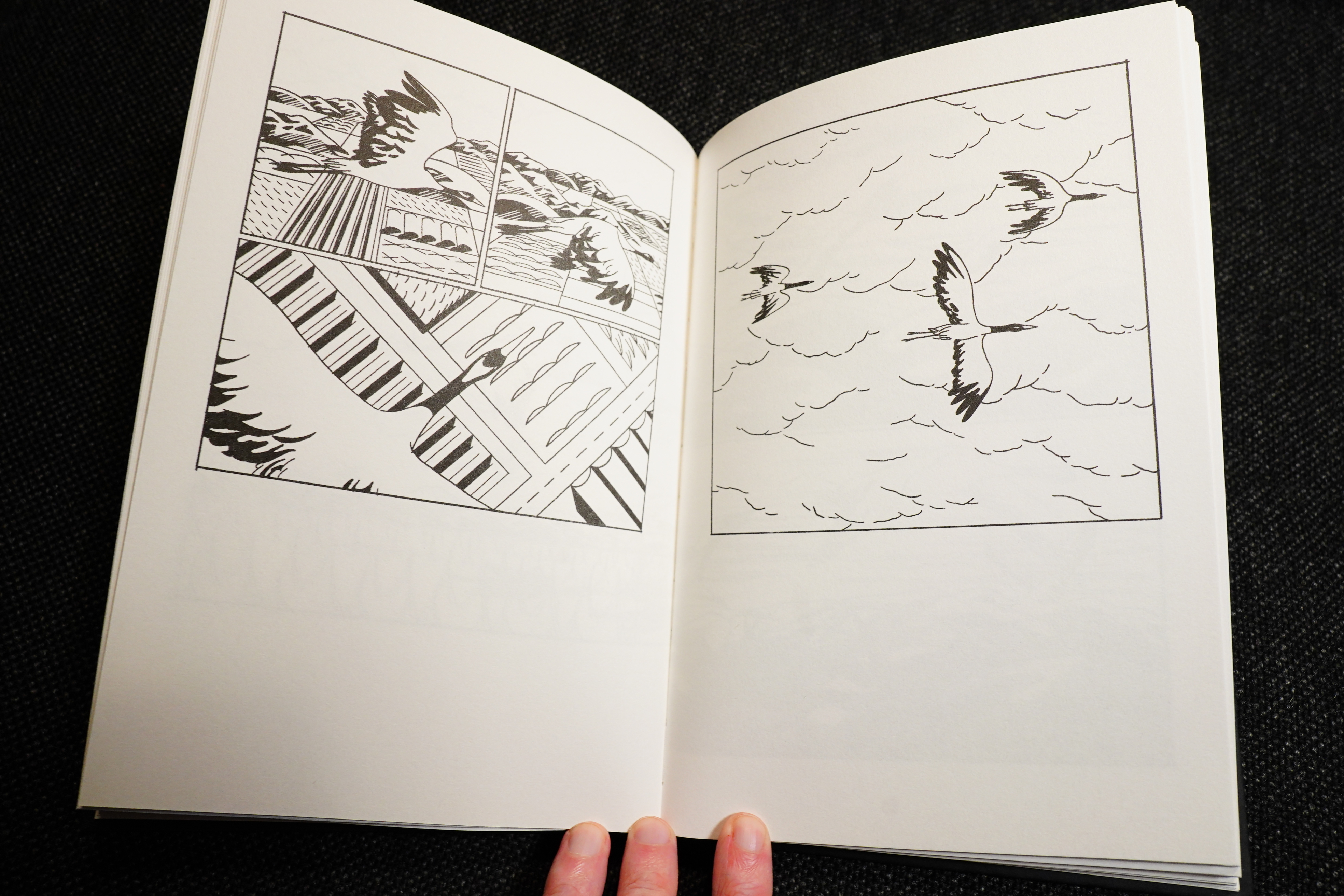
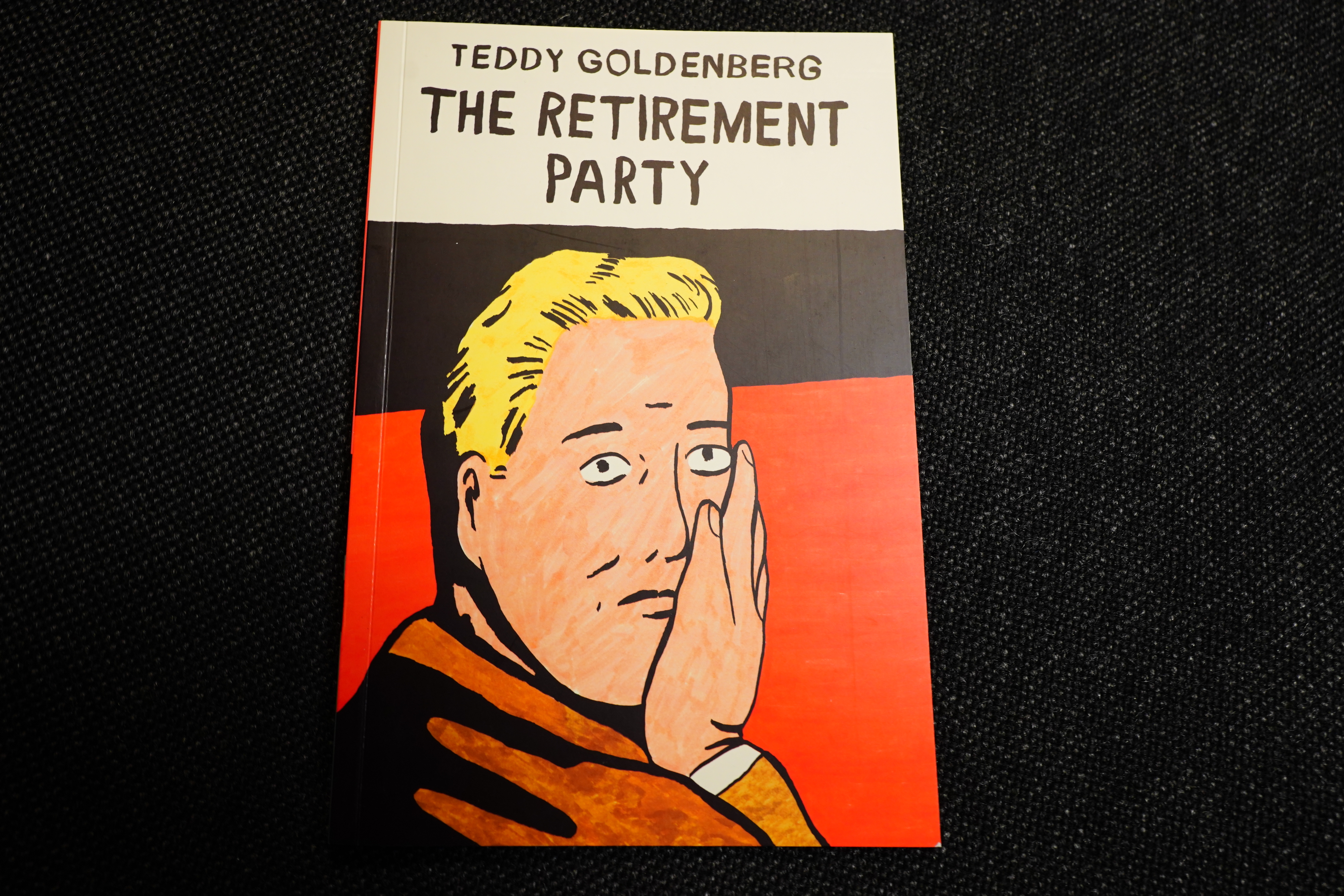
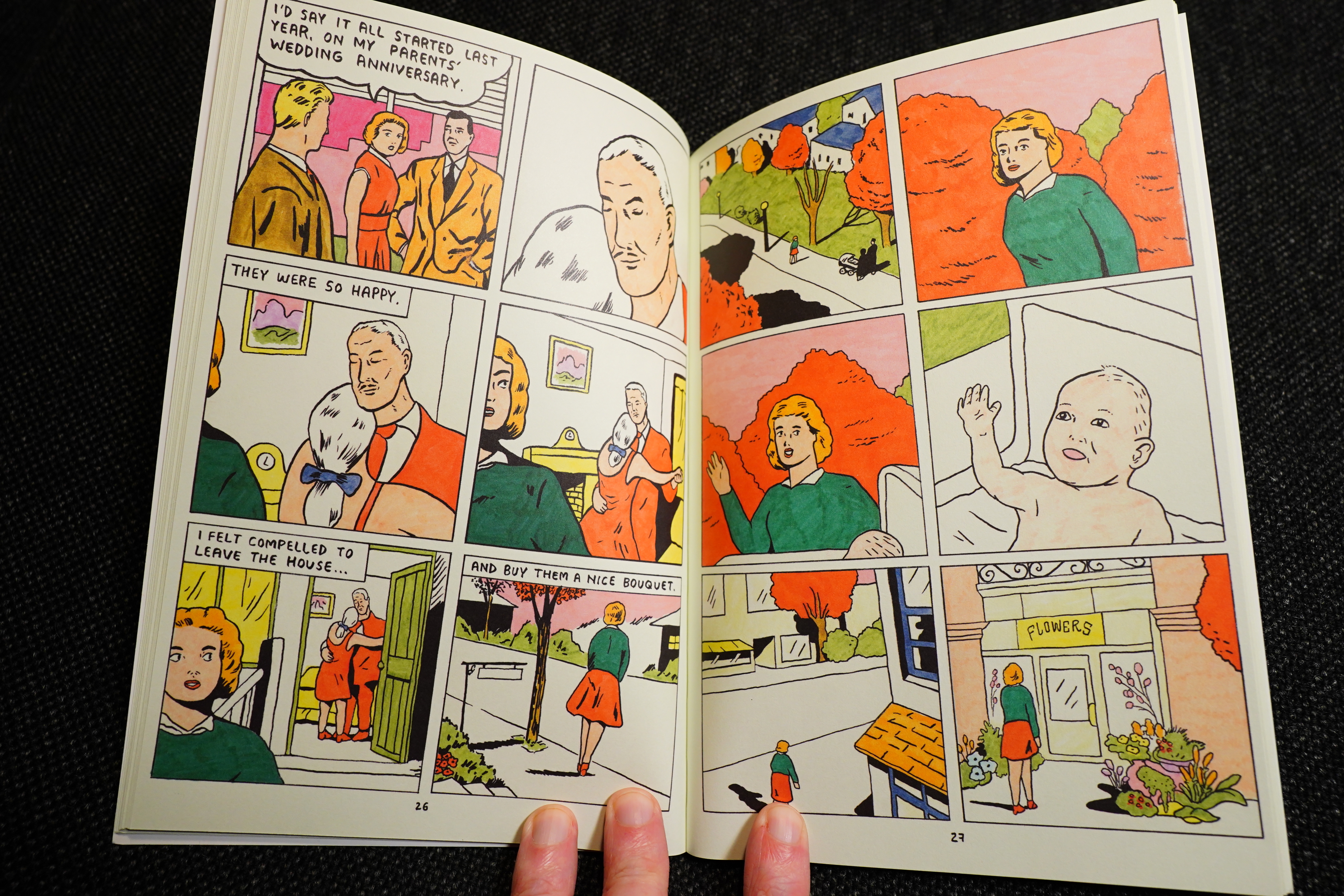
The Retirement Party by Teddy Goldenberg (Floating World Comics)
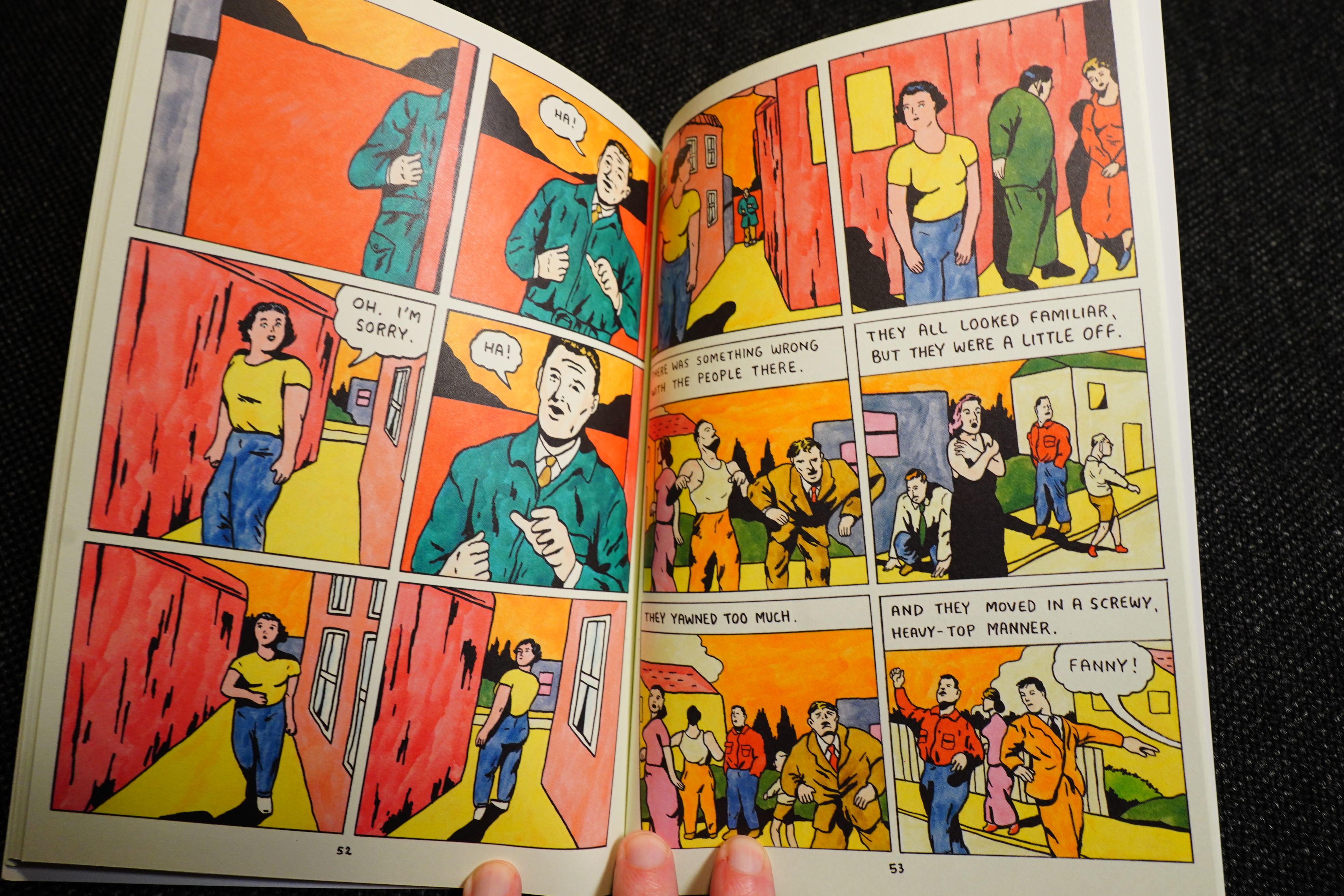
This one is amazing.
And… that’s it. Another year dawns.