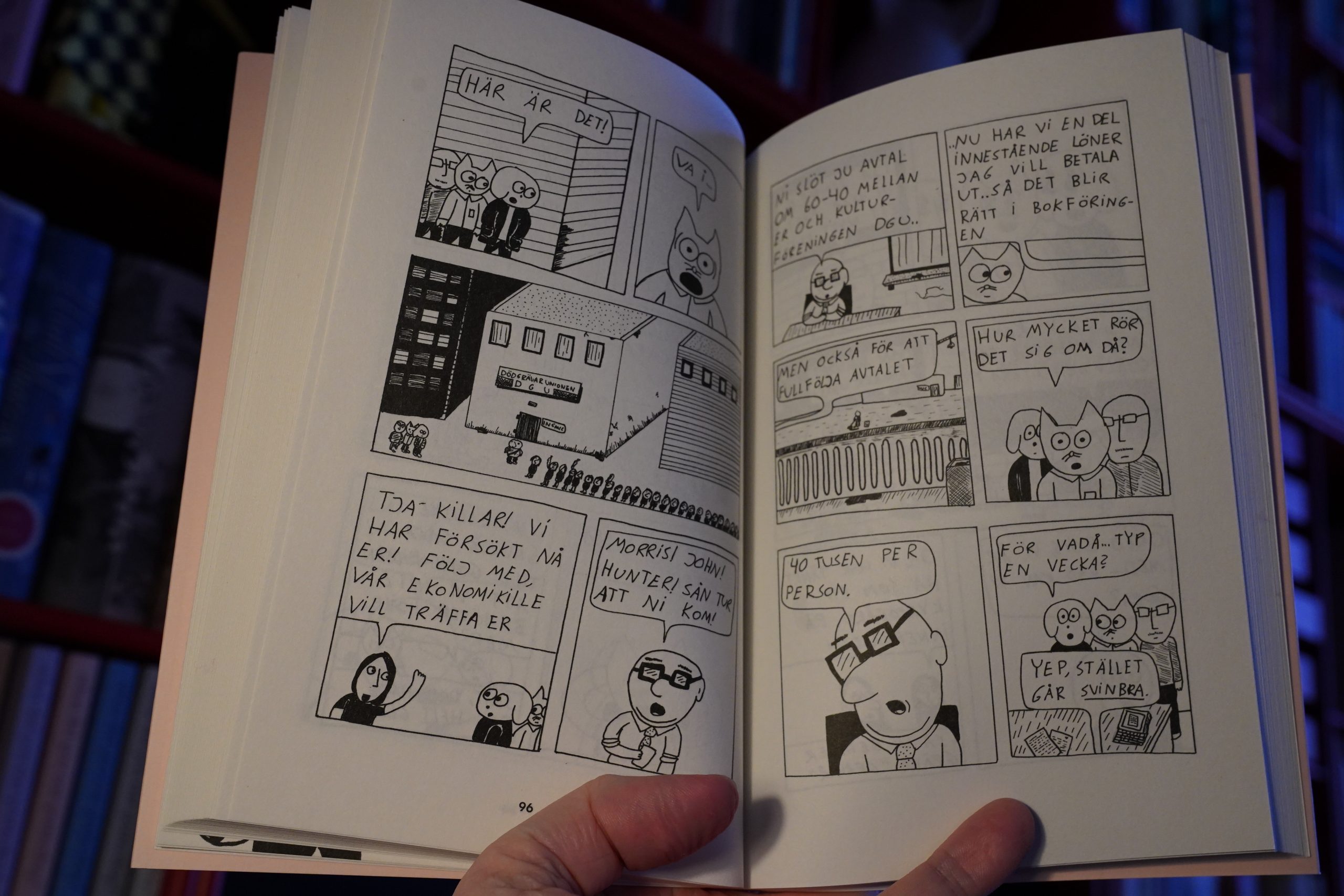
I think this is one of those days where I should just read comics all day.
Let’s get going.
| A. G. Cook: 7G (1): Drums |  |
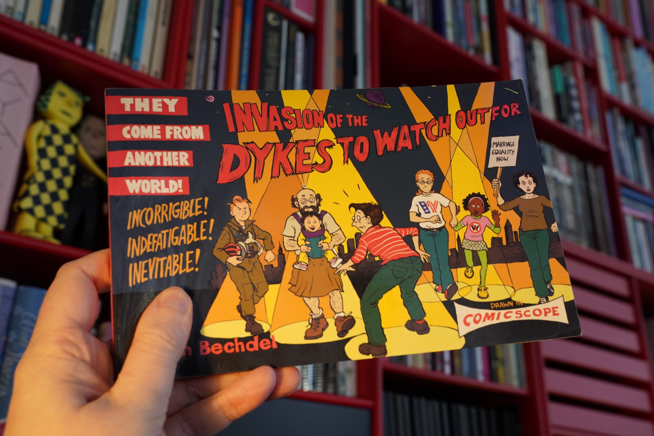
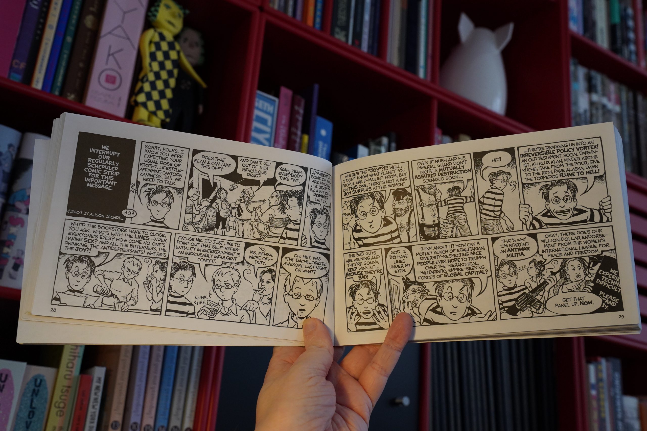
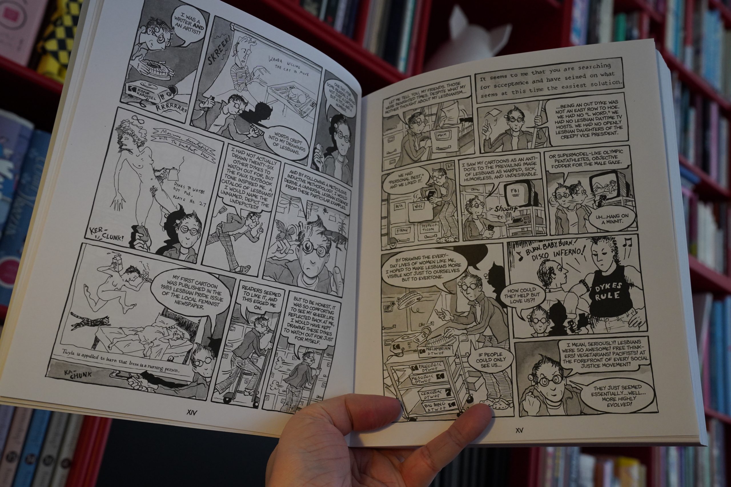
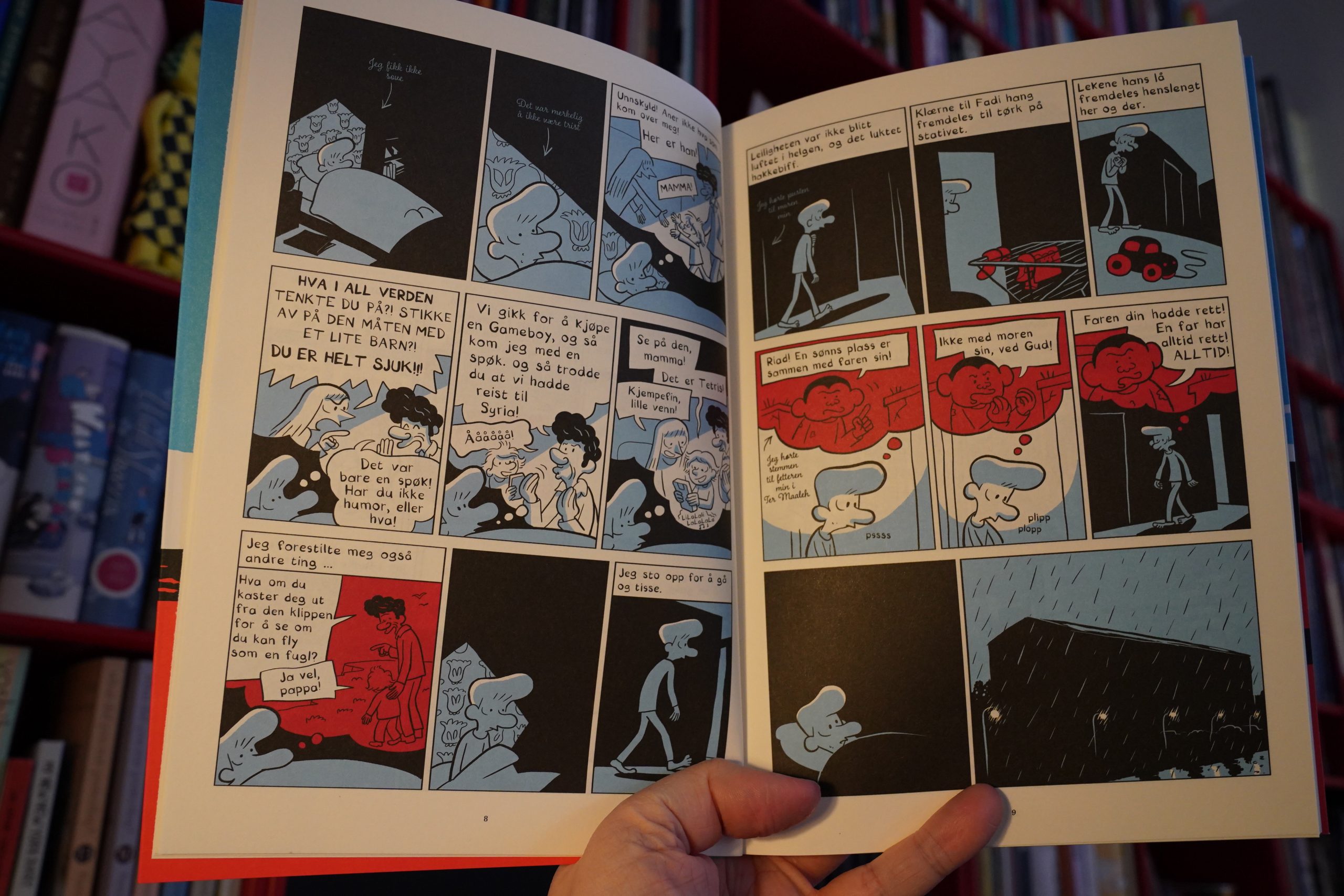
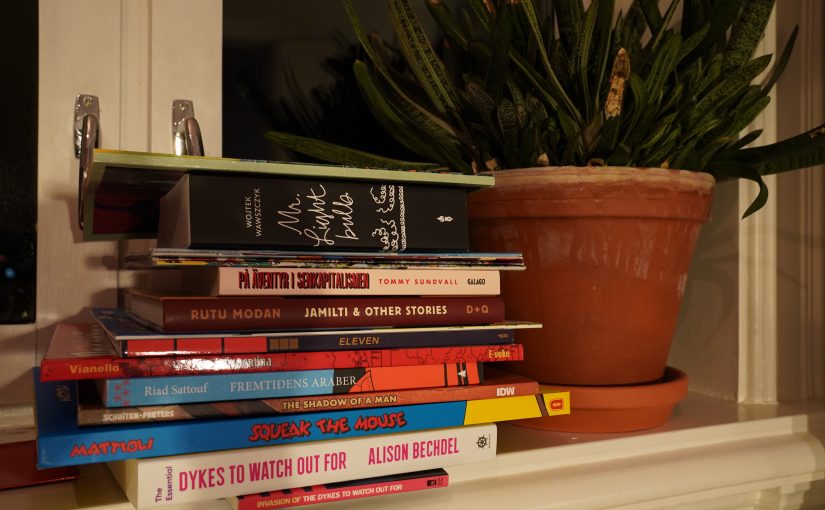
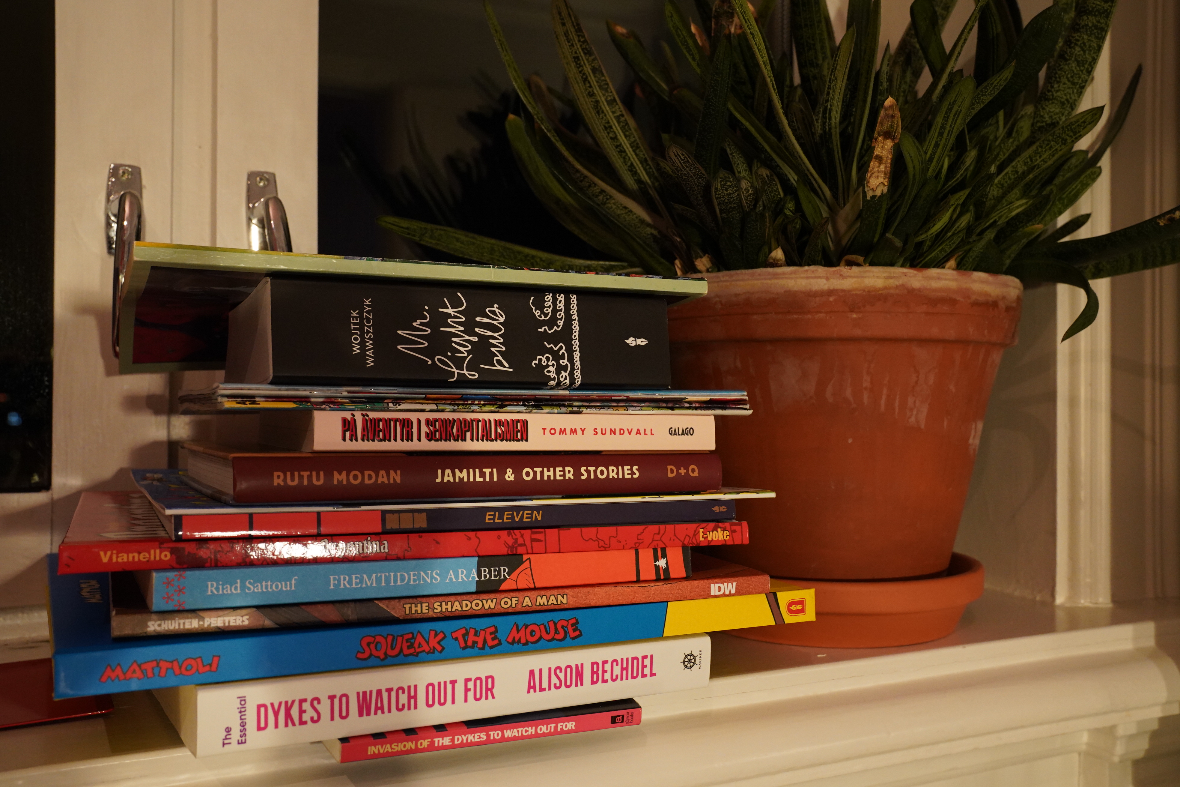
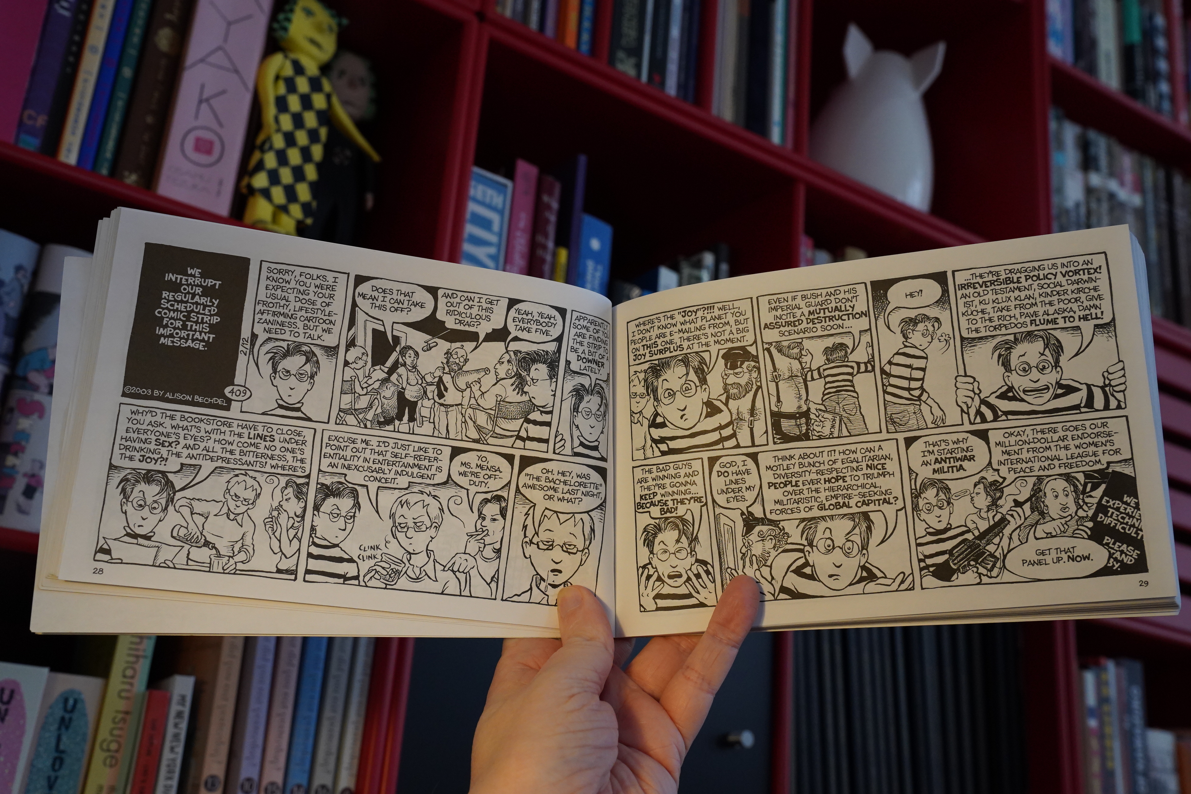
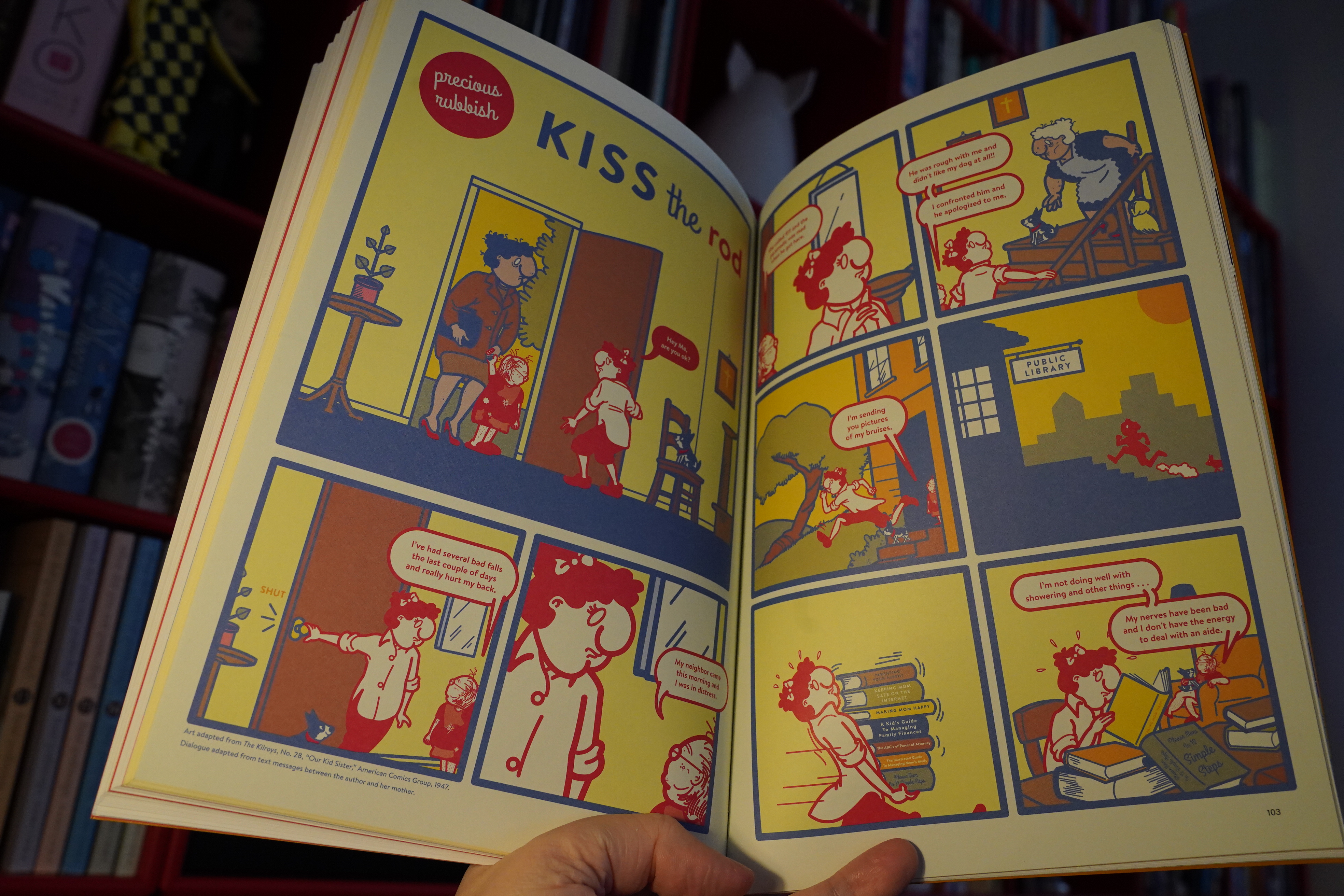
10:20: Invasion of the Dykes to Watch Out For by Alison Bechdel (Alyson Books)
I’ve been reading all the Dykes To Watch Out For books over the last (I think) three evenings in preparation to reading this book (which I missed at the time).
Re-reading… it’s a think people in the graphic novel community do a lot, isn’t it? I mean, people do re-read novels, and they re-watch sitcoms endlessly, but I feel like re-reading is a more deeply ingrained part of comics culture. Perhaps it’s mostly a result of how many comics are serial in nature (in one way or another). I don’t re-watch all of Claire Denis’ movies every time there a new one, for instance, but perhaps I would if they had the same characters?
And I did re-watch the first two seasons of Twin Peaks before watching the third.
But still: I think there’s something a bit different in scale when it comes to re-reading comics: There’s something about the form that invites re-reading… it’s yet another thing where comics have more in common with poetry than prose: Reading a work several times isn’t an anomaly, something you do with very special things you treasure, but something you do as an expected part of reading.
Anyway, I really, really enjoyed re-reading these (about ten?) books over the past three nights. I remembered the main plot points from before, but getting really immersed into the Mo-verse was so… thrilling? Yes. Very funny. And I’d forgotten how much non-strip stuff is in those books — about a third of each book is a loooong non-strip story, and that makes the reading experience even better.
But reading the entire series is also slightly depressing, because she references current events so much, and the book spans 1987 to 2002 (is where I think the tenth book ended), and boy… Things looked so hopeful politically in the late 80s, and then slowly turned to shit over the decades.
Even trying to imagine this strip set in the Trump era is just too depressing to contemplate.
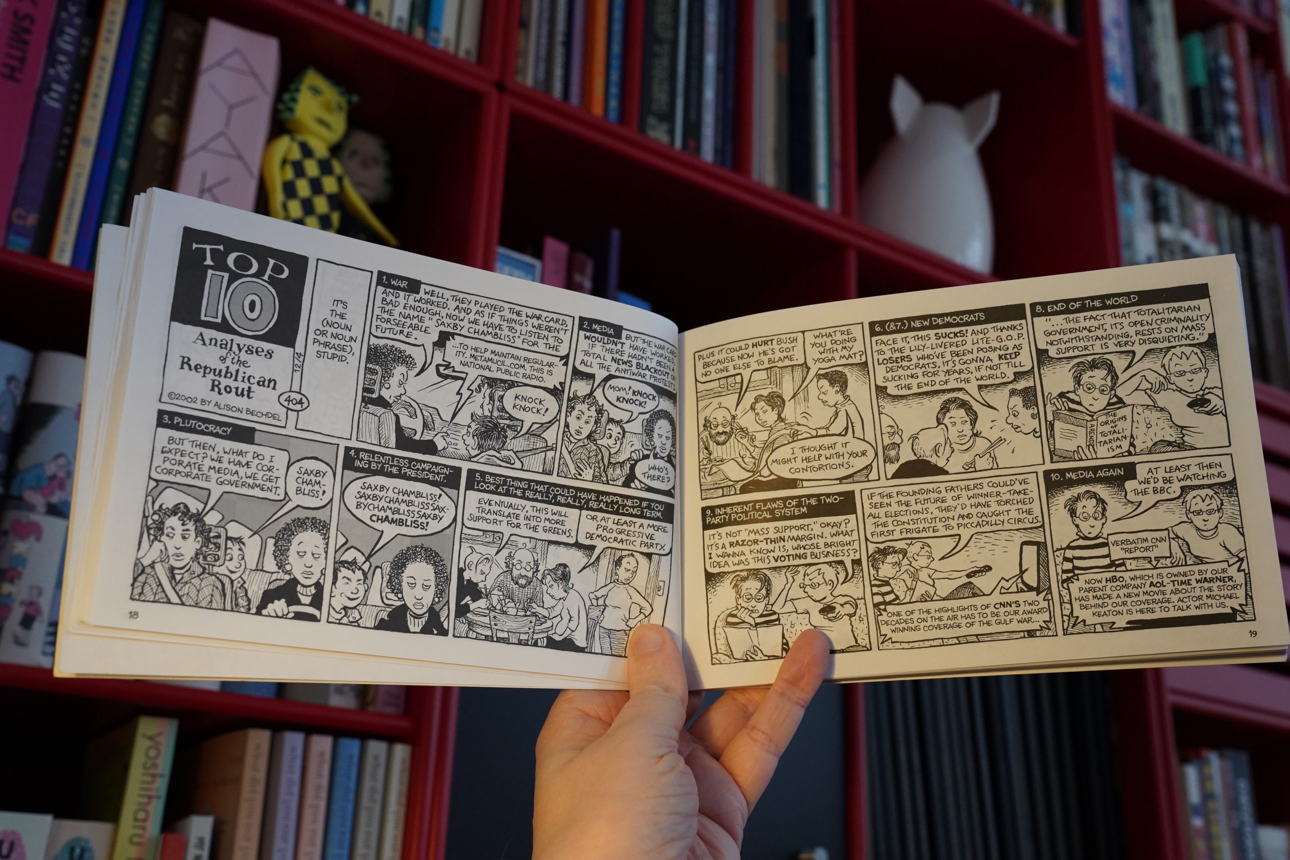
So this is the one book I haven’t read before (it’s from 2005, and I must just have missed it). It’s from the zany days of the second Iraq invasion, and midterms which were going to finally galvanise the Democrats.
Sound familiar?
| Fine Young Cannibals: Fine Young Cannibals |  |
So it’s depressing, but also quite funny.
| Eberhard Weber: Fluid Rustle |  |
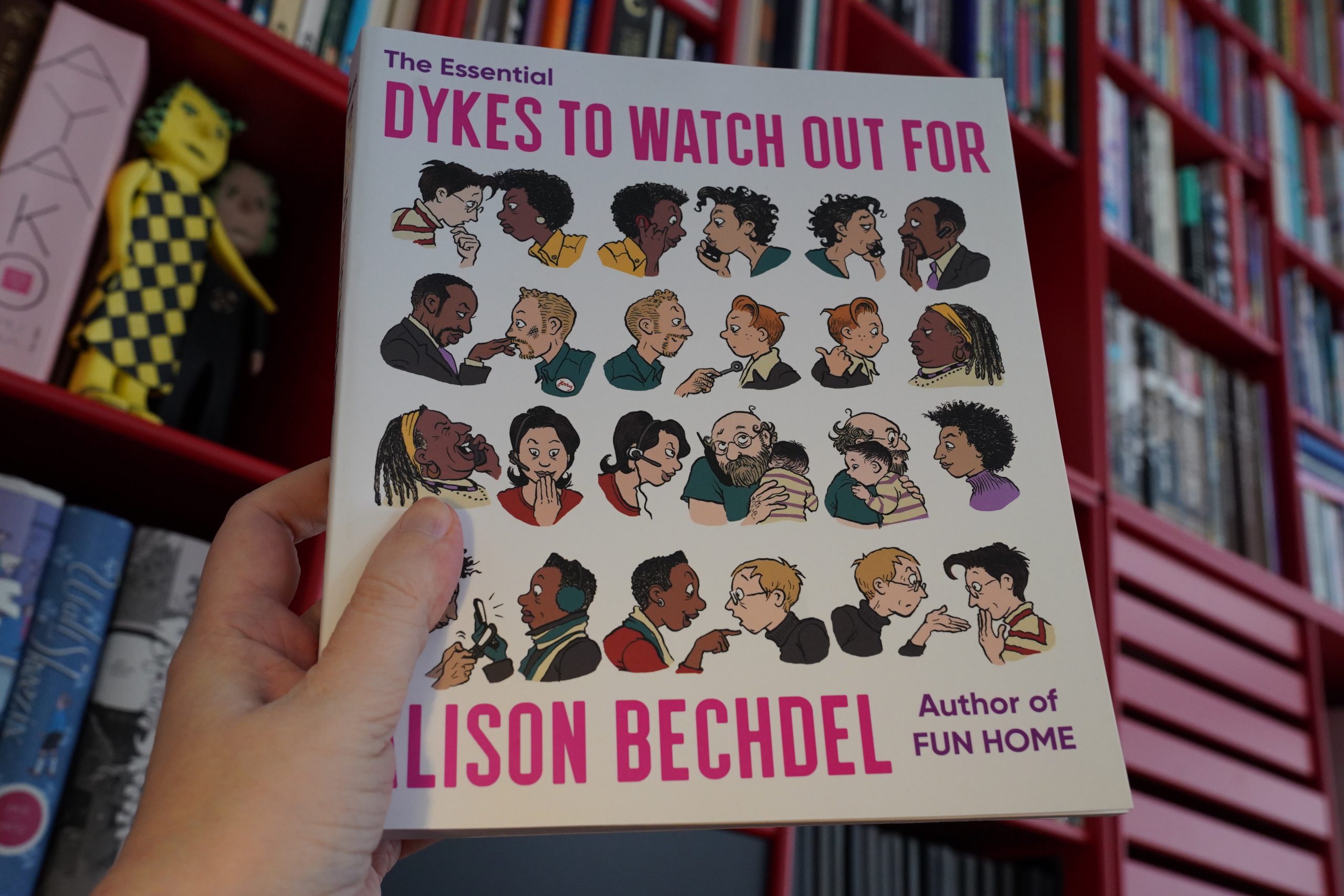
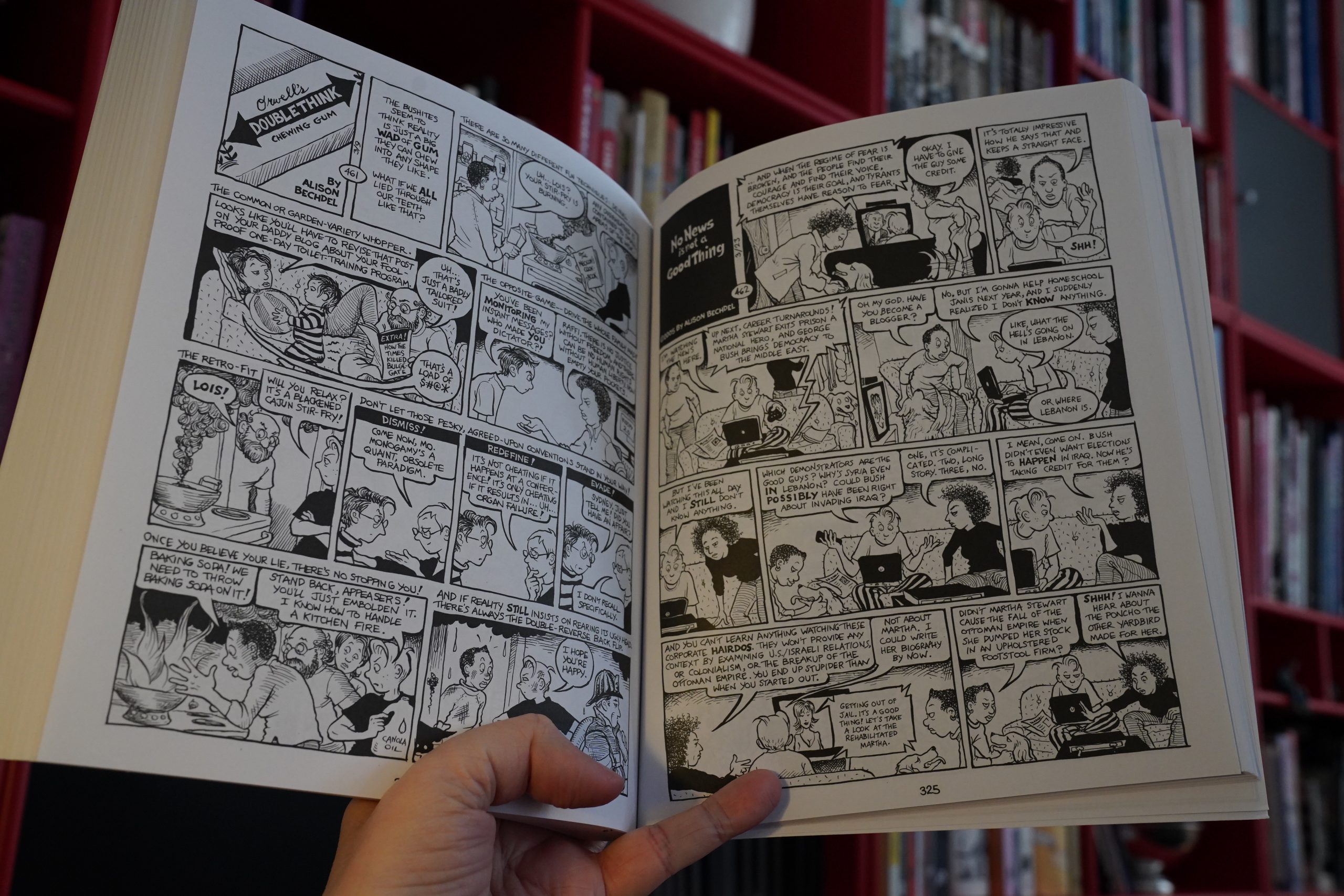
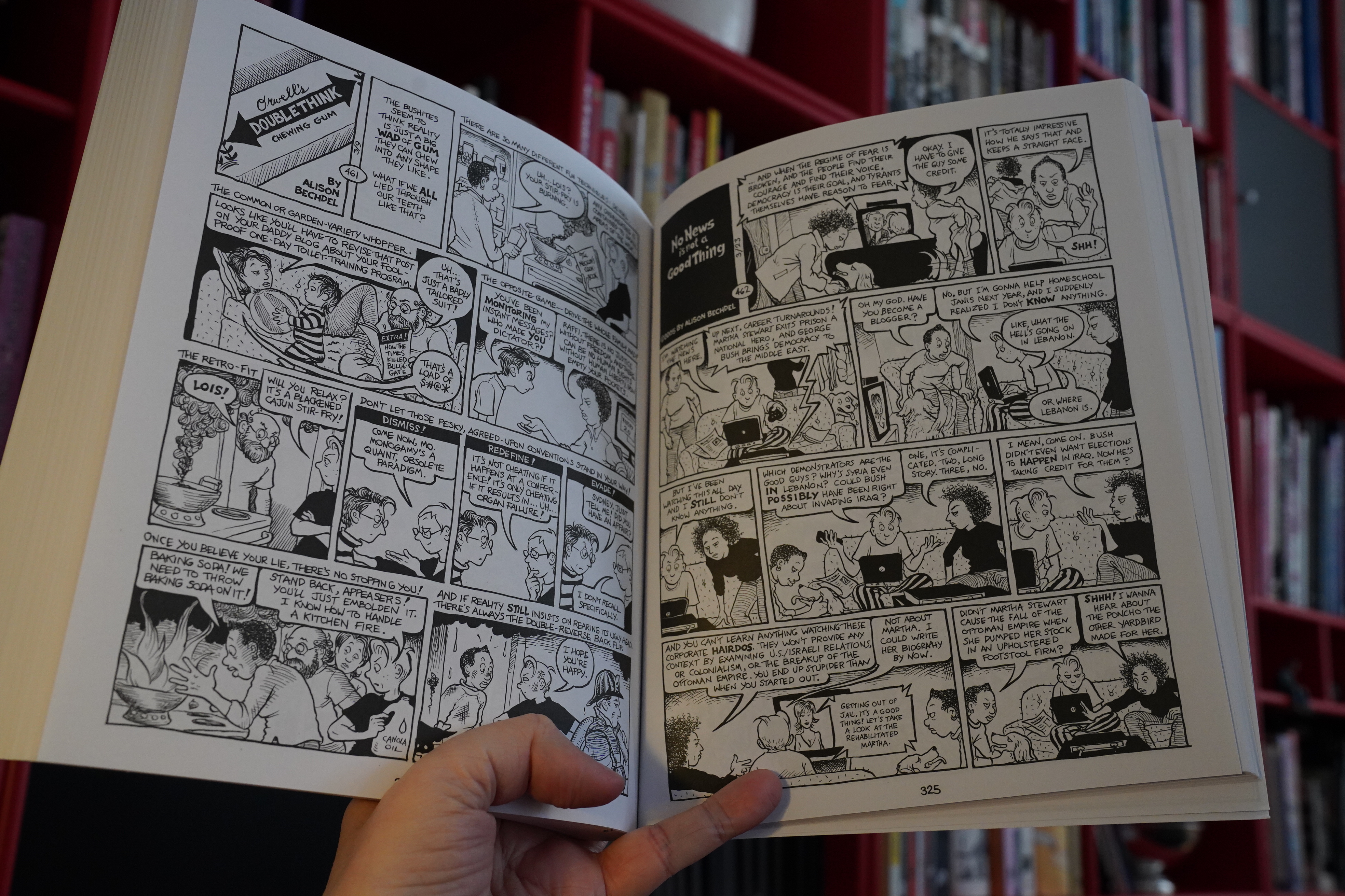
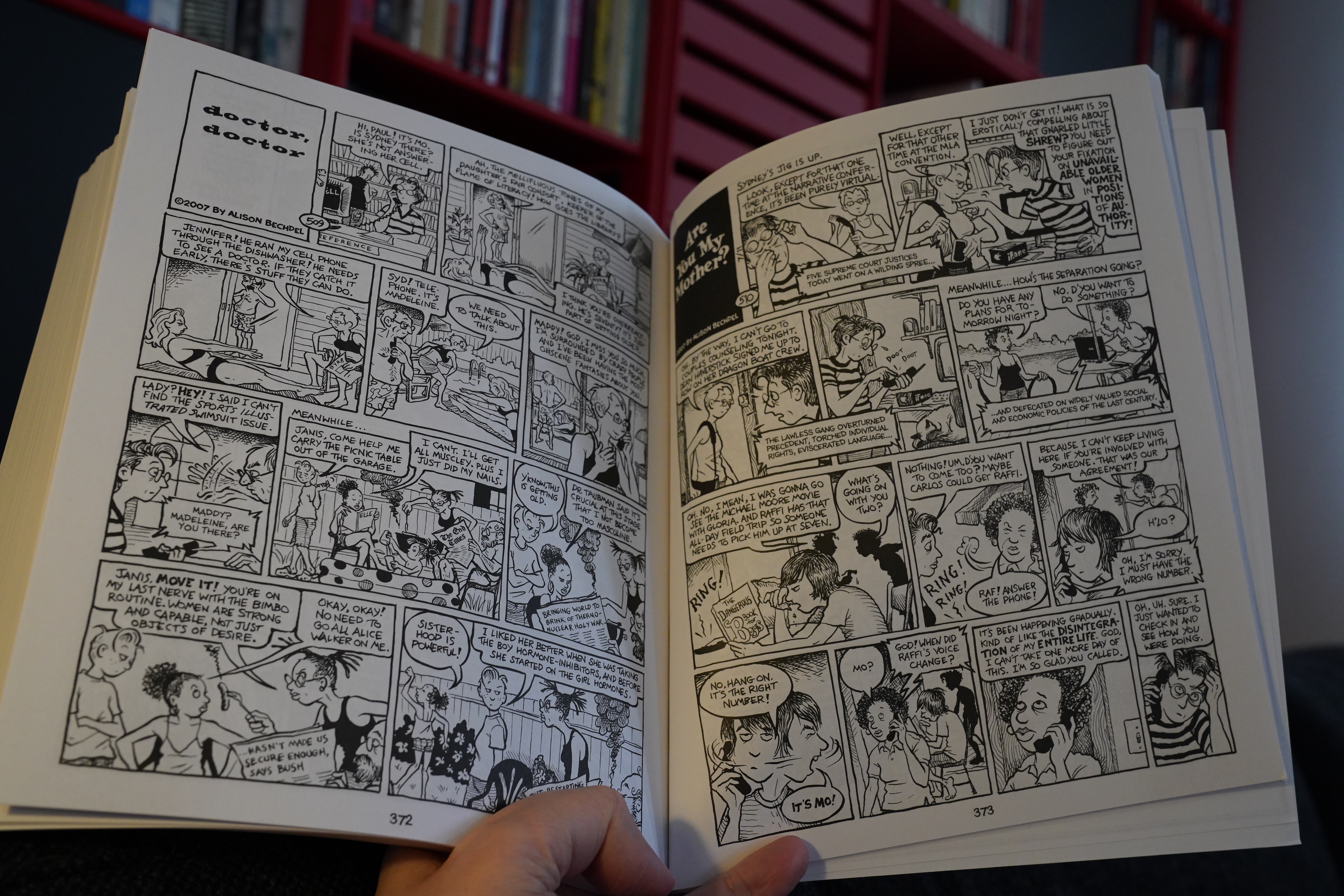
12:08: The Essential Dykes To Watch Out For by Alison Bechdel (Mariner Books)
Whaaa…? After reading all the collections, I’m now gonna read a meta-collection? No, not really. The previous collections took us to strip #457 (in 2004), and this book collects about 300 of those 457 previous strips, and then #458-527.
Rude! 70 strips would have been more than enough to bring out a book in the same format as the rest of the series, and… why do an “essential” when you could have done a “complete”? It’s weird.
So we open here with a quite amusing introduction done in Bechdel’s newer style…
… and I skip to strip #458 and continue reading.
I guess this format looks quite nice, too? I mean, I prefer the horizontal format… perhaps because Bechdel’s pages are just so dense. But it looks good this way, too.
| 50 Foot Wave: Black Pearl |  |
And speaking of dense — like I said up there, reading these strips took me three good and long evenings, so putting everything into one huge book has to change the reading experience somewhat. Of course, Bechdel had a stratospheric success with Fun Home… so I guess Mariner Books wanted something hefty to put on the shelves next to that book? But there’s hefty and there’s hefty. I can imagine people just becoming frustrated with the book because it’s a bit on the exhausting side; takes days and days to read and never really lets up.
Which isn’t what the smaller books were like: One third of each book was a new, non-strip story, much less dense, so it gives you breathing space. But googling critical reception of the book, everybody seems positive, so perhaps it’s just me.
In 2014, Bechdel got the MacArthur “genius” award (which her character Sydney had been lusting after for years), which is nice.
| Wet Leg: Wet Leg |  |
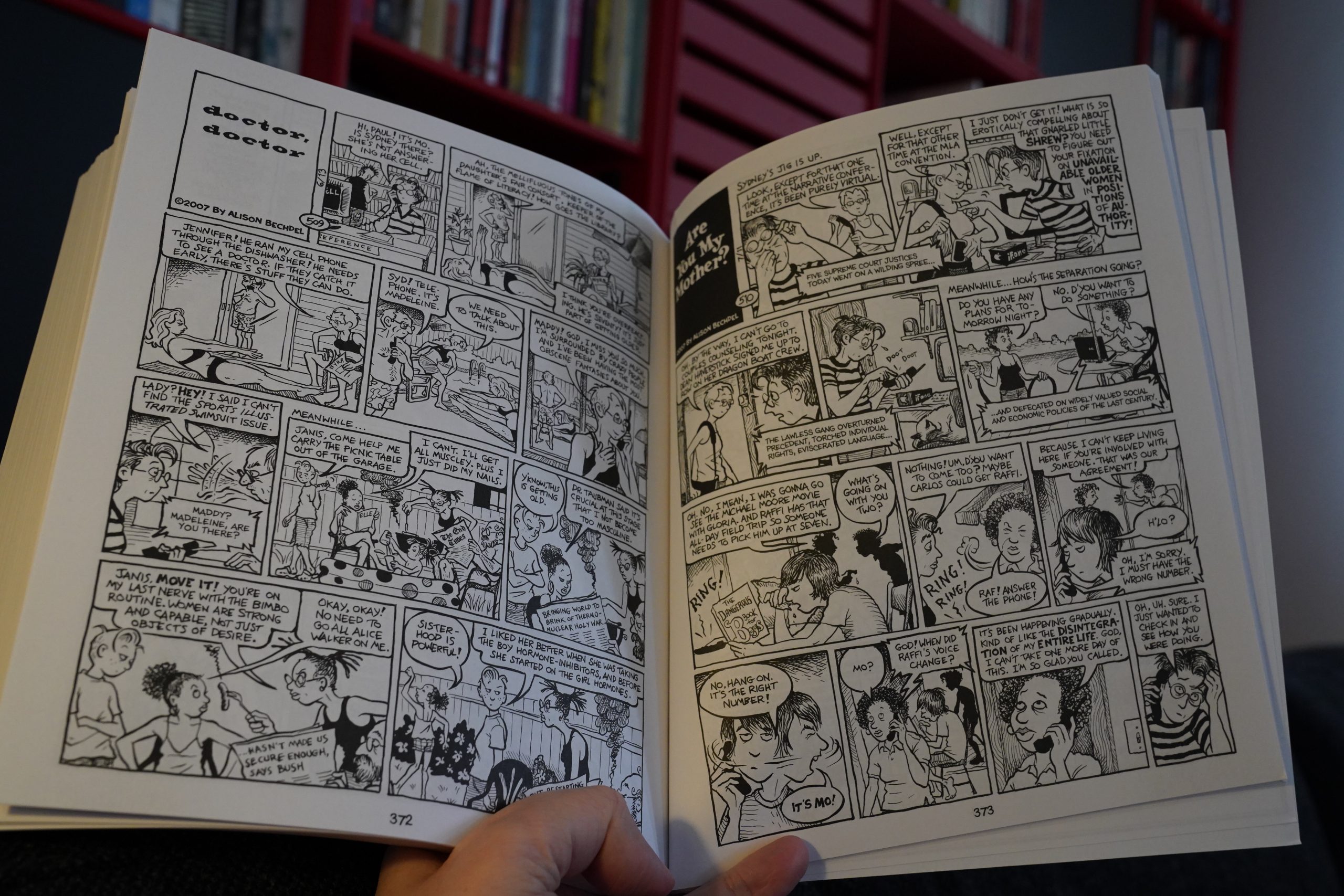
I wondered if Bechdel would try to have some kind of… ending? I mean, at least a bit of winding down? But it mostly just keeps on going until it stops.
I mean, the final strip has wistful tone, and that works in a “yes, we’re just leaving everybody going on with their lives” way, and nothing very dramatic was going on, but I have to admit being a bit disappointed. A couple more strips to say goodbye to everybody would have been nice after so many hours and years spent with these characters.
Oh well.
| Little Simz: Sometimes I Might Be Introvert |  |
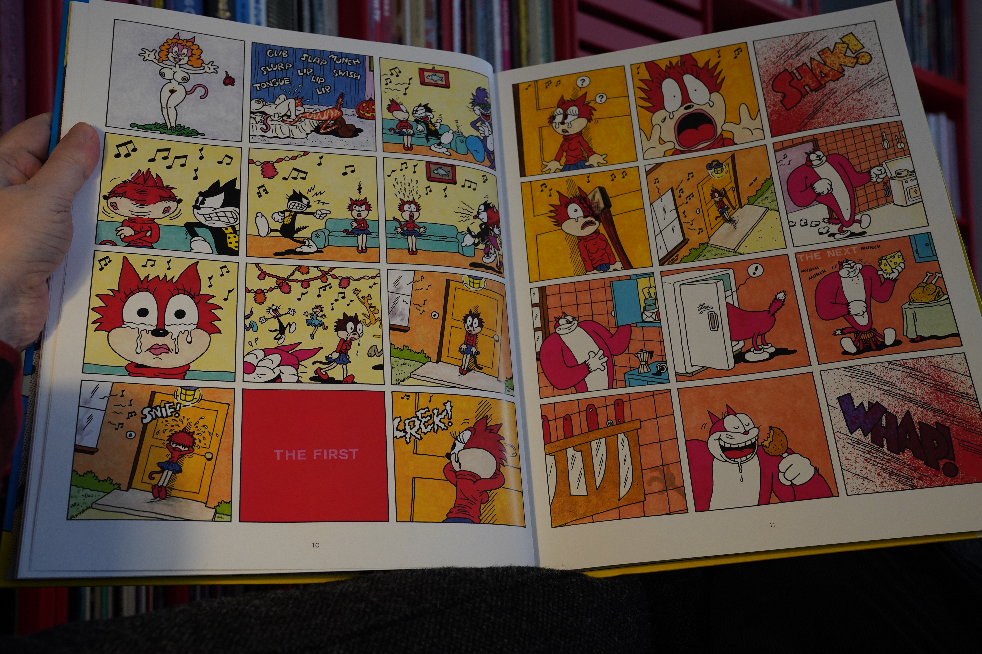
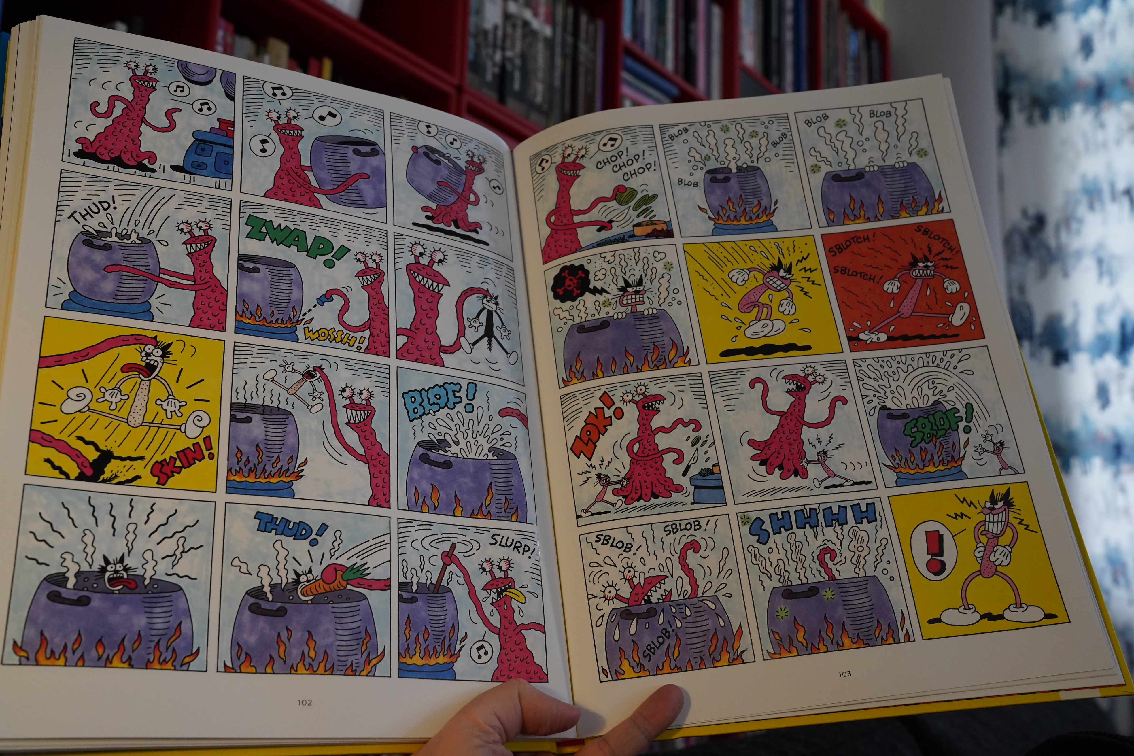
13:58: Squeek the Mouse by Mattioli (Fantagraphics)
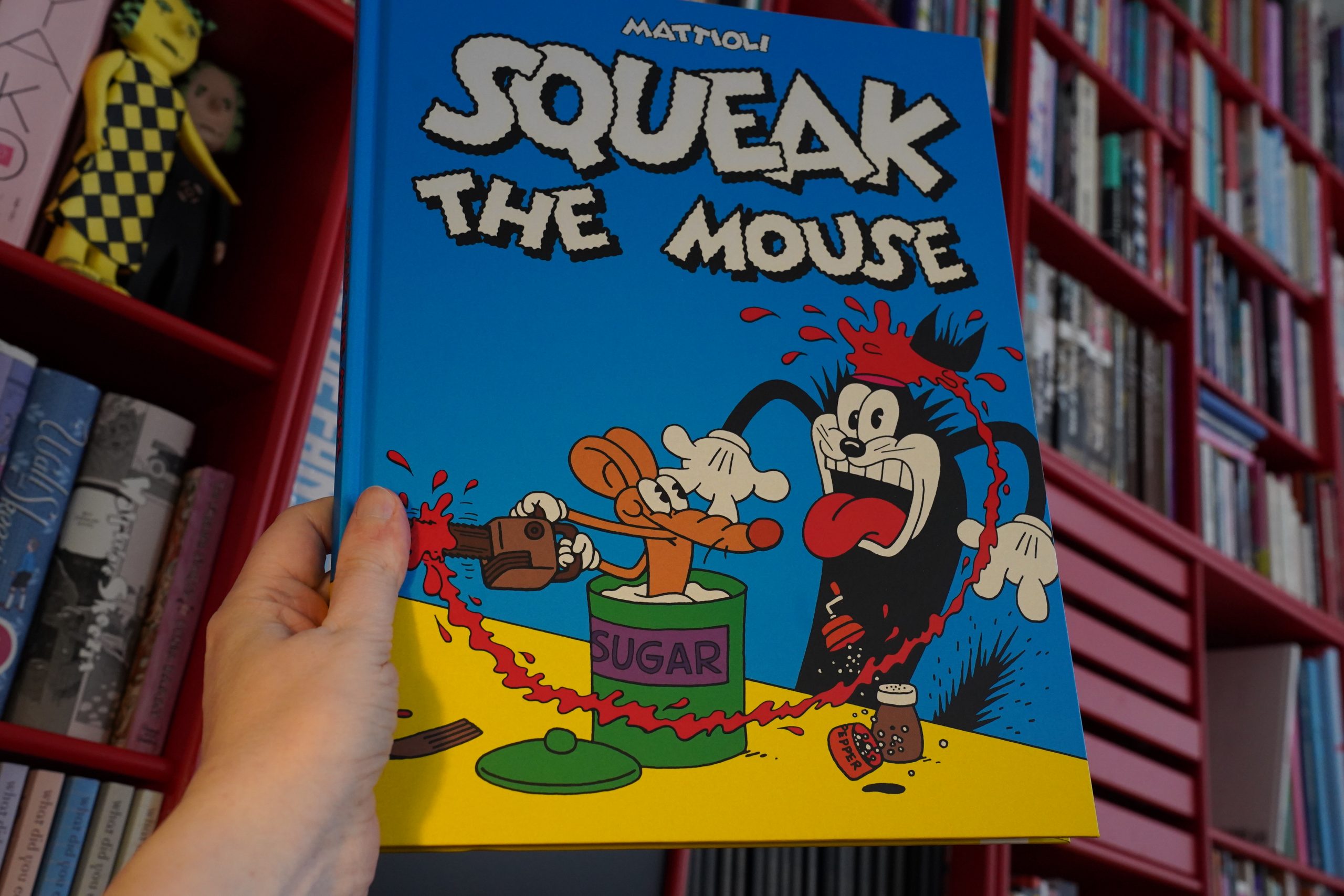
Hey, I had this book as a teenager. In a Catalan edition?
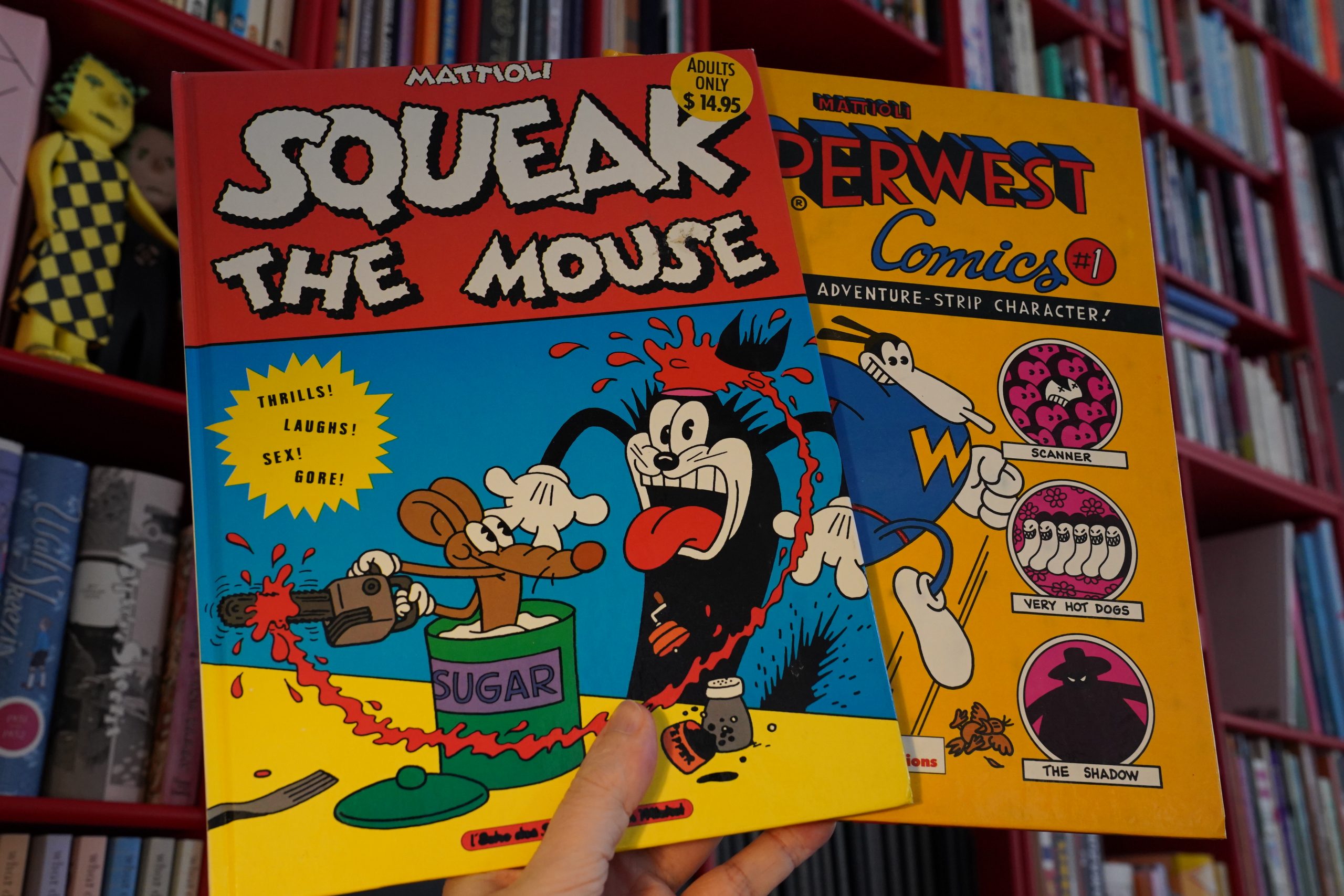
Wow! I found it. And something called Superwest, also from Mattioli. But the Catalan Squeak is only 48 pages, and the new book is three times the length… looks like it includes three Squeak books.
I remember this being super duper violent, and kinda porny? Let’s see if I remember correctly.
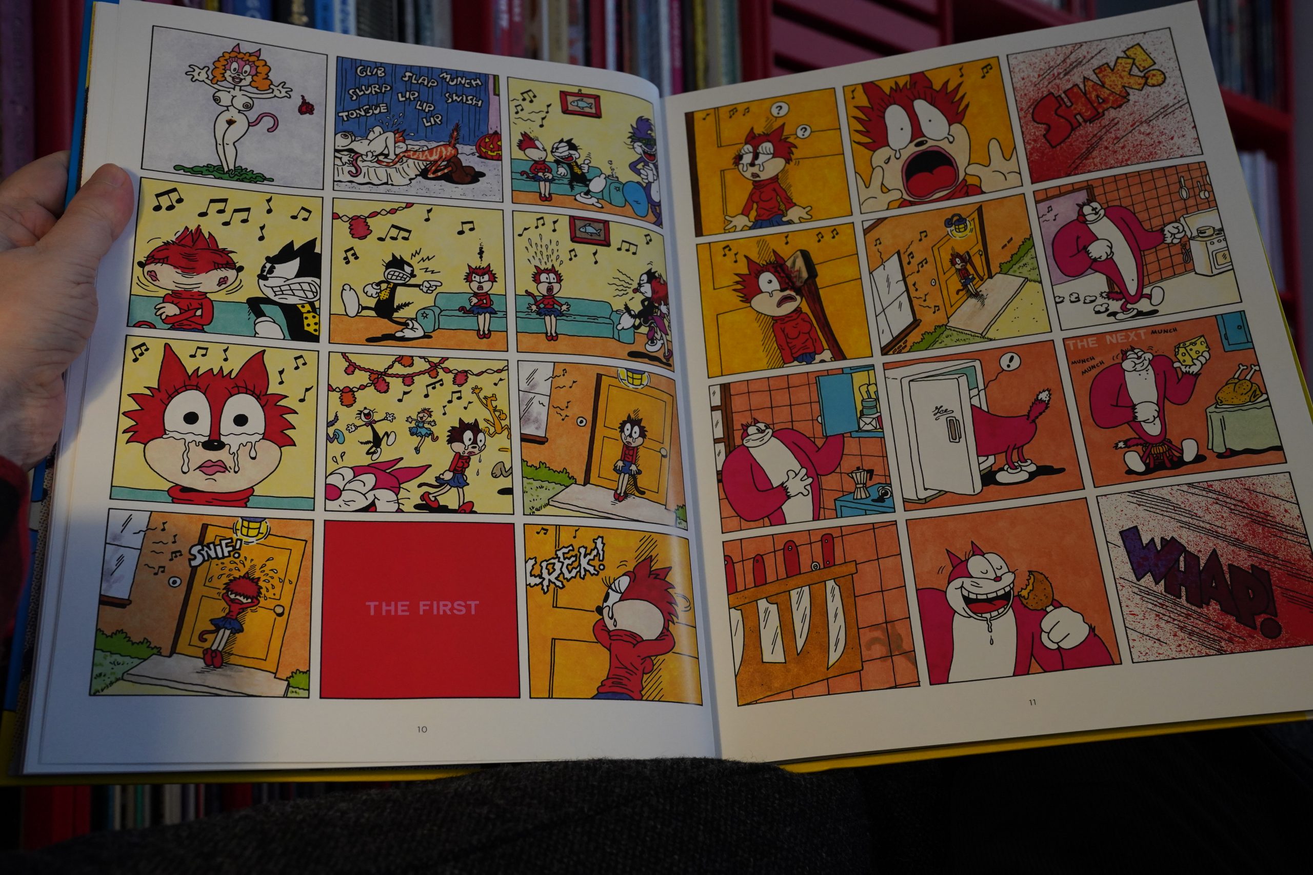
Yup. But re-reading the first Squeak album — it’s a really strong work. I mean, it’s sophomoric in a Micahel Haneke kind of way: Implicating the viewer in the every-escalating violence, saying “you like watching violent things, right? LIKE THIS!!!”; challenging the reader. (No, I’m not snapping pics of any of the really violent pages here.)
It’s jejune, but it works.
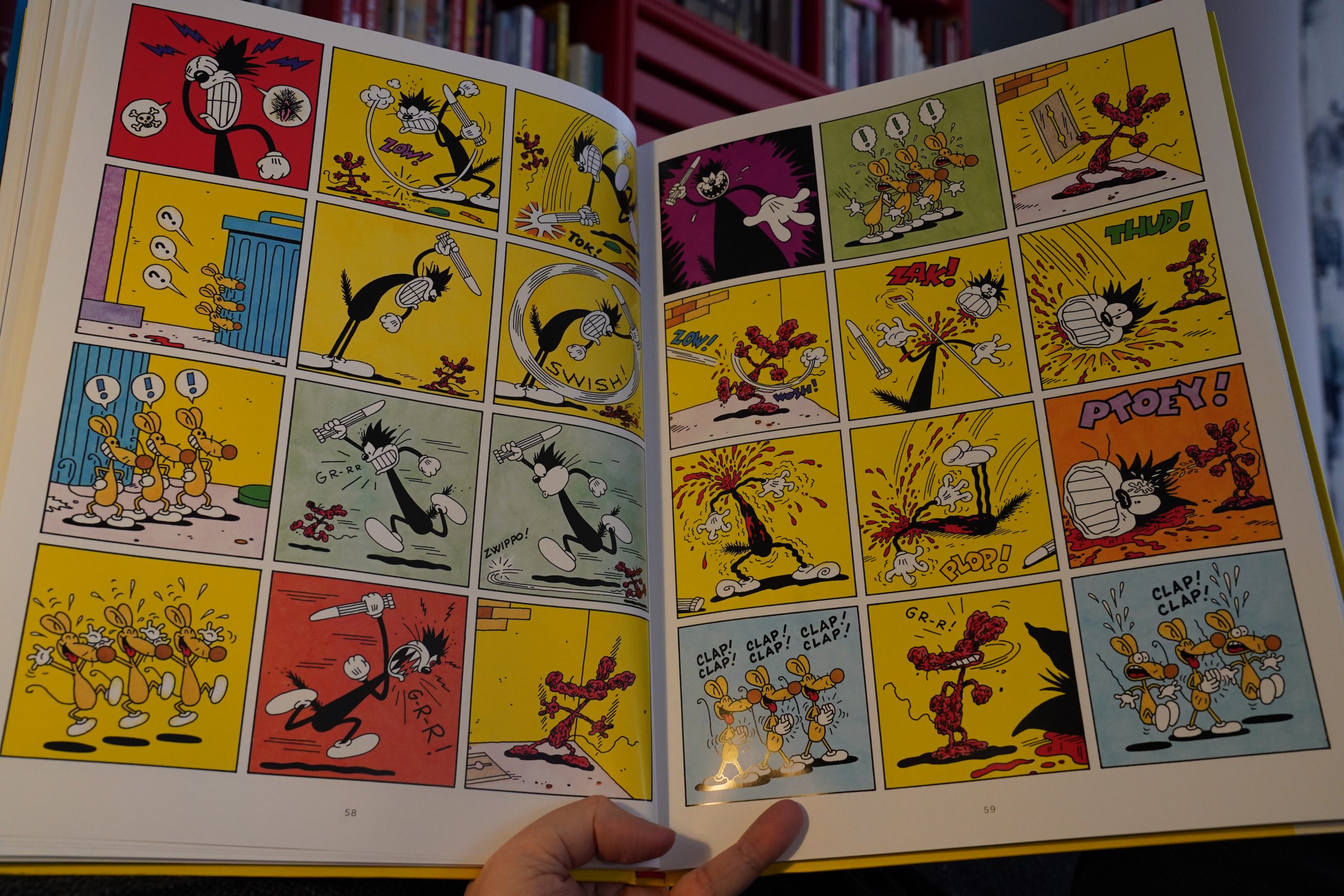
But then there’s the second album, and it’s just pure tedium. The first album had an escalating dream logic, but the only logic I can see here is “oh, people liked those strips, so I have to make some more”. It’s repetetive and offputting.
So the Catalan people did the only right thing in just publishing the first album.
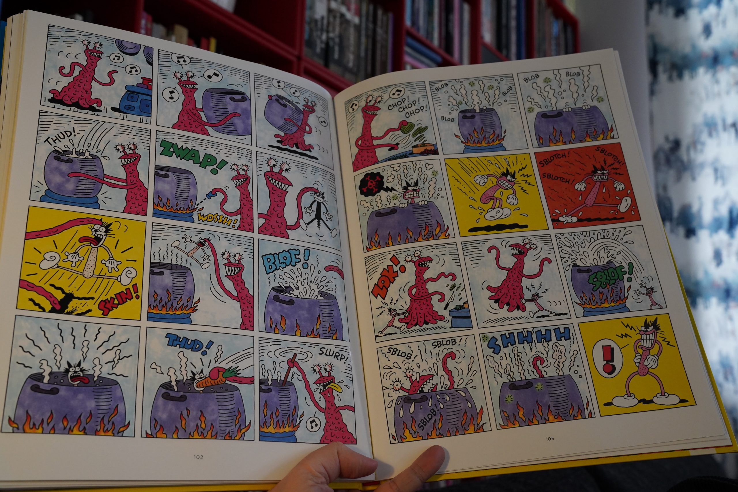
But then there’s even more? Bedetheque only knows about two albums, but a third volume was published in 2020, when the collected trilogy was published in Spanish? It says that it was never printed before… and I’m guessing that it’s much newer? The artwork’s a lot sloppier, but at least it doesn’t just repeat everything like the second volume. Unfortunately, it kinda sucks. It’s totally running on empty. The first book was angry, at least.
| Sonic Youth: In Out In |  |

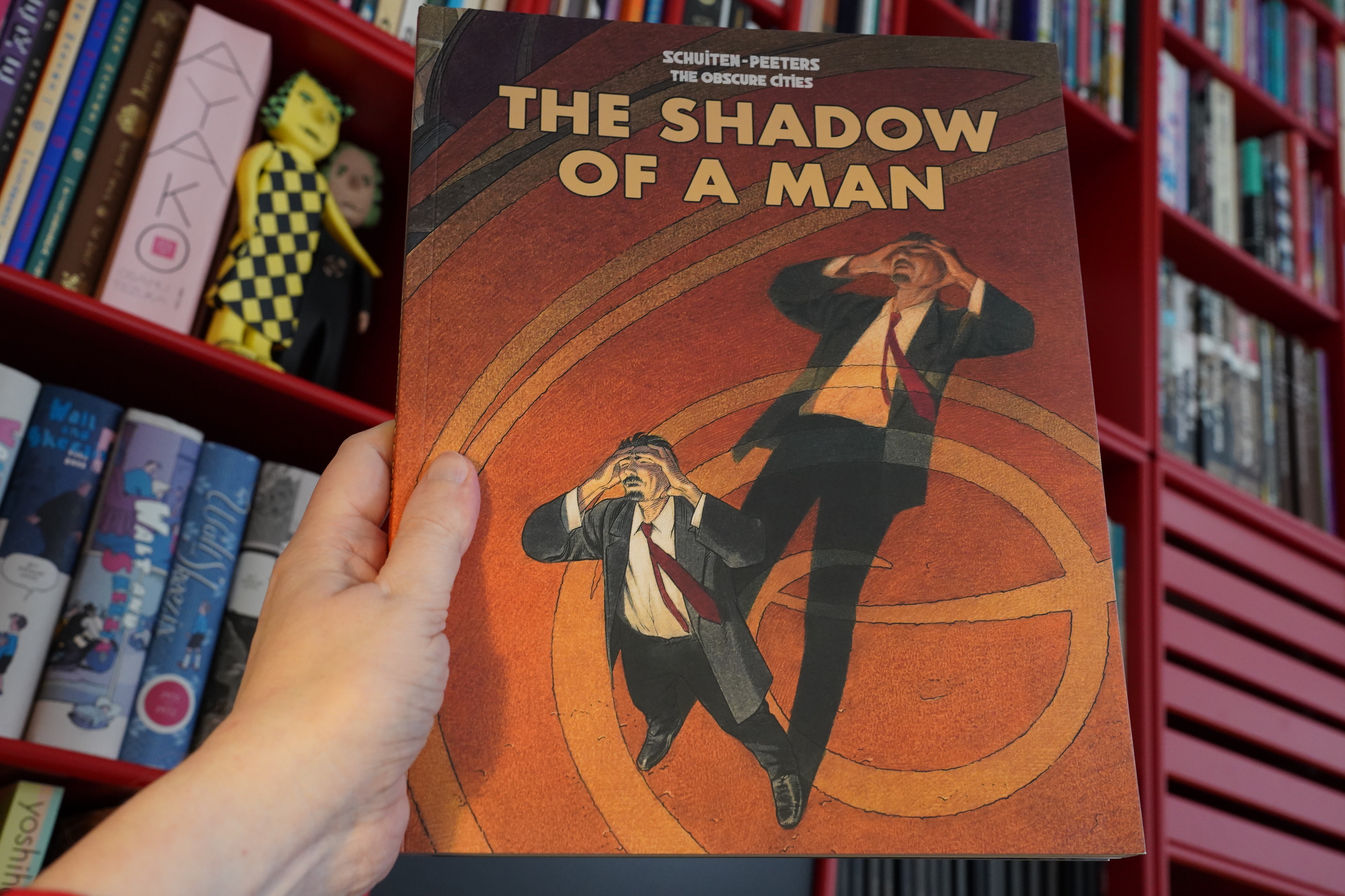
14:37: The Shadow of a Man by Schuiten/Peeters (IDW)
What?! IDW is publishing the Obscure Cities series now? I completely missed that.
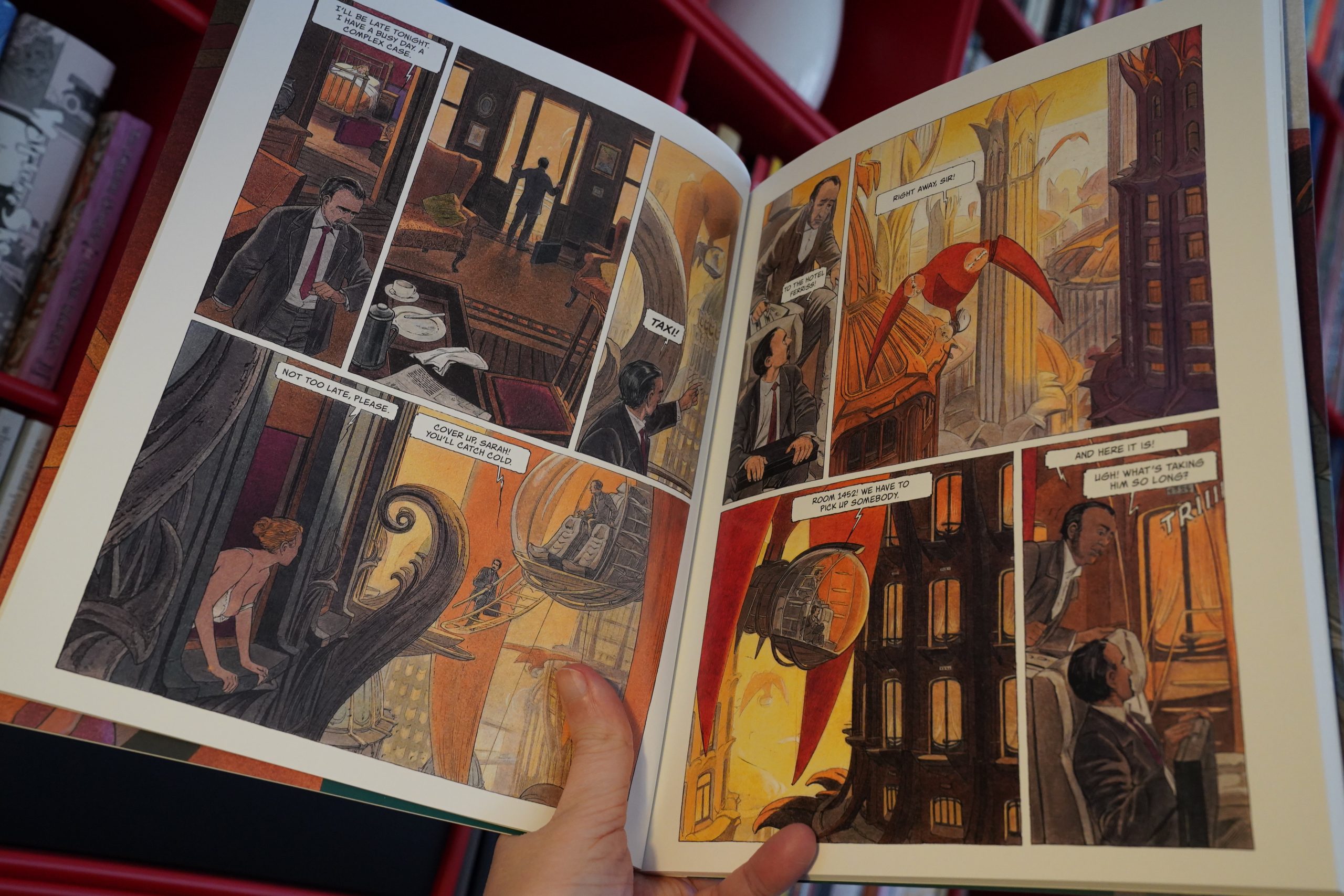
As usual, the main attraction here is the oddball city, where everything looks like a cross between 1930s Paris and some retro futuristic city. I’m not sure everything really coheres as a fictional world, but it’s pleasantly diverting.

Ding dong food. I forgot to eat lunch today, and I don’t have time to make dinner since I’m reading comics, so some nice takeout. (And bubble tea for dessert.)
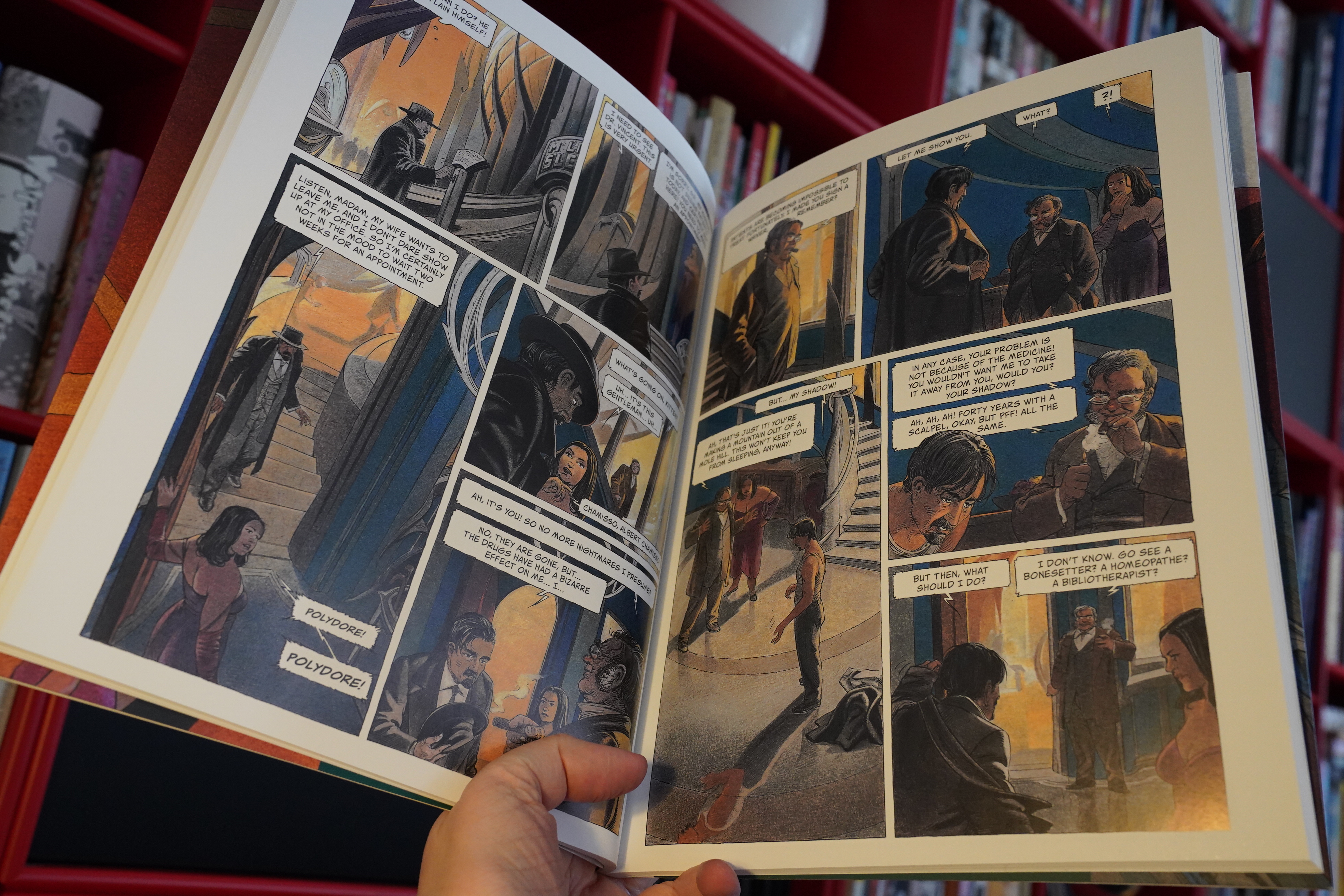
And as usual, the storyline doesn’t really go much anywhere: A strange thing happens, and then people respond to that strangeness in not-very-convincing ways, and then the strange thing dissipates. All these Obscure Cities albums are like this, and I like it.
It’s a kind of abstracted and distracted storytelling.
| The Weather Station: How Is It That I Should Look At The Stars |  |

15:33: L’Arabe du futur 5 by Riad Sattouf (Gyldendal)
Probably the most anticipated comics across the continent… The first volume was a global phenom, and if I remember correctly, it was still going kinda strong in the fourth volume?
And… it’s pretty good? The storytelling is effortless as usual — his character design and cartooning is crystal clear, and it’s got an easy flow.

It’s a bit on the chatty side, though? It’s not that any individual scene is bad — it all works — but I felt my interest starting to flag here and there.
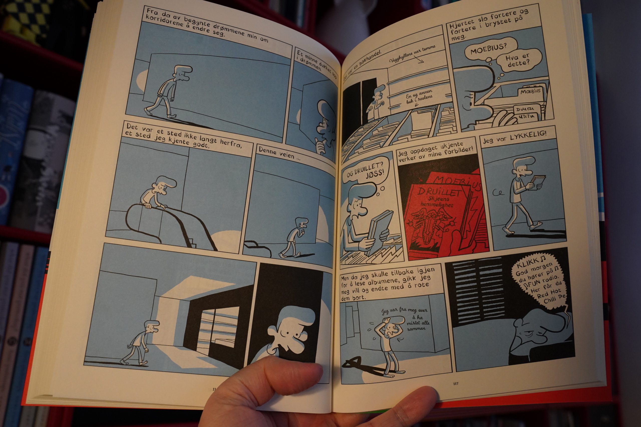
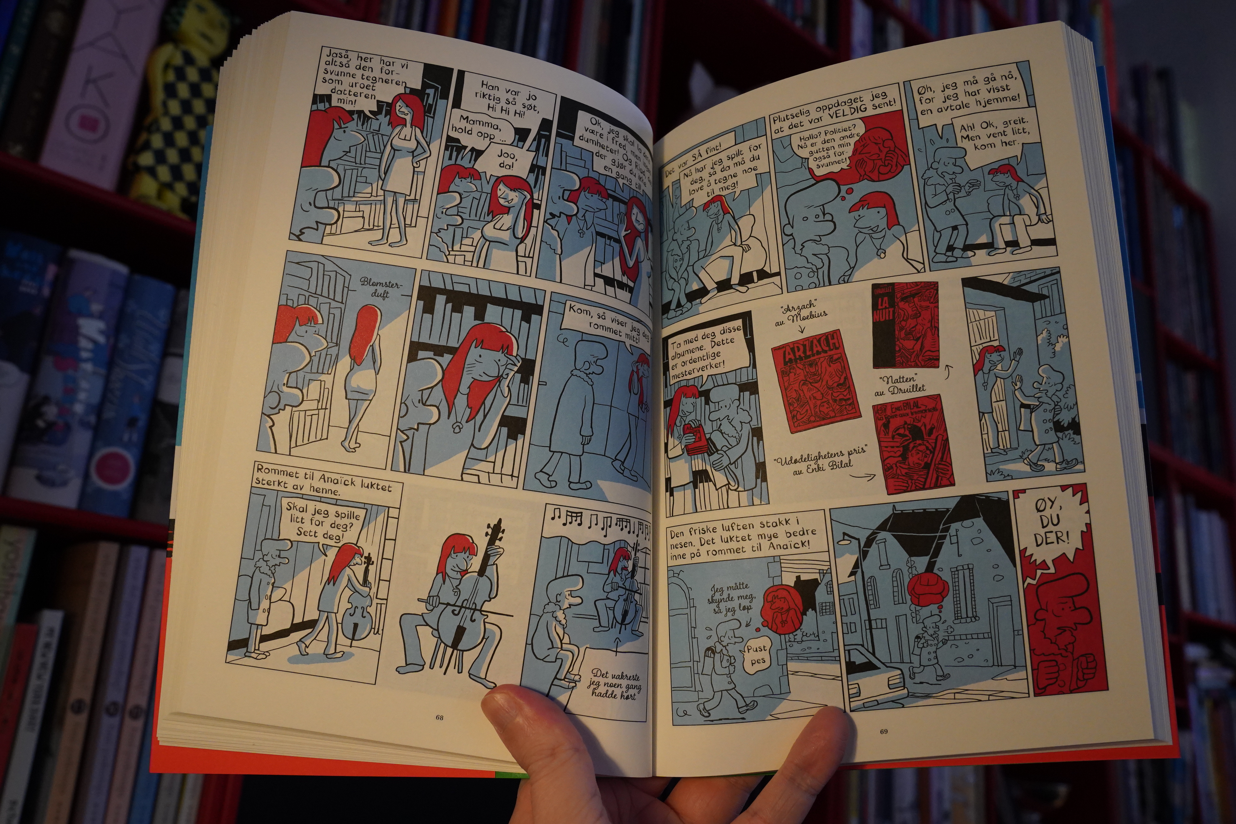
Heh heh — is that a universal dream that everybody who’s into comics have? The shops I dream about aren’t that deserted, and I don’t usually lose the books I buy, but it’s otherwise spot on. (Well, OK, my dreams have unheard-of albums by Tardi and Pratt, not Druillet and Moebius.)
| Kraftwerk: Remixes (1) |  |

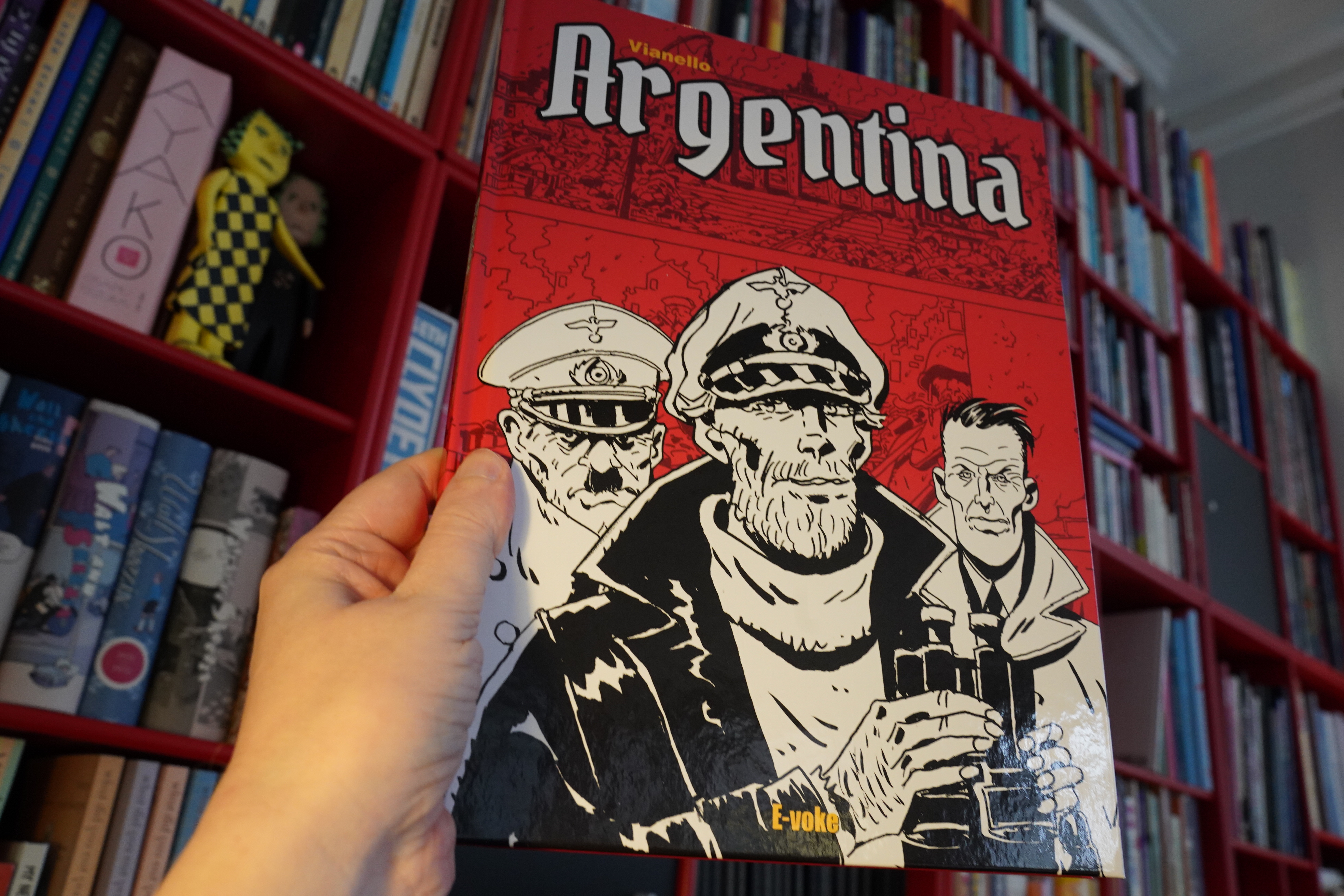
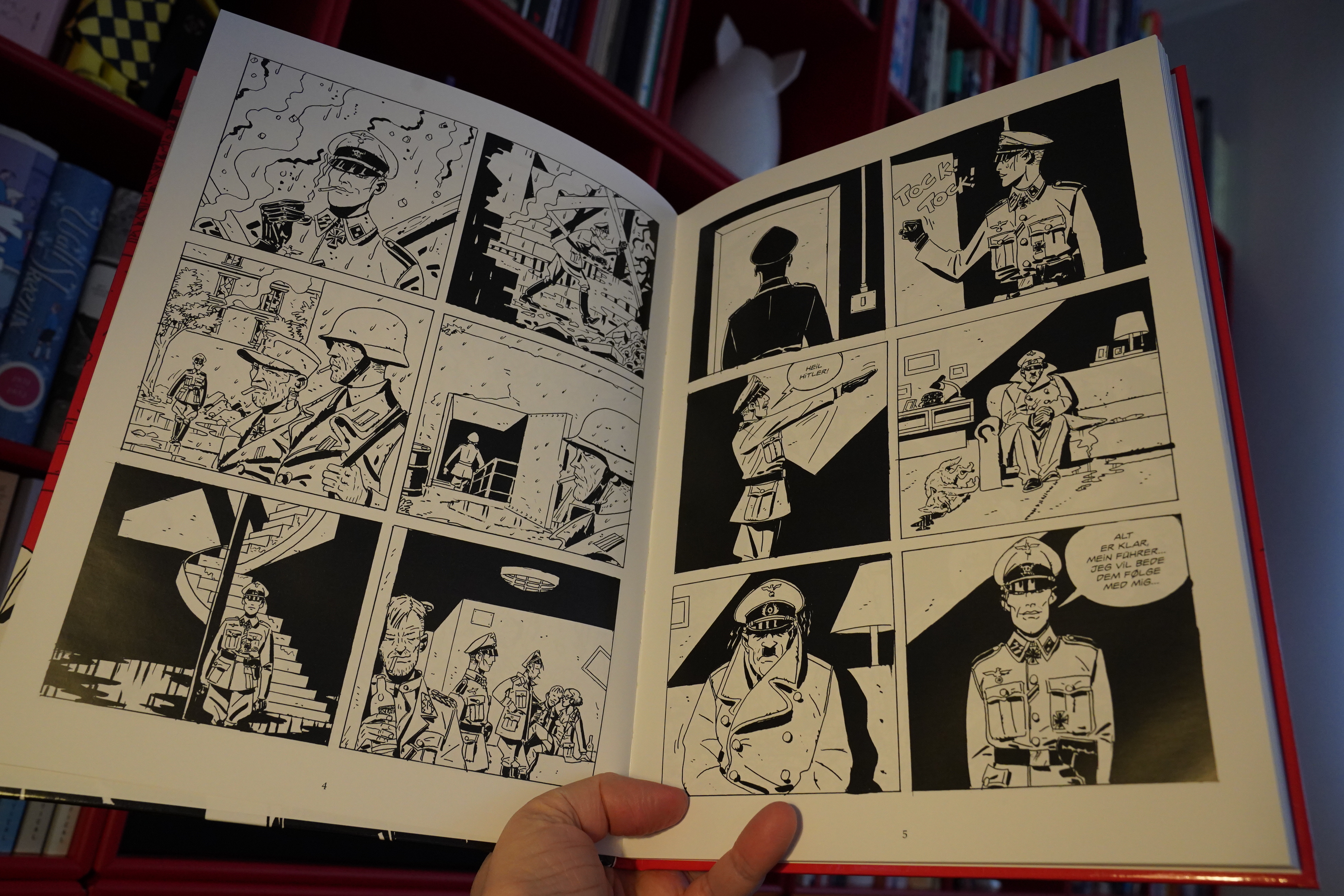
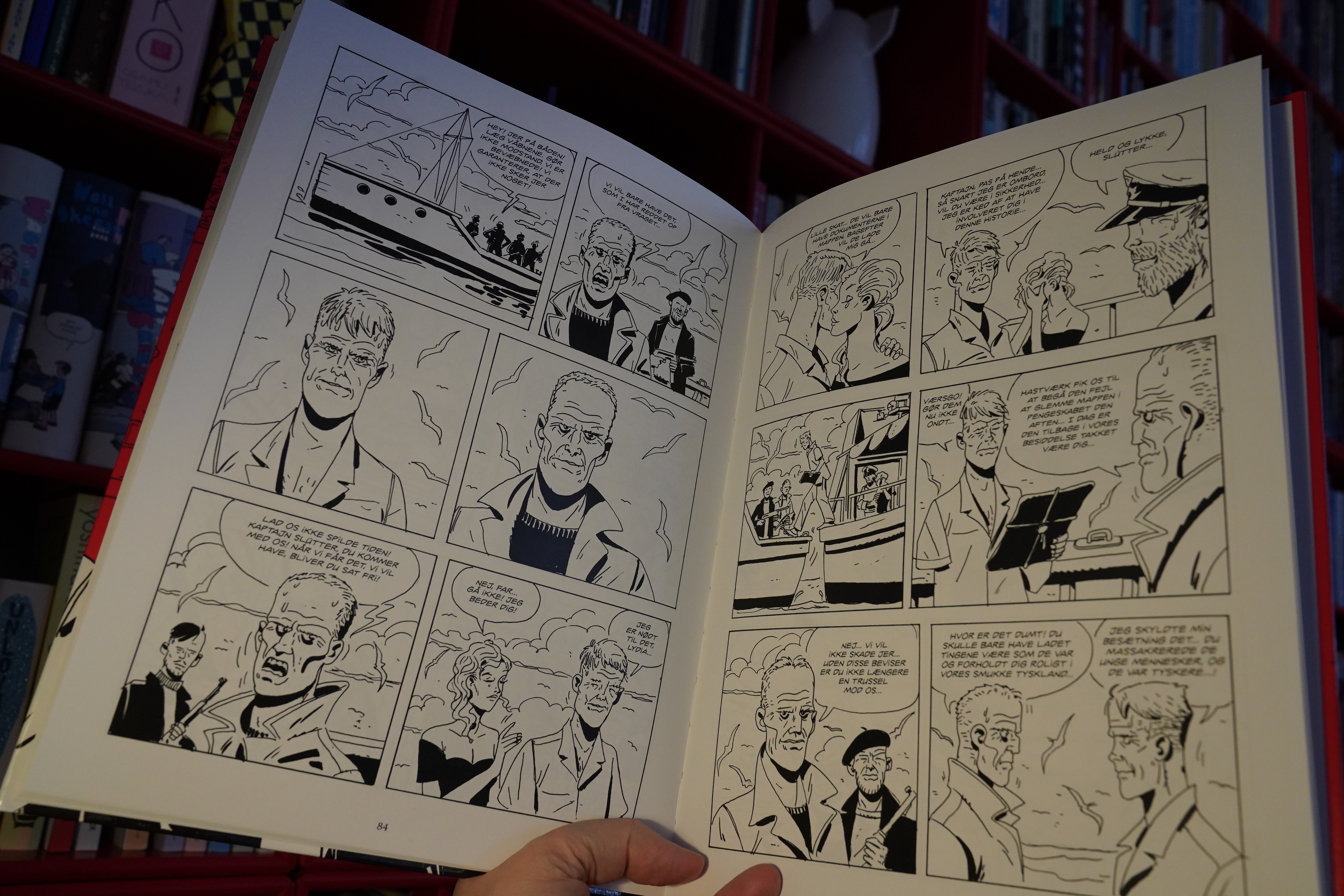
17:11: Argentina by Vianello (E-Voke)
And speaking of Pratt — I almost got a heart attack when I saw this book at the book store. But it’s Lele Vianello, not Pratt — and Vianello was Pratt’s assistant, apparently?

When you’re expecting an undiscovered Pratt masterpiece, anything else is bound to be a disappointment. But this does have a certain charm — it certainly looks very pretty.
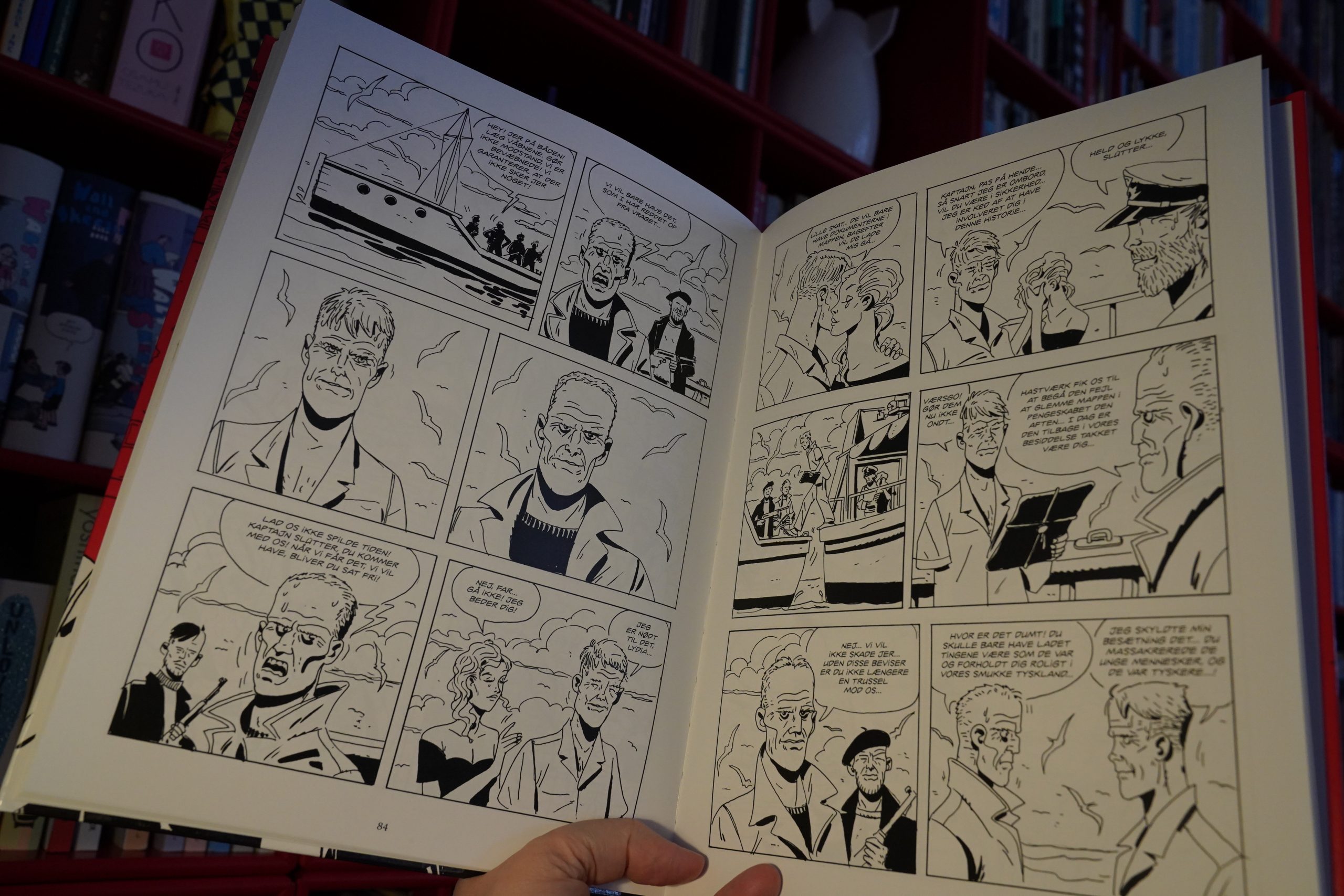
The storytelling is choppy as hell, though, and it doesn’t help that almost all the characters are drawn very similarly. I had to keep flipping back and comparing names to see who was who, which is seldom good.
But it’s OK? It’s OK.
| Ministry: Twelve Inch Singles (Expanded Edition) |  |
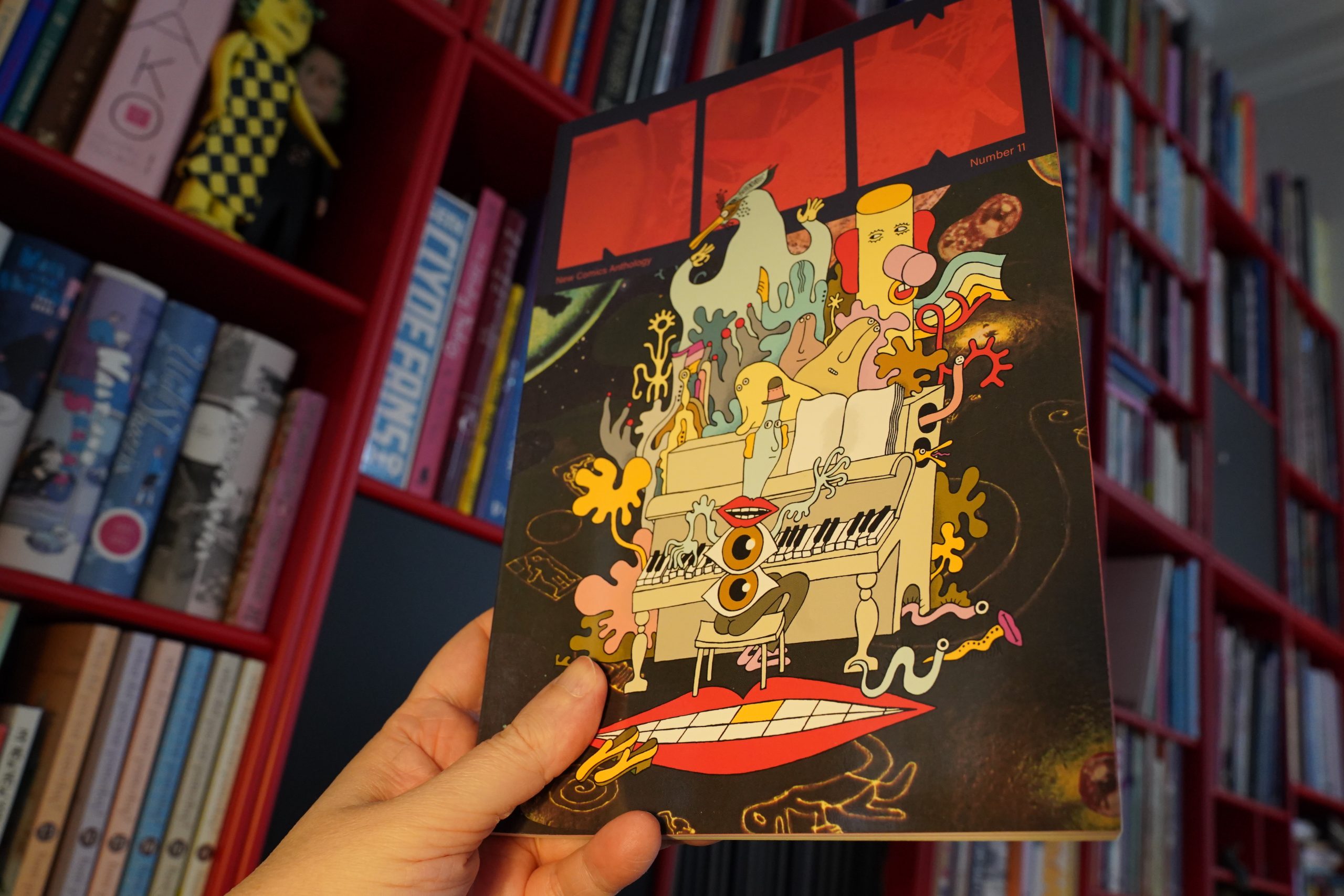
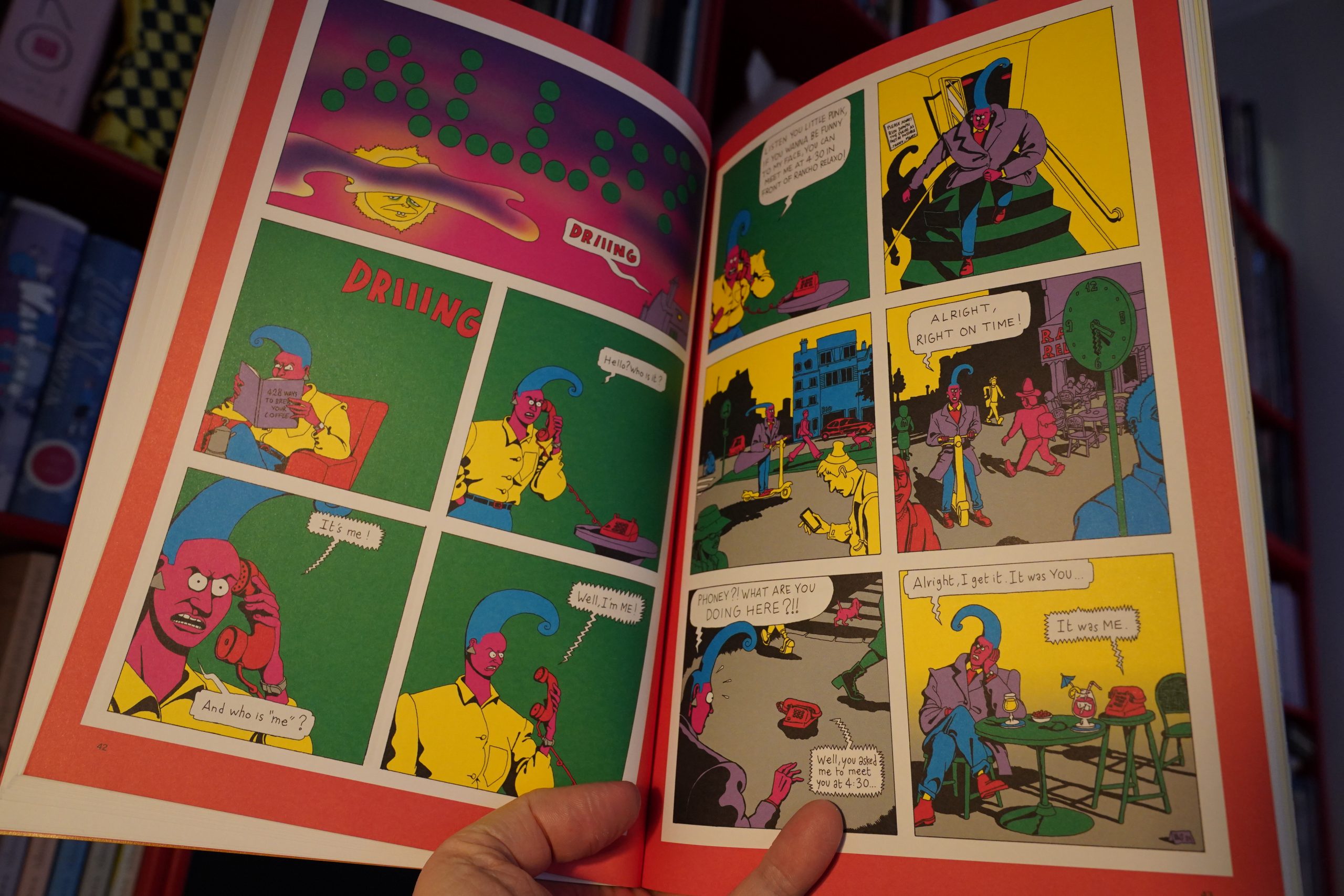
17:53: Now #11 edited by Eric Reynolds (Fantagraphics)
Wha? They’ve finally classed Now up a bit. It’s no longer on that shitty, thin glossy paper, and it’s got thicker covers. Nice.
Everything looks nicer on this paper. (I guess they used the shiny one for economical reasons or something?)
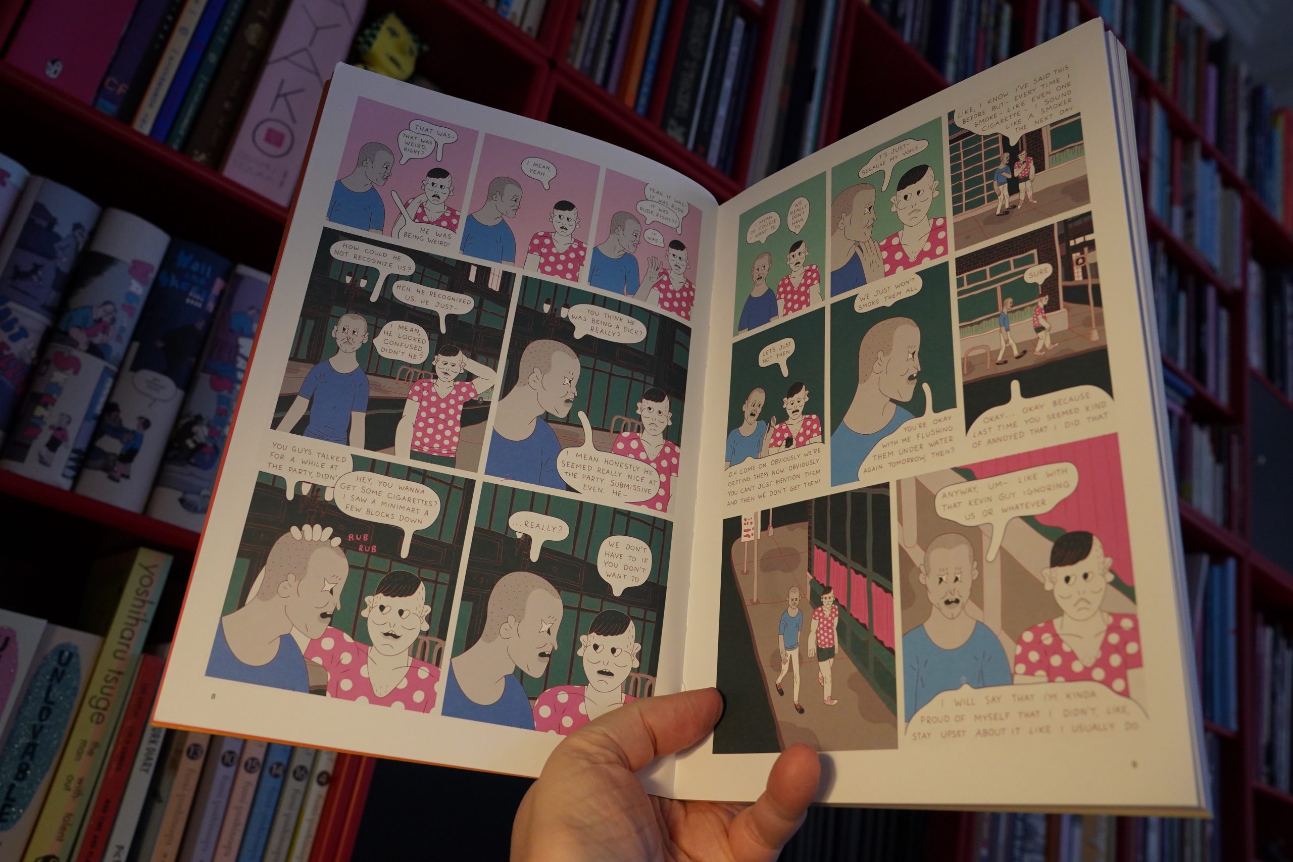
Anyway, it’s probably the strongest Now issue ever! Every thing in here is good and original (Jesse Simpson above).
There’s also a nice mix of short and nicely absurd stuff like Baptiste Virot…

… and the absolutely stunning long piece from Stacy Gougoulis. It’s sheer brilliance — starts off slightly mundane and then a bit later, every page hits hard.

Kayla E.’s reappropriation thing is the most distressing bit in the issue.
Fantastic issue.
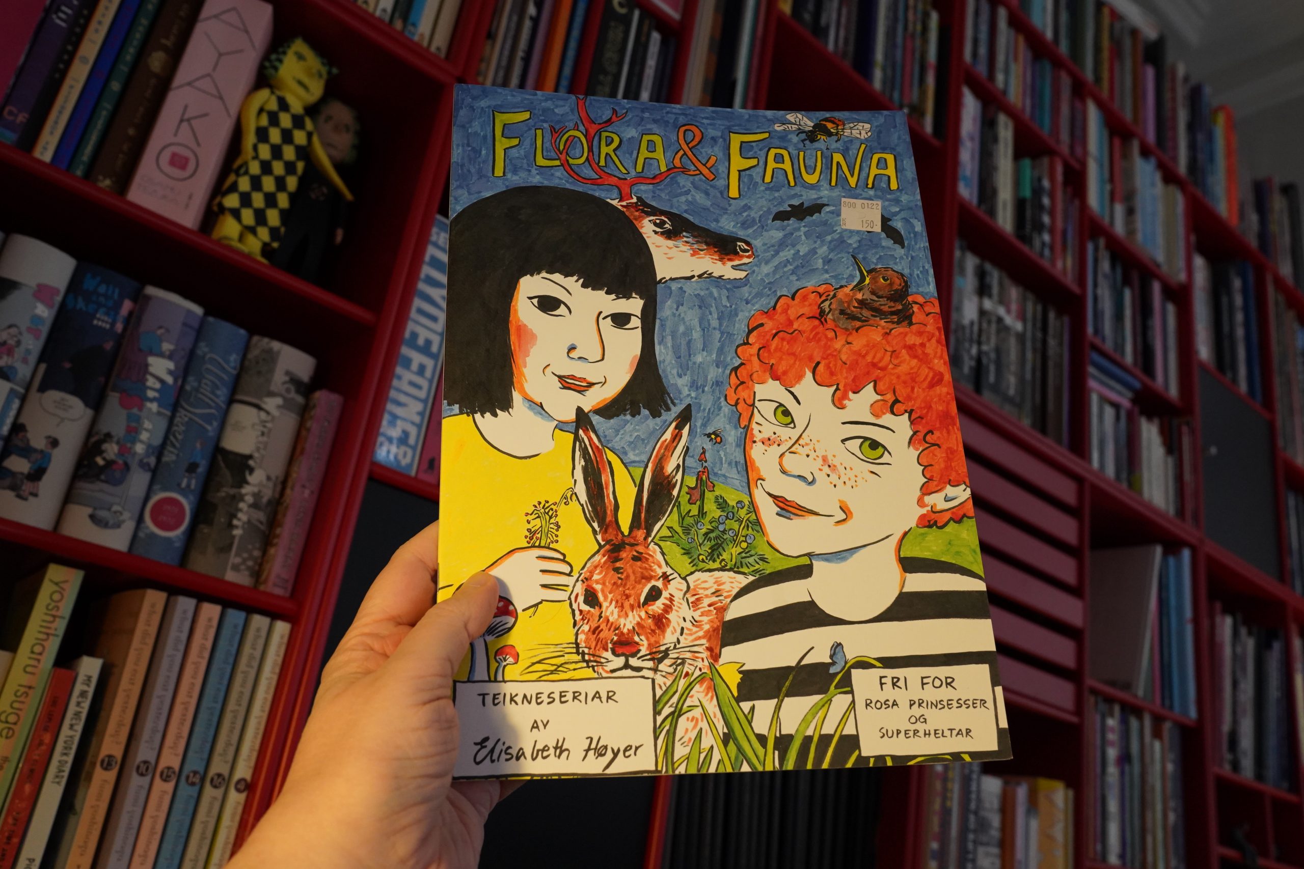
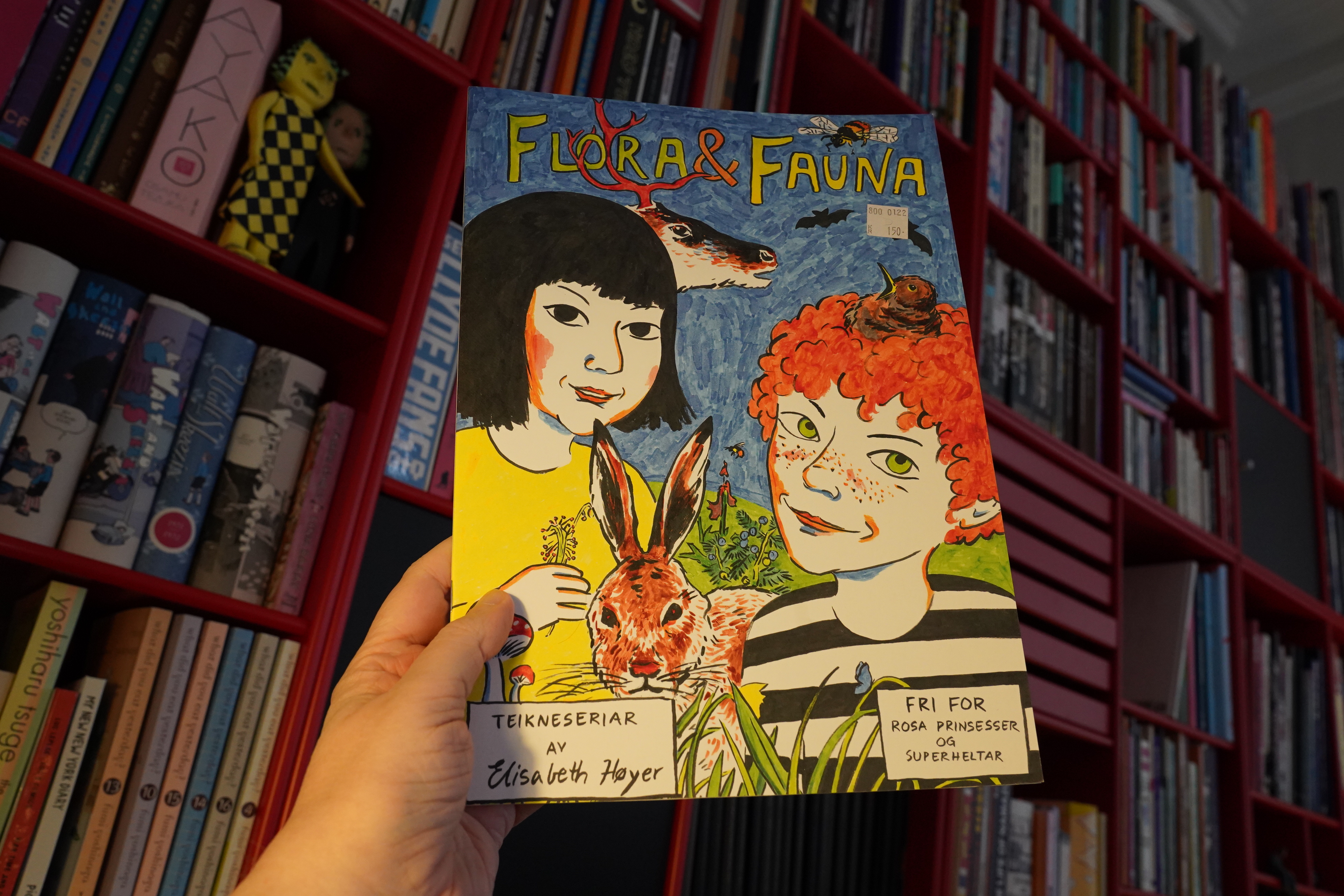
18:31: Flora & Fauna by Elisabeth Høyer
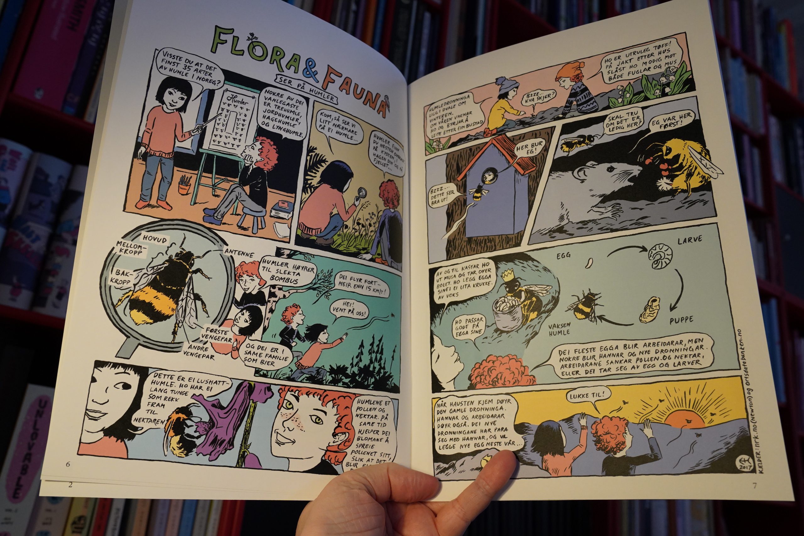
Oops, a comic book for small children. But the artwork’s charming, and the little stories are fun and informative.
Very nice.

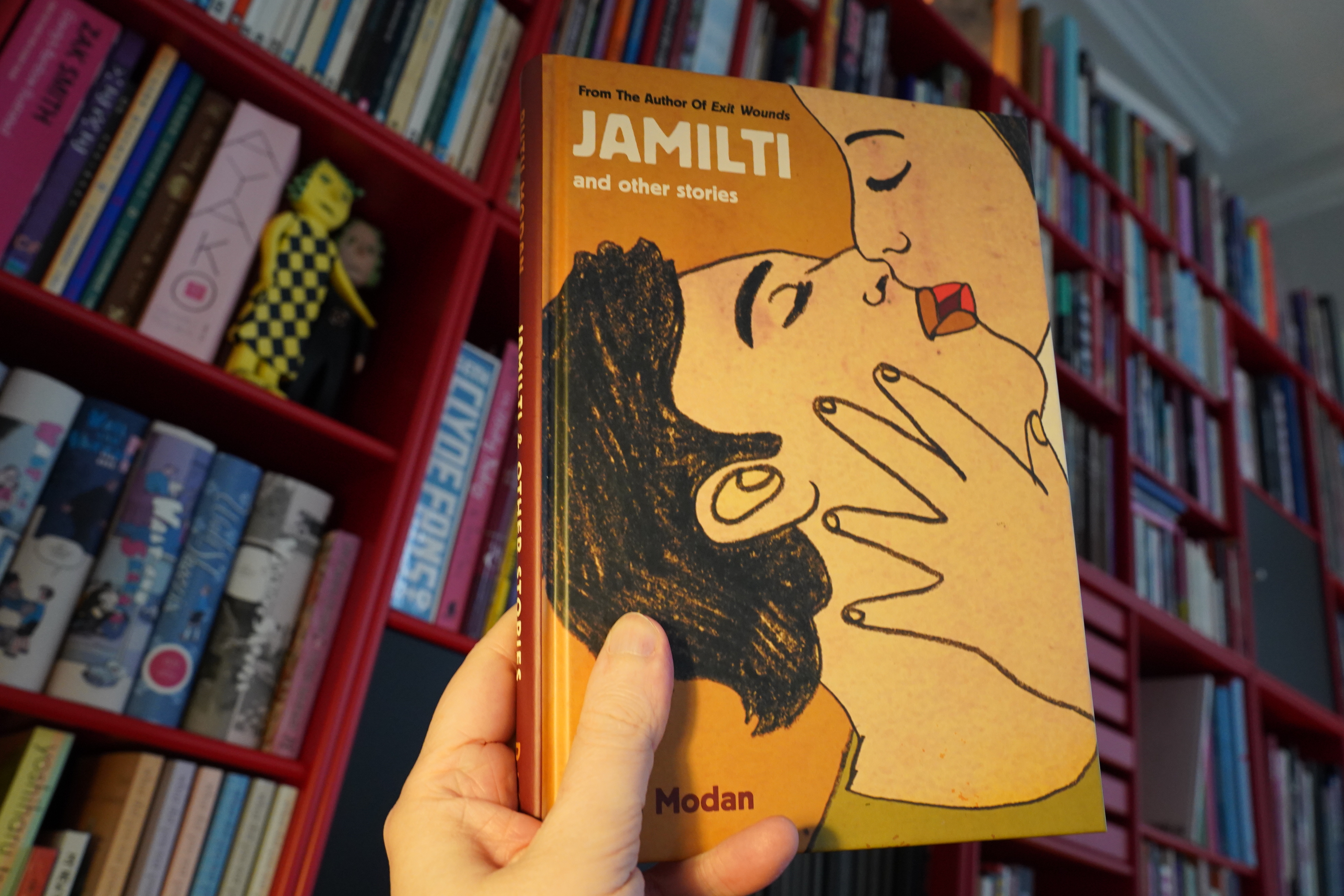
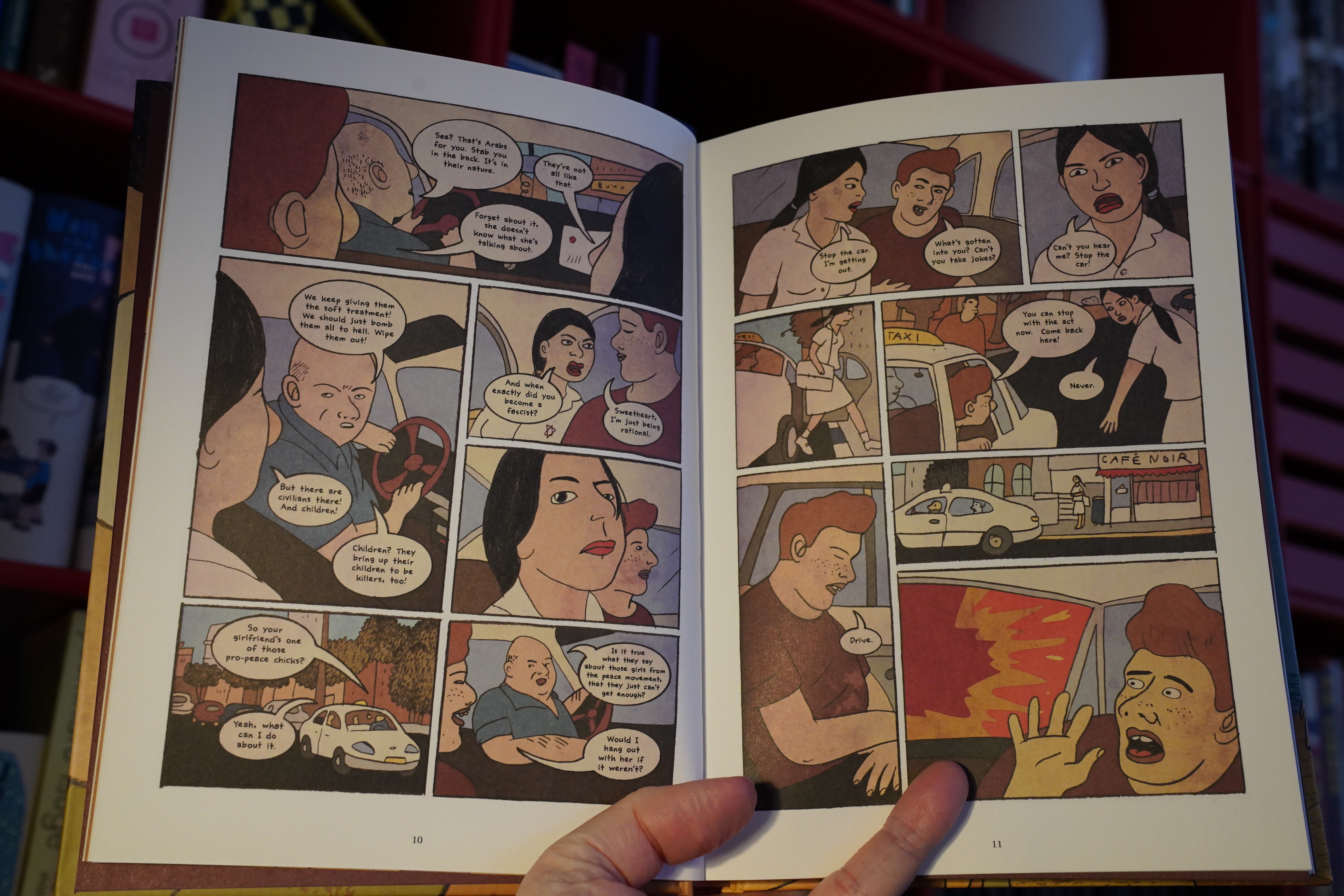
18:43: Jamilti & Other Stories by Rutu Modan (Drawn & Quarterly)
I think I’ve somehow missed reading this before? Her later books are really good, though, so it’s weird I haven’t picked this up before.

Hm… seems slightly familiar?
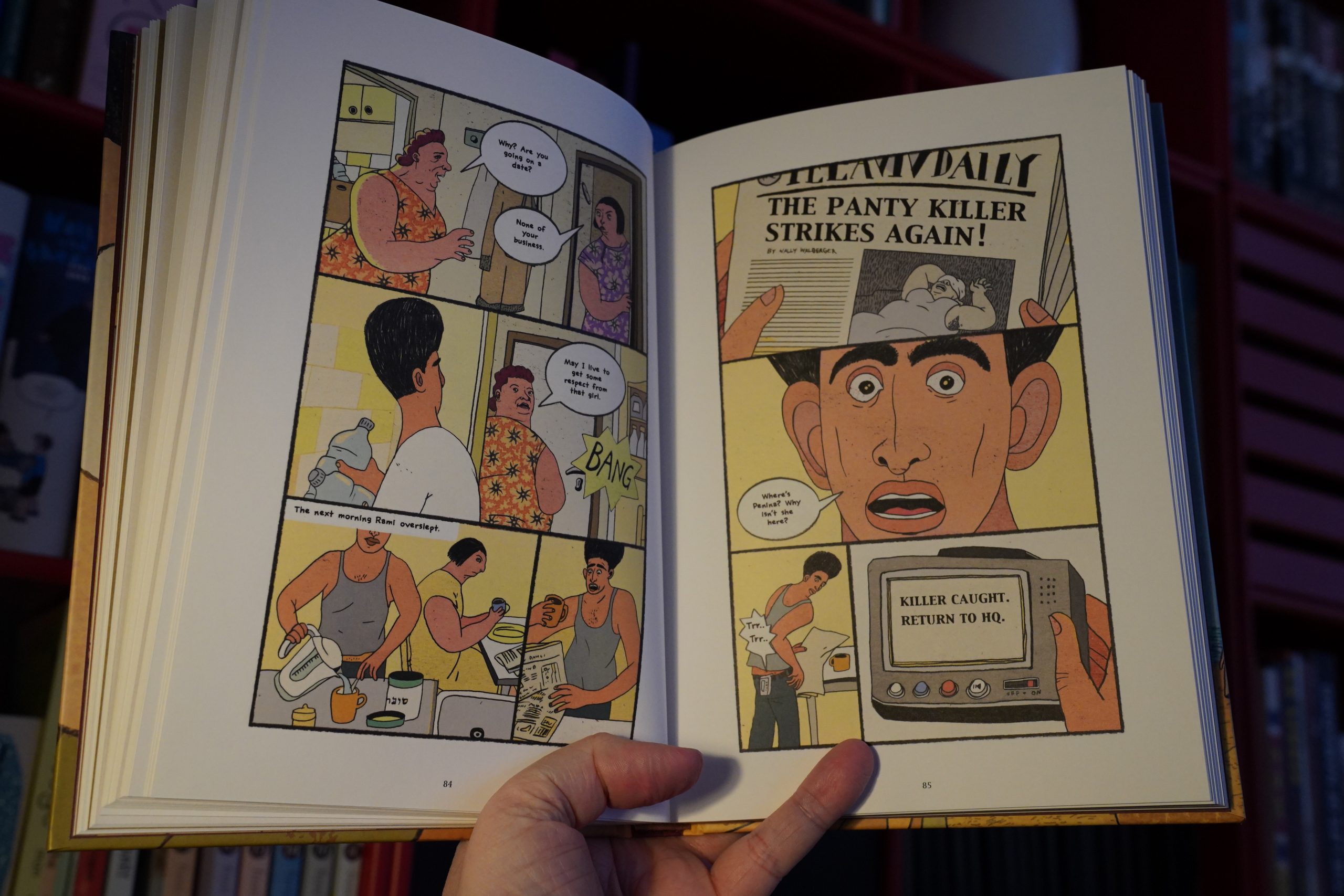
Oh, yeah — I think I’ve got some of these stories in the Actus Tragicus editions?
Anyway, I love these stories. They’re all slightly off kilter, keeping you on your toes.
And great fun.
| Jeff Buckley: You and I |  |
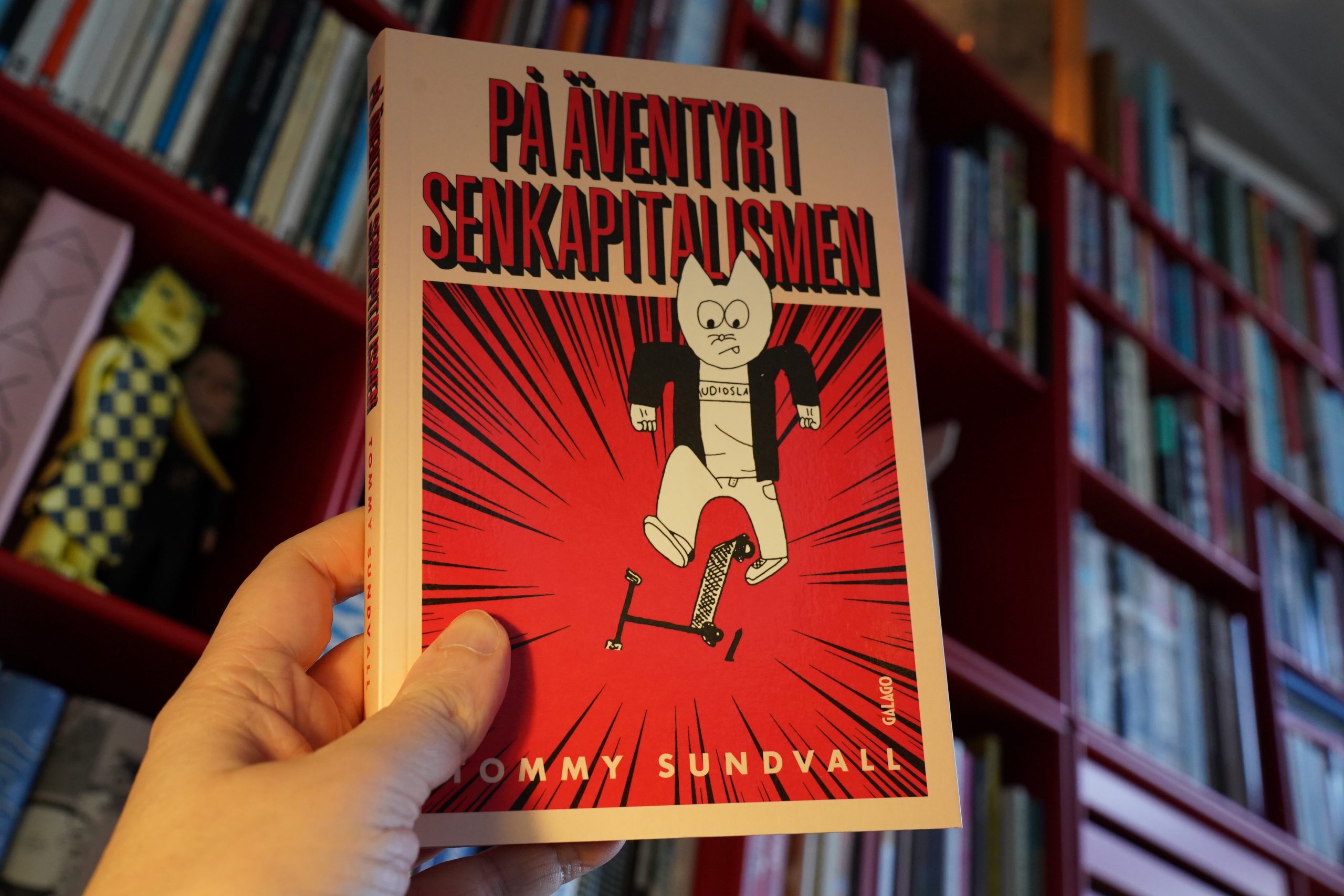
19:42: På äventyr i senkapitalismen by Tommy Sundwall (Galago)
Gotta cover all the Scandinavian countries, so here’s a Swedish book.
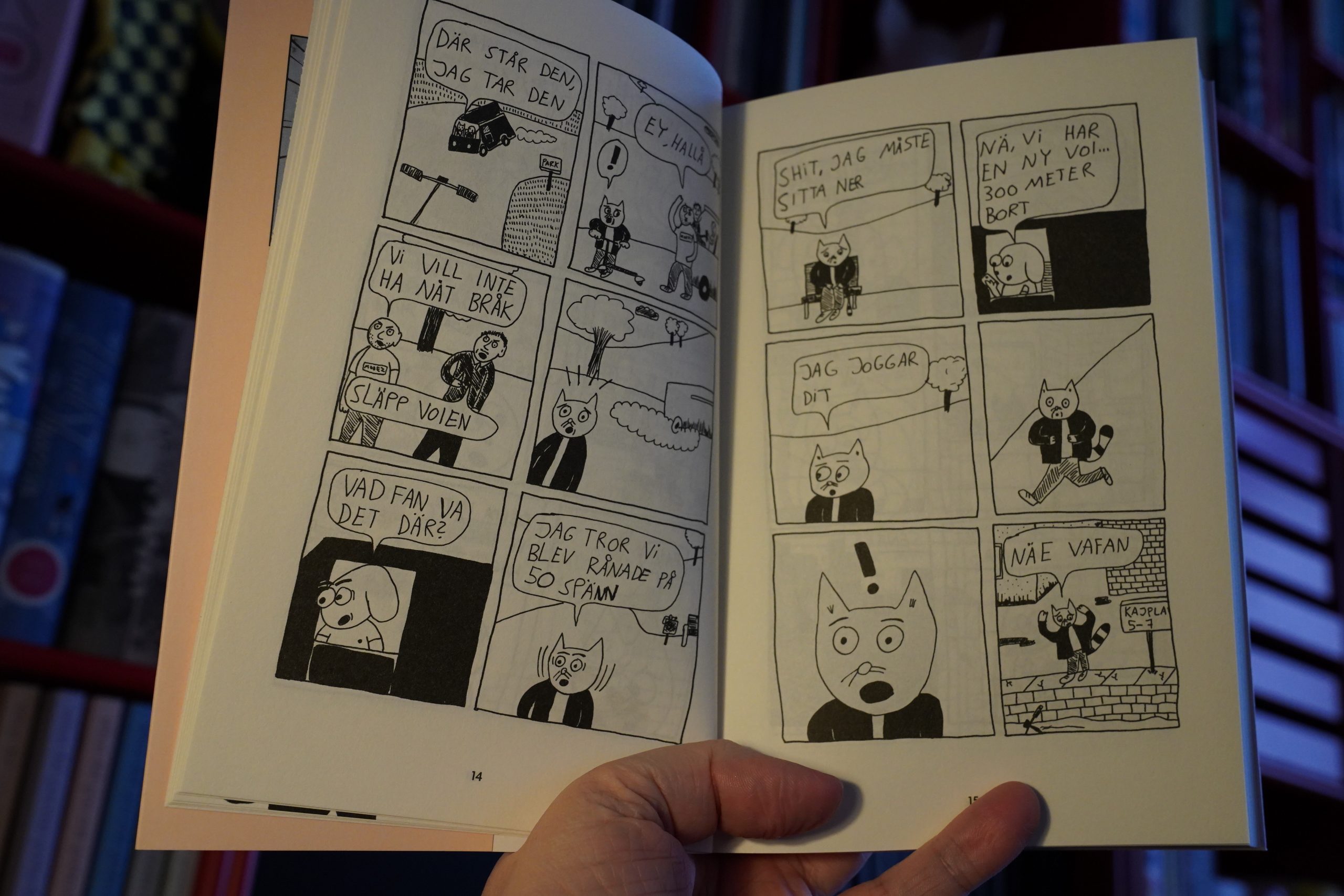
I thought this was gonna be a kinda-sorta serious book about the precariat…
… but it’s instead a goofy series of hapless adventures. It’s amusing, and the hi-jinx are original. But… the storytelling chops just aren’t there. It’s pretty rough.
OK, that was a good one.
| Various: Ocean Child: Songs of Yoko Ono |  |
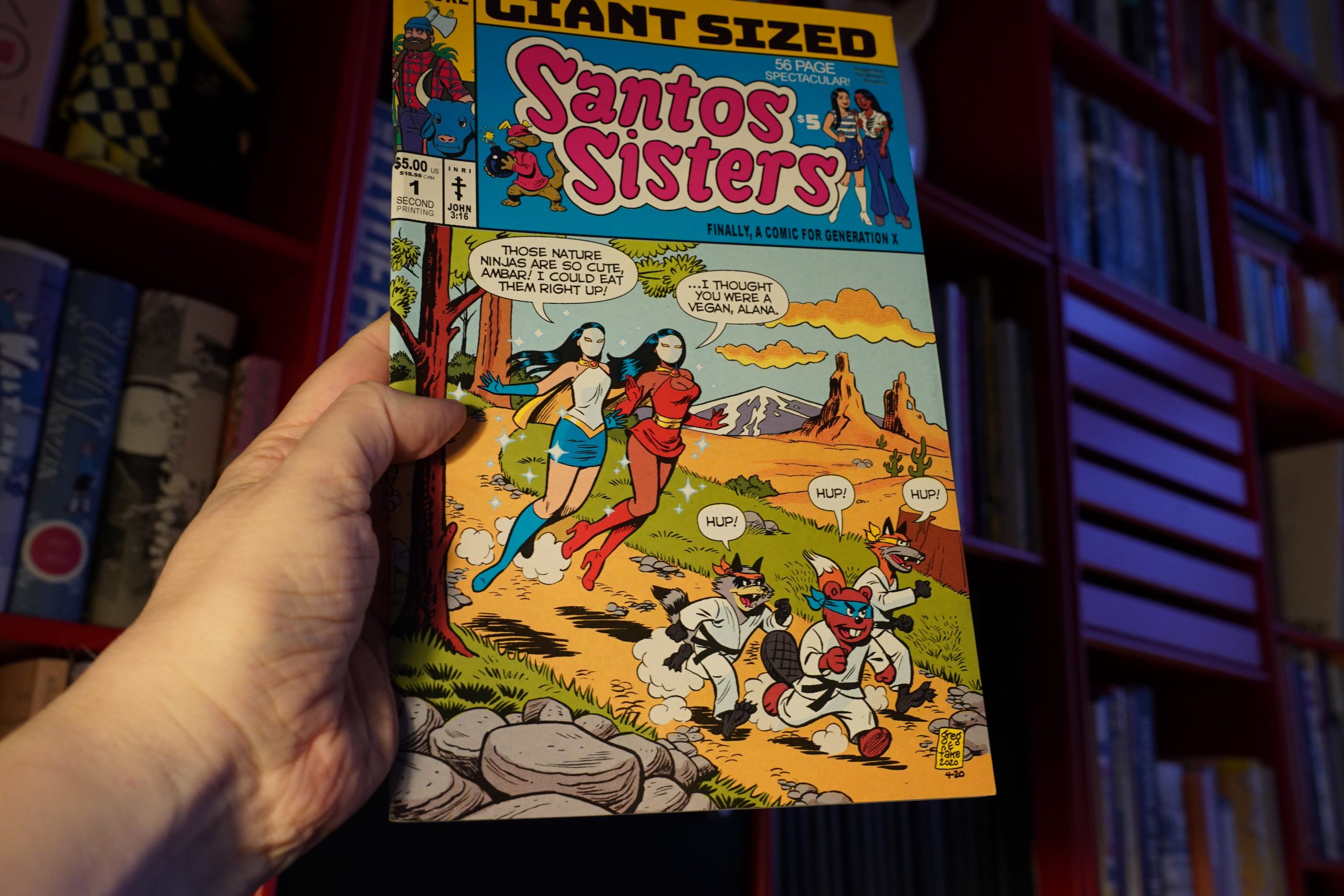
21:01: Giant Sized Santos Sisters #1 by Fake & Greg Petre (Floating World Comics)
Hm… this looks really familiar. Or perhaps I’ve read another Santos Sisters thing? Hm, it says “second printing”…
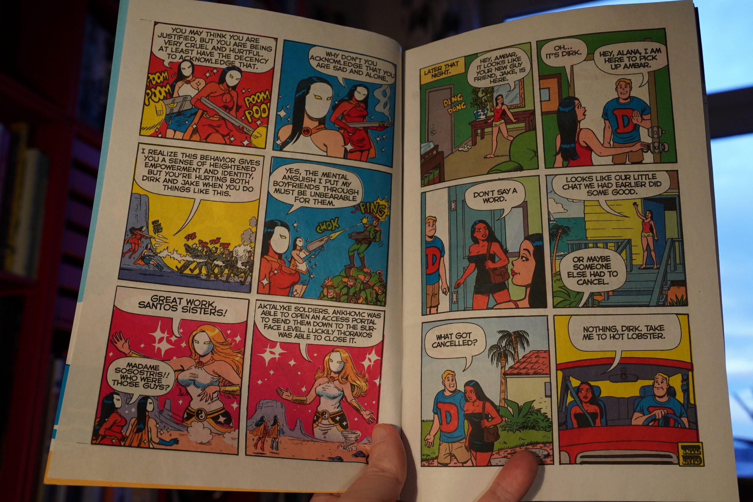
This is quite amusing, and very strange. I mean, it’s not really a straight up Archie/super-hero parody. Instead it’s a bizarre riff on… a lot of stuff… and it kinda works?
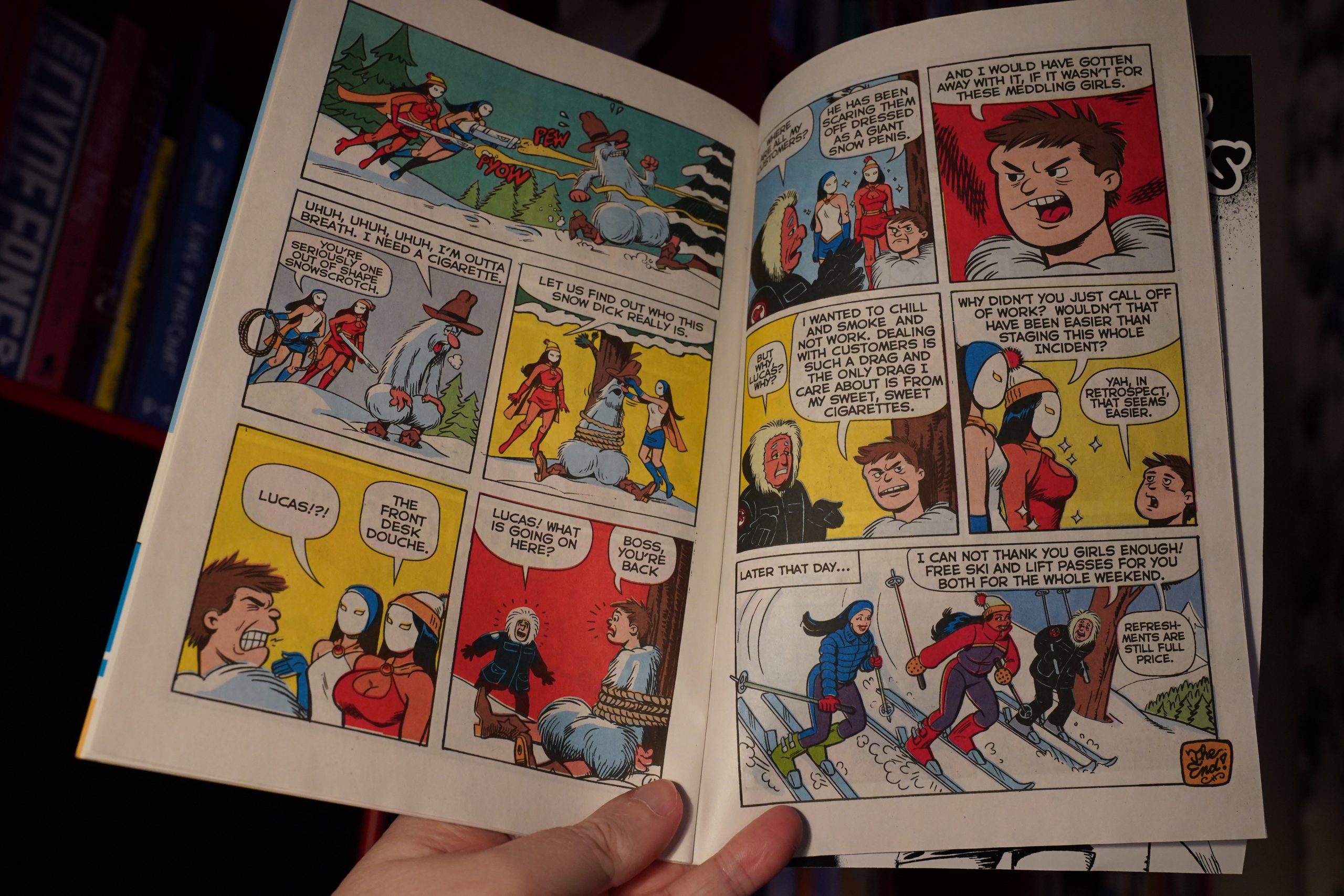
The production job is amazing. Lots of people try to emulate 60s comics books, but they take it way too far to be sure that we notice. Instead the colour registration is just exactly the right amount off, just like it was back then.
Looks great.
| Arto Lindsay, Joe McPhee, Ken Vandermark, and Phil Sudderberg: Largest Afternoon |  |
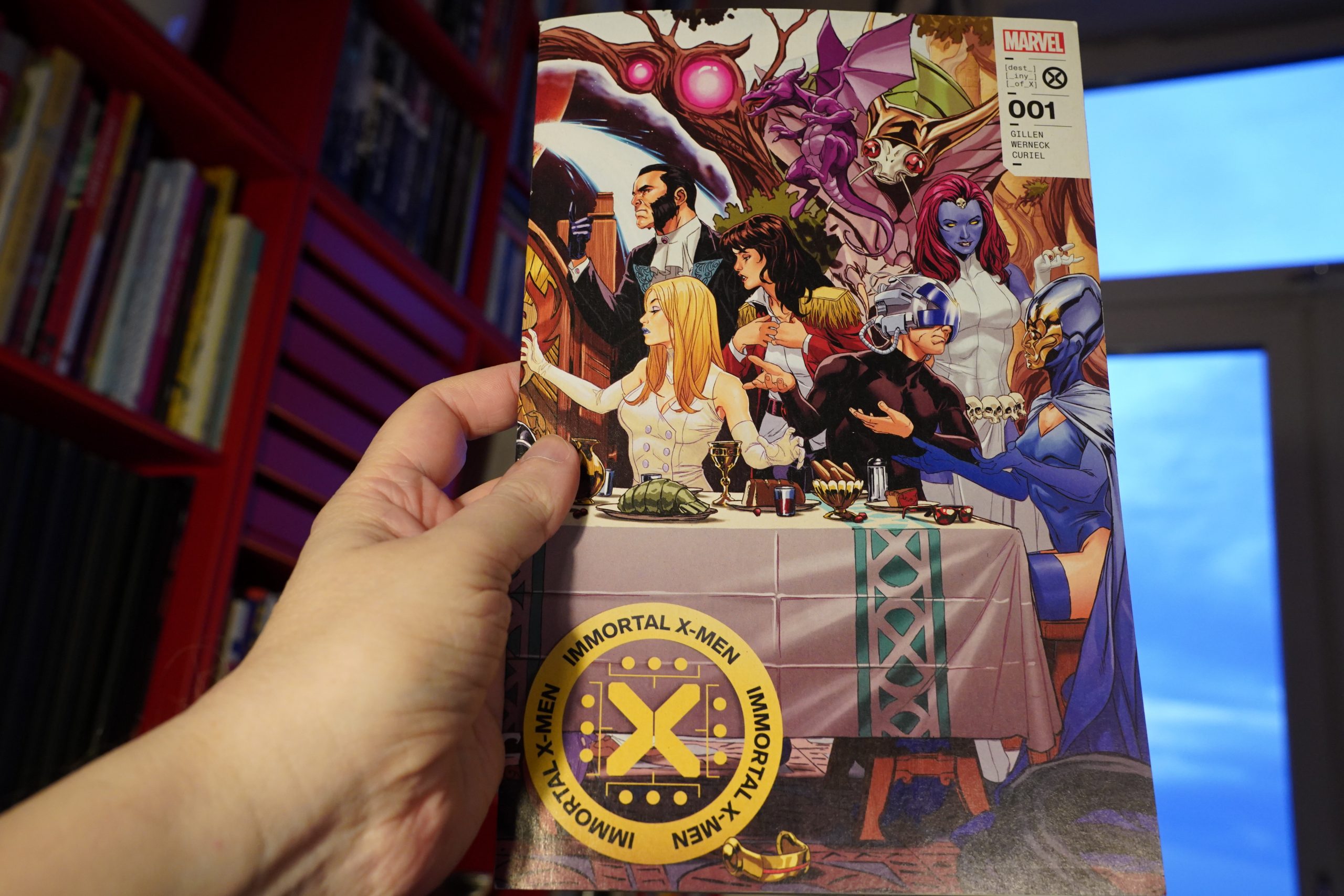
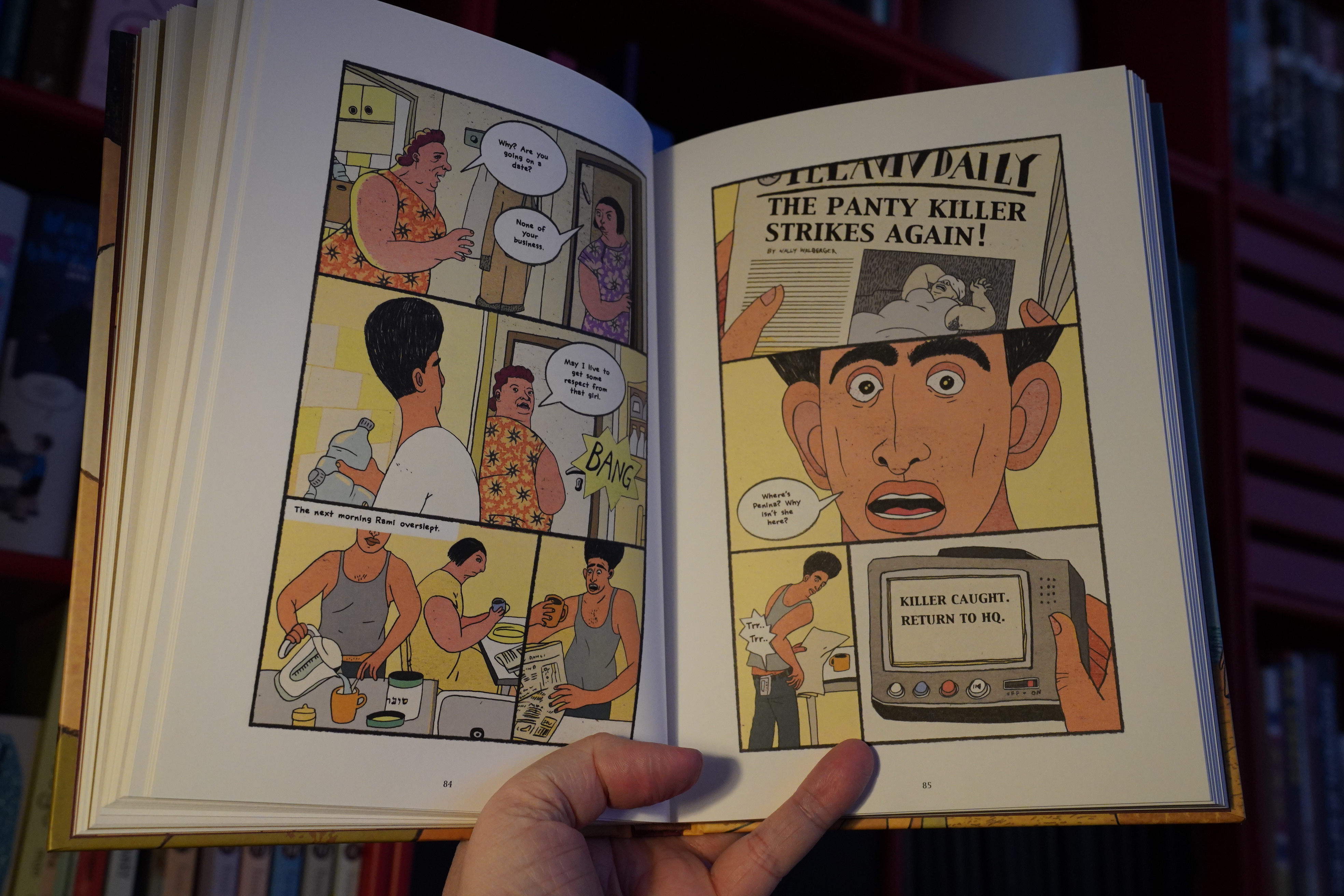
21:26: Immortal X-Men #1 by Gillen/Werneck/Curiel (Marvel Comics)
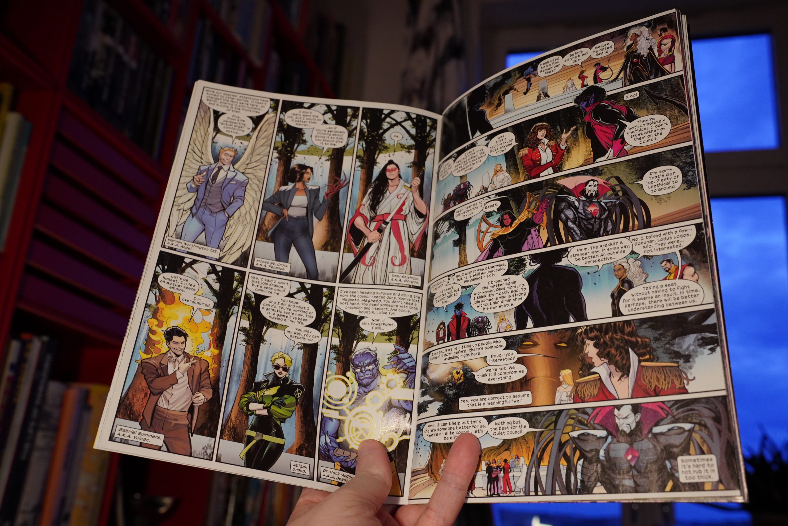
I was quite entertained by the Hickman HoX/PoX stuff, so I got into the X-Men again. But, predictably enough, after the excitement had worn off, Marvel put their worst hacks (like… whatsisname… Garry Duggan? Something like that) on some of the books, and the stuff became unreadable again.
But it sounds like they’re trying to make the line fun again, so I’m giving it another try.
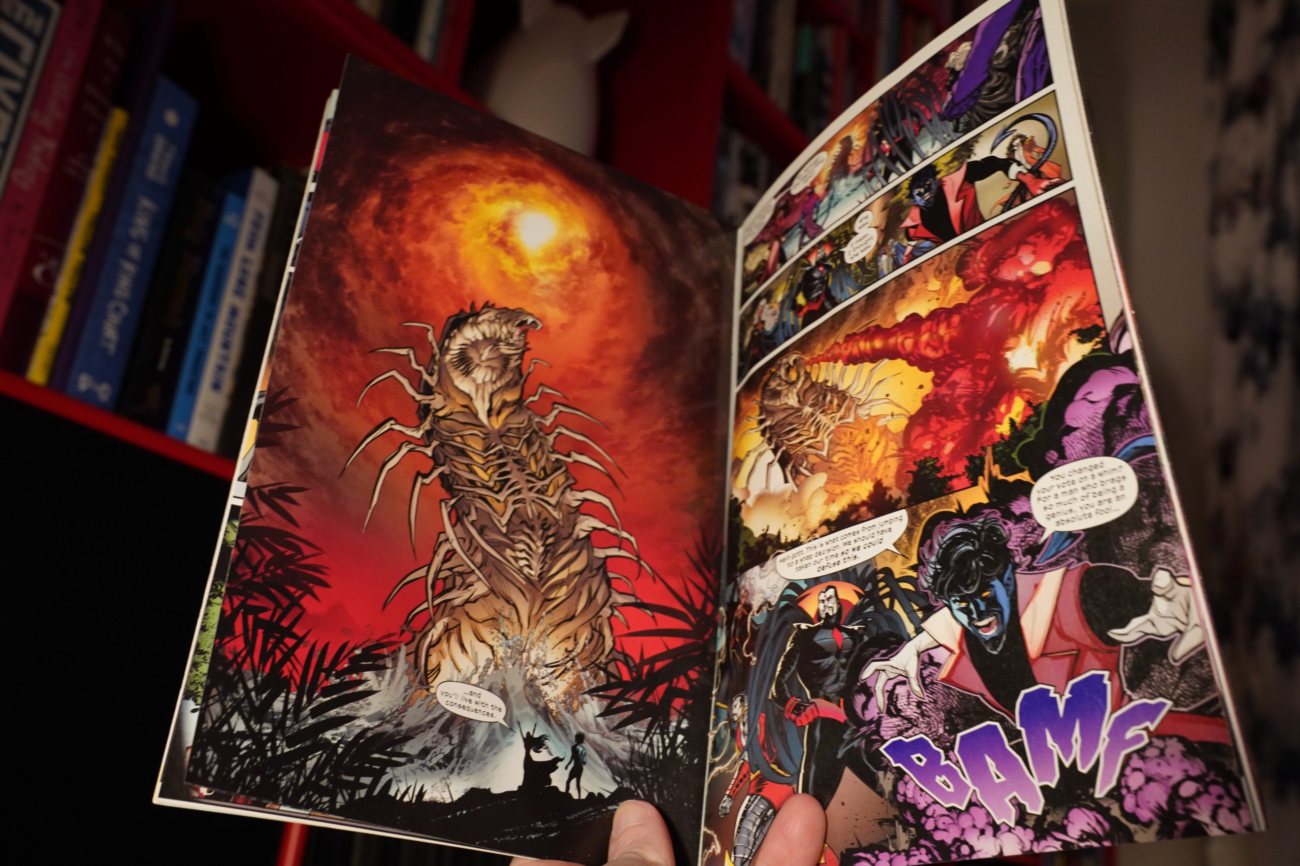
The artwork doesn’t do much for me, and there’s way too much exposition, but it’s OK.
| The Knife: Afraid of You |  |

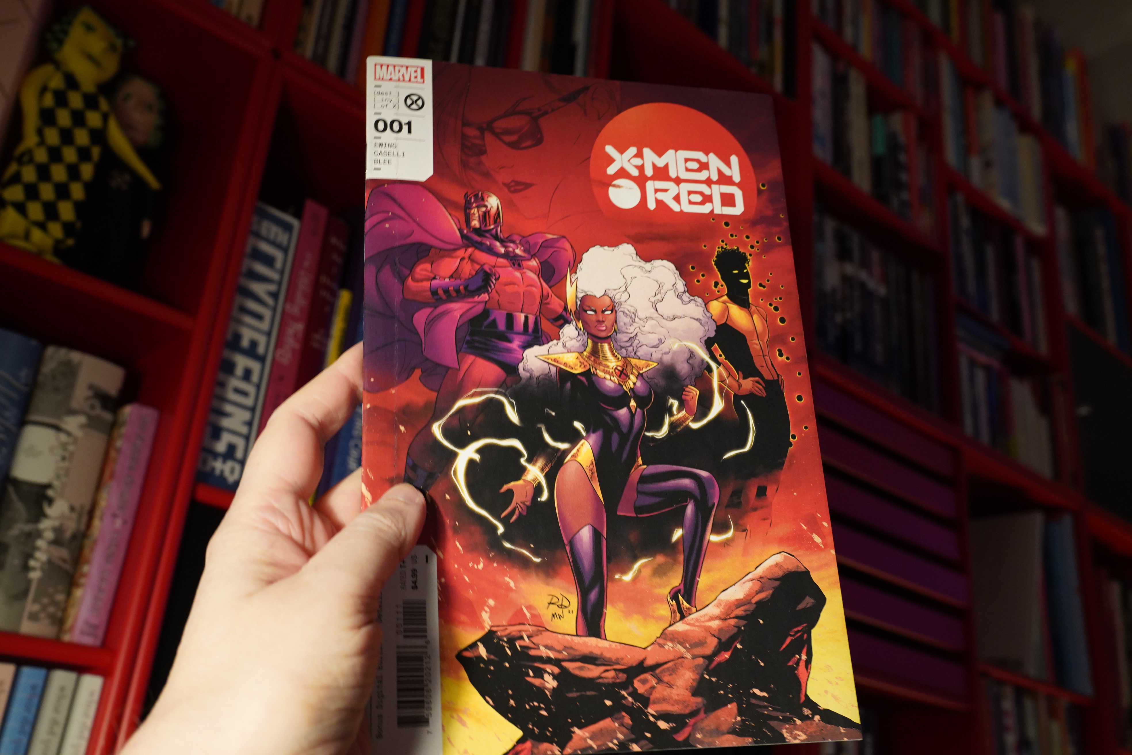
21:48: X-Men Red #1 by Ewing/Caselli/Blee (Marvel Comics)
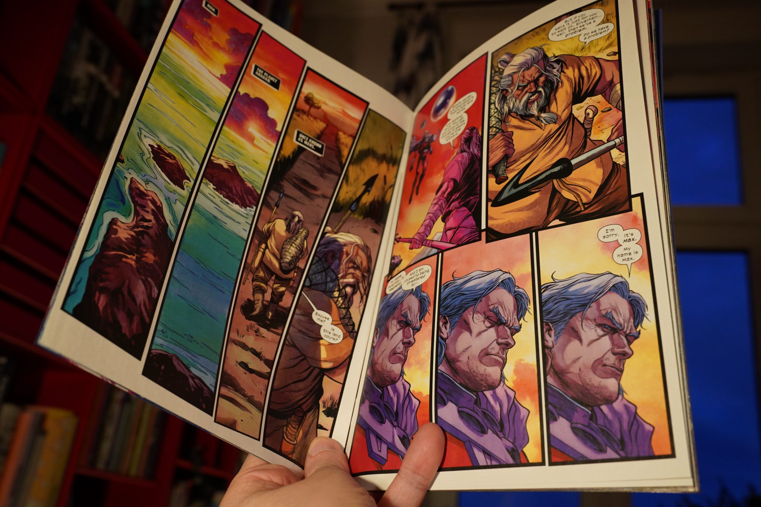
This has better art, but is somehow even chattier. But the chatter here is more amusing (was Ewing trying to see how many references to lyrics he could put in here or something?).
This X-Men iteration seems promising, so I think I’ll stick with it until Marvel replaces Gillen/Ewing with somebody boring again.
| Black Cab: Superheroes |  |

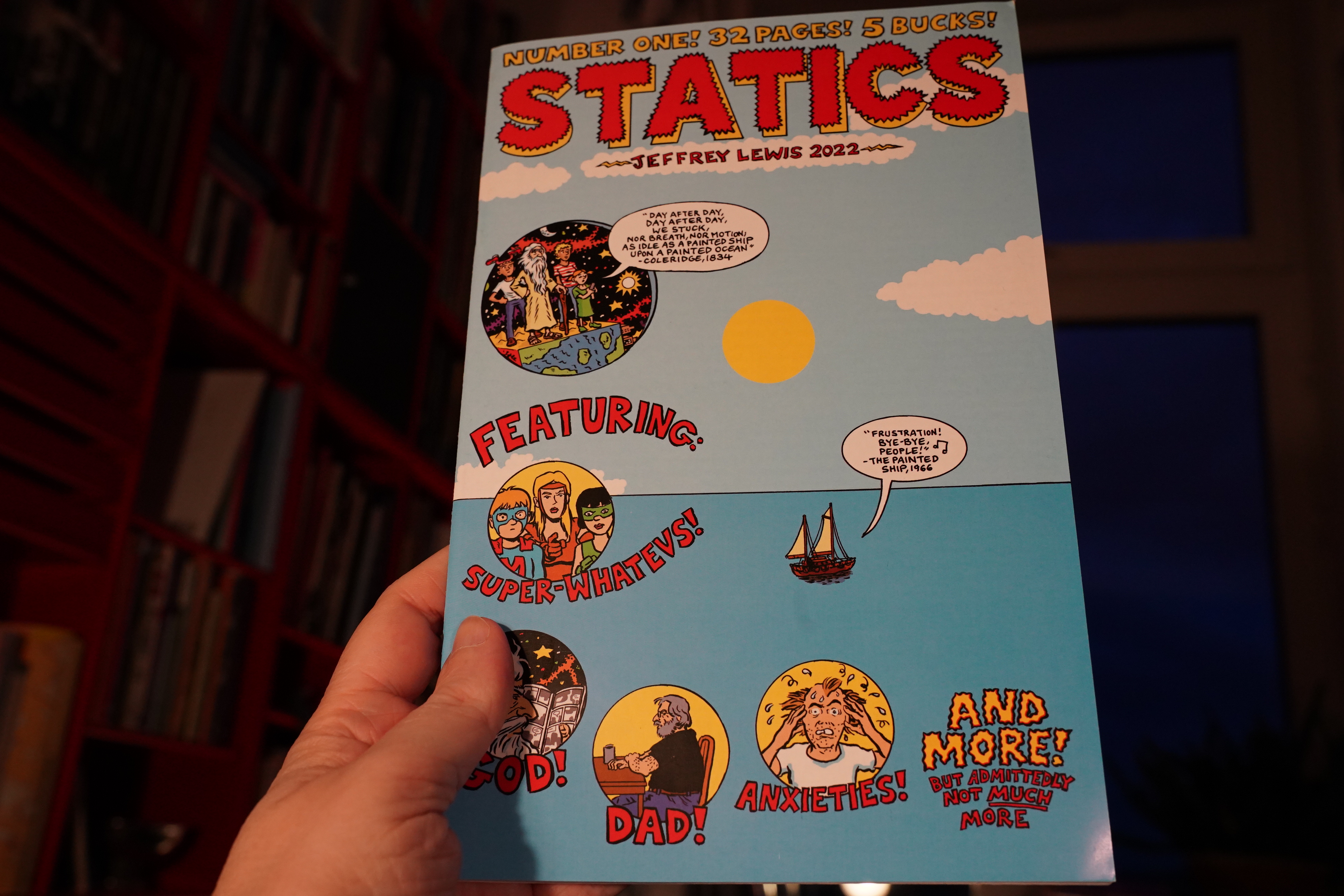
22:00: Statics by Jeffrey Lewis
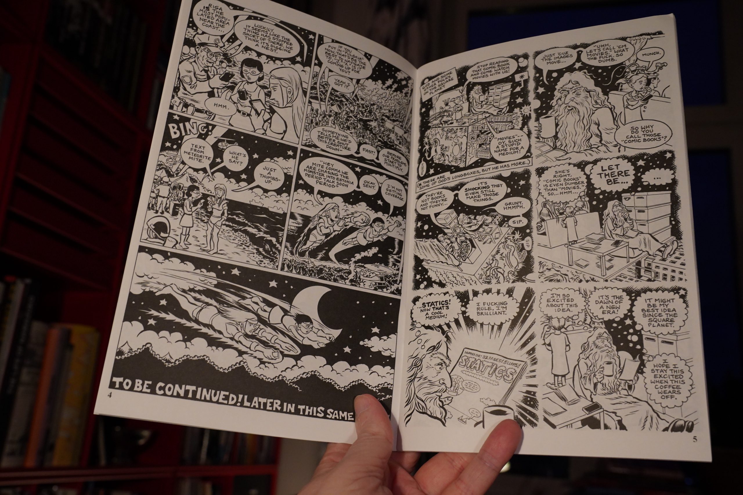
Hey! It’s an old fashioned single author indie anthology.
It’s really interesting… I like how he’s replicating the rhythms of his father’s speech patterns while illustrating his story.
It’s a solid issue.
| Cold in Berlin: … and yet |  |
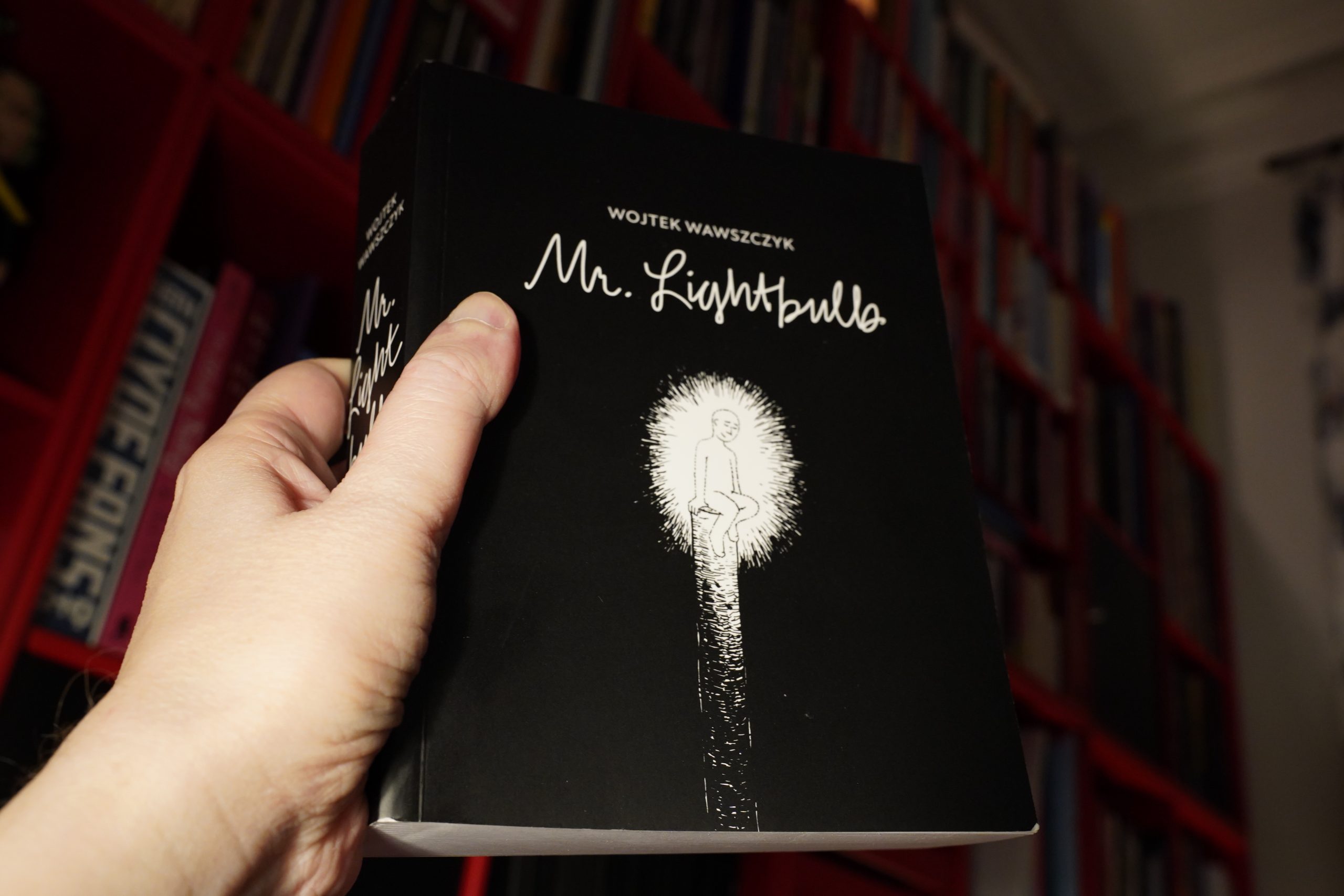
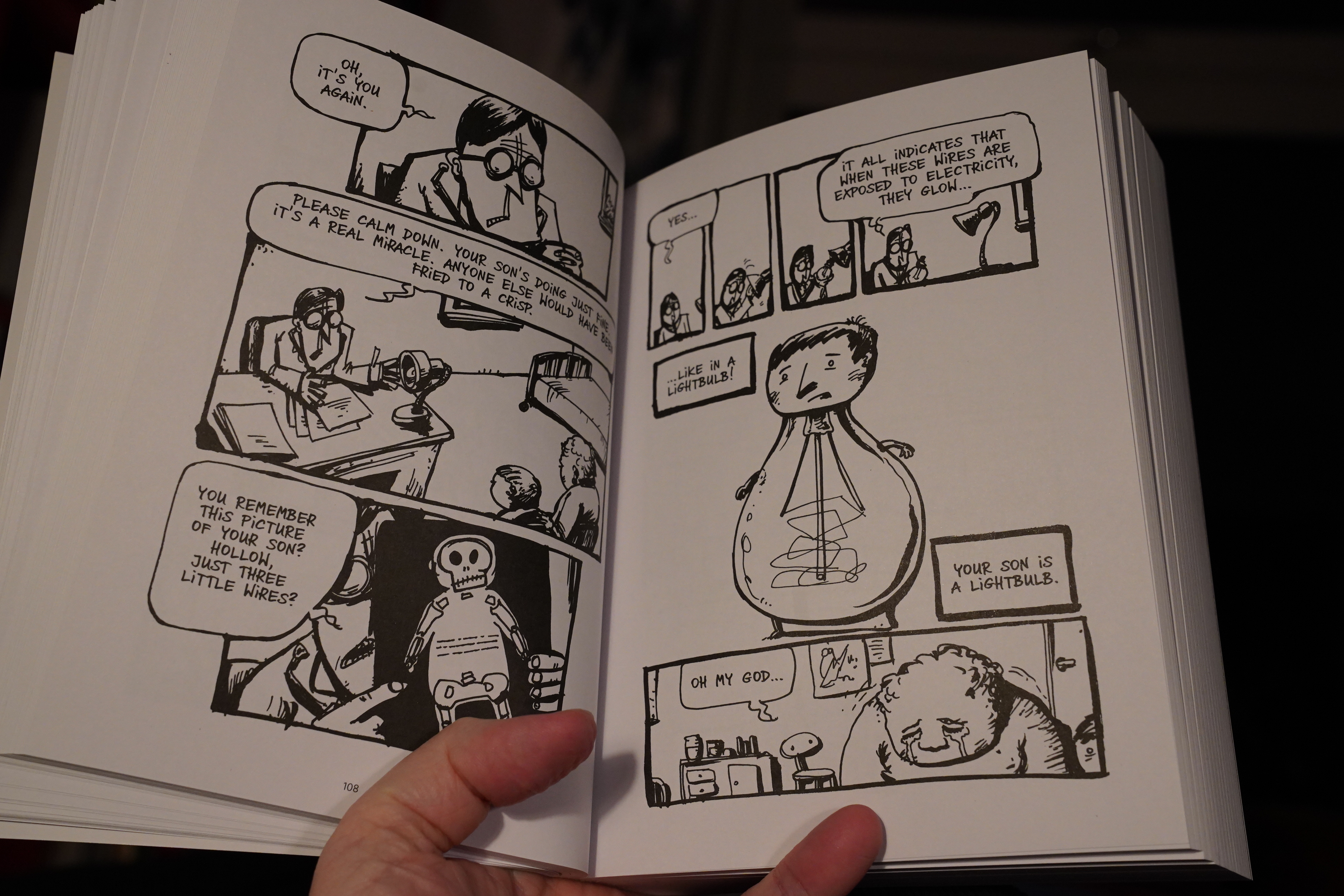
22:23: Mr. Lightbulb by Wojtek Wawszczyk (Fantagraphics)
I’ve read several Polish comics translated into Danish lately, and they all sucked. The Danish translation spurt seemed to be fuelled by subsidies from the Polish gummint, and…
… yup, this one, too.
So my expectations here are very low indeed.

So satire. Very allegory.
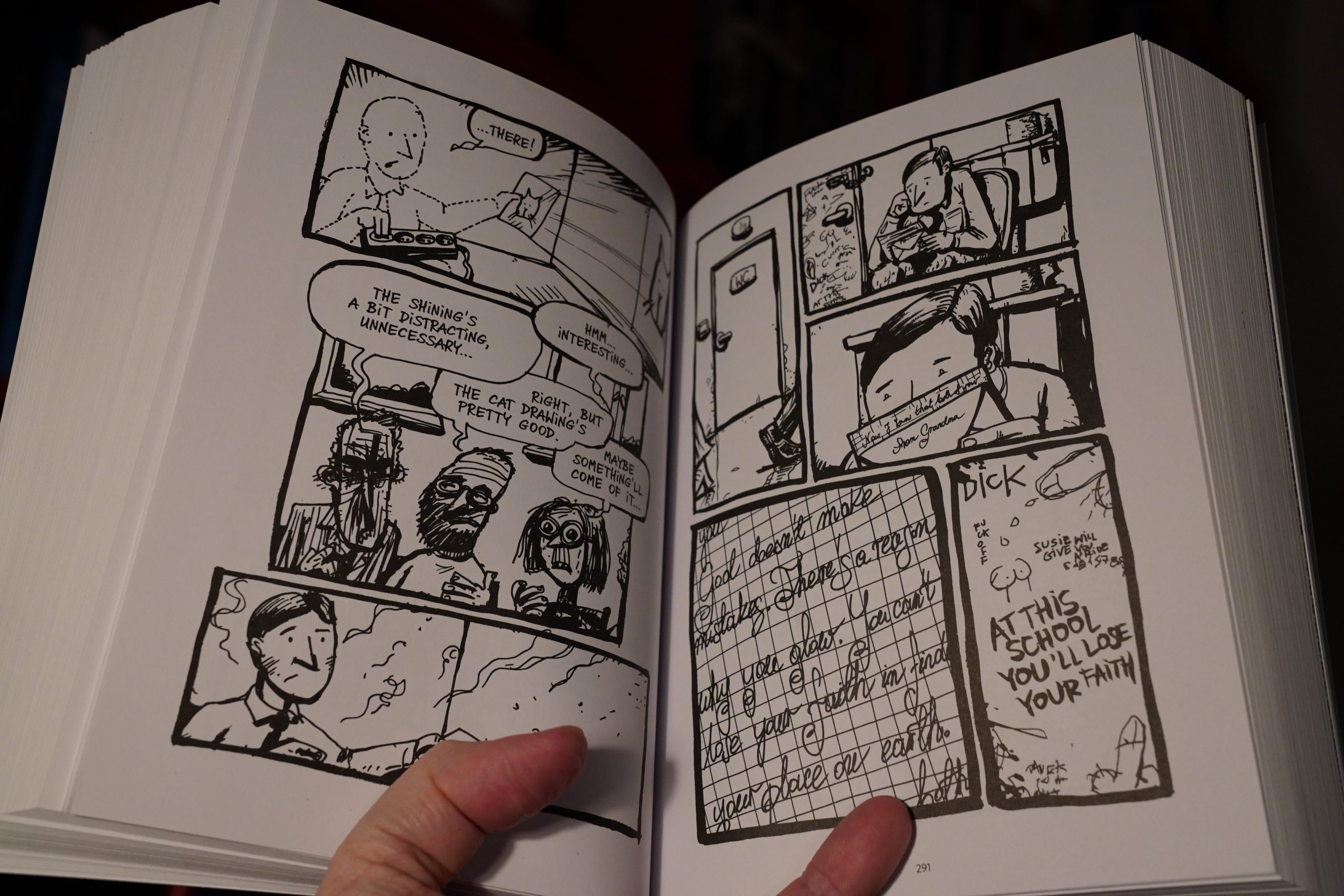
Oh. Oh. So the guy with the (literally) bright talents also draws comics and goes to art school? This is a whiny book about how hard it is to be an artist, especially when you have a broken mother and a flat father?
*sigh*
The book is a bit embarrassing.
But the artwork’s nice, and it’s got a generally good flow.
I really should go to bed now, because I’m exhausted after all these comics, but I can’t end the evening with that book…
| Bogdan Raczynski: Mixes |  |

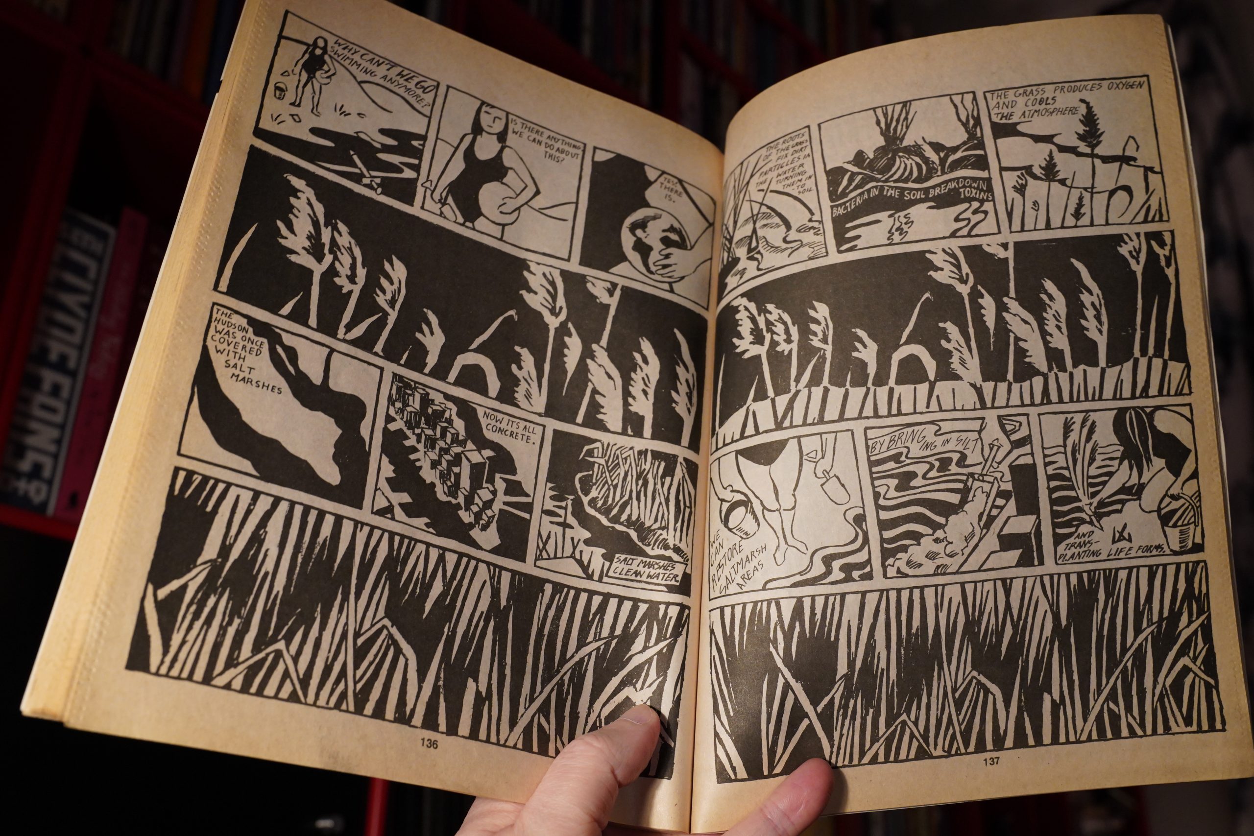
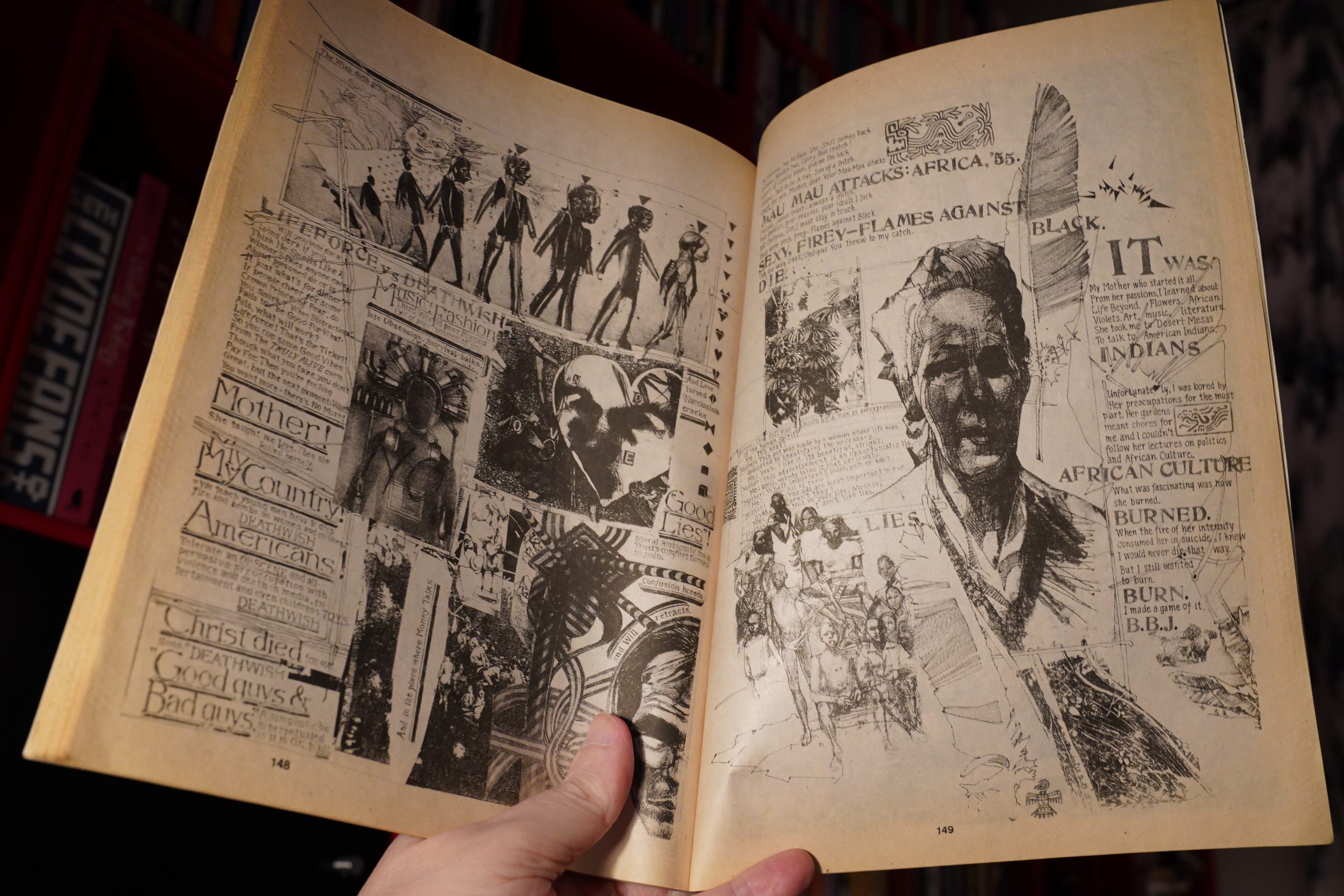
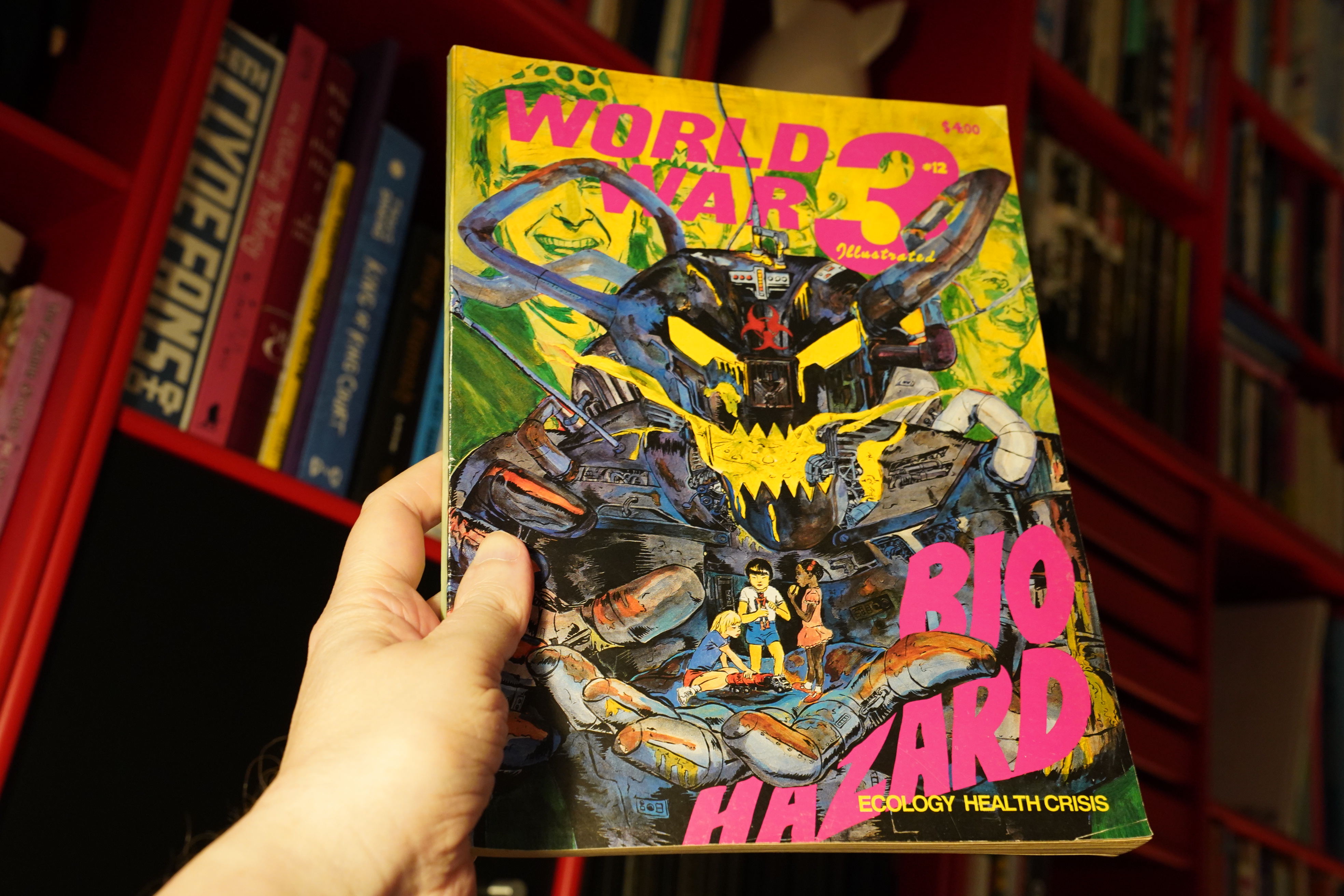
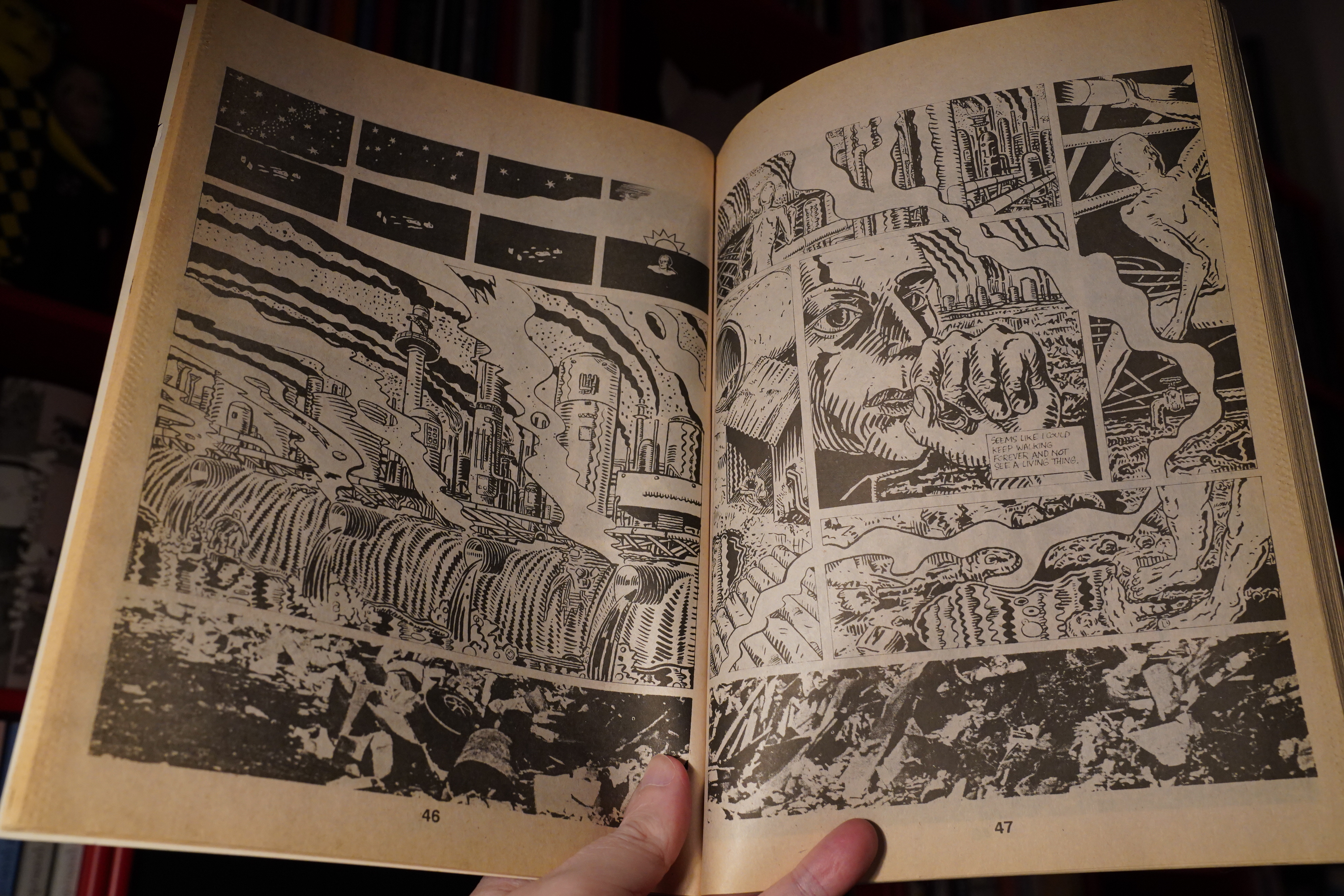
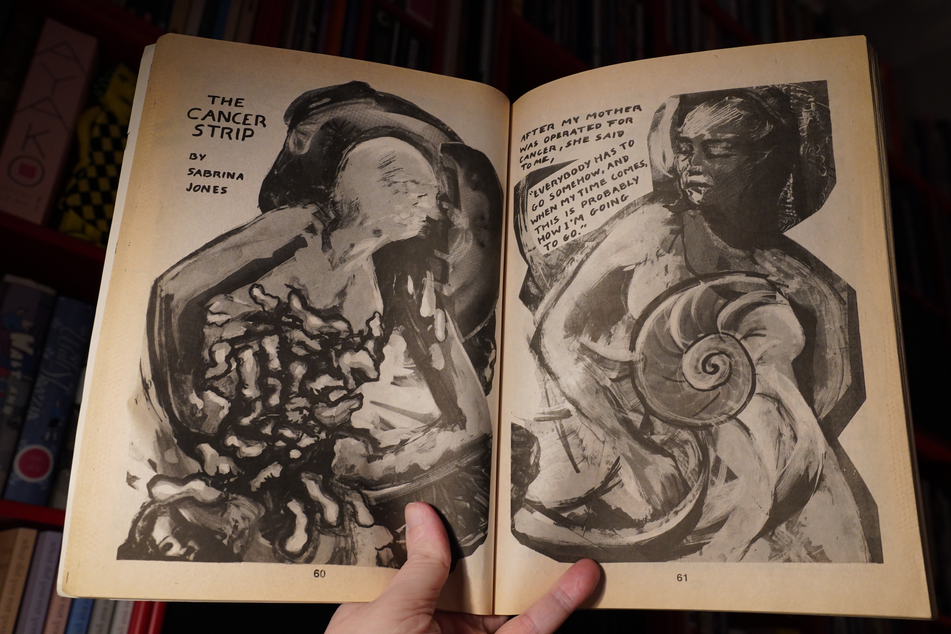
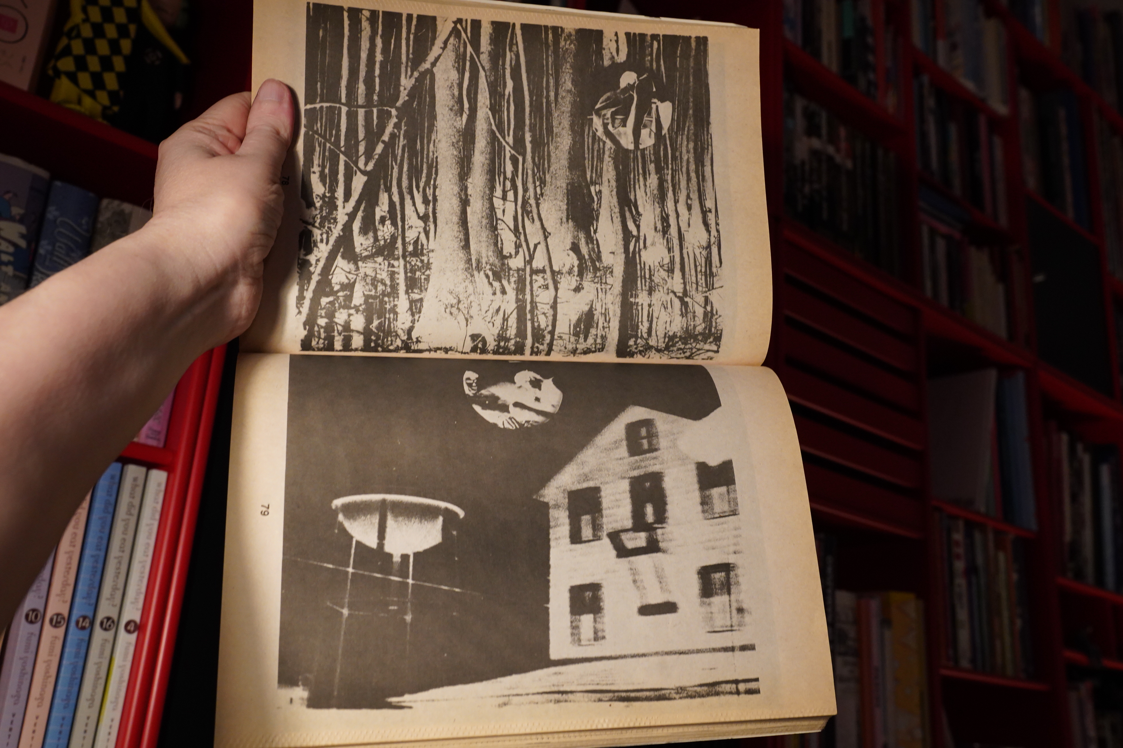
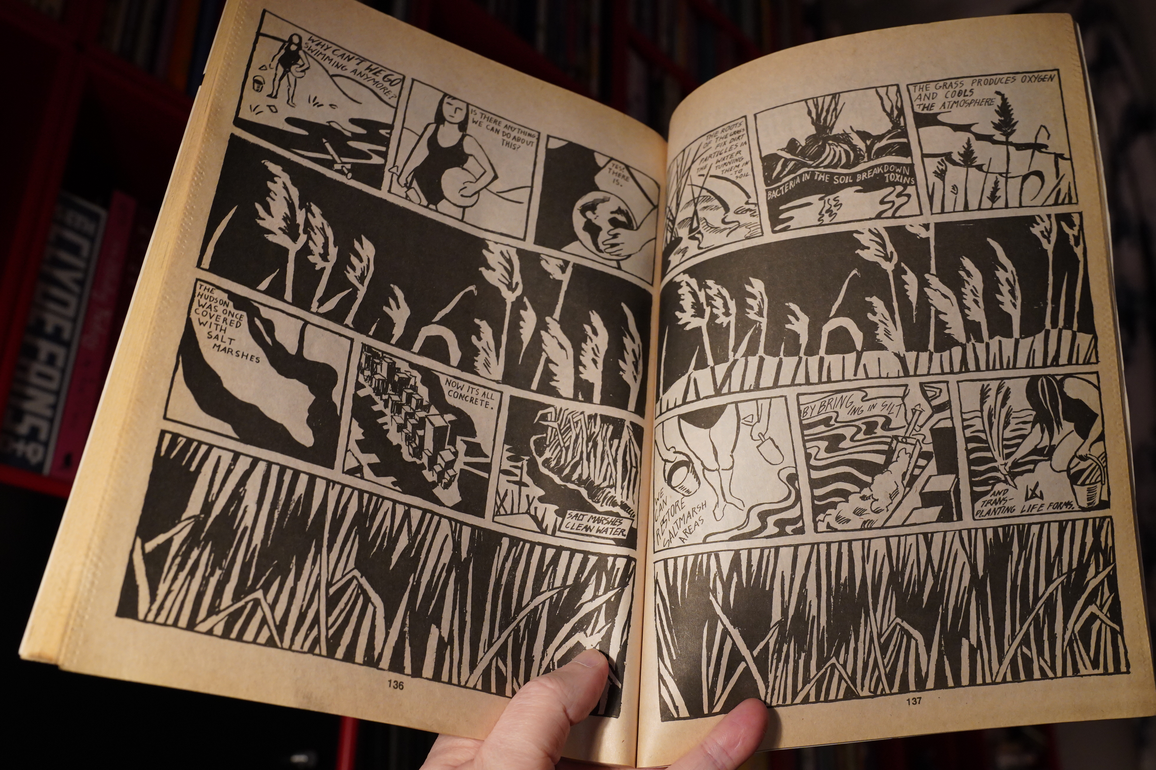
23:23: World War 3 Illustrated #12
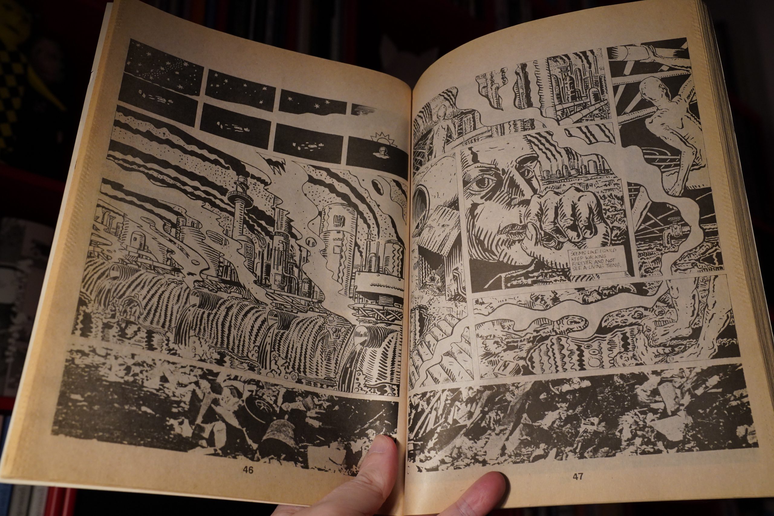
This issue is about disease and the environment. (Chuck Sperry.)
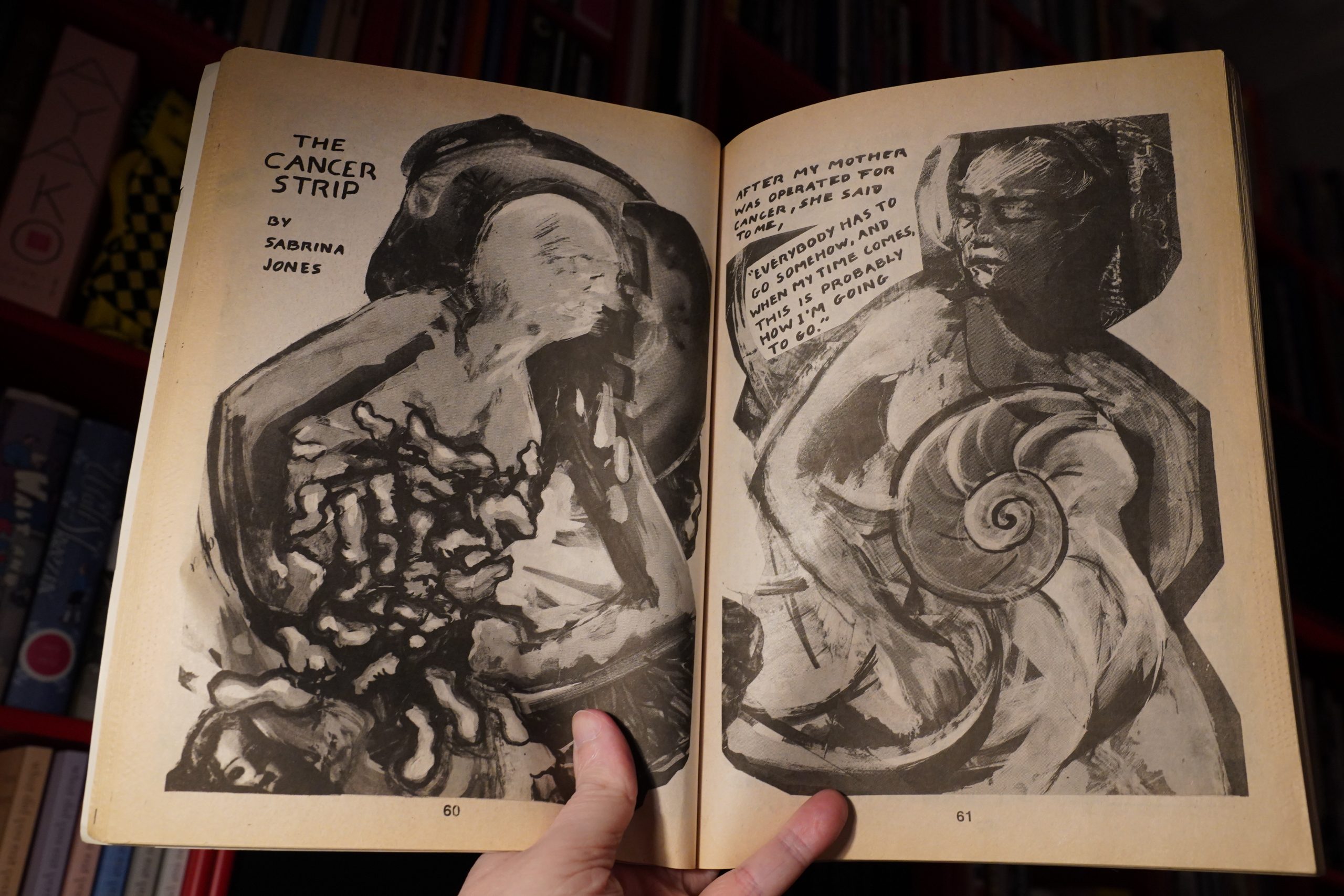
It’s a really strong issue. (Sabrina Jones.)

Hey! David Wojnarowicz.
Seth Tobocman.
Barron Storey? That’s unusual.
Anyway, really good issue.
| Steven Brown: El Hombre Invisible |  |
00:02: Night
But I really should get some sleep.
Nighty.


)


)
)

)
)