Remember a couple of days ago when I said that I had refreshed the Diamond/Lunar previews web site I’ve been doing for a few years? No?
But when I first start futzing around with a project, more and more little annoyances become clearer, and improvements present themselves, so I always end up sitting for days, just tweaking and tweaking… the code! Dude! I’m tweaking the code!
So there’s now phrase search “like this”, and backwards search, and highlighting the search hits. And you can now filter on unnumbered books. And many CSS tweaks to make things really stay put — the idea is, after all, that nothing should move on the page as you advance through the catalogue, so that you can scan things fast without hunting for things with your eyes on the page.
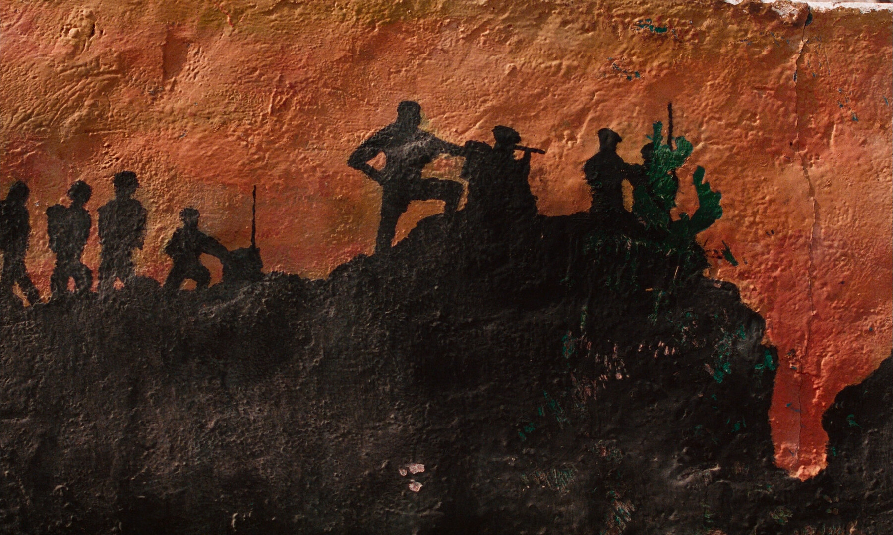
Oh, and I grew tired of the monochrome background, so I er appropriated some art from the all time favourite fine art artist among cartoonists. Guess who!
The mobile version is basically the same as the desktop version (but with things rearranged), so these improvements are there, too.
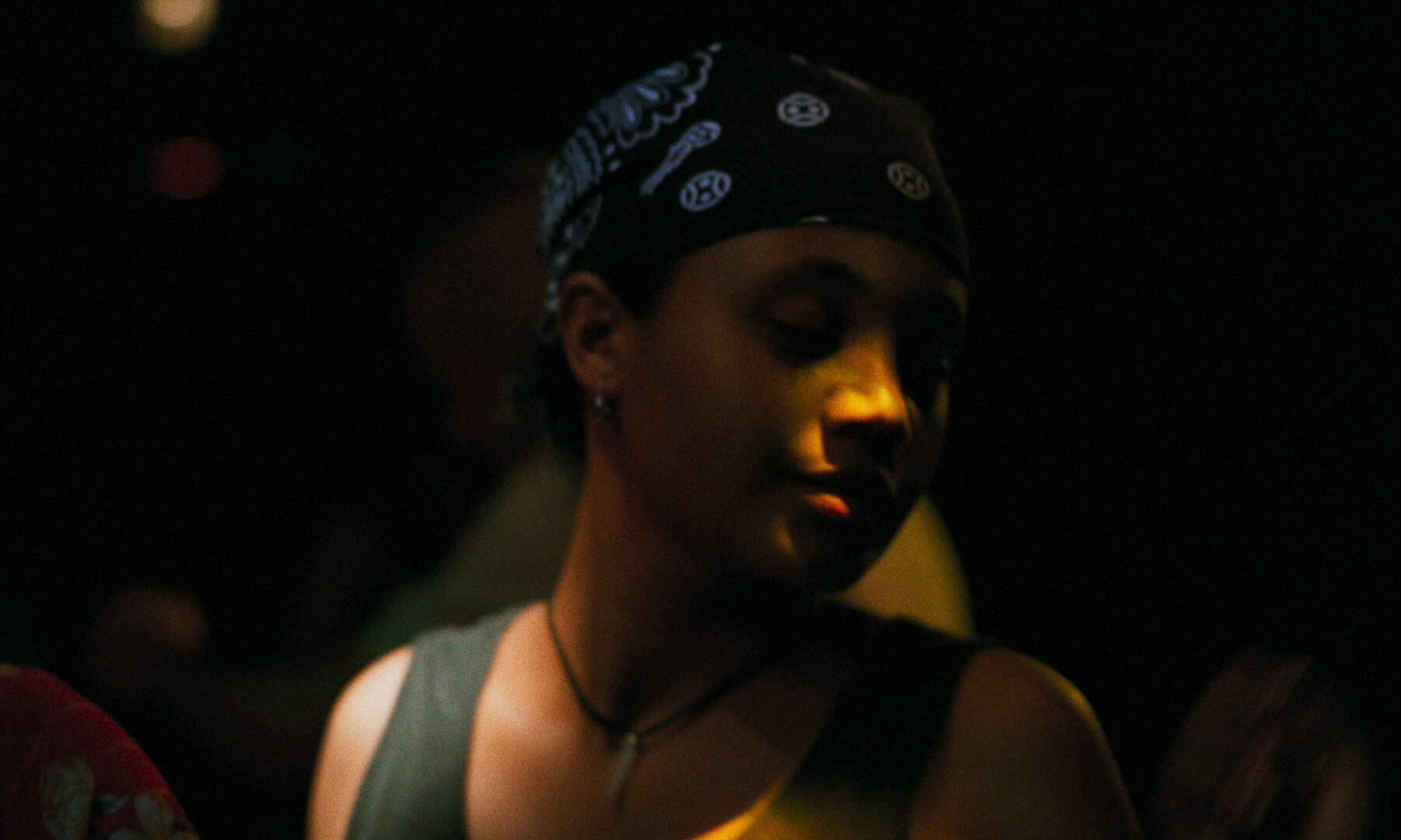
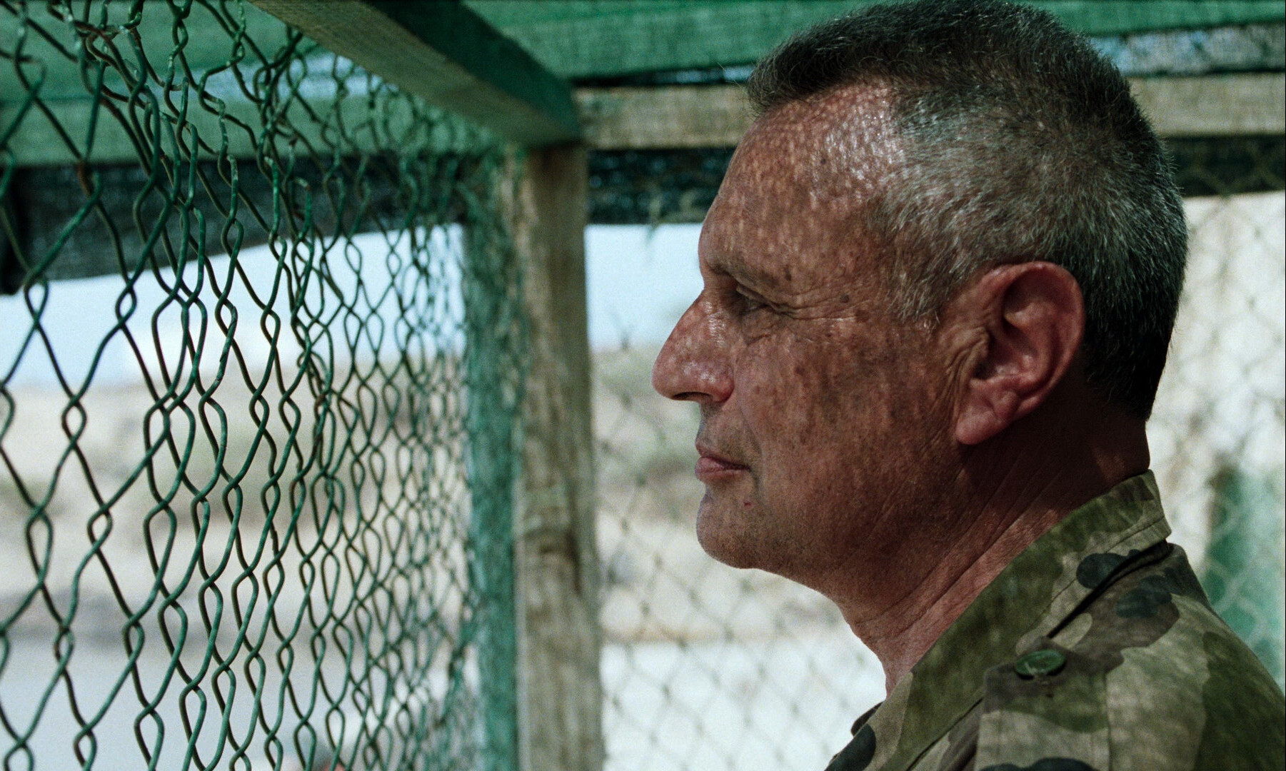
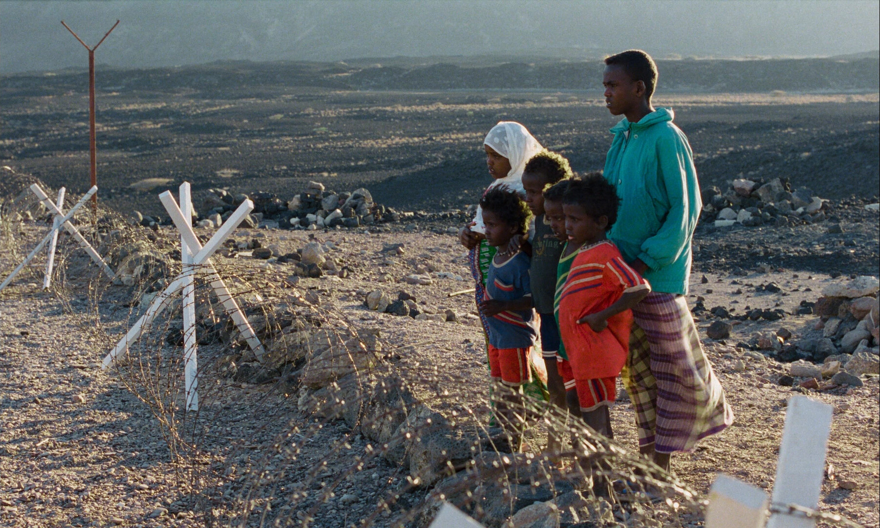
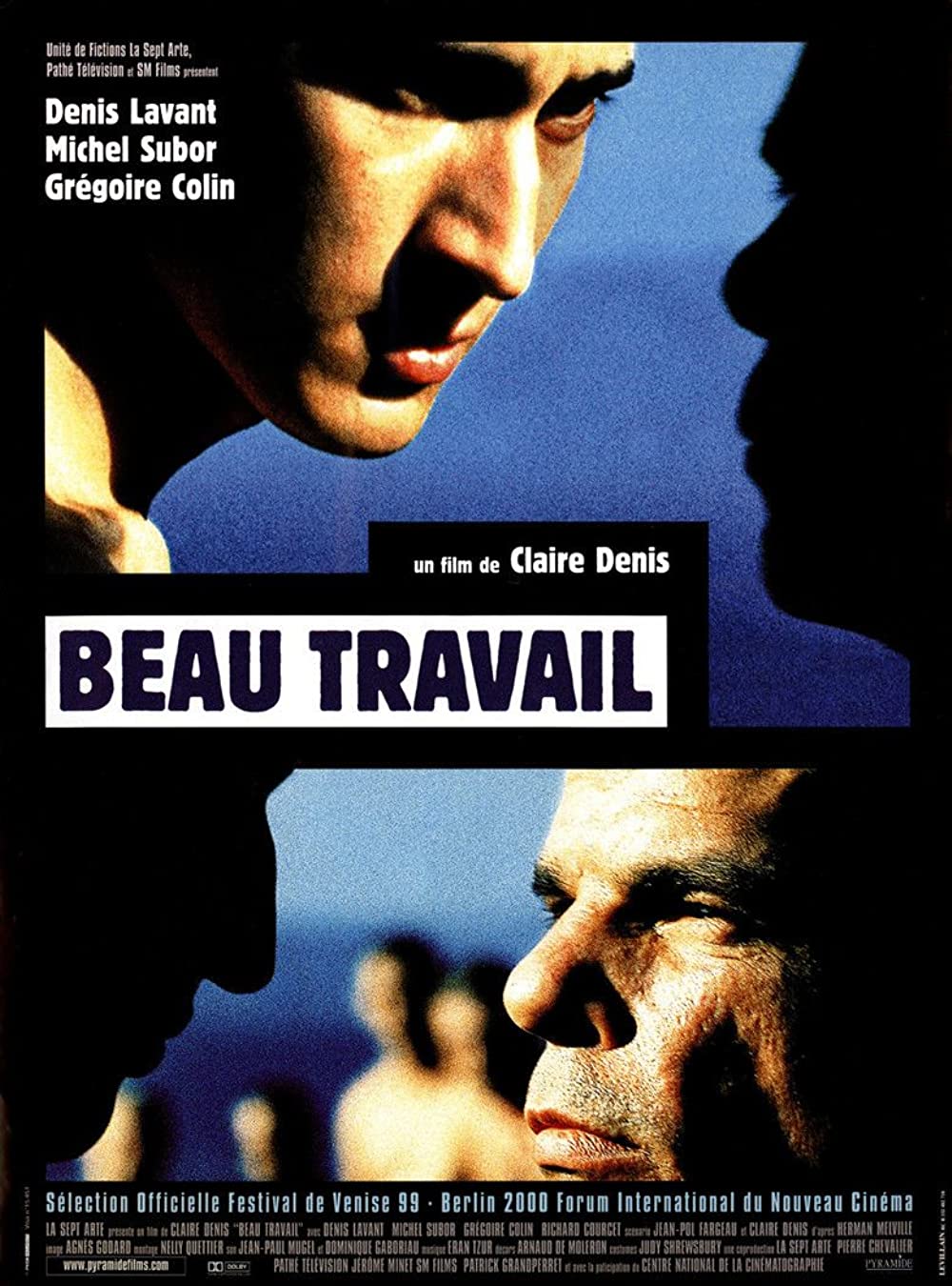
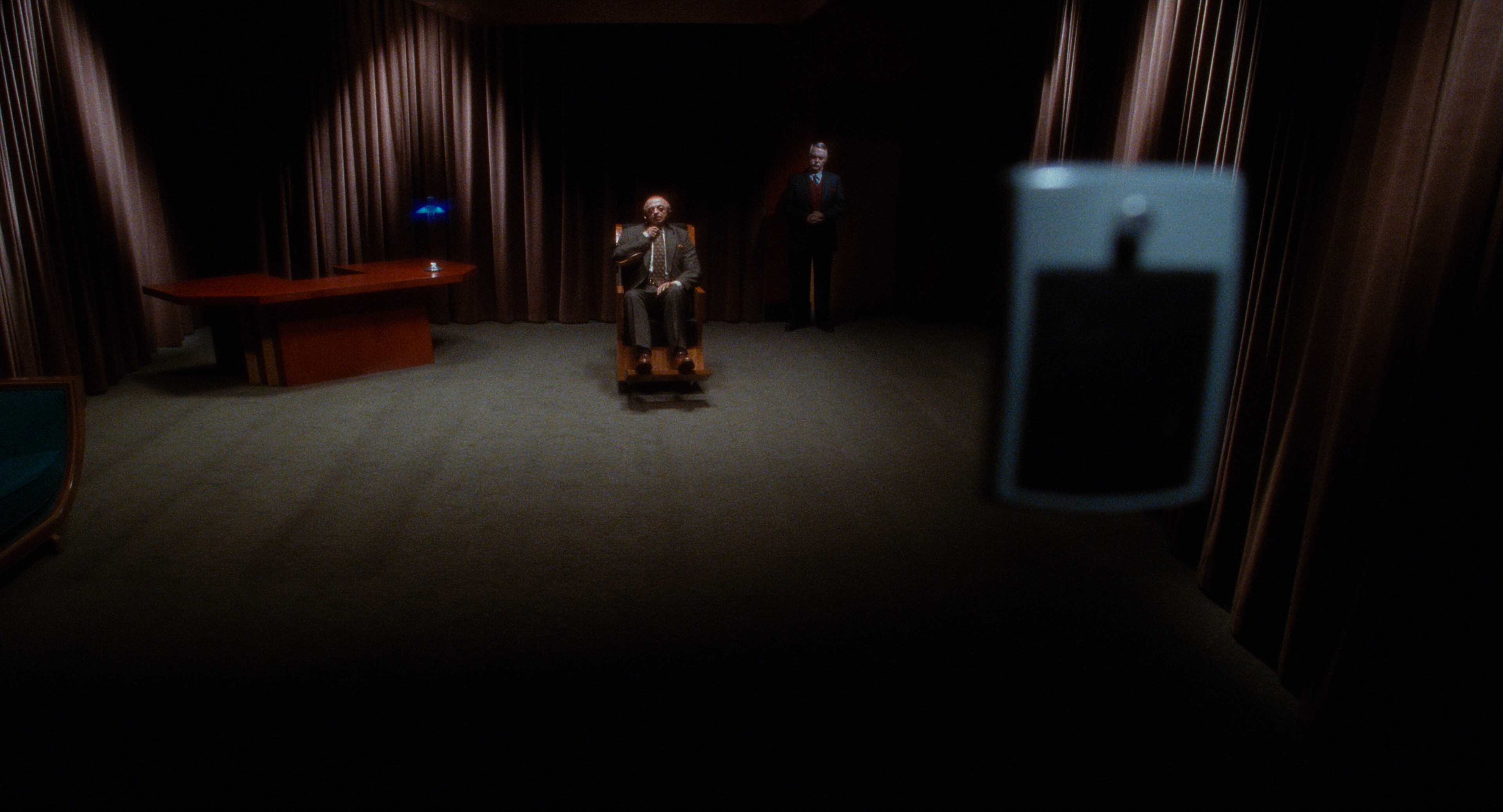
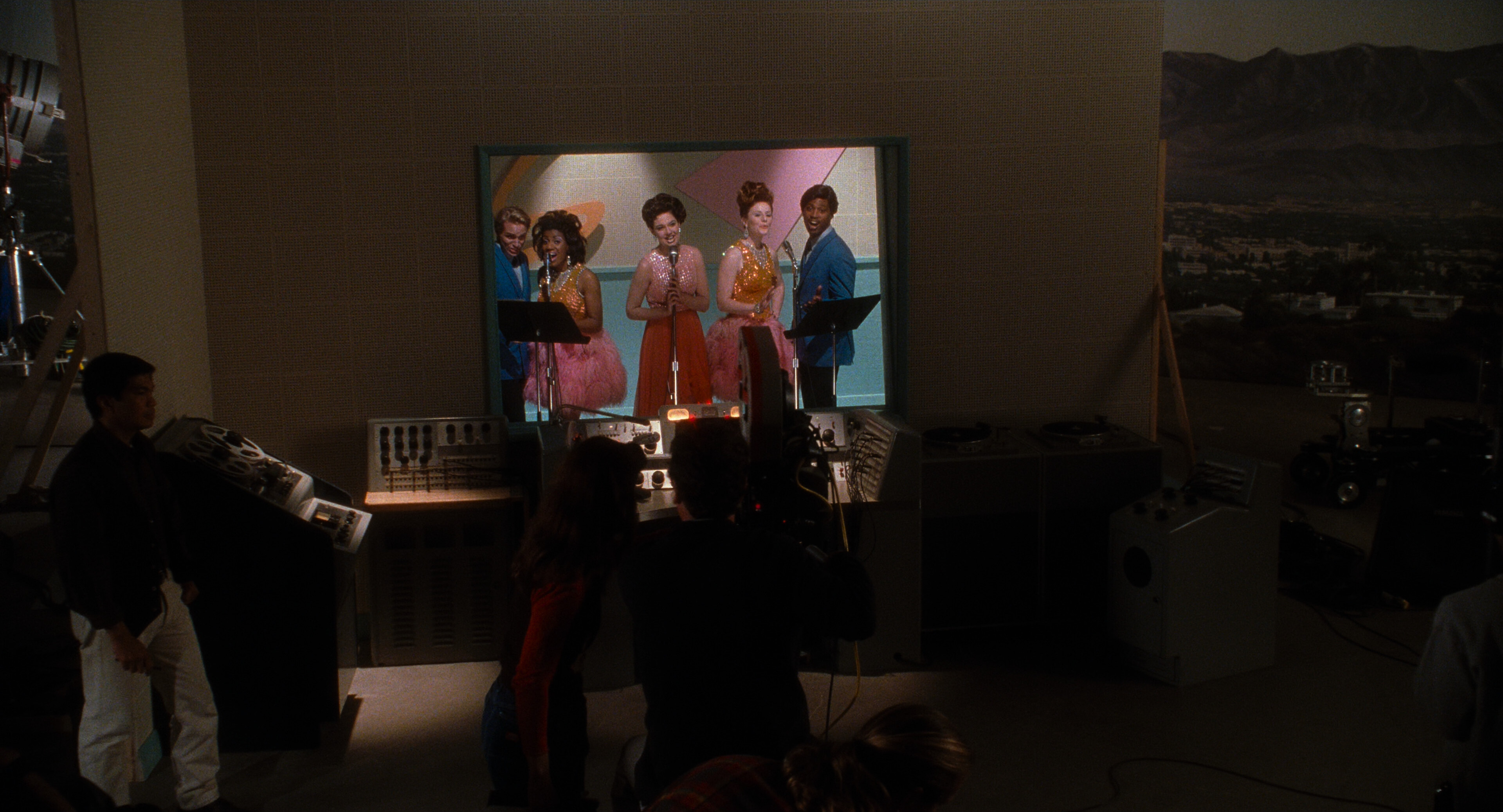
I’ve seen this movie several times before, and it’s not new on this year’s Top 100 (it was the only movie directed by a woman on the 2012 list — at #91). But I’ve got at 2K restoration recently, so I’m watching the movie again.
In a recent interview with Alice Diop in Sight & Sound magazine, Diop described Denis’ way of filming something like… er… that she’s always filming as if she loves the character and/or actor that’s in front of the camera? Something like that. It’s very accurate.
It’s such a tense movie. It doesn’t let up.
This movie has the best ending in the history of history.
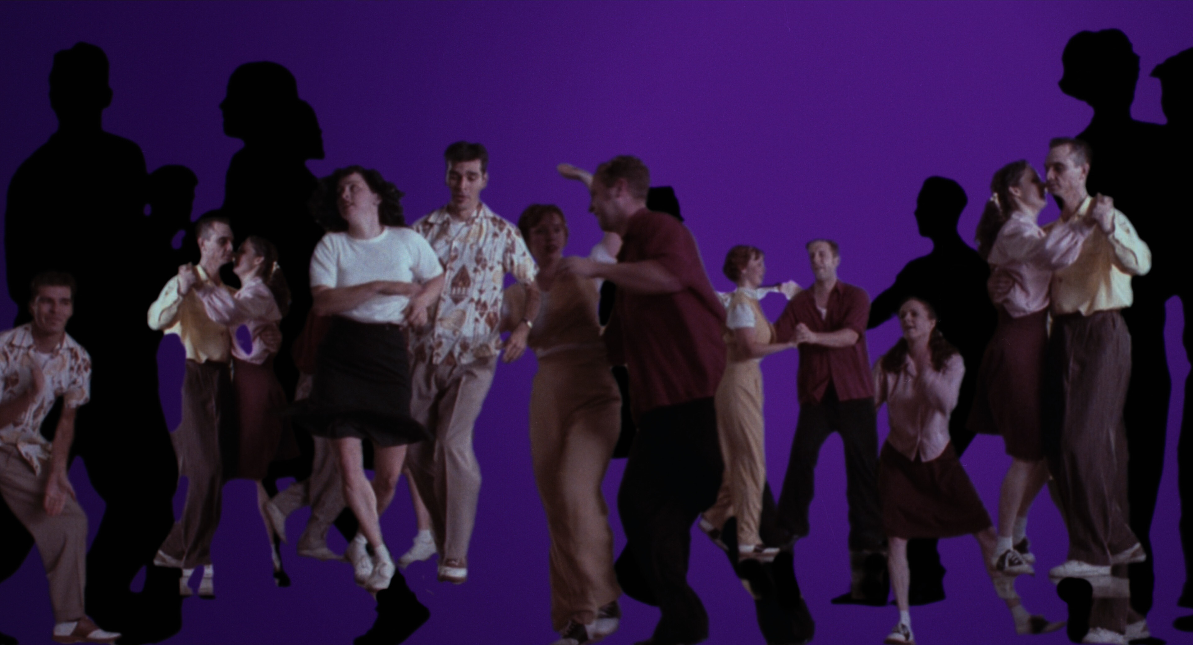
I’ve watched this before, of course — last time three years ago. And this movie isn’t new on the Top 100 (it jumped from #75 to #22, though). But I’m re-watching this anyway, because Studiodigital (I think) has done a new 4K restoration, and Criterion has released the bluray.
More pixels! More bandwidth! More mystery!
And, of course, this movie is one that rewards rewatchings. If you consider it a puzzle movie, there’s all these hints to get excited about. But it’s also just so… engrossing to watch even if you’re not trying to decode anything, but just let it all wash over you.
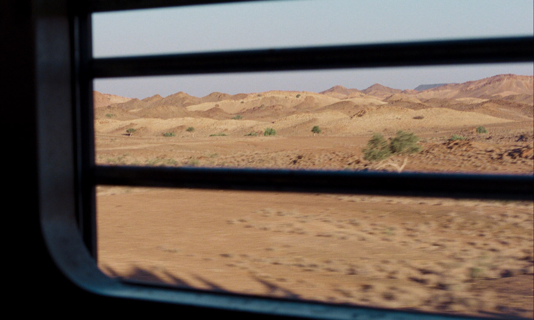
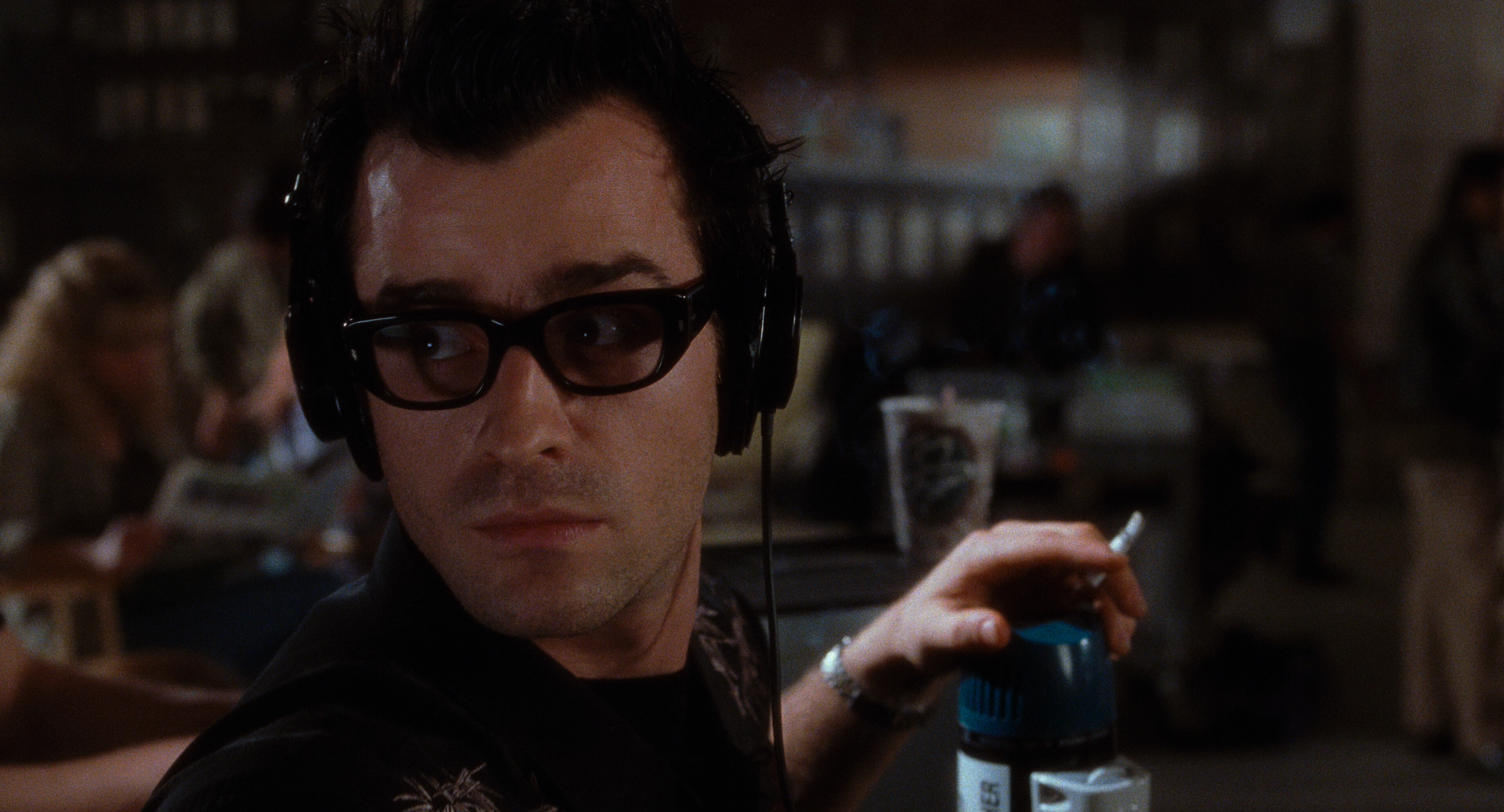
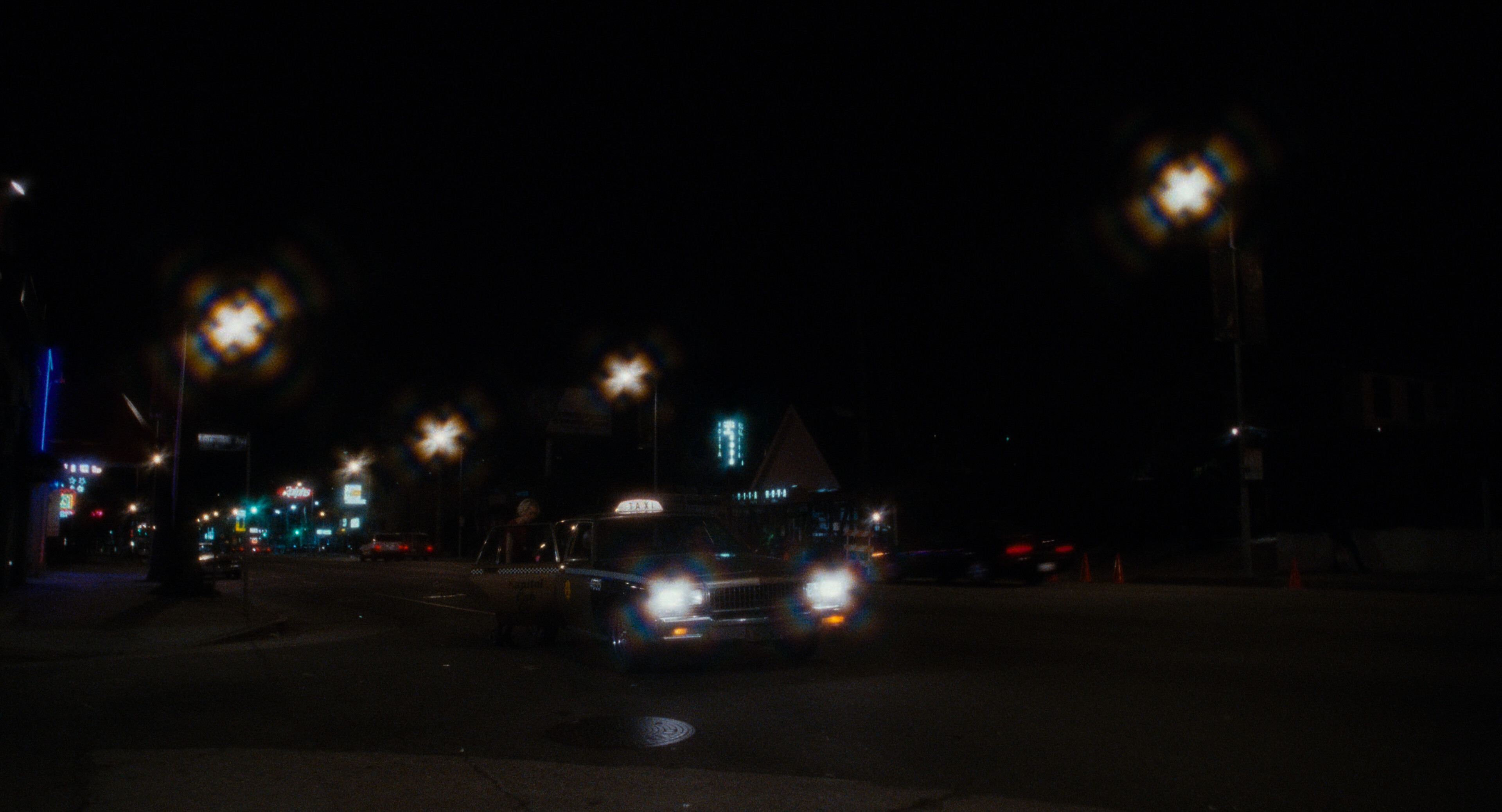
Those are some odd lens flares.
I remembered this movie as doing the switcharoo about halfway in, so when we were getting towards the two hour mark, I wondered whether I was totally misremembering the film.
It’s still a great movie, but this time around, I was just kinda overwhelmed by the last part. There’s so much to process that you want to pause the film and give things a good think-through…
Oh, right: I’d forgotten that this was originally meant to be a TV series, but ABC passed on the pilot:
Most of the new scenes were filmed in October 2000, funded with $7 million from French production company StudioCanal.
Anyway — it’s mostly a delight to watch and re-watch. Some bits are kinda weak, but it’s mostly amazing.
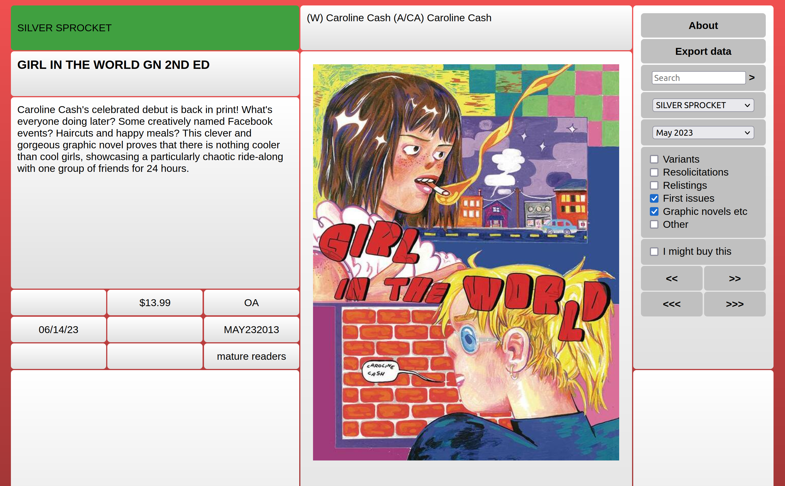
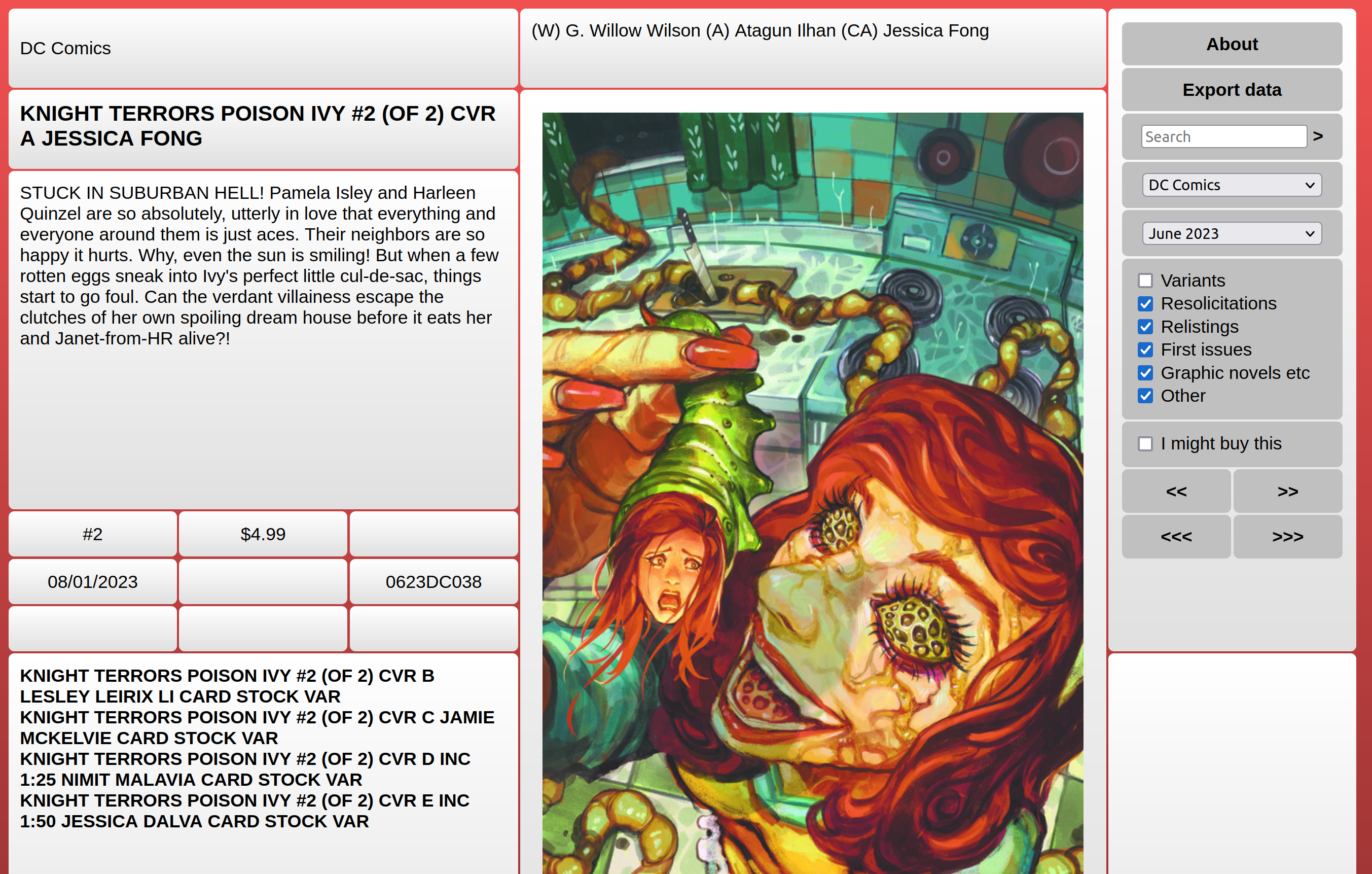
I’ve now updated the world’s least-used (certified by the Guinness Book of Records) service, Goshenite, so that it also scans the DC portions of the Lunar Distribution previews — it no longer just gets data from Diamond Distribution.
OK, since nobody knows what Goshenite is, I should probably explain a bit, right? Right.
So, I’m one of those people who order comics from the previews instead of doing the sensible thing and buy stuff after it’s in a bookshop and I can take a look at the comics. I’m just lazy that way. So for decades, I’ve been frustrated with how crappy and inefficient the previews thing is (unless you use the papery version, I guess).
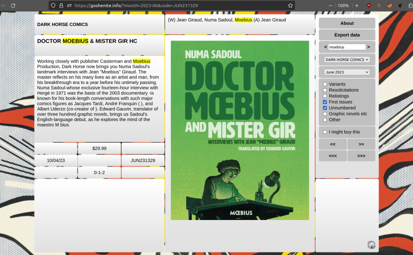
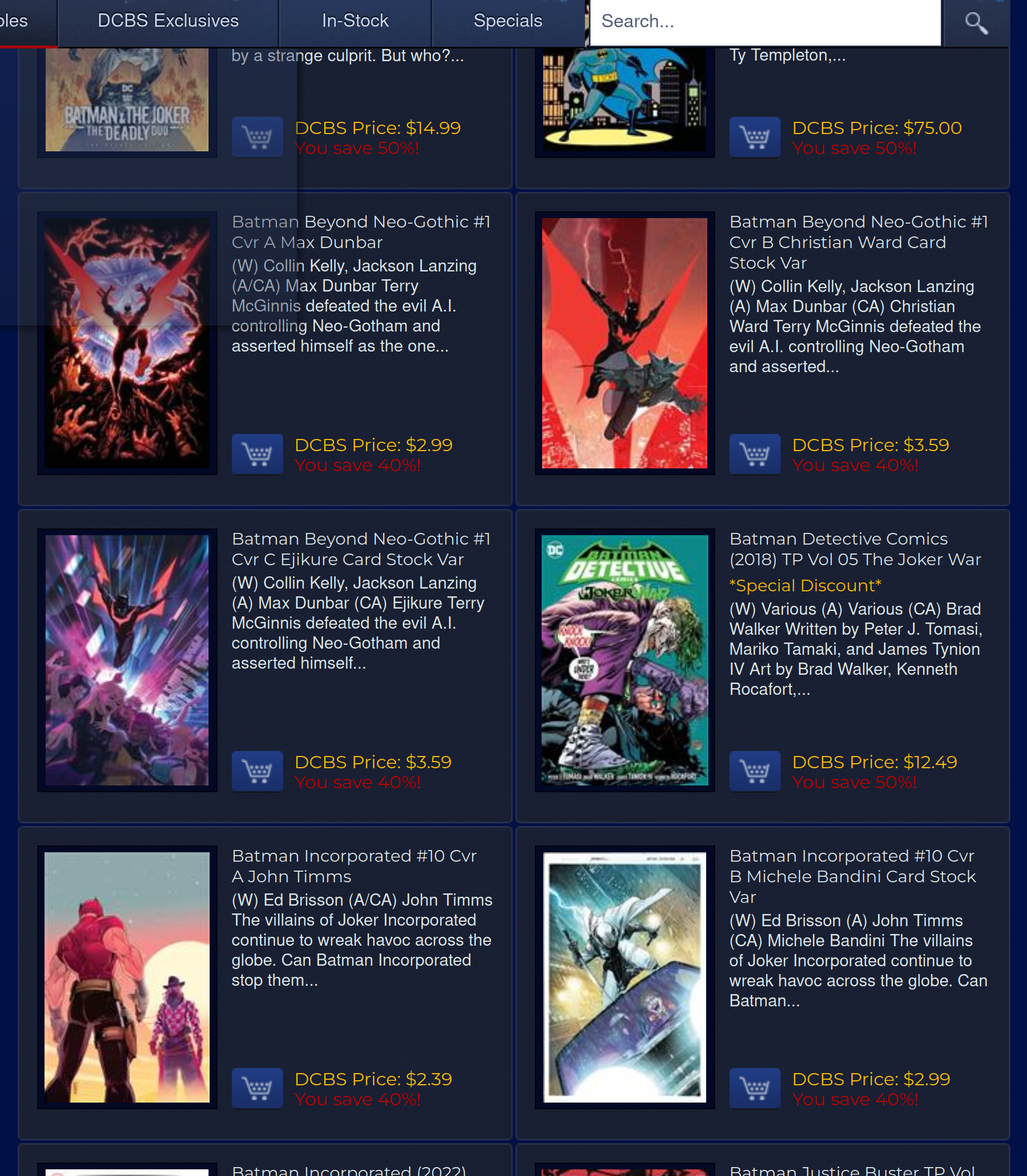
Take, for instance, the web interface of the largest US comics retailer, DCBS:
You have tiny cover images, where you can’t really make much out. You have a snippet of text that’s so short that it’s pointless. There’s no way to say “only show me first issues”, or “only graphic novels”. When you scroll, you have to move your eyes around a lot. And you have to wade through variant cover version after variant cover version, and it’s just all so annoying.
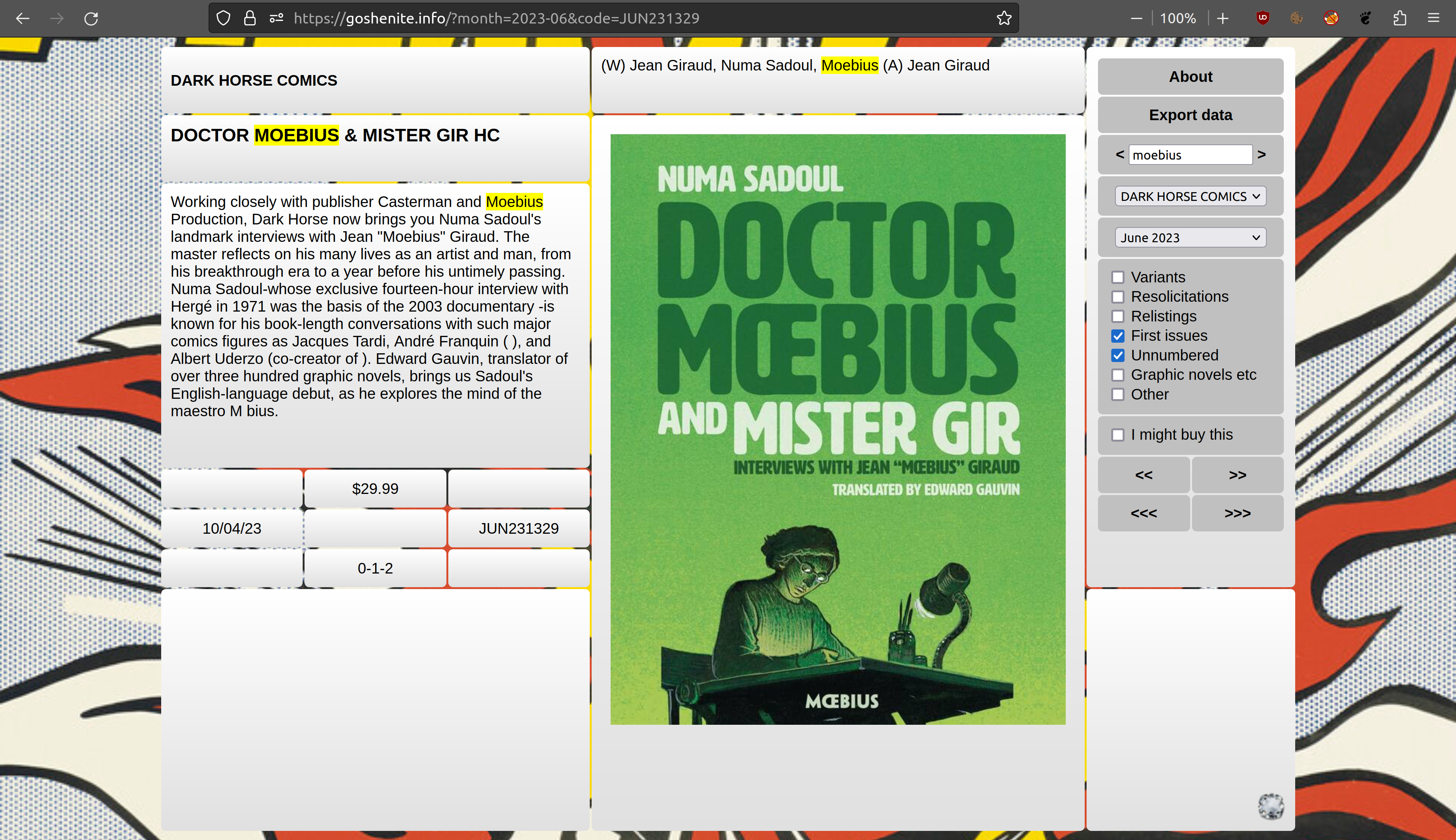
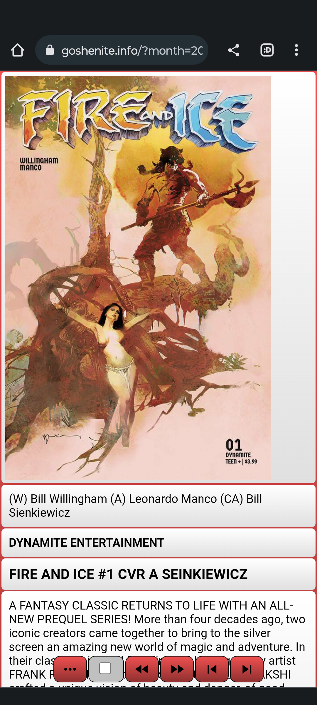
So I whipped up a web site where the primary design goal was to allow quickly scanning though comics, without everything being tiny teensy, so I went with a one-comic-at-a-time thing… but with no scrolling, and where you can keep your eyes at the same point all the time, and just hit <Right> and <Left> to navigate quickly, and hit <Enter> when you see something you want to buy. With the Goshenite approach, I can cover the stuff I’m interested in in about ten minutes once a month, which is doable even for somebody as lazy as me.
(Other necessary features: Being able to filter out stuff I’m not interested in, and being able to “favourite” certain publishers so that I never miss whatever, say, Uncivilized is publishing.)
But a couple years ago, DC Comics left Diamond Distribution, which is where I was scraping the data from. And, like, I virtually never buy anything from DC anyway, so I wasn’t much bothered… but it’s been nagging at me.
So I finally spent an afternoon whipping up some code to give Lunar Distribution the same treatment as Diamond, and voilá souffle:
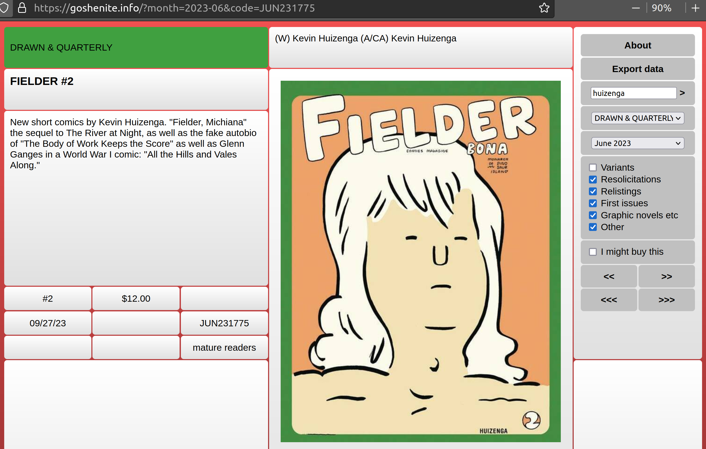
Oh, and while I was at it, I added a simple “search” facility so that you quickly can find all the books by Kevin Huizenga:
The user interface is probably too idiosyncratic for most people, but if you wanna use it, go ahead.
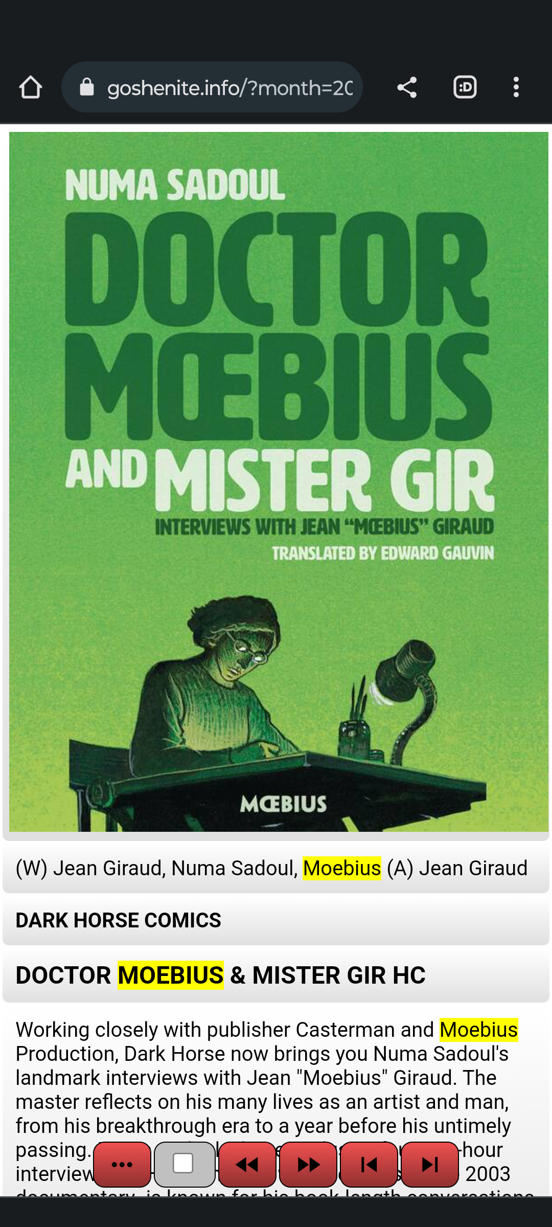
The UX on the phone version is probably more intuitive — you just swipe left a lot. (Which says something about the quality of the comics, I betcha.)
The site is goshenite.info — an easy-to-remember name for sure.
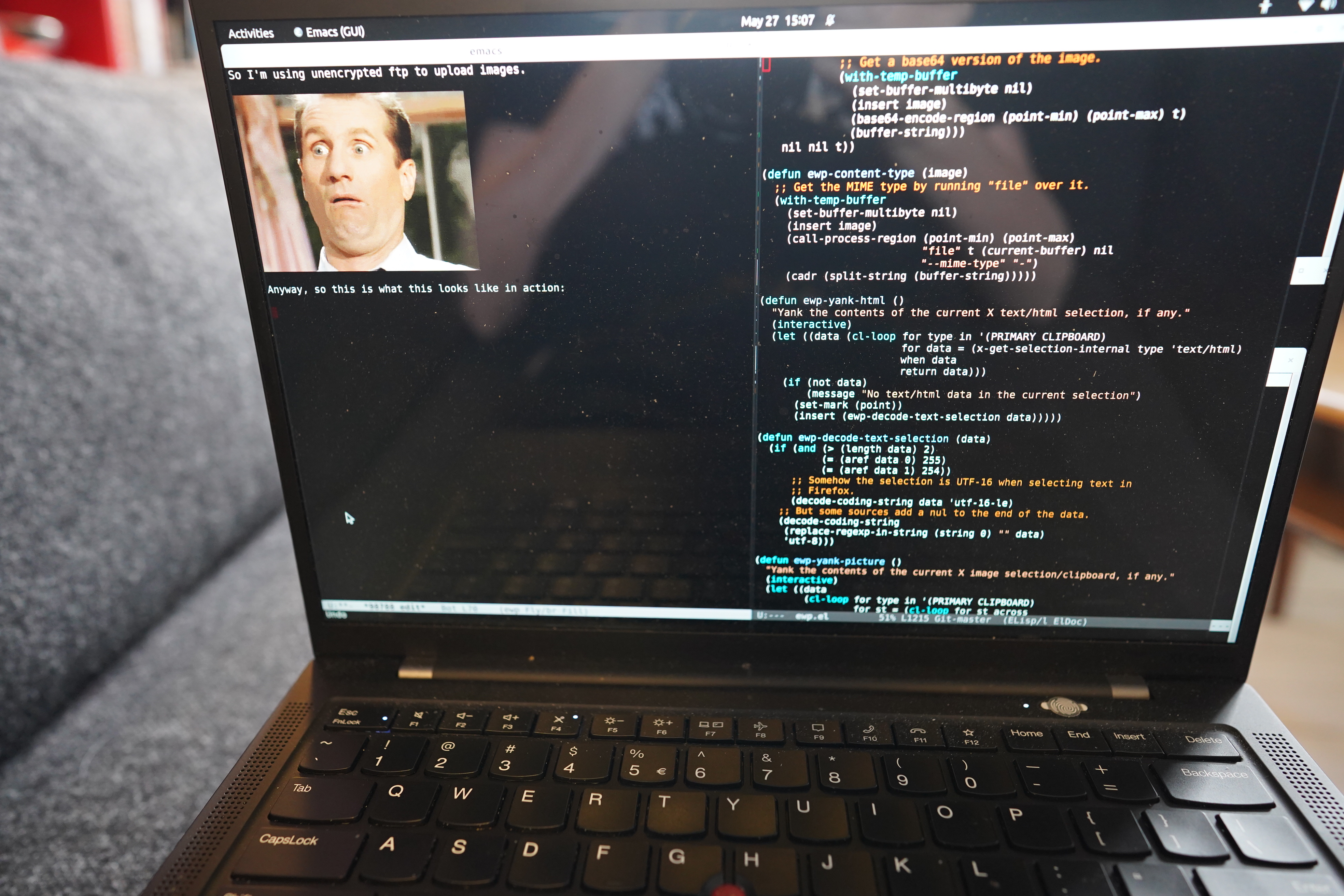
When blogging, I usually sit on the couch with my laptop on my lap (as is logical), typing away in Emacs in ewp mode, snapping pics of stuff (mostly comics) in bad lighting conditions.
Taking nice snaps of things is a breeze if the lighting is good (i.e., sufficient), or if you’ve got a camera on a mount, but that’s not what we’re dealing with here: I want to snap pics in a frictionless manner, because I don’t have no time for no futzing around.
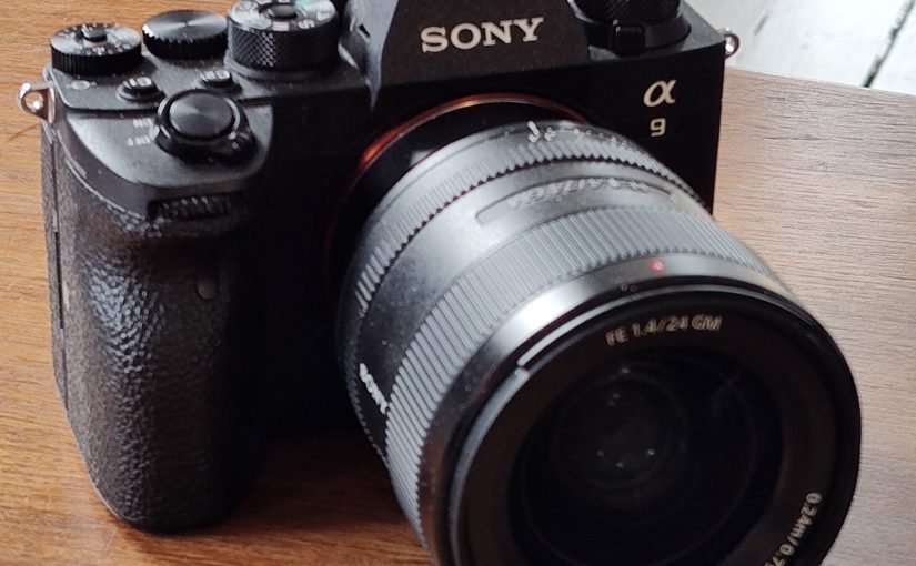
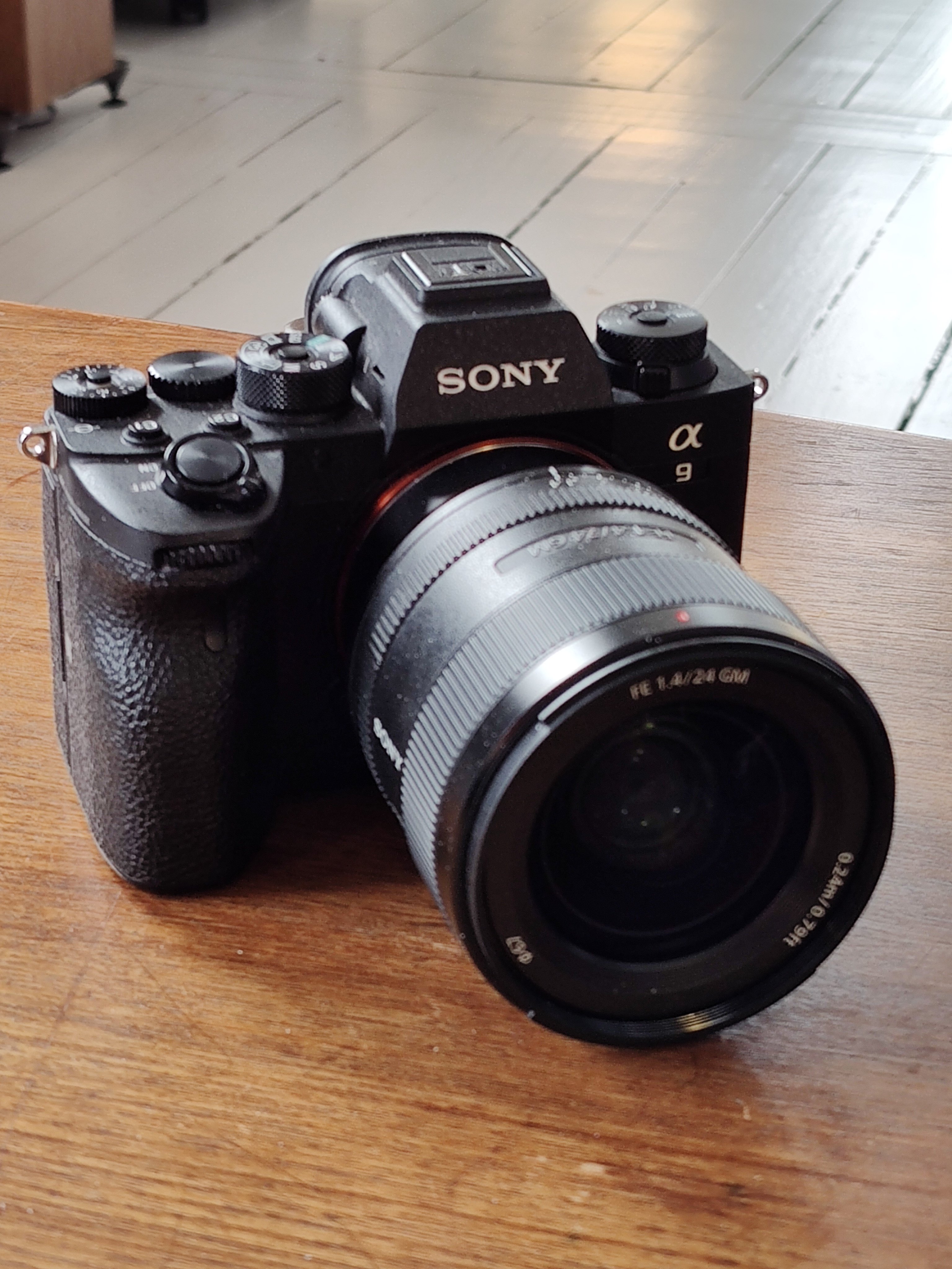
Over the years, I’ve tried a bunch of different cameras, but within my (peculiar) constraints, it’s just hard to not end up with blurry, out of focus images with bad white balance. What I’m currently using is a Sony a9 II camera with a 24mm lens (fixed lens since I can’t change focal length and hold both the camera and a comic book at the same time), set at f/12 (because I’m snapping pics of comics that I’m often holding in an angled way to avoid reflections, and anything less than that (at this distance) will mean that half the book is out of focus) and 1/25 (because anything slower than that will mean that the book is blurred from either my comic holding hand or my camera holding hand shaking).
(Auto white balance, though, auto focus, and I have to adjust the brightness of the image throughout the day/night by adjusting the ISO.)
See what serious problems I’m having!
But that’s not what this blog post is about: It’s about image transfer.
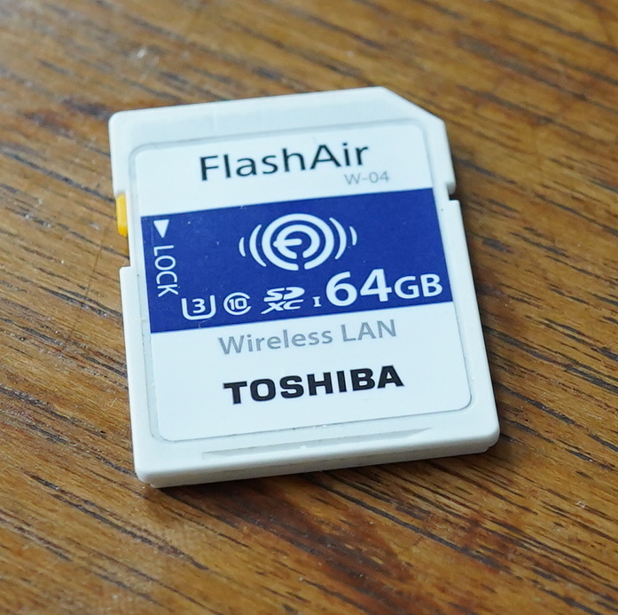
For almost a decade I’ve been using Toshiba FlashAir SD cards to transfer images from whatever camera I’ve been using to my laptop (and then automatically into Emacs). It works… fine… but there are some janky things about it.
The main problem is that the wifi range of the card is basically half a meter. That’s not really that surprising — I mean, it’s got a tiny antenna, and it’s inside a metal camera body. The amazing thing is that it works at all — it’s an engineering marvel for sure, having an entire computer with wifi and a web server in an SD card.
But that range means that I have to have a wifi Access Point running on my laptop. Which is easy enough, but when the laptop’s wifi runs in dual AP/client configuration, the wifi speed drops to, like, a tenth of the normal speed. Which is annoying. So I only take the AP up when blogging, which means that I have to have a daemon for taking the AP up/down running as root to make that happen automatically etc, and that’s just kinda janky.
(And the reading speed of the FlashAir card is pretty bad, so if I want to examine the image on the camera (that ▶️ button), it takes three seconds (!) to load.)
While most cameras these days have wifi capabilities themselves, the functionality needed hasn’t really been there. The previous camera only supported uploading images manually, and nobody has time for that. The camera before that required running some kind of server software on a Windows machine, and do I look like I have a Windows machine?
But!!! It turns out that Sony has put exactly what I (and any sane person) need in the firmware for their nicer cameras for a few years now. 1) The camera connects to a given wifi and 2) if connected, uploads everything you snap to a server via ftp automatically! It’s perfect! No manual interventions, and no janky special servers — just standard software on the server (i.e., laptop) side.
Figuring out how to get things to work on the Linux side took me a few hours, so that’s why this blog post exists.
The easiest ftp server to set up on Linux is probably vsftd, so that’s what I’ve gone with here. (And this recipe is for Ubuntu, but I think it’s similar on most Linux distributions.)
First create a user. We’ll be logging in as this user from the camera. Let’s call the user sony, and prep it a bit:
adduser sony
mkdir /home/sony/ftp
chown sony.users /home/sony/ftp
chmod a-w /home/sony
So the /home/sony/ftp directory is where the uploaded files will go. We make /home/sony read-only, because we want to use a chroot jail for the user so that we get a bit more security: We only want this user to be able to alter things in /home/sony/ftp and not have access to anything else.
apt install vsftpd
Then open /etc/vsftpd.conf in an editor, and find the commented-out lines and change them to:
And now we get some multiple choice bits: My Sony a9 ii camera only supports TLS v1.0, and that’s so old that modern Linux distributions don’t support it, and apparently on Ubuntu 22.04 (which I’m running here), there’s no way to enable it in vsfpd. At least I haven’t found any way to do so. But ideally we’d have:
ssl_enable=YES
And enable “Secure Protocol” in “Destination Settings” in “Server Setting” under “Ftp Transfer Func” on the Sony camera. But that doesn’t work for this combination of camera/laptop. On the other hand… it doesn’t really matter that much, anyway. *gasp* Yes, it’s shocking, but with a chrooted user, and this only being used on the home wifi (and WPA2 encryption, janky as that is), the danger of using an unencrypted connection is, in this case, minimal.
So I’m using unencrypted ftp to upload images.
Anyway, so this is what this looks like in action:
So I snap and it takes a couple seconds for the image to appear in this Emacs buffer. Here’s that image:
Magic!
So… kudos to Sony for getting the functionality right, and *rolls eyes* on using such an old version of the TLS libraries that they don’t support TLS v1.2.
(Although I haven’t tried updating the firmware — it’s possible that newer versions work fine.)
And perhaps the biggest advantage of using this over the FlashAir card is that the Sony a9 camera has good wifi range, so I don’t have to have the camera near my (laptop) AP to make things work.