The Sky Won't Fall?
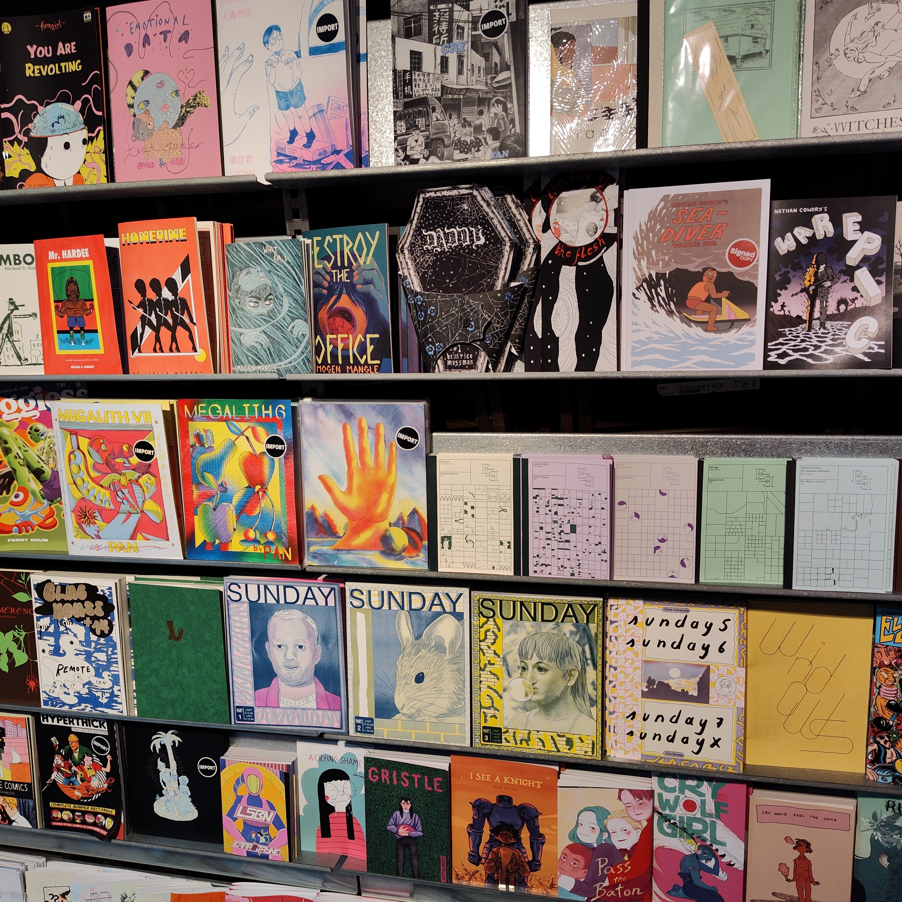
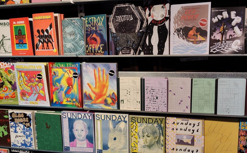
(Gosh Comics, London.)
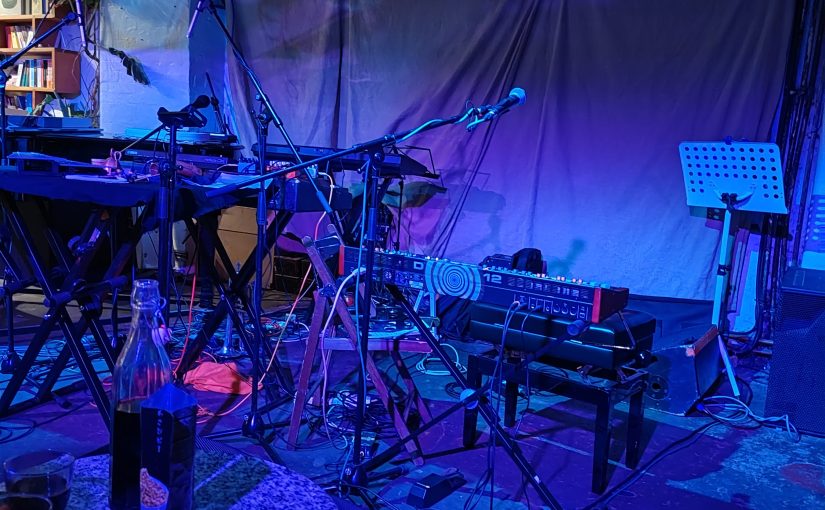
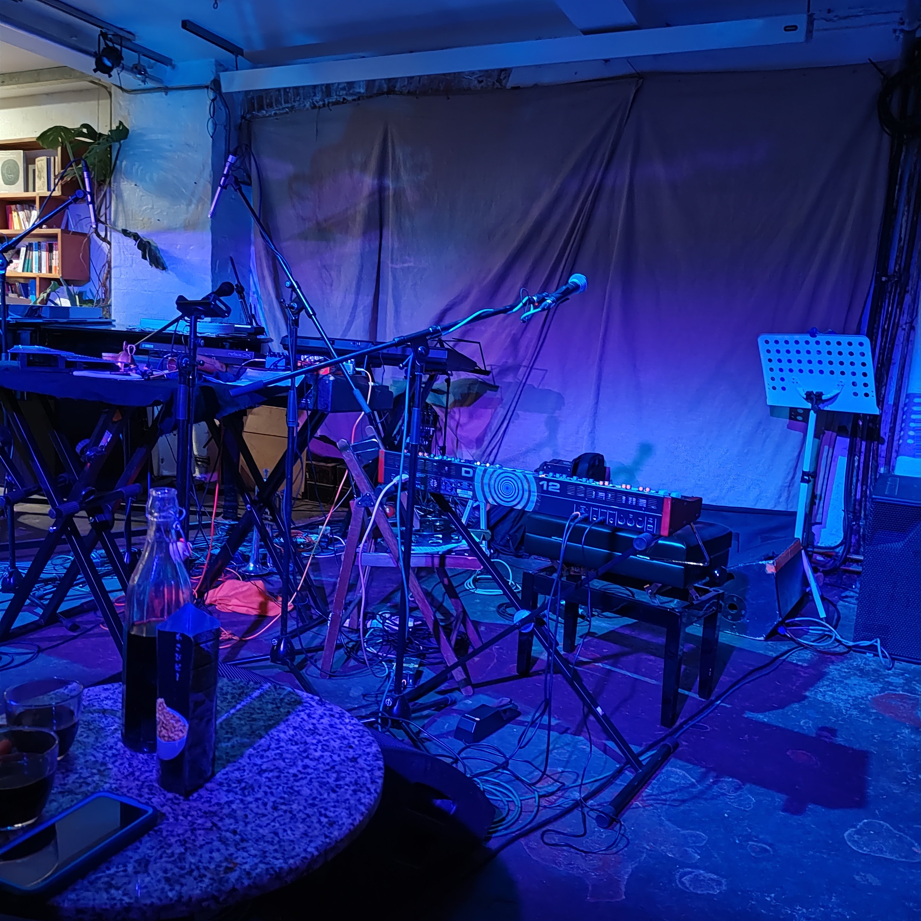
And why is Android Photos so bad at taking pics at a strobing show? This is an example pic.