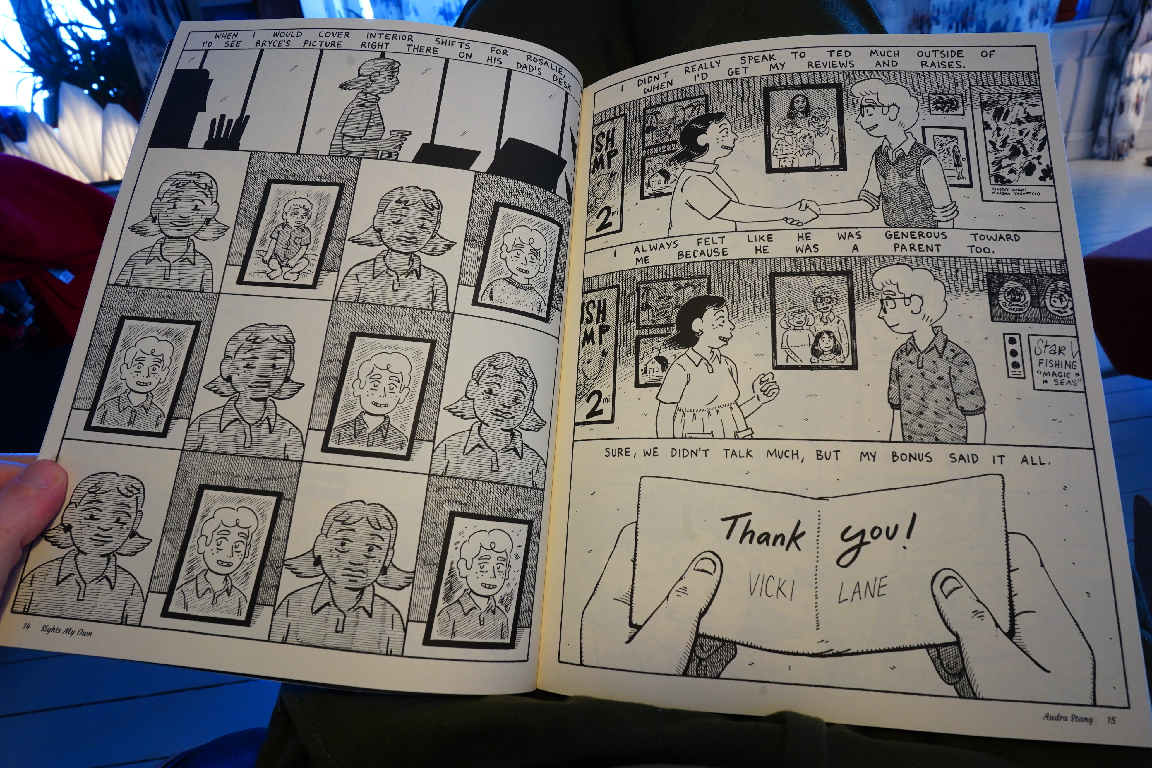
I read some comics this week, but first: Comics drama!
The social mediases (that’s a word) have been doing an impressive pile-up on a comic book artist today. It started when Alex Graham (full disclosure: I disliked Dog Biscuits and I like The Devil’s Grin) posed a subtweet-ey criticism of Comics These Days, and it’s really just perfection… if you wanted to have the entire Comics Internet come down on you. Let me count the ways:
- She dares to imply that not all comics are fantastic. That’s just rude!
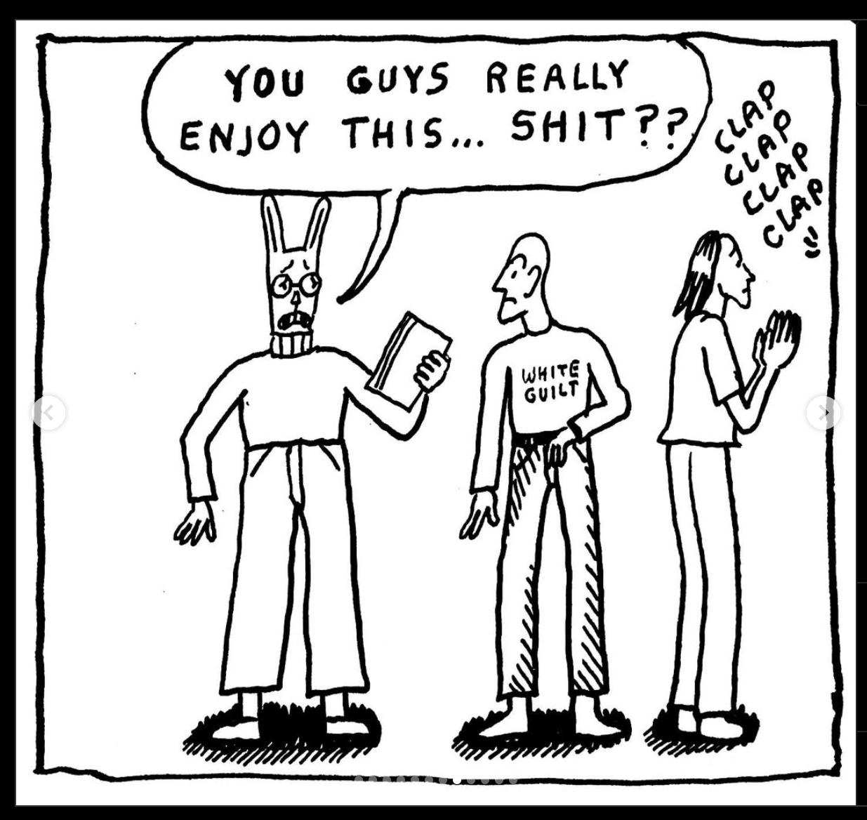
- She names a style she finds particularly annoying, and it’s “Cal-Arts”. This offends comics people on several levels: You’re not allowed to say that people work in a particular style, because we’re all individuals, and also there’s so many people using that style, so you just offended all those people. I had no idea what that style was, but it’s this thing:
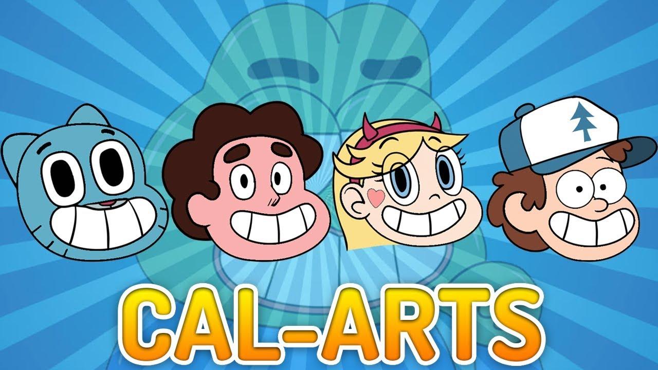
The horror!
- The strip doesn’t name anybody, which means that all the Internet Sleuths are raring to go to discover who Graham is mad at:
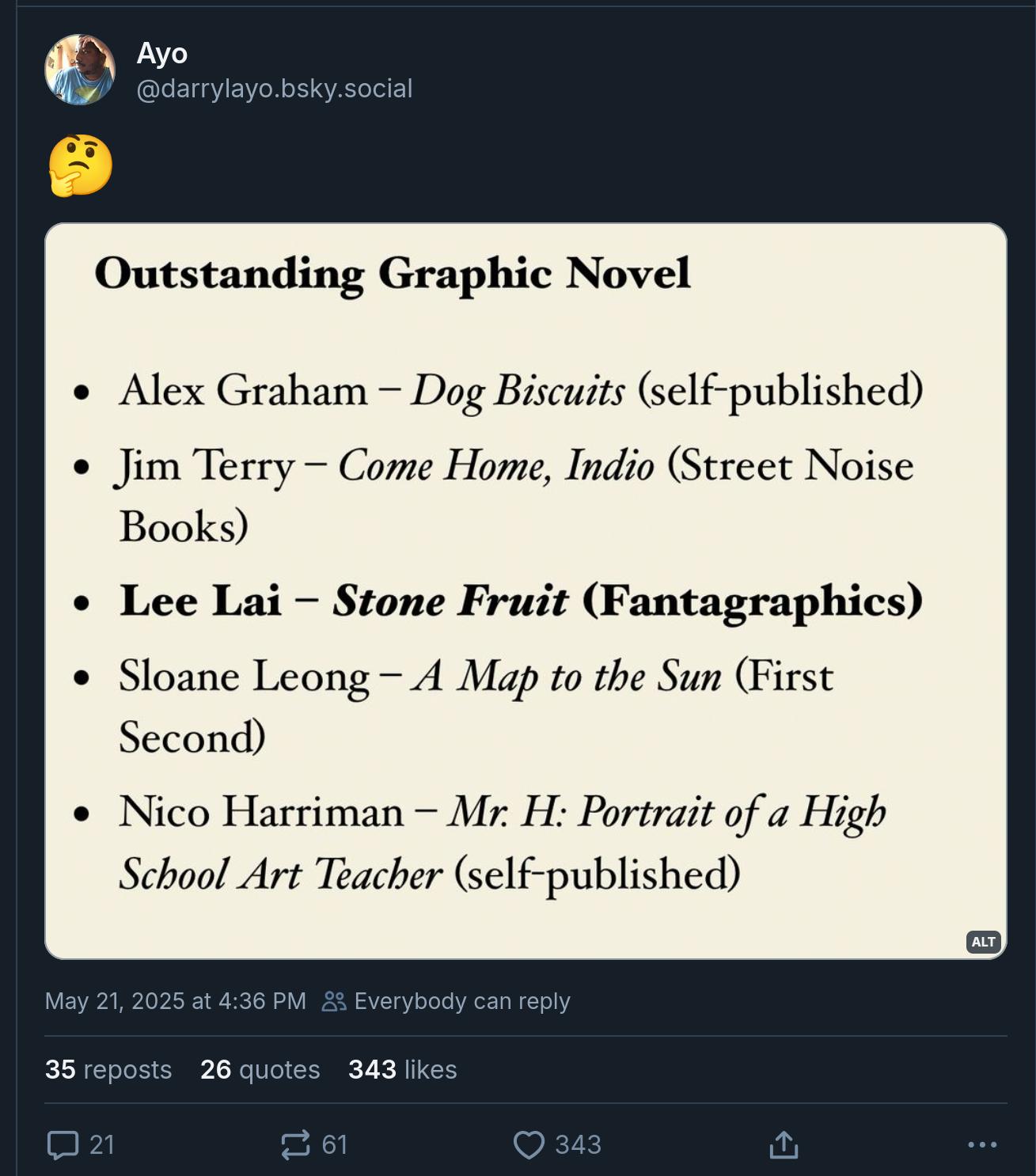
Which makes no sense, because if there’s anything that looks less Cal-Arts it’s Lee Lai:
- When I read the panel below, I assumed Graham was just saying “white men suck”, which is, you know, fair:
Everybody else interpreted it as having to mean that the comics Graham was dissing had to be created by a Black person, which is, you know, also fair, so she should have dropped that one. But:

- Mainstream comics fans have never heard of Alex Graham, and if somebody who is not famous dares to have an opinion on something popular, that’s just an outrage:

(There are about three hundred people posting basically the same thing — bragging about never having heard of Graham, which is just a weird flex: She’s been nominated to all the awards, and her previous major book was on a lot of the “best of” lists that year.)
- And people thought that Alex Graham was a man:

So: Perfect storm. You couldn’t have created a more perfect way to get all of Comics Internet to gang up on you. I’ve seen only one person try to defend Graham.
I wonder which anthology she was dissing?
[Edit five minutes later: More defense

]
Which is… bizarre. And:

Anyway, to recap: Perfect recipe for an Internet Pile-On: Criticising comics (while not being a famous comics artist) and a popular comics art style (while using a non-traditional style herself) to get people really riled up, and then mentioning race gives people a convenient cudgel. (Granted, the cudgel is there, so…)
It’s what the Internet was made for.
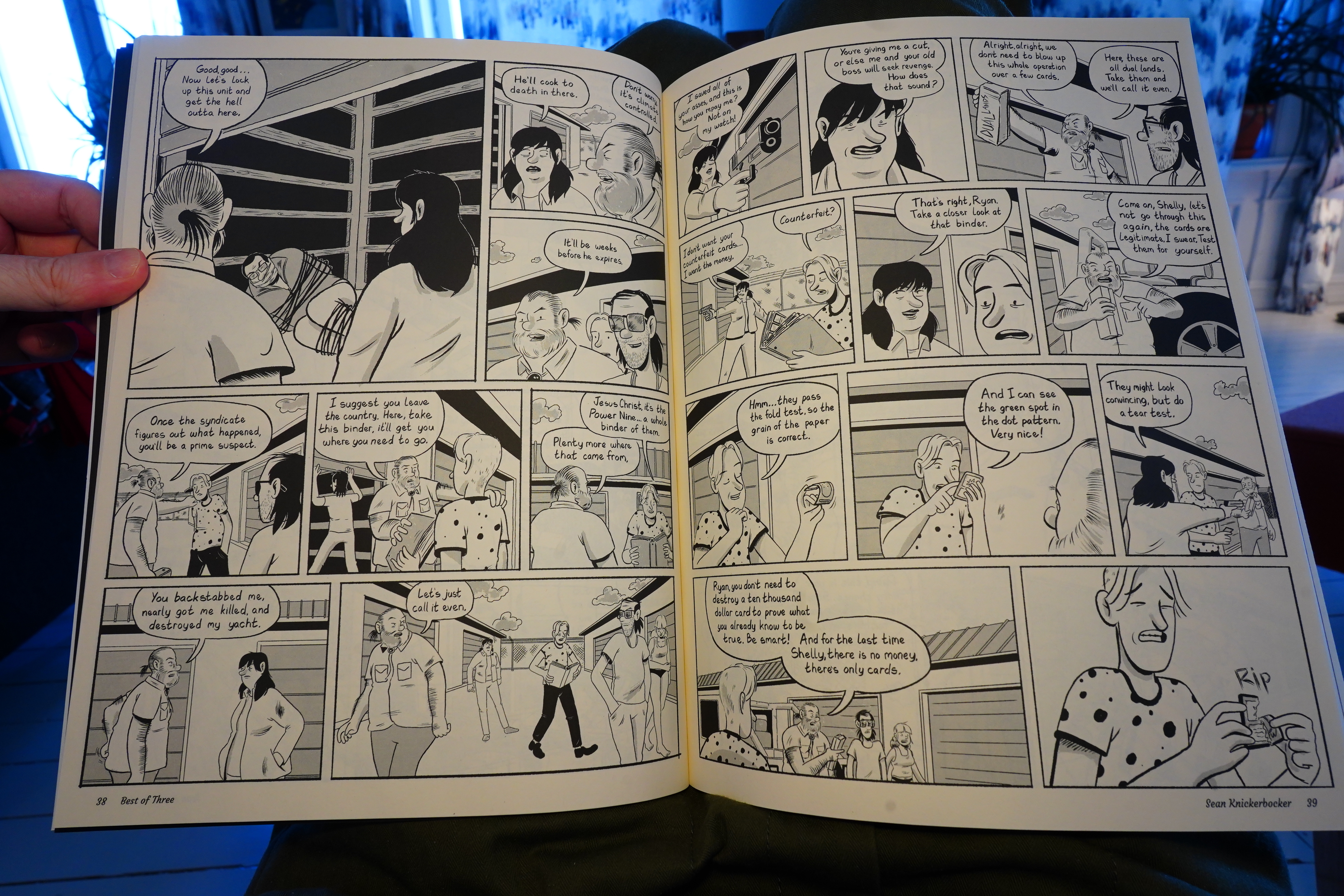
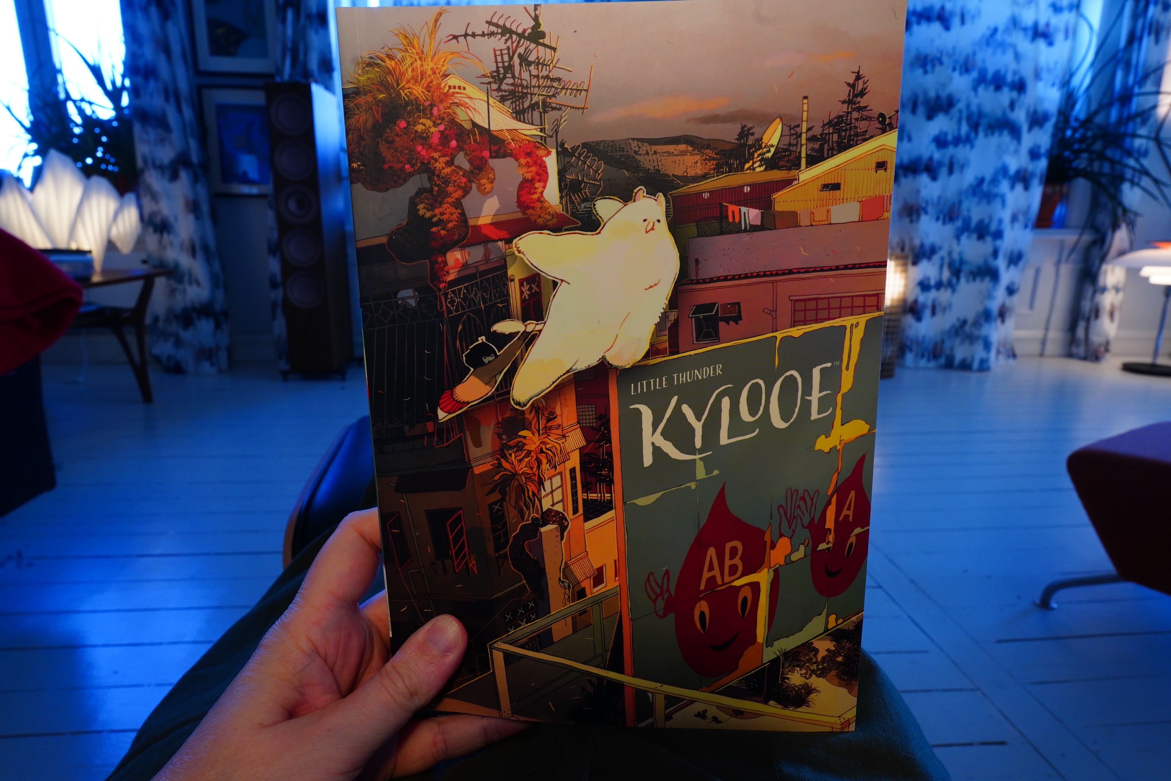
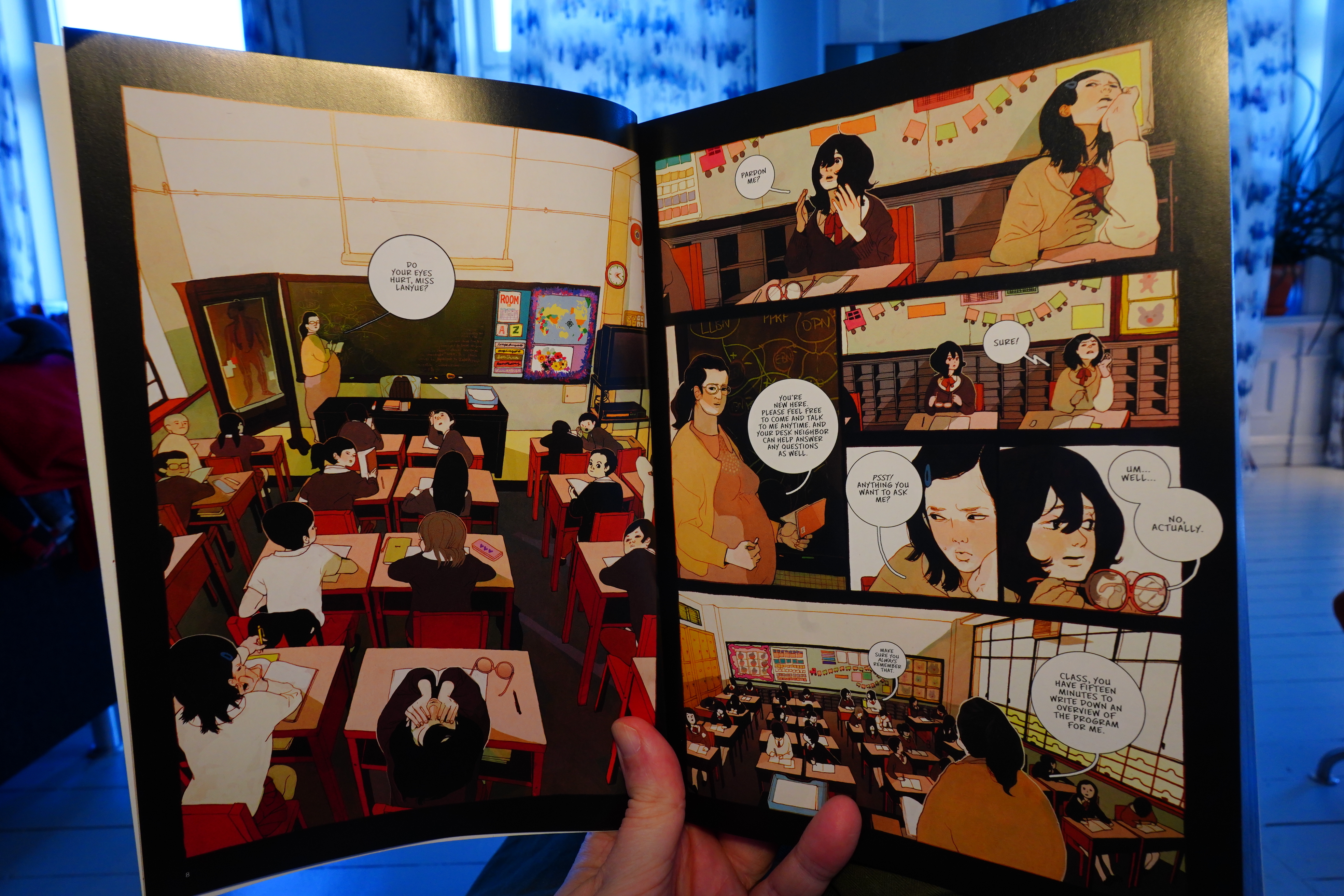
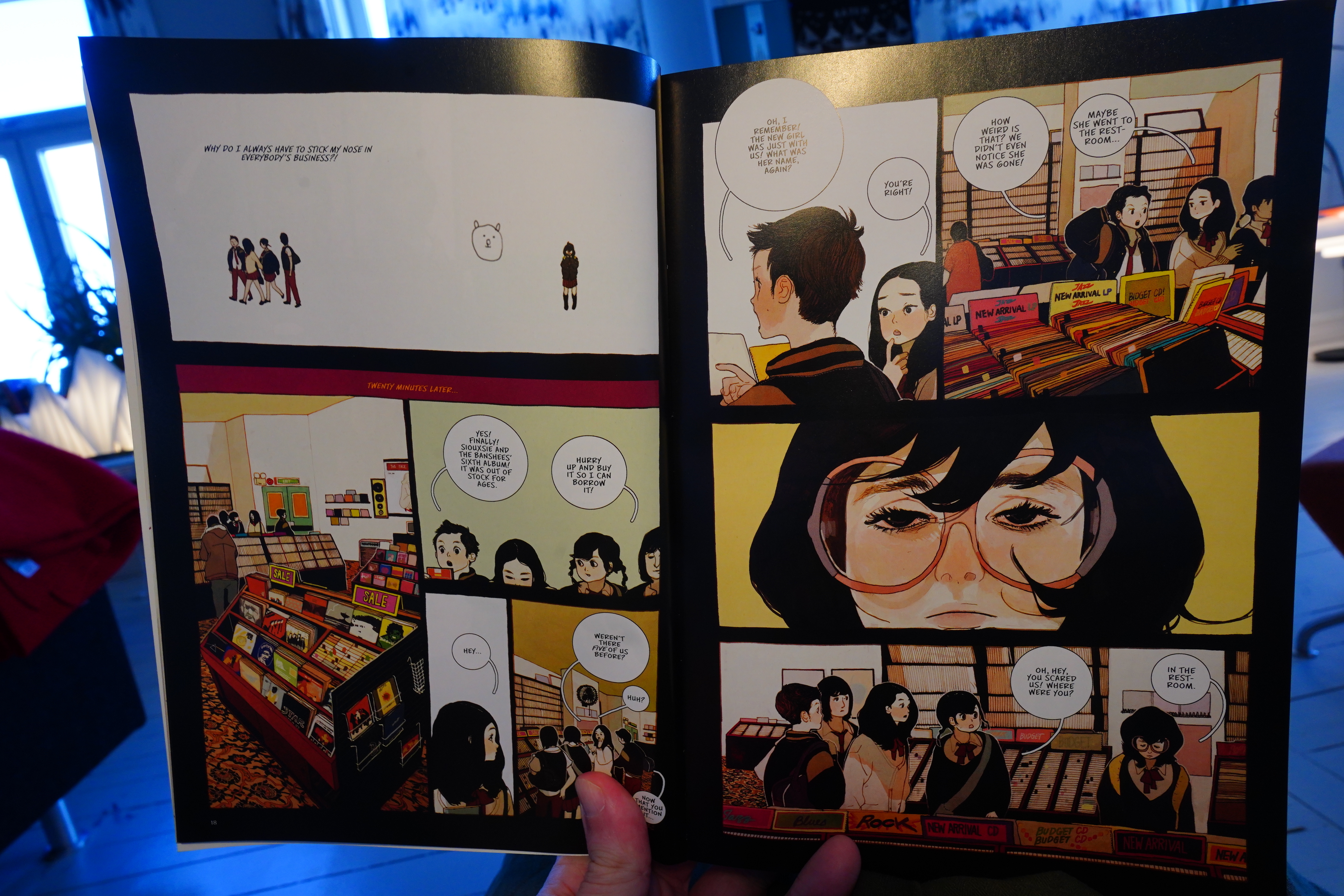
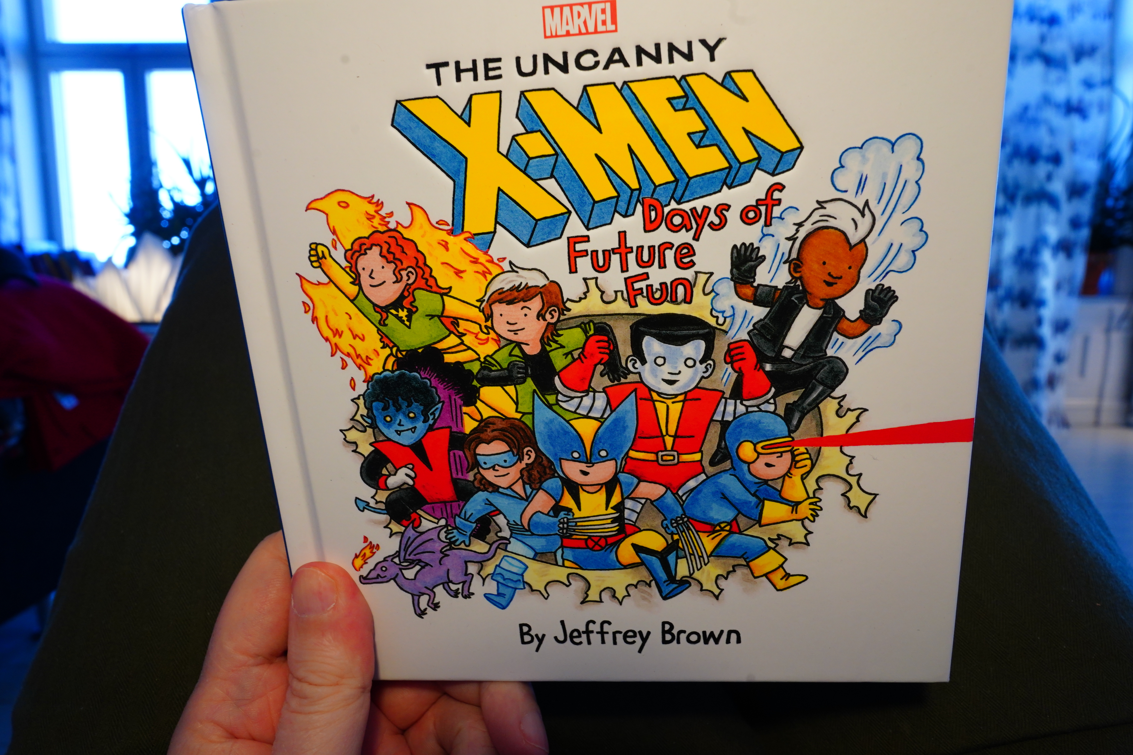
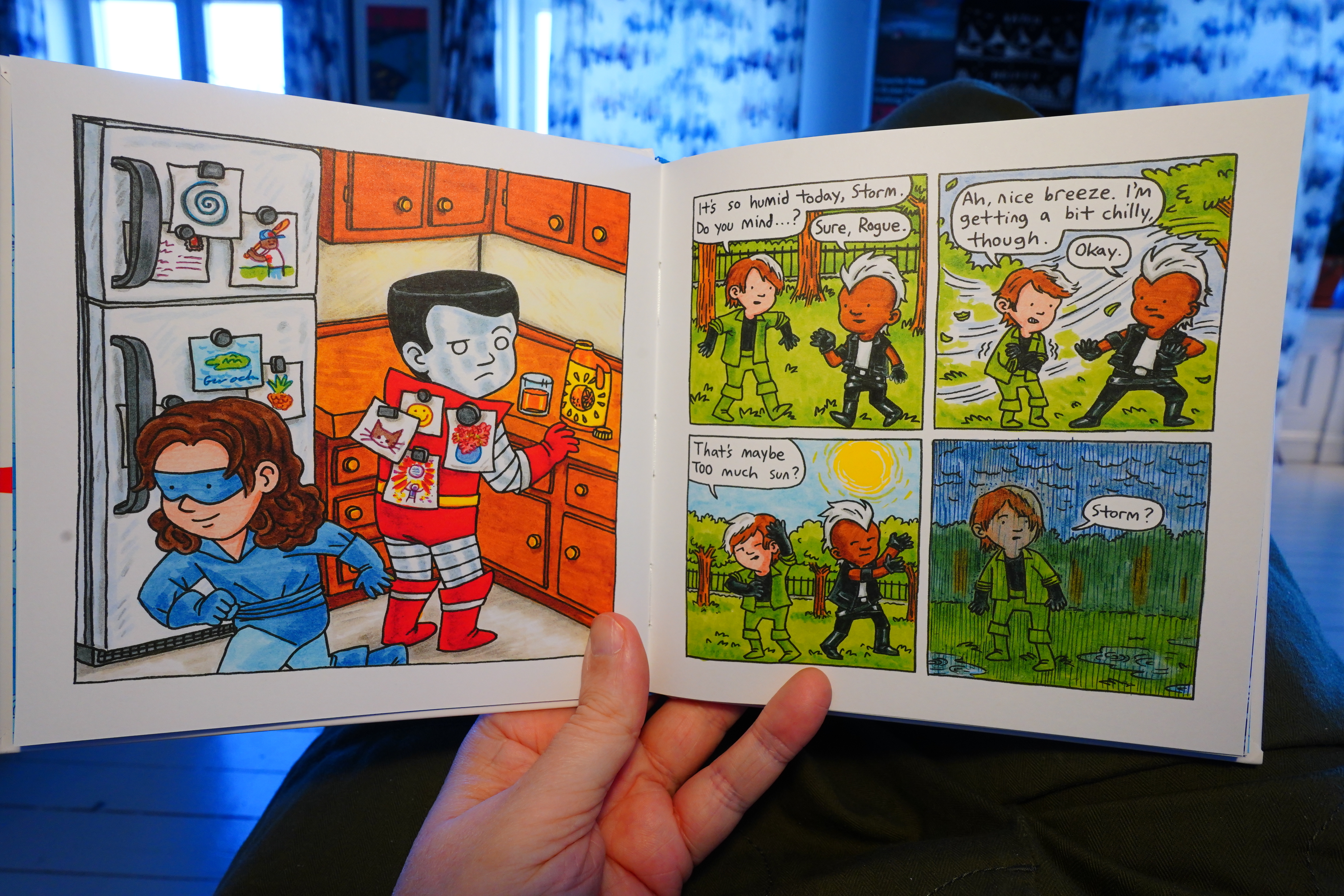
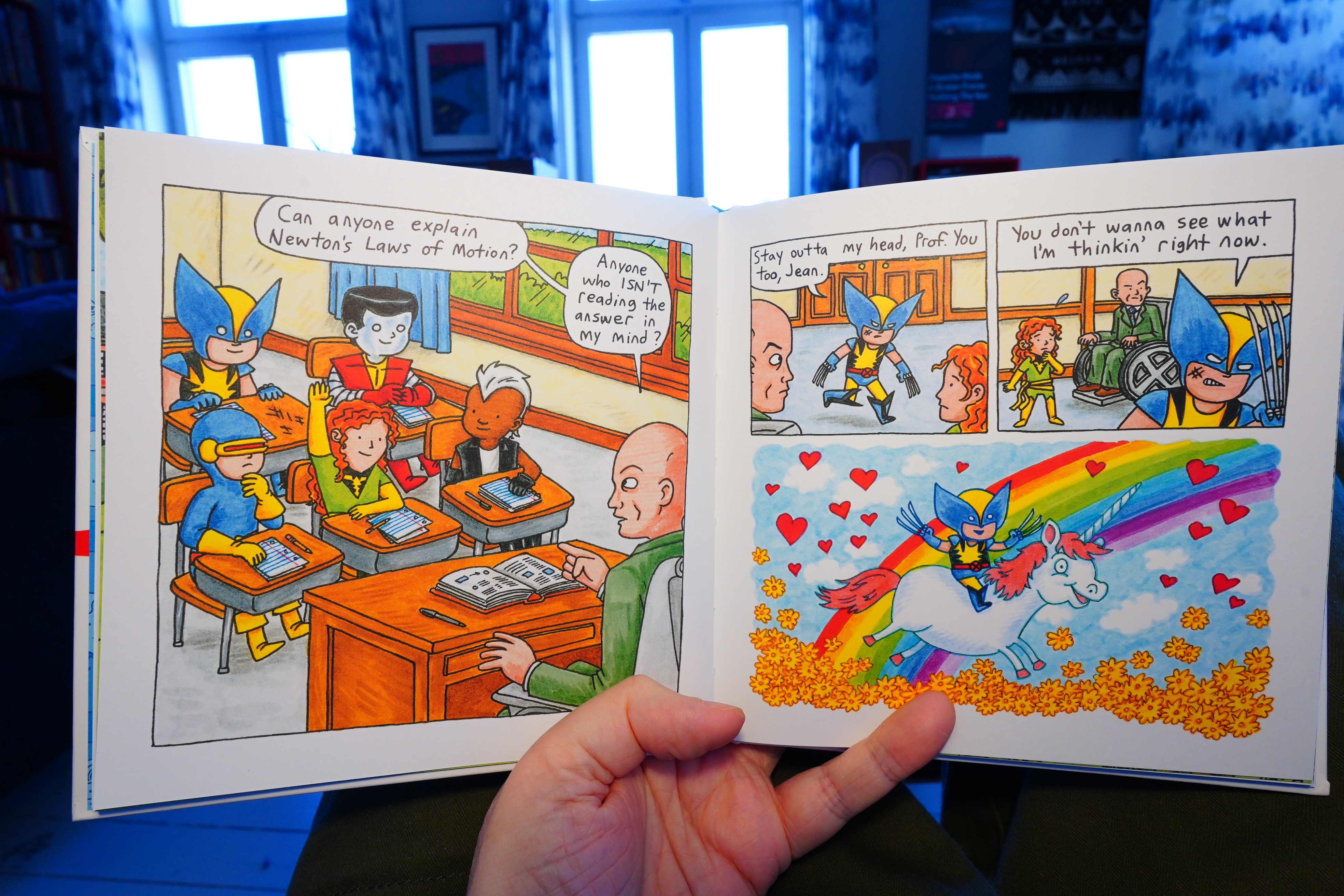
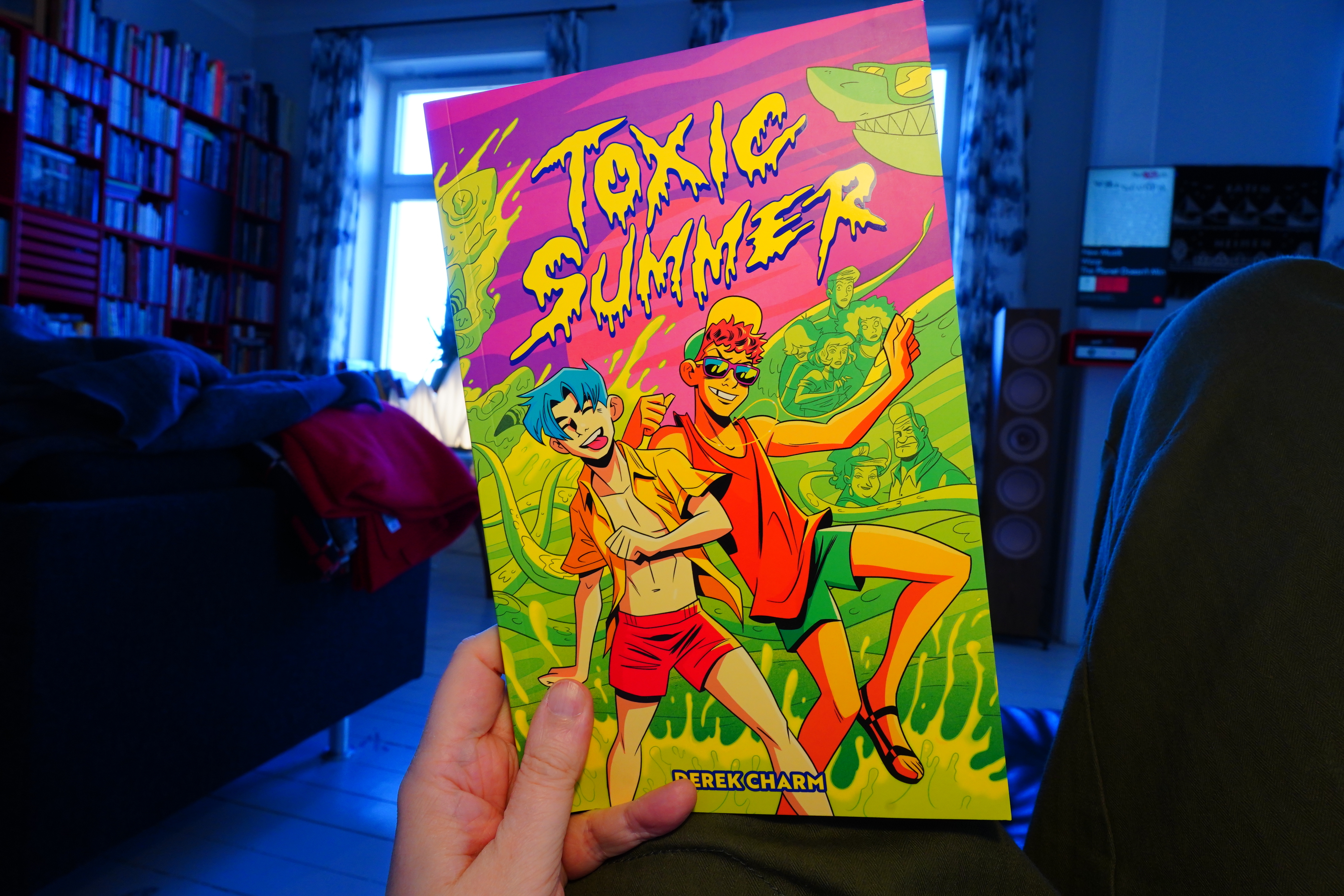
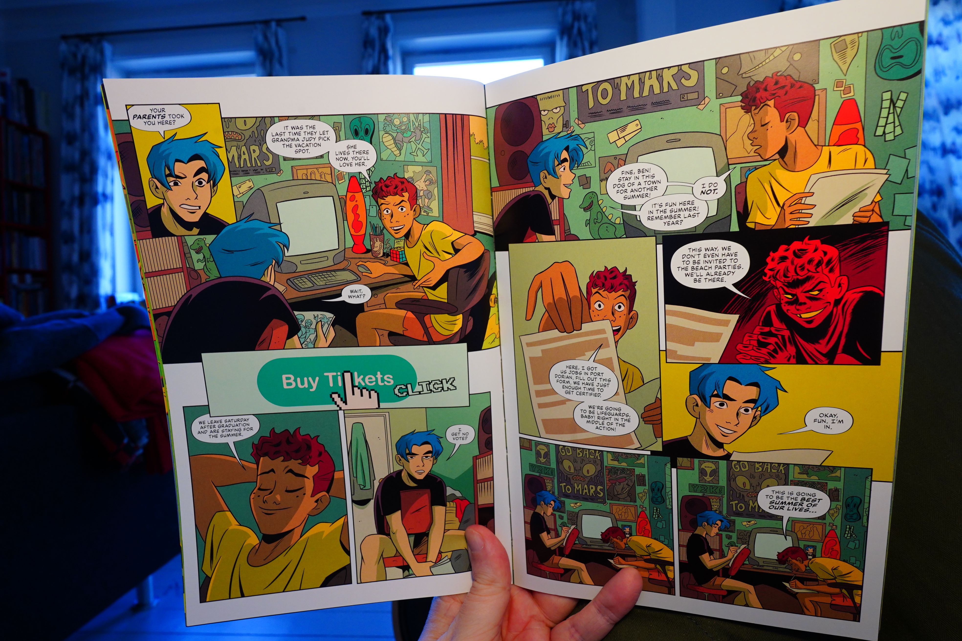
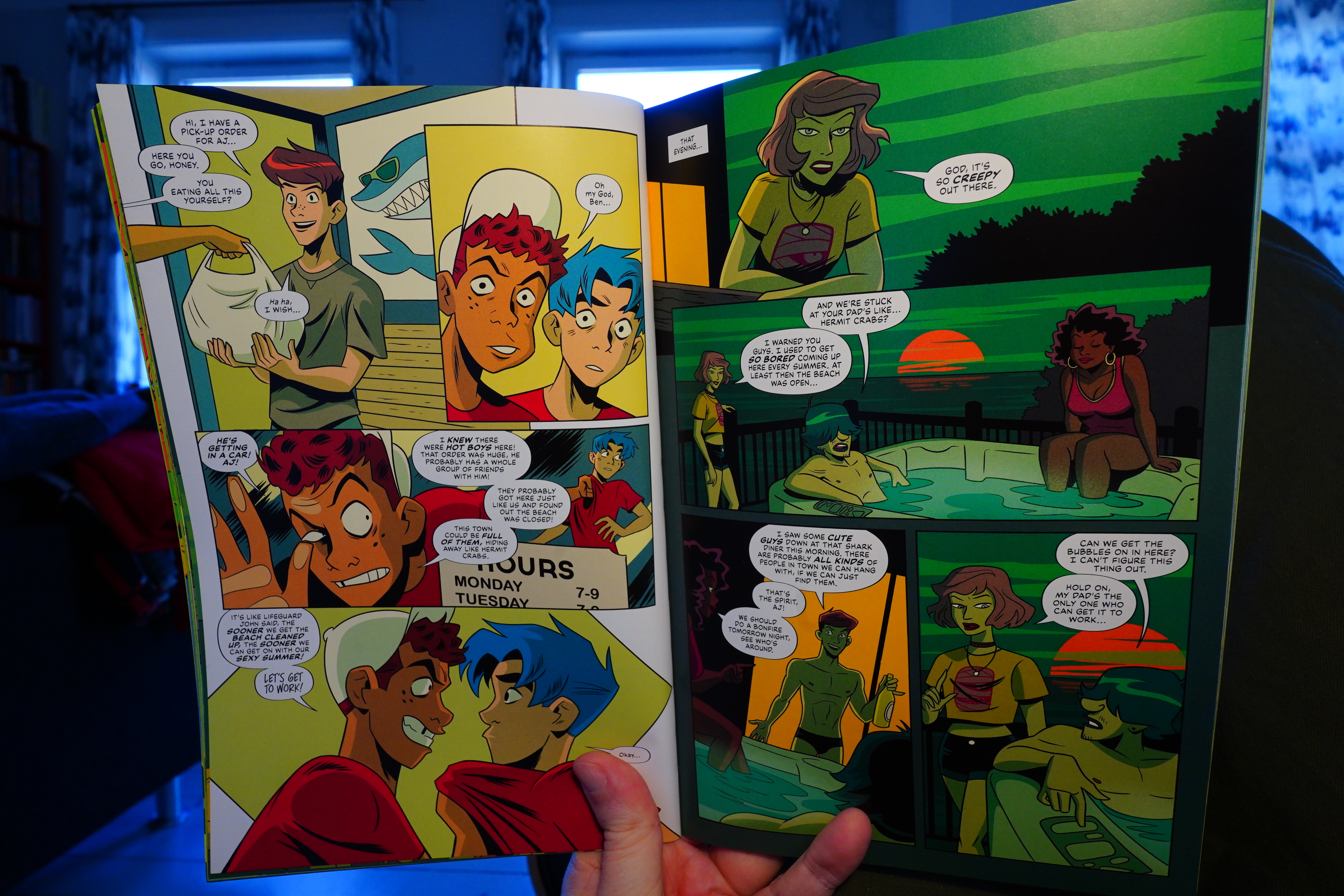
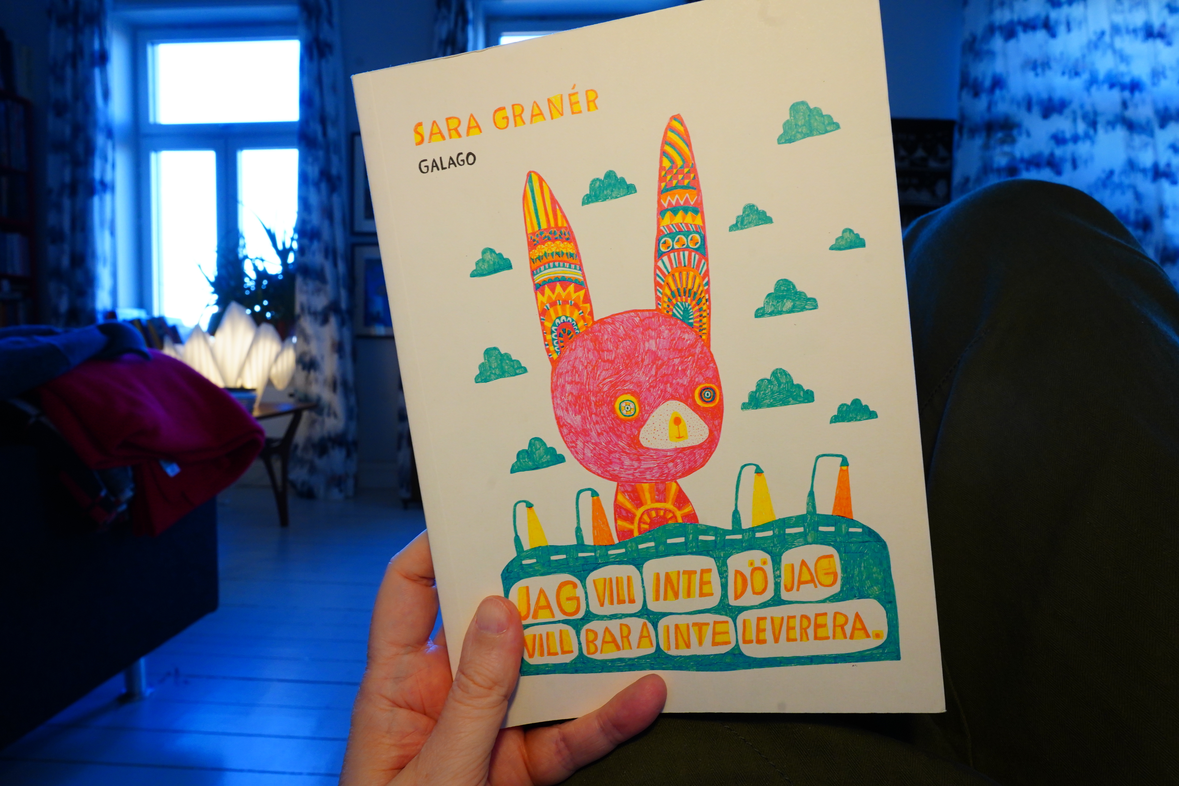
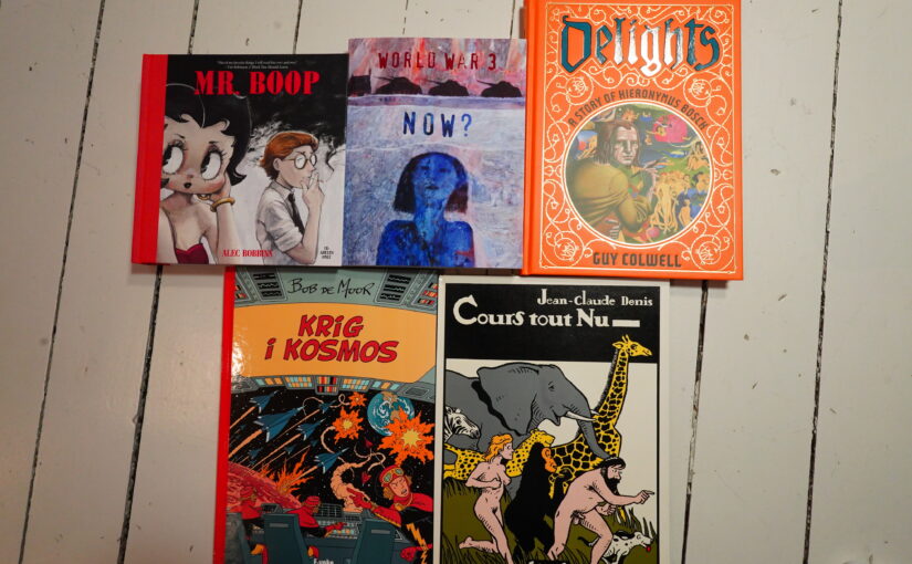
Onto the comics:
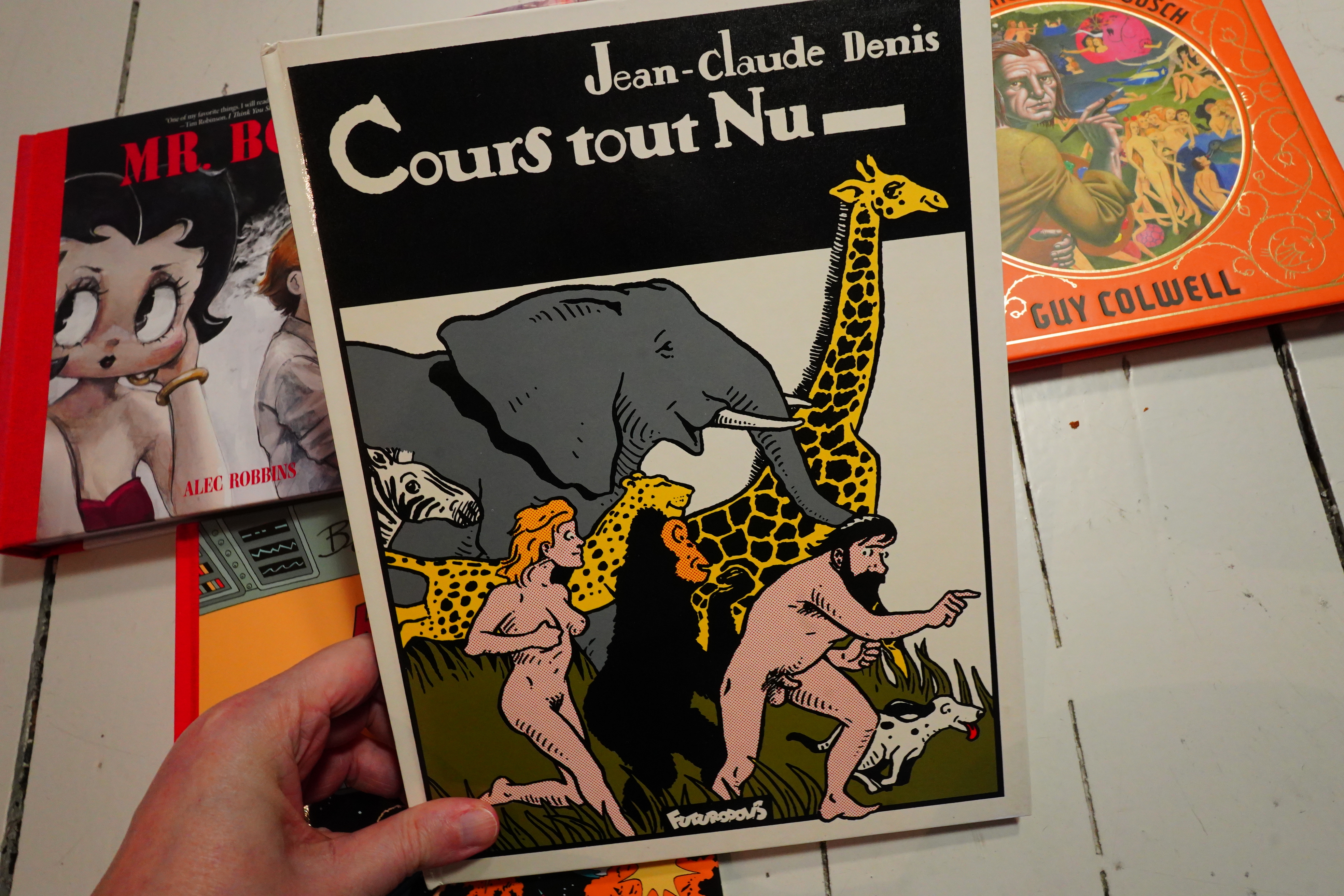
I’ve never heard of Jean-Claude Denis, but I picked this up at a used bookstore in Montreal last year.
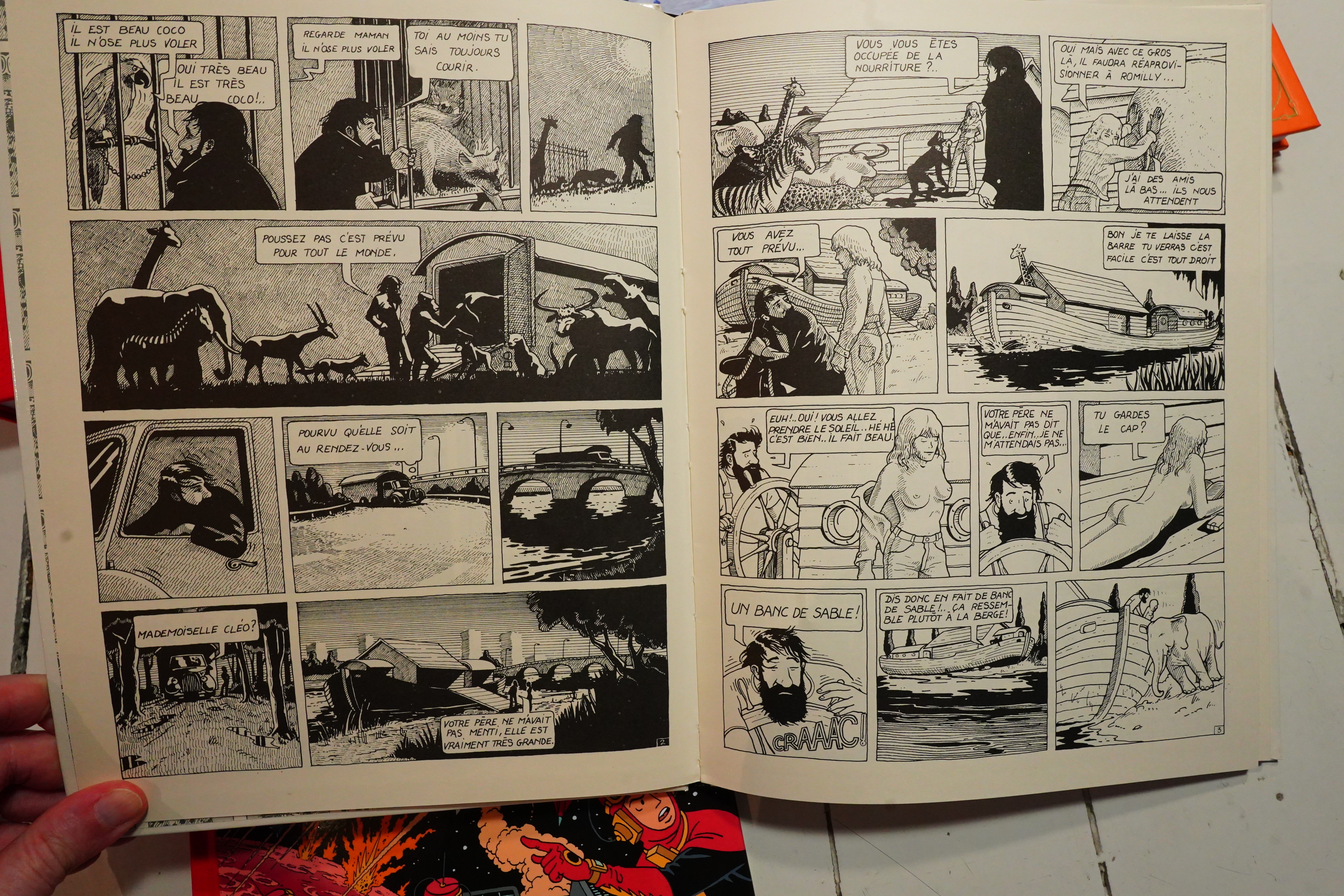
And… it’s from 1979, and it looks 97% like an American underground comic book.
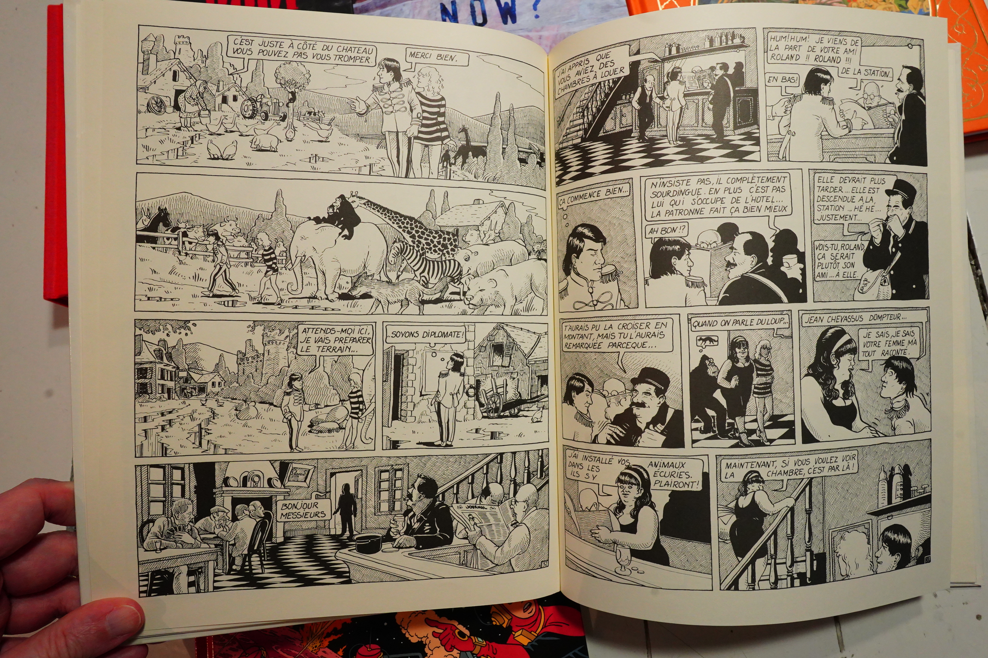
It’s pretty good? It’s about a guy who wants to liberate some animals from a zoo (and a circus), and there’s twists and turns. I really like the artwork — the animals look totally natural…
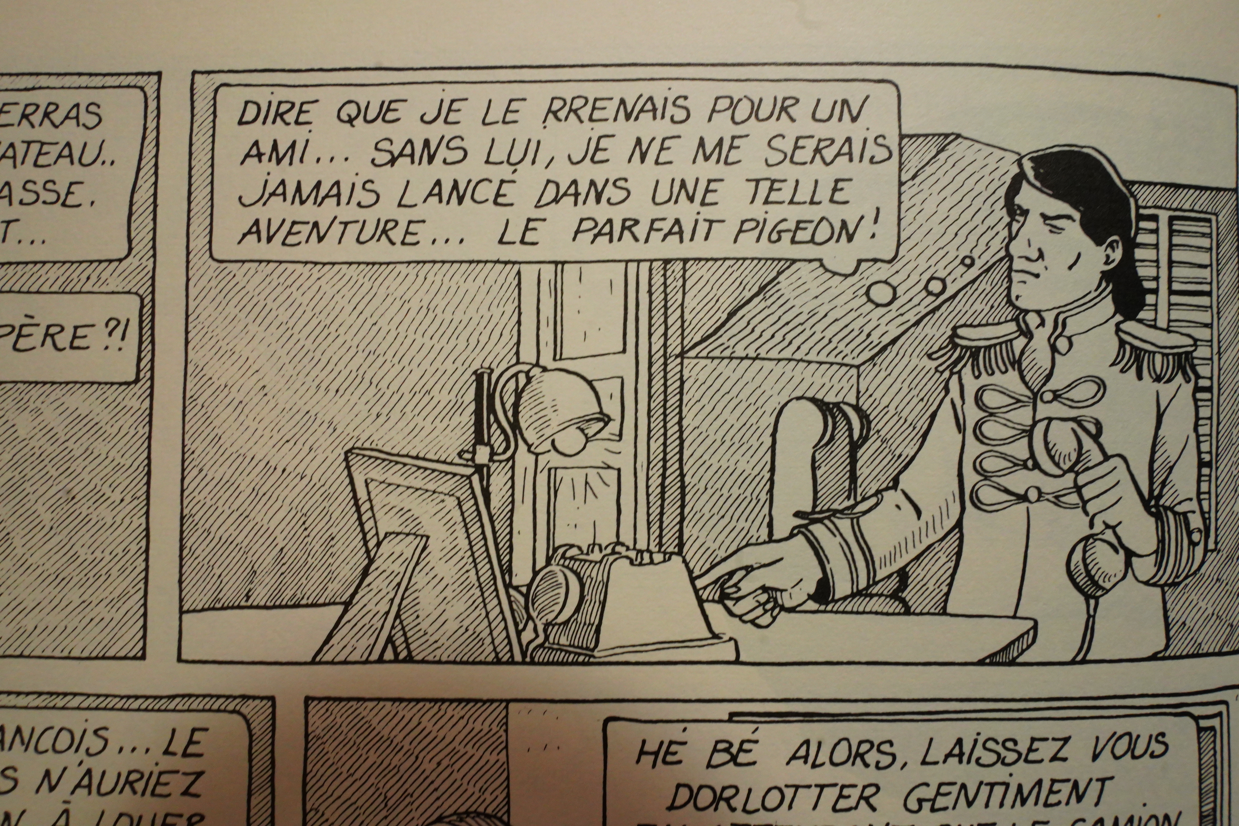
I’m learning French, and one of the problems is that I have no idea when I encounter something new whether it’s something I don’t know, or whether it’s just wrong. The artist has several words that start with “rr”, like “rrenais” up there… so I had to google that. But I think it’s just misspelled “prenais”? I mean, that makes sense — “to think that I I took her for a friend” or something along those lines.
But it’s just bizarre to letter a “P” as an “R”.
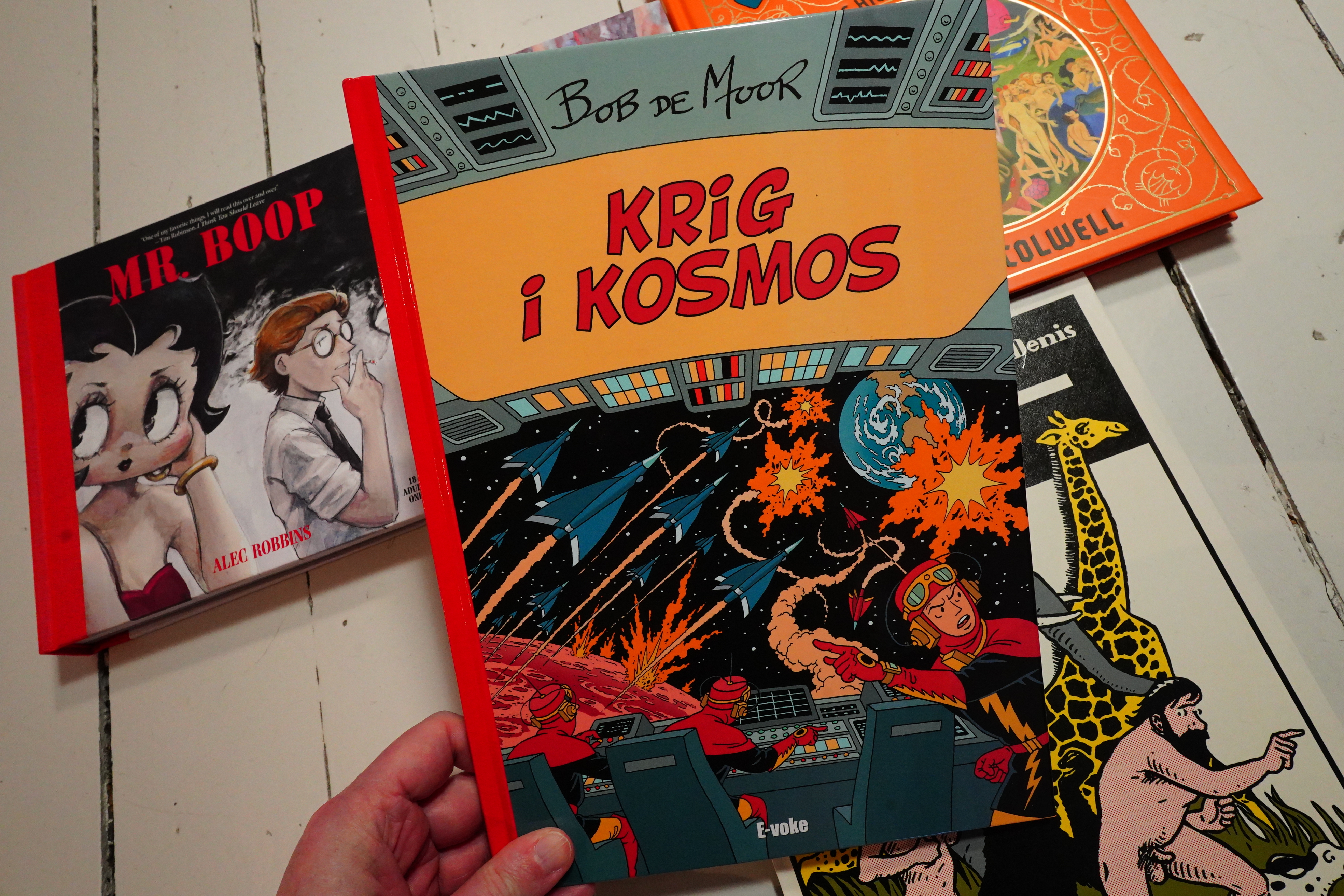
This is from 1948/49, and is one of Bob de Moor’s earliest long-form stories.
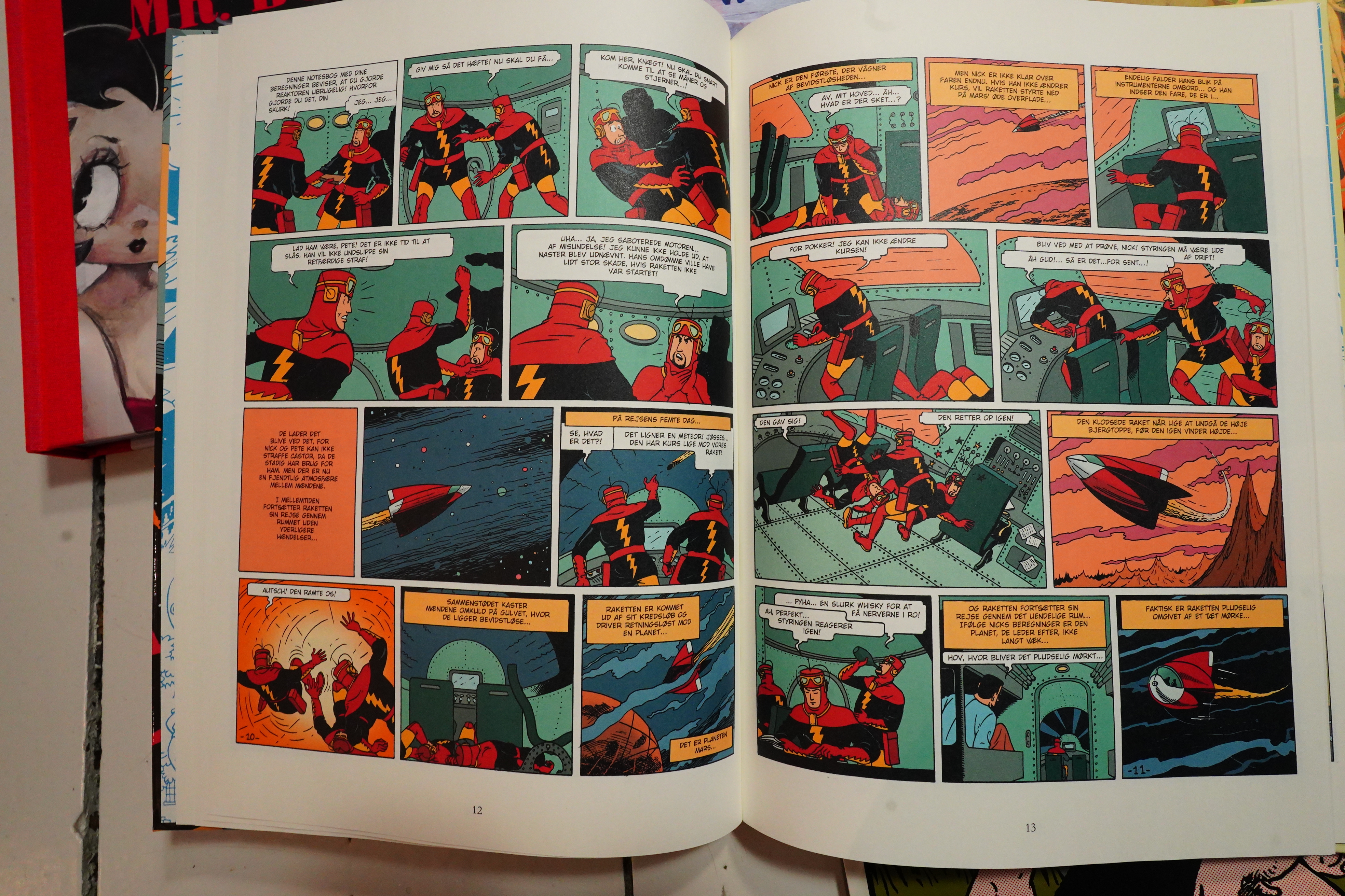
As you can probably tell, de Moor was Hergé’s assistant…
This is kind of a dry-run for one of the most famous Tintin stories, On a marché sur la Lune that started serialisation in 1950. Well, at least I think it must have been — there’s no editorial text. But it’s about going to the moon, and it was published a year before Tintin went to the moon, so they must have been getting designs ready by the point this was published.
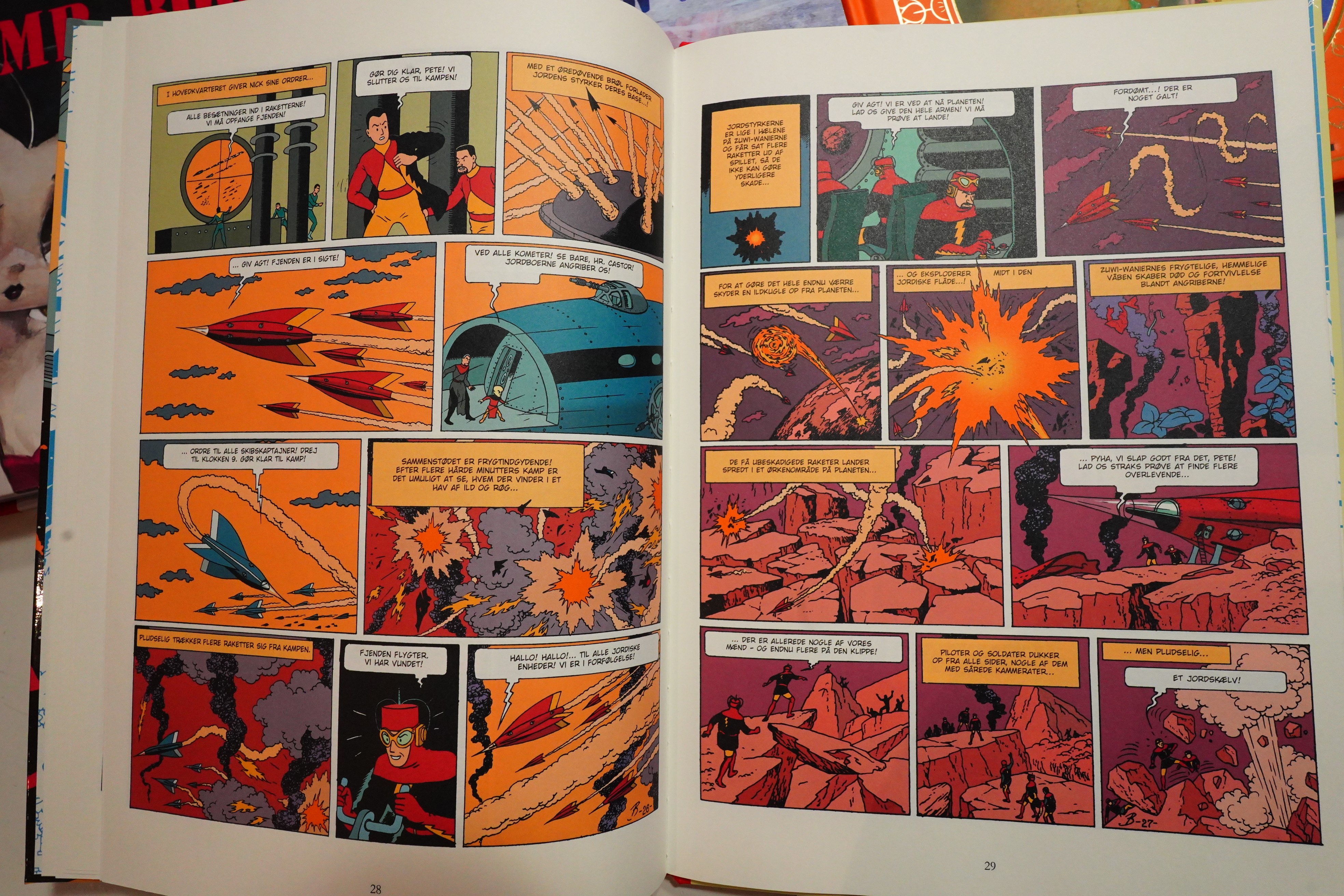
But while the Tintin story was a pretty peaceful adventure, this is all war and stuff.
It’s not actually, er, what’s the word… “good”… Which may explain why it wasn’t collected in a colour album until a couple years ago.
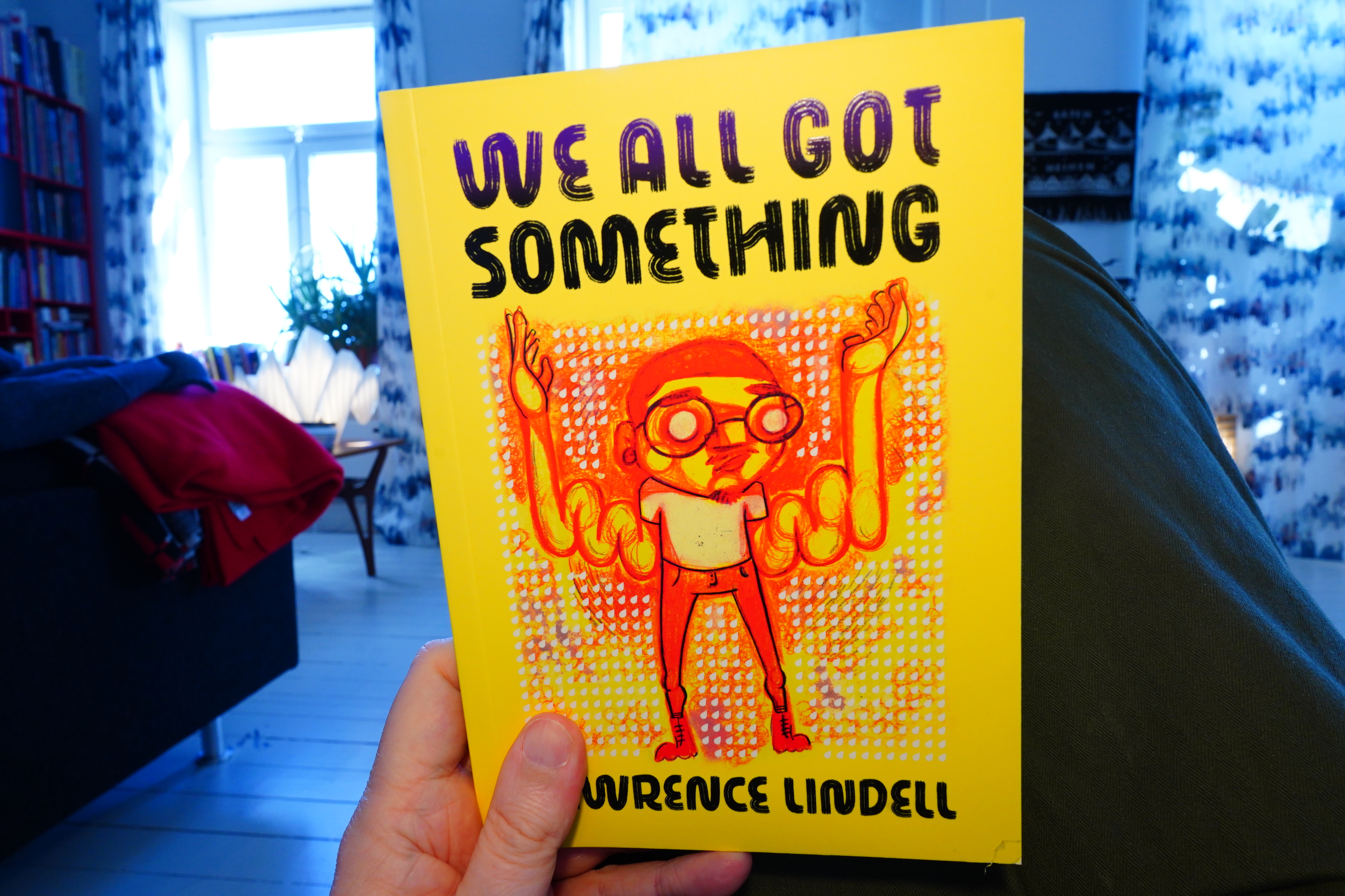
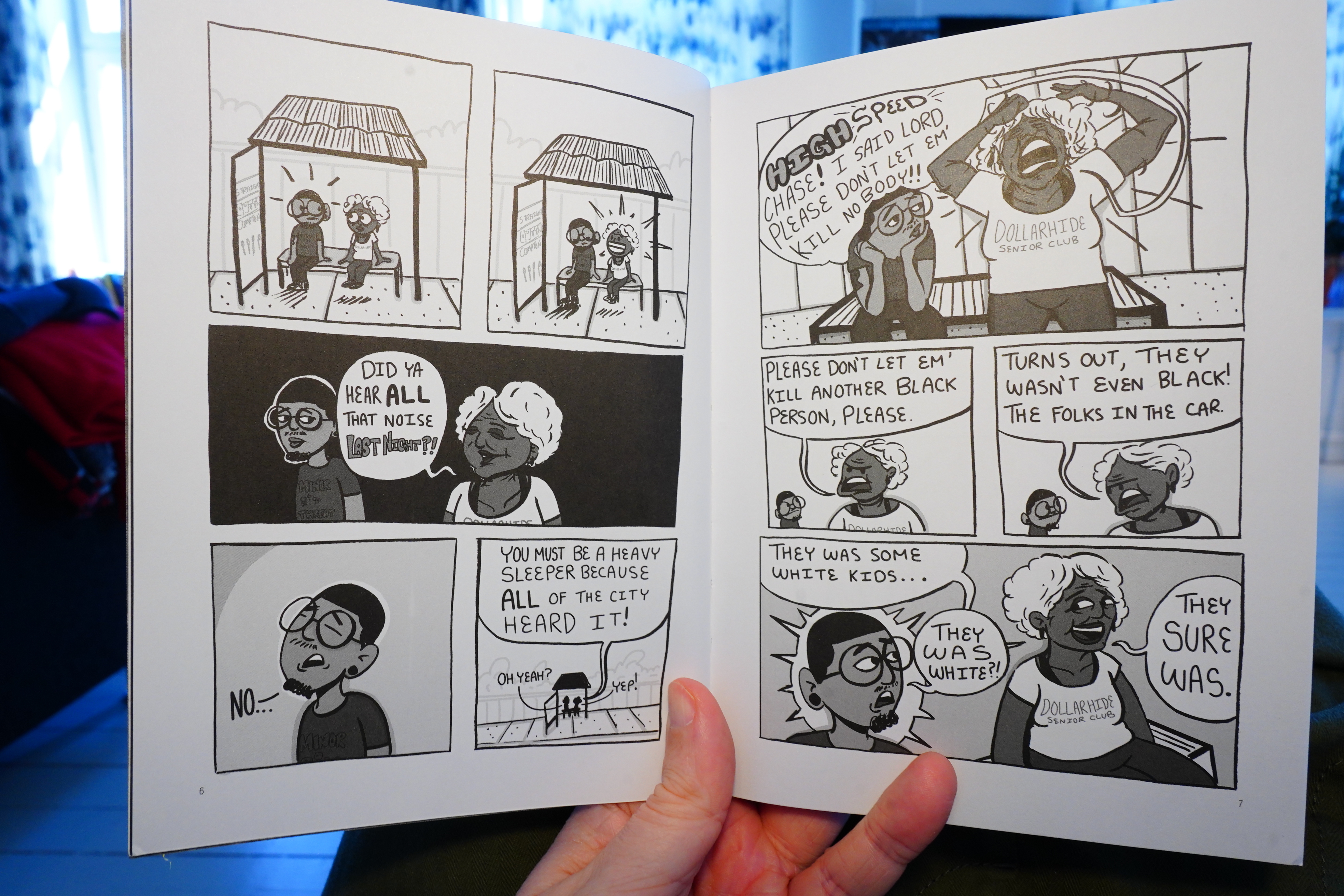
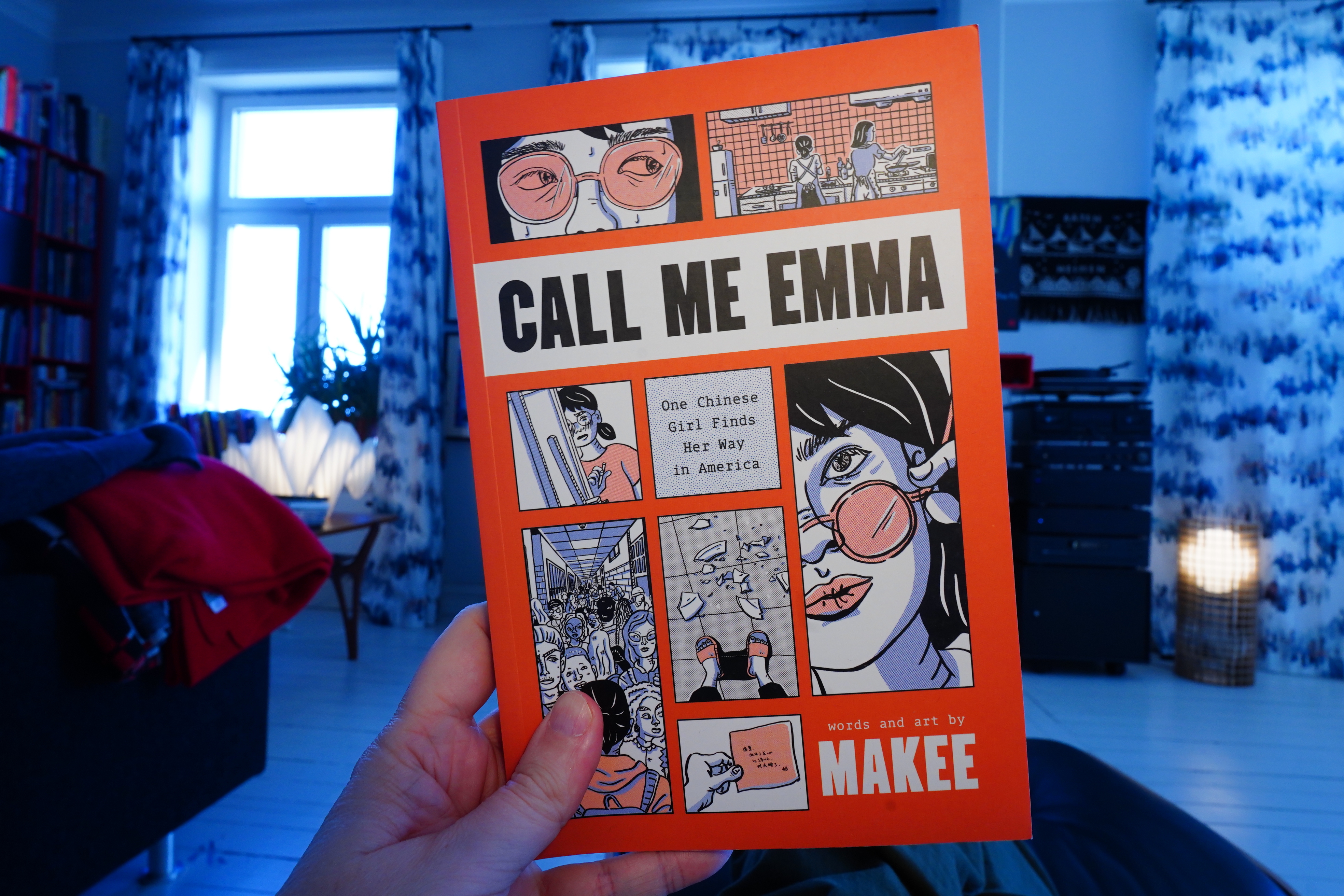
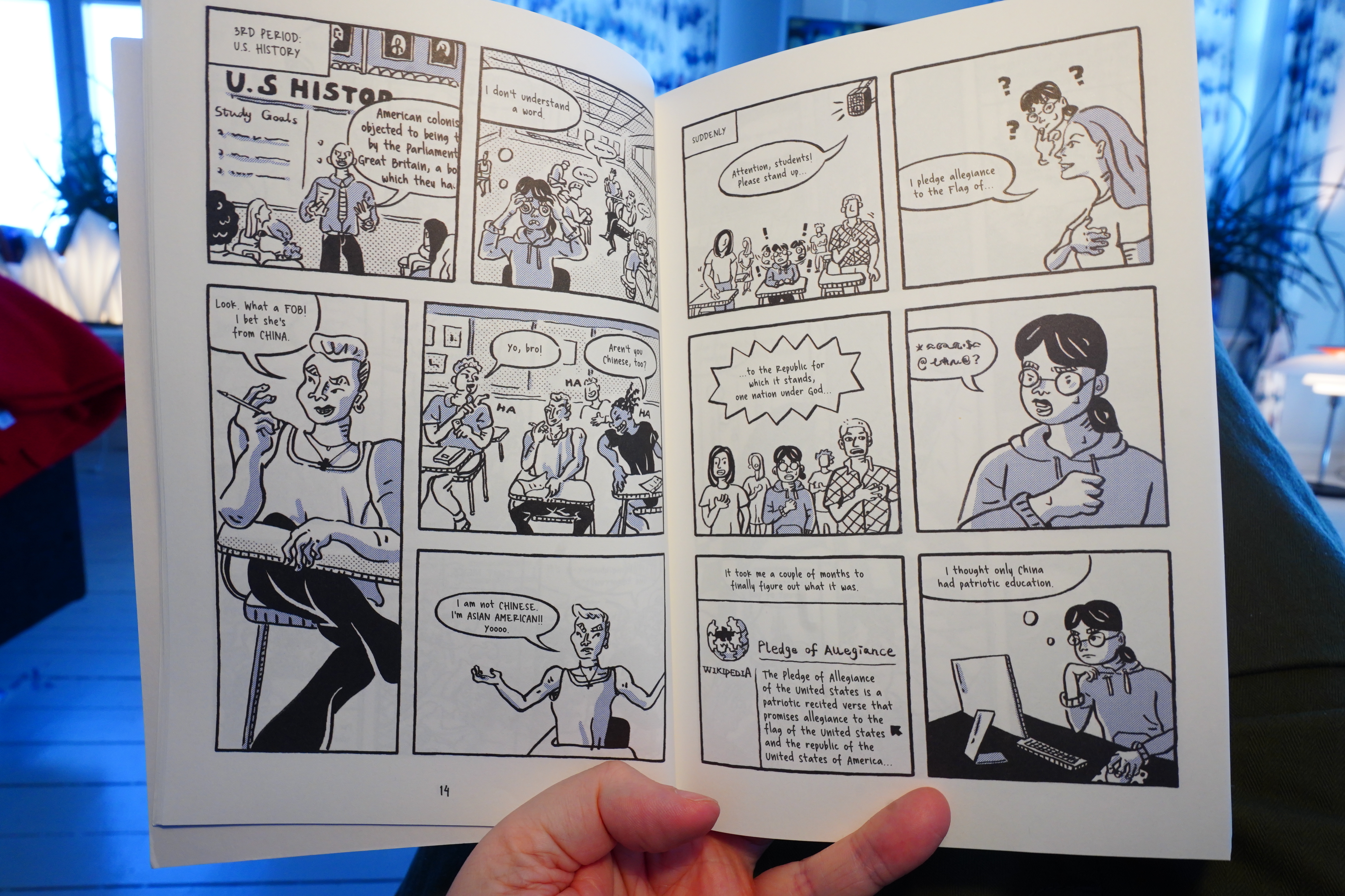
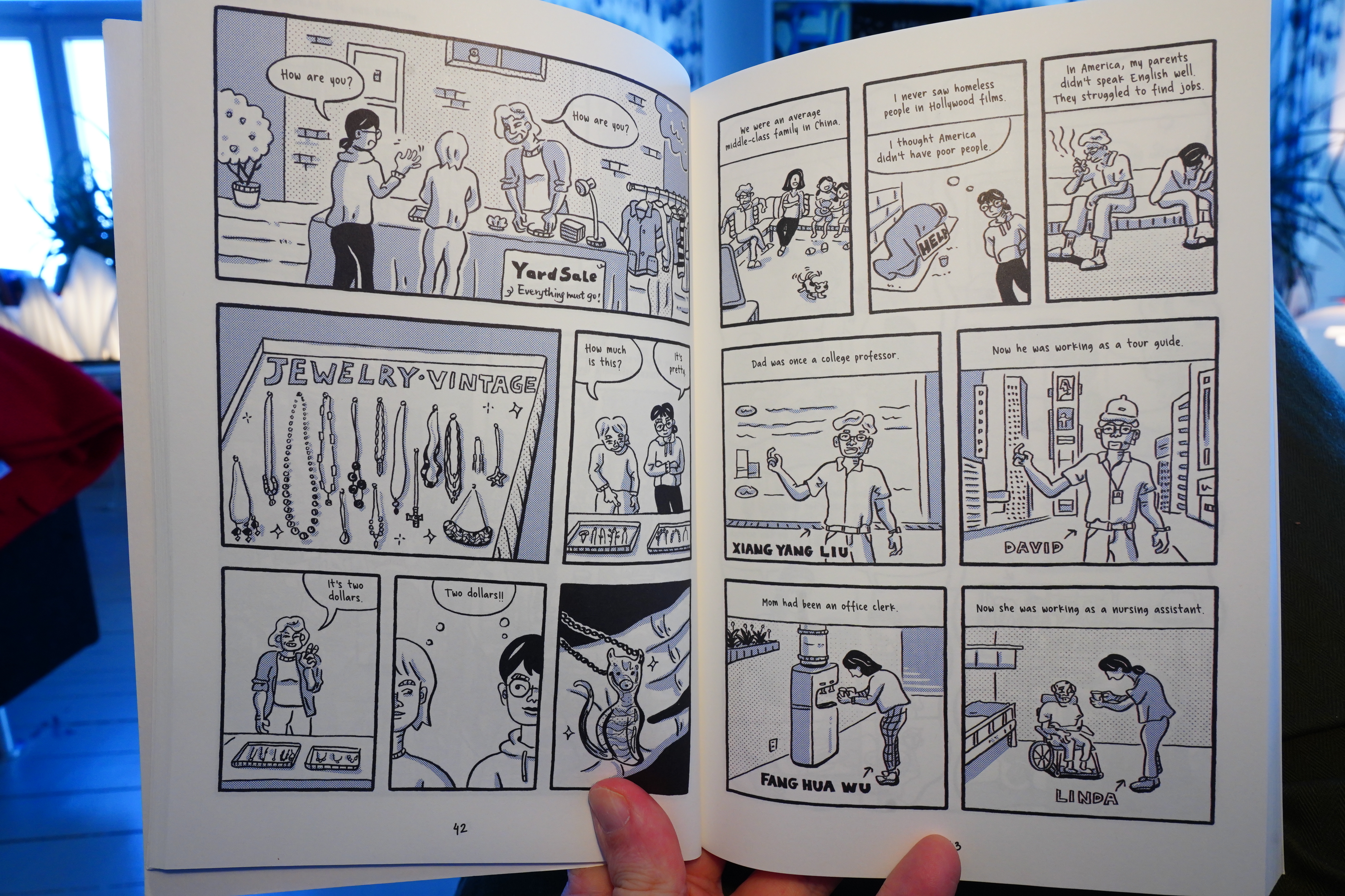
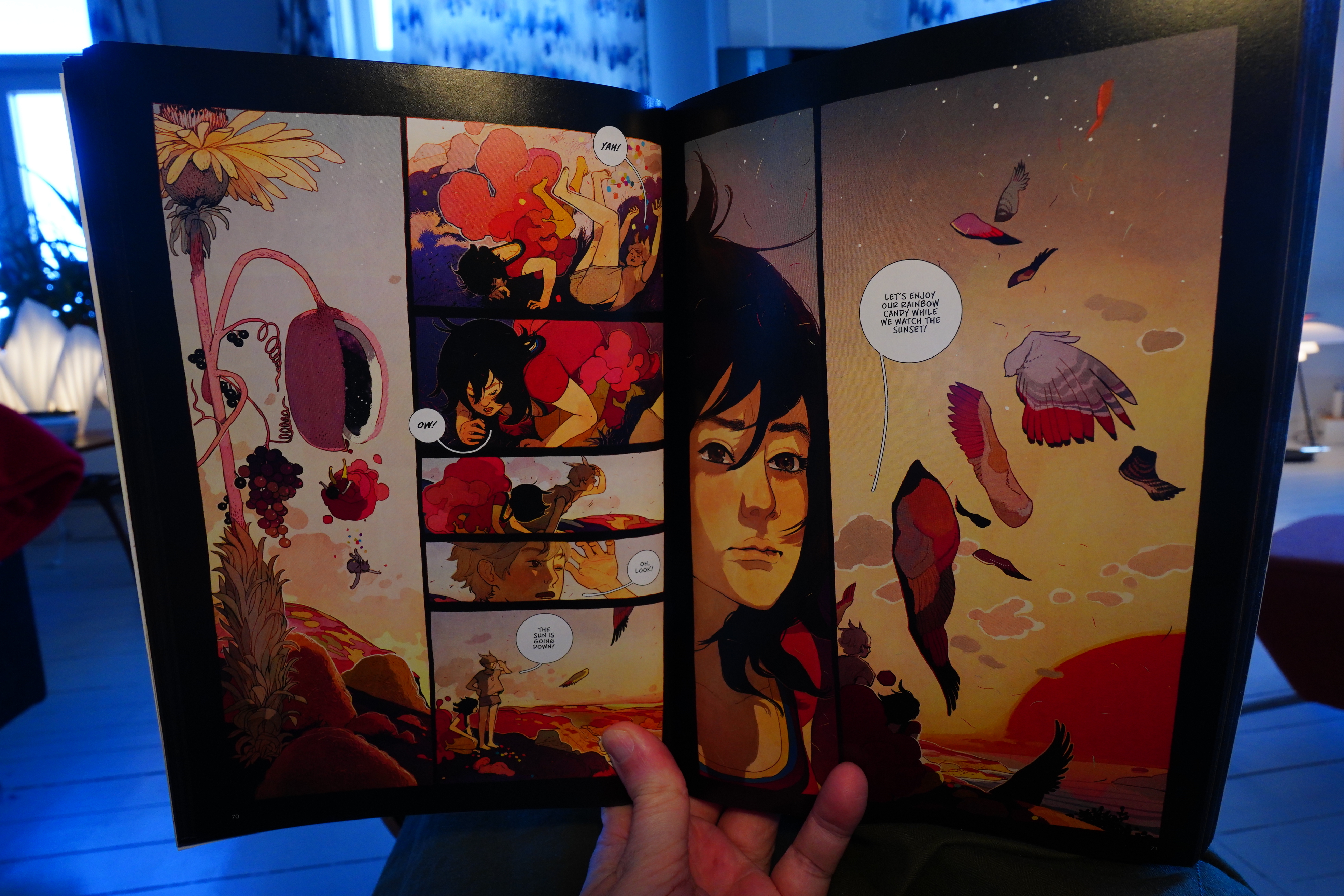
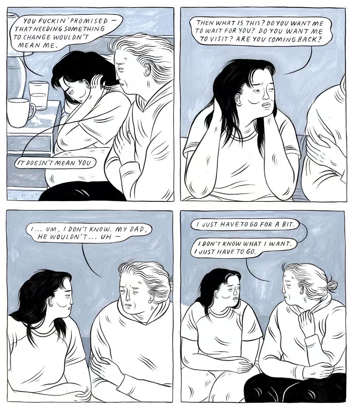
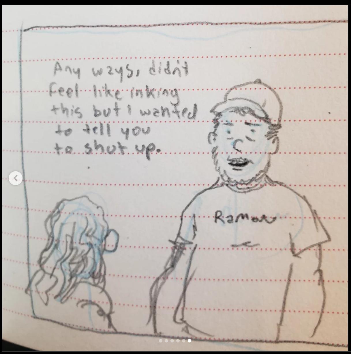
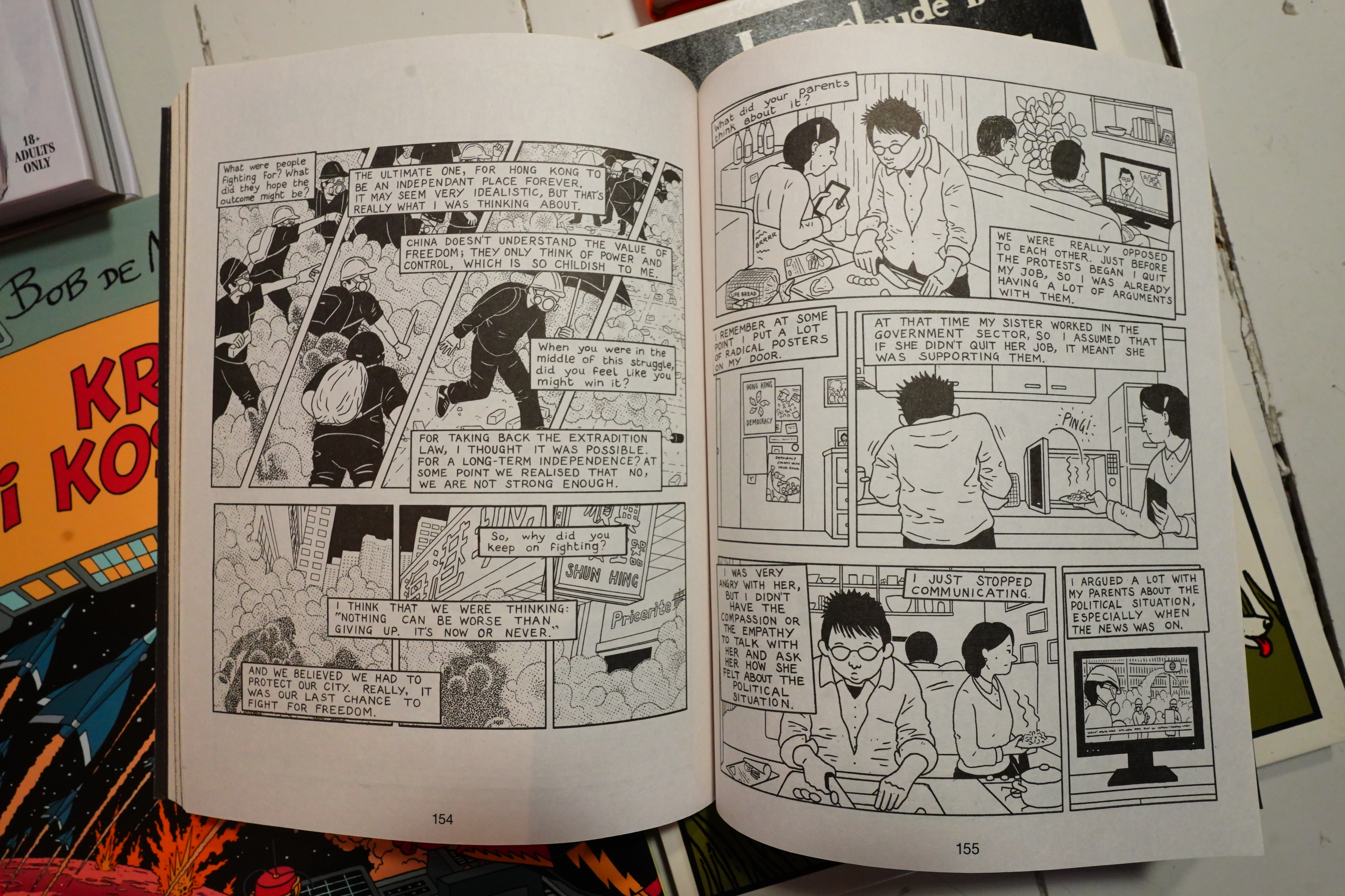
I finally got around to buying this… I mean, it got a lot of attention a few years back, but I just completely forgot.
If I understand correctly, it was serialised on Instagram, and started off as a goof.
But then got quite serious after a while.
And the end is quite gripping.
But… uhm… I liked it overall, I guess? But I have to say I got quite impatient with it all after reading (let’s say) one quarter, and I didn’t really get into it again until the final quarter.
I got this from here.
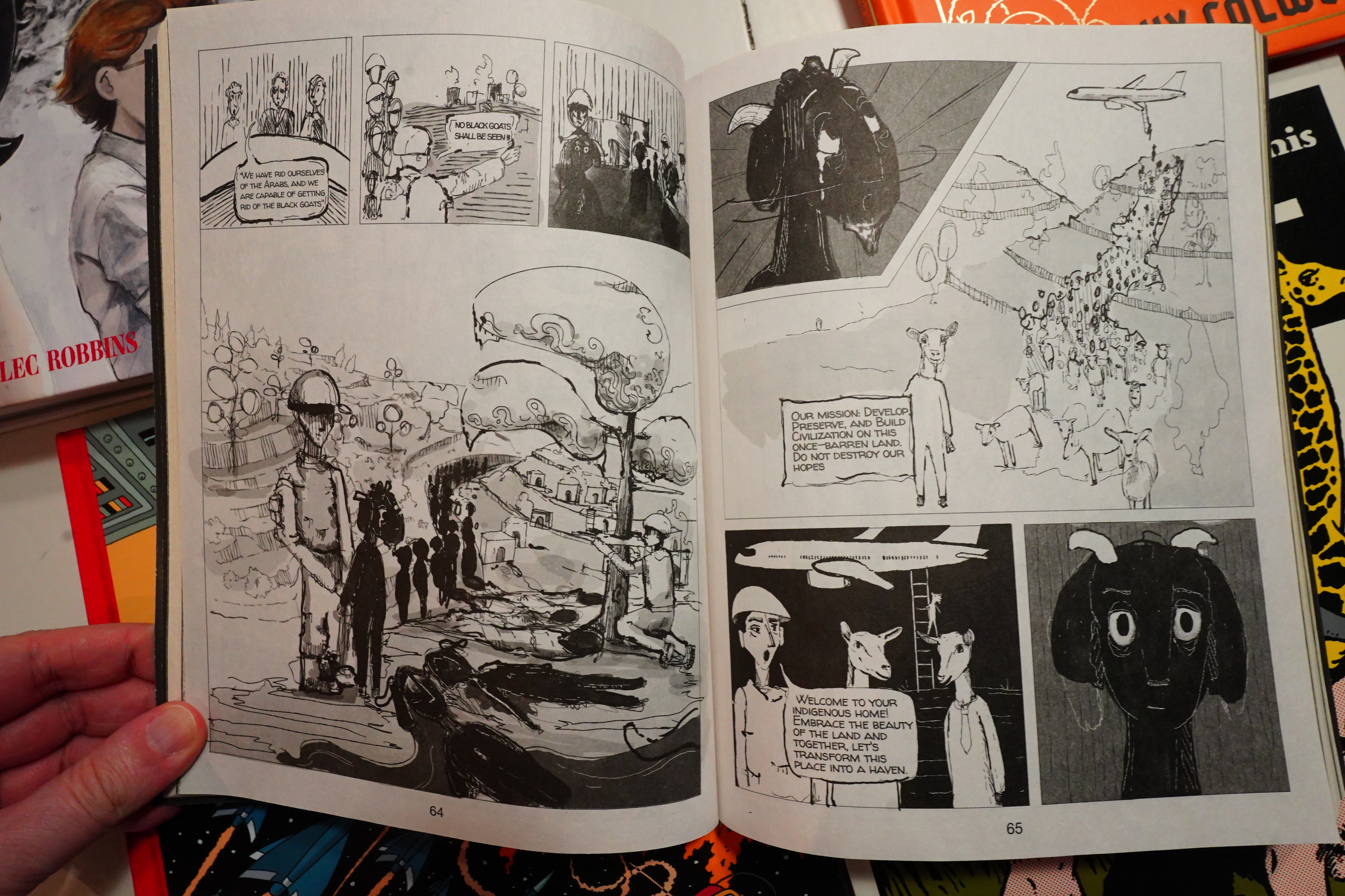
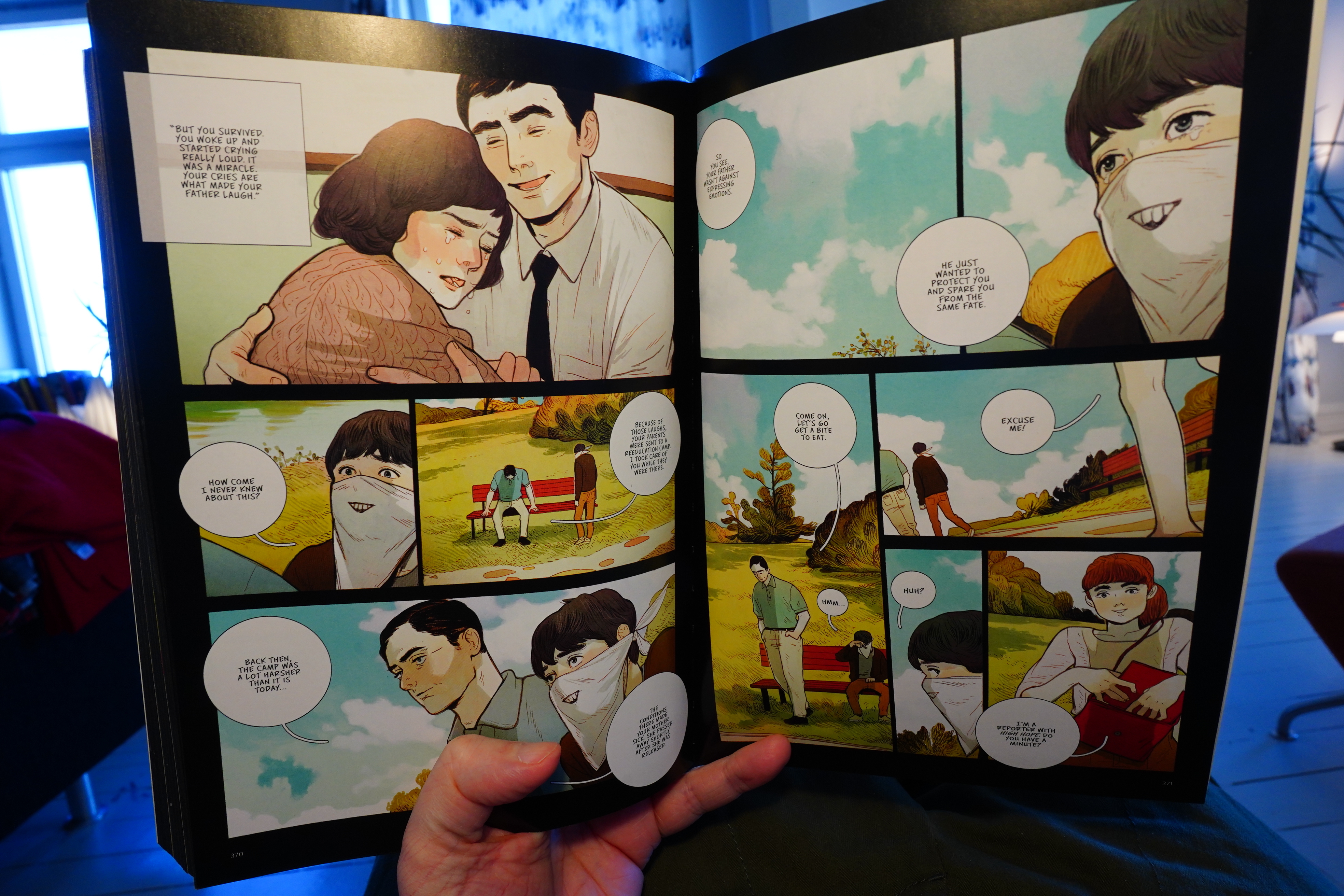
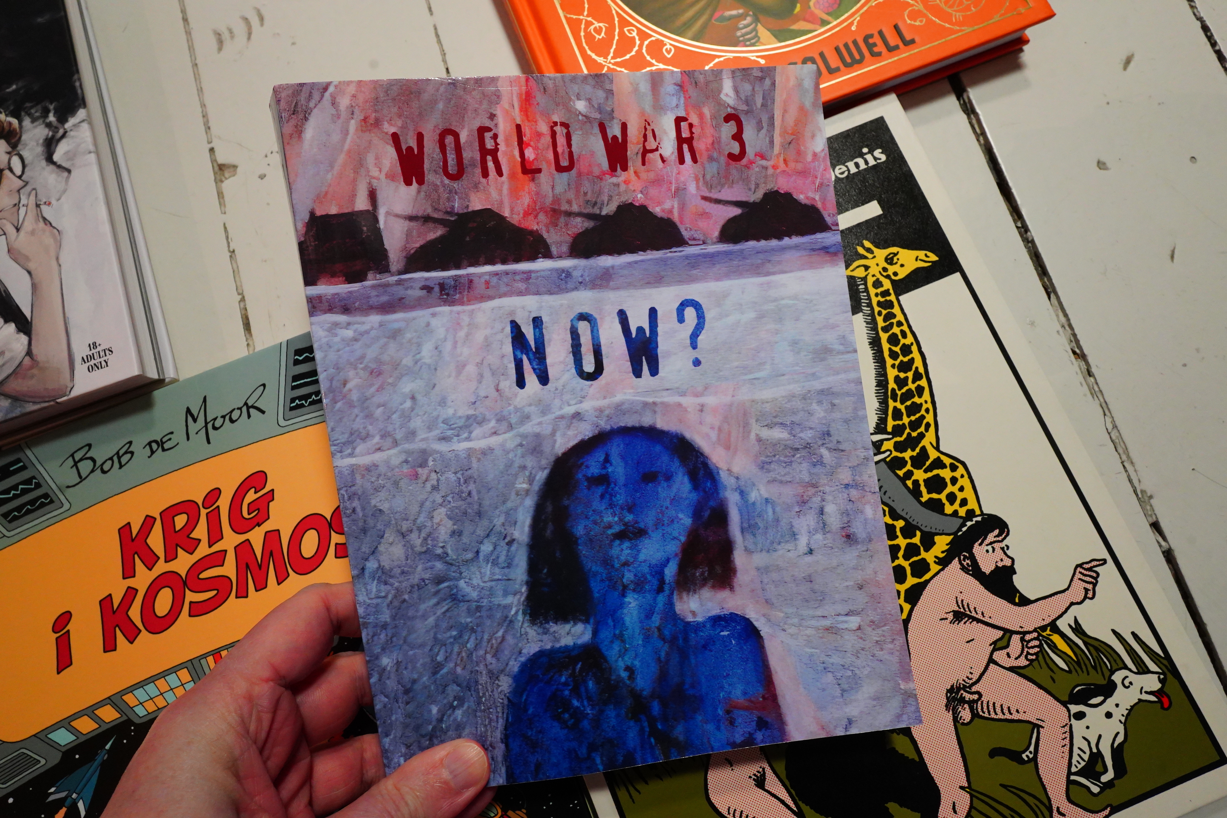
This issue is a hefty one. It’s heavier (in all senses) than World War 3 Illustrated usually is, and it’s usually pretty heavy.
It’s about the wars in Gaza and Ukraine, mostly — WW3I is usually grounded in smaller issues…
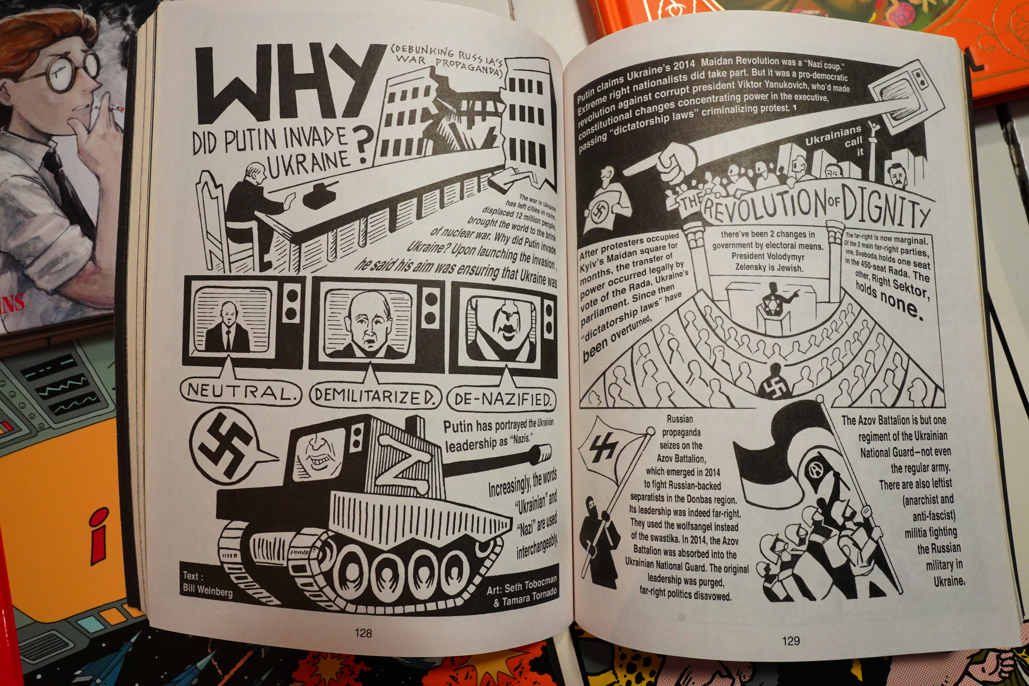
So we get explainers and stuff. It’s all correct, so I’m not complaining — I’m just saying that it’s less gripping than issues usually are.
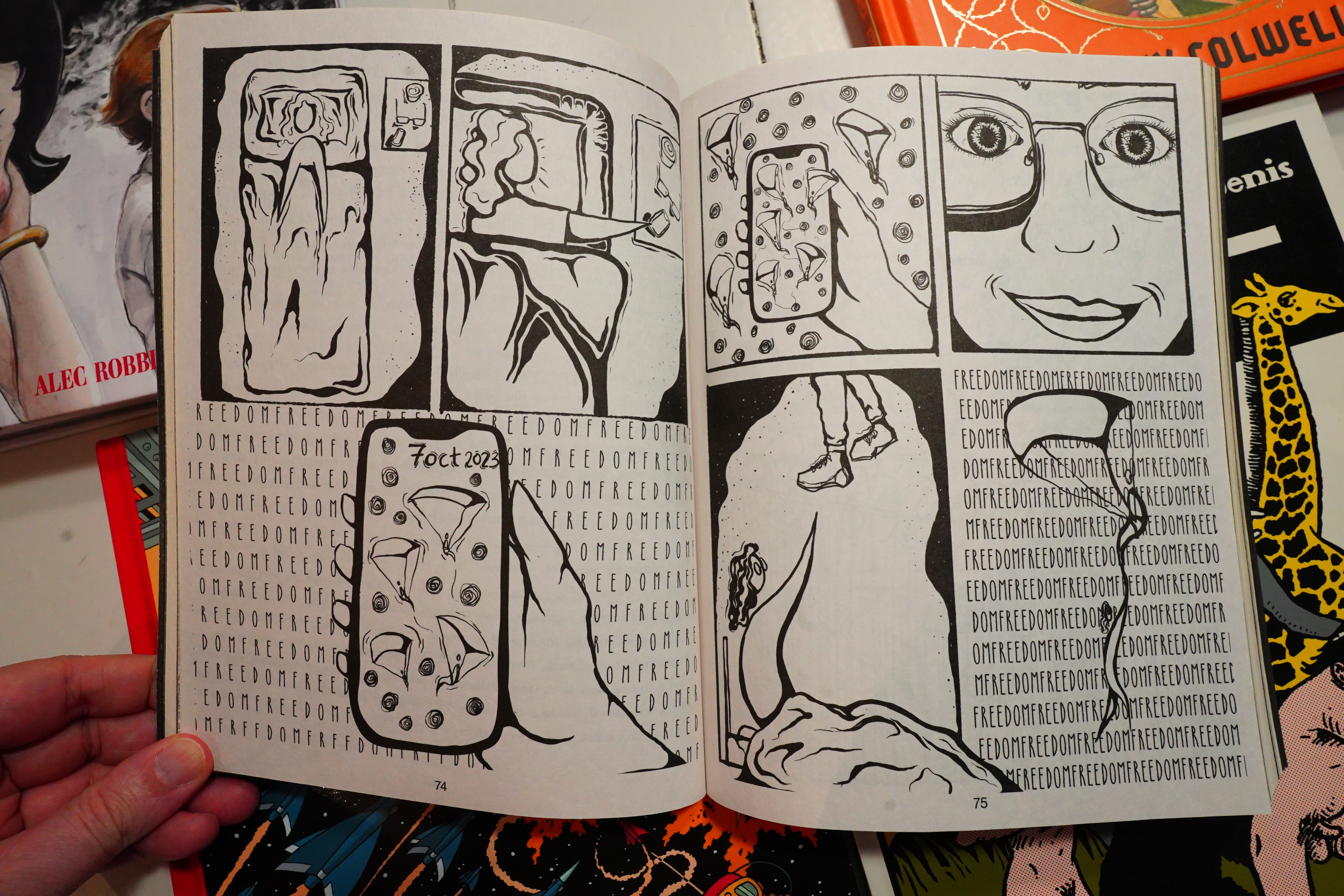
The most successful pieces are the ones that focus more on personal experience, like the above.
But misunderstand me right — it’s still a really strong issue. Get a copy.
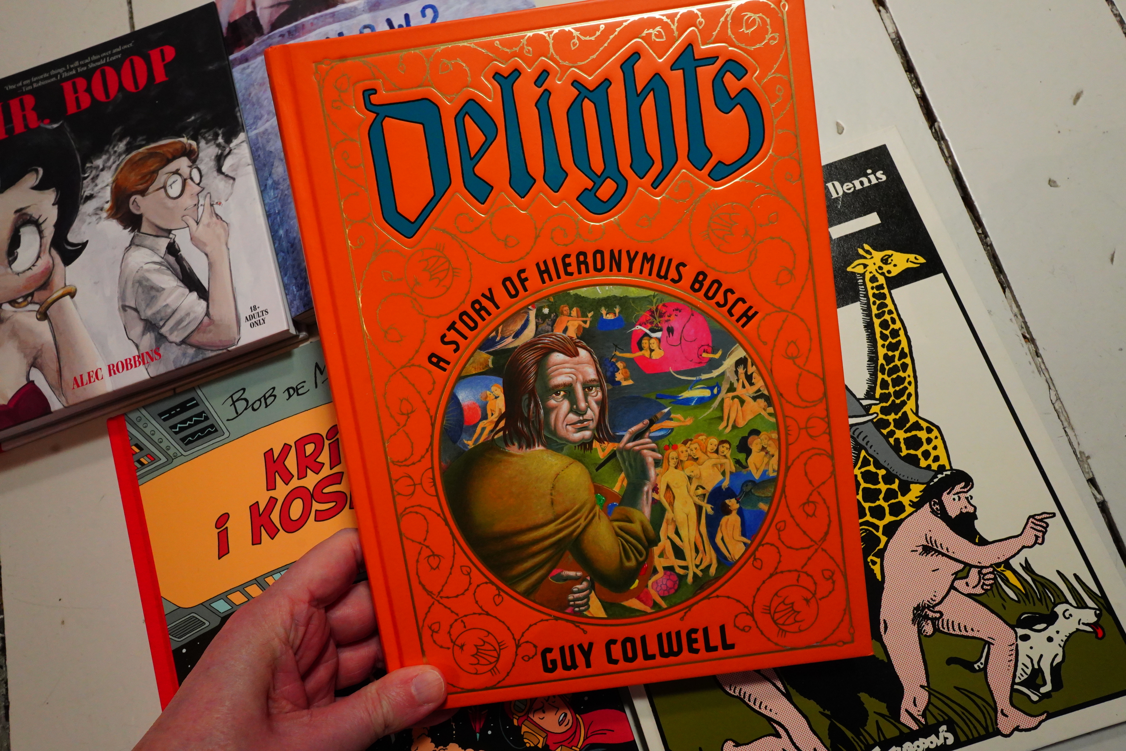
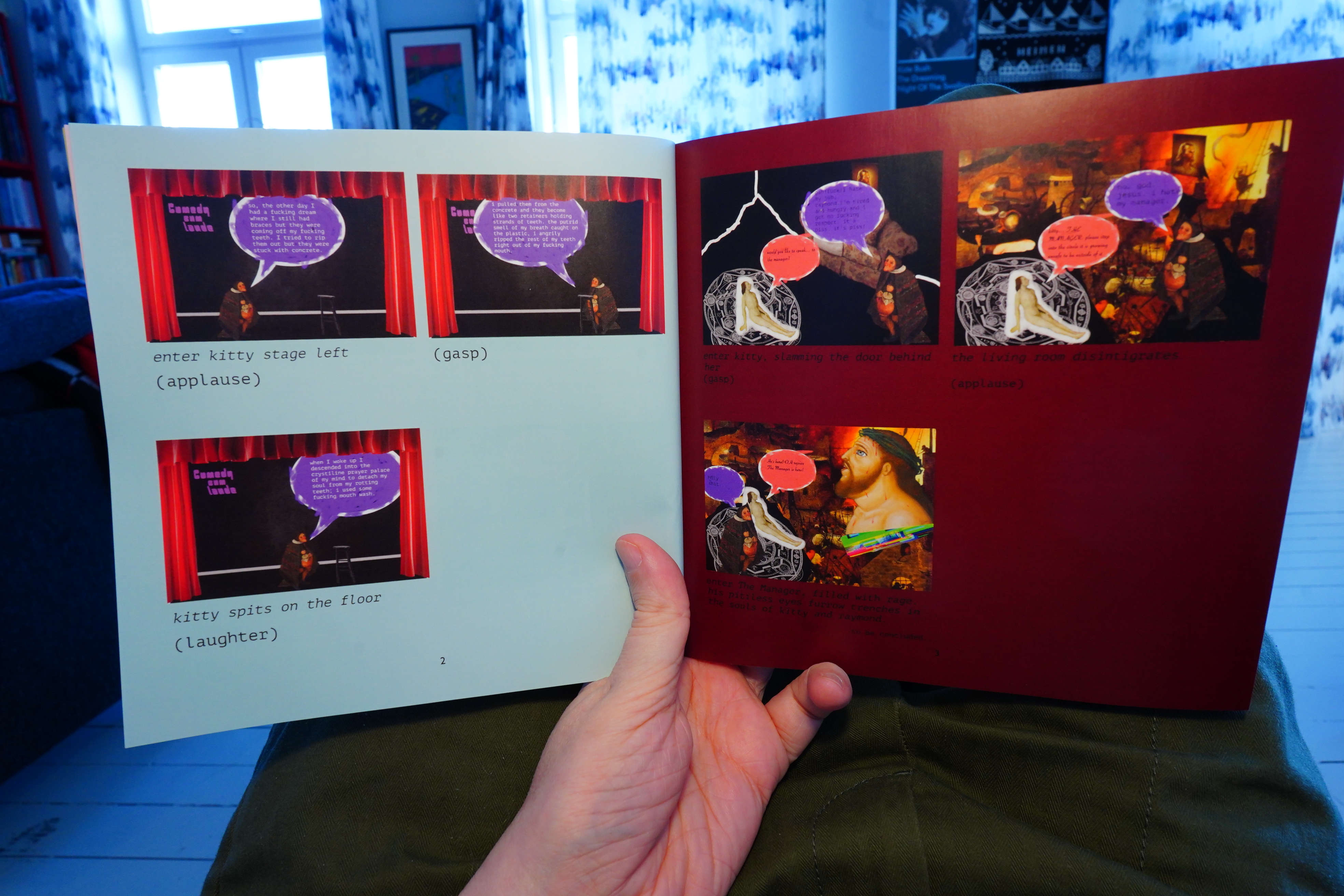
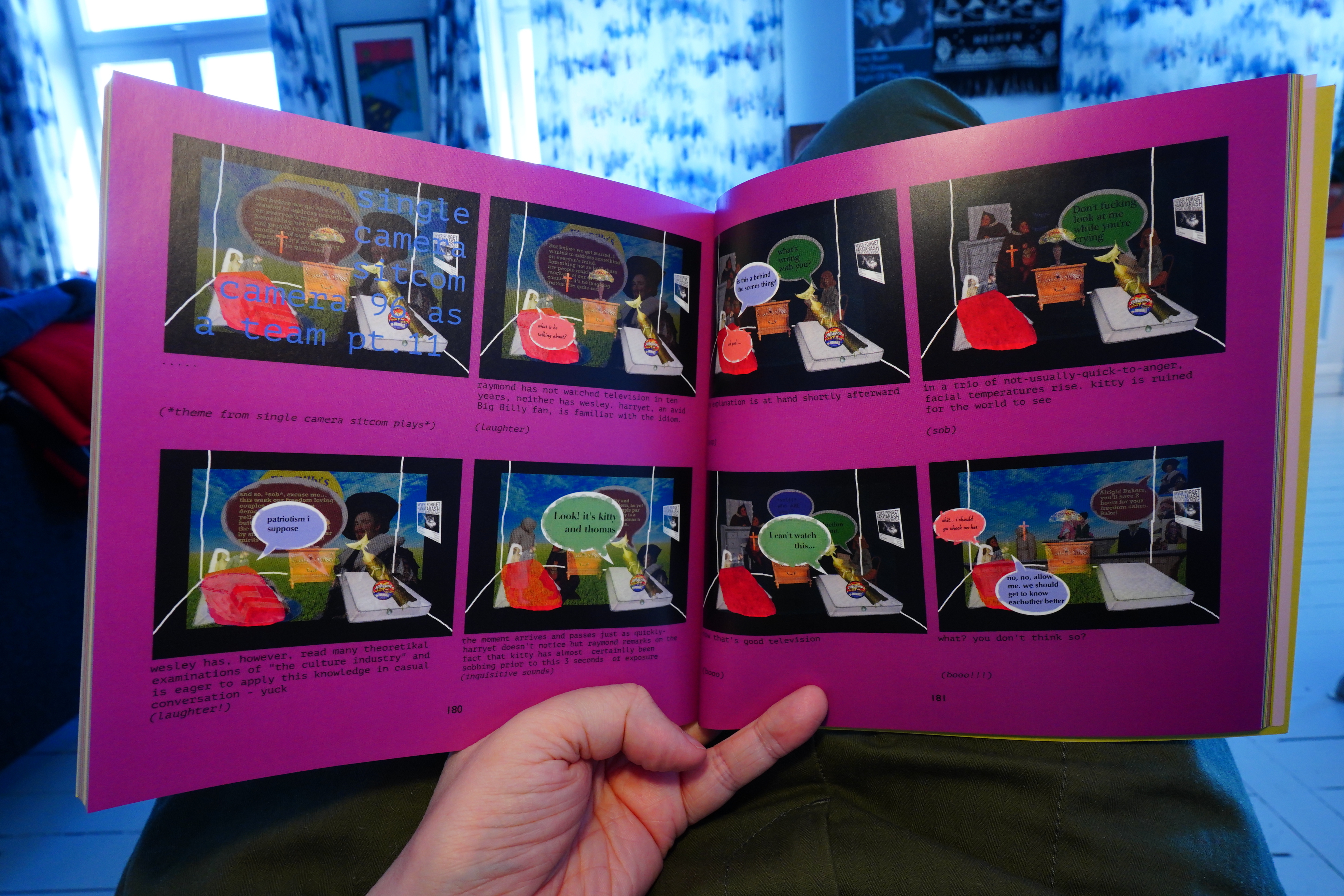
Well, this is a strange one. Colwell has done some amazing comics over the years — his longer piece in Bizarre Sex #10 is awesome. But I guess he’s mostly known for the Doll series these days? It’s been a few decades since he published a major work, and it’s about Bosch?
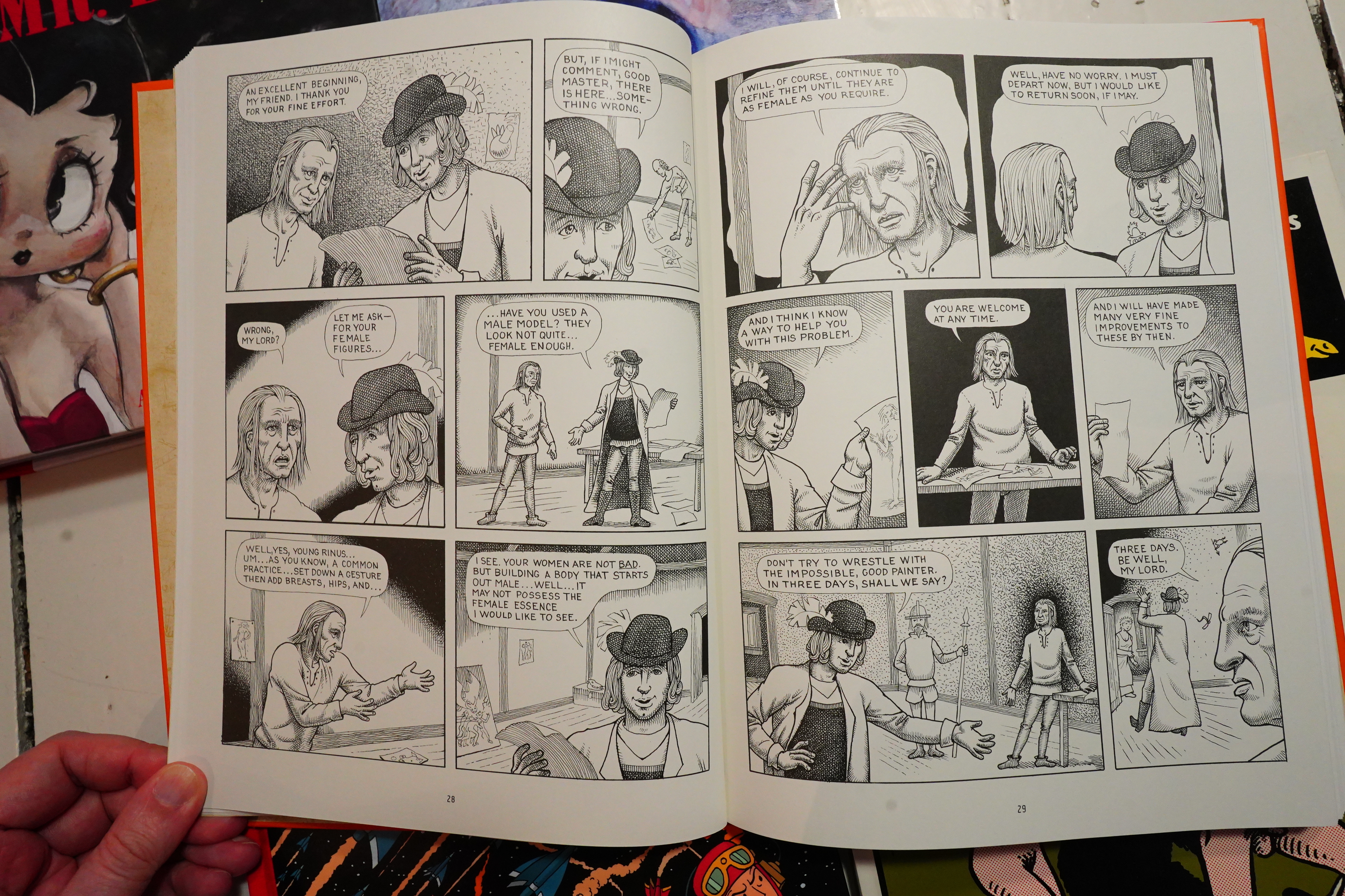
I know nothing about Bosch (I mean, more than what everybody knows), but I’m guessing that the story Colwell tells here is complete fiction? I mean, it’s about how Bosch painted The Garden of Earthly Delights, but it seems unlikely that somebody wrote down how that painting came to be created, at least in this much detail? (I know, I could do research, but where’s the fun in that.)
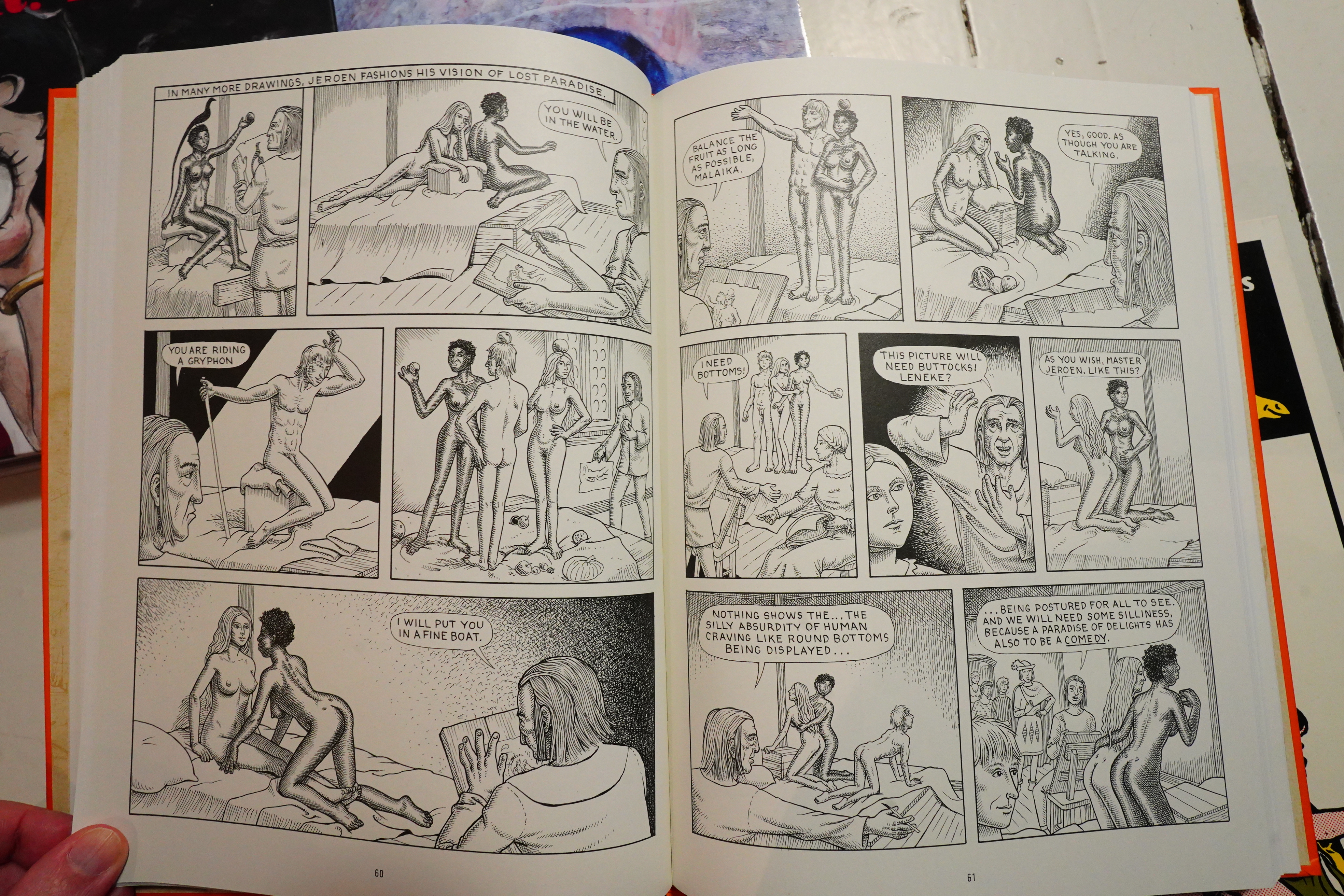
I like Colwell’s artwork — it’s stiff and posed, but in a good way. And this is, of course, about people posing, stiffly, so it’s perfect.
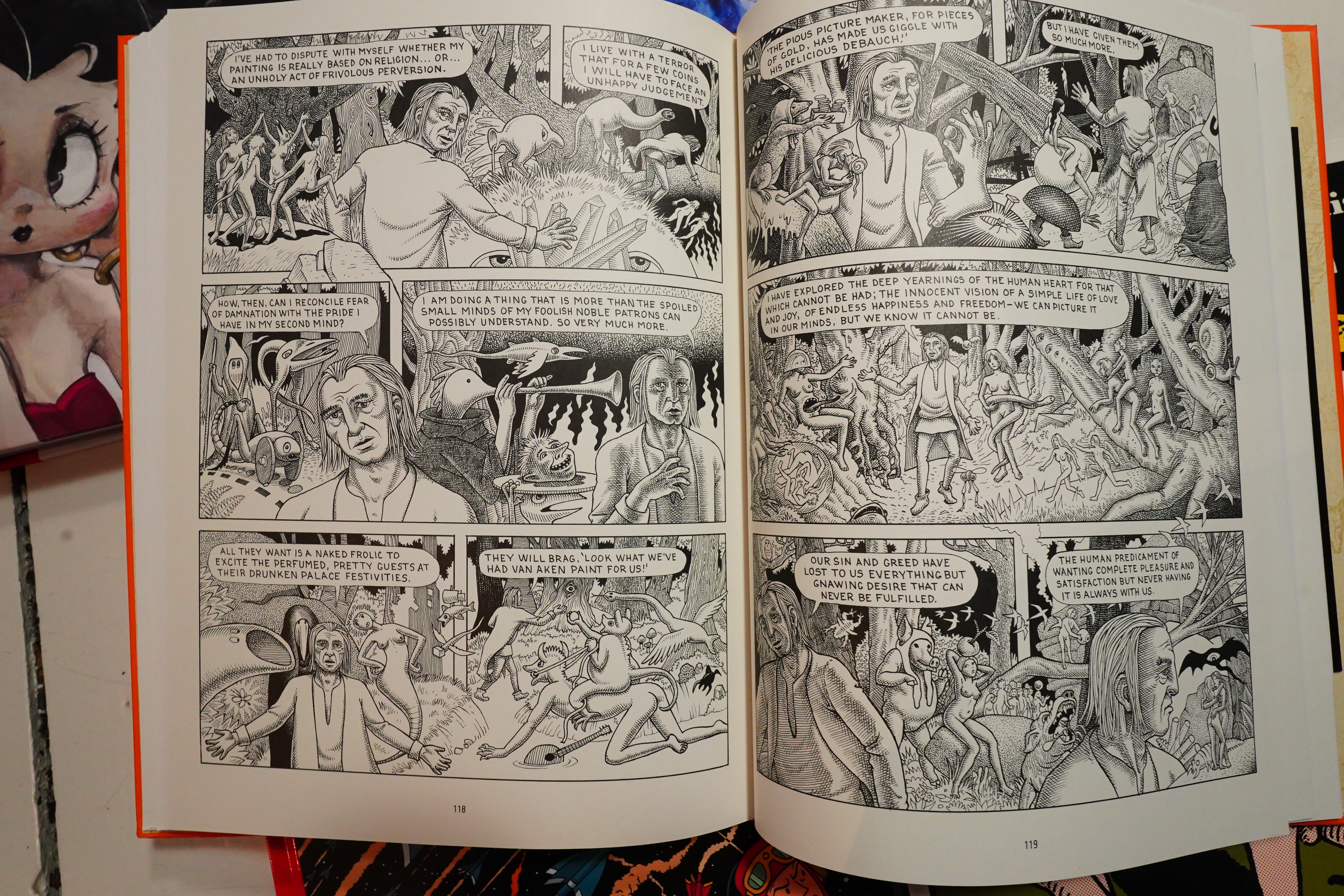
The book’s thesis is that Bosch suffered through great pangs while making The Garden of Etc, and I dunno. Perhaps? He’s depicted as a totally naive guy, though, and that just seems… unlikely?
Well, I dunno. It’s an enjoyable book, anyway.
And that’s it for this week.