I had a cold, so I’ve been fixing Emacs bugs instead of cooking, but now I’m back in the kitchen.
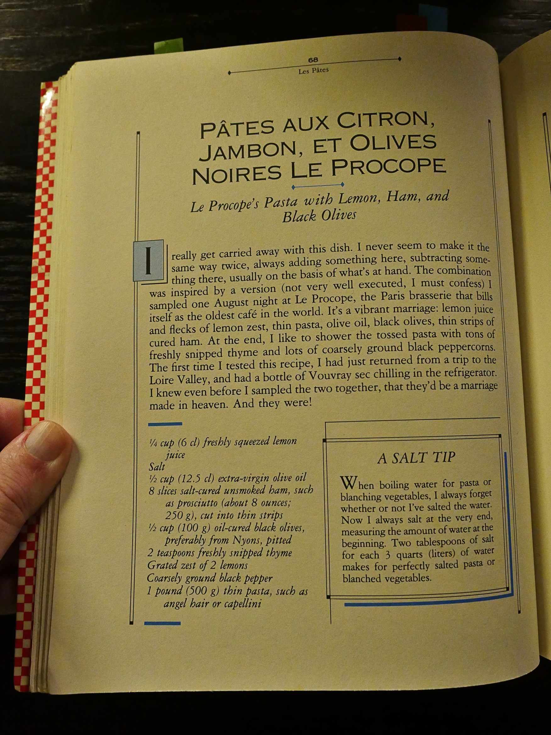
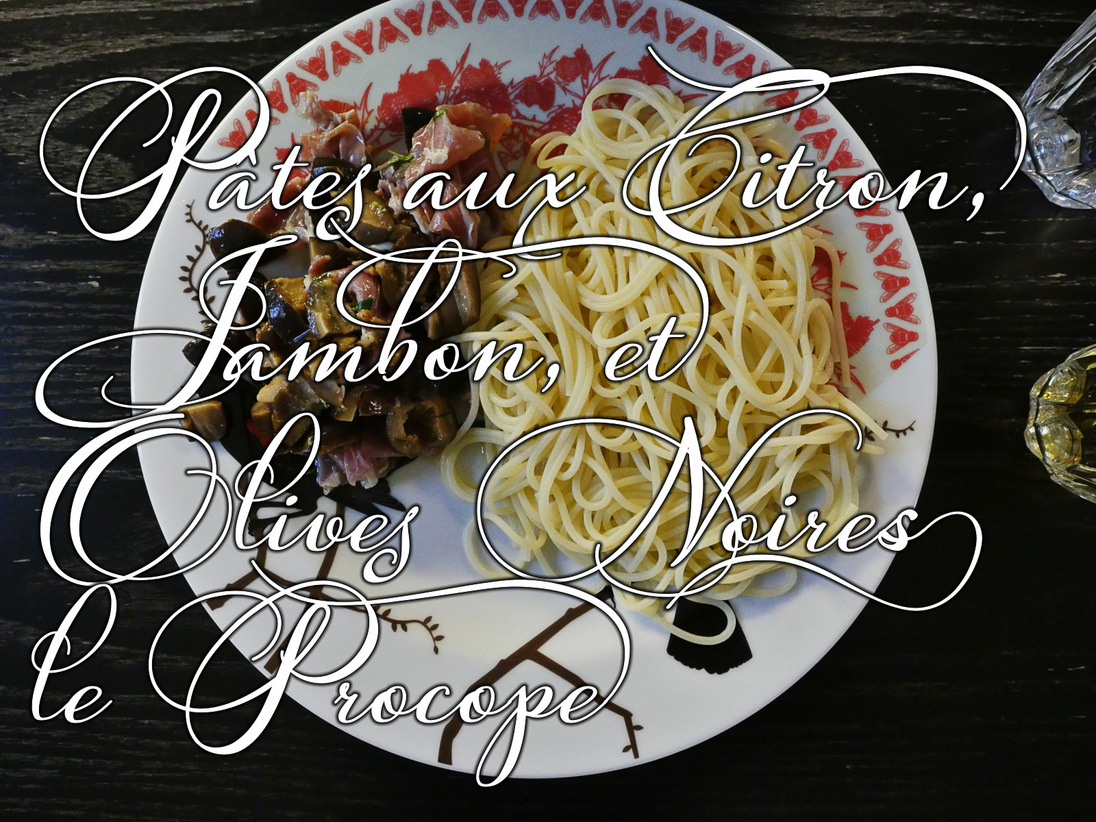
This is the first pasta recipe I’ve done from the book? Looks annoyingly simple: It more fun to do elaborate dishes. But perhaps it’ll be delicious. Hm. That list of ingredients makes me doubtful, though.
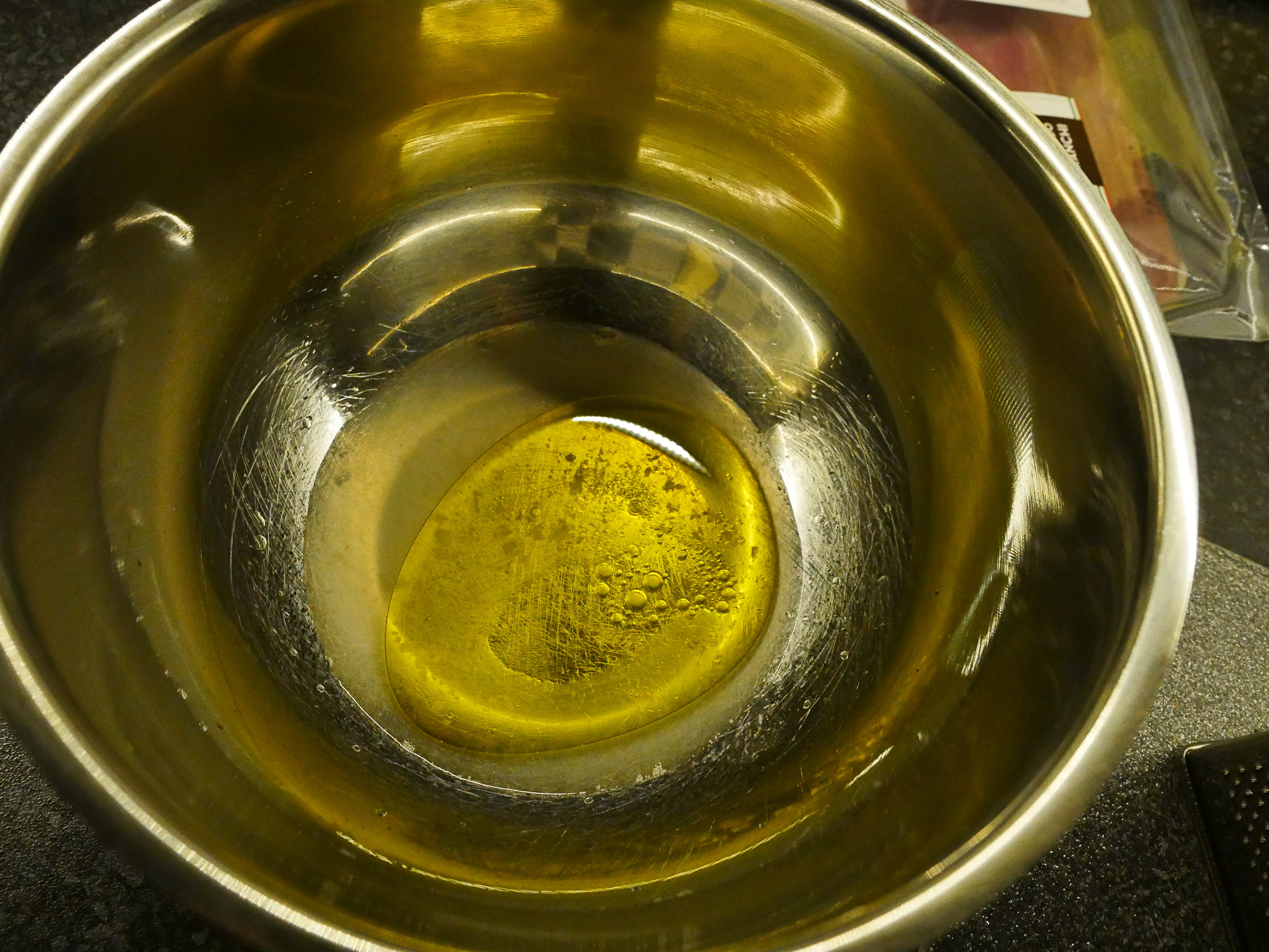
Because it’s basically just very thin spaghetti with cold olives and ham, and with a … sauce? consisting of lemon juice and olive oil.
I mean: I like lemon, and I love olive oil, but this is a bit ridiculous, isn’t it? Not even a smidgen of sugar to take the edge off? Hm…
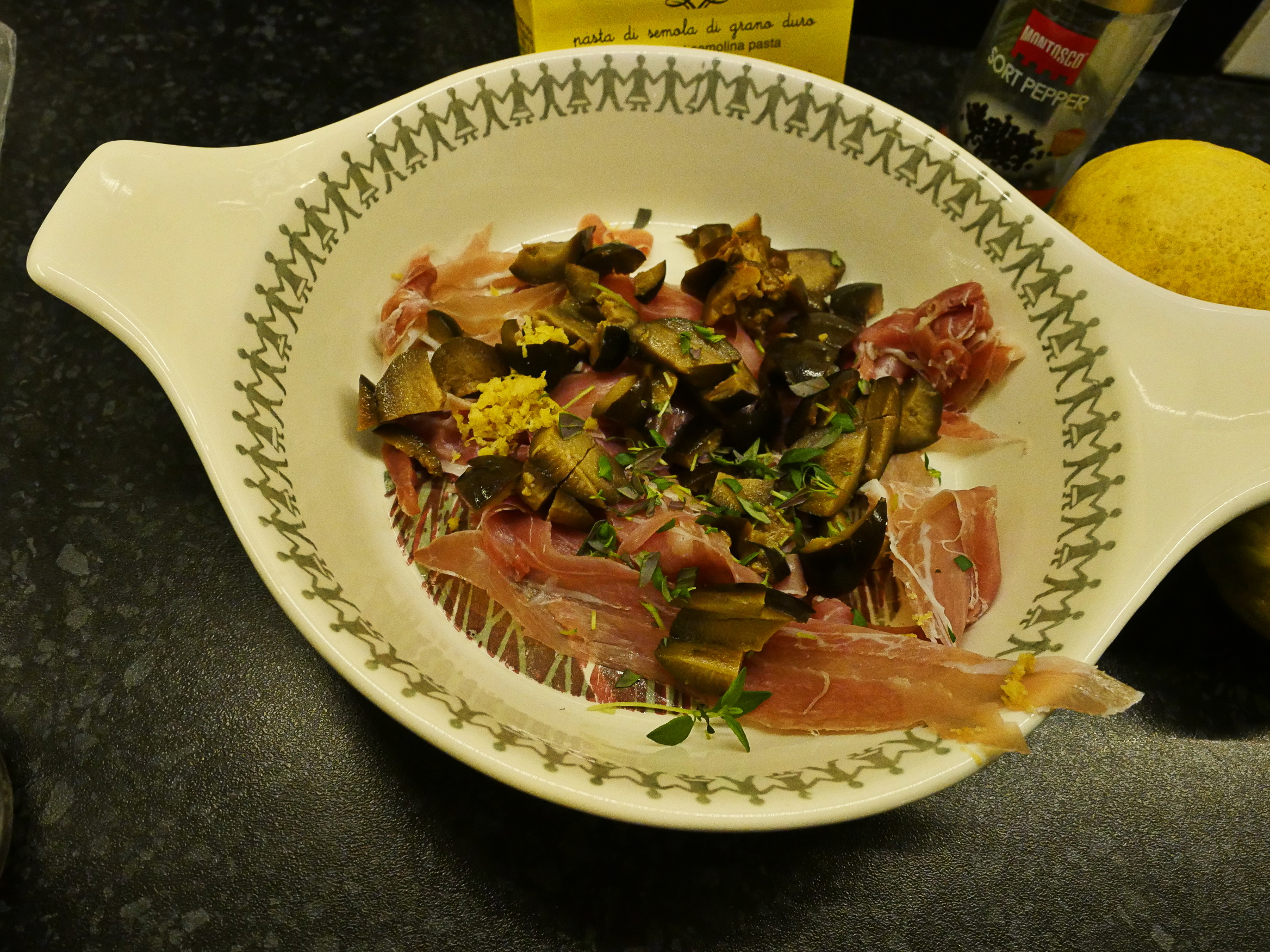
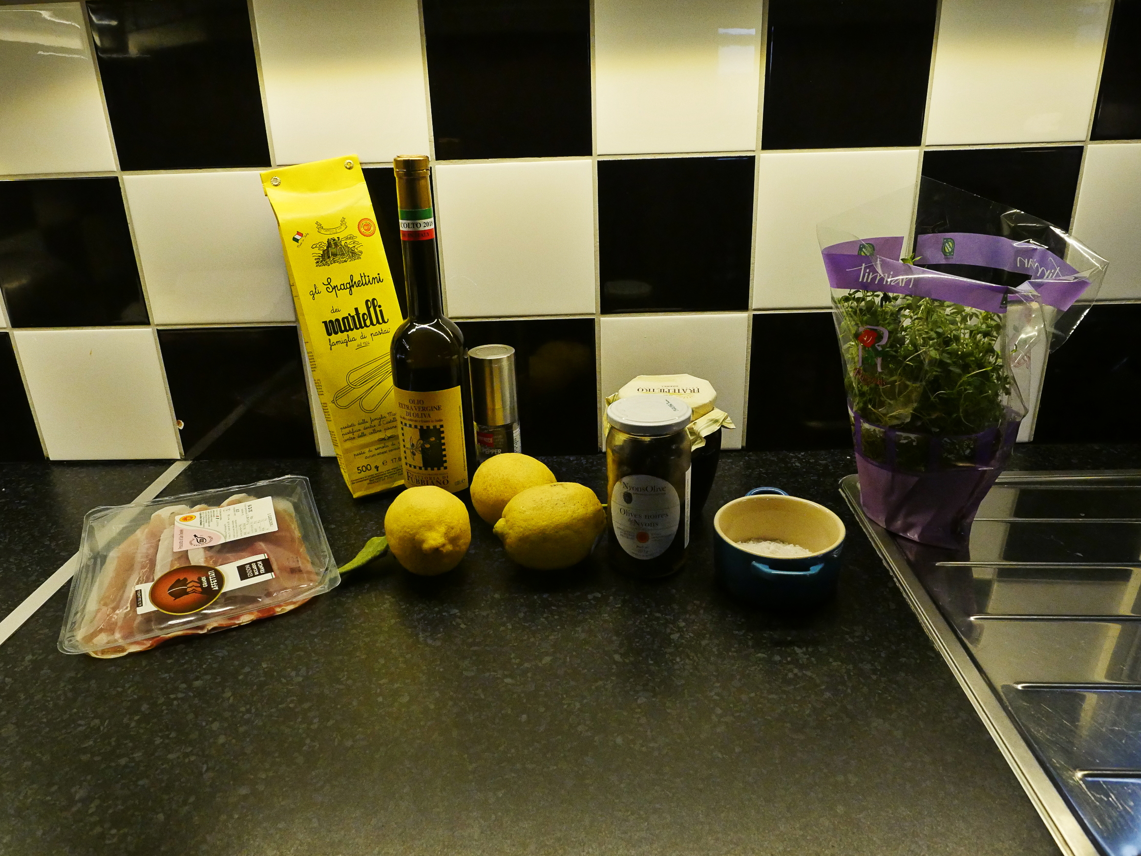
So we cut a bunch of prosciutto into strips, and then add the olives, some thyme, lemon zest (!) and the saucy stuff.
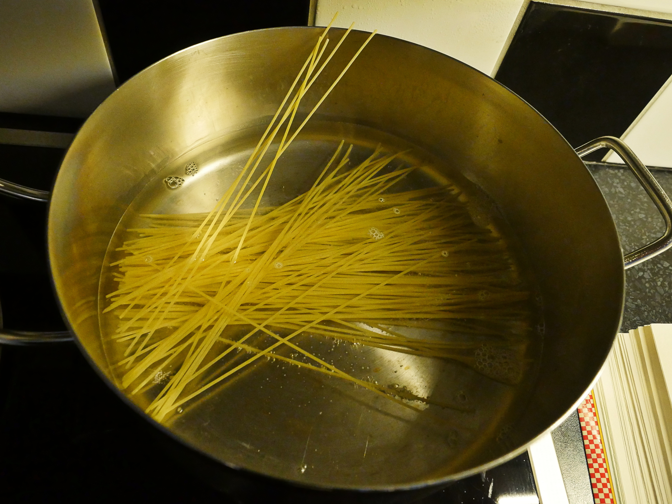
I don’t really like super-thin spaghetti. It goes from crunchy to oatmeal in the blink of an eye, but this time I stood there the entire time and tasted. “crunchy… crunchy… crunchy… crunchy… AL DENTE!” *whisk away*
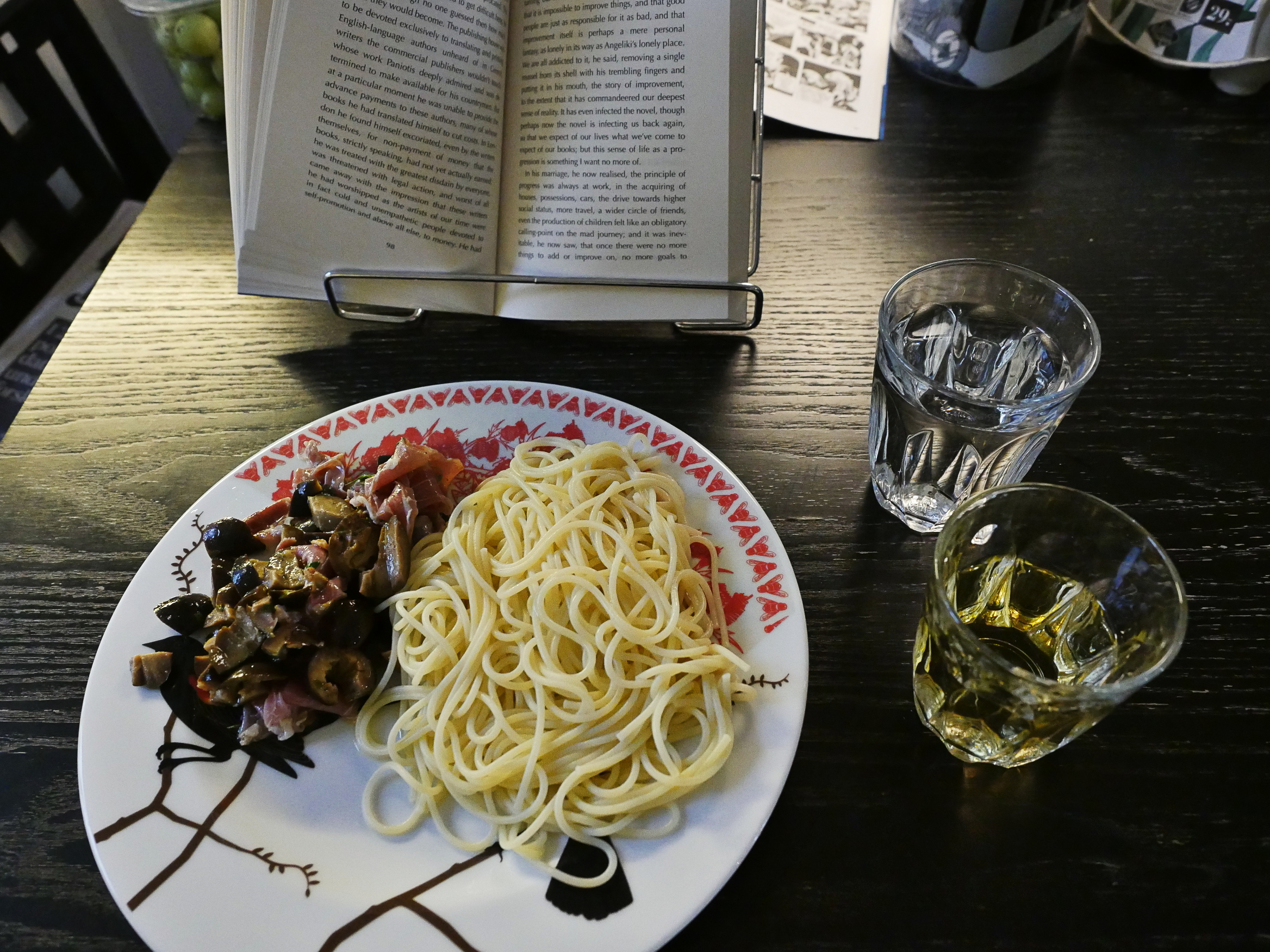
So that’s the dish — the recipe seemed to imply that I’m not even supposed to stir the hammy/lemoney/olivey thing into the pasta, so I didn’t.
So what did it taste like? Well, the prosciutto was delicious, and so were the olives, but man, that lemon thing is just so harsh.
Perhaps going forward I should just stop trusting the recipes in this book, and just start diverging whenever it seems like it’s going overboard in a direction or another. I mean, if this had, like, a quarter of the lemon, and there’s been more herbs and perhaps a pinch of sugar or something, then this would have been great, but it’s… not.
But I ate it all, so.
Oh, the book:
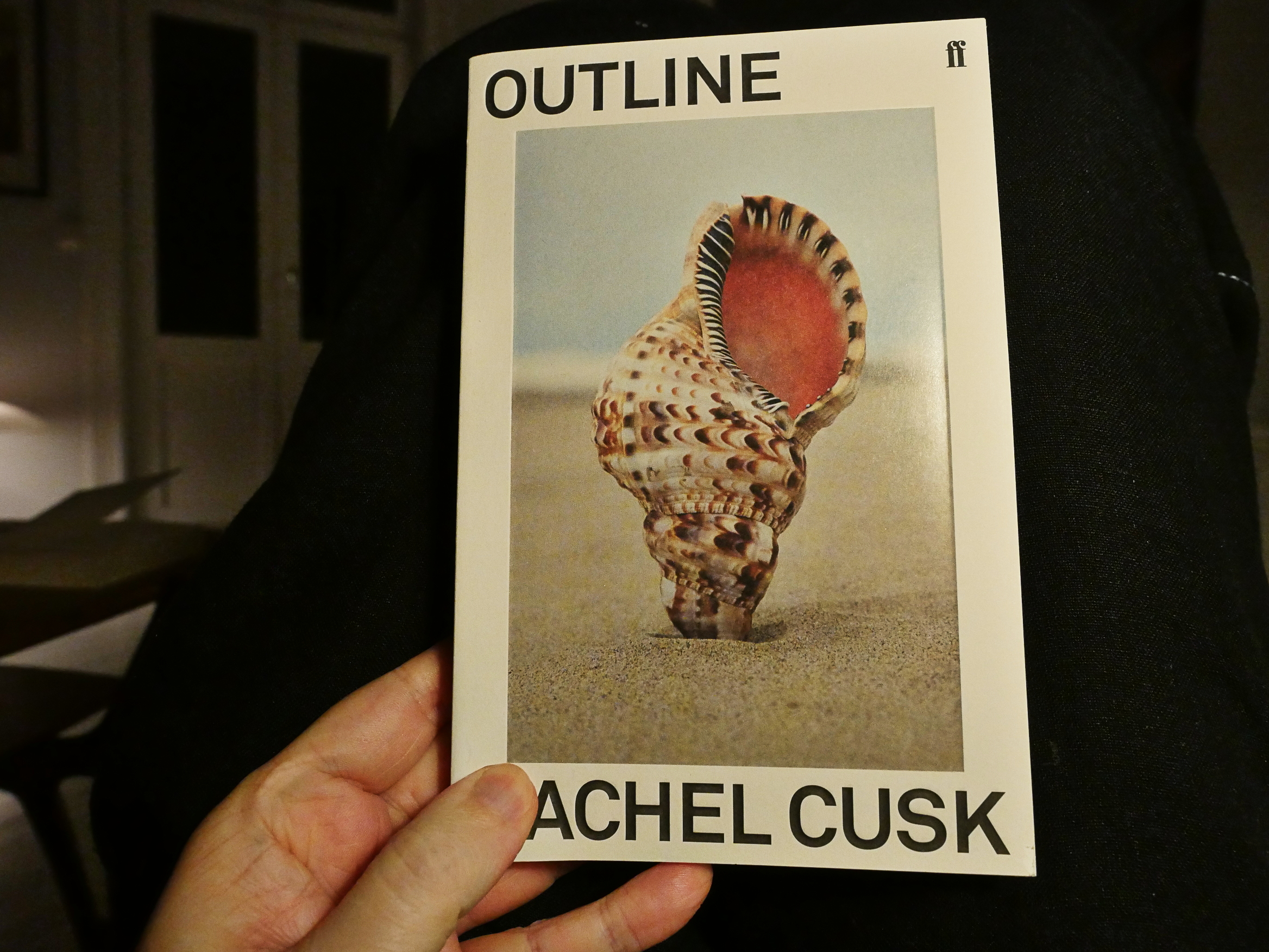
I’ve now come to Outline by Rachel Cusk. Man, that’s a good-looking cover.
Cusk is hot shit now, which is why I’ve bought this book. I’ve been trying to make an effort into sampling whatever people are enthusiastic about instead of obsessively just reading all the novels of a handful of authors, and it’s not going that well. Sally Rooney was just eye-rolling in her attempts to be all abject and stuff, and Patrick DeWitt wasn’t witty enough.
But let’s read the first three pages together.
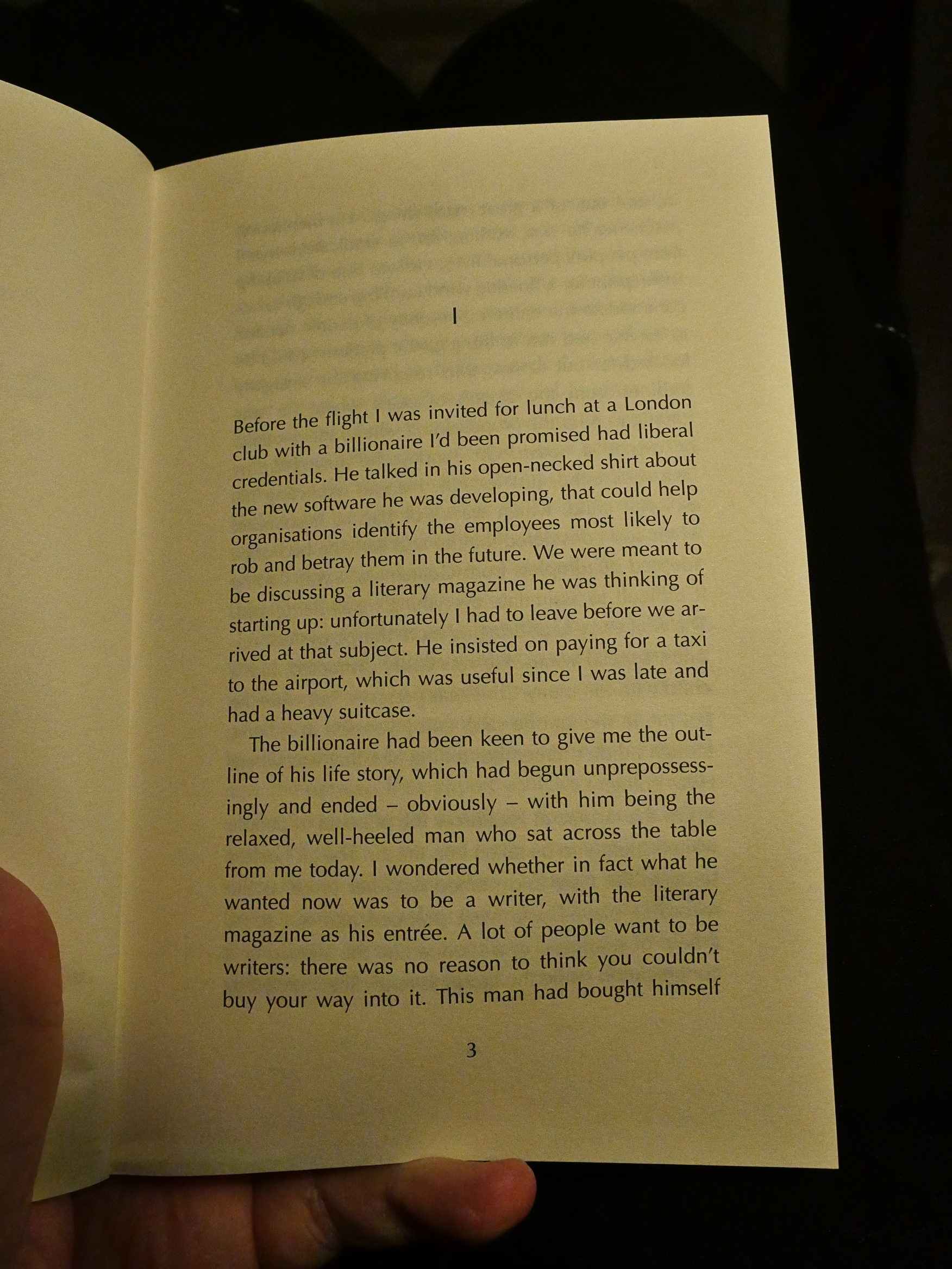
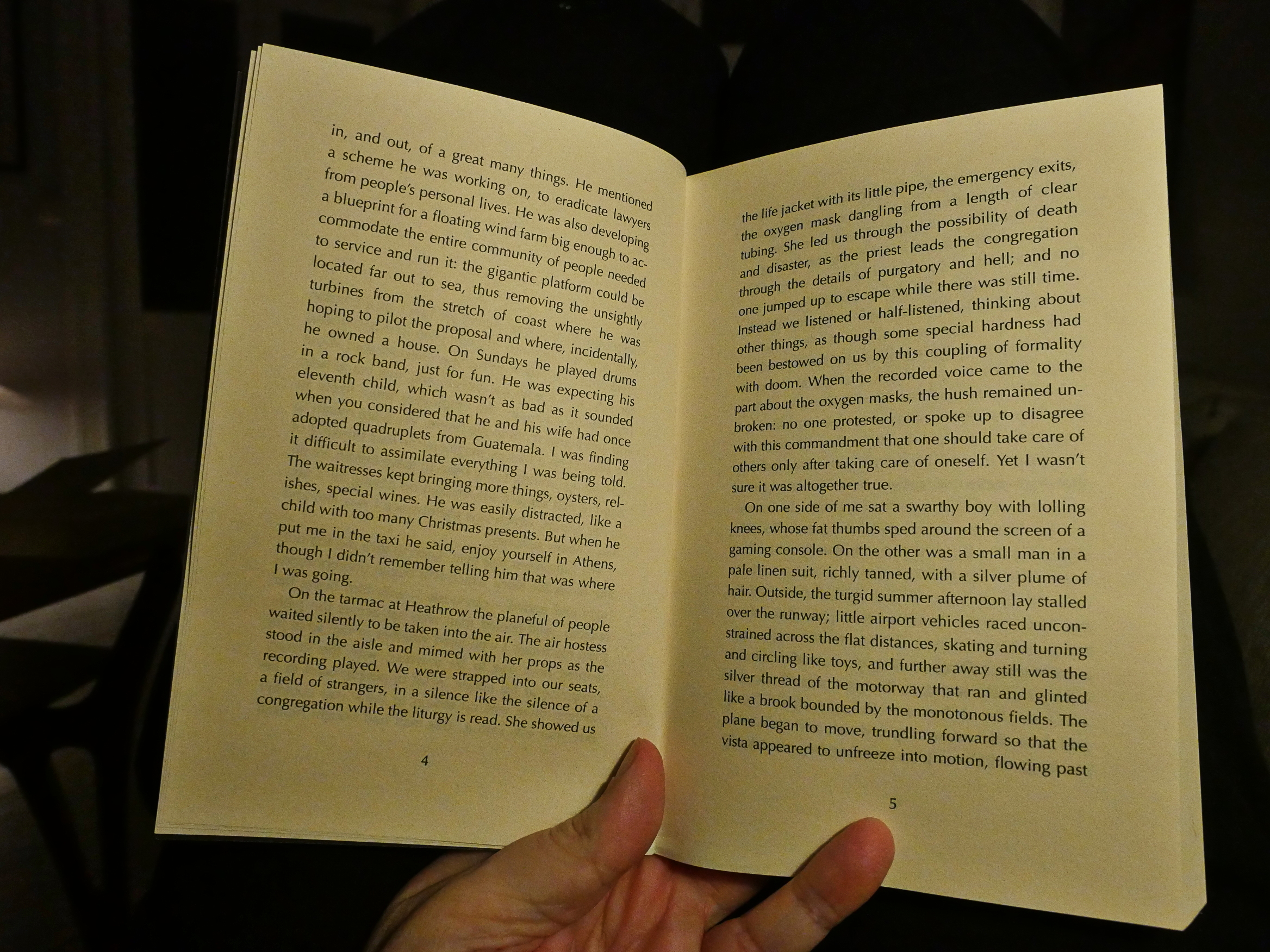
Hey, that’s not too bad… in fact, it’s rather spiffy. The language has got a kind of languid quality to it that I find very appealing, and it looks like we’re not going to get heavy on plot, which I also like.
Heh heh. Venezuela.
Anyway, this style of writing reminds me of The Paris Review, which is my favourite in-flight reading material: Sharp, smart, amusing. But… it… also seems a bit familiar? Did I read this before?
I did! It’s that novel The Paris Review serialised some years back! Dude! What are the odds! Hah! I liked her before the was popular!
I do remember really enjoying it back then, so I might as well re-read it now. The only thing I remember about it is… that… it’s in Greece? Some bits on a boat with an older guy? And then some … problems in an apartment?
Very vague, and I wonder why I didn’t go out and buy Cusk’s other novels back then since I remember enjoying it a lot. I guess I just kinda forgot. I remember them serialising Roberto Bolaño led to me buying a bunch of his novels…
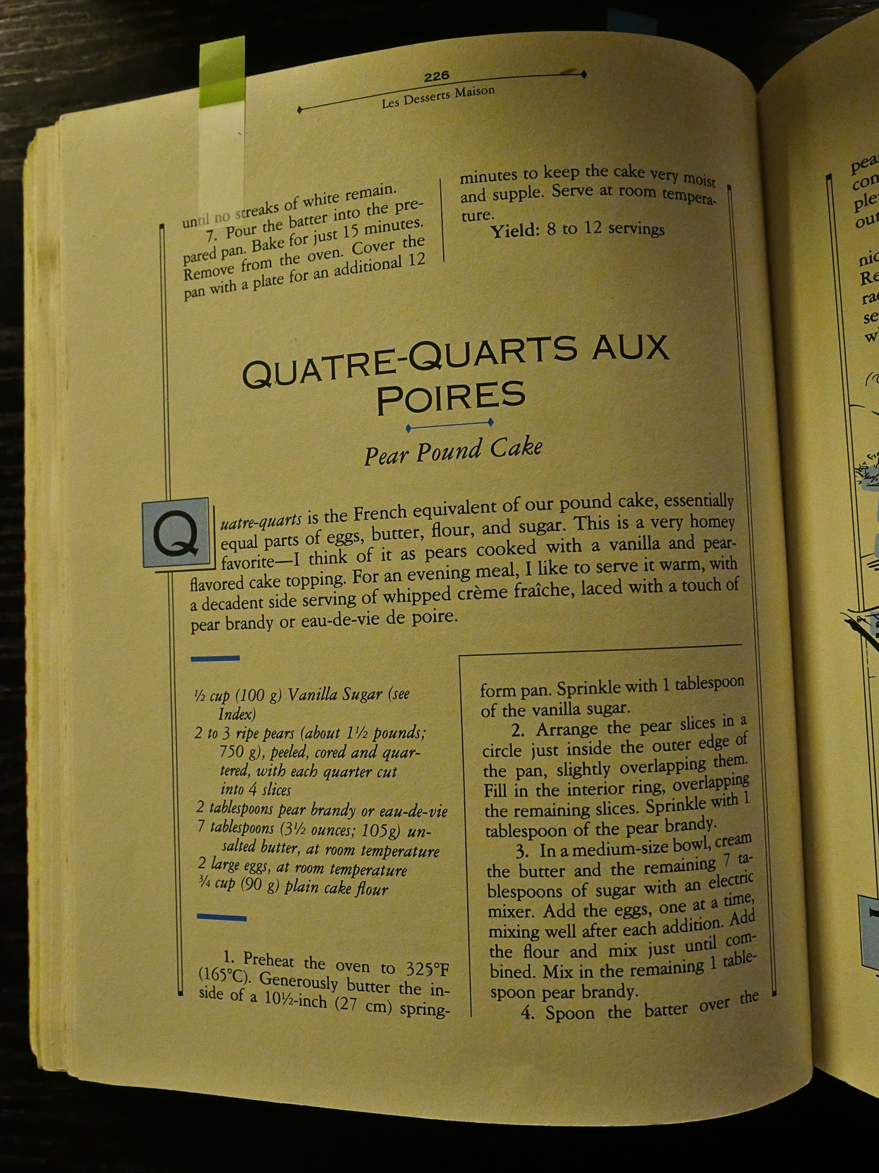
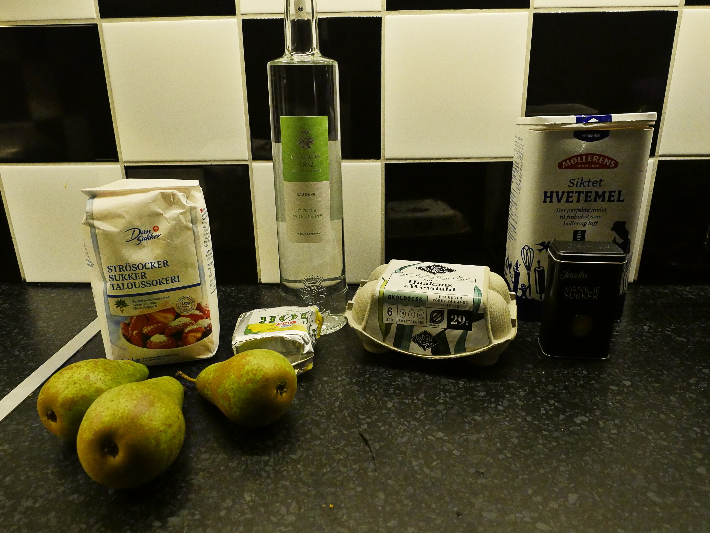
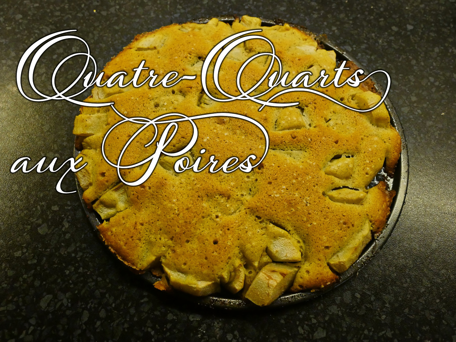
Anyway, I should make a dessert, and the next thing in the dessert chapter is this cake, which looks very simple and… possibly delicious? I love pear. And this has both pear and pear brandy.
But a very very simple recipe.
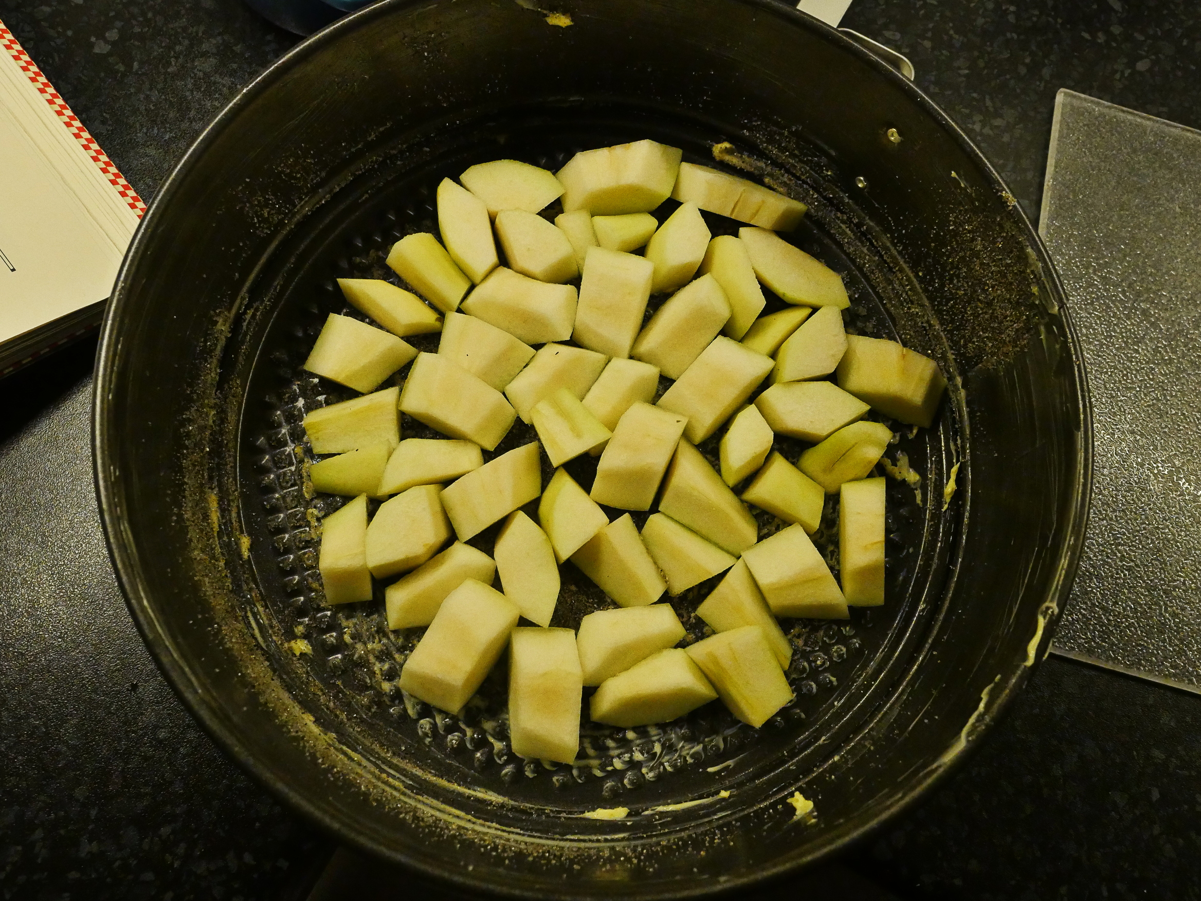
So first layer the pear bits. The recipe was really vague about how thick the slices were supposed to be, so I ended up with these chunks? That’s probably not right.
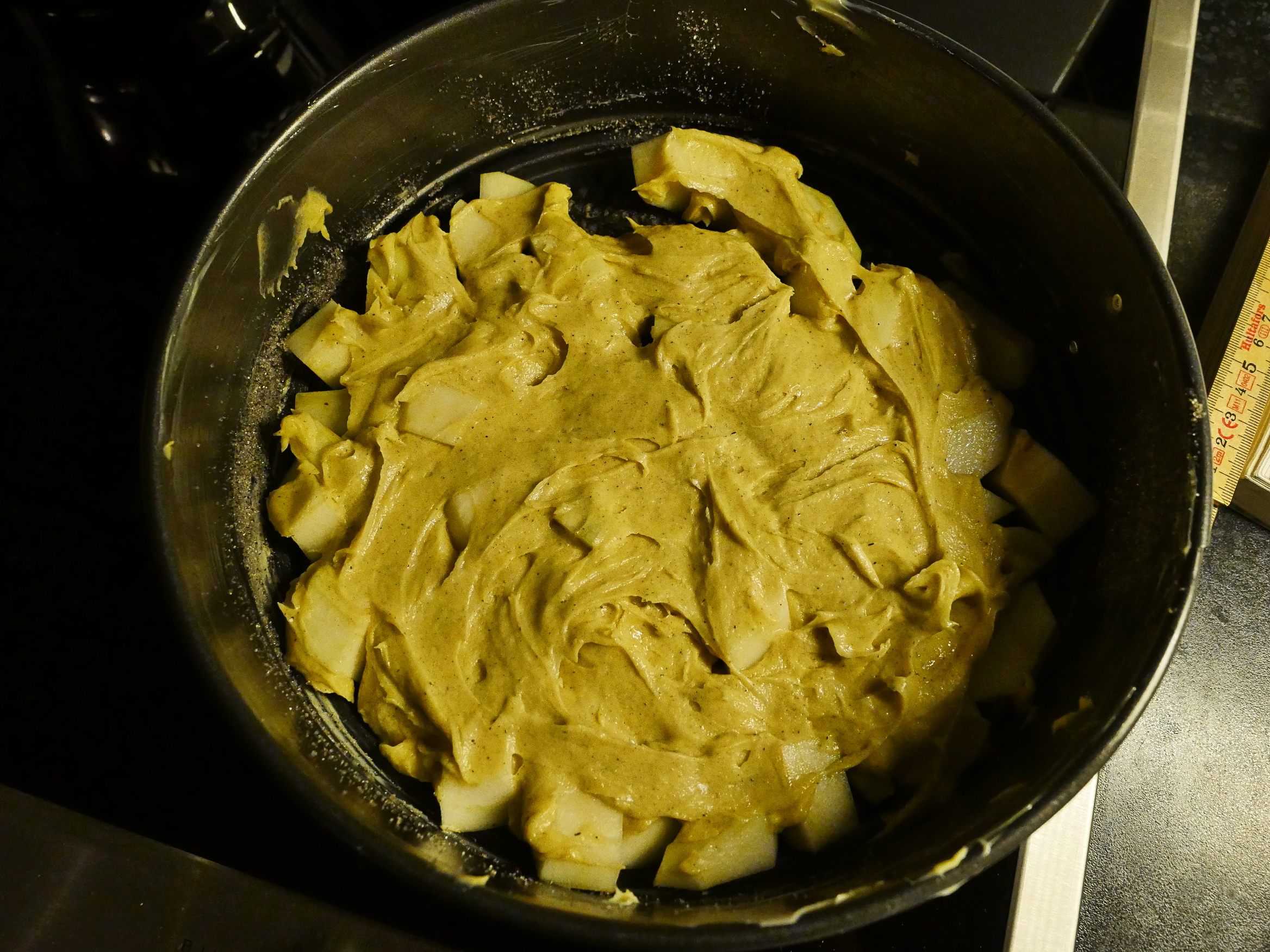
The dough is, again, very simple: Just butter and sugar whisked together, and then eggs, and then flour. I… feel… that my butter was too cold, so I didn’t get enough air into the butter/sugar thing. *crosses finger*
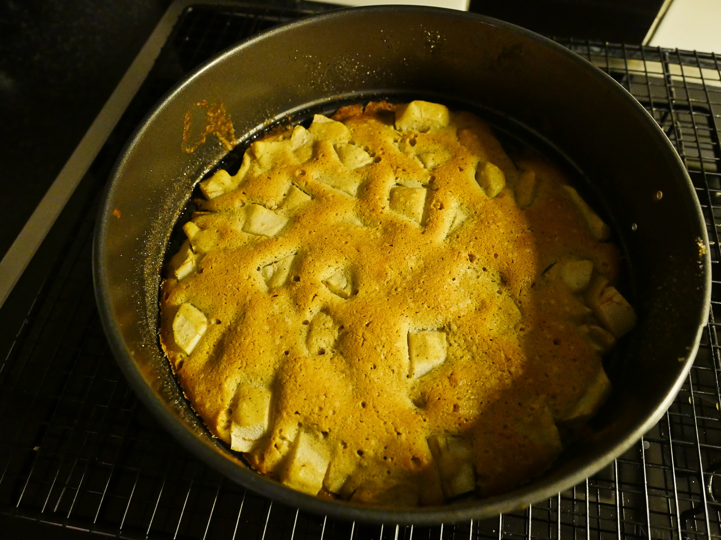
Boo! That didn’t rise at all.
Flat as a pancake.
Well… perhaps it’ll taste good…
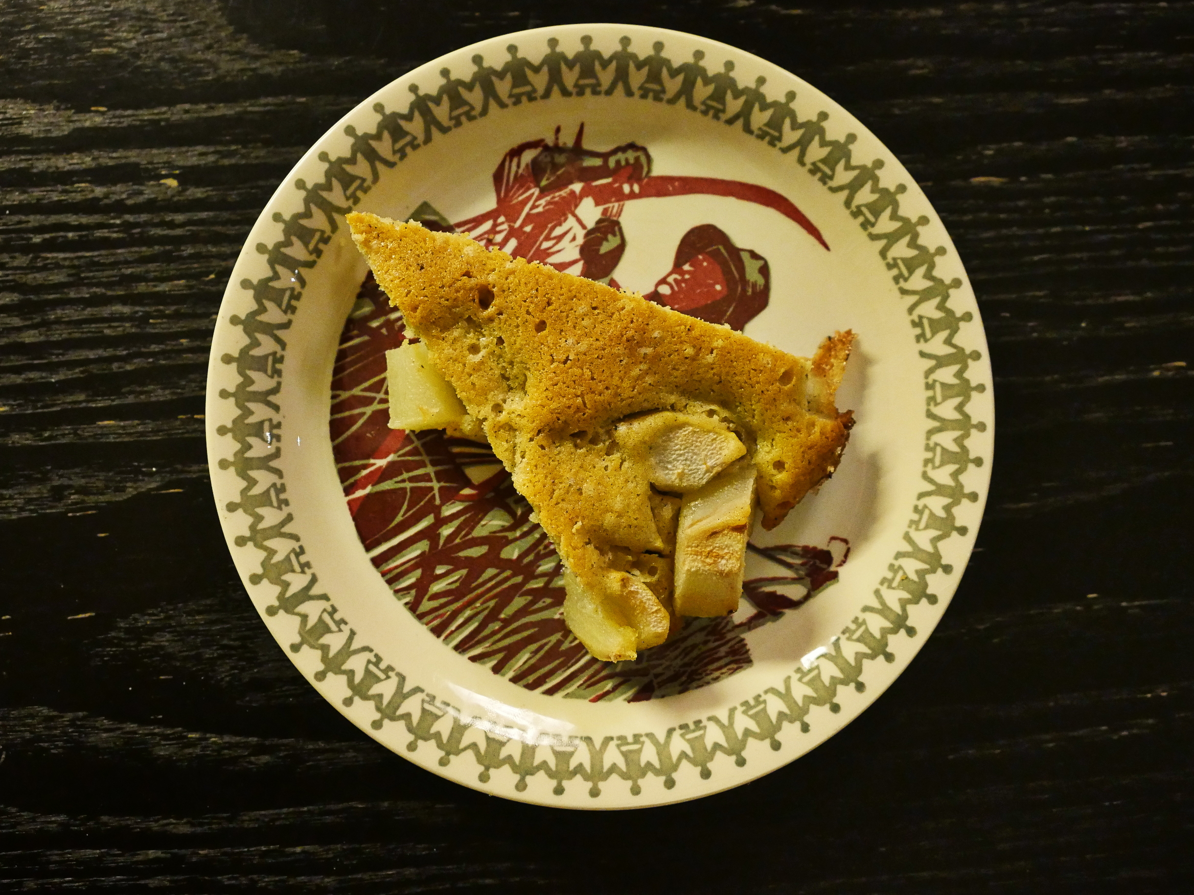
From that angle it doesn’t look awful!
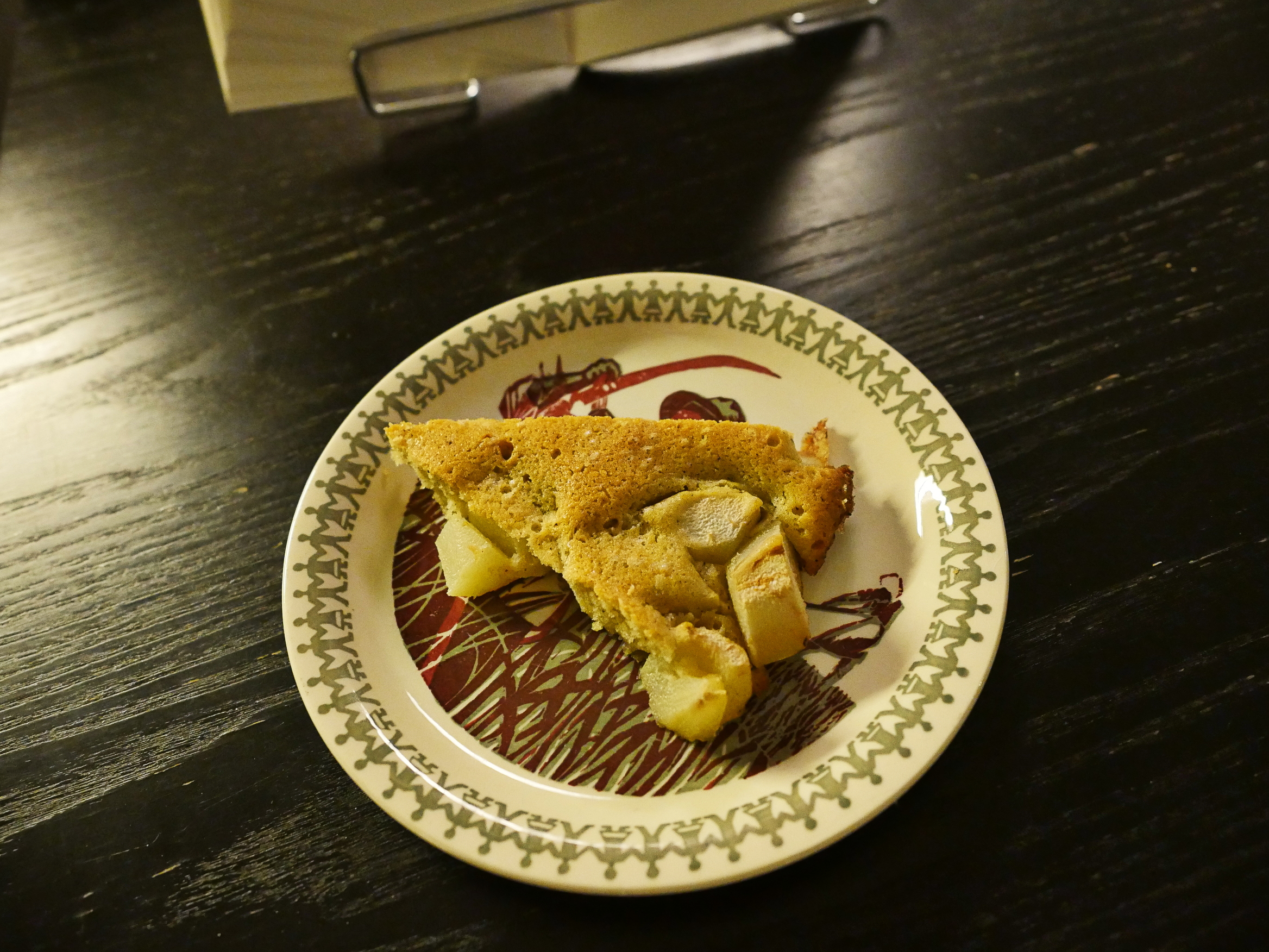
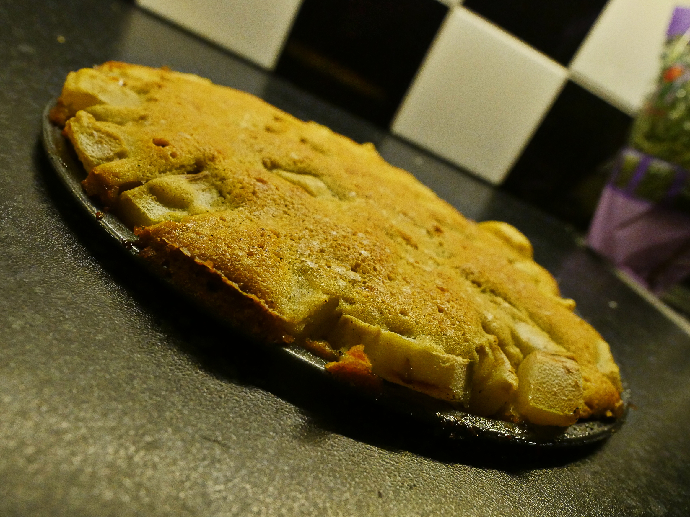
Actually… this tastes a lot better than I thought it would do. It’s more of a pie now, I guess, than a cake. The pears are perfectly cooked, and the pear brandy and the vanilla go really well together. It is, shockingly enough, really tasty!
I have to remake this sometime, but do it… better…
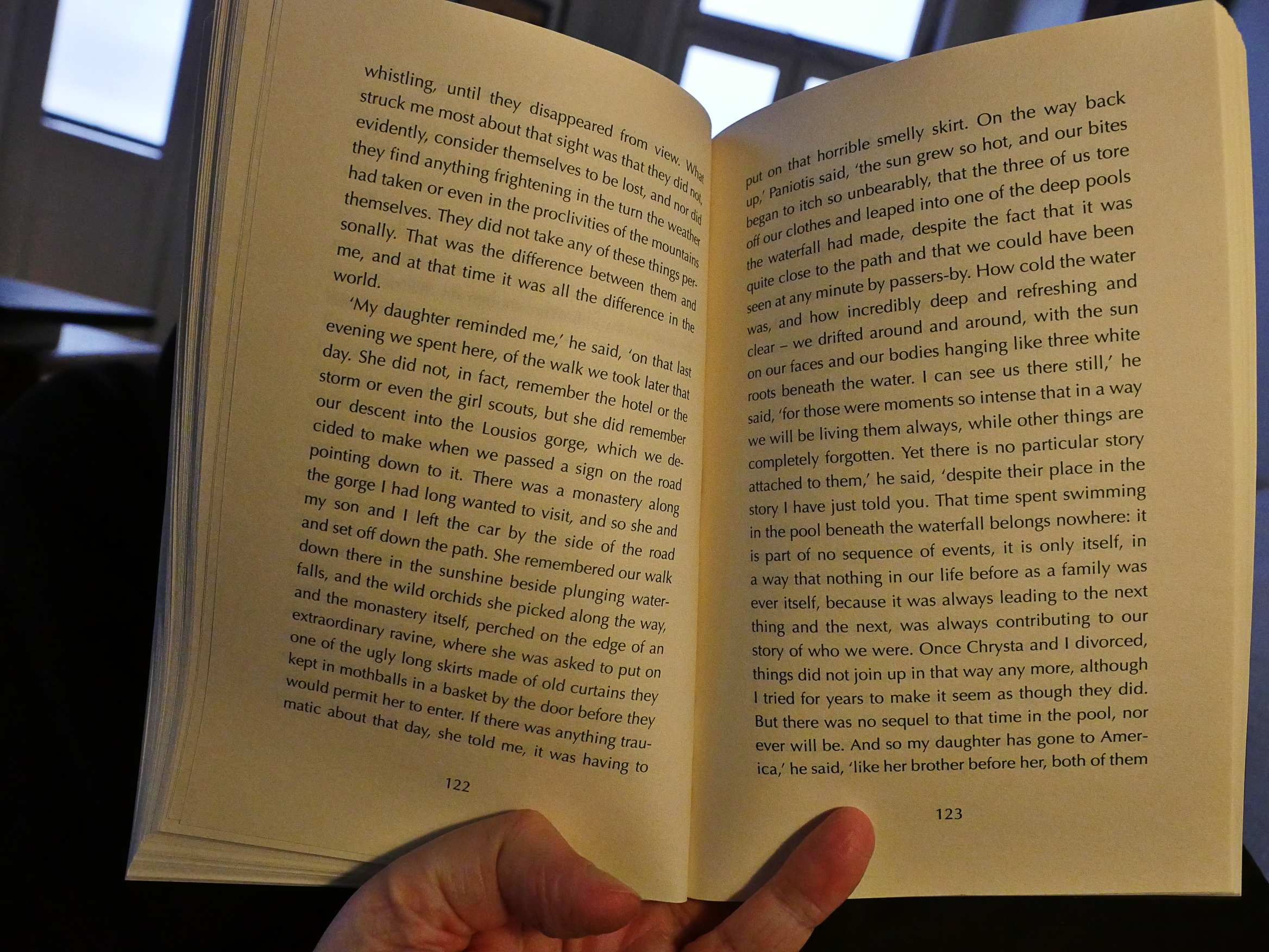
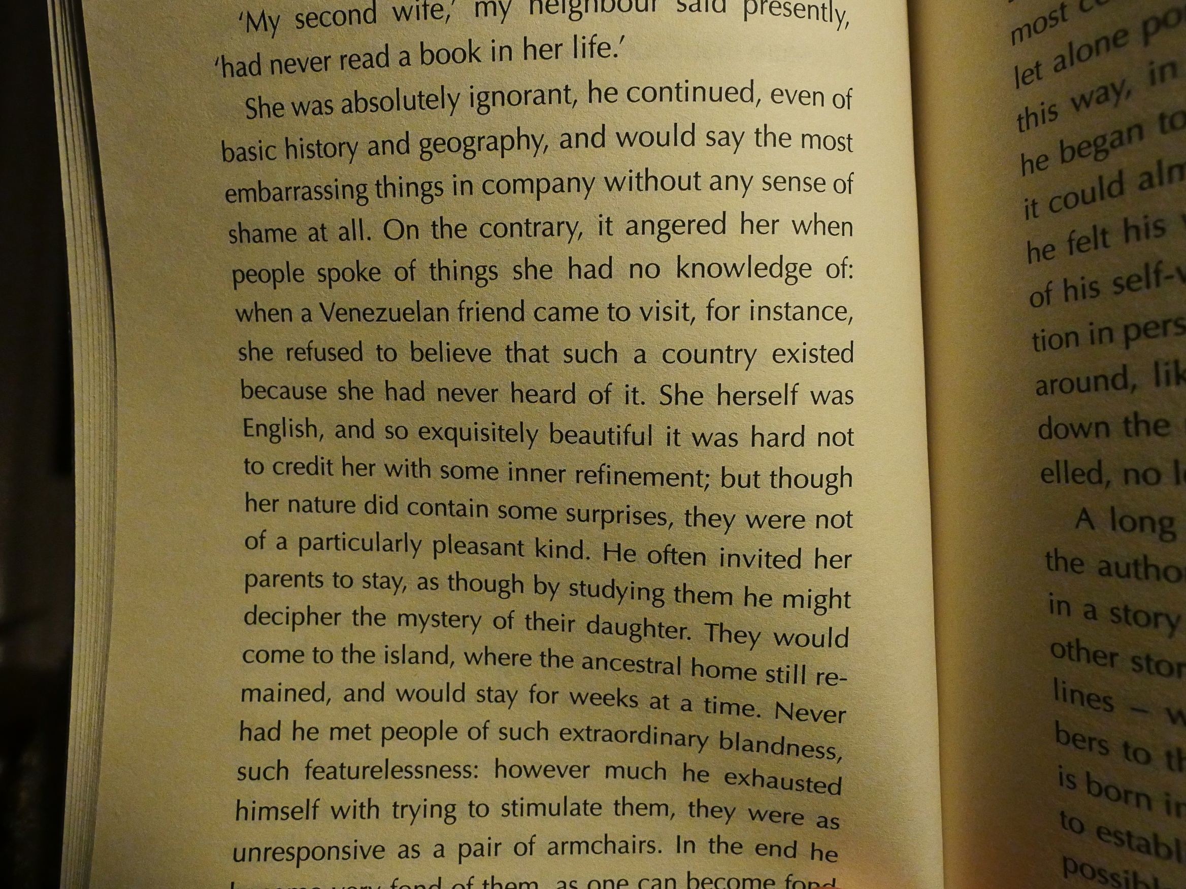
Anyway, Outline is fascinating. It’s basically structured around people telling stories to each other and then discussing the stories. There’s no attempt to have each person talk in a distinct voice: They’re all the same person. And that person is very thoughtful and smart and somehow these stories, no matter how slight (or not) seem vital.
I have no idea how Cusk does this, but it’s a delight to (re-)read.
Like I probably said up there somewhere, I didn’t know anything about Cusk other than seeing her books pop up, very prominently, in All The Bookstores over the past couple of years, so I assumed the was new. But she’s not. But I seem to be correct that she’s become a much bigger deal, starting with this book, after having published what seems to be a couple of very controversial books, and having to sort of start over again:
“Without wishing to sound melodramatic, it was creative death after Aftermath. That was the end. I was heading into total silence – an interesting place to find yourself when you are quite developed as an artist.”
[…]
She believes Outline’s “annihilated perspective” might be the “beginning of something interesting” (she is already working on a sequel).
And indeed it was.
I think I’ll toodle down to the bookstore tomorrow and buy the other two books in this trilogy.
This blog post is part of the Bistro
Cooking & Books series.