It’s been way too long since I read some new comics! (I mean, I’ve been reading old comics for the Comico blog, but that’s not the same…)
| This Mortal Coil: It’ll End In Tears |  |
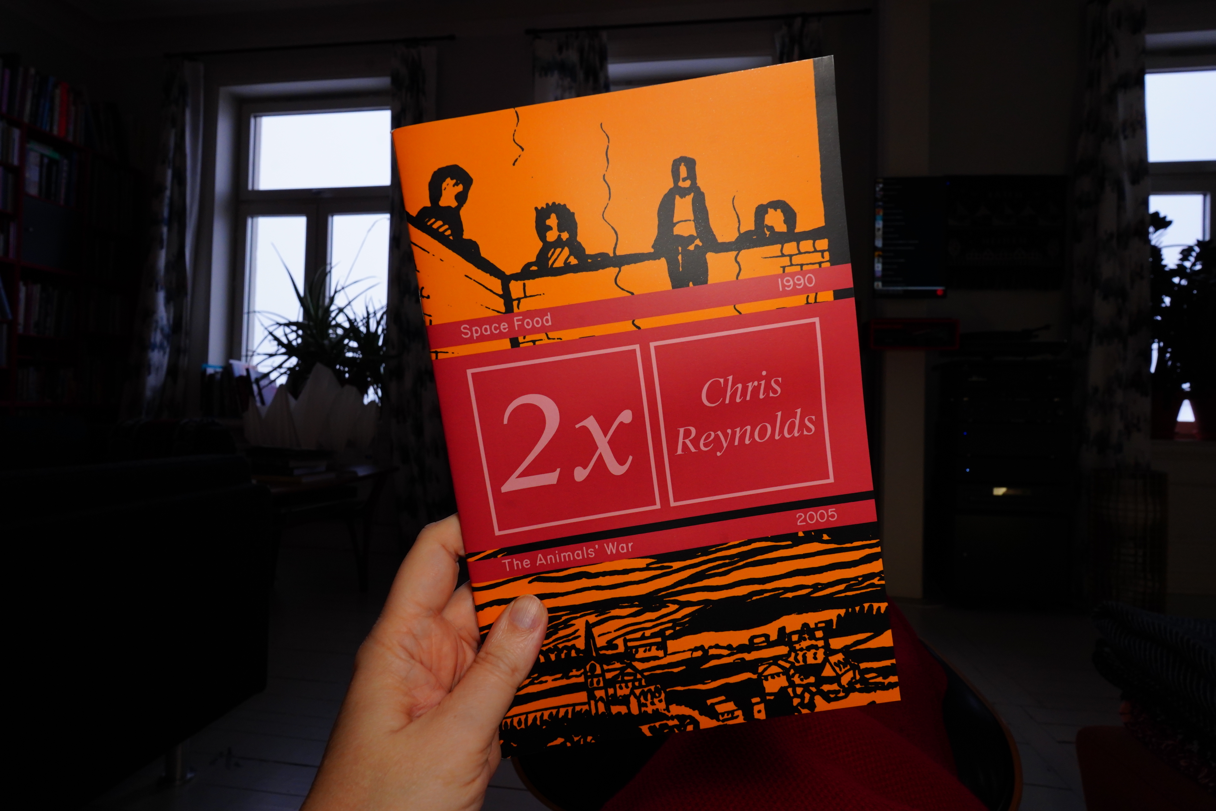
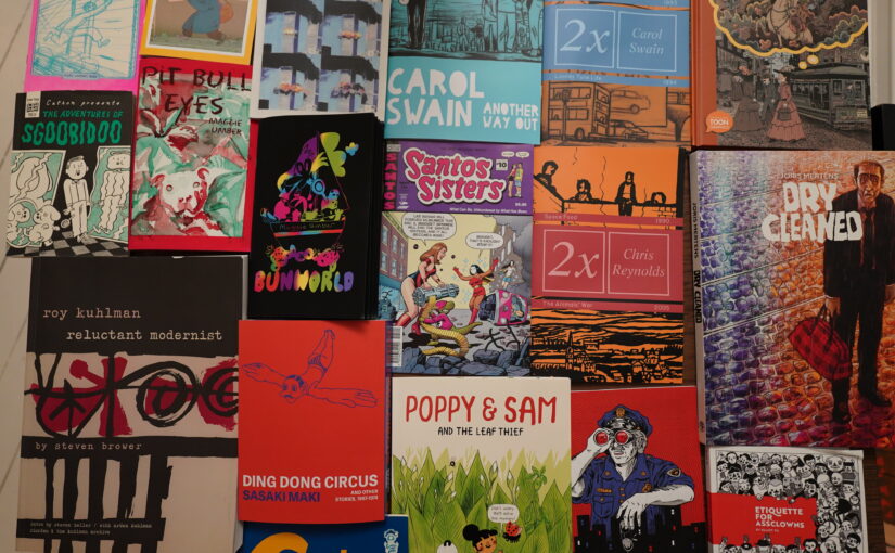
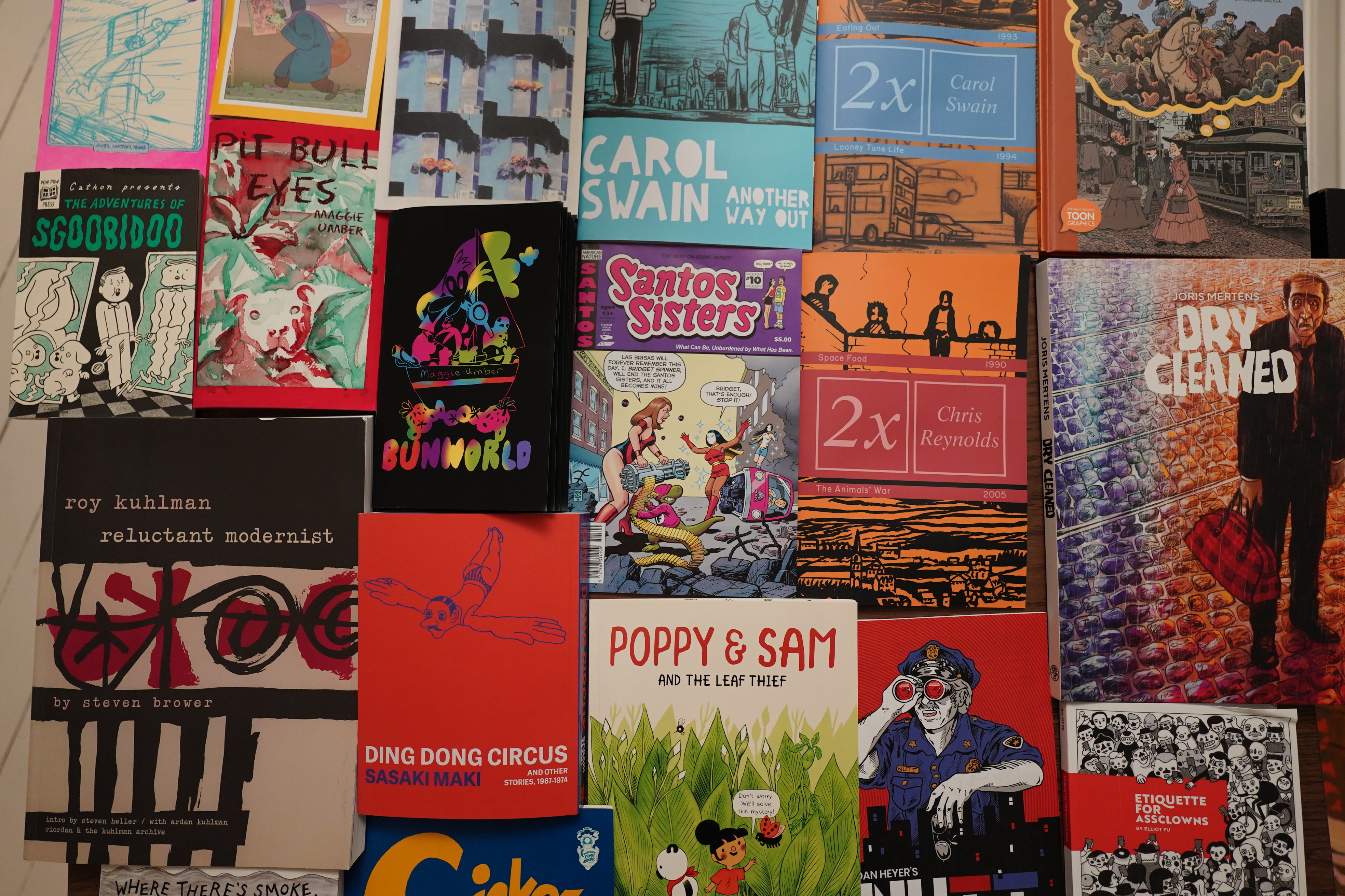
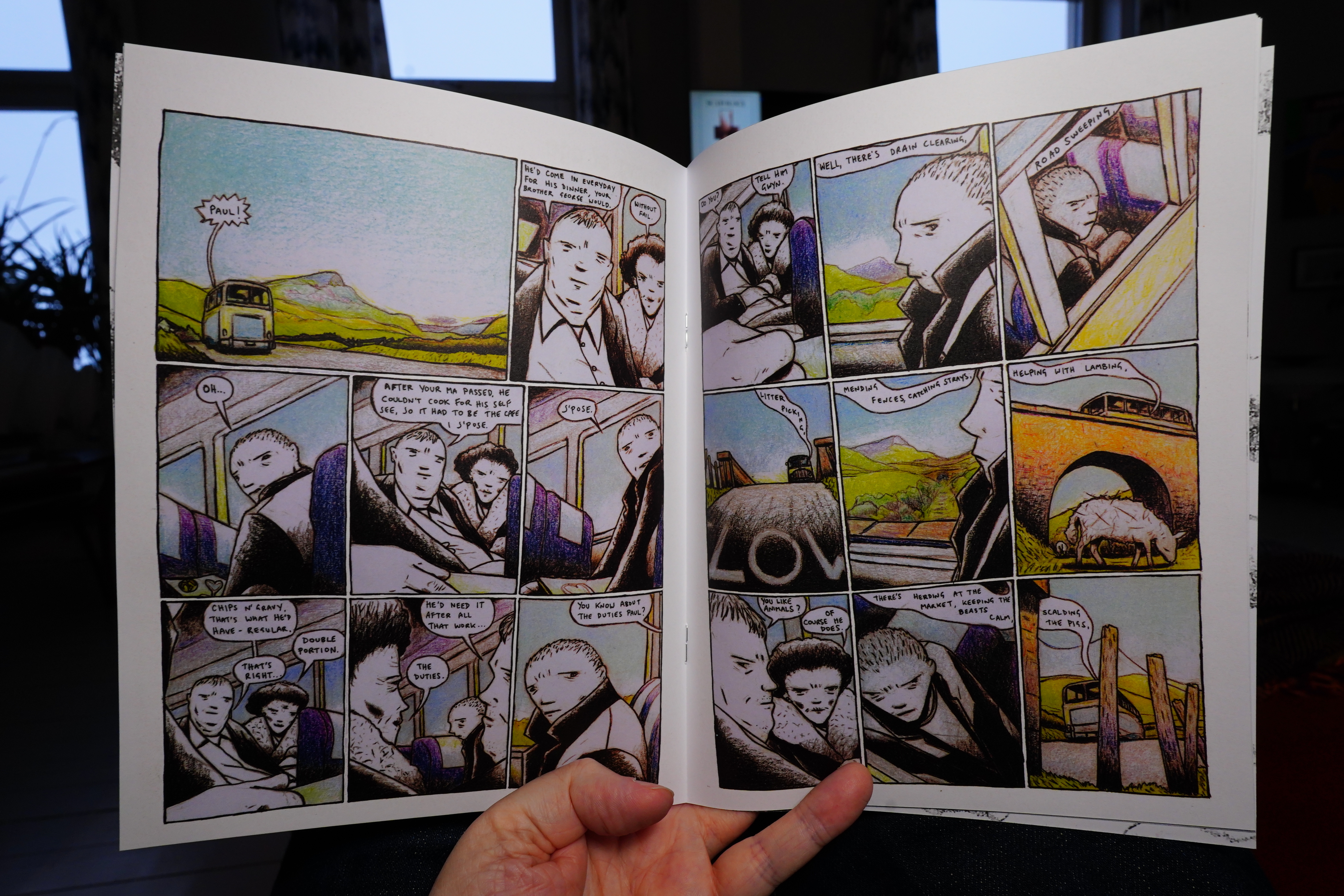
13:22: 2x by Chris Reynolds (Dark & Golden Books)
I got this from here — it’s a new company (?) that’s reprinting some old books by Chris Reynolds and Carol Swain. I’m wondering whether it’s stuff I’ve read before, though.
Right. But isn’t it called “Adventures From Mauretania”?
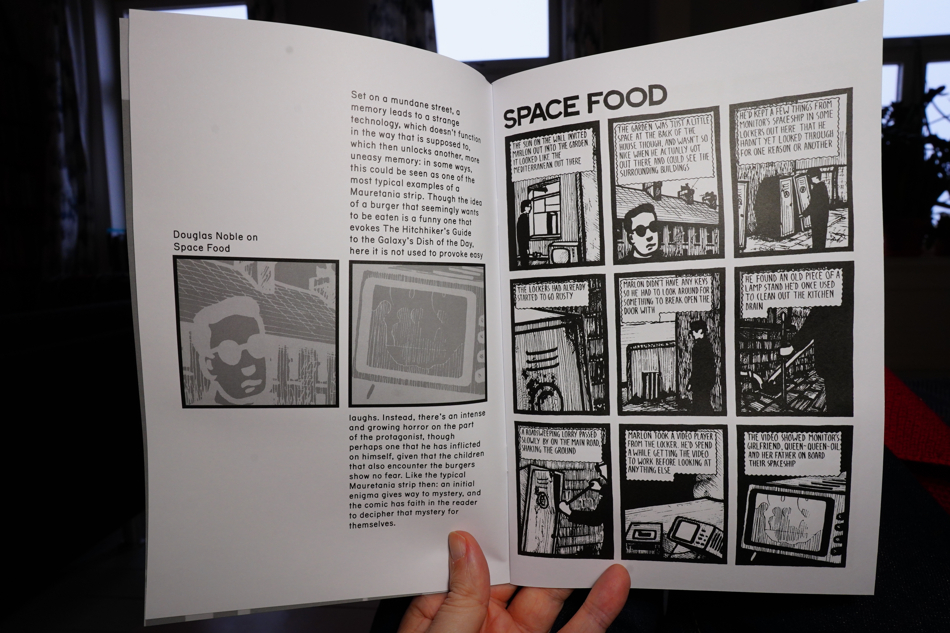
Oh, I’ve read this one… I’m not sure these introductions are really necessary? But I mean, it’s OK.
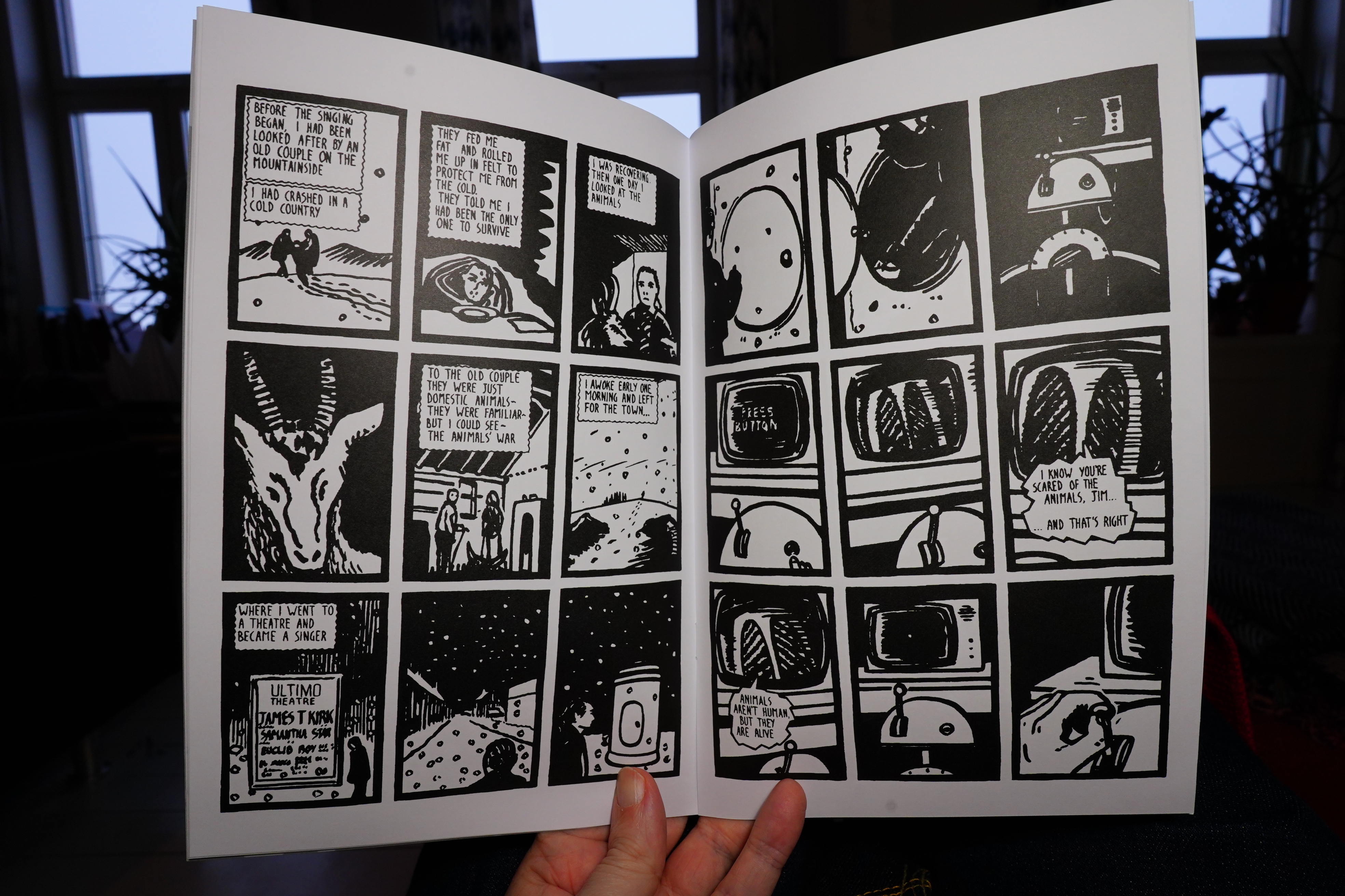
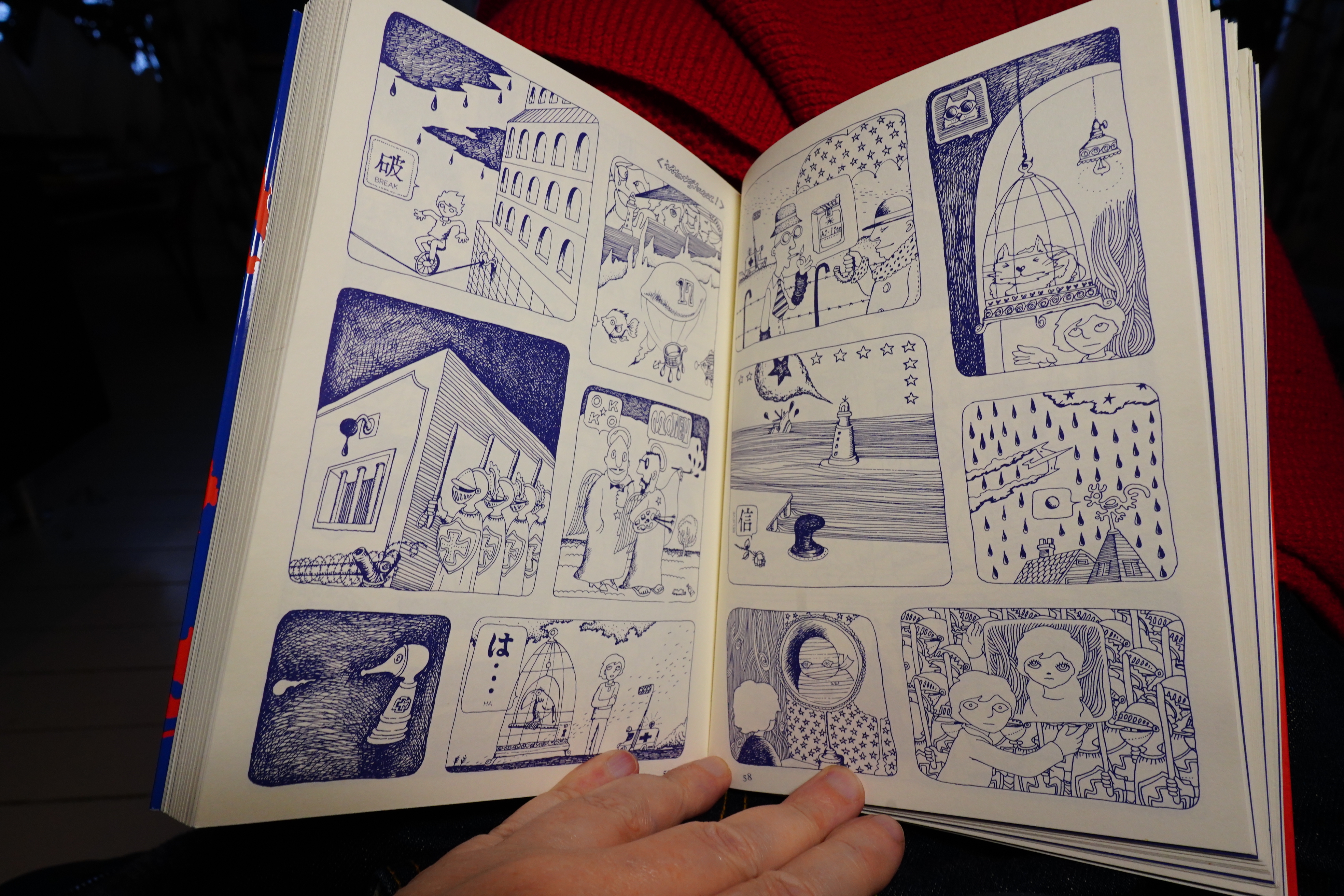
Hm, I can’t remember this one… it’s fantastic! I should read that collection again — I think it was originally a print-on-demand book from Lulu? Yup.
| Coil: Scatology |  |
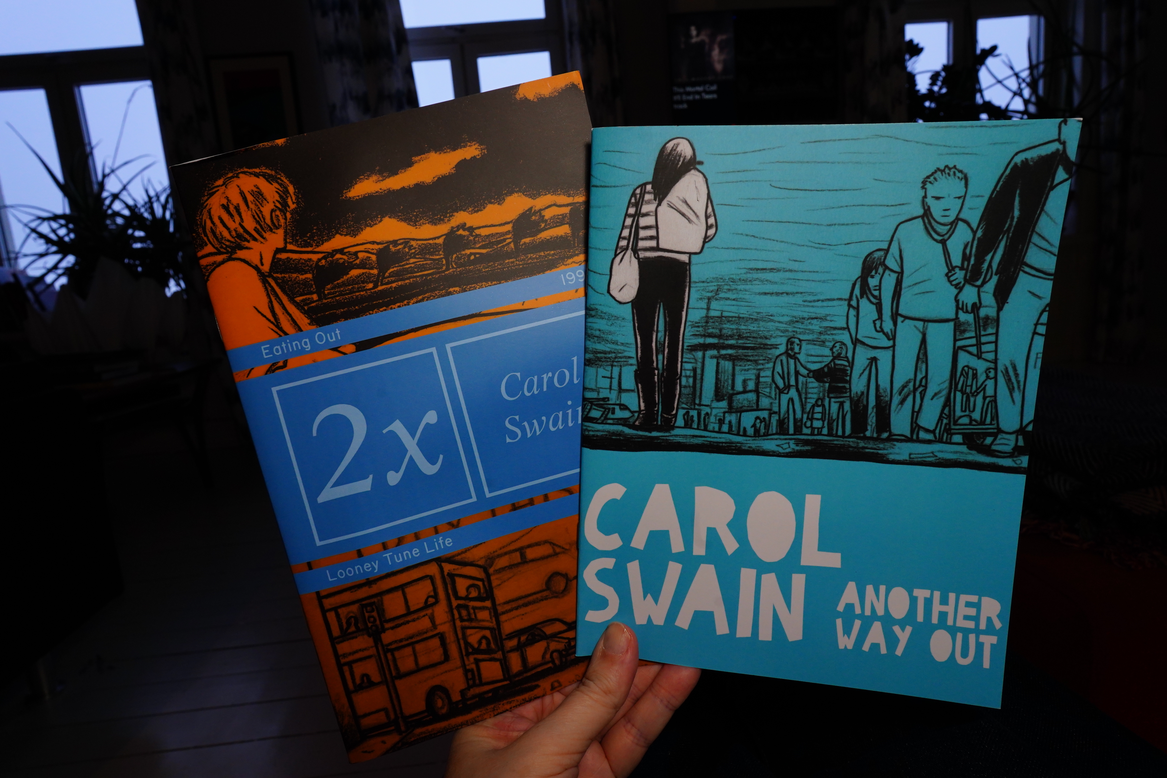
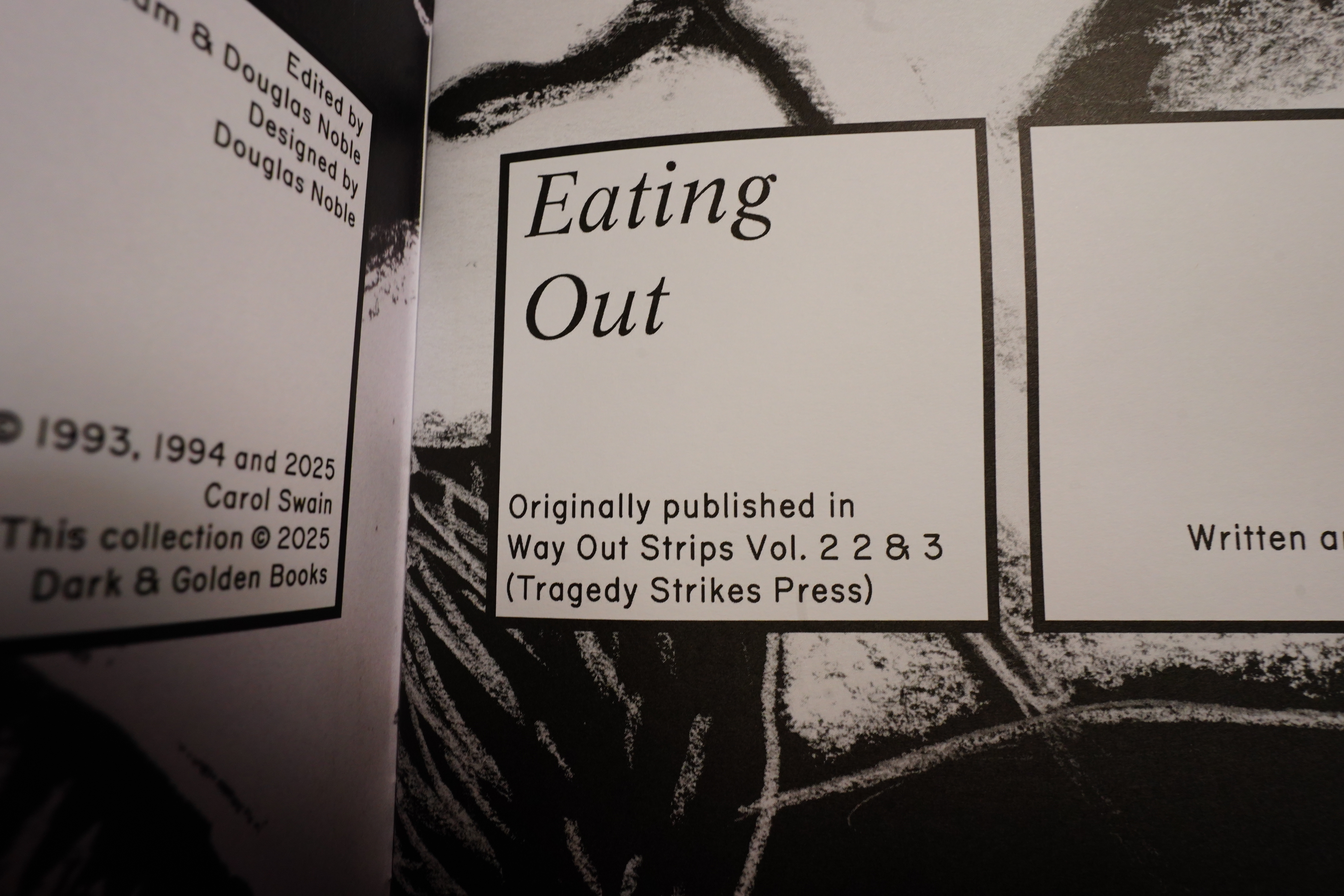
13:38: 2x/Another Way Out by Carol Swain (Dark & Golden Books)
These are from the same place as the Reynolds book. And did you know that you can buy Carol Swain originals now?
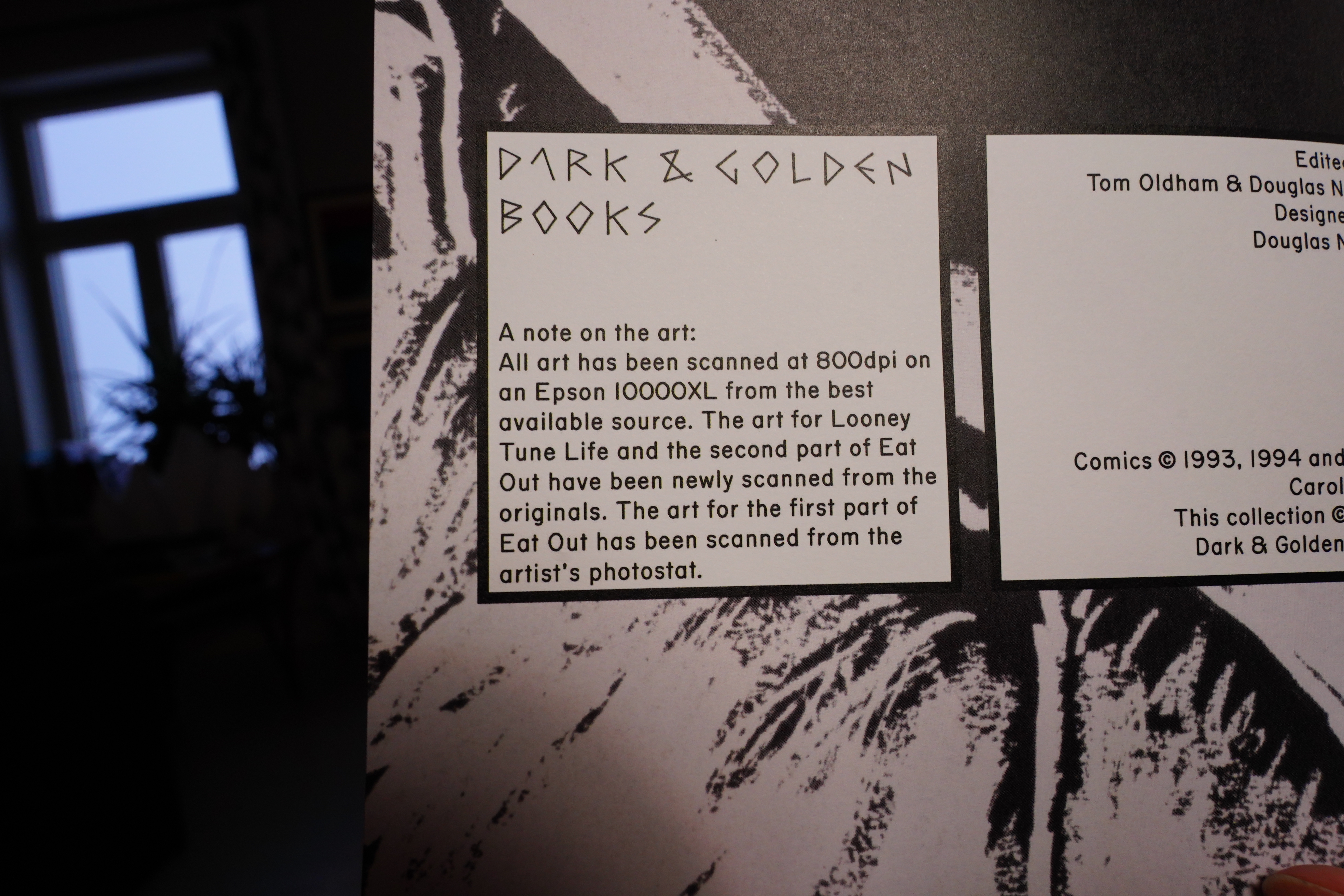
Hey! I’ve got that scanner, too. It’s good, but very slow. Unfortunately, Epson stopped making scanners of that size — “A3+” — nowadays their biggest one is strictly A3, which means that it’s not big enough to scan an LP cover. Why can’t we have nice things?
Oh, I’ve read these before, then.
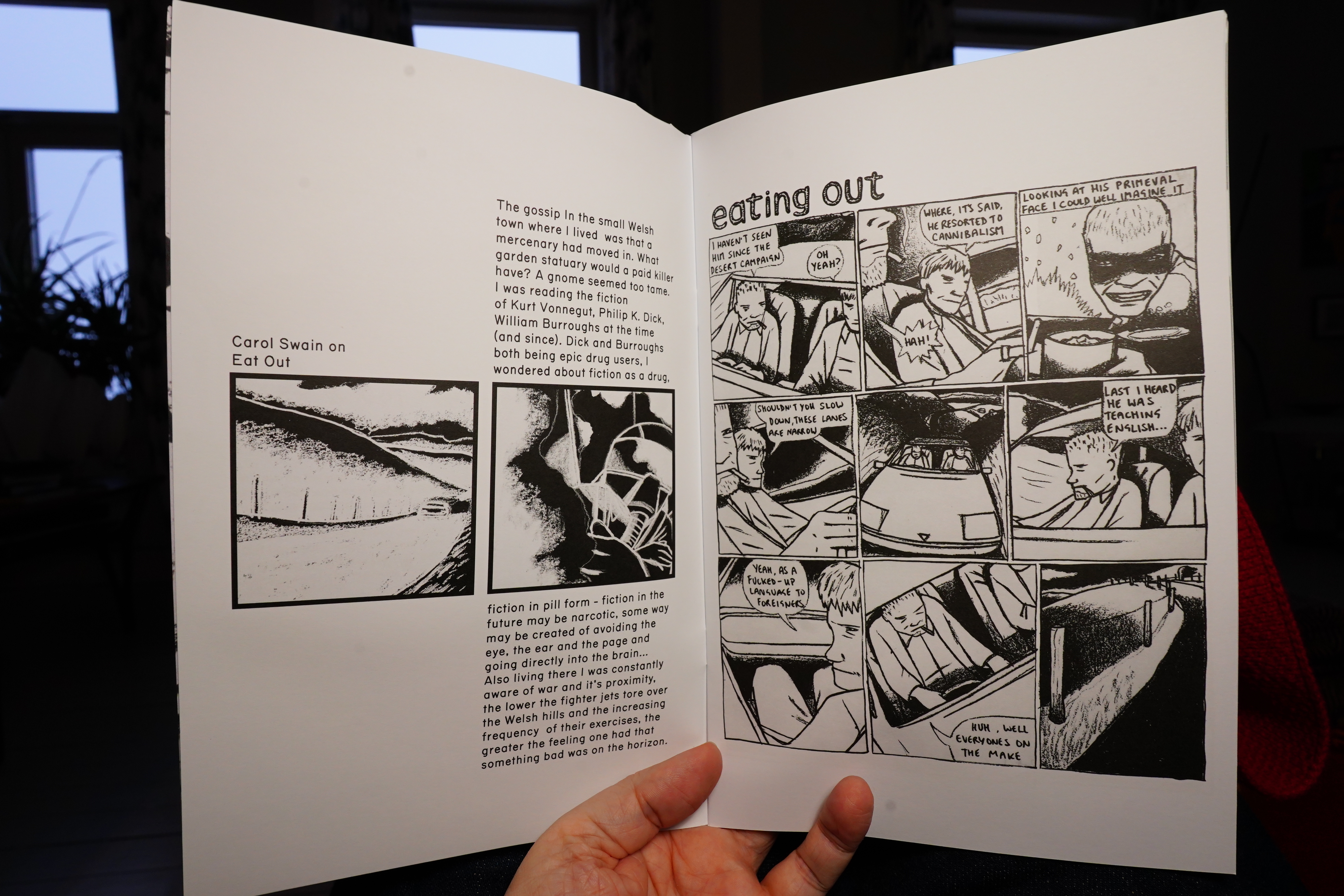
Swain does her own introductions…
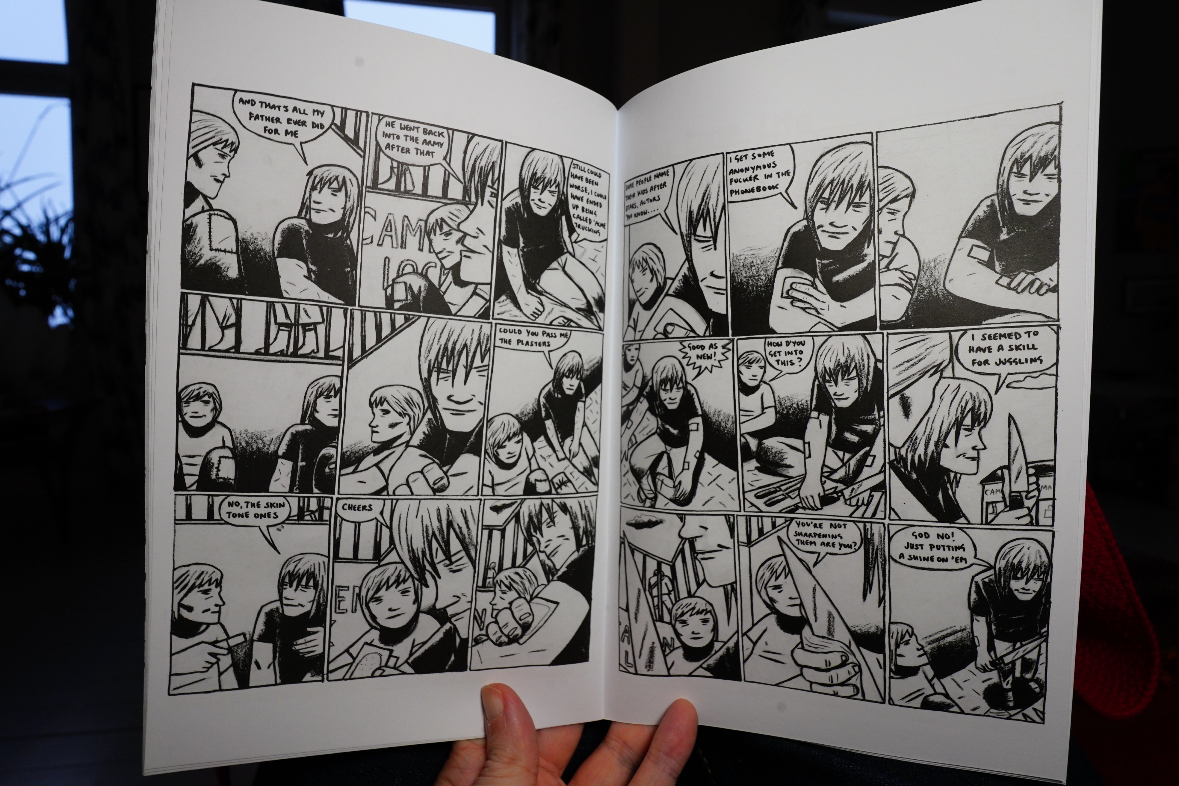
The stories are as fantastic as I remember.
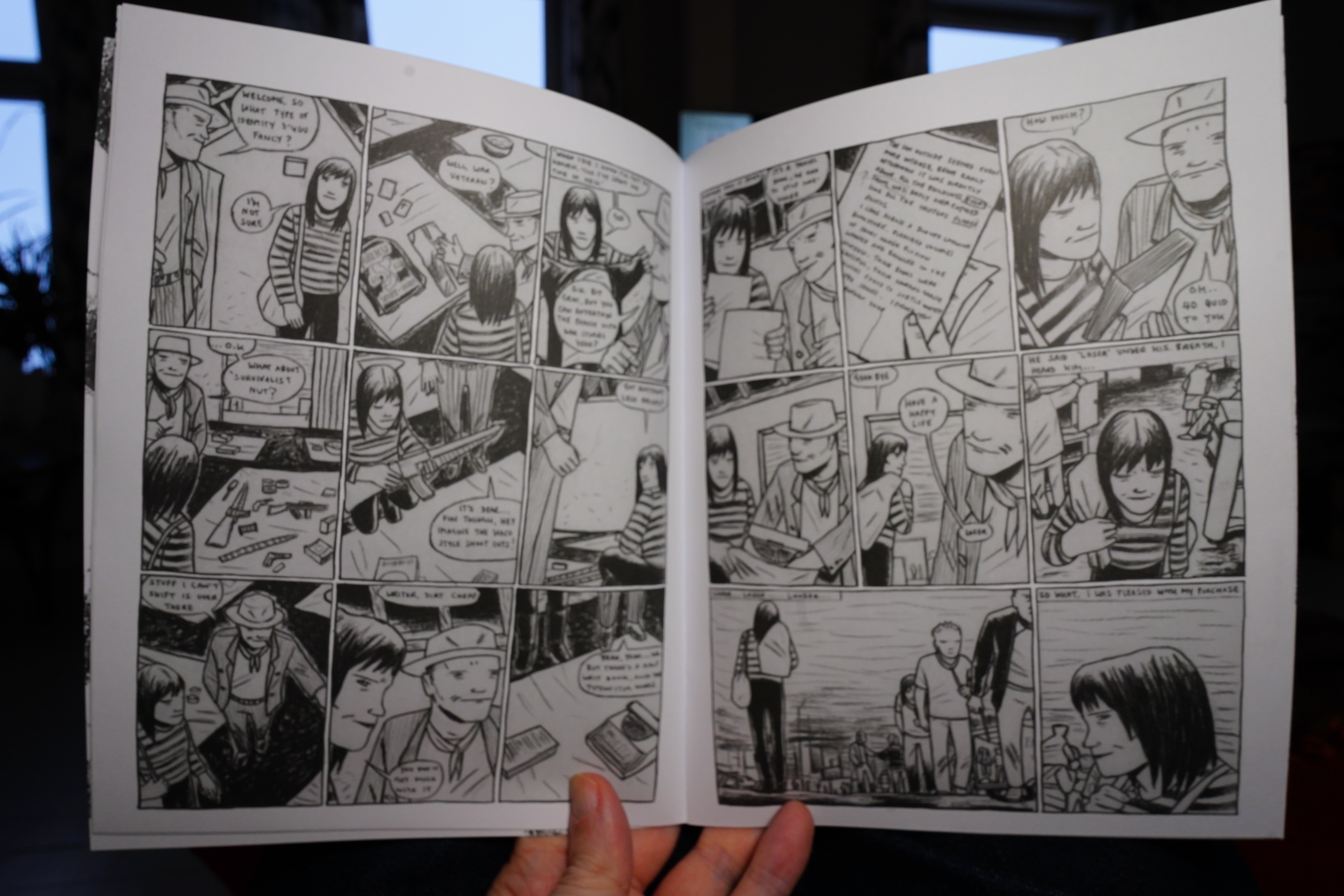
And then there’s the other book, which has new stuff! Yay!
It’s super. Love it!
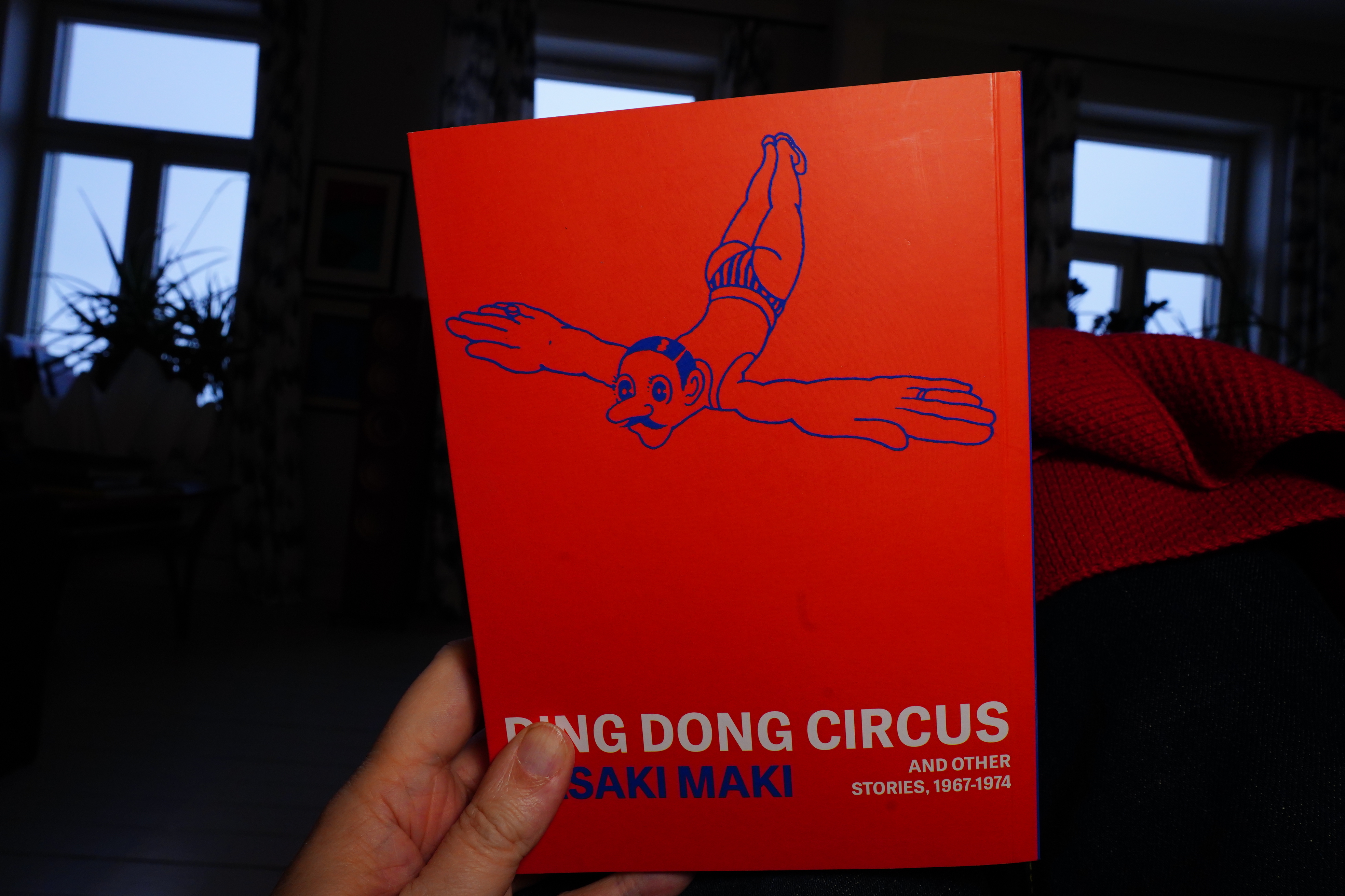
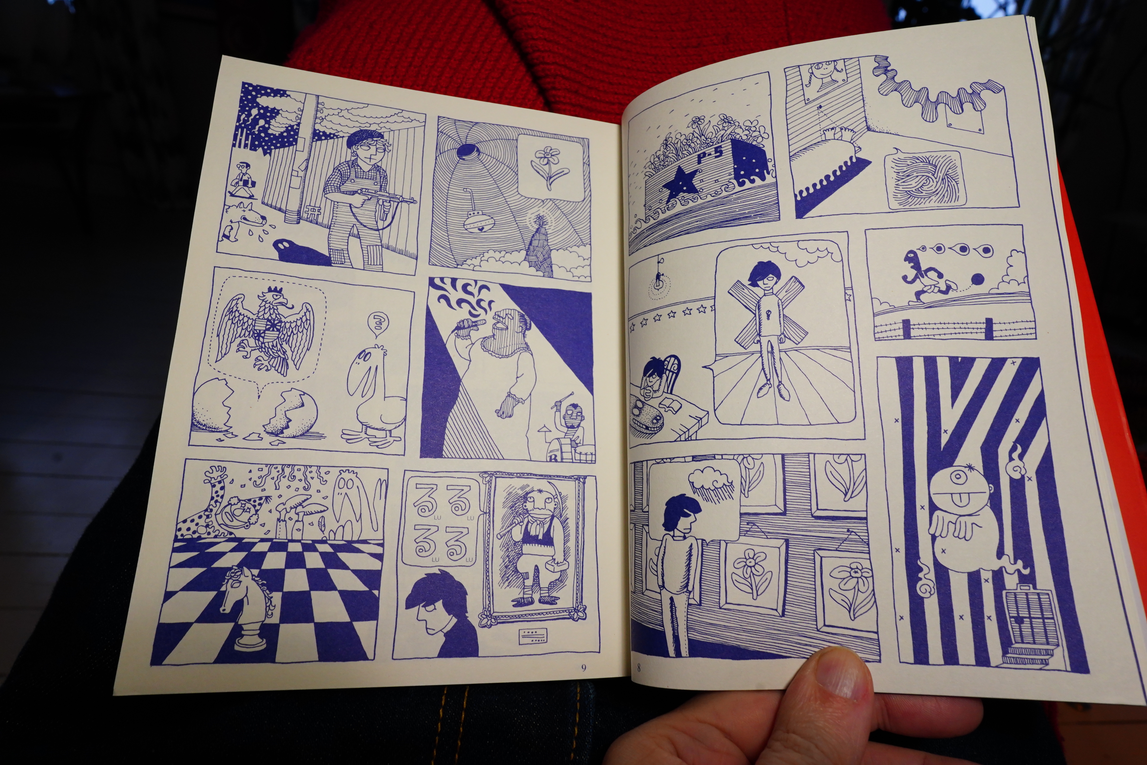
13:57: Ding Dong Circus by Sasaki Maki (Breakdown Press)
This is another instalment in Ryan Holmberg’s apparent project of getting all of Garo reprinted, I guess.
Hey! Pretty nice… looks extremely influenced by French pop art.
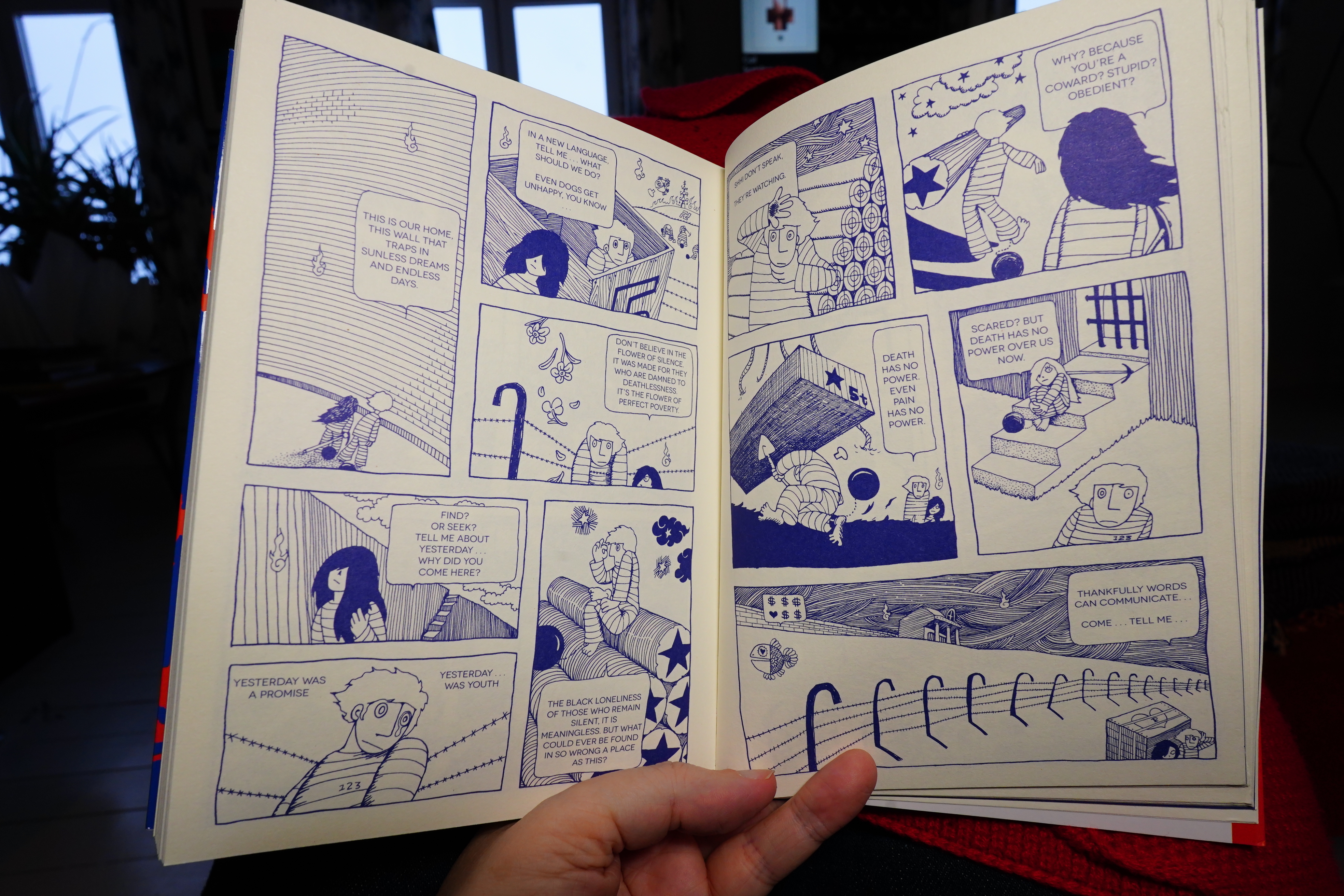
A couple of the pieces seem to be somewhat narrative…
… but most of them are apparently just random images. The artwork’s nice, but piece after piece of this stuff is rather tedious. It probably worked brilliantly in the original context in Garo, though, which is a problem this book shares with many of these collections. I’d rather see Garo translated in its entirety, really.
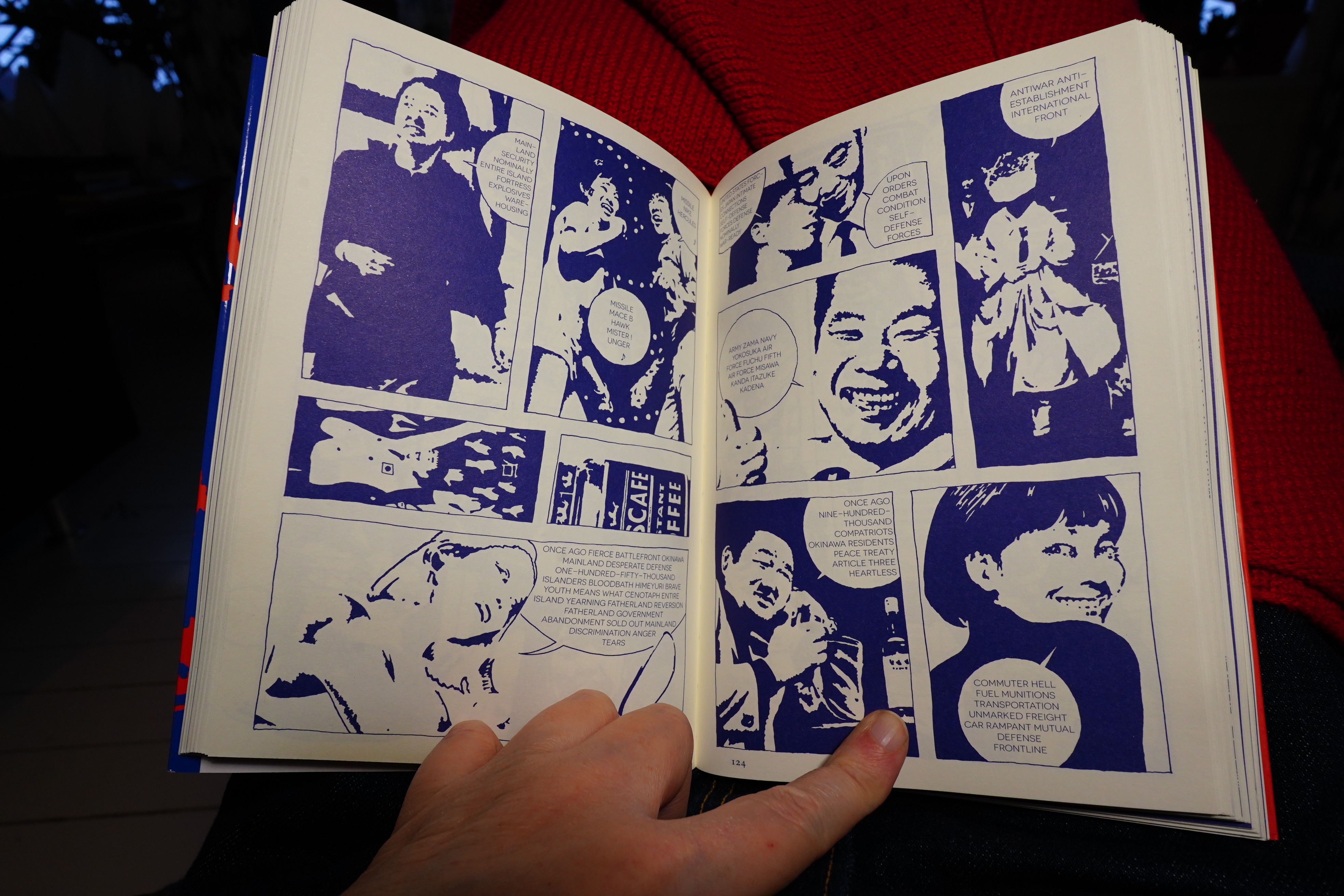
There’s one piece that’s done differently — it’s a comment on the absurdity of the discussions about the Vietnam war.
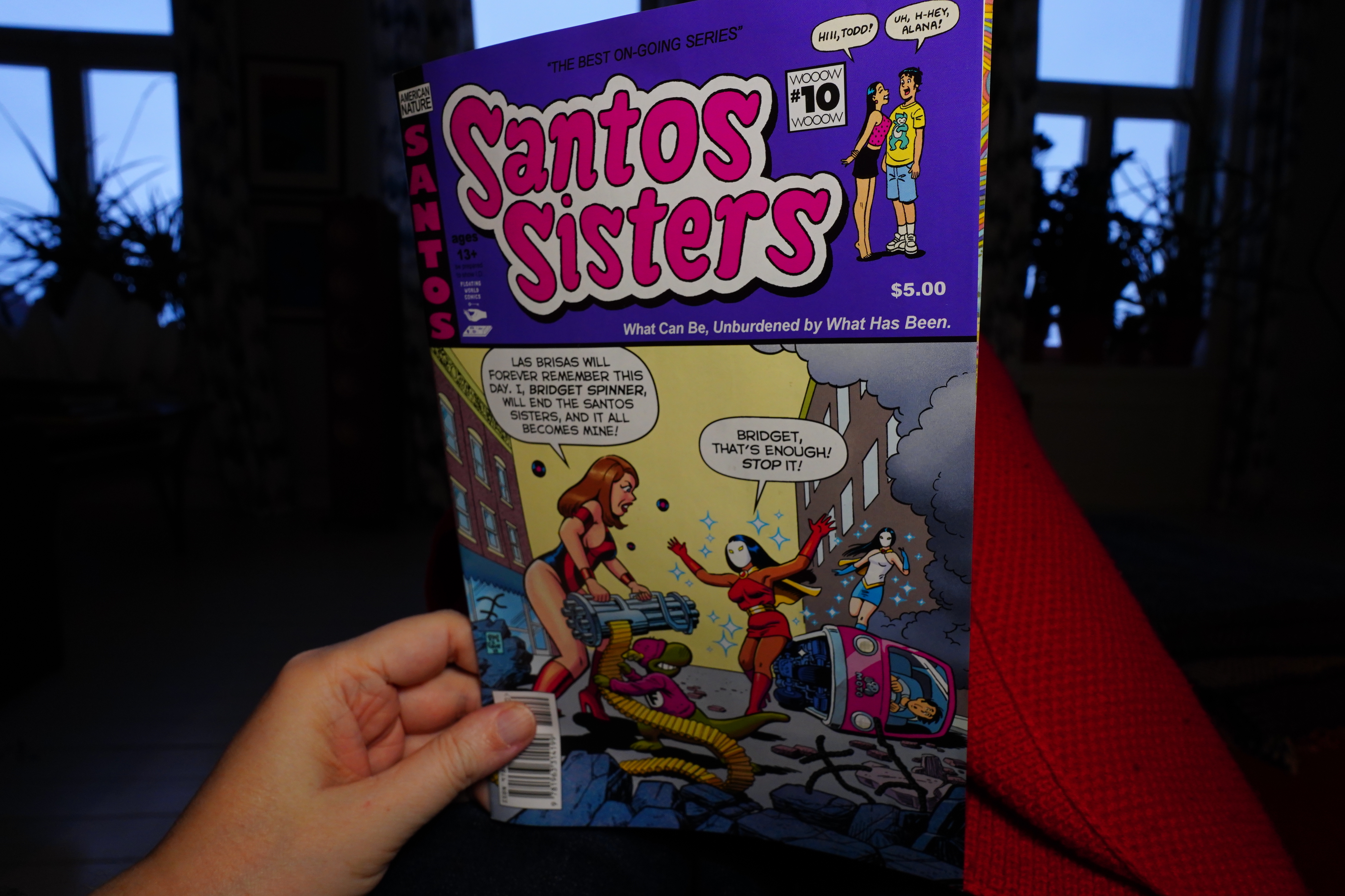
14:16: Santos Sisters #10 by Greg & Fake (Floating World Comics)
Fantagraphics published a Santos Sisters collection last year, which meant that it finally “broke containment” and ended up on a lot of people’s Best Of lists. Which led to a lot of comments like “well, it’s really fun, but I’m not sure I get it? is it an Archie parody or not? IS IT!!! TELL MEEEE!!! ARE THEY SERIOUS!1! *tilt*” which was fun to read.
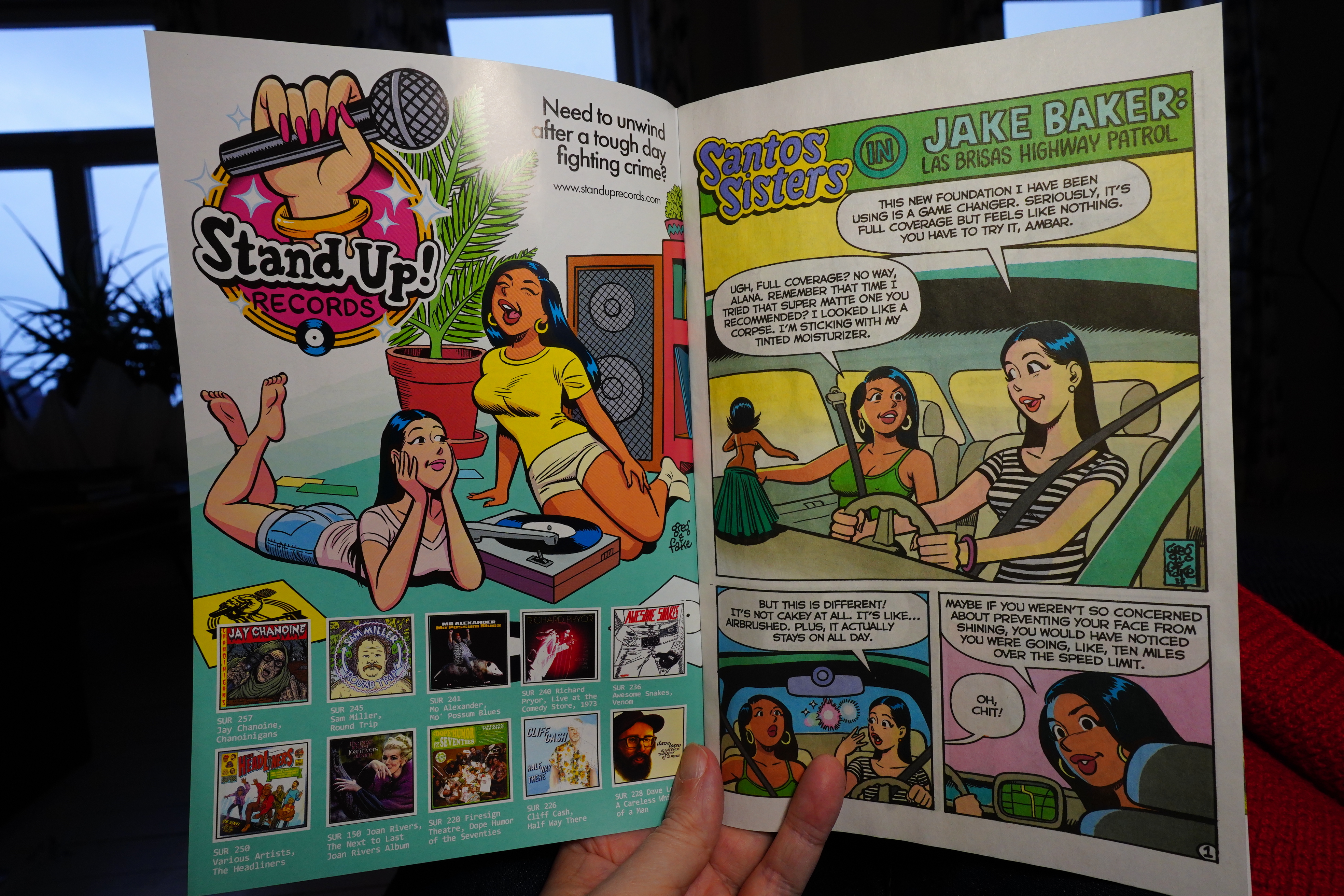
This issue is a bit of a departure…
We get a Martin Shkreli parody, for instance. It’s fun.
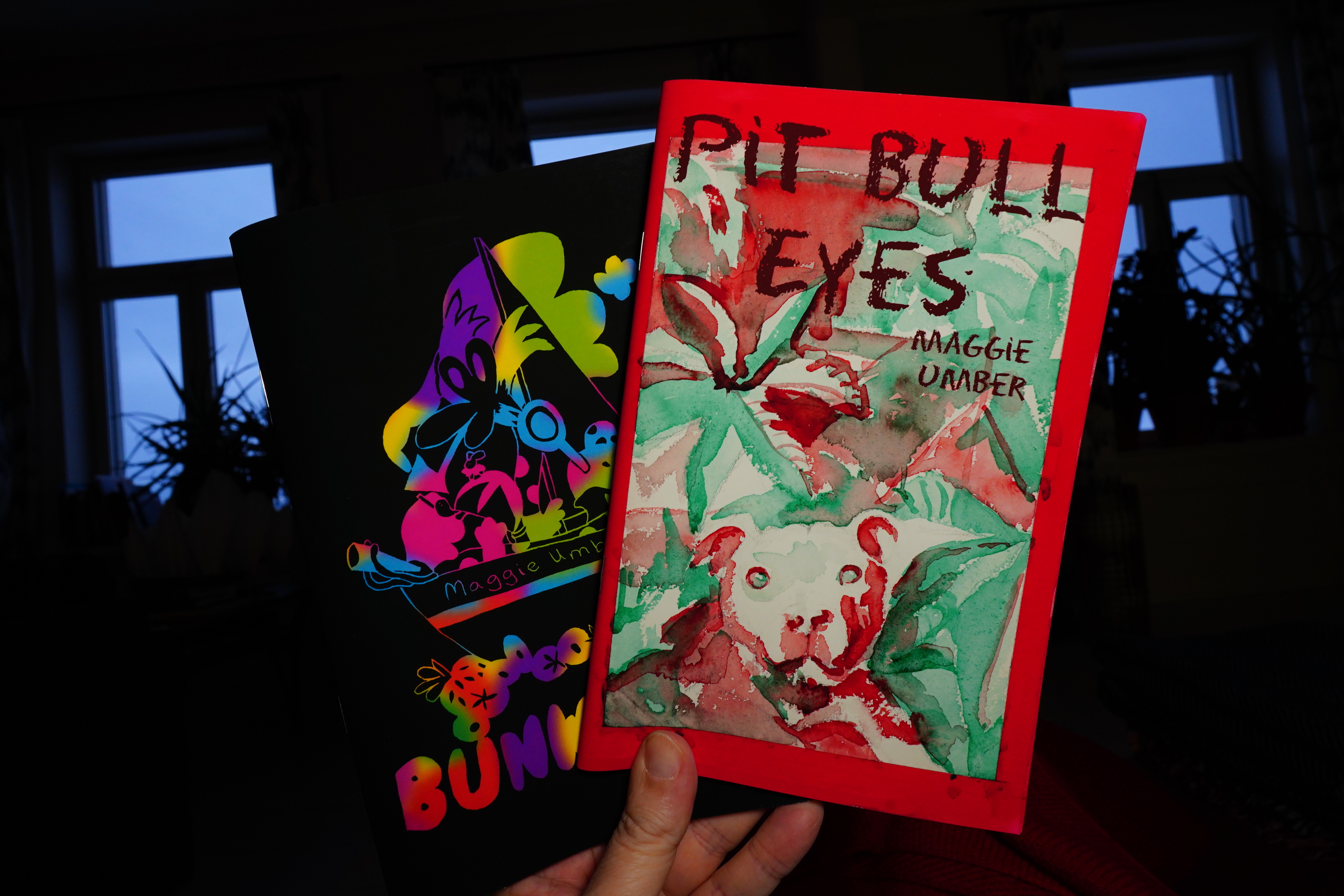
14:27: Bunworld 2 and Pit Bull Eyes by Maggie Umber
I got this from here.
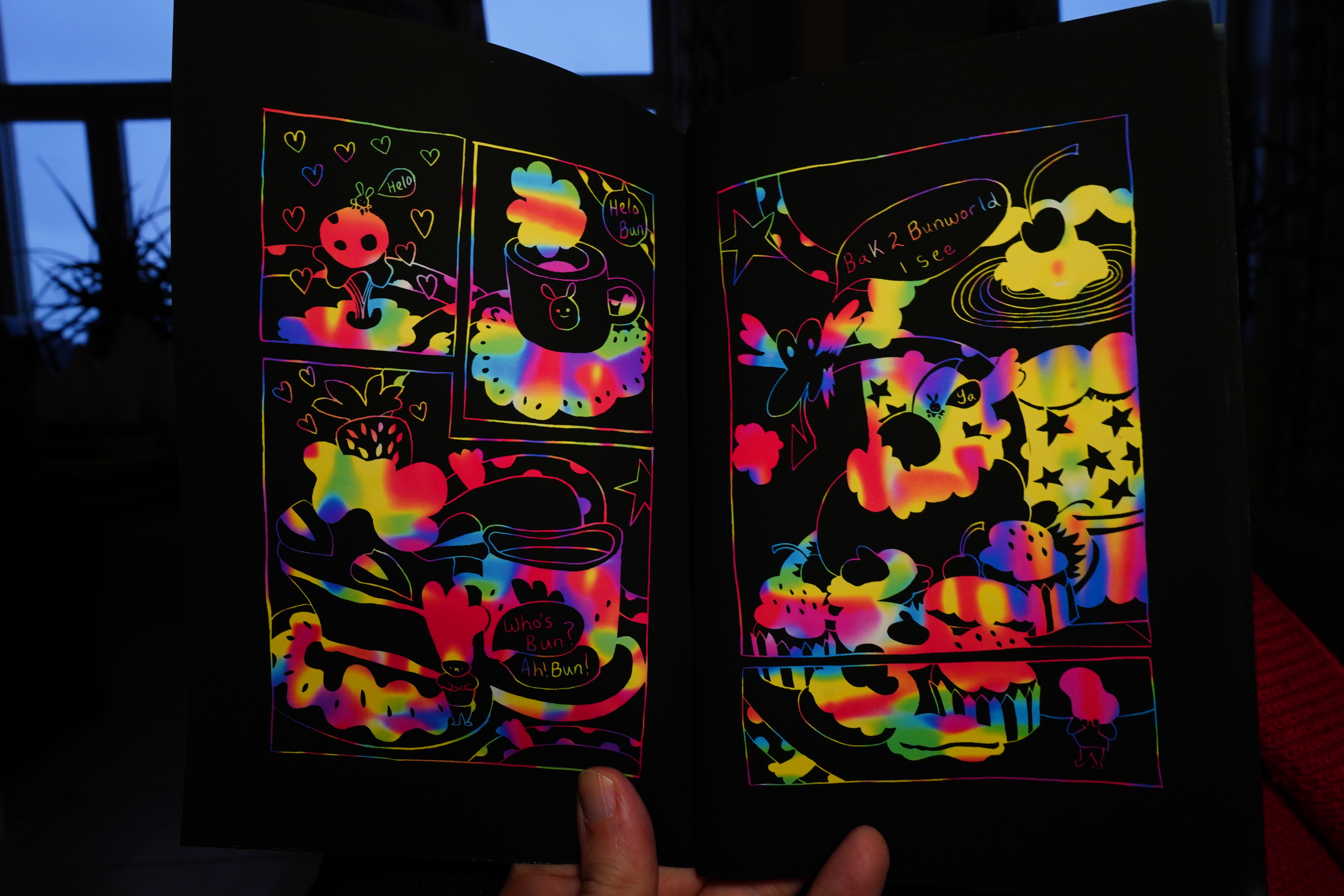
I love the look of the Bunworld books. It’s unique.
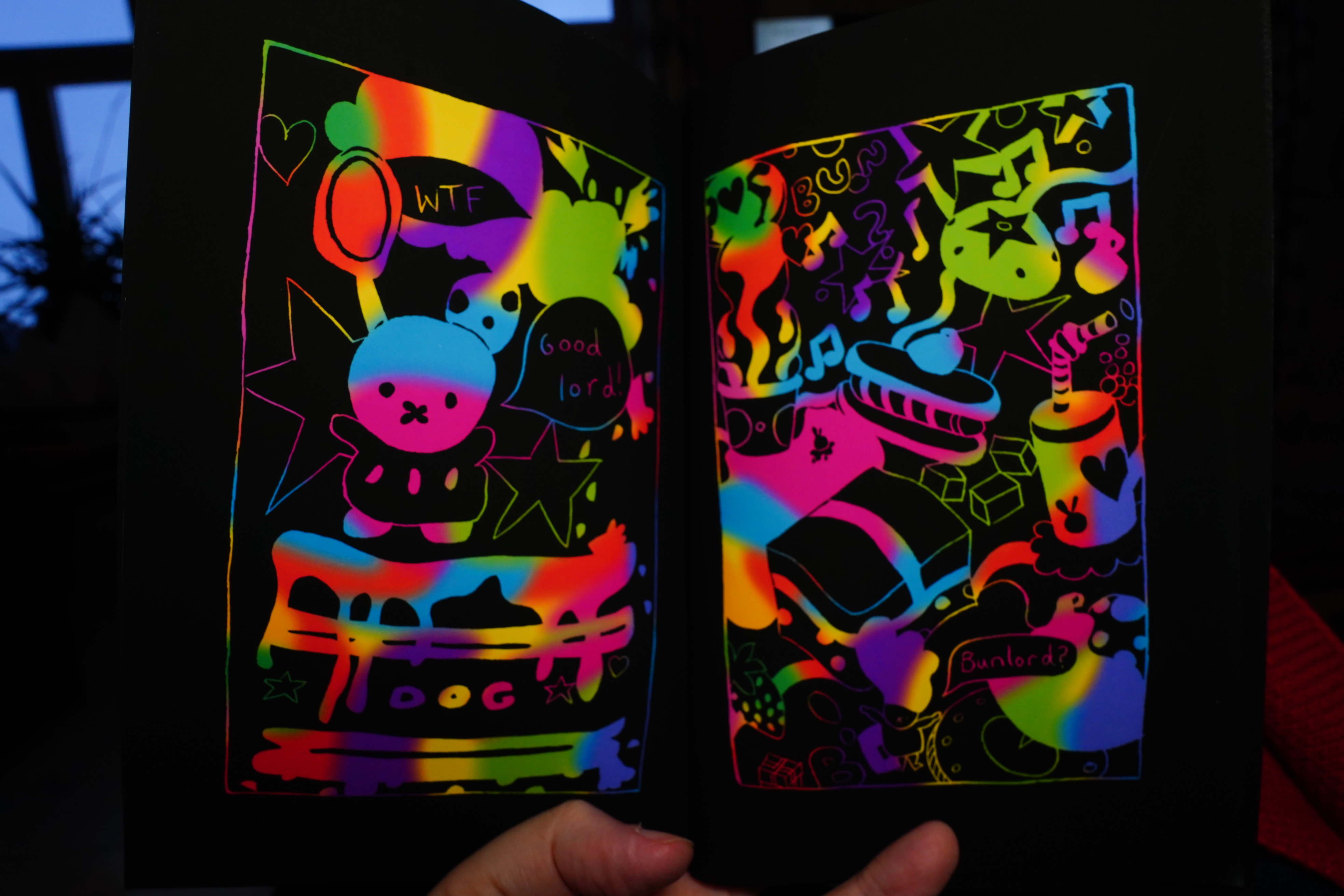
And it’s fun.
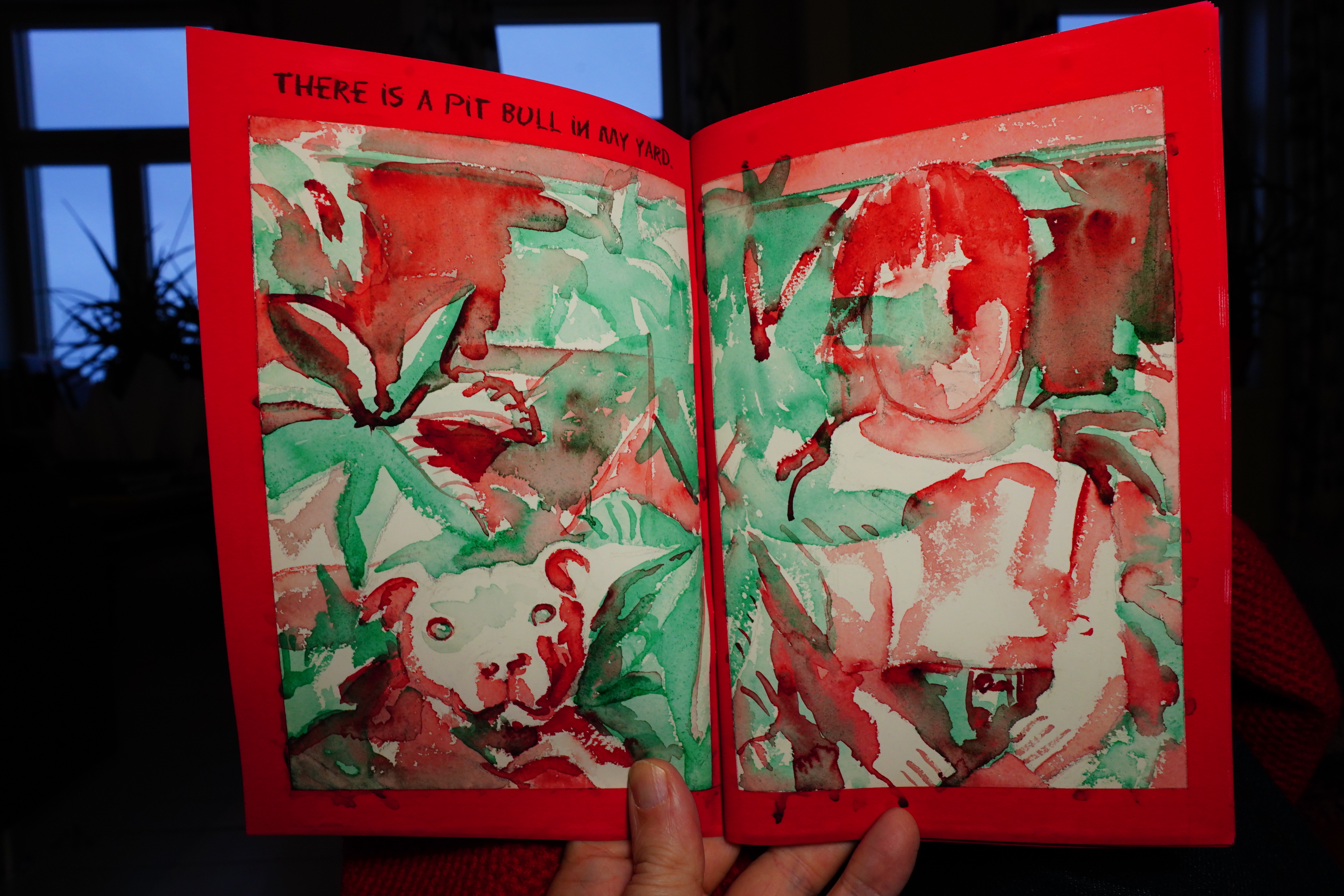
Is this screenprinted?
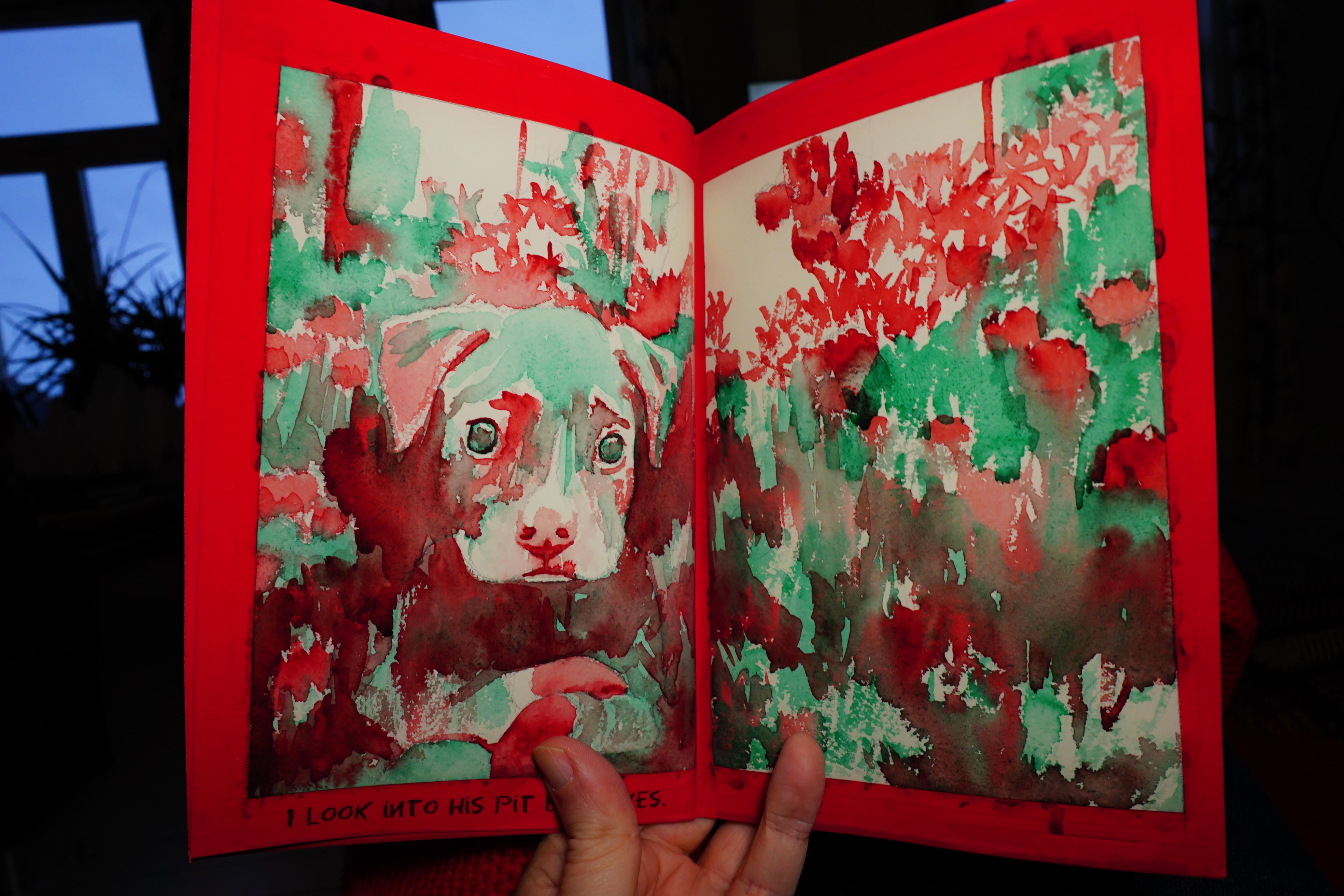
It’s lovely, anyway. Two very handsome books.
| Cabaret Voltaire: Micro-Phonies |  |
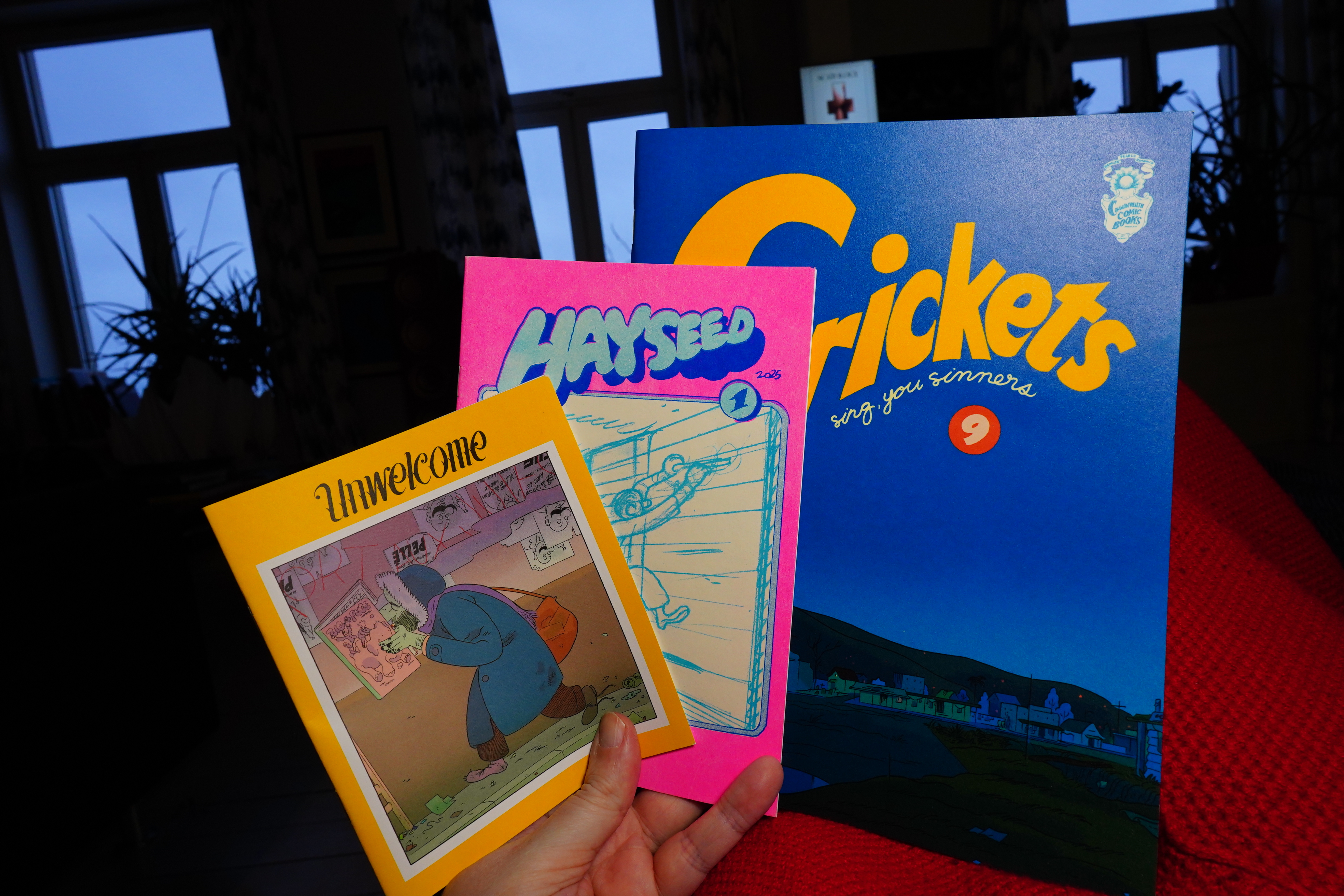
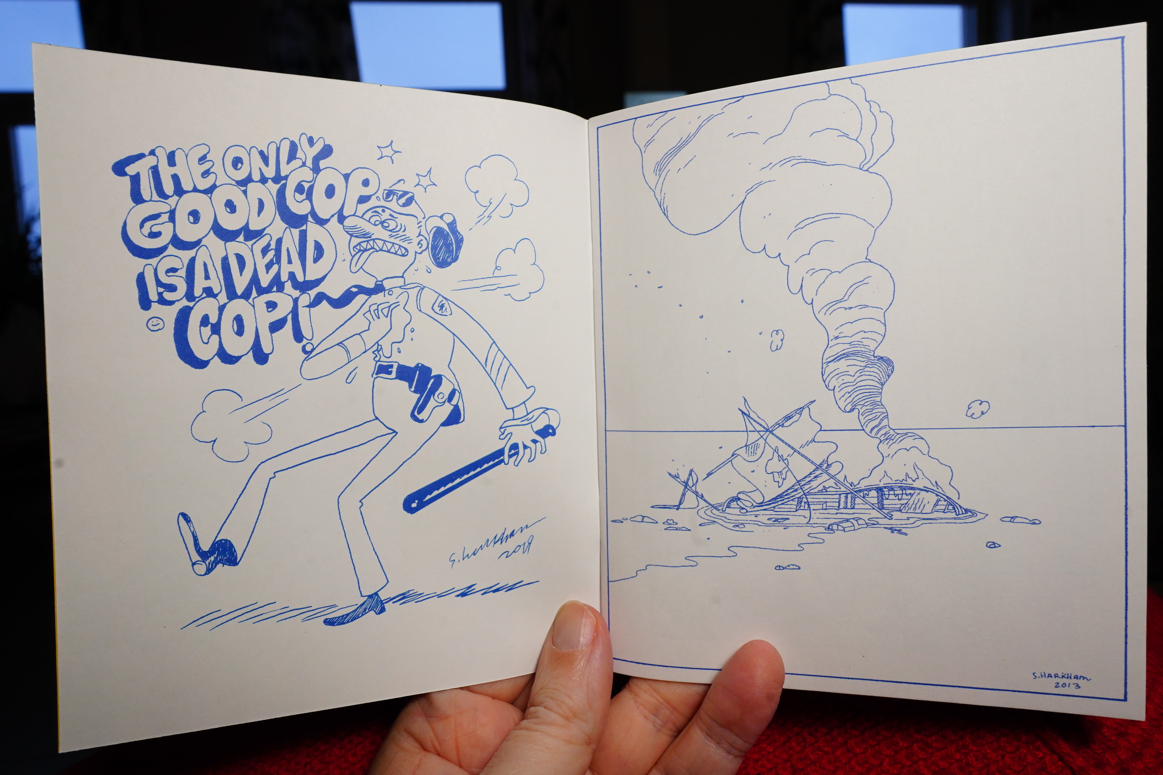
14:34: Crickets #9, Hayseed #1 & Unwelcome by Sammy Harkham
I got these from here, I think.
Unwelcome is a collection of illustrations…
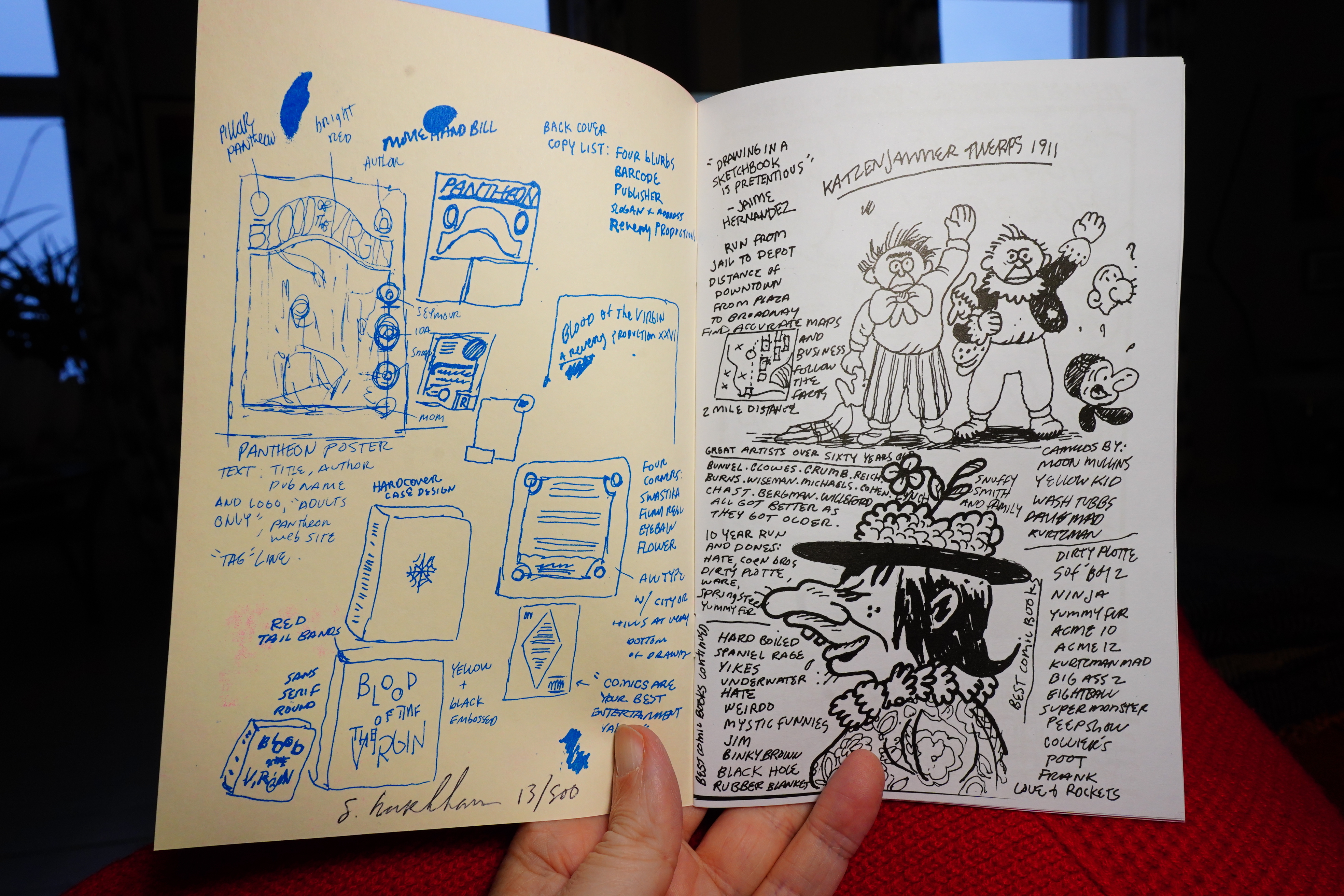
Hayseed consists of sketchbook drawings, I guess.
Heh heh. Nice.
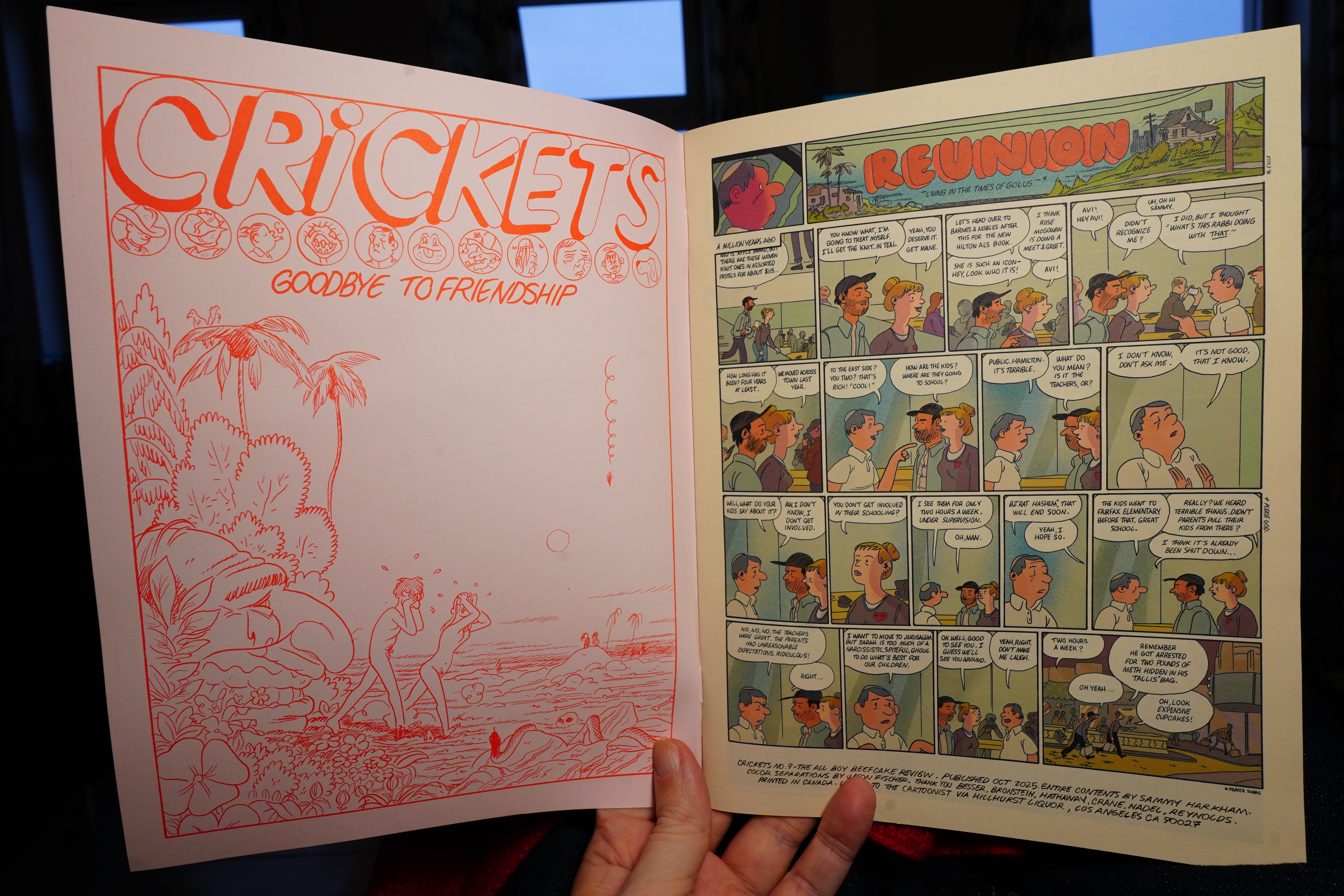
Harkham finished his big serial in the previous issue of Crickets, so what’s he up to now? The short pieces in this issue are very funny.
And then he starts a new serial, which seems like it might go on for many issues. It’s a solid issue.
15:02: The Adventures of Sgoobidoo by Catohn (Pow Pow Press)
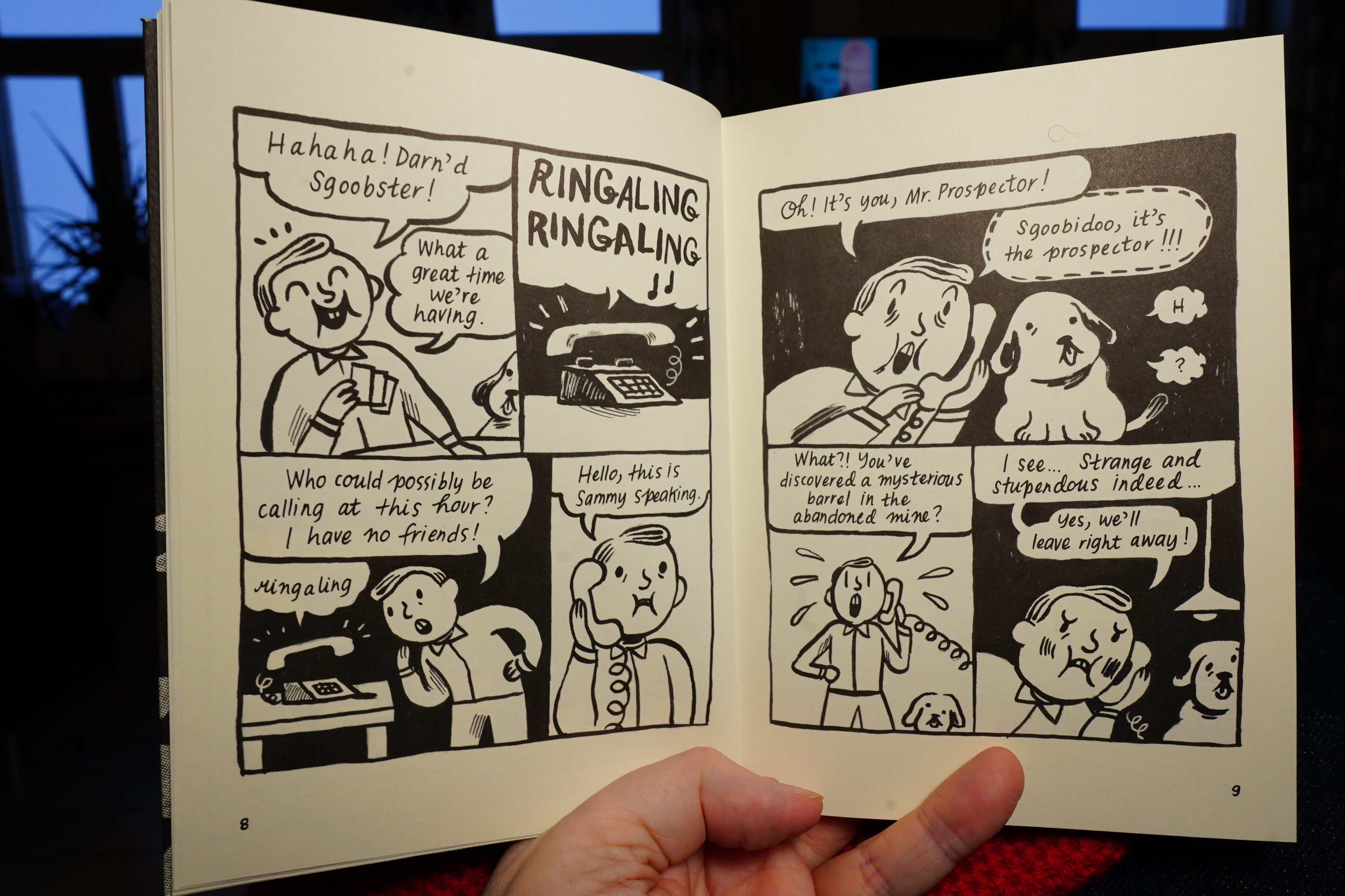
This is very funny.
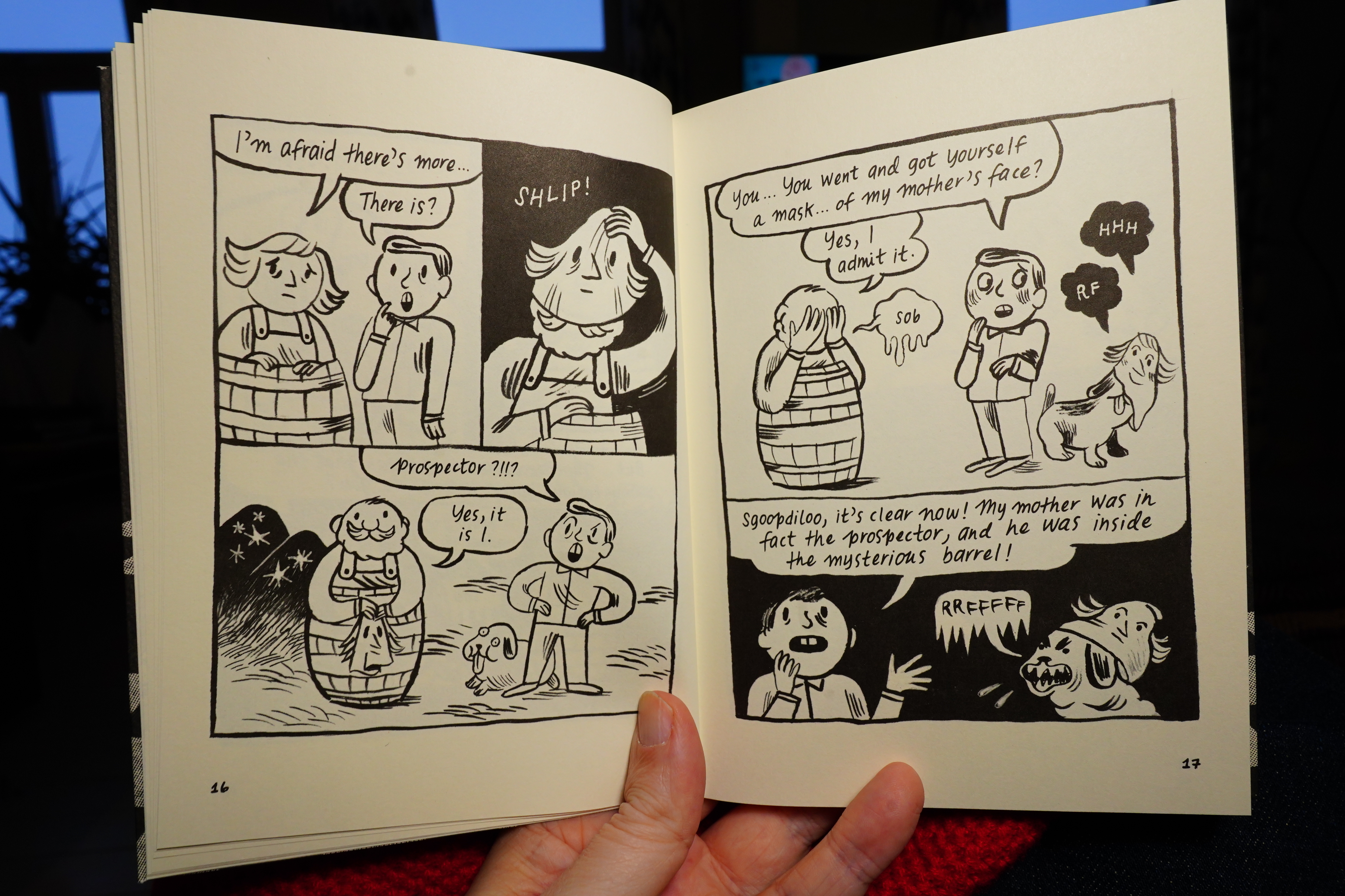
It’s a riff on Scooby-do, but instead of a scooby gang, it’s a delusional, lonely guy with a dog. It’s both funny and affecting.
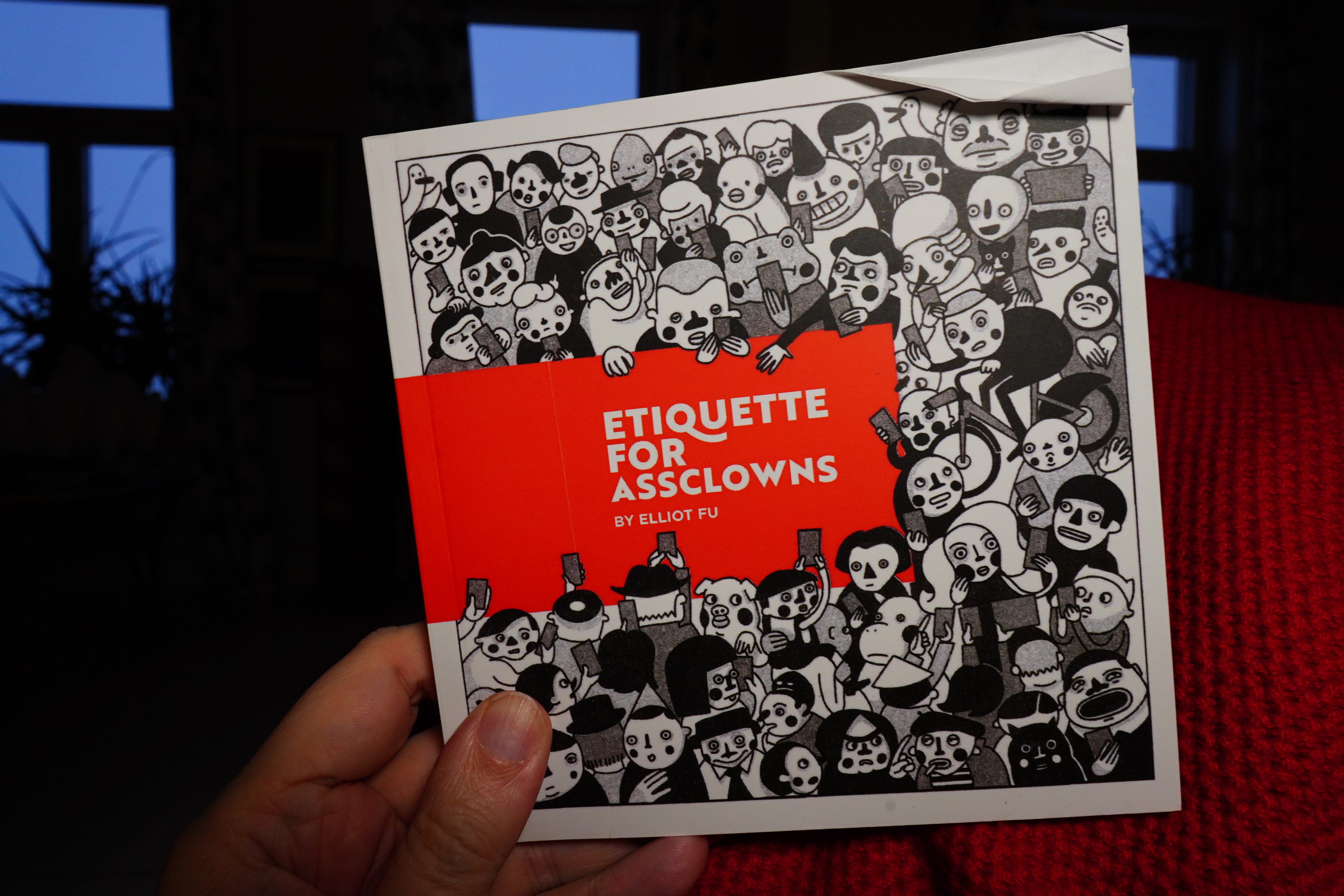
15:22: Etiquette For Assclowns by Elliot Fu (Desert Island)
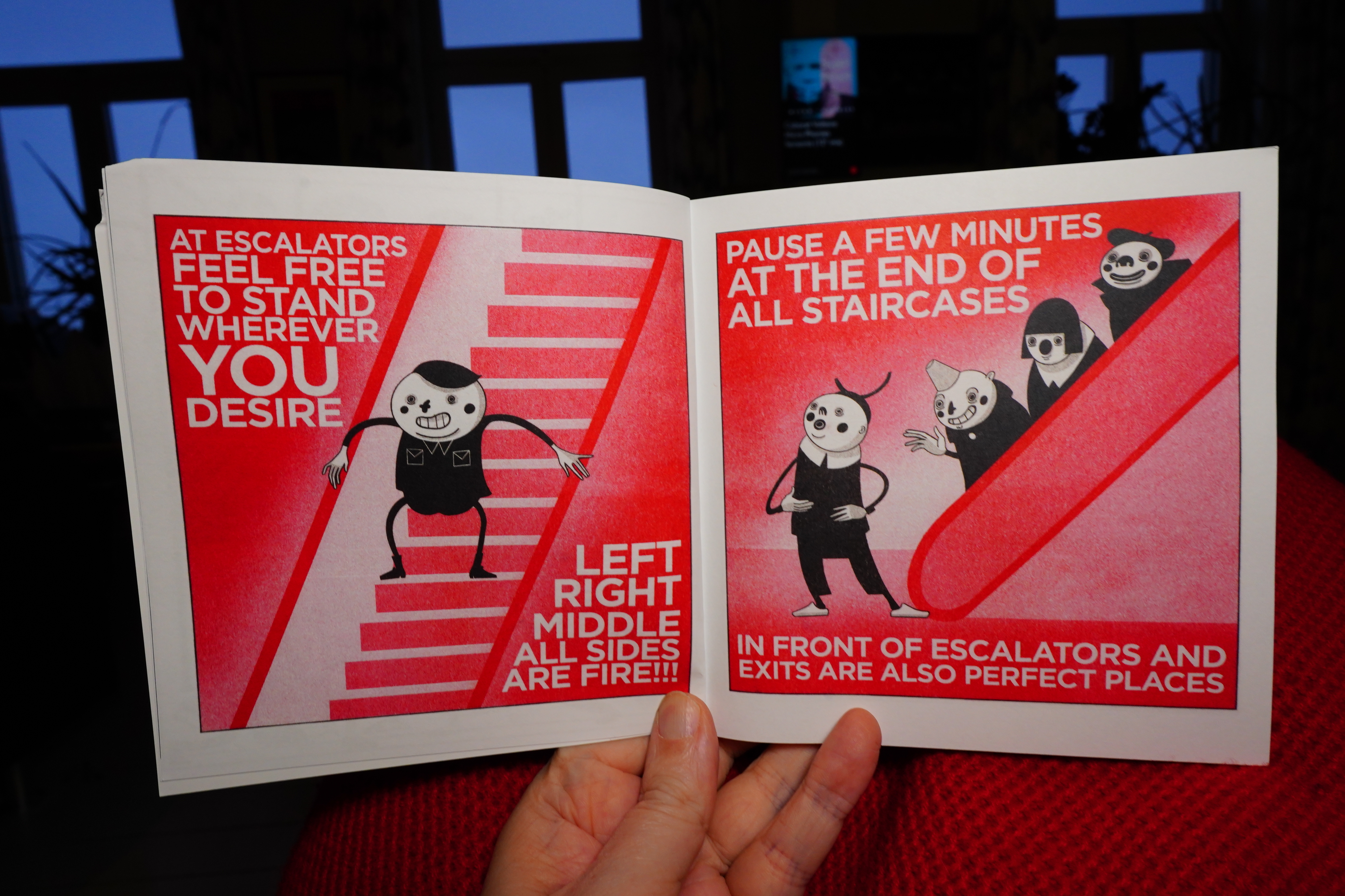
Well, I like peeving as much as the next guy…
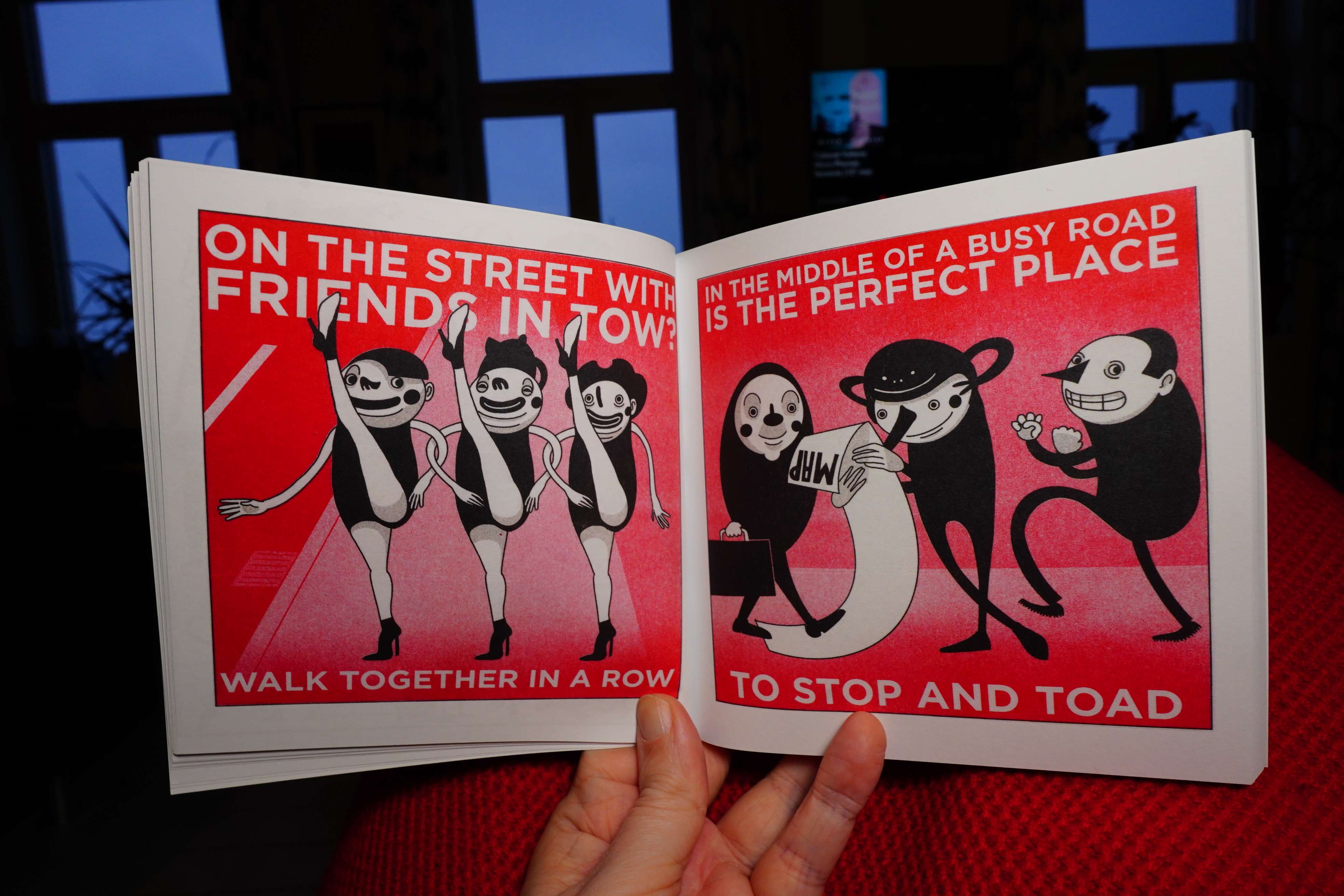
… but presented like this, with one peeve after another…
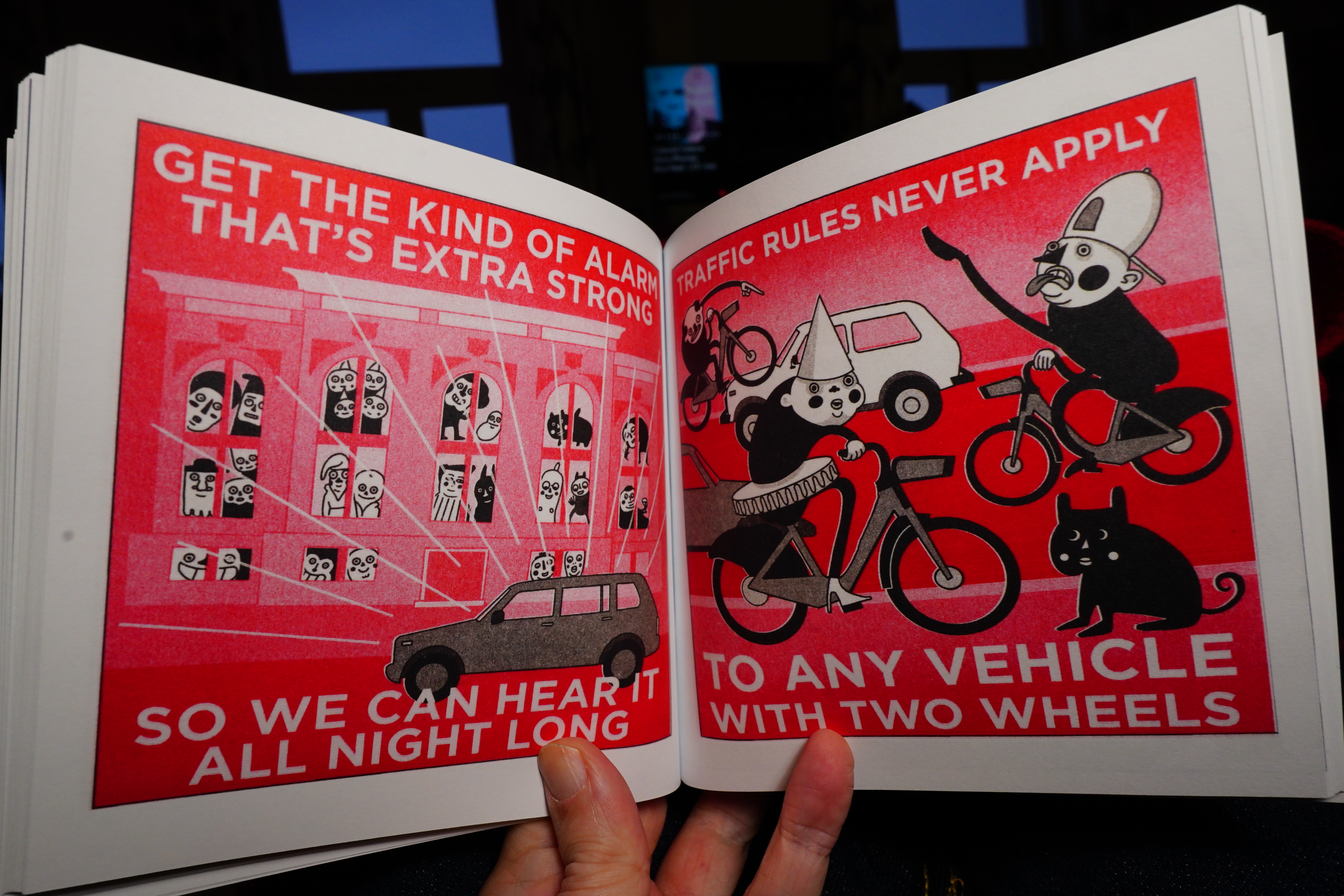
… the effect is the opposite of what’s presumably intended: You start hating the really uptight guy doing all the peeving.
| Colourbox: Say You | 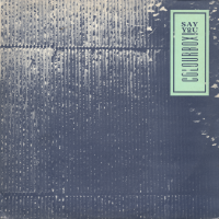 |
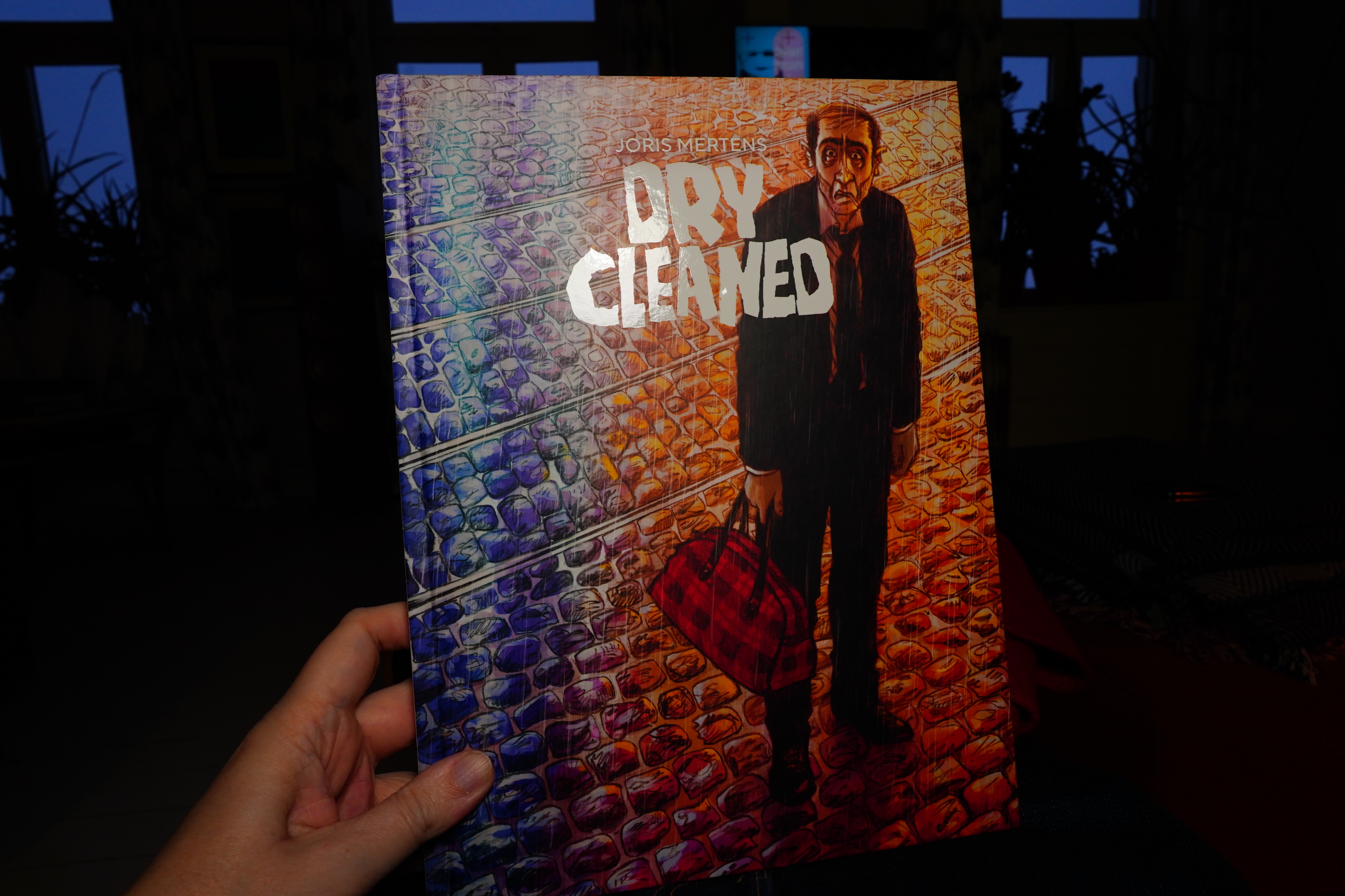
15:36: Dry Cleaned by Joris Mertens (Jonathan Cape)
I got this because it was on The Guardian’s list of the best comics of 2025…
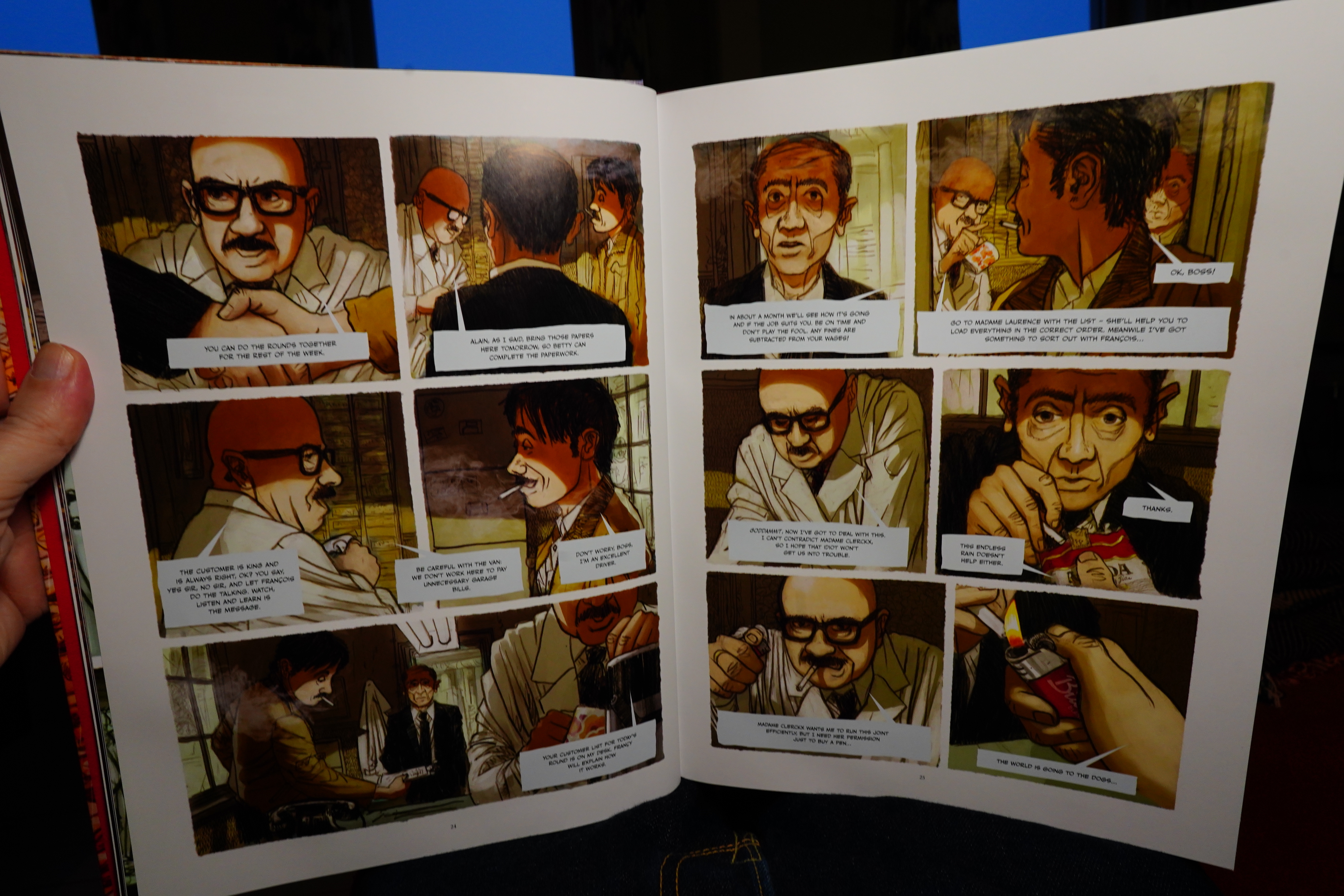
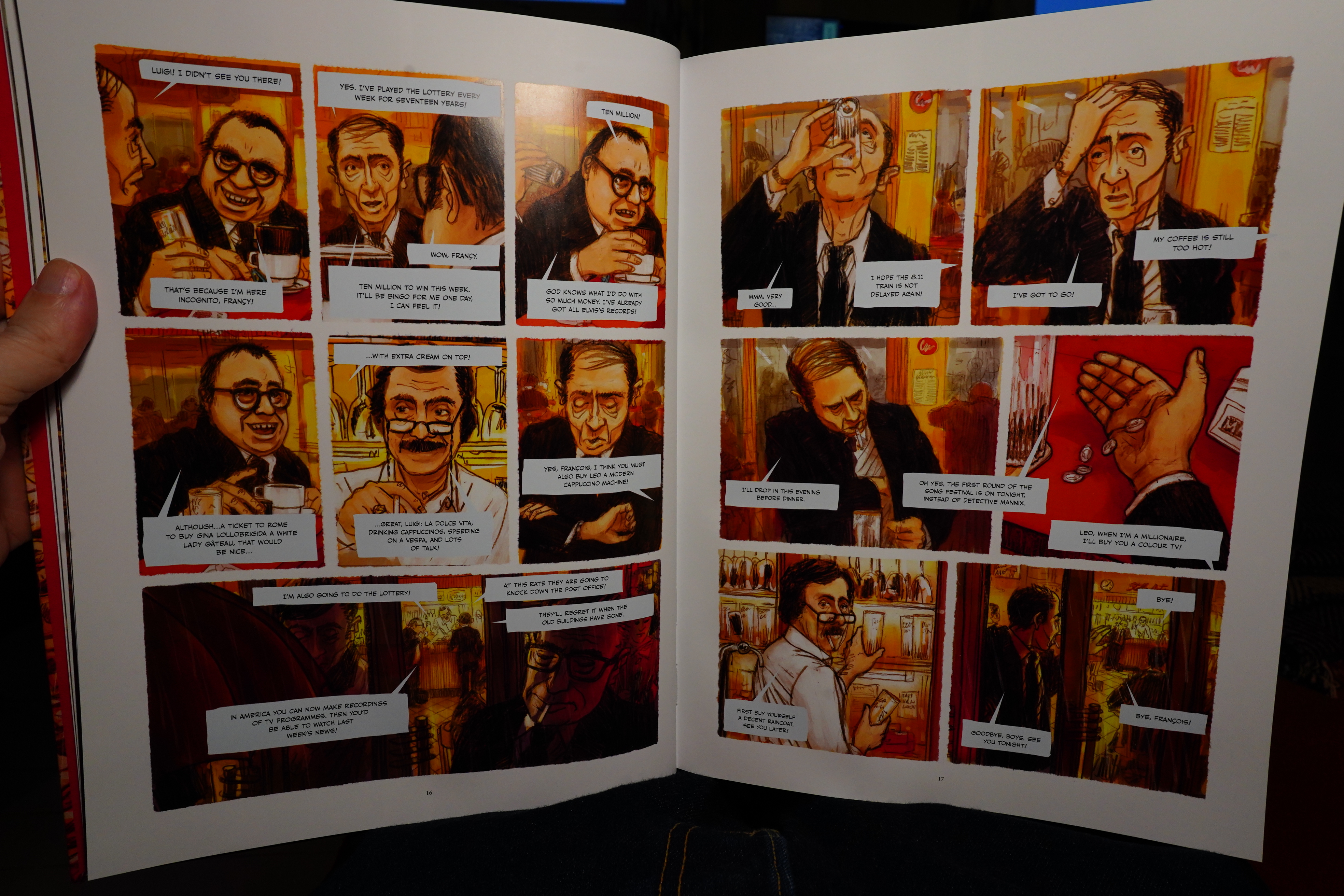
I like bits of it, but things like the shifting perspectives don’t really add much to the proceedings.
In the end, it’s one of those oh-so-ironic stories, and they gild the lily by making the ending triply ironic — when the final twist showed up, I started laughing. It’s so over the top.
But I mean, it’s not a bad book. Just a bit pointless, really.
| The Cure: The Top |  |
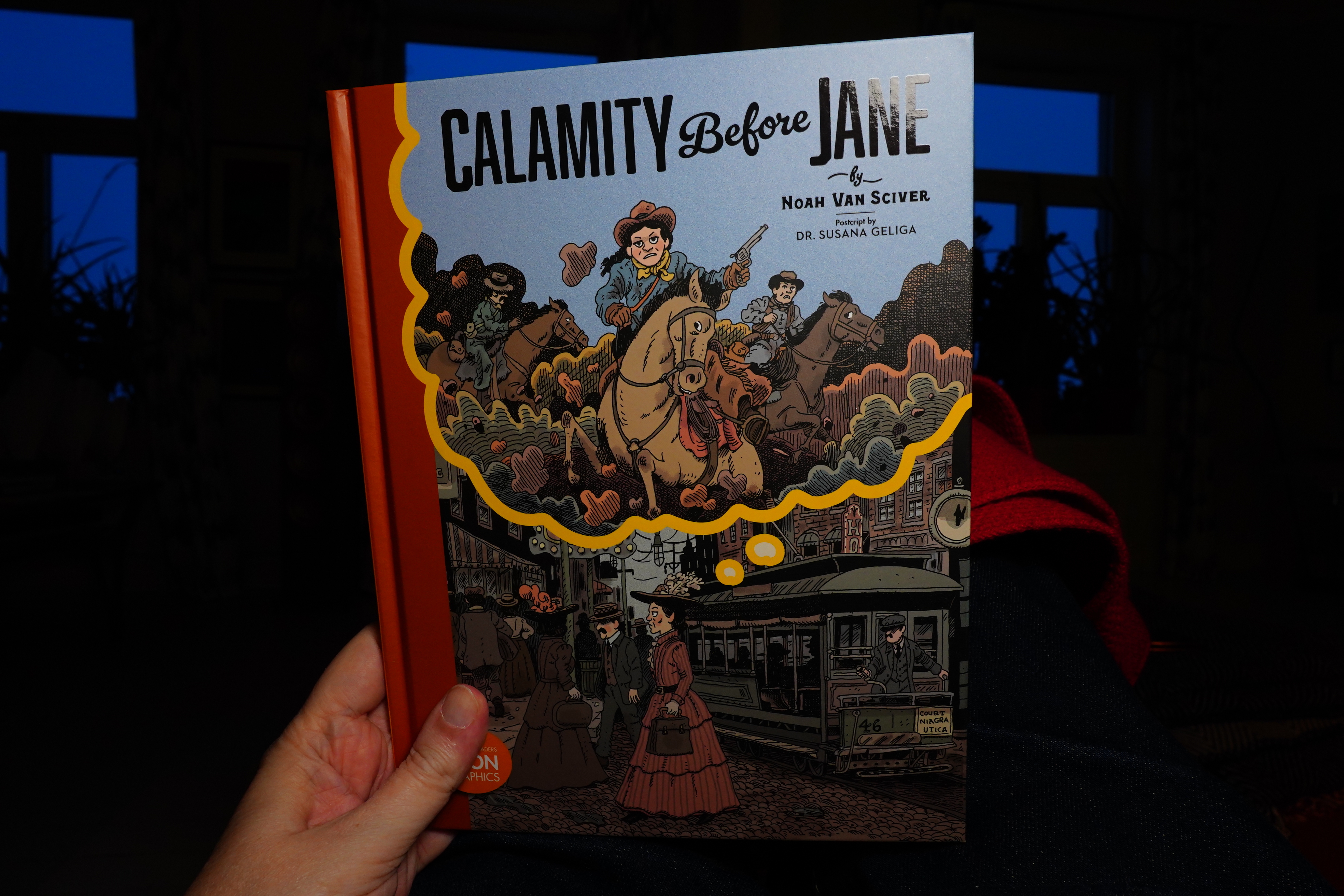
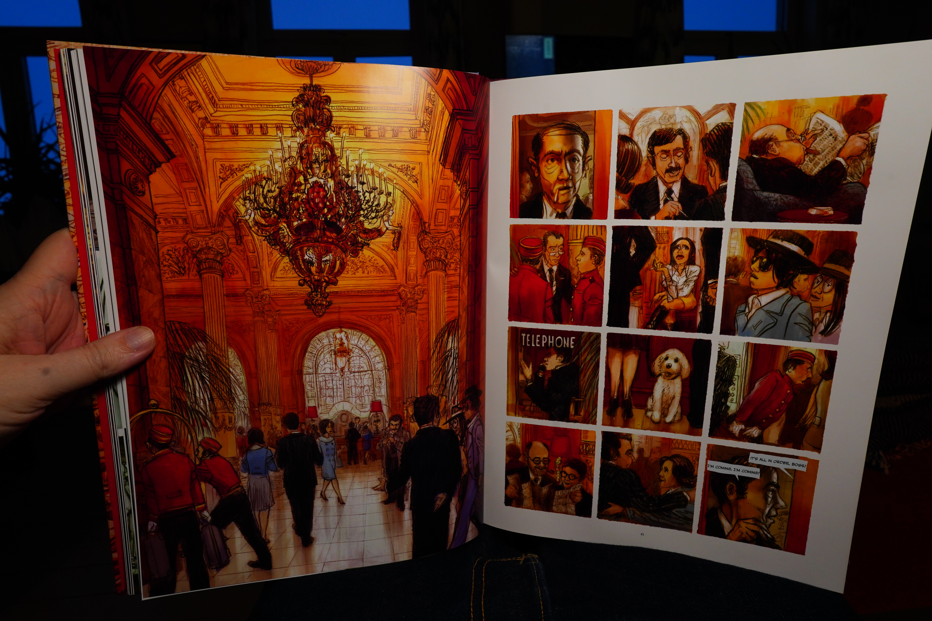
15:53: Calamity Before Jane by Noah Van Sciver (Toon Books)
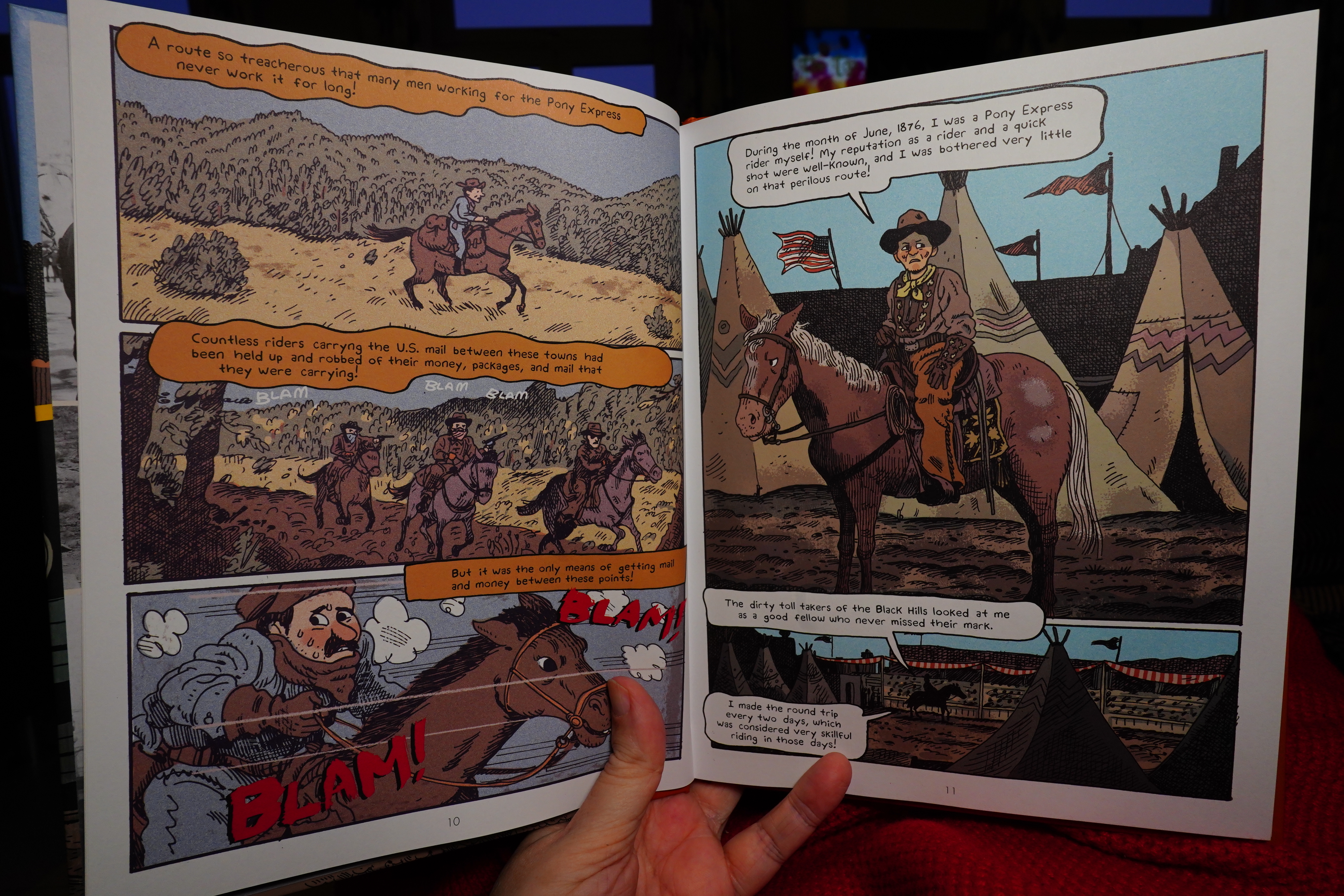
I wonder whether this is meant to be used in class?
It’s very didactic, but the approach is pretty odd — do we learn anything about Calamity Jane’s life or not? I wasn’t interested enough to actually read the postscript.
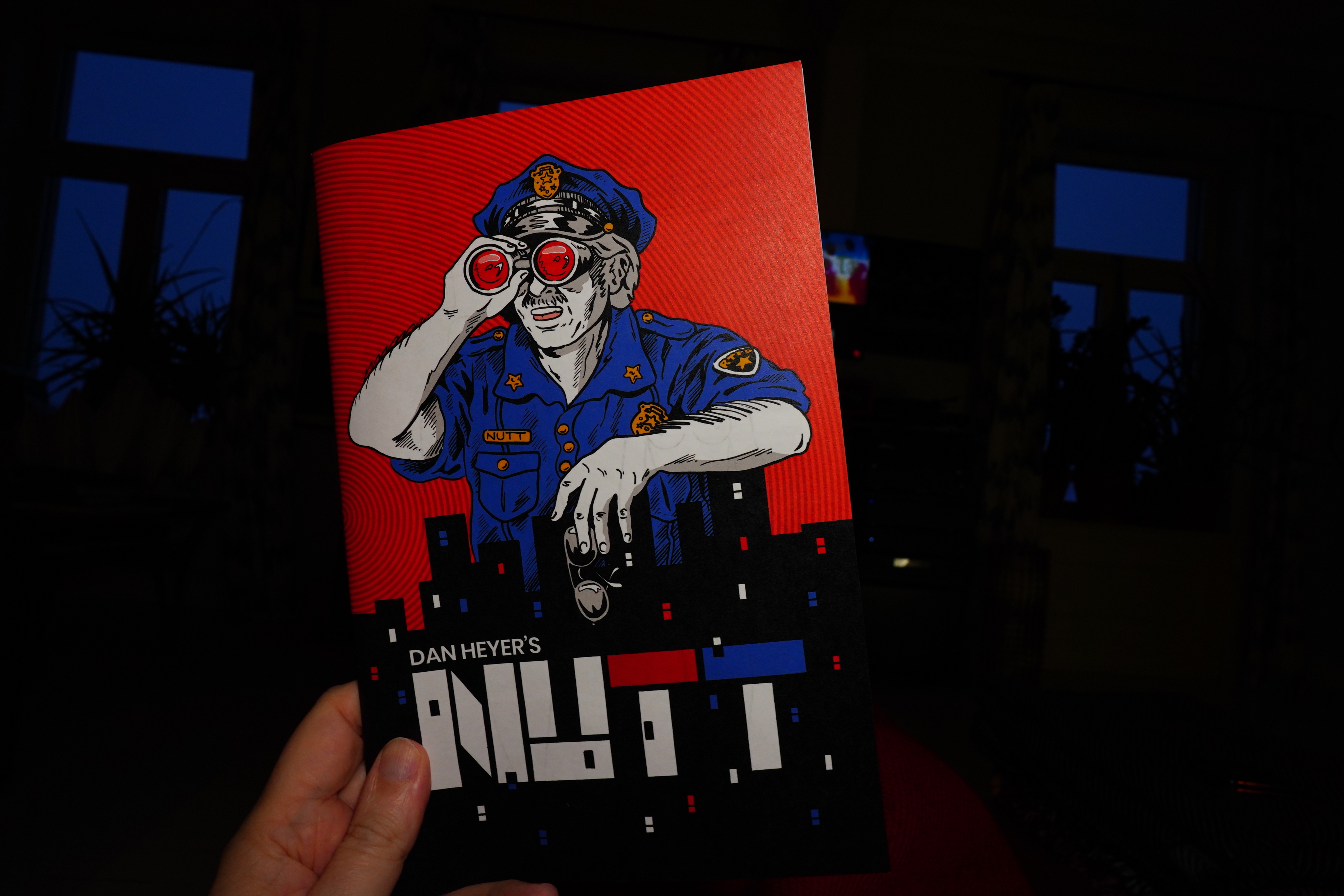
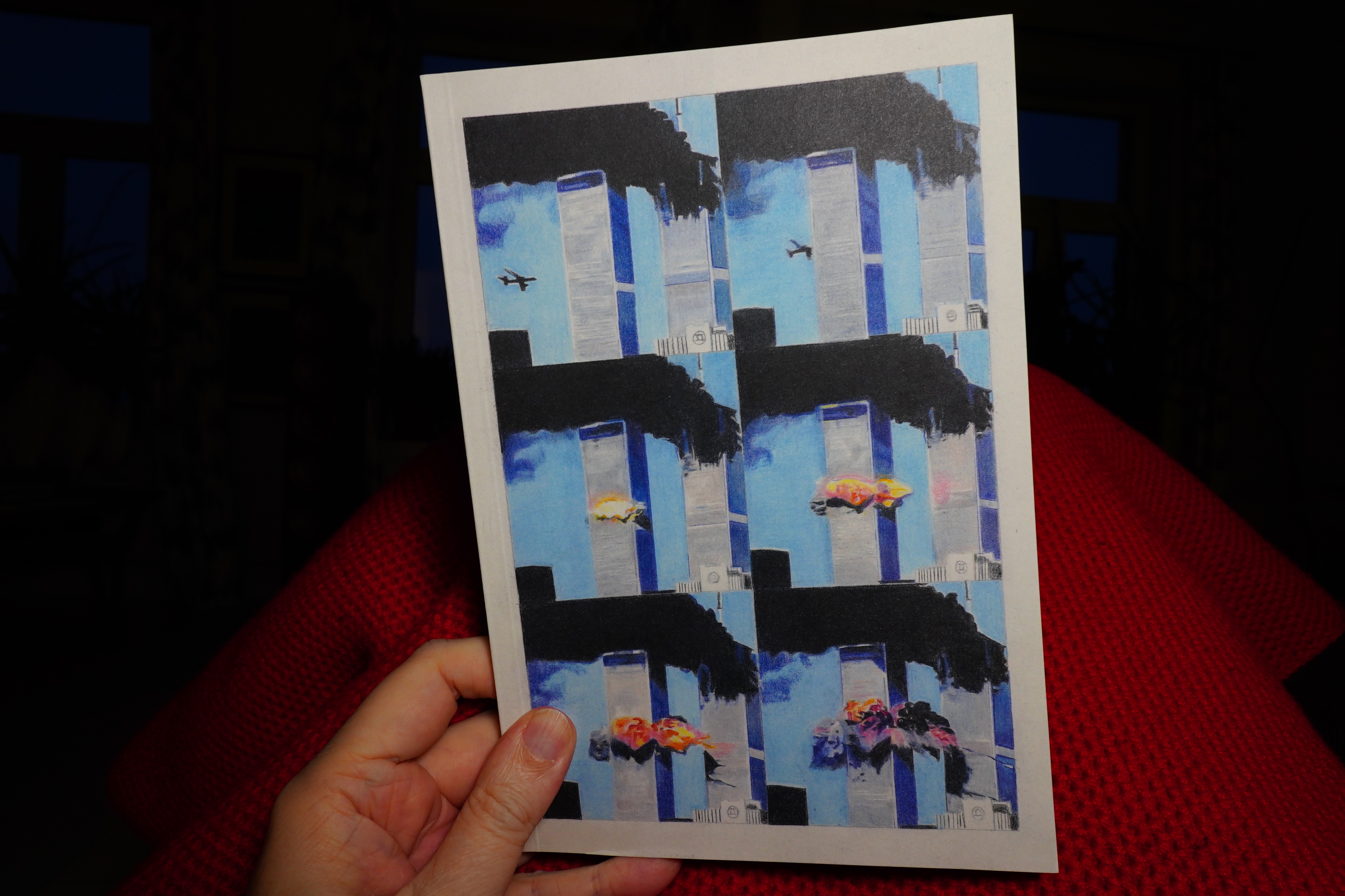
16:07: Nutt by Dan Heyer
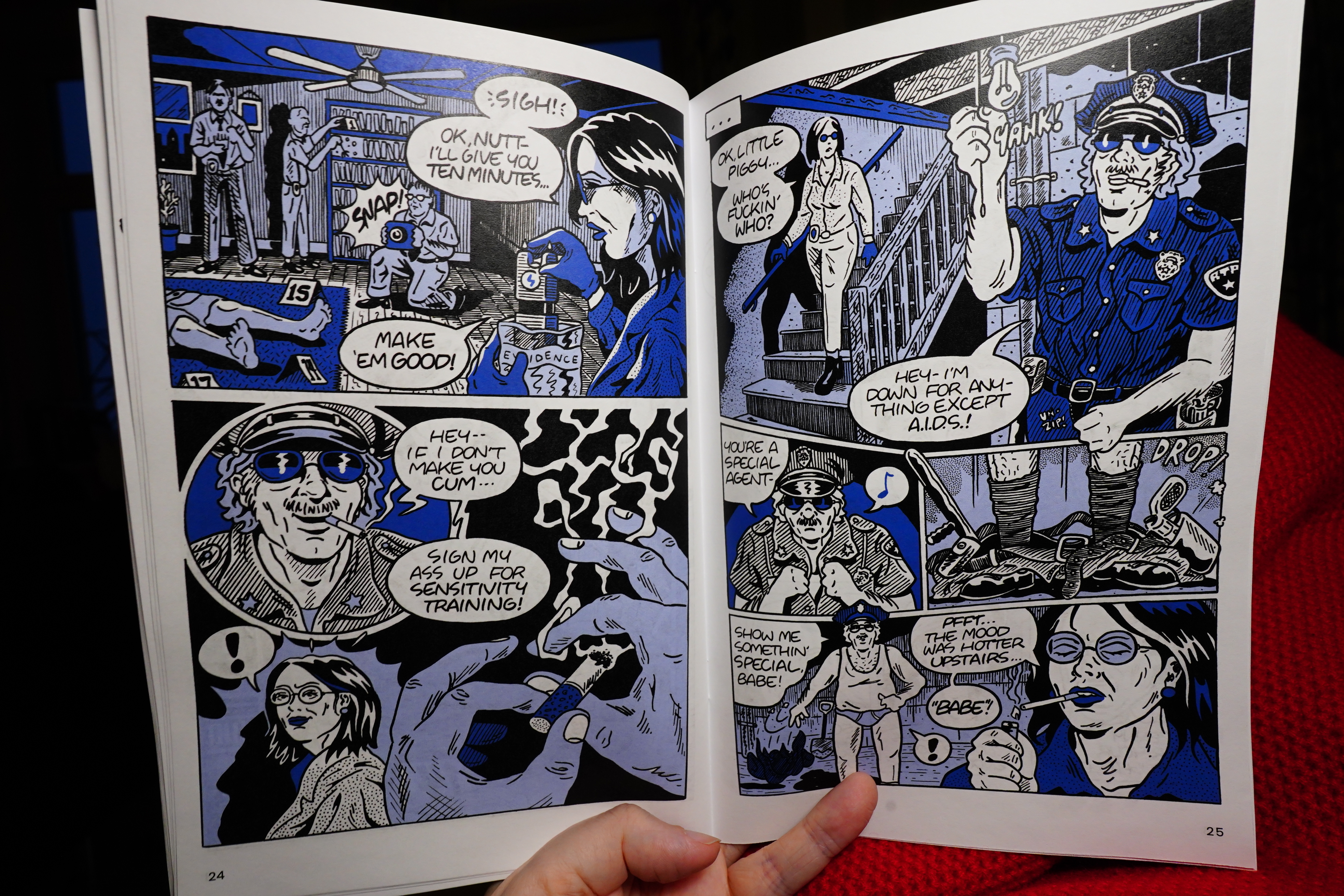
Since this is a family oriented blog, this was the only spread from this book I could snap — it’s a very rude book.
Pretty funny.
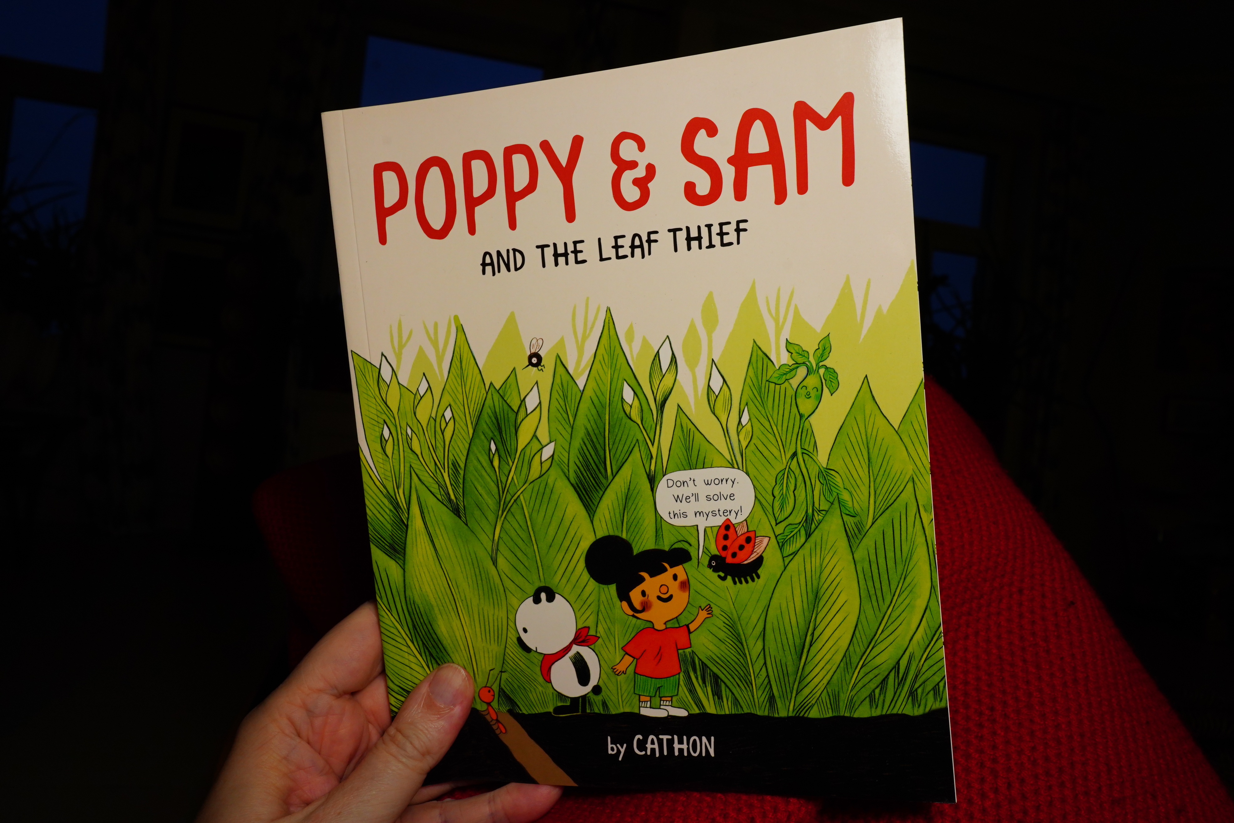
16:13: Poppy & Sam by Cathon (Owlkids)
Oh yeah, I bought all the books by Cathon I could find, because I liked her latest book so much…
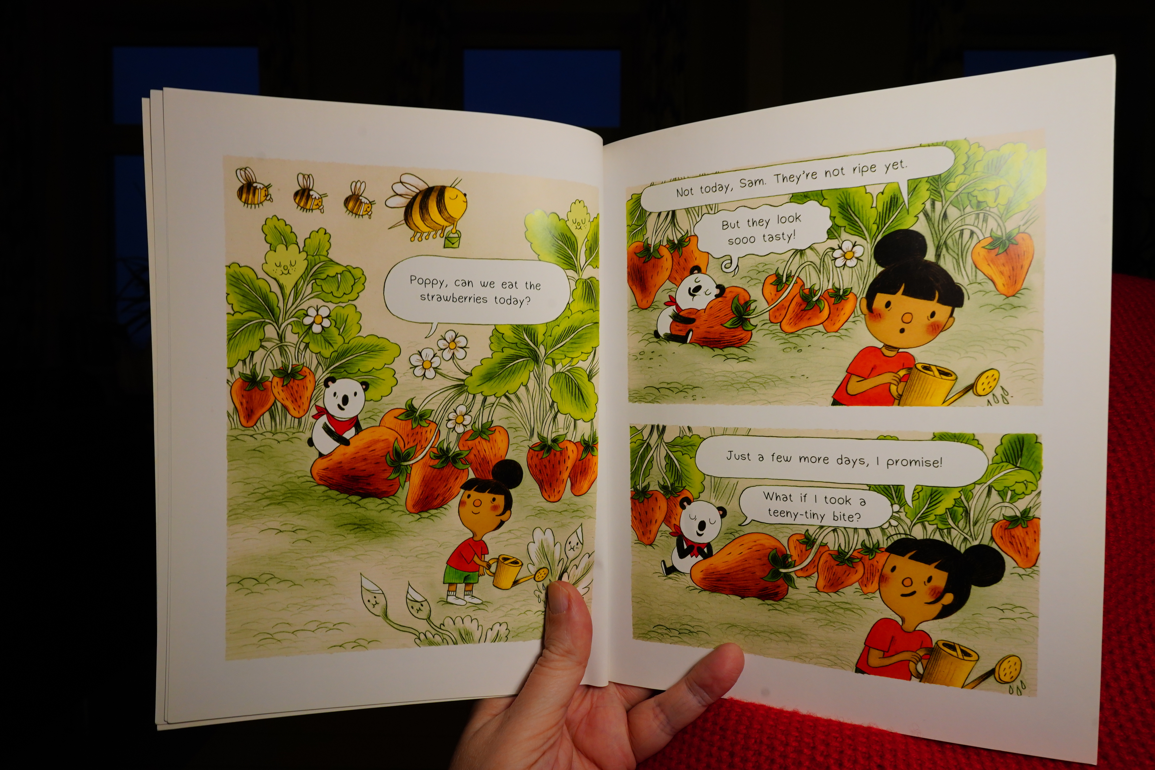
It’s cute.
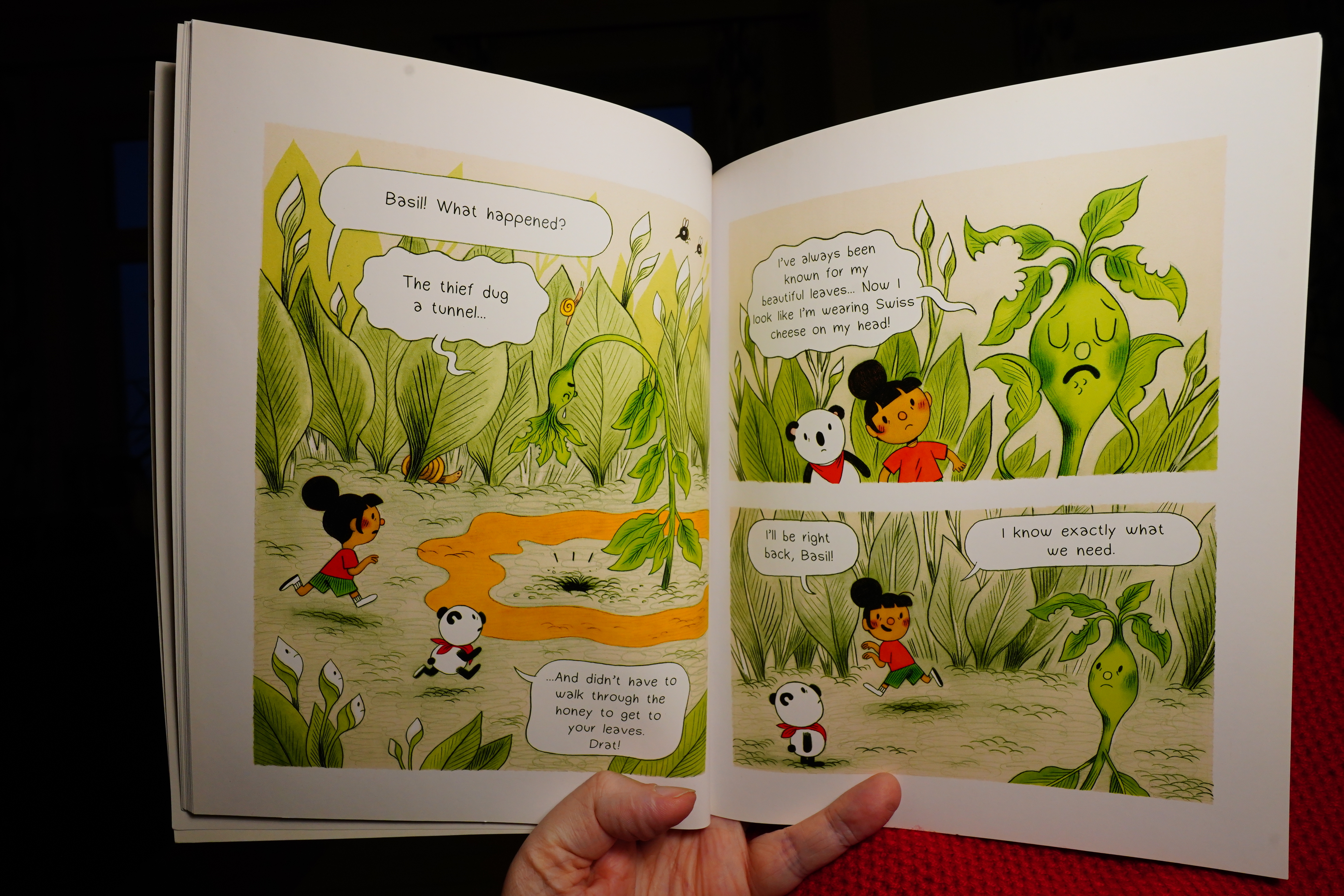
Poor Basil.
| Kissing the Pink: What Noise? |  |
16:17: Mirror Mirror 4 (2d cloud)
This anthology is full of fucked up stuff. It’s the most full-of-fucked-up-stuff anthology I’ve read ever.
And it’s apparently being published my regularly now? Three times a year? Yay.
There’s also reviews in here, but I didn’t actually read them. Sorry!
And some Japanese comics.
It’s an interesting book (the editorial texts, too), and I’m there for any further issues.
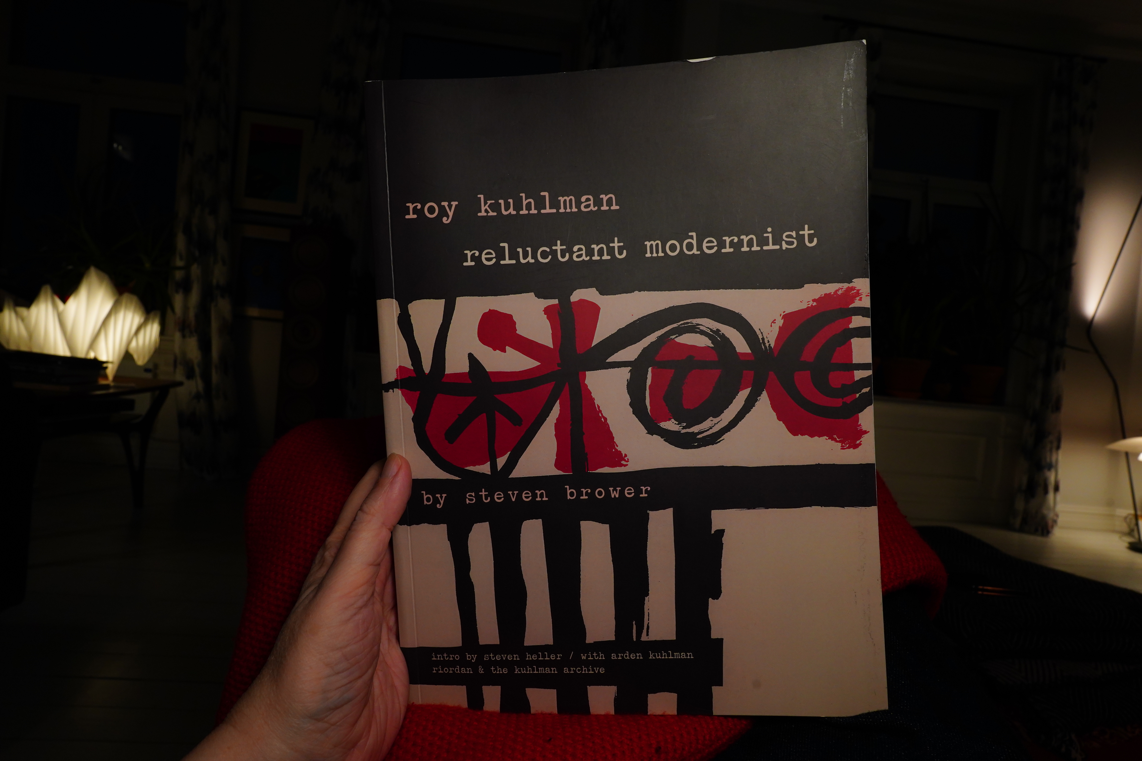
16:34: Roy Kuhlman: Reluctant Modernist by Steven Brower (Fantagraphics)
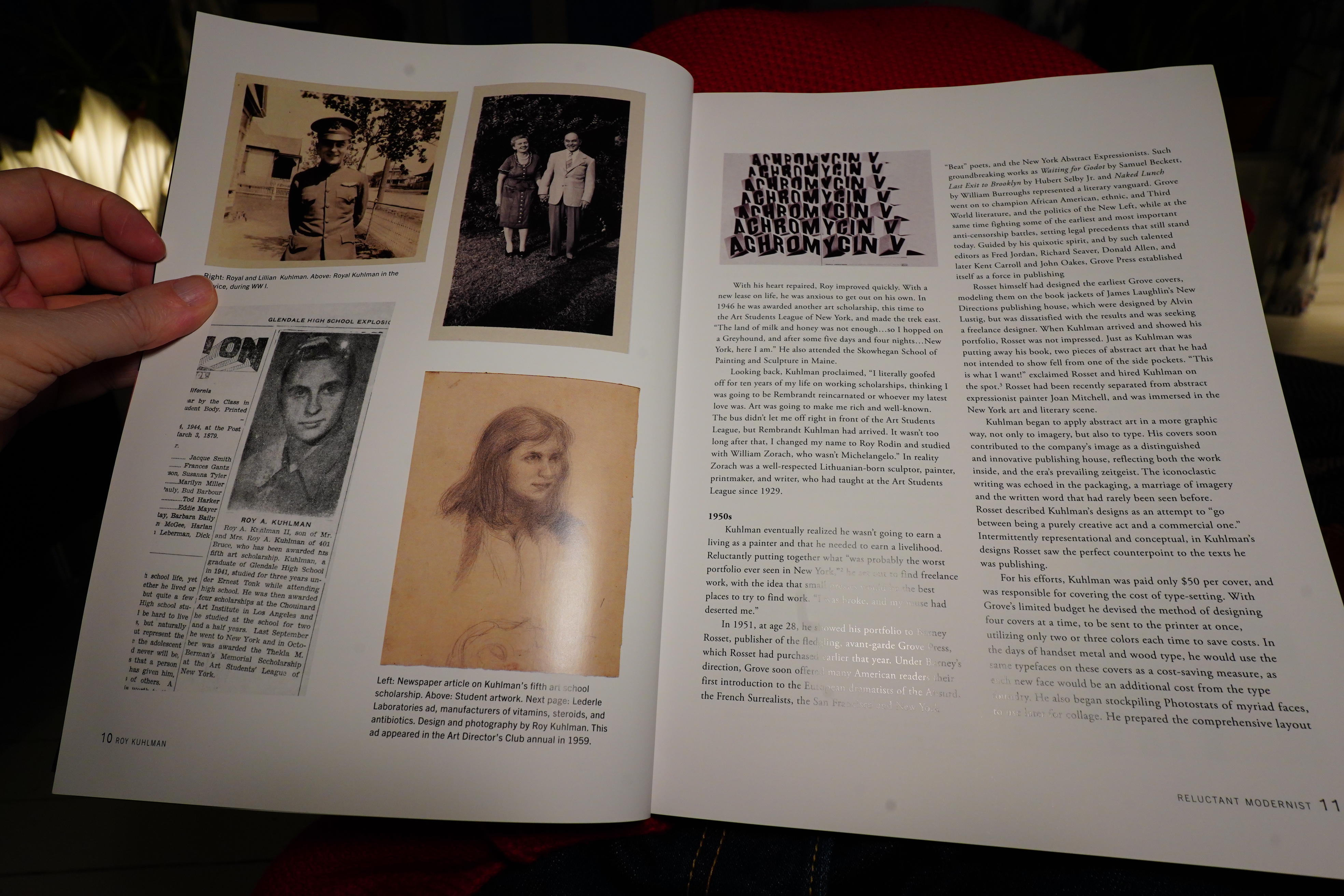
This has a long introduction (which, again, I didn’t read)…
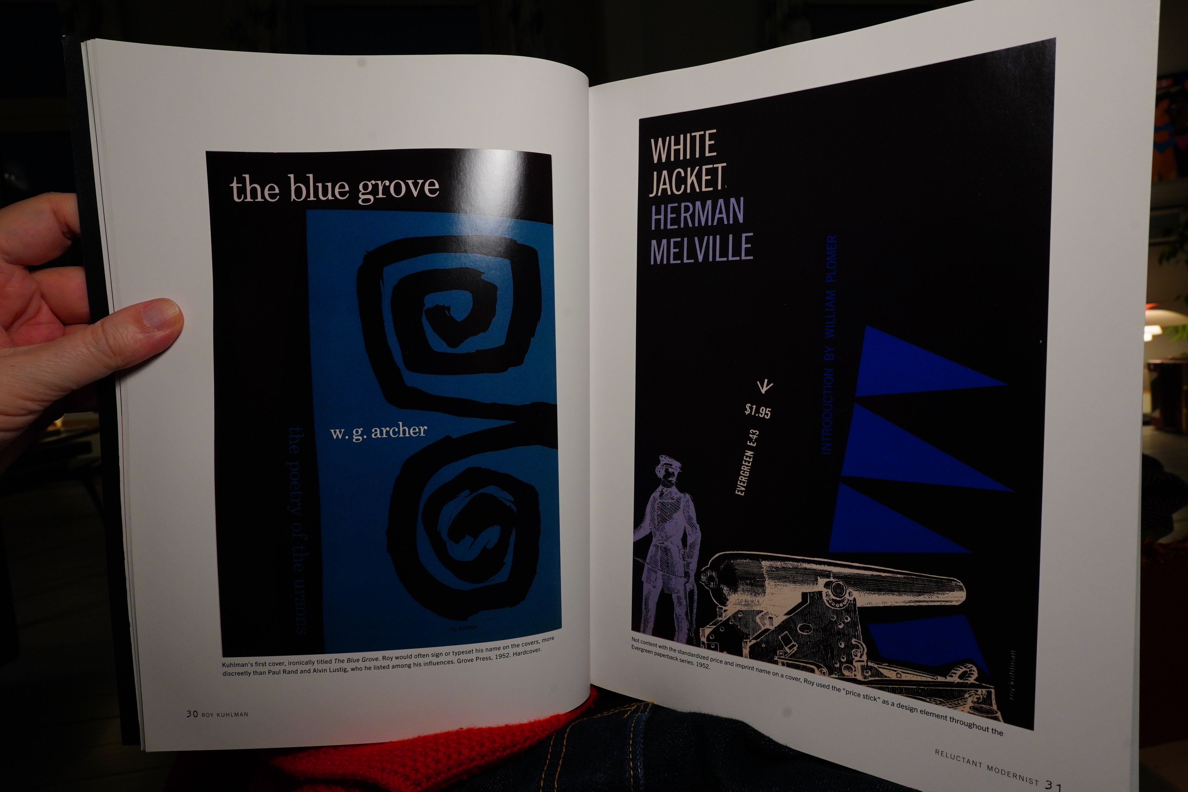
And then the rest of the book consists of reproductions of covers designed by this guy.
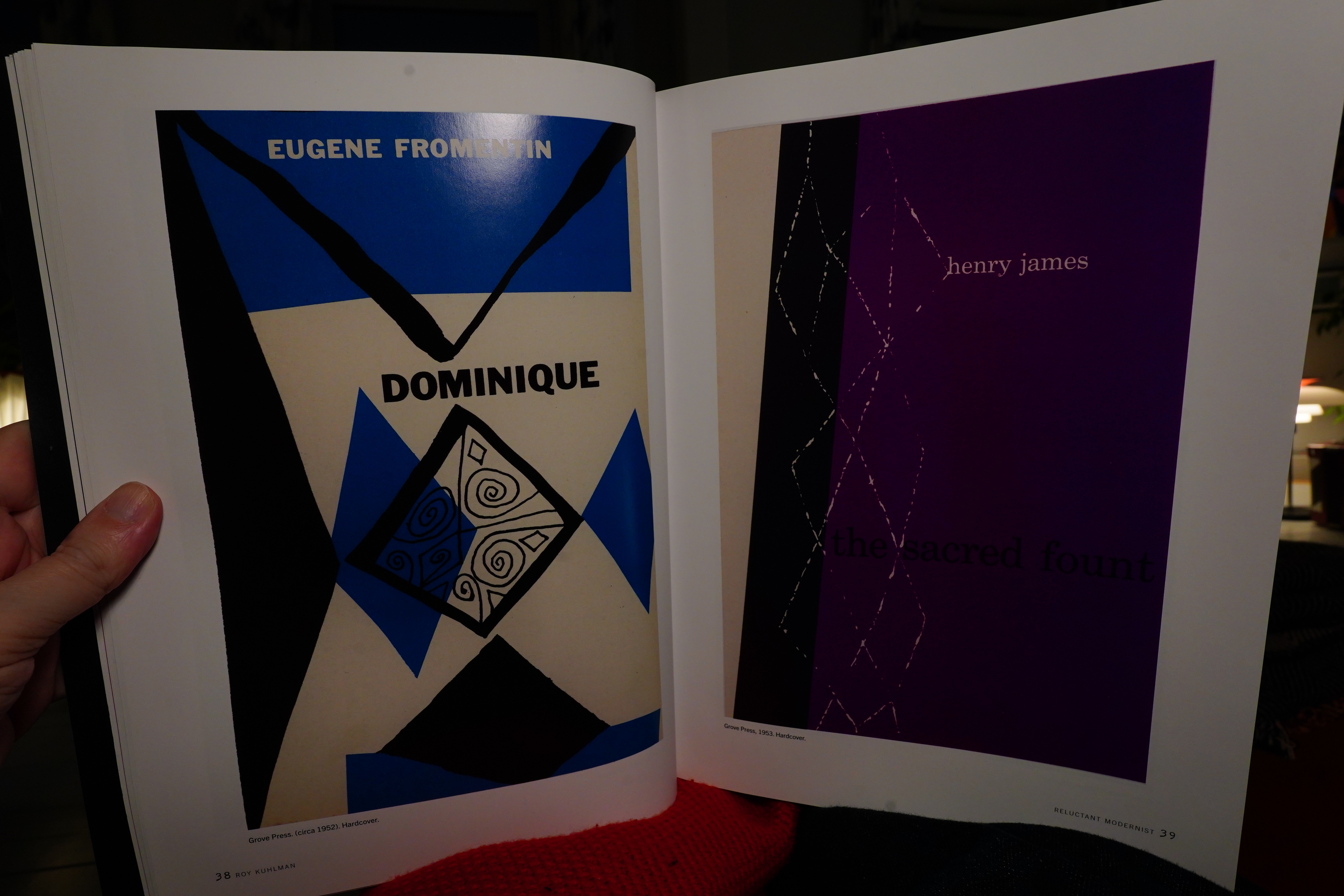
I’m not sure the format here is ideal — printing these covers this large, on the shiniest paper in existence, doesn’t really seem like the intended format. I mean, I really like these designs — but flipping through this book is underwhelming.
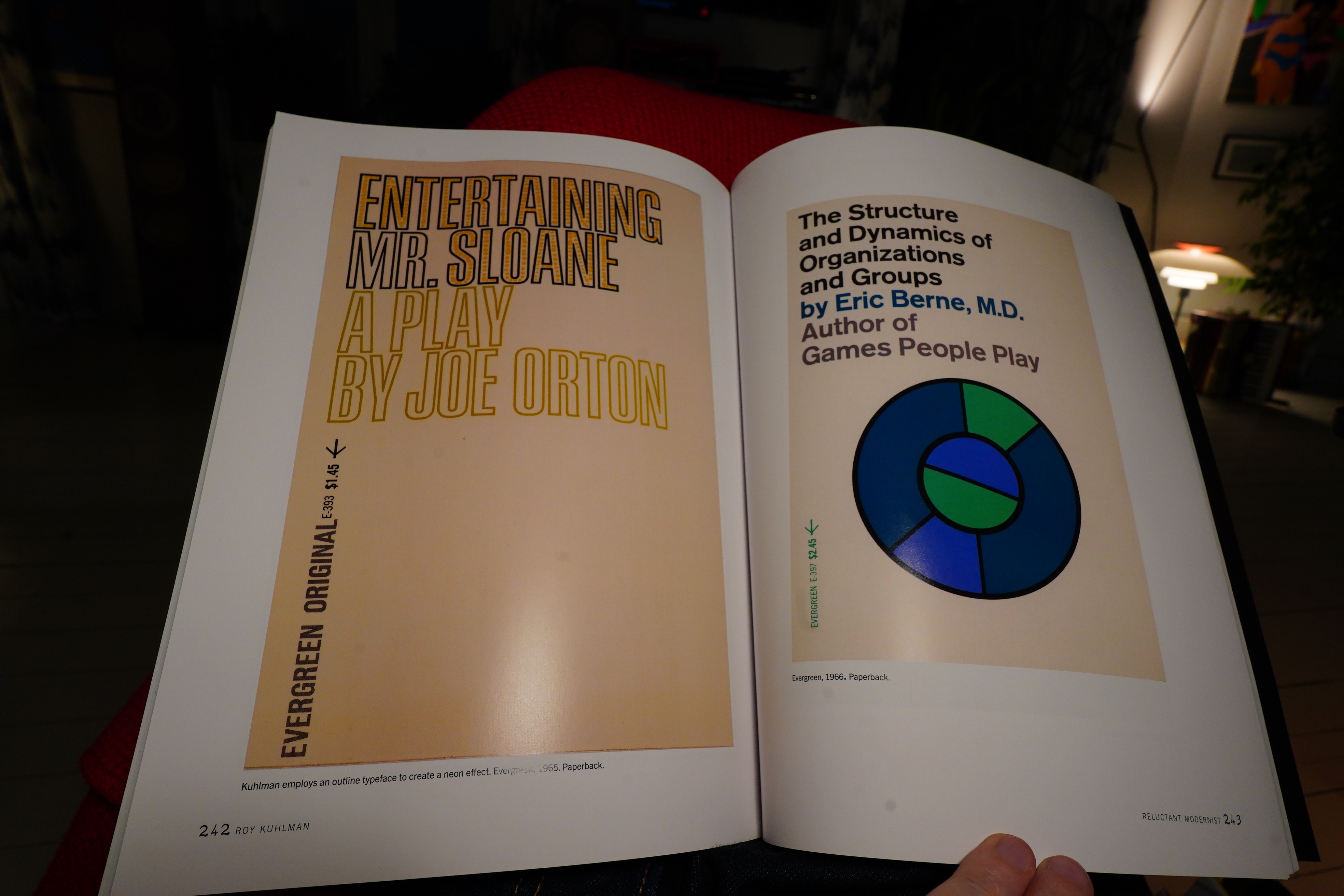
Some of the covers have terse commentary, but mostly not very interesting.
A very odd book, even for a design retrospective.
| King Crimson: Three of a Perfect Pair |  |
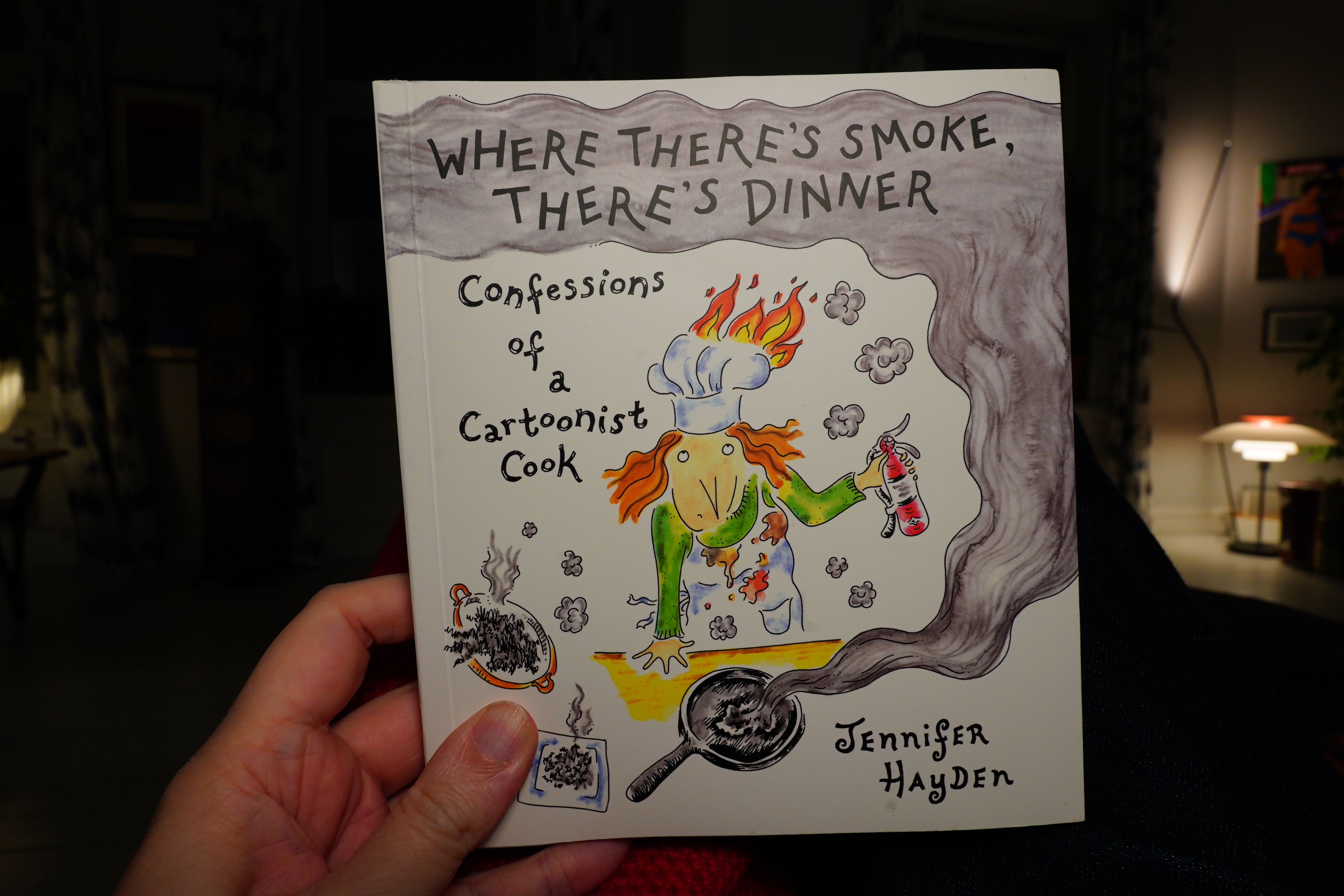
16:43: Where There’s Smoke, There’s Dinner by Jennifer Hayden (Top Shelf)
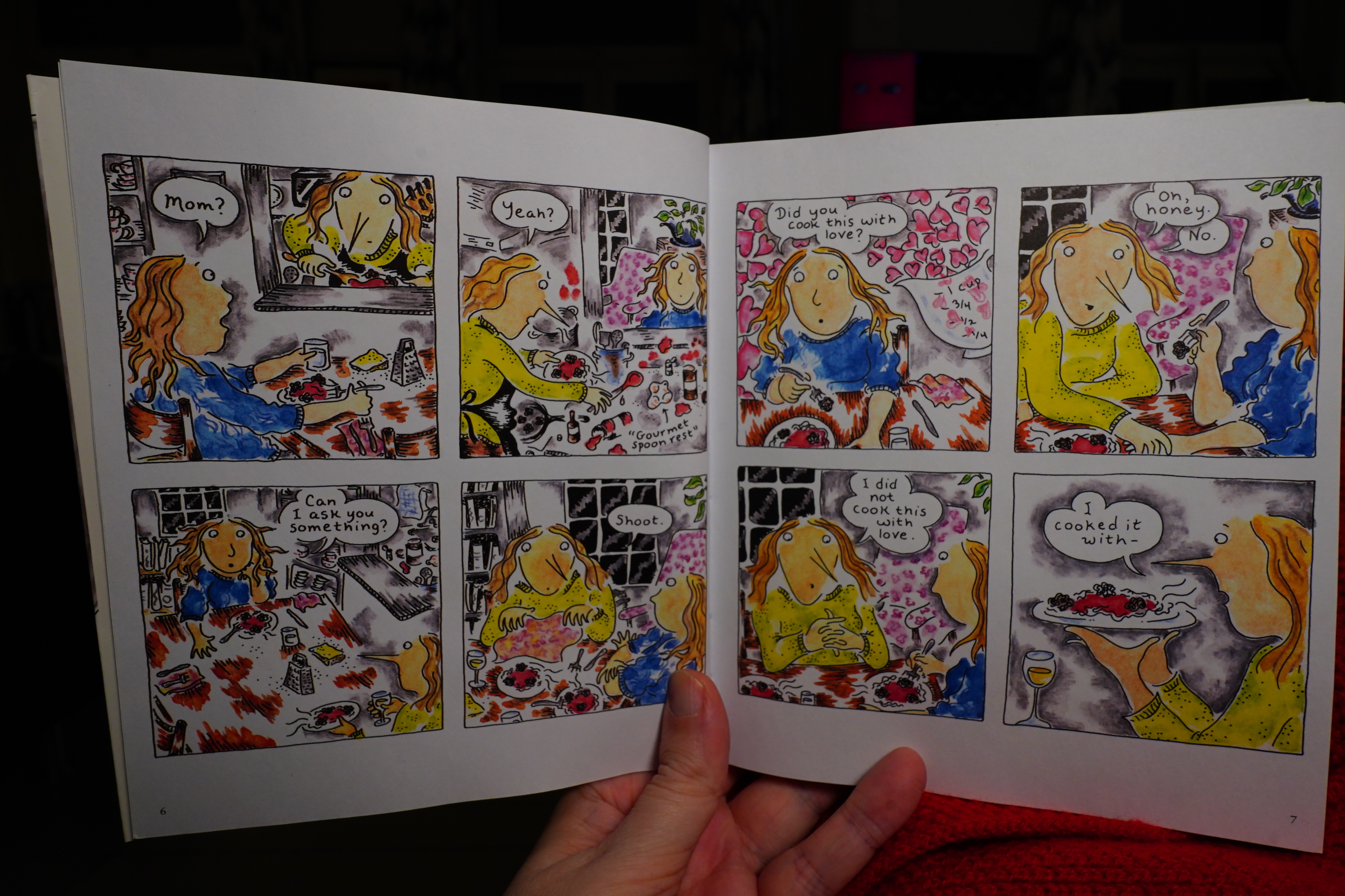
This is a really enjoyable read — it’s got a distracted vibe going on. It’s about making food.
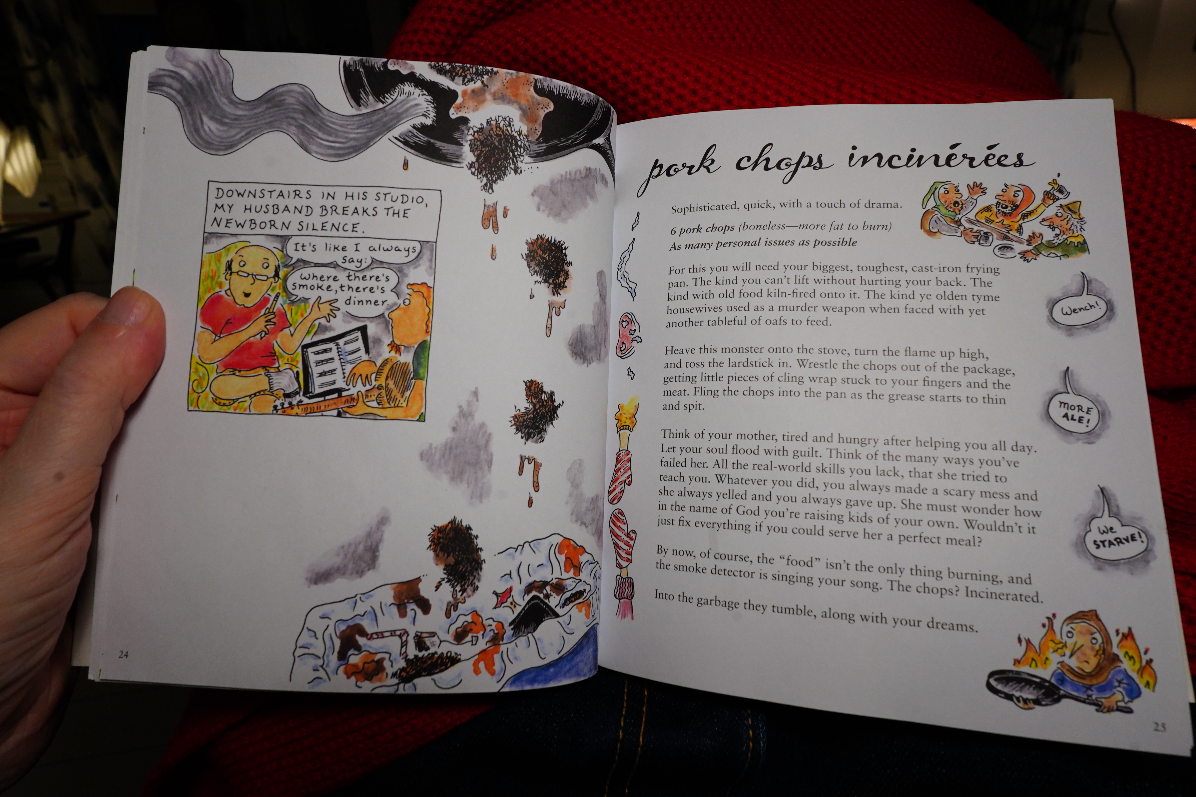
There’s recipes, too.
It’s really focused on the subject matter, but it’s got an amiable mood going on, which pairs well with the art style and the colours.
17:39: The End
And reading that has made me famished, so now I have to make dinner myself.