I haven’t really been doing my bug patrol thing this cycle, so I’m kinda surprised that I’m doing a blog post now. But the numbers speak for themselves: target achieved. So this has been virtually exclusively daily new bug reports and patches merged.
Oh, hi — for new readers, this is where I natter on a bit about what’s going on in Emacs development through the lens of spelunking through the Emacs bug tracker. But not actually any spelunking this time.
I’ve barely been involved with the most important thing that’s happened this cycle, except as a cheerleader. Namely:
EMACS NO LONGER CHOKES ON LONG LINES!!!1!
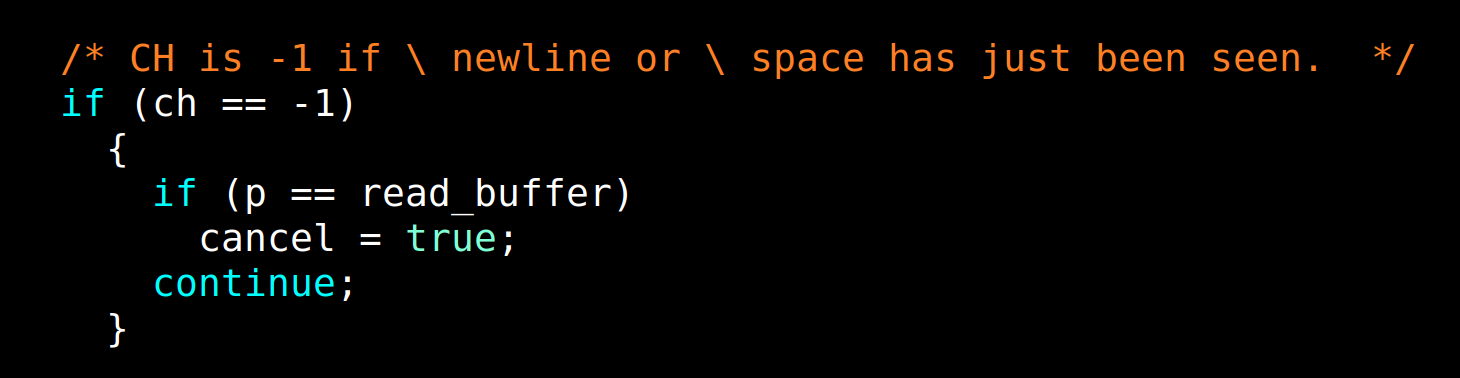
Gregory Heytings has developed a brand new, general approach to this tricky problem. The problem stems from how Emacs handles lines, basically: Many functions, like font-locking, run from redisplay, and wants to determine the syntax by looking at a line as (more or less) a unit. And that leads to Emacs hanging if the mode’s font-lock rules hasn’t been written in a careful manner, and they mostly haven’t.
When I’m talking about “long lines” here, I’m not talking about 120 columns or something, but files that have lines that are, say, 1MB long. This doesn’t happen in files people are normally editing, but in data dump files like JSON files, minified Javascript, XML, SQL database dumps and the like. Opening a file like that in Emacs 28 could make Emacs hang completely — and it happens during redisplay, so you can’t C-g out of it either. You just have to kill Emacs.
It’s the most embarrassing thing in Emacs, and that’s gone now. Thank you, Gregory.
Now, there’s still a bunch of details to be ironed out. The current approach sacrifices some font-locking accuracy (etc.) while displaying these humongous lines, and there’s ongoing discussion (and work happening by Gregory and Eli Zaretskii) to tweak bits in this area. So it’s a work in progress, but those inaccuracies are of a completely different magnitude than Emacs hanging on you if you happen to open some unfortunate file.
So what have I been doing? I’ve taken a couple of holidays and going to music festivals here and there. The result:
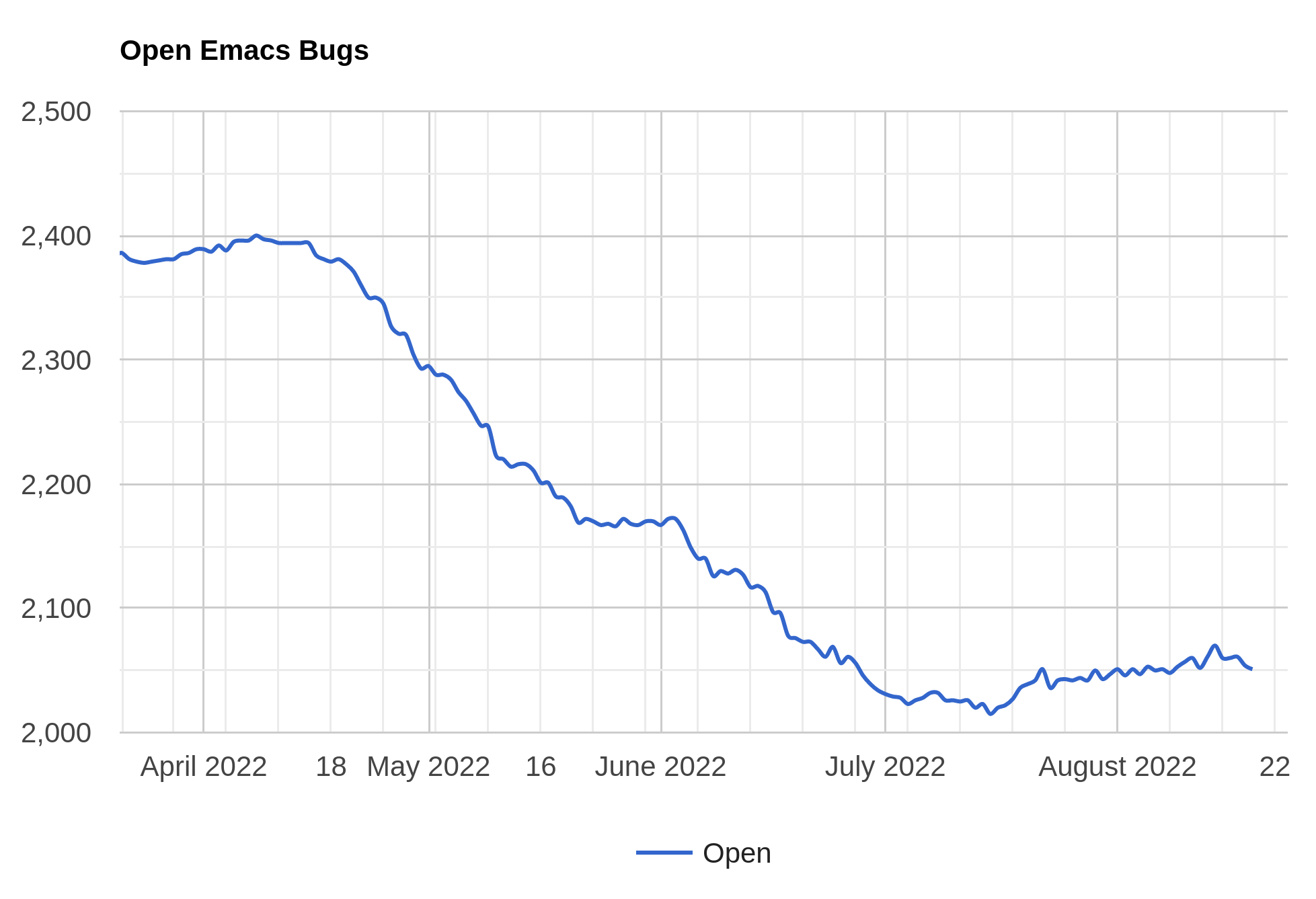
The number of open bugs has *gasp* increased! We started this cycle at 2028 open bugs, and we’re now at 2051 open bugs.
But I haven’t just been slacking off — what’s taken most of my time has been a fiddly build thing, which is probably not interesting to users, but should make maintenance in this area easier in the future.
It’s about how Emacs accesses doc strings from autoloaded functions. Previously, this was done by generating a DOC file by running a parser over the loaddefs.el files we had. This led to other weird hacks in the Emacs Lisp reader (!):
That is, you have to make sure you format the doc strings in loaddefs.el files in Just The Right Way, so that the Lisp reader could ignore them. This One Weird Trick has led to some head scratching from basically anybody trying to understand how this all ties together, and why some strings (during the Emacs build) would seemingly disappear magically.
This is a very, very old thing — probably three decades or more — and there’s always some trepidation when dealing with things that are connected in these magical ways, but all this magic is now gone, and the doc strings in loaddefs files are handled normally. (And the loaddefs files are now also byte-compiled, which is nice, because then the byte compiler can tell us when there’s something wonky in them. I’m all in favour of offloading tedious tasks to the computers. Sorry, future AI overlords; I’m sure that came off as anti computer chauvinism. Sorry! Don’t digitise me!)
But ensuring that altering this decades-old build system didn’t break anything took me weeks and a gazillion Emacs builds, so there wasn’t much time to work on other fun stuff, and there aren’t a lot of new user-visible features this time around. Just bug fixes.
Oh, yeah, I forgot that I also added a new mechanism for defining and theming icons. And that’s also a work in progress, but perhaps there’ll be more progress now that most of the music festivals are over…