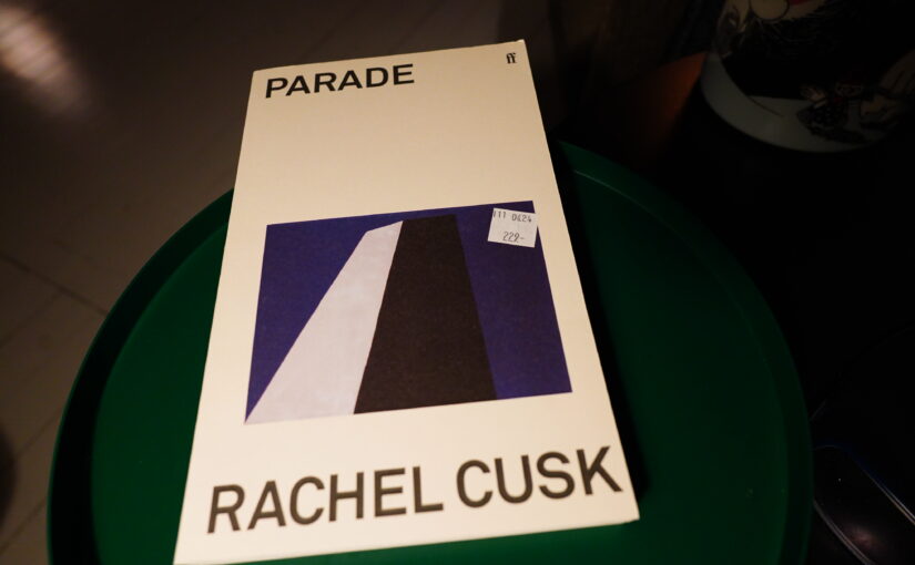
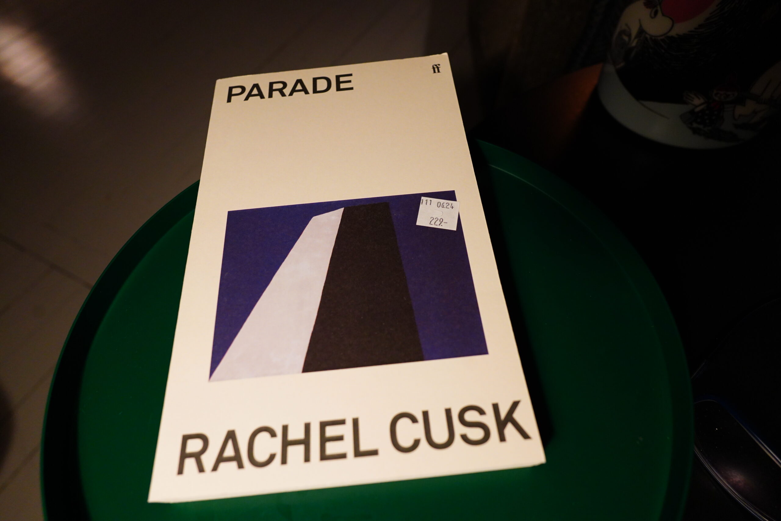
In the years after Rachel Cusk’s Outline books took the literary world by storm, book publishers tried to get in on the action (as is their wont) by giving all women authors basically the same design that Cusk uses on her books: One ambiguous, large image in the middle of a white page, with the name of the author and the short title (always a short title) set in a bold grotesque font.
(Exemplified above by Cusk’s latest book, which I bought yesterday. Looks nice, eh?)
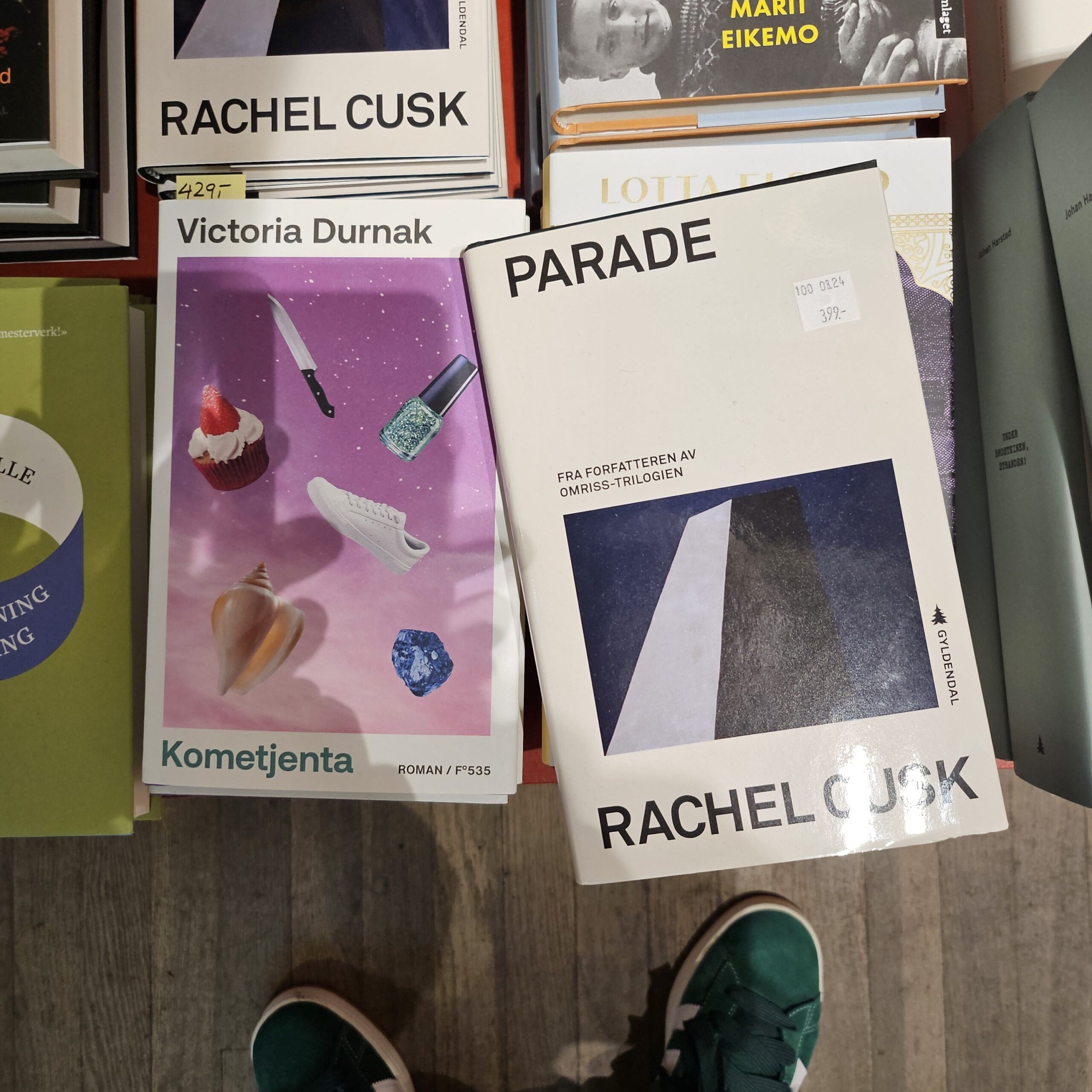
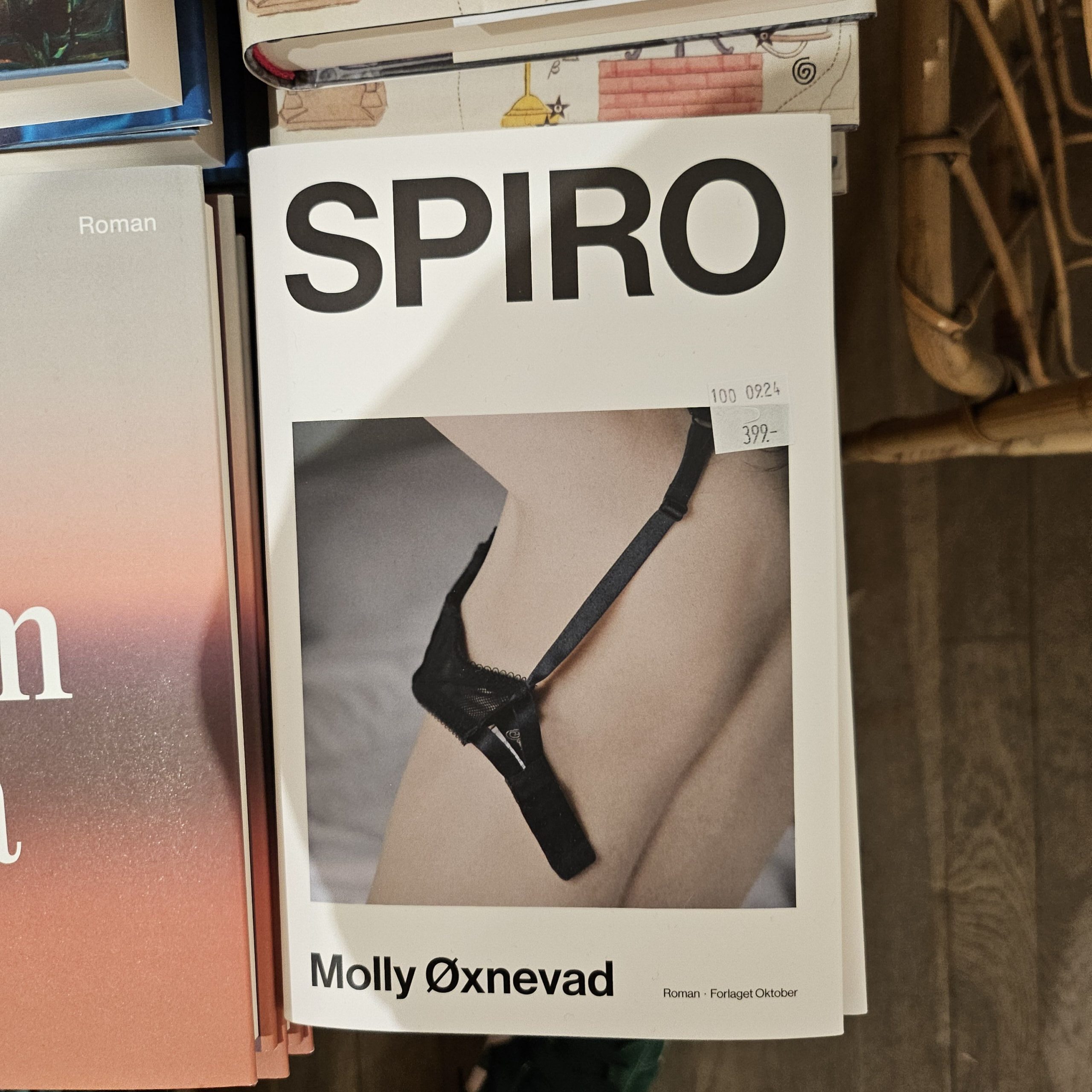
So while I was at the bookstore yesterday, I wanted to check whether this design was Totally Over Now (I mean, it’s been almost ten years now), and indeed.
Only two books using this template on the New Books shelf! It’s the fewest I’ve seen since it started, which means that it’s almost over, and Cusk can go back to having dibs on it very soon, I guess?


