

Just a scant handful of decades after XEmacs introduced a mode line with proportional fonts, we’re thinking about doing the same in Emacs.
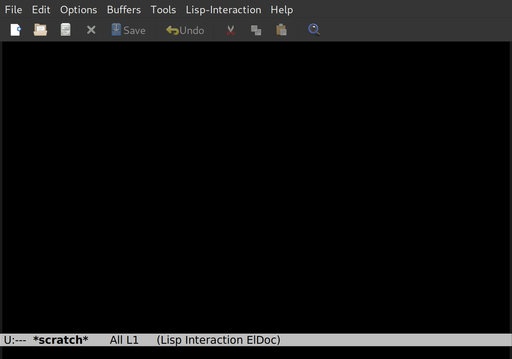
Here’s how the mode line looks (by default) in Emacs 28:

Here’s how we’re considering having it look (by default) in Emacs 29:

See? Huge difference. Huge.
The attractive thing about this change is that, well, it’s prettier, but it’s also more consistent with the other elements at the margins of the Emacs frame: The menus and the toolbar have used proportional fonts for a long time, so doing the same in the mode line might also be nice. And you can generally squeeze in more information when using proportional fonts, which is helpful if you’re jamming a lot of stuff into the mode line:
![]()

Changing this has been brought up a number of times over the years, but there’s been pushback because some of the elements in the mode line are pretty dynamic, and it’d suck if everything moved around. For instance, when displaying the column number in the mode line, it might be annoying to have the rest of the line shift to the left/right when moving the cursor around in the window.
So we’ve now added a new display spec (called ‘min-width’) today that you can slap around bits of text (and in the mode line) that ensures that the width never decreases beyond a certain point.
Perhaps that’ll make a difference in the level of resistance? I guess we’ll find out, because starting today, we’re doing a one month long test on “master”: This new mode line look is enabled by default now, and in a month we’ll evaluate based on feedback.
So give it a whirl for a few weeks, and vote on emacs-devel mailing list. (And report any glitches, of course. And suggestions for improvements are always welcome.)