

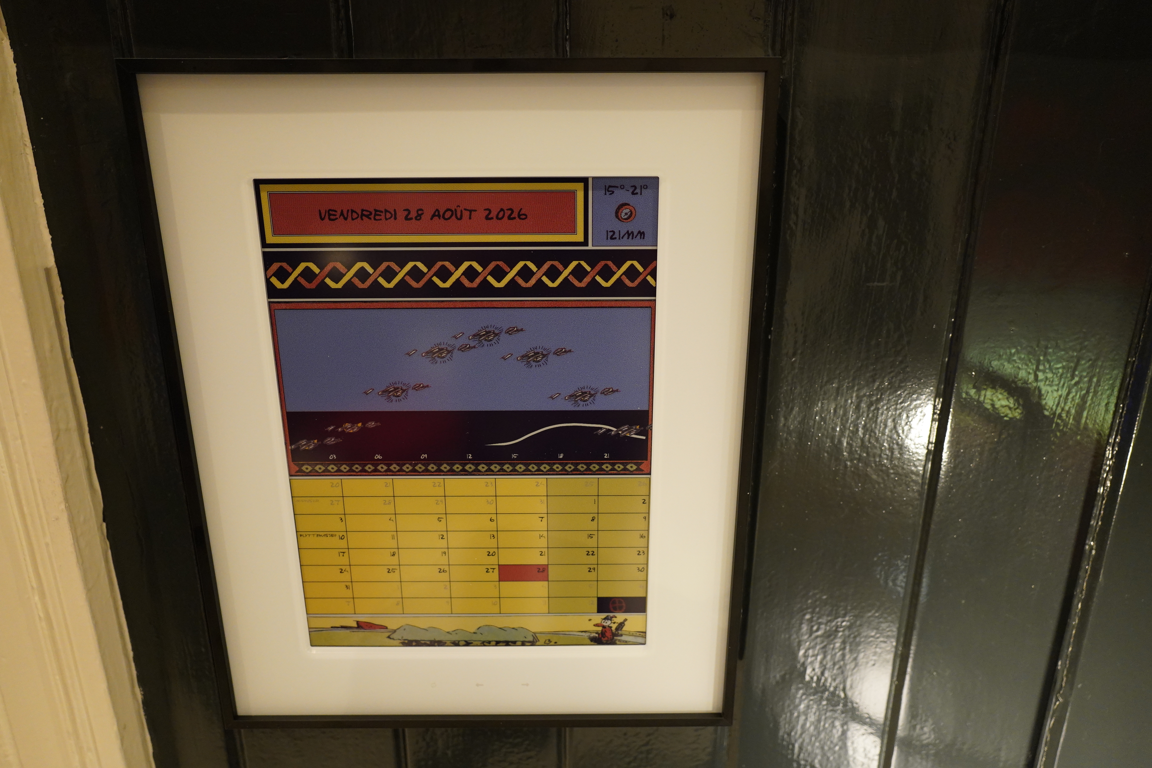
A couple months ago I bought a Reterminal E1004 epaper display which I was going to use to display (in my living room) the temperature and stuff… but then it turned out that the update cycle is so absolutely horrendous that it’s not something you can have on your wall if it’s going to update often.
And if you’re displaying the temperature and stuff, you’re going to want to have it update at least a few times an hour, so I had to ditch that plan.
But now what? The display is otherwise nice, so I had to find something to use it for… and the obvious thing (that doesn’t need to update more than once per day) is a calendar with a weather forecast.
That way, it can update by itself in the middle of the night when nobody sees it, hiding the shameful update cycle.
And so… time to write something to make a calendar, I guess?
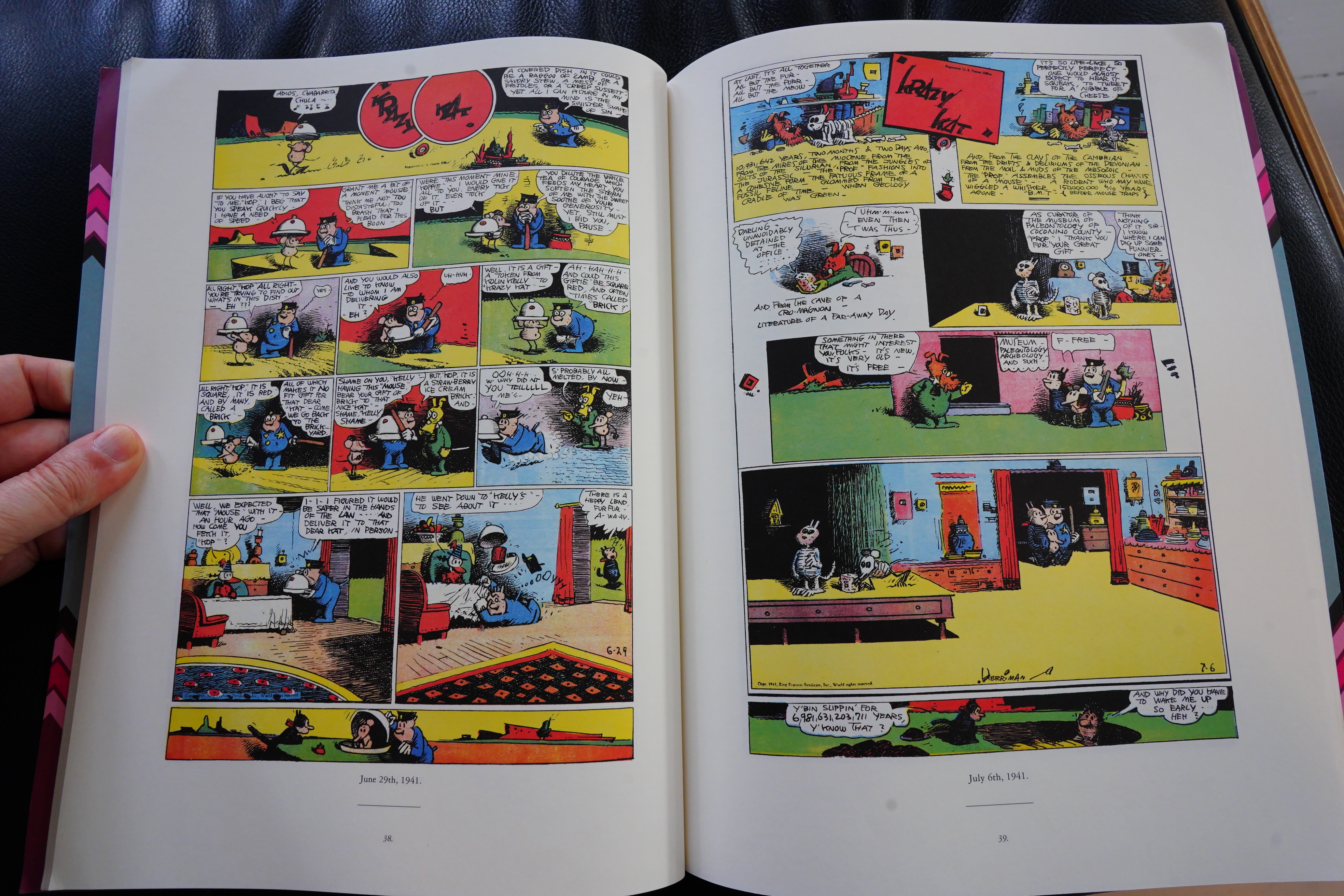
But what should it look like? Well, it’s an epaper display, so it looks a bit like a newspaper — and that made me think of George Herriman’s Krazy Kat, as one does. Could I take some design inspiration from that?
First of all — the colours look very appropriate for an epaper display — Herriman uses a limited palette with a few solid colours that work very well together.
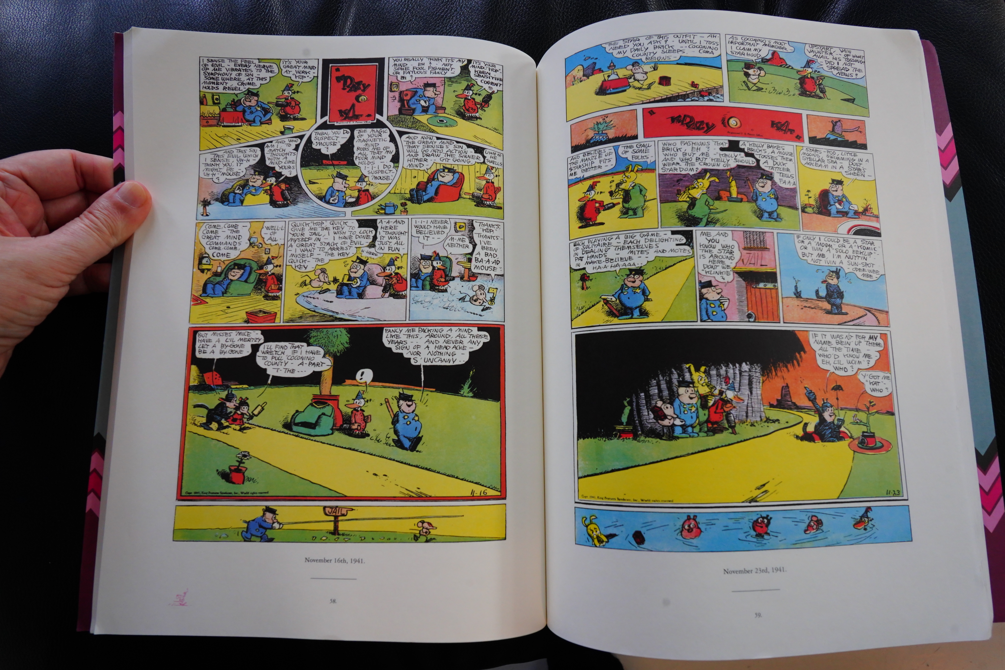
Also this panel arrangement — some smaller panels, and then some large full-width panels. Some random symbols here and there… And also quite a lot of solid black.
Also important is Herriman’s lettering — it’s very distinctive.
Which made me wonder whether anybody’s made a font inspired by him, and there’s something called Harriman — but…
That’s not bad at all, but it’s too whimsical, really — and Herriman isn’t whimsical, he’s magical. So I started wondering whether I could give some example pages to Fable and ask it to make a font for me. (Herriman’s work is in the public domain; relax.)
I tried something similar a year ago for an earlier project (I don’t remember what it was?), and the results were just pitiful — I ended up with a font that looked like a worse version of Comic Sans.
The horror!
But now? (I apologise in advance for subjecting you to LLM prose in the next two images; skip it if you’re sensitive to LLM writing.)
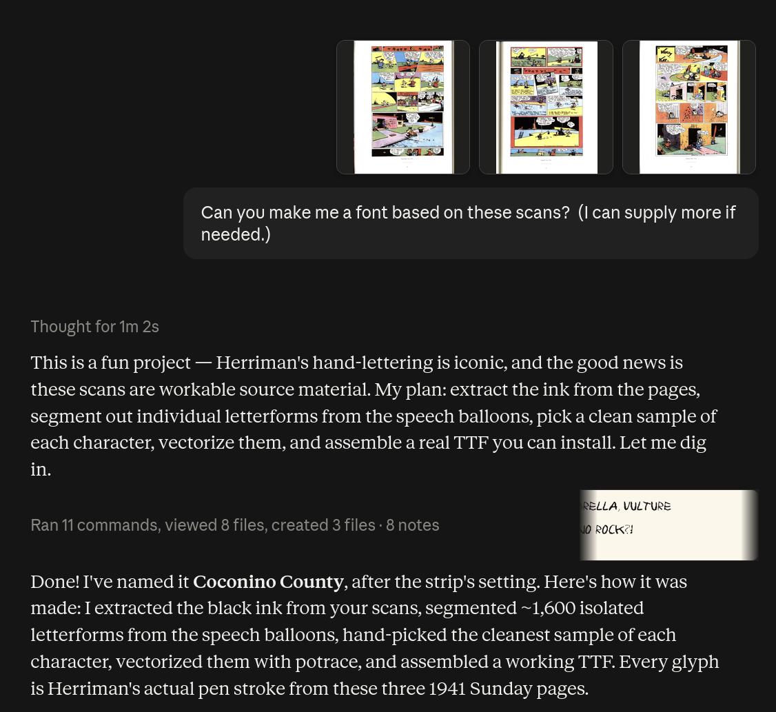
And it worked! First try and I had a workable font! I’m amaze! And:
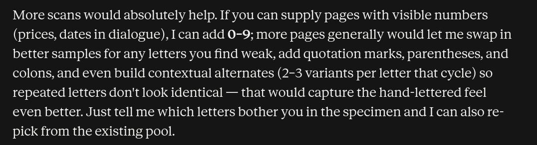
I have to say I was surprised that it suggested making contextual alternates — I’ve read so many comics with computer lettering that have no contextual alternates, so whenever you have the same letter appearing several times, the repetition of the identical form stands out like a sore thumb.
So after a few more iterations where it added this and also diacritics, I now have:
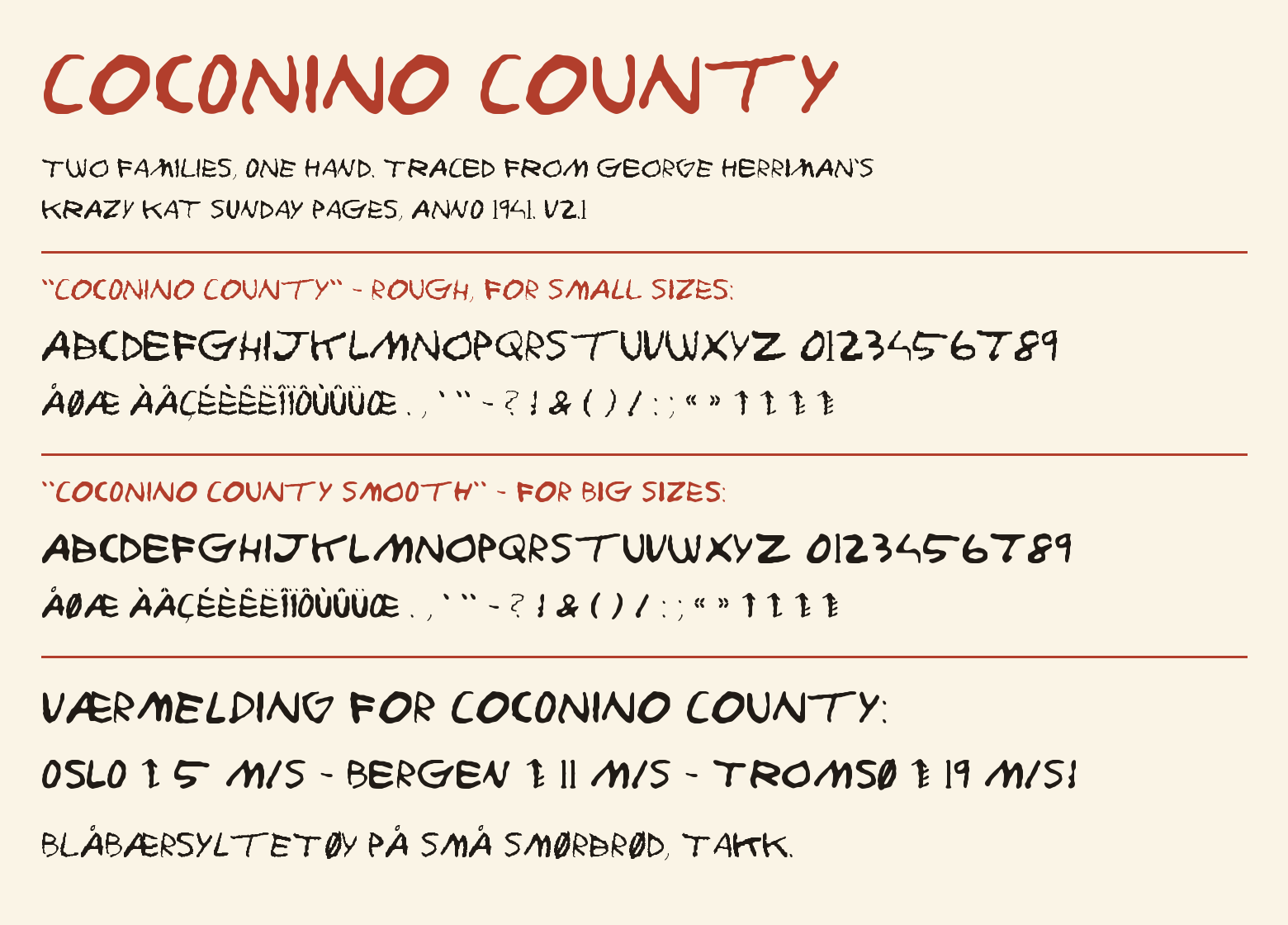
The future is here, old man!
I’ve put the resulting Cononino County TTF font set on Microsoft Github.
Getting a custom font designed for a silly hobby project like this would have been unthinkable just a couple of years ago. I’m not quite sure what this cost me, because Anthropic wisely doesn’t have a “show how much this session cost” button anywhere, but I guesstimate that it cost me around $40. So that’s expensive, but not insane? I mean, it’s insane, but on a Me Scale, that’s practically being sensible.
Anyway! Now that I have some design parameters, I just have to decide what to display. I’m thinking… weather forecast? And a calendar — I can download what’s in my Google Calendar and put that in there, too?
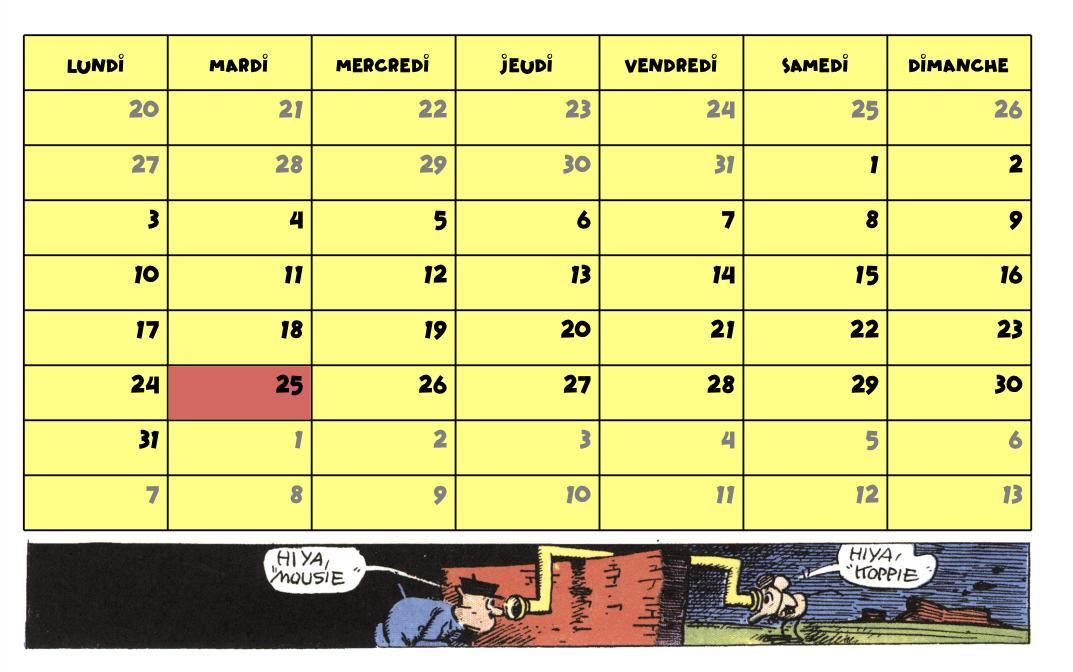
After programming for a day, I then had some (in Emacs Lisp, of course) code to output this:
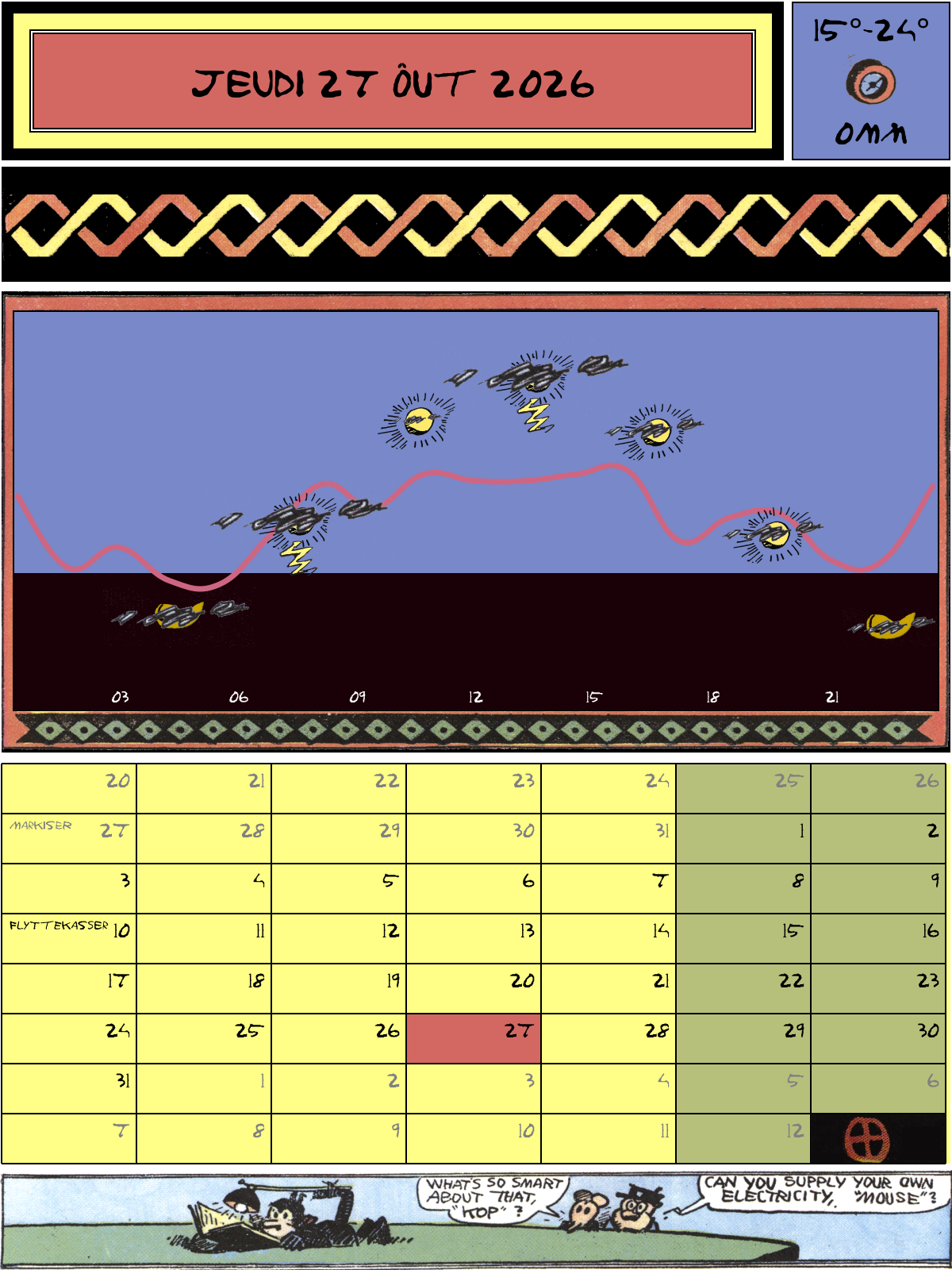
Yes! This is going to work! I also included one random Krazy Kat panel — on the Sunday pages, the final panel is almost always a page-spanning horizontal panel (that usually stands on its own), so I had Claude write a script to extract that from them.
But there’s so much weather data that I could put on here, but what is it that I care about? Well, I want to know whether it’s going to rain. That’s the most important thing, so that’s that snakey line — how high it is how much it’s going to rain. And also thunder and lightening might be nice to know… And how cloudy it is? Sure. And how high the sun is in the sky? Yeah, sure. But that’s it! No wind, no humidity, no pressure. I don’t really care about those…
The epaper display needs a dithered paletted version that maps to its colours, so that’s:
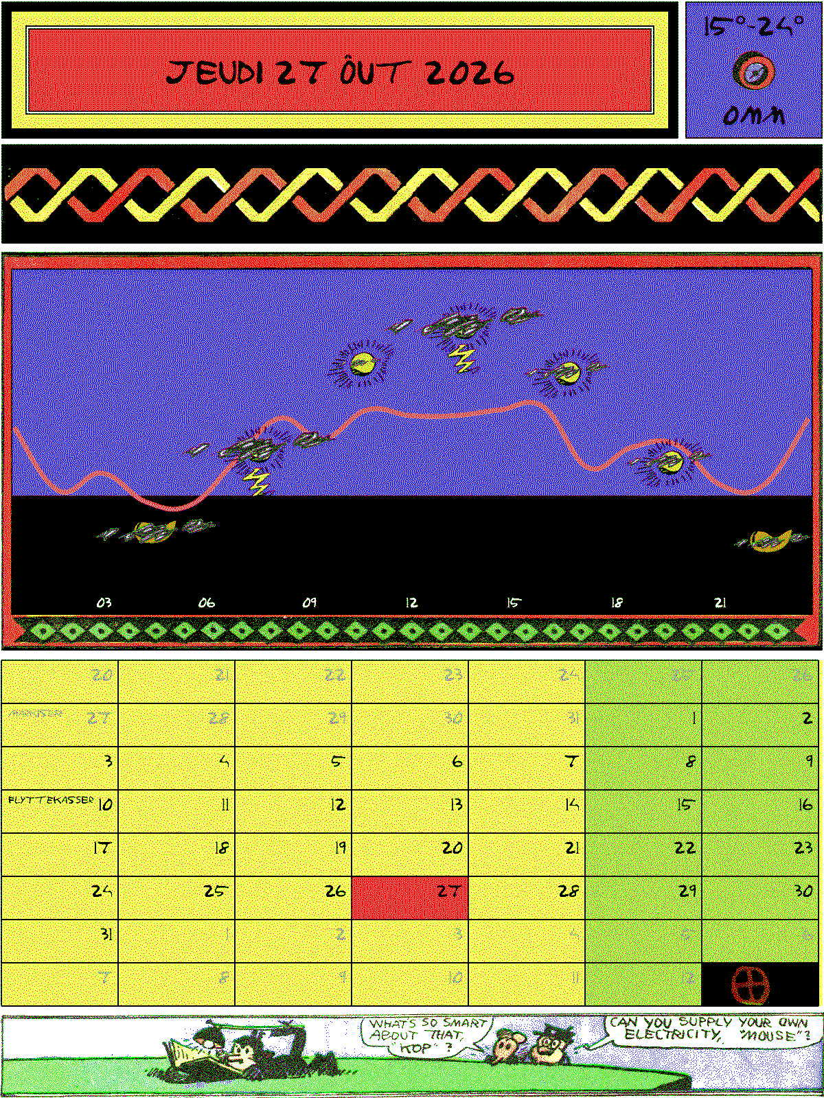
*gulp* The resulting PNG looks pretty horrible, eh? But:
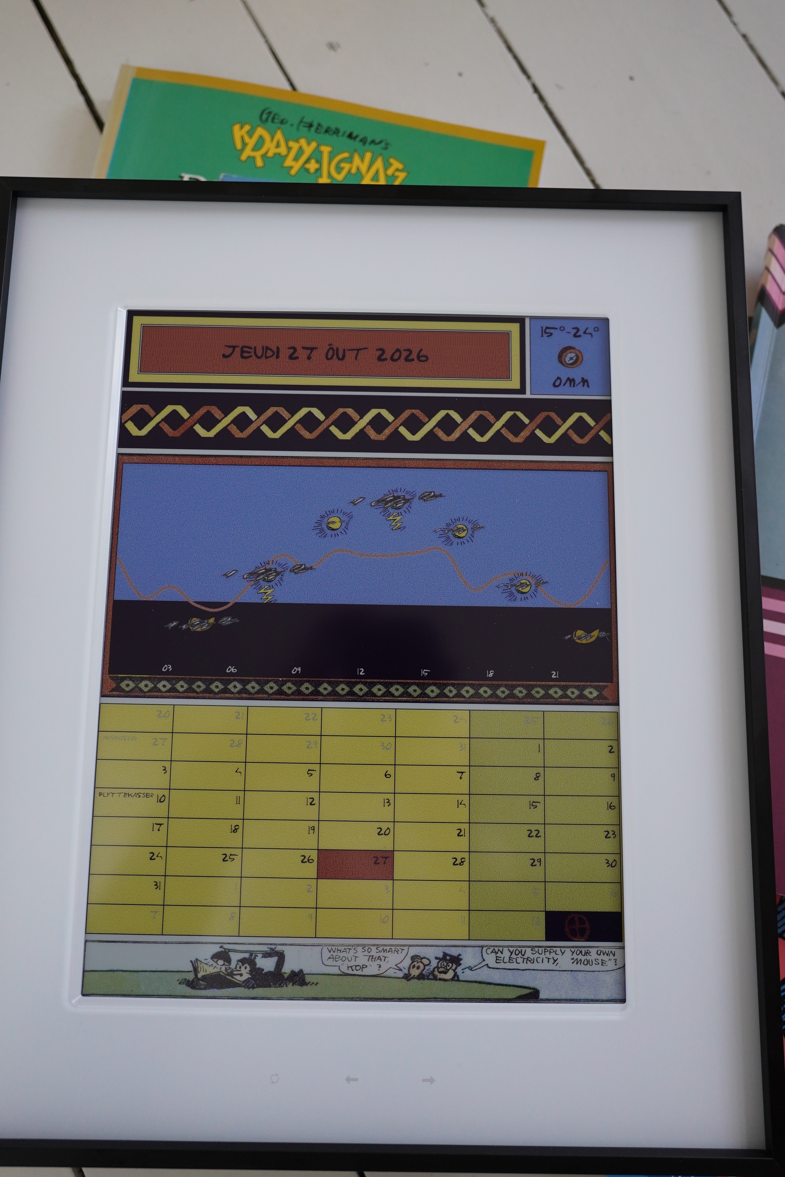
On the epaper display, it looks quite nice? Trust the algorithm!
So what does it look like when it changes between two images:
Yeah, just horrible. But the calendar just needs to change once per day, and it can do that in the middle of the night, when nobody’s around to see it and possibly get their epilepsy triggered. I hope! I apologise in advance to any thieves in the night with epilepsy that plan on robbing me! Ya brought it on yerselves!
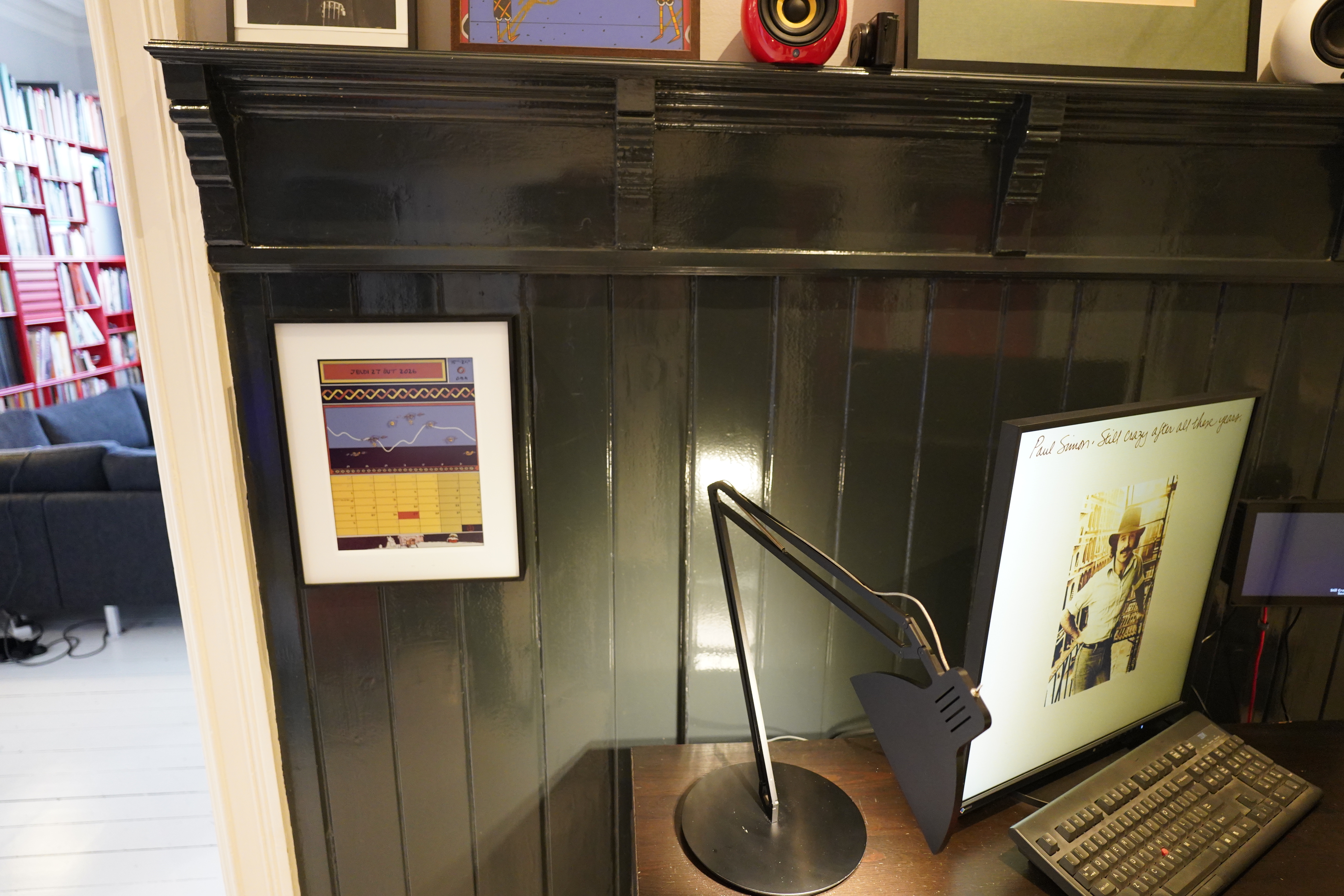
Since it’s refreshing the display only once per day, the battery in this is supposed to last for half a year. And it looks kinda magical on the wall there without any wires going to it, eh?
I’m not really much of a calendar guy. Even though I’m really forgetful, I couldn’t get myself to start using it until a couple years ago. Even now, I kinda only resentfully enter things into it. So I only do that for the absolutely totally necessary stuff. So my calendar is basically pretty empty.
Much of that is because I… just don’t like being organised. But another thing is that the Google Calendar (which I’m using) interface is just so … much work.
Hm. Perhaps I can make something that’s less work? And now that I’m actually displaying the calendar, perhaps that’ll make me actually put stuff on my calendar? Hm… I guess that’s possible…
I foresee some more programming coming up…