Watching Twitter melt down is fun. I never liked Twitter, because it encourages the absolute worst behaviour in people.
So having a petulant billionaire buy the whole thing to own the libs, I mean, to ensure free speech (and then throw all journalists criticising him off Twitter) while his fans explain his 4D chess is really entertaining: Twitter was a horrible hell site, and now it’s getting even worse. Fights are more amusing to watch when there’s bad people on both sides.
On the other hand, there are some good jokes on twitter sometimes:
So perhaps Twitter is good? A site that generates good jokes can’t be all bad.
I’m not really “on” Twitter myself, but I auto-post links from mah blogs there. As it’s clear that Twitter is going away (i.e., either it turns into 4chan, or Musk’ll just petulantly press the off button one day when he’s gotten tired of people being oh-so-rude to him), I thought it might be nice to check out that Mastodon thing for this?
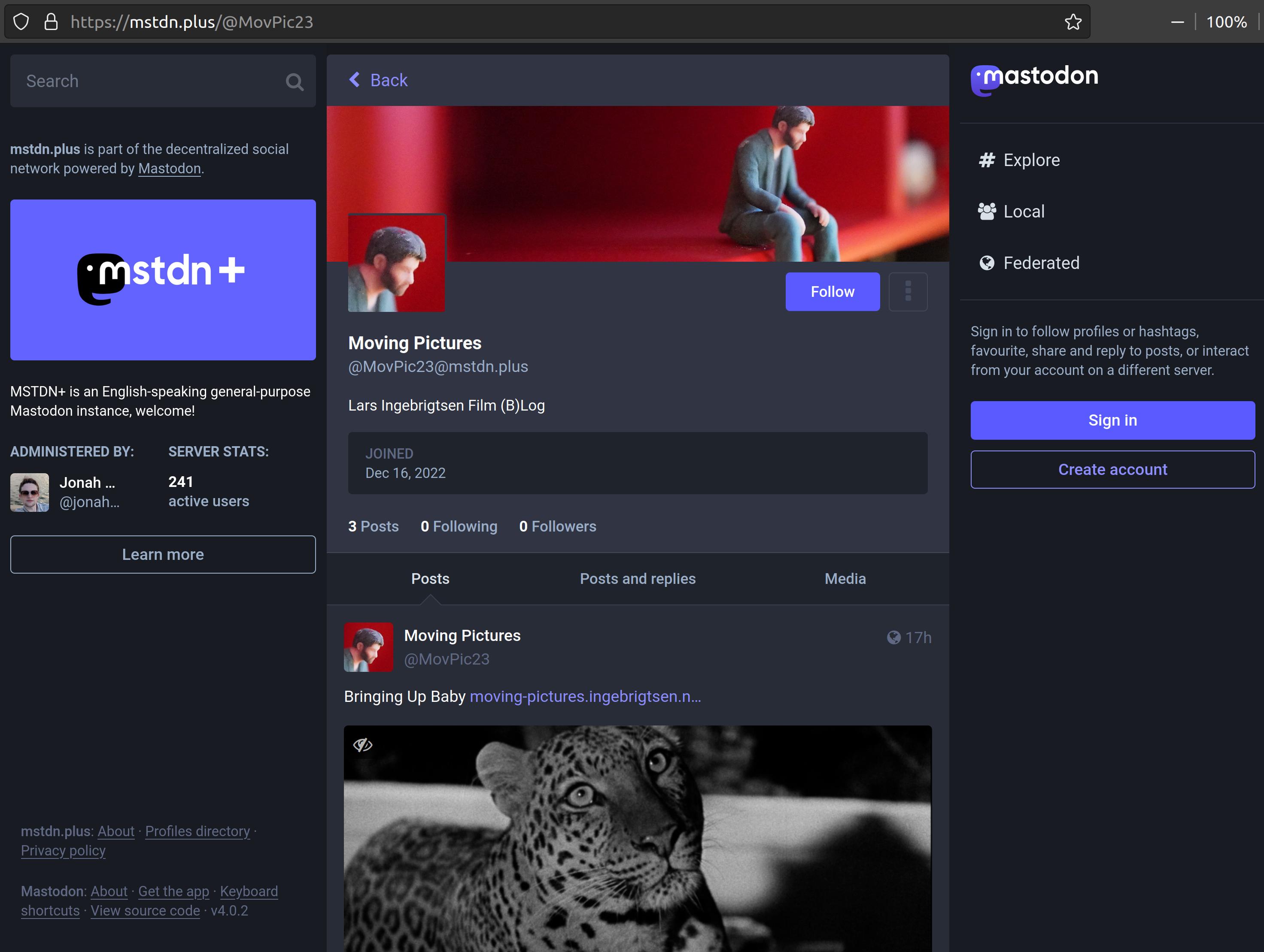
So I chose a server at random and connected my movie blog and presto! Look ma, I’m on Mastodon! (And it has zero followers, just like on Twitter. Nice!)
I have to say I’m impressed, so far. Not by the fediverse stuff in general — it seems like they’re trying to get all the disadvantages of central hosting combined with the disadvantages of distributed hosting: If the person who runs the server gets tired one day and switches the server off, your account is lost. You can migrate, but the server has to be up for that to happen, and a migration doesn’t carry over your old posts. And it seems like a total resource hog, with everybody replicating media etc. (There’s innumarable posts about this.) But the UX is quite nice, even though the account will go away on the whim of whomeever.
I do have some usability notes: If I go to any page on Mastodon, say the explore page, it focuses on this element:
Because obviously when you want to explore Mastodon, you really want to toot something. So I have to click somewhere else on the page for any movement keys to work. Perhaps this is just a Firefox issue? Or perhaps the Mastodon developers never use the keyboard for navigation.
Also:
There’s always an 👁️ overlay over the images (up there in the left-hand upper corner), which just looks untidy in general, and covers up stuff you want to read. If you click on it:
Yes, that is so useful, and is definitely something normal people actually do.
And then there’s the default 16:9 crop factor that’s applied to all images — you can disable that in your personal settings, but nobody does that, so many images just look odd. (Twitter stopped aggressive vertical cropping for various reasons, but that was one of them.)
I’m just kvetching — I’m sure they’ll iterate and fix these minor UX annoyances now that they have more users.
Hm… I do have Ublock, so perhaps I can remove some of the uglyness? Let’s see… before:
After:
So pretty! But of course, it’s still putting the focus on the (now-invisible) “What’s on your mind” box. Oh well.
And I’m not sure whether WordPress connection stuff counts as “bots” — which is something Mastodon seems to frown on in general. So perhaps the account will disappear suddenly? We’ll see!
Oh, and I’m using the Share on Mastodon plugin to *checks notes* share on Mastodon. It seems to work well, but the customisation is pretty innovative: You put stuff into your theme PHP files:
// Never upload attached images.
add_filter( 'share_on_mastodon_attached_images', '__return_false' );

// Always share supported Post Types.
add_filter( 'share_on_mastodon_enabled', '__return_true' );
Sure, why not!? Check-boxes are for wimps!
While I was typing this, there’s further developments. So perhaps I should change the title of this blog post, since it’s automatically posted on Twitter… the title mentions Mastodon now… OK, I’ll change it to something on the down low. Yeah.


