IDW announced last year that they were going to translate and publish a complete set of Hugo Pratt’s Corto Maltese (in English translation). There was much rejoicing across the land. I haven’t read those comics for decades, since they were stuck at my parent’s house up in the North, so I thought “what they hey” and bought the first volume, Under the Sign of Capricorn.
But this Xmas holiday it struck me that I could, like, just start shipping the comics up there down here so that I could re-read … all that stuff … So I started packing.
After six boxes of 20kg each I stopped, because comics are heavy and I recalled that I live on the fourth floor, no elevator, and I’m lazy.
But included in those first six boxes were all the Corto Maltese albums published in Danish and Swedish back in the 80s, so I thought it might be slightly interesting to compare the new editions to the old ones. I’m doing this on my comics reading couch for added versimilitude instead of doing scans.
So, first of all: That cover.
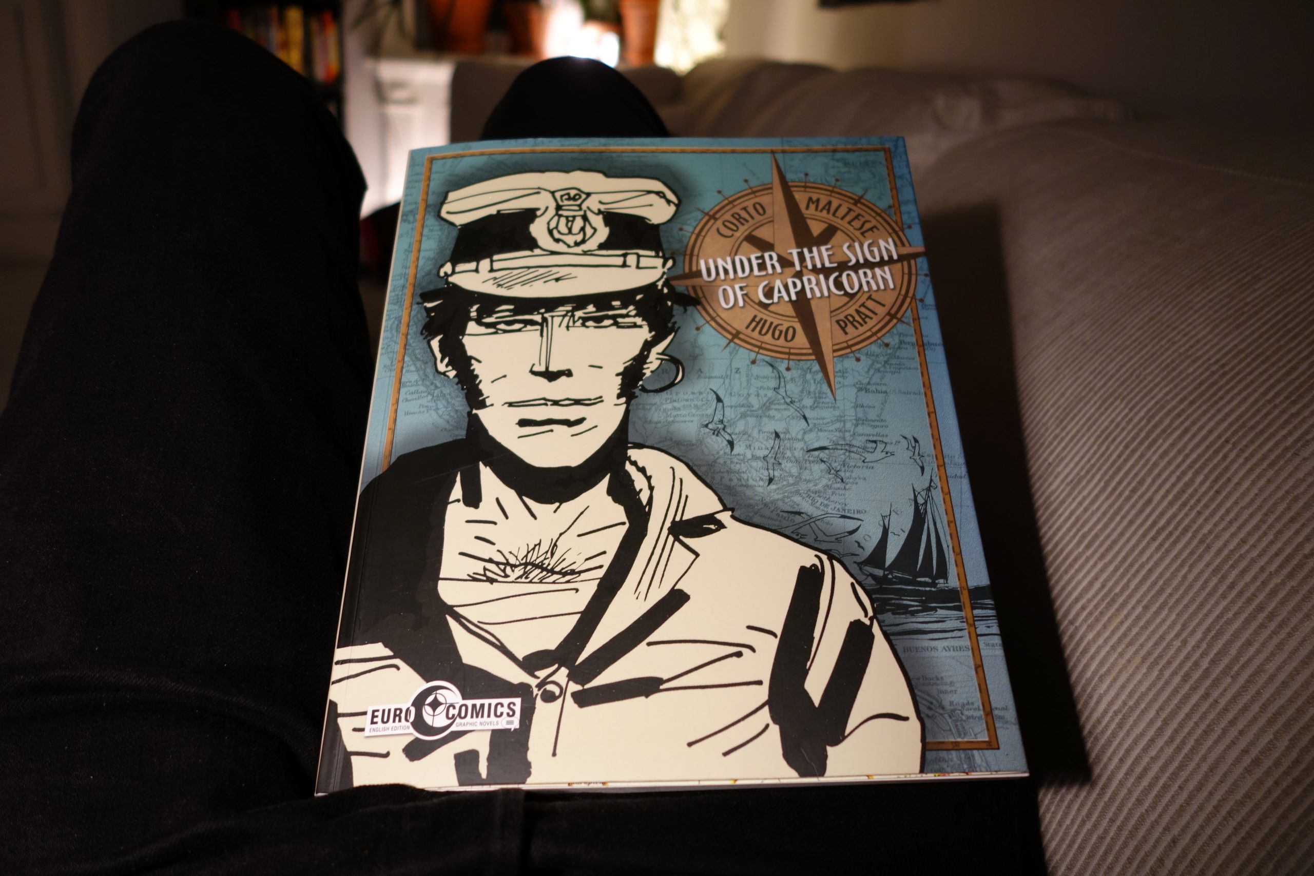 That is ugly. That’s just ugly.
In addition to choosing a pretty weird drawing of Corto Maltese here, there are just so many other bad things going on here. Let me linger on this ugliness for an unreasonable amount of time and pictures:
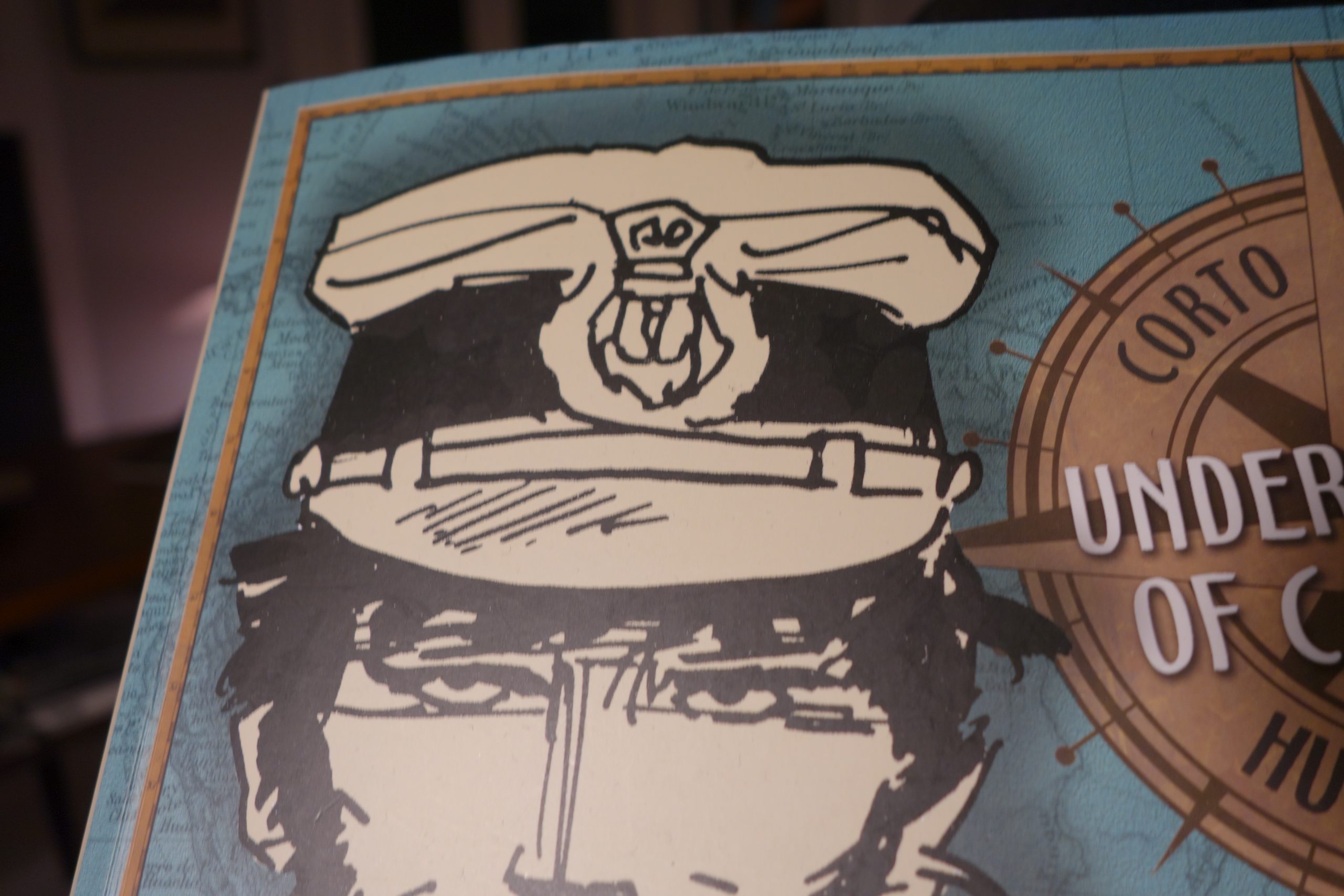
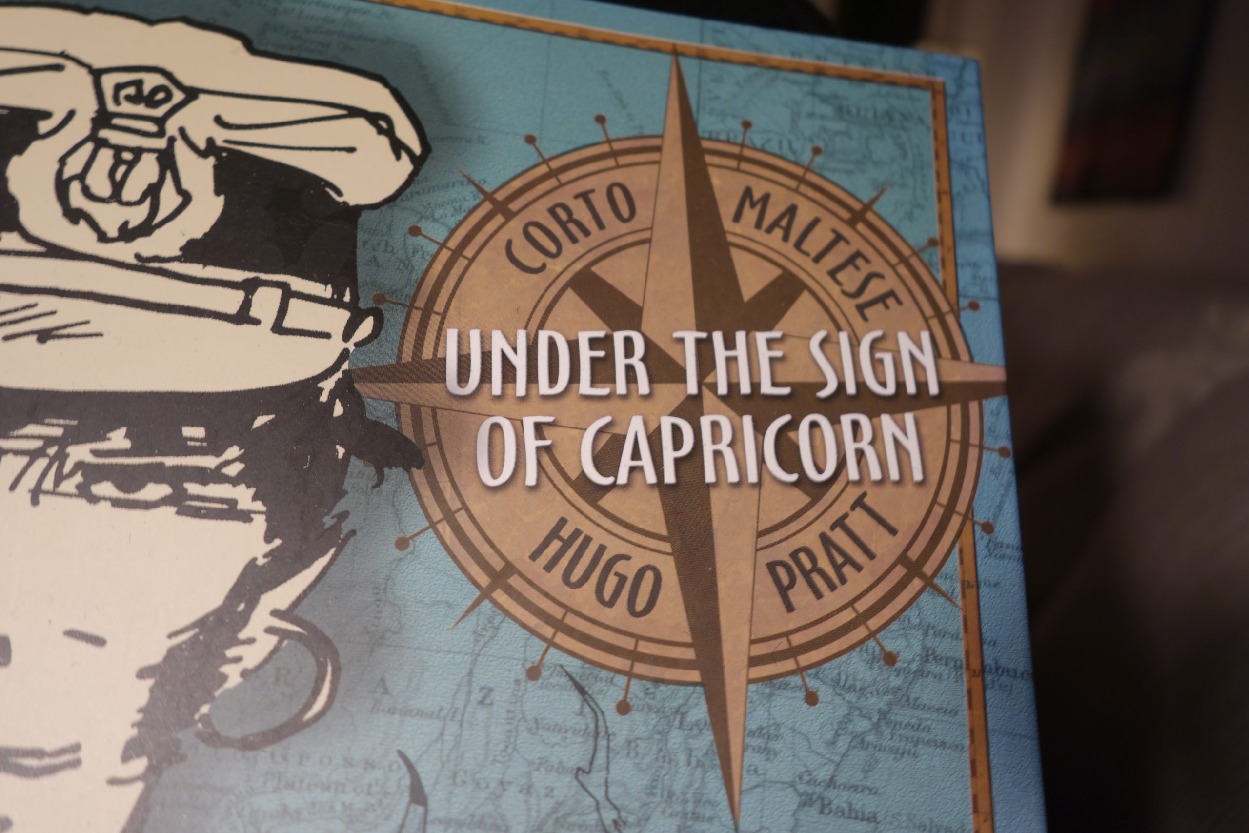
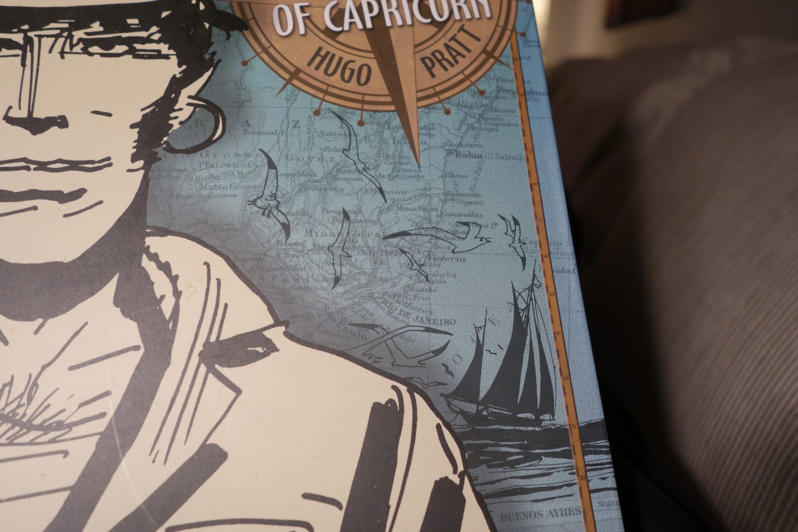
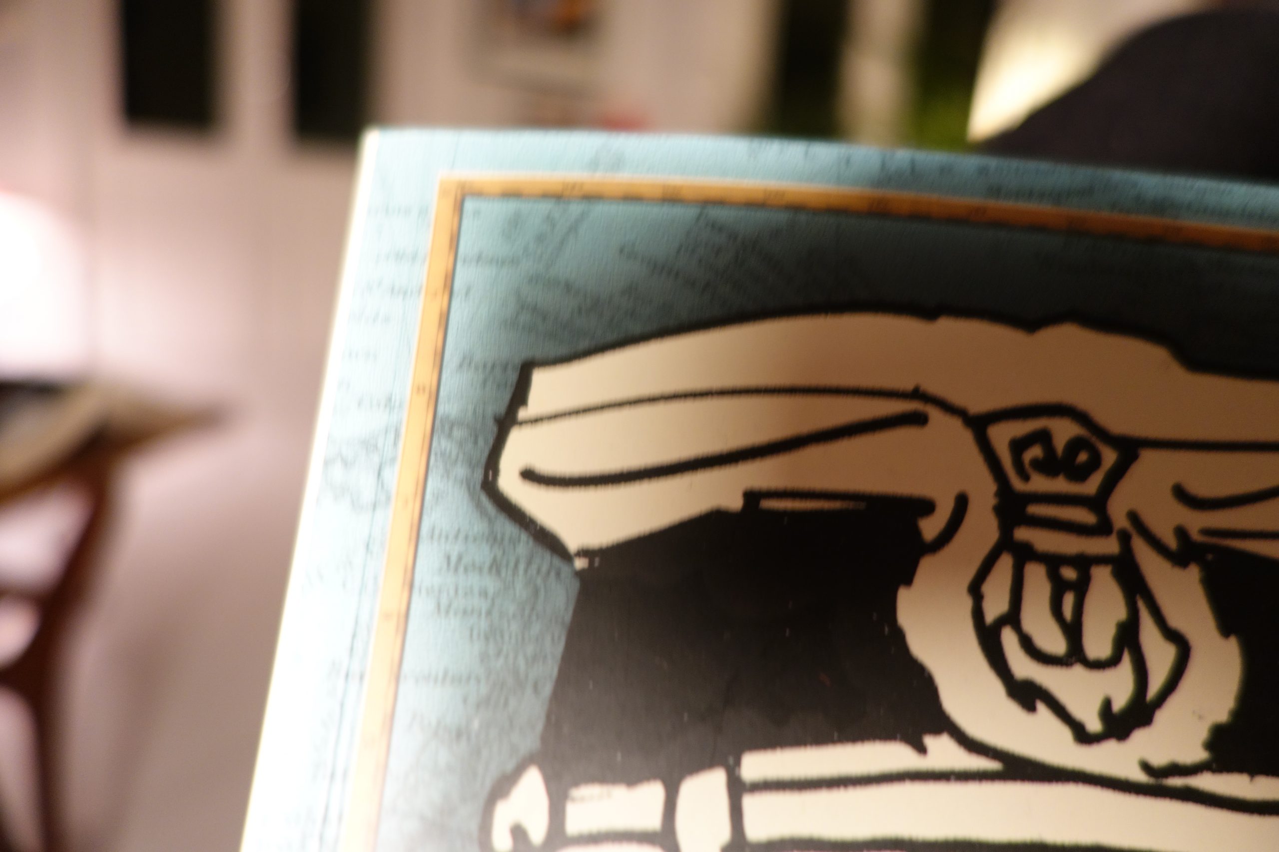
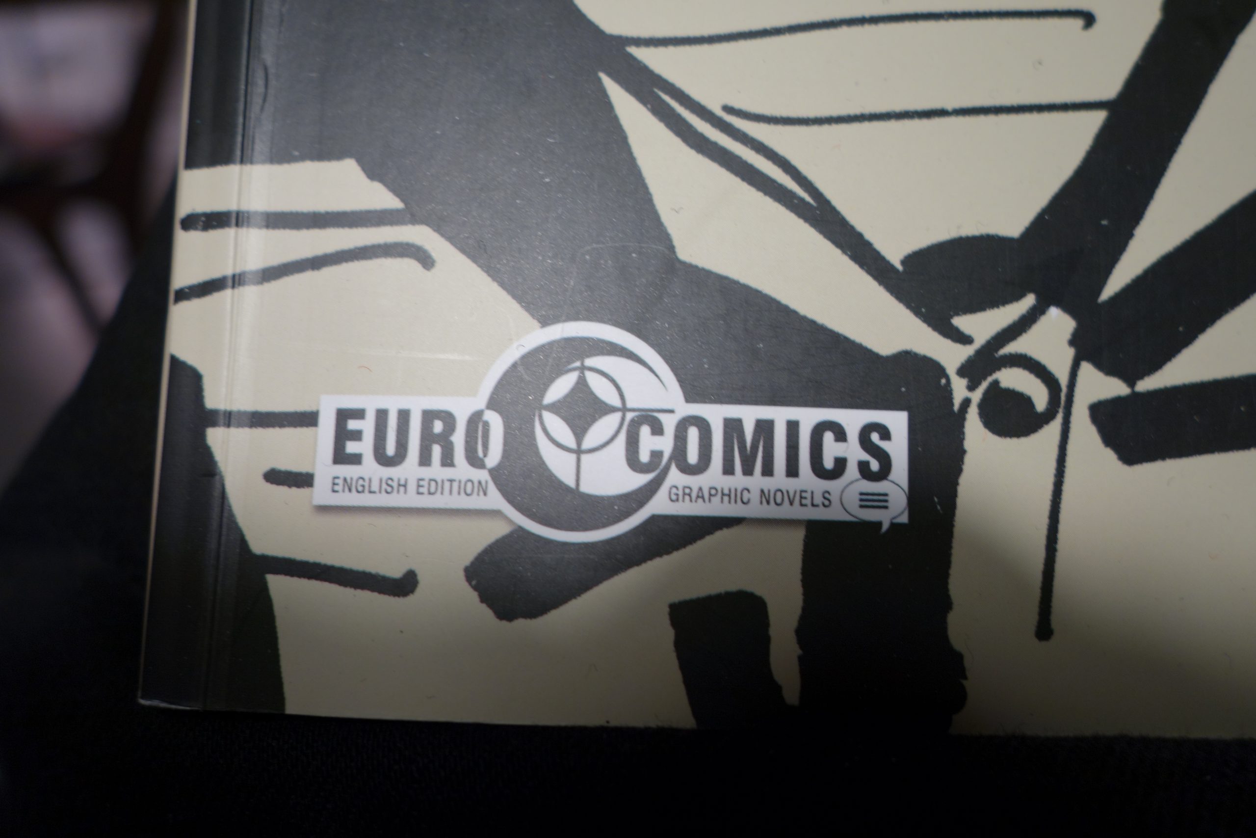
The cover looks like somebody with attention deficit disorder went mad in Photoshop for fifteen minutes.
Seriously.
Here’s what the Danish version looked like in 1982:
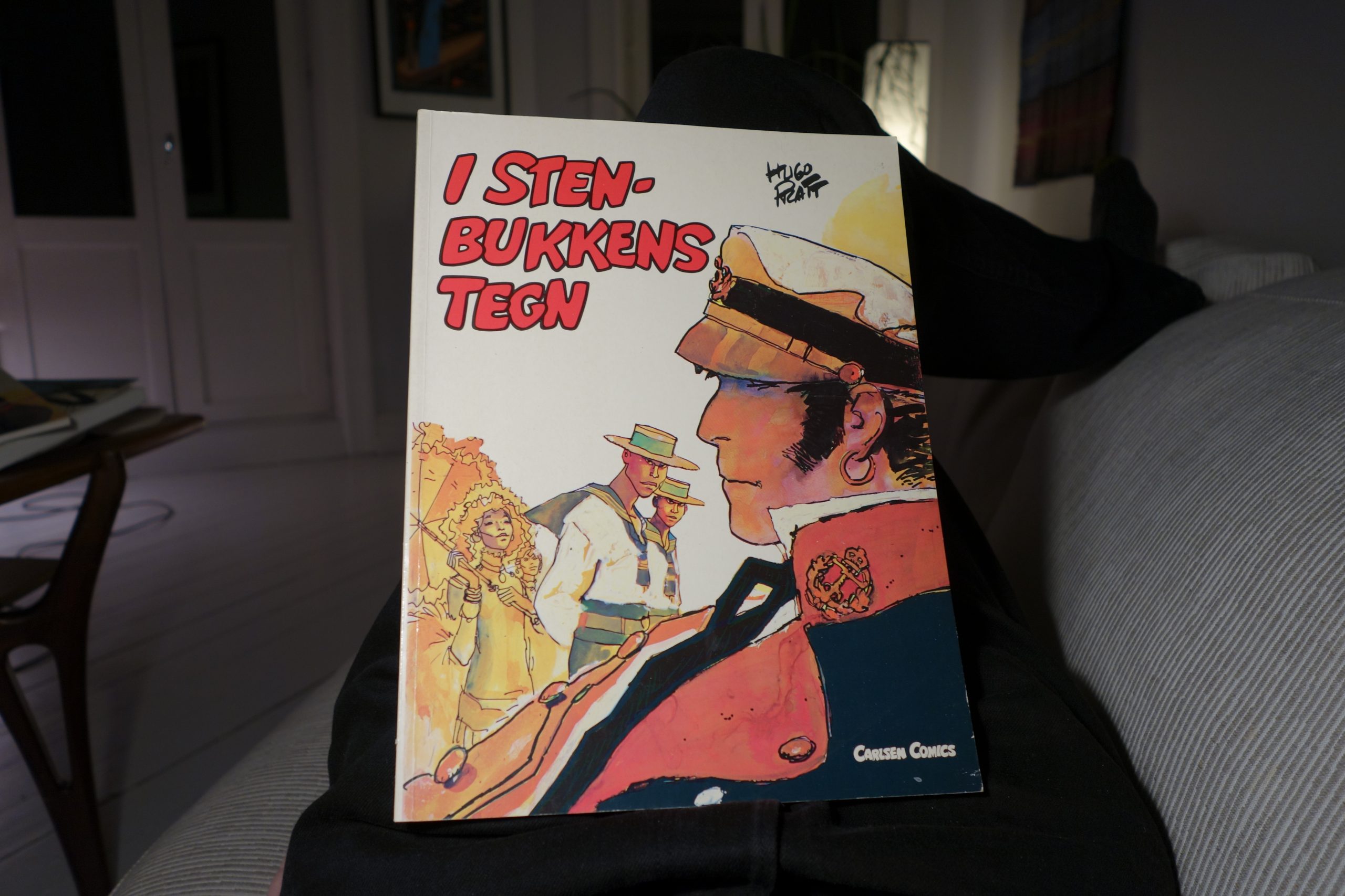 Peace. Tranquility. Beautiful.
Ok, enough with the cover, already. Get ready for some innards. By now I was cringing, expecting the worst…
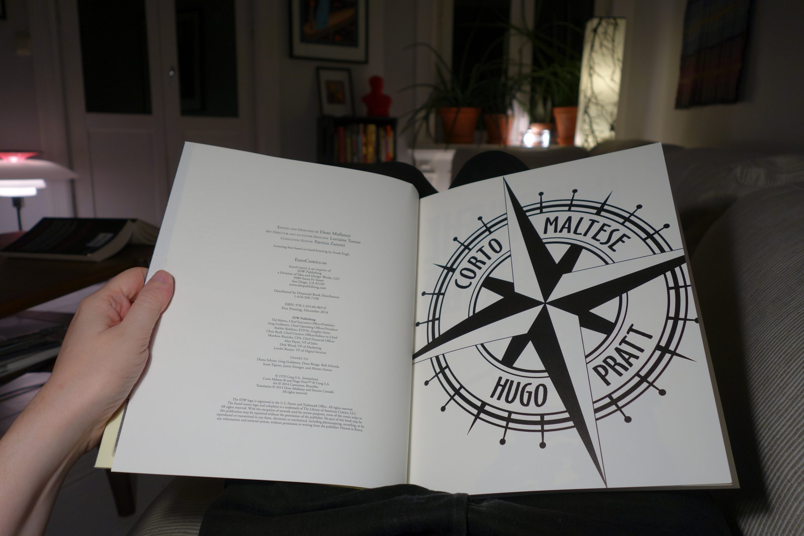
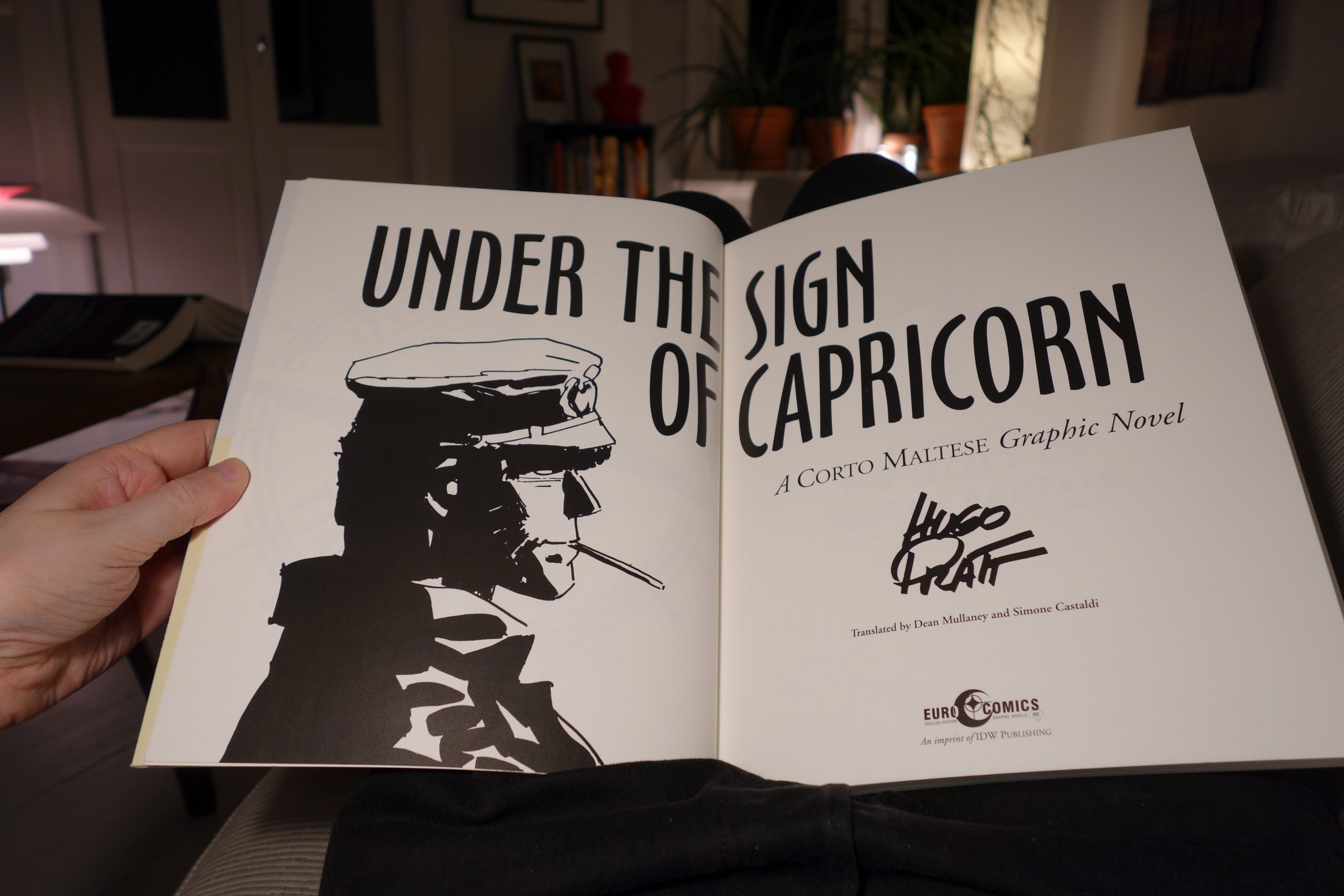
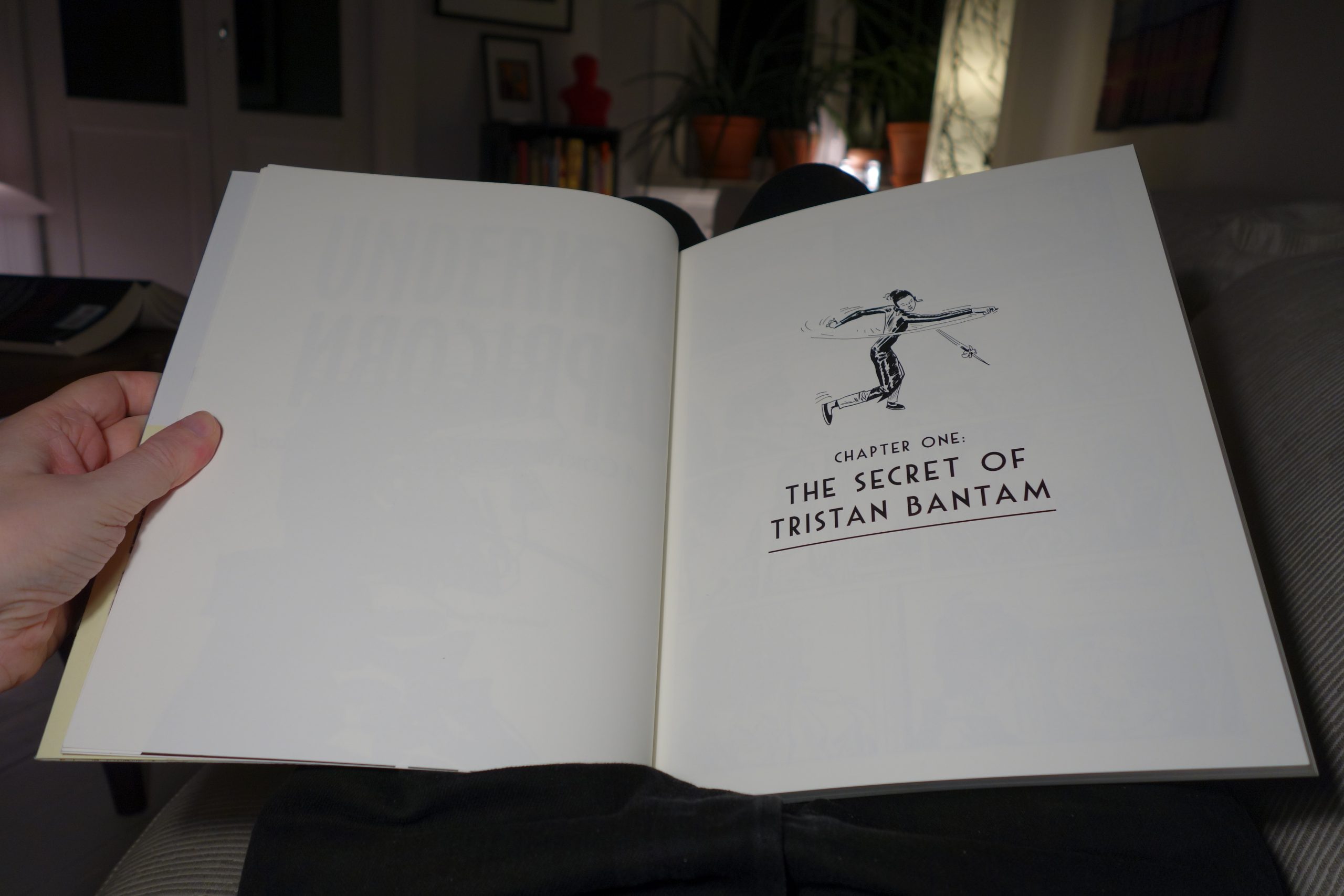
And then the story itself starts. What does it look like?
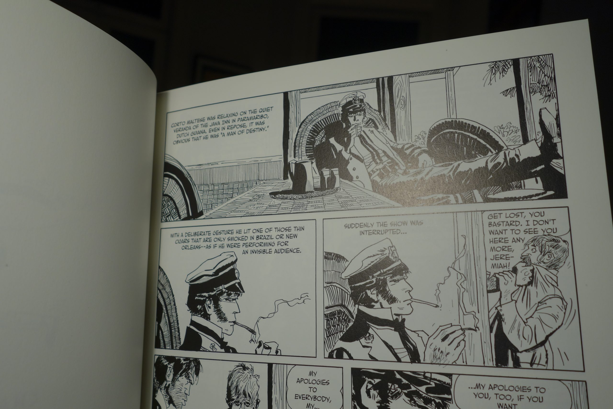 The printing looks really nice and crisp. However, they’ve used a semi-glossy paper stock, which means that you have to keep shifting the page around to be able to read it, because the light makes reflections. It’s not as shiny as many other modern reprint projects, but it’s still not… good.
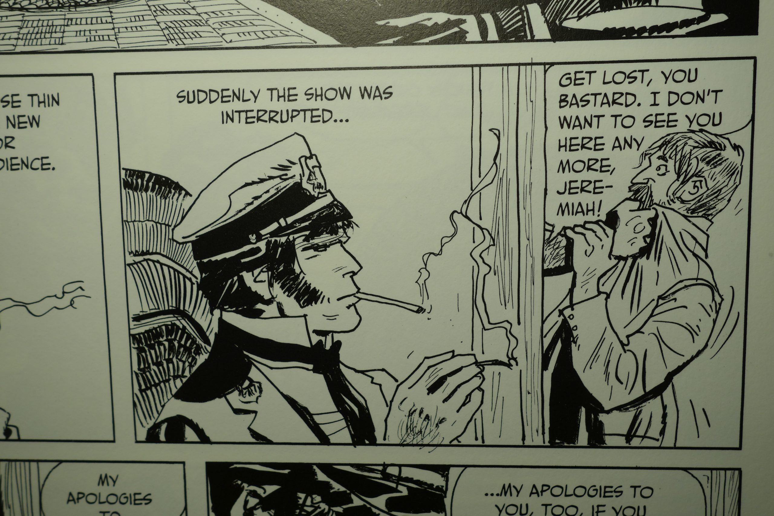 But when you angle the paper just right, it looks really nice. The ink is nice and black, and the paper is just slightly off-white. It’s perfectly acceptable.
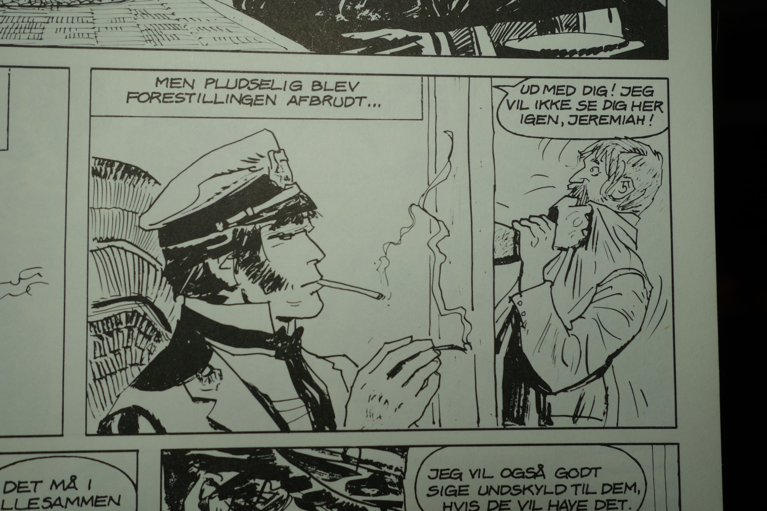 The Danish version from 1982 is more washed out, but is printed on completely matte paper. So that’s a tie, I guess. I do think the new printing is perhaps a bit busier than intended. All those lines that were probably intended as barely visible skritches (compare the lines in the woodwork and the lines in Corto’s brow in the two versions), and these small lines are now solid, with even width. It looks like whoever digitised this applied a thresholding function that makes all the lines look stark. More lines mo better, perhaps, but…
Let me digress a bit about a subject that is, strictly speaking, totally irrelevant here:
These days, most reprint projects of European albums have a tendency to stick a lot of albums together into a great whopping book. European albums are mostly in the 40-60 page range, and selling anything less than 120 pages is apparently impossible these days.
But sticking separate stories together into one volume changes the way they read.
Most European albums are separate works that have a definite beginning and ending. After reading one, you feel you’ve experienced something complete. Sticking several of these works together into one volume changes that experience. When the next story starts three pages later, there’s a compulsion to continue reading, but more importantly, when you have 60 pages left in the book when you’re reading the end of a story, it doesn’t really feel like the end of a story.
It’s like if films were realeased with a two second pause between “The End” and then the next film the director did starting. American comics are often more serially oriented, and presenting collections of those works fine, as does collections of TV series. But doing the same with most European comics changes the reading experience, and not for the better.
But like I said, that rant is irrelevant here, because this book is a collection of six related stories, so just forget what I just said.
As is the norm, though, this volume is over 120 pages, while the 80s edition comes in two volumes:
 Oh, and there’s the cover of the second 80s volume:
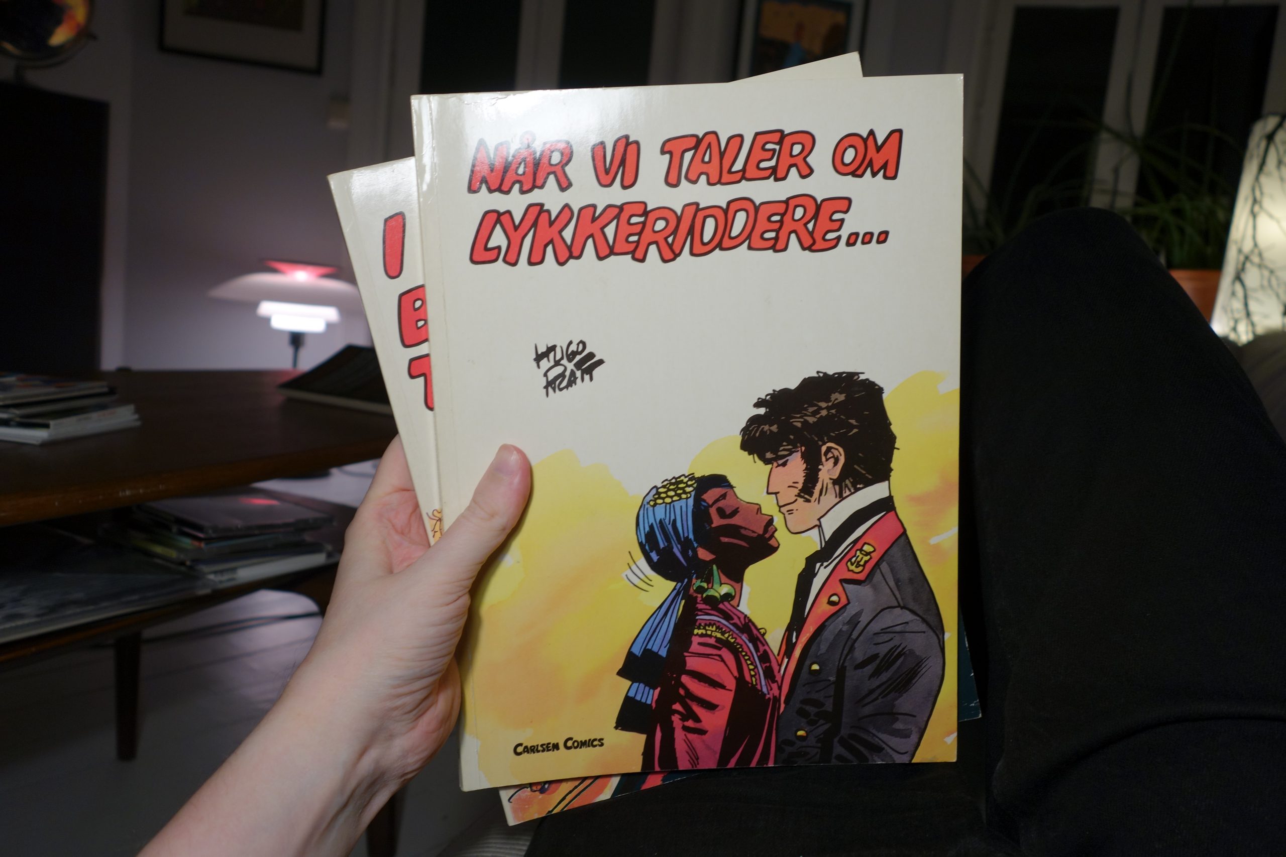 Kinda purdy, that one too. I mean, not as good as the first volume, but still way better than the IDW cover.
Oh, and what’s the stories like? They’re fantastic, of course, and if you haven’t read them already, you should run out to your nearest comic book store and buy one immediately. Then rip off the cover, put it in the paper recycling, and then read the stories.
3 thoughts on “Corto Maltese: Under the Sign of Capricorn”