I was too poor at the time (1993, I think?) to buy the limited-edition version of This Rimy River by Vaughan Oliver, but reading the 4AD biography reminded me that I had to buy it.
The regular version is very pretty, and has an overview of Oliver’s design career. The limited edition is weirder.
The slipcase is, er, traditional enough. It comes in a velvet-ey slipcase with a bucket on the front.
 The book itself comes has a plexiglas cover.

So luxurious.
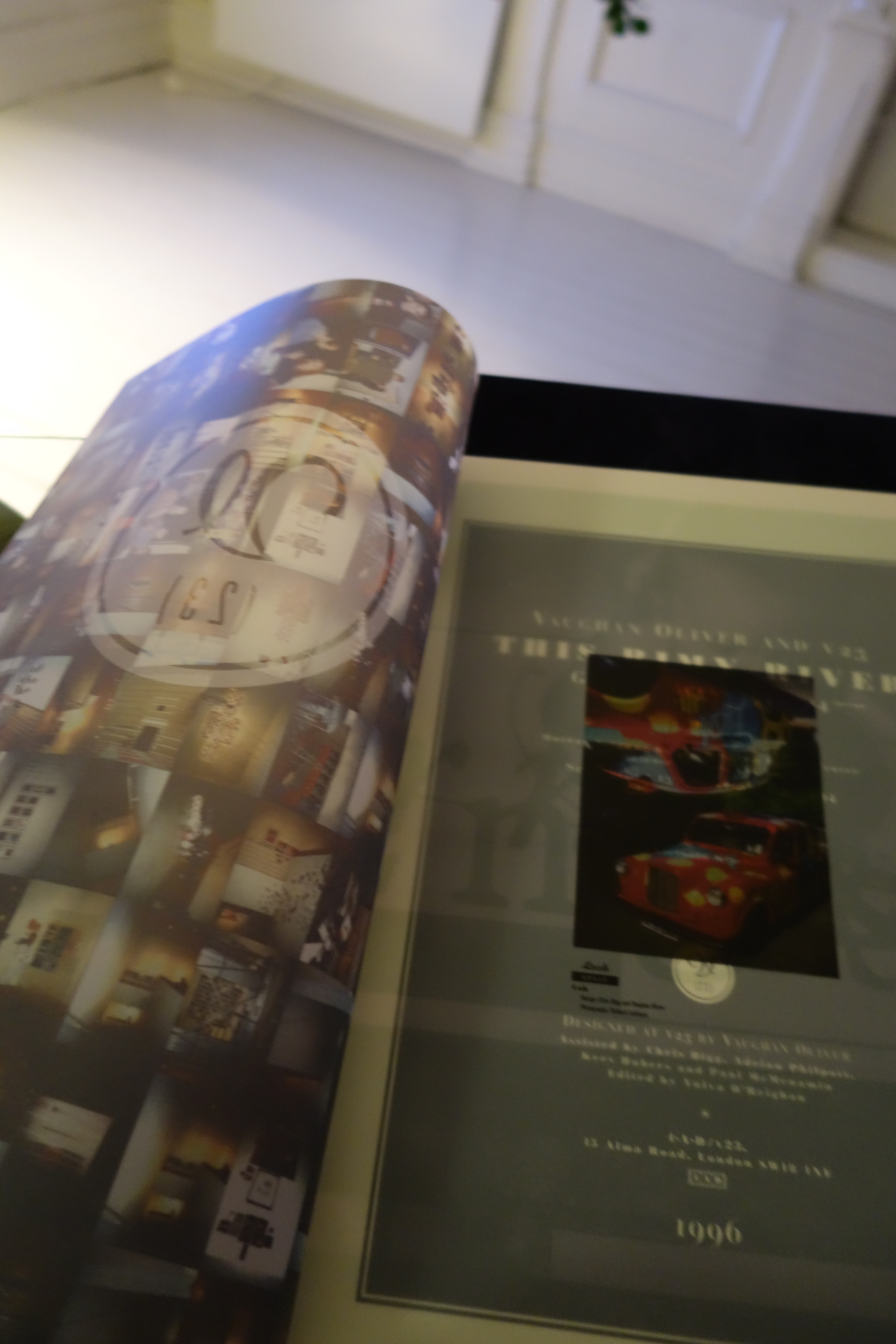
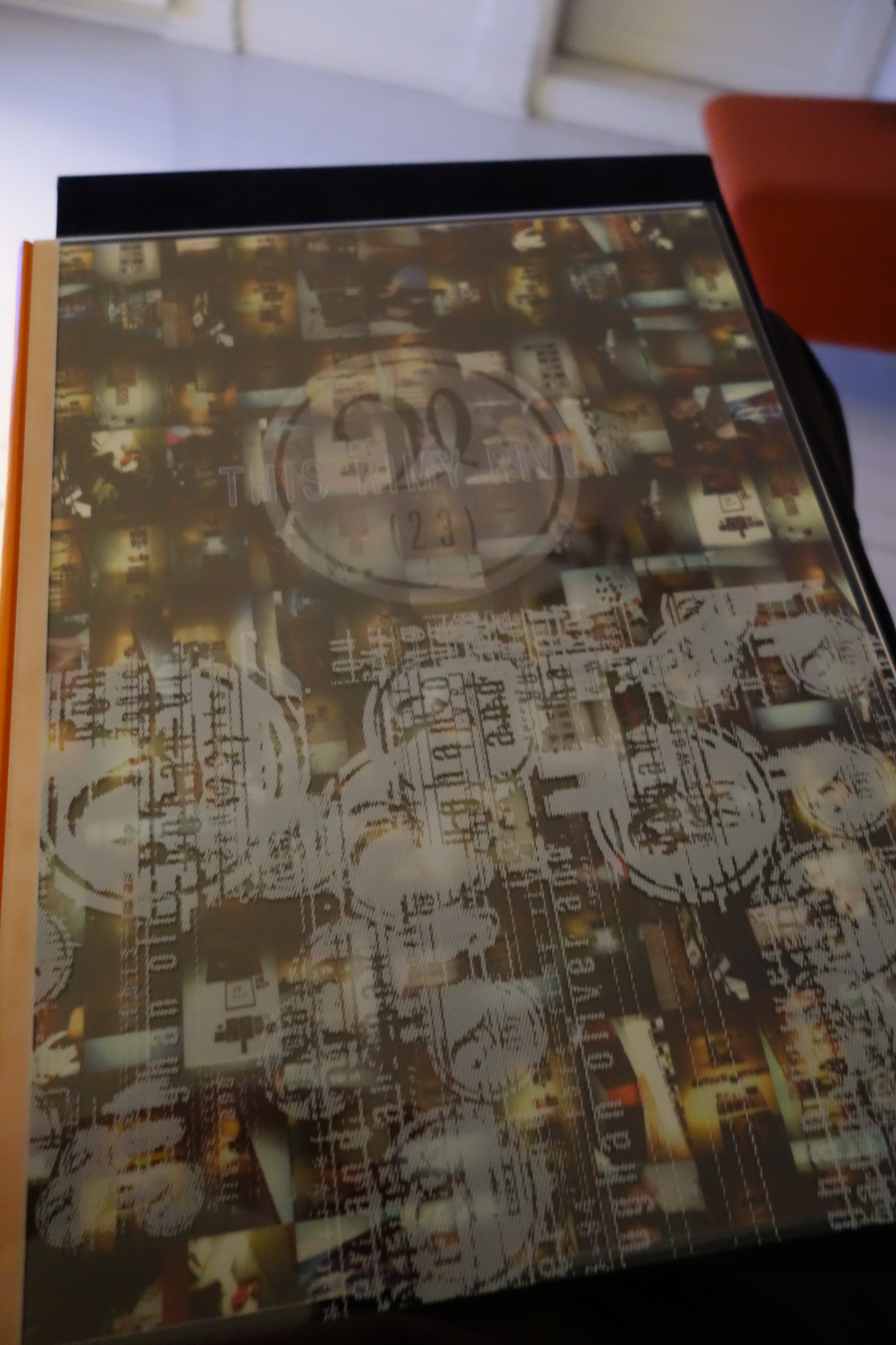
Which brings us to the interiors. Oliver had his poor interns chop copies of the regular version apart, and then screen-print the hell out of the pages. They mainly applied two layers — one black (obscuring the original stuff on the pages) and one in copper (one word per page from a poem Oliver’s wife wrote).
So compare: Limited edition version regular.
Limited edition to the left. The page on the right completely obliterates the original page, while the black print on the left page is somewhat more subtle.
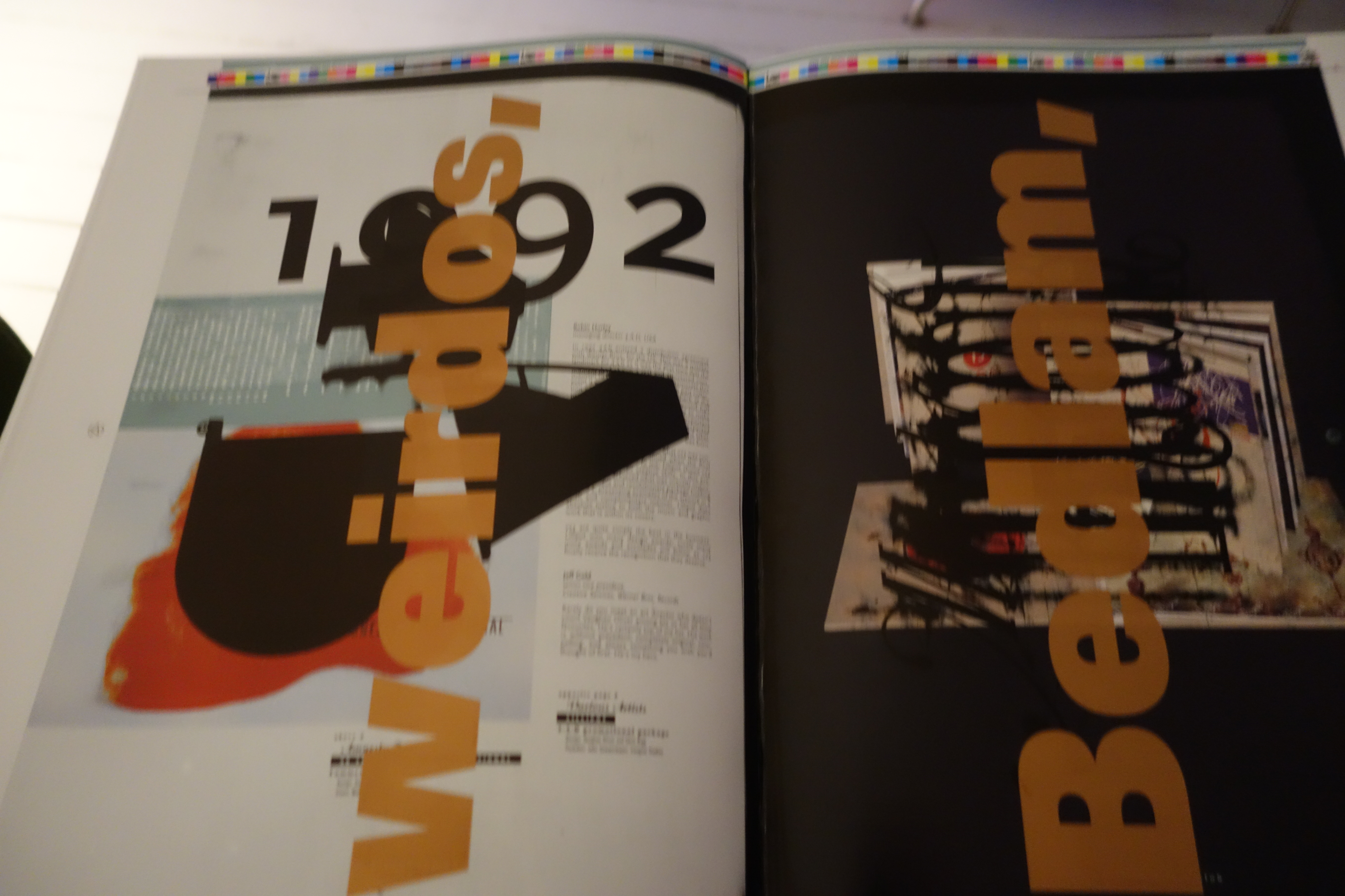
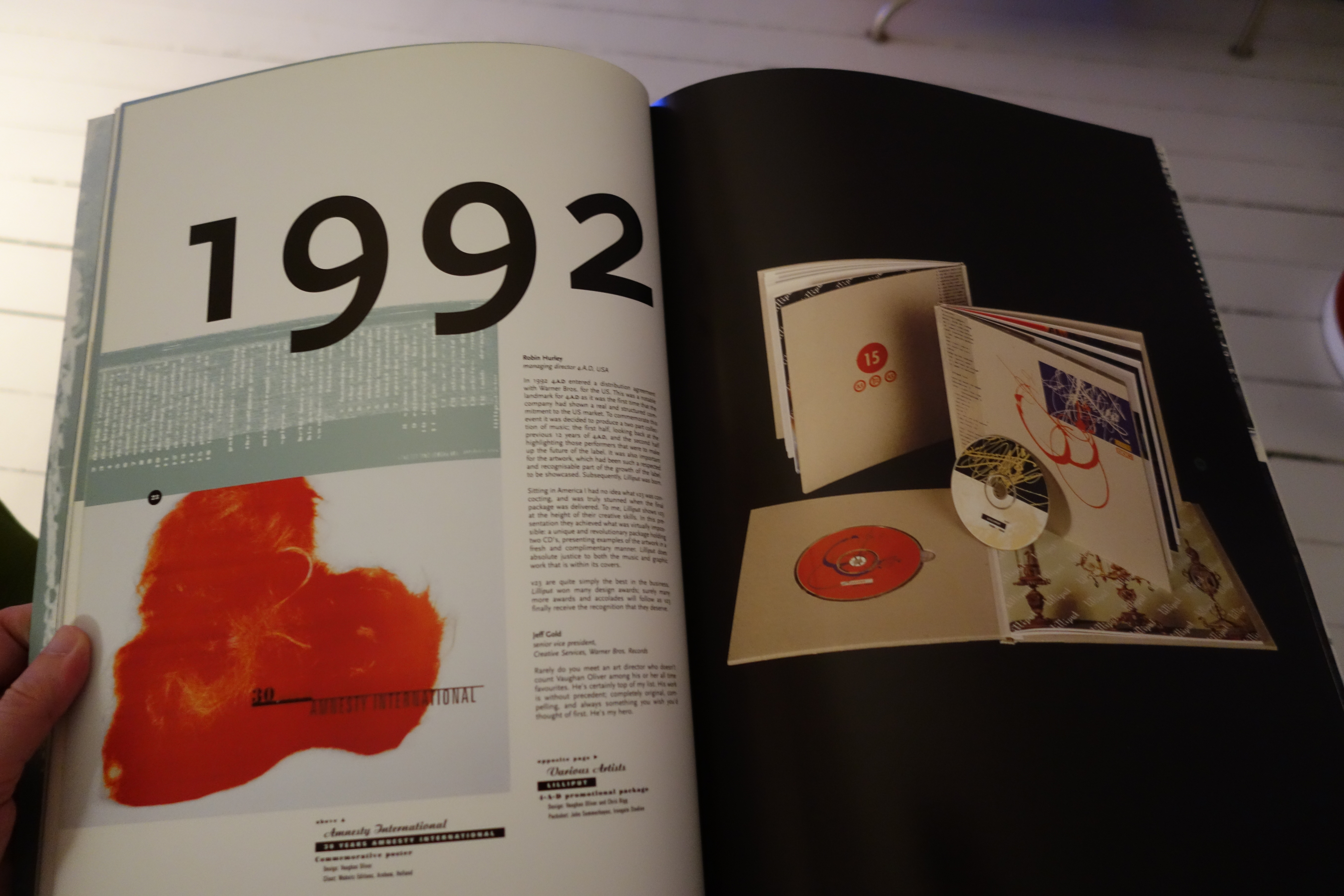
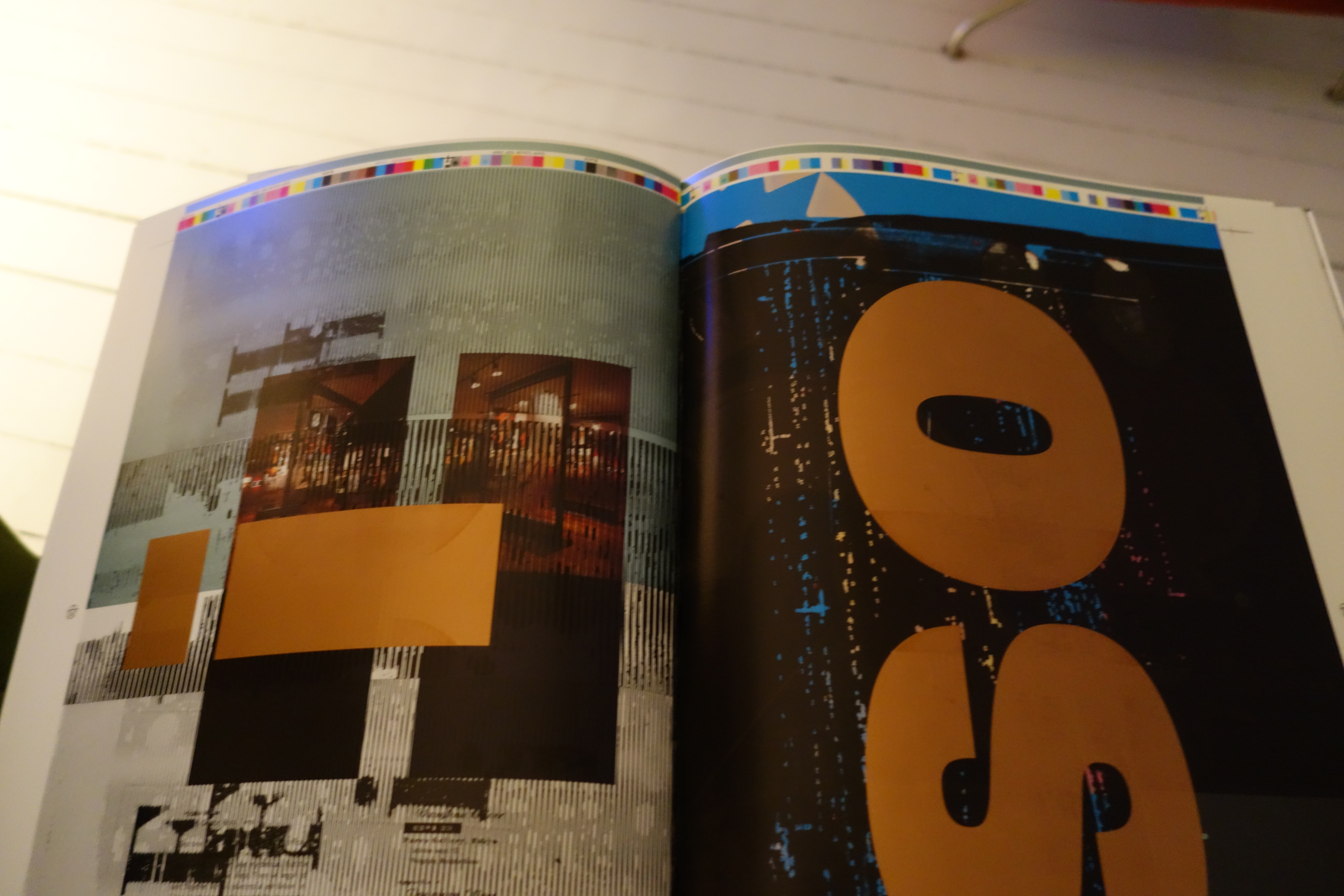
Again, limited edition on the light. On these two pages the black additional printing is less overwhelming.
Oliver has a great sense of humour. It’s both a “fuck you” to people who has money to buy these kinds of things (since you need the regular version to actually read it), and it’s also a beautiful object in itself. <slow clap>